
Icons, links and buttons We have a unique icon design principle. Our icons are based on the same...
4
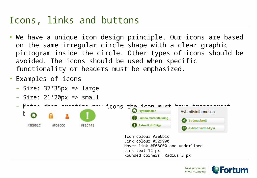
Icons, links and buttons • We have a unique icon design principle. Our icons are based on the same irregular circle shape with a clear graphic pictogram inside the circle. Other types of icons should be avoided. The icons should be used when specific functionality or headers must be emphasized. • Examples of icons – Size: 37*35px => large – Size: 21*20px => small – Note: When creating new icons the icon must have transparent background Icon colour #3e6b1c Link colour #529900 Hover link #F08C00 and underlined Link text 12 px Rounded corners: Radius 5 px
-
Upload
ambrose-skinner -
Category
Documents
-
view
216 -
download
0
Transcript of Icons, links and buttons We have a unique icon design principle. Our icons are based on the same...
Icons, links and buttons
• We have a unique icon design principle. Our icons are based on the same irregular circle shape with a clear graphic pictogram inside the circle. Other types of icons should be avoided. The icons should be used when specific functionality or headers must be emphasized.
• Examples of icons– Size: 37*35px => large
– Size: 21*20px => small
– Note: When creating new icons the icon must have transparent background
Icon colour #3e6b1cLink colour #529900Hover link #F08C00 and underlinedLink text 12 pxRounded corners: Radius 5 px
2
Links
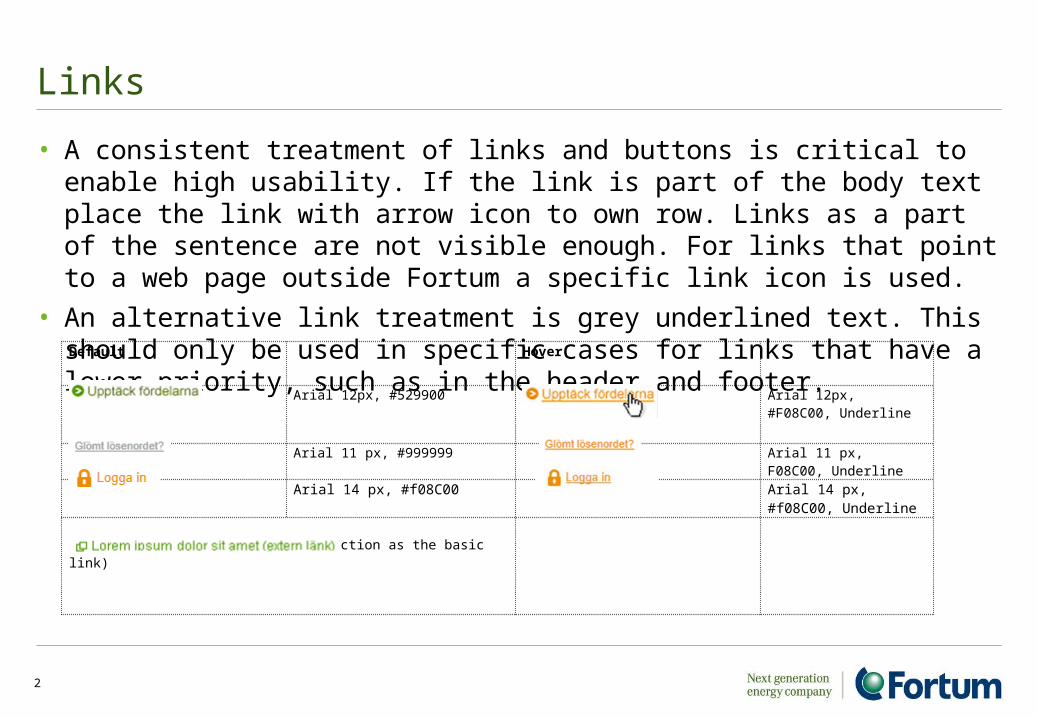
• A consistent treatment of links and buttons is critical to enable high usability. If the link is part of the body text place the link with arrow icon to own row. Links as a part of the sentence are not visible enough. For links that point to a web page outside Fortum a specific link icon is used.
• An alternative link treatment is grey underlined text. This should only be used in specific cases for links that have a lower priority, such as in the header and footer. Default Hover
Arial 12px, #529900 Arial 12px, #F08C00, Underline
Arial 11 px, #999999 Arial 11 px, F08C00, Underline
Arial 14 px, #f08C00 Arial 14 px, #f08C00, Underline
Link outside Fortum site (same function as the basic link)
3
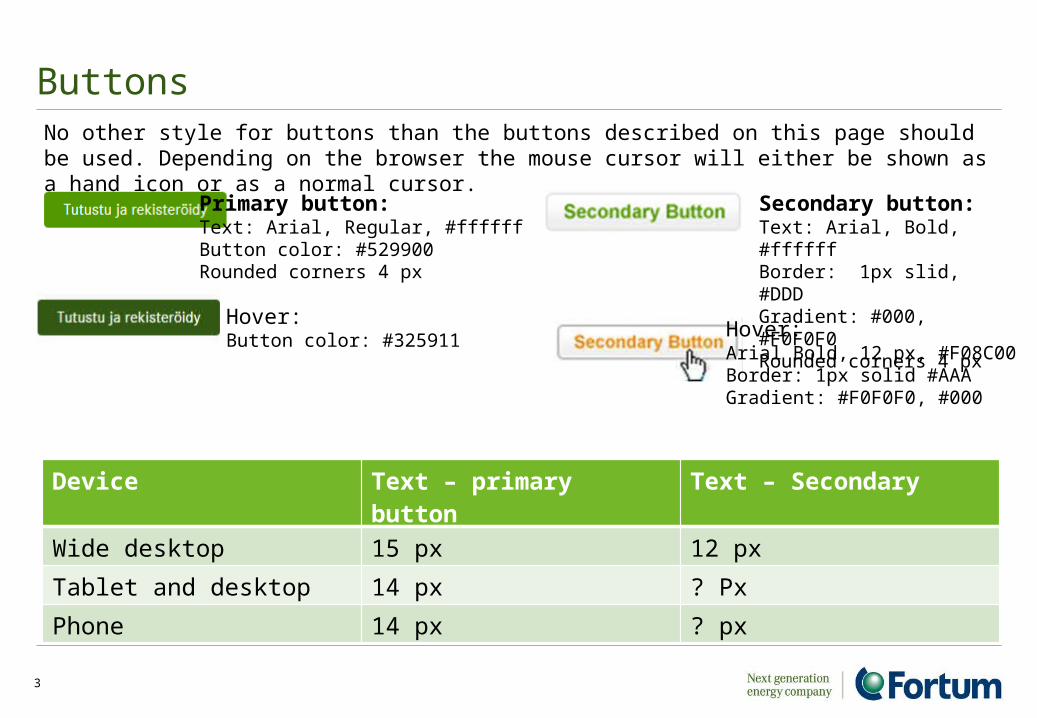
ButtonsNo other style for buttons than the buttons described on this page should be used. Depending on the browser the mouse cursor will either be shown as a hand icon or as a normal cursor.
Primary button:Text: Arial, Regular, #ffffffButton color: #529900Rounded corners 4 px
Hover:Button color: #325911
Device Text – primary button Text – Secondary
Wide desktop 15 px 12 px
Tablet and desktop 14 px ? Px
Phone 14 px ? px
Secondary button:Text: Arial, Bold, #ffffffBorder: 1px slid, #DDDGradient: #000, #F0F0F0Rounded corners 4 px
Hover:Arial Bold, 12 px, #F08C00Border: 1px solid #AAAGradient: #F0F0F0, #000
4
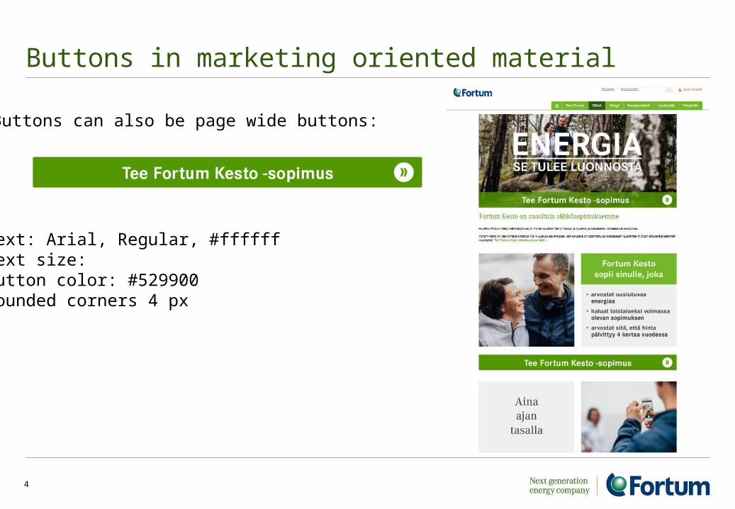
Buttons in marketing oriented material
Buttons can also be page wide buttons:
Text: Arial, Regular, #ffffffText size: Button color: #529900Rounded corners 4 px