
Human Anatomy & Physiology I Lab 2 Graphing …...0 10 20 30 0 10 20 % Time, s 0 10 20 30 0 10 20 %...
18
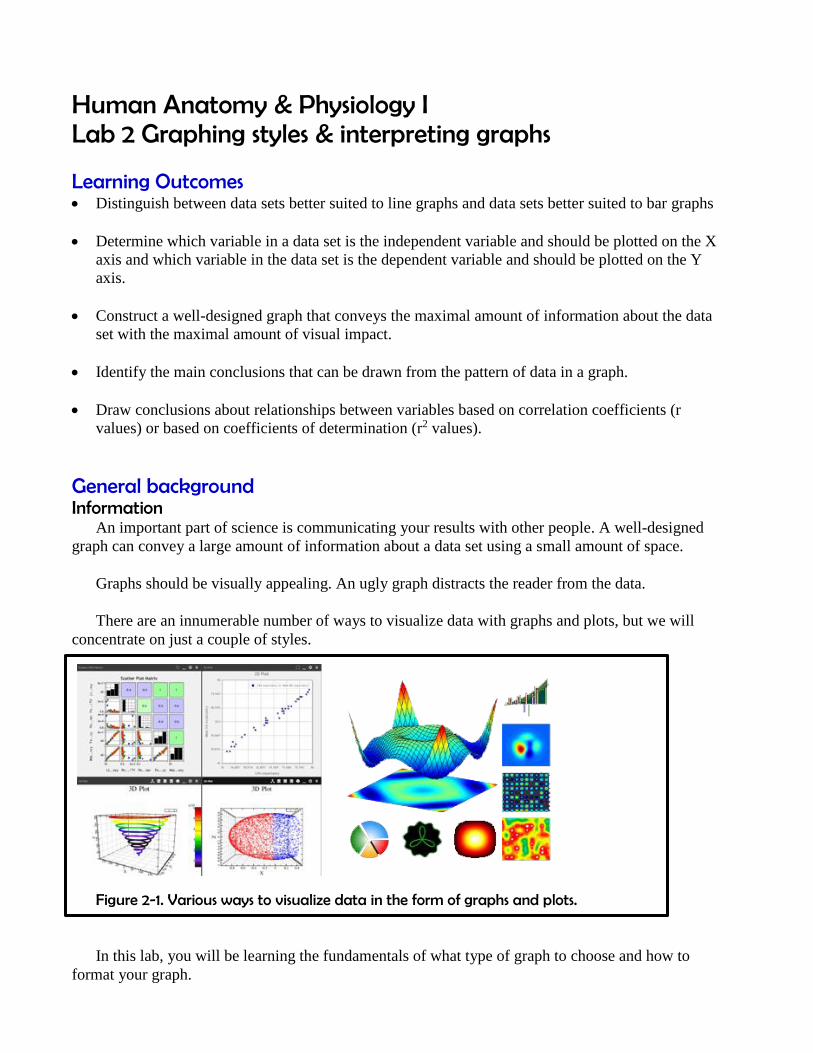
Human Anatomy & Physiology I Lab 2 Graphing styles & interpreting graphs Learning Outcomes Distinguish between data sets better suited to line graphs and data sets better suited to bar graphs Determine which variable in a data set is the independent variable and should be plotted on the X axis and which variable in the data set is the dependent variable and should be plotted on the Y axis. Construct a well-designed graph that conveys the maximal amount of information about the data set with the maximal amount of visual impact. Identify the main conclusions that can be drawn from the pattern of data in a graph. Draw conclusions about relationships between variables based on correlation coefficients (r values) or based on coefficients of determination (r 2 values). General background Information An important part of science is communicating your results with other people. A well-designed graph can convey a large amount of information about a data set using a small amount of space. Graphs should be visually appealing. An ugly graph distracts the reader from the data. There are an innumerable number of ways to visualize data with graphs and plots, but we will concentrate on just a couple of styles. Figure 2-1. Various ways to visualize data in the form of graphs and plots. In this lab, you will be learning the fundamentals of what type of graph to choose and how to format your graph.
Transcript of Human Anatomy & Physiology I Lab 2 Graphing …...0 10 20 30 0 10 20 % Time, s 0 10 20 30 0 10 20 %...
Human Anatomy & Physiology I Lab 2 Graphing styles & interpreting graphs
Learning Outcomes Distinguish between data sets better suited to line graphs and data sets better suited to bar graphs
Determine which variable in a data set is the independent variable and should be plotted on the X
axis and which variable in the data set is the dependent variable and should be plotted on the Y
axis.
Construct a well-designed graph that conveys the maximal amount of information about the data
set with the maximal amount of visual impact.
Identify the main conclusions that can be drawn from the pattern of data in a graph.
Draw conclusions about relationships between variables based on correlation coefficients (r
values) or based on coefficients of determination (r2 values).
General background Information An important part of science is communicating your results with other people. A well-designed
graph can convey a large amount of information about a data set using a small amount of space.
Graphs should be visually appealing. An ugly graph distracts the reader from the data.
There are an innumerable number of ways to visualize data with graphs and plots, but we will
concentrate on just a couple of styles.
Figure 2-1. Various ways to visualize data in the form of graphs and plots.
In this lab, you will be learning the fundamentals of what type of graph to choose and how to
format your graph.
0
10
20
30
0 10 20
Response,
%
Time, s
0
10
20
30
0 10 20
Response,
%
Time, s
0
5
10
15
Drug A Drug B Drug C
Recovery
, %
Treatment
0
5
10
15
1 2 3
Reaction t
ime, s
Experimental Group
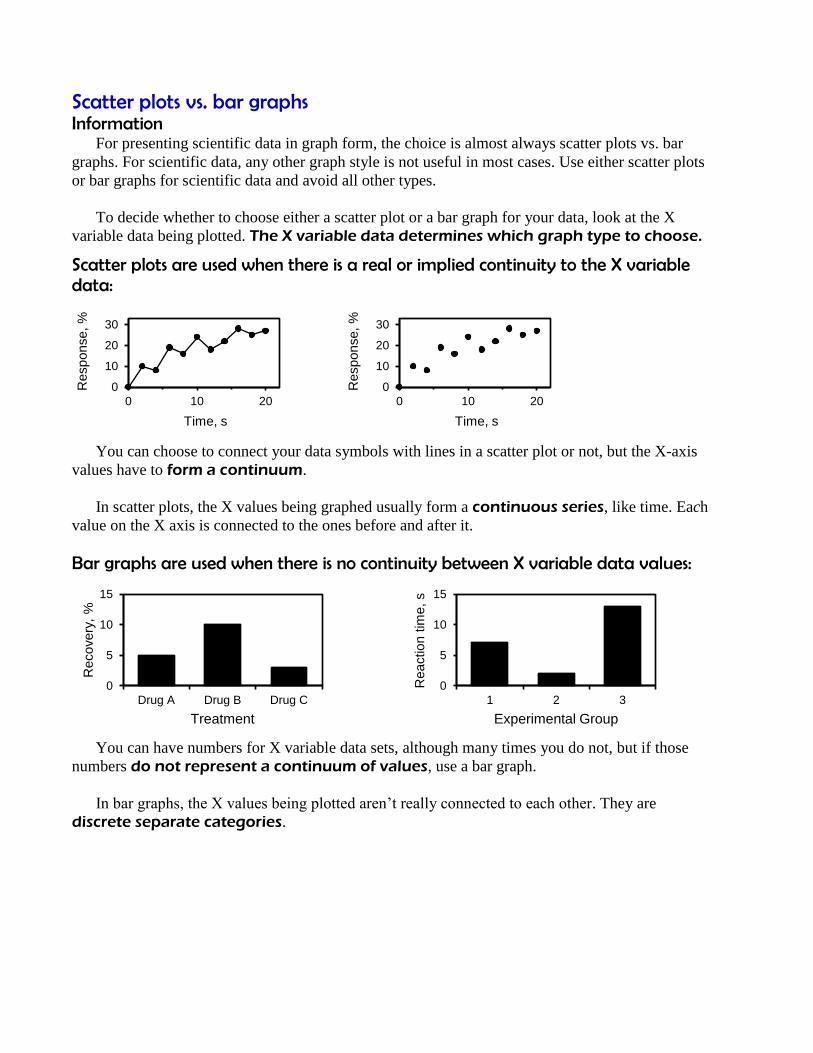
Scatter plots vs. bar graphs Information For presenting scientific data in graph form, the choice is almost always scatter plots vs. bar
graphs. For scientific data, any other graph style is not useful in most cases. Use either scatter plots
or bar graphs for scientific data and avoid all other types.
To decide whether to choose either a scatter plot or a bar graph for your data, look at the X
variable data being plotted. The X variable data determines which graph type to choose.
Scatter plots are used when there is a real or implied continuity to the X variable data:
You can choose to connect your data symbols with lines in a scatter plot or not, but the X-axis
values have to form a continuum.
In scatter plots, the X values being graphed usually form a continuous series, like time. Each
value on the X axis is connected to the ones before and after it.
Bar graphs are used when there is no continuity between X variable data values:
You can have numbers for X variable data sets, although many times you do not, but if those
numbers do not represent a continuum of values, use a bar graph.
In bar graphs, the X values being plotted aren’t really connected to each other. They are
discrete separate categories.
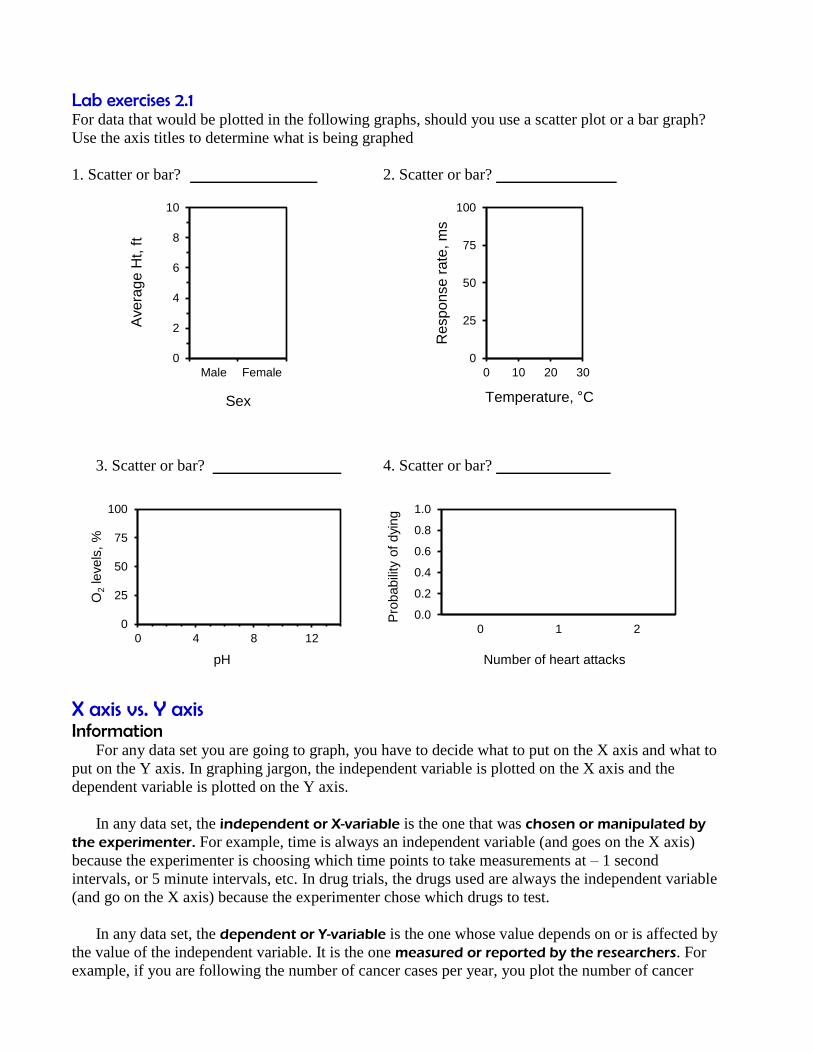
Lab exercises 2.1
For data that would be plotted in the following graphs, should you use a scatter plot or a bar graph?
Use the axis titles to determine what is being graphed
1. Scatter or bar? 2. Scatter or bar?
3. Scatter or bar? 4. Scatter or bar?
X axis vs. Y axis Information For any data set you are going to graph, you have to decide what to put on the X axis and what to
put on the Y axis. In graphing jargon, the independent variable is plotted on the X axis and the
dependent variable is plotted on the Y axis.
In any data set, the independent or X-variable is the one that was chosen or manipulated by
the experimenter. For example, time is always an independent variable (and goes on the X axis)
because the experimenter is choosing which time points to take measurements at – 1 second
intervals, or 5 minute intervals, etc. In drug trials, the drugs used are always the independent variable
(and go on the X axis) because the experimenter chose which drugs to test.
In any data set, the dependent or Y-variable is the one whose value depends on or is affected by
the value of the independent variable. It is the one measured or reported by the researchers. For
example, if you are following the number of cancer cases per year, you plot the number of cancer
0
2
4
6
8
10
Male Female
Ave
rag
e H
t, f
t
Sex
0
25
50
75
100
0 10 20 30
Re
spo
nse
ra
te, m
s
Temperature, °C
0
25
50
75
100
0 4 8 12
O2
levels
, %
pH
0.0
0.2
0.4
0.6
0.8
1.0
0 1 2
Pro
babili
ty o
f dyi
ng
Number of heart attacks

cases on the Y axis because that number is different for each year, and the value you plot depends on
which year you choose (you are choosing the year, so year goes on the X axis; you are reporting the
number of cancer cases, which is dependent on which year you chose, so that goes on the Y axis.)
Lab exercises 2.2
For each of the following data sets, which is the independent variable (X variable) and which is the
dependent variable (Y variable)?
1. You are testing the toxicity of a new drug. You administer different doses to groups of mice and
determine the percentage of the group that died as a result.
The two variables are:
i) Percentage of dead mice X axis or Y axis?
ii) Drug dosage X axis or Y axis?
2. You are following the crime rate in Columbus over the past year. You are counting the number of
crimes in each month.
The two variables are:
i) Month X axis or Y axis?
ii) Number of crimes X axis or Y axis?
3. You take all the crimes in Columbus in the past year and classify them according to type
(murder, robbery, assault, etc.)
The two variables are:
i) Type of crime X axis or Y axis?
ii) Number of that type of crime X axis or Y axis?
4. You are comparing three different cold remedies. You have volunteers with colds take one of the
remedies and you measure how much longer the cold lasts after taking the medicine.
The two variables are:
i) How much longer the cold lasts X axis or Y axis?
ii) Which cold remedy was used X axis or Y axis?
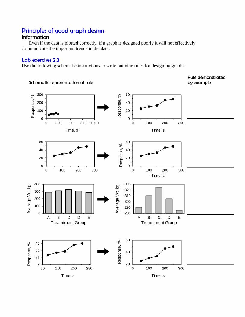
Principles of good graph design Information Even if the data is plotted correctly, if a graph is designed poorly it will not effectively
communicate the important trends in the data.
Lab exercises 2.3
Use the following schematic instructions to write out nine rules for designing graphs.
Rule demonstrated Schematic representation of rule by example
0
100
200
300
0 250 500 750 1000
Response,
%
Time, s
0
20
40
60
0 100 200 300R
esponse,
%
Time, s
0
20
40
60
0 100 200 300
0
20
40
60
0 100 200 300
Response,
%
Time, s
0
100
200
300
400
A B C D E
Ave
rag
e W
t, k
g
Treamtment Group
280
290
300
310
320
330
A B C D E
Ave
rag
e W
t, k
g
Treamtment Group
7
21
35
49
20 110 200 290
Response,
%
Time, s
20
40
60
0 100 200 300
Response,
%
Time, s
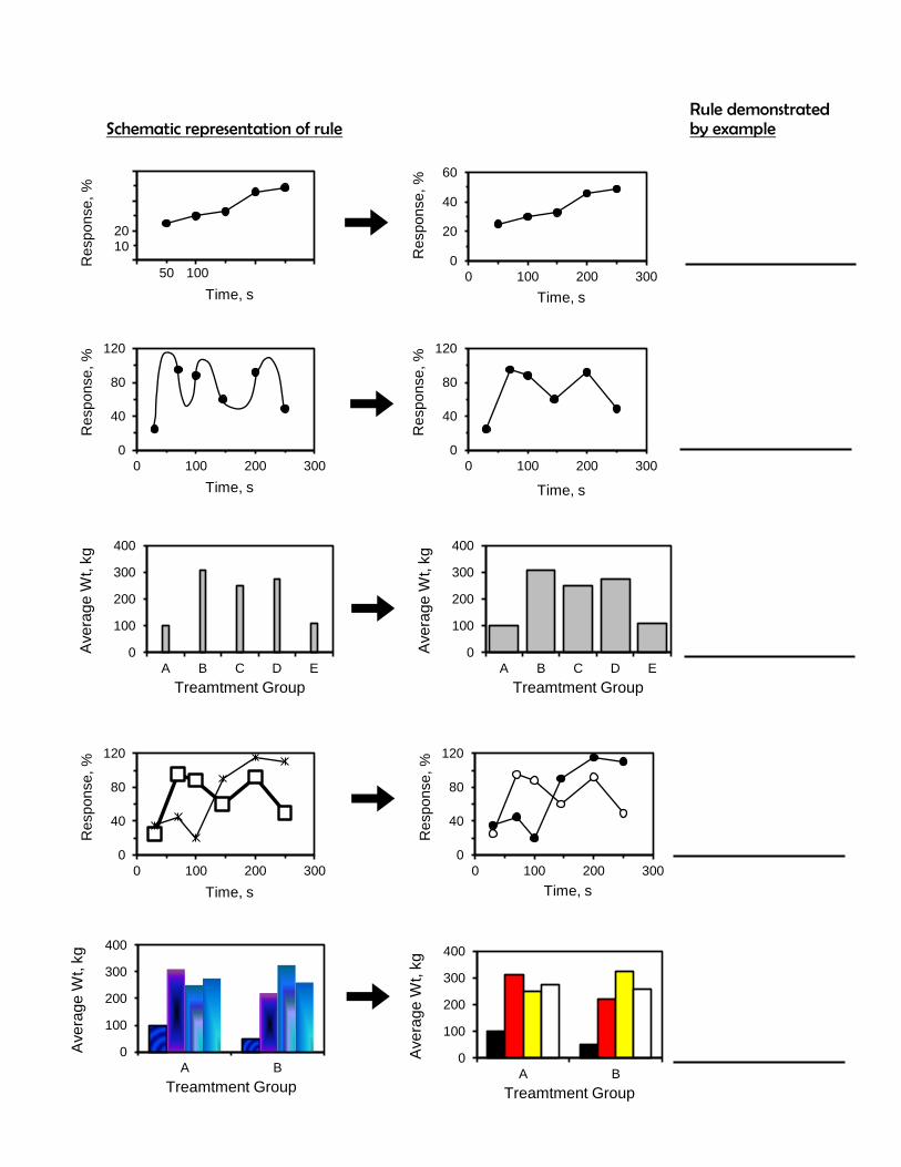
Rule demonstrated Schematic representation of rule by example
Response,
%
Time, s
100
20
50
100
20
40
60
0 100 200 300
Response,
%
Time, s
0
40
80
120
0 100 200 300
Response,
%
Time, s
0
40
80
120
0 100 200 300
Response,
%
Time, s
0
100
200
300
400
A B C D E
Ave
rag
e W
t, k
g
Treamtment Group
0
100
200
300
400
A B C D E
Ave
rag
e W
t, k
g
Treamtment Group
0
40
80
120
0 100 200 300
Response,
%
Time, s
0
40
80
120
0 100 200 300
Response,
%
Time, s
0
100
200
300
400
A B
Ave
rag
e W
t, k
g
Treamtment Group
0
100
200
300
400
A B
Ave
rag
e W
t, k
g
Treamtment Group
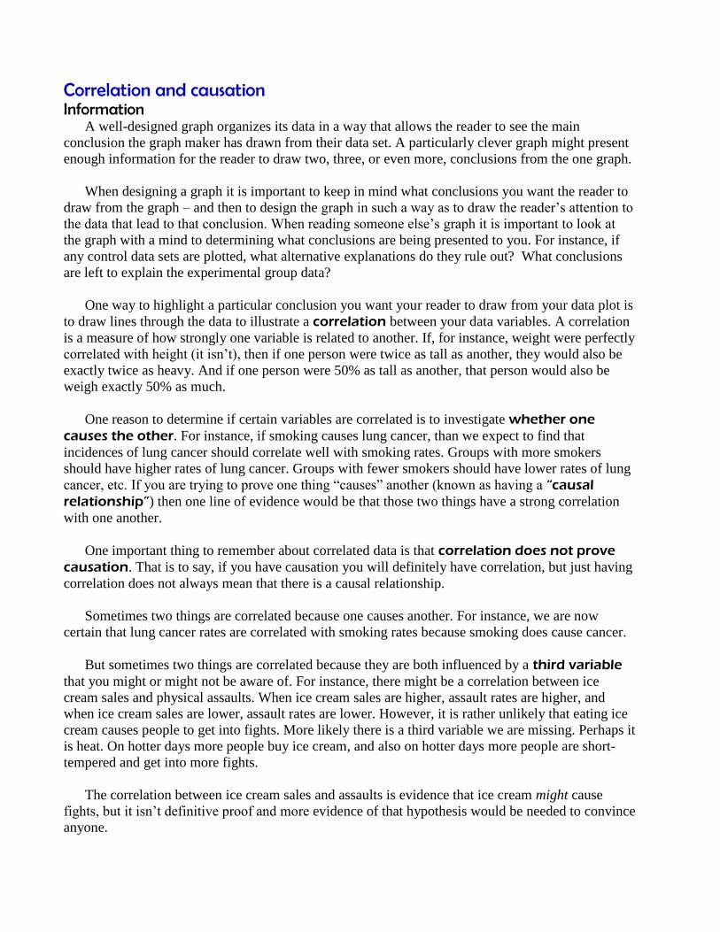
Correlation and causation Information A well-designed graph organizes its data in a way that allows the reader to see the main
conclusion the graph maker has drawn from their data set. A particularly clever graph might present
enough information for the reader to draw two, three, or even more, conclusions from the one graph.
When designing a graph it is important to keep in mind what conclusions you want the reader to
draw from the graph – and then to design the graph in such a way as to draw the reader’s attention to
the data that lead to that conclusion. When reading someone else’s graph it is important to look at
the graph with a mind to determining what conclusions are being presented to you. For instance, if
any control data sets are plotted, what alternative explanations do they rule out? What conclusions
are left to explain the experimental group data?
One way to highlight a particular conclusion you want your reader to draw from your data plot is
to draw lines through the data to illustrate a correlation between your data variables. A correlation
is a measure of how strongly one variable is related to another. If, for instance, weight were perfectly
correlated with height (it isn’t), then if one person were twice as tall as another, they would also be
exactly twice as heavy. And if one person were 50% as tall as another, that person would also be
weigh exactly 50% as much.
One reason to determine if certain variables are correlated is to investigate whether one
causes the other. For instance, if smoking causes lung cancer, than we expect to find that
incidences of lung cancer should correlate well with smoking rates. Groups with more smokers
should have higher rates of lung cancer. Groups with fewer smokers should have lower rates of lung
cancer, etc. If you are trying to prove one thing “causes” another (known as having a “causal
relationship”) then one line of evidence would be that those two things have a strong correlation
with one another.
One important thing to remember about correlated data is that correlation does not prove
causation. That is to say, if you have causation you will definitely have correlation, but just having
correlation does not always mean that there is a causal relationship.
Sometimes two things are correlated because one causes another. For instance, we are now
certain that lung cancer rates are correlated with smoking rates because smoking does cause cancer.
But sometimes two things are correlated because they are both influenced by a third variable
that you might or might not be aware of. For instance, there might be a correlation between ice
cream sales and physical assaults. When ice cream sales are higher, assault rates are higher, and
when ice cream sales are lower, assault rates are lower. However, it is rather unlikely that eating ice
cream causes people to get into fights. More likely there is a third variable we are missing. Perhaps it
is heat. On hotter days more people buy ice cream, and also on hotter days more people are short-
tempered and get into more fights.
The correlation between ice cream sales and assaults is evidence that ice cream might cause
fights, but it isn’t definitive proof and more evidence of that hypothesis would be needed to convince
anyone.
(In the case of the connection between lung cancer and smoking, the evidence started out as
correlations, but eventually came to include many other types of evidence, which is why we now
accept the causal relationship.)
When you are plotting data, showing that two variables correlate well is interesting, and can be
used as one piece of evidence of perhaps a causal relationship, but the correlation by itself will
never be enough. Often a correlation is the first step in establishing the causal relationship.
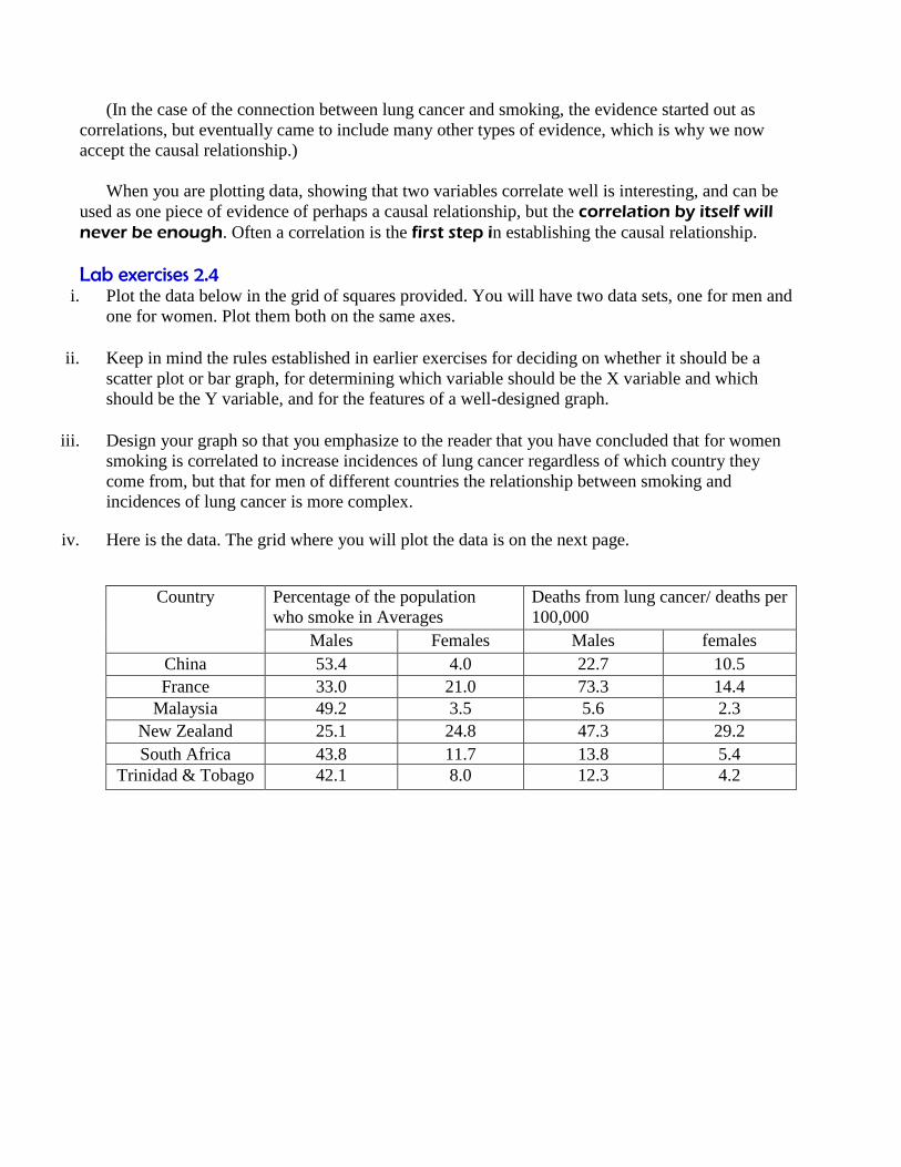
Lab exercises 2.4
i. Plot the data below in the grid of squares provided. You will have two data sets, one for men and
one for women. Plot them both on the same axes.
ii. Keep in mind the rules established in earlier exercises for deciding on whether it should be a
scatter plot or bar graph, for determining which variable should be the X variable and which
should be the Y variable, and for the features of a well-designed graph.
iii. Design your graph so that you emphasize to the reader that you have concluded that for women
smoking is correlated to increase incidences of lung cancer regardless of which country they
come from, but that for men of different countries the relationship between smoking and
incidences of lung cancer is more complex.
iv. Here is the data. The grid where you will plot the data is on the next page.
Country Percentage of the population
who smoke in Averages
Deaths from lung cancer/ deaths per
100,000
Males Females Males females
China 53.4 4.0 22.7 10.5
France 33.0 21.0 73.3 14.4
Malaysia 49.2 3.5 5.6 2.3
New Zealand 25.1 24.8 47.3 29.2
South Africa 43.8 11.7 13.8 5.4
Trinidad & Tobago 42.1 8.0 12.3 4.2

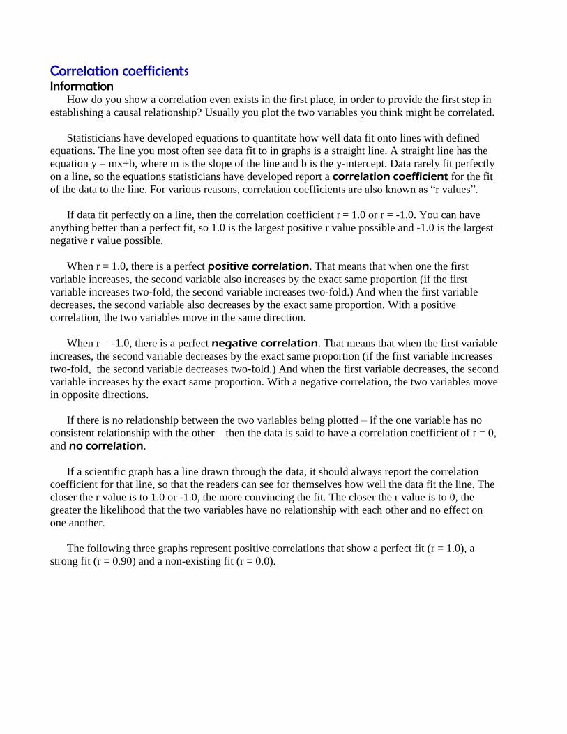
Correlation coefficients Information How do you show a correlation even exists in the first place, in order to provide the first step in
establishing a causal relationship? Usually you plot the two variables you think might be correlated.
Statisticians have developed equations to quantitate how well data fit onto lines with defined
equations. The line you most often see data fit to in graphs is a straight line. A straight line has the
equation y = mx+b, where m is the slope of the line and b is the y-intercept. Data rarely fit perfectly
on a line, so the equations statisticians have developed report a correlation coefficient for the fit
of the data to the line. For various reasons, correlation coefficients are also known as “r values”.
If data fit perfectly on a line, then the correlation coefficient r = 1.0 or r = -1.0. You can have
anything better than a perfect fit, so 1.0 is the largest positive r value possible and -1.0 is the largest
negative r value possible.
When r = 1.0, there is a perfect positive correlation. That means that when one the first
variable increases, the second variable also increases by the exact same proportion (if the first
variable increases two-fold, the second variable increases two-fold.) And when the first variable
decreases, the second variable also decreases by the exact same proportion. With a positive
correlation, the two variables move in the same direction.
When r = -1.0, there is a perfect negative correlation. That means that when the first variable
increases, the second variable decreases by the exact same proportion (if the first variable increases
two-fold, the second variable decreases two-fold.) And when the first variable decreases, the second
variable increases by the exact same proportion. With a negative correlation, the two variables move
in opposite directions.
If there is no relationship between the two variables being plotted – if the one variable has no
consistent relationship with the other – then the data is said to have a correlation coefficient of r = 0,
and no correlation.
If a scientific graph has a line drawn through the data, it should always report the correlation
coefficient for that line, so that the readers can see for themselves how well the data fit the line. The
closer the r value is to 1.0 or -1.0, the more convincing the fit. The closer the r value is to 0, the
greater the likelihood that the two variables have no relationship with each other and no effect on
one another.
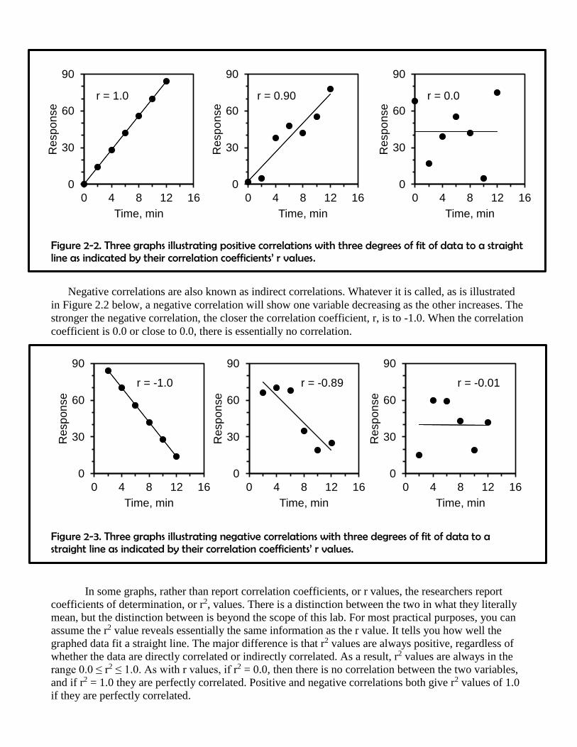
The following three graphs represent positive correlations that show a perfect fit (r = 1.0), a
strong fit (r = 0.90) and a non-existing fit (r = 0.0).
0
30
60
90
0 4 8 12 16
Resp
on
se
Time, min
r = 0.0
0
30
60
90
0 4 8 12 16
Resp
on
se
Time, min
r = -0.01
Figure 2-2. Three graphs illustrating positive correlations with three degrees of fit of data to a straight line as indicated by their correlation coefficients’ r values.
Negative correlations are also known as indirect correlations. Whatever it is called, as is illustrated
in Figure 2.2 below, a negative correlation will show one variable decreasing as the other increases. The
stronger the negative correlation, the closer the correlation coefficient, r, is to -1.0. When the correlation
coefficient is 0.0 or close to 0.0, there is essentially no correlation.
Figure 2-3. Three graphs illustrating negative correlations with three degrees of fit of data to a straight line as indicated by their correlation coefficients’ r values.
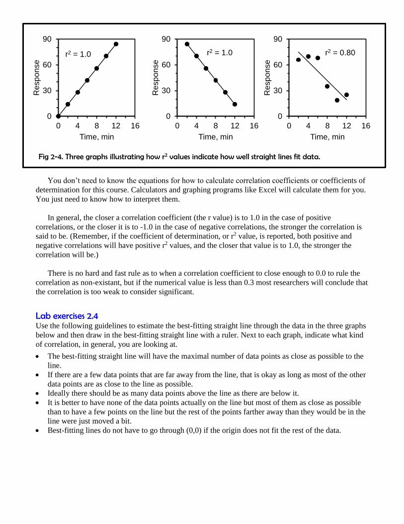
In some graphs, rather than report correlation coefficients, or r values, the researchers report
coefficients of determination, or r2, values. There is a distinction between the two in what they literally
mean, but the distinction between is beyond the scope of this lab. For most practical purposes, you can
assume the r2 value reveals essentially the same information as the r value. It tells you how well the
graphed data fit a straight line. The major difference is that r2 values are always positive, regardless of
whether the data are directly correlated or indirectly correlated. As a result, r2 values are always in the
range 0.0 ≤ r2 ≤ 1.0. As with r values, if r2 = 0.0, then there is no correlation between the two variables,
and if r2 = 1.0 they are perfectly correlated. Positive and negative correlations both give r2 values of 1.0
if they are perfectly correlated.
0
30
60
90
0 4 8 12 16
Resp
on
se
Time, min
r = 1.0
0
30
60
90
0 4 8 12 16
Resp
on
se
Time, min
r = 0.90
0
30
60
90
0 4 8 12 16
Resp
on
se
Time, min
r = -0.89
0
30
60
90
0 4 8 12 16
Resp
on
se
Time, min
r = -1.0
0
30
60
90
0 4 8 12 16
Resp
on
se
Time, min
r2 = 1.0
0
30
60
90
0 4 8 12 16
Resp
on
se
Time, min
r2 = 1.0
0
30
60
90
0 4 8 12 16
Re
sp
on
se
Time, min
r2 = 0.80
Fig 2-4. Three graphs illustrating how r2 values indicate how well straight lines fit data.
You don’t need to know the equations for how to calculate correlation coefficients or coefficients of
determination for this course. Calculators and graphing programs like Excel will calculate them for you.
You just need to know how to interpret them.
In general, the closer a correlation coefficient (the r value) is to 1.0 in the case of positive
correlations, or the closer it is to -1.0 in the case of negative correlations, the stronger the correlation is
said to be. (Remember, if the coefficient of determination, or r2 value, is reported, both positive and
negative correlations will have positive r2 values, and the closer that value is to 1.0, the stronger the
correlation will be.)
There is no hard and fast rule as to when a correlation coefficient to close enough to 0.0 to rule the
correlation as non-existant, but if the numerical value is less than 0.3 most researchers will conclude that
the correlation is too weak to consider significant.
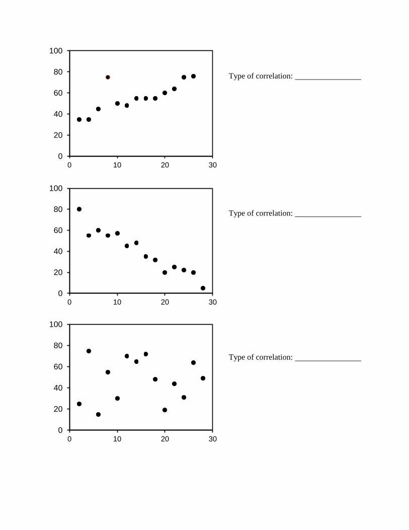
Lab exercises 2.4
Use the following guidelines to estimate the best-fitting straight line through the data in the three graphs
below and then draw in the best-fitting straight line with a ruler. Next to each graph, indicate what kind
of correlation, in general, you are looking at.
The best-fitting straight line will have the maximal number of data points as close as possible to the
line.
If there are a few data points that are far away from the line, that is okay as long as most of the other
data points are as close to the line as possible.
Ideally there should be as many data points above the line as there are below it.
It is better to have none of the data points actually on the line but most of them as close as possible
than to have a few points on the line but the rest of the points farther away than they would be in the
line were just moved a bit.
Best-fitting lines do not have to go through (0,0) if the origin does not fit the rest of the data.
0
20
40
60
80
100
0 10 20 30
0
20
40
60
80
100
0 10 20 30
0
20
40
60
80
100
0 10 20 30
Type of correlation:
Type of correlation:
Type of correlation:

Interpreting graphs Information A graph of data, whether it is a correlational graph or not, always tells some kind of story about
the data being plotted. How do you figure out what that story is for a particular graph? What is it
telling you and how is it telling it?
For any graph, you need to figure out the following:
1. What is being plotted?
2. Why is it being plotted?
3. What can I conclude from the data and its relationships?
4. What can I not yet conclude from the data?
If you are interpreting a correlational graph, you additionally need to ask yourself:
5. Why is the relationship between these data being highlighted?
6. How does the strength of the correlation (as revealed by the r or r2 value) affect my conclusions
about the data and their relationship?
7. If there is more than one set of data being plotted, what does comparing their correlation
coefficients allow me to conclude?
Remember, sometimes researchers plot data to show there is a correlation between them (and
therefore, possible one is causing the other), and sometimes research plot data to show there is no
correlation between them (and therefore, the one is having no effect on the other.)
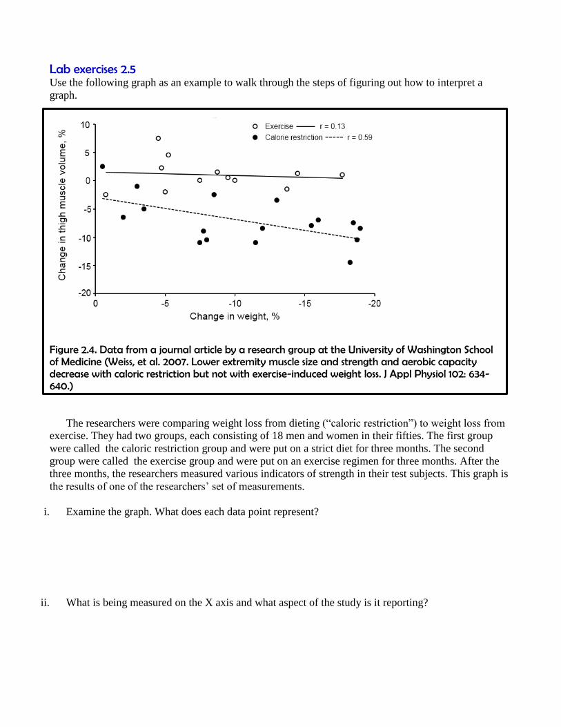
Lab exercises 2.5
Use the following graph as an example to walk through the steps of figuring out how to interpret a
graph.
Figure 2.4. Data from a journal article by a research group at the University of Washington School of Medicine (Weiss, et al. 2007. Lower extremity muscle size and strength and aerobic capacity decrease with caloric restriction but not with exercise-induced weight loss. J Appl Physiol 102: 634-640.)
The researchers were comparing weight loss from dieting (“caloric restriction”) to weight loss from
exercise. They had two groups, each consisting of 18 men and women in their fifties. The first group
were called the caloric restriction group and were put on a strict diet for three months. The second
group were called the exercise group and were put on an exercise regimen for three months. After the
three months, the researchers measured various indicators of strength in their test subjects. This graph is
the results of one of the researchers’ set of measurements.
i. Examine the graph. What does each data point represent?
ii. What is being measured on the X axis and what aspect of the study is it reporting?
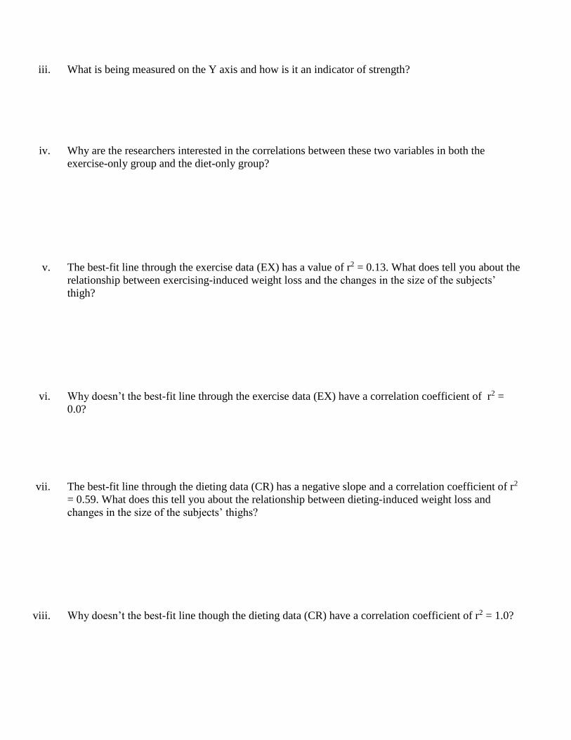
iii. What is being measured on the Y axis and how is it an indicator of strength?
iv. Why are the researchers interested in the correlations between these two variables in both the
exercise-only group and the diet-only group?
v. The best-fit line through the exercise data (EX) has a value of r2 = 0.13. What does tell you about the
relationship between exercising-induced weight loss and the changes in the size of the subjects’
thigh?
vi. Why doesn’t the best-fit line through the exercise data (EX) have a correlation coefficient of r2 =
0.0?
vii. The best-fit line through the dieting data (CR) has a negative slope and a correlation coefficient of r2
= 0.59. What does this tell you about the relationship between dieting-induced weight loss and
changes in the size of the subjects’ thighs?
viii. Why doesn’t the best-fit line though the dieting data (CR) have a correlation coefficient of r2 = 1.0?

ix. This graph only tells us definitive information about how weight loss via exercise or dieting effect
the size of the thigh muscles in these volunteers. But we can formulate more general hypotheses
about the effect of dieting-induced weight loss vs. exercise-induced weight loss on overall strength
based on these result. These more general hypotheses are not definitively supported yet, but they are
suggested by these results. What are these more general hypotheses?
Licenses and attributions. Unless otherwise noted, all figures
Figure 2-1 Source: adapted from:
https://commons.wikimedia.org/wiki/File:Visualization_tools_in_pSeven.png
and https://commons.wikimedia.org/wiki/File:ScinetChartDataVisualization.PNG
Figure 2-2 Source: created by Ross Whitwam
Figure 2-3 Source: created by Ross Whitwam
Figure 2-4 Source: created by Ross Whitam
Figure 2-5 Source: adapted and regraphed from Weiss, et al. 2007. Lower extremity muscle size and
strength and aerobic capacity decrease with caloric restriction but not with exercise-induced weight
loss. J Appl Physiol 102: 634-640.


![Specialty Drug Listing for HD 1.15.19 Specialty Drug List ver 10262017.pdf · 'du]doh[ ghflwdelqh pj 0* 62/5 'dxqr;rph 0* 0/ ,1-'hihur[dplqh 0hv\odwh 0* 62/5 'hihur[dplqh 0hv\odwh](https://static.fdocuments.in/doc/165x107/5e7ccd3a8dcd6629e013728f/specialty-drug-listing-for-hd-11519-specialty-drug-list-ver-10262017pdf-dudoh.jpg)


![+90 kg - SportsTG · [Dragon (NSW)] DRA 330 2 217 3 110 4 440 1 00 5 10 0 0 10 0 7 0 10 0 0 0 10 0 0 10 0 Score points: Ippon 100 / Wazaari 10 / Yuko 1 / Penalties 0,5](https://static.fdocuments.in/doc/165x107/5b6ef1447f8b9a58578b9209/90-kg-sportstg-dragon-nsw-dra-330-2-217-3-110-4-440-1-00-5-10-0-0-10.jpg)


