HTC Data Use Tool -User’s Manual · · 2016-06-23refer to the HTC Data Use Tool User’s Manual...
51
Global Strategic Information UCSF Global Health Sciences Contact us: [email protected] Version 2.0 3/14/2013 HTC Data Use Tool - User’s Manual Module 2: Mapping with QGIS
-
Upload
truongduong -
Category
Documents
-
view
215 -
download
2
Transcript of HTC Data Use Tool -User’s Manual · · 2016-06-23refer to the HTC Data Use Tool User’s Manual...
Version 2.0 | 1
Global Strategic Information
UCSF Global Health Sciences
Contact us: [email protected]
Version 2.0
3/14/2013
HTC Data Use Tool - User’s Manual
Module 2: Mapping with QGIS

Version 2.0 | 2
Table of Contents Table of Contents ...................................................................................................................................... 2
How to Use This Module ........................................................................................................................... 4
Vocabulary for Mapping ....................................................................................................................... 5
1. Introduction to mapping with QGIS and the HTC Data Use Tool ...... 6
1.1. Preparing Data in Excel ................................................................................................................. 6
1.2. Mapping in QGIS ........................................................................................................................... 8
1.2.1. Adding shapefiles .................................................................................................................. 8
1.2.2. Verify Coordinate Reference System .................................................................................... 9
1.2.3. Importing Excel data ........................................................................................................... 11
1.2.4. Confirming Data Import ...................................................................................................... 12
1.2.5. Joining data ......................................................................................................................... 14
1.3. Stylizing, Formatting and Managing Maps ................................................................................. 16
1.3.1. Creating a Graduated Map .................................................................................................. 16
1.3.2. Adding Labels ...................................................................................................................... 19
1.3.3. Adding additional layers ..................................................................................................... 21
1.3.4. Formatting Line Layers ........................................................................................................ 21
1.3.5. Zooming to and panning features on a map ....................................................................... 23
1.4. Creating a shapefile from x,y Coordinates .................................................................................. 26
1.4.1. Requirements for displaying coordinate point-locations ................................................... 26
1.4.2. Importing coordinate data .................................................................................................. 26
1.4.3. Specifying a Coordinate Reference System ........................................................................ 28
1.4.4. Formatting Point Layers ...................................................................................................... 30
1.5. Finalizing and exporting maps .................................................................................................... 32
1.5.1. Rules for constructing map layouts .................................................................................... 32
1.5.2. Creating a map layout in Print Composer ........................................................................... 32
1.5.3. Adding a map to the map layout ........................................................................................ 34
1.5.4. Adding a Title ...................................................................................................................... 35
1.5.5. Drawing a border ................................................................................................................ 36
1.5.6. Adding and formatting a legend ......................................................................................... 37
Version 2.0 | 3
1.5.7. Indicating scale and direction in a map layout ................................................................... 38
1.5.8. Exporting map layout .......................................................................................................... 39
1.5.9. Saving Project files .............................................................................................................. 40
1.5.10. Opening a Project file .......................................................................................................... 40
1.6. Advanced Mapping Techniques in QGIS ..................................................................................... 41
1.6.1. Adding a base layer ............................................................................................................. 41
1.6.2. Adding Secondary labels ..................................................................................................... 43
1.6.1. Editing Attribute Data ......................................................................................................... 45
1.6.2. Rule-based Styles for Points ................................................................................................ 46

Version 2.0 | 4
How to Use This Module
This module offers a systematic approach to mapping using QGIS mapping software with the HIV testing
and counseling (HTC) Data Use Tool and is meant to accompany the HTC Data Use Tool User’s Manual.
Although this guide uses only HTC examples, the Tool and examples can be adapted to different data-
use questions related to HIV prevention, treatment, and care as well as other programmatic areas.
Users of this manual are required to download QGIS 2.2.0-Valmiera, a free software program created
under a General Public License. QGIS 2.2.0-Valmiera is compatible with Windows XP (or higher), MacOS
X, Linux and FreeBSD. There are no formal system requirements, however 1 GB RAM and 1.6 GHz
processor are generally recommended.
The manual is designed to provide users with a solid background and understanding of the mapping
process. It is most useful as a preparation tool for those who will take part in an HTC Data Use and
Strategic Planning workshop or those who have completed a workshop and may need to refer back to
the concepts and processes at a later time.
All materials related to this manual and the HTC Data Use and Strategic Planning Tool can be found here:
http://globalhealthsciences.ucsf.edu/prevention-public-health-group/global-strategic-information-
gsi/monitoring-and-evaluation/hiv-testing
Version 2.0 | 5
Vocabulary for Mapping
* Administrative levels – An area of a country defined for the purposes of government or
administration such as region, province, or district. Shapefiles used for mapping are
distinguished by administrative levels where higher number administrative levels represent a
smaller administrative level. For example in Tanzania, administrative level 0 is the national level,
administrative level 1 is the regional level, administrative level 2 is the district level, and
administrative level 3 is the ward level.
* Coordinates – Numerical values that represent specific point-locations on the surface of the
earth. Geographic coordinates are used to represent locations on a three-dimensional sphere;
they are defined both in terms of latitude (horizontal) and longitude (vertical) degrees.
Geographic coordinates are calculated and recorded using a GPS receiver. Projected coordinates
are used to represent locations on a two-dimensional flat surface (such as a computer screen);
they are represented as discrete x and y values.
* Coordinate Reference System (CRS) – A set of rules for assigning coordinates to real-world
locations. Because the Earth is a three dimensional oblong sphere, geographic data must be
stretched or compressed in order for (1) images to visualized on a flat surface, and (2) spatial
relationships to be measured (e.g., distance, area). GPS receivers record coordinates by
completing a set of calculations defined by the Coordinate Reference System (CRS). If the CRS is
changed, a different set of coordinates will be produced for the same location. When using a
GPS receiver to gather coordinates, the specific CRS must be specified and recorded so that
shapefiles can be accurately created from the coordinates. The most common geographic
coordinate system is the World Geodetic System 84 (WGS84).
* Geographic Information System (GIS) – A system used to capture, manage, analyze and display
geographic information. This system works by assigning (or “referencing”) data to a geographic
location on the earth’s surface to create a digital representation of the world. Geographic
Information Systems can geographically display non-spatial data, such as prevalence or testing
coverage, by associating values with specific locations or areas on a digital globe or atlas.
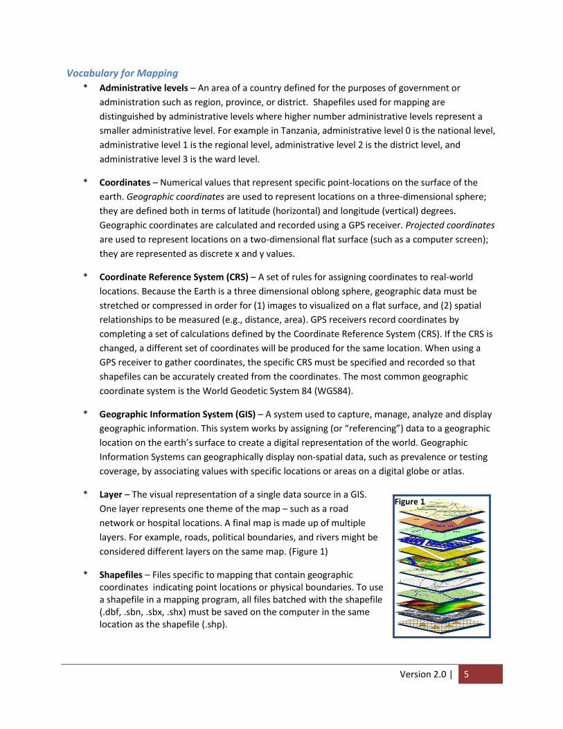
* Layer – The visual representation of a single data source in a GIS.
One layer represents one theme of the map – such as a road
network or hospital locations. A final map is made up of multiple
layers. For example, roads, political boundaries, and rivers might be
considered different layers on the same map. (Figure 1)
* Shapefiles – Files specific to mapping that contain geographic coordinates indicating point locations or physical boundaries. To use a shapefile in a mapping program, all files batched with the shapefile (.dbf, .sbn, .sbx, .shx) must be saved on the computer in the same location as the shapefile (.shp).
Figure 1

Version 2.0 | 6
1. Introduction to mapping with QGIS and the HTC Data Use Tool
Mapping software use geographic information systems (GIS) and health data from national, regional, or district levels to create simple maps that show spatial relationships. For example, maps can show the relationships between:
HIV prevalence/incidence data
Programmatic data (e.g., number tested, number counseled)
Roads, water, geographic borders
Health facility locations
To create a map, mapping software (e.g., QGIS, ArcGIS, Epi Info™) links a program or survey data file to
coordinate data stored in shapefiles (files made up of latitude and longitude geographic coordinates) by
matching the same attribute between the two files such as a Unique ID or administrative level. This
linked data is manipulated in the mapping software to display values and labels from the data as colors
or points on a map as shown in Figure 2. Important information, such as roads and water, can be added
to the map as additional layers.
Figure 2
Throughout this chapter, we will use data from Tanzania to answer the question: Where do the HIV
prevalence rates differ in magnitude?
1.1. Preparing Data in Excel To import HIV indicator data in QGIS, data aggregated by geographical level must first be saved in Excel
2003 format (.xls) – not in Excel 2007/2010 format (.xlsx).
Data to be imported into QGIS will first need to be made into a table using the excel-based HTC Data Use
Tool. Column A of your table should be the geographic level to be displayed on the map (e.g. region,
Version 2.0 | 7
district, ward, etc). The subsequent columns of the table should be all indicators to be mapped. Please
refer to the HTC Data Use Tool User’s Manual for instruction on how to create tables in the tool.
For a step-by-step video tutorial on “How to prepare data for use in Epi Info™,” download the .wmv file
from the UCSF website listed in the introduction, or stream through this link:
http://youtu.be/Gv4c2_X4WYE
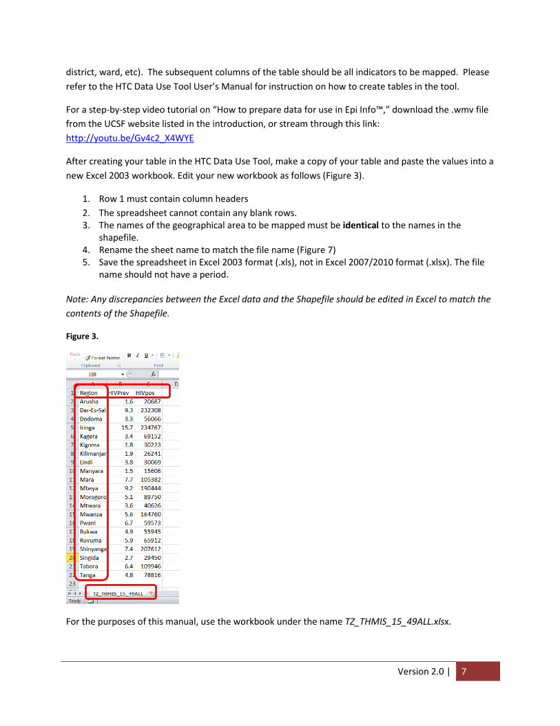
After creating your table in the HTC Data Use Tool, make a copy of your table and paste the values into a
new Excel 2003 workbook. Edit your new workbook as follows (Figure 3).
1. Row 1 must contain column headers
2. The spreadsheet cannot contain any blank rows. 3. The names of the geographical area to be mapped must be identical to the names in the
shapefile. 4. Rename the sheet name to match the file name (Figure 7) 5. Save the spreadsheet in Excel 2003 format (.xls), not in Excel 2007/2010 format (.xlsx). The file
name should not have a period.
Note: Any discrepancies between the Excel data and the Shapefile should be edited in Excel to match the
contents of the Shapefile.
Figure 3.
For the purposes of this manual, use the workbook under the name TZ_THMIS_15_49ALL.xlsx.

Version 2.0 | 8
1.2. Mapping in QGIS After saving the data in as an Excel table, begin using QGIS mapping software.
1. Open QGIS (Figure 4). The map design window is now visible.
Figure 4
1.2.1. Adding shapefiles
First, add administrative boundaries for Tanzania by loading a vector shapefile.
1. Click on “Add vector layer” button .
2. In the “Add vector layer window”, click Browse (Figure 5).
Figure 5
3. Browse to where the Tanzania shapefile is saved on your computer [Tanzania_adm1.shp] (Figure
6).

Version 2.0 | 9
Figure 6
4. Click Open in the Add Vector Layer window. The Tanzania administrative boundary shapefile is now
open in the QGIS application window (Figure 7).
Figure 7
1.2.2. Verify Coordinate Reference System
When shapefiles are first created from GPS coordinates, the CRS may sometimes be dropped from the
data; in this case the user must specify the CRS manually when loading it into GIS software. Before
preforming complex mapping procedures – users should ensure that the shapefile specifies the correct
CRS. If no CRS is specified, consult with the institution that created the shapefile to determine the
original CRS.
1. Right-click on the “Tanzania_adm1” layer and select Properties (Figure 8).

Version 2.0 | 10
Figure 8
2. In the properties window, select the General tab in the left hand pane to view the CRS (Figure 9).
WGS84 is listed under ‘Coordinate reference system’ as the CRS for this shapefile.
Figure 9
As will be discussed in Section 1.4.3, shapefiles created from raw coordinates require that the CRS is
entered manually.

Version 2.0 | 11
1.2.3. Importing Excel data
In order to link a shapefile to data, you must first import the excel data file into QGIS.
1. Click on the Add Vector Layer button .
2. Select Browse in the Add vector layer window (Figure 10).
Figure 10
3. Browse to your Tanzania data Excel table created in Section 1.1 (TZ_THMIS_15_49ALL.xls) (Figure
11). If you do not see the file you are looking for, change the file type to “All files (*)”.
Figure 11
4. Click Open.

Version 2.0 | 12
5. Click Open in the Add Vector Layer window. The Excel data will now be available as a table in the
Layer menu.
1.2.4. Confirming Data Import
Before mapping this Excel data, ensure the import was successful by checking the contents of the
attribute table and Metadata. The attribute table allows users to view data associated with tables and
shapefiles, while the Metadata tells users what type of data is contained within the attribute table (e.g.,
text, numbers, etc.).
1. Right-click on the imported table (TZ_THMIS_15_49ALL) (Figure 12).
Figure 12
2. Select Open Attribute Table. Notice that our Attribute Table now contains the same information as
the Excel file from Section 0 (Figure 13). While this data looks similar, view the file’s metadata to
determine whether QGIS is representing numerical data as actual numbers and not text strings.

Version 2.0 | 13
Figure 13
3. Close the Attribute table by clicking on the Close button.
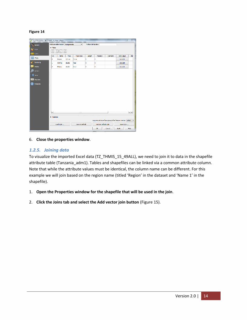
4. To view the Metadata, right-click on the table (TZ_THMIS_15_49ALL) and select Properties.
5. In the Layer Properties window, select the Fields tab (Figure 14). Each row in the metadata should
correspond to a field column in our Attribute table. Under “Type” the geographic variable (e.g.
Region) should be list as QString (text data) while indicators (e.g. HIVPrev and HIVpos) should be
listed as either Real or integer (numerical data).
Version 2.0 | 14
Figure 14
6. Close the properties window.
1.2.5. Joining data
To visualize the imported Excel data (TZ_THMIS_15_49ALL), we need to join it to data in the shapefile
attribute table (Tanzania_adm1). Tables and shapefiles can be linked via a common attribute column.
Note that while the attribute values must be identical, the column name can be different. For this
example we will join based on the region name (titled ‘Region’ in the dataset and ‘Name 1’ in the
shapefile).
1. Open the Properties window for the shapefile that will be used in the join.
2. Click the Joins tab and select the Add vector join button (Figure 15).

Version 2.0 | 15
Figure 15
In the Add vector join window, we will specify what data will be joined to the shapefile and what fields
should be used to match the data. “Join layer” and “Join field” dropdown menus refer to the dataset,
while the “Target field” dropdown menu refers to the shapefile (Figure 16).
3. Select the data to be joined from the Join Layer drop down menu [TZ_THMIS_15_49ALL], the name
of the geographic field in the table [Region] and the geographic field in the shapefile [Name_1]
(Figure 16).
Figure 16
4. Click OK to close the Add vector join.

Version 2.0 | 16
5. Click OK to close the Properties window.
6. Reopen the shapefile’s attribute table to ensure that the Attribute table now has additional
indicators signifying that the join was completed successfully (Figure 17).
Figure 17
1.3. Stylizing, Formatting and Managing Maps This next section will cover the basic principles of map design, which involves conveying information
(e.g., HIV prevalence) as polygons or points on a map.
1.3.1. Creating a Graduated Map
A graduated map relates indicators values to color gradients on a polygon map; each color gradation
corresponds to a specific interval of indicator values. For this example, regions in Tanzania with higher
HIV prevalence will be shown as a darker shade whereas regions with lower HIV prevalence will be
lighter shades.
1. Open the properties window for the “Tanzania_adm1” shapefile layer.
2. Click the Style tab (Figure 18).
3. In the Style window, select Graduated from the dropdown menu.

Version 2.0 | 17
Figure 18
4. Click the Column arrow, scroll to and select the indicator from your dataset you would like to
show on your map [TZ_THMIS_15_49ALL_HIVPrev] (Figure 19). QGIS automatically divides the
entire range of regional HIV prevalence values into 5 intervals of equal size: 1.5 -4.34; 4.34 – 7.18;
7.18 – 10.02; 10.02 – 12.86; 12.86 – 15.70.
Figure 19
Note that the upper bound of each interval appears to be exactly the same as the lower bound of the
next. While not showing it, QGIS considers the lower bound of each interval as belonging to the interval
preceding it. For example, while it appears that the value 4.34 is included in both the first and second
intervals; in reality, QGIS only includes this value in the first interval. Therefore, if a region’s HIV

Version 2.0 | 18
prevalence is exactly 4.34, it will be colored white – not baby-blue. To reflect this convention, we need
to edit the interval labels.
5. Under Label, double click the range and increase the lower bound. For this example, double click
4.3400 – 7.1800 and type “4.35% – 7.18%”.
6. Repeat this process for each subsequent interval until all labels accurately reflect its contents as in
Figure 20.
Figure 20
7. Click OK. The map now shows five classifications of HIV prevalence ranging from lowest to highest
values with darker colors representing higher values (Figure 21).
Figure 21
Version 2.0 | 19
1.3.2. Adding Labels
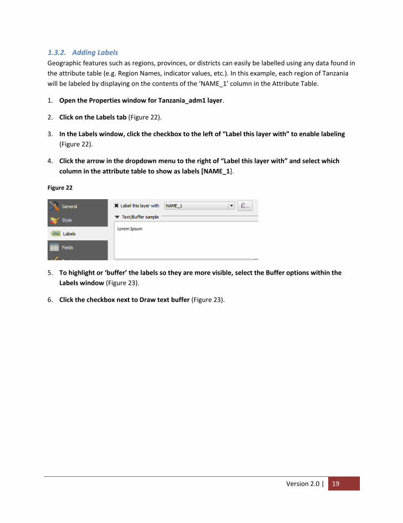
Geographic features such as regions, provinces, or districts can easily be labelled using any data found in
the attribute table (e.g. Region Names, indicator values, etc.). In this example, each region of Tanzania
will be labeled by displaying on the contents of the ‘NAME_1’ column in the Attribute Table.
1. Open the Properties window for Tanzania_adm1 layer.
2. Click on the Labels tab (Figure 22).
3. In the Labels window, click the checkbox to the left of “Label this layer with” to enable labeling
(Figure 22).
4. Click the arrow in the dropdown menu to the right of “Label this layer with” and select which
column in the attribute table to show as labels [NAME_1].
Figure 22
5. To highlight or ‘buffer’ the labels so they are more visible, select the Buffer options within the
Labels window (Figure 23).
6. Click the checkbox next to Draw text buffer (Figure 23).

Version 2.0 | 20
Figure 23
7. Click OK. Region labels outlined in white are now applied to the map (Figure 24).
Figure 24

Version 2.0 | 21
1.3.3. Adding additional layers
Additional map layers can be added to a map for further analysis such as roads and facility locations.
QGIS stacks layers from the bottom up, so larger features – such as polygons – should be on the layer
below smaller features – such as points and lines. For this scenario, we will be adding a road shapefile on
top of the region shapefile.
1. Click the Add vector layer button .
2. In the Add vector layer window, click Browse.
3. Browse to the Tanzania road shapefile (TZ_roads_paved.shp) and click Open.
4. Click Open once more to add the road shapefile to the map (Figure 25). Be sure the TZA_roads
layer is above the Tanzania_adm1 layer in the layers window. To move a layer, click and drag that
layer to its desired location in the list.
Figure 25
1.3.4. Formatting Line Layers
Additional layers may have lines that are difficult to distinguish from other layers, such as roads and
region borders. In this example we will change the color of the roads to a lighter color than the color of
the region borders.
1. Open the Properties window for the TZA_roads layer.
2. Click the Style tab.

Version 2.0 | 22
3. Within the Style tab, click the rectangle Color button (Figure 26).
Figure 26
4. In the Select Color window, click the soft grey color under Basic colors (Figure 27).
Figure 27
5. Click OK to close the Select Color menu.
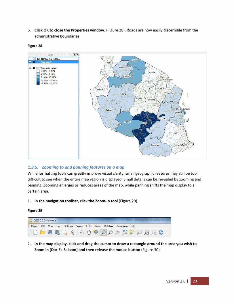
Version 2.0 | 23
6. Click OK to close the Properties window. (Figure 28). Roads are now easily discernible from the
administrative boundaries.
Figure 28
1.3.5. Zooming to and panning features on a map
While formatting tools can greatly improve visual clarity, small geographic features may still be too
difficult to see when the entire map region is displayed. Small details can be revealed by zooming and
panning. Zooming enlarges or reduces areas of the map, while panning shifts the map display to a
certain area.
1. In the navigation toolbar, click the Zoom-in tool (Figure 29).
Figure 29
2. In the map display, click and drag the cursor to draw a rectangle around the area you wish to
Zoom in [Dar-Es-Salaam] and then release the mouse button (Figure 30).

Version 2.0 | 24
Figure 30
3. The resulting map displays only the zoomed area of Dar-Es-Salaam (Figure 31).
Figure 31

Version 2.0 | 25
4. To pan to a different area, in the navigation tool bar, click the Pan button .
5. On the map, click and drag the cursor to show what you want displayed in the window. In this
example, moving the pan tool upwards will display the area below Dar-Es-Salaam, Pwani (Figure 32).
Figure 32
6. To zoom out, click the Zoom-Out tool in the navigation bar and click anywhere in the map.
Notice that with each click, more of Tanzania can be viewed with less detail.
7. To return to the original view (as seen in Figure 30), click the Zoom to Full tool in the
navigation toolbar. This will zoom out to reveal the extents of all layers contained within our map.
Alternatively, if we want to view a particular layer, right-click on the desired layer and select Zoom
to Layer Extent (Figure 33).
Figure 33

Version 2.0 | 26
1.4. Creating a shapefile from x,y Coordinates GPS receivers calculate and record specific locations on the earth’s surface as x & y coordinates – or
longitude and latitude, respectively. These coordinates can then be downloaded on to a computer and
read by GIS software for spatial display. In this section, we will cover how to import and display GPS
coordinates for health facility locations in Tanzania.
1.4.1. Requirements for displaying coordinate point-locations
In order for QGIS to correctly display the coordinates as point-locations, the following criteria must be
met:
The user must know what Coordinate Reference System (CRS) was used by the GPS receiver to
create the coordinates. As mentioned, the CRS provides a set of rules for defining spatial
relationship between coordinates. Just as GPS receivers use a CRS to calculate coordinates, QGIS
uses the CRS to align the shapefiles created under different systems. The table of coordinates
does not along contain information of the CRS – users will be prompted to specify the CRS when
importing the coordinates into QGIS.
Coordinate data must be in decimal degrees (i.e., 18.4567°). If coordinates are formatted as
degrees, minutes and seconds (i.e., 18°27’24.12”) consult with a GIS expert on appropriate
conversion techniques.
Columns for longitude and latitude must be correctly labelled in the coordinate data file.
Coordinate columns can alternatively be labelled x and y respectively.
The coordinate data file must be saved as a .csv.
1.4.2. Importing coordinate data
1. Click the Add text delimited layer button on the Manage Layers toolbar (Figure 34).

Version 2.0 | 27
Figure 34
2. In the Create a Layer from a Delimited Text File window, click browse (Figure 35).
Figure 35
3. In the next window, browse to the appropriate folder and select the coordinate data file
[Facilities_Tanzania.csv].
4. Click Open to return to the Create a Layer from a Delimited Text File window (Figure 36). Notice
that the table preview includes x and y coordinates labelled “Long” and “Lat” respectively.

Version 2.0 | 28
Figure 36
5. Under Geometry definition, select “Long” for the X field and “Lat” for the Y field (Figure 37).
Figure 37
6. Click OK.
1.4.3. Specifying a Coordinate Reference System
Before adding coordinates, QGIS prompt users to specify a CRS. Since the GPS receiver capturing
coordinates used WGS 84, QGIS must also use WGS 84 when drawing the new point layer. While WGS
84 is a commonly used CRS, it may not be used for every coordinate data file you encounter. Always
check the CRS with the individual or organization that created the coordinates before importing into
QGIS.
1. Under Coordinate reference systems of the world, click the plus-box next to Geographic
Coordinate Systems to expand the selection (Figure 38).

Version 2.0 | 29
Figure 38
2. Scroll through the Coordinate Reference Systems until you reach WGS 84 and click to select
(Figure 39).
Figure 39
3. Click OK. A layer called Facilites_Tanzania is now created (Figure 40). Notice that the new layer
nicely overlays the regional layer.

Version 2.0 | 30
Figure 40
1.4.4. Formatting Point Layers
Similar to polygons and lines, we can also format point layers.
1. Right-click the Facilities_Tanzania layer and open the layer’s Properties.
2. Click the Style tab.
3. Click the rectangle next to Color to open the Select Color window.
4. Select red and click OK.
5. Click the Size text box and enter “0.75” (Figure 41).

Version 2.0 | 31
Figure 41
6. Click OK. The result is an easy to read map (Figure 42).
Figure 42
Version 2.0 | 32
1.5. Finalizing and exporting maps We have now created a well-designed map that illustrates regional variations in HIV prevalence in
Tanzania. However, to facilitate use in decision making, we need to bring it out of QGIS and format the
map for printing. This process occurs in the map layout. The map layout also contains information that
helps users orient themselves to the location and context of the information being presented.
1.5.1. Rules for constructing map layouts
Regardless of content or style, all map layouts require certain features to contextualize the information
presented. The following are minimum features that should be included on all, final maps:
Legend: defines the symbols or colors used on a map. The legend should clearly define what
each marker, line type, color or pattern represents
Title: easily identifiable descriptive text that indicates location and purpose of the map. The title
is the largest text on the layout, but does not dominate the map itself.
Border: a thick line drawn around the map that identifies exactly where the mapped area stops.
The border should be thick and the map should be centered within the border.
Scale: a graphic bar that indicates the relative size of the map – may not be necessary for all
audiences.
Orientation: graphic indication of which way is north. This is commonly done through a north
arrow.
1.5.2. Creating a map layout in Print Composer
The print composer is a QGIS module separate from the map design window that allows users to design
a map layout and export as an image or PDF. In this scenario, we will export the map as a .jpeg image
that can be pasted into a word document, a powerpoint presentation or shared online.
1. To open the Print Composer, click “New Print Composer” in the Project dropdown menu (Figure
43).

Version 2.0 | 33
Figure 43
2. In the Composer title window, type “HIV prevalence Tanzania” (Figure 44). This title will help you
stay organized when creating multiple map layouts.
Figure 44
3. Click OK. The Print Composer window will now appear (Figure 45).
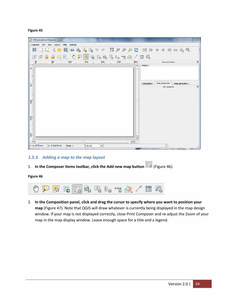
Version 2.0 | 34
Figure 45
1.5.3. Adding a map to the map layout
1. In the Composer Items toolbar, click the Add new map button (Figure 46).
Figure 46
2. In the Composition panel, click and drag the cursor to specify where you want to position your
map (Figure 47). Note that QGIS will draw whatever is currently being displayed in the map design
window. If your map is not displayed correctly, close Print Composer and re-adjust the Zoom of your
map in the map display window. Leave enough space for a title and a legend.

Version 2.0 | 35
Figure 47
1.5.4. Adding a Title
1. In the Composer tools toolbar, click the Add new label tool .
2. Click a point on the map where you would like to place your title. A small box with the letters
“QGIS” will appear where you clicked.
3. Click and drag your cursor to one edge of the box to increase its size (Figure 48).
Figure 48
4. Click the Item properties tab in the side-bar window.
5. Under Main properties, enter “HIV Prevalence among 15-49 year old by region in Tanzania, THMIS
2010” into the text box (Figure 49). This will be the title of our map.
6. Click Font (Figure 49).

Version 2.0 | 36
Figure 49
7. In Select Font window, change Size to 22 and Font to Bold (Figure 50).
Figure 50
8. Click OK.
9. Back in the Item properties tab, under Alignment select Center (Figure 51).
Figure 51
1.5.5. Drawing a border
1. Click the Select/Move item tool in the Composer toolbar.
Version 2.0 | 37
2. Click the Tanzania map.
3. In the Item properties tab, scroll down and click the Frame checkbox.
1.5.6. Adding and formatting a legend
1. Click the Add new legend tool in the Composer toolbar.
2. Click a desired position for the legend on your map (Figure 52).
Figure 52
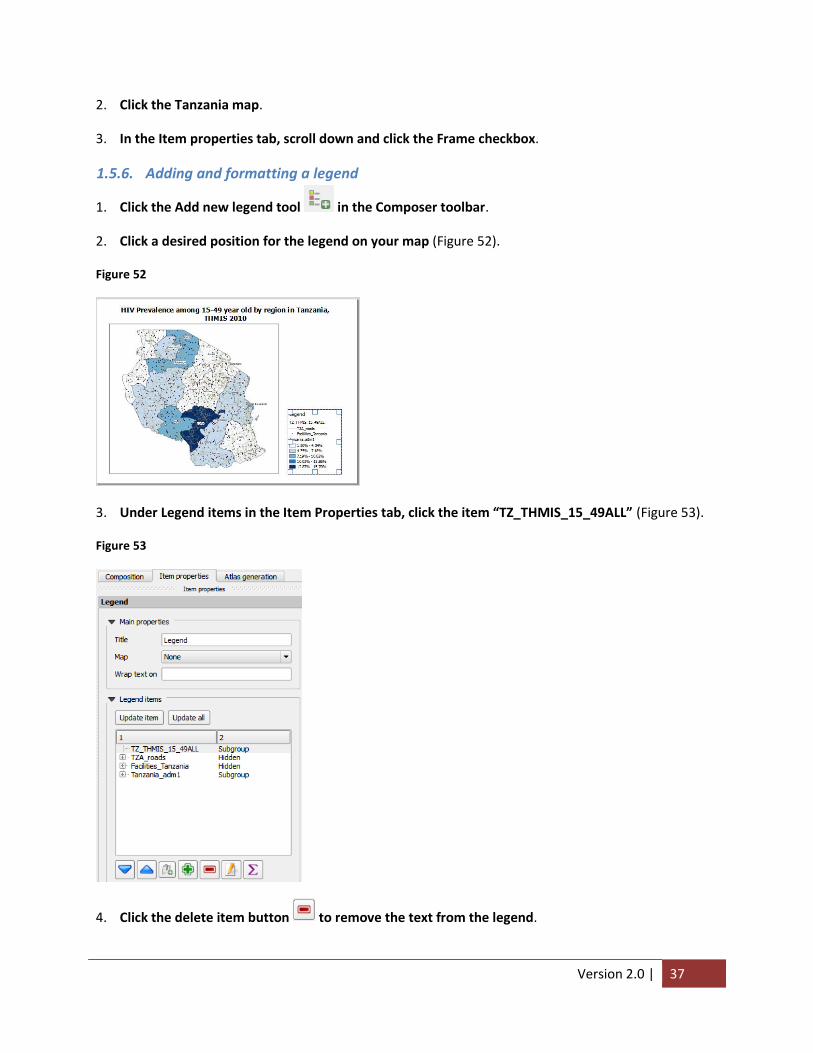
3. Under Legend items in the Item Properties tab, click the item “TZ_THMIS_15_49ALL” (Figure 53).
Figure 53
4. Click the delete item button to remove the text from the legend.

Version 2.0 | 38
5. Select “Tanzania_adm1” and click the Rename button .
6. In the Legend item properties window, type “HIV Prevalence” in the item textbox.
7. Click OK.
8. Scroll down the Item properties tab until Fonts appears; expand the menu if not already done
(Figure 54).
Figure 54
9. Increase the size of the legend by clicking on the respective Fonts buttons. In our legend, Title font
refers to the text “Legend”, Subgroup font refers to “HIV Prevalence” and Item font refers to
everything else.
1.5.7. Indicating scale and direction in a map layout
1. Click the Add new scalebar in the Composer toolbar.
2. Click on the desired location in the map layout to place the scale bar (Figure 55). For this example,
place the scale bar within the bounds of the map border.
Figure 55
3. Click the Add arrow tool in the Composer toolbar.
4. In the map layout, click and drag the cursor directly up to represent North (Figure 56).

Version 2.0 | 39
Figure 56
5. Use the Select/Move item tool in the Composer toolbar to reposition the new items as
necessary.
1.5.8. Exporting map layout
Map layouts can be exported as images or PDFs. The file type you choose will depend on how you are
using the map. If the maps are to be used as stand-alone hard copies, then PDF’s may be most
appropriate; if the maps are to be imbedded into documents, presentations, emails or websites, then
images may be more effective. Note that the exported map layer cannot be edited once it is in an image
or PDF file.
1. Click the Composer drop-down menu in the Print Composer window.
2. Click the Export as Image option (Figure 57).
Figure 57
3. In the next window, select the desired image type (Figure 58).
4. Browse to the desired folder location and type the image name [HIVPrevalenceTanzania].

Version 2.0 | 40
Figure 58
5. Click Save.
6. Close Print Composer.
1.5.9. Saving Project files
To simplify the process of building large, complex maps, users can save their work as a Project file.
Project files do not contain maps, instead they contain information on where original shapefiles are
stored and what processes are needed to recreate a map. Before closing QGIS, users should save their
progress in a Project file so it can be used and edited in the future. It is important to note that all
shapefiles associated with the map must stay in their original location. If they are moved, QGIS will not
be able to locate the files and rebuild the map.
1. Click the Project drop-down menu and select Save as (Figure 59).
Figure 59
2. In the next window, browse to the desired location and enter the file name [TanzaniaHIV]. Ensure
the file-extension is .qgis.
3. Click save.
4. Close QGIS.
1.5.10. Opening a Project file
After saving a project file, you can open it at a later date to continue working.

Version 2.0 | 41
5. Open QGIS.
6. In the Project drop-down menu, click Open.
7. Browse and select the Project file (as saved in Section 1.5.9) [TanzaniaHTC].
8. Click Open.
1.6. Advanced Mapping Techniques in QGIS In the previous sections, we focused on the nuts and bolts of creating and formatting maps to covey
important information. In this section, we will focus on additional tips and tricks that can help users to
get the most out of QGIS. While not essential, these techniques can help users to become even savvier
in the art and science of GIS.
1.6.1. Adding a base layer
A base layer provides geographical context to a region of interest. For example, a base layer might help
viewers orient themselves to a specific country by displaying the surrounding countries or oceans. For
our purposes, we will be adding a base layer shapefile of Africa to provide geographical context to
Tanzania.
1. Click the Add Vector layer button in the Layer toolbar.
2. Click Browse in the Add vector layer window.
3. Browse to and select the base layer shapefile [Africa.shp].
4. Click Open. QGIS will prompt you to specify a CRS.
5. Select WGS 84 as the CRS and click OK. This will add the base shapefile of Africa as a layer (Figure
60). Notice that because the layer was added on top of all our other layers, our previous map is now
obscured.
Version 2.0 | 42
Figure 60
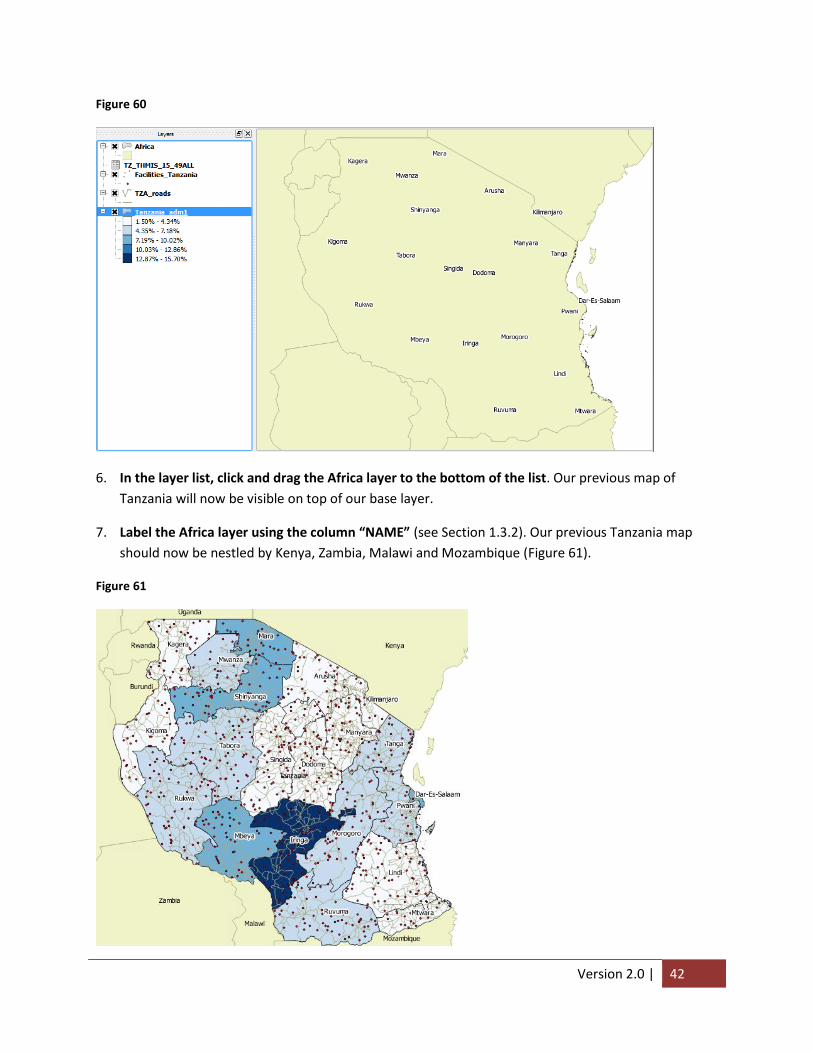
6. In the layer list, click and drag the Africa layer to the bottom of the list. Our previous map of
Tanzania will now be visible on top of our base layer.
7. Label the Africa layer using the column “NAME” (see Section 1.3.2). Our previous Tanzania map
should now be nestled by Kenya, Zambia, Malawi and Mozambique (Figure 61).
Figure 61

Version 2.0 | 43
1.6.2. Adding Secondary labels
In Section 1.3.1 we explored creating gradient maps by dividing the range of HIV prevalence values into
equal intervals. Users may also want to see the prevalence values displayed in the respective provinces
as a second set of labels. As described in section 1.3.2, QGIS can add one label per layer, so we will need
to add a second, duplicate layer to display secondary labels. For this example, we will duplicate our
Regional Tanzania layer to display the HIV prevalence values for each region.
1. Right-click on the Tanazania regional layer [Tanzania_adm1] and select Duplicate. QGIS will add a
new layer to the contents panel [Tanzania_adm1 copy] (Figure 62). This layer is exactly like the one
above it.
Figure 62
2. Right-click the new layer [Tanzania_adm1 copy] and select Rename.
3. Rename the layer “HIV Prevalence Values”.
4. Enable the layer by clicking the checkbox next to the name. Since duplicate layers are displayed,
each region contains two identical name labels (Figure 63).
Figure 63

Version 2.0 | 44
5. Click the checkmark box next to TZA_roads and Facilities_Tanzania to disable the roads and
facility layer. This will make the next addition easier to see.
6. Right-click the HIV Prevalence Values layers and select properties.
7. In the Labels tab, click the ‘Label this layer with’ dropdown menu and select
“TZ_THMIS_15_49ALL_HIVPrev”. Since there are two labels for each region, we need to change the
placement so they do not overlap.
8. Click Placement (Figure 64).
9. Under Placement, select Offset from centroid (Figure 64). This will allow us to specify where the
label should be placed in relation to the center of the polygon.
10. For Quadrant, click the bottom-right button (Figure 64). This will set our labels.
Figure 64
Since we only want to show labels, we need to make the new layer transparent so that it does not
obscure other shapefiles. Just as we stylized our first Tanzania regional layer in Section 1.3.1, we will
remove the gradient in the Style Tab of the Properties window.
11. Without closing the Properties window, open the Style tab.
12. In the drop down menu, select Single Symbol (Figure 65).
13. Under Symbol layers, click Simple fill.
14. Click the dropdown menu for Fill style and select “No Brush”.

Version 2.0 | 45
Figure 65
15. Click OK to close the Properties window. Notice that each region now has a name and an associated
HIV prevalence value (Figure 66).
Figure 66
1.6.1. Editing Attribute Data
You may wish to change the spelling of text or the appearance of values in your Attribute Table.
1. In the Layers panel, right click on the file you wish to edit [Tanzania_adm1]

Version 2.0 | 46
2. Select Open Attribute Table (Figure 67)
3. Open the Properties window for the same layer.
Figure 67
4. In the Attribute Table, select Toggle Editing to allow editing of the table
5. Double click within a cell in your Attribute Table and enter the desired value or text
6. Select save changes to confirm changes (Figure 68). Note that changes made to a shapefile are
permanent and cannot be undone. As a precaution, you may wish to make changes in a duplicate
layer so you can revert back to the original layer in the case of errors.
Figure 68
1.6.2. Rule-based Styles for Points
You may only wish to display the geographic relationship of a subset of points. For example, when
assessing PMTCT programs, it may be desirable to only display the facilities that offer PMTCT services.
As shown in the facility layer attribute table displayed in Figure 69, the Facility-level data we imported
contains information on the services offered at each facility. Therefore, we can tell QGIS to only display
the facilities that offer a specific service. Before moving forward, take note of how this data is structured
- PMTCT sites are delineated with the value “PMTCT” under the PMTCT column; we will instruct QGIS to
only display sites that have “PMTCT” listed in the PMTCT column.

Version 2.0 | 47
Figure 69
1. In the Layers panel, verify the checkbox for the facility layer is enabled [Facilities_Tanzania].
2. Open the Properties window for the same layer.
3. Click the Style tab.
4. In the dropdown menu, select “Rule-based” (Figure 70).
Figure 70
Version 2.0 | 48
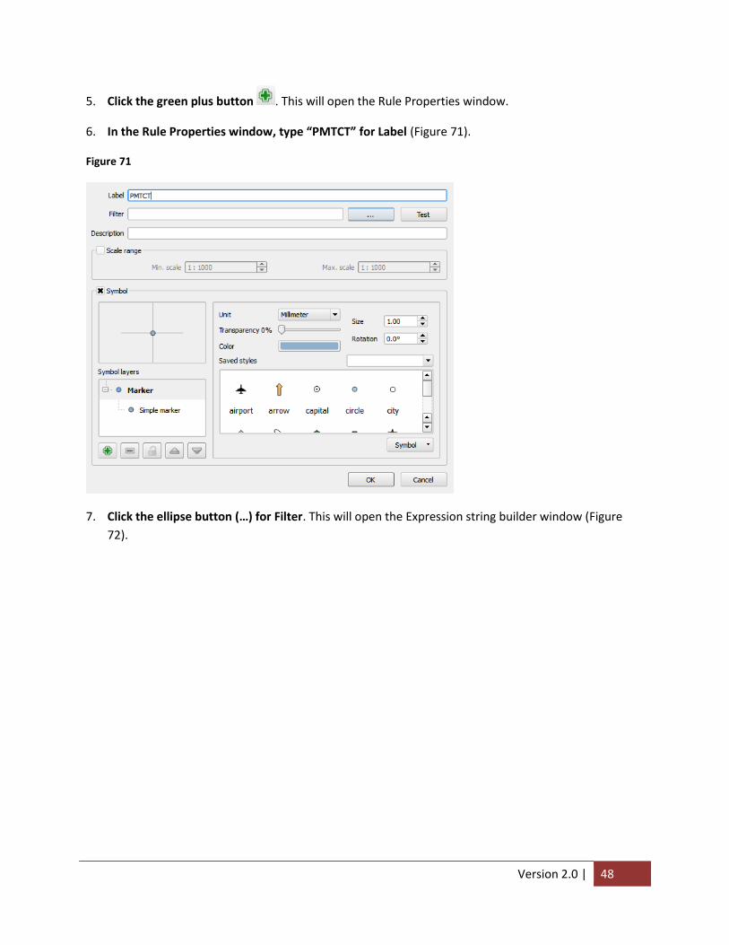
5. Click the green plus button . This will open the Rule Properties window.
6. In the Rule Properties window, type “PMTCT” for Label (Figure 71).
Figure 71
7. Click the ellipse button (…) for Filter. This will open the Expression string builder window (Figure
72).

Version 2.0 | 49
Figure 72
In this window, we will create a simple equation – also called an Expression – that will instruct QGIS to
display only those sites that are PMTCT.
8. In the Expression sting builder, expand the list for Field and Values by clicking the plus box (Figure
73).
9. Double click “PMTCT”. This will add the column PMTCT to our Expression.
Figure 73
10. Click the Equals button under operators.
11. Under Field values, click “all unique” for Load values (Figure 74). This will add three values to our
Field values box.
Version 2.0 | 50
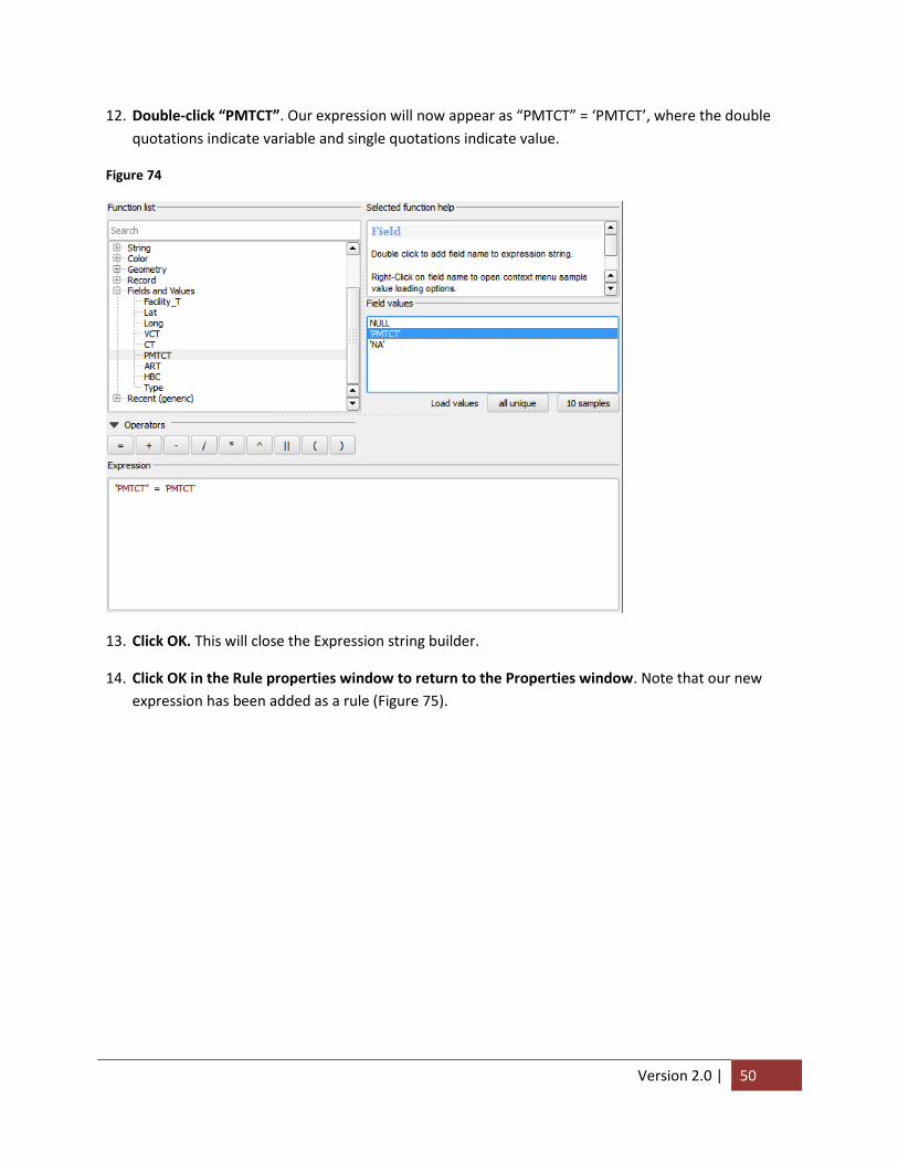
12. Double-click “PMTCT”. Our expression will now appear as “PMTCT” = ‘PMTCT’, where the double
quotations indicate variable and single quotations indicate value.
Figure 74
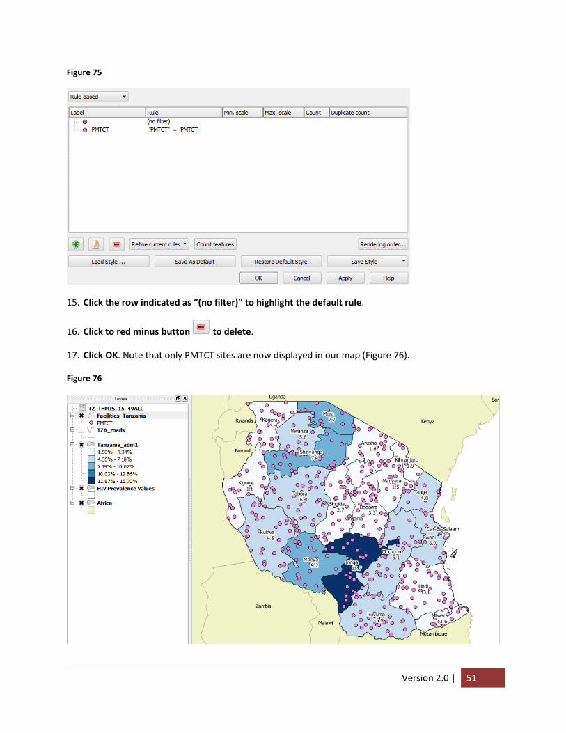
13. Click OK. This will close the Expression string builder.
14. Click OK in the Rule properties window to return to the Properties window. Note that our new
expression has been added as a rule (Figure 75).
Version 2.0 | 51
Figure 75
15. Click the row indicated as “(no filter)” to highlight the default rule.
16. Click to red minus button to delete.
17. Click OK. Note that only PMTCT sites are now displayed in our map (Figure 76).
Figure 76