How to-design-a-memorable-brand-that-catches-on
50
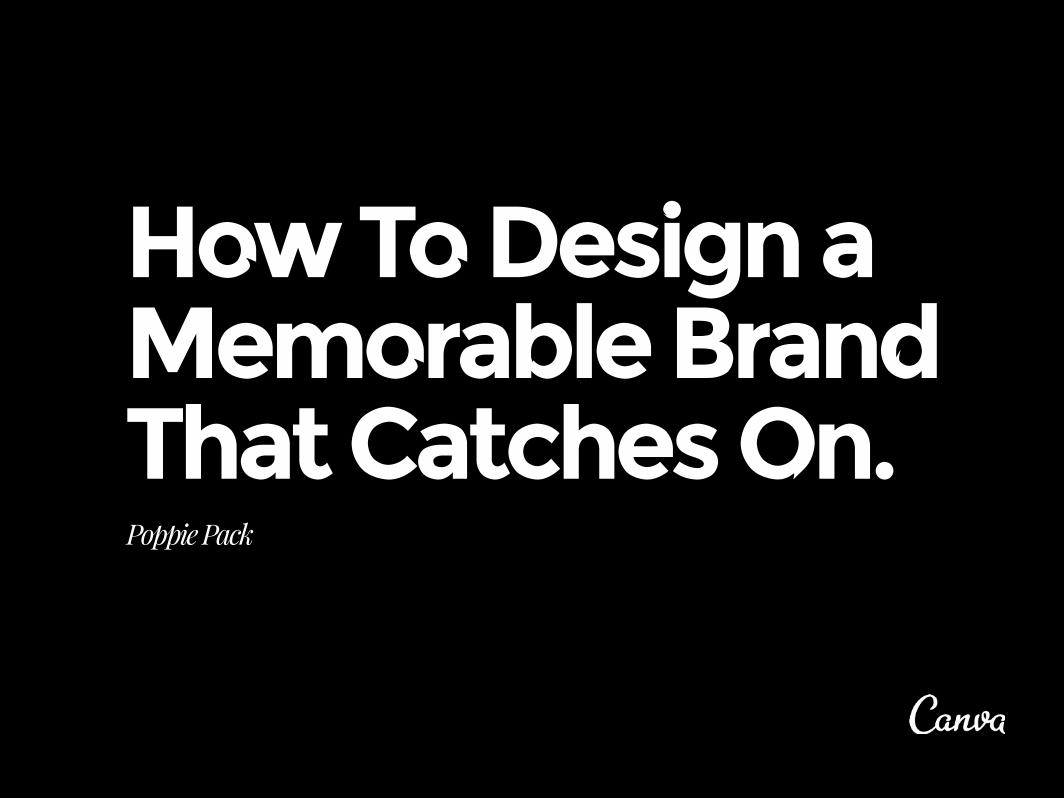
How To Design a Memorable Brand That Catches On. Poppie Pack
Transcript of How to-design-a-memorable-brand-that-catches-on
How To Design a Memorable Brand That Catches On.Poppie Pack

WHAT MAKES GOOD BRANDINGHow the combination of strategy, design and consistency creates a strong brand.
BRANDING PRINCIPLESThe traditional components of branding such as vision, experience and originality.
DESIGN IN PRACTICEHow to use design elements such as color, type and photo filters to create an effective brand style.
CASE STUDIESSome great brand examples created in Canva to show how to create your own style guide and marketing collateral.
NOW IT’S YOUR TURNIt’s time to implement what you’ve learned and work with your brand, creating beautiful designs of your own.
RESOURCESAccess all the resources you’ve seen throughout the book. Remix our graphics and create your own style guide.
CONTENTSHOW BRANDING WORKS
1
2
3
4
5
6

Today’s world is all about accessibility. If taxis were easy to hail, we wouldn’t need Uber. If books were affordable, then we wouldn’t need kindles. If it was easy to ask a girl out at a party, we wouldn’t need Tinder. Uber gives you the GPS whereabouts of your driver with the model of their vehicle; Kindle gives you recommendations on what book to read next based on your previous purchase; and Tinder gives you a shot at meeting someone you might not have the guts to introduce yourself to. They have all created a promise that is unique by positioning themselves as ruler of their game within the marketplace, quickly becoming a necessity in your life. This is branding.
Every morning, on your commute to work, whether by foot, public transport or car, you are bombarded with a visual feast of billboards, automobiles, apparel, technology, bumper stickers, advertising screens, radio… the list goes on. Some of these products get lost in the chaos and fall under the radar. Then
you see a mark that draws you in. The shoe with the swoosh on the side, a familiar tagline on a poster, or the slick looking mobile phone with the graphite-back that grabs your attention. It might be that you have never seen this brand before. It’s your first date and you’re trying to work it out. It’s intrigued you and you want to know more. Through their unique combinations of design, color and typography, they have incited your curiosity and captured your attention. Behind these products are companies with a deep understanding of their audience and how to engage with their target consumer. They have taken a strategic and bold approach to standing out from the crowd and are becoming a bigger piece of the puzzle.
Poppie Pack Senior Designer, Canva
AN INTRODUCTION

WHAT MAKES GOOD BRANDING
This section will uncover the fundamental components which make up the general practice of branding, This includes the importance of brand loyalty, strategy and great design.
1.

Know your customer. Find out what they do and what they like - what makes them tick. This will allow you to tailor your product to suit their needs.
LOYALTY
The world is divided into two types of people. Are you partial to “Ice Cold Sunshine”, or “Taking it to The Max”? Whether it’s Coca Cola or Pepsi that floats your boat, you are part of a battle between fiercely loyal consumers. You are one or the other – not often will you find someone who swings both ways. Pepsi challenged Coke in the 1960s by positioning itself as “the generation ahead”
- making Coke seem old fashioned. Coke maintains its classic brand ethos and by doing so, maintains its following.
Brand loyalty is the commitment shown to a brand through repetitive purchasing of a certain product, letting the product become superior to its competitors.
How to keep your customers.

STRATEGY + UNIQUE SELLING PROPOSITIONIconic brands don’t happen by accident. Understanding your customer, how they connect with your brand and why they absorb and respond to your marketing, is the basis of a well crafted strategy. Understanding what motivates your audience is crucial, you have to become an untrained psychologist.
What makes your business unique in a world of over-saturated advertising? How do you stand out from your peers or competitors? The key to long-term success is recognizing what
makes your company different. To be your own evangelist, you need to know more about your company or product than anybody else. The only way to guarantee this is to research your market, your competitors and the people that have been champions in your domain before you. From analytics to brand stories, consumer trends and demographics – you don’t need to be risk free but the more you know, the better your outcome will be.
Crate&Barrel offers a promise to their customers: great value and high quality furniture and homewares. The brand experience is unpretentious and speaks to the “every man”. It brings you product directly from the “crate and barrel”, breaking away from the traditional but unaffordable
style of its competitors. Crate&Barrel’s initial focus in 1967 was an unconventional shopping experience which led them to easily implement an e-commerce strategy, paving a way for online shopping that keeps with the brand experience created decades prior.
The brand experience is unpretentious and speaks to the ‘every man’ – bringing you product directly from the ‘crate and barrel’.
CRATE & BARREL - HOMEWARE

Aesthetics matter. A well designed logo together with strategic positioning makes all the difference for your marketing
material. Ensuring your creative identity is cohesive across all collateral created for your brand is the most effective form of
visual communication. The look and feel of the logo should help with the implementation of a clarified set of style
standards. Your style guides is your refence for designing marketing collateral to ensure purity of your visual identity.
GREAT DESIGN
Established in 1851, Kiehl’s is a family company created by a pharmacist. The logo is elegant and simple, yet adheres to the look and feel associated with
pharmaceutical products. The point of difference with Keihl’s is transparency. All ingredients, directions and skin benefits are displayed on the front of the
packaging, and in contrast to their competitors, Kiehl’s offers a clean and less feminine approach to design. It’s no surprise that 30-40% of their customers are
male. Kiehl’s are an eco friendly company with packaging made of recyclable material.
KIEHL’S - COSMETICS

CONSISTENCY
Consistency creates the groundwork for the success of your business. With the fast moving influence of different advertising platforms, the application of consistent design
style across all these mediums is becoming harder to adhere to. From smartphones and LED billboards to social media, the spectrum of places to apply your brand is broadening.
Nike is one of the most globally recognized brands thanks to its messaging, consistent use of typefaces, and a clean uncluttered visual style. The “Just do it” slogan embodies the voice of Nike, with accompanying
taglines of athletic prosperity like “Eat our dust” and “Smoke ‘em”. This kind of consistency isn’t just about applying the exact same style to everything, but also reinforcing the brand’s persona.
NIKE - SPORTSWEAR

Endeavor Snowboards is a Canadian based company that was founded by a pro rider and photographer in 2002. It strives to raise the bar for what snowboarding should be, and redefines the ultimate snow experience.
Endeavor’s consistent branding is a particularly interesting element of its social media and marketing material. The subject matter used in its social media and marketing tends to be action shots of boarders and snow-capped mountain tops.
Interestingly enough, Endeavor uses a monochrome filter which not only captures the dramatic velocity of the content, but also enhances the positive/negative (black and white) space of the photographic composition. This application even inspires the snow-shy to catch a chairlift. The black and white theme extends throughout all of Endeavour’s creative, including its social media channels and website design. This maintains a cohesive visual aesthetic, as well as creating a unique brand style.
ENDEAVOR - SNOWBOARDS
en-deav-or: v. try hard to do or achieve something. / n. an attempt to achieve a goal / earnest and industrious effort, esp. when sustained over a period of time.

BRAND PRINCIPLES
It’s important you understand the footprint you are trying to make in your market, how you are different from your competitors and how you are going to create a unique journey for your customers.
2.

The beginning of any project starts with a conversation about the future. What’s the ideal outcome for this endeavor? What is the dream result at the end of the day? And most importantly, how do we as a team make
these dreams become a reality? The fortuitous conversation and overarching plan that is made at the stage of conception is what will define the brand’s vision and create a mission statement.
Make a mission statement. What do you think a Wall Street banker would know about selling books on the internet? In 1994, an innovative Jeffrey P. Bezos left his banking career to embark on the creation of online retailing sensation Amazon. It was a brainstorm of the Top 20 products that he could potentially
sell online that landed him with books as his final draw card. And its mission statement? To be Earth’s most consumer-focused company, where anyone can find and discover anything they want at the lowest prices. This might have seemed overly ambitious in 1995, but today Amazon is a multi-billion dollar company.
BRAND + VISIONTHE IDEALS OF YOUR BRAND
A brand for a company is like a reputation for a person. You earn reputation by trying to do hard things well. - Jeff Bezos
Kindle Family & PaperWhite (right) - one of Amazon’s best selling e-readers.
AMAZON - E-COMMERCE
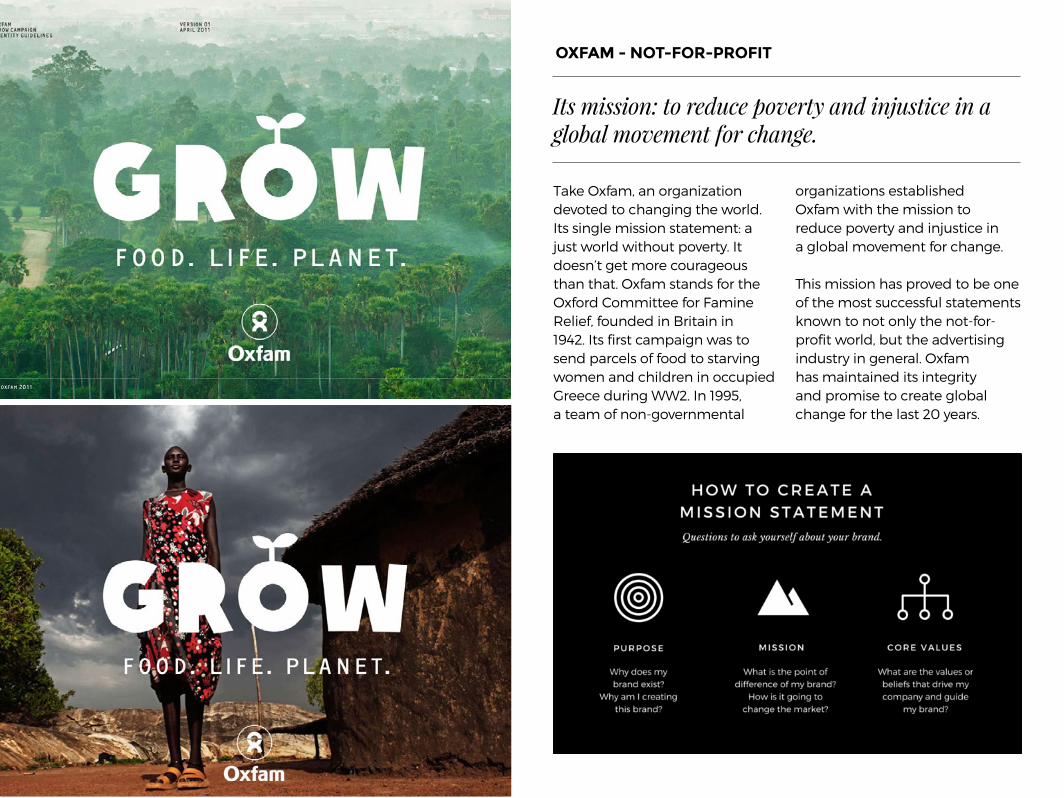
Take Oxfam, an organization devoted to changing the world. Its single mission statement: a just world without poverty. It doesn’t get more courageous than that. Oxfam stands for the Oxford Committee for Famine Relief, founded in Britain in 1942. Its first campaign was to send parcels of food to starving women and children in occupied Greece during WW2. In 1995, a team of non-governmental
organizations established Oxfam with the mission to reduce poverty and injustice in a global movement for change.
This mission has proved to be one of the most successful statements known to not only the not-for-profit world, but the advertising industry in general. Oxfam has maintained its integrity and promise to create global change for the last 20 years.
OXFAM - NOT-FOR-PROFIT
Its mission: to reduce poverty and injustice in a global movement for change.
charity diagram

BRAND + EXPERIENCECREATING A JOURNEY FOR YOUR AUDIENCE
Let’s talk about brand experience. Before work every morning, you go to your favorite cafe. When you walk up to the counter it’s not necessary to tell the bearded barista your order, because he’s
already started making it. You hand over your loyalty card and he stamps it (one more until your free cup!), wishing you a great day and using your first name as a friend would. Within minutes, you have your piping hot latte with
half a sugar. Exchanging a smile with the waitress, you rush out of the cafe to get to the bus on time. Once seated, you take your first sip and disappointment stings across your face. He gave you a soy cappuccino with too much sugar.
This has not only ruined your morning, but tarnished the once peachy ideals you associated with your local cafe. A bad experience can lose a lifetime of loyalty.
You hand over your loyalty card and they stamp it (one more until your free cup) wishing you a great
day using your first name as a friend would.

On the flipside, you have companies like The Ritz Carlton, who not only provide an exceptional experience but take it to the next level. Each staff member is given up to $2000 to spend on a guest, to deliver the
ultimate luxury hotel experience. This might seem extravagant but they claim it’s how they keep their brand promise. This is not a free-breakfast-kind-of-deal; it’s a “special concept” to make customers feel valued. There are
plenty of stories like that of the Ritz Carlton Dubai, where one waiter overheard a gentleman whose wife was in a wheelchair, saying it was a shame she couldn’t get down to the beach. The waiter told maintenance, who by the next
afternoon had prepared a wooden walkway down the beach with a tent set up for them to dine in that evening. Now, that’s how you create a great brand experience!
This is not a free-breakfast-kind-of-deal, it’s a “special concept”, to make your customer feel valued.
THE RITZ-CARLTON - HOSPITALITYAdvertisement for The Ritz-Carlton

Using a functional typeface for its logo together with the bodies of retail assistants and word of mouth, American Apparel has gone against the grain of a mainstream fashion brand. Some might consider it aesthetic purity, intentionally avoiding the sugarcoated stereotype of the fashion industry. To add pack to punch, American Apparel creates marketing material that
is both controversial and totally acceptable from an advertising perspective, displaying near naked people wearing little more than the item being promoted. Part of what is so special about American Apparel is that it has created a voice that reflects its brand and speaks to the pop-culture audience, while remaining true to the quintessential American Style.
BRAND + ORIGINALITYSETTING YOURSELF APART FROM COMPETITORS
American Apparel has created a voice that reflects its brand and speaks to its pop-culture demographic.

Brand identity is the visual characteristics which define your brand. It is what you see, touch and recognize. It is the tangible aspect of your product. It is the print or digital collateral with logos, taglines and an original aesthetic unique to the brand itself. Brand identity is the fire that connects your business and your customer.
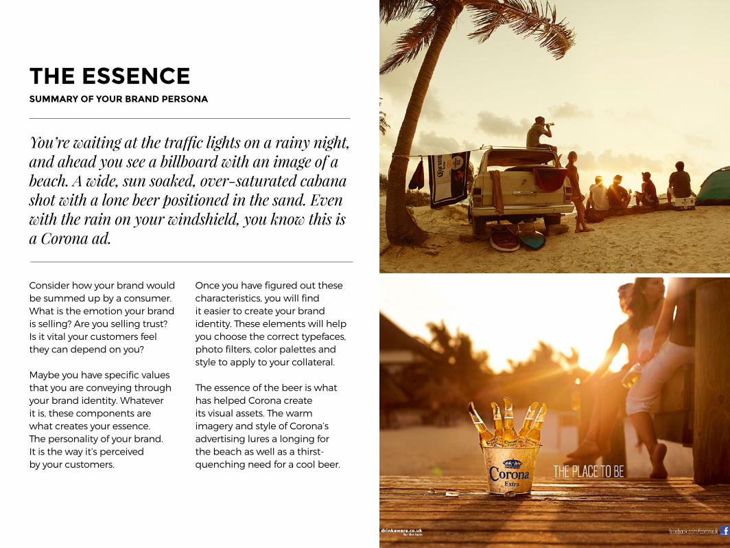
THE ESSENCE SUMMARY OF YOUR BRAND PERSONA
Consider how your brand would be summed up by a consumer. What is the emotion your brand is selling? Are you selling trust? Is it vital your customers feel they can depend on you?
Maybe you have specific values that you are conveying through your brand identity. Whatever it is, these components are what creates your essence. The personality of your brand. It is the way it’s perceived by your customers.
Once you have figured out these characteristics, you will find it easier to create your brand identity. These elements will help you choose the correct typefaces, photo filters, color palettes and style to apply to your collateral.
The essence of the beer is what has helped Corona create its visual assets. The warm imagery and style of Corona’s advertising lures a longing for the beach as well as a thirst-quenching need for a cool beer.
You’re waiting at the traffic lights on a rainy night, and ahead you see a billboard with an image of a beach. A wide, sun soaked, over-saturated cabana shot with a lone beer positioned in the sand. Even with the rain on your windshield, you know this is a Corona ad.

THE LOGOA SYMBOL CREATED TO VISUALLY REPRESENT THE BRAND
The logo or mark that is used to represent your business is often the first relationship that is formed between the brand and
the customer. It is the first point of recognition. Create a logo that is not only well-designed but one that is memorable. However, it is
imperative to rememeber that your logo is not your brand. It should not define you, but instead be a visual representation of your
company. Your logo is just one element of your visual identity.
Type-based logos: Allpress, FedEx and Coachella. Pictorial logos: WWF, Apple, Spotify, Target.
“The life of a designer is a life of fight. Fight against the ugliness. Just like a doctor fights against disease. For us, the visual disease is what we have around, and what we try to do is cure it somehow with design.”- Massimo Vignelli
Mixed logos: Bondi Harvest, Saturdays Surf NYC.

DESIGN IN PRACTICE
The following section will explain the different components of designing for your brand, from color and typeface choices, to applying consistent style filters to all your imagery.
Design is not just what it looks like and feels like. Design is how it works.- Steve Jobs
3.
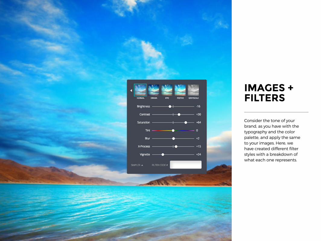
IMAGES + FILTERS
Consider the tone of your brand, as you have with the typography and the color palette, and apply the same to your images. Here, we have created different filter styles with a breakdown of what each one represents.

VINTAGE‘70s-inspired photo filters are in high demand. They echo beaches, salty skin and general summer bliss. In this image, the brightness has been decreased, to soften the blue sky and create warmer tones. Lowering the contrast takes the edge off the hard gleam in the palm tree. Adding a bit of X-process, inflects green tones into the sharp blue, imitating an aged photograph.
VISTAMake the still blue of lakes and rivers gleam by increasing contrast and saturation. This helps the shadows become more prominent and separates the colors by darkening specific hues.

SHARPEN UPCreate detail and texture in your image by decreasing the blur. This is a great way to get the full texture of elements in your photo. The veins in the leaves (often hindered by the effects of a slow shutter speed) are now brought to life.
MONOCHROMEGet the full effect of shapes and forms by applying monochrome to your image. This doesn’t necessarily mean that you have to make it black and white; monochrome simply means shades of one color. Toggle the contrast and brightness sliders to achieve the optimum effect for the features within your image.

CREATE CONTRASTWith objects that are textural, such as twine and pine cones, the contrast has been increased to accent the blends. This feature also helps the layers of objects offset each other by defining the lightest and darkest areas within your image. The saturation has been adjusted to enhance the natural hues in each object.
HIGH SATURATIONIn food photography, keep your objects luminous and intense by increasing the saturation and adjusting the x-process. This will also help enhance the seperation between colors.

FILTER TIP
Make the still blue of lakes and rivers gleam by applying
contrast and saturation. This
helps the shadows become more
prominent and separates the colors
by darkening specific hues.
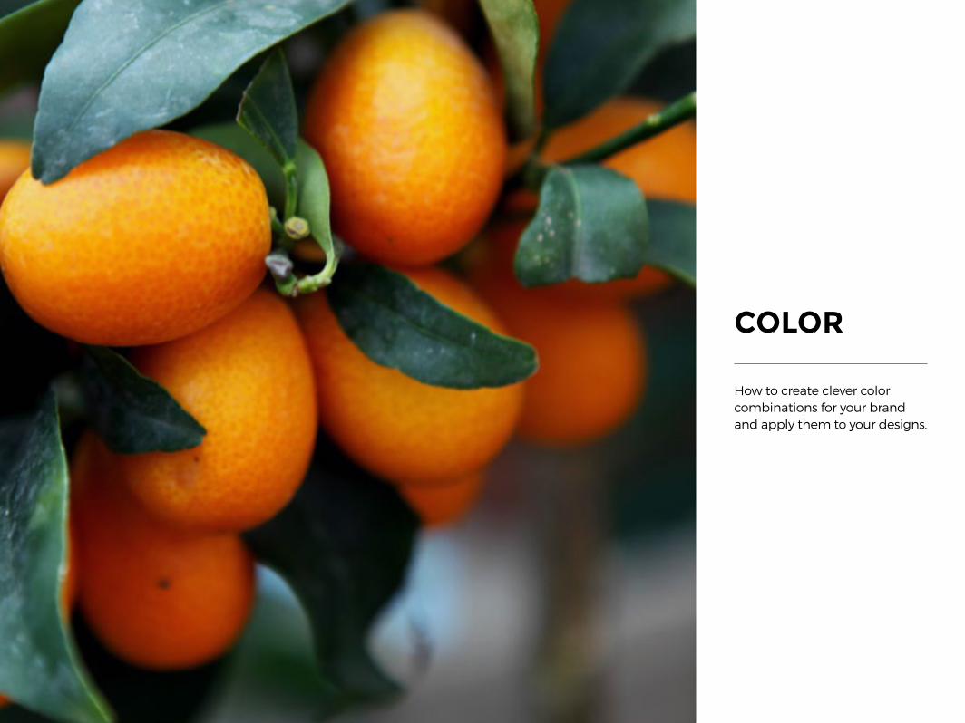
COLOR
How to create clever color combinations for your brand and apply them to your designs.
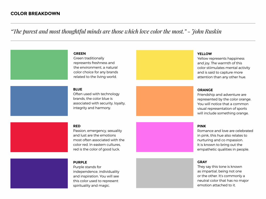
COLOR BREAKDOWN
BLUEOften used with technology brands, the color blue is associated with security, loyalty, integrity and harmony.
REDPassion, emergency, sexuality and lust are the emotions most often associated with the color red. In eastern cultures, red is the color of good luck.
PURPLEPurple stands for independence, individuality and inspiration. You will see this color used to represent spirituality and magic.
ORANGEFriendship and adventure are represented by the color orange. You will notice that a common visual representation of sports will include something orange.
PINKRomance and love are celebrated in pink, this hue also relates to nurturing and co mpassion. It is known to bring out the empathetic qualities in people.
YELLOWYellow represents happiness and joy. The warmth of this color stiimulates mental activity and is said to capture more attention than any other hue.
GRAYThey say this tone is known as impartial, being not one or the other. It’s commonly a neutral color that has no major emotion attached to it.
GREEN Green traditionally represents freshness and the environment, a natural color choice for any brands related to the living world.
“The purest and most thoughtful minds are those which love color the most.” - John Ruskin

Color code #
THE COLOR WHEEL
Designed in 1666 by Sir Isaac Newton - the color wheel is the basic compass used for combining colors, a visual representation of color theory.
PASTELSPastel colors are the lightest, and most diluted version of each color, and are located in the center of the color wheel. These tones have the lowest saturation.
BRIGHTBright colors are found on the outer edge of the color wheel. They are high-saturation and described as a “hue”, the pure spectrum of the color (red, blue, yellow etc).
MIDTONESThese colors are your mid- range tones. They have an impact without over dominating, and can be considered a little muted as they lack the vibrance of bright colors, and the calmness of pastels.
WARM TONESWarm tones represent energy
and vibrance. They contain red and orange tones.
COOL TONESThese are colors that have
blue tones in them. They evoke calm and tranquil emotions.
BRIGHTNESS SLIDER The brightness slider is the tool which allows you to lighten or amplify the tone of your hue.
HEXADECIMAL CODEThe six-digit code which
represents the exact color by specifying the values of each hue.

ANALOGOUS These colors sit next to each other on the color wheel. Because they are so similar in hue, create contrast by using different tones. COMPLEMENTARYThese colors are opposite each other on the color wheel. This high contrast application creates a vibrant pairing and a strong visual effect.
SPLIT COMPLEMENTARYThis group is easier to work with than complementary colors. It is made up of two similar colors along with one contrasting hue.
TRIADColors that sit in an even triangle across the color wheel are the triad group. A successful balance of these hues is when one color dominates over the other two.
MONOCHROMATICA monochromatic color palette is when all shades are of the same color. It is commonly misrepresented as tones of grey, however its true definition is tones of the same hue.
“There are colors which cause each other to shine brilliantly, which form a couple which complete each other like man and woman.” - Vincent van Gogh
Analogous Complementary TriadSplit Complementary Monochromatic
COLOR GROUPS
Choosing colors has some science to it. Here is a breakdown of some of the main color groups, and how they are established based on their location within the color wheel. Remember this is a guide; the best way to find colors is to experiment with different palettes and combinations.

Color combinations can come from anywhere, from the tones in nature, to the facades of buildings. Use a color dropper tool to create some beautiful palettes of your own. Here we have collated some nice options to inspire you.
Choosing the right colors for your brand might seem like a daunting exercise. Find out which colors represent your industry or reflect the emotion you want your brand to convey.
Experiment by playing around with different schemes by plucking hues from photos, and creating moodboards to see how the colors work together, or don’t.Try creating a template with a
photo grid. Insert images with interesting colors and collect the dominant hues you like from the photograph to form a palette. It’s important to ensure you choose a collection of colors with enough
contrast so that they will work well when applied as backgrounds, elements and overlaying type.
CHOOSING BRAND COLORS

FONTS
How to create and apply effective font combinations to develop a typographic style for your brand.
COMBININGtypefaces for impact
SacrementoUse the typeface Josefin SansRegular for your body copy.
Mr DafoeUse the typeface Roboto
for your body copy.
R O B O T O R E G U L A R
LIBREBASKERVILLE
Use the typeface Libre Baskervillefor your body copy.
Libre Baskerville Italic ROBOTO CONDENSED
1 9 4 0 C O C K T A I L H O U R
P E R F U M E R I E I N D U S T R I A L
NORWESTER
Use the typeface Archivo NarrowRegular for your body copy.
E C O N O M I C A B O L D
Use the typeface Lora Regularfor your body copy.
R O B O T O C O N D E N S E D
GERMANIA ONEHAMMERSM I TH ONE
ANTONUse the typeface Open Sans
for your body copy.
S I X C A P S
L U M B E R J A C K
G R A N D O P E N I N GO K T O B E R F E S T
B I G & B O L D
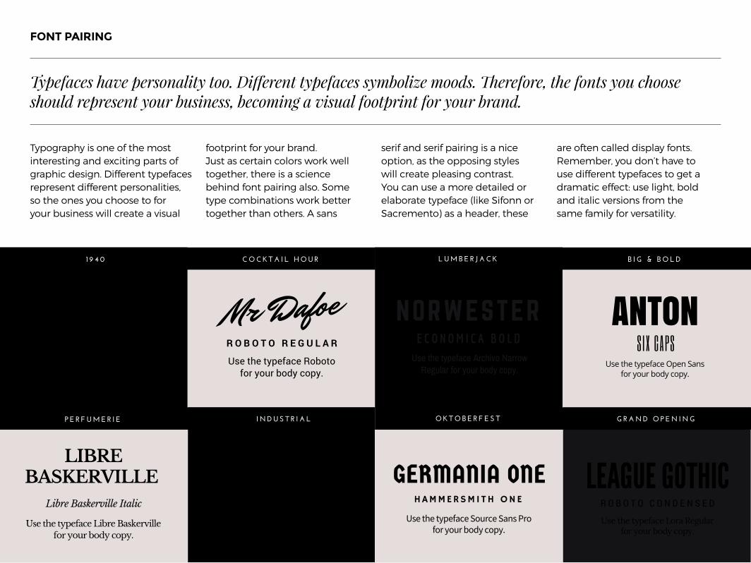
Typography is one of the most interesting and exciting parts of graphic design. Different typefaces represent different personalities, so the ones you choose to for your business will create a visual
footprint for your brand. Just as certain colors work well together, there is a science behind font pairing also. Some type combinations work better together than others. A sans
serif and serif pairing is a nice option, as the opposing styles will create pleasing contrast. You can use a more detailed or elaborate typeface (like Sifonn or Sacremento) as a header, these
are often called display fonts. Remember, you don’t have to use different typefaces to get a dramatic effect: use light, bold and italic versions from the same family for versatility.
FONT PAIRING
Typefaces have personality too. Different typefaces symbolize moods. Therefore, the fonts you choose should represent your business, becoming a visual footprint for your brand.

Quattrocento
Use Quattrocento foryour body copy.
QUANDO
OSWALD BOLDUse Archivo Narrow for
your body copy.
O S W A L D R E G U L A R
R A L E W A Y R E G U L A R
Use Raleway Regularfor your body copy.
Yellowtail
E N G A G E M E N T C O N D E N S E D
G E L A T O B A R G E O M E T R I C
Quattrocento
Use Quattrocento foryour body copy.
QUANDO
OSWALD BOLDUse Archivo Narrow for
your body copy.
O S W A L D R E G U L A R
R A L E W A Y R E G U L A R
Use Raleway Regularfor your body copy.
Yellowtail
E N G A G E M E N T C O N D E N S E D
G E L A T O B A R G E O M E T R I C
FONT PAIRING
Abril Fatface
Use Libre Baskervillefor your body copy.
E C O N O M I C A B O L D
Parisienne
C O U S T A R D
Use Sanchez Regularfor your body copy.
ARVO BODONI BOLDUse Quattrocento Regular
for your body copy.
Bodoni Italic
M A G A Z I N E F R E N C H B A K E R Y
O R G A N I C P R O D U C E F A S H I O N
SacrementoUse the typeface Josefin SansRegular for your body copy.
Mr DafoeUse the typeface Roboto
for your body copy.
R O B O T O R E G U L A R
LIBREBASKERVILLE
Use the typeface Libre Baskervillefor your body copy.
Libre Baskerville Italic ROBOTO CONDENSED
1 9 4 0 C O C K T A I L H O U R
P E R F U M E R I E I N D U S T R I A L

Design can be art. Design can be aesthetics. Design is so simple, that’s why it is so complicated.
- Paul Rand
4.CASE STUDY SECTION
Now that we’ve demonstrated the elements that make up a brand’s identity, we will run through four case studies. They have been created in Canva to show how to easily implement a style guide.

G U I D E L I N E S
We’ve created Object Product is a homeware and product company that sells Scandinavian style furniture and objects. They’ve distinguished themselves for their beautiful and functional Nordic products. Given this cool and calm aesthetic, the strategy behind OP is to create a stylish and easy shopping experience.
CASE STUDY ONEObject Product - Home ware Company

L O G O
The logo is used in color variants based on category.
P L A N T A T I O N C R A F T I N G E D I B L EG E N E R I C
P L A N T A T I O N C R A F T I N G E D I B L E
The edible collection.Blue is the color chosen torepresent all the culinary
and food associatedbrand category.
Crafting collection. This category encompasses all items containing paper
and crafting materials.
Plantation collection.Plantation green is usedto celebrate all plantsand items made of
plant materials.
C O L O R P A L E T T E
The geometric monogram inside the circle is a typical minimalistic symbol, which is part of the Scandinavian style. The O and P have been tightened together together using letter spacing to symbolize the way furniture
and items in a house combine to make a home. Enclosing your logo inside a shape is extremely functional. It means you are able to place it with ease no matter what the background.
Colors can produce an emotional response, therefore the colors you choose for your products should be selected with care. The palette below has outlined a rationale behind the color choice of each category.
This home ware company has color coded its category sections to easily identify with their audience what each piece of marketing material is about.
Colors can produce an emotional response, therefore the colors you choose for your products should be selected with care.
THE COLOR PALETTETHE LOGO

J O S E F I N S A N SSecondary Typeface 2
J O S E F I N S A N S ( B O L D )
Secondary Typeface 1
Primary Typeface
S U B H E A D I N G S
T Y P O G R A P H Y T R E A T M E N T
Sifonn to be used for title and headings.
Josefin Sans Bold caps to beused for all subheadings.
Bodycopy
Josefin Sans Bold caps to beused for all bodycopy.
F ILT ER CODE : 7E32A764640075
This filter is low contrast and high saturation. The benefit of this is that it creates a shallow depth of field,allowing the imagery to act as a flatter style background but keeping the colors strong and warm.
I M A G E R Y
The font combination chosen for this brand is Sifonn and Josefin Sans, both art-deco style sans serifs. The clean and sharp edges of the typefaces represent the equally crisp edges and structure of the products sold at Object Product, while also
fitting with its contemporary aesthetic. Sifonn, with its heavier weight, is a suitable typeface for headings and call to action messaging. Josefin Sans is a finer font, and works well for body copy and subheadings.
The filter used for Object Product is low contrast and high saturation. This creates a shallow depth of field, making the objects in the image seem flat, allowing the photograph to act as a background. Another vital component to all the
photographs used is that it has been shot from a bird’s eye view (flat high angle), to showcase the products laying flat. This also creates a more one dimensional effect which better acts as a background than angled photographs.
THE IMAGESTHE TYPOGRAPHY
Another vital component to all the photography used is that it has been shot from a bird’s eye view (flat high angle), to showcase the products laying flat.

C O L L E C T I O N
O B J E C T P R O D U C T . C O M / E D I B L E
Its Twitter posts use color overlay on top of the background image which helps the collection category stand out and enhances the white type.
Object Product has used the color overlay effect for their social media posts. This application serves the minimal text on
these graphics. It well offsets the background from the type and allows the category name to be full focus.
Left: A Twitter post in action. Right: Three different posts using different category colors and imagery.
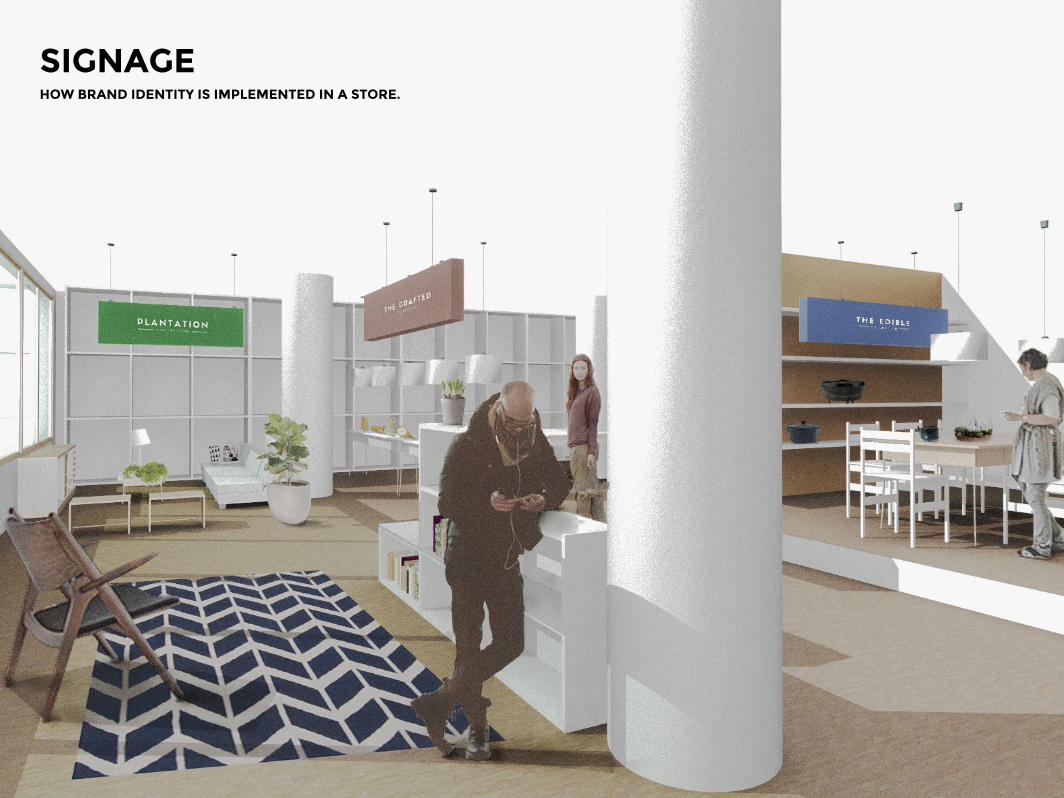
SIGNAGEHOW BRAND IDENTITY IS IMPLEMENTED IN A STORE.

Wednesday for Wishes is a charity foundation that supports less privileged children. Every child brought up in a loving home with the luxuries of choice has wishes granted, but the same is not said for those less fortunate. Wednesday for Wishes raises money to help grant the wishes of children that are orphaned, homeless or unwell. It is a humanity focused not-for-profit with a dream for a better world.
CASE STUDY TWOWednesday for Wishes - Charity Foundation

Design is in everything we make, but it’s also between those things. It’s a mix of craft, science, storytelling, propaganda, and philosophy. — Erik Adigard
THE TYPOGRAPHYTHE LOGO
Montserrat has been chosen as the brand typeface. It’s a very neutral and unpretentious sans serif that is easy to read and stands out well when scaled. There are three weights that are applied to different parts
of text, and all copy is placed in lowercase, this is the brand making a statement. This choice represents their lack of interest in hierarchy or levels of importance, only their brand mission.
The “Ribbon of Infinity” has been created to represent the idea that a wish does not go away until it is granted. Both ends of the ribbon get smaller, but one always sits off
the page as if never ending. The logo can be used in any of the brand colors but always at 80% opacity.

Wednesday for Wishes choose wild dandelions as a theme in their marketing material as they are synonymous with the analogy of wishes. There is also a subtle transparency applied to the images to enhance the whimsical tone.
THE IMAGES
The image style chosen for Wednesday for Wishes is made up of decreased brightness, a purple tint and heavy x-processing. The combination of these effects makes for a soft and whimsical effect. In terms of the content, Wednesday for
Wishes choose wild dandelions as a theme in marketing material, as they are synonymous with the analogy of wishes. There is also a subtle transparency applied to the images to enhance style and tone of the brand.
The Wednesday for Wishes foundation has a soothing palette made up of soft colors. These colors have been muted with a subtle transparency to
represent the opaque thistles of a dandelion. The dandelion is a common symbol within brand imagery and is associated with making a wish.
COLOR PALETTE

Here is a collection of Wednesday for Wishes collateral. The poster has more detailed information in order to drive potential new supporters. From a design perspective, you will see that
the text wraps around the dandelion for emphasis.The social media posts take a more simplistic approach. It’s vital to include your tagline and a call to action within your graphic.
If you are creating a Facebook Cover or Twitter Header, there is an avatar on the left hand side. It’s important to compose your design to the left as opposed to the other graphics which have
been right aligned. The logo is already in your profile picture, so it isn’t neccessary to include it in the design of your cover.
DESIGN IN PRACTICE
From top left: Poster, Social Media Posts and Facebook Cover.

The McGrath family has been building Orchard, their fresh goods company, for 57 years. They deliver consistent quality to their customers, and continue to improve season to season. Orchard uses no pesticides or genetic enhancers on their produce. They pride themselves on their organic methods, from the growth of its fruit and vegetables to their packaging and delivery. The “Paper Bag Promise” of 100% natural food that was installed by the Orchard pioneer still lives today.
CASE STUDY THREEOrchard - Fresh Produce

THE COLORSLOGO
Because Orchard doesn’t believe in artificial adjustments or modifications, the same rules apply to their branding. Therefore, the colors chosen
for their color palette are tones drawn from the first products that original founder, Terry McGrath grew: blueberries, pumpkins and eggplant.
The team at Orchard are firm believers in “you are what you eat”. Orchard’s logo is symmetrical, representing the natural balance and order that’s found in nature. The logo serves as a guarantee to
customers that the company is committed to supplying food in its most natural form. Orchard will nourish and connect your family with the goodness of the earth.
Orchard’s logo is symmetrical, representing the natural balance and order that’s found in nature.

THE TYPOGRAPHY THE IMAGES
The filters used for Orchard imagery are slightly desaturated, suggesting that the products are free of genetic modifications. fruits and vegetables.
Orchard uses two typefaces: Raleway Heavy and Source Sans Pro. Raleway Heavy, with its bold and geometric style, is used for titles and headings.
Source Sans Pro has been chosen as a secondary typeface for its easy to read quality. An added benefit is how its narrow form contrasts nicely with Raleway.
The filters used for Orchard imagery are slightly desaturated, suggesting that the products are free of genetic modifications. fruits and vegetables. This finish gives the content an organic and
untouched feel. Increasing the brightness enhances the element of freshness. Adjusting the brightness also ensures that when the dark color overlay is applied the produce doesn’t get lost.
R A L E W A Y H E A V Y
Mr Dafoe
O R C H A R D

The team at Orchard offer weekend tours around the farm to educate people on the importance of organic horticulture. Orchard’s Facebook page is used as a resource for follow up information.
Posters designed to celebrate seasonal fruit using the feature typeface, Mr Dafoe.

Orchard’s social media space is utilized as an educational forum to encourage customers to learn about the health benefits of the different fruit and vegetables sold at the market. This is also an excellent learning portal for
children. There are printable fact cards, and on weekends there are guides who offer tours on the farm educating people on the importance of organic horticulture.
The “Paper Bag Promise” of 100% natural food that was forged by the Orchard pioneers still lives on today.
From top left: Printable fact cards, the Orchard Facebook Page featuring cover image and profile picture.

So there you have it, an introduction to the world of branding! This is just the beginning of your adventure. Next time you are catching the subway home, look at all the visuals around you. The products in your peripheral, the fonts used on the transport signs or the symbols on backpacks. When you are on Tinder, think about the logo; that familiar flame that is burnt into your brain, how it is consistently used to navigate through the app. When a hot day takes its toll and you need a cool drink to bounce back, do you go classic Coke or are you part of the
Next Generation with Pepsi? As a consumer, you are a player in a strategic plan created by companies to challenge ideals and cultivate a following.
I hope this has exposed you to other elements within branding. Whether you are a small business owner, a Canva fan or a curious creative, this will help you put into practice the basic principles of branding. Now that you’re equipped with the resources, it’s time to make your own mark in the world.
Now it’s your turn. What are you waiting for?
“Branding is not just a product, it’s also a way of life, an idea, branding is actually leadership.” - Onyi Anyado
NOW IT’S YOUR TURN.

RESOURCES SECTIONCANVA REMIX LINKS TO START YOUR OWN BRANDING JOURNEY.
Color palette Filters Fact graphics
Object Product styleguide Wednesday for Wishes styleguide Twitter graphics
Click on these links to create and save your own version of all the brilliant designs you have seen in this book. Adjust the
designs as you please, create new color palettes and challenge your type combinations using these useful templates.
Orchard styleguide
Diagram layout

START DESIGNING TODAY!Put all the tips you’ve learned into practice.
Sign up to Canva today to access all these amazing resources and start your design journey!
www.canva.com