How neutral coloured backgrounds affect the attractiveness ...
12
Delft University of Technology How neutral coloured backgrounds affect the attractiveness and expensiveness of fresh produce Howell, Bryan F.; Schifferstein, Hendrik N.J. DOI 10.1016/j.foodqual.2019.05.018 Publication date 2019 Document Version Final published version Published in Food Quality and Preference Citation (APA) Howell, B. F., & Schifferstein, H. N. J. (2019). How neutral coloured backgrounds affect the attractiveness and expensiveness of fresh produce. Food Quality and Preference, 78, 1-11. [103718]. https://doi.org/10.1016/j.foodqual.2019.05.018 Important note To cite this publication, please use the final published version (if applicable). Please check the document version above. Copyright Other than for strictly personal use, it is not permitted to download, forward or distribute the text or part of it, without the consent of the author(s) and/or copyright holder(s), unless the work is under an open content license such as Creative Commons. Takedown policy Please contact us and provide details if you believe this document breaches copyrights. We will remove access to the work immediately and investigate your claim. This work is downloaded from Delft University of Technology. For technical reasons the number of authors shown on this cover page is limited to a maximum of 10.
Transcript of How neutral coloured backgrounds affect the attractiveness ...
Delft University of Technology
How neutral coloured backgrounds affect the attractiveness and expensiveness of freshproduce
Howell, Bryan F.; Schifferstein, Hendrik N.J.
DOI10.1016/j.foodqual.2019.05.018Publication date2019Document VersionFinal published versionPublished inFood Quality and Preference
Citation (APA)Howell, B. F., & Schifferstein, H. N. J. (2019). How neutral coloured backgrounds affect the attractivenessand expensiveness of fresh produce. Food Quality and Preference, 78, 1-11. [103718].https://doi.org/10.1016/j.foodqual.2019.05.018
Important noteTo cite this publication, please use the final published version (if applicable).Please check the document version above.
CopyrightOther than for strictly personal use, it is not permitted to download, forward or distribute the text or part of it, without the consentof the author(s) and/or copyright holder(s), unless the work is under an open content license such as Creative Commons.
Takedown policyPlease contact us and provide details if you believe this document breaches copyrights.We will remove access to the work immediately and investigate your claim.
This work is downloaded from Delft University of Technology.For technical reasons the number of authors shown on this cover page is limited to a maximum of 10.
Contents lists available at ScienceDirect
Food Quality and Preference
journal homepage: www.elsevier.com/locate/foodqual
How neutral coloured backgrounds affect the attractiveness andexpensiveness of fresh produce
Bryan F. Howella, Hendrik N.J. Schiffersteinb,⁎
a Department of Industrial Design, School of Technology, Ira R. Fulton College of Engineering, Brigham Young University, 265 Crabtree Building, Provo, UT, USAbDepartment of Industrial Design, Delft University of Technology, Landbergstraat 15, 2628 CE Delft, the Netherlands
A R T I C L E I N F O
Keywords:VegetablesFood presentationRetail designColour assimilationColour contrastSimultaneous contrast
A B S T R A C T
The colour of the background on which products are presented may affect their perceived attractiveness. In orderto find out on which type of background various fresh food products look most attractive, we presented fivedifferent vegetables (tomato, carrot, yellow bell pepper, eggplant, mushroom) on five different backgroundswith neutral grey colours varying in degree of blackness: 5, 30, 50, 65, and 90%. Forty-six participants providedcolour matches for the vegetables and evaluated them on 10 attributes.
Overall, the blackness of the backgrounds had little or no effect on the perceived colour of the vegetable. Onlyfor carrots we found a small but significant difference, mainly between the 5% and 90% blackness backgrounds.On the darkest background, the carrot would be perceived as a bit lighter, more saturated, and more yellowrather than red, compared to the lightest background.
Differences in perceived attractiveness on the grey backgrounds varied between 0.3 and 1.0 units on a 9-pointscale. Attractiveness and expensiveness ratings for most vegetables were highest on the 90% blackness back-ground. In comparison to our previous study where we presented vegetables on hued backgrounds, differencesbetween mean attractiveness ratings were smaller. Because mean attractiveness ratings in the current study werehigher, we expect that grey backgrounds are more likely to present vegetable assortments with a variety of huesin an attractive way than hued backgrounds.
1. Introduction
In order to stimulate the sales of fresh produce in retail stores, it issalient that vendors present them in an attractive and appetizingmanner. One important aspect of attractive presentation concerns thecolour of the materials on which products are presented. In a previousstudy, results showed that cool, warm, light and dark, orange and bluehued backgrounds were not suitable to present vegetables with dif-ferent colours in an optimal fashion. In fact, backgrounds that optimallypaired with a particular vegetable colour differed substantially betweenvegetables species (Schifferstein, Howell, & Pont, 2017). In the presentstudy, we continue our search for a background colour or a mechanismthat can predict how a variety of vegetables can be presented in anattractive, optimized way.
Appropriateness of colour application for achieving a specific goalsuch as increased attractiveness or preference has shown to be bothdependent on the nature of the object and the context in which it ispresented and such effects can be difficult to predict. First of all, al-though exact colour preferences may differ between individuals, they
have been shown to be highly product-specific. This is already the casefor many kinds of industrial products for which colours may be chosenarbitrarily (Holmes & Buchanan, 1984; Siple & Springer, 1983), and it iscertainly the case for unprocessed agricultural products, where pro-ducts colours may serve as indicators of freshness, ripeness and decaythat all relate to the product’s sensory properties, safety and nutritionalquality (De Groote & Kimenju, 2008; Lee, Lee, Lee, & Song, 2013;Schifferstein, Wehrle, & Carbon, 2019).
Furthermore, the attractiveness of products is influenced by thebackgrounds on which they are presented and the context in which theyoccur (Howell, Marin, & Kook, 2014). In this case, the mechanisms bywhich background affects product attractiveness is also dependent onthe characteristics of the product displayed. Mechanisms operating with2D stimuli do not seem to apply to 3D objects. For instance, a study oncool and warm hue preferences in 2D stimuli reported that all fore-ground colours were liked when presented on a cool coloured back-ground, while only the cool figure colours were liked when presentedon a warm coloured background (Schloss & Palmer, 2011). When wetried to replicate these findings in a more realistic setting with
https://doi.org/10.1016/j.foodqual.2019.05.018Received 26 February 2019; Received in revised form 22 May 2019; Accepted 22 May 2019
⁎ Corresponding author.E-mail address: [email protected] (H.N.J. Schifferstein).
Food Quality and Preference 78 (2019) 103718
Available online 23 May 20190950-3293/ © 2019 The Authors. Published by Elsevier Ltd. This is an open access article under the CC BY-NC-ND license (http://creativecommons.org/licenses/BY-NC-ND/4.0/).
T

vegetables presented on blue and orange backgrounds, these expectedoutcomes were fragmented into a variety of preferred hue combina-tions. Some of the discrepancies may be due to the occurrence of in-terreflections between 3D objects and their background, an effect thatmight even be larger if the objects were presented in a box painted inthe background colour (Schifferstein et al., 2017).
Other studies have shown that background colours can also affectthe perceived taste properties of the products presented. For instance,serving popcorn from red, blue, green and white bowls influenced theperceived saltiness and sweetness of the popcorn. Salty popcorn wasrated sweeter when taken from a blue or red coloured bowl, whilesweet popcorn was rated saltier when taken from a blue bowl (Harrar,Piqueras-Fiszman, & Spence, 2011). A restaurant-oriented study foundthat lighter coloured desserts tasted sweeter when served on whiteplates, while darker coloured desserts tasted sweeter when paired withblack plates (Piqueras-Fiszman, Alcaide, Roura, & Spence, 2012).Hence, it is understood that colour can also exert significant influenceon how foods are perceived. Researchers suggest that these effects onproduct attractiveness and product perception cannot be explainedsolely in terms of colour contrast and suggest further studies to un-derstand these phenomena (Adams, 2013; Harrar et al., 2011; Piqueras-Fiszman et al., 2012; Piqueras-Fiszman, Giboreau, & Spence, 2013).
To understand colour preferences and the mechanisms that affectthem, it is important to understand the basic mechanisms of colourperception. Understanding colour preferences is complex, as is thehuman visual system. Physiological and cognitive processes collabo-rate, in ways not yet fully understood, to enable colour vision. In 1878Hering observed that colour perceptions could not be simultaneouslyyellowish and blueish or reddish and greenish (see Hering, 1964).Therefore, he posited that humans have four fundamental colour per-ceptions: red, green, blue and yellow. The colour pairs red-green andyellow-blue are called opponent colours, currently known as com-plementary colours. He also defined a third opponent pair – black andwhite – and found that they could veil or influence perceptions of thefour fundamental hues (Kuehni & Schwarz, 2008).
Hering’s theory aligns with the contemporary physiological under-standing of human colour vision, which depends on three classes ofchromatic receptors, the short (S), medium (M), and long (L) wave-length-sensitive cones. These cones convert wavelengths into neuralsignals that travel through the optic nerve to the brain’s primary visualcortex. These neural signals are processed into three colour-opponentchannels designated red-green, yellow-blue (chromatic channels), andblack-white (lightness channel), which enables colour vision.Interestingly, while each cone class is tuned to receive certain wave-lengths (S, M, L) all cones, no matter the class, read lightness or blackand white (Ware, 2008). In the black and white channel, the differencebetween stimulus perceptions is called blackness, lightness or bright-ness contrast. In the red-green and yellow-blue colour channels, this iscalled chromatic contrast. That all channels register luminance differ-ences enables people to see considerably more detail in black and whiteand conversely considerably less detail where differences are purelychromatic.
The eye consists of two different types of light energy receptors,cones as discussed above, and rods. Rods are low light receptors thatoperate at lower visible wavelengths than cones do and cannot mediatecolour vision. In contemporary artificially lit society rods are rarelyutilized. Colour vision relies solely on cones to convert light energy intoneural signals, which enable full chromatic perception (Ware, 2008).
If we want to understand how context may affect the perception offocal objects, it is important to realize that the visual distinctness ofcolour is controlled as much by the characteristics of the environmentas it is by the object itself. Colour studies often present colour swatcheson backgrounds of neutral grey. Neutral grey is considered a char-acterless, indifferent, achromatic colour, of which the perceived colourcan be easily influenced by contrasting shade and hue (Itten, 1970),while having little to no colour effect on neighbouring colours. To
accurately assess a hue’s distinctness, it would be prudent to isolate thecolour with a neutral grey border (Ware, 2008). Artists and designershave demonstrated that coloured and neutral line work between uniquehues in a composition reduces the effects of simultaneous contrast orthe perceived influence adjacent hues have on each other. Also, out-lining an area of colour with black tends to deepen it, making it richerand more jewel-like (Feisner & Reed, 2014).
In order for objects to stand out against their background, it is im-portant that their colour contrasts with that of the background. Forinstance, type legibility has long been shown to be most effective whenthe lettering colour is in strong contrast with the background colour.Researchers have also shown that colour viewed against backgroundswith strongly contrasting hues are perceived as more saturated thanwhen they are viewed against a background with similar hues (Lotto &Purves, 2000). Furthermore, objects appear more vivid and richly co-loured against low-contrast, grey surroundings over high-contrastmulti-coloured surroundings (Brown & MacLeod, 1997).
However, contrast not only determines whether the object standsout and its colour becomes more vivid, but it can also have an effect onits attractiveness. Helson and Lansford (1970) asked participants to ratethe pleasantness of 125 colour samples that were presented on 25 co-loured backgrounds in five sources of illumination. In this study, thewhite background turned out to generate the highest mean pleasantnessratings for the 125 foreground colours in 4 out of 5 sources of illumi-nation. The overall mean pleasantness rating for the samples on thewhite background was 6.24 on a 9-point scale. Other background col-ours on which the colour samples looked good were either very light orvery dark, and mostly had low saturation. The samples presented on theblack and grey backgrounds in this study obtained a mean rating of5.89 and 5.86, respectively, which were among the ten best performingbackgrounds. From evaluating individual foreground-background pairsthe authors concluded that the principle factor determining the plea-santness of the colour samples was the amount of brightness contrast:The most pleasant combinations involved large brightness differencesbetween colour sample and background, whereas the least pleasantcombinations involved little or no difference.
Our previous study (Schifferstein et al., 2017) focused on chromaticcontrasts between hued vegetables and their hued backgrounds withlimited success. Based on the discussion above, we believe that focusingon blackness contrast is more likely to yield a mechanism which canreliably predict attractiveness ratings for the presented vegetables.According to the blackness contrast hypothesis, we expect to find thelowest attractiveness ratings when vegetables are presented on back-grounds that exactly match their own blackness values. The larger thedifference between the blackness values of the vegetable and its back-ground, the larger the attractiveness rating will be.
Reynolds-McIlnay, Morrin, and Nordfält (2017) studied the re-levance of brightness contrast in a retail environment by showing threestacks of towels (about 24, 55 and 91% brightness) on various greybackgrounds (26, 50 and 82% brightness). They found that productswere chosen more often when their brightness levels contrasted morewith those of the environment if the products were neatly displayed.Possibly, there is a direct relationship between the degree to whichobjects stand out and their attractiveness. Marketing studies havepointed out that objects to which shoppers devote more visual attentionare preferred and more likely to be chosen (Milosavljevic,Navalpakkam, Koch, & Rangel, 2012).
The present study focuses on how respondents perceive vegetableattractiveness when placed on grey backgrounds. It exchanges the co-loured backgrounds of the previous study for a range of grey back-grounds while keeping the assessment methods nearly identical.Furthermore, in the present study we do not only look at the attrac-tiveness of the focal object (the vegetable), but since our context is si-tuated in a marketing environment, we also look at the effects on theperceived expensiveness and premiumness of the vegetable in relationto their attractiveness values. Expensiveness is defined as the ability of
B.F. Howell and H.N.J. Schifferstein Food Quality and Preference 78 (2019) 103718
2

an artefact to “command a high price that is not based on its intrinsicworth”. Premiumness is defined as “a value in excess of what is nor-mally or usually expected”. Attractiveness is defined as “arousing in-terest or pleasure” (Merriam-Webster, 2004).
Food marketers are increasingly aiming at product advantage andinfluence in consumer choice by optimizing product appearance.Colour communicates quality, aesthetic, symbolic and category values(Creusen & Schoormans, 2005) and is an important attribute of a pro-duct’s visual equity, which can be defined as the value derived from aproduct’s visual elements (Bottomley & Doyle, 2006). Product colour isrecognized as the silent salesman that attracts attention and transmitsproduct-specific messaging that defines premiumness (Mastropietro vonRautenkrantz, 2016). In particular, the colour black has been associatedwith expensive, high quality, trustworthy, luxurious and elegant attri-butes in various contexts (Amsteus, Al-Shaaban, Wallin, & Sjöqvist,2015). Incorporating expensiveness ratings into the study will hopefullyexpose insights into how blackness values affect consumer perceptionsof vegetables in terms of their premiumness (Lyons & Wien, 2018;Mastropietro von Rautenkrantz, 2016).
The present study will explore how various light to dark neutralgrey backgrounds may assist retailers in presenting a range of vege-tables in an attractive and appetizing manner. We predict that:
Hypothesis 1 –The perception of vegetable colours will not be sig-nificantly influenced by the vegetable’s proximity to neutral greybackground colours on which they are placed.Hypothesis 2 – Vegetable colours with blackness measurements thatare increasingly similar to the blackness measurements of thebackgrounds colours will be perceived as the least attractive.Hypothesis 3 – Vegetable colours with blackness measurements thathave increasingly greater differences to the blackness measurementsof the background colours will be perceived as more attractive.
2. Method
The experimental procedures followed here are described in detailin the previous study (Schifferstein et al., 2017). Important deviationsare described below.
2.1. Participants
Forty-six volunteers, 22 females and 24 males, participated in thestudy. The females varied in age between 18 and 24, with a mean age of21.2 years. The males varied in age from 18 to 26, with a mean age of21.8 years. Participants were informed that they would perform acolour vision test and subsequently be asked to match the colour of fivevegetables with different colour swatches and then provide attractive-ness responses to those same vegetables in different colour contexts.Only a couple of them (<10%) had participated in the previous study.All respondents were undergraduate students of Brigham YoungUniversity (BYU), with the majority studying industrial design (41%),life sciences (15%), or engineering (9%). All participants were screenedprivately for colour vision deficiencies using a printed Ishihara test. Allparticipants, including those asked to withdraw due to colour defi-ciency, received slices of pizza as compensation after the study. Theexperiment was approved by the BYU Institutional Review Board (IRB)for Human Subjects (study number E15416).
2.2. Stimuli
The study was performed with five different vegetables, each in adifferent colour: mushroom (white), bell pepper (yellow), carrot (or-ange), tomato (red) and eggplant (purple). These products were chosen,because they were prototypical examples of vegetables that included abroad range of hue and lightness values, had similar smooth skin tex-tures, and fairly homogeneous colours over their whole surface. The
five chosen vegetables correlated with a range of neutral grey lightnessvalues varying from very light (mushroom) to very dark (eggplant). Thedark cucumber from the previous study was replaced with a light greywhite mushroom to enable a full complement of blackness contrasts.
One sample of each vegetable was used in all tests over three days oftesting. The samples were purchased the day the study began and werekept refrigerated before and after each session. All vegetables remainedvisually fresh and consistent in appearance, except perhaps for thecarrot, which showed some minor traces of dryness after the secondday. Because all statistical tests involved within-participant compar-isons, we assume that any possibly observable change in appearancewould have affected the ratings in all conditions to the same degree.
Participants were asked to report on how often they ate the vege-tables used in the study (rarely or never, 1–2 times per month, 1–2times per week, 3–4 times per week, or daily). These responses wereconverted to a weekly average indicating that mushrooms were eaten0.4 times per week, yellow peppers 0.6 times, carrots 1.6 times, to-matoes 1.0 times and eggplant 0.1 times per week. Participants werealso asked to rate how much they liked the taste of the study vegetableson a scale of 1 “don’t like” to 9 “like very much”. On average, themushrooms were rated 5.3, yellow peppers 6.5, orange carrots 6.8, andtomatoes 6.2. The eggplant was the least liked at 4.2. These data in-dicate that all vegetables used in the study are fairly familiar to mostparticipants, except perhaps for the eggplant, which was not particu-larly liked and consumed only occasionally.
The Natural Colour System (NCS) is a logical, perception-basedcolour notation system that describes colour by hue, blackness andchromaticness values (Hård & Sivik, 1981). Pages from the NCS colouratlas were used to standardize assessments of stimuli. To determine theapproximate NCS colour matches of the five vegetables, three designersassessed NCS colour swatches held in close proximity to the vegetablesunder the same lighting situation as the final experiment. They variedthe comparison location over the sample considering colour variationscaused by reflection. After stepping back and forth through the swat-ches, the best hue page match was determined for each vegetable. Thehue page selections made for the study consisted of: C= 00/C=02-mushroom, Y10R – bell pepper, Y50R – carrot, Y80R – tomato, and R –eggplant.
2.3. Backgrounds
In the process of selecting the five background colours, each vege-table was photographed using lamps specified at 30W with a colour-rendering index of 90+ and a colour temperature of 5500 K. The lampswere standard E26 size screw sockets and mounted close together in agroup of five inside a fabric light box with translucent white frontcovers. Each vegetable was photographed at the same distance andangle.
Adobe Photoshop CC version 2017.1.1 was used to convert thecolour images to greyscale using a “custom proof” setup used in highquality printing, because the designers determined this setup to be morevisually accurate than using either the “black and white” or “desatu-rate” tools more commonly used to convert colour images to grey scale.For “device to simulate” we selected “working grey – dot gain, 20%proof condition” and for “rendering intent” we selected “relative col-orimetric”, which is the standard rendering intent for printing in NorthAmerica and Europe.
To collect blackness percentages for each vegetable colour thePhotoshop “eye dropper” tool, scaled to a “5 by 5 average” sample sizewas used. “5 by 5” was selected to increase precision on the thinnervegetables and to identify accurately when the tool was reading eitherreflections or shadows. Blackness percentages were measured byclicking the eye dropper tool between the two light box reflections onspherical vegetables and to the left and right of the highlight on tubularvegetables. Readings were taken around the highlights to understandwhat pixels represented reflections or shadows and what best
B.F. Howell and H.N.J. Schifferstein Food Quality and Preference 78 (2019) 103718
3

represented the vegetable colour.The mushroom measured between 7 and 11% blackness, the yellow
pepper between 30 and 35%, the carrot between 47 and 53%, the to-mato between 70 and 75%, and the eggplant between 94 and 97%blackness. The five NCS A4 paper colour samples were also measuredusing the method outlined above to understand the difference betweenPhotoshop and NCS blackness values. The Photoshop blackness valuesmeasured 3–4% higher than NCS values.
The background colours selected for this study approximatelyaligned with the vegetable blackness measurements. These were NCSsamples S 0500-N or 5% blackness to align with the mushroom, S 3000-N or 30% grey aligned with the bell pepper, S 5000-N or 50% greyaligned with the carrot, S 6500-N or 65% grey aligned with the tomatoand S 9000-N or 90% grey aligned with the eggplant (see Fig. 1). Ide-ally, we would have liked to make perfect matches, but this was notpossible because of difficulty in accurately measuring blackness levelson spherical and tubular translucent skinned vegetables using standardPhotoshop tools, the innate blackness specification differences betweenNCS and Photoshop technologies, and limitations in the number of NCScolours available. As a consequence, the viewer may perceive differ-ences in blackness levels between vegetable and their backgroundmatch. What further complicates the comparison is that vegetables are3D and produce highlights and shadows, while the background is 2Dwithout any details. As a consequence, a strong visual border with aproduct shadow occurs between the vegetable and its background.These highlights, shadows and borders make it difficult to determinevisually whether the blackness of vegetable and background are thesame.
2.4. Procedure
The experimental study was conducted in a darkened room on BYUcampus with blacked out windows and no peripheral lighting. The onlylight sources were artificial lights setup in the testing cubicles whichmeasured at 1150 lm at the centre of the booth. One sample of eachvegetable was presented on a semi-matte A4 NCS paper, placed against
the back wall of the viewing booth at a distance of about 50–60 cm.Participants were instructed to only look at the samples withouttouching either the vegetables, the background or the hue pages.Complete cubicle and luminance details can be found in Schiffersteinet al. (2017).
Sessions were conducted in nine groups of four or five participantssimultaneously over three days. Each session consisted of five rounds ofa colour matching task that were alternated with five rounds of aproduct evaluation task. In each round all five products were evaluated.Whether the session started with a colour matching task or a productevaluation task was determined by chance. In addition, the sequence ofthe five background colours within each task was determined by chanceand was different for each group of participants.
2.4.1. Colour matchingIn the colour matching task, it was determined whether potential
changes in product attractiveness were based on shifts in a vegetable’sperceived colour. Vegetable samples were presented on semi-matte A4NCS paper backgrounds and respondents were asked to identify thecolour that best represented the colour of the vegetable from any of thedesignated NCS swatch pages.
Each vegetable, except the mushroom, had three NCS atlas pages tochoose from. On each of these pages, the approximately 50 uniquecolour swatches exhibit many variations in blackness and chromatic-ness, but the hue is constant. One was the matching colour page, asdetermined by the designer’s judgment, and two were adjacent huepages. The bell pepper was presented with hue pages Y, Y10R (targetpage) and Y20R, the carrot with Y40R, Y50R (target page) and Y60R,the tomato with Y70R, Y80R (target page) and Y90R, and the eggplantwith R (a pure hue and the target page), R10B, and R20B. With themushroom sample only one page of grey colour swatches, labelledC=00/C=02, was presented. This page had a different legend stylethan the hue pages, because the NCS atlas deals with neutral and subtlegreys in a different way. All 71 NCS grey swatches are included on thissingle page. The swatches labelled C= 00 are the neutral greys, whichstart at 5% light grey and step up in 5% increments to 90% dark grey.
Fig. 1. Images of all 25 vegetable and background pairings. Shown in colour on the left and black & white on the right of each column.
B.F. Howell and H.N.J. Schifferstein Food Quality and Preference 78 (2019) 103718
4

The swatches labelled C=02 are tinted greys including the pure huesof yellow (Y), red (R), blue (B) and green (G) as well as the mixed huesof Y50R, R50B, B50G, G50Y. The NCS pages were presented to theparticipants in different orientations for each sample and participantswere not allowed to adjust or move them during assessment.
Participants were provided with a 10× 10 cm NCS S 6500N (65%)grey coloured hand-held mask with a 1.8× 1.8 cm square hole throughthe centre of the mask that could be put on the NCS forms to view eachcolour sample swatch in isolation from other swatches (Fig. 2). Thismask matched the grey colour of the cubicle’s presentation and workingsurface. Participants were asked to input the NCS colour code of thematching colour in a Google form displayed on an iPad Mini 2 with a7.9″, 2048× 1536 LED backlit display. The Google forms were de-signed with an S 1000N (10%) grey background and S 5500N (55%)grey instruction header areas with white text. The form response areaswere white background with S 5500N text. The iPad’s backlights wereset low in order to minimize possible interference during the assess-ment. Participants were instructed to hold the iPads parallel to the tabletop and away from both the vegetable sample and the hue pages as theyinput their results. This minimized the chance of participants partiallyblocking their view of the samples or creating reflectance that mightinadvertently influence participant judgements. Participants wereasked to complete their assessments within 45 s before they advanced tothe next cubicle and sample. This timing was established to allow eachrespondent enough time to complete the task, but also allow follow-onsessions to occur as scheduled. As participants became familiar with theprocess, they typically completed their assessments in less than 45 s.
2.4.2. Product evaluationIn the product evaluation task, vegetable samples were again pre-
sented on semi-matte A4 NCS paper backgrounds. Respondents wereasked to judge the attractiveness of the produce samples by ticking abox for each of the response scales listed on the Google form. The re-sponse scales measured the degree to which the vegetable samplelooked appetizing, healthy, fresh, natural, beautiful, tasty, attractive,
expensive, vibrant and vivid on a 9-point scale anchored with endpoints of ‘Not at all’ (1) and ‘Very’ (9). The study plan allowed 80 s toevaluate each sample. As participants became familiar with the processthey typically completed their assessments in under 60 s.
After participants evaluated a sample in either the colour matchingor product evaluation task, they would then advance, with their as-signed iPad, to the adjacent cubicle and assess a new sample.Participants repeated this until all five produce and background pair-ings were evaluated. During a single round, all five vegetables werepresented on the same background colour. After completing eachround, participants were requested to stand back from the cubicleswhile the assistants placed the next round of stimuli in the cubicles andthe process would repeat.
2.5. Data analysis
Colour assessments were recorded as NCS codes, which consist of apercentage value for lightness or blackness (from white to black), forchromaticness (from desaturated to saturated), and for hue (selectedfrom the segmented yellow, red, blue, and green colour wheel). Thesethree percentage values were analysed in a doubly multivariate ANOVAwith repeated measures for Products and Backgrounds in IBM SPSSversion 22. Although the hue percentage values refer to the balancebetween different hues for different products, this does not hinder de-monstrating whether background colour affects the perception of thehue for the various products as the MANOVA accounts for the inter-dependence between the dependent measures. We used F-values cor-responding to Wilks’ Lambda to evaluate multivariate effects.
The ratings on the ten product evaluation response scales were alsoanalysed by doubly multivariate ANOVA, following the procedure de-scribed above. In case of significant effects in the multivariate analysis,subsequent repeated measures ANOVAs were performed for single re-sponse scales. In these analyses the degrees of freedom were correctedwith the Greenhouse-Geisser ε if ε < 0.7, and the ε values were aver-aged from Greenhouse-Geisser and Huynh-Feldt when ε > 0.7 in
Fig. 2. Participant using the mask to isolate a colour sample during the colour assessment task.
B.F. Howell and H.N.J. Schifferstein Food Quality and Preference 78 (2019) 103718
5

accordance with Stevens (2002). Differences between individual stimuliwere investigated by a posteriori t-tests with Bonferroni adjustment. Tocompare the differences between backgrounds for separate vegetables,we also performed repeated measures analyses on single response scalesfor each vegetable, using the same correction of degrees of freedom andadjustment for multiple comparisons. We used p=0.05 as cut-off valuein tests of statistical significance.
3. Results
3.1. Colour matching
In the analysis of the colour matching data, the responses of threeparticipants were deleted, because they had missing data for 10 or moresamples. Any other missing responses were supplemented by filling inthe mean of the other respondents’ responses (5 responses). Hence,these analyses were performed on data of 43 participants.
The multivariate tests of the three percentage values describing theNCS-matched colours showed a significant main effect for Vegetable [F(12,418)= 3273.7, p < 0.001, η2= 0.98], for Background [F(12,418)= 2.6, p < 0.01, η2= 0.06] and for theVegetable× Background interaction [F(48,1898)= 2.1, p < 0.001,η2= 0.05]. Hence, although the sizes for the effects of the backgroundsare quite small, they are statistically significant.
To investigate these effects further, MANOVAs were performed foreach vegetable separately with Background as the only within-subjectsvariable. A consistent Background main effect in the multivariate testswas found only for carrots [F(12,418)= 4.5, p < 0.001, η2= 0.10],with significant effects for each of the three colour dimensions black-ness [F(4,160)= 4.5, p < 0.001, η2= 0.10], chromaticness [F(4,160)= 3.3, p < 0.05, η2= 0.08], and hue [F(3.1, 123)= 4.6,p < 0.01, η2= 0.10]. These perceived colour differences are verysubtle and seem to distinguish mainly the carrots presented on thebackgrounds with the highest and lowest blackness values. On thelightest background (5%), the estimated perceived colour would be 9.3(blackness) 70.5 (chromaticness) Y57.6R (hue), whereas on the darkestbackground (90%) the estimate would be 6.8 (blackness) 72.7 (chro-maticness) and Y52.7R (hue) (see Fig. 3). Hence, on the darkest back-ground, the carrot would be perceived as a bit lighter, more saturated,and have an increase of yellow. The mean value on the three inter-mediate backgrounds is very close and can be approximated by 7.6(blackness), 68.6(chromaticness), Y55.6R (hue). While the carrot aloneshows a minor effect, the first hypothesis that neutral grey backgroundswould have little effect on the perceived vegetable colours is sustain-able.
Because the effects of backgrounds on the perceived colours wereeither negligible or very small, the perception data were aggregatedover the backgrounds and the frequencies with which the variouscolour swatches were selected was determined. Fig. 4 shows an over-view of the colour swatches that were chosen most often for each ve-getable in the present study and compares these outcomes to the find-ings in the previous study. It shows that colour matches in the twostudies were quite similar for some vegetables (bell pepper, carrot), butdiffer substantially for others (tomato, eggplant).
3.2. Product evaluations
Participant responses to nine of the ten response scales on thequestionnaire were generally highly correlated. The expensiveness re-sponses seemed to follow a different pattern and will be assessed in-dependently below. Principal components analysis of the nine scalesyielded a single factor with an Eigenvalue> 1, with this single factorexplaining 67% of total variance. This outcome suggests that the re-sponse scales tend to measure a single underlying construct. The at-tribute that loaded highest on this factor was the attractiveness item(0.88). Therefore, we decided to present the analyses here only for thisitem as the outcomes for the other items are highly similar. Repeatedmeasures ANOVA for the attractiveness ratings showed significant maineffects for Product [F(3.3, 134.0)= 24.5, p < 0.001, η2= 0.38],Background colour [F(4, 160)= 4.0, p < 0.01, η2= 0.09] andProduct× Background interaction [F(10.0, 399.2)= 3.0, p < 0.001,η2= 0.07].
According to the blackness contrast hypothesis, it was expected thatthe highest attractiveness ratings would be obtained for vegetablespresented on backgrounds whose blackness values are furthest awayfrom the vegetables’ own blackness values. For example, the darkervegetables should perform best on the 5% blackness background, whilethe lighter vegetables should perform best on the 90% blacknessbackground.
Fig. 5 shows the marginal means for the attractiveness ratings of thedifferent background–vegetable combinations. Overall, changes in at-tractiveness on the grey backgrounds varying in blackness value wererelatively small and did not show a consistent pattern of increased ordecreased ratings, which contradicted our second and third hypotheses.Although the attractiveness for mushrooms seemed to increase con-sistently with darkening of the background, we did not see the oppositepattern for the eggplant, which was the vegetable with the darkestcolour. For carrots, tomatoes, bell peppers, and mushrooms attrac-tiveness ratings appeared to be highest for the darkest background, butratings were generally not increased on the lightest background.
The post hoc test comparing the aggregated means for the fivebackgrounds provided the highest mean for the 90% background (6.7),but the difference was only significant with the 50% background (6.1).In analyses per individual vegetable, differences between backgroundsdid not reach significance for the bell pepper and the eggplant [F-test,both p > 0.09]. For the carrot, the attractiveness on 90% blacknesswas significantly higher than on all other backgrounds, while for thetomato it was significantly higher than on 50% and 65% blackness. Dueto variations in standard deviation, for the mushroom only the differ-ences between 30% blackness on the one hand and the 50% and 65%blackness on the other hand were significant [p < 0.05].
In the present study expensiveness was added as a new attribute tobe rated. This attribute correlated the least with the attractivenessratings (Pearson r= 0.44). Therefore, these responses were analysedseparately. Repeated measures ANOVA for the expensiveness ratingsshowed significant main effects for Product [F(4, 160)= 26.7,p < 0.001, η2= 0.40], Background colour [F(2.4, 95.7)= 10.6,p < 0.001, η2= 0.21] and Product×Background interaction [F(9.4,374.7)= 3.4, p < 0.001, η2= 0.08]. Fig. 6 shows the marginal meansfor the expensiveness ratings of the different background–vegetablecombinations.
When inspecting the mean expensiveness ratings one effect standsout: most vegetables were rated more expensive when presented on90% blackness. Apparently, participants found that vegetables pre-sented on (almost) black backgrounds looked more expensive than onother backgrounds. The post hoc test comparing the aggregated meansfor the five backgrounds provided the highest mean for the 90%background (5.0), which was significantly different from all othermeans (ranging from 4.1 to 4.2). When this analysis was repeated forthe individual vegetables, this outcome was replicated for the mush-room and the carrot. For the tomato, expensiveness ratings were highest
Fig. 3. The nearest NCS colours showing how the different backgrounds in-fluence the perceived carrot colours. The left shows the carrot colour as per-ceived on the 5% grey background while the right shows the same on the 90%grey background.
B.F. Howell and H.N.J. Schifferstein Food Quality and Preference 78 (2019) 103718
6
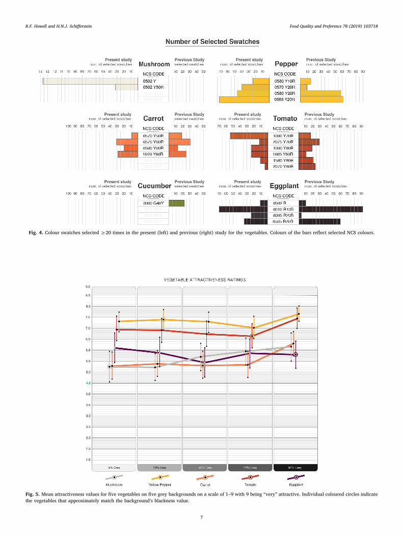
Fig. 4. Colour swatches selected ≥20 times in the present (left) and previous (right) study for the vegetables. Colours of the bars reflect selected NCS colours.
Fig. 5. Mean attractiveness values for five vegetables on five grey backgrounds on a scale of 1–9 with 9 being “very” attractive. Individual coloured circles indicatethe vegetables that approximately match the background’s blackness value.
B.F. Howell and H.N.J. Schifferstein Food Quality and Preference 78 (2019) 103718
7

on the 90% background and differed significantly from 30%, 50% and65% blackness [p < 0.05], but not from the 5% background[p > 0.20]. The ratings for the eggplant and the bell pepper did notdiffer significantly among the five different backgrounds [F-test,p > 0.15].
4. Discussion
4.1. Effect of backgrounds on vegetable colour perception
Participants assessed perceived vegetable colours using a colourmatching task. In the previous study, it was found that the backgroundshad no effect on vegetable colour perception. In the current study suchan effect was only found for the carrot. However, these differences werequite small and subtle and are unlikely to account for the more pro-nounced effects found in the product evaluation judgments. Theseoutcomes align with expectations that neutral grey backgrounds shouldhave minimal effect on perceived colour of the presented vegetables.
If we compare the colour matches that we obtained for the differentvegetables in the two studies, Fig. 4 indicates that the colour matcheswere quite similar in both studies for the bell pepper, the carrot, and theeggplant. However, for the tomato the differences between the twostudies seem to stand out more. These differences are not necessarilydue to methodological differences, but may simply reflect naturalcolour deviations that may be due to geographical or seasonal influ-ences, disparities in ripening stages, or changes in skin moisture con-tent.
4.2. Effect of backgrounds on vegetable attractiveness ratings
For each vegetable, the effects of the light grey to dark grey back-grounds in the present study on the attractiveness scale ratings varied
between 0.3 and 1.0, whereas in the previous study the effects of lightand dark blue and orange backgrounds were larger and varied between2.0 and 3.6. This comparison suggests that the effects on perceivedattractiveness may be much larger for vegetables presented on back-grounds that include differences in hue and saturation than back-grounds that differ only in blackness.
An important goal of the present study was to find a suitablebackground colour that multiple different coloured vegetables could beattractively presented on. In both the present and previous study, theattractiveness response scales were identical and four of five of thevegetables were the same species. The primary difference between thetwo studies were the hued versus neutral grey backgrounds. Assessingthe aggregate outcomes from these two studies could demonstrate thatmultiple vegetables will be found generally more attractive when as-sessed on neutral grey backgrounds than on hued backgrounds.Therefore, we also calculated the mean attractiveness ratings for thevegetables, averaged over the various backgrounds in the two studies.
Table 1 shows that mean attractiveness ratings were more extremeon the hued backgrounds than on the grey backgrounds, yielding lowerminimum values, but also yielding higher maximum values. However,on average over the various backgrounds, the mean attractivenessratings for the four common vegetables in the studies was 6.0 for thehued background and 6.4 for the grey backgrounds. This suggests that,on average, backgrounds with neutral colours are more likely to presentmultiple vegetables in an attractive way than hued backgrounds.
In general, the attractiveness of vegetables seems to be highest forthe background with the highest blackness level. This finding is in linewith previous studies reporting that the colour black was associatedwith high quality and expensiveness in multiple contexts (Amsteuset al., 2015). Fig. 5 shows that attractiveness ratings for vegetables ongrey backgrounds with 5–65% blackness vary somewhat, but do notshow a consistent trend; the means aggregated over vegetables ranged
Fig. 6. Mean expensiveness ratings for five vegetables on five grey backgrounds on a scale of 1–9 with 9 being “very” expensive. Individual coloured circles indicatethe vegetables that approximately match the background’s blackness value.
B.F. Howell and H.N.J. Schifferstein Food Quality and Preference 78 (2019) 103718
8

between 6.1 and 6.2. For the background with the highest blacknesslevel (90%) the aggregate mean was 6.7, which is a notable increasecompared to the previous values. In the previous study with the huedbackgrounds, overall attractiveness means increased monotonicallyfrom 5.6 (light orange, 24% blackness), 6.0 (light blue, 31%), 6.0 (darkorange, 69%), to 6.4 (dark blue, 78%). This suggests that darkerbackground colours will yield higher attractiveness ratings over avariety of vegetables than lighter colours.
Originally, we started out from the blackness contrast hypothesissuggesting that vegetables would look the least attractive when theircolours had blackness levels close to the backgrounds on which theywere presented, while expecting higher attractiveness ratings with in-creasingly lighter or darker backgrounds. Although we found high at-tractiveness ratings for vegetables presented on the darkest back-ground, we did not obtain high ratings for the lightest background. Thisoutcome deviates from Helson and Lansford’s (1970) original study,which reported the highest pleasantness ratings on the white back-ground. Maybe the discrepancy in results may be due to fact that theoriginal colour studies were performed with 2D colour samples,whereas the target stimuli in the current study are 3D objects on a flatsurface. Possibly darker backgrounds make the 3D products look moreattractive, because dark colours do not reflect or reveal shadows asmuch as lighter colours. As a consequence, the vegetable’s form orsilhouette will be easier for the participant to read and understandwhen it is on a darker background. A vegetable placed on a lightbackground will reveal its single or multiple shadows, as well as itsform and colour reflection directly beneath the object. The visualcleanness or purity of form that participants visually perceive withobjects on darker backgrounds could contribute to the perceived at-tractiveness.
Remarkably, white plates tend to be more common for presentingprepared dishes than black plates in restaurants. This makes us wonderwhether prepared food perhaps looks better on white plates than onblack plates, even though the raw vegetables in our study did not lookmore attractive on the lighter backgrounds? If so, would this effect bedue to differences in size and shape, or the fact that prepared food doesnot cast so many shadows on plates than raw food? Or is it because thesurface textures of prepared foods are less shiny than those of raw foodsand that their texture contrasts with the shiny surface of the porcelainplate? This could be an interesting topic for a follow-up study.
The high attractiveness ratings on darker backgrounds may be re-lated to the perceived premiumness of such vegetables, that is reflectedin the increased expensiveness ratings on the 90% darkness back-ground. When consumers encounter a package design it elicits cogni-tive, affective and behavioural responses that causes the consumer tointerpret the quality and authenticity of the product. Colour choice inpackaging can evoke a premium or generic brand perception and costcorrelation (Mastropietro von Rautenkrantz, 2016; Mugge, Massink,Hultink, & van den Berg-Weitzel, 2014). Hence, if premium associationsare preferred, designers might explore integrating darker backgroundsin the design. In contrast, if designers develop packaging for a low-cost
product, they might explore utilizing a lighter background. The sameprinciples could potentially be incorporated in larger displays of ve-getables.
4.3. Differences in attractiveness and expensiveness ratings betweenvegetables
Fig. 5 shows that certain vegetables generally rate more attractivethan others. The bell pepper rates highest on all backgrounds (seeTable 1) and is mirrored by the tomato. The other three vegetables areperceived as less attractive, with the carrots obtaining the lowest meanrating. These attractiveness ratings deviate substantially from the con-sumption frequencies and the taste liking data that the participantsreported (see 2.2 Stimuli), which generally showed the highest pre-ference for carrots, followed by yellow peppers and tomatoes, thenmushrooms, and the lowest liking for eggplants. Hence it is clear thatattractiveness judgments deviate substantially from taste preferences.
Differences in attractiveness ratings are probably related to the vi-sual properties of vegetables and how people tend to evaluate these.The appearance of agricultural products is normally evaluated byconsidering size, shape, form, colour, freshness, and the absence ofvisual defects (Costa et al., 2011; Schifferstein et al., 2019). Researchhas indicated that a food’s surface colour is the first sensation a con-sumer perceives and uses to accept or reject the product (León, Mery,Pedreschi, & León, 2006). Note that the food colours consumers judgeas acceptable may depend on their age, ethnicity, and the context inwhich the products are encountered (Francis, 1995). Although thesevisual properties could explain differences in attractiveness betweenproduct variants of the same species, we think that not all of theseproperties are likely to account for differences between species.
An explanation that might explain the differences between productspecies could perhaps be found in the physiology of how the humanmind processes colours. The primary colours (saturated red, green,blue, and yellow) have been shown to receive preferential cognitiveprocessing and thereby capture our attention faster. Attention capturestudies have shown that red and yellow are tracked fastest, while ittakes more time to find orange and purple (Andersen & Maier, 2017).The yellow pepper and red tomato have saturated primary colours,while the orange carrot carries a saturated secondary colour. The egg-plant contains a dark, unsaturated red-purple, while the mushroom hasa light, unsaturated yellow tinted grey. The hierarchy of colours inattentional capture observations correlates with the attractivenesshierarchy of the vegetables carrying the saturated colours. Hence, itmight be interesting to explore this idea further in subsequent studies.
Physical properties such as surface texture and gloss could also haveinfluenced attractiveness ratings. The lower performers have roughertextures and matt finishes (carrot and mushroom), while the top per-formers (bell pepper, tomato) have smooth textures and glossy surfaces.Human beings are attracted to glossy objects and our preference forshine has been associated with people’s basic need for water (Meert,Pandelaere, & Patrick, 2014). Produce that is freshly harvested often
Table 1Mean attractiveness ratings for multiple vegetables presented on different background colours in two studies with grey (current study) or hued (Schifferstein et al.,2017) backgrounds. We show the smallest value, the mean value, the largest value, and the difference between the two extreme values for each study.
Grey backgrounds Hued backgrounds
Minimum Mean of 5 Maximum Difference Minimum Mean of 4 Maximum Difference
Mushroom 5.2 5.7 6.2 1.0 – – –Yellow pepper 7.0 7.3 7.7 0.6 4.0 6.2 7.6 3.6Carrot 5.3 5.5 6.3 1.0 4.4 6.0 7.7 3.3Cucumber – – – 4.4 6.1 8.0 3.5Tomato 6.7 7.0 7.5 0.8 5.0 6.1 7.0 2.0Eggplant 5.8 5.8 6.1 0.3 3.7 5.7 7.3 3.6Mean of 4 common vegetables 6.2 6.4 6.9 0.7 4.4 6.0 7.4 3.1
B.F. Howell and H.N.J. Schifferstein Food Quality and Preference 78 (2019) 103718
9

has a bright, glossy surface and is found to be both desirable and pre-ferred to a dried appearance. The brightness of colour and the absenceof visual defects or drip also indicate freshness (Pathare, Opara, & Al-Said, 2013). That the higher performing vegetables had both highsurface gloss and saturated colours could have influenced the attrac-tiveness ratings.
Another possible factor could involve the inclusion or exclusion ofthe vegetable stem. The yellow pepper, tomato, and eggplant retainedtheir normal stems, which were easily visible. The carrot’s green leaveswere removed so the large mass of green would not affect the percep-tion of the orange colour of the carrot, but approximately 1 cm of thestem was left attached to the carrot. The mushroom stem was removedso it would lay flat on the background (Fig. 1). Vegetable stems can adda highlight of complementary colour that could contrast with the mainvegetable colour, which could make the whole more attractive.
Besides attractiveness we also studied expensiveness ratings. Theseratings may partly reflect the actual retail prices of each piece of ve-getable at the time of the study. The mushroom ($ 0.14) and the carrot($ 0.20) are low in price and received the lowest expensiveness ratings,while the tomato ($ 0.40–0.80), the bell pepper ($ 0.88) and the egg-plant ($ 1.49) are more expensive and obtained higher ratings. In ad-dition, the mushroom and the carrot both have rougher, matte surfaces,whereas the other three vegetables all have a shiny, glossy surface. Thismight also partly be a factor that affects their expensiveness ratings,since many expensive materials like precious metals and stones haveshiny surfaces.
Although expensiveness ratings had the lowest correlation with at-tractiveness ratings of all the variables assessed in the study (Pearsonr= 0.44), the patterns of means displayed in Figs. 5 and 6 show severalsimilarities. For instance, ratings tend to be highest for vegetables dis-played on the darkest background for both dependent variables. How-ever, this effect seems more pronounced in the expensiveness ratingsthan in the attractiveness ratings. Furthermore, for both measures theeggplant and the bell pepper do not produce significant differencesbetween the five backgrounds, whereas the other vegetables do.
4.4. Methodological limitations and suggestions for future research
Measuring highly reflective 3-dimensional curved surfaces on mul-tiple vegetables and incorporating digital software tools to interprettheir blackness values naturally lead to human judgement choices infinal measurements. The experimenters were conscientious of this anddid their best to be consistent in methods and technology use, butnonetheless, biases may have occurred in some of the measurements(see 2.3 Backgrounds).
Although we mainly focused on the colours of the products we in-vestigated, proportional variations between the various vegetable sizesand shapes and the standardized background sizes could have an im-pact on participants’ perceptions and responses. The eggplant is sig-nificantly larger than the mushroom, while all backgrounds were thesame size. The smaller vegetables like the carrot allowed the back-ground colour to be seen both behind and in front of the carrot, whereasthe eggplant was tall enough that the back wall of the viewing boothwas seen on the far side of the vegetable rather than the colouredbackground.
The present study shows again that theories developed for thecolour perception of 2D stimuli do not seem to hold for real worldobjects that are not only 3D, but also differ on many more aspects, suchas size, shape, and surface properties. Hence, investigating the im-plications of colour evaluations in realistic contexts is necessary tounderstand the complex world that people live in. In order to in-vestigate the impact of these factors, the current research could beextended with objects in a single colour that differ in size and shape,and possibly also in glossiness, while presenting them on a number ofgrey backgrounds. In addition, the characteristics of the background(e.g., matte versus glossy) could vary.
Grobelny and Michalski (2015) determined consumer preferencesfor product packages displaying a black mobile phone on a neutral greyversus a pinkish grey colour. In this study, participants did not judgethe attractiveness of the phone by itself, but the attractiveness of thephone and its background simultaneously. These authors found a largeeffect of gender, with women preferring the pinkish grey and menpreferring the neutral grey package colour. The study also suggests thatthe package background colour factor was markedly more important tomen than to women in determining their preferences. Because pink isoften associated with femininity, the men probably do not like thepinkish grey, because they do not want to be associated with a femininepackage, while for women both packages would be acceptable. In theirstudy, the focus is not so much on the physical properties of the colours,but more on the meaning of these colours to the participants. Just likethe evaluations of expensiveness in our study, future studies could focusnot only on perceived attractiveness, but could include more aspectsthat reflect what colours signify to potential consumers.
Although objects that show more blackness contrast stand out moreand tend to be preferred, Reynolds-McIlnay et al. (2017) found that thispreference tended to be reversed when the target products appeared indisarray. Apparently, sales and purchase likelihood can decrease whenattention is drawn to a negative product attribute (Areni, Duhan, &Kiecker, 1999). This suggests that when products stand out more,consumers are also more likely to notice any irregularities or blemishes,which could then affect their evaluation and purchase probability ne-gatively.
In the current study, the participants were mainly students vo-lunteering to participate. In future studies we could expand our parti-cipant sample to include consumer groups varying in concerns or eatingpatterns (e.g., health-conscious, vegetarian, vegan, raw consumption)to determine how their preferences and product evaluations are af-fected by displaying products on different background colours.
5. Conclusion
It would be commercially interesting to demonstrate that certainbackground colours would increase attractiveness perceptions of ve-getables. This study, while not conclusive, has exposed how light todark neutral greys could influence how fresh foods are presented byretailers and perceived by consumers in a variety of food related en-vironments. The finding that consumers generally find vegetables moreattractive on very dark backgrounds may be of direct relevance tocurrent food retailers. Designers may utilize these insights to improvevegetable packaging or presentation to effectively achieve the mar-keting goals of food industry managers. As industry and consumersachieve clarity in the effects of visual messaging related to colour, ourgeneral well-being could be enhanced by both enabling healthy eatingand enhancing the commercial outcomes of food retailers and services.
Acknowledgements
The authors are indebted to Camilla Stark, Hannah Cardall, SarahSkriloff, and Joshua Seibert for their assistance in conducting the ex-periment.
Appendix A. Supplementary data
Supplementary data to this article can be found online at https://doi.org/10.1016/j.foodqual.2019.05.018.
References
Adams, S. (2013). How to rescue NHS food? Put it on a blue plate: Simple switch hashelped elderly and weak patients eat nearly a third more. Retrieved from http://www.dailymail.co.uk/news/article-2520058/How-rescue-NHS-food-Put-blue-plate-Simple-switch-helped-elderly-weak-patients-eat-nearly-more.html#ixzz4BhrHe87W.
B.F. Howell and H.N.J. Schifferstein Food Quality and Preference 78 (2019) 103718
10

Amsteus, M., Al-Shaaban, S., Wallin, E., & Sjöqvist, S. (2015). Colors in marketing: Astudy of color associations and context (in)dependence. International Journal ofBusiness and Social Science, 6(3), 32–45.
Andersen, E., & Maier, A. (2017). The attentional capture of colour in visual interfacedesign: a controlled environment study. In Paper presented at the 21st InternationalConference on Engineering Design (ICED17), Vancouver, Canada.
Areni, C. S., Duhan, D. F., & Kiecker, P. (1999). Point-of-purchase displays, product or-ganization, and brand purchase likelihoods. Journal of the Academy of MarketingScience, 27(4), 428–441.
Bottomley, P. A., & Doyle, J. R. (2006). The interactive effects of colors and products onperceptions of brand logo appropriateness. Marketing Theory, 6(1), 63–83.
Brown, R. O., & MacLeod, D. I. A. (1997). Color appearance depends on the variance ofsurround colors. Current Biology, 7, 844–849.
Costa, C., Antonucci, F., PallottinoJ, F., Aguzzi, J., Sun, D.-W., & Menesatti, P. (2011).Shape analysis of agricultural products: A review of recent research advances andpotential application to computer vision. Food and Bioprocess Technology, 4(5),673–692.
Creusen, M. E. H., & Schoormans, J. P. L. (2005). The different roles of product ap-pearance in consumer choice. Journal of Product Innovation Management, 22, 63–81.
De Groote, H., & Kimenju, S. C. (2008). Comparing consumer preferences for color andnutritional quality in maize: Application of a semi-double-bound logistic model onurban consumers in Kenya. Food Policy, 33(4), 362–370.
Feisner, E. A., & Reed, R. (2014). Color studies. New York, NY: Fairchild.Francis, F. J. (1995). Quality as influenced by color. Food Quality and Preference, 6(3),
149–155.Grobelny, J., & Michalski, R. (2015). The role of background color, interletter spacing,
and font size on preferences in the digital presentation of a product. Computers inHuman Behavior, 43, 85–100.
Hård, A., & Sivik, L. (1981). NCS – Natural Color System: A Swedish standard for colornotation. Color Research and Application, 6, 129–138.
Harrar, V., Piqueras-Fiszman, B., & Spence, C. (2011). There’s more to taste in a colouredbowl. Perception, 40(7), 880–882.
Helson, H., & Lansford, T. (1970). The role of spectral energy of source and backgroundcolor in the pleasantness of object colors. Applied Optics, 7, 1513–1562.
Hering, E. (1964). Outlines of a theory of the light sense. Cambridge MA: Harvard UniversityPress.
Holmes, C. B., & Buchanan, J. (1984). Color preference as a function of the object de-scribed. Bulletin of the Psychonomic Society, 22, 423–425.
Howell, B., Marin, E., & Kook, S. J. (2014). The effects of context in product color testing.Paper presented at the 9th International Conference on Design and Emotion 2014. Bogota,Colombia: The Colors of Care.
Itten, J. (1970). The elements of color. New York, NY: Van Nostrand Reinhold.Kuehni, R. G., & Schwarz, A. (2008). Color ordered: A survey of color systems from antiquity
to the present. New York, NY: Oxford University Press.Lee, S.-M., Lee, K.-T., Lee, S.-H., & Song, J.-K. (2013). Origin of human colour preference
for food. Journal of Food Engineering, 119, 508–515.León, K., Mery, D., Pedreschi, F., & León, J. (2006). Color measurement in L∗a∗b∗ units
from RGB digital images. Food Research International, 39(10), 1084–1091.Lotto, R. B., & Purves, D. (2000). An empirical explanation of color contrast. Proceedings
of the National Academy of Sciences, 97(23), 12834–12839.Lyons, S. J., & Wien, A. H. (2018). Evoking premiumness: How color-product congruency
influences premium evaluations. Food Quality and Preference, 64, 103–110.Mastropietro von Rautenkrantz, M. (2016). Colour in food packaging strategies and rules.
Cultura e Scienza del Colore – Color Culture and Science, 5, 21–30.Meert, K., Pandelaere, M., & Patrick, V. M. (2014). Taking a shine to it: How the pre-
ference for glossy stems from an innate need for water. Journal of ConsumerPsychology, 24(2), 195–206.
Merriam-Webster (2004). Collegiate dictionary (11th ed.). MA: Springfield.Milosavljevic, M., Navalpakkam, V., Koch, C., & Rangel, A. (2012). Relative visual sal-
iency differences induce sizable bias in consumer choice. Journal of ConsumerPsychology, 22(1), 67–74.
Mugge, R., Massink, T., Hultink, E. J., & van den Berg-Weitzel, L. (2014). Designing apremium package: Some guidelines for designers and marketers. The Design Journal,17(4), 583–605.
Pathare, P. B., Opara, U. L., & Al-Said, F. A.-J. (2013). Colour measurement and analysisin fresh and processed foods: A review. Food and Bioprocess Technology, 6(1), 36–60.
Piqueras-Fiszman, B., Alcaide, J., Roura, E., & Spence, C. (2012). Is it the plate or is it thefood? Assessing the influence of the color (black or white) and shape of the plate onthe perception of the food placed on it. Food Quality and Preference, 24(1), 205–208.
Piqueras-Fiszman, B., Giboreau, A., & Spence, C. (2013). Assessing the influence of thecolor of the plate on the perception of a complex food in a restaurant setting. Flavour,2(1), 1–11. https://doi.org/10.1186/2044-7248-2-24.
Reynolds-McIlnay, R., Morrin, M., & Nordfält, J. (2017). How product–environmentbrightness contrast and product disarray impact consumer choice in retail environ-ments. Journal of Retailing, 93(3), 266–282.
Schifferstein, H. N. J., Howell, B. F., & Pont, S. C. (2017). Colored backgrounds affect theattractiveness of fresh produce, but not it’s perceived color. Food Quality andPreference, 56(Part A), 173–180.
Schifferstein, H. N. J., Wehrle, T., & Carbon, C.-C. (2019). Consumer expectations forvegetables with typical and atypical colors: The case of carrots. Food Quality andPreference, 72, 98–108.
Schloss, K. B., & Palmer, S. E. (2011). Aesthetic response to color combinations:Preference, harmony, and similarity. Attention, Perception & Psychophysics, 73,551–571.
Siple, P., & Springer, R. M. (1983). Memory and preference for the colors of objects.Perception & Psychophysics, 34, 363–370.
Stevens, J. P. (2002). Applied multivariate statistics for the social sciences (4th ed.). Mahwah,NJ: Erlbaum.
Ware, C. (2008). Visual thinking for design. Burlington, MA: Morgan Kaufmann.
B.F. Howell and H.N.J. Schifferstein Food Quality and Preference 78 (2019) 103718
11