How Information Visualization Novices Construct Visualizations · How Information Visualization...
10
How Information Visualization Novices Construct Visualizations Lars Grammel, Melanie Tory, and Margaret-Anne Storey Abstract—It remains challenging for information visualization novices to rapidly construct visualizations during exploratory data analysis. We conducted an exploratory laboratory study in which information visualization novices explored fictitious sales data by communicating visualization specifications to a human mediator, who rapidly constructed the visualizations using commercial visualization software. We found that three activities were central to the iterative visualization construction process: data attribute selection, visual template selection, and visual mapping specification. The major barriers faced by the participants were translating questions into data attributes, designing visual mappings, and interpreting the visualizations. Partial specification was common, and the participants used simple heuristics and preferred visualizations they were already familiar with, such as bar, line and pie charts. From our observations, we derived abstract models that describe barriers in the data exploration process and uncovered how information visualization novices think about visualization specifications. Our findings support the need for tools that suggest potential visualizations and support iterative refinement, that provide explanations and help with learning, and that are tightly integrated into tool support for the overall visual analytics process. Index Terms—Empirical study, visualization, visualization construction, visual analytics, visual mapping, novices. 1 I NTRODUCTION Information visualization (InfoVis) is becoming a mainstream technology that is being utilized by InfoVis novices – those who are not familiar with information visualization and visual data analysis. Sites such as Many Eyes [37] enable anyone to upload and visualize data, and systems that fall under the umbrella of casual InfoVis provide visualizations in everyday life [30]. Despite this progress, the vision of InfoVis for and by the masses has not yet been realized [14, 17]. Part of the reason for this is that constructing perceptually effective visualizations, and even interpreting moderately complex ones, remains challenging for InfoVis novices. Interacting with visualizations has become easier with recent tools such as Many Eyes, Tableau etc. However, many potential users that could benefit from these tools lack visualization construction expertise. In particular, it has been noted that users have difficulties deciding how to map data elements to graphic attributes [14]. This is especially problematic because selecting inappropriate visual mappings can impede analysis and even result in misleading conclusions. It is therefore important to provide tool support that enables InfoVis novices to design good visual mappings easily [14]. To create such tool support, we need to understand how InfoVis novices think about and express visual mappings, which barriers they encounter, and how this impacts the sensemaking process. Once the specific characteristics of visual mapping expression are uncovered, we can build tools that specifically support this process, for example by reducing discovered barriers. Such tools could potentially enable a larger audience to leverage visual data exploration and analysis for decision-making and insight generation, both in work and in daily life. While general models of the visualization process have been proposed (e.g. [3, 5, 35, 38]), it remains unclear how these models apply to visualization construction by InfoVis novices, and exactly how a lack of visualization expertise impacts sensemaking. To explore this in detail, we designed an exploratory laboratory study that investigated which processes novices typically follow during visualization construction, which common patterns appear, and which barriers and problems InfoVis novices encounter. Our work makes three primary contributions: first, we empirically examine how information visualization novices construct visualizations; second, we derive abstract models describing barriers in the data exploration process and how information visualization novices think about visualization specifications, and finally, we provide implications for tool design based on our findings and models. 2 RELATED WORK There are several models of information visualization processes that describe the different steps users follow in configuring and using visualizations to gain insights. Card et al.’s reference model for visualization ([3], see Fig.1) describes how visualizations are created in four steps and how the user interprets and interacts with visualizations. First, raw data are processed and transformed into data tables (data transformations). Data tables can be further transformed, for example by filtering, adding calculations, and merging tables. The resulting data tables are then mapped to visual structures (visual mappings), which are generic visual representation mechanisms such as line charts or maps with their corresponding visual properties. After the data tables are mapped to visual structures, views of the visual structures can be rendered and displayed to the user. Different views show different parts of the visual structures at varying levels of abstraction from different perspectives. View transformations are operations that change those views, e.g. zooming on a map can change the visible part of the map and the level of detail, but does not change the visual structure. The user interprets the views with a task in mind, and can interact with the visualization by changing data transformations, visual mappings and the current view. Chi’s Data State Model [6] extends and formalizes Card’s reference model by allowing for multiple pipelines, and by having nodes represent state and directed edges represent single transformations operations. Chi also analyzed different visualization techniques and showed how they fit into the Data State Model [5]. Spence [35] identified selection, encoding, and presentation as the main steps in the transformation from raw data to visualization. Ware [38] devised a model of the visualization process that explicitly takes data gathering into account, but does not distinguish between data tables, visual structures, and views. Ware’s model contains four stages: collection and storage of data, data pre-processing, construction of image, and the human perceptual and cognitive system. • Lars Grammel is with the University of Victoria, E-Mail: [email protected]. • Melanie Tory is with the University of Victoria, E-Mail: [email protected]. • Margaret-Anne Storey is with the University of Victoria, E-Mail: [email protected]. Manuscript received 31 March 2010; accepted 1 August 2010; posted online 24 October 2010; mailed on 16 October 2010. For information on obtaining reprints of this article, please send email to: [email protected].
Transcript of How Information Visualization Novices Construct Visualizations · How Information Visualization...

How Information Visualization Novices Construct Visualizations
Lars Grammel, Melanie Tory, and Margaret-Anne Storey
Abstract—It remains challenging for information visualization novices to rapidly construct visualizations during exploratory data
analysis. We conducted an exploratory laboratory study in which information visualization novices explored fictitious sales data by
communicating visualization specifications to a human mediator, who rapidly constructed the visualizations using commercial
visualization software. We found that three activities were central to the iterative visualization construction process: data attribute
selection, visual template selection, and visual mapping specification. The major barriers faced by the participants were translating
questions into data attributes, designing visual mappings, and interpreting the visualizations. Partial specification was common, and
the participants used simple heuristics and preferred visualizations they were already familiar with, such as bar, line and pie charts.
From our observations, we derived abstract models that describe barriers in the data exploration process and uncovered how
information visualization novices think about visualization specifications. Our findings support the need for tools that suggest
potential visualizations and support iterative refinement, that provide explanations and help with learning, and that are tightly
integrated into tool support for the overall visual analytics process.
Index Terms—Empirical study, visualization, visualization construction, visual analytics, visual mapping, novices.
1 INTRODUCTION
Information visualization (InfoVis) is becoming a mainstream technology that is being utilized by InfoVis novices – those who are not familiar with information visualization and visual data analysis. Sites such as Many Eyes [37] enable anyone to upload and visualize data, and systems that fall under the umbrella of casual InfoVis provide visualizations in everyday life [30]. Despite this progress, the vision of InfoVis for and by the masses has not yet been realized [14, 17]. Part of the reason for this is that constructing perceptually effective visualizations, and even interpreting moderately complex ones, remains challenging for InfoVis novices.
Interacting with visualizations has become easier with recent tools such as Many Eyes, Tableau etc. However, many potential users that could benefit from these tools lack visualization construction expertise. In particular, it has been noted that users have difficulties deciding how to map data elements to graphic attributes [14]. This is especially problematic because selecting inappropriate visual mappings can impede analysis and even result in misleading conclusions. It is therefore important to provide tool support that enables InfoVis novices to design good visual mappings easily [14]. To create such tool support, we need to understand how InfoVis novices think about and express visual mappings, which barriers they encounter, and how this impacts the sensemaking process. Once the specific characteristics of visual mapping expression are uncovered, we can build tools that specifically support this process, for example by reducing discovered barriers. Such tools could potentially enable a larger audience to leverage visual data exploration and analysis for decision-making and insight generation, both in work and in daily life.
While general models of the visualization process have been proposed (e.g. [3, 5, 35, 38]), it remains unclear how these models apply to visualization construction by InfoVis novices, and exactly how a lack of visualization expertise impacts sensemaking. To explore this in detail, we designed an exploratory laboratory study that investigated which processes novices typically follow during
visualization construction, which common patterns appear, and which barriers and problems InfoVis novices encounter.
Our work makes three primary contributions: first, we empirically examine how information visualization novices construct visualizations; second, we derive abstract models describing barriers in the data exploration process and how information visualization novices think about visualization specifications, and finally, we provide implications for tool design based on our findings and models.
2 RELATED WORK
There are several models of information visualization processes that describe the different steps users follow in configuring and using visualizations to gain insights. Card et al.’s reference model for visualization ([3], see Fig.1) describes how visualizations are created in four steps and how the user interprets and interacts with visualizations. First, raw data are processed and transformed into data tables (data transformations). Data tables can be further transformed, for example by filtering, adding calculations, and merging tables. The resulting data tables are then mapped to visual structures (visual mappings), which are generic visual representation mechanisms such as line charts or maps with their corresponding visual properties. After the data tables are mapped to visual structures, views of the visual structures can be rendered and displayed to the user. Different views show different parts of the visual structures at varying levels of abstraction from different perspectives. View transformations are operations that change those views, e.g. zooming on a map can change the visible part of the map and the level of detail, but does not change the visual structure. The user interprets the views with a task in mind, and can interact with the visualization by changing data transformations, visual mappings and the current view.
Chi’s Data State Model [6] extends and formalizes Card’s reference model by allowing for multiple pipelines, and by having nodes represent state and directed edges represent single transformations operations. Chi also analyzed different visualization techniques and showed how they fit into the Data State Model [5]. Spence [35] identified selection, encoding, and presentation as the main steps in the transformation from raw data to visualization. Ware [38] devised a model of the visualization process that explicitly takes data gathering into account, but does not distinguish between data tables, visual structures, and views. Ware’s model contains four stages: collection and storage of data, data pre-processing, construction of image, and the human perceptual and cognitive system.
• Lars Grammel is with the University of Victoria, E-Mail: [email protected].
• Melanie Tory is with the University of Victoria, E-Mail: [email protected].
• Margaret-Anne Storey is with the University of Victoria,
E-Mail: [email protected].
Manuscript received 31 March 2010; accepted 1 August 2010; posted online
24 October 2010; mailed on 16 October 2010.
For information on obtaining reprints of this article, please send
email to: [email protected].

Several aspects of these visualization models, such as view interaction (e.g. [19, 34, 40]), individual analytical processes (e.g. [1, 12, 29]), and team level analytics (e.g. [16, 32]), have been explored in depth, but an understanding of how users construct visual mappings remains limited. Several case studies present how visualizations are created from a designer’s point of view [31] or as a close interaction between designers and users [39]. These studies found that an iterative process of prototyping visualizations is essential: detours are often unavoidable and can provide valuable knowledge. While these studies provide insights into the visualization construction process, they assume experts create the visualizations for users, whereas our study focused on how InfoVis novices create visualizations for their own use. This shifts the focus from facilitating communication and iterative domain understanding to bridging gaps caused by a lack of visualization expertise. Heer et al. [14] devised some guidelines on how to support novice users: facilitate user-friendly data input, provide automatic selection of visualization type using sensible defaults, and provide contextual information that explains which data are displayed and which encodings are used. Our study corroborates these guidelines with empirical evidence and provides suggestions for additional tool support features.
In summary, we offer several contributions beyond existing work. We build a model of how InfoVis novices think about visualization specifications and how they construct visualizations. We also provide design guidelines for tool support to help novices create visualizations. We note that our model and design guidelines are based on empirical evidence.
3 METHODOLOGY
In this section, we discuss our study design, its limitations and the design choices we made. Our research goal was to explore how InfoVis novices construct visualizations, and specifically to understand the processes used in mapping data elements to visualization attributes. We define InfoVis novices as those who are not familiar with information visualization and visual data analysis beyond the charts and graphics encountered in everyday life. InfoVis novices can be domain experts in their area of expertise (subject matter experts) and the data they are analyzing can be from this area. Our research question is:
How do InfoVis novices construct visualizations during visual data exploration?
We conducted an exploratory observational study in a laboratory setting with a human mediator who used the visualization construction software on behalf of the participants. Because InfoVis novices are typically not exposed to advanced visualization tools and are unlikely to perform many in-depth visual analytics tasks, field studies and survey research were not viable strategies. We chose to let participants construct and analyze real visualizations, because we believe that actually seeing the underlying data rendered in the specified visualizations provides essential feedback for designing visual mappings. Creating and refining visualization through a mediator was less dynamic than direct interaction with visualization tools, and this might have impacted the observed process. While we believe that such direct interaction would be more iterative and
dynamic, we argue that elements of the process will be the same, and that by introducing communication with a mediator, we achieved deeper insight into how users think about visualizations, similar to a think-aloud protocol.
3.1 Pilot Studies
The study design was shaped in a series of five pilot studies with four participants – the same person participated in the first two pilots. In the first pilot, the participant directly used Tableau Desktop 4.1. It turned out that the user interface and instructions influenced the participants’ behaviour, and we could not determine whether problems occurred because of the interface or lack of understanding of how to create visual mappings. After the first pilot, we switched to an approach where the participants told a human mediator how they wanted the data to be visualized, and the mediator in turn created the visualizations for the participants. In contrast to Wizard-of-Oz approaches, participants were aware that the visualizations were created by a human mediator, and the goal was not to simulate a system, but to shield participants from the tool interface. By hiding the interface, we aimed to reduce tool and instruction bias while preserving the iterative loop of constructing, seeing and refining visualizations. In the last three pilots and in the study, the mediator was in a different room and used predefined messages to communicate with the participant to further reduce the influence on the participants’ behaviour.
Similar to the influence of the software interface, we found in the first two pilots that the task questions strongly influenced the visualization construction process and which visualizations were constructed, and participants focused too much on understanding the specific questions. To remove the influence of the questions, we switched to an open data exploration task after the first two pilots. We improved the setup further in the last three pilots by adding a board with visualization samples, improving and standardizing how the human mediator responded, and refining the predefined messages as well as the task instructions.
3.2 Participants
Nine 3rd and 4th year business students participated in the study (see Table 1 for details). To recruit participants, we announced our study in four business classes, posted to two business student mailing lists and put up flyers on bulletin boards across campus. Although the number of participants may seem low, we believe it is appropriate for our exploratory research approach, because our findings were saturated in the 150 visualization construction cycles (see Section 3.7) that were our unit of analysis.
The participants were between 20 and 24 years old with a median age of 21. The participants had been using computers between 8 and 18 years (median 11). All participants used computers for at least 1 hour per day, and often more. The frequency of how often participants performed data analysis varied from daily to never. 7 out of 9 participants reported that they were familiar with statistics, but only 3 used statistics regularly. All participants were familiar with graphs and charts.
We chose participants with no specific experience in visualization and with backgrounds that supported the understanding of basic
Participant ID 1 2 3 4 5 6 7 8 9
Age 22 22 21 23 20 21 24 20 21
Gender M F F F F F M F F
DA D D W M M N W N W
# VCCs 13 11 18 18 22 13 29 18 8
Table 1. Participants.
Data Analysis (DA) performed Daily (D), Weekly (W), Monthly (M),
Never (N). #VCCS indicates number of visualization construction
cycles created by participant (see Section 3.7).
Fig.1. Visualization Reference Model by Card et al. [3]. The aspects
that were investigated in this study are emphasized.

business data, because our data set contained sales data. We recognize that selecting business students limits the generalizability of our results. Nevertheless, we believe that our results are similar to other groups of InfoVis novices, because the impact of the data set and domain on the visual mapping process itself is limited. Also, while we did not observe significant inter-participant variations on the level of visualization construction cycles (see Section 3.7), it is possible that individual differences such as cognitive style [20] influenced the visualization construction behaviour, as variations have been observed by Kang et al. [18] for the sensemaking process.
3.3 Procedure
For each participant, there was a separate study session that lasted about 1 hour and 45 minutes. It started with a computer-based background survey. Next, the materials for the observation phase, i.e. the sample visualizations, the task instructions, the visualization cheat sheet, and the data attributes were explained. The participant was invited to ask questions, and was given a 5 minute training phase to become familiar with the procedure. The goal of the training phase was to reduce the influence of learning. We still observed minor learning effects in some sessions, but those were usually limited to the first few minutes and participants were able to construct visualizations during that time. After the training phase, we observed how the participant created and analyzed visualizations for 45 minutes. Participants were encouraged to verbalize their thoughts. The study session concluded with a follow-up interview, in which we asked the participant about any encountered problems and the created visualizations. The interview was also used to clarify any other observations made during the observation phase.
3.4 Setting and Apparatus
Participants were seated in a usability lab throughout the procedure. The two operators were in a control room linked by video and audio, except while the initial instructions were being given. The participants’ workspace (see Figure 2) consisted of a 19’’ LCD monitor that was used to display the constructed visualizations, a board with 16 example visualizations, a notepad and three colored pens. The participants were observed using cameras and a microphone. Three cameras recorded the workspace and the participant’s actions from an above, a back-left and a back-right viewpoint. The participants’ screen was also recorded.
Operator 1 (mediator) observed the participant on three monitors, and had a dual monitor workstation on which he created the requested visualizations using Tableau 4.1. One monitor output was duplicated to the participant’s screen. In response to a visualization request, the mediator moved the visualization window to his private screen, created or adjusted the visualization, switched to presentation mode and moved the window to the duplicated screen. By switching
to Tableau’s presentation mode, the controls and data attributes were hidden. We chose Tableau Desktop 4.1 as the visualization software, because it allowed us to rapidly create and modify a diverse set of visualizations on behalf of the participants. One limitation of our study is that the range of visualizations which could be created with Tableau 4.1 and the defaults provided by the tool still influenced the created visualizations and the mediator responses to some degree. However, a further reduction of tool influence was not possible, because we needed a software tool to allow for rapid iterative visual data exploration within a study session. Also, separating mediator and participants in different rooms might have led to increased miscommunication, and waiting for visualizations to appear might have influenced the participants to switch to different questions before finishing their current analysis. However, we considered reducing the mediator influence more important than retaining realistic communication, because it increases the reproducibility of the study.
In addition to creating visualizations, the mediator was also able to display text messages to the participant. Whenever the participants asked for clarification, a visualization could not be created or requested data was not available, the mediator responded to the participant using text messages. Predefined responses were used whenever possible. The audio channel from mediator to participant was only used if text messages did not suffice, which happened rarely. Operator 2 controlled the recording and took notes to inform the follow-up interview.
3.5 Task and Materials
The participants were asked to explore a fictitious sales data set and look for interesting insights. They were told to imagine that they were new employees in a company, and their supervisor had asked them to analyze the sales data of the last 4 years and report their insights. The instruction to look for insights was solely intended to guide the participants. We did not analyze their insights, and not all participants reported their insights in a think-aloud manner.
We used the superstore sales example data set from Tableau 4.1. It contains about 8,400 sales records with 28 different attributes. This data was chosen based on two important characteristics: it contained enough attributes to support interesting exploration tasks for 45 minutes, the length of our study, and participants were unlikely to be familiar with the data and make preconceived assumptions about it.
Participants received a task sheet containing the available data attributes, the visual properties that could be mapped (color, shape, size, label, position, animation), the possible operations (filtering,
Fig.2. Participants’ Workspace Fig.3. Board with 16 Sample Visualizations. The board showed 5
variations of bar charts (D, E, I, N, O), 4 variations of scatter plots (A,
B, H, P – A & B only use 1 dimension for numerical values), 3
variations of line charts (C, F, G – the line in F was not chronological),
a pie chart (M), a histogram (J), a map (L), and horizontal lines with
changing width and color (K).
sorting, grouping, calculations, visualization history), and the task description including a short scenario. The participants also had a notebook for sketches and notes, and a board of 16 example visualizations labelled by letters (see Figure 3). We chose to provide sample visualizations, because we noticed in the pilots that participants tended to use only the visualizations they are most familiar with. We selected a broad range of different visualizations that are possible in Tableau 4.1 by choosing from the Tableau visualization samples web page and adding three standard visualizations (samples D, E, M). We aimed at covering as many visual elements and visualization types as possible in visualization samples of similar visual complexity. The visualizations were put on a board so they were all visible. We intentionally put more common visualizations (bar, line, and pie charts) on the less prominent parts of the board (left, bottom, and top), hoping that participants would give greater consideration to visualizations that are presumably less familiar.
3.6 Follow-up Interview
The goal of the follow-up interview was to elicit more information about the designed visual mappings and the experienced difficulties. We followed an interview guide that contained questions about those topics. The interview was audio-recorded. Operator 2 selected a diverse set of about five different visualizations that the participant created during the observation session, and asked about the reasons for choosing those visualizations. We showed the corresponding video passages and visualizations, if necessary. We also asked about the encountered difficulties and what might have helped to resolve them. At the beginning of the interview, the participants rated their understanding of the data set and their preference for familiar visualizations on a 5 point Likert scale. We also asked them about the reasons for preferring or not preferring familiar visualizations.
3.7 Data Analysis
We analyzed the video and interview material using the qualitative data analysis approach outlined by Creswell [7]. The transcribed material was coded in several passes during which the codes were developed, refined and consolidated. Themes that emerged from the codes were compared to the interview data and the raw video material to check their validity and to provide richer descriptions of the themes. We also analyzed the code occurrences to gain insights into the distributions and likelihoods of the underlying events.
We used visualization construction cycles as units of analysis. We define visualization construction cycles (VCCs) as instances during which the participants created and refined a visualization. They ended when the final visualization was displayed. New VCCs started when the participants changed their analysis questions, switched to different data or started creating a new visualization. Minor refinements were not considered to be new VCCs. We observed 150 visualization construction cycles, ranging between 8 and 29 per participant, with a median of 18 (see Table 1). The VCCs are not statistically independent samples, because each participant created several VCCs. However, on the level of VCCs, the observations reported here were evident across all participants, and we did not observe that inter-participant differences had a big influence.
To prepare the data for analysis, we transcribed the entire interview and most of the video material. The only parts of the video that we did not transcribe completely were the participants’ interpretations of the visualizations; we only transcribed passages that led to changes of the visualization, led to switching the analysis goal, or exposed difficulties interpreting the visualization. The video transcription also included gazes, gestures and sketching.
Our analysis was an iterative process with three to five passes by a single coder (the first author) in which the coder developed, refined and consolidated codes. First, codes were attached to transcribed passages. These codes described what was immediately apparent from the data, e.g. ‘[reference to] sample visualization’, ‘time span’ or ‘[reference to] visual property’. Next, the coder grouped codes
and their context into themes, e.g. ‘data attribute selection’. When grouping codes into higher-level codes and themes, the relationship between the codes was taken into account, e.g. words linking codes together as in ‘[…] consumers down the y-axis […]’. In this example, ‘consumers’ was coded as ‘data attribute’ and ‘y-axis’ was coded as ‘visual property’. Taking the linking word ‘down’ into account, the passage was coded as ‘visual mapping’.
For each VCC, we identified how it was entered, between which main activities (themes identified in exploratory coding) transitions happened, and where difficulties occurred. The findings across all VCCs were then summarized and are presented in Section 4. Interview material was used to support and explain themes that emerged during coding. Background survey data was evaluated in the context of particular observations, e.g. the preference of familiar visualizations.
4 F INDINGS
We found that there were three main activities in the iterative visualization construction process: data attribute selection, visual template selection, and visual mapping specification (4.1). The major barriers were translating questions into data attributes, designing visual mappings that support answering these questions, and interpreting the visualizations (4.2). The participants often omitted parts of the visualization specification (4.3), and used simple heuristics or preferred visualizations they were already familiar with, such as bar, line and pie charts (4.4).
4.1 Visualization Construction Process
In the visualization construction cycles (VCCs), the participants started by creating a visualization specification, and after the system visualized the data according to that specification, the participants interpreted the visualization and refined the specification. The visualization specification consisted of data tables, visual structures (i.e. visualization types and their properties) and visual mappings (i.e. connections between attributes and visual properties) that are similar to those from the visualization reference model by Card et al.
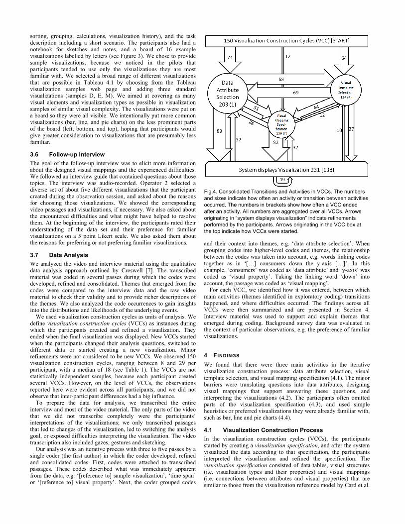
Fig.4. Consolidated Transitions and Activities in VCCs. The numbers
and sizes indicate how often an activity or transition between activities
occurred. The numbers in brackets show how often a VCC ended
after an activity. All numbers are aggregated over all VCCs. Arrows
originating in “system displays visualization” indicate refinements
performed by the participants. Arrows originating in the VCC box at
the top indicate how VCCs were started.

[3]. The participants used different modes of expression, i.e. gestures, verbal statements, and sketches, to communicate the visualization specification. The gestures included pointing at sketches, samples, and the current visualization, as well as drawing shapes in the air, e.g. circles for pie chart or waves for lines. The modes of expression were used separately and combined. We observed three different specification activities (data attribute selection, visualization template selection and visual mapping specification). Together these three specification activities indicated which visualization should be created. Figure 4 summarizes the steps taken by the participant to construct visualizations.
The participants started either by selecting data attributes (74 times), by choosing a visualization template (64 times overall, 30 times referring to the current visualization as part of the analysis flow) or by specifying visual mappings (12 times), e.g. by starting to draw a sketch. We were able to identify a concrete hypothesis or question in 29% of the VCCs. For example, one participant asked at the beginning of a visualization construction cycle “What are our best sellers? What do we make the most money on?”
The participants then moved to different specification activities or waited for the visualization to be displayed. There was no common temporal order in which these activities happened. Instead, the participants seemed to switch between data attribute selection and visual mapping specification. The visual template was selected at different points during that process, but typically only once per visualization construction. Participants specified at least the data attributes that should be used, either directly or as part of the visual mapping specification or the visualization template. Waiting and looking at the screen indicated that they expected the visualization to appear, and was observed after all three activities. Because the participants often omitted information (see 4.3), the different elements of the visualization specification are not necessarily complete and connected. For example, operations that need to be applied to data attributes might be missing, or the visual mappings might be incomplete.
During data attribute selection, participants expressed which data attributes and relationships they wanted to see in the visualization without mapping them to any visual property, for example: “Can I see the sales per state?” This specification often also included expressing the expected level of abstraction, filtering, sorting, and operations that should be applied. For example, one participant asked for filtering to concrete categories this way: “Can I see the furniture data for Washington State divided by the customer segment in terms of sales […]?” Another participant expressed the level of abstraction for a data property and the application of the totals operations like this: “Can I see the regional sales for each year for the past 4 years and then the total?” Sometimes, the participants also expressed the cognitive operation they planned to apply, e.g. “[…] to compare that time to order priority”. Data attribute selection covers only the data attributes that are selected without referring to visual properties. The participants could also implicitly add data attributes to the visualization by including them in visual mapping specification or visual template selection activities. We did not include such references to data attributes in the data attribute selection activity.
For visualization template selection, participants decided how they wanted to visualize the data by picking a template. Visualization templates are structures that specify the visualization composition and potentially visual mappings and concrete data attributes. We noted during our analysis that templates could be categorized within three classes: visualization types remembered by the participants, e.g. “Can I see this as a bar chart” (49 times), the current visualization that was on the screen (39 times), and the samples that were available on the board, e.g. “Can I see something like […]?” (77 times). A visual template selection could sometimes be categorized in more than one class, e.g. when the participants mentioned the name of a visualization and pointed to the sample board. Participants used three aspects of the template: visualization structure, concrete mappings that were apparent in the template and
data attributes that were used in the template. Templates were typically selected once during the process, although there were instances where participants did not select a template or changed their initial selection. Even when participants sketched visualizations, they did not arbitrarily map data attributes to visual properties, but used known templates such as line charts, bar charts or trees.
The visual mapping specification linked a data attribute to a visual property. For example, one participant specified a visual mapping as follows: “[…] the thickness shows the shipping cost […]”. The linking between visual property and data attribute was either in the sentence structure, e.g. using intermediate words such as “shows”, “to”, and “on”, or in the synchronicity of gesture and data attributes vocalization, e.g. one participant said “and the profits […]” and moved her finger along the y-axis of one sample visualization in parallel. When using the current visualization as a template, visual mappings were often expressed as replacements of already mapped data attributes: “[…] instead of region have the different shipping modes […]”. Sometimes, participants expressed the mappings in more detail by describing how value ranges from the data attribute should be mapped to the visual property, e.g. “a size mapping so that more sales relate to a larger circle”. The expression of the visual mappings often triggered a refinement of the data attribute selection, e.g. by adding additional data attributes, or by adding operations such as average. A few times, it led to the insight that the selected template is inappropriate and triggered the selection of a different template.
After the visualization was shown, participants interpreted it. If the participants wanted to change the visualization in some way, this was typically the first thing they mentioned, and happened about 5-20 seconds after it became visible. Sometimes, they noticed something they wanted to change later during the interpretation, but this was rare. We observed four kinds of refinement: participants altered data attributes (32 times), modified visual mappings (32 times), changed the appearance (19 times), and switched to a different template (10 times). These changes triggered the creation and interpretation of a new visualization. Appearance refinements did not change the visual mappings or data attributes, but were changes to superficial attributes of the visualization such as the size, the fonts, and the position of legends. During the interpretation phase, the participants requested interactions such as showing the names of items on a scatter plot using mouse-over. We treated actions that did not change the visualization specification as interaction, not as part of the creation process. As a result of the interpretation phase, insights and new hypotheses were generated.
4.2 Barriers
Three steps in the VCCs turned out to be challenging: translating questions into data attributes, constructing visualizations that help to answer these questions from a set of data attributes, and interpreting the visualizations. The users all encountered various barriers that led to frustration and wrong conclusions, and impeded the overall
Table 2: Common Interpretation Problems
High visual complexity, due to a high number of data items,
occlusion, and very spiky line-chart profiles
Unfamiliar visualization types, e.g. scatter plots
Inappropriate scaling of measurement mappings (axes, color,
size) and inappropriate width/height ratio
Inappropriate size of the visualization
Difficulties understanding semantics of measurements,
including the selection operation (e.g. average, sum)
Inappropriate levels of abstraction, either too high or too low
Readability problems, e.g. bright colors, small font sizes and
inappropriate positioning of labels and legends
Missing numbers
analytics process significantly. When frustration increased, participants switched to a different question or goal. Also, problems earlier in the process typically led to problems at later stages, e.g. problems during visual template selection often led to interpretation problems, because an inappropriate template was chosen.
Decomposing questions and abstract goals into data attributes required the participants to decide which data attributes to choose. Although this worked well in most cases, sometimes it was problematic, e.g. one participant mentioned that the 28 data attributes were overwhelming: “I have the questions in my head, like […] where is most profit coming from? But I just don’t know how to translate that […] because there are so many different categories and data attributes to choose from.” Another participant used the high-level concept of ‘popularity’ like a data attribute, but was unable to translate this into a specific data attribute. Yet another participant wanted to investigate if one product category should be dropped, but did not know what data to look at: “It looks like office supplies is doing less well than the [other product categories]. I am not sure where I would go from there through using this data.”
The next step, designing the visual mappings, was the most problematic step during visualization construction – seven participants had difficulties with this step at least once. We observed expression difficulties, and also noticed complete failures to pick visualization templates and to design visual mappings. For instance, one participant expressed all the required data attributes and the presentation goal, but then stopped after trying to sketch the visualization: “Actually, I don’t know how I would want to see that – never mind”. Another participant wanted to create a visualization that showed if there is a Pareto distribution among the customers: “What I would like to know is whether there is just a small core of customers […] accounting for a large portion of the overall sales.” He then thought how this could be visualized, but failed after considering a bar chart and trying to sketch his idea: “I can’t think of a way that would show that very easily – let’s look at something different then.” Several minutes later, he revisited that problem and succeeded in specifying a visualization. Yet another participant struggled with visual template selection and often selected visual templates that did not match selected data attributes well, resulting in useless visualizations, e.g. trying to see ‘time since order placed’ and ‘ship modes’ on a scatter plot, which resulted in a scatter line with heavy over plotting, because the ship mode dimension was categorical. Seven participants completely omitted template and visual mapping selection 20 times overall. One participant, who omitted visual template selection a couple of times, said during the interview: “I was hoping […] I could get an answer from somebody which would be the best way to look at this data.”
All participants had problems interpreting visualizations. The main sources of confusion and problems are displayed in Error! Reference source not found.. For example, one participant misinterpreted a sorted bar chart as a trend, because the height of the bars was falling. Participants tried to solve these issues by changing the visual mappings or the aesthetics of the visualizations, but we observed several cases among 4 participants which led to interpretation mistakes and frustration. In general, interpretation problems led either to a refinement and clarification of the visualizations, if they were discovered by the participants, or to interpretation mistakes and wrong conclusions, if they remained undetected.
4.3 Partial Specification
We observed a strong tendency towards omitting parts of the visualization specification among all participants. This trend was prevalent at all steps of the visualization construction process, i.e. selecting the data attributes, selecting the visualization template, and specifying the visual mappings. The importance of the omitted information ranged from complete steps, e.g. not specifying the visualization template, to smaller details.
The most common forms of partial specification we observed were: not specifying visual mappings for selected data attributes (63
times); not specifying which operator to apply to measurement data attributes if they are grouped together or that they should not be grouped (62 times); not specifying data attributes for higher level concepts such as time, location, importance or measurements (30 times); not specifying a visualization template when visual mappings were insufficiently specified (20 times); and not specifying level of abstraction for time (10 times). Also, participants almost never mentioned the presentation goal, e.g. comparison or looking for trends, and omitted data attributes if they mentioned concrete data values, especially when filtering, e.g. “Could I look at Washington state [implies data attribute ‘state’] for furniture [implies data attribute ‘product category’], specifically, and maybe look at the profit on that in terms of a bar chart […]”.
Typically, several things were left unspecified in each visualization construction cycle. For example, consider the following specification made by one participant: “Can I see something like C [points at sample depicting line chart] just annually over the four years with the sales and the profit and see those as separate colors?” This specification leaves out the visual mappings except the color mapping, it does not mention how composite values should be calculated, it does not specify which data attribute for time should be selected, and it omits the presentation goal.
However, the omitted information could often be inferred from the context. We observed four sources that participants seemed to use for such default reasoning: data values implying data attributes, matching structure and types of selected data attributes and visualization properties, visual mappings from visualization templates, and the current analysis session state.
To give an example for matching structure, one participant asked “Could I just see the furniture data for Massachusetts divided by product subcategory in terms of total sales with a bar chart?”. Here, the mappings to concrete visual properties such as bar length and bars are not specified, but it is obvious that the bars should represent the product subcategories and the bar length should encode the total sales per product subcategory. This is because the structure and type of the selected data attributes (category with related measurement) matches the structure of the visualization (bars with bar lengths).
We observed that participants seemed to assume defaults based on the mappings visible in the visualization templates and the current state of the visualization. This was particularly true for time attributes. For example, one participant omitted the specification of a time mapping and did not pick a data attribute for time, but looked confused when the mediator responded that more data attributes were required, and immediately said “I guess quarter, if we did it by quarter?” The requested visualization template contained a time mapping and quarter was used as time unit in the previously analyzed visualization, so a reasonable default could have been inferred.
4.4 Visualization Choices
The most popular visualizations were bar (34% of constructed visualizations excluding data tables), line (23%) and pie charts (13%). Maps were also used frequently (12%). Two factors seemed to influence their visualization choices: familiarity with visualization types and heuristics based on selected data attributes and operations. Preference for familiar visualizations was a prevalent theme; it is discussed in detail below. Some of the heuristics we observed were pie charts for whole-part analysis, line charts for trend analysis, and maps for information on geographical entities. While we were able to identify those heuristics and observed that they were used frequently, we do not know what other heuristics were used or how consistently they were applied.
There were many cases where guidelines (e.g. [9]) suggest different visualizations than those chosen by the participants. E.g. participants often used pie charts to perform whole-part analysis, whereas Few [9] recommends bar charts. The participants also used maps in cases where they wanted to compare measurements among states, where bar charts would have been preferable as well. We also

observed a couple of cases where participants used bar charts instead of line charts for trend analysis.
We observed that participants strongly preferred visualization types that they were familiar with, typically line, bar, and pie charts. The pilots indicated that this preference would be interesting, and thus we added specific questions addressing this issue to the background questionnaire and follow-up interview. We first asked the participants about their familiarity with visualization types in the background survey, then observed their visualization choices during the observation session, and finally asked them about their preferences for familiar visualizations in the follow-up interview.
In the background questionnaire, participants were asked to choose known visualization types from 16 samples, and rank those by their familiarity. These visualizations were different from the samples on the board: samples on the board only depicted visualizations that are possible in Tableau, whereas these samples also included node-link diagrams and tag clouds. Participants were familiar with 4 to 14 of these visualizations. We counted which visualization types were in their top three choices. Pie charts (selected by 9 participants), bar charts (by 8) and line charts (by 5) were the more popular visualizations. Next, we counted how often each visualization type was created during the observation session. We found that those 3 diagram types accounted for over 70% of the constructed visualizations (excluding data tables).
The participants reported a strong subjective preference for familiar visualizations. Four participants said they always used familiar visualization (5 on a 5-point Likert scale from 1=never to 5=always used familiar visualizations), four participants said they almost always used familiar visualizations (4 on the Likert scale), and one participant slightly preferred familiar visualizations (3.5 on the Likert scale). They reported that they preferred familiar visualizations because they understand them well and the visualizations can be quickly and simply applied. Some participants mentioned that they would use a broader range of visualizations if they knew more about them, and also that they can understand complex visualizations, but find it too hard to produce them.
4.5 Semantic Information, Additional Data and Prediction
Several times, participants requested additional semantic information to clarify their understanding of data attributes. For example, several participants asked what the data attribute “time to ship” represented. Similarly, participants requested information outside the scope of our data set, typically to explore hypotheses. For example, three participants asked for the location of the company warehouses, stores or headquarter and one requested demographic data. We also observed several times that the participants wanted to predict the impact of a decision that they were considering as a result of their data analysis: “What I am wondering is if the company could just focus on technology […] maybe that would save money”.
5 D ISCUSSION
Based on our findings, we propose a model of the barriers InfoVis novices encounter and a model that describes how novices might think about visualization specification.
5.1 Barriers
The steps that are challenging for InfoVis novices - translating questions into data attributes, constructing visualizations, and interpreting the visualizations - are related to converting between different representations: concepts that are part of the mental model of the user, data that are contained in databases and information repositories, and visualizations. Figure 5 depicts a simplified model of the overall visual data exploration process we observed in the study. The InfoVis novices face a data selection barrier (1, selection barrier) when they try to find the right data attributes and relevant data sets for their higher level questions which
are expressed in concepts as part of their mental model. For selecting the right data attributes, they have to understand the meaning of the attributes and how they relate to the higher-level concepts. After selecting the data, the next barrier (2, visual mapping barrier) is to transform these data into a visual representation that supports answering their questions. Finally, the visualization needs to be related back to the concepts in the mental model to make sense out of it, which was again a source of challenges that we observed in the study (3, interpretation barrier).
This model shares the main elements (users’ cognitive processing / mental model, data, visualization) with more complex models of the visualization process (e.g. [3, 6, 35, 38]), but was simplified by only including those activities and elements that are relevant to the barriers that we observed. We did not include interaction with visualizations, because we did observe this due to our study design, but we recognize that this might be an additional source of difficulties [21].
Previous work in information visualization provides further insight into barriers to visual analysis. The worldview gap and the rationale gap described by Amar and Stasko [2] refer to difficulties relating the visualization to higher-level analytical activities (interpretation barrier). Kobsa reports high cognitive setup costs when using Spotfire (visualization barrier) as well as general interpretation problems (interpretation barrier) in his study of three visualization systems [19]. Lam surveyed 32 user studies on information visualization and derived a framework of interaction costs that includes costs for choosing a data subset (selection barrier) [21]. Related barriers are also well-known in user interface design in general. Norman’s gulf of evaluation is similar to the interpretation barrier and the selection and visual mapping barriers represent the gulf of execution in visualization construction [27]. To bridge the gulf of execution, we need to understand the mental model visualization novices have of visualization specification.
5.2 Mental Model of Visualization Specification
While the different models of the visualization process [3, 6, 35, 38] take user interaction and input into account, they emphasize visualization construction as the transformation of raw data into visual representations. Although this is a very useful description of the algorithmic processing, the observations from our user study indicate that InfoVis novices think differently about visualization specifications. We think that the following characteristics are central to the mental model novices have about visualization specification: (1) Separation between data/concept space and visual structure.
The participants in our study thought about data attributes and concepts often without visual structures or properties being involved, e.g. when they formulated hypotheses or initially selected data attributes. This indicates that they perceive these to be separate from the visual structure.
Fig.5. Barriers in InfoVis Novices’ Visual Data Exploration Process.
Barriers are indicated with lightning bolts. 1: selection barrier; 2: visual
mapping barrier; 3: interpretation barrier

(2) Limited distinction between data attributes and concepts. The participants in our study had trouble distinguishing between concepts and data attributes and converting from concepts to data attributes. They instead tried to use higher level concepts in the visualization mappings, and had more trouble with data attributes that less closely resemble higher level concepts (e.g. ‘time to ship’ was harder to use than ‘sales’). This indicates that they only used lower-level data attributes such as ‘time to ship’ because the higher-level concepts were not available.
(3) Concrete values can be used instead of data attributes. The participants frequently used data values, e.g. concrete product line names, instead of the data attributes.
(4) Relationships between concepts, data attributes and values. The participants were aware of relationships between concepts, for example that profit can be calculated for product lines, and that orders could be analyzed over time because they have at least one time attribute. They used those relationships when defining which data should be displayed in the visual structure, even when they do not define how these relationships are mapped on the visual structure side (see 4.3).
(5) Composite elements in visual structures. The participants used higher-level elements in visual structures, such as bars, pies, tree nodes, states on a map directly. These composite elements are constrained in the way that they are drawn. For example, the bars are rectangles which are aligned to the axes. The composite elements expose both standard visual properties such as color and specific visual properties such as bar height. Both types of visual properties were used by the participants, which indicates that they understood how the composite elements are compiled and which visual properties they expose.
(6) Visual structure templates. As discussed before, the participants used templates that define the general elements and composition of the visualization, e.g. a map or a line chart. This indicates that they consciously think about those elements, especially when they are aware of their names.
(7) Linking between data/concept space and visual structure. The participants linked the concepts and data attributes they wanted to see to visualizations, either in a generic form (“show me sales by product line in a pie chart”) or by applying specific visual mappings from concepts/data attributes to elements and properties from the visual structure. This shows that they are aware of the need to create links between the two.
While these characteristics reflect the lack of visualization experience on the part of InfoVis novices, we believe that they can provide a better understanding of the kinds of visualizations InfoVis novices can construct easily, and where they have difficulties. The proposed mental model can be used to provide better cognitive support for visualization constructions tasks, as we will discuss in the next section.
6 IMPLICATIONS FOR TOOL DESIGN
Based on our findings and the model presentation in the discussion, we derive implications for how tools can better assist InfoVis novices in constructing visualizations.
6.1 Provide Search Facilities to Retrieve Data
The participants had trouble selecting data attributes from a large set. We found that they often knew concrete data values, e.g. ‘Texas’, and context of the data attributes they were looking for, e.g. sales. Therefore, we believe that keyword-based textual queries would help them find those data attributes. Using semantic information might even enable the search for data attributes that relate to higher-level concepts such as ‘top-sellers’ or enable the system to infer data attributes from concrete values such as ‘2009’. Supporting more
advanced queries that contain several data attribute references and their relationships, e.g. ‘sales by product line 2009’, might be beneficial. We observed participants stating such queries several times, and therefore believe that such query patterns can be expressed by InfoVis novices and might even be typical.
Tool support could also leverage semantic relationships and specific rules to find and rank potentially relevant data attributes related to user queries. For example, imagine the user enters the query ‘sales 2009’. The system could choose orders as the relevant database table, because sales are related to orders. It could then prefer the date of order over the date of receipt as data attribute for the value ‘2009’, based on a company rule that specifies that sales should be calculated based on the date of order. The retrieved data attributes could be used as input for suggesting visualizations.
6.2 Suggesting Visualizations
InfoVis novices also have difficulties designing visual mappings. Their lack of visualization knowledge leads to the construction of non-optimal visualizations. However, they can express which data attributes they want to look at and how those relate, how they want to split, filter and sort the data set, and what operations to apply with less effort and difficulty. Tool support that suggests potential visualizations could help users to surmount the visual mapping barrier, as proposed by Heer et al. [14]. Such suggestions could be displayed both after the user described what data he wants to look at and in the context of the current visualization, like the ‘Show Me’ approach [23]. The former would help the user create visualizations from scratch, while the latter would help with refinement. We believe that the suggestions should be thumbnail previews based on the data selected by the participants, because this would help users to evaluate the usefulness of suggestions in the context of the chosen data. Previews could be displayed using a gallery-based approach [10, 24], enabling easy comparison of alternatives. This could help the users to familiarize themselves with alternate visualizations which might represent the data in a more useful way, and thus address the problem that users prefer visualizations they are familiar with, even though they may be less effective.
Suggestions could be generated by the algorithms from research on automatic visualization (e.g. [4, 10, 22, 23, 33]). Based on our findings, we believe that three types of information besides the actual data attributes should be used to guide the automated visualization algorithms:
Semantic meta-information includes attribute types as well as connections between the data attributes. For example, if there are meta-data that state how three hockey stats are related ‘points = assists + goals, goals >= 0, assists >= 0’, and the user wants to visualize those three data attributes for several players, the system can use this information to show a stacked bar chart instead of a simple bar chart with one bar per data attribute.
High visual complexity and inappropriate scaling were frequent problems during interpretation. By analyzing the available screen real-estate and the data distribution, automatically generated visualizations can be improved on two levels: by choosing visualization types that work best for the given screen real-estate and number of data points, and by optimizing the visualizations using techniques such as clutter reduction [8] or banking lines to 45º [13].
Knowing the presentation goal is essential in order to create visualizations that support the user in successfully analyzing data. While several automatic visualization algorithms take this into account (e.g. [4, 33]), the goal remains hard to elicit [23]. One possible approach is to monitor the user’s behavior [11]. We observed that users sometimes stated goals such as “compare”, and that they often seemed to have an intuitive understanding of how well a visualization supports them in reaching their goal. We believe that this could be leveraged to elicit the presentation goal, for example by presenting them a gallery of visualizations that are tuned towards different goals, and letting them pick what they think best supports their task.

6.3 Supporting Iterative Specification
We observed that visualizations are constructed through a series of iterative refinements. This can be regarded as an explorative search for a visualization that is good enough to support the user in reaching his/her goal. This iterative search for appropriate visualizations can be supported by several mechanisms in a visualization construction tool. Rapid feedback in the form of usable visualizations can help the users to stay immersed in the process of visualization creation and exploration. It should be easy for users to try out visualizations, and mistakes in their choices should not hamper them too much. Premature commitment should be avoided, for example by providing previews, undo/redo, graphical histories [15] and the ability to take snapshots of the current visualization. Similarly, the user should be able to change visualizations and visual mappings quickly, for example using drag and drop as in Polaris/Tableau [36], and the system should not prescribe in which order data attributes selection, visual template selection and visual mapping specification should take place. Also, the mechanisms described in Sections 6.2, 6.4 and 6.5 could facilitate and guide iterative visualization construction. Overall, the tool should encourage the user to explore configurations rapidly. This serves three purposes: finding an appropriate visualization, seeing the data from different perspectives and gaining experience with the visualizations.
Many available visualization systems already offer some or many of these features, e.g. undo/redo is a common feature. However, we believe there is still much room for improvement. For example, visualizations are often constructed using wizards, which lead to premature commitment, and previews are seldom used.
6.4 Dealing with Partial Specification
Partial specification was a prevalent pattern that we observed. Incomplete specifications were similarly found by Miller for programming in natural language [25]. Miller suggests that targeting people instead of computers as receivers of the instruction might be a cause. That is, participants may have left out information because they knew there was a human operator. However, Pane et al. found that imprecision and underspecification also occur when users know the computer is receiving the instructions [28]. We believe such partial specification happens for two main reasons: users’ mental models of the specification structure are simplistic and they therefore do not consider certain aspects (see Section 5.2), and users omit elements that are implicit in the context or can be inferred from other parts of the specification.
While partial specification may have been caused by the mediator in our study, we believe it is important to design for partial specification. By flexibly dealing with partial specification, the system could respond in a way that the user perceives as intuitive, thereby increasing the user’s efficiency in communicating intended visualizations. For example, defaults and mappings can often be inferred. Marking those settings as inferred could further help the user understand what parts she specified and how the system reacted to this. When good defaults cannot be inferred, the system could ask the user to clarify those aspects, e.g. by presenting her with a list of choices. For all defaults, it is important to pick sensible values, as noted by Heer et al. [14].
6.5 Providing Explanations and Supporting Learning
InfoVis novices typically lack visualization and analysis experience and knowledge, but such an understanding is important to create and interpret visualizations. We therefore believe that it is not just important to enable users to create visualizations, but to support them in learning how to use and interpret them. While showing explanations of what is displayed was already suggested by Heer et al. [14], we believe it is important to go a step further by explaining why these visual mappings are used, i.e. by providing reasons, advantages and disadvantages to enable InfoVis novices to make better visual mapping decisions in the future.
When the system suggests visualizations or infers defaults, it should provide explanations about why it has chosen those items and what their advantages and disadvantages are. This will help users to decide which visualization to pick and which inferred default they might want to change. The system could also provide semantic explanations about the data attributes that are visualized – simple legends that show how the data attributes are mapped to visual properties are not enough in many cases, as we found. For example, the tool could explain what ‘time to ship’ means in the context of the shipment process, thus providing a semantic context. A caption generation system such as the one described in [26] could be leveraged to create such explanations.
Similarly, a system could provide contextual help on visualizations that explains which patterns can typically be observed in the current visualization type, and how to interpret them. It could also analyze the current visualization and point out its strengths and weaknesses, as well as potential interpretation problems.
6.6 Tight Integration into Visual Analytics Process
Visual mapping is only relevant and useful in the larger context of visual analytics. Therefore, we propose that it is important to embed tool support for flexible visualization construction into tool support for visual analytics. Such an environment would provide support for searching data attributes, searching and integrating additional data sources, and accessing semantics, among other things. We consider a tight integration between those different activities to be very important to enable successful visual analytics for InfoVis novices, because the differences between activities might not be apparent to them and they are likely to switch opportunistically between activities. For example, semantic information could be accessed from within a visualization and used to modify or extend the visualization, or even to create new visualizations. Similarly, the visualization context could be used to search for data attributes similar to those within a visualization.
7 CONCLUSIONS AND FUTURE WORK
We presented a study on how InfoVis novices construct visualizations. We learned which activities are central in visualization specification and how they are related (summarized in Fig. 4.), we identified three major barriers in the data exploration process (selection, visual mapping, interpretation), and discovered that InfoVis novices do not fully specify visualizations and that their visualization choices are driven by heuristics and familiarity with visualization types. Based on these observations, we derived a model of how novices might think about visualization specification, and suggested that tools should facilitate searching for data attributes, automatically create different visualizations and present them as choices, provide explanations, and support learning.
The tool implications presented here are based on empirical evidence; however, we believe that further evaluation on how concrete implementations support InfoVis novices in creating visualizations is warranted. Our future work involves incorporating the tool suggestions into prototypes that will facilitate further experimentation and improve our understanding of how novices can more effectively construct and interpret visualizations. We hope that this research will bring us one step closer to making information visualization accessible to everyone, not just to expert analysts.
ACKNOWLEDGMENTS
The authors wish to thank the members of the CHISEL and VisID groups at the University of Victoria, Sigrid Dösseler and the reviewers for their valuable feedback and editing suggestions. We are also thankful to Nick Matthijssen, Gargi Bougie and Narges Mahyar for helping us conduct the study. We would also like to thank the pilot and study participants. This work was funded by an IBM CAS PhD Fellowship.

REFERENCES
[1] Robert Amar, James Eagan, and John T. Stasko, Low-level components
of analytic activity in information visualization. In IEEE Symposium on
Information Visualization, 2005. INFOVIS 2005, pages 111–117, 2005.
[2] Robert Amar and John T. Stasko. Knowledge precepts for design and
evaluation of information visualizations. IEEE Transactions on
Visualization and Computer Graphics, pages 432–442, 2005.
[3] Stuart Card, Jock Mackinlay, and Ben Shneiderman, editors. Readings
in information visualization: using vision to think. Morgan Kaufmann
Publishers Inc., San Francisco, CA, USA, 1999.
[4] Stephen Casner. Task-analytic design of graphic presentations. PhD
thesis, Pittsburgh, PA, USA, 1990.
[5] Ed Chi. A taxonomy of visualization techniques using the data state
reference model. In IEEE Symposium on Information Visualization,
2000. InfoVis 2000, pages 69–75, 2000.
[6] Ed Chi and John Riedl. An operator interaction framework for
visualization systems. In INFOVIS '98: Proceedings of the 1998 IEEE
Symposium on Information Visualization, pages 63–70, Washington,
DC, USA, 1998. IEEE Computer Society.
[7] John W. Creswell. Educational research: Planning, conducting, and
evaluating quantitative and qualitative research. Pearson/Merrill
Prentice Hall, 2007.
[8] Geoffrey Ellis and Alan Dix. A taxonomy of clutter reduction for
information visualisation. IEEE Transactions on Visualization and
Computer Graphics, 13(6):1216–1223, 2007.
[9] Stephen Few. Now you see it: Simple Visualization Techniques for
Quantitative Analysis. Analytics Press, 2009.
[10] Owen Gilson, Nuno Silva, Phil W. Grant, and Min Chen. From web data
to visualization via ontology mapping. In Computer Graphics Forum,
volume 27, pages 959–966. Blackwell Publishing Ltd, 2008.
[11] David Gotz and Zhen Wen. Behavior-driven visualization
recommendation. In IUI '09: Proceedings of the 13th international
conference on Intelligent user interfaces, pages 315–324, ACM, New
York, NY, USA, 2009.
[12] David Gotz and Michelle X. Zhou. Characterizing users’ visual analytic
activity for insight provenance. Information Visualization, 8(1):42–55,
2009.
[13] Jeffrey Heer and Maneesh Agrawala. Multi-scale banking to 45 degrees.
IEEE Transactions on Visualization and Computer Graphics,
12(5):701–708, 2006.
[14] Jeffrey Heer, Frank van Ham, Sheelagh Carpendale, Chris Weaver, and
Petra Isenberg. Creation and collaboration: Engaging new audiences for
information visualization, in Information Visualization: Human-
Centered Issues and Perspectives, pages 92–133, Springer,
Berlin/Heidelberg, 2008.
[15] Jeffrey Heer, Jock D. Mackinlay, Chris Stolte, and Maneesh Agrawala.
Graphical Histories for Visualization: Supporting Analysis,
Communication, and Evaluation. In IEEE Transactions on Visualization
and Computer Graphics, 14(6):1189-1196, 2008.
[16] Petra Isenberg, Anthony Tang, and Sheelagh Carpendale. An
exploratory study of visual information analysis. In CHI '08:
Proceeding of the twenty-sixth annual SIGCHI conference on Human
factors in computing systems, pages 1217–1226, ACM, New York, NY,
USA, 2008.
[17] Chris Johnson, Robert Moorehead, Tamara Munzner, Hanspeter Pfister,
Penny Rheingans, and Terry S. Yoo. NIH-NSF Visualization Research
Challenges Report, 2006.
[18] Youn-ah Kang, Carsten Görg, and John Stasko. Evaluating Visual
Analytics Systems for Investigative Analysis: Deriving Design
Principles from a Case Study. IEEE VAST, pages 139–146, 2009.
[19] Alfred Kobsa. An empirical comparison of three commercial
information visualization systems. In Proceedings of the IEEE
Symposium on Information Visualization, page 123, 2001.
[20] Maria Kozhevnikov, Stephen Kosslyn, and Jennifer Shephard. Spatial
versus object visualizers: A new characterization of visual cognitive
style. Memory & cognition, 33(4):710, 2005.
[21] Heidi Lam. A framework of interaction costs in information
visualization. IEEE transactions on visualization and computer
graphics, 14(6):1149–1156, 2008.
[22] Jock D. Mackinlay. Automating the design of graphical presentations of
relational information. ACM Transactions on Graphics (TOG),
5(2):110–141, 1986.
[23] Jock D. Mackinlay, Pat Hanrahan, and Chris Stolte. Show Me:
Automatic presentation for visual analysis. IEEE Transactions on
Visualization and Computer Graphics, 13(6):1137–1144, 2007.
[24] J. Marks, B. Andalman, PA Beardsley, W. Freeman, S. Gibson,
J. Hodgins, T. Kang, B. Mirtich, H. Pfister, W. Ruml, et al. Design
galleries: A general approach to setting parameters for computer
graphics and animation. In Proceedings of the 24th annual conference
on Computer graphics and interactive techniques, pages 389–400. ACM
Press/Addison-Wesley Publishing Co. New York, NY, USA, 1997.
[25] Lance A. Miller. Natural Language Programming: Styles, Strategies,
and Contrasts. IBM Systems Journal, 20(2):184–215, 1981.
[26] Vibhu O. Mittal, Johanna D. Moore, Guiseppe Carenini, and Steven F.
Roth. Describing complex charts in natural language: A caption
generation system. Computational Linguistics, 24(3):431–467, 1998.
[27] Donald A. Norman. The Design of Everyday Things. New York:
Doubleday, 1990.
[28] John F. Pane, Brad A. Myers, and Chotirat A. Ratanamahatana.
Studying the language and structure in non-programmers' solutions to
programming problems. Int. J. Hum.-Comput. Stud., 54(2):237–264,
2001.
[29] Peter Pirolli and Stuart Card. The sensemaking process and leverage
points for analyst technology as identified through cognitive task
analysis. In Proceedings of International Conference on Intelligence
Analysis, 2005.
[30] Zachary Pousman, John T. Stasko, and Michael Mateas. Casual
information visualization: Depictions of data in everyday life. IEEE
Transactions on Visualization and Computer Graphics, 13(6):1145–
1152, 2007.
[31] A. Johannes Pretorius and Jarke J. van Wijk. What does the user want to
see? What do the data want to be? Information Visualization, 8(3):153–
166, 2009.
[32] Anthony C. Robinson. Collaborative synthesis of visual analytic results.
In Visual Analytics Science and Technology, 2008. VAST'08. IEEE
Symposium on, pages 67–74, 2008.
[33] Steven F. Roth and Joe Mattis. Automating the presentation of
information. In Seventh IEEE Conference on Artificial Intelligence
Applications, 1991.
[34] Ben Shneiderman. The eyes have it: A task by data type taxonomy for
information visualizations. In VL '96: Proceedings of the 1996 IEEE
Symposium on Visual Languages, pages 336-343, IEEE Computer
Society, Washington, DC, USA, 1996.
[35] Robert Spence. Information Visualization, Pearson Education Ltd.,
Harlow, England, 2001.
[36] Chris Stolte, Diane Tang and Pat Hanrahan. Polaris: a system for query,
analysis, and visualization of multidimensional databases. In
Communications of the ACM, 51(11):75-84, 2008
[37] Fernanda B. Viégas, Martin Wattenberg, Frank van Ham, Jesse Kriss,
Matt McKeon. Manyeyes: a site for visualization at internet scale. IEEE
Transactions on Visualization and Computer Graphics, 13(6):1121–
1128, 2007.
[38] Colin Ware. Information Visualization: Perception for Design. Morgan
Kaufmann Publishers Inc., San Francisco, CA, USA, 2004.
[39] Chris Weaver, David Fyfe, Anthony Robinson, Deryck Holdsworth,
Donna Peuquet, and Alan M. MacEachren. Visual analysis of historic
hotel visitation patterns. In 2006 IEEE Symposium On Visual Analytics
Science And Technology, pages 35–42, 2006.
[40] Ji Soo Yi, Youn ah Kang, John T. Stasko, and Julie A. Jacko. Toward a
deeper understanding of the role of interaction in information
visualization. IEEE Transactions on Visualization and Computer
Graphics, 13(6):1224–1231, 2007