
HOUSEHOLD WEALTH TRENDS IN THE UNITED STATES, …wealth holdings, Section 5 on changes in the...
71
NBER WORKING PAPER SERIES HOUSEHOLD WEALTH TRENDS IN THE UNITED STATES, 1962-2013: WHAT HAPPENED OVER THE GREAT RECESSION? Edward N. Wolff Working Paper 20733 http://www.nber.org/papers/w20733 NATIONAL BUREAU OF ECONOMIC RESEARCH 1050 Massachusetts Avenue Cambridge, MA 02138 December 2014 I would like to express my appreciation for financial support provided by the Institute of New Economic thinking (INET). The views expressed herein are those of the author and do not necessarily reflect the views of the National Bureau of Economic Research. NBER working papers are circulated for discussion and comment purposes. They have not been peer- reviewed or been subject to the review by the NBER Board of Directors that accompanies official NBER publications. © 2014 by Edward N. Wolff. All rights reserved. Short sections of text, not to exceed two paragraphs, may be quoted without explicit permission provided that full credit, including © notice, is given to the source.
Transcript of HOUSEHOLD WEALTH TRENDS IN THE UNITED STATES, …wealth holdings, Section 5 on changes in the...

NBER WORKING PAPER SERIES
HOUSEHOLD WEALTH TRENDS IN THE UNITED STATES, 1962-2013:WHAT HAPPENED OVER THE GREAT RECESSION?
Edward N. Wolff
Working Paper 20733http://www.nber.org/papers/w20733
NATIONAL BUREAU OF ECONOMIC RESEARCH1050 Massachusetts Avenue
Cambridge, MA 02138December 2014
I would like to express my appreciation for financial support provided by the Institute of New Economicthinking (INET). The views expressed herein are those of the author and do not necessarily reflectthe views of the National Bureau of Economic Research.
NBER working papers are circulated for discussion and comment purposes. They have not been peer-reviewed or been subject to the review by the NBER Board of Directors that accompanies officialNBER publications.
© 2014 by Edward N. Wolff. All rights reserved. Short sections of text, not to exceed two paragraphs,may be quoted without explicit permission provided that full credit, including © notice, is given tothe source.

Household Wealth Trends in the United States, 1962-2013: What Happened over the GreatRecession?Edward N. WolffNBER Working Paper No. 20733December 2014JEL No. D31,J15
ABSTRACT
Asset prices plunged between 2007 and 2010 but then rebounded from 2010 to 2013. The most tellingfinding is that median wealth plummeted by 44 percent over years 2007 to 2010, almost double thedrop in housing prices. The inequality of net worth, after almost two decades of little movement, wasalso up sharply. Relative indebtedness expanded, particularly for the middle class, though the proximatecauses were declining net worth and income rather than an increase in absolute indebtedness. Thesharp fall in median net worth and the rise in overall wealth inequality over these years are traceableprimarily to the high leverage of middle class families and the high share of homes in their portfolio.The racial and ethnic disparity in wealth also widened considerably. Households under age 45 sawtheir relative and absolute wealth declined sharply. Rather remarkably, there was virtually no changein median wealth from 2010 to 2013 despite the rebound in asset prices. The proximate cause wasthe high dissavings of the middle class, though their debt continued to fall. Wealth inequality and theracial and ethnic wealth gap also remained largely unchanged, though there was some recovery ofnet worth for young households.
Edward N. WolffDepartment of EconomicsNew York University19 W. 4th Street, 6th FloorNew York, NY 10012and [email protected]

1
1. Introduction
The paper focuses mainly on how the middle class fared in terms of wealth over years
2007 to 2010 during one of the sharpest declines in stock and real estate prices and over years
2010 to 2013 as asset prices recovered. The debt of the middle class exploded from 1983 to
2007, already creating a very fragile middle class in the United States. The main question is
whether their position deteriorated even more over the “Great Recession.”
In particular, there are five specific issues addressed in the paper. (1) Did median
household wealth continue to advance over time or did it fall, particularly from 2007 to 2013? (2)
Did the inequality of household wealth rise over time, particularly during years 2007 to 2013? (3)
Did the debt of the middle class increase over time, especially over the Great Recession? (4)
What are the time trends in home ownership and home equity and what happened, in particular,
from 2007 to 2013? (5) How did time trends in average wealth, household debt, the home
ownership rate, and home equity vary by race, ethnic group, and age group?
The period covered is from 1962 to 2013. In particular, results will be provided for years
1962, 1969, 1983, 1989, 1992, 1995, 1998, 2001, 2004, 2007, 2009, 2010, and 2013. The choice
of years is dictated by the availability of survey data on household wealth. By 2013, we will be
able to see what the fall-out was from the financial crisis and associated recession and, in
particular, which groups were impacted the most.
As discussed in the next section, trends in household wealth have a direct bearing on
household well-being and should therefore be of general public interest. Moreover, since the
election of Barack Obama in 2012, the fortunes of the middle class have generated a large
amount of political interest and media interest as well.
The paper is organized as follows. The next section, Section 2, provides some historical
background. Section 3 discusses the measurement of household wealth and describes the data
sources used for this study. Section 4 presents results on time trends in median and average
wealth holdings, Section 5 on changes in the concentration of household wealth, and Section 6
on the composition of household wealth. In Section 7, I provide an analysis of the effects of
leverage on wealth movements over time, particularly in regard to how it impacted households
during the Great Recession. Section 8 investigates changes in wealth holdings by race and

2
ethnicity; and Section 9 reports on changes in the age-wealth profile. A summary of results and
concluding remarks are provided in Section 10.
Previous work of mine (see Wolff, 1994, 1996, 1998, 2001, 2002, and 2011a), using the
1983, 1989, 1992, 1995, 1998, 2001, 2004, and 2007 Surveys of Consumer Finances, presented
evidence of sharply increasing household wealth inequality between 1983 and 1989 followed by
little change between 1989 and 2007. Both mean and median wealth holdings climbed briskly
from 1983 to 2007. However, most of the wealth gains from 1983 to 2007 were concentrated
among the richest 20 percent of households. Moreover, despite the buoyant economy over the
1990s and 2000s, overall indebtedness rose among American families, particularly those in the
middle class. The wealth gap between African-American and white families was much the same
in 2007 as in 1983. However, the relative wealth holdings of younger families (under age 45) fell
somewhat between 1983 and 2007.
In this study, I look at wealth trends from 1962 to 2013. Asset prices plunged between
2007 and 2010 but then rebounded from 2010 to 2013. The most telling finding is that median
wealth plummeted by 44 percent over years 2007 to 2010, almost double the drop in housing
prices, and by 2010 was at its lowest level since 1969. The inequality of net worth, after almost
two decades of little movement, was up sharply from 2007 to 2010. Relative indebtedness
expanded from 2007 to 2010, particularly for the middle class, though the proximate causes were
declining net worth and income rather than an increase in absolute indebtedness. In fact, the
average debt of the middle class fell by 25 percent in real terms. The sharp fall in median net
worth and the rise in overall wealth inequality from 2007 to 2010 are traceable primarily to the
high leverage of middle class families and the high share of homes in their portfolio. The racial
and ethnic disparity in wealth holdings widened considerably in the years between 2007 and
2010. Hispanics, in particular, got hammered by the Great Recession in terms of net worth and
net equity in their homes. Young households (under age 45) also got pummeled by the Great
Recession, as their relative and absolute wealth declined sharply from 2007 to 2010.
Rather remarkably, there was virtually no change in median (and mean) wealth from 2010
to 2013 despite the rebound in asset prices, presenting a new puzzle. The proximate cause was
the high dissavings of the middle class. Relative indebtedness fell for the middle class as
outstanding debt continued to drop. Wealth inequality and the racial and ethnic wealth gap also
remained largely unchanged, though there was some recovery of the net worth of young

3
households.
2. Historical Background
The last two decades have witnessed some remarkable events. Perhaps, most notable is
the housing value cycle which first led to an explosion in home prices and then a collapse,
affecting net worth and helping to precipitate the Great Recession, followed by a modest
recovery. The median house price remained virtually the same in 2001 as in 1989 in real terms.1
However, the home ownership rate shot up from 62.8 percent in 1989 to 67.7 percent in 2001
according to data from the Survey of Consumer Finances (SCF). Then, 2001 saw a recession
(albeit a short one). Despite this, house prices suddenly took off. The median sales price of
existing one-family homes spurted by 17 percent nationwide. However, from 2004 to 2007
housing prices slowed, with the median price advancing only 1.7 percent. Over the years 2001 to
2007 housing prices gained 19 percent. The home ownership rate continued to expand, though at
a somewhat slower rate, from 67.7 to 68.6 percent.
Then, the “Great Recession” and the associated financial crisis hit. The Great Recession
“officially” began in December, 2007, and “officially” ended in June, 2009.2 Over this period, real
GDP fell by 4.3 percent and then from the second quarter of 2009 to the second quarter of 2013 it
gained 9.2 percent. The unemployment rate shot up from 4.4 percent in May of 2007 to a peak of
10.0 percent in October of 2009 but by February of 2014 it was down to 6.7 percent.3
One consequence was that asset prices plummeted. From 2007 to 2010, in particular, the
median home price nose-dived by 24 percent, and the share of households owning their own
home fell off, from 68.6 to 67.2 percent. This was followed by a partial recovery, with median
house prices rising 7.8% through September 2013, though still way below their 2007 value.
1 The source for years 1989 to 2007 is Table 935 of the 2009 Statistical Abstract, US Bureau of the Census, available at http://www.census.gov/compendia/statab/. For years after 2007, the source is: National Association of Realtors, “Median Sales Price of Existing Single-Family Homes for Metropolitan Areas,” available at: http://www.realtor.org/sites/default/files/reports/2012/embargoes/2012-q1-metro-home-prices-49bc10b1efdc1b8cc3eb66dbcdad55f7/metro-home-prices-q1-single-family-2012-05-09.pdf [both accessed October 17, 2014].The figures are based on median prices of existing houses for metropolitan areas only. All figures are in constant dollars unless otherwise indicated. 2 The source is: http://www.nber.org/cycles/cyclesmain.html [accessed April 20, 2014]. 3 The source is the U.S. Bureau of Labor Statistics at: http://data.bls.gov/timeseries/LNS14000000 [accessed April 10, 2014].

4
However, the homeownership rate continued to contract, falling to 65.1 percent.
The housing price bubble in the years leading up to 2007 was fueled in large part by a
generous expansion of credit available for home purchases and re-financing. This took a number
of forms. First, many home owners re-financed their primary mortgage. However, because of the
rise in housing prices, these home owners increased the outstanding mortgage principal and
thereby extracted equity from their homes. Second, many home owners took out second
mortgages and home equity loans or increased the outstanding balances on these instruments.
Third, among new home owners, credit requirements were softened, and so-called “no-doc”
loans were issued requiring none or little in the way of income documentation. Many of these
loans, in turn, were so-called “sub-prime” mortgages, characterized by excessively high interest
rates and “balloon payments” at the expiration of the loan (that is, a non-zero amount due when
the term of the loan was up). All told, average mortgage debt per household expanded by 59
percent in real terms between 2001 and 2007 according to the SCF data, and outstanding
mortgage loans as a share of house value rose from 0.334 to 0.349, despite the 19 percent gain in
real housing prices (see Table 4 below for more details).
In contrast to the housing market, the stock market boomed during the 1990s. On the
basis of the Standard & Poor (S&P) 500 index, stock prices surged 159 percent between 1989
and 2001.4 Stock ownership spread and by 2001 over half of U.S. households owned stock either
directly or indirectly. However, the stock market peaked in 2000 and dropped steeply from 2000
to 2003 but recovered somewhat in 2004, so that between 2001 and 2004 the S&P 500 was down
by 11 percent.
From 2004 to 2007, the stock market rebounded, with the S&P 500 rising 19 percent.
Over the period from 2001 to 2007, stock prices were up 6 percent. However, the share of
households who owned stock either directly or indirectly fell to 49 percent. Then came the Great
Recession. Stock prices, based on the S&P 500 index, crashed from 2007 to 2009 and then
partially recovered in 2010 for a net decline of 26 percent. The stock ownership rate also once
again declined, to 47 percent. The stock market continued to rise after 2010 and by 2013 the S&P
500 index was up 39 percent over 2010 and above its previous high in 2007. However, the stock
4 The source for stock prices is Table B-96 of the Economic Report of the President, 2013, available at http://www.gpoaccess.gov/eop/tables13.html, with updates to 2013 from: http://us.spindices.com/indices/equity/sp-composite-1500 [both accessed October 17, 2014].
5
ownership rate continued to drop, to 46 percent.
Real wages, after stagnating for many years, finally grew in the late 1990s. According to
BLS figures, real mean hourly earnings gained 8.3 percent between 1995 and 2001.5 From 1989
to 2001, real wages rose by 4.9 percent (in total), and median household income in constant
dollars grew by 6.0 percent (see Table 1). Employment also surged over these years, growing by
16.7 percent.6 The (civilian) unemployment rate remained relatively low over these years, at 5.3
percent in 1989, 4.7 percent in 2001, with a low point of 4.0 percent in 2000, and averaging 5.5
percent over these years.7
Real wages then rose very slowly from 2001 to 2004, with the BLS mean hourly earnings
up by only 1.5 percent, and median household income dropped by 1.6 percent. From 2004 to
2007, real wages remained stagnant, with hourly earnings rising by only 1.0 percent. Median
household income showed some growth over this period, rising by 3.2 percent. From 2001 to
2007 it gained 1.6 percent. Employment also grew more slowly over these years, gaining 6.7
percent. The unemployment rate remained low again, at 4.7 percent in 2001 and 4.6 percent in
2007 and an average value of 5.2 percent over the period.
Real wages, on the other hand, picked up from 2007 to 2010, increasing by 3.6 percent. In
contrast, median household income in real terms declined sharply over this period, by 6.7 percent
(see Table 1 below). Moreover, employment contracted over these years, by 4.8 percent, and the
unemployment rate surged from 4.6 percent in 2007 to 10.5 percent in 2010. From 2010 to 2013
employment grew by 4.7 percent, and the unemployment rate did come down to an average rate
of 7.4 percent in 2013.
There was also an explosion of consumer debt leading up to the Great Recession.
Between 1989 and 2001, total consumer credit outstanding in constant dollars surged by 70
5 These figures are based on the Bureau of Labor Statistics (BLS) hourly wage series. The source is Table B-15 of the Economic Report of the President, 2014,available at http://www.gpo.gov/fdsys/pkg/ERP-2014/pdf/ERP-2014-table15.pdf [accessed October 17, 2014]. The BLS wage figures are converted to constant dollars on the basis of the Consumer Price Index (CPI-U). 6 The figure is for civilian employment. The source is Table B-14 of the Economic Report of the President, 2014, available at http://www.gpo.gov/fdsys/pkg/ERP-2014/pdf/ERP-2014-table14.pdf [accessed October 17, 2014]. 7 The source is Table B-12 of the Economic Report of the President, 2014, available at http://www.gpo.gov/fdsys/pkg/ERP-2014/pdf/ERP-2014-table12.pdf [accessed October 17, 2014].
6
percent and then from 2001 to 2007 it rose by another 17 percent.8 There were a number of
factors responsible for this. First credit cards became more generally available for consumers.
Second, credit standards were relaxed considerably, making more households eligible for credit
cards. Third, credit limits were generously increased by banks hoping to make profits out of
increased fees from late payments and from higher interest rates.
Another source of new household indebtedness was from a huge increase in student
loans. This issue has recently received wide attention in the press. According to the SCF data, the
share of households reporting an educational loan rose from 13.4 percent in 2004 to 15.2 percent
in 2007 and then surged to 19.1 percent in 2010 and 19.9 percent in 2013.9 The mean value of
educational loans in 2013 dollars exclusively among loan holders increased by 17 percent
between 2004 and 2007, another 14 percent between 2007 and 2010, and then by an additional 5
percent to $29,110 in 2013. The median value of such loans first went up by 19 percent from
2004 to 2007, by another 3 percent between 2007 and 2010, and then by an added 22 percent to
$17,000 in 2013. These loans were heavily concentrated among younger households and, as we
shall see below, was one of the factors (though not the principal one) which led to a precipitous
decline in their net worth between 2007 to 2010.
Another major change in the 1990s and the decade of the 2000s affecting household
wealth was a major overhaul of the private pension system in the United States. As documented
in Wolff (2011b), in 1989, 46 percent of all households reported holding a defined benefit (DB)
pension plan. DB plans are traditional pensions, such as provided by many large corporations, the
federal government, and state and local governments, which guarantee a steady flow of income
upon retirement. By 2007, that figure was down to 34 percent. The decline was more pronounced
among younger households, under the age of 46, from 38 to 23 percent, as well as among middle-
aged households, ages 47 to 64, from 57 to 39 percent.
Many of these plans were replaced by so-called defined contribution (DC) pension
accounts, most notably 401(k) plans and Individual Retirement accounts (IRAs). These plans
allow household to accumulate savings for retirement purposes directly. The share of all
8 These figures are based on the Federal Reserve Board’s Flow of Funds data, Table B.100, available at: http://www.federalreserve.gov/releases/Z1/ [accessed October 17, 2014]. 9 Unfortunately, no data on educational loans are available before the 2004 SCF.

7
households with a DC plan skyrocketed from 24 percent in 1989 to 53 percent in 2007. Among
younger households, the share rose from 31 to 50 percent, and among middle-aged households it
went from 28 to 64 percent.
This transformation is even more notable in terms of actual dollar values. While the
average value of DB pension wealth among all households crept up by 8 percent from $56,500 in
1989 to $61,200 in 2007, the average value of DC plans shot up more than 7-fold from $10,600
to $76,800 (all figures are in 2007 dollars).10 Among younger households, average DB wealth
actually fell in absolute terms, while DC wealth rose by a factor of 3.3. Among middle-aged
households, the mean value of DB pensions also declined, while the average value of DC plans
mushroomed by a factor of 6.5.
These changes are important for understanding trends in household wealth because DB
pension wealth is not included in the standard measure of marketable household wealth whereas
DC wealth is included (see Section 4 below). Thus, the substitution of DC wealth for DB wealth
is likely to lead to an overstatement in the “true” gains in household wealth, since the
displacement in DB wealth is not captured (see Wolff, 2011b, for more discussion).
The other big story was household debt, particularly that of the middle class, which
skyrocketed during these years, as we shall see below. Despite the recession, the relative
indebtedness of American families continued to rise from 2007 to 2010, though it did fall off
from 2010 to 2013.
What have all these major transformations wrought in terms of the distribution of
household wealth, particularly over the Great Recession? How have these changes impacted
different demographic groups, particularly as defined by race, ethnicity, and age? This is the
subject of the remainder of the paper.
3. Data sources and methods
The primary data sources used for this study are the 1983, 1989, 1992, 1995, 1998, 2001,
2004, 2007, 2010, and 2013 Survey of Consumer Finances (SCF) conducted by the Federal
Reserve Board. Each survey consists of a core representative sample combined with a high-
income supplement. In 1983, for example, the supplement was drawn from the Internal Revenue
10 The computation of DB pension wealth is based on the present value of expected pension benefits upon retirement. See Wolff (2011b) for details.
8
Service's Statistics of Income data file. For the 1983 SCF, an income cut-off of $100,000 of
adjusted gross income was used as the criterion for inclusion in the supplemental sample.
Individuals were randomly selected for the sample within pre-designated income strata. In later
years, the high income supplement was selected as a list sample from statistical records (the
Individual Tax File) derived from tax data by the Statistics of Income Division of the Internal
Revenue Service (SOI). This second sample was designed to disproportionately select families
that were likely to be relatively wealthy (see, for example, Kennickell, 2001, for a more extended
discussion of the design of the list sample in the 2001 SCF). Typically, about two thirds of the
cases come from the representative sample and one third from the high-income supplement.
The principal wealth concept used here is marketable wealth (or net worth), which is
defined as the current value of all marketable or fungible assets less the current value of debts.
Total assets are the sum of: (1) housing; (2) other real estate owned by the household; (3) bank
deposits, certificates of deposit, and money market accounts; (4) financial securities; (5) the cash
surrender value of life insurance plans; (6) the value of pension plans, including IRAs, Keogh,
and 401(k) plans; (7) corporate stock and mutual funds; (8) net equity in unincorporated
businesses; and (9) equity in trust funds. Total liabilities are the sum of: (1) mortgage debt, (2)
consumer debt, including auto loans, and (3) other debt such as educational loans.
This measure reflects wealth as a store of value and therefore a source of potential
consumption. I believe that this is the concept that best reflects the level of well-being associated
with a family's holdings. Thus, only assets that can be readily converted to cash (that is,
"fungible" ones) are included. As a result, consumer durables such as automobiles, televisions,
furniture, household appliances, and the like, are excluded here, since these items are not easily
marketed, with the possible exception of vehicles, or their resale value typically far understates
the value of their consumption services to the household. Another justification for their exclusion
is that this treatment is consistent with the national accounts, where purchase of vehicles is
counted as expenditures, not savings. As a result, my estimates of household wealth will differ
from those provided by the Federal Reserve Board, which includes the value of vehicles in their
standard definition of household wealth (see, for example, Kennickell and Woodburn, 1999).
Also excluded is the value of future Social Security benefits the family may receive upon
retirement (usually referred to as "Social Security wealth"), as well as the value of retirement
benefits from private pension plans ("pension wealth"). Even though these funds are a source of

9
future income to families, they are not in their direct control and cannot be marketed.11
Two other data sources are used in the study. The first of these is the 1962 Survey of
Financial Characteristics of Consumers (SFCC). This survey was also conducted by the Federal
Reserve Board of Washington and is a precursor to the SCF. This is also a stratified sample
which over-samples high income households. Though the sample design and questionnaire are
different from the SCF, the methodology is sufficiently similar to allow comparisons with the
SCF data (see Wolff, 1987, for details on the adjustments). The second is the so-called 1969
MESP database, a synthetic dataset constructed from income tax returns and information
provided in the 1970 Census of Population. A statistical matching technique was employed to
assign income tax returns for 1969 to households in the 1970 Census of Population. Property
income flows (such as dividends) in the tax data were then capitalized into corresponding asset
values (such as stocks) to obtain estimates of household wealth (see Wolff, 1980, for details).
4. Median wealth plummets over the Great Recession
Table 1 documents a robust growth in wealth from 1983 to 2007, even back to 1962 (also
see Figure 1). Median wealth increased at an annual rate of 1.6 percent from 1962 to 1983, then
slower at 1.1 percent from 1983 to 1989, about the same at 1.2 percent from 1989 to 2001, and
then much faster at 2.9 percent from 2001 to 2007.12 Then between 2007 and 2010, median
wealth plunged by a staggering 44 percent! Indeed, median wealth was actually lower in 2010
than in 1969 (in real terms). The primary reasons, as we shall see below, were the collapse in the
housing market and the high leverage of middle class families. There was virtually no change
from 2010 to 2013.13
As shown in the third row of Panel A, the percentage of households with zero or negative
net worth, after falling from 18.2 percent in 1962 to 15.5 percent in 1983, increased to 17.9
percent in 1989 and 18.6 percent in 2007. However, this was followed by a sharp rise to 21.8
percent in 2010, at which level it remained in 2013.
11 See Wolff (2011b) for estimates of Social Security and pension wealth.
12 Unless otherwise indicated, all dollar figures are in 2013 dollars. 13 The percentage decline in median net worth from 2007 to 2010 is lower when vehicles are included in the measure of wealth – “only” 39 percent. The reason is that automobiles comprise a substantial share of the assets of the middle class. However, median net worth with vehicles remained virtually unchanged from 2010 to 2013.

10
Mean net worth also grew vigorously from 1962 to 1983, at an annual rate of 1.82
percent, a little higher than that of median wealth. Its growth accelerated to 2.27 percent per year
over years 1983 to 1989, about double the growth rate of median wealth. Over the years 1989 to
2001, the growth rate of mean wealth was 3.02 percent per year, even higher than in the
preceding periods. Its annual growth rate accelerated even more, reaching 3.10 percent between
years 2001 and 2007. This acceleration was due largely to the rapid (19 percent) increase in
housing prices over the six years counterbalanced by a reduced growth in stock prices in
comparison to years 1989 to 2001, and to the fact that housing comprised 28 percent and (total)
stocks made up 25 percent of total assets in 2001. Overall, its 2007 value was almost double its
value in 1983 and about three quarters larger than in 1989. Another point of note is that mean
wealth grew more about twice as fast as the median between 1983 and 2007, indicating widening
inequality of wealth over these years.
The great Recession also saw an absolute decline in mean household wealth. However,
whereas median wealth plunged by 44 percent between 2007 and 2010, mean wealth fell by
(only) 16 percent.14 In this case, the main cause was both falling housing and stock prices (see
below). However, here, too, the relatively faster growth in mean wealth than median wealth (that
is, the latter’s more moderate decline) was coincident with rising wealth inequality. There was
again virtually no change in mean wealth from 2010 to 2013.
Median household income (based on Current Population Survey data) advanced at a fairly
solid pace from 1962 to 1983, at 0.61 percent per year (also see Figure 2). Then, after gaining
2.03 percent per annum between 1983 and 1989, its annual growth dipped to only 0.48 percent
from 1989 to 2001 and then to 0.26 percent from 2001 to 2007, for a net change of 22 percent
(overall) from 1983 to 2007. However, from 2007 to 2010, it fell off in absolute terms by 6.7
percent. Though this is not an insignificant amount, the reduction was not nearly as great as that
in median wealth. From 2010 to 2013, median income slipped by another 1.3 percent (overall).
In contrast, mean income, after advancing at an annual rate of 0.93 percent from 1962 to
1983, gained 2.66 percent per year from 1983 to 1989, 1.21 percent per year from 1989 to 2001,
and then -0.14 percent per year from 2001 to 2007, for a total change of 35 percent from 1983 to
2007. Between 1983 and 2007, mean income grew less than mean net worth, and median income
14 The decline in mean net worth is 16 percent when vehicles are included in net worth.

11
grew at a much slower pace than median wealth. However, mean income also dropped in real
terms from 2007 to 2010, by 5.2 percent, slightly less than that of median income, but gained 0.9
percent from 2010 to 2013.
In sum, while household income virtually stagnated for the average American household
from 1989 to 2007, median net worth grew strongly. The Great Recession, on the other hand, saw
a massive reduction in median net worth but much more modest declines in mean wealth and
both median and mean income.
5. Wealth inequality jumps in the late 2000s
Net worth is highly concentrated, with the richest 1 percent (as ranked by wealth) owning
37 percent of total household wealth in 2013 and the top 20 percent owning 89 percent (see Table
2). The figures in Table 2 also show that wealth inequality in 1983 was quite close to its level in
1962 (also see Figure 3).15 Then, after rising steeply between 1983 and 1989, it remained
virtually unchanged from 1989 to 2007. The share of wealth held by the top 1 percent rose by 3.6
percentage points from 1983 to 1989 and the Gini coefficient increased from 0.80 to 0.83.16
Between 1989 and 2007, the share of the top percentile actually declined sharply, from
37.4 to 34.6 percent, though this was more than compensated for by an increase in the share of
the next four percentiles.17 As a result, the share of the top five percent increased from 58.9
percent in 1989 to 61.8 percent in 2007, and the share of the top quintile rose from 83.5 to 85.0
percent. The share of the fourth and middle quintiles each declined by about a percentage point
from 1989 to 2007, while that of the bottom 40 percent increased by almost one percentage point.
Overall, the Gini coefficient was virtually unchanged -- 0.832 in 1989 and 0.834 in 2007.
15 This is not to say that there was no change in wealth inequality over these years. Indeed, on the basis of estate tax data, Wolff (2002) documents a sharp reduction in wealth inequality from about 1969 to 1976 and then an equally sharp rise from 1976 to 1983. 16 What was behind the sharp rise in wealth inequality? As I shall discuss in Section 9, there are two principal factors accounting for changes in wealth concentration. The first is the change in income inequality and the second is the change in the ratio of stock prices to housing prices. As we shall see below, there was a huge increase in income inequality between 1983 and 1989, with the Gini coefficient rising by 0.041 points. Second, stock prices increased much faster than housing prices. The stock market boomed and the S&P 50 Index was up by 62 percent, whereas median home prices increased by a mere two percent. As a result, the ratio between the two climbed by 58 percent. 17 This difference, by the way, shows the danger of relying on the share of the top one percent as a measure of inequality, as has been done in many studies, since it tracks differently over time than the Gini coefficient.

12
In contrast, the years 2007 to 2010 saw a very sharp elevation in wealth inequality, with
the Gini coefficient rising from 0.834 to 0.866. Interestingly, the share of the top percentile
showed a smaller relative gain -- less than a one percentage point gain. Most of the rise in wealth
share took place in the remainder of the top quintile, and overall the share of wealth held by the
top quintile climbed by almost four percentage points. The shares of the other quintiles
correspondingly dropped, with that of the bottom 40 percent falling from 0.2 to -0.9 percent.
From 2010 to 2013 there was a very small rise in the Gini coefficient, from 0.866 to
0.871. The share of the top one percent did increase by 1.6 percentage points but there was
virtually no change in the share of the top quintile. In constant dollar terms, the net worth of the
top one percent grew by 5.9 percent over those years but that of the next 19 percent was down by
1.8 percent. The wealth of the fourth quintile also lost 1.7 percent, that of the middle quintile fell
0.7 percent, and that of the bottom forty percent declined 5.7 percent.
The top 1 percent of families (as ranked by income on the basis of the SCF data) earned
20 percent of total household income in 2012 and the top 20 percent accounted for 62 percent --
large figures but lower than the corresponding wealth shares.18 The time trend for income
inequality also contrasts with that for net worth (also see Figure 3). Income inequality showed a
sharp rise from 1961 to 1982, with the Gini coefficient expanding from 0.428 to 0.480 and the
share of the top one percent from 8.4 to 12.8 percent. Income inequality increased sharply again
between 1982 and 1988, with the Gini coefficient rising from 0.48 to 0.52 and the share of the
top one percent from 12.8 to 16.6 percent.
Inequality again surged from 1988 to 2000, with the share of the top percentile rising by
3.4 percentage points, the share of the top quintile up by 3.0 percentage points, the shares of the
other quintiles falling again, and the Gini index advancing from 0.52 to 0.56. As a result, the
years from 1989 to 2001 saw almost the same degree of increase in income inequality as the
1983-1989 period.19 Inequality once again rose from 2001 to 2007, though the pace slackened.
18 It should be noted that the income in each survey year (say 2013) is for the preceding year (2012 in this case).
19 It should be noted that the SCF data show a much higher level of income inequality than the CPS data. In the year 2000, for example, the CPS data show a share of the top five percent of 22.1 percent and a Gini coefficient of 0.462. The difference is primarily due to three factors. First, the SCF oversamples the rich, while the CPS is a representative sample. Second, the CPS data are top-coded, whereas the SCF data are not. Third, the SCF income definition includes realized capital gains whereas the CPS definition does not. However, the CPS data also show a large increase of inequality between 1989 and 2000, with the share of the top five percent rising from 18.9 to 22.1 percent and the Gini coefficient from 0.431 to 0.462.

13
The Gini coefficient increased from 0.562 to 0.574, the share of the top one percent was up by
1.3 percentage points, the share of the top quintile was also up by 1.7 percentage points, and the
shares of the other quintiles fell. All in all, the period from 2001 to 2007 witnessed a moderate
increase in income inequality and a small rise in wealth inequality.
Perhaps, somewhat surprisingly, the years 2007 to 2010 witnessed a rather sharp
contraction in income inequality. The Gini coefficient fell from 0.574 to 0.549 and the share of
the top one percent dropped sharply from 21.3 to 17.2 percent. Property income and realized
capital gains (which is included in the SCF definition of income), as well as corporate bonuses
and the value of stock options, plummeted over these years, a process which explains the steep
decline in the share of the top percentile. Real wages, as noted above, actually rose over these
years, though the unemployment rate also increased. As a result, the income of the middle class
was down but not nearly as much in percentage terms as that of the high income groups. In
contrast, transfer income such as unemployment insurance rose, so that the bottom also did better
in relative terms than the top. As a result, overall income inequality fell over the years 2006 to
2009.20
The second half of the Great Recession saw a reversal in this trend, with income
inequality once again increasing sharply. The Gini coefficient increased by 0.025 points to 0.574,
the same level as in 2007. The share of the top percentile rose to 19.8 percent, slightly below its
level in 2007, while the share of the top quintile was up to 61.8 percent, slightly above its level in
2007. The same set of factors, though in reverse, help explain this turnaround in income
inequality. Property income, realized capital gains, and associated income rose sharply over these
years as the stock market recovered, accounting for the sharp rise in the share of the top
percentile. The unemployment rate fell over these years but real wages were down, according to
the BLS figures. As a result, the income of the middle class rose but not nearly as much in
percentage terms as that of the high income groups. Transfer income such as unemployment
20 The CPS data, in contrast, shows little change in household income inequality, with the Gini coefficient falling slightly from 0.470 in 2006 to 0.468 in 2009.The source is: http://www.census.gov/hhes/www/income/data/historical/household/2010/H04_2010.xls. However, the work of Emmanuel Saez and Thomas Piketty, based on IRS tax data, reveals a sizeable decline in income inequality from 2007 to 2010. In particular, incomes at the 99.99th, 99.9th, and 99th percentile dropped sharply over these years. The source is the World Top Incomes Database, available at http://topincomes.parisschoolofeconomics.eu/ [accessed Oct. 24, 2014].

14
insurance fell, as the extensions of benefits enacted in the early days of the recession ended.
All in all, income inequality increased much more than either net worth or non-home
wealth inequality over years 1983 to 2013. On the basis of the Gini coefficient, net worth
inequality was up by nine percent, while income inequality rose by 20 percent.
As a result, one of the puzzles we have to contend with is the fact that net worth
inequality rose sharply over the first part of the Great Recession while income inequality fell
sharply, at least according to the SCF data. A second is the reverse, namely that wealth inequality
remained virtually unchanged over the second half of the recession while income inequality
increased sharply over these years. A third is that income inequality increased much more than
net worth inequality over years 1983 to 2013. I will return to these questions in Section 8 below.
5.1 The share of overall wealth gains, 1983 to 2013
Table 3 shows the absolute changes in wealth and income between 1983 and 2013. The
results are even more striking. Over this period, the largest gains in relative terms were made by
the wealthiest households. The top one percent saw their average wealth (in 2013 dollars) rise by
over eight million dollars or by 82 percent. The remaining part of the top quintile experienced
increases from 52 to 110 percent and the fourth quintile by 24 percent, while the middle quintile
lost 14 percent and the average wealth of the poorest 40 percent fell by $17,500. By 2013, the
average wealth of the bottom 40 percent had fallen to -$10,800.
Another way of viewing this phenomenon is afforded by calculating the proportion of the
total increase in real household wealth between 1983 and 2013 accruing to different wealth
groups. This is computed by dividing the increase in total wealth of each percentile group by the
total increase in household wealth, while holding constant the number of households in that
group. If a group's wealth share remains constant over time, then the percentage of the total
wealth growth received by that group will equal its share of total wealth. If a group's share of
total wealth increases (decreases) over time, then it will receive a percentage of the total wealth
gain greater (less) than its share in either year. However, it should be noted that in these
calculations, the households found in each group (say the top quintile) may be different in the
two years.
The results indicate that the richest one percent received 41 percent of the total gain in
marketable wealth over the period from 1983 to 2013. This proportion was greater than the share
of wealth held by the top one percent in any of the intervening 10 years. The next 4 percent

15
received 36 percent of the total gain and the next 15 percent 22 percent, so that the top quintile
collectively accounted for almost 100 percent of the total growth in wealth, while the bottom 80
percent accounted for virtually none.
A similar calculation using the SCF income data reveals that the greatest gains in real
income over the period from 1982 to 2012 were made by households in the top one percent of the
income distribution, who saw their incomes grow by 90 percent. Mean incomes increased by
over half for the next 4 percent, over a quarter for the next highest 5 percent and by 14 percent
for the next highest ten percent. The fourth quintile of the income distribution experienced only a
3 percent growth in income, while the middle quintile and the bottom 40 percent had absolute
declines in mean income. Of the total growth in real income between 1982 and 2012, almost half
accrued to the top one percent and over 100 percent to the top quintile. These figures are very
close to those for net worth.
These results indicate rather dramatically that the despite the Great Recession and its
aftermath, growth in the economy during the period from 1983 to 2013 was concentrated in a
surprisingly small part of the population -- the top 20 percent and particularly the top one
percent.
6. Household debt finally recedes
In 2013, owner-occupied housing was the most important household asset in the average
portfolio breakdown for all households shown in Table 4, accounting for 29 percent of total
assets (also see Figure 4). However, net home equity -- the value of the house minus any
outstanding mortgage -- amounted to only 17 percent of total assets. Real estate, other than
owner-occupied housing, comprised 10 percent, and business equity another 18 percent.
Demand deposits, time deposits, money market funds, CDs, and the cash surrender value
of life insurance (collectively, “liquid assets”) made up 8 percent and pension accounts 17
percent. Bonds and other financial securities amounted to 2 percent; corporate stock, including
mutual funds, to 13 percent; and trust fund equity to 3 percent. Debt as a proportion of gross
assets was 15 percent, and the debt-equity ratio (the ratio of total household debt to net worth)
was 0.18.
There were some significant changes in the composition of household wealth over time.
First, the share of housing wealth in total assets, after fluctuating between 28 and 30 percent from

16
1983 to 2001, jumped to 34 percent in 2004 and then declined to 29 percent in 2013. Two factors
explain this movement. The first is the trend in the homeownership rate. According to the SCF
data, the homeownership rate rose from 63 percent in 1983 to 69 percent in 2004 and then fell off
to 65 percent in 2013. The second is the trend in housing prices. The median house price for
existing one-family homes rose by 18 percent between 2001 and 2004 but plunged by 17 percent
from 2004 to 2013.21
A second and related trend is that net equity in owner-occupied housing (the difference
between the market value and outstanding mortgages on the property), after falling almost
continuously from 24 percent in 1983 to 18 percent in 1998, picked up to 22 percent in 2004 but
then fell again to 17 percent in 2013. The difference between the two series (gross versus net
housing values as a share of total assets) is attributable to the changing magnitude of mortgage
debt on homeowner's property, which increased from 21 percent in 1983 to 37 percent in 1998,
fell back to 35 percent in 2004, and then rose again to 39 percent in 2013. Moreover, mortgage
debt on principal residence climbed from 9.4 of total assets in 2001 to 12.7 percent in 2010
before receding to 11.2 percent in 2013. The increase in net home equity as a proportion of assets
between 2001 and 2004 reflected the strong gains in real estate values over these years, while its
sharp decline from 2007 to 2013 reflected the steep fall in housing prices over those years.
Third, relative indebtedness first increased, with the debt-equity ratio climbing from 15
percent in 1983 to 21 percent in 2010, and then fell off to 18 percent in 2013. Likewise, the debt-
income ratio surged from 68 percent in 1983 to 127 percent in 2010 but then dropped to 107
percent in 2013. If mortgage debt on principal residence is excluded, then the ratio of other debt
to total assets actually fell off over time from 6.8 percent in 1983 to 4.0 percent in 2013.
The large rise in relative indebtedness among all households between 2007 and 2010
could be due to a rise in the absolute level of debt and/or a fall off in net worth and income. As
shown in Table 1, both mean net worth and mean income fell over the three years. There was
also a slight contraction of debt in constant dollars, with mortgage debt declining by 5.0 percent,
other debt by 2.6 percent, and total debt by 4.4 percent. Thus, the steep rise in the debt to equity
and the debt to income ratio over the three years was entirely due to the reduction in wealth and
21 It may seem surprising that the share of housing in gross assets declined very little between 2007 and 2010, given the steep drop in housing prices, but the prices of other assets also fell over this period, particularly those of stocks and business equity.

17
income. In contrast, from 2010 to 2013, relative indebtedness declined. In this case, both net
worth and incomes were relatively unchanged, so that the proximate cause was a sizeable
reduction in household debt. In fact, average mortgage debt (in constant dollars) dropped by 13
percent, the average value of other debt by 11 percent, and average household debt by 13 percent.
A fourth change is that pension accounts rose from 1.5 to 16.5 percent of total assets from
1983 to 2013. This increase largely offset the decline in the share of liquid assets in total assets,
from 17.4 to 7.6 percent, so that it is reasonable to infer that households to a large extent
substituted tax-deferred pension accounts for taxable savings deposits.
Fifth, other (non-home) real estate fell from 15 percent of total assets in 1983 to 10
percent in 2013, financial securities declined from 4.2 to 1.5 percent of total assets, and
unincorporated business equity held more or less steady over time at around 18 percent. Stocks
and mutual funds rose from 9 to 13 percent of gross assets over these years. Its year to year trend
mainly reflects fluctuations in the stock market. If we include the value of stocks indirectly
owned through mutual funds, trusts, IRAs, 401(k) plans, and other retirement accounts, then the
value of total stocks owned as a share of total assets more than doubled from 11.3 percent in
1983 to 24.5 percent in 2001, and then tumbled to 17.5 percent in 2010, before rising to 20.7
percent in 2013. The rise during the 1990s reflected the bull market in corporate equities as well
as increased stock ownership, while the decline in the 2000s was a result of the sluggish stock
market as well as a drop in stock ownership. The increase from 2010 to 2013 reflected the
recovery of the stock market.
6.1. Portfolio composition by wealth class
The tabulation in Table 4 provides a picture of the average holdings of all families in the
economy, but there are marked class differences in how middle-class families and the rich invest
their wealth. As shown in Table 5, the richest one percent of households (as ranked by wealth)
invested almost three quarters of their savings in investment real estate, businesses, corporate
stock, and financial securities in 2013 (also see Figure 5). Corporate stocks, either directly owned
by the households or indirectly owned through mutual funds, trust accounts, or various pension
accounts, comprised 25 percent by themselves. Housing accounted for only 9 percent of their
wealth (and net equity in housing 7 percent), liquid assets 6 percent, and pension accounts
another 9 percent. Their ratio of debt to net worth was only 3 percent, their ratio of debt to
income was 38 percent, and the ratio of mortgage debt to house value was 17 percent.

18
Among the next richest 19 percent, housing comprised 28 percent of their total assets
(and net home equity 20 percent), liquid assets 8 percent, and pension assets another 22 percent.
Investment assets -- real estate, business equity, stocks, and bonds – made up 41 percent and 23
percent was in the form of stocks directly or indirectly owned. Debt amounted to 12 percent of
their net worth and 97 percent of their income, and the ratio of mortgage debt to house value was
30 percent.
In contrast, over three-fifths of the assets of the middle three quintiles of households was
invested in their own home in 2013. However, home equity amounted to only 31 percent of total
assets, a reflection of their large mortgage debt. Another quarter went into monetary savings of
one form or another and pension accounts. Together housing, liquid assets, and pension assets
accounted for 87 percent of the total assets of the middle class. The remainder was about evenly
split among non-home real estate, business equity, and various financial securities and corporate
stock. Stocks directly or indirectly owned amounted to only 10 percent of their total assets. The
ratio of debt to net worth was 64 percent, substantially higher than for the richest 20 percent, and
their ratio of debt to income was 125 percent, also much higher than that of the top quintile.
Finally, their mortgage debt amounted to about half the value of their principal residences.
Almost all households among the top 20 percent of wealth holders owned their own
home, in comparison to 67 percent of households in the middle three quintiles. Three-quarters of
very rich households (in the top percentile) owned some other form of real estate, compared to 44
percent of rich households (those in the next 19 percent of the distribution) and only 12 percent
of households in the middle 60 percent. Eighty-nine percent of the very rich owned some form of
pension asset, compared to 84 percent of the rich and 44 percent of the middle. A somewhat
startling 77 percent of the very rich reported owning their own business. The comparable figures
are 26 percent among the rich and only 7 percent of the middle class.
Among the very rich, 84 percent held corporate stock, mutual funds, financial securities
or a trust fund, in comparison to 60 percent of the rich and only 14 percent of the middle class.
Ninety-four percent of the very rich reported owning stock either directly or indirectly, compared
to 85 percent of the rich and 41 percent of the middle. If we exclude small holdings of stock, then
the ownership rates drop off sharply among the middle three quintiles, from 41 percent to 30
percent for stocks worth $5,000 or more and to 25 percent for stocks worth $10,000 or more.
Table 6 looks at trends in the wealth composition of the middle three wealth quintiles as

19
well as asset ownership rates. Perhaps, the most striking development is with regard to the
homeownership rate. After rising almost continuously over time from 72 percent in 1983 to 78
percent in 2004, it plunged by 11 percentage points to 67 percent in 2013. This trend was more
pronounced than that among all households, among whom the homeownership rate dropped from
69 percent in 2004 to 65 percent in 2013. A similar trend is evident for the share of home values
in total assets. It remained virtually unchanged from 1983 to 2001 but then rose sharply in 2004.
This increase was largely a result of rising house prices and secondarily a consequence of the
continued gain in the homeownership rate. The share then declined from 2004 through 2013 as
housing prices fell and the homeownership rate plummeted.
It might seem surprising that despite the steep drop in home prices from 2007 to 2010,
housing as a share of total assets actually fell only slightly. The reason is that the other
components of wealth fell even more than housing. While the mean value of housing among
households in the middle three quintiles fell by 31 percent in real terms, the mean value of other
real estate was down by 39 percent and that of stocks and mutual funds fell by 47 percent.
Likewise, despite the modest recovery in housing prices from 2010 to 2013, the share of
housing in total assets dropped by 2.3 percentage points. The mean value of housing fell by 7.3
percent. Of this, the decline in the homeownership rate accounted for only 19 percent of the
overall decline, while the main culprit was the decline in the mean values of houses, which
explained 81 percent. This result seems contrary to the finding that the median value of existing
homes rose by 8 percent in real terms according to data from the National Association of Realtors
(see footnote 1 for the reference). The most likely reason for the difference in results is that the 8
percent figure is based on data for existing homes only whereas the SCF data includes the value
of homes that were owned by the household prior to the current year as well as newly bought
homes. Another difference is that the former include all families whereas my figure is based on
households in the middle three wealth quintiles. In fact, according to the SCF data, the median
value of homes among middle class households was down by 14 percent in real terms from 2010
to 2013. This result, in turn, may be due to the fact that the new homes bought by families in the
SCF sample were cheaper than existing homes.
The share of pension accounts in total assets rose by 15 percentage points from 1983 to
2013, while that of liquid assets declined by 13 percentage points. This trend was more or less
continuous over time. This set of changes paralleled that of all households. In contrast, the share

20
of middle class households holding a pension account, after surging by 41 percentage points from
12 percent in 1983 to 53 percent in 2007, collapsed by 7.6 percentage points to 46 percent in
2010 and then declined further to 44 percent in 2013. From 2007 to 2010 the mean value of
pension accounts fell quite sharply, by 25 percent, though this was less than that of average
overall assets, so that the share of pension accounts in total assets rose. From 2010 to 2013, in
contrast, mean pension accounts were up by 12 percent, despite the slight decline in the
ownership rate, so that the share of pension accounts in total assets strengthened considerably (by
2.2 percentage points).
The share of all stocks in total assets mushroomed from 2.4 percent in 1983 to 12.6
percent in 2001 and then fell off to 8.1 percent in 2010 as stock prices stagnated and then
collapsed and middle class households divested themselves of stock holdings. The proportion
then rebounded to 9.5 percent in 2013 as the stock market recovered. The stock ownership rate
among the middle class also shot up quickly from 17 percent in 1983 to 51 percent in 2001, when
it peaked. It then declined steeply to 41 percent in 2010, where it remained in 2013. In similar
fashion, the share of middle class households owning either corporate stock, financial securities,
mutual funds or a personal trust rose from 22 percent in 1983 to 28 percent in 2001 and then
collapsed almost by half to 14 percent in 2013. Much of the decline took place between 2007 and
2010, as middle class households got scared off by the stock market collapse of those years.
6.2 Middle Class Debt
The rather staggering debt level of the middle class in 2013 raises the question of whether
this is a recent phenomenon or whether it has been going on for some time. The debt-income
ratio peaked in 2010 and then receded in 2013, while the debt-equity ratio peaked in 2007 and
then contracted substantially in 2010 and a bit more in 2013.
There was a sharp rise in the debt-equity ratio of the middle class from 37 percent in 1983
to 61 percent in 2007. There was a particularly steep rise between 2001 and 2004, a reflection
mainly of a steep rise in mortgage debt. The debt to income ratio skyrocketed from 1983 to 2007,
more than doubling. Once, again, much of the increase happened between 2001 and 2004. In
constant dollar terms, the mean debt of the middle class shot up by a factor of 2.6 between 1983
and 2007, the mean mortgage debt by a factor of 3.2, and the average value of other debt by a
factor of 1.5. The rise in the debt-equity ratio and the debt-income ratio was much steeper than
those for all households. In 1983, for example, the debt to income ratio was about the same for

21
middle class as for all households but by 2007 the ratio was much larger for the middle class.
Then, the Great Recession hit. The debt-equity ratio continued to rise, reaching 72 percent
in 2010 but there was actually a retrenchment in the debt to income ratio, falling to 134 percent
in 2010. The reason is that from 2007 to 2010, the mean debt of the middle class actually
contracted by 25 percent in constant dollars. Average mortgage debt declined by 23 percent, as
families paid down their outstanding balances, while the mean value of other debt plummeted by
32 percent, as families paid off credit card balances and other forms of consumer debt. The
significant rise in the debt-equity ratio of the middle class between 2007 and 2010 was due to the
steeper drop off in net worth than in debt, while the decline in the debt-income ratio was
exclusively due to the sharp contraction of overall debt.
Both the debt-equity and the debt-income ratios fell from 2010 to 2013. The proximate
cause was a decline in overall mean debt, which fell by 8.2 percent in real terms over these years.
This, in turn, was due to a decline in average mortgage debt, which dropped by 10.4 percent. The
average balance on other debt actually increased slightly, by 1.6 percent.
As for all households, net home equity as a percentage of total assets fell for the middle
class from 1983 to 2013 and mortgage debt as a proportion of house value rose. The decline in
the former between 2007 and 2010 was relatively small despite the steep decrease in home
prices, a reflection of the sharp reduction in mortgage debt. There was virtually no change from
2010 to 2013. On the other hand, the rise in the ratio of mortgage debt to house values was
relatively large over years 2007 to 2010 because of the fall off in home prices. This ratio actually
contracted somewhat from 2010 to 2013 as outstanding mortgage debt fell.
6.3 Concentration of assets by asset type
Another way to portray differences between middle class households and the rich is to
compute the share of total assets of different types held by each group (see Table 7). In 2013 the
richest one percent of households held about half of all outstanding stock, financial securities,
trust equity, and business equity, and a third of non-home real estate. The top 10 percent of
families as a group accounted for about 85 to 90 percent of stock shares, bonds, trusts, and
business equity, and over three quarters of non-home real estate. Moreover, despite the fact that
46 percent of households owned stock shares either directly or indirectly through mutual funds,
trusts, or various pension accounts, the richest 10 percent of households accounted for 81 percent
of the total value of these stocks, though less than its 91 percent share of directly owned stocks

22
and mutual funds.
In contrast, owner-occupied housing, deposits, life insurance, and pension accounts were
more evenly distributed among households. The bottom 90 percent of households accounted for
59 percent of the value of owner-occupied housing, 33 percent of deposits, 35 percent of life
insurance cash value, and 35 percent of the value of pension accounts. Debt was the most evenly
distributed component of household wealth, with the bottom 90 percent of households
responsible for 74 percent of total indebtedness.
The concentration of asset ownership by asset type remained remarkably stable over the
three decades despite the dramatic changes in the economy over this time period discussed in
Section 2. However, there were three exceptions. First, the share of total stocks and mutual funds
held by the richest 10 percent of households declined from 90 to 85 percent from 1983 to 2004
but then rose back to 91 percent in 2013, while their share of stocks directly or indirectly owned
fell from 90 percent in 1983 to 77 percent in 2001 but then rose to 81 percent in 2013. Second,
the proportion of total pension accounts held by the top 10 percent fell from 68 percent in 1983
to 51 percent in 1989, reflecting the growing use of IRAs by middle income families, and then
rebounded to 65 percent in 2013 from the expansion of 401(k) plans and their adoption by high
income earners. Third, the share of total debt held by the top 10 percent declined from 32 to 27
percent between 1983 and 2013.
6.4. The “middle class squeeze”
Nowhere is the middle class squeeze more vividly demonstrated than in their rising debt.
As noted above, the ratio of debt to net worth of the middle three wealth quintiles rose from 37
percent in 1983 to 46 percent in 2001 and then jumped to 61 percent in 2007. Correspondingly,
their debt to income rose from 67 percent in 1983 to 100 percent in 2001 and then zoomed up to
157 percent in 2007! This new debt took two major forms. First, because housing prices went up
over these years, families were able to borrow against the now enhanced value of their homes by
refinancing their mortgages and by taking out home equity loans (lines of credit secured by their
home). In fact, mortgage debt on owner-occupied housing (principal residence only) as a proportion
of total assets climbed from 29 percent in 1983 to 47 percent in 2007, and home equity as a share of
total assets fell from 44 to 35 percent over these years. Second, because of their increased
availability, families ran up huge debt on their credit cards.

23
Where did the borrowing go? Some have asserted that it went to invest in stocks. However,
if this were the case, then stocks as a share of total assets would have increased over this period,
which it did not (it fell from 13 to 7 percent between 2001 and 2007). Moreover, they did not go
into other assets. In fact, the rise in housing prices almost fully explains the increase in the net
worth of the middle class from 2001 to 2007. Of the $16,400 rise in median wealth, gains in
housing prices alone accounted for $14,000 or 86 percent of the growth in wealth. Instead, it
appears that middle class households, experiencing stagnating incomes, expanded their debt in
order to finance normal consumption expenditures.
The large build-up of debt set the stage for the financial crisis of 2007 and the ensuing Great
Recession. When the housing market collapsed in 2007, many households found themselves
“underwater,” with larger mortgage debt than the value of their home. This factor, coupled with the
loss of income emanating from the recession, led many home owners to stop paying off their
mortgage debt. The resulting foreclosures led, in turn, to steep reductions in the value of mortgage-
backed securities. Banks and other financial institutions holding such assets experienced a large
decline in their equity, which touched off the financial crisis.
6.5. The housing market
It is perhaps no surprise that the housing sector took an especially large hit in the financial
crisis — the prime culprits in this crisis were the mortgage industry and the creation of faulty
financial instruments by the financial sector that were tied to the fate of the housing market. The
housing bubble in the early part of the last decade, which artificially inflated home prices to
unprecedented levels, certainly set the stage for a major market ‘correction’. Indeed, as noted in
Section 2 above, from 2007 to 2010, the median price of existing homes plummeted by 24
percent in real terms. Because housing makes up over 30 percent of total assets for all
households and over 60 percent of the assets for the middle class, any economic downturn that
affects the housing market will naturally hurt the wealth of the middle class.
As discussed above, the overall home ownership rate declined from 68.6 percent in 2007
to 67.2 percent in 2010 according to the SCF data, for a drop of 1.4 percentage points (see Table
8). This seems pretty modest, given all the media hype about home foreclosures over these years.
Percentage point reductions were sharper for African-American and Hispanic households (1.9
percentage points) than for white households (almost no change); for single males (2.6
percentage points) than for married couples or single females (actually a net increase); for high

24
school graduates (4.3 percentage points) than other educational groups; younger age groups in
comparison to age group 75 and over (a large net increase); and for households with annual
incomes below $25,000 and, surprisingly, above $75,000 than for middle income households.
The collapse in home values led to a surprisingly modest uptick in the number of families
“underwater,” or with negative home equity. In 2007, only 1.8 percent of homeowners reported
that their net home equity was negative on the basis of the 2007 SCF. By 2010, according to the
SCF data, 8.2 percent of homeowners were “underwater.” As discussed above, though housing
prices dropped by 24 percent in real terms from 2007 to 2010, there was also a substantial
retrenchment of mortgage debt, which accounts for the relatively small share of home owners
underwater in 2010.
Normally, we might think that the poorest households had the greatest incidence of being
underwater but this was not always the case. Minorities did have a somewhat higher incidence of
negative home equity than (non-Hispanic) whites but the differences were quite small.
Somewhat surprisingly, single females, the poorest of the three family types, and single males
had a somewhat lower incidence of negative home equity among homeowners than married
couples. The reason for this is likely the lower mortgage debt of single females and single males
(that is, they had less expensive houses to begin with). Also, again somewhat surprisingly, the
lowest educational group, those with less than 12 years of schooling, had the smallest incidence
of negative home equity among their homeowners, only 5 percent.22 In contrast, the incidence
ranged from 8 percent to 11 percent among high school graduates, those with some college, and
college graduates.
The age pattern is more consistent with expectations. Homeowners in the youngest age
group, under age 35, had by far the highest incidence of negative home equity, 16 percent. The
incidence of negative home equity declined almost directly with age, reaching only 3 percent for
the oldest age group, 75 years and older. This reflects the fact that mortgages are generally paid
off as people age. Moreover, the overall ratio of debt to net worth also declined directly with age
(see Table 15).
However, the pattern by income class is again unexpected. The overall pattern is U-
shaped, with the lowest incidence of negative home equity being for the lowest income class
22 One possible explanation for this finding is that the least educated group is also the oldest group, who probably bought homes in the more distant past. This fact could explain their low incidence of negative home equity.

25
(under $15,000 of annual income) and the highest income class ($250,000 or more). The
incidence of negative home equity among homeowners peaked at the $50,000 to $75,000 income
class. Thus, the middle class was hit hardest by the collapse in housing prices. The reason is that
they took out much higher mortgage debt, through re-financing, secondary mortgages, and home
equity lines of credit, relative to their home values than the poor or the rich (see Table 5 above).
I also show the percentage decline in the average value of home equity among home
owners from 2007 to 2010. For all home owners, the average decline was 29 percent (in constant
dollars). This, again, is a surprisingly low figure given the 24 percent decline in real housing
prices. The reason is that if average mortgage debt had remained constant over the three years,
average home equity would have dropped by 37 percent.23 It was only the contraction of average
mortgage debt over these years that kept the percentage decline in home equity at 26 percent
instead of 37 percent.
The pattern by demographic group in the change in net home equity tends to be different
than that of the fifth column, the share of households who were underwater in 2010. Hispanic
home owners suffered by far the largest percentage decline in home equity – 47 percent – of the
three racial/ethnic groups. Black households experienced a somewhat larger percentage decline
than white home owners. Single female households experienced a somewhat larger decline than
single males or married couples. The less schooled households suffered a larger decline than
college graduates (only 26 percent for the latter). There is tremendous age variation, with older
households more immune to the housing price collapse. The youngest age group experienced a
53 percent fall in home equity while the oldest age group had “only” a 19 percent decline.
There is a U-shaped pattern with regard to household income, with the lowest income
class experiencing only a 0.6 percent depreciation in home equity, income class $75,000-$99,999
suffering the greatest percentage decline – 32 percent – and the highest income class undergoing
a 18 percent loss. It is likely that this pattern is due to the fact that Hispanic, black, and younger
households came later into the home buying market and therefore were more likely to buy when
prices were peaking. Indeed, during the early 2000s mortgage companies and banks were using
all kinds of devices to permit households with low income and low credit ratings to get into very
23 In 2007, the average house value was $207,600 and the average mortgage debt was $72,400, resulting in an average home equity of $135,200. If house prices decline by 24 percent and mortgage debt remains fixed, then average home equity falls to $85,400, for a decline of 37 percent.

26
risky mortgages. This particularly affected minorities and low income whites.
Generally speaking (though not always) the groups with the highest ownership rates --
non-Hispanic whites, married people, people with higher education, older people (over age 64),
and people with higher income -- also had the lowest share of homeowners with negative home
equity and the lowest percentage loss in home equity. Here, too, the difference likely reflects
when the families in these groups bought their home. Of those who were home owners,
minorities, married individuals, those with some college education, younger people and people
with incomes between $50,000 and $100,000 had the highest percentages with negative home
equity. Likewise, among home owners, Hispanics, single females, those with less than a high
school degree and those with some college, younger households, and those with incomes
between $75,000 and $990,000 suffered the largest percentage declines in home equity. Young
homeowners under the age of 35 (16.2 percent with negative home equity and a 59 percent
decline in net home equity) were the hardest hit by the recession.
An update to 2013 is also provided in Table 8. Did the housing situation change by 2013?
The overall homeownership rate, as noted above, fell by 2.1 percentage points between 2010 and
2013. Blacks and Hispanics suffered larger declines than whites but declines were about equal
among family types. Those with some college, middle aged families, particularly age group 45-
54, and middle income families, especially income class $25,000 to $49,999, experienced the
largest drops in homeownership. On the other hand, the homeownership rate picked up among
age group 65-74, the lowest income class, and income class $75,000-$99,999.
There was a modest reduction in the overall share of homeowners underwater between
2010 and 2013, from 8.2 to 6.9 percent. The share fell among white households but continued to
rise among black and Hispanic households, by 5.0 and 2.9 percentage points, respectively. By
2013, 14 percent of black homeowners had negative home equity, the largest of the three groups.
The “underwater rate” fell among the three family types – most strongly among single females –
It declined among the educational groups except the lowest one, where it showed a very modest
uptick. There was a sizeable decline in the underwater rate among the youngest age group,
bringing it down to 9.4 percent from 16.2 percent, and more modest decreases for age groups 35-
44 and 75 and over. For the oldest group, the underwater rate was down to 0.4 percent. There
were relatively small changes among the other age groups. Changes were also relatively minor
by income class, except for middle income ones which experienced very substantial declines in

27
their underwater rate (decreases of 4.7 percentage points for income class $50,000-$74,999 and
2.9 percentage points for income class $75,000-$99,999).
Overall, mean home equity declined by 3.8 percent in real terms from 2010 to 2013.
Among African-Americans, it fell by 20 percent, compared to 3.4 percent for whites, and among
Hispanics a slight increase was recorded, offsetting the steep falloff in the previous three years.
Home equity among single males rose by 4.8 percent but dropped by 1.6 percent among married
couples and almost 10 percent among single females, compounding the previous precipitous
decrease. Net home equity recovered somewhat among those with less than a high school
education but fell sharply among high school graduates. Some recovery in net home equity was
found for the two youngest age groups but it continued to fall among middle age (45-54 and 55-
64) households and among the oldest age group. The record is mixed by income classes, though
the middle income group ($25,000-$49,999) showed the steepest falloff in home equity.
7. The role of leverage in explaining the trends in median wealth and wealth inequality
7.1 The Six Puzzles
Six puzzles emerge from the preceding analysis. Before proceeding to a discussion of
these, it is helpful to review previous work on these issues. As discussed in Wolff (2002), wealth
inequality is very sensitive and positively related to the ratio of stock prices to housing prices,
since the former is heavily concentrated among the rich and the latter is the chief asset of the
middle class. A regression was run of a wealth inequality index, measured by the share of
marketable wealth held by the top one percent of households (WLTH) on income inequality,
measured by the share of income received by the top five percent of families (INC), and the ratio
of stock prices (the Standard and Poor index) to housing prices (RATIO), with 21 data points
between 1922 and 1998. It yields:
(1) WLTH = 5.10 + 1.27 INC + 0.26 RATIO, R2 = 0.64, N = 21 (0.9) (4.2) (2.5)
with t-ratios shown in parentheses. Both variables are statistically significant (INC at the 1
percent level and RATIO at the 5 percent level) and with the expected (positive) sign. Also, the
fit is quite good, even for this simple model.

28
The first puzzle is why median wealth surged from 2001 to 2007 while median income was
sluggish. The second is why wealth inequality was flat over these years when income inequality
grew. The third is why there was such a steep plunge in median wealth between 2007 and 2010
of 47 percent. This happened despite a moderate drop in median income of 6.4 percent in real
terms and steep but less steep declines in housing and stock prices of 24 and 26 percent in real
terms, respectively.
The fourth is why there was such a steep increase of wealth inequality, of 0.035 Gini
points, over years 2010 to 2013. It is surprising that wealth inequality rose so sharply, given that
income inequality dropped by 0.025 Gini points (at least according to the SCF data) and stock
and housing prices declined at about the same rate.
The fifth and, perhaps, most perplexing one is why median (and mean) wealth failed to
recover in years 2010 to 2013 when asset prices surged. The last is why wealth inequality
increased so moderately from 2010 to 2013 when income inequality shot up and the stock to
house price ratio climbed from 66 to 85.
Changes in median wealth can be explained to a large extent by the high leverage (that is,
debt to net worth ratio) of middle class households. This is particularly the case for the strong
gains in median net worth over the 2001 to 2007 period and its steep fall over years 2007 to
2010. Trends in wealth inequality are largely accountable by differential leverage between the
rich and the middle class. This factor can help explain the constancy of wealth inequality over the
2001-2007 and 2010-2013 periods and its spike over years 2007 to 2010. With regard to the fact
that median net worth showed no improvement over years 2010 to 2013, a different explanation
is called for. It appears that substantial dissavings over this period accounts for the failure of
wealth to grow over these years.
7.2 Two arithmetic examples
A simple arithmetical example might illustrate the effects of leverage. Suppose average
assets are 50 and average debt is zero (see Table 9a). Also, suppose that asset prices rise by 20
percent. Then average net worth also rises by 20 percent. However, now suppose that average
debt is 40 and asset prices once again rise by 20 percent. Then average net worth increases from a
base of 10 (50 minus 40) to 20 (60 minus 40) or by 100 percent, Thus, leverage amplifies the
effects of asset price changes.

29
However, the converse is also true. Suppose that asset prices decline by 20 percent. In the
first case, net worth falls from 50 to 40 or by 20 percent. In the second case, net worth falls from
10 to 0 (40 minus 40) or by 100 percent. Thus, leverage can also magnify the effects of an asset
price bust.
Another arithmetical example might illustrate the effects of differential leverage. Suppose
the total assets of the very rich in a given year is 100, consisting of 50 in stocks and 50 in other
assets, and its debt is zero, for a net worth of 100 (see Table 9b). In contrast, among the “middle
class”, suppose their total assets are 70, consisting of 60 in housing and 10 in other assets, and
their mortgage debt is 30, for a net worth of 40. The ratio of net worth between the very rich and
the middle is then 2.5 (100/40).
Suppose the value of both stocks and housing falls by 20 percent from year one to year
two. Then, the total assets of the rich fall to 90 (40 in stocks and 50 in other), for a net worth of
90.24 The total assets of the middle falls to 58 (48 in housing and 10 in other) but its debt
remains exactly the same at 30, for a net worth of 28. As a result, the ratio of net worth between
the rich and the middle rises to 3.21 (90/28). Here it is apparent that even though housing and
stock prices fall at the same rate, the inequality of wealth goes up. The key is the differential
leverage between the rich and the middle. If asset prices fall, then the rate of return to net worth
will be lower than that to assets alone if households are leveraged. In other words, if asset prices
decline at the same rate, net worth decreases at an even greater rate for the middle class than the
rich, since the ratio of debt to net worth is much higher for the middle class than the rich. The
converse is also true. If the debt-equity ratio is higher for the middle class than the rich, then an
equal percentage increase in house and stock prices will result in a decrease in wealth inequality.
7.3 Rates of return
Table 10 shows estimates of average annual rates of return for both gross assets and net
worth over the period from 1983 to 2013. Results are based on the average portfolio composition
over the period and assume that all households receive the same rate of return by asset type.25 It
is first of interest to look at the results for all households (see Appendix Table 1 for the source 24 This assumes that the prices of “other assets” remain unchanged. 25 In particular, it is assumed that there are no systematic differences in returns of, for example, stocks by wealth class. Though work on this issue is limited, there is one paper, in particular – Feldstein and Yitzhaki (1982) -- that found that high income investors received a higher rate of return on their investments than low income ones. However, the study, based on income tax returns, relied exclusively on capital gains realized on corporate stock.

30
data). The overall average annual rate of return on gross assets rose from 2.33 percent in the
1983-1989 period to 3.33 percent in the 1989-2001 period and then fell slightly to 3.10 percent in
the 2001-2007 period before plummeting to -6.38 percent over the Great Recession. This was
followed by a substantial recovery to 4.83 percent over years 2010 to 2013.
As shown in Appendix Table 1, the largest declines in asset prices over the years 2007 to
2010 occurred for residential real estate and the category businesses and non-home real estate.
The value of financial assets, including stocks, bonds, and other financial securities, registered an
annual rate of return of “only” -3.72 percent because interest rates on corporate and foreign
bonds continued to remain strong over these years. The value of pension accounts had a
-0.34 percent annual rate of return, reflecting the mixture of bonds and stocks held in pension
accounts. From 2010 to 2013, all asset classes with the exception of liquid assets made a robust
recovery. This was led by financial assets which recorded a 12.5 percent annual return and
businesses and non-home real estate, which experienced a 7.4 percent annual return.
The average annual rate of return on net worth among all households also increased from
3.32 percent in the first period to 4.35 percent in the second , declined somewhat to 4.04 percent
in the third and then fell off sharply to -7.28 percent in the 2007-2010 period. Once again, there
was a strong recovery to 6.20 percent in the 2010-2013 period. It is first of note that the annual
rates of return on net worth are uniformly higher – by about one percentage point – than those of
gross assets over the first three periods and the last period, when asset prices were generally
rising. However, in the 2007-2010 period, the opposite was the case, with the annual rate of
return on net worth about one percentage point lower than that on gross assets. These results
illustrate the effect of leverage, raising the return when asset prices rise and lowering the return
when asset prices fall. Over the full 1983-2013 period, the annual return on net worth was 0.83
percentage points higher than that on gross assets.26
When we next consider rates of return by wealth class, we see some striking differences.
The highest rates of return on gross assets were registered by the top one percent of wealth
holders, followed by the next 19 percent and then by the middle three wealth quintiles. The one
exception was the 2007-2010 period when the next 19 percent was first (the least negative),
followed by the top one percent and then the middle three quintiles. The differences are quite
26 An earlier analysis was conducted by the author for the 1969-1975 period in the U.S. See Wolff (1979) for details.

31
substantial. Over the full 1983-2013 period, the average annual rate of return on gross assets for
the top one percent was 0.59 percentage points greater than that of the next 19 percent and 1.52
percentage points greater than that of the middle quintiles. The differences reflect the greater
share of high yield investment assets like stocks in the portfolios of the rich and the greater share
of housing in the portfolio of the middle class (see Tables 5 and 6). Indeed, in the 2010-2013
period, there was a huge cleavage in rates of return between the top one percent and the middle
group of 2.63 percentage points, reflecting the much higher gains on stocks and investment assets
than on housing in those years.
This pattern is almost exactly reversed when we look at rates of return for net worth. In
this case, in the first three periods and the last when asset prices were generally rising, the highest
return was recorded by the middle three wealth quintiles but in the 2007-2010 period, when asset
prices were declining, the middle three quintiles registered the lowest (that is, most negative) rate
of return. The exception was the first period when the top one percent had a slightly higher return
than the middle class. The reason was the substantial spread in returns on gross assets between
the top one percent and the middle group – 1.72 percentage points.
Differences in returns between the top one percent and the middle three quintiles were
quite substantial in some years. In the 2001-2007 period, the average annual rate of return on net
worth was 5.58 percent for the latter and 3.92 percent for the former – a difference of 1.67
percentage points. The spread was less over years 2010 to 2013, only 0.79 percentage points. The
smaller difference was due to the much higher returns on gross assets held by the top percentile
than by the middle group. On the other hand, over years 2007 to 2010, when asset prices
declined, the rate of return on net worth was -6.52 percent for the top one percent and -10.55
percent for the middle three quintiles – a differential of 4.04 percentage points in favor of the top
one percent.
The spread in rates of return between the top one percent and the middle three quintiles
reflects the much higher leverage of the middle class. In 2013, for example, the debt-equity ratio
of the middle three quintiles was 0.64 while that of the top one percent was 0.026. The debt-
equity ratio of the next 19 percent was also relatively low, at 0.118.
The huge negative rate of return on net worth of the middle three wealth quintiles was
largely responsible for the precipitous drop in median net worth between 2007 and 2010. This
factor, in turn, was due to the steep drop in asset prices, particularly housing, and the very high

32
leverage of the middle wealth quintiles. Likewise, the very high rate of return on net worth of the
middle three quintiles over the 2001-2007 period played a big role in explaining the robust
advance of median net worth, despite the sluggish growth in median income. This in turn, was a
result of their high leverage coupled with the boom in housing prices. However, somewhat
puzzling is the fact that the rate of return on net worth of the middle group was very high over
years 2010 to 2013 – in fact, the highest of any period – and yet median wealth stagnated over
these years. We shall return to this issue later.
The substantial differential in rates of return on net worth between the middle three
wealth quintiles and the top quintile (our percentage points lower) helps explain why wealth
inequality rose sharply between 2007 and 2010 despite the decline in income inequality.
Likewise this differential over the 2001-2007 period (a spread of 1.67 percentage points in favor
of the middle quintiles) helps account for the stasis in wealth inequality over these years despite
the increase in income inequality. The higher rate of return of the middle than the top group over
years 2010 to 2013 also helps account for the relative constancy in wealth inequality despite the
rise in income inequality
8. The racial divide widens over the Great Recession
Striking differences are found in the wealth holdings of different racial and ethnic groups.
In Tables 11 and 12, households are divided into three groups: (i) non-Hispanic whites, (ii) non-
Hispanic African-Americans, and (iii) Hispanics.27 In 2006, while the ratio of mean incomes
between non-Hispanic white (“white”) and non-Hispanic black (“black”) households was an
already low 0.48 and the ratio of median incomes was 0.60, the ratios of mean and median
wealth holdings in 2007 were even lower, at 0.19 and 0.06, respectively (also see Figure 16).28
The homeownership rate for black households was 49 percent in 2007, a little less than two
thirds the rate among whites, and the percentage of black households with zero or negative net
worth stood at 33.4, more than double the corresponding percentage among whites.
27 The residual group, American Indians and Asians, is excluded here because of its small sample size.
28 It should be stressed that the unit of observation is the household, which includes both families (two or more related individuals living together), as well as single adults. As is widely known, the share of female-headed households among African-Americans is much higher than that among whites. This difference partly accounts for the relatively lower income and wealth among African-American households.

33
Between 1982 and 2006, while the average real income of white households increased by
42 percent and the median by 10 percent, the former rose by only 28 percent for blacks and the
latter by 18 percent. As a result, the ratio of mean income slipped from 0.54 in 1982 to 0.48 in
2006, while the ratio of median income rose from 0.56 to 0.60. The contrast in the time trends for
the ratio of means and that of medians reflects the fact that a relatively small number of white
households increased their incomes by a huge amount over these years – a result of rising income
inequality among white households.
Between 1983 and 2001, average net worth (in constant dollars) climbed by 73 percent
for whites but rose by only 31 percent for black households, so that the net worth ratio fell from
0.19 to 0.14. However, between 2001 and 2007, mean net worth among black households gained
an astounding 58 percent while white wealth advanced only 29 percent, so that by 2007 the net
worth ratio was back to 0.19, the same level as in 1983.
In the case of median wealth, the black-white ratio increased from 7 percent in 1983 to 10
percent in 2001 but then dipped to 6 percent in 2007, a little less than the ratio in 1983. In this
case, median wealth among white households grew by 37 percent between 1983 and 2001 but
more than doubled among black households. However, between 2001 and 2007, median net
worth among black households actually crashed by 26 percent, reflecting in part the rising share
of black households with zero or negative net worth.
The homeownership rate of black households grew from 44 to 47 percent between 1983
and 2001 but relative to white households, the homeownership ratio slipped slightly to 0.64 in
2001. Homeownership rates continued to rise for both groups between 2001 and 2007 and the
homeownership ratio remained about the same.
In contrast, the percentage of black households reporting zero or negative net worth fell
from 34 percent in 1983 to 31 percent in 2001 (and also fell relative to the corresponding rate for
white households). However, by 2007, the share was up to 33 percent (though a bit lower relative
to whites). The share of households with zero or negative wealth very likely reflects the
boom/bust cycle in the housing market. For example, if a family bought a home in 2001, its
home value increased substantially as home prices surged but then tanked as home prices
collapsed, leading to a sharp decline in net worth.
The picture is somewhat different for Hispanics (see Table 12). The ratio of mean income
between Hispanics and (non-Hispanic) whites in 2007 was 0.50, almost the same as that between

34
blacks and whites. However, the ratio of median income was 0.70, much higher than the black-
white ratio. The ratio of mean net worth was 0.26 compared to a ratio of 0.19 between blacks and
whites. However, the ratios of medians were 0.06 and 0.01, respectively, almost identical to
those between blacks and whites. The Hispanic homeownership rate was 49 percent, almost
identical to that of black households, and 34 percent of Hispanic households reported zero or
negative wealth, almost the same as African-Americans.
Progress among Hispanic households over the period from 1983 to 2007 was generally a
positive story. Mean household income for Hispanics grew by 18 percent and median household
income by 16 percent, so that the ratio of mean income slid from 60 to 50 percent while that of
median income advanced from 66 to 70 percent.
The ratio of mean net worth between Hispanic and white households was about the same
in 2001 as in 1983. Mean net worth among Hispanics then surged by an astonishing 82 percent
from 2001 to 2007, and the corresponding ratios climbed to 26 , quite a bit higher than that
between black and white households. The steep rise in Hispanic wealth from 2001 to 2007 can be
traced to a five percentage point jump in the Hispanic home ownership rate (see below).
From 1983 to 2007, median wealth among Hispanics remained largely unchanged, so that
the ratio of median wealth between Hispanics and whites stayed virtually the same. In contrast,
the homeownership rate among Hispanic households surged from 33 to 44 percent between 1983
and 2001, and the ratio of homeownership rates between the two groups advanced from 0.48 to
0.60. Then, between 2001 and 2007, the Hispanic homeownership rose once again, to 49 percent,
about the same as black households, and the homeownership ratio grew to 0.66.
The percentage of Hispanic households with zero or negative net worth fell rather steadily
over time, from 40 percent in 1983 to 34 percent in 2007, and the share relative to white
household tumbled from a ratio of 3.55 to 2.30.
Despite some progress from 2001 to 2007, the respective wealth gaps between African-
Americans and Hispanics on the one hand and non-Hispanic whites on the other were still much
greater than the corresponding income gaps in 2007. While mean income ratios were of the order
of 50 percent, mean wealth ratios were of the order of 20-25 percent. The percent with zero or
negative net worth was around a third, in contrast to 15 percent among white households (a
difference that appears to mirror the gap in poverty rates). While blacks and Hispanics were left
out of the wealth surge of the years 1998 to 2001 because of relatively low stock ownership, they

35
actually benefited from this (and the relatively high share of houses in their portfolio) in the
2001-2007 period. However, all three racial/ethnic groups saw an increase in their debt to asset
ratio from 2001 to 2007.29
The racial/ethnic picture changed radically by 2010. While the ratio of both mean and
median income between black and white households changed very little between 2007 and 2010
(mean income, in particular, declined for both groups), the ratio of mean net worth dropped from
0.19 to 0.14. The proximate causes were the higher leverage of black households and their higher
share of housing wealth in gross assets (see Table 13). In 2007, the ratio of debt to net worth
among African-American households was an astounding 0.55, compared to 0.15 among whites,
while housing as a share of gross assets was 54 percent for the former as against 31 percent for
the latter. The ratio of mortgage debt to home value was also much higher for blacks, 0.49, than
for whites, 0.32. The sharp drop in home prices from 2007 to 2010 thus led to a relatively steeper
loss in home equity for black homeowners, 26 percent, than for white homeowners, 24 percent
(see Table 8), and this factor, in turn, led to a much steeper fall in mean net worth for black
households than white households. In fact, the annual rate of return on the net worth of black
families over years 2007 to 2010 was a staggering -9.9 percent, compared to -7.1 percent for
white households.30
The early part of the Great Recession actually hit Hispanic households much harder than
black households in terms of household wealth. Mean income among Hispanic households rose a
bit from 2007 to 2010 and the ratio with respect to white households increased from 0.50 to 0.57.
On the other hand, the median income of Hispanics fell, as did the ratio of median income
between Hispanic and white households. However, the mean net worth in constant dollars of
Hispanics fell almost in half, and the wealth ratio with respect to white households plummeted
from 0.26 to 0.15. The same factors were responsible as in the case of black households. In 2007,
29 One important reason for the wealth gap is differences in inheritances. According to my calculations from the SCF data, 24 percent of white households in 1998 reported receiving an inheritance in 1998 or earlier, compared to 11 percent of black households, and the average bequest among white inheritors was $115,000 (present value in 1998), compared to $32,000 among black inheritors. Thus, inheritance differences appear to play a vital role in explaining the large wealth gap, particularly in light of the fact that black families appear to save more than white families at similar income levels (see, for example, Blau and Graham, 1990; Oliver and Shapiro, 1997; and Gittleman and Wolff, 2004).
30 There was almost no change in the relative home ownership rates of the two groups – both experienced moderate losses – while the share of households with non-positive net worth actually increased more in relative terms for white households than black ones.

36
the debt-equity ratio for Hispanics was 0.51, compared to 0.15 among whites, while housing as a
share of gross assets was 53 percent for the former as against 31 percent for the latter (see Table
13). The ratio of mortgage debt to home value was also higher for Hispanics, 0.452, than for
whites, 0.324. As a result, net home equity dropped by 47 percent among Hispanic homeowners,
compared to 24 percent among white homeowners (see Table 8), and this factor, in turn, was
largely responsible for the huge decline in Hispanic net worth both in absolute and relative terms.
Indeed, the annual rate of return on the net worth of Hispanic families over these years was an
astonishing -10.8 percent, compared to -7.1 percent for white households.
There are two reasons that might explain the extreme drop in Hispanic net worth. First, a
large proportion of Hispanic home owners bought their home in the interval from 2001 to 2007,
when home prices were peaking. This is reflected in the sharp increase in their home ownership
rate over this period. As a result, they suffered a disproportionately large percentage drop in their
home equity. Second, it is likely that Hispanic home owners were more heavily concentrated than
whites in parts of the country like Arizona, California, Florida, Arizona, and Nevada where home
prices plummeted the most. There was also a steep drop in the homeownership rate among
Hispanic households of 1.9 percentage points from 2007 to 2010.
Was there any relative improvement over the second half of the Great Recession, 2010-
2013? Black households continued to suffer moderate losses in both mean and median household
income in absolute terms, and declines relative to white households. The mean net worth of black
households also continued to fall, in this case by 9 percent, and the ratio of mean net worth
between black and white households dipped further to 0.13 from 0.14. Their median net worth
actually fell from $6,700 to $1,700, and the ratio relative to white households plunged from 0.06
to 0.01.
One of the most notable developments was a sharp fall in the black homeownership rate
from 48 to 44 percent, which followed a more modest 0.9 percentage point decrease from 2007
to 2010, and a decline in the homeownership rate relative to white households from 0.64 in 2010
to 0.60 in 2013. Equally striking is the steep uptick in the share of black households with no net
worth, from 33 to 40 percent. Thus, by almost all indicators, the absolute and relative position of
black household deteriorated even further from 2010 to 2013. This development actually seems
surprising in light of the fact that the annual yield on the portfolio of black households was 7.14
percent, compared to 6.12 percent for white households. The key is the sharp decline in their

37
homeownership rate. Indeed, this led to a considerable loss in home equity in the black portfolio,
which fell by 26 percent overall and 20 percent among black homeowners (see Table 8).
Income trends were very similar for Hispanics but wealth trends were different. Mean
incomes of Hispanics were down 15 percent from 2010 to 2013, and the ratio relative to white
households plunged from 0.57 to 0.45. The story was similar for median income. On the other
hand, the mean net worth of Hispanic households remained stable from 2010 to 2013, as did their
position relative to white households, while their median wealth fell from $2,900 to $2,000.
However, like black families, their homeownership rate continued to fall, in this case from 47 to
44 percent (back to where it was in 1992), and their homeownership ratio relative to whites also
slipped from 0.63 to 0.60. The percent of Hispanics with non-positive wealth actually fell slightly
from 2010 to 2013. Overall, Hispanic households had an average annual rate of return on their
portfolio of 7.48 percent, compared to 7.14 percent for black households. The main difference
between them and black households was a much smaller decline in home equity – only 5 percent
overall – and an actual 1.6 percent increase among Hispanic homeowners alone.
9. Wealth shifts from the young to the old
As shown in Table 14, the cross-sectional age-wealth profiles of the various years
between 1983 and 2013 generally follow the predicted hump-shaped pattern of the life-cycle
model (see, for example, Modigliani and Brumberg, 1954). Mean wealth increases with age up
through age 65 or so and then falls off. Homeownership rates also have a similar profile, though
the fall-off after the peak age is much more attenuated than for the wealth numbers (and in 2004
they actually show a steady rise with age). In 2013, the wealth of elderly households (age 65 and
over) was 2.0 times as high as that of the non-elderly and their homeownership rate was 24
percentage points higher.
Despite the apparent similarity in the profiles, there were notable shifts in the relative
wealth holdings of age groups between 1983 and 2007 (also see Figure 7). The relative wealth of
the youngest age group, under 35 years of age, slipped from 21 percent of the overall mean in
1983 to 17 percent in 2007. In 2007, the mean wealth of the youngest age group was $102,400
(in 2013 dollars), which was only slightly more than the mean wealth of this age group in 1989
($99,500). The mean net worth of the next youngest age group, 35-44, relative to the overall
mean tumbled from 0.71 in 1983 to 0.58 in 2007.

38
Changes in homeownership rates tend to mirror net worth trends. While the overall
ownership rate increased by 5.2 percentage points between 1983 and 2007 (from 63.4 to 68.6
percent), the share of households in the youngest age group owning their own home increased by
only 2.1 percentage points. The homeownership rate of households between 35 and 44 of age
actually fell by 2.3 percentage points. By 2007, homeownership rates rose monotonically with
age up to age group 65-74 and then dropped for the oldest age group. The statistics point to a
relative shifting of homeownership away from younger towards older households between 1983
and 2007.
Changes in relative wealth were even more dramatic from 2007 to 2010. The relative
wealth of the under 35 age group plummeted from 0.17 to 0.11 and that of age group 35-44 from
0.58 to 0.42. In 2013 dollars, the average wealth of the youngest age group collapsed almost in
half, from $102,400 in 2007 to $55,400 in 2010, its second lowest point over the 30 year period
(the lowest occurred in 1995), while the relative wealth of age group 35-44 shrank from
$346,900 to $211,200 its lowest point over the whole 1983 to 2010 period. One possible reason
for these steep declines in wealth is that younger households were more likely to have purchased
their homes near the peak of the housing cycle. Home ownership rates fell for all age group from
2007 to 2010 (except the very oldest) but the percentage point decline (3.3 percentage points)
was greatest for the youngest age group.
Changes in the relative wealth position of different age groups depend in large measure
on relative asset price movements and differences in asset composition. The latter are highlighted
in Table 15 for the year 2007. Homes comprised over half the value of total assets for age group
35 and under, and its share of total assets fell off with age to about a quarter for age group 55-64
and then rose to 30 percent for age group 75 and over. Liquid assets as a share of total assets
remained relatively flat with age group at around 6 percent except for the oldest group for whom
it was 11 percent, perhaps reflecting the relative financial conservativeness of older people.
Pension accounts as a share of total assets rose from 4 percent for the youngest group to 16
percent for age group 55 to 64 and then fell off to 5 percent for the oldest age group. This pattern
likely reflects the build-up of retirement assets until retirement age and then a decline as they are
liquidated.31 Corporate stock and financial securities showed a steady rise with age, from a 4
31 This pattern may also be partly a cohort effect since 401(k) plans and other defined contribution plans were not widely introduced into the workplace until after 1989.

39
percent share for the youngest group to a 26 percent share for the oldest. A similar pattern is
evident for total stocks as a percentage of all assets. Unincorporated business equity and non-
home real estate are relatively flat as a share of total assets with age, about 30 percent.
There was a pronounced fall off of debt with age. The debt-equity ratio declined from 93
percent for the youngest group to 2 percent for the oldest, the debt-income ratio from 168 percent
to 30 percent, and principal residence debt as a share of house value from 65 to 5 percent. As a
result of the latter, net home equity as a proportion of total assets rose from 19 to 29 percent from
the youngest to oldest age group.
Younger households were thus more heavily invested in homes and more heavily in debt
whereas the portfolio of older households was more heavily skewed to financial assets,
particularly corporate stock. As a result, younger households benefit relatively when housing
prices rise and inflation is strong while older households benefit relatively from rising stock
prices. Changes in the relative net worth position of age groups over the 1983 to 2007 period
were to a large extent due to differences in portfolio composition and relative asset price
movements. Conversely, as with black and Hispanic households, the higher leverage of younger
age groups made them vulnerable when asset prices, particularly housing prices, declined.
The steep decline in house prices from 2007 to 2010 then led to a relatively steeper loss in
home equity for the youngest homeowners, 53 percent, than all homeowners, 29 percent (see
Table 8), and this factor, in turn, led to a much steeper fall in net worth . Indeed, in terms of the
annual rate of return on their wealth portfolio, this group, which had the highest over the 2001-
2007 period, 7.9 percent, had the lowest over the 2007-2010 period, -13.5 percent!
The story is very similar for age group 35 to 44. Their debt-equity ratio was 0.41 in 2007,
their ratio of mortgage debt to house value was 0.51, and their share of housing in gross assets
was 44 percent, all much higher than overall. As with the youngest age group, the drop in home
prices from 2007 to 2010 caused a large fall in home equity of 48 percent among homeowners,
which in turn caused a steep fall off in their relative net worth. In terms of the annual rate of
return on their wealth portfolio, this group went from being the second highest in years 2001-
2007, 5.6 percent, to the second lowest in years 2007 to 2010, -7.4 percent.
Years 2010 to 2013 saw an 11 percent (real) increase in the net worth of the youngest age
group and a slight rise in relative terms as well. On the surface, one might have expected an even

40
larger rise since the rate of return on the portfolio of this age group was a robust 10.7 percent per
year – the highest of any age group. However, further investigation indicates that the main reason
why its net worth did not increase more was the continued decline in its homeownership rate,
which fell by almost two percentage points.
Age group 35-44 made a big comeback in terms of net worth, which rose an astonishing
54 percent (in real terms) from 2010 to 2013. The average net home equity among homeowners
in this age group jumped by 36 percent (see Table 8), and though the homeownership rate did fall
by two percentage points, average home equity among all households in this age group expanded
by 32 percent. This age group also had a 7.5 annual average return on its portfolio over these
years, and, partly as a result, the mean value of other real estate was up by 39 percent, that of
business equity by 137 percent, mean pension accounts by 42 percent, and mean corporate stock
and mutual funds by 40 percent.
10. Summary and concluding remarks
After a period of robust growth, median wealth continued to climb by 19 percent from
2001 to 2007, even faster than during the 1990s (and 1980s). Median income, on the other hand,
rose only 1.6 percent. Then the Great Recession hit. From 2007 to 2010, house prices fell by 24
percent in real terms, stock prices by 26 percent, and median wealth by a staggering 44 percent.
Median income also dropped but by a more modest 6.7 percent and median non-home wealth
plummeted by 49 percent. The share of households with zero or negative net worth rose sharply
from 18.6 to 21.8 percent.
However, from 2010 to 2013, asset prices recovered with stock prices up by 39 percent
and house prices by 8 percent. Despite this, both median and mean wealth stagnated, while
median income was down by 1.3 percent but mean income rose by 0.9 percent. The percent of
households with zero or negative net worth remained unchanged.
Wealth inequality after remaining relatively stable from 1989 to 2007 showed a steep
advance over years 2007 to 2010. The Gini coefficient climbed from 0.834 to 0.866 and the share
of the top 20 percent from 85 to 89 percent. In contrast, income inequality, after rising
moderately from 2000 to 2007 (an increase of 0.12 Gini points), dropped substantially from 2006
to 2009 (a decrease of 0.25 Gini points). Net worth inequality, on the other hand, remained
relatively unchanged between 2010 and 2013, though the share of the top one percent was up by

41
1.6 percentage points. But income inequality showed a substantial rise from 2010 to 2013, with
the Gini coefficient returning to its 2007 level.
Between 1983 and 2013, the top one percent received 41 percent of the total growth in net
worth, 43 percent of the total growth in non-home wealth, and 49 percent of the total increase in
income. The figures for the top 20 percent are 99 percent, 98 percent, and 103 percent,
respectively – that is to say, the upper quintile got it all!
Another notable development was the sharply rising debt to income ratio during the early
and mid 2000s, reaching its highest level in almost 25 years, at 119% among all households in
2007. The debt-equity ratio was also way up, from 14.3 percent in 2001 to 18.1 percent in 2007.
Most of the rising debt was from increased mortgages on homes. From 2007 to 2010 both ratios
continued to rise, the former moderately from 119 to 127 percent and the latter more steeply from
18.1 to 20.6 percent. This was true despite a moderate retrenchment of overall average debt of
4.4 percent and reflected the drop in both mean wealth and income. Both ratios fell off sharply
by 2013, to 107 percent and 17.9 percent, respectively, as outstanding debt continued to shrink,
by 13 percent in this case.
Home values as a share of total assets among all households remained relatively
unchanged from 1983 to 2010 (around 30 percent). However, net equity in owner-occupied
housing as a share of total assets fell from 24 percent in 1983 to 17 percent in 2010, reflecting
rising mortgage debt on homeowner's property, which grew from 21 to 39 percent in 2013. The
large increase in the ratio from 2007 to 2010 was a result of falling home values (average
mortgage debt actually declined by 5.0 percent in constant dollars). The decline from 2010 to
2013 reflected a substantial reduction in average outstanding mortgage debt (13 percent).
Among the middle class (defined here by the middle three wealth quintiles) there was a
huge increase in the debt-income ratio from 100 to 157 percent from 2001 to 2007 and of the
debt-equity ratio from 46 to 61 percent. The debt-equity ratio was also much higher among the
middle 60 percent of households in 2007, at 0.61, than among the top one percent (0.028) or the
next 19 percent (0.121). However, from 2007 to 2010, while the debt-equity ratio continued to
advance to 69 percent, the debt to income ratio actually fell off to 134 percent. The reason is the
substantial retrenchment of average debt among the middle class over these years. Overall debt
fell by 25 percent in real terms, mortgage debt by 23 percent, and other debt by 32 percent. The
fact that the debt-equity ratio rose over these years was a reflection of the steep drop in median

42
net worth of 44 percent. Both ratios dropped from 2010 to 2013 as outstanding debt levels fell --
overall debt by 8 percent and mortgage debt by 10 percent, though other debt rose by 1.6 percent.
The overall stock ownership rate (either directly or indirectly through mutual funds, trust
funds, or pension plans), after rising briskly from 32 percent in 1989 to 52 percent in 2001, fell
off moderately to 49 percent in 2007 and then to 47 percent in 2010 and 46 percent in 2013.
Similar time trends are evident for the share of households with $5,000 or more of stocks (in
1995 dollars) and with $10,000 or more of stocks. The fall off from 2007 to 2010 was
surprisingly modest in light of the very steep decline in stock prices over those years.
However, the concentration of investment type assets generally remained as high in 2013
as during the previous two and a half decades. About 90 percent of the total value of stock
shares, bonds, trusts, and business equity, and about 80 percent of non-home real estate were held
by the top 10 percent of households. Stock ownership is also highly skewed by wealth and
income class. The top one percent of households classified by wealth owned 38 percent of all
stocks in 2013, the top 10 percent 81 percent, and the top quintile 92 percent.
Despite the 24 percent plunge in house prices (in real terms) from 2007 to 2010, the share
of home owners who were “underwater” was “only” 8.2 percent in 2010. However, average
home equity among home owners did decline by 29 percent. This reduction would have been
higher except for the contraction of mortgage debt noted above. Hispanics, younger households,
and middle income households were hit particularly hard in terms of the loss of home equity.
From 2010 to 2013, the share underwater fell to 6.9 percent as mortgage debt continued to
decline and house prices recovered somewhat. Mean home equity dropped by only 3.8 percent.
The decline was particularly great among black, single female, middle aged, and middle class
households, while younger households recorded particularly large gains.
The one piece of mainly positive news is that among all households there was no
deterioration in pension accumulations in DC-type pension plans over the Great Recession. The
share of households with a DC account, after rising from 11 percent in 1983 to 53 percent in
2007, did fall off to 49 percent in 2013. However, average DC pension wealth among all
households continued to grow from 2007 to 2010 and from 2010 to 2013. The main reason was a
shifting of household portfolios. Pension accounts as a share of total assets, after rising from 1.5
percent in 1983 to 12.1 percent in 2007, jumped to 15.1 percent in 2010 and then to 16.5 percent
in 2013. Moreover, the percent of middle class households with a defined contribution pension

43
plan, after growing robustly from 12 percent in 1983 to 53 percent in 2007, fell off sharply to 46
percent in 2010 and then to 44 percent in 2013, and the change in dollar terms from 2007 to 2013
was -16 percent.
The key to understanding the plight of the middle class over the Great Recession was
their high degree of leverage and the high concentration of assets in their home. The steep
decline in median net worth between 2007 and 2010 was primarily due to the very high negative
rate of return on net worth of the middle three wealth quintiles (-10.6 percent per year). This, in
turn, was attributable to the precipitous fall in home prices and their very high degree of leverage.
High leverage, moreover, helps explain why median wealth fell more than house (and stock)
prices over these years and declined much more than median income.
However, this is not the whole story with regard to the collapse in median net worth from
2007 to 2010. On the basis of the rates of return computed for the middle three wealth quintiles
(and assuming that all wealth classes receive the average rate of return by asset class), median
wealth should have fallen by only 27 percent, instead of the actual 44 percent. If we ignore net
flows of inheritances and gifts over the period,32 this discrepancy must be due to dissavings.
Indeed, the results imply a substantial dissaving rate over this period, of 5.6 percent per year
relative to initial wealth and 11.4 percent per year relative to initial (median) income.33
With regard to the fact that median net worth showed no improvement over years 2010 to
2013, a different explanation is called for. For the period from 2010 to 2013, the whole story is
dissavings. As noted above, asset prices more than recovered from 2010 to 2013, except for
housing, which was still up by 8 percent (in real terms). On the basis of rates of return computed
for the three middle wealth quintiles, median net worth should have increased by 36 percent.
Despite this, median wealth was down slightly over these years. It appears (once again ignoring
net flows of inheritances and gifts) that substantial dissavings over this period accounts for the
failure of wealth to grow over these years. In particular, the middle class must have had an annual
32 According to Wolff (forthcoming), net inheritance flows for middle class households are quite small on an annual basis. 33 Results are different for mean net worth. In this case, mean wealth fell by 16 percent between 2007 and 2010. Based on the annual rate of return for all households, it would have fallen by 20 percent. This was offset by a positive annual savings rate of 1.2 percent on initial mean wealth.

44
dissavings rate of 8.1 percent relative to initial wealth and 9.9 percent relative to initial (median)
income.34
The stagnation of median wealth from 2010 to 2013 can be traced to the depletion of
assets. In particular, the middle class was using up its assets to pay down its debt, which
decreased by 8.2 percent over these years. This shows up, in particular, in reduced asset
ownership rates. The homeownership rate fell from 68.0 to 66.7 percent, that of pension accounts
from 45.8 to 44.4 percent, that of unincorporated businesses from 8.2 to 6.6 percent, and that of
stocks and financial securities from 15.3 to 14.2 percent. However, the reduction in assets was
greater than the reduction of debt.
The likely reason for the high rate of dissavings of the middle class over both the 2007-
2010 and the 2010-2013 periods is income stagnation (actually, a reduction in median income
over these years). It appears that the middle class was depleting its assets to maintain its previous
level of consumption. The evidence, moreover, suggests that middle class households,
experiencing stagnating incomes, expanded their debt (at least until 2007) mainly in order to
finance normal consumption expenditures rather than to increase their investment portfolio.35
The large spread in rates of return on net worth between the middle three wealth quintiles
and the top percentile (over four percentage points) also largely explains why wealth inequality
advanced steeply from 2007 to 2010 despite the decline in income inequality and constancy in
the ratio of stock to housing prices (both declined at about the same rate over these years). It was
thus the case that the middle class took a bigger relative hit on their net worth from the decline in
home prices than the top 20 percent did from the stock market plunge. This factor is also
reflected in the fact that median wealth dropped much more in percentage terms than mean
wealth over the Great Recession.
In contrast, there was relatively little change in wealth inequality from 2010 to 2013. This
is true despite the large increase in income inequality over these years as well as a sharp rise of
29 percent in the ratio of stock to housing prices. The offsetting factor in this case was the higher
rate of return on net worth of the middle class than the top one percent (a 0.79 percentage point 34 Results are similar for mean net worth. Mean wealth showed a slight increase from 2010 and 2013. Based on the annual rate of return for all households, mean net worth should have increased by 20 percent. This was offset by an annual dissavings rate of 6.6 percent on initial mean wealth. 35 Saez and Zucman (2014) also reported a substantial dissavings rate for the bottom 90 percent of the wealth distribution over years 2007 to 2010 – of the order of 5 percent on income. Their data series ends in 2011

45
difference).
The racial disparity in wealth holdings, after fluctuating over the years from 1983 to
2007, was almost exactly the same in 2007 as in 1983. However, the Great Recession hit
African-American households much harder than whites and the ratio of mean wealth between the
two groups plunged from 0.19 in 2007 to 0.14 in 2010, mainly due to a 33 percent decline (in
real terms) in black wealth. The relative (and absolute) losses suffered by black households from
2007 to 2010 are ascribable to the fact that blacks had a higher share of homes in their portfolio
than did whites and much higher leverage than whites (debt-equity ratios of 0.55 and 0.15,
respectively). These factors led to a wide discrepancy in rates of return on their respective
portfolios (-9.9 versus -7.1 percent per year). From 2010 to 2013, the wealth ratio slipped from
0.14 to 0.13, despite the fact that the rate of return on the portfolio of black families was greater
than that of white families (7.14 versus 6.12 percent per year). The results imply that black
families had a substantially higher dissavings rate than white families.
Hispanic households made sizeable gains on (non-Hispanic) white households from 1983
to 2007. The ratio of mean net worth grew from 0.16 to 0.26, the homeownership rate among
Hispanic households climbed from 33 to 49 percent, and the ratio of homeownership rates with
white households advanced from 48 to 66 percent. However, in a reversal of fortunes, Hispanic
households got hammered by the first half of the Great Recession. Their mean net worth plunged
in half from 2007 to 2010, the ratio of mean net worth with white households fell from 0.26 to
0.15, their home ownership rate fell by 1.9 percentage points, and their net home equity
plummeted by 47 percent. The relative (and absolute) losses suffered by Hispanic households
over these three years are also mainly due to the much larger share of homes in their wealth
portfolio and their much higher leverage rate (a debt-equity ratio of 0.51 versus 0.15). These
factors led to a wide disparity in returns on their respective portfolios (-10.8 versus -7.1 percent
per year). Another likely factor is that a high percentage of Hispanics bought their homes close to
the housing cycle peak. From 2010 to 2013, their net worth ratio remained unchanged despite the
fact that they had a higher return on their portfolio than did whites (7.5 versus 6.1 percent per
year). The implication here too is that Hispanics had higher dissavings rates than did whites.
Young households also got pummeled by the Great Recession. The ratio of net worth
between households under age 35 and all households, after falling from 0.21 in 1983 to 0.17 in
2007, plunged to 0.11 in 2010. In (real) dollar terms, their mean net worth declined by 46 percent

46
from 2007 to 2010. Among age group 35-44, the ratio of their net worth to the overall figure fell
from 0.71 in 1983 to 0.58 in 2007 and then declined precipitously to 0.42 in 2010. In dollar
terms, their wealth fell by 39 percent over the latter three years. The same two factors explain the
losses suffered by young households as for minorities – the higher share of homes in their wealth
portfolio and their much higher leverage ratios. In terms of rates of return, the youngest age
group had an annual return of -13.5 percent and age group 35-44 had a return of -9.6 percent
compared to -7.3 percent for all households. The relative net worth of the under 35 age group did
recover slightly to 0.12 in 2013 while that of age group 35-44 rebounded to 0.64. These trends
mainly reflected the high annual rate of return on their wealth portfolio – 10.7 percent for the
under 35 age group and 7.5 percent for age group 35-44 compared to 6.2 percent overall.
References
Blau, Francine D., and John W. Graham. 1990. "Black-White Differences in Wealth and
Asset Composition." Quarterly Journal of Economics, Vol. 105, No. 1 (May): 321-339.
Board of Governors of the Federal Reserve System. 1998. "Flow of Funds Accounts of
the United States: Flows and Outstanding Second Quarter 1998." (September 11).
Feldstein, Martin, and Shlomo Yitzhaki. 1982. “Are High Income Individuals Better
Stock Market Investors?” NBER Working Paper No. 948, June.
Gittleman, Maury, and Edward N. Wolff. 2004. "Racial Differences in Patterns of Wealth
Accumulation,” Journal of Human Resources, Vol. 39, No. 1, Winter, pp. 193-227.
Kennickell, Arthur B. 2001. "Modeling Wealth with Multiple Observations of Income:
Redesign of the Sample for the 2001 Survey of Consumer Finances," October,
http://www.federalreserve.gov/pubs/oss/oss2/method.html.
Kennickell, Arthur B., and R. Louise Woodburn. 1999. "Consistent Weight Design for
the 1989, 1992, and 1995 SCFs, and the Distribution of Wealth." Review of Income and Wealth
Series 45, No. 2, June, pp. 193-216.
Modigliani, Franco, and Richard Brumberg. 1954. "Utility Analysis and the Consumption
Function: An Interpretation of Cross-Section Data." In K. Kurihara ed., Post-Keynesian
Economics. New Brunswick, N.J.: Rutgers University Press.
Oliver, Melvin L., and Thomas M. Shapiro. 1997. Black Wealth, White Wealth. New
York: Routledge.

47
Saez, Emmanuel, and Gabriel Zucman. 2014. “Wealth Inequality in the United States
since 1913: Evidence from Capitalized Income Tax Data,”NBER Working Paper No. 20625,
October.
U.S. Council of Economic Advisers. 2004. Economic Report of the President, 1994.
Washington, DC: United States Government Printing Office.
U.S. Council of Economic Advisers. 2012. Economic Report of the President, 2012.
Washington, DC: United States Government Printing Office.
Wolff, Edward N. 1980. “Estimates of the 1969 Size Distribution of Household Wealth in
the U.S from a Synthetic Data Base,” in James D. Smith ed., Modeling the Distribution and
Intergenerational Transmission of Wealth, Chicago: Chicago University Press, pp. 223-271.
-----. 1979. "The Distributional Effects of the 1969-75 Inflation on Holdings of
Household Wealth in the United States." Review of Income and Wealth, Series 25, No. 2, June,
pp. 195-207.
-----. 1987. "Estimates of Household Wealth Inequality in the United States, 1962-83."
Review of Income and Wealth, Series 33, No. 3, September, pp. 231-256.
-----. 1994. "Trends in Household Wealth in the United States, 1962-1983 and 1983-
1989." Review of Income and Wealth, Series 40, No. 2, June, pp. 143-174.
-----. 1996. TOP HEAVY: A Study of Increasing Inequality of Wealth in America. New
York: New Press.
-----. 1998. "Recent Trends in the Size Distribution of Household Wealth." Journal of
Economic Perspectives, Vol. 12, No. 3, Summer, pp. 131-150.
-----. 2001. "Recent Trends in Wealth Ownership, from 1983 to 1998", in Thomas M.
Shapiro and Edward N. Wolff eds., Assets for the Poor: The Benefits of Spreading Asset
Ownership, New York: Russell Sage Press, pp. 34-73.
-------. 2002. TOP HEAVY: A Study of Increasing Inequality of Wealth in America.
Newly updated and expanded edition, New York: the New Press.
------. 2011a. “Recent Trends in Household Wealth in the U.S.: Rising Debt and the
Middle Class Squeeze,” in Jason M. Gonzales editor, Economics of Wealth in the 21st Century.
Nova Science Publishers, Inc., pp. 1-41.
-----. 2011b. The Transformation of the American Pension System: Was It Beneficial for
Workers? Kalamazoo, Michigan : W.E. Upjohn Institute for Employment Research.

48
------. Forthcoming. Inheriting Wealth in America: Future Boom or Bust? New York:
Oxford University Press.

49
Table 1: Mean and Median Wealth and Income, 1962-2013
(In thousands, 2013 dollars)
Variable 1962 1969 1983 1989 1992 1995 1998 2001 2004 2007 2010 2013 A. Net Worth
1. Median 55.5 68.0 78.0 83.5 71.3 69.7 86.7 96.7 96.0 115.1 64.6 63.8 2. Mean 207.4 248.4 303.8 348.1 338.4 312.6 386.2 500.0 530.9 602.3 505.7 508.7 3. Percent with zero or
Negative net worth 18.2 15.6 15.5 17.9 18.0 18.5 18.0 17.6 17.0 18.6 21.8 21.8 B. Income (CPS)b
1. Median 40.9 53.3 46.4 52.4 49.8 51.7 55.5 55.6 54.7 56.4 52.6 51.9 2. Mean 46.4 60.6 56.5 66.2 63.2 68.2 74.0 76.6 74.6 76.0 72.0 72.6
Annual Growth Rates (percent) Percentage Change
1962- 1983- 1989- 2001- 2007- 2010- 1962- 2007- 2010-
1983 1989 2001 2007 2010 2013 2013 2010 2013
II Annual Growth Rates (percent)
A. Net Worth
1. Median 1.63 1.13 1.22 2.91 -19.27 -0.39 0.28 -43.9 -1.2
2. Mean 1.82 2.27 3.02 3.10 -5.83 0.20 1.76 -16.0 0.6
C. Income (CPS)b
1. Median 0.61 2.03 0.48 0.26 -2.32 -0.45 0.47 -6.7 -1.3
2. Mean 0.93 2.66 1.21 -0.14 -1.78 0.29 0.88 -5.2 0.9
Source: own computations from the 1983, 1989, 1992, 1995, 1998, 2001, 2004, 2007, 2010, and 2013 Survey of Consumer Finances (SCF). Additional sources are the 1962 Survey of Financial Characteristics of Consumers (SFCC) and the 1969 MESP file.
Wealth figures are deflated using the Consumer Price Index (CPI-U).
b. Source for household income data: U.S. Census of the Bureau, Current Populations Surveys, available on the Internet.
http://www.census.gov/hhes/www/income/data/historical/household/
The 1962 figures are based on family income and the rate of change of family income between 1962 and 1969.

50
Table 2. The Size Distribution of Wealth and Income, 1962-2013
Percentage Share of Wealth or Income held by: Gini Top Next Next Next Top 4th 3rd Bottom Year Coefficient 1.0% 4.0% 5.0% 10.0% 20.0% 20.0% 20.0% 40.0% All A. Net worth 1962 0.803 33.4 21.2 12.4 14.0 81.0 13.4 5.4 0.2 100.0 1969 0.811 34.4 20.3 14.0 12.0 80.7 12.8 4.9 1.5 100.0 1983 0.799 33.8 22.3 12.1 13.1 81.3 12.6 5.2 0.9 100.0 1989 0.832 37.4 21.6 11.6 13.0 83.5 12.3 4.8 -0.7 100.0 1992 0.823 37.2 22.8 11.8 12.0 83.8 11.5 4.4 0.4 100.0 1995 0.828 38.5 21.8 11.5 12.1 83.9 11.4 4.5 0.2 100.0 1998 0.822 38.1 21.3 11.5 12.5 83.4 11.9 4.5 0.2 100.0 2001 0.826 33.4 25.8 12.3 12.9 84.4 11.3 3.9 0.3 100.0 2004 0.829 34.3 24.6 12.3 13.4 84.7 11.3 3.8 0.2 100.0 2007 0.834 34.6 27.3 11.2 12.0 85.0 10.9 4.0 0.2 100.0 2010 0.866 35.1 27.4 13.8 12.3 88.6 9.5 2.7 -0.8 100.0 2013 0.871 36.7 28.2 12.2 11.8 88.9 9.3 2.7 -0.9 100.0 B. Income 1962 0.428 8.4 11.4 10.2 16.1 46.0 24.0 16.6 13.4 100.0 1969 0.469 7.1 14.5 9.6 14.9 46.1 22.2 16.2 15.4 100.0 1982 0.480 12.8 13.3 10.3 15.5 51.9 21.6 14.2 12.3 100.0 1988 0.521 16.6 13.3 10.4 15.2 55.6 20.6 13.2 10.7 100.0 1991 0.528 15.7 14.8 10.6 15.3 56.4 20.4 12.8 10.5 100.0 1994 0.518 14.4 14.5 10.4 15.9 55.1 20.6 13.6 10.7 100.0 1997 0.531 16.6 14.4 10.2 15.0 56.2 20.5 12.8 10.5 100.0 2000 0.562 20.0 15.2 10.0 13.5 58.6 19.0 12.3 10.1 100.0 2003 0.540 17.0 15.0 10.9 14.9 57.9 19.9 12.1 10.2 100.0 2006 0.574 21.3 15.9 9.9 14.3 61.4 17.8 11.1 9.6 100.0 2009 0.549 17.2 16.5 10.7 14.7 59.1 18.7 14.9 7.3 100.0 2013 0.574 19.8 16.5 10.8 14.7 61.8 17.8 11.1 9.4 100.0 Source: own computations from the 1983, 1989, 1992, 1995, 1998, 2001, 2004, 2007, 2010, and 2013 SCF. Additional sources are the 1962 SFCC and the 1969 MESP file. Income data are from these files. For the computation of percentile shares of net worth, households are ranked according to their net worth; and for percentile shares of income, households are ranked according to their income.

51
Table 3. Mean Wealth Holdings and Income by Wealth or Income Class, 1983-2013 (In thousands, 2013 dollars) Top Next Next Next Top 4th 3rd Bottom Variable 1.0% 4.0% 5.0% 10.0% 20.0% 20.0% 20.0% 40.0% All A. Net Worth 1983 10,255 1,696 737.7 398.3 1,235.6 191.0 79.3 6.7 303.8 2013 18,623.4 3,550.8 1,238.9 605.0 2,260.3 236.4 68.1 (10.8) 508.7 % change 81.6 109.3 67.9 51.9 82.9 23.8 -14.1 -- 67.4 % of gaina 40.9 36.2 12.2 10.1 99.4 4.4 -1.1 -3.4 100.0 B. Income 1982 883.6 228.3 141.8 106.4 178.5 74.5 48.7 21.2 68.8 2012 1,679.0 350.5 181.2 120.9 257.2 76.5 46.0 20.3 85.1 % change 90.0 53.5 27.8 13.6 44.1 2.7 -5.6 -4.3 23.6 % of gaina 48.9 31.3 12.8 9.6 102.6 2.6 -3.6 -2.3 100.0 Source: own computations from the 1983 and 2013 SCF. For the computation of percentile shares of net worth, households are ranked according to their net worth; and for percentile shares of income, households are ranked according to their income. a. The computation is performed by dividing the total increase in wealth of a given group by the total increase of wealth for all households over the period, under the assumption that the number of households in each group remains unchanged over the period. It should be noted that the households found in a given group (such as the top quintile) may be different in each year.

52
Table 4. Composition of Total Household Wealth, 1983 - 2013 (Percent of gross assets) Wealth component 1983 1989 1992 1995 1998 2001 2004 2007 2010 2013 Principal residence 30.1 30.2 29.8 30.4 29.0 28.2 33.5 32.8 30.7 28.5 Other real estatea 14.9 14.0 14.7 11.0 10.0 9.8 11.5 11.3 11.6 10.2 Unincorporated business equityb 18.8 17.2 17.7 17.9 17.7 17.2 17.1 20.1 17.7 18.3 Liquid assetsc 17.4 17.5 12.2 10.0 9.6 8.8 7.3 6.6 7.7 7.6 Pension accountsd 1.5 2.9 7.2 9.0 11.6 12.3 11.8 12.1 15.1 16.5 Financial securitiese 4.2 3.4 5.1 3.8 1.8 2.3 2.1 1.5 1.8 1.5 Corporate stock & mutual funds 9.0 6.9 8.1 11.9 14.8 14.8 11.9 11.8 11.2 12.7 Net equity in personal trusts 2.6 3.1 2.7 3.2 3.8 4.8 2.9 2.3 2.4 3.2 Miscellaneous assetsf 1.3 4.9 2.5 2.8 1.8 1.8 1.8 1.7 1.7 1.5 Total 100.0 100.0 100.0 100.0 100.0 100.0 100.0 100.0 100.0 100.0 Debt on principal residence 6.3 8.6 9.8 11.0 10.7 9.4 11.6 11.4 12.7 11.2 All other debtg 6.8 6.4 6.0 5.3 4.2 3.1 3.9 3.9 4.4 4.0 Total debt 13.1 15.0 15.7 16.3 15.0 12.5 15.5 15.3 17.1 15.2 Selected ratios in percent: Debt / equity ratio 15.1 17.6 18.7 19.4 17.6 14.3 18.4 18.1 20.6 17.9 Debt / income ratio 68.4 87.6 88.8 91.3 90.9 81.1 115.0 118.7 127.0 107.1 Net home equity / total assetsh 23.8 21.6 20.1 19.5 18.2 18.8 21.8 21.4 18.1 17.3 Principal residence debt as 20.9 28.6 32.7 36.0 37.0 33.4 34.8 34.9 41.2 39.3 ratio to house value Stocks, directly or indirectly 11.3 10.2 13.7 16.8 22.6 24.5 17.5 16.8 17.5 20.7 owned as a ratio to total assetsi Source: own computations from the 1983, 1989, 1992, 1995, 1998, 2001, 2004, 2007, 2010, and 2013 SCF. a. In 2001, 2004, and 2007, this equals the gross value of other residential real estate plus the net equity in non-residential real estate. b. Net equity in unincorporated farm and non-farm businesses and closely-held corporations.

53
c. Checking accounts, savings accounts, time deposits, money market funds, certificates of deposits, and the cash surrender value of life insurance. d. IRAs, Keogh plans, 401(k) plans, the accumulated value of defined contribution pension plans, and other retirement accounts. e. Corporate bonds, government bonds (including savings bonds), open-market paper, and notes. f. Gold and other precious metals, royalties, jewelry, antiques, furs, loans to friends and relatives, future contracts, and miscellaneous assets. g. Mortgage debt on all real property except principal residence; credit card, installment, and other debt. h. Ratio of gross value of principal residence less mortgage debt on principal residence to total assets. i. Includes direct ownership of stock shares and indirect ownership through mutual funds, trusts, and IRAs, Keogh plans, 401(k) plans, and other retirement accounts

54
Table 5. Composition of Household Wealth by Wealth Class, 2013 (Percent of gross assets) All Top One Next Middle
Asset Households Percent 19 Percent 3
Quintiles Principal residence 28.5 8.7 28.0 62.5 Liquid assets (bank deposits, money 7.6 6.1 8.4 8.1 market funds, and cash surrender value of life insurance) Pension accounts 16.5 9.2 21.7 16.1 Corporate stock, financial securities, 17.4 27.3 16.3 3.4 mutual funds, and personal trusts Unincorporated business equity 28.5 46.9 24.2 8.6 other real estate Miscellaneous assets 1.5 1.9 1.4 1.2 Total assets 100.0 100.0 100.0 100.0 Memo (selected ratios in percent): Debt / equity ratio 17.9 2.6 11.8 64.0 Debt / income ratio 107.1 38.2 96.6 125.0 Net home equity / total assetsa 17.3 7.3 19.7 31.4 Principal residence debt / house value 39.3 16.5 29.5 49.8 All stocks / total assetsb 20.7 24.6 22.7 9.5 Ownership Rates (Percent) Principal residence 65.1 96.9 95.1 66.7 Other real estate 17.4 75.5 44.0 12.4 Pension assets 49.2 88.7 84.0 44.4 Unincorporated business 10.4 76.6 25.6 6.6 Corporate stock, financial securities, 21.5 84.4 59.5 14.2 mutual funds, and personal trusts
Stocks, directly or indirectly ownedb 46.1 94.0 84.6 41.0 (1) $5,000 or more 36.4 92.9 81.7 30.3 (2) $10,000 or more 32.4 92.8 79.7 25.3 Source: own computations from the 2013 SCF. Households are classified into wealth class according to their net worth. Brackets for 2013 are: Top one percent: Net worth of $7,766,500 or more. Next 19 percent: Net worth between $401,000 and $7,766,500. Quintiles 2 through 4: Net worth between $0 and $401,000.
Also, see Notes to Table 4.
a. Ratio of gross value of principal residence less mortgage debt on principal residence to total assets. b. Includes direct ownership of stock shares and indirect ownership through mutual funds, trusts, and IRAs, Keogh plans, 401(k) plans, and other retirement accounts

55
Table 6. Composition of Household Wealth of the Middle Three Wealth Quintiles, 1983-2013 (Percent of gross assets) Asset 1983 1989 1998 2001 2004 2007 2010 2013 Principal residence 61.6 61.7 59.8 59.2 66.1 65.1 64.8 62.5 Liquid assets (bank deposits, money 21.4 18.6 11.8 12.1 8.5 7.8 8.0 8.1 market funds, and cash surrender value of life insurance) Pension accounts 1.2 3.8 12.3 12.7 12.0 12.9 13.9 16.1 Corporate stock, financial securities, 3.1 3.5 5.5 6.2 4.2 3.6 3.1 3.4 mutual funds, and personal trusts Unincorporated business equity 11.4 9.4 8.8 8.5 7.9 9.3 8.9 8.6 other real estate Miscellaneous assets 1.3 2.9 1.8 1.2 1.4 1.3 1.3 1.2 Total assets 100.0 100.0 100.0 100.0 100.0 100.0 100.0 100.0 Memo (selected ratios in percent): Debt / equity ratio 37.4 41.7 51.3 46.4 61.6 61.1 69.2 64.0 Debt / income ratio 66.9 83.0 101.6 100.3 141.2 156.7 134.3 125.0 Net home equity / total assetsa 43.8 39.2 33.3 33.8 34.7 34.8 31.4 31.4 Principal residence debt / house value 28.8 36.5 44.4 42.9 47.6 46.6 51.5 49.8 All stocks / total assetsb 2.4 3.3 11.2 12.6 7.5 7.0 8.1 9.5 Ownership Rates (Percent) Principal residence 71.6 71.5 73.3 75.9 78.2 76.9 68.0 66.7 Other real estate 15.4 15.5 13.7 13.2 13.6 14.7 12.4 12.4 Pension assets 12.2 27.3 48.5 52.9 51.4 53.4 45.8 44.4 Unincorporated business 8.5 8.4 8.5 7.9 8.1 8.8 8.2 6.6 Corporate stock, financial securities, 21.6 24.2 26.7 27.5 27.1 23.1 15.3 14.2 mutual funds, and personal trusts
All stocksb 16.5 29.4 46.6 51.1 49.7 47.8 41.4 41.0 Mean Debt (thousands, 2013$) Debt on principal residence 23.5 34.2 33.2 49.7 71.4 76.1 58.5 52.4 All other debt 12.5 10.5 9.2 12.2 15.1 19.2 13.1 13.3 Total debt 36.0 44.7 42.4 61.9 86.5 95.2 71.6 65.7 Source: own computations from the 1983, 1989, 1992, 1995, 1998, 2001, 2004, 2007, 2010, and 2013 SCF.
Households are classified into wealth class according to their net worth. Also, see Notes to Table 5. a. Ratio of gross value of principal residence less mortgage debt on principal residence to total assets. b. Includes direct ownership of stock shares and indirect ownership through mutual funds, trusts, and IRAs, Keogh plans, 401(k) plans, and other retirement accounts

56
Table 7. The Percent of Total Assets Held by Wealth Class, 2013
Top Next Bottom Share of Top 10 %
Asset Type 1.0% 9.0% 90.0% All 1983 1989 1992 1995 1998 2001 2004 2007 2010 2013 A. Investment assets
Stocks & mutual funds 49.8 41.2 9.1 100.0 90.4 86.0 86.3 88.4 85.1 84.5 85.4 89.4 91.2 90.9 Financial securities 54.7 39.6 5.7 100.0 82.9 87.1 91.3 89.8 84.1 88.7 87.9 98.5 93.6 94.3 Trusts 49.5 34.0 16.5 100.0 95.4 87.9 87.9 88.5 90.8 86.7 81.5 79.4 80.9 83.5 Business equity 62.8 31.0 6.2 100.0 89.9 89.8 91.0 91.7 91.7 89.6 90.3 93.3 91.8 93.8 Non-home real estate 33.7 44.1 22.2 100.0 76.3 79.6 83.0 78.7 74.9 78.5 79.4 76.9 78.9 77.8 Total for group 51.5 37.0 11.5 100.0 85.6 85.7 87.6 87.5 86.2 85.5 85.6 87.8 87.5 88.5 Stocks, directly or 37.8 43.6 18.6 100.0 89.7 80.8 78.7 81.9 78.7 76.9 78.8 81.2 80.6 81.4 indirectly owneda
B. Housing, liquid assets, pension assets, and debt
Principal residence 9.8 31.1 59.2 100.0 34.2 34.0 36.0 31.7 35.2 37.0 38.0 38.5 40.2 40.8 Depositsb 24.8 42.4 32.8 100.0 52.9 61.5 59.7 62.3 51.0 57.2 60.9 57.7 67.5 67.2 Life insurance 30.0 35.3 34.7 100.0 33.6 44.6 45.0 44.9 52.8 46.0 57.3 54.9 54.4 65.3 Pension accountsc 17.8 47.5 34.8 100.0 67.5 50.5 62.3 62.3 59.8 60.4 58.3 59.2 65.4 65.2 Total for group 14.5 37.6 47.9 100.0 41.0 43.9 45.2 42.5 44.0 45.9 45.7 45.8 51.0 52.1 Total debt 5.4 21.1 73.5 100.0 31.8 29.4 37.5 28.3 27.0 25.9 27.0 26.6 27.4 26.5 Source: own computations from the 1983, 1989, 1992, 1995, 1998, 2001, 2004, 2007, 2010, and 2013 SCF.
Households are classified into wealth class according to their net worth. Brackets for 2013 are:
Top one percent: Net worth of $7,766,500 or more.
Next 9 percent: Net worth between $980,900 and $7,766,500.
Bottom 90 Percent: Net worth less than $908,900.
a. Includes direct ownership of stock shares and indirect ownership through mutual funds,
trusts, and IRAs, Keogh plans, 401(k) plans, and other retirement accounts
b. Includes demand deposits, savings deposits, time deposits, money market funds, and CDs.
c. IRAs, Keogh plans, 401(k) plans, and other retirement accounts.

57
Table 8. Share of Homeowners with Negative Home Equity
by Household Characteristic, 2007-2013
Percentage
Percent of Homeowners Change in Mean
Home Ownership Rate with Negative
Home Equity [2013$] (percentage) Home Equity For Home Owners 2007 2010 2013 2007 2010 2013 2007-10 2010-13 A. All Households 68.6 67.2 65.1 1.8 8.2 6.9 -28.9 -3.8 B. Race/Ethnicitya
1. Non-Hispanic white 74.8 74.6 73.1 1.7 8.0 5.5 -24.2 -3.4 2. African-American 48.6 47.7 44.0 1.3 9.2 14.2 -26.4 -19.9 3. Hispanic 49.2 47.3 43.9 2.1 9.1 12.0 -47.0 1.6 C. Family Type
1. Married couples 79.0 77.5 75.5 1.9 8.4 7.7 -24.7 -1.6 2. Single males 51.4 48.9 46.8 3.0 7.5 5.7 -23.4 4.8 3. Single females 55.1 55.5 53.8 0.9 7.8 5.1 -31.1 -9.9 D. Years of Schoolingb
1. Less than 12 years 52.8 54.3 51.8 0.4 5.0 5.9 -35.9 11.9 2. 12 Years 68.9 64.6 64.0 2.4 8.4 7.8 -24.5 -11.7 3. 13-15 years 62.3 61.5 56.4 2.1 10.5 7.5 -34.0 0.3 4. 16 or more years 77.8 76.5 74.1 1.4 7.8 6.3 -26.0 -3.8 E. Age Classb
1. Under 35 40.7 37.5 35.6 5.5 16.2 9.4 -52.7 24.8 2. 35-44 66.1 63.8 61.7 2.6 13.8 11.8 -47.8 36.2 3. 45-54 77.3 75.2 69.1 1.4 8.5 10.1 -28.3 -15.7 4. 55-64 81.0 78.1 74.2 0.9 5.3 5.9 -14.3 -10.8 5. 65-74 85.5 82.5 85.8 0.4 3.5 2.8 -29.7 2.7 6. 75 and over 77.0 81.3 80.1 0.0 2.7 0.4 -18.8 -15.8 C. Income Class [2007$]
1. Under $15,000 36.3 32.5 35.1 0.8 2.6 3.8 -0.6 -14.6 2. $15-000-$24,999 53.5 49.5 46.6 1.7 6.4 5.5 -23.3 8.0 3. $25,000-$49,999 60.9 65.8 61.3 1.9 8.1 9.3 -22.4 -16.8 4. $50-000-$74,999 76.8 79.4 77.4 1.9 11.7 7.0 -30.2 6.6 5. $75,000-$99,999 89.2 84.3 86.9 3.2 10.9 8.0 -32.2 -1.1 6. $100,000-$249,999 92.9 91.3 90.7 1.3 7.4 6.3 -20.5 -11.5 7. $250,000 or over 97.2 96.1 95.8 0.3 1.4 1.4 -17.7 2.7
Source: authors' computations from the 2007, 2010, and 2013 SCF.
a. Asian and other races are excluded from the table because of small sample sizes.
b. Households are classified by the schooling level and age of the head of household.

58
Table 9a. The Effects of Leverage on the Rate of Return: Arithmetic Examples
%
Year 1 Year 2 Change
"The Rich"
Assets 50 60
Debt 0 0
Net Worth 50 60 20
% Increase in 20
Asset Prices
"The Middle Class"
Assets 50 60
Debt 40 40
Net Worth 10 20 100
% Increase in 20
Asset Prices
Table 9b. The Effects of Differential Leverage
On the Rate of Return: Arithmetic Examples
%
Year 1 Year 2 Change
"The Rich"
Stocks 50 40
Other Assets 50 50
Debt 0 0
Net Worth 100 90 -10
% Change in -20
Stock Prices
"The Middle Class"
Housing 60 48
Other Assets 10 10
Debt 30 30
Net Worth 40 28 -30
% Increase in -20
Asset Prices

59
Table 10. Average Annual Real Rates of Return by Period and Wealth Class, 1983 - 2013 (percentage)
1983- 1989- 2001- 2007- 2010- 1983-
1989 2001 2007 2010 2013 2013
A. Gross Assets
1. All Households 2.33 3.33 3.10 -6.38 4.83 2.27
2. Top 1 Percent 3.07 3.92 3.75 -6.37 5.91 2.88
3. Next 19 Percent 2.33 3.44 2.88 -6.07 4.78 2.29
4. Middle 3 Quintiles 1.35 2.32 2.71 -7.07 3.28 1.36
B. Net Worth
1. All Households 3.32 4.35 4.04 -7.28 6.20 3.10
2. Top 1 Percent 3.45 4.19 3.92 -6.52 6.16 3.11
3. Next 19 Percent 3.00 4.09 3.46 -6.63 5.66 2.83
4. Middle 3 Quintiles 3.35 4.67 5.58 -10.55 6.94 3.30
Memo: difference between
top 1% and middle quintiles -0.10 0.48 1.67 -4.04 0.79 0.18
Source: own computations from the 1983, 1989, 2001, 2007,2010, and 2013 SCF.
Rates of return by asset type are provided in Appendix 1.
Households are classified into wealth class according to their net worth.
Calculations are based on household portfolios averaged over the period.
Miscellaneous assets are excluded from the calculation.

60
Table 12. Household Income and Wealth by Race, 1983-2013 (In thousands, 2013 dollars)
Means
Medians Non-Hispanic Non-Hispanic
Non-Hispanic Non-Hispanic
Year Whites African-Americans Ratio Whites African-
Americans Ratio A. Income
1982 72.8 39.2 0.54
51.2 28.5 0.56 1988 79.8 35.5 0.45
53.1 20.2 0.38
2000 99.8 48.3 0.48
57.9 32.9 0.57 2006 103.7 50.1 0.48
56.2 33.7 0.60 2009 92.7 44.3 0.48
54.5 32.1 0.59 2012 99.9 41.5 0.42
54.0 30.0 0.56 B. Net Worth
1983 355.0 66.8 0.19
102.2 6.8 0.07
1989 420.1 70.4 0.17
121.4 3.1 0.03 2001 612.7 87.3 0.14
140.0 14.0 0.10 2007 732.7 137.8 0.19
161.4 10.4 0.06 2010 646.4 92.8 0.14
110.5 6.7 0.06 2013 656.2 84.5 0.13
116.8 1.7 0.01 C. Homeownership Rate (in Percent)
1983 68.1 44.3 0.65
1989 69.3 41.7 0.60
2001 74.1 47.4 0.64
2007 74.8 48.6 0.65
2010 74.6 47.7 0.64
2013 73.1 44.0 0.60
E. Percent of Households with zero or negative net worth
1983 11.3 34.1 3.01
1989 12.1 40.7 3.38
2001 13.1 30.9 2.35
2007 14.5 33.4 2.30
2010 17.9 32.9 1.84
2013 16.3 40.0 2.46 Source: own computations from the 1983, 1989 1992, 1995, 1998, 2001, 2004, 2007, 2010, and 2013 SCF. Households are divided into four racial/ethnic groups: (I) non-Hispanic whites; (ii) non-Hispanic blacks; (iii) Hispanics; and (iv) American Indians, Asians, and others. For 1995, 1998, and 2001, the classification scheme does not explicitly indicate non-Hispanic whites and non-Hispanic blacks for the first two categories so that some Hispanics may have classified themselves as either whites or blacks.

61
Table 12. Household Income and Wealth for Non-Hispanic Whites and Hispanics, 1983-2013, Selected Years (In thousands, 2013 dollars) Means Medians Non-Hispanic Non-Hispanic Year Whites Hispanics Ratio Whites Hispanics Ratio A. Income 1982 72.8 44.1 0.60 51.2 34.0 0.66 1988 79.8 36.4 0.46 53.1 25.5 0.48 2000 99.8 49.5 0.50 57.9 31.6 0.55 2006 103.7 52.1 0.50 56.2 39.3 0.70 2009 92.7 52.4 0.57 54.5 36.3 0.67 2012 99.9 44.8 0.45 54.0 32.0 0.59 B. Net Worth 1983 355.0 57.7 0.16 102.2 4.0 0.04 1989 420.1 69.1 0.16 121.4 2.5 0.02 2001 612.7 105.4 0.17 140.0 3.9 0.03 2007 732.7 191.4 0.26 161.4 10.2 0.06 2010 646.4 99.4 0.15 110.5 2.9 0.03 2013 656.2 98.2 0.15 116.8 2.0 0.02 C. Homeownership Rate (in Percent) 1983 68.1 32.6 0.48 1989 69.3 39.8 0.57 2001 74.1 44.3 0.60 2007 74.8 49.2 0.66 2010 74.6 47.3 0.63 2013 73.1 43.9 0.60 D. Percent of Households with zero or negative net worth 1983 11.3 40.3 3.55 1989 12.1 39.9 3.31 2001 13.1 35.3 2.69 2007 14.5 33.5 2.30 2010 17.9 34.6 1.93 2013 16.3 33.9 2.09 Source: own computations from the 1983, 1989 1992, 1995, 1998, 2001, 2004, 2007, 2010, and 2013 SCF. See footnote to Table 11 for details on racial/ethnic categories.
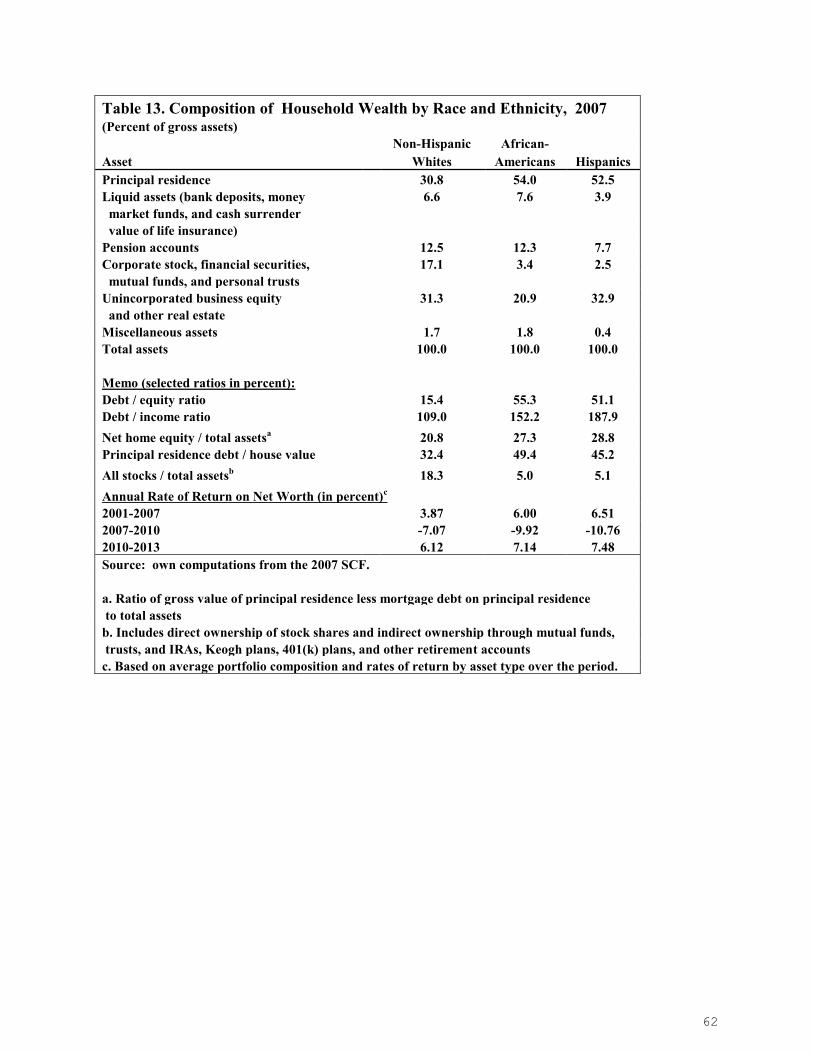
62
Table 13. Composition of Household Wealth by Race and Ethnicity, 2007 (Percent of gross assets) Non-Hispanic African- Asset Whites Americans Hispanics Principal residence 30.8 54.0 52.5 Liquid assets (bank deposits, money 6.6 7.6 3.9 market funds, and cash surrender value of life insurance) Pension accounts 12.5 12.3 7.7 Corporate stock, financial securities, 17.1 3.4 2.5 mutual funds, and personal trusts Unincorporated business equity 31.3 20.9 32.9 and other real estate Miscellaneous assets 1.7 1.8 0.4 Total assets 100.0 100.0 100.0 Memo (selected ratios in percent): Debt / equity ratio 15.4 55.3 51.1 Debt / income ratio 109.0 152.2 187.9 Net home equity / total assetsa 20.8 27.3 28.8 Principal residence debt / house value 32.4 49.4 45.2 All stocks / total assetsb 18.3 5.0 5.1 Annual Rate of Return on Net Worth (in percent)c
2001-2007 3.87 6.00 6.51 2007-2010 -7.07 -9.92 -10.76 2010-2013 6.12 7.14 7.48 Source: own computations from the 2007 SCF. a. Ratio of gross value of principal residence less mortgage debt on principal residence to total assets b. Includes direct ownership of stock shares and indirect ownership through mutual funds, trusts, and IRAs, Keogh plans, 401(k) plans, and other retirement accounts c. Based on average portfolio composition and rates of return by asset type over the period.

63
Table 14. Age-Wealth Profiles and Homeownership Rates by Age Group, 1983-2013
Age 1983 1989 1992 1995 1998 2001 2004 2007 2010 201
3
A. Mean Net Worth (Ratio to Overall Mean) Overall 1.00 1.00 1.00 1.00 1.00 1.00 1.00 1.00 1.00 1.00 Under 35 0.21 0.29 0.20 0.16 0.22 0.19 0.14 0.17 0.11 0.12 35-44 0.71 0.72 0.71 0.65 0.68 0.64 0.65 0.58 0.42 0.64 45-54 1.53 1.50 1.42 1.39 1.27 1.25 1.21 1.19 1.14 0.99 55-64 1.67 1.58 1.82 1.81 1.91 1.86 1.91 1.69 1.80 1.52 65-74 1.93 1.61 1.59 1.71 1.68 1.72 1.57 1.86 1.73 2.01 75 & over 1.05 1.26 1.20 1.32 1.12 1.20 1.19 1.16 1.35 1.17
B. Homeownership Rate (in Percent) Overall 63.4 62.8 64.1 64.7 66.3 67.7 69.1 68.6 67.2 65.1
Under 35 38.7 36.3 36.8 37.9 39.2 40.2 41.5 40.8 37.5 35.6 35-44 68.4 64.1 64.4 64.7 66.7 67.6 68.6 66.1 63.8 61.7 45-54 78.2 75.1 75.5 75.4 74.5 76.1 77.3 77.3 75.2 69.1 55-64 77.0 79.2 77.9 82.3 80.6 83.2 79.1 80.9 78.1 74.2 65-74 78.3 78.1 78.8 79.4 81.7 82.5 81.2 85.5 82.5 85.8 75 & over 69.4 70.2 78.1 72.5 76.9 76.2 85.1 77.0 81.3 80.1 Source: own computations from the 1983, 1989 1992, 1995, 1998, 2001, 2004, 2007, 2010, and 2013 SCF. Households are classified according to the age of the householder.

64
Table 15. Composition of Household Wealth by Age Class, 2007
(Percent of gross assets)
Asset All Under 35 35-44 45-54 55-64 65-74 75 & over
Principal residence 32.8 54.3 43.7 33.8 25.6 28.2 30.2 Liquid assets (bank deposits, money 6.6 5.7 5.4 6.4 6.3 6.1 10.5 market funds, and cash surrender value of life insurance) Pension accounts 12.1 6.0 10.7 13.0 15.8 12.9 5.0 Corporate stock, financial securities, 15.5 4.2 8.6 13.1 16.4 20.5 25.6 mutual funds, and personal trusts Unincorporated business equity and other real estate 31.3 28.7 30.1 32.0 34.4 30.2 27.1 Miscellaneous assets 1.7 1.2 1.5 1.7 1.5 2.1 1.6 Total assets 100.0 100.0 100.0 100.0 100.0 100.0 100.0 Memo (selected ratios in percent): Debt / equity ratio 18.1 92.7 41.3 20.2 11.9 7.1 2.1 Debt / income ratio 118.7 167.5 156.5 118.2 100.0 79.7 29.9 Net home equity / total assetsa 21.4 18.8 21.3 20.9 18.1 23.4 28.7 Principal residence debt / house value 34.9 65.4 51.4 38.3 29.2 16.9 4.9 All stocks / total assetsb 16.8 5.9 11.2 15.1 19.4 21.5 20.0 Annual Rate of Return on Net Worth (in percent)c 2001-2007 4.04 7.90 5.63 4.25 3.68 3.38 2.53 2007-2010 -7.28 -13.49 -9.56 -7.54 -6.64 -6.50 -6.47 2010-2013 6.20 10.70 7.50 6.51 5.92 5.71 5.32 Source: own computations from the 2007 SCF. Households are
classified into age class according to the age of the household head.
a. Ratio of gross value of principal residence less mortgage debt on principal residence to total assets. b. Includes direct ownership of stock shares and indirect ownership through mutual funds,
trusts, and IRAs, Keogh plans, 401(k) plans, and other retirement accounts
c. Based on average portfolio composition and rates of return by asset type over the period.

65
Appendix Table 1. Average Annual Nominal Rates of Return By Asset Type and Period, 1983-2013
Average nominal rates of return by period (percentage)
Description 1983-2013 1983-1989 1989-2001 2001-2007
2007-2010
2010-2013
Residential Real Estate 3.54 4.02 4.49 5.84 -7.22 4.92 Business + Non-Home Real Estate 4.53 3.94 4.10 9.75 -5.83 7.39 Liquid Assets 3.98 6.70 4.69 3.11 1.28 0.12 Financial Assets (including stocks) 9.21 13.32 13.01 2.34 -3.72 12.45 Pension Accounts 7.56 11.63 9.60 3.00 -0.34 8.26 Mortgage Debt 0.00 0.00 0.00 0.00 0.00 0.00 Non-mortgage Debt 0.00 0.00 0.00 0.00 0.00 0.00 Inflation (CPI-U average) 2.88 3.72 3.02 2.66 1.71 2.23 Notes: Real Rate of Return = (1 + nominal rate ) / (1 + ΔCPI) - 1
Owner-Occupied Housing: The source for years 1989 to 2007 is Table 935 of the 2009 Statistical Abstract, US Bureau of the Census, available at [http://www.census.gov/compendia/statab/].For years after 2007, the source is: National Association of Realtors, “Median Sales Price of Existing Single-Family Homes for Metropolitan Areas,” available at: http://www.realtor.org/. The figures are based on median prices of existing houses
for metropolitan areas only.
Business and Non-Home Real Estate: Holding gains (taken from the Flow of Funds table R.100) divided by equity in non-corporate business (taken from the Flow of Funds table B.100), available at:
http://www.federalreserve.gov/releases/Z1/20140605.
Liquid assets: The weighted average of the rates of return on checking deposits and cash, time
and saving deposits, and life insurance reserves. The weights are the proportion of these assets in their combined total (calculated from the Flow of Funds table B.100). The assumptions regarding the rates of return are: zero for checking deposits, the rate of return on a 1-month CD (taken from the table “H.15 Selected Interest Rates” published by the Federal Reserve and available at:
http://www.federalreserve.gov/releases/h15/data.htm) for time and saving deposits and life insurance. Financial assets: The weighted average of the rates of return on open market paper, Treasury
securities, municipal securities, corporate and foreign bonds, corporate equities, and mutual fund shares. The weights are the proportion of these assets in total financial assets held by the
household sector (calculated from the Flow of Funds table B.100). The assumption regarding the rate of return on open market paper is that it equals the rate of return on 1-month Finance paper (taken from the table H.15 “Selected Interest Rates” published by the Federal Reserve and
available at: http://www.federalreserve.gov/releases/h15/data.htm). The data for the rates of return on other assets are taken from the Economic Report of the President 2009, table B.73. The
assumptions regarding Treasury securities, municipal securities, corporate and foreign bonds, and corporate equities are, respectively, average of Treasury security yields, high-grade municipal
bond yield, average of corporate bond yields, and annual percent change in the S&P 500 index.
Mutual fund shares are assumed to earn a rate of return equal to the weighted average of the rates of return on open market paper, securities, and corporate equities. The weights are calculated from the Flow of Funds table L.123.
Stock prices: Table B-96 of the Economic Report of the President, 2013, available at
available at http://www.gpoaccess.gov/eop/tables13.html, with updates to 2013 from:
http://us.spindices.com/indices/equity/sp-composite-1500
Pension (DC) Accounts: Weighted average of returns on stocks, bonds, and money market funds, where the weights are based on the average portfolio composition of DC accounts over the period. Inflation rate: Calculated from the CPI-U, published by the Bureau of Labor Statistics.

66

67

68

69


