
Hour 1 - dcc.ufmg.br · The Visual C++ Environment New Term: An IDE, or Integrated Development...
439
1 - Hour 1 - Introducing Visual C++ 5 Welcome to Hour 1 of Teach Yourself Visual C++ 5 in 24 Hours! Visual C++ is an exciting subject, and this first hour gets you right into the basic features of the new Visual C++ 5 compiler and starts you off building some basic programs. These are the highlights of this hour: • A short overview of the Visual C++ environment and how to work in it • How to compile a simple console-mode program • How to use AppWizard to create a Windows application Exploring Visual C++ 5 Visual C++ 5 is the latest C++ compiler from Microsoft, continuing a long line of Microsoft tools for Windows development. The Visual C++ package contains more than a compiler; it also contains all the libraries, examples, and documentation needed to create applications for Windows 95 and Windows NT. Windows development tools have certainly come a long way since the earliest C and C++ compilers for Windows. By combining into a single tool all the resources required to build Windows applications, Microsoft has made it much easier for you to learn to build applications. The Visual C++ Environment New Term: An IDE, or Integrated Development Environment, is a program that hosts the compiler, debugger, and application-building tools. The central part of the Visual C++ package is Developer Studio, the Integrated Development Environment (IDE), shown in Figure 1.1. Developer Studio is used to integrate the development tools and the Visual C++ compiler. You can create a Windows program, scan through an impressive amount of online help, and debug a program without leaving Developer Studio.
Transcript of Hour 1 - dcc.ufmg.br · The Visual C++ Environment New Term: An IDE, or Integrated Development...
1
- Hour 1 - Introducing Visual C++ 5
Welcome to Hour 1 of Teach Yourself Visual C++ 5 in 24 Hours! Visual C++ is an
exciting subject, and this first hour gets you right into the basic features of the new Visual
C++ 5 compiler and starts you off building some basic programs.
These are the highlights of this hour:
• A short overview of the Visual C++ environment and how to work in it
• How to compile a simple console-mode program
• How to use AppWizard to create a Windows application
Exploring Visual C++ 5
Visual C++ 5 is the latest C++ compiler from Microsoft, continuing a long line of Microsoft tools for
Windows development. The Visual C++ package contains more than a compiler; it also contains all the
libraries, examples, and documentation needed to create applications for Windows 95 and Windows NT.
Windows development tools have certainly come a long way since the earliest C and C++ compilers for
Windows. By combining into a single tool all the resources required to build Windows applications,
Microsoft has made it much easier for you to learn to build applications.
The Visual C++ Environment
New Term: An IDE, or Integrated Development Environment, is a program that hosts the compiler,
debugger, and application-building tools.
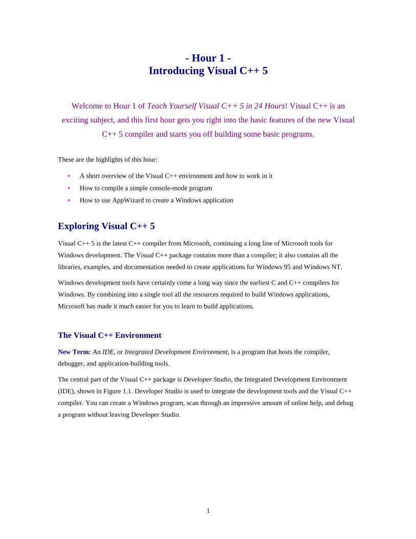
The central part of the Visual C++ package is Developer Studio, the Integrated Development Environment
(IDE), shown in Figure 1.1. Developer Studio is used to integrate the development tools and the Visual C++
compiler. You can create a Windows program, scan through an impressive amount of online help, and debug
a program without leaving Developer Studio.
2
Figure 1.1. Using Developer Studio to create a Windows program.
Visual C++ and Developer Studio make up a fully integrated environment that makes it very easy to create
Windows programs. By using the tools and wizards provided as part of Developer Studio, along with the
MFC class library, you can create a program in just a few minutes.
Many of the programs used as examples in this book require less than a page of additional source code.
However, these programs use the thousands of lines of source code that are part of the MFC class library.
They also take advantage of AppWizard and ClassWizard, two of the Developer Studio tools that manage
your project for you.
Developer Studio Tools
Once upon a time, Windows programmers used simple text editors and tools that were hosted on MS-DOS to
create their Windows programs. Developing a program under those conditions was tedious and error-prone.
Times have definitely changed; Developer Studio includes a number of tools that you might once have paid
extra to purchase.
• An integrated editor offers drag-and-drop and syntax highlighting as two of its major features. You
can configure the Developer Studio editor to emulate the keystroke commands used by two popular
programmer's editors, Brief and Epsilon.

3
• A resource editor is used to create Windows resources, such as bitmaps, icons, dialog boxes, and
menus.
• An integrated debugger enables you to run programs and check for errors. Because the debugger is
part of Developer Studio, it's easy to find and correct bugs. If you find a programming error while
debugging, you can correct the source code, recompile, and restart the debugger.
Developer Studio also features an online help system, which can be used to get context-sensitive help for all
of the tools included in Developer Studio, as well as detailed help on the C++ language, the Windows
programming interface, and the MFC class library.
Developer Studio Wizards
New Term: A Wizard is a tool that helps guide you through a series of steps.
In addition to tools that are used for debugging, editing, and creating resources, Developer Studio includes
several wizards that are used to simplify developing your Windows programs. The most commonly used ones
are
• AppWizard (also referred to in some screens as MFC AppWizard) is used to create the basic outline of
a Windows program. Three types of programs are supported by AppWizard: single document and
multiple document applications based on the Document/View architecture and dialog box-based
programs, in which a dialog box serves as the application's main window. Later in this hour, you will
use AppWizard to create a simple program.
• ClassWizard is used to define the classes in a program created with AppWizard. Using ClassWizard,
you can add classes to your project. You can also add functions that control how messages received
by each class are handled. ClassWizard also helps manage controls that are contained in dialog boxes
by enabling you to associate an MFC object or class member variable with each control. You will
learn more about ClassWizard in Hour 4, "Dialog Boxes and C++ Classes."
• ActiveX ControlWizard is used to create the basic framework of an ActiveX control. An ActiveX
control is a customized control that supports a defined set of interfaces and is used as a reusable
component. ActiveX controls replace Visual Basic controls, or VBXs, which were used in 16-bit
versions of Windows. ActiveX controls are used in Hour 20, "Using ActiveX Controls," and you will
build an ActiveX control in Hour 24, "Creating ActiveX Controls."
MFC Libraries
New Term: A library is a collection of source code or compiled code that you can reuse in your programs.
Libraries are available from compiler vendors such as Microsoft, as well as from third parties.
New Term: Visual C++ 5 includes Version 5.0 of MFC, the Microsoft Foundation Classes, a class library
that makes programming for Windows much easier.

4
By using the MFC classes when writing your programs for Windows, you can take advantage of a large
amount of source code that has been written for you. This enables you to concentrate on the important parts of
your code rather than worry about the details of Windows programming.
New Term: A recent addition to the C++ standard is the Standard C++ Library. This library includes a set of
classes that were known as the Standard Template Library, or STL, during the standardization process. Unlike
the MFC class library, which is used primarily for Windows programming, the standard C++ library is used
for general-purpose programming.
Starting Developer Studio
To start Developer Studio, click the Developer Studio icon located in the Visual C++ folder. To get to the
Visual C++ folder, click the Start button on the taskbar and then select Programs. One of the items in the
Programs folder is Microsoft Visual C++ 5.0. Figure 1.2 shows a start menu tree opened to the Microsoft
Developer Studio icon.
Figure 1.2. Starting Developer Studio from the Start button.
Developer Studio initially displays two windows:
• A Project Workspace window located on the left side; this window contains a table of online help
contents

5
• A Document window on the right side; this window contains the documentation home page
Developer Studio also includes a rich set of menus, toolbars, and other user interface features, as shown in
Figure 1.3.
Figure 1.3. Developer Studio when first started.
Exploring InfoViewer
InfoViewer is the online help system integrated into Developer Studio. InfoViewer is also compatible with the
Microsoft Developer Network CD-ROM, enabling you to search that database for information.
Time Saver: Usually, the indexes used by the InfoViewer are copied to your hard disk and the actual database remains on the CD-ROM. If you would like to speed up InfoViewer, run Visual C++ setup again and install InfoViewer to the hard disk.
Using Dockable Windows in Developer Studio
New Term: Many of the views displayed by Developer Studio are dockable, which means they can be
attached to the edge of the Developer Studio workspace, where they remain until undocked.
The Project Workspace window shown in Figure 1.3 is an example of a dockable view. To "undock" a
dockable window, double-click the window's edge. To dock a floating window, move it to the edge of the
workspace. If it is a dockable window, it docks itself. If you want to move a dockable window close to the
edge of a workspace without docking, press the Ctrl key on the keyboard when moving the window.

6
Getting Context-Sensitive Help
To get context-sensitive help from InfoViewer, press F1. You select a topic based on the current window and
cursor position, and you see the InfoViewer window, containing context-sensitive help. If you press F1 while
editing a source file, help is provided for the word under the cursor. If there is more than one possible help
topic, you see a list of choices.
The Visual C++ Editor
Developer Studio includes a sophisticated editor as one of its tools. The editor is integrated with the other
parts of Developer Studio; files are edited in a Developer Studio child window.
You use the Developer Studio editor to edit C++ source files that will be compiled into Windows programs.
The editor supplied with Developer Studio is similar to a word processor, but instead of fancy text-formatting
features, it has features that make it easy to write source code.
You can use almost any editor to write C++ source code, but there are several reasons to consider using the
editor integrated with Developer Studio. The editor includes many features that are found in specialized
programming editors.
• Automatic syntax highlighting colors keywords, comments, and other source code in different colors.
• Automatic "smart" indenting helps line up your code into easy-to-read columns.
• Emulation for keystrokes used by other editors helps if you are familiar with editors such as Brief and
Epsilon.
• Integrated keyword help enables you to get help on any keyword, MFC class, or Windows function
just by pressing F1.
• Drag-and-drop editing enables you to move text easily by dragging it with the mouse.
• Integration with the compiler's error output helps you step through the list of errors reported by the
compiler and positions the cursor at every error. This enables you to make corrections easily without
leaving Developer Studio.
Just a Minute: If you do choose to use another editor to create your source files, make sure the files are stored as ASCII, also known as "plain text" files. The Visual C++ compiler cannot process files that have special formatting characters embedded in them, such as the files created by word- processing programs.
Using Editor Commands
A large set of editing commands are available from the keyboard. Although most editor commands are also
available from the menu or toolbar, the following commands are frequently used from the keyboard:

7
• Undo, which reverses the previous editor action, is performed by pressing Ctrl+Z on the keyboard.
The number of undo steps that can be performed is configurable in the Options dialog box.
• Redo, which is used to reverse an undo, is performed by pressing Ctrl+Y.
• LineCut, which removes or "cuts" the current line and places it on the Clipboard, is performed by
pressing Ctrl+L.
• Cut removes any marked text from the editor and places it on the Clipboard. This command is
performed by pressing Ctrl+X.
• Copy copies any marked text to the Clipboard but, unlike the Cut command, doesn't remove the text
from the editor. If no text is marked, the current line is copied. This command is performed by
pressing Ctrl+C.
• Paste copies the Clipboard contents into the editor at the insertion point. This command is performed
by pressing Ctrl+V.
This is only a small list of the available keyboard commands. To see a complete list, select Keyboard Map...
from the Help menu. A list of the current keyboard command bindings is displayed, as shown in Figure 1.4.
Figure 1.4. An example of keyboard command bindings in Developer Studio.

8
Creating Your First C++ Program
New Term: A console-mode application is a character-based program that runs in a DOS window.
For your first Visual C++ program, you will build a console-mode program that displays a Hello World
greeting. Console-mode programs are often simpler to build than Windows applications, and this example
will take you through the steps of building and running a program built with Visual C++.
Starting Your First Program
The first stage in writing your first Visual C++ program is to create a project. Follow these steps:
1. Choose File|New from the main menu. The New dialog box will be displayed.
2. Select the Projects tab, and then click the Win32 Console Application icon from the list box.
3. Specify Hello as the project name in the Project name box; a default location for your project will automatically be entered in the Location box (see Figure 1.5).
Figure 1.5. The New Projects dialog box for the Hello project.
4. Click OK to create the project.

9
Editing Your First C++ Source File
The most important parts of any C++ program are the source files. Although the sample program provided in
Listing 1.1 is very short, it contains many of the elements present in all C++ programs.
TYPE: Listing 1.1. A simple C++ console-mode program.
// Hello world example#include <iostream>using namespace std;int main(){cout << "Hello World!" << endl;return 0;
}
Open a new source file document and type the program exactly as shown in Listing 1.1. As discussed earlier,
there are two ways to open a new source file for editing:
• Click the New Text File icon on the toolbar.
• Select File|New from the main menu, and select C++ Source File from the New dialog box under the
Files tab.
If you open a new file for editing while a project is open, you have the option of automatically adding the file
to the currently open project. To take advantage of this option, make sure the Add to Project: check box is
checked, and provide a name for the file in the dialog box (in this case use Hello.cpp).
CAUTION: When using C++, remember that capitalization is important. For example, MAIN and main are two different names to the compiler. White space, such as the number of spaces before a word such as cout, is not significant to the compiler. White space is often used to help make programs more readable.
Just a Minute: If you used the toolbar's New Source File icon to create your new source file, syntax highlighting will not be provided until the file is saved and the file is given a name. This is because the Developer Studio editor uses the file extension to determine the file type, and it does not know what type of file is being edited.

10
Saving a Source File
After you have entered the program in Listing 1.1, save the source file in your project's directory as
Hello.cpp. To save the contents of the editor, click the Save icon on the toolbar. The Save icon looks like a
small floppy disk. You can also press Ctrl+S or select Save from the File menu.
When updating a previously saved source file, you don't see a dialog box, and no further action is needed on
your part. The existing file is updated using the current contents of the editor. If you save a new file, you see
the Save As dialog box, and you must choose a location and filename for the new source file. Save the
contents of Listing 1.1 in the C:\ directory using the name CFoo.cpp. After saving the file, close
CFoo.cpp by selecting Close from the File menu.
To save a file under a new name, select Save As from the File menu or press F12. Enter the new path and
filename using the Save As dialog box as described previously.
If you have not yet added the source file to the project, follow these steps:
1. Select Project|Add To Project|Files... from the main menu. This will display the Insert Files into Project dialog box.
2. Select the Hello.cpp source file and then click OK.
Just a Minute: Visual C++ requires that your C++ source files have a .CPP file extension. This helps Developer Studio properly compile your source code, as well as provide the proper syntax highlighting. Other types of files also have standard extensions. For example, C source files must use the .C extension. Other file extensions will be discussed as they are introduced.
Building the Hello Project
Compile the Hello project by selecting Build|Build Hello.exe from the main menu (or press F7). If you
entered Listing 1.1 correctly, the project is built with no errors, and the last line in the status window reads as
follows:
HELLO.exe - 0 error(s), 0 warning(s)
Time Saver: You can also build the Hello project by clicking the Build button on the toolbar. The toolbar was shown in Figure 1.3.
If errors or warnings are displayed in the Build status window, there is probably an error in the source file.
Check your source file again for missing semicolons, quotes, or braces.
11
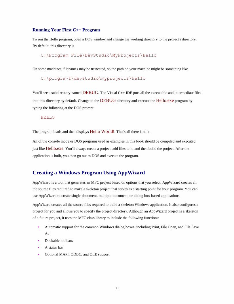
Running Your First C++ Program
To run the Hello program, open a DOS window and change the working directory to the project's directory.
By default, this directory is
C:\Program File\DevStudio\MyProjects\Hello
On some machines, filenames may be truncated, so the path on your machine might be something like
C:\progra~1\devstudio\myprojects\hello
You'll see a subdirectory named DEBUG. The Visual C++ IDE puts all the executable and intermediate files
into this directory by default. Change to the DEBUG directory and execute the Hello.exe program by
typing the following at the DOS prompt:
HELLO
The program loads and then displays Hello World!. That's all there is to it.
All of the console mode or DOS programs used as examples in this book should be compiled and executed
just like Hello.exe. You'll always create a project, add files to it, and then build the project. After the
application is built, you then go out to DOS and execute the program.
Creating a Windows Program Using AppWizard
AppWizard is a tool that generates an MFC project based on options that you select. AppWizard creates all
the source files required to make a skeleton project that serves as a starting point for your program. You can
use AppWizard to create single-document, multiple-document, or dialog box-based applications.
AppWizard creates all the source files required to build a skeleton Windows application. It also configures a
project for you and allows you to specify the project directory. Although an AppWizard project is a skeleton
of a future project, it uses the MFC class library to include the following functions:
• Automatic support for the common Windows dialog boxes, including Print, File Open, and File Save
As
• Dockable toolbars
• A status bar
• Optional MAPI, ODBC, and OLE support
12
After answering a few questions using AppWizard, you can compile and run the first version of your
application in a few minutes.
Building Windows Applications with AppWizard
In general, the following steps are used to build a program using AppWizard:
1. Create a program skeleton using AppWizard.
2. Create any additional resources used by the program.
3. Add any additional classes and message-handling functions using ClassWizard.
4. Add the functionality required by your program. You actually have to write some code yourself for this part.
5. Compile and test your program, using the Visual C++ integrated debugger if needed.
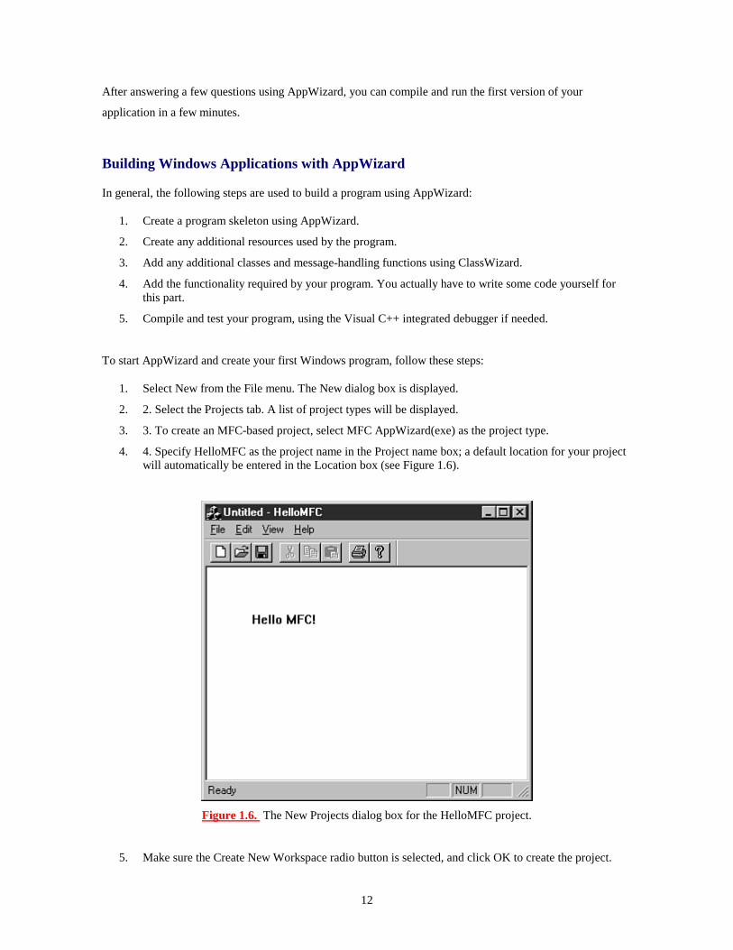
To start AppWizard and create your first Windows program, follow these steps:
1. Select New from the File menu. The New dialog box is displayed.
2. 2. Select the Projects tab. A list of project types will be displayed.
3. 3. To create an MFC-based project, select MFC AppWizard(exe) as the project type.
4. 4. Specify HelloMFC as the project name in the Project name box; a default location for your project will automatically be entered in the Location box (see Figure 1.6).
Figure 1.6. The New Projects dialog box for the HelloMFC project.
5. Make sure the Create New Workspace radio button is selected, and click OK to create the project.

13
6. The first MFC AppWizard screen asks for a project type, as shown in Figure 1.7. MFC AppWizard works similarly to the Developer Studio Setup Wizard, enabling you to move forward and backward using the Next and Back buttons. Select the radio button labeled Single Document and then click the Next button.
Figure 1.7. The first AppWizard screen for HelloMFC.
7. Move through all six MFC AppWizard screens. Each screen enables you to change a different option about the HelloMFC project. Although this example won't use any optional features, feel free to experiment with the options offered by MFC AppWizard.
8. 8. The last MFC AppWizard screen presents a list of classes that is generated for the project. Click the button labeled Finish. MFC AppWizard displays a summary of the project, listing the classes and features you selected, as shown in Figure 1.8.
Figure 1.8. The New Project Information dialog box for the Hello project.
9. Click the OK button to start generating files required for the HelloMFC project.
Exploring the HelloMFC AppWizard Project
After you create the HelloMFC project using MFC AppWizard, the Project Workspace window opens. The
Project Workspace window contains four tabs, each used to show a different view of the current project:
• The ClassView tab displays information about the C++ classes used in the HelloMFC project.
• The ResourceView tab displays information about the resources, such as bitmaps and dialog boxes,
used in the HelloMFC project.
• The FileView tab displays information about the files used for the HelloMFC project.
• The final view is the InfoView, which is used for online help information.
Handling Output Using MFC
The HelloMFC project already contains a function that handles output. It's called OnDraw, and it can be
found in the CHelloMFCView class. When your project is created by AppWizard, the OnDraw function
really doesn't do much useful work--it's up to you to supply a version of this function that does something
meaningful.
To edit the CHelloMFCView class, follow these steps:
1. Click the ClassView tab in the Project Workspace window. A list of the classes used in the HelloMFC application will be displayed. Note that all the class names begin with the letter C. This is

14
a Microsoft naming convention--all of Microsoft's classes begin with C.
2. Expand the CHelloMFCView node of the tree control. A list of functions that are used in the CHelloMFCView class will be displayed.
3. Double-click the function named OnDraw. The editor will open to the OnDraw member function. Edit the CHelloMFCView::OnDraw function so that it looks like the function in Listing 1.2. You will need to remove a comment and two existing lines of code that were in the function already.
TYPE: Listing 1.2. The OnDraw function used for HelloMFC.
void CHelloMFCView::OnDraw(CDC* pDC){
pDC->TextOut(50,50,"Hello MFC!", 10);}
Compile the HelloMFC project by selecting Build|Build HelloMFC.exe from the main menu (or press F7).
The build window displays the progress of the build, which should look something like the following:
Compiling resources...Compiling...StdAfx.cppCompiling...HelloMFCDoc.cppHelloMFC.cppMainFrm.cppHelloMFCView.cppGenerating Code...Linking...
HelloMFC.exe - 0 error(s), 0 warning(s)
Congratulations; you have created a simple Windows program! To execute the HelloMFC project, select
Execute from the Build menu or press F5 on the keyboard. The most common way to launch a project from
Developer Studio is to use the debugger. To start the debugger, click the Go button on the toolbar or press F5
on the keyboard.
Figure 1.9 shows an example of the HelloMFC application running under Windows 95.
Figure 1.9. The HelloMFC program.

15
One unusual aspect of the HelloMFC application is that the message is in a fixed location. If the window is
resized, the text doesn't move. This is because the call to DrawText needs a fixed location for the message
string in the first two parameters:
pDC->TextOut(50,50,"Hello MFC!", 10);
The third parameter is the actual message to be displayed, and the last parameter is the number of characters
in the message.
In the next hour, you will learn how to display the message in the center of the main window.
Summary
In this chapter, you were introduced to Developer Studio and Visual C++, as well as the main tools and
wizards included in Developer Studio and the MFC class library.
You also created two small programs using Visual C++: a console-mode application that displayed "Hello
World!" and a Windows application that was built with AppWizard.
Q&A
Q. If I know C, how much effort is needed to learn C++?
A. C++ is very close to C in a number of ways. Almost every legal C program is also a legal C++ program. C++ introduces the idea of classes, which are discussed in Hour 3. A C++ compiler also has a different standard library than a C compiler. As you will see, Visual C++ makes it very easy to develop Windows programs using C++, even if you have no experience in C or C++.
Q. Can I replace the Developer Studio editor with my own favorite editor?
A. No, but you can use your favorite editor to edit files, then use Developer Studio to build those files into a final executable. You will lose many of the integrated benefits of the integrated editor if you do this, however. You can change the Developer Studio editor to emulate Brief and Epsilon editors if you prefer their keyboard mappings.
Workshop
The Workshop is designed to help you anticipate possible questions, review what you've learned, and begin
thinking ahead to putting your knowledge into practice. The answers to the quiz are in Appendix B, "Quiz
Answers."

16
Quiz
1. What is a library? 2. How do you build a project using Developer Studio? 3. What is a wizard? 4. What are the three most commonly used wizards? 5. How do you invoke context-sensitive help inside the editor? 6. What are the four tab views inside the Project Workspace window? 7. What MFC function is used to display output? 8. What keyboard function is used to start the build process in Developer Studio? 9. What keyboard editor command is used for Undo? 10. What is the difference between Undo and Redo?
Exercises
1. Change the Hello World console-mode program to display your name. 2. The first two parameters in the TextOut function call are the position coordinates for the text message. Experiment with the HelloMFC application, and change the position of the output message.

17
- Hour 2 - Writing Simple C++ Programs
In the previous hour, you compiled some simple programs. Now it's time to learn some
more details about how C++ programs work. Even simple C++ programs demonstrate basic
concepts that are shared by all applications.
In this hour, you will learn
• The common elements of a C++ program
• Standard input and output in a C++ program
• The C++ preprocessor
In this hour you will build a simple C++ program that accepts input from the user and echoes it back on the
screen.
The Common Elements of a C++ Program
Computer programs are composed of instructions and data. Instructions tell the computer to do things, such as
to add and subtract. Data is what the computer operates on, such as the numbers that are added and subtracted.
In mature programs, the instructions don't change as the program executes (at least they're not supposed to).
Data, on the other hand, can and usually does change or vary as the program executes. A variable is nothing
more than the name used to point to a piece of this data.
Fundamental C++ Data Types
The C++ language offers several fundamental data types. As in most other programming languages, these
built-in types are used to store and calculate data used in your program. In later chapters, you use these
fundamental types as a starting point for your own more complex data types.
C++ has a strong type system, which is used to make sure that your data variables are used consistently and
correctly. This makes it easy for the compiler to detect errors in your program when it is compiled rather than
when it is executing. Before a variable is used in C++, it must first be declared and defined as follows:
int myAge;

18
This line declares and defines a variable named myAge as an integer. A declaration introduces the name
myAge to the compiler and attaches a specific meaning to it. A definition like this also instructs the compiler
to allocate memory and create the variable or other object.
When the Visual C++ compiler reads the myAge definition, it will do the following:
• Set aside enough memory storage for an integer and use the name myAge to refer to it
• Reserve the name myAge so that it isn't used by another variable
• Ensure that whenever myAge is used, it is used in a way that is consistent with the way an integer
should be used
Time Saver: It's possible to define several variables on a single line, although as a style issue, many people prefer to declare one variable per line. If you want to make your source file more compact, you can separate your variables by a comma, as follows:
int myAge, yourAge, maximumAge;
This line defines three integer variables. Declaring all three variables on one line of code doesn't make your code execute any faster, but it can sometimes help make your source code more readable.
Understanding Type Safety
New Term: Some languages enable you to use variables without declaring them. This often leads to problems
that are difficult to trace or fix. When using C++, you must declare all variables before they are used. This
enables the compiler to catch most of the common errors in your software program. This capability to catch
errors when your program is compiled is sometimes referred to as type safety.
You can think of type safety as a warranty that the compiler helps to enforce in your C++ program. For
example, if you try to use an int when another type is expected, the compiler either complains or converts the
variable into the expected type. If no conversion is possible, the compiler generates an error and you have to
correct the problem before the program can be compiled.
For example, character values are normally between 0 and 127 and are stored in variables of type char. In
Visual C++, a char is a single byte variable and is quite capable of storing all character values. If the
compiler detects that you are attempting to store a number larger than 127 in a char, it will complain about it
and issue a warning message. Listing 2.1 is an example of a program that tries to store a value that is too large
in a char.

19
TYPE: Listing 2.1. An example of a problem that can be caught by the compiler.
#include <iostream>using namespace std;// This program will generate a compiler warningint main(){char distance = 765;cout << "The distance is " << distance << endl;return 0;
}
To see an example of a type mismatch that is caught by the compiler, create a console mode project with
Listing 2.1 as the only source file, following the steps used in Hour 1, "Introducing Visual C++ 5." The
compiler flags line 6 with a warning; however, it still generates an executable program.
In order to get the program to compile with no warnings and run as expected, you must change line 5 so that
the distance variable is defined as an integer:
int distance = 765;
The new version of the source code is shown in Listing 2.2.
TYPE: Listing 2.2. A corrected version of the previous example.
#include <iostream>using namespace std;// This program will compile properly.int main(){int distance = 765;cout << "The distance is " << distance << endl;return 0;
}
New Term: Another common data type is the floating-point value, or a number with a decimal point.
Floating-point values are stored in float or double variables in C++ programs. These are the only two built-
in (or fundamental) variable types that can store floating-point values.

20
Using Different Variable Types
So far, you've used int and double variables, two of the fundamental types available in C++. They're called
fundamental types because they are the basic data types that are a part of the language definition. There is also
a set of derived types that will be covered in the next few hours. In addition, as you saw earlier with the string
class, you can define your own types that work just like the built-in types. The names of the built-in types
used in C++ include the following:
• bool is a Boolean variable that can have the values true or false.
• char is a variable normally used for storing characters. In Visual C++, it can have any value from -
128 to 127. If char is declared as unsigned, its range is from 0 to 255, and no negative values are
allowed.
• A short int variable, sometimes just written as short, is similar to an int, but it can contain a smaller
range of values. Think of it as a lightweight version of an int that can be used if data storage is a
problem. A short variable can store any scalar (whole) value between -32768 and 32767. If a short
is declared as unsigned, its range is from 0 to 65535.
• int is an integer value used to store whole numbers. When using Visual C++, an int is a 32-bit value
so it can store any value from -2,147,483,648 to 2,147,483,647. If an int is declared as unsigned, its
range is from 0 to 4,294,967,295.
• A long int, sometimes just written as long, is a scalar variable like an int, only larger when using
some compilers. In Visual C++, a long int can store the same values as an int.
• A float variable is the smallest variable type capable of storing floating-point values. It is often an
approximation of the value that was originally stored. In Visual C++, a float stores up to six decimal
digits.
• A double variable stores floating-point values just like a float does. However, the compiler stores
the value with more precision, meaning that a more accurate value can be stored. A double can store
up to 15 decimal digits.
• A long double has the same characteristics as a double. However, from the compiler's point of
view, they are different types. The long double type is part of the C++ language, and on some
machines and compilers, the difference between double and long double is that long double has
greater precision, allowing storage of more than 15 decimal digits.
New Term: Some of the variables in the preceding list can be declared as unsigned. When a variable is
declared as unsigned, it can store only non-negative values. When a variable is declared as an int, it can store

21
both negative and positive numbers. However, an unsigned int can store a much larger positive value than a
plain old int.
An unsigned int can store a larger positive value because the computer must use one bit of data in the
memory location to handle the sign. This sign indicates whether the variable is positive or negative. Because
using the sign bit reduces the number of bits that are available for storage, the maximum value for the variable
is reduced by half. Figure 2.1 is an example of a variable that has been declared as int and another variable
that has been declared as unsigned int.
Figure 2.1. Most computers can use a sign bit to determine whether a variable is positive or negative.
The fundamental variable types require different amounts of storage. As a rule of thumb, the char data type is
large enough to contain all the characters in the machine's native language, or eight bits. The int type is
usually the "natural" variable size for the target machine, so int variables are 32 bits in Visual C++. Table 2.1
lists the number of bytes required to store each of the fundamental types.
Just a Minute: Earlier versions of Visual C++ that were used with Windows 3.1 were 16-bit compilers. The natural variable size under Windows 3.1 was 16 bits, so the int type was 16 bits. The last version of Visual C++ that used 16-bit integers was Visual C++ 1.5.

22
Table 2.1. Storage required for fundamental C++ types.
Type Size (in bytes) bool 1
char 1
short 2
int 4
long 4
float 4
double 8
long double 8
Variable Naming
One important part of programming is the selection of names for your variables and other parts of your
programs. The program listings you've seen so far have been very simple. As you become a more experienced
user of Visual C++, you will need to establish some sort of naming convention for your identifiers.
When naming your variables, use names that are as long as necessary to indicate how the variable is used. A
variable name in C++ is an example of an identifier. Identifiers in C++ are used to name variables and
functions, among other things. In Visual C++, your identifiers can be literally hundreds of characters long and
can include any combination of letters, numbers, and underscores, as long as the first character is a letter or
underscore. Listing 2.3 is an example of several different variable declarations.
TYPE: Listing 2.3. Some examples of good and bad variable names.
#include <iostream>using namespace std;int main(){// Good declarationsint nEmployees; // Number of employeeschar chMiddleInitial; // A middle initial
// Declarations that could be improvedint i, n, k; // What are these vars used for ?float temp; // May not be enough informationchar ch; // Should have more information

23
return 0;}
No matter which technique you use to name your variables, it's important to be consistent. For example, most
of the sample programs and online help examples provided as part of Visual C++ use a naming convention
known as Hungarian Notation.
When Hungarian is used properly, it's easy to tell the logical type of variable at a glance without searching for
its declaration. For example, most scalar variables such as int, long, or short are prefixed with an n.
Variables that are used to store characters are prefixed with ch, as in chEntry and chInitial. Most of the
sample code available from Microsoft uses Hungarian Notation, which will be used for the remainder of the
code listings in this book. A listing of common Hungarian prefixes is provided in Appendix D, "Hungarian
Notation."
DO/DON'T: DO use meaningful names for your variables. DO be consistent in your naming conventions. DO use variable types that match your data. DON'T depend on capitalization to differentiate between variables.
Assigning Values to Variables
In assigning values to variables, the assignment operator is just an equals sign used as follows:
nFoo = 42;
This line assigns the integer value 42 to nFoo.
If a floating-point decimal value is assigned, it's assumed by the compiler to be a double, as follows:
dFoo = 42.4242;
You can assign to a variable of type char in two ways. If you are actually storing a character value, you can
assign the letter using single quotes as shown here:
chInitial = `Z';
The compiler converts the letter value into an ASCII value and stores it in the char variable. Small integer
values can also be stored in a char, and the assignment is done just like an int variable.
chReallyAnInt = 47;

24
Time Saver: The char variable type is sometimes used to store small integer values. This is useful if you are storing a large number of values, because an int takes up four times the storage of a char.
A Simple C++ Program
In Hour 1, you created a C++ project named Hello that displayed a simple "Hello World!" message. This hour
you will make a simple modification to the Hello project--the Hello2 project will ask you for a name and then
use the name in the greeting. Building this project will help demonstrate some common elements found in
C++ programs.
Creating the Hello2 Project
The first step in writing any Visual C++ program is to create a project, as you did in the first hour. To review,
these are the steps required to create a console-mode project:
1. Begin by selecting File | New from the Visual C++ main menu. This will display the New dialog box.
2. Select the Projects tab in the New dialog box. A list box containing different types of projects will be displayed.
3. Select the icon labeled Win32 Console Application, as shown in Figure 2.2. You must also provide a name for the project--a default location will be provided for you automatically.
Figure 2.2. The New Projects dialog box.
After you have selected the project type and the subdirectory, click OK to create the project.
Creating the Source File for Your Program
The source file for the Hello2 project is shown in Listing 2.4. Unlike your first Hello program, this version
collects input from the user and then outputs a greeting.

25
TYPE: Listing 2.4. A console mode program that accepts input.
#include <iostream>#include <string>using namespace std;
// Prompt the user to enter a name, collect the name,// and display a message to the user that contains// the name.int main(){string userName;
cout << "What is your name? :";cin >> userName;cout << "Hello " << userName << "!" << endl;
return 0;}
Open a new C++ source file and type the code shown in Listing 2.4. Remember that C++ is case-sensitive.
Save the file as Hello2.cpp in the project's directory. To review, these are the steps required to open a new
C++ source file and add it to the project:
1. Select File | New from the main menu, and select the Files tab in the New dialog box.
2. Select the icon labeled C++ Source File.
3. Check the Add to Project check box, and enter Hello2.cpp as the filename.
4. Click OK to close the dialog box and open the file for editing.
Compile the Hello2 project by selecting Build | Build Hello2.exe from the main menu (or press F7). If the
source code was entered correctly, the project will be built with no errors, and the last line in the status
window will read
Hello2.exe - 0 error(s), 0 warning(s)
If there are errors or warnings, check the source code for typographical errors and build again.
Running the Hello2 Program
Open a DOS window and change to the DEBUG subdirectory under the Hello2 project directory. Run the
Hello2 program by typing Hello2 at the DOS prompt. The program produces the following output:

26
What is your name? :Alex Hello Alex!
The Hello2 program accepts any name as input and uses that name for its Hello World message.
Analyzing the Hello2 Program
Let's take a look at the Hello2 program because it has a lot in common with much larger C++ programs. Even
though it is fairly short, it has many of the elements that you will see in more complicated Windows programs
later in this book.
Include Statements
The first line of Hello2.cpp is a message to the compiler to include another file when compiling
Hello2.cpp:
#include <iostream>
This #include statement tells the compiler to look for the file named iostream and insert it into your source
file. Actually, the #include statement is read by the preprocessor, a part of the compiler that scans the source
file before the file is compiled.
New Term: Statements read by the preprocessor are known as preprocessor directives because they aren't
actually used by the compiler. Preprocessor directives always begin with a #. You will learn more about
preprocessor statements throughout the rest of the book.
New Term: The file iostream is an example of a header file. A header file contains declarations or other
code used to compile your program. In order to perform common input and output operations, you must
#include the iostream file.
Just a Minute: Traditionally, C++ header files have an .h or .hpp file extension; the standard C++ library includes files such as iostream that have no extension. For backward compatibility, the Visual C++ compiler includes older versions of the include files that have the .h extension.
The #include preprocessor directive is seen in two basic forms:

27
• When including library files, the file to be included is surrounded by angled brackets, as shown in the
Hello2.cpp file shown earlier. The preprocessor searches a predefined path for the file.
• When including header files that are specific to a specific application, the filename is surrounded by
quotes, such as #include "stdafx.h". The preprocessor will search for the file in the current source
file directory. If the file is not found, the search will continue along the predefined include path.
The second line of Hello2.cpp is also an #include directive:
#include <string>
The string header file is part of the standard C++ library. Including the string header file enables a C++ source
file to use the standard string class, which simplifies using text strings in a C++ application.
The std Namespace
New Term: A collection of names and other identifiers in C++ is known as a namespace. By default, any
name that is introduced in a C++ program is in the global namespace. All names found in the standard C++
library are located in the std namespace.
Namespaces make it easier to manage names in large C++ projects, especially when using libraries or code
developed by different groups of people. Before namespaces were introduced to C++, it wasn't unusual to
have two or more libraries that were incompatible with each other simply because they used conflicting
names.
Namespaces allow libraries to place their names into a compartment that itself has a name. As shown in
Figure 2.3, two namespaces can each use a common name, in this case string; because each namespace
provides a compartment for the name string, the two names do not conflict with each other.

28
Figure 2.3. Namespaces provide separate compartments for names used in a C++ program.
When using a name from a namespace, the namespace must be prefixed, like std::string or codev::string.
Alternatively, a using namespace directive can be used to tell the compiler that an identifier can be found
in the global namespace, as in the next line of the program, which tells the compiler that the names found in
the program can be found in the std namespace:
using namespace std;
Using Comments to Document Your Code
New Term: A comment is a note provided to the person reading the source code. It has no meaning to the
compiler or computer.
The next line begins with //, which is used to mark the beginning of a single-line comment in a C++ program.
By default, comments are colored green by the Developer Studio editor. In contrast, int and return are
colored blue to indicate that they are C++ keywords.
Time Saver: It's a good idea to use comments to document your code. After time has passed, you can use your comments to help explain how your code was intended to work.
The main Function
The next line of Hello2.cpp is the beginning of the main function.
int main()

29
The first line inside the main function is a variable declaration.
string userName;
Don't worry too much about what this means--for now, it's enough to know that userName is a string
variable. A string is not one of the fundamental data types; instead, it's part of the standard library. The
string type enables you to use strings of text as though they are built-in fundamental types.
Following the declaration of userName is a statement that displays a message to the user as a prompt for the
user's name:
cout << "What is your name? :";
This particular statement in Hello2.cpp displays a line of characters to the console window by using the
iostream object cout. The iostream library is included with every C++ compiler, although it is not
technically part of the C++ language definition; instead, it's part of the standard C++ library. Performing
standard input and output for your console mode program is easy using the iostream library.
The iostream library uses the << symbol for output and the >> for input to and from IO streams. Think of a
stream as a sequence of bytes, like a disk file, or the output to a printer or a character-mode screen.
Just a Minute: One simple rule of thumb is that when you see the << symbol, the value to the right of the symbol will be output to the IO object on the left. When you see the >> symbol, data from the IO object on the left is stored in a variable to the right.
The next line of Hello2.cpp accepts input from the user and stores it in userName:
cin >> userName;
The variable userName now contains whatever value was entered by the user.
The next line displays the Hello greeting and adds the contents of the userName variable. When using cout,
several different components can be output one after another by separating them with the << symbol:
cout << "Hello " << userName << "!" << endl;
The last line of the main function is a return statement. When a return statement is executed, the function
returns or stops executing, and the caller of the function is passed the value provided after the return

30
keyword. Because this return statement is inside main, the value 0 is passed back to the operating system.
The return keyword can appear almost anywhere in a function. However, as a matter of style, most people
prefer to have a single return statement in a function if possible.
Summary
In this hour, you have learned more details about C++ programs. You wrote a simple console-mode program
and analyzed its parts. You also learned about the C++ preprocessor, type-safety, and variables.
Q&A
Q. When I compile the Hello2 project and enter my first and last name, only the first name is displayed. How can I display my first and last names? A. When using cin to gather input as shown in the Hello2 project, white space such as the space between your first and last name will cause your names be parsed into two separate variables. You can use cin with multiple variables much like you use cout with multiple variables; just separate the variables with the >> operator. A new version of Hello2 that displays first and last names looks like this:
#include <iostream>#include <string>using namespace std;int main(){string strFirstName;string strLastName;
cout << "Please enter your first and last name:";
cin >> strFirstName >> strLastName;
cout << "Hello " << strFirstName << strLastName<< endl;
return 0;}
Q. When I declare a variable, sometimes I get strange error messages from the compiler in the Build window. This is the line that causes the error:
int my age;
A. In C++, all variables must be a single identifier. The compiler complains because after using
31
the identifier as a variable name, it can't figure out what to do with the identifier name. One coding style is to separate the words that make up a variable name with an underscore, like this:
int my_age;
Workshop
The Workshop is designed to help you anticipate possible questions, review what you've learned, and begin
thinking ahead to putting your knowledge into practice. The answers to the quiz are in Appendix B, "Quiz
Answers."
Quiz
1. What is the difference between the cout and cin iostream objects? 2. What are the two forms of the #include preprocessor directive? 3. What type of variable is used to store character values? 4. What is the purpose of a C++ namespace? 5. How can you declare more than one variable on a single line? 6. What is type-safety? 7. What types of variable are used to store floating-point values? 8. How do you assign a value to a variable? 9. What type of variable is normally used to store integer values? 10. Why would you declare a variable as unsigned?
Exercise
1. Modify the Hello2 program to ask for your age in addition to your name; display the name and age in the Hello message.

32
- Hour 3 - Structures, Classes, and the MFC Class Library
In the first two hours, you have learned some of the basic concepts behind C++, and you
have written some simple programs. In this hour, you will be introduced to some more
advanced Visual C++ programming topics. In particular, you will learn
• How functions are used to provide small reusable chunks of code
• How structures and classes are used to create source code and data components
• How expressions and statements are used in C++ programs
• How to use the MFC class library to write Windows programs without using ClassWizard
You will also build sample programs that illustrate the topics you learn about in this hour.
Using Functions
New Term: A function is a group of computer instructions that performs a well-defined task inside a
computer program.
Functions are one of the primary building blocks of C and C++ applications. Functions provide a way to
break up a large program into more manageable parts. At the same time, functions make it possible to perform
the same task at various points within the program without repeating the code.
For example, If you buy a wagon, you'll find that it comes with a full set of assembly instructions and has four
identical wheels. Why should the instructions repeat the steps to assemble a wheel four times? It is much
easier to describe the wheel assembly process once and indicate that you perform the process for each wheel.
The wheel assembly instructions are a module (function), within the full set of assembly instructions
(program), that is executed four times.
Every C++ program has at least one function; this function is called main. The main function is called by
the operating system when your application starts; when main has finished executing, your program has
finished.

33
Declaring Function Prototypes
Before you can use a function, you must declare it by supplying a function prototype to the compiler. To
declare a function, you specify the function's name, its return value, and a list of any parameters that are
passed to it, as shown here:
int CalculateAge(int nYearBorn);
This line is a function prototype for the CalculateAge function, which takes a single integer as a parameter
and returns an integer as its result. A function that returns no value is declared as returning the void type.
New Term: The traditional way to provide function prototypes is to place them in header files, which are
usually named with an .h extension.
Header files that are part of the C++ standard library do not use the .h extension; two examples of standard
header files are iostream and math. These header files contain all the prototypes and other declarations
needed for IO streams and math functions to be compiled correctly.
Defining Functions
A function is defined the same way the main function is defined. All function definitions follow the same
pattern; it's basically the function prototype with the function's body added to it. The function definition
always consists of the following:
• The function's return value
• The function's name
• The function's parameter list
• The actual function body, enclosed in curly braces
Listing 3.1 shows how to use a function to display the Hello World! message. To run this project, create a
new console-mode project named HelloFunc, using the steps described for the Hello and Hello2 projects in
the first two hours.
TYPE: Listing 3.1. The Hello World! program rewritten to use a function.
#include <iostream>using namespace std;// Function prototypevoid DisplayAge(int nAge);

34
int main(){DisplayAge(42);return 0;
}
void DisplayAge(int nAge){cout << "Hello World! I'm " << nAge << " years old."
<< endl;}
Because the function doesn't return a value to the calling function, the return type is defined as void.
Calling Functions
In the C++ language, the act of transferring control to a function is known as calling the function. When a
function is called, you supply a function name and a list of parameters, if any. The following steps take place
when a function is called:
1. The compiler makes a note of the location from which the function was called and makes a copy of the parameter list, if any.
2. Any storage required for the function to execute is temporarily created.
3. The called function starts executing, using copies of the data that was supplied in the parameter list.
4. After the function has finished executing, control is returned to the calling function, and memory used by the function is released.
These steps are shown in Figure 3.1, which uses the function from Listing 3.1 as an example.

35
Figure 3.1. Steps involved in calling a function.
Just a Minute: The requirement that you declare functions before using them is an extension of the C++ type system. Because function prototypes are required, the compiler can detect errors such as incorrect parameters used in a function call.
What Are Structures?
New Term: A structure is a data type that is an aggregate; that is, it contains other data types, which are
grouped together into a single user-defined type.
Just a Minute: Structures are commonly used when it makes sense to associate two or more data variables.
An example of a structure is a payroll record, where the number of hours worked and the pay rate are
combined in a structure, as shown in Figure 3.2.

36
Figure 3.2. Structures are made up of member variables.
Declaring a structure introduces a new type of variable into your program. Variables of this new type can be
defined just like int, char, or float variables are defined. Listing 3.2 is an example of how a structure is
typically used.
TYPE: Listing 3.2. Using a structure to calculate a weekly salary.
#include <iostream.h>
struct TIME_REC{double dHours;double dRate;
};
int main(){TIME_REC payrollRecord;
payrollRecord.dHours = 40.0;payrollRecord.dRate = 3.75;

37
cout << "This week's payroll information:"<< endl;
cout << "Hours worked : " << payrollRecord.dHours<< endl;
cout << "Rate :$" << payrollRecord.dRate<< endl;
double dSalary =payrollRecord.dRate * payrollRecord.dHours;
cout << "Salary :$" << dSalary<< endl;
return 0;}
What Are Classes?
New Term: A class allows data and functions to be bundled together and used as if they are a single element.
Classes typically model real-world concepts that have both data and some sort of behavior, although this is
not a hard and fast rule.
Classes are similar to structures; in fact, classes really are just structures with a different name. Classes have
one feature that makes them very useful for object-oriented programming: Unless a member of a class is
specifically declared as public, that member is generally not accessible from outside the class. This means
that you can hide the implementation of methods behind the external interface.
Just a Minute: Like functions, classes are an important part of the C++ programming language. In fact, one of the earliest names for C++ was C with Classes.
New Term: An instance of a class, sometimes called an object, is an occurrence of a class. An instance of one
of your classes can be used or manipulated inside your programs.
You normally use classes to model objects in your program. Member functions, described in the next section,
are used to control the state of an object, as well as to access any data contained in it.
In programs written with MFC, classes are used to model different parts of the application, such as the
window frame, menus, buttons, and other controls. Member functions are used to handle specific work that
needs to be handled by the class.

38
Classes Versus Instances
Classes and instances of classes are not the same things--this can sometimes be a confusing concept if you are
new to C++ or object-oriented programming. Think of a class as the description of an object; an instance of a
class is a concrete occurrence of that class.
Constructors
New Term: A constructor, sometimes called a "ctor," is a special member function that is created when an
object of the class is created.
A constructor always has the same name as the class and never has a return value, not even void. The
purpose of the constructor is to place a newly created object into a known state. Typically, constructors can
allocate system resources, clear or set variables, or perform some other type of initialization.
Destructors
New Term: A destructor, sometimes called a "dtor," is a special member function that is called as an object is
destroyed. The destructor is declared as having no return type and is never declared with a parameter list. The
name of the destructor is the class name prefixed by a tilde (~) character.
It is not necessary to define a destructor unless there are specific tasks that must be performed to clean up
after an object, such as releasing system resources that might have been allocated.
Using MFC for Windows Programming
In the first hour, you created an MFC program using AppWizard. When you use AppWizard to create a
project, it might seem that you get a great deal of functionality for free. However, a great deal of code is
generated--even a simple program like HelloMFC results in a large number of source files.
MFC doesn't need to be that complicated. In fact, you can write a very simple MFC program that fits in a
single source file and is about one page long.
The HelloWin MFC Example
Listing 3.3 is an example of a simple MFC program that displays a Hello World message in the center of the
client window, much like the HelloMFC program you created in the first hour.

39
TYPE: Listing 3.3. A simple Windows program written using C++ and MFC.
#include <afxwin.h>
// The CHelloApp classclass CHelloApp : public CWinApp{public:BOOL InitInstance();
};
// The CHelloWnd classclass CHelloWnd : public CFrameWnd{public:CHelloWnd();
protected:afx_msg void OnPaint();DECLARE_MESSAGE_MAP()
};
// InitInstance - Returns TRUE if initialization issuccessful.BOOL CHelloApp::InitInstance(){m_pMainWnd = new CHelloWnd;if( m_pMainWnd != 0 ){m_pMainWnd->ShowWindow( m_nCmdShow );m_pMainWnd->UpdateWindow();return TRUE;
}elsereturn FALSE;
}
// Create a message map that handles one message -WM_PAINTBEGIN_MESSAGE_MAP( CHelloWnd, CFrameWnd )
ON_WM_PAINT()END_MESSAGE_MAP()
CHelloWnd::CHelloWnd(){Create( NULL, "Hello" );
}

40
// OnPaint - Handles the WM_PAINT message from Windows.void CHelloWnd::OnPaint(){CPaintDC dc(this);dc.TextOut(50, 50, "Hello World!", 12);
}
// Create a single instance of the application.CHelloApp theApplication;
The simple Windows program provided in Listing 3.3 might seem large, but it's actually about half the size of
a similar program written in C. Using the MFC class library enables you to use a large amount of source code
that has already been written for you. There is a lot of strange-looking code in Listing 3.3, so don't try to
understand it all right now.
Building the HelloWin Example
To build the program, create an MFC Windows project named HelloWin. Begin by selecting File | New from
the Visual C++ main menu; select the Projects tab in the New dialog box. Next, select Win32 Application as
the project type. You must also specify a name and location for your project, just as you did for the projects in
the first two hours.
After the project has been created, open a new C++ source file document and enter the contents of Listing 3.3
exactly as they are shown. Save the file as HelloWin.cpp and add it to the project. (If necessary, refer to
Hour 1, "Introducing Visual C++ 5," for specific instructions.)
Set the linking options for the project by selecting Project | Settings from the main menu. On the tab marked
General is an item labeled Microsoft Foundation Classes. It will have the value Not Using MFC. Change
the selection to Use MFC in a Shared Dll. You can do this by clicking on the down arrow beside the Not
Using MFC selection. This opens a box where you can then make the appropriate selection.
Compile the HelloWin project by selecting Build | Build HelloWin.exe from the main menu (or Press F7).
To start the HelloWin program, select Build | Start Debug | Go from the main menu (or Press F5). Figure 3.3
shows an example of HelloWin running.

41
Figure 3.3. The HelloWin program displaying its message in a window.
The Common Elements of a Windows Program
Two elements are found in almost every Windows program; each of these elements can be found in the
HelloWin program that you just compiled and ran:
• Windows are used for visible parts of an application
• Messages are used to control the interaction between an application and the Windows operating
system
Windows Are Everywhere
One of the fundamental concepts in Windows programming is that everything you see is a window. Some
examples of windows are
• Controls such as pushbuttons, list boxes, and text edit controls
• Dialog boxes and property pages
• Toolbars and menu bars
• The Windows 95 taskbar
• The DOS command box that is used for console-mode applications
All windows have a common set of operations that can be applied to them. They are all re-sized, moved,
enabled, disabled, hidden, and displayed in the same way.
The Client and Non-Client Areas
A window is divided into two main areas, as shown in Figure 3.4:

42
• The non-client area, which contains the border, menus, and caption area for the window
• The client area, which is the area that is left over, also known as the "main" part of the window
Figure 3.4. Client and non-client areas of a window.
The non-client area of a window is normally maintained by Windows; your applications will normally be
concerned only with the client area.
Messages and Functions
When Windows needs to communicate with an application, it sends it a message. A message is similar to a
function call--in fact, the MFC library will route most messages as function calls into your application. For
example, in an AppWizard application, the MFC library calls the OnDraw function whenever Windows
sends a WM_PAINT message.
When your application communicates with a window, it will usually send it a message. To enable or disable a
control, you must send the control a WM_ENABLE message. When using C, this process is very tedious
and error prone. MFC simplifies things by providing functions that you can call and then handling the
message sending for you.

43
What Are Statements and Expressions?
Statements and expressions are the elements defined by the C++ language that are converted into machine
code by the compiler to build your C++ programs. Seems like a textbook-type definition, doesn't it? In reality,
though, it is very hard to define exactly what they are. When talking about a building, we can say that it is
made of bricks, boards, and other things; we can define the brick or board very easily. In the case of the C++
programming language, it is much more difficult. Here we are dealing with abstract concepts. The difference
between a statement and expression is very subtle, as you will soon see. Although it appears to be confusing
at first, the language will become understandable with practice. Eventually the C++ language will become as
natural to you as your native language.
Just like the simple Hello programs, all C++ programs are made up of statements and expressions.
Expressions and statements range from the simple statements that were shown in the Hello programs to very
complex expressions that stretch across several lines.
Statements
All statements end with semicolons. In fact, the simplest statement is called the null statement, and it consists
of only a single semicolon, as follows:
;
The null statement isn't used often; it's used only in situations in which the C++ syntax requires a statement,
but no real work needs to be done.
You use a statement to tell the compiler to perform some type of specific action. For example, you know from
the console mode programs you created that the following statement will cause the characters Hello World!
to be displayed on your screen:
cout << "Hello World!" << endl;
Declarations
A declaration is another type of statement. As discussed earlier, declarations introduce a variable to the
compiler. The following line is an example of a simple declaration:
int myAge;
This tells the compiler that myAge is an integer.

44
Assignment
An assignment expression is used to assign a value to a variable, using the assignment operator, =, as follows:
int myAge;myAge = 135;
Every expression has a value. The value of an assignment expression is the value of the assignment. This
means that the following statement assigns the value 42 to the variables yourAge and myAge:
myAge = yourAge = 42;
The program in Listing 3.4 demonstrates how to assign a value to a variable.
TYPE: Listing 3.4. A C++ program that assigns a value to a variable.
#include <iostream>using namespace std;int main(){int myAge;
myAge = 42;cout << "Hello" << endl;cout << "My age is " << myAge << endl;
return 0;}
The assignment operator is just one example of the operators available in C++. More operators are discussed
in the next section.
Other Common Expressions and Operators
The C++ language contains operators that you can use to write addition, subtraction, multiplication, and other
expressions. Some common math operators are shown in Table 3.1.
Table 3.1. Some common math operators used in C++.

45
Operator Description + Addition
- Subtraction
/ Division
* Multiplication
All math operators group from left to right. The multiplication and division operators have a higher
precedence than the addition and subtraction operators. This means that the following expressions are
equivalent: a + 5 * 3 a + 15 You can use parentheses to force an expression to be evaluated in a preferred
order. Note the grouping of the following expression: (a + 5) * 3 This expression adds 5 to the value stored in
a and then multiplies that value by 3. The math operators can also be combined with an assignment operator,
as follows:
int myAge;myAge = 40 + 2;
The expression 40 + 2 has a value of 42. After that value is calculated, the value of the expression is stored
in the myAge variable.
Rectangles and Regions
The rectangle is a fundamental component of most Windows programs. Because most windows and controls
are rectangular, it isn't surprising that one of the most commonly used data structures in Windows
programming is used to represent a rectangle.
Rectangles are often used to represent the position or size of all types of windows: main windows as well as
controls, toolbars and dialog boxes. There are two basic types of rectangle coordinates:
• Screen rectangle coordinates, which place a rectangle in relationship to the entire screen
• Client rectangle coordinates, which always have their top and left values set to zero and provide the
size of a rectangle that represents a window's client area
Screen rectangle coordinates are often used when moving a window in relation to the entire screen. Client
rectangles are most commonly used when positioning controls or drawing inside a control or other window.
When requesting the dimensions of a rectangle, you must pass a CRect variable to one of the Windows
rectangle functions. The following two lines of code declare an instance of CRect as a variable and pass it to
the GetClientRect function:

46
CRect rcClient;GetClientRect(rcClient);
The next example uses a client area rectangle to display a message to the user, just like the HelloMFC
program in the first hour. The new example will draw the message in the center of the client area; if the
window is resized, the message will be redrawn in the center of the new rectangle.
Create an MFC AppWizard application named HelloRect, following the steps presented in the first hour.
Modify the OnDraw function found in the CHelloRectView class so that it looks like the function shown
in Listing 3.5.
TYPE: Listing 3.5. Using a rectangle to center a message in a window.
void CHelloRectView::OnDraw(CDC* pDC){CRect rcClient;GetClientRect(rcClient);pDC->DrawText("Hello Client Rectangle!",
-1,rcClient,DT_SINGLELINE |DT_CENTER |DT_VCENTER );
}
Build the HelloRect application, and run it from Developer Studio. Note that if you resize the window, the
message is redrawn so that it remains in the center of the client area.
Summary
In this hour, you have learned about some of the more advanced building blocks that make up C++ programs:
functions, structures, and classes. You also looked at some basic information about the MFC class library and
built an MFC application without using ClassWizard.
Q&A
Q. What is the difference between a rectangle that uses screen coordinates and a rectangle that uses client coordinates? A. Every window in a Windows application can be represented by a rectangle; this rectangle will typically use either screen or client coordinates. The rectangle that results from these coordinates is always the same, the difference is only in the point of reference that is used to

47
measure the rectangle. Q. Can a structure have member functions? A. Absolutely. A class and a structure are exactly the same, except that all members of a structure are accessible by default, while class members are private (not accessible) by default. You will learn more about access restrictions in the next hour. Q. Why is no function prototype required for main()? A. The short answer: because the C++ standard says you don't need one. The purpose of function prototypes is to introduce new functions to the compiler; because every C++ program is required to have a main function, no function is necessary.
Workshop
The Workshop is designed to help you anticipate possible questions, review what you've learned, and begin
thinking ahead to putting your knowledge into practice. The answers to the quiz are in Appendix B, "Quiz
Answers."
Quiz
1. What are some examples of the different types of windows found in a Windows application? 2. What is a function? 3. What are the four parts of a function definition? 4. How are classes different from structures? 5. What function is called when an instance of a class is created? 6. What function is called when an instance of a class is destroyed? 7. What is the difference between the client and non-client areas? 8. What is the value of the expression a = 42? 9. What symbol is used for multiplication? 10. What symbol is used for division?
Exercises
1. Write a console-mode program that asks for a distance in miles and converts the distance into feet. There are 5,280 feet in a mile. 2. Modify the HelloWin program to display different messages in different parts of the main window.

48

49
- Hour 4 - Dialog Boxes and C++ Classes
In this hour, you will learn about two fundamental concepts used when creating Windows
programs using C++: object-oriented design and dialog boxes. The following topics are
covered in this hour:
• An introduction to object-oriented design concepts
• Using dialog boxes in your Windows applications
• Creating dialog-based projects
• Adding controls to dialog boxes
• Creating new classes using ClassWizard
Also during this hour, you will create two sample projects that demonstrate how you can use dialog boxes in
your applications.
What Is Object-Oriented Design?
One of the design goals for the C++ language was to provide a language that supported object-oriented
programming and design. Object-oriented design involves classifying real-world objects and actions as
classes that can be created, manipulated, and destroyed.
The data that makes up an object, and the functions that are performed on that object, are combined to form a
class, or a description of that object. Classes can inherit functionality from other objects, and you easily can
add new classes that leverage existing classes.
Just a Minute: Object-oriented programming is not new; the first language to support object-oriented programming, Simula, has been around since the mid-1960s.
Why Use Object-Oriented Design?
In traditional, structured design, the data manipulated by a program and the functions that manipulate the data
are separate. Reusing parts of a design built with structured design techniques often is difficult unless the new
design is very similar to the old design.

50
Object-oriented design is useful because it can be used to create designs that can be reused and extended. A
design, or a portion of a design, can be reused in future programs much like a hardware component, such as a
computer chip, a disk drive, or a sound card. Object-oriented designs describe the object's class completely, so
each class is easily reused because the data and functions described by the class are integrated.
Because you can hide the implementation of a class behind an interface, changing the implementation details
of a class without affecting users of that class--as long as the interface doesn't change--is easy. For example,
the Tab control was not available in versions of Windows before Windows 95. The MFC CPropertyPage
class was rewritten for MFC 4.0 to take advantage of the new Tab control without impacting users of that
class, except that the class is now more efficient.
Describing Objects in a Class
New Term: In C++, objects are described by a class. A class is just a description of the object that can be
created and the actions that can be performed on it.
A C++ class has two main parts:
• The class declaration. This contains the class interface and information about data members for the
class. The class interface usually is located in a header file having a .H suffix. Any file in your
program that uses the class must use the #include directive so that the class declaration is added to
the source file by the preprocessor.
• The class implementation. This includes all the member functions that have been declared as part of
the class. The class implementation usually is located in a file that has a .CPP suffix.
What Is a Dialog Box?
New Term: A dialog box is a specialized window that is used to provide feedback or collect input from the
user. Dialog boxes come in all shapes and sizes, ranging from simple message boxes that display single lines
of text to large dialog boxes that contain sophisticated controls.
New Term: The most commonly used type of dialog box is a modal dialog box. A modal dialog box prevents
the user from performing any other activity with the program until the dialog box is dismissed.
Dialog boxes are also used for one-way communication with a user, such as "splash screens" used to display
copyright and startup information as a program is launched. The opening screen displayed by the Visual C++
Developer Studio and Microsoft Word are two examples of dialog boxes used for one-way communication.
Dialog boxes are sometimes used to notify the user about the progress of a lengthy operation.

51
Just a Minute: Dialog boxes provide a convenient way for users to interact with Windows programs. Users expect most interaction with a Windows program to take place through dialog boxes. All dialog boxes have certain things in common; these common characteristics make the user's life easier, because users don't need to learn and relearn how dialog boxes work from program to program.
There are several different types of dialog boxes, and each of them has a specific purpose. This hour covers
three main types of dialog boxes:
• Message boxes
• Modal dialog boxes
• Modeless dialog boxes
Understanding Message Boxes
The simplest type of dialog box is the message box, which is used to display information. This type of dialog
box is so simple you can call it with just one line of code using the MFC class library. For example, to display
a message box using default parameters supplied by MFC, just use this line:
AfxMessageBox( "Hello World" );
This line of code creates a message box with an exclamation mark inside a yellow triangle. There are several
additional options for the icon displayed in a message box, as you will see later.
Using Dialog Boxes for Input
When most people think of dialog boxes, they think of the dialog boxes that collect input from a user. Dialog
boxes are often used to contain controls that are used to handle user input. You can include in a dialog box a
wide range of controls. In fact, a major portion of this book covers the various types of controls available in
Windows.
New Term: Some dialog boxes are needed so often in Windows programs that they have been included as
part of the operating system. These dialog boxes, known as common dialog boxes, are available by calling a
function and don't require you to create a dialog box resource. There are common dialog boxes for opening
and selecting files, choosing fonts and colors, and performing find and replace operations. Many of the
common dialog boxes are covered later in the book. For example, in Hour 13, "Fonts," you will use a
common dialog box to select a font.
New Term: A dialog box that is modeless enables other activities to be carried out while the dialog box is
still open.

52
An example of a modeless dialog box is the Find and Replace common dialog box used by Developer Studio.
When the dialog box is open, you can still make selections from the main menu, and even open other dialog
boxes. In contrast, all other Developer Studio dialog boxes are modal. As long as they are open, the user
cannot interact with the other parts of Developer Studio.
How Are Dialog Boxes Used?
Developer Studio makes using dialog boxes in a Windows program easy. All the necessary steps are
automated, and the tools used to create the dialog box and include it in a project are all integrated.
Adding Message Boxes
As discussed earlier, you can add message boxes to your program using a single line of code. You must
supply at least a single parameter: the text that is displayed inside the dialog box. Optionally, you can also
specify an icon style and a button arrangement pattern. The types of icons that are available for message
boxes are shown in Figure 4.1.
Figure 4.1. Icons you can include in a message box.
Each of the icons in Figure 4.1 has a specific meaning. When most Windows programs display a message
box, they use a standard icon for each message. When programs use the same icons consistently, users find it
much easier to understand the meanings of information provided with message boxes. The meaning and style
name for each icon is shown in Table 4.1.
Table 4.1. Icons used in Windows message-box dialog boxes.
Icon Displayed Meaning Message Box Style Exclamation mark Warning MB_ICONEXCLAMATION An "i" in a circle Information MB_ICONINFORMATION Question mark Question MB_ICONQUESTION Stop sign Error MB_ICONSTOP

53
In addition, you can specify a button arrangement to be used in the message box. By default, a single button
labeled OK is included in the message box. However, sometimes it's convenient to ask a user a simple
question and collect an answer. One use for these button arrangements is to ask the user what action to take
during an error. For example, the following code displays a message box that contains a question mark icon
and asks the user whether the current file should be deleted:
int nChoice = AfxMessageBox( "Overwrite existing file?",MB_YESNOCANCEL |MB_ICONQUESTION );
if( nChoice == IDYES ){// Overwrite file
}
The user can choose between buttons marked Yes, No, and Cancel. Table 4.2 gives the different button
arrangements possible for a message box.
Table 4.2. Button arrangements.
Message Box Style Buttons Included in Dialog Box MB_ABORTRETRYIGNORE Abort, Retry, and Ignore
MB_OK OK
MB_OKCANCEL OK and Cancel
MB_RETRYCANCEL Retry and Cancel
MB_YESNO Yes and No
MB_YESNOCANCEL Yes, No, and Cancel
The message-box return value indicates the button selected by the user. Table 4.3 is a list of possible return
values and the choice made by the user.
Table 4.3. Message-box return values.
Return Value Button Pressed IDABORT Abort
IDCANCEL Cancel
IDIGNORE Ignore
IDNO No
IDOK OK
IDRETRY Retry

54
IDYES Yes
Using the Bitwise OR Operator
In an earlier code fragment, a vertical bar was used to separate two different options for the
AfxMessageBox function. The vertical bar is the bitwise OR operator, which is used to combine the bit
patterns of two or more values.
Unlike adding two operands, the values are combined "bitwise," meaning that the two values are compared bit
by bit. If a particular bit is high in either operand, the result will have that bit enabled. If a particular bit is low
in both operands, the result will be zero. For example, this expression is equal to 7:
4 | 3
However, the result of the following is also equal to 7:
4 | 7
Each possible parameter has a unique bit pattern, enabling you to use the bitwise OR operator when you
combine parameter values in AfxMessageBox or other MFC function calls.
When using the bitwise OR operator with AfxMessageBox, you can combine one icon style and one
button style. You can't combine two icon styles or two button styles. If no styles are provided, the message
box will contain the exclamation-mark icon and an OK button.
Adding a Dialog Box
Adding a dialog box to a program usually takes four steps:
1. Design and create a dialog box resource using the Developer Studio resource tools.
2. Use ClassWizard to create a C++ class derived from CDialog that will manage the dialog box.
3. Add functions to handle messages sent to the dialog box, if needed.
4. If the dialog box is selected from the main menu, the menu resource must be modified and message-handling functions must be created using ClassWizard.
Each of these steps is covered in the following sections.

55
Understanding Resources
Dialog boxes are just specialized types of windows. However, because they commonly are used for short
periods of time they usually are stored as program resources and loaded only when needed. You can see this
behavior when running a Windows program on a machine that has little free memory. Every time a dialog box
is opened, the hard disk is accessed to load the dialog box resources from the EXE.
Menus and accelerators, which are covered in Hour 10, "Menus," are two types of resources. Here are some of
the other resource types used by Windows programs:
• Bitmaps store images such as the logo from the Visual C++ opening, or splash screen. You will learn
more about bitmaps in Hour 15, "Using Bitmaps."
• Cursors indicate the current mouse position. A program can modify the cursor to indicate that a
specific action can be taken with the mouse at its current position, or for other user-feedback
purposes. You will learn more about cursors in Hour 14, "Icons and Cursors."
• Dialog boxes are windows used to interact with a program's user. The message box covered earlier in
this hour is one example of a dialog box.
• Icons are small bitmaps in a special format that can be used to represent another object in a Windows
program. For example, icons are often used to represent programs and documents that aren't currently
visible.
In this hour you will learn how to create and use dialog box resources. Later hours deal with the other
resource types.
Creating a Dialog Box Resource Using Developer Studio
Developer Studio enables you to create a dialog box and configure it visually. You can add and size controls
by using a mouse. You can set attributes for the dialog box and its controls with a click of a mouse button.
Before using the following steps, create a Single Document MFC AppWizard application named HelloSDI,
following the steps presented in the first hour. Create a new dialog box resource for the HelloSDI project
using either of the following methods:
• Select Resource from the Insert menu, then select Dialog as the resource type.
• Right-click the Dialog folder in the Resource tree, and select Insert Dialog from the pop-up menu.
With either of these methods the dialog box editor is displayed, as shown in Figure 4.2.

56
Figure 4.2. The Developer Studio dialog box editor.
The dialog box that is displayed for editing initially contains two button controls, one labeled OK and another
labeled Cancel. As you will learn in Hour 5, "Button Controls," these are two standard dialog box controls.
The MFC class library usually handles the operation of these controls.
Customizing the Dialog Box's Properties
Every dialog box has properties that you can display by right-clicking and selecting Properties from the pop-
up menu. Here are the dialog box properties under the tab labeled General:
• ID: Normally set to something like IDD_DIALOG1. Naming dialog boxes with an identifier that
begins with IDD_ is an MFC convention, although you should try to name your dialog boxes with a
more meaningful name; rename this dialog box IDD_HELLO.
• Caption: Normally set to a default of Dialog. You should change this to something more meaningful
as well, such as Hello for the sample dialog box.
• Menu: Normally cleared because few dialog boxes use a menu.
• X Pos: Normally cleared to use the default positioning for the dialog box.
• Y Pos: Normally cleared to use the default positioning for the dialog box.
• Font Name: Contains the current font used by the dialog box.

57
• Font Size: Contains the current font size used by the dialog box.
Time Saver: There is also a pushbutton labeled Font... that you can use to change the default font for the dialog box. However, just because you can doesn't mean that you should. Windows enables users to set the font style used in dialog boxes; many users, such as the visually impaired, might need specific fonts to be able to use your dialog box.
Like all windows, a dialog box has several style attributes. You can display these attributes by selecting the
tab labeled Styles. Here are the default values for the following attributes:
• Style: Usually set to Popup for most dialog boxes. In the case of special dialog box templates used in
form views or dialog bars, the style is set to Child.
• Border: Set to Dialog Frame for most dialog boxes.
• Minimize Box: Creates a minimize box for the dialog box. This check box is cleared for most dialog
boxes, indicating that no minimize box is provided.
• Maximize Box: Used to create a maximize box for the dialog box. This check box is cleared for most
dialog boxes, indicating that no maximize box is provided.
• Title Bar: Creates a title bar for the dialog box. This check box is almost always checked because
most dialog boxes have a title bar.
• System Menu: Used to indicate that a system menu should be provided for the dialog box. This check
box is normally checked.
• Horizontal Scroll: Used to create a scrollbar for the dialog box. This check box is almost always
cleared because dialog boxes rarely use scrollbars.
• Vertical scroll: Used to create a vertical scrollbar for the dialog box. Like the horizontal scrollbar, this
attribute is rarely used.
• Clip Siblings: Used only with child windows. This check box is normally cleared.
• Clip Children: Used for parent windows. This check box is rarely checked for most dialog boxes.
The tab labeled More Styles contains additional properties for the dialog box:
• System Modal: Creates a system-modal dialog box. If this option is enabled, the user cannot switch to
another program.
• Absolute Align: Used to indicate how the dialog box is positioned when initially displayed. If this
check box is checked, the dialog box is aligned with the screen instead of with the parent window.

58
• No Idle Message: Prevents a particular window message, WM_ENTERIDLE, from being sent
when the dialog box's message queue is empty. This check box is normally cleared.
• Local Edit: Used to specify how an edit control's memory is allocated. This check box is normally
cleared, which means edit controls use memory outside the program's data segment.
• Visible: Used to specify that the dialog box should be visible when first displayed. This check box is
usually checked. In the case of form views, this check box is cleared. Form views are discussed in
Hour 23, "Advanced Views."
• Disabled: Indicates that the dialog box should be disabled when initially displayed. This check box is
usually cleared.
• 3D-Look: Gives the dialog box a three-dimensional appearance. This check box is usually cleared.
• Set Foreground: Forces the dialog box to be placed into the foreground. This check box is usually
cleared.
• No Fail Create: Tells Windows to create the dialog box even if an error occurs. This check box is
usually cleared.
• Control: Creates a dialog box resource that can be used as a child control. This check box is usually
cleared.
• Center: Causes the dialog box to be centered when it is initially displayed. This check box is usually
cleared.
• Center Mouse: Places the mouse cursor in the center of the dialog box. This check box is usually
cleared.
• Context Help: Adds a question mark icon for context-sensitive help in the title bar. This check box is
usually cleared.
Advanced styles are located under the tab labeled Extended Styles. These styles are rarely used and aren't
discussed in this book.
Adding a Static Text Control
A simple control that you can add to the dialog box is a static text control. The static text control requires no
interaction with the dialog box; it is often used as a plain text label for other controls contained by the dialog
box. To add a static text control, follow these steps:
1. Select the Static Text control icon on the control toolbar. The cursor changes shape to a plus sign when moved over the dialog box.
2. Center the cursor over the dialog box, and click the left mouse button. A static text control is created and contains the label Static.
3. Change the label of the static text control by right-clicking the control and selecting Properties from the shortcut menu; change the caption to "Hello World".

59
The static text control is visible whenever the dialog box is displayed. Text controls are an excellent choice
for labeling controls or messages that are not likely to change. Experiment with changing the size and position
of the static text control by dragging its edges with the mouse.
Creating a Class for the Dialog Box
You can use the CDialog class to manage most of the interaction with a dialog box in your program. The
CDialog class provides member functions that make a dialog box easy to use. You should use ClassWizard
to derive a class from CDialog that is specifically tailored for your dialog box.
To start ClassWizard, use any of these methods:
• Press Ctrl+W almost any time in Developer Studio.
• Select ClassWizard from the View menu.
• Right-click anywhere in the dialog box editor, and select ClassWizard from the pop-up menu.
If ClassWizard knows that a new resource has been added, such as IDD_HELLO, a dialog box asks you to
choose between two options for the new dialog box resource:
• Create a new class.
• Select an existing class.
You should almost always choose to create a new dialog box class unless you are reusing some existing code.
A New Class dialog box is displayed, as shown in Figure 4.3.
Values provided to the New Class dialog box are used by ClassWizard to create a class that will manage the
new dialog box resource. Use the values from Table 4.4 to fill in the values for the IDD_HELLO dialog
box.
Table 4.4. Sample values for the New Class dialog box.
Control Value Name CHelloDlg File Name HelloDlg.cpp Base Class CDialog Dialog ID IDD_HELLO OLE Automation None

60
Figure 4.3. The New Class dialog box.
Click the button labeled OK. The CHelloDlg class is generated, and two files will be added to your project:
• The HelloDlg.h file contains the class declaration.
• The HelloDlg.cpp file contains the class definitions.
Adding a Message Handler for WM_INITDIALOG
Dialog boxes receive the WM_INITDIALOG message from the operating system when all the controls
owned by the dialog box have been created. Most dialog boxes use the WM_INITDIALOG message to
perform any initialization that is needed.
After you have added the CHelloDlg class to the HelloSDI project, you can use ClassWizard to add a
message-handling function for messages such as WM_INITDIALOG.
To add a message handler for WM_INITDIALOG, follow these steps:
1. Open ClassWizard by pressing Ctrl+W or by right-clicking in a source code window and selecting ClassWizard from the menu.
2. Select the tab labeled Message Maps and select from the Class Name combo box the class that will handle the message--in this case, CHelloDlg.
3. Select the object that is generating the message from the Object ID list box--in this case,

61
CHelloDlg. A list of messages sent to the dialog box will be displayed in the Messages list box.
4. Select the WM_INITDIALOG message from the Messages list box and click the Add Function button. ClassWizard will automatically add the OnInitDialog function to the CHelloDlg class.
5. Click OK to close ClassWizard.
The CHelloDlg::OnInitDialog function doesn't really need to initialize any variables, so you can display
a message box instead. Edit OnInitDialog so that it looks like the function in Listing 4.1.
TYPE: Listing 4.1. The CHelloDlg::OnInitDialog function.
BOOL CHelloDlg::OnInitDialog(){
CDialog::OnInitDialog();AfxMessageBox( "WM_INITDIALOG received" );return TRUE;
}
Adding a Menu Choice for the New Dialog Box
To add a menu item to the menu used by HelloSDI follow the steps in this section. Don't worry too much
about what's going on here; you'll learn more about menus in Hour 10.
Menus are stored in your project as resources. To display the current menu resources, select the
ResourceView tab in the project workspace window. Expand the resource tree to show the different resource
types defined for the current project; one of the folders is labeled Menu.
Open the Menu folder to display the single menu named IDR_MAINFRAME. Open the menu resource
by double-clicking the menu resource icon. The menu is displayed in the resource editor ready for editing.
Clicking any top-level menu item displays the pop-up menu associated with that item, as shown in Figure 4.4.

62
Figure 4.4. Using the Developer Studio resource editor to edit a menu resource.
The last item of every menu is an empty box. This box is used to add new menu items to the menu resource.
All menu items are initially added to the end of a menu resource and then moved to their proper position. To
add a new menu item, follow these steps:
1. Double-click the empty box on the File menu to display the Menu Properties dialog box.
2. To add a menu item, provide a menu ID and caption for the new menu item. For this example, enter ID_FILE_HELLO as the menu ID and &Hello as the menu caption.
3. Click anywhere outside the properties dialog box to return to the editor.
After adding a menu item, the next step is to add a message-handling function to handle the new menu item.
To add a message-handling function for the ID_FILE_HELLO menu item, follow these steps:
1. Open ClassWizard by pressing Ctrl+W or by right-clicking in a source code window and selecting ClassWizard from the menu.
2. Select the tab labeled Message Maps and select from the Class Name combo box the class that will handle the message--in this case, CMainFrame.
3. Select the object that is generating the message from the Object ID list box--in this case, ID_FILE_HELLO. Two message-handling functions are displayed in the Messages list box.
4. Select the COMMAND message from the Messages list box and click the Add Function button. Accept the default name suggested by ClassWizard for the function name: OnFileHello.
5. Click OK to close ClassWizard.

63
Edit the CMainFrame::OnFileHello function so that it looks like the function provided in Listing 4.2.
TYPE: Listing 4.2. The message-handling function for the Hello menu item.
void CMainFrame::OnFileHello(){CHelloDlg dlgHello;
if( dlgHello.DoModal() == IDOK )AfxMessageBox( "OK button pressed" );
else // IDCANCELAfxMessageBox( "Cancel button pressed" );
}
Add an #include statement in MainFrm.cpp that includes the class definition for CHelloDlg, found in
HelloDlg.h, by adding the following line just above the include statement for MainFrm.h:
#include "HelloDlg.h"
Compile and run the HelloSDI project. When the DoModal member function is called, the IDD_HELLO
dialog box is displayed. The function call does not return until you close the dialog box by pressing one of the
dialog box's buttons. If you press OK, the return value is IDOK. If you press Cancel, the return value is
IDCANCEL.
Creating Dialog Box-Based Projects
New Term: A dialog box-based project uses a dialog box as the main window of a simple program. For
example, many of the utilities found in the Windows 95 Control Panel are dialog box-based.
A dialog box-based program has a menu that is accessed through the system menu at the upper-left corner of
the dialog box's caption bar. A dialog box-based project is often used to build very small programs that
interact with the user through a single dialog box. The program can be much smaller and easier to program
because the number of classes created by AppWizard is reduced by about half.
Time Saver: If your program must have sophisticated menus, it should not be dialog box based.

64
A user can easily operate a dialog box-based program. There is only one dialog box window, no menu, and all
the available controls usually are initially visible. There are no hidden dialog boxes or menu items, and the
user can usually see exactly which operations should be carried out.
AppWizard Support for Dialog Box-Based Projects
You can create a dialog box-based program using AppWizard, just like the SDI program you built earlier in
this hour. Building a dialog box-based project is one of the initial options offered by AppWizard.
Because a dialog box-based project is much simpler than an SDI or MDI project, fewer steps are required
when using AppWizard. Only four wizard pages are presented by AppWizard when building a dialog box-
based project, versus the six pages required for an SDI or MDI project.
To create a dialog box-based project using AppWizard, follow these steps:
1. Open MFC AppWizard by creating a new project workspace, as you have in previous hours. For the purpose of building an example for this hour, use the name HelloDialog.
2. When the opening screen for AppWizard appears, select a dialog box-based project as the project type.
3. Accept the default project settings suggested by AppWizard and press the Finish button. You can also browse through the Wizard pages and change the default settings. AppWizard creates the dialog box-based project for you, just as it did earlier in the hour for the HelloSDI project.
Exploring the HelloDialog AppWizard Project
After you create the HelloDialog project, take some time to explore the project workspace. Much of the
project workspace looks just as it does for an SDI project. There are four tabs for the different project
workspace views, and several files and resources have been created for you.
There are several differences between a dialog-based project and an SDI or MDI project:
• No menu resource is created for the project. Because the project uses a dialog box as its main
window, there's no need for a menu in most cases.
• There are no document or view classes. Dialog-based projects are intended to be very simple
applications that don't require Document/View support.
• There are two dialog box resources. The main window for the project is a dialog box, as is the About
box. The names of the two dialog box resources for the HelloDialog project are
IDD_ABOUTBOX and IDD_HELLODIALOG_DIALOG.

65
Using the Dialog Box Editor
Open the dialog box editor by double-clicking the IDD_HELLODIALOG_DIALOG icon. The
IDD_HELLODIALOG_DIALOG dialog box is displayed in the dialog box editor, along with a
dockable control toolbar or palette. The dialog box will already contain a static text control. Modify the static
text control so that it reads Hello Dialog Project, as shown in Figure 4.5.
Figure 4.5. The main dialog box for the HelloDialog project.
Build and run the HelloDialog project. Because it is much smaller, the HelloDialog project will compile and
launch faster than an SDI or MDI project. For that reason many of the examples in this book that deal with
controls will use dialog box-based projects.
Summary
This hour began with an introduction to object-oriented design. In this hour, you also learned about dialog
boxes and how they are used in programs written for Windows. This hour also covered the support provided
by Developer Studio, including ClassWizard, the MFC class library, and the dialog box editor.
Q&A
Q. When I display a modal dialog box, no other part of the user interface can be used; does my application also stop functioning while the dialog box is displayed? A. A modal dialog box prevents the user from accessing other parts of your application; it does not prevent Windows from sending events to your message-handling procedures. Your application will continue to work normally while displaying a modal dialog box. Q. Why are C++ classes always split into two files? Wouldn't it be easier to have only a single file that defines the class as is done with Java?

66
A. A key part of most languages that support object-oriented programming is the idea that the description of a class should be kept separate from its implementation. This fits in with the notion of information hiding, where unnecessary details are hidden whenever possible. In a well-designed C++ class, the implementation is considered a detail that the consumer doesn't need to be concerned with. In Java, the class is always defined inside the class declaration, and they are never separated. This simplifies the work required for the compiler and runtime system. However, it also forces you to deal with implementation details when reading the class declaration. If you prefer to define a class inside the class declaration, C++ supports that coding style; just include the function body after its declaration: class CFoo{int m_nBar;
public:CFoo(){ m_nBar = 0; }
void SetBar(int newVal){ m_nBar = newVal; }
int GetBar() const{ return m_nBar; }
};
Workshop
The Workshop is designed to help you anticipate possible questions, review what you've learned, and begin
thinking ahead to putting your knowledge into practice. The answers to the quiz are in Appendix B, "Quiz
Answers."
Quiz
1. What is the difference between a modal and modeless dialog box? 2. What message is sent to a dialog box for initialization purposes? 3. What is the file extension used for C++ class declaration files? 4. What is the file extension used for C++ class implementation files? 5. What message box style is provided by default when using AfxMessageBox?

67
6. What message box style should be used when reporting an error to a user? 7. What MFC class is used to manage dialog boxes? 8. What member function is called to pop up a modal dialog box? 9. If the user presses the Yes button in a message box, what return value is provided to AfxMessageBox? 10. If the user presses the No button in a message box, what return value is provided to AfxMessageBox?
Exercises
1. Change the HelloSDI example so that the message box displayed for WM_INITIDIALOG uses the information icon. 2. Add a second static text label to the HelloDialog project's main dialog box that displays your name.

68
- Hour 5 - Button Controls
Button controls are probably the most flexible controls available in Windows. Before
learning about buttons, though, it's important to begin with a short lesson about conditional
expressions in C++ programs. In this hour you will also learn about
• Using the different types of button controls provided by Windows
• Using the MFC CButton class that is used to manage button controls
• Using the MFC CWnd class to enable and disable controls
Later this hour, you will add each type of button to a dialog box-based project. You will also use ClassWizard
to add button events and member variables for the dialog box's button controls.
What Are Conditional Expressions?
New Term: A conditional expression is an expression that results in a true or false value.
Most programs exercise some type of control over their execution flow using conditional expressions. They
perform different actions based on varying conditions as the execution progresses. Then, they repeat these
actions until all their tasks are complete. For example, a Windows program might need to search for a certain
record from a database, or might take different actions depending on the messages that are sent to it.
New Term: A selection statement uses a conditional expression to pick a particular path of execution in your
program. This is similar to choosing a fork in the road.
New Term: A sequence statement uses a conditional expression to determine how often to execute a part of
your program.
Selecting an Execution Path with Selection Statements
The first set of control statements to look at are the selection statements. If your program must take a
particular action only if a certain condition is true, or if a user must make a choice from a list of possible
items, these statements are for you.

69
Just a Minute: All selection statements work by evaluating an expression, then taking an action based on the value of that expression.
Using the if Statement
The if statement enables one or more statements to be executed only if an expression inside the parentheses is
true. If necessary, values inside the parentheses are converted into Boolean values, with zero being converted
to false and all non-zero values converted to true.
Listing 5.1 provides a function that shows how the if statement is used. If the parameter passed to the
function is greater than zero, the function returns a value of true.
TYPE: Listing 5.1. A function that returns true if a positive number is passed to it.
bool IsPositive( int nCheckValue ){bool bReturn = false;
if( nCheckValue > 0 )bReturn = true;
return bReturn;}
Using Compound Statements
The statement controlled by an if statement is executed only when the test condition is true. If more than one
statement must be executed, group the statements together to form a compound statement. Compound
statements are often called blocks because they group statements into blocks of code.
A compound statement begins and ends with curly braces, just like a function body. All the statements within
a compound statement that follows an if statement are executed when the test condition is true, as shown in
Listing 5.2.
TYPE: Listing 5.2. Using a compound statement to group several statements together.
void PrintTest(bool bShouldPrint){

70
if( bShouldPrint == true ){cout << "A short demonstration of" << endl;cout << "a compound statement - also" << endl;cout << "known as a block." << endl;
}}
In Listing 5.2, the test for equality is made using ==, the equality operator.
CAUTION: A common mistake is to use =, which is the assignment operator.
A standard code-formatting convention is to visually nest each conditional "level" of your source code by
indenting statements, as in Listings 5.1 and 5.2. Indentation helps make your code more readable because it
helps make the flow of control in your source code easy to see.
Using else with if Statements
You can couple an else statement with an if statement to create an either/or selection. When the expression
tested by the if statement is true, the first statement (or block statement) is executed. When the expression is
false, the statements grouped with the else statement are executed instead.
Listing 5.3 provides an example of a function that uses the if and else statements. This function always
returns the larger of two parameters passed to it.
TYPE: Listing 5.3. A function that uses the if and else statements.
int GetMax( int nFirst, int nLast ){int nReturn;
if( nFirst > nLast )nReturn = nFirst;
elsenReturn = nLast;
return nReturn;}

71
Using the switch Statement
Sometimes you must choose between more than just one or two alternatives. Suppose you are implementing a
simple menu function with three choices. If you use the if statement, you might wind up with a function like
the one shown in Listing 5.4.
TYPE: Listing 5.4. A menu-selection function.
//// Processes a selection from a character-based menu. If// a valid selection is made, the proper functions are// called, and true is returned. If an invalid selection// is made, false is returned.
bool HandleMenuSelection( char chSelection ){bool bValidSelection = true;
if( chSelection == `F' )OpenNewFile();
else if( chSelection == `P' )PrintDocument();
else if( chSelection == `S' )SaveFile();
elsebValidSelection = false;
return bValidSelection;}
This is already starting to look a little cluttered, but how bad would it look if you had a few more selections?
What if you had 20 or 30? The solution is to use the switch statement. A switch statement evaluates an
expression and then chooses from a list of choices, as shown in Listing 5.5.
TYPE: Listing 5.5. Using the switch statement.
bool HandleMenuSelection( char chSelection ){bool bValidSelection = true;
switch( chSelection ){

72
case `F':OpenNewFile();break;
case `P':PrintDocument();break;
case `S':SaveFile();break;
default:bValidSelection = false;
}return bValidSelection;
}
As Listing 5.5 shows, the switch statement has several different parts. Here are the major features of a
switch statement:
• The switch() expression. The expression contained inside the switch parentheses is evaluated, and
its value is used as the basis for making the selection.
• One or more case labels. Each case label includes a value. Every case label must be unique. If a
case label's value matches the switch expression, the statements after the case label are executed.
• One or more break statements. The break statement is used to stop execution inside a switch
statement. A break statement is normally placed between every case. If a break statement is
removed, statements in the next case are executed until a break is reached, or until no more
statements remain inside the switch.
• A default label. The default label is selected when no case labels match the switch expression.
What Is a Button?
New Term: A button is a special type of window that contains a text or bitmap label, usually found in a
dialog box, toolbar, or other window containing controls.
Five different types of buttons are provided by Windows:
• Pushbuttons have a raised, three-dimensional appearance and seem to be depressed as they are clicked
with the mouse. Pushbuttons normally have a text label on the face of the control.
• Radio buttons consist of a round button with a label adjacent to it.

73
• Check boxes are made up of a square box that contains a check mark when selected and a label next to
the control.
• Owner-drawn buttons are painted by the button's owner instead of by Windows.
• Group boxes are simply rectangles that are used to surround other controls that have a common
purpose.
In general, buttons are used to indicate a user selection. Buttons are used in Windows programs because they
are convenient and easy for users to operate. Users have come to expect buttons to be presented in a large
number of cases, especially when dialog boxes are present in a program.
What Are Pushbuttons?
Almost every dialog box has at least one pushbutton control to indicate actions that a user can invoke. Some
common uses for pushbuttons include closing a dialog box, beginning a search, or asking for help.
What Are Radio Buttons?
Radio buttons are used when a selection must be made from several mutually exclusive options, such as a
user's gender. Only one of the radio buttons, which usually are grouped together, is checked at any particular
time.
What Are Check Boxes?
Check boxes are used as Boolean flags that indicate whether a particular condition is true or false. Unlike
radio buttons, several check boxes in a group can be checked. Optionally, a check box can support a third
state--disabled--meaning that the control is neither true nor false.
What Are Group Boxes?
A group box logically groups controls that are used for similar purposes. This helps the user understand the
relationships between controls and makes a dialog box easier to use. Radio buttons are almost always
enclosed in a group box so that it's obvious which controls are associated with each other.
MFC Support for Buttons
Button controls normally are created as part of a dialog box. After you add a button to a dialog box, you can
use ClassWizard to add functions that can be used to handle events created when the button is pressed,

74
checked, or selected. You also use ClassWizard to create CButton objects that are associated with individual
button controls.
You can use the MFC class CButton to interact with button controls--both buttons that have been added to a
dialog box resource and buttons that have been created dynamically. Use ClassWizard to associate a button
control with a specific CButton object.
A Sample Project Using Buttons
In order to see how button controls can be used with dialog boxes, create a dialog box-based project named
Button using AppWizard, following the steps provided in Hour 4, "Dialog Boxes and C++ Classes." You will
use this project for the rest of this hour as an example of how to use buttons in a dialog box.
Click the ResourceView tab in the project workspace. Open the dialog box editor by double-clicking the
IDD_BUTTON_DIALOG icon in the Dialog resource folder.
The IDD_BUTTON_DIALOG dialog box is displayed in the dialog box editor, along with a dockable
control toolbar or palette. The floating control palette contains all the controls available for a dialog box, as
shown in Figure 5.1.
Figure 5.1. The floating control palette, showing the buttons and boxes needed to create basic dialog boxes.
There are four different icons on the control palette for buttons, each used for a particular button type. Use
one of the following steps to add a button control to a dialog box:
• Drag a button control from the palette to the dialog box by pressing the left mouse button while over
the control button, then dragging the mouse cursor to the dialog box with the left mouse button still
pressed. Release the mouse button when the cursor is over the desired spot in the dialog box.
• Select a button control by clicking a control in the control palette. Click the desired location for the
control in the dialog box, and the dialog box editor creates a control for you in that location.

75
These steps apply for all controls in the control palette. After you've added a control to the dialog box, you
can use the mouse to reposition and resize it.
As a demonstration, add several buttons to the main dialog box used in the Button project. You will use these
controls later this hour to demonstrate button events. Refer to Figure 5.2 for the location of the added buttons.
Figure 5.2. The main dialog box used by the Button project.
A total of five buttons are added to IDD_BUTTON_DIALOG. Use the values from Table 5.1 to set the
properties for each control. Except for the ID and caption, all controls use the default set of properties.
Table 5.1. Values used for controls in IDD_BUTTON_DIALOG.
Control ID Button Type Caption IDC_BTN_TEST Pushbutton &Test
IDC_RADIO_HIGH Radio button &High
IDC_RADIO_LOW Radio button &Low
IDC_GROUP_VOLUME Group control &Volume
IDC_CHECK_AMP Check box &Amplified
Button Control Properties
Like all controls, buttons have a set of properties that define the behavior of each control. Although there are
four different types of button controls, they share a common set of properties. You can display the properties
for a particular control by selecting Properties from the menu displayed when you right-click the control.
These properties are shared by all button controls:

76
• ID: Used for the button's resource ID. A default resource ID, such as IDC_BUTTON1, is supplied
by Developer Studio. Using IDC_ as a prefix for control resource IDs is a Microsoft naming
convention.
• Caption: Indicates the text that appears as the button's label. Developer Studio supplies a default
name, such as Button. To make one of the letters in the caption of a control the mnemonic key,
precede it with an ampersand (&).
• Visible: Indicates that the button is initially visible. This check box is normally checked.
• Disabled: Indicates that the button should be initially disabled. This check box is normally cleared.
• Group: Marks the first control in a group. All controls following a control with this attribute are
considered part of the same group if this check box is cleared. A user can move between controls in
the same group using the arrow keys.
• Tab Stop: Indicates that this control can be reached by pressing Tab on the keyboard. This check box
is normally checked.
• Default Button: Marks this control as the dialog box's default button. There can be only one default
button in a dialog box, and it is executed if the user presses Enter without using any other controls in
the dialog box. This check box is normally cleared.
• Owner Draw: Indicates that the button will be drawn by the button's owner; in this case, the dialog
box. In most cases, this check box is cleared.
Group boxes support the fewest properties of any button control. All button properties are supported except
Default Button and Owner Draw.
Radio buttons do not use the default button property because they aren't used as default buttons. However,
radio buttons do support two properties not used by pushbutton controls:
• Auto: Automatically changes the state of the control when it is selected. This check box is normally
selected.
• Left Text: Places the control's label on the left side of the check box instead of the right. This check
box is normally cleared.
Check boxes support the same properties as radio controls, except that they are used with one additional
attribute:
• Tri-state: The check box can have three states instead of two. In addition to true and false, the
control can be disabled, meaning that the value is neither true nor false.
In addition, all controls have a property page that is labeled Extended Styles. These styles are rarely used, and
aren't discussed in this book.
77
Using Standard Pushbutton Layouts in Your Dialog Boxes
Several pushbuttons are commonly used in dialog boxes that contain controls. Because each of these
pushbuttons carries a specific meaning, you should try to use the standard terminology whenever possible
because it minimizes the amount of work required for users of your programs. Here are the standard meanings
for these buttons:
• OK: Used to close and accept any information that is present in the dialog box. Any user-supplied
information in the dialog box is used by the program. Note that the OK pushbutton is the only button
spelled with all capital letters.
• Cancel: Used to close the dialog box and remove any changes that might have been performed while
the dialog box was open. If there are changes that cannot be reversed, the label for this button should
be changed to read Close. Changing the label for a button is discussed later in this hour.
• Close: Used to close the dialog box. It does not necessarily imply that any action is taken by the
program. Close is most often used when a Cancel button cannot be used to remove changes made
while the dialog box is open. Many programs change a Cancel button into a Close button.
• Help: Used to request context-sensitive help for the open dialog box.
• Apply: Used to perform changes based on data that has been entered in the dialog box. Unlike the OK
button, the dialog box should remain open after the Apply button is pressed.
Binding a Button Control to a CButton Object
The easiest way to set or retrieve the value of a control is to associate it with a class-member variable using
ClassWizard. When associating a member variable with a control, you can associate the member variable
either with the control or with the control's value. Member variables representing buttons are rarely associated
by value; instead, the CButton class is used to represent most button controls. You will learn about
associating member variables by value with dialog box controls in Hour 6, "Using Edit Controls."
To add a member variable to a CDialog-derived class, follow these steps:
1. Open ClassWizard.
2. Select the tab labeled Member Variables.
3. Select the CDialog-derived class that manages the dialog box; in this case, CButtonDlg.
4. Select the control ID representing the control associated with the new member variable.
5. Press the button labeled Add Variable. An Add Member Variable dialog box appears. Enter the control's name, category, and variable type, then press OK.
6. Close ClassWizard.

78
Follow these steps for all controls added to the IDD_BUTTON_DIALOG earlier. Use the values from
Table 5.2 for each new member variable added to CButtonDlg.
Table 5.2. Values used to add member variables for CButtonDlg.
Control ID Variable Name Category Type IDC_BTN_TEST m_btnTest Control CButtonIDC_GROUP_VOLUME m_btnVolume Control CButtonIDC_CHECK_AMP m_btnAmp Control CButton
ClassWizard automatically adds the member variables to the CButtonDlg class declaration for you.
Adding Button Events to a Dialog Box Class
Although the buttons are part of the dialog box resource and appear whenever the dialog box is displayed,
nothing happens when the buttons are used because no button events are handled by the dialog box class.
Pushbuttons are normally associated with button events in a dialog box class. To add a button event for
IDC_BTN_TEST, follow these steps:
1. Open ClassWizard.
2. Select the tab labeled Message Maps.
3. Select CButtonDlg as the class name.
4. Select IDC_BTN_TEST as the object ID.
5. Select BN_CLICKED from the Messages list box.
6. Press the button labeled Add Function and accept the default name for the member function.
7. Close ClassWizard.
Check boxes and radio buttons sometimes use BN_CLICKED messages, but not as often as pushbuttons.
Add the source code from Listing 5.6 to the CButtonDlg::OnBtnTest function, then compile and run the
project.
TYPE: Listing 5.6. The CButtonDlg::OnBtnTest member function.
void CButtonDlg::OnBtnTest() {
AfxMessageBox( "Test button pressed" );

79
}
Changing a Button's Label
Like all controls, a button is a just a special type of window. For that reason, the MFC class library uses the
CWnd class as a base class for all control classes. To change the label for a button, you can use the
SetWindowText function.
This function commonly is used to change the label for buttons after the dialog box has been created. You can
use the SetWindowText function to change the Amplify button from the earlier example into a Record
button. To do so, replace the CButtonDlg::OnBtnTest function with the function provided in Listing 5.7.
TYPE: Listing 5.7. Changing the label for several buttons.
void CButtonDlg::OnBtnTest(){static BOOL bSetWaterLevel = TRUE;if( bSetWaterLevel == TRUE ){m_btnVolume.SetWindowText( "&Water Level" );m_btnAmp.SetWindowText( "&Record" );bSetWaterLevel = FALSE;
}else{m_btnVolume.SetWindowText( "&Volume" );m_btnAmp.SetWindowText( "&Amplify" );bSetWaterLevel = TRUE;
}}
After you build the Button example using the code from Listing 5.7, the radio button group will alternate
between Volume and Water Level.
Enabling and Disabling Buttons
Most controls are enabled by default, although a control can be initially disabled by setting that attribute in its
property list. A control can be selected only if it is enabled. The CWnd class includes the EnableWindow
member function that allows a CWnd object to be enabled or disabled. Because CButton and all other

80
control classes are derived from CWnd, they include all the member data and member functions from the
CWnd class, and you can disable a button like this:
pButton->EnableWindow( FALSE ); // Disables control
The parameter for EnableWindow is TRUE if the window or control should be enabled, and FALSE if
it should be disabled. The default parameter for EnableWindow sets the parameter to TRUE because no
parameter is needed to enable the control:
pButton->EnableWindow(); // Enables control
It is common practice for buttons and other controls to be enabled or disabled based on events that are
received by the dialog box. As an example, pressing one button can cause another button to be disabled or
enabled. To disable a dialog box control, replace the CButtonDlg::OnBtnTest function with the source
code provided in Listing 5.8.
TYPE: Listing 5.8. Using CWnd::EnableWindow to disable a dialog box control.
void CButtonDlg::OnBtnTest(){static BOOL bEnableControl = FALSE;
m_btnAmp.EnableWindow( bEnableControl );
if( bEnableControl == TRUE )bEnableControl = FALSE;
elsebEnableControl = TRUE;
}
Now when you click the Test button, the Amplify check box is disabled. When you click the Test button
again, the check box is enabled.
Hiding a Button
It's not unusual to need to hide a button that is located in a dialog box. Often, a button has its properties set to
be hidden by default. Once again, the CWnd class has a member function that can be used to hide or display
a window as needed. Use the CWnd::ShowWindow member function like this:
pButton->ShowWindow( SW_HIDE ); // Hide control

81
This code hides the pButton window, which is a button control in this case. To display a hidden window, the
ShowWindow function is used with the SW_SHOW parameter:
pButton->ShowWindow( SW_SHOW ); // Display control
Listing 5.9 provides a function that uses CWnd::ShowWindow to alternately hide and display some of the
other buttons in the main dialog box.
TYPE: Listing 5.9. Using CWnd::ShowWindow to hide a dialog box control.
void CButtonDlg::OnBtnTest(){static int nShowControl = SW_HIDE;
m_btnAmp.ShowWindow( nShowControl );
if( nShowControl == SW_SHOW )nShowControl = SW_HIDE;
elsenShowControl = SW_SHOW;
}
Defining and Setting Tab Order
New Term: When a dialog box is presented to the user, one control will have the keyboard focus, sometimes
just called the focus. The control that has the focus receives all input from the keyboard. When a control has
the focus, it has a dotted focus rectangle drawn around it.
A user can change the focus to a new control by pressing the Tab key on the keyboard. Each time the Tab key
is pressed, a new control receives the focus. If you aren't familiar with how this works, you might want to
experiment with a few dialog boxes from Developer Studio.
New Term: The controls are always selected in a fixed order, known as the tab order. Tab order lets users
select controls without using the mouse. Although almost all Windows users have access to a mouse, using
the keyboard sometimes is more convenient. Also, because tabbing between controls is a standard feature in
Windows dialog boxes, you should use it correctly.

82
Time Saver: The tab order should follow a logical pattern through the dialog box. If the tab order follows a predictable pattern, users of the dialog box will find it much easier to navigate using the Tab key. Usually, the first editable control receives the focus when the dialog box is opened. After that, the focus should be passed to the next logical control in the dialog box. The buttons that control the dialog box--OK, Cancel, and Apply--should receive the focus last.
In a dialog box, the tab order follows the sequence in which controls were defined in the resource script. As
new controls are added, they are placed at the end of the tab order. You can use the resource tools included in
the Developer Studio to change this sequence, thereby altering the tab order.
Time Saver: To prevent a user from selecting a control using the Tab key, clear the Tab Stop property for the control.
With the dialog box displayed in the Developer Studio, select Tab Order from the Layout menu, or press
Ctrl+D. Each control in the dialog box that has the tabstop attribute is tagged with a number, as shown in
Figure 5.3.
Figure 5.3. Displaying the tab order for dialog box controls.
To change the tab order, just click the control that should be in tab position 1; the tag associated with that
control changes to reflect its new tab order. Repeat the process of clicking controls until the displayed tab
order is correct.
Summary
In this hour you learned about the different types of button controls provided by Windows and used the
controls in a variety of ways. You also built a dialog box-based project. Finally, you learned about control tab
order and conditional expressions.
Q&A
Q. What is the difference between BOOL and bool? A. The bool type is defined by the C++ standard, whereas the BOOL type is defined

83
deep inside the Windows header files. In practice, they work very much alike, and you can interchange them without any problem. The reason for the BOOL type is historical; bool was only recently added to the C++ standard, and the BOOL type has been used for Windows programming for many years. In fact, BOOL was used for Windows programming before C++ was invented. Q. When is it more appropriate to hide a control instead of disabling it? A. If a control is unavailable or doesn't make sense for a temporary period, it should be disabled. If the control is unavailable for a long period of time, it should be hidden. In general, the user should be presented with as few options as possible, especially if those options cannot be selected.
Workshop
The Workshop is designed to help you anticipate possible questions, review what you've learned, and begin
thinking ahead to putting your knowledge into practice. The answers to the quiz are in Appendix B, "Quiz
Answers."
Quiz
1. What is the difference between the Cancel and Close buttons? 2. What is the difference between the OK and Apply buttons? 3. What MFC class is used to manage button controls? 4. What are the five types of button controls? 5. How do you prevent the Tab key from being used to select a control? 6. What function is used to disable a control at runtime? 7. What function is used to hide a control at runtime? 8. What is the default label used for in a switch statement? 9. What is the difference between the = and == operators? 10. What function is used to change the label on a button?

84
Exercises
1. Modify the Button project so that the Amplify check box is removed from the tab order. 2. Modify the Button project so that the source code from Listing 5.7 is used, except that the Amplify check box is hidden when the group box caption is set to Water Level.

85
- Hour 6 - Using Edit Controls
In Windows programs, user input is often collected using edit controls. In this hour you will
also learn about
• Identifier scope and lifetime, an important topic for C++ programming
• Using edit controls to collect and display free-form text supplied by the user
• Associating an edit control with CEdit and CString objects using ClassWizard
• Using DDV and DDX routines for data validation and verification
You will also create an SDI project and use it to show how data is transferred in and out of edit controls used
in dialog boxes.
Identifier Scope and Lifetime
New Term: The scope of an identifier refers to its visibility in a C++ program.
Every identifier used to name a variable or function has a specific scope when it is created, and this scope
determines how and where that name can be used. If a variable is "in scope" at a certain point in a program, it
is visible and can be used in most circumstances. If it is "out of scope," it is not visible, and your program will
not be capable of using that variable.
One simple type of scope is shown in the following code sample. The following code is not legal because the
variable myAge is used before it is declared:
myAge = 12;int myAge;
Because the identifier myAge is not in the current scope, it cannot be assigned a value.
Just a Minute: The preceding example illustrates one simple property about visibility: it almost always runs "downward," beginning at the point where the variable is declared. There are also several different types of scope, ranging from very small to very large.

86
Time Saver: In general, your program should use variables that have as small a scope as possible. The smaller the scope, the less chance that an identifier will be accidentally misused or subjected to side effects. For example, passing objects as parameters to a function is always better than relying on global variables. Using variables that are local to the function helps make the function more reusable.
Using Different Types of Scope
The scope of an identifier comes into play whenever an identifier is declared. The most commonly used types
of scope available in a C++ program are
• Local scope
• Function scope
• Class scope
Each of these types of scope is discussed in the following sections.
Local Scope
The simplest example of local scope is a variable or other object that is declared outside any functions, like
this:
int foo;
int main(){return 0;
}
In this example, the variable foo is in scope from the point of its declaration to the end of the source file. For
this reason, this type of local scope is sometimes called file scope. All declarations that occur outside class or
function definitions have this type of scope.
Variables declared inside a function body have local scope and are visible only within the function.
Another type of local scope is block scope, where a variable within a compound statement or other block is
visible until the end of the block, as shown in Listing 6.1.

87
TYPE: Listing 6.1. An example of local block scope.
if( bPrinting == true){int nMyAge = 42;cout << "My age is " << nMyAge << endl;
}// nMyAge is not in scope here.
The variable nMyAge has block scope and can be used only between the curly braces.
Function Scope
Function scope is rarely an issue. Function scope applies to labels declared inside a function definition. The
only time you would use a label is with the widely discouraged goto statement.
None of the labels declared in a function are visible outside the function. This means that the C++ language
does not directly support jumping to a label outside the current function. It also means that you can reuse
labels in different functions.
Class Scope
All identifiers used in a class, union, or structure are tightly associated with the class and have class scope. An
identifier with class scope can be used anywhere within the class, union, or structure.
If a class or variable name is used to qualify access to the identifier, it also is visible outside the class. For
example, if a class is defined as follows, the variables m_myVar and m_myStaticVar are in scope for all
the CFoo member functions:
// class CFooclass CFoo{public:CFoo();
int GetMyVar();int GetStaticVar();
int m_myVar;static int m_myStaticVar;
};

88
int CFoo::m_myStaticVar;
Outside the CFoo class, the variables can be accessed only through a CFoo object, like this:
aFoo.m_myVar = 42;
There is one exception to the rule that requires a member to be accessed with a variable name: A class
member declared as static is shared by all objects of that class. Static members of a class exist even when no
objects of a class have been created. To access a static class member without using a class object, prefix the
class name to the member name, like this:
CFoo::m_myStaticVar = 1;
Understanding Identifier Lifetime
In a C++ program, every variable or object has a specific lifetime, which is separate from its visibility. It is
possible for you to determine when a variable is created and when it is destroyed.
Just a Minute: Lifetime can be an important issue when you design your program. Large objects can be costly to create and destroy. By understanding the lifetime of objects created in your programs, you can take advantage of features in the C++ language that help your programs run more efficiently.
Static Lifetime
A variable declared as static in a function is created when the program starts and is not destroyed until the
program ends. This is useful when you want the variable or object to remember its value between function
calls. Listing 6.2 is an example of a static object in a function.
TYPE: Listing 6.2. A static object in a function, destroyed when the program ends.
#include <iostream>using namespace std;
void PrintMessage();
int main(){for( int nMessage = 0; nMessage < 10; nMessage++ )PrintMessage();
return 0;

89
}
void PrintMessage(){static int nLines = 1;cout << "I have printed " << nLines << " lines."
<< endl;nLines++;
}
Understanding Edit Controls
New Term: An edit control is a window used to store free-form text input by a user.
New Term: A single-line edit control is an edit control that enables a single line of text to be entered.
New Term: A multiple-line edit control, sometimes called an MLE, is an edit control that enables multiple
lines of text to be entered.
Edit controls are usually found in dialog boxes. Almost anywhere user input is required, you can usually find
an edit control.
Why Use an Edit Control?
Single-line edit controls are used when text must be collected. For example, when a name or address must be
entered in a dialog box, an edit control is used to collect that information. Multiline edit controls often use
scrollbars that enable more text to be entered than can be displayed.
A prompt in the form of default text can be provided for an edit control. In some situations, this can reduce
the amount of typing required by a user. All edit controls also support a limited amount of editing, without
any need for extra programming on your part. For example, the standard cut-and-paste commands work as
expected in an edit control. Table 6.1 lists the editing commands available in an edit control.
Table 6.1. Editing commands available in an edit control.
Command KeystrokeCut Control+X Paste Control+V Copy Control+CUndo Control+Z
90
Just a Minute: Because of the built-in editing capabilities of the edit control, it's possible to create a simple text editor using a multiple-line edit control. Although an MLE cannot replace a real text editor, it does provide a simple way to collect multiple lines of text from a user.
One difference between edit controls and the pushbutton controls you saw in Hour 5, "Button Controls," is
that a button control is normally used to generate events. An edit control can generate events also, but it most
often is used to actually store data.
MFC Support for Edit Controls
You normally add edit controls to a dialog box just as you added buttons in Hour 5. After you add the control
to a dialog box, use ClassWizard to configure the control for use in the program.
The MFC class CEdit is often used to interact with edit controls. As you will see in the next section, you can
use ClassWizard to associate an edit control with a specific CEdit object. An edit control can also be
associated with a CString object, which can simplify the use of edit controls in dialog boxes. You will learn
about using edit controls associated with CString objects in detail beginning with the section "Passing
Parameters to Dialog Boxes Using DDV and DDX Routines," later in this hour.
Just a Minute: Of course, edit controls can be used in dialog box-based programs, which were discussed in Hour 5. However, in this hour an SDI program is used to show off some of the data exchange and validation features often used with edit controls.
Building an SDI Test Project
Some of the sample programs in this book require you to build an SDI project and add a test dialog box. You
can use the following steps to build a test project that includes a test dialog box:
1. Create an SDI project named EditTest using MFC AppWizard, as discussed in Hour 1, "Introducing Visual C++ 5." Feel free to add or remove any of the optional features suggested by AppWizard, because they aren't used in this hour.
2. As discussed in Hour 4, "Dialog Boxes and C++ Classes," add a dialog box resource to the program. Name the dialog box IDD_TEST, and set the caption to Test Dialog. Using ClassWizard, create a dialog box class called CTestDlg for the new dialog box.
3. Add a menu choice named ID_VIEW_TEST, with a caption of Test... that brings up the Edit dialog box by adding a new menu choice on the View menu. Add a message-handling function for the new menu item using ClassWizard. The steps required to add a message-handling function that uses a CDialog-based object were discussed in Hour 4. Use the source code provided in Listing 6.3 for the CMainFrame message-handling function.

91
4. Include the class declaration for CTestDlg in the MainFrm.cpp file by adding the following line after all the #include directives in MainFrm.cpp: #include "testdlg.h"
5. Add a pushbutton control, IDC_TEST, labeled Test, to the dialog box, as was done in Hour 5. Using ClassWizard, add a function that handles the BN_CLICKED message, which will be used in later examples.
6. After following these steps, make sure that the project compiles properly by pressing the Build icon on the toolbar or by selecting Build|Build EditTest.exe from the main menu. Try the menu item to make sure the IDC_TEST dialog box is displayed when View|Test... is selected.
TYPE: Listing 6.3. Handling a menu-item selection for EditTest.
void CMainFrame::OnViewTest(){CTestDlg dlg;
dlg.DoModal();}
Adding an Edit Control to a Dialog Box
You add an edit control to a dialog box just as you added a button control in Hour 5, using either of these two
basic methods:
Using drag-and-drop, drag an edit control from the control palette and drop at a desirable location in the
dialog box.
Select an edit control by clicking the Edit Control icon in the tool palette, and click over the location in the
dialog box where the edit control should be located.
Arrange the edit control so that the dialog box resembles the one in Figure 6.1.

92
Figure 6.1. The dialog box used in the edit control examples.
In Figure 6.1, a static text control is located immediately to the left of the edit control. Edit controls are
usually labeled with static text so a user can determine the type of input needed. Static text controls were
discussed in Hour 4. The ID for the new edit control is set by default to IDC_EDIT1 or a similar name.
Change the ID to IDC_EDIT_TEST, leaving the other properties set to their default values.
Edit Control Properties
You can examine the properties for an edit control, just as with other resources, by right-clicking over the
control and selecting Properties from the pop-up menu. These general properties are available for an edit
control:
• ID: Used for the edit control's resource ID. Like other controls, a default resource ID is supplied by
Developer Studio.
• Visible: Indicates that the edit control is initially visible. This option is normally selected.
• Disabled: Indicates that the edit control should be initially disabled. This option is not normally
selected.
• Group: Used to mark the first control in a group. All controls following a control with this attribute
are considered part of the same group if the attribute is cleared. A user can move between controls in
the same group using the arrow keys.
• Help ID: Creates a context-sensitive help ID for this control.
• Tab Stop: Indicates that this control can be reached by pressing the Tab key. This option is normally
selected.
There also is a group of properties that apply specifically to edit controls. The following properties are
displayed by clicking the Styles tab in the Properties dialog box:
• Align Text: A drop-down list box that is enabled if the edit control is an MLE. The text can be aligned
to the left, center, or right, with left as the default.

93
• Multiline: Defines the control as an MLE. This option is not selected by default.
• Number: Restricts the edit control to digits only. This feature is available only in Windows 95 or
Windows NT version 3.51 or later.
• Horizontal Scroll: Enabled only for an MLE and provides a horizontal scrollbar. The option is not
selected by default.
• Auto HScroll: Scrolls text to the right if needed. This option is normally selected.
• Vertical Scroll: Enabled only for an MLE and provides a vertical scrollbar. The option is not selected
by default.
• Auto VScroll: Enabled only for an MLE and provides automatic scrolling when the user presses
Return on the last line. The option is not selected by default.
• Password: Hides the user's input by displaying an asterisk instead of each character. This option is
available only in single-line controls and is not selected by default.
• No Hide Selection: Changes the way an edit control handles the focus. When this option is enabled,
text appears to be selected at all times. This option is not selected by default.
• OEM Convert: Performs conversions on the user's input so that the AnsiToOem function works
correctly if called by your program. This option is not selected by default.
• Want Return: Applies to MLE controls. This option allows an edit control to accept an Enter
keypress, so that an Enter keypress doesn't affect the dialog box's default pushbutton.
• Border: Creates a border around the control. This option is selected by default.
• Uppercase: Converts all input to uppercase characters. This option is not selected by default.
• Lowercase: Converts all input to lowercase characters. This option is not selected by default.
• Read-only: Prevents the user from typing or editing text in the edit control. This option is not selected
by default.
Binding a CEdit Object to an Edit Control
As discussed earlier, one way to interact with an edit control is through a CEdit object that is attached to the
control. To attach a CEdit object to an edit control, you use ClassWizard much as you did for button controls
in the previous hour:
1. Open ClassWizard.
2. Select the CDialog-derived class that manages the dialog box; in this case, CTestDlg.
3. Select the tab labeled Member Variables.
4. Select the control ID representing the control associated with the new member variable; in this case, IDC_EDIT_TEST.
5. Click the button labeled Add Variable. An Add Member Variable dialog box appears. Enter the control's name, category, and variable type, then click OK. For this example, use the values from Table 6.2.

94
Table 6.2. Values used to add a CEdit member variable for CTestDlg.
Control ID Variable Name Category Type IDC_EDIT_TEST m_editTest Control CEdit
The default value displayed in the Category control is Value. The Value category is used for some member
variables later this hour, when you learn about DDV and DDX routines.
Collecting Entered Text from an Edit Control
The primary reason for using an edit control, of course, is to collect information from a user. To do that, you
must get the information from the edit control. Using the CEdit class simplifies this process.
Using CEdit Member Functions to Retrieve Text
Several CEdit member functions are useful when collecting information from an edit control, such as the
GetWindowText and LineLength member functions. As an example, add the source code in Listing 6.4
to the CTestDlg::OnTest member function, created earlier.
TYPE: Listing 6.4. Collecting input from an edit control using CEdit.
void CTestDlg::OnTest(){CString szEdit;CString szResult;
int nLength = m_editTest.LineLength();m_editTest.GetWindowText( szEdit );szResult.Format( "%s has %d chars", szEdit, nLength );
AfxMessageBox( szResult );}
When the Test button is clicked, the text entered in the edit control is retrieved by using the m_editTest object. Normally, you are interested only in data contained in an edit control if OK is clicked. If the Cancel
button is clicked, the dialog box should be closed and, usually, any entered information is simply discarded.
95
Passing Parameters to Dialog Boxes Using DDV and DDX Routines
The DDV and DDX routines are helper functions that help manage data for dialog boxes. DDV, or Dialog
Data Validation, routines are used for data validation. DDX, or Dialog Data Exchange, routines are used to
exchange data to and from the controls in a dialog box.
Time Saver: Although you can use the DDV and DDX routines in your dialog boxes directly, ClassWizard adds the code for you at the click of a button. Normally, you add the DDV and DDX routines with ClassWizard instead of trying to hand-code the necessary function calls.
Why Are DDV and DDX Routines Used?
The DDV routines are useful when collecting data from an edit control. In general, you have little control
over how a user enters data in an edit control. A DDV enables you to perform some simple validation based
on range or string length.
Just a Minute: For example, if an edit control is used to collect an abbreviated state name, you want to limit the entered text to two characters. Using a DDV routine, it's easy to make sure that two characters have been entered.
DDX functions link member variables from the dialog box class to controls that are contained in the dialog
box. DDX routines enable data to be transferred to and from the controls much easier than is otherwise
possible. As discussed in Hour 4, a dialog box is normally used something like this:
CMyDialog dlgMine; dlgMine.DoModal();
In this example, the dialog box is created when DoModal is called, and the function does not return until the
user closes the dialog box. This presents a problem if data must be passed to or from the dialog box. Because
none of the controls exist until the dialog box is created, using SetWindowText, GetWindowText, or
other functions to interact directly with controls contained in the dialog box is not possible. After the dialog
box has been dismissed, it is too late to use those functions to collect user input.
When DDX routines are used to exchange information with a dialog box, the dialog box can be used like this:
CMyDialog dlgMine; dlgMine.m_szTest = "Hello World"; dlgMine.DoModal();

96
The DDX routines enable you to have access to the dialog box's controls before and after the dialog box has
been created. This simplifies dialog box programming because it is a much more flexible method than adding
code in the InitDialog member function.
How Are DDV and DDX Routines Used?
The easiest and most useful way to add DDV and DDX routines to your dialog box class is by using
ClassWizard. Member variables associated with dialog box controls by value automatically use the DDV and
DDX routines provided by MFC. For example, CString member variables are often associated with edit
controls. ClassWizard adds source code to handle the exchange and validation of data in two places:
• In the dialog box's constructor, source code is added to initialize the member variable.
• In the dialog box's DoDataExchange member function, ClassWizard adds DDV and DDX routines
for each member variable associated with a control's value.
DoDataExchange is a virtual function that is called to move data between the control and the dialog box's
member data. DoDataExchange takes a single parameter, either TRUE or FALSE, with TRUE as the
default parameter. When DoDataExchange( FALSE ) is called, data is moved from the member variable
to the control. When DoDataExchange( TRUE ) is called, data is copied from the control to the member
variable.
When the dialog box is initially displayed during CDialog::OnInitDialog, UpdateData(FALSE) is
called to transfer data from the member variables to the dialog box's controls. Later, during
CDialog::OnOk, UpdateData() is called to transfer data from the dialog box's controls to member
variables.
As shown in Figure 6.2, DoDataExchange has a single parameter that controls the direction that data, in
this case m_szTest, is copied.
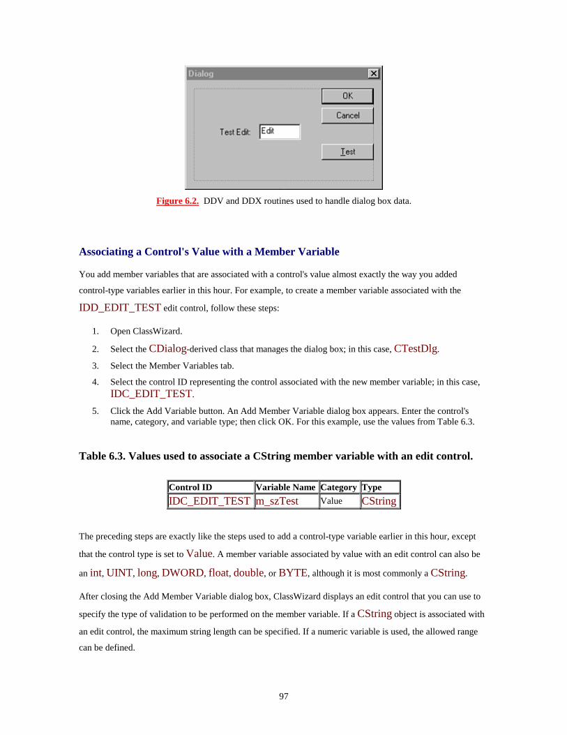
97
Figure 6.2. DDV and DDX routines used to handle dialog box data.
Associating a Control's Value with a Member Variable
You add member variables that are associated with a control's value almost exactly the way you added
control-type variables earlier in this hour. For example, to create a member variable associated with the
IDD_EDIT_TEST edit control, follow these steps:
1. Open ClassWizard.
2. Select the CDialog-derived class that manages the dialog box; in this case, CTestDlg.
3. Select the Member Variables tab.
4. Select the control ID representing the control associated with the new member variable; in this case, IDC_EDIT_TEST.
5. Click the Add Variable button. An Add Member Variable dialog box appears. Enter the control's name, category, and variable type; then click OK. For this example, use the values from Table 6.3.
Table 6.3. Values used to associate a CString member variable with an edit control.
Control ID Variable Name Category Type IDC_EDIT_TEST m_szTest Value CString
The preceding steps are exactly like the steps used to add a control-type variable earlier in this hour, except
that the control type is set to Value. A member variable associated by value with an edit control can also be
an int, UINT, long, DWORD, float, double, or BYTE, although it is most commonly a CString.
After closing the Add Member Variable dialog box, ClassWizard displays an edit control that you can use to
specify the type of validation to be performed on the member variable. If a CString object is associated with
an edit control, the maximum string length can be specified. If a numeric variable is used, the allowed range
can be defined.

98
Exchanging Edit-Control Information Using DDX Functions
The member variables associated with dialog box controls by ClassWizard are added to the dialog box class
as public variables. This allows the member variables to be easily accessed and used. For example, to use the
m_szTest variable that was added in the previous section, edit the CMainFrame::OnViewTest member
function so it looks like the function in Listing 6.5. Before compiling the project, remove the following line,
which was added to CTestDlg::OnInitDialog earlier:
m_editTest.SetWindowText( "Default" );
TYPE: Listing 6.5. Using member variables to exchange information with an edit
control.
void CMainFrame::OnViewTest(){CTestDlg dlg;
dlg.m_szTest = "DDX Test";
if( dlg.DoModal() == IDOK ){AfxMessageBox( dlg.m_szTest );
}else{AfxMessageBox( "Dialog cancelled" );
}}
Listing 6.5 sets the value of m_szTest before the dialog box is displayed to the user.
CDialog::OnInitDialog calls the CWnd::UpdateData function, which calls UpdateData. Because
UpdateData is a virtual function, the proper version of the function is called--the version that is part of the
CDialog-derived class that handles the dialog box.
After the dialog box closes, the CMainFrame::OnViewTest function checks the return value of
DoModal. If IDOK was returned, the dialog box was closed using the OK button, and the value of
m_szTest is displayed.

99
Summary
In this hour, you learned about identifier scope and lifetime. You also learned about the Windows edit control
and how it is usually used in a dialog box. You saw how to associate an edit control with a CEdit object
using ClassWizard and used data exchange and validation to pass parameters to and from dialog boxes.
Q&A
Q I would like to use the DDV routines for all my dialog box data, but what if I have a complex data type, such as a credit card number? How can I use the DDV DDX mechanism? A You have two options. You can perform the validation yourself when accepting user input by testing for valid data before the user is allowed to close the dialog box. You can also write your own custom DDV routine. Technical Note 26 describes how to write such a routine. You can find this technical note by searching for TN026 in the Developer Studio online help. Q Can I call UpdateData at any time? I would like to implement an Undo feature in my dialog box. A Normally, UpdateData is called when the dialog box is initialized and when the user closes the dialog box by clicking OK. However, if you must call UpdateData at other times, it's perfectly okay.
Workshop
The Workshop is designed to help you anticipate possible questions, review what you've learned, and begin
thinking ahead to putting your knowledge into practice. The answers to the quiz are in Appendix B, "Quiz
Answers."
Quiz
1. What MFC class is used to manage edit controls? 2. What is the difference between an MLE and an SLE? 3. How are DDV and DDX routines used? 4. What member function do you call to transfer data to and from your dialog box controls?

100
5. What function is used to retrieve text from an edit control? 6. What function is used to set text in an edit control? 7. What property is used to hide user input in an edit control by replacing it with asterisks? 8. What keystroke is used to paste text into an edit control? 9. What keystroke is used to copy text from an edit control? 10. What keystroke is used to cut text from an edit control?
Exercises
1. Set the maximum length for the text entered in the edit control in the Test project to five characters. 2. Change the Test project so that the edit control is used to store an integer value instead of a string.

101
- Hour 7 - Using List Box and Combo Box Controls
List boxes and combo boxes are two types of controls that are used often in Windows
programming. The list box often is used to enable a user to select from a large number of
possible choices, whereas the combo box is a combination of the list box and edit controls.
In this hour, you will learn about these controls and use them in simple examples.
Using Loops
In Hour 5, "Button Controls," you learned about using conditional expressions to control the flow of
execution in C++ programs. Another way to control the flow of execution in your program is to execute
sequences, also known as loops or iterations. Popular uses for loops include waiting for user input, printing a
certain number of reports, or reading input from a file until an End Of File (EOF) mark is detected. Three
different loop statements are used in C++:
• The while loop
• The do-while loop
• The for loop
Using the while Loop
The while loop is used to execute a statement as long as a test expression evaluates as true. Listing 7.1
shows an example of a while loop.
TYPE: Listing 7.1. Executing a while loop 10 times.
CString szMsg;szMsg.Format("This is loop number %d", nLoopCounter);int nLoopCounter = 0;while(nLoopCounter < 10){nLoopCounter++;AfxMessageBox(szMsg);
}AfxMessageBox("The loop is finished");

102
In Listing 7.1, the compound statement following the while loop is executed as long as nLoopCounter is
less than 10. When nLoopCounter is equal to 10, the condition tested by while becomes false, and the
next statement following the block controlled by while is executed. In this example, a compound statement is
executed; however, a single statement can also be executed.
Compound statements were discussed in Hour 5. A compound statement is a group of statements that are
enclosed within curly braces.
Using a do-while Loop
A relative of the while loop is the do-while loop. The do-while loop is used when a statement or series of
statements must be executed at least once. Listing 7.2 is an example of a do-while loop used to check an
input character for Q.
TYPE: Listing 7.2. Using the do-while loop to test for user input in a console mode
program.
#include <iostream>using namespace std;
int main(){char ch;
do{cout << "\nPress `Q' to exit ->";cin >> ch;// Ignore input until a carriage return.cin.ignore( 120, `\n');
}while( ch != `Q' );
cout << "Goodbye" << endl;
return 0;}

103
Using the for Loop
The for loop is often used in C++ programs to write a very compact loop statement. The for loop enables you
to write loops in a more compact style than is possible using while loops. Listing 7.3 is equivalent to Listing
7.1, except that it has been rewritten using the for loop.
TYPE: Listing 7.3. Using a for loop to display a message 10 times.
CString szMsg;
szMsg.Format("This is loop number %d", nLoopCounter);
for(int nLoopCounter = 0; nLoopCounter < 10;nLoopCounter++)
{AfxMessageBox(szMsg);
}
AfxMessageBox("The loop is finished");
There are four components to every for statement:
for( expression1; expression2; expression3 ) statement1
When the for loop begins, expression1 is executed. This is usually where you declare loop counters. As
long as expression2 is true, the statement controlled by the loop is executed. After the controlled statement
(statement1) has been performed, expression3 is executed. Loop counters are usually incremented in
expression3.
Just a Minute: In the example provided in Listing 7.3, the expression nLoopCounter++ was used as a way to increment the value of nLoopCounter by one. To decrement the value, you can use nLoopCounter--.
Time Saver: As a rule of thumb, if the loop is executed a fixed number of times, it's usually easier to use for instead of while. However, if you are waiting for an event to occur, or if the number of loops isn't easily predicted, it's better to use while.

104
What Are List Boxes?
New Term: List box controls are used to contain a list of items available for selection. The user can select
items by using the keyboard or by clicking an individual item using a mouse.
New Term: A single selection list box enables one item to be selected at a time. This is the default style for a
list box.
New Term: A multiple selection list box enables multiple items to be selected at one time.
A list box normally is found in a dialog box, control bar, or other window that contains controls. List boxes
often are used to contain a large number of items. If some items cannot be displayed, a scrollbar is displayed
to help the user navigate through the list.
Why Use a List Box?
List boxes are the simplest control that enables an arbitrary number of items to be displayed to a user. List
boxes are often used to display lists of information that are extracted from databases or reports. Because the
list box doesn't have to be sized, it is well-suited for this type of data. When a sorted list box is used, it's easy
for a user to search through a large number of text items and make a selection.
List boxes are also extremely easy to program. If you have created a list box object, you can add an item to
the list box with just one line of code, like this:
listBox.AddString("Gwen");
No other control is as flexible and easy to use for both the programmer and the user.
Just a Minute: The list box is also the first control you have seen that uses indexes. Whenever an item is selected, inserted, or deleted, a zero-based index is used to identify the item. This index can be synchronized with a database index or used to identify the item in other ways.
MFC Support for List Boxes
You normally add list boxes to a dialog box resource just as you added buttons and edit controls in the
previous two hours. After you have added the control, use ClassWizard to add message-handling functions
and associate the control with a CListBox object.
You can use the MFC CListBox class to manage and interact with the list box control. Like other control
classes, CListBox is derived from CWnd, and most CWnd functions can be used with CListBox
objects. You will see more details about the CListBox later, in the section, "Using the CListBox Class."

105
Adding a List Box to a Dialog Box
For demonstration purposes, create a dialog box-based project named ListBox using AppWizard, following
the steps presented in Hour 4, "Dialog Boxes and C++ Classes." Click the ResourceView tab in the project
workspace. Open the dialog box editor by double-clicking the IDD_LISTBOX_DIALOG icon in the
Dialog resource folder.
Adding a list box to IDD_LISTBOX_DIALOG, the main dialog box, is just like adding a button or edit
control. Either drag and drop a list box control from the control palette to the main dialog box, or select the
list box control on the tool palette using the mouse, and click the desired position in the main dialog box.
Figure 7.1 shows the IDD_LISTBOX_DIALOG with a list box control.
Figure 7.1. The main dialog box used in the ListBox sample program.
Open the Properties dialog box for the list box by right-clicking the control and selecting Properties from the
shortcut menu. Change the resource ID to IDC_LIST. Set all other properties to their default values.
List Box Properties
Just like other controls, list boxes have properties that you can configure using the Developer Studio resource
editor. Some of these properties are available in other controls, and some are unique to list boxes. These
properties are available for a list box control:
• ID: Used for the list box resource ID. Developer Studio supplies a default resource ID, such as
IDC_LIST.
• Visible: Indicates that the list is initially visible. This check box is normally checked.
• Disabled: Indicates the list should be initially disabled. This check box is normally cleared.
• Group: Marks the first control in a group. This check box is normally cleared.
• Tab Stop: Indicates that this control can be reached by pressing the Tab key. This check box is
normally checked.

106
• Help ID: Creates a context-sensitive help ID for this control.
• Selection: Determines how items in a list box can be selected. A single-selection list box enables one
item to be selected at any given time. Multiple-selection list boxes enable several selections at once,
but ignore the Shift and Control keys. Extended selection list boxes use the Shift and Control keys
during selection.
• Owner Draw: Indicates that the button will be drawn by the button's owner, in this case the dialog
box. In most cases, this option is set to no.
• Has Strings: Specifies that an owner-drawn list box contains strings. All other list boxes contain
strings by default.
• Border: Specifies a border for the list box. This option is enabled by default.
• Sort: Indicates that the list box contents should be sorted. This option is normally selected.
• Notify: Indicates that notification messages should be sent to the dialog box. This option is normally
selected.
• Multi-Column: Creates a multicolumn list box. This option is normally cleared.
• Horizontal Scroll: Creates a list box with a horizontal scrollbar. This option is normally cleared.
• Vertical Scroll: Creates a list box with a vertical scrollbar. This option is normally selected.
• No Redraw: Indicates that the list box should not update its appearance when its contents are changed.
This option is rarely selected and is cleared by default.
• Use Tabstops: Specifies that text items displayed in the list box can contain tabs. This option is
normally cleared.
• Want Key Input: Indicates that the list box owner should receive WM_VKEYTOITEM or
WM_CHARTOITEM messages when keys are pressed while the list box has the input focus.
This option is normally cleared.
• Disable No Scroll: Displays a vertical scrollbar even if it's not needed. This option is normally
cleared.
• No Integral Height: Indicates that Windows should display the list box exactly as specified in the
resource description, displaying partial items if needed. This option is normally selected.
Using the CListBox Class
Like control classes used in previous hours, the MFC CListBox class makes your life much easier by
providing a C++ class that hides control messages and provides an easy-to-use interface. To attach a
CListBox object to a list box control, use ClassWizard as you have for controls in previous hours:
1. Open ClassWizard.
2. Select the CDialog-derived class that manages the dialog box; in this case, CListBoxDlg.
3. Select the Member Variables tab.
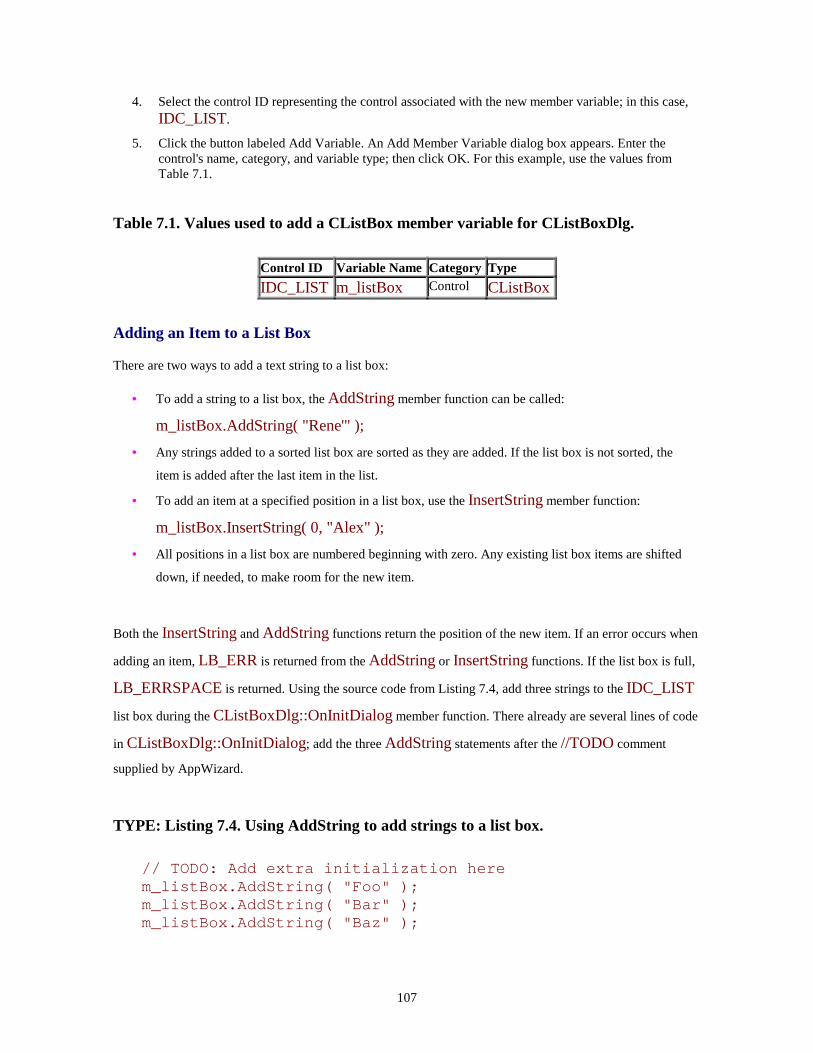
107
4. Select the control ID representing the control associated with the new member variable; in this case, IDC_LIST.
5. Click the button labeled Add Variable. An Add Member Variable dialog box appears. Enter the control's name, category, and variable type; then click OK. For this example, use the values from Table 7.1.
Table 7.1. Values used to add a CListBox member variable for CListBoxDlg.
Control ID Variable Name Category Type IDC_LIST m_listBox Control CListBox
Adding an Item to a List Box
There are two ways to add a text string to a list box:
• To add a string to a list box, the AddString member function can be called:
m_listBox.AddString( "Rene'" ); • Any strings added to a sorted list box are sorted as they are added. If the list box is not sorted, the
item is added after the last item in the list.
• To add an item at a specified position in a list box, use the InsertString member function:
m_listBox.InsertString( 0, "Alex" ); • All positions in a list box are numbered beginning with zero. Any existing list box items are shifted
down, if needed, to make room for the new item.
Both the InsertString and AddString functions return the position of the new item. If an error occurs when
adding an item, LB_ERR is returned from the AddString or InsertString functions. If the list box is full,
LB_ERRSPACE is returned. Using the source code from Listing 7.4, add three strings to the IDC_LIST
list box during the CListBoxDlg::OnInitDialog member function. There already are several lines of code
in CListBoxDlg::OnInitDialog; add the three AddString statements after the //TODO comment
supplied by AppWizard.
TYPE: Listing 7.4. Using AddString to add strings to a list box.
// TODO: Add extra initialization herem_listBox.AddString( "Foo" );m_listBox.AddString( "Bar" );m_listBox.AddString( "Baz" );

108
To determine the number of items currently in a list box, use the GetCount member function:
nItems = listBox.GetCount();
CAUTION: The GetCount function returns the total number of items in a list box, not the value of the last valid index. If a list box contains five items, GetCount returns five, but the last valid index is four.
Removing Items from a List Box
To remove items from a list box, specify the item position to be removed in a call to the DeleteString
member function:
listBox.DeleteString(8);
This line removes the item in the ninth position of the list box. Remember, all list box position indexes start
from zero. The return value from the DeleteString member function is the number of items remaining in the
list box, or LB_ERR if any errors occur. The return value can be used like this:
int nItems = listBox.GetCount();while(nItems > 3 && nItems != LB_ERR )nItems = listBox.DeleteString(nItems - 1);
This code removes the contents of a list box, except for the first three items. To clear a list box completely,
use the ResetContent function:
listBox.ResetContent();
The ResetContent function returns void.
Receiving List Box Messages
Several messages are sent to the parent of a list box for notification purposes when certain events occur. All
these messages are prefixed with LBN_, for List Box Notification. For these messages to be sent, the list box
must have the Notify property enabled. The following messages are sent from the list box to its parent:
• LBN_DBLCLK is sent when a user double-clicks a list-box item.

109
• LBN_ERRSPACE indicates that an action could not be performed due to a lack of memory.
• LBN_KILLFOCUS is sent just before the list box loses the input focus.
• LBN_SELCANCEL is sent when a user cancels a list box selection.
• LBN_SELCHANGE is sent when the selection state in a list box is about to change.
• LBN_SETFOCUS is sent when a list box receives the input focus.
The LBN_DBLCLK message is the most frequently used notification message. Most users expect some
sort of default action to take place when a list box item is double-clicked. For example, when a list of
filenames is displayed, double-clicking a particular filename might be expected to open that file for editing.
The steps to add message-handling functions for any of the controls used in Windows are very similar. To
create a message-handling function for the LBN_DBLCLK notification message, follow these steps:
1. Open ClassWizard and click the Message Maps tab.
2. Select the CListBoxDlg class and the IDC_LIST Object ID.
3. Select LBN_DBLCLK, and click the Add Function button.
4. Accept the suggested function name CListBoxDlg::OnDblclkList. 5. Click the button labeled Edit Code.
6. Add the source code from Listing 7.5 to the CListBoxDlg::OnDblclkList function.
TYPE: Listing 7.5. Handling a list box notification message.
void CListBoxDlg::OnDblclkList(){int nSelection = m_listBox.GetCurSel();if( nSelection != LB_ERR ){CString szSelection;m_listBox.GetText( nSelection, szSelection );
AfxMessageBox( szSelection );}
}
Compile and run the ListBox project and then double-click any of the list box items. The LBN_DBLCLK
message is sent to the CListBoxDlg::OnDblclkList function, and a message box is displayed with
information about the selected item.

110
You can determine the currently selected item in the list box by using the CListbox::GetCurSel member
function, as shown in Listing 7.5. The GetCurSel member function returns the position of the currently
selected item, with the first item position starting at zero. If no item is selected, or if the list box has the
multiple-selection property, LB_ERR is returned.
What Are Combo Boxes?
A combo box control is a single control that combines an edit control with a list box. A combo box enables a
user to enter data either by entering text like an edit control or by selecting an item from several choices like a
list box.
Combo boxes are quite useful when a user is not limited to selecting only the items presented in a list box.
The list box portion of the combo box can be used to display recent selections, giving the user the freedom to
enter a new selection in the edit control.
There are three types of combo boxes:
• Simple combo boxes display an edit control and list box. Unlike the other combo box types, the list
box is always visible. When the list box contains more items than can be displayed, a scrollbar is used
to scroll through the list box.
• Drop-down combo boxes hide the list box until the user opens it. With this type of combo box, the list
uses much less room in a dialog box than that used by the simple combo box.
• Drop-down list boxes are similar to drop-down combo boxes in that they display the list box only
when opened by the user. However, a static-text control is used to display the selection instead of an
edit control. Therefore, the user is limited to selecting items from the list box.
Just a Minute: Combo boxes also are used when space in a dialog box is at a premium. A large number of choices in a combo box can be hidden until the combo box is opened, enabling more controls to be placed in a smaller area than that required for a list box.
MFC Support for Combo Boxes
Just like list boxes and other controls, you normally add combo boxes to dialog box resources using the
Developer Studio dialog box editor. After you add the control, use ClassWizard to add message-handling
functions and associate the control with a CComboBox object.

111
You use the MFC CComboBox class to manage and interact with the combo box control, and it contains
many of the member functions that are available in the CListBox and CEdit classes. For example, you can
use GetCurSel to get the currently selected item from the list box part of a combo box.
Combo Box Properties
A combo box has a large number of properties because it combines an edit control and a list box. Most edit-
control and list-box styles have similar properties that can be applied to combo boxes. These combo box
properties are identical to the list box properties discussed earlier:
• ID
• Visible
• Disabled
• Group
• Tab Stop
• Owner Draw
• Has Strings
• Sort
• Vertical Scroll
• No Integral Height
• Help ID
• Disable No Scroll
The following combo box properties are identical to properties offered for edit controls (discussed in Hour 6,
"Using Edit Controls"):
• Auto HScroll
• OEM Convert
These two properties are unique to combo box controls:
• List Choices, used to list items that appear by default when the dialog box is created. Press Ctrl+Enter
after each entry.
• Type, used to specify the type of the combo box. You can choose between Simple, Dropdown, and
Drop List. Dropdown is the default choice.

112
Adding Items to a Combo Box
You add strings to combo boxes just as you add them to list boxes. Just like CListBox, the CComboBox
class contains AddString and InsertString member functions:
comboBox.AddString( "Riley" );
or
comboBox.InsertString( 0, "Mitch" );
All positions in a combo box are numbered beginning with zero, just like list boxes. However, if an error
occurs, CB_ERR is returned instead of LB_ERR. If an item cannot be added due to insufficient space,
CB_ERRSPACE is returned.
To determine the number of items currently in a combo box, CComboBox includes the GetCount member function:
nItems = comboBox.GetCount();
Remember, CB_ERR is returned instead of LB_ERR when using a CComboBox object.
Collecting Input from a Combo Box
You can collect input from a combo box by using the GetWindowText member function, just like an edit
control. For simple combo boxes and drop-down combo boxes, this is the easiest way to get the current
selection. You can also use the GetCurSel member function to determine the current selection position from
the list box.
A Combo Box Example
To create a sample project using a combo box and the CComboBox class, follow these steps:
1. Create a dialog box-based project named ComboList using AppWizard, as described in previous examples.
2. Add a drop-down combo list to the IDD_COMBOLIST_DIALOG resource, as you did for the list box earlier in this hour.
3. Give the combo box the resource ID IDC_COMBO. Use the default values for all other properties.
4. Add a static-text control to the dialog box, and give it the resource ID IDC_RESULT. This text

113
control will be used to display information about messages received from the combo box.
5. Using ClassWizard, add a member variable to the CComboListDlg class named m_comboList. Set the Category to Control.
6. Using ClassWizard, add a message-handling function for the IDOK control BN_CLICKED message to the CComboListDlg class.
7. Using ClassWizard, add message-handling functions for IDC_COMBO control messages to the CComboListDlg class. Add functions to handle CBN_CLOSEUP and CBN_EDITUPDATE messages.
Adding Strings to a Combo Box
After completing these steps, add the source code in Listing 7.6 to the CComboListDlg::OnInitDialog
member function. This code adds three entries to the combo box. There are already several lines of code in the
function; don't remove them. Just add the code from Listing 7.6 after the //TODO comment provided by
AppWizard.
TYPE: Listing 7.6. Source code added to the CComboListDlg::OnInitDialog function.
// In OnInitDialog...// TODO: Add extra initialization here
m_comboList.AddString( "Foo" );m_comboList.AddString( "Bar" );m_comboList.AddString( "Baz" );
Getting the Current Combo Box Selection
Edit the CComboListDlg::OnOK member function so it looks like the source code provided in Listing
7.7. This code uses member functions from the CComboBox class to display information about the current
combo box selection.
TYPE: Listing 7.7. Source code added to the CComboListDlg::OnOK function.
void CComboListDlg::OnOK(){CString szCombo;
m_comboList.GetWindowText( szCombo );AfxMessageBox( szCombo );

114
int nChoice = m_comboList.GetCurSel();szCombo.Format( "The current selection is %d",
nChoice );AfxMessageBox( szCombo );
CDialog::OnOK();}
Detecting Combo Box Events
Add the source code provided in Listing 7.8 to the CComboListDlg::OnCloseupCombo function.
When the CBN_CLOSEUP message is received, a message is displayed on the static-text control
IDC_RESULT.
TYPE: Listing 7.8. Source code added to the CComboListDlg::OnCloseupCombo
function.
void CComboListDlg::OnCloseupCombo(){CString szChoice;CString szResult;int nChoice;
// Get current selections from edit and list-box// controlsm_comboList.GetWindowText( szChoice );nChoice = m_comboList.GetCurSel();
if( nChoice != CB_ERR ){// If a valid choice was made from the list box,// fetch the item's text string.m_comboList.GetLBText( nChoice, szChoice );szResult = "Closing after selecting " + szChoice;
}else if( szChoice.IsEmpty() == TRUE ){// No choice was made from the list box, and the edit// control was empty.szResult = "No choice selected";
}else if( m_comboList.FindStringExact(-1, szChoice)
!= CB_ERR )

115
{// The string from the edit control was found in the// list box.szResult = "Closing after selecting " + szChoice;
}else{// The edit control contains a new string, not// currently in the list box. Add the string.m_comboList.AddString( szChoice );szResult = "Adding " + szChoice + " to list";
}
// Get a pointer to the static-text control, and// display an appropriate result message.CWnd* pWnd = GetDlgItem( IDC_RESULT );ASSERT( pWnd );if( pWnd )pWnd->SetWindowText( szResult );
}
The CComboListDlg::OnCloseupCombo function collects the contents from the edit control section of
the combo box and the selected item from the list box section of the combo box. If a selection has been made
in the list box, the item's string is retrieved and displayed. Otherwise, if a string was entered in the edit
control, it is displayed. The string is not currently in the list box; it is added to it.
Add the source code provided in Listing 7.9 to the CComboListDlg::OnEditupdateCombo member
function. CBN_EDITUPDATE is received when the user types inside the edit control. When the
CBN_EDITUPDATE message is received, the contents of the edit control are displayed on the
IDC_RESULT text control.
TYPE: Listing 7.9. Source code added to the CComboListDlg::OnEditupdateCombo
function.
void CComboListDlg::OnEditupdateCombo(){CString szChoice;CString szResult;
m_comboList.GetWindowText( szChoice );szResult = "Choice changed to " + szChoice;

116
CWnd* pWnd = GetDlgItem( IDC_RESULT );ASSERT( pWnd );if( pWnd )pWnd->SetWindowText( szResult );
}
Compile and run the ComboList project. Experiment by adding new entries to the combo box and by
expanding and closing the combo box. Other messages sent to the combo box can be trapped and displayed
just as CBN_EDITUPDATE was handled in Listing 7.9.
Summary
In this hour, you learned about list box and combo box controls and how they are used in Windows programs.
You also learned how to associate these controls with CListBox and CComboBox objects.
Q&A
Q What is the easiest way to create a list box that has a bitmap image next to each item? A The only way to display a bitmap in a list box is to create an owner-drawn list box, where you take responsibility for drawing each item in the list box. You can easily achieve a similar effect by using a list view control, which is discussed in Hour 18, "List View Controls." Q When should I use a combo box drop list, and when is a list box more appropriate? A A drop list is appropriate when space on your dialog box is at a premium. A list box is more appropriate when the user must see more than one item without clicking on the control.
Workshop
The Workshop is designed to help you anticipate possible questions, review what you've learned, and begin
thinking ahead to putting your knowledge into practice. The answers to the quiz are in Appendix B, "Quiz
Answers."
117
Quiz
1. Which MFC class is used to manage list box controls? 2. What message is sent to your dialog box when a user double-clicks a dialog box? 3. What functions are used to add items to a list box control? 4. What function is used to retrieve the number of items in a list box control? 5. What function is used to retrieve the currently selected index in a list box? 6. What are the three styles used for list box controls? 7. What are the three types of loops used in C++ programs? 8. Which MFC class is used to manage combo boxes? 9. What function is used to add an item to a combo box at a specific index? 10. What are the three styles used for combo boxes?
Exercise
1. Modify the ListBox project by adding a new button labeled Loop. When a user clicks the Loop button, display each item in the list box in a message box, one item at a time.
118
- Hour 8 - Messages and Event-Driven Programming
Messages are at the heart of every Windows program. Even the 50-line MFC program in
Hour 2, "Writing Simple C++ Programs," had to handle the WM_PAINT message. A good
understanding of how the Windows operating system sends messages will be a great help to
you as you write your own programs.
In this hour, you will learn
• How Windows applications use messages to communicate with the operating system and window
objects in the application
• How messages are managed using the MFC framework
• Some basic information about the Document/View architecture and how AppWizard is used to create
Document/View applications
• MFC base classes that are used in every MFC application
In this hour, you will also create a small sample program to learn how messages are passed to applications by
the Windows operating system.
Understanding the Windows Programming Model
Programs written for Windows differ from most console-mode programs. The console-mode programs that
you have seen in this book have consisted of short listings that created small sequential programs that
assumed complete control over a console-mode window.
Although sequential programs work well for explaining simple concepts like the basics of the C++ language,
they don't work well in a multitasking environment like Microsoft Windows. In the Windows environment
everything is shared: the screen, the keyboard, the mouse--even the user. Programs written for Windows must
cooperate with Windows and with other programs that might be running at the same time.
In a cooperative environment like Windows, messages are sent to a program when an event that affects the
program occurs. Every message sent to a program has a specific purpose. For example, messages are sent
when a program should be initialized, when menu selections are made, and when a window should be
redrawn. Responding to event messages is a key part of most Windows programs.

119
Another characteristic of Windows programs is that they must share resources. Many resources must be
requested from the operating system before they are used and, after they are used, must be returned to the
operating system so that they can be used by other programs. This is one way Windows controls access to
resources like the screen and other physical devices.
In short, a program that runs in a window must be a good citizen. It cannot assume that it has complete control
over the computer on which it is running; it must ask permission before taking control of any central resource,
and it must be ready to react to events that are sent to it.
Using AppWizard with Document/View
As you saw in the first few hours, the Developer Studio includes a tool, AppWizard (also called MFC
AppWizard), which is used to create a skeleton application. AppWizard asks you a series of questions about
your program; then it generates a project and much of the source code for you, letting you concentrate on the
code that makes your program unique.
So far you have used AppWizard to create programs that use a dialog box as their main window. However,
the real strength of AppWizard is its capability to help you create full Windows applications. Much of the
code that is used as a starting point for Windows programs is generic "skeleton" code; AppWizard will
generate this code for you.
Just a Minute: The MFC class library is built around the Document/View programming model. Using AppWizard to create the skeleton code for your program is the quickest way to get started writing Document/View programs.
A Quick Overview of the Document/View Architecture
The AppWizard uses MFC classes to create applications that are based on the MFC Document/View
architecture. The basic idea behind Document/View is to separate the data-handling classes from the classes
that handle the user interface.
Separating the data from the user interface enables each class to concentrate on performing one job, with a set
of interfaces defined for interaction with the other classes involved in the program. A view class is
responsible for providing a "viewport" through which you can see and manage the document. A document
class is responsible for controlling all the data, including storing it when necessary. Figure 8.1 shows how the
document and view classes interact with each other.

120
Figure 8.1. The Document/View architecture.
You will learn more about the Document/View architecture in Hour 9, "The Document/View Architecture."
For now, just be aware that four main "super classes" are used in a Document/View application:
• The document class controls the data used by an application. The data does not have to be an actual
page of text; for example, a spreadsheet or project plan can easily be represented as a document.
• The view class is used to display information about the document to the user and to handle any
interaction that is required between the user and the document.
• The frame class is used to physically contain the view, menu, toolbar, and other physical elements of
the program.
• The application class controls the application-level interaction with Windows.
In addition to the four classes listed here, you will learn in Hour 9 some specialized classes that are used in
Document/View programs.
Types of Applications Built by AppWizard
AppWizard sets up the following types of generic programs for you:
• Single Document, or SDI: A program that controls a single document at a time
• Multiple Document, or MDI: A program that can control several different documents at once
• Dialog based: A program that has a dialog box as its main display window
After you select one of these application types, you are asked for more information about the new program.
The opening MFC AppWizard screen is shown in Figure 8.2.

121
Figure 8.2. The opening screen for MFC AppWizard.
Using AppWizard to Create an SDI Application
To create a simple SDI program, select Single Document on the opening MFC AppWizard screen.
AppWizard displays six Wizard pages filled with default information for a typical SDI program. You can
move to the next page by pressing the button labeled Next and to the previous page by pressing the button
labeled Back. At any time you can tell AppWizard to create the project for you by pressing the button labeled
Finish.
AppWizard will create several classes and files for you and create a project that you can use to manage the
process of compiling the program. AppWizard creates these classes for a program named Hello:
• CHelloApp: Derived from CWinApp, the application class for the program
• CHelloDoc: The program's document class, derived from CDocument
• CHelloView: The program's view class derived from CView
• CMainFrame: The main frame class for the program
In addition, AppWizard creates several files that are not used for C++ classes. Some of these files are
• hello.aps: A file that contains a precompiled version of the program's resources

122
• hello.clw: A file that contains information used by ClassWizard
• readme.txt: A file that has information about all the files created by AppWizard
• hello.rc: A resource file that contains information about dialog boxes, menus, and other resources
used by the program
• resource.h: A header file containing declarations needed for the resources used by the program
• hello.dsp and hello.dsw: The project and workspace files used by Developer Studio to build the
program
• stdafx.cpp: A file included in all AppWizard programs that includes all the standard include files
• stdafx.h: A standard header file included in all AppWizard programs that is used to include other
files that are included in the precompiled headers
Creating a Windows program using AppWizard is easy. In fact, you can compile and run the program as it is
now, although it doesn't really do anything.
What Are Messages?
Programs written for Microsoft Windows react to events that are sent to a program's main window. Examples
of events include moving the mouse pointer, clicking a button, or pressing a key. These events are sent to the
window in the form of messages. Each message has a specific purpose: redraw the window, resize the
window, close the window, and so on.
New Term: The default window procedure is a special message-handling function supplied by Windows that
handles the message if no special processing is required.
For many messages, the application can just pass the message to the default window procedure.
A Windows program can also send messages to other windows. Because every control used in a Windows
program is also a window, messages are also often used to communicate with controls.
Two different types of messages are handled by a Windows program:
• Messages sent from the operating system
• Messages sent to and from controls that deal with user input
Examples of messages sent from the operating system include messages used to tell the program that it should
start or close or to tell a window that it is being resized or moved. Messages sent to controls can be used to
change the font used by a window or its title. Messages received from a control include notifications that a
button has been pressed or that a character has been entered in an edit control.
123
There are two reasons why messages are used so heavily in Windows programs:
• Unlike a function call, a message is a physical chunk of data, so it can be easily queued and
prioritized.
• A message is not dependent on a particular language or processor type, so a message-based program
can easily be ported to other CPUs, as is often done with Windows NT.
Queues work well for event-driven programming. When an event occurs, a message can be created and
quickly queued to the appropriate window or program. Each message that is queued can then be handled in an
orderly manner.
The fact that messages are language independent has enabled Windows to grow over the years. Today, you
can write a Windows program using diverse languages such as Visual Basic, Delphi, Visual C++, or
PowerBuilder. Because messages are language independent, messages can easily be sent between these
programs. The message interface enables you to add new features to the programs you write and also enables
Windows to grow in the future.
Just a Minute: Since it was first introduced, every release of Microsoft Windows has added new messages and new functionality. However, most of the core messages used in the initial version of Windows still are available, even on multiprocessor machines that are running Windows NT.
CAUTION: When using an event-driven programming model such as Microsoft Windows, you cannot always be certain about message order. A subtle difference in the way different users use a program can cause messages to be received in a different sequence. This means that every time you handle an event, you should handle only that particular event and not assume that any other activity has taken place.
A Program to Test for Mouse Clicks
As an example, you're about to create a program that actually shows how messages are used to notify your
application about events. This program, MouseTst, will be an SDI application that displays a message
whenever the mouse is clicked inside the client area. The first step in creating MouseTst is to use AppWizard
to create an SDI application. Feel free to select or remove any options offered by AppWizard, because none
of the options have any bearing on the demonstration. Name the application MouseTst.
What Are Message Queues?
Messages are delivered to all windows that must receive events. For example, the simple act of moving the
mouse cursor across the main window of a Windows program generates a large number of messages.

124
Messages sent to a window are placed in a queue, and a program must examine each message in turn.
Typically, a program examines messages that are sent to it and responds only to messages that are of interest,
as shown in Figure 8.3.
Figure 8.3. Messages queued and handled in order by an application.
As shown in Figure 8.3, messages sent to a program are handled by a window procedure that is defined for
the program.
How Are Messages Handled?
When a user moves the mouse over a program's main window, two messages are sent to the program's
window procedure.
• WM_NCMOUSEMOVE is sent when the mouse is moved over the menu or caption bar.
• WM_MOUSEMOVE is sent when the mouse is over the window's client area.
Another type of mouse message is the WM_LBUTTONDOWN message, sent when the primary mouse
button is pressed. Because this is the left button for most mouse users, the message is named
WM_LBUTTONDOWN. A similar message is WM_RBUTTONDOWN, sent when the secondary,
usually right, mouse button is pressed.

125
These and other messages are sent to a window's window procedure. A window procedure is a function that
handles messages sent to it. When a window procedure receives the message, the parameters passed along
with the message are used to help decide how the message should be handled.
Handling Messages with ClassWizard
ClassWizard (also called MFC ClassWizard) adds code that typically is used for a particular message-
handling function. This commonly reused, or "boilerplate," code can help reduce the number of errors still
further, because it's guaranteed to be correct. Listing 8.1 is an example of a function created by ClassWizard
to handle the WM_LBUTTONDOWN message.
TYPE: Listing 8.1. The OnLButtonDown function created by ClassWizard.
void CMyView::OnLButtonDown(UINT nFlags, CPoint point){//TODO: Add your message handler code here// and/or call default
CView::OnLButtonDown(nFlags, point);}
New Term: A message map connects messages sent to a program with the functions that are meant to handle
those messages.
When AppWizard or ClassWizard adds a message-handling function, an entry is added to the class message
map. Listing 8.2 shows an example of a message map.
TYPE: Listing 8.2. A message map for the CMyView class.
BEGIN_MESSAGE_MAP(CMyView, CView)//{{AFX_MSG_MAP(CMyView)ON_WM_LBUTTONDOWN()//}}AFX_MSG_MAP// Standard printing commandsON_COMMAND(ID_FILE_PRINT, CView::OnFilePrint)ON_COMMAND(ID_FILE_PRINT_DIRECT, CView::OnFilePrint)ON_COMMAND(ID_FILE_PRINT_PREVIEW,CView::OnFilePrintPreview)
END_MESSAGE_MAP()

126
CAUTION: The message map begins with the BEGIN_MESSAGE_MAP macro and ends with the END_MESSAGE_MAP macro. The lines reserved for use by ClassWizard start with //{{AFX_MSG_MAP and end with //}}AFX_MSG_MAP. If you make manual changes to the message map, do not change the entries reserved for ClassWizard; they are maintained automatically.
Messages Handled by MouseTst
The MouseTst program must handle four messages used to collect mouse events. The messages used by
MouseTst are listed in Table 8.1.
Table 8.1. Messages handled by MouseTst.
Message Function Description WM_LBUTTONDOWN OnLButtonDown Left mouse button clicked
WM_LBUTTONDBLCLK OnLButtonDblClk Left mouse button double-clicked
WM_RBUTTONDOWN OnRButtonDown Right mouse button clicked
WM_RBUTTONDBLCLK OnRButtonDblClk Right mouse button double-clicked
In addition, when the WM_PAINT message is received, the MFC framework calls the OnDraw member
function. MouseTst will use OnDraw to update the display with the current mouse position and last
message.
Updating the CMouseTst View Class
All the work that keeps track of the mouse events will be done in the CMouseTstView class. There are two
steps to displaying the mouse event information in the MouseTst program:
1. When one of the four mouse events occurs, the event type and mouse position are recorded, and the view's rectangle is invalidated. This causes a WM_PAINT message to be generated by Windows and sent to the MouseTst application.
2. When a WM_PAINT message is received by MouseTst, the CMouseTstView::OnDraw member function is called, and the mouse event and position are displayed.
127
Just a Minute: All output is done in response to a WM_PAINT message. WM_PAINT is sent when a window's client area is invalidated. This often is due to the window being uncovered or reopened. Because the window must be redrawn in response to a WM_PAINT message, most programs written for Windows do all their drawing in response to WM_PAINT and just invalidate their display window or view when the window should be updated.
To keep track of the mouse event and position, you must add two member variables to the
CMouseTstView class. Add the three lines from Listing 8.3 as the last three lines before the closing curly
brace in CMouseTstView.h.
TYPE: Listing 8.3. New member variables for the CMouseTstView class.
private:CPoint m_ptMouse;Cstring m_szDescription;
The constructor for CMouseTstView must initialize the new member variables. Edit the constructor for
CMouseTstView, found in CMouseTstView.cpp, so it looks like the source code in Listing 8.4.
TYPE: Listing 8.4. The constructor for CMouseTstView.
CMouseTstView::CMouseTstView(){m_ptMouse = CPoint(0,0);m_szDescription.Empty();
}
Using ClassWizard, add message-handling functions for the four mouse events that you're handling in the
MouseTst program. Open ClassWizard by pressing Ctrl+W, or by right-clicking in a source-code window and
selecting ClassWizard from the menu. After ClassWizard appears, follow these steps:
1. Select the CMouseTstView class in the Object ID list box; a list of messages sent to the CMouseTstView class will be displayed in the Message list box.
2. Select the WM_LBUTTONDOWN message from the Message list box, and click the Add Function button.
3. Repeat step 2 for the WM_RBUTTONDOWN, WM_LBUTTONDBLCLK, and WM_RBUTTONDBLCLK messages.

128
4. Click OK to close ClassWizard.
Edit the message-handling functions so they look like the function provided in Listing 8.5. You must remove
some source code provided by ClassWizard in each function.
TYPE: Listing 8.5. The four mouse-handling functions for CMouseTstView.
void CMouseTstView::OnLButtonDblClk(UINT nFlags,CPoint point)
{m_ptMouse = point;m_szDescription = "Left Button Double Click";InvalidateRect( NULL );
}
void CMouseTstView::OnLButtonDown(UINT nFlags,CPoint point)
{m_ptMouse = point;m_szDescription = "Left Button Down";InvalidateRect( NULL );
}
void CMouseTstView::OnRButtonDblClk(UINT nFlags,CPoint point)
{m_ptMouse = point;m_szDescription = "Right Button Double Click";InvalidateRect( NULL );
}
void CMouseTstView::OnRButtonDown(UINT nFlags,CPoint point)
{m_ptMouse = point;m_szDescription = "Right Button Down";InvalidateRect( NULL );

129
}
Each of the message-handling functions in Listing 8.5 stores the position of both the mouse event and a text
string that describes the event. Each function then invalidates the view rectangle. The next step is to use the
CMouseTstView::OnDraw function to display the event. Edit CMouseTstView::OnDraw so it
contains the source code in Listing 8.6. Remove any existing source code provided by AppWizard.
TYPE: Listing 8.6. The OnDraw member function for CMouseTstView.
void CMouseTstView::OnDraw(CDC* pDC){pDC->TextOut( m_ptMouse.x, m_ptMouse.y,
m_szDescription );}
The OnDraw member function uses TextOut to display the previously saved event message. The CPoint
object, m_ptMouse, was used to store the mouse event's position. A CPoint object has two member
variables, x and y, which are used to plot a point in a window.
Running MouseTst
Build and run MouseTst, then click the main window's client area. A message is displayed whenever you
click the left or right mouse button.
Figure 8.4 shows the MouseTst program after a mouse button has been clicked.

130
Figure 8.4. The MouseTst program displaying a mouse event.
What Are MFC Base Classes?
The MFC class library includes a large number of classes well suited for Windows programming. Most of
these classes are derived from CObject, a class that is at the root of the MFC class hierarchy. In addition,
any class that represents a window or control is derived from the CWnd class, which handles basic functions
that are common to all windows.
Just a Minute: The CObject and CWnd classes use virtual functions, which enable your program to access general-purpose functions through a base pointer. This enables you to easily use any object that is derived from CObject or CWnd when interacting with the MFC framework.
The CObject Base Class
Almost every class used in an MFC program is derived from CObject. The CObject class provides four
types of services:
• Diagnostic memory management provides diagnostic messages when memory leaks are detected.
These leaks are often caused by failing to free objects that have been dynamically created.

131
• Dynamic creation support uses the CRuntimeClass to enable objects to be created at runtime. This
is different from creating objects dynamically using the new operator.
• Serialization support enables an object to be stored and loaded in an object-oriented fashion.
Serialization is discussed in Hour 22, "Serialization."
• Runtime class information is used by the MFC class library to provide diagnostic information when
errors are discovered in your program. Runtime class information is also used when you're serializing
objects to or from storage.
The CWnd Base Class
The CWnd class is derived from CObject and adds a great deal of functionality that is shared by all
windows in an MFC program. This also includes dialog boxes and controls, which are just specialized
versions of windows. Figure 8.5 shows some of the major MFC classes derived from CWnd.
Figure 8.5. Some of the major MFC classes derived from CWnd.
The CWnd class defines functions that can be applied to any CWnd object, including objects that are
instances of classes derived from CWnd. As first shown in Hour 5, "Button Controls," to set the caption or
title for any window, including controls, you can use the CWnd::SetWindowText function.
Almost every significant object in an MFC program is a CObject instance. This enables you to take
advantage of the MFC support for discovering many common memory leaks and other types of programming
errors. The CObject class also declares functions that can be used to provide diagnostic dumps during
runtime and support for serialization. Serialization is discussed in Hour 22.

132
Every window in an MFC program is a CWnd object. CWnd is derived from CObject so it has all the
CObject functionality built in. Using the CWnd class to handle all controls and windows in your program
enables you to take advantage of polymorphism; the CWnd class provides all the general window functions
for all types of windows. This means you don't need to know exactly what type of control or window is
accessed through a CWnd pointer in many cases.
An Example Using the CObject and CWnd Base Classes
The CObject and CWnd classes are used in different ways. The CObject class is normally used as a base
class when you create your own classes. The CWnd class is often passed as a function parameter or return
value and is used as a generic pointer to any type of window in an MFC program.
In this section, you create a sample console mode project that demonstrates how the CObject class is used.
To start the sample, create a new console mode project named Runtime. In addition, configure the project so
that it uses the MFC class library by following these steps:
1. Select Settings from the Project menu. This opens the Project Settings dialog box.
2. Click the General tab.
3. Select Use MFC in a Shared DLL from the Microsoft Foundation Classes combo box.
4. Close the dialog box by clicking OK.
Using CObject as a Base Class
The CObject class is always used as a base class; there isn't really anything that can be done with a plain
CObject. When used as a base class, the CObject class provides a great deal of basic functionality to a
class. You can control the amount of functionality provided by CObject by using macros in the derived
class's declaration and definition files.
Four different levels of support are offered by CObject to its derived classes:
• Basic support with memory leak detection requires no macros.
• Support for runtime class identification requires the use of the DECLARE_DYNAMIC macro in
the class declaration and the IMPLEMENT_DYNAMIC macro in the class definition.
• Support for dynamic object creation requires the use of the DECLARE_DYNCREATE macro in
the class declaration and the IMPLEMENT_DYNCREATE macro in the class definition. The
use of dynamic object creation is discussed later in this hour.

133
• Serialization support requires the use of the DECLARE_SERIAL macro in the class declaration
and the IMPLEMENT_SERIAL macro in the class definition. The use of serialization is
discussed in Hour 22.
Each of the CObject macros is used in a similar way. All DECLARE macros have one parameter--the
name of the class. The IMPLEMENT macros generally take two parameters--the name of the class and the
name of the immediate base class. IMPLEMENT_SERIAL is an exception because it requires three
parameters, as discussed in Hour 22.
Listing 8.7 is the class declaration for CMyObject, a simple class that is derived from CObject. The
CMyObject class supports dynamic creation, so it includes the DECLARE_DYNCREATE macro.
TYPE: Listing 8.7. The CMyObject class declaration, using CObject as a base class.
class CMyObject : public CObject{DECLARE_DYNCREATE( CMyObject );
// Constructorpublic:CMyObject();
//Attributespublic:void Set( const CString& szName );CString Get() const;
//Implementationprivate:CString m_szName;
};
Save the source code from Listing 8.7 in the Runtime project directory as MyObj.h. It's just an include
file, so don't add it to the project.
The source code for the CMyObject member functions is provided in Listing 8.8. Save this source code as
MyObj.cpp and add it to the Runtime project. This source file contains the
IMPLEMENT_DYNCREATE macro that matches the DECLARE_DYNCREATE macro from
the class declaration.

134
TYPE: Listing 8.8. Member functions for the CMyObject class.
#include <afx.h>#include "MyObj.h"IMPLEMENT_DYNCREATE( CMyObject, CObject );CMyObject::CMyObject(){}void CMyObject::Set( const CString& szName ){
m_szName = szName;}CString CMyObject::Get() const{
return m_szName;}
Time Saver: It's important to remember that the DECLARE and IMPLEMENT macros are used in two different places. A DECLARE macro, such as DECLARE_DYNCREATE, is used in the class declaration. An IMPLEMENT macro, such as IMPLEMENT_DYNCREATE, is used only in the class definition.
Creating an Object at Runtime
There are two ways to create objects dynamically. The first method uses the C++ operator new to
dynamically allocate an object from free storage.
CMyObject* pObject = new CMyObject;
The second method is used primarily by the MFC framework and uses a special class, CRuntimeClass, and
the RUNTIME_CLASS macro. You can use CRuntimeClass to determine the type of an object or to
create a new object. Listing 8.9 creates a CMyObject instance using the
CRuntimeClass::CreateObject function.
TYPE: Listing 8.9. Creating an object at runtime using CRuntimeClass.
#include <afx.h>#include <iostream.h>#include "MyObj.h"int main()

135
{CRuntimeClass* pRuntime = RUNTIME_CLASS( CMyObject );CObject* pObj = pRuntime->CreateObject();ASSERT( pObj->IsKindOf(RUNTIME_CLASS(CMyObject)) );
CMyObject* pFoo = (CMyObject*)pObj;pFoo->Set( "FooBar" );
cout << pFoo->Get() << endl;
delete pFoo;return 0;
}
Save the contents of Listing 8.9 as Runtime.cpp and add the file to the Runtime project. Compile the
project and if there are no errors, run the project in a DOS window by following these steps:
1. Open a DOS window from the Start button's Programs menu.
2. Change the current directory to the project directory.
3. Type Debug\Runtime in the DOS window. The program executes and outputs FooBar.
Leave the DOS window open for now because you use it for the next example.
Testing for a Valid Object
The MFC class library offers several diagnostic features. Most of these features are in the form of macros that
are used only in a debug version of your program. This gives you the best of both worlds. When you are
developing and testing your program, you can use the MFC diagnostic functions to help ensure that your
program has as few errors as possible, although it runs with the additional overhead required by the
diagnostics. Later, when your program is compiled in a release version, the diagnostic checks are removed
and your program executes at top speed.
Three macros are commonly used in an MFC program:
• ASSERT brings up an error message dialog box when an expression that evaluates to FALSE is
passed to it. This macro is compiled only in debug builds.
• VERIFY works exactly like ASSERT except that the evaluated expression is always compiled,
even for non-debug builds, although the expression is not tested in release builds.

136
• ASSERT_VALID tests a pointer to a CObject instance and verifies that the object is a valid
pointer in a valid state. A class derived from CObject can override the AssertValid function to
enable testing of the state of an object.
The ASSERT and VERIFY macros are used with all expressions, not just those involving CObject.
Although they both test to make sure that the evaluated expression is TRUE, there is an important difference
in the way these two macros work. When compiled for a release build, the ASSERT macro and the
expression it evaluates are completely ignored during compilation. The VERIFY macro is also ignored, but
the expression is compiled and used in the release build.
CAUTION: A common source of errors in MFC programs is placing important code inside an ASSERT macro instead of a VERIFY macro. If the expression is needed for the program to work correctly, it belongs in a VERIFY macro, not an ASSERT macro. These functions are used in examples throughout the rest of the book to test for error conditions.
Providing a Dump Function
In addition to the diagnostic functions and macros in the previous section, CObject declares a virtual
function for displaying the contents of an object at runtime. This function, Dump, is used to send messages
about the current state of the object to a debug window.
If you are debugging an MFC program, the messages are displayed in an output window of the debugger. Add
the source code from Listing 8.10 to the CMyObject class declaration. The Dump function is usually
placed in the implementation section of the class declaration; in this example, it should be placed after the
declaration for m_szName. Because Dump is called only by the MFC framework, it is usually declared as
protected or private. Because the Dump function is called only for debug builds, the declaration is
surrounded by #ifdef and #endif statements that remove the declaration for Dump for release builds.
TYPE: Listing 8.10. Adding a Dump function to the CMyObject declaration.
#ifdef _DEBUGvoid Dump( CDumpContext& dc ) const;
#endif

137
Add the source code from Listing 8.11 to the MyObj.cpp source code file. The implementation of the
function is also bracketed by #ifdef and #endif statements to remove the function for release builds.
TYPE: Listing 8.11. Adding the implementation of Dump to CMyObject.
#ifdef _DEBUGvoid CMyObject::Dump( CDumpContext& dc ) const{CObject::Dump( dc );dc << m_szName;
}#endif
The Dump function in Listing 8.11 calls the base class version of Dump first. This step is recommended to
get a consistent output in the debug window. After calling CObject::Dump, member data contained in the
class is sent to the dump context using the insertion operator, <<, just as if the data was sent to cout.
Summary
In this hour, you looked at how messages are handled by a program written for Windows, and you wrote a
sample program that handles and displays some commonly used mouse event messages. You also looked at
the CObject and CWnd base classes and learned how to add diagnostic features to your classes.
Q&A
Q I want to have runtime class identification support for my class, and I also want to be able to create objects dynamically. I tried using the DECLARE_DYNAMIC and DECLARE_DYNCREATE macros together in my header file and the IMPLEMENT_DYNAMIC and IMPLEMENT_DYNCREATE macros in my source file, but I got lots of errors. What happened? A The macros are cumulative; The xxx_DYNCREATE macros also include work done by the xxx_DYNAMIC macros. The xxx_SERIAL macros also include xxx_DYNCREATE. You must use only one set of macros for your application. Q Why does the MouseTst program go to the trouble of invalidating part of the view, then updating the window in OnDraw? Wouldn't it be easier to just draw directly on the screen when a mouse click is received?

138
A When the MouseTst window is overlapped by another window then uncovered, the view must redraw itself; this code will be located in OnDraw. It's much easier to use this code in the general case to update the display rather than try to draw the output in multiple places in the source code.
Workshop
The Workshop is designed to help you anticipate possible questions, review what you've learned, and begin
thinking ahead to putting your knowledge into practice. The answers to the quiz are in Appendix B, "Quiz
Answers."
Quiz
1. What is the default window procedure? 2. Why are messages used to pass information in Windows programs? 3. How is an application notified that the mouse is passing over one of its windows? 4. What is a message map used for? 5. What is the base class for most MFC classes? 6. What is the CObject::Dump function used for? 7. What is the difference between the ASSERT and VERIFY macros? 8. What message is sent to an application when the user presses the primary mouse button? 9. How can you determine which source code lines in a message map are reserved for use by ClassWizard?
Exercises
1. Modify the MouseTst program to display the current mouse position as the mouse is moved over the view. 2. Add an ASSERT macro to ensure that pObj is not NULL after it is created in Runtime.cpp.

139
- Hour 9 - The Document/View Architecture
The main topic for this hour is Document/View, the architecture used by programs written
using AppWizard and the MFC class library. In this hour, you will learn
• The support offered for Document/View by the MFC class library and tools such as AppWizard and
ClassWizard
• The MFC classes used to implement Document/View
• Using pointers and references and the role they play in Document/View
Also in this hour you will build DVTest, a sample program that will help illustrate how documents and views
interact with each other in an MFC program.
Visual C++ Support for Document/View
MFC and AppWizard use the Document/View architecture to organize programs written for Windows.
Document/View separates the program into four main classes:
• A document class derived from CDocument
• A view class derived from CView
• A frame class derived from CFrameWnd
• An application class derived from CWinApp
Each of these classes has a specific role to play in an MFC Document/View application. The document class
is responsible for the program's data. The view class handles interaction between the document and the user.
The frame class contains the view and other user interface elements, such as the menu and toolbars. The
application class is responsible for actually starting the program and handling some general-purpose
interaction with Windows. Figure 9.1 shows the four main parts of a Document/View program.

140
Figure 9.1. The Document/View architecture.
Although the name "Document/View" might seem to limit you to only word-processing applications, the
architecture can be used in a wide variety of program types. There is no limitation as to the data managed by
CDocument; it can be a word processing file, a spreadsheet, or a server at the other end of a network
connection providing information to your program. Likewise, there are many types of views. A view can be a
simple window, as used in the simple SDI applications presented so far, or it can be derived from
CFormView, with all the capabilities of a dialog box. You will learn about form views in Hour 23,
"Advanced Views."
SDI and MDI Applications
There are two basic types of Document/View programs:
• SDI, or Single Document Interface
• MDI, or Multiple Document Interface
An SDI program supports a single type of document and almost always supports only a single view. Only one
document can be open at a time. An SDI application focuses on a particular task and usually is fairly
straightforward.
Several different types of documents can be used in an MDI program, with each document having one or
more views. Several documents can be open at a time, and the open document often uses a customized toolbar
and menus that fit the needs of that particular document.
Why Use Document/View?
The first reason to use Document/View is that it provides a large amount of application code for free. You
should always try to write as little new source code as possible, and that means using MFC classes and letting
AppWizard and ClassWizard do a lot of the work for you. A large amount of the code that is written for you
in the form of MFC classes and AppWizard code uses the Document/View architecture.

141
The Document/View architecture defines several main categories for classes used in a Windows program.
Document/View provides a flexible framework that you can use to create almost any type of Windows
program. One of the big advantages of the Document/View architecture is that it divides the work in a
Windows program into well-defined categories. Most classes fall into one of the four main class categories:
• Controls and other user-interface elements related to a specific view
• Data and data-handling classes, which belong to a document
• Work that involves handling the toolbar, status bar, and menus, usually belonging to the frame class
• Interaction between the application and Windows occurring in the class derived from CWinApp
Dividing work done by your program helps you manage the design of your program more effectively.
Extending programs that use the Document/View architecture is fairly simple because the four main
Document/View classes communicate with each other through well-defined interfaces. For example, to
change an SDI program to an MDI program, you must write little new code. Changing the user interface for a
Document/View program impacts only the view class or classes; no changes are needed for the document,
frame, or application classes.
Using AppWizard
Use AppWizard to create SDI and MDI applications. In earlier chapters, you use AppWizard to create the SDI
programs used as examples. Although doing so is more complicated, you can use AppWizard to create an
MDI application almost as easily as an SDI.
The basic difference between an SDI application and an MDI application is that an MDI application must
manage multiple documents and, usually, multiple views. The SDI application uses only a single document,
and normally only a single view.
Both SDI and MDI applications use an object called a document template to create a relationship between a
view, a document, and a frame class, as well as an identifier used for the program's menu, icon, and other
resources. You use the CSingleDocTemplate class for SDI applications and the CMultiDocTemplate
class for MDI applications. These two classes share a common base class, CDocTemplate. Listing 9.1 is an
example of a document template used for an SDI program.
TYPE: Listing 9.1. How AppWizard uses a document template in an SDI application.
CSingleDocTemplate* pDocTemplate;
pDocTemplate = new CSingleDocTemplate(IDR_MAINFRAME,

142
RUNTIME_CLASS(CTestDoc),RUNTIME_CLASS(CMainFrame),RUNTIME_CLASS(CTestView));
AddDocTemplate(pDocTemplate);
Two types of frame windows exist in an MDI program: the main frame, which encompasses the entire client
area, and the child frame, which contains each MDI child window. The different windows used in an MDI
program are shown in Figure 9.2.
Figure 9.2. The windows used in a typical MDI program.
The C++ source code generated by Developer Studio for an MDI program is slightly different than the code it
generates for an SDI program. Examine this code, shown in Listing 9.2, to see some of the differences
between MDI objects and SDI objects.
TYPE: Listing 9.2. AppWizard code that uses a document template in an MDI
application.
CMultiDocTemplate* pDocTemplate;
pDocTemplate = new CMultiDocTemplate(IDR_TESTTYPE,RUNTIME_CLASS(CTestDoc),RUNTIME_CLASS(CChildFrame),RUNTIME_CLASS(CTestView));
AddDocTemplate(pDocTemplate);

143
CChildFrame is a class included in every MDI project created by AppWizard, and is derived from
CMDIChildFrame. This class is provided to make customizing the frame to suit your needs easy. Every
MDI child window has a frame that owns the minimize, maximize, and close buttons and the frame around
the view. Any customization you want to do to the frame is done in the CChildFrame class.
Using ClassWizard
You have used ClassWizard in previous hours to add member variables to dialog box classes, add new classes
to a project, and handle messages sent to view windows and dialog boxes. You also use ClassWizard to add
interfaces defined as part of the Document/View architecture. In most cases, default behavior provided by the
MFC framework is enough for simple programs.
You will learn about the interfaces used by the document and view classes in the next section. However, you
add almost all these interfaces using ClassWizard. Let's look at one of these interfaces,
GetFirstViewPosition. A document can obtain a pointer to the first view associated with the document
using this function. Normally, the framework will maintain a list of the views associated with a document, but
you can keep this list yourself by overriding this function. Because the GetFirstViewPosition function is
virtual, your implementation of it is always called if available.
To add an implementation for one of the Document/View interface functions, follow these steps, which are
similar to the steps used to add message-handling functions:
1. Open ClassWizard.
2. Select the name of the class that supplies the interface to be added; in this case, a class derived from CDocument.
3. Select the Message Maps tab.
4. Select the CDocument-derived class as the object ID.
5. Select the interface function to be added from the list box.
6. Click the Add Function button.
7. Close ClassWizard.
You can use ClassWizard to override all the interfaces defined for programs using the Document/View
architecture. Interfaces such as GetFirstViewPosition are rarely overridden, except when debugging. If
you provide a new version of GetFirstViewPosition, you probably should override the related function
GetNextView as well.
For the remaining examples in this hour, you will create an MDI project named DVTest. To create the
DVTest example, use AppWizard to create a default MDI program. Name the program DVTest. Feel free to

144
accept or change any of the default parameters offered by AppWizard because they have no impact on these
examples. When finished, DVTest displays a collection of names stored by the document class.
Pointers and References
Pointers are important topics in C++ programming. A good understanding of the ways in which pointers are
used will help you write programs that are more flexible and reliable. C++, and MFC in particular, relies very
heavily on proper understanding and use of pointers.
New Term: A pointer is simply a numeric variable. This numeric variable is an address, or location in
memory where the actual data resides. Pointers must also follow the same rules that are applied to other
variables. They must have unique names, and they must be declared before they can be used.
Every object or variable that is used in an application takes up a location or multiple locations in memory.
This memory location is accessed via an address (see Figure 9.3).
Figure 9.3. The text Hello stored beginning at address 1000.
In this figure, the text Hello is stored in memory beginning at address 1000. Each character takes up a unique
address space in memory. Pointers provide a method for holding and getting to these addresses in memory.
Pointers make manipulating the data easier because they hold the address of another variable or data location.
Just a Minute: Pointers give flexibility to C++ programs and enable the programs to grow dynamically. By using a pointer to a block of memory that is allocated at runtime, a program can be much more flexible than one that allocates all its memory at once.

145
A pointer is also easier to store than a large structure or class object. Because a pointer just stores an address,
it can easily be passed to a function. However, if an object is passed to a function, the object must be
constructed, copied, and destroyed, which can be costly for large objects.
How Are Pointers Used?
When using pointers and memory addresses, it is often useful to know the amount of memory required for
each object pointed to. If you must know the amount of storage required for a particular object or variable,
you can use the sizeof operator. You can also use sizeof to determine the amount of storage required for
your own classes and structures, as shown in Listing 9.3.
TYPE: Listing 9.3. Using sizeof with class types.
void DisplayBtnSize(){int nSize = sizeof(CButton);
CString strMsg;strMsg.Format("The size of CButton is %d bytes", nSize);
AfxMessageBox(strMsg);}
The Indirection and Address Operators
Two operators are used when working with addresses in a C++ program: the address-of operator (&) and the
indirection operator (*). These operators are different from operators seen previously because they are unary,
meaning that they work with only one operand.
The address-of operator, &, returns the address of a variable or object. This operator is associated with the
object to its right, like this:
&myAge;
This line returns the address of the myAge variable.
The indirection operator, *, works like the address-of operator in reverse. It also is associated with the object
to its right, and it takes an address and returns the object contained at that address. For example, the following
line determines the address of the myAge variable; then it uses the indirection operator to access the variable
and give it a value of 42:

146
*(&myAge) = 42;
Using the Indirection Operator
You can use a pointer with the indirection operator to change the value of the other variable, as shown in the
console-mode program in Listing 9.4.
TYPE: Listing 9.4. Using a pointer variable with the indirection operator.
#include <iostream>using namespace std;int main(){int nVar;int* pVar;
// Store a value in nVar, and display it. Also// display nVar's address.nVar = 5;cout << "nVar's value is " << nVar << "." << endl;cout << "nVar's address is " << &nVar << "." << endl;
// Store the address of nVar in pointer pVar. Display// information about pVar and the address it points to.pVar = &nVar;cout << "pVar's value is " << pVar << "." << endl;cout << "*pVar's value is " << *pVar << "." << endl;
// Change the value of the variable pointed to by pVar.*pVar = 7;cout << "nVar's value is " << nVar << "." << endl;cout << "pVar's value is " << pVar << "." << endl;cout << "*pVar's value is " << *pVar << "." << endl;
return 0;}
It's important to remember that the pointer does not contain a variable's value, only its address. The
indirection operator enables you to refer to the value stored at the address instead of to the address itself.
As shown in Listing 9.4, a pointer variable is declared using the indirection operator, like this:
int* pVar; // declare a pointer to int

147
CAUTION: If you are in the habit of declaring several variables on one line, look out for pointer declarations. The indirection operator applies only to the object to its immediate right, not to the whole line. The declaration
int* pFoo, pBar;
declares and defines two variables: a pointer to an int named pFoo, and an int named pBar. The pBar variable is not a pointer. If you insist on declaring more than one pointer per line, use this style:
int *pFoo, *pBar;
Pointers are useful when you must change a parameter inside a function. Because parameters are always
passed by value, the only way to change the value of a parameter inside a function is to send the address of
the variable to the function, as Listing 9.5 does.
TYPE: Listing 9.5. Using a pointer and a function to change a variable's value.
#include <iostream>using namespace std;void IncrementVar( int* pVar );
int main(){int nVar = 0;
cout << "The value of nVar is now " << nVar << "."<< endl;
IncrementVar( &nVar );cout << "The value of nVar is now " << nVar << "."
<< endl;
return 0;}
void IncrementVar( int* nVar ){*nVar += 1;
}
Figure 9.4 shows how the address is used to change the value of a variable outside the function.

148
Figure 9.4. Changing a variable's address outside a function.
Another use for pointers is to keep a reference to memory that has been requested at runtime from the
operating system. You will use pointers like this later, in the section called "Using new and delete to Create
Dynamic Objects."
Using References
In addition to using pointers to refer to other variables, the C++ language also has a derived type known as a
reference. A reference is declared using the reference operator &, which bears an uncanny resemblance to the
address-of operator. Both operators use the same symbol; however, you use them in different contexts. The
only time & is used for a reference is in a declaration, like this:
int myAge;int& myRef = myAge;
This code defines a reference variable named myRef, which is a reference, or alias, for the myAge
variable. The advantage of using a reference instead of a pointer variable is that no indirection operator is
required. However, after it is defined, the reference variable cannot be bound to another variable. For
example, code such as that in Listing 9.6 often is misunderstood.
TYPE: Listing 9.6. Using references to change the value of a variable.
void refFunc(){int nFoo = 5;int nBar = 10;
149
// Define a reference to int that is an alias for nFoo.int& nRef = nFoo;
// Change the value of nFoo.nRef = nBar;
CString strMsg;strMsg.Format("nFoo = %d, nBar = %d", nFoo, nBar);
AfxMessageBox(strMsg);}
If you use the refFunc function in a Windows program, you will see that the line
nRef = nFoo;
does not change the binding of the nRef variable; instead, it assigns the value of nBar to nFoo, with nFoo
being the variable to which nRef is a reference.
References are most commonly used when passing parameters to functions. Passing a class object as a
function parameter often is quite expensive in terms of computing resources. Using a pointer to pass a
parameter is subject to errors and affects the function's readability. However, if you use references as function
parameters, you eliminate unnecessary copies, and you can use the parameter as if a copy were passed. To
prevent the called function from changing the value of a reference variable, you can declare the parameter as
const, like this:
void Print( const int& nFoo ){nFoo = 12; // error - not allowed to change constcout << "The value is " << nFoo << endl;
}
]Time Saver: References to const objects are often used when large objects are passed to a function because it can be expensive, in terms of computing resources, to generate a copy of a large object that is used only during a function call.
Using new and delete to Create Dynamic Objects
So far, you've learned about variables allocated as local objects that are created when a function or block is
entered and destroyed when the function or block is exited. Most programs that work in the real world use

150
variables and objects that have a dynamic lifetime, meaning that they are explicitly created and explicitly
destroyed.
In a C++ program, you can use the new and delete operators to allocate and destroy variables dynamically,
as shown in Listing 9.7.
TYPE: Listing 9.7. Using new and delete for fundamental types.
void ptrFunc(){int *pFoo = new int;*pFoo = 42;
CString strMsg;strMsg.Format("Foo = %d", *pFoo);AfxMessageBox(strMsg);
delete pFoo;}
Using new[] and delete[] to Create Arrays
You also can create arrays dynamically using new[], with the size of the array specified inside the square
brackets. When you create an array using new[], you must use delete[] to release the memory allocated for
the array. The size of the array is not specified when delete[] is used. Using delete[] is the only clue to the
compiler indicating that the pointer is the beginning of an array of objects. Listing 9.8 is an example of a
function showing how to allocate and free a dynamic array.
TYPE: Listing 9.8. Using new[] to create a dynamic array.
void ptrArrayFunc(){// Create arrayconst int nMaxFoo = 5;int *arFoo = new int[nMaxFoo];
// Fill arrayfor(int n = 0; n < nMaxFoo; n++){arFoo[n] = 42 + n;
}

151
// Read arrayfor(n = 0; n < nMaxFoo; n++ ){CString strMsg;strMsg.Format("Index %d = %d", n, arFoo[n]);AfxMessageBox(strMsg);
}
// Free arraydelete[] arFoo;
}
Note that in Listing 9.8, it's possible to use a variable to specify the size of the array.
Using Pointers with Derived Classes
An instance of a class can be allocated and used dynamically, just as if it were one of the fundamental types,
like this:
CRect* pRect = new CRect;
This example allocates space for a CRect object and calls the CRect constructor to perform any needed
initializations. Of course, after the CRect object is no longer needed, you should make sure that the program
calls delete to free the allocated memory and cause the class's destructor to be called.
delete pRect;
When using a pointer to a class or structure, you use the member selection operator, or ->, to access member
data and functions:
pRect->left = 0;int nHeight = pRect->Height();
Using a Pointer to a Base Class
Because a class derived from a base class actually contains the base, it's possible to use a pointer to a base
class when working with a derived object. For example, in the MFC library, you can use a pointer to a
CWnd object in place of a CDialog object. This makes a design much easier to implement because all the
functions that work with any type of window can just use pointers to CWnd instead of trying to determine
the type of each object. In other words, because CDialog is a CWnd, you should be able to do this:

152
CWnd* pWnd = new CDialog(/*Initialization info deleted*/;pWnd->EnableWindow();
You might be wondering how this code works--after all, how does the compiler know to call the CWnd
version of EnableWindow or the CDialog version of EnableWindow? In order to solve this problem,
you must declare functions used through base-class pointers as virtual functions. When a function is declared
with the virtual keyword, the compiler generates code that determines the actual type of the object at runtime
and calls the correct function.
Using Virtual Functions
New Term: A virtual function is a function that is resolved at runtime.
When a virtual function is used, the compiler constructs a special table, called a virtual function table. This
table is used to keep track of the correct functions to be called for every object of that class. When a virtual
function is called, the virtual function table is used to access the correct function indirectly, as shown in
Figure 9.5.
Figure 9.5. The virtual function table, used to determine the correct virtual function.
The added overhead of using the virtual function table is fairly small, but it could be significant if you have
thousands of small objects or if execution speed is critical. For that reason, a function must be specified as

153
virtual; it doesn't happen by default. Listing 9.9 is an example of a class declaration that uses a virtual
function.
TYPE: Listing 9.9. An example of declaring a virtual function.
class CUser{public:CUser();virtual void ClearInfo();
protected:// ...
};
Time Saver: The virtual keyword is used only in the class declaration, not in the function definition.
New Term: When a base class declares a virtual function, it sometimes makes no sense for the base class to
provide any implementation for the function. A base class that includes functions that are declared, but are
implemented in derived classes, is an abstract class.
To force all subclasses of a class to implement a virtual function, you can declare that function as a "pure"
virtual function by adding = 0; to its declaration in the abstract class, as shown in Listing 9.10.
TYPE: Listing 9.10. An example of declaring a pure virtual function.
class CShape { public: virtual void Draw() = 0;
};
Exploring Document/View Interfaces
The most commonly used interfaces in a Document/View program handle communication between the
document and view objects, and between Windows and the document and view objects. Each of these
interfaces has a particular purpose. Some are always overridden in the classes you include in your project;

154
many are overridden only when needed. These are three of the major interfaces used in a Document/View
program:
• GetDocument, a CView member function used to retrieve a pointer to its document
• UpdateAllViews, a CDocument member function used to update views associated with a
document
• OnNewDocument, a CDocument member function used to initialize the document's member
data
Remember, this list is just an overview of the major interfaces. The list does not cover all the interfaces
required in an SDI or MDI program. Your mileage may vary; after using the Document/View architecture for
a while, you might have another set of favorite interfaces.
The interfaces defined by the Document/View architecture represent guarantees about how each of the MFC
classes that make up an application behave with regard to each other. For example, the MFC framework
always calls the CDocument::OnNewDocument function when a new document is created. The MFC
framework, and other classes that might be part of an MFC-based program, expect the new document to be
initialized after this function has been called.
Using well-defined interfaces like CDocument::OnNewDocument to perform specific tasks enables you
to modify only the functions where you must take special action; you can let the MFC framework handle most
functions and interfaces if you want the default behavior.
The Document/View architecture also makes it easy to separate work. For example, data belongs only to the
document; a view calls the GetDocument function to collect a document pointer and then uses member
functions to collect or update data.
Creating a Data Model
Each of the interfaces discussed earlier has a specific role. For the remaining examples in this chapter, you
will use the DVTest example created earlier in this hour.
Return to the DVTest example and add a CArray template object to the document class as a private data
member. Add the source code from Listing 9.11 to the CDVTestDoc class header, found in the
DVTestDoc.h file. Add the source code to the attributes section of the class declaration, which begins with
the // Attributes comment generated by AppWizard.

155
TYPE: Listing 9.11. Changes to the CDVTestDoc class declaration.
// Attributespublic:CString GetName( int nIndex ) const;int AddName( const CString& szName );int GetCount() const;
private:CArray<CString, CString> m_arNames;
Because the CDVTestDoc class contains a CArray member variable, the template collection declarations
must be included in the project. Add an #include statement at the bottom of the StdAfx.h file.
#include "afxtempl.h"
The next step is to implement the functions described in the CDVTestDoc class interface. These functions
provide access to the data stored in the document. Add the source code in Listing 9.12 to the
DVTestDoc.cpp file.
TYPE: Listing 9.12. New functions added to the CDVTestDoc class.
CString CDVTestDoc::GetName( int nIndex ) const{ASSERT( nIndex < m_arNames.GetSize() );return m_arNames[nIndex];
}
int CDVTestDoc::AddName( const CString& szName ){return m_arNames.Add( szName );
}
int CDVTestDoc::GetCount() const{return m_arNames.GetSize();
}
Every document class must specify some access functions to add and retrieve data. The three functions in
Listing 9.12 are typical access functions in that they do not just expose the CArray template. The data could
also be stored in another type of collection. Storing the data in a CArray object is an implementation detail

156
that should not be of interest to users of the CDVTestDoc class. This enables the internal implementation
of CDVTestDoc to be changed in the future, if necessary.
Initializing a Document's Contents
You create and initialize document objects in two different ways, depending on the type of application using
the document:
• A new MDI document object is created for every new document opened by the program.
• SDI programs create a single document object that is reinitialized each time a new document is
opened.
In most cases, the best place to perform any initialization is in the CDocument::OnNewDocument member function. This function is provided with some default code inserted by AppWizard. Edit the
OnNewDocument function so it looks like the code provided in Listing 9.13.
TYPE: Listing 9.13. Changes to the CDVTestDoc::OnNewDocument member
function.
BOOL CDVTestDoc::OnNewDocument(){TRACE( "CDVTest::OnNewDocument" );if (!CDocument::OnNewDocument())return FALSE;
m_arNames.RemoveAll();m_arNames.Add( "Curly" );m_arNames.Add( "Moe" );m_arNames.Add( "Shemp" );return TRUE;
}
Listing 9.13 clears the contents of the m_arNames collection and adds three new names.
Time Saver: The TRACE macro sends an output message to the compiler's debug window, which displays useful information as the program executes. In Listing 9.13, the TRACE macro will display a line of text when a new document is created. It's a good idea to have your program provide tracing information whenever an interesting event occurs.

157
Getting the Document Pointer
Every view is associated with only one document. When a view must communicate with its associated
document, the GetDocument function is used. If the view is created by AppWizard, as CDVTestView
is, the GetDocument function returns a pointer to the proper document type. Listing 9.14 is a version of
OnDraw that uses GetDocument to retrieve a pointer to the CDVTestDoc class; then it uses the pointer
to collect the names contained in the document.
TYPE: Listing 9.14. Using GetDocument to fetch a document pointer.
void CDVTestView::OnDraw(CDC* pDC){CDVTestDoc* pDoc = GetDocument();ASSERT_VALID(pDoc);
// Calculate the space required for a single// line of text, including the inter-line area.TEXTMETRIC tm;pDC->GetTextMetrics( &tm );int nLineHeight = tm.tmHeight + tm.tmExternalLeading;
CPoint ptText( 0, 0 );for( int nIndex = 0; nIndex < pDoc->GetCount();
nIndex++ ){CString szName = pDoc->GetName( nIndex );pDC->TextOut( ptText.x, ptText.y, szName );ptText.y += nLineHeight;
}}
There are three main parts to Listing 9.14:
• In the first part, the document pointer is retrieved using GetDocument. The pointer value is
validated using the ASSERT_VALID macro. You should always use this macro after an old-style
cast to ensure that the pointer is accurate.
• In the second part, the size of a line of text is calculated using the CDC::GetTextMetrics function.
This function fills the TEXTMETRICS structure with information about the current font used by
the device context. The tmHeight member is the maximum height of a character, and the

158
tmExternalLeading member is the spacing between character lines. Adding these two values
together results in a good spacing value between displayed rows of text.
• Finally, the third part collects each name in turn from the document, using the functions added earlier
to the document class. After each line of text is displayed, the ptText.x value is increased by the line
spacing value calculated earlier.
Compile and run the DVTest project. DVTest displays the names stored in the document class, as shown in
Figure 9.6.
Figure 9.6. DVTest displays three names in its view window.
In Hour 22, "Serialization," you'll learn how to save the document to a file. In Hour 23, "Advanced Views,"
you'll extend DVTest to include multiple views; one view will enable you to add names to the document.
Summary
In this hour you've learned about pointers and references, as well as the basic Document/View architecture
used in most MFC programs. You learned how to use AppWizard and ClassWizard in SDI and MDI
applications, and created a sample program demonstrating the use of Document/View.

159
Q&A
Q When I use pointers, sometimes I get an Unhandled Exception error from Windows and my program crashes. The code that causes the problem looks something like this: int *pBadInt; *pBadInt = 42; // Error here
A There are two problems. First, the pointer isn't initialized. You should always initialize a pointer to either NULL or to an area of memory that is dynamically allocated, like this: int *pInt = NULL; int *pInt = new int;
A pointer doesn't automatically set aside any storage area--in the preceding code, pBadInt is uninitialized and is pointing to a random area of memory. You must assign the pointer either an address of an existing variable or the address of a block of dynamically allocated memory: int n; int *pInt; pInt = &n; *pInt = 42; // Okay pInt = new int; *pInt = 42; // Okay delete pInt;
Q I don't get all this Document/View stuff. Wouldn't it be easier to store all the data in the view class? A It might seem easier at first. However, the MFC framework will provide a great deal of help for free if you follow the Document/View rules. For example, if you try to store your data in your view class, it will be very difficult to provide multiple views for the same document. As you will see in Hour 23, it's fairly straightforward if you follow the Document/View model. Also, as you will see in Hour 22, MFC gives you a great deal of support for loading and storing data stored in your document classes.
Workshop
The Workshop is designed to help you anticipate possible questions, review what you've learned, and begin
thinking ahead to putting your knowledge into practice. The answers to the quiz are in Appendix B, "Quiz
Answers."
Quiz
1. What is the sizeof operator used for?
160
2. What are some of the differences between pointers and references? 3. What is more efficient to pass as a parameter--a pointer or an object? Why? 4. What keyword is used to dynamically allocate memory? 5. What keyword is used to release dynamically allocated memory? 6. In the Document/View architecture, which classes are responsible for maintaining the user interface? 7. What are the four main categories of classes in the Document/View architecture? 8. What part of the Document/View architecture is responsible for the application's data? 9. What CView member function is used to retrieve a pointer to the document associated with the view? 10. What CDocument member function is used to notify a document's views that their user interface might need to be updated?
Exercises
1. Use the TRACE macro to see when the view requests information from the document. Add a TRACE macro to the document's GetName function, and experiment with resizing and moving the view to see when the view requests the data. 2. Modify the DVTest project so that a line number is displayed for each item in the view.

161
- Hour 10 - Menus
Menus are an essential part of most Windows programs. With the exception of some simple
dialog box-based applications, all Windows programs offer some type of menu.
In this hour, you will learn
• How menus are used in Windows programs
• How the MFC CMenu class is used to support menus
• How to add accelerators to your menu items
In this hour you will also modify a menu created by AppWizard and create a floating context menu.
What Is a Menu?
A menu is a list of command messages that can be selected and sent to a window.
To the user, a menu item is a string that indicates a task that can be performed by the application. Each menu
item also has an ID that is used to identify the item when routing window messages. This ID is also used
when modifying attributes for the menu item.
Menus are usually attached to a window, although many applications support floating pop-up menus that can
appear anywhere on the desktop. Later in this hour, you create a floating pop-up menu that is displayed when
the right mouse button is pressed. These menus are often used to provide context-sensitive help and offer
different menu choices depending on the window that creates the menu.
In order to make Windows programs easier to use, most programs follow a common set of guidelines
regarding the appearance of their menus. For example, menu items leading to dialog boxes that require
additional user input are usually marked with an ellipsis (...).
Another user interface requirement is a mnemonic, or underlined letter for each menu item. When this letter is
pressed, the appropriate menu item is selected. This letter is usually the first letter of the menu item; however,
in some cases another letter is used. For example, the Exit menu item found in the File menu uses X as its
mnemonic. You must be careful not to duplicate letters used for mnemonics; if you do, the menu won't work
properly.
Menus are sometimes nested, which means that one menu item is actually a submenu with a series of
additional menu items. A menu item that leads to a nested submenu has a right arrow to indicate that more

162
selections are available. You can see an example of a nested menu structure in the menus used by the
Windows 95 Start button, as shown in Figure 10.1.
Figure 10.1. The nested menu structure used by the Start button.
Command Message Routing
Before you learn about creating and modifying menus, look at how menu messages are handled by Windows
programs in general and MFC programs in particular.
A menu is always associated with a particular window. In most MFC programs, it is associated with the main
frame window, which also contains the application's toolbar and status bar. When a menu item is selected, a
WM_COMMAND message is sent to the main frame window; this message includes the ID of the menu
item. The MFC framework and your application convert this message into a function call, as described in
Hour 8, "Messages and Event-Driven Programming."
In an MFC application, many windows can receive a menu selection message. In general, any window that is
derived from the CCmdTarget class is plugged into the MFC framework's message loop. When a menu
item is selected, the message is offered to all the command target objects in your application, in the following
order:

163
1. The CMainFrame object
2. The main MDI frame window
3. The active child frame of an MDI frame window
4. The view that is associated with the MDI child frame
5. The document object associated with the active view
6. The document template associated with the document object
7. The CWinApp object
Just a Minute: This list might seem like a large number of steps to take, but it's actually not very complicated in practice. Usually, a menu item is handled by one type of object: a view or main frame. Menu messages are rarely handled directly by the document template or child frame objects.
Figure 10.2 shows a simplified map of how commands are routed in an MFC application.
In most cases, you can use ClassWizard to configure the message maps required to route menu selection
messages to their proper destinations.
MFC Support for Menus
You can create menus dynamically or as static resources that are added to your program. The MFC class
library provides a CMenu class that simplifies handling menus and is used for the examples in this hour.

164
Figure 10.2. Menu command routing in an MFC application.
AppWizard generates a menu resource for programs that it creates. This menu resource can be edited to add
extra menu items for your application, or you can create new menu resources for your application.
For the examples used in this hour, create a sample SDI application called Menu. This program is used to
demonstrate how menu resources are created and modified.
Adding New Menu Items
One of the easiest tasks to perform with a menu is adding a new menu item. In order to use a new menu item,
you must do two things:
Modify the menu resource to include the new menu item.
Add a message-handling function using ClassWizard.
These steps are explained in the next two sections.
Opening the Menu Resource
To display the current menu resources, select the ResourceView tab in the project workspace window.
Expand the resource tree to show the different resource types defined for the current project; one of the
folders is labeled Menu.

165
Open the Menu folder to display the resources defined for the project's menus. Every multiple-document
application created by AppWizard has two menu resources. MDI applications use an IDR_MAINFRAME
menu when no views are active. They also have an additional menu item used when a view is active. The
name of this menu resource is based on the application name, such as IDR_xxxTYPE, where xxx is
replaced by the program's name. For example, IDR_FOOTYPE is the second menu resource created for a
program named Foo.
SDI applications, such as the Menu example, have a single menu created by AppWizard named
IDR_MAINFRAME. This is the menu displayed by default for single-document applications. Every
AppWizard program begins with the same menu; supplying any modifications that are required for your
application is up to you.
Editing the Menu Resource
Open the menu resource by double-clicking the menu resource icon. The menu is displayed in the resource
editor ready for editing. When the menu is initially loaded into the editor, only the top-level menu bar is
displayed. Clicking any top-level menu item displays the pop-up menu associated with that item, as shown in
Figure 10.3.
Figure 10.3. Using the Developer Studio resource editor to edit a menu resource.

166
The last item of every menu is an empty box. This box is used to add new menu items to the menu resource.
All menu items are initially added to the end of a menu resource and then moved to their proper position. To
add a new menu item, follow these steps:
1. Double-click the empty box on the File menu to display the Menu Properties dialog box.
2. To add a menu item, provide a menu ID and caption for the new menu item. By convention, menu IDs begin with ID_ and then you include the name of the top-level menu. For this example, enter ID_FILE_HELLO as the menu ID and &Hello as the menu caption.
3. Optionally, you can provide a prompt that is displayed in the status bar when the new menu item is highlighted.
4. Click anywhere outside the Properties dialog box to return to the editor.
After you've added the new menu item you can move it to a new position by dragging it with the mouse.
Changing the menu position does not change any of its attributes.
Menu Item Properties
Several optional properties can be applied to a menu item via the Properties dialog box:
• ID is used for the menu's resource ID. This ID is sent as part of the WM_COMMAND message to
your application and is used by ClassWizard to identify the menu item.
• Caption is the name used to identify the menu item. The mnemonic letter is preceded by an
ampersand (&) and is used to select the item without using the mouse.
• Separator is used to indicate that this menu item is a separator, or horizontal line that divides logical
sections of a menu. This check box is usually cleared.
• Checked is used to indicate that the menu item should display a check mark to indicate the menu item
is selected. This check box is usually cleared.
• Pop-up is used to indicate that this menu item is the top level of a pop-up or submenu. This option is
usually cleared except on the top-level menu bar.
• Grayed indicates that this menu item is grayed. This check box is usually cleared.
• Inactive indicates that this menu item is inactive. This check box is usually cleared.
• Help places the menu item to the far right side of the menu bar. This option is rarely used, even for
the Help menu.
• Break is used to split the menu at this menu item. The default choice is none and is used in almost all
cases.
• Prompt is used to specify the text that will be displayed in the status bar when the menu item is
highlighted.

167
Adding a Message-Handling Function
After adding a menu item to the application's menu, the next step is to add a message-handling function to
handle the new menu item. As discussed in Hour 8, ClassWizard is used to create message-handling functions
for MFC-based Windows programs. To add a message-handling function for the ID_FILE_HELLO menu
item, follow these steps:
1. Open ClassWizard by pressing Ctrl+W or by right-clicking in a source code window and selecting ClassWizard from the menu.
2. Select the Message Maps tab and select the class that will handle the message from the Class Name combo box--in this case, CMainFrame.
3. Select the object that is generating the message from the Object ID list box--in this case, ID_FILE_HELLO. Two message-handling functions are displayed in the Messages list box.
4. Select the COMMAND message from the Messages list box and click the Add Function button. Accept the default name suggested by ClassWizard for the function name--OnFileHello.
5. Click OK to close ClassWizard.
Edit the CMainFrame::OnFileHello function so that it looks like the function provided in Listing 10.1.
TYPE: Listing 10.1. The CMainFrame::OnFileHello message-handling function.
void CMainFrame::OnFileHello(){AfxMessageBox( "Hello from the File menu" );
}
Just a Minute: These basic steps are used to add all the menu items used in examples for the remaining hours in this book. The Developer Studio tools are so easy to use that adding a new menu item will be second nature in no time.
Creating a Shortcut Menu
New Term: A shortcut menu, sometimes called a pop-up or context menu, is displayed by right-clicking on a
window. Shortcut menus provide a list of commonly used actions.
Creating a shortcut menu is similar to modifying an existing menu except that a new menu resource must be
created as the first step. Most shortcut menus are displayed in response to the WM_CONTEXTMENU
message, which is sent when the right mouse button is pressed.

168
Creating the Resource
Use the Developer Studio resource editor to create the context menu. To create the new menu resource, use
one of the following techniques:
Select Resource from the Insert menu and then select Menu from the Insert Resource dialog box.
Right-click the Menu folder in the ResourceView and then select Insert Menu from the pop-up menu.
Both of these methods opens a new menu resource for editing. Add a dummy caption for the first top-level
item on the menu bar. This caption is not displayed by the menu; it is used only as a placeholder.
Open the Properties dialog box for the menu resource by double-clicking the edge of the menu resource, and
change the resource ID to ID_POPUP. Using the values from Table 10.1, add three menu items under the
dummy label.
Table 10.1. Menu items added to the ID_POPUP menu resource.
Menu ID CaptionID_LIONS &Lions
ID_TIGERS &Tigers
ID_BEARS &Bears
Adding Message-Handling Functions
The new context menu is displayed when a right mouse click is detected on the application's view. After a
menu item has been selected, a message is displayed at the menu's location, similar to the message displayed
in the MouseTst example from Hour 8.
You must add two new variables to the CMenuView class: a CString variable that stores the message and
a CPoint variable that stores the location of the pop-up menu. Add the source code provided in Listing 10.2
to the CMenuView class after the //Implementation comment.
TYPE: Listing 10.2. New member variables for the CMenuView class.
// Implementationprotected:CPoint m_ptMsg;
169
CString m_szMsg; The constructor for CMenuView must initialize the m_ptMsg variable. Edit the
constructor for CMenuView, found in MenuView.cpp, so it looks like the source code in Listing 10.3.
TYPE: Listing 10.3. The constructor for CMenuView.
CMenuView::CMenuView(){m_ptMsg = CPoint(0,0);
}
The CMenuView::OnDraw member function resembles the OnDraw member function from
CMouseTestView in Hour 8. Both functions use the TextOut function to display a message at a certain
point in the view. Edit the CMenuView::OnDraw function so that it looks like the function provided in
Listing 10.4. You must remove a few lines of AppWizard-supplied code.
TYPE: Listing 10.4. The CMenuView::OnDraw member function.
void CMenuView::OnDraw(CDC* pDC){pDC->TextOut( m_ptMsg.x, m_ptMsg.y, m_szMsg );
}
Trapping Messages
Use ClassWizard to add four new message-handling functions to the CMenuView class: three message-
handling functions for the new menu items and one message-handling function to detect the right-click from
the mouse button. The steps used to add the message-handling functions are similar to the ones used earlier
when modifying an existing menu, except these messages are handled by the CMenuView class.
1. Open ClassWizard by pressing Ctrl+W or right-clicking in a source code window and selecting ClassWizard from the menu.
2. Select the Message Maps tab and select the class that will handle the message from the Class Name combo box--in this case, CMenuView.
3. Select the object that is generating the message from the Object ID list box--in this case, use one of the values from Table 10.2.
4. Select a message from the Messages list box and click the Add Function button. Accept the default name suggested by ClassWizard for the function name.
5. Repeat this process for all entries in Table 10.2.
170
6. Click OK to close ClassWizard.
Table 10.2. Values used to create message-handling functions.
Object ID Message Function CMenuView WM_CONTEXTMENU OnContextMenu ID_LIONS COMMAND OnLions ID_TIGERS COMMAND OnTigers ID_BEARS COMMAND OnBears
The source code for the CMenuView::OnContextMenu message-handling function is provided in
Listing 10.5.
TYPE: Listing 10.5. Popping up a menu when a right mouse button is clicked.
void CMenuView::OnContextMenu(UINT nFlags, CPoint point){CMenu zooMenu;// Store popup point, and convert to client coordinates// for the drawing functions.m_ptMsg = point;ScreenToClient( &m_ptMsg );
zooMenu.LoadMenu( ID_POPUP );CMenu* pPopup = zooMenu.GetSubMenu( 0 );pPopup->TrackPopupMenu( TPM_LEFTALIGN|TPM_RIGHTBUTTON,
point.x,point.y,this );
}
When a right mouse click is detected, the WM_CONTEXTMENU message is sent to the application and
the MFC framework calls the OnContextMenu message handler. The OnContextMenu function creates
a CMenu object and loads the ID_POPUP menu resource. The floating menu is displayed by calling
GetSubMenu and TrackPopupMenu.
The GetSubMenu function is used to skip past the dummy menu item at the top of the ID_POPUP menu
resource. The GetSubMenu function returns a temporary pointer to the pop-up menu. Calling

171
TrackPopupMenu causes the pop-up menu to be displayed and the menu item selection to automatically
follow the mouse cursor.
The source code for handling menu selection messages sent to the CMenuView class is provided in Listing
10.6.
TYPE: Listing 10.6. Message-handling functions for floating menu items.
void CMenuView::OnLions(){m_szMsg = "Lions are out";InvalidateRect( NULL );
}void CMenuView::OnTigers(){m_szMsg = "Tigers are afoot";InvalidateRect( NULL );
}void CMenuView::OnBears(){m_szMsg = "Bears are hungry";InvalidateRect( NULL );
}
Each of the message-handling functions in Listing 10.6 works in a similar way: A message is stored in the
m_szMsg member variable, and the view rectangle is invalidated. This causes a WM_PAINT message to
be sent to the MFC framework, which in turn calls the OnDraw function to display the message.
Build the Menu project. Experiment by right-clicking in the main view window. Selecting any menu item
from the shortcut menu will cause a message to be displayed, as shown in Figure 10.4.

172
Figure 10.4. Selecting an item from the context menu.
Using Keyboard Accelerators
New Term: Keyboard accelerators are keyboard shortcuts to message-handling functions.
A keyboard accelerator provides easy access to commonly accessed program functions. Each keyboard
accelerator is a sequence of keystrokes that are translated into a Windows WM_COMMAND message,
just as if a menu item were selected. This message is routed to a specific command handler.
AppWizard creates several keyboard accelerators automatically for your SDI and MDI applications. The
following are some of the more common accelerators:
• Ctrl+N is used to call the ID_FILE_NEW command handler.
• Ctrl+C is used to call the ID_EDIT_COPY command handler.
• Ctrl+V is used to call the ID_EDIT_PASTE command handler.
Just a Minute: There is no requirement that a keyboard accelerator must be mapped to a menu item. However, finding an action that is useful as a keyboard accelerator but not useful as a menu item is extremely rare.

173
Displaying Keyboard Accelerator Resources
Keyboard accelerators are resources and are displayed and edited much like menu resources. To see the
keyboard accelerators for the Menu sample project, open the IDR_MAINFRAME Accelerator resource
folder in the project workspace. The keyboard accelerators used by the project will be displayed as shown in
Figure 10.5.
Figure 10.5. Displaying the keyboard accelerators associated with the Menu sample project.
Just a Minute: An MDI program will have at least two accelerator resources. Only one resource identifier is in use at a time; the current accelerator resource has the same identifier as the current menu resource.
Adding Keyboard Accelerators
To create a new keyboard accelerator, bring up the Accel Properties dialog box by double-clicking the empty
line at the bottom of the accelerator list. The Accel Properties dialog box is shown in Figure 10.6.

174
Figure 10.6. Use the Accel Properties dialog box to add new accelerator resources to your project.
Time Saver: You can also bring up the Accel Properties dialog box by pressing the Insert key on your keyboard.
Each keyboard accelerator has several properties:
• ID is the WM_COMMAND message that will be sent when the accelerator is invoked. This value
is usually a menu item identifier.
• Key is the keyboard key that is used to start the accelerator.
• Modifiers is used to indicate whether one or more of the Shift, Control, or Alt keys is pressed as part
of the accelerator combination.
• Type is used to specify whether the Key value is a virtual key code or an ASCII value.
The simplest way to fill in the Accel Properties dialog box is to click the button labeled Next Key Typed.
After clicking this button, the dialog box will use the next keystroke combination to fill in the properties for
the accelerator.
CAUTION: Avoid using the ASCII value type for your keyboard accelerators because they behave unpredictably in the presence of Shift and Caps Lock keys. The virtual keycode is much more reliable and is not affected by your keyboard's Shift and Caps Lock states.
A Keyboard Accelerator Example
To illustrate how accelerators are added to Windows applications, you can add a keyboard accelerator to the
Menu sample project. The accelerator will perform the same action as selecting Bears from the pop-up
shortcut menu.

175
Open the IDR_MAINFRAME accelerator resource folder, and add a new accelerator resource to the
Menu project using the values from Table 10.3.
Table 10.3. The new accelerator resource for the Menu project.
ID Key Modifiers Type ID_BEARS B Ctrl Virtual
Build the Menu project. Instead of selecting an item from the shortcut menu, try pressing Ctrl+B on your
keyboard; you will get the same message as when you select Bears from the shortcut menu.
Summary
In this hour, you learned about the use of menus in Windows applications. You learned about the routing of
menu command messages, as well as methods for modifying and creating menu resources. As an example,
you created an application that displays a floating pop-up menu when the right mouse button is clicked.
Q&A
Q I added a new item to my menu, but it's gray. I've checked the menu attributes to make sure that the menu should be enabled; why is the menu item still gray? A Make sure that you have provided a message-handling function for the menu item. The MFC framework will not enable a menu item that doesn't have a message handler. Q All the menu items with keyboard accelerators that are provided by MFC and AppWizard place the accelerator label to the far right of the menu window. How can I provide that effect for my controls? A Use the \t tab escape sequence between your menu item and the accelerator text. For example, the caption for the Bears menu item would be &Bears\tCtrl+B
Workshop
The Workshop is designed to help you anticipate possible questions, review what you've learned, and begin
thinking ahead to putting your knowledge into practice. The answers to the quiz are found in Appendix B,
"Quiz Answers."

176
Quiz
1. What MFC class is used to manage menus? 2. What message is handled when providing a shortcut menu? 3. What visual cue should be provided for a menu that leads to a dialog box that requires further input from the user? 4. What is a mnemonic? 5. What is a keyboard accelerator?
Exercises
1. The File|Enable Hello and File|Check Hello menu items are not updated to reflect the current state of the application. Add update command UI handlers for these menu items so that their captions read File|Disable Hello and File|Uncheck Hello when appropriate. 2. Add accelerators for the Lions and Tigers shortcut menu items in the Menu project.
177
- Hour 11 - Device Contexts
All output in a program written for Windows must be done using a device context. A device
context is an important part of the Windows Graphics Device Interface, or GDI. Device
contexts are used by Windows and applications to provide device-independent output.
In this hour, you will learn
• The different type of device contexts used in Windows and the MFC classes that support them
• How to use device mapping modes
• How to use GDI objects in your Windows application
• How to use the different options for text output in Windows
You also will build a sample program that demonstrates how a device context is used with text output.
What Are Device Contexts?
New Term: A device context, often abbreviated as DC, is a structure that stores information needed when a
program written for Windows must display output to a device. Device contexts are maintained by Windows.
The device context stores information about the drawing surface and its capabilities. Before using any of the
GDI output functions, you must create a device context.
Just a Minute: Deep down inside Windows, device contexts are actually structures that the GDI uses to track the current output state for a window. However, you never have access to the individual members of a device context; instead, all access to device contexts occurs through function calls.
The simplest reason to use device contexts is because they are required; there's simply no other way to
perform output in a Windows program without them. However, using a device context is the first step toward
using many of the GDI features that are available under Windows. Understanding how device contexts work
can also help make your Windows programs more efficient.

178
Types of GDI Objects
New Term: Associating a GDI object with a device context is commonly referred to as selecting a GDI
object into the device context.
A GDI object can be selected into a device context in order to provide specific drawing capabilities for the
DC. Each GDI object can be used to create a different type of output. For example, a GDI pen object can be
used to draw lines, whereas brush objects are used to fill screen areas. The GDI objects most commonly used
with device contexts are listed in Table 11.1.
Table 11.1. Commonly used GDI objects in Windows programs.
Object Purpose Pen Drawing lines Brush Filling regions Bitmap Displaying images Font Typeface characteristics
Types of Device Contexts
Windows and the MFC class library provide the following four different basic types of device contexts.
Although you use these device contexts in different situations, the basic rules for their use are consistent.
• Display DCs, used to display information to a standard video terminal. These are the most commonly
used device contexts in a Windows program.
• Printer DCs, used to display output on a printer or plotter.
• Memory DCs, sometimes called compatible device contexts, used to perform drawing operations on a
bitmap.
• Information DCs, used to collect information on a device. These DCs cannot be used for actual
output. However, they are extremely fast and have little overhead, and therefore are ideal for use
when information is being collected.
With the exception of the information device contexts, each of the different DC types is used to create a
different type of output. In addition, the MFC class library offers several different types of display device
contexts, which are covered in the section "How to Use Device Contexts."
Hardware Independence
The goal behind using device contexts is to give programs written for Windows hardware independence. With
a little care, your program can run on any display or printer that's supported by a Windows hardware driver.

179
Most new output devices supply a driver if Windows doesn't currently provide automatic support. This means
that programs you write today will work with display devices that have not been developed yet.
Just a Minute: Because of the way device contexts insulate a program written for Windows from the actual device hardware, output is often said to be "written to a device context." This independence from hardware makes it easy to send output to a printer that looks very much like screen output. You will learn more about printing in detail in Hour 21, "Printing."
In order to achieve true hardware independence, you must take a few precautions:
• Don't hard-code any dimensions into your program. Larger or smaller screens or printers will cause
hard-coded dimensions to look skewed or distorted.
• Don't assume that Windows is running on a display with a particular resolution. Making assumptions
about video monitors, in particular, is a bad idea. It's a sure bet that many people don't use your screen
resolution or dimensions.
• Don't assume that a certain set of colors are available or are appropriate in all cases. For example,
don't assume the workspace background is always white. A large number of Windows users have
laptops that simulate VGA displays. Other users often change the available color scheme. The
selection of colors used is strictly up to the user.
Device contexts can help by providing much of the information you need to stay hardware-independent.
How to Use Device Contexts
When using Developer Studio, you almost always use an MFC class to gain access to a device context. The
MFC class library offers not just one, but four different device context classes that can help make your life
easier, at least when displaying output in a Windows program:
• CDC: The base class for all the device context classes
• CPaintDC: Performs some useful housekeeping functions that are needed when a window responds
to WM_PAINT
• CClientDC: Used when a device context will be used only for output to a window's client area
• CWindowDC: Used when the entire window can be drawn on
There are more MFC device context classes, but they are used for specialized purposes and are discussed
elsewhere in this book. For example, the CPrinterDC class is discussed in Hour 21.
180
Wizard Support for Device Contexts
When you create a class using ClassWizard or AppWizard, often code that uses or creates a device context is
provided automatically. For example, the OnDraw function for a typical view class is provided in Listing
11.1.
TYPE: Listing 11.1. A typical OnDraw function.
void CDisplayView::OnDraw(CDC* pDC){CDocument* pDoc = GetDocument();// TODO: add draw code here
}
The device context used for the OnDraw function is created by the MFC framework before the OnDraw
function is called. Because every OnDraw function must display some output, the device context is provided
for you automatically, without the need for you to write any code.
Most functions that need a device context have one provided as a parameter, just like OnDraw. This is one
of the ways MFC helps make your code easier to write and more reliable at the same time.
Selecting a GDI Object
One of the most common mistakes made when using device contexts occurs when selecting a GDI object into
a DC. When a device context is created, it contains a set of default GDI objects, as shown in Figure 11.1.

181
Figure 11.1. A device context created with a collection of default GDI objects.
When a new GDI object--for example, a bitmap--is selected into a device context, the default GDI bitmap is
passed as a return value to the caller. This return value must be saved so that it can be returned to the device
context later. Listing 11.2 is an example of selecting a new bitmap into a DC and returning the previously
selected GDI object at the end of the function.
TYPE: Listing 11.2. Selecting and restoring a GDI object.
CBitmap bmpHello;bmpHello.LoadBitmap( IDB_HELLO );CBitmap* pbmpOld = dcMem.SelectObject( &bmpHello );if( pbmpOld != NULL ){//// Use the bitmap...

182
//dcMem.SelectObject( pbmpOld );
}
Notice that the pbmpOld value is checked to make sure that it isn't NULL. If the call to SelectObject fails, the original bitmap is not returned. In that case, there's no need to return the original bitmap to the DC,
because a new one was never selected.
CAUTION: You must restore the device context to its original state when you are finished with it. If you don't, resources that you have selected into a device context might not be properly released, causing your program to consume more and more GDI resources. This type of problem is known as a resource leak and is very difficult to track down--getting into the habit of always restoring the original object back into the device context is much better.
Stock Objects
A group of commonly used GDI objects known as stock objects are maintained by Windows. These objects
are much easier to use than objects that you create yourself. To select a stock object into a device context, use
the SelectStockObject function:
HPEN hOldPen = pDC->SelectStockObject(BLACK_PEN);
Although stock objects do not need to be destroyed after they are used, attempting to destroy a stock object is
not harmful. Table 11.2 describes the 16 stock objects available for use in your Windows programs.
Table 11.2. Windows stock objects.
Stock Object Description BLACK_BRUSH A black brush.
DKGRAY_BRUSH A dark gray brush.
GRAY_BRUSH A gray brush.
HOLLOW_BRUSH This is the same as NULL_BRUSH. LTGRAY_BRUSH A light gray brush.
NULL_BRUSH A null brush, which is a brush that has no effect.
WHITE_BRUSH A white brush.
BLACK_PEN A black pen.
NULL_PEN A null pen, which is a pen that has no effect.
WHITE_PEN A white pen.

183
ANSI_FIXED_FONT A fixed-pitch system font.
ANSI_VAR_FONT A variable-pitch system font.
DEVICE_DEFAULT_FONT A device-dependent font. This stock object is available only on Windows NT.
DEFAULT_GUI_FONT The default font for user interface objects such as menus and dialog boxes.
OEM_FIXED_FONT The OEM dependent fixed-pitch font.
SYSTEM_FONT The system font.
When a device context is created, it already has several stock objects selected. For example, the default pen is
a stock object BLACK_PEN, and the default brush is the stock object NULL_BRUSH.
Time Saver: Stock objects can be used to restore a device context to its original state before the device context is deleted. Selecting a stock object into a device context will deselect a currently selected GDI object. This will prevent a memory leak when the device context is released:
hBrNew = CreateSolidBrush(RGB(255,255,0));
SelectObject(hDC, hBrNew); // Original handle not stored
.
[Use the device context]
.
SelectObject(hDC, GetStockObject(BLACK_BRUSH));
This technique is commonly used when it is not practical to store the handle to the original GDI object.
DCTest: A Device Context Example
To demonstrate some basic ideas about how device contexts can be used, create a sample SDI program named
DCTest. To help reduce the amount of typing required for GDI examples, the DCTest program will be used
through Hour 14, "Icons and Cursors."
DCTest is an SDI program that displays some information about the current device context, its map mode,
and information about the default font. It will be possible to change the view's map mode using a dialog box.
To begin building the DCTest example, create an SDI program named DCTest using MFC AppWizard. Feel
free to experiment with options offered by AppWizard because none of the options will affect the sample
project.
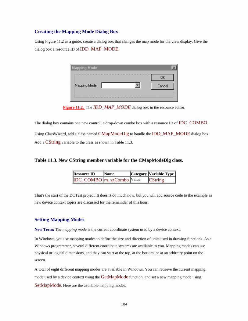
184
Creating the Mapping Mode Dialog Box
Using Figure 11.2 as a guide, create a dialog box that changes the map mode for the view display. Give the
dialog box a resource ID of IDD_MAP_MODE.
Figure 11.2. The IDD_MAP_MODE dialog box in the resource editor.
The dialog box contains one new control, a drop-down combo box with a resource ID of IDC_COMBO.
Using ClassWizard, add a class named CMapModeDlg to handle the IDD_MAP_MODE dialog box.
Add a CString variable to the class as shown in Table 11.3.
Table 11.3. New CString member variable for the CMapModeDlg class.
Resource ID Name Category Variable Type IDC_COMBO m_szCombo Value CString
That's the start of the DCTest project. It doesn't do much now, but you will add source code to the example as
new device context topics are discussed for the remainder of this hour.
Setting Mapping Modes
New Term: The mapping mode is the current coordinate system used by a device context.
In Windows, you use mapping modes to define the size and direction of units used in drawing functions. As a
Windows programmer, several different coordinate systems are available to you. Mapping modes can use
physical or logical dimensions, and they can start at the top, at the bottom, or at an arbitrary point on the
screen.
A total of eight different mapping modes are available in Windows. You can retrieve the current mapping
mode used by a device context using the GetMapMode function, and set a new mapping mode using
SetMapMode. Here are the available mapping modes:

185
• MM_ANISOTROPIC: Uses a viewport to scale the logical units to an application defined value.
The SetWindowExt and SetViewportExt member functions are used to change the units,
orientation, and scaling.
• MM_HIENGLISH: Each logical unit is converted to a physical value of 0.001 inch. Positive x is
to the right; positive y is up.
• MM_HIMETRIC: Each logical unit is converted to a physical value of 0.01 millimeter. Positive x
is to the right; positive y is up.
• MM_ISOTROPIC: Similar to MM_ANISOTROPIC, where logical units are converted to
arbitrary units with equally scaled axes. This means that 1 unit on the x-axis is always equal to 1 unit
on the y-axis. Use the SetWindowExt and SetViewportExt member functions to specify the
units and orientation of the axes.
• MM_LOENGLISH: Each logical unit is converted to a physical value of 0.01 inch. Positive x is
to the right; positive y is up.
• MM_LOMETRIC: Each logical unit is converted to a physical value of 0.1 millimeter. Positive x
is to the right; positive y is up.
• MM_TEXT: Each logical unit is converted to 1 device pixel. Positive x is to the right; positive y is
down.
• MM_TWIPS: Each logical unit is converted to 1/20 of a point. Because a point is 1/72 inch, a twip
is 1/1440 inch. This mapping mode is useful when sending output to a printer. Positive x is to the
right; positive y is up.
Modifying the Mapping Mode Dialog Box
Modify the combo box in the IDD_MAPMODE dialog box so that it can be used to track the current
mapping mode. You can set the contents of the combo box in the resource editor, just as you set other combo
box attributes. Because this combo box contains a fixed list of items, adding them in the resource editor is
easier than in OnInitDialog. Add the items from the following list to the combo box:
MM_ANISOTROPIC MM_HIENGLISH MM_HIMETRIC MM_ISOTROPIC MM_LOENGLISH MM_LOMETRIC MM_TEXT MM_TWIPS
186
Adding a Menu Item
Use the values from Table 11.4 to add a menu item and a message-handling function to the CDCTestView
class. Unlike menu-handling functions you have seen earlier, the view class must handle this menu selection
because the dialog box changes data that is interesting only for the view class.
Table 11.4. New member functions for the CDCTestView class.
Menu ID Caption Event Function Name ID_VIEW_MAP_MODE Map Mode... COMMAND OnViewMapMode
Listing 11.3 contains the source code for the OnViewMapMode function, which handles the message sent
when the new menu item is selected. If OK is clicked, the new map mode is calculated based on the value
contained in the combo box. The view rectangle is invalidated, which causes the view to be redrawn.
TYPE: Listing 11.3. The CDCTestView::OnViewMapMode function.
void CDCTestView::OnViewMapMode(){CMapModeDlg dlg;
if( dlg.DoModal() == IDOK ){POSITION pos;pos = m_map.GetStartPosition();while( pos != NULL ){CString szMapMode;int nMapMode;m_map.GetNextAssoc( pos, nMapMode, szMapMode );if( szMapMode == dlg.m_szCombo ){m_nMapMode = nMapMode;break;
}}InvalidateRect( NULL );
}}

187
Add an #include statement to the DCTestView.cpp file so the CDCTestView class can have access to
the CMapModeDlg class declaration. Add the following line near the top of the DCTestView.cpp file,
just after the other #include statements:
#include "MapModeDlg.h"
Collecting Information from a Device Context
The CDC class has two member functions that are commonly used to collect information:
• GetDeviceCaps, used to return information about the physical device that is associated with a
device context.
• GetTextMetrics, used to retrieve information about the currently selected font.
Using the GetDeviceCaps Function
One common use for GetDeviceCaps is to determine the number of pixels per logical inch for the device
associated with the DC. To retrieve the number of pixels per logical inch in the horizontal direction (also
known as the x-axis), call GetDeviceCaps and pass an index value of LOGPIXELSX as a parameter:
int cxLog = pDC->GetDeviceCaps( LOGPIXELSX );
Later this hour you will use GetDeviceCaps to display this information in the DCTest example.
Just a Minute: GetDeviceCaps is used primarily when printing; you can use this function to determine whether the printer supports specific GDI functions. In Hour 21 you will see how GetDeviceCaps is used to determine whether a printer can have bitmaps transferred to it.
Using the GetTextMetrics Function
GetTextMetrics is used to fill a TEXTMETRIC structure with a variety of information:
TEXTMETRIC tm;pDC->GetTextMetrics(&tm);
The TEXTMETRIC structure has a large number of member variables that contain information about the
currently selected font. The most commonly used members of the TEXTMETRIC structure are shown in
Table 11.5.

188
Table 11.5. Common member variables of the TEXTMETRIC structure.
Member Specifies... TmAscent The number of units above the baseline used by characters in the current font.
TmDescent The number of units below the baseline used by characters in the current font.
TmHeight The total height for characters in the current font. This value is equal to adding the tmAscent and tmDescent values together.
TmInternalLeading The area reserved for accent marks and similar marks associated with the font. This area is inside the tmAscent area.
TmExternalLeading The area reserved for spacing between lines of text. This area is outside the tmAscent area.
TmAveCharWidth The average width for non-bold, non-italic characters in the currently selected font.
TmMaxCharWidth The width of the widest character in the currently selected font.
To get the height of the currently selected font, call the GetTextMetrics function and use the value stored
in the tmHeight member variable:
TEXTMETRIC tm;pDC->GetTextMetrics(&tm);nFontHeight = tm.tmHeight;
Modifying the CDCTestView Class
In order to display information about the current map mode, you must first create a collection based on
CMap, one of the template collection classes. The CMap variable, m_map, associates an integer map-
mode value with a CString object that describes the map mode. As shown in Listing 11.4, add two new
variables to the CDCTestView class declaration in the attributes section.
TYPE: Listing 11.4. New member variables added to the CDCTestView class
declaration.
// Attributesprivate:CMap< int, int, CString, CString > m_map;int m_nMapMode;
When using one of the MFC collection classes in a project, you should always add an #include
"afxtempl.h" statement to the stdafx.h file in the project directory. This include directive adds the MFC
template declarations to the project's precompiled header, reducing project build time.

189
#include "afxtempl.h"
The source code for CDCTestView::OnDraw is provided in Listing 11.5. The current map mode is
displayed, along with text and device metrics. The text metrics vary depending on the current logical mapping
mode, while the device measurements remain constant. Some of the mapping modes will display the
information from top to bottom, whereas some of the modes cause the information to be displayed from
bottom to top.
TYPE: Listing 11.5. The CDCTestView::OnDraw function.
void CDCTestView::OnDraw(CDC* pDC){// Set mapping modepDC->SetMapMode( m_nMapMode );// Get client rect, and convert to logical coordinatesCRect rcClient;GetClientRect( rcClient );pDC->DPtoLP( rcClient );int x = 0;int y = rcClient.bottom/2;
CString szOut;m_map.Lookup( m_nMapMode, szOut );pDC->TextOut( x, y, szOut );
// Determine the inter-line vertical spacingTEXTMETRIC tm;pDC->GetTextMetrics( &tm );int nCyInterval = tm.tmHeight + tm.tmExternalLeading;
y += nCyInterval;szOut.Format( "Character height - %d units",
tm.tmHeight );pDC->TextOut( x, y, szOut );
y += nCyInterval;szOut.Format( "Average width - %d units",
tm.tmAveCharWidth );pDC->TextOut( x, y, szOut );
y += nCyInterval;szOut.Format( "Descent space - %d units",
tm.tmDescent );pDC->TextOut( x, y, szOut );
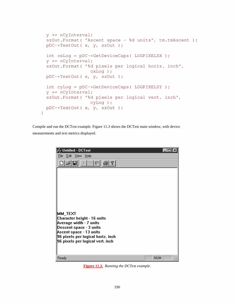
190
y += nCyInterval;szOut.Format( "Ascent space - %d units", tm.tmAscent );pDC->TextOut( x, y, szOut );
int cxLog = pDC->GetDeviceCaps( LOGPIXELSX );y += nCyInterval;szOut.Format( "%d pixels per logical horiz. inch",
cxLog );pDC->TextOut( x, y, szOut );
int cyLog = pDC->GetDeviceCaps( LOGPIXELSY );y += nCyInterval;szOut.Format( "%d pixels per logical vert. inch",
cyLog );pDC->TextOut( x, y, szOut );
}
Compile and run the DCTest example. Figure 11.3 shows the DCTest main window, with device
measurements and text metrics displayed.
Figure 11.3. Running the DCTest example.

191
Using Color in Windows Applications
As a final topic in this hour, it's important to understand how colors are represented in Windows applications.
Color values are stored in COLORREF variables, which are 32-bit variables defined as
typedef DWORD COLORREF;
Each COLORREF is a 32-bit variable, but only 24 bits are actually used, with 8 bits reserved. The 24 bits
are divided into three 8-bit chunks that represent the red, green, and blue components of each color.
A COLORREF is created using the RGB macro, which stands for Red, Green, and Blue--the three colors
used for color output in a Windows program. The RGB macro takes three parameters, each ranging from 0 to
255, with 255 signifying that the maximum amount of that color should be included in the COLORREF.
For example, to create a COLORREF with a white value, the definition would look like this:
COLORREF clrWhite = RGB(255,255,255);
For black, the definition would look like this:
COLORREF clrBlack = RGB(0,0,0);
You can change the current text color used for a device context through the SetTextColor function.
SetTextColor returns the previous text color used by the device context.
Listing 11.6 shows two different ways in which you can use the SetTextColor function. The first method
uses the RGB macro inside the SetTextColor function call; the next method creates a COLORREF
value that is passed as a parameter.
TYPE: Listing 11.6. Changing the text color using the SetTextColor function.
// Change text color to pure greenCOLORREF colorOld = pDC->SetTextColor(RGB(0,255,0));
// Change text color to pure blueCOLORREF colorBlue = RGB(0,0,255);pDC->SetTextColor(colorBlue);
// Restore original text colorpDC->SetTextColor(colorOld);

192
Summary
In this hour you learned about the Graphics Device Interface, or GDI. You also learned the basics of the
device context, as well as some of the MFC classes that are used to manage them. You built a sample program
that enables you to change and display information about an output device and its map mode.
Q&A
Q I'm having trouble drawing an ellipse that is exactly six inches across. I used GetDeviceCaps to retrieve the LOGPIXELSX and LOGPIXELSY values, but the image is drawn either too small or too large. How can I draw an image to an exact physical size? A The LOGPIXELSX and LOGPIXELSY values are supplied by the video driver. These values are approximate, and are really just a wild guess. There's no way to determine the true number of pixels per inch on your display adapter. Q Why is a CPaintDC created and used for WM_PAINT messages instead of a normal CDC object? A The CPaintDC class is exactly like the CDC class, except that its constructor and destructor do some extra work that is needed when handling a WM_PAINT message. This extra work tells Windows that the window has been repainted. If a CDC object is used, Windows will not be notified that the window has been repainted, and will continue to send WM_PAINT messages.
Workshop
The Workshop is designed to help you anticipate possible questions, review what you've learned, and begin
thinking ahead to putting your knowledge into practice. The answers to the quiz are in Appendix B, "Quiz
Answers."
Quiz
1. What is the difference between a device context and an information device context? 2. What CDC member function is used to select a stock object? 3. How many twips are in an inch? 4. What type of GDI object is used to draw lines?

193
5. What type of GDI object is used to fill areas? 6. How do you determine the height and other characteristics of characters in the currently selected font? 7. What is the RGB macro used for? 8. What MFC class is used as a base class for all device contexts? 9. How can you tell that a call to SelectObject has failed? 10. What mapping mode maps 1 device pixel per measurement unit?
Exercises
1. Modify the DCTest program to change the color for each line of output. 2. Modify the DCTest program so that every line starts with its x and y coordinates.
194
- Hour 12 - Using Pens and Brushes
In this hour you will look at pens and brushes. Specifically, you will learn
• How pens are used to draw lines and geometric shapes in Windows programs
• How brushes are used to fill areas with colors and patterns
• MFC class library support that simplifies the use of pens and brushes
You also modify the DCTest sample program from Hour 11, "Device Contexts," to draw a variety of figures
using pens and brushes.
What Is a Pen?
New Term: A pen is a Windows GDI object used to draw lines and figures.
Think of a Windows pen as being like an ink pen at your desk. A Windows pen object has three attributes:
• Width: Normally one pixel wide, although a pen can be as wide as you like
• Style: Can be any of the pen styles discussed in this chapter
• Color: Can be any Windows color packed into a COLORREF structure
Programs written for Windows use two types of pens:
• Cosmetic pens, which are always drawn in device units, regardless of the current mapping mode.
• Geometric pens, which are drawn in logical units and are affected by the current mapping mode.
Geometric pens have more style and drawing options than cosmetic pens.
You use a cosmetic pen when you must always draw lines with a fixed size. For example, rulers and grid lines
are often drawn using cosmetic pens. You use geometric pen lines to reflect the scaling provided by the
current mapping mode.
Just a Minute: A pen is perfect in situations in which you must draw a geometric shape or line. Although you can use a bitmap for complicated images, you easily can draw squares, rectangles, circles, and other basic shapes using GDI objects.

195
You can create and use pens with a variety of styles. Cosmetic pens are extremely quick and are mapped
directly into device units. This makes them useful for drawing things like frames, borders, grid lines, and
other screen objects that should not be affected by the current device context-mapping mode. Geometric pens
require more CPU power but offer more styles. You can manipulate geometric pens using any of the available
mapping modes.
Pens are also useful for drawing three-dimensional highlighting or other effects. It's not uncommon for pens
and other GDI objects to be used to simulate controls in Windows; before Windows 95 was released, early
versions of property pages used pens to draw simulated "tabs."
MFC Support for Pens
Like other GDI objects, you normally use a pen by creating an MFC object. Use the CPen class to create and
manage both cosmetic and geometric pens. When creating a pen, you must specify at least three things:
• The pen's style
• The pen's width
• The pen's color
Time Saver: The number of styles available for geometric pens is much larger than for cosmetic pens. However, cosmetic pens have much less overhead. You should use cosmetic pens whenever possible. The next few sections discuss the various options available for cosmetic and geometric pens.
Using Cosmetic Pens
Cosmetic pens are not affected by the current mapping mode's scaling factor because they are always drawn
in device units. Therefore, they are useful where a line must overlay another view that may be scaled. These
basic styles are available for cosmetic pens:
• PS_SOLID: Creates a solid pen.
• PS_DOT: Creates a dotted pen. This style is also valid only for pens with a width of one. Wider
pens are drawn as PS_SOLID.
• PS_DASH: Creates a dashed pen. If the pen width is greater than one, the pen is drawn as
PS_SOLID.
• PS_DASHDOT: Creates a pen with alternating dashes and dots. If the pen width is greater than
one, a solid pen is drawn instead.
• PS_DASHDOTDOT: Creates a pen with alternating dashes and double dots. If the pen width is
greater than one, a solid pen is drawn instead.

196
• PS_NULL: Creates a null pen; this pen doesn't draw at all.
• PS_INSIDEFRAME: Creates a pen that draws a line inside the frame of closed shapes produced
by GDI functions, such as the Ellipse and Rectangle functions.
• PS_ALTERNATE: Can be applied only to cosmetic pens and creates a pen that sets every other
pixel.
Figure 12.1 shows examples of each of the pen styles.
Figure 12.1. Examples of the styles available for pens.
Using Geometric Pens
Geometric pens can use all the styles available for cosmetic pens except for the PS_ALTERNATE style,
and they also have access to four additional attributes:
• A pattern used to draw the pen
• A hatch style used for some types of patterns
• The type of end cap used to terminate a line

197
• A joining style, used when two lines intersect
Using the CPen Class
The CPen class is simple because there really are only a few things that can be done to a pen object; most of
the fun occurs when the pen object is selected into a device context. The CPen class provides three
constructors: two simple constructors primarily for cosmetic pens and another extremely flexible constructor
primarily for geometric pens.
The first constructor has no arguments:
CPen aGreenPen;aGreenPen.Create( PS_SOLID, 1, RGB(0,255,0);
If you use this constructor, use the Create member function to actually create the pen and make it ready for
use.
The second constructor provided for CPen also is used for cosmetic pens:
CPen penDottedAndRed( PS_DOT, 1, RGB(255,0,0) );
This version of the constructor accepts three parameters: the pen style, width, and color. In this case, the
CPen instance is a dotted red pen.
The third constructor used for CPen objects enables any type of pen to be created. It also uses more
parameters, as shown in Listing 12.1.
TYPE: Listing 12.1. Creating a brush using a LOGBRUSH structure.
LOGBRUSH lbrGrnHatch;
lbrGrnHatch.lbStyle = BS_HATCHED;lbrGrnHatch.lbColor = RGB(0,255,0);lbrGrnHatch.lbHatch = HS_DIAGCROSS;
CPen penGeometric( PS_DOT | PS_GEOMETRIC |PS_ENDCAPROUND,
50,&lbrGrnHatch,0,NULL );
198
The constructor's first parameter is the pen's style, with the C++ OR operator, |, used to combine all styles
that are applied to the pen. The second parameter for the constructor is the width; if the pen is cosmetic, it
must be set to 1. The third parameter is a pointer to a LOGBRUSH structure. In Listing 12.1,
lbrGrnHatch is defined as a diagonally cross-hatched green brush.
The last two parameters are rarely used; they define a user-supplied pattern for the pen. These two parameters
are used only if the pen is created with the PS_USERSTYLE attribute. The fourth parameter is the number
of elements in the style array, whereas the fifth parameter is an array of DWORD values, each used to
define the length of a dash or space in the pen's pattern.
Using Stock Pens
The simplest pens to use are known as stock objects. Stock objects were discussed in Hour 11; they are GDI
objects that belong to the operating system. Windows provides three stock pens:
• BLACK_PEN: Provides, oddly enough, a black pen
• WHITE_PEN: Provides a white pen
• NULL_PEN: Provides a null pen and is exactly the same as creating a pen with the PS_NULL
style
Each of these pens is exactly one unit wide. If you need a wider pen, you must create one using the CPen
class. These pens are used through a CDC object by calling the SelectStockObject function, passing the
stock object as a parameter, as follows:
CPen* pOldPen = pDC->SelectStockObject( BLACK_PEN );
An Example that Draws with Pens
After a pen has been selected into a device context, several different drawing functions can be performed with
the device context. The CDC class used to represent device contexts, as you learned in Hour 11, includes
these drawing functions often used with pens:
• Ellipse: Used to draw an ellipse. This function is also used to draw circles, because a circle is just a
special type of ellipse.
• Arc: Used to draw a portion of an ellipse.
• LineTo and MoveTo: Used to draw lines. Together they are often used to draw highlighting,
squares, rectangles, and other types of figures.

199
As an example using pens, you can modify the DCTest program you created in Hour 11. The changes use
three pens to draw three figures in the view window in a variety of styles and colors. Modifying the existing
project also gives you a chance to see how different mapping modes affect the figures drawn using pens.
Although some of the listings might look long, most of them require only a few changes in the source code
that is already present.
Modifying the Mapping Mode Dialog Box
As the first step in the sample program, modify the Mapping Mode dialog box and the CMapModeDlg
class to support extra options used when drawing with pens. The new version of the IDD_MAP_MODE
dialog box is shown in Figure 12.2.
Figure 12.2. The new version of the Mapping Mode dialog box.
Use the values from Table 12.1 for the new controls you add to the Mapping Mode dialog box, using
ClassWizard to add member variables to the CMapModeDlg class. All existing controls should remain as
they are.
Table 12.1. Values for new edit controls you add to the Mapping Mode dialog box.
Edit Control Resource ID Variable Name Type Pen Width IDC_WIDTH m_nPenWidth int Ellipse Width IDC_CXELLIPSE m_cxEllipse int Ellipse Height IDC_CYELLIPSE m_cyEllipse int
200
Modifying the CDCTestView Class
You must modify the CDCTestView class slightly to add three new member variables that store the pen
height and the ellipse variables you just added to the dialog box class. Add three new member variables to the
attributes section of the CDCTestView class declaration, as shown in Listing 12.2.
TYPE: Listing 12.2. New member variables added to the CDCTestView class.
// Attributesprivate:// Variables added for Hour 11CMap< int, int, CString, CString > m_map;int m_nMapMode;// Variables added for Hour 12 - pensint m_cxEllipse;int m_cyEllipse;int m_nPenWidth;
Do not modify the declarations for existing member variables.
Modifying the CDCTestView Member Functions
You must modify three CDCTestView member functions:
The CDCTestView constructor
The CDCTestView::OnViewMapMode menu handler
The CDCTestView::OnDraw member function
Each of these views is modified in the following sections. None of these member functions are new; all are
used in the current DCTest project.
Add three new lines to the CDCTestView constructor to initialize the new variables added to the
CDCTestView class. Listing 12.3 is the new version of the CDCTestView constructor. Most of the
function should already be entered; you must add only the last three lines before the closing parenthesis.
TYPE: Listing 12.3. The new version of the CDCTestView constructor.
CDCTestView::CDCTestView(){

201
m_nMapMode = MM_TEXT;m_map.SetAt( MM_ANISOTROPIC, "MM_ANISOTROPIC" );m_map.SetAt( MM_HIENGLISH, "MM_HIENGLISH" );m_map.SetAt( MM_HIMETRIC, "MM_HIMETRIC" );m_map.SetAt( MM_ISOTROPIC, "MM_ISOTROPIC" );m_map.SetAt( MM_LOENGLISH, "MM_LOENGLISH" );m_map.SetAt( MM_LOMETRIC, "MM_LOMETRIC" );m_map.SetAt( MM_TEXT, "MM_TEXT" );m_map.SetAt( MM_TWIPS, "MM_TWIPS" );m_nPenWidth = 1;m_cxEllipse = 100;m_cyEllipse = 200;
}
Modify the CDCTestView::OnViewMapMode function to handle the changes in the Mapping Mode
dialog box. Listing 12.4 provides the source code for the new version of OnViewMapMode. There are a
total of six new source code lines, each marked with a comment. You should need to add only these six lines;
the rest of the function should have been created already.
Listing 12.4. The new version of the CDCTestView::OnViewMapMode function.
void CDCTestView::OnViewMapMode(){CMapModeDlg dlg;// The next three lines are added for Hour 12 - pensdlg.m_nPenWidth = m_nPenWidth; // 1dlg.m_cxEllipse = m_cxEllipse; // 2dlg.m_cyEllipse = m_cyEllipse; // 3if( dlg.DoModal() == IDOK ){// The next three lines are added for Hour 12 - pensm_nPenWidth = dlg.m_nPenWidth; // 4m_cxEllipse = dlg.m_cxEllipse; // 5m_cyEllipse = dlg.m_cyEllipse; // 6POSITION pos;pos = m_map.GetStartPosition();while( pos != NULL ){CString szMapMode;int nMapMode;m_map.GetNextAssoc( pos, nMapMode, szMapMode );if( szMapMode == dlg.m_szCombo ){m_nMapMode = nMapMode;

202
break;}
}InvalidateRect( NULL );
}}
Last but not least, you must create a new version of the OnDraw function. Most of this version of OnDraw
is new because you are now drawing with pens instead of listing device attributes. Use the source code
provided in Listing 12.5 for the new version of CDCTestView::OnDraw.
Listing 12.5. The new version of CDCTestView::OnDraw.
void CDCTestView::OnDraw(CDC* pDC){pDC->SetMapMode( m_nMapMode );// Draw an ellipse based on the current map-mode and// values supplied by the user.CRect rcClient;GetClientRect( rcClient );pDC->DPtoLP( rcClient ); // Covert device
// units to logicalCPoint ptCenter( rcClient.Width()/2,
rcClient.Height()/2 );CRect rcEllipse(
ptCenter.x - ( m_cxEllipse/2 ),ptCenter.y - ( m_cyEllipse/2 ),ptCenter.x + ( m_cxEllipse/2 ),ptCenter.y + ( m_cyEllipse/2 ) );
CPen penRed( PS_SOLID, m_nPenWidth, RGB(255,0,0) );CPen* pOldPen = pDC->SelectObject( &penRed );pDC->Ellipse( rcEllipse );// Draw a black box around the ellipse, using one// of the stock pens.pDC->SelectStockObject( BLACK_PEN );pDC->MoveTo( rcEllipse.TopLeft() );pDC->LineTo( rcEllipse.right, rcEllipse.top );pDC->LineTo( rcEllipse.BottomRight() );pDC->LineTo( rcEllipse.left, rcEllipse.bottom );pDC->LineTo( rcEllipse.left, rcEllipse.top );// Draw an arc using the client area as a bounding// rectangle. Clip the arc so that only the lower-left// half is displayed.CPen penDottedAndGreen( PS_DOT, 1, RGB(0,255,0) );

203
pDC->SelectObject( &penDottedAndGreen );pDC->Arc(rcClient,rcClient.TopLeft(),rcClient.BottomRight());
pDC->SelectObject( &pOldPen );}
Compile and run the DCTest project, and experiment by changing the values in the Mapping Mode dialog
box. Figure 12.3 shows the DCTest project running with the mapping mode set to MM_TEXT.
Figure 12.3. The DCTest example after adding pen GDI objects.
What Are Brushes?
A brush is a GDI object used to fill a control, window, or other area when programming for Windows. A
brush is much like a pen; both are selected the same way, some of the attributes are similar, and you can use a
series of stock objects without much overhead. However, you use a brush to fill an area rather than draw a
line or a figure. A common use for brushes is to color windows, controls, or dialog boxes.
Every brush has several attributes:

204
Color: Specifies the brush color. You use a COLORREF value, just as when you specify a pen color.
Pattern: Defines the pattern used by the brush.
Hatching Style: Specifies a hatch pattern.
By choosing different values for attributes given to a brush, you can achieve a wide variety of effects.
MFC Support for Brushes
In a program you write with Visual C++, you normally create and use CBrush objects the way you create
and use CPen objects. Every brush has a set of attributes that define how it appears and behaves. Just as with
pens, Windows has several stock brushes that are available by calling the SelectStockObject function.
Your Windows program can create four basic types of brushes:
• Solid brushes: Similar to solid pens, except they are used to fill areas instead of drawing lines. You
normally give these brushes a color when you use a COLORREF to create them.
• Stock brushes: Predefined brushes stored and maintained by Windows.
• Hatch brushes: Fill an area with a predefined hatch pattern, as shown in Figure 12.4. These brushes
can also be colored when they are created.
• Pattern brushes: Fill an area with a pattern supplied in an 8x8 bitmap, as shown in Figure 12.4.
Figure 12.4. Examples of styles available for brushes.
You create each of these brush types using a different function call. For example, a solid brush is created
using CreateSolidBrush, whereas a hatched brush is created using CreateHatchBrush. When using the

205
CBrush class, it's also possible to call a specialized CBrush constructor to construct the CBrush object in
the desired style. You will use the CBrush class later in this hour.
You can create solid and hatch brushes with a color attribute that specifies the color used when the brush fills
an area. In the case of a hatched brush, the color specifies the color of the hatching lines.
Hatch Styles for Brushes
Six hatch styles are available for hatch brushes. You create a hatch style by passing one of the following
styles as a parameter when you create the brush:
• HS_BDIAGONAL: Creates a brush with a downward hatch pattern. The lines used in the hatch
pattern run from left to right at 45 degrees.
• HS_CROSS: Creates a hatch pattern with vertical and horizontal intersecting lines.
• HS_DIAGCROSS: Creates a cross-hatch pattern with each line angled at 45 degrees.
• HS_FDIAGONAL: Creates a brush with an upward hatch pattern. The lines used in the hatch
pattern run from left to right at 45 degrees.
• HS_HORIZONTAL: Creates a horizontal hatch pattern.
• HS_VERTICAL: Creates a vertical hatch pattern.
Figure 12.5 shows examples of these six hatching styles.

206
Figure 12.5. Examples of brush hatching styles.
Using the CBrush Class
To use a brush in an MFC program, create a CBrush object and select it into a device context. You can
create the brush using single-step construction, like this:
CBrush brBlack( RGB(0,0,0) );
Alternatively, use two-step construction, where the brush object is constructed and then explicitly created, like
this:
CBrush brBlack();brBlack.CreateSolidBrush( RGB(0,0,0) );
The advantage of using two-step construction is that the function used to create a brush returns FALSE if the
function fails.

207
Unlike pens, which use style bits to determine the type of pen to be created, separate functions are used for
different brush types. In two-step construction, you can use three functions to create a brush after you
construct the CBrush object:
• CreateSolidBrush
• CreateHatchBrush
• CreatePatternBrush
Four different constructors are provided for CBrush. In addition to the default constructor, you can use three
constructors to create a specific type of brush in one step. The second constructor is used to create a solid
brush and takes one COLORREF parameter, indicating the color used for the brush.
CBrush brGreen( RGB(0,0,255) );
Using this brush is equivalent to using the default constructor and then calling CreateSolidBrush.
The third form of the CBrush constructor is used to create a hatched brush, and takes the hatching style and
hatch color as parameters:
CBrush brGray( HS_CROSS, RGB(192,192,192) );
This constructor is equivalent to using the default constructor and then calling CreateHatchBrush.
Use the fourth and final constructor for CBrush to create brushes that have bitmap patterns. You will learn
more about bitmaps in Hour 15, "Using Bitmaps"; for now, just remember that a bitmap can be used as a
pattern for a brush. The constructor takes a pointer to a CBitmap object as a parameter:
CBrush brArrow( &bmpArrow );
The CBitmap object can be up to 8x8 pixels. If the bitmap is larger, only the upper-left eight pixel squares
are used for the brush pattern.
Logical Brushes
Logical brushes are defined using the LOGBRUSH structure. A logical brush often is used when
specifying how a brush should be constructed. For example, earlier in this hour you used a LOGBRUSH
structure to specify the characteristics of a geometric pen. Think of a LOGBRUSH as a recipe for a brush
that might be created: It's not a brush yet, but it might help build a brush in the future.

208
The LOGBRUSH structure has three data members:
• lbrStyle contains the brush style.
• lbrColor stores a COLORREF value for the brush.
• lbrHatch stores a hatch style if needed.
Each of the three LOGBRUSH data members corresponds to one of the style attributes available for
brushes, discussed earlier in this hour. To create a logical brush, just assign values to the three data members,
as with any structure. Listing 12.6 uses a logical brush to create a red hatched brush.
TYPE: Listing 12.6. Filling a LOGBRUSH structure.
LOGBRUSH lbrRed;lbrRed.lbrStyle = BS_HATCH;lbrRed.lbrColor = RGB(255,0,0);lbrRed.lbrHatch = HS_CROSS;
CBrush theRedBrush;theRedBrush.CreateBrushIndirect( &lbrRed );
Using Stock Brushes
Just like stock pens discussed earlier in this hour, Windows maintains a set of stock brushes. Windows
provides seven stock brushes:
• BLACK_BRUSH: Provides a black brush.
• DKGRAY_BRUSH: Provides a dark gray brush.
• GRAY_BRUSH: Provides a gray brush.
• HOLLOW_BRUSH: Equivalent to NULL_BRUSH.
• LTGRAY_BRUSH: Provides a light gray brush.
• NULL_BRUSH: Provides a null brush.
• WHITE_BRUSH: Provides a white brush.
As with other stock objects, these brushes are used through a CDC object by calling the
SelectStockObject function, passing the stock object as a parameter, as follows:
CPen* pOldBrush = pDC->SelectStockObject( BLACK_BRUSH );

209
Using the Common Color Dialog Box
The Windows operating system includes a series of dialog boxes as part of the operating system. These dialog
boxes are guaranteed to be present, and using them requires just a few lines of code. Use these dialog boxes
for common operations where it's beneficial for all Windows programs to have a similar look and feel. The
common dialog boxes shipped with Windows can help you
• Select a file to be opened
• Choose a font
• Choose a color
• Create a standard Find and Replace dialog box
• Choose options and print to a supported printer
To use the Common Color dialog box, just create a CColorDialog object and call DoModal, just as with
any other dialog box:
CColorDialog dlgColor;if( dlgColor.DoModal() ){ //....
If IDOK is returned from the dialog box, the CColorDialog::GetColor function gets the selected color
value. The example in the next section uses the Common Color dialog box to choose a brush color. You will
use other common dialog boxes in later hours. (For example, the font-selection dialog box is used in Hour 13,
"Fonts.")
Changing the Mapping Mode Dialog Box and CMapModeDlg Class
As an example of how to use brushes, continue to modify the DCTest project that you worked with earlier this
hour. The new version of the project displays a colored ellipse on a gray view background. Both the ellipse
and background color are filled using CBrush objects. You can change the color of the ellipse using the
Common Color dialog box; as a bonus, the Mapping Mode dialog box color changes to match the ellipse.
Modify the Mapping Mode dialog box to allow the user to choose a color for the dialog box and a brush used
for the view. The CMapModeDlg class needs two new variables: a COLORREF for the currently
selected color, and a CBrush object that has been created using the current color. Listing 12.7 contains the
changes to the CMapModeDlg class declaration. Add the new code in the Dialog Data section, just after
the AFX_DATA comments.

210
TYPE: Listing 12.7. Changes to the CMapModeDlg class declaration.
// Dialog Data//{{AFX_DATA(CMapModeDlg)enum { IDD = IDD_MAP_MODE };CString m_szCombo;int m_cyEllipse;int m_cxEllipse;int m_nPenWidth;//}}AFX_DATA// Variable added in Hour 12
public:COLORREF m_clrChoice;
private:CBrush m_brControl;
You must change the Mapping Mode dialog box slightly for this example. Remove the pen-width edit control
and add a pushbutton control, as shown in Figure 12.6. Use ClassWizard to remove the m_nPenWidth
member variable from the CMapModeDlg class.
Figure 12.6. The new version of the Mapping Mode dialog box.
Use the values from Table 12.2 for the new button control.
Table 12.2. Values for the new Color button.
Resource ID Caption Function IDC_COLOR &Color... CMapModeDlg::OnColor
Using ClassWizard, add a new message-handling function to the CMapModeDlg class named
CMapModeDlg::OnColor. The source code for OnColor is provided in Listing 12.8.

211
TYPE: Listing 12.8. The CMapModeDlg::OnColor member function.
void CMapModeDlg::OnColor(){CColorDialog dlgColor;if( dlgColor.DoModal() == IDOK ){m_clrChoice = dlgColor.GetColor();// If the brush already exists, delete the current// GDI object before calling CreateSolidBrushif( m_brControl.Detach() )m_brControl.DeleteObject();
m_brControl.CreateSolidBrush( m_clrChoice );InvalidateRect( NULL );
}}
The OnColor function creates a Common Color dialog box and displays it using DoModal. If the user
selects a new color, the color is collected and the brush is updated. If the brush has previously been created,
the Detach and DeleteObject functions must be called to destroy the current brush before creating a new
brush.
Handling the WM_CTLCOLOR Message
Before displaying any control or dialog box, Windows asks for the control's color by sending a
WM_CTLCOLOR message to the owner of the control. To specify a color to be used for the control or
dialog box, return a solid brush containing the color in response to this message, as shown in Listing 12.9.
The m_brControl brush is a class member variable because it must survive for the life of the control.
TYPE: Listing 12.9. Changing the color of a dialog box by handling
WM_CTLCOLOR.
HBRUSH CMapModeDlg::OnCtlColor(CDC* pDC,CWnd* pWnd,UINT nCtlColor)
{if( nCtlColor == CTLCOLOR_DLG ||
nCtlColor == CTLCOLOR_STATIC ){pDC->SetBkMode( TRANSPARENT );
212
return (HBRUSH)m_brControl.GetSafeHandle();}elsereturn CDialog::OnCtlColor(pDC, pWnd, nCtlColor);
}
Time Saver: The easiest way to deal with colored dialog boxes is shown in Listing 12.9, where the text-drawing mode is set to transparent by calling SetBkMode. If this line is commented out, you will see that the static text has colored areas around each color. By setting the drawing mode to transparent, the text is drawn without including the text background color, allowing the dialog box color to show through.
The GetSafeHandle function is used with all GDI objects to return a handle to the underlying object. A
CBrush object returns an HBRUSH handle; a CPen object returns an HPEN, and so on.
The WM_CTLCOLOR message is sent for every control type found in the dialog box. It's possible to set
different colors for each control type by testing for the values found in Table 12.3. If a brush is not returned,
determine the return value by calling CDialog::OnCtlColor.
Table 12.3. Control-type message return value.
Control Message Value Control Type CTLCOLOR_BTN Button control
CTLCOLOR_DLG Dialog box
CTLCOLOR_EDIT Edit control
CTLCOLOR_LISTBOX List box control
CTLCOLOR_MSGBOX Message box
CTLCOLOR_SCROLLBAR Scrollbar control
CTLCOLOR_STATIC Static control
Updating the CDCTestView Class
The CDCTestView class must store the color and brush selected by the user to color the ellipse and
Mapping Mode dialog box. One new variable is added to the attributes section of the CDCTestView class,
as shown in Listing 12.10: The m_clrChoice variable stores the currently selected color for the ellipse.

213
TYPE: Listing 12.10. Changes to the CDCTestView class declaration.
// Attributesprivate:// Variables added for Hour 11CMap< int, int, CString, CString > m_map;int m_nMapMode;// Variables added for Hour 12 - pensint m_cxEllipse;int m_cyEllipse;// Variable added for Hour 12 - brushesCOLORREF m_clrChoice;
Changes to CDCTestView Member Functions
To update the DCTest project to use brushes instead of pens, you must make four basic changes to the
CDCTestView member functions:
• All references to m_nPenWidths must be removed.
• The new variable, m_clrChoice, must be initialized in the constructor.
• The OnViewMapMode function must update the m_clrChoice variable if the user changes the
color.
• The OnDraw function must be changed to use brushes instead of pens.
• Edit the constructor for CDCTestView so it looks like the source code provided in Listing 12.11.
The m_nPenWidth variable has been removed, and one line has been added to initialize the
m_clrChoice variable.
TYPE: Listing 12.11. The CDCTestView constructor.
CDCTestView::CDCTestView(){m_nMapMode = MM_TEXT;m_map.SetAt( MM_ANISOTROPIC, "MM_ANISOTROPIC" );m_map.SetAt( MM_HIENGLISH, "MM_HIENGLISH" );m_map.SetAt( MM_HIMETRIC, "MM_HIMETRIC" );m_map.SetAt( MM_ISOTROPIC, "MM_ISOTROPIC" );m_map.SetAt( MM_LOENGLISH, "MM_LOENGLISH" );m_map.SetAt( MM_LOMETRIC, "MM_LOMETRIC" );m_map.SetAt( MM_TEXT, "MM_TEXT" );m_map.SetAt( MM_TWIPS, "MM_TWIPS" );// The next two lines are added for Hour 12 - pensm_cxEllipse = 100;

214
m_cyEllipse = 200;// The next line is added for Hour 12 - brushesm_clrChoice = RGB(0,0,0);
}
Modify the CDCTestView::OnViewMapMode function as shown in Listing 12.12. The code in this
listing removes all references to the m_nPenWidth variable, and the function now tracks the color selected
by the user. A total of two lines have been removed and one line added to the existing function.
TYPE: Listing 12.12. The OnViewMapMode function.
void CDCTestView::OnViewMapMode(){CMapModeDlg dlg;// The next two lines are added for Hour 12 - pensdlg.m_cxEllipse = m_cxEllipse;dlg.m_cyEllipse = m_cyEllipse;// The next line is added for Hour 12 - brushesdlg.m_clrChoice = m_clrChoice;if( dlg.DoModal() == IDOK ){// The next two lines are added for Hour 12 - pensm_cxEllipse = dlg.m_cxEllipse;m_cyEllipse = dlg.m_cyEllipse;// The next line is added for Hour 12 - brushesm_clrChoice = dlg.m_clrChoice;POSITION pos;pos = m_map.GetStartPosition();while( pos != NULL ){CString szMapMode;int nMapMode;m_map.GetNextAssoc( pos, nMapMode, szMapMode );if( szMapMode == dlg.m_szCombo ){m_nMapMode = nMapMode;break;
}}InvalidateRect( NULL );
}}

215
Modify the CDCTestView::OnDraw function as shown in Listing 12.13. The new version of OnDraw
uses a CBrush object to fill the view window with a red brush. Another CBrush object is used to draw an
ellipse in the center of the view using a user-defined color to fill the figure.
TYPE: Listing 12.13. The OnDraw member function modified to use brushes.
void CDCTestView::OnDraw(CDC* pDC){CRect rcClient;GetClientRect( rcClient );pDC->DPtoLP( rcClient );CBrush brBackground( RGB( 255, 255, 100 ) );pDC->FillRect( rcClient, &brBackground );CPoint ptCenter( rcClient.Width()/2,
rcClient.Height()/2 );CRect rcEllipse( ptCenter.x - ( m_cxEllipse/2 ),
ptCenter.y - ( m_cyEllipse/2 ),ptCenter.x + ( m_cxEllipse/2 ),ptCenter.y + ( m_cyEllipse/2 ) );
CBrush brEllipse( m_clrChoice );CBrush* pOldBrush = pDC->SelectObject( &brEllipse );pDC->Ellipse( rcEllipse );pDC->SelectObject( &pOldBrush );
}
Compile and run the DCTest project, and experiment by changing the values in the Mapping Mode dialog
box. Also experiment with different colors for the dialog box and ellipse by clicking the Color button. Figure
12.7 shows an example of the DCTest project running.

216
Figure 12.7. The DCTest example after adding brush GDI objects.
Summary
In this hour you learned about two GDI objects--pens and brushes--and how they are used to draw figures and
fill shapes in Windows programs. You also learned about the MFC classes CPen and CBrush that are used
to manage pen and brush objects. Finally, you modified the DCTest program to use the MFC CPen and
CBrush classes.
Q&A
Q Can a pen and a brush be used at the same time? A Yes, in fact, you are always drawing with both a pen and a brush. Earlier in this hour the ellipse and rectangle were drawn with specific pens; the shapes weren't filled in because the default brush for a device context is the hollow, or null brush. Because this brush has no effect, it seems as though no brush is being used. Q Why aren't pushbuttons affected by handling WM_CTLCOLORBTN? A The WM_CTLCOLORBTN message will affect radio buttons and check boxes, but not pushbuttons. To change the color of a pushbutton you must make it an owner-drawn

217
pushbutton and take over responsibility for drawing every aspect of the button.
Workshop
The Workshop is designed to help you anticipate possible questions, review what you've learned, and begin
thinking ahead to putting your knowledge into practice. The answers to the quiz are in Appendix B, "Quiz
Answers."
Quiz
1. What are the three attributes of a pen? 2. What are the two types of pens? 3. What MFC class is used to manage pens? 4. What stock pens are maintained by Windows? 5. What styles are available for cosmetic pens? 6. What styles are available for geometric pens? 7. What are the four types of brushes? 8. What stock brushes are maintained by Windows? 9. What MFC class is used to manage brushes? 10. What function is used to draw a circle?
Exercises
1. Modify the DCTest example, and change the edit control color to red. 2. Modify the DCTest example so that the ellipse is drawn with a red outline.

218
- Hour 13 - Fonts
Fonts define the symbols and characters used to display text in a Windows program. In this
hour, you will learn
• The basic attributes that are available for fonts
• How to use the Common Font dialog box provided as part of Windows
• MFC class library support for creating and managing fonts
At the end of the hour is some sample code that extends the DCTest example to show how fonts are used in a
Windows program.
What Are Fonts?
Fonts are GDI objects, much like the pens and brushes discussed in Hour 12, "Using Pens and Brushes," and
are used to define the characters used for output in a Windows program. A collection of characters and other
symbols that share the same attributes is a font.
Just a Minute: Strictly speaking, fonts are not necessary for most programs written for Windows. A default font is selected into every device context automatically, and it can work just fine for most applications. However, almost every program can benefit from using fonts that have been selected to suit its specific needs.
In this hour you see some terms that are unique to programming with fonts.
New Term: A glyph is an individual character.
New Term: Font pitch refers to the width of individual characters; fixed pitch means that each character has
the same width; variable pitch means that some characters will be wider than others.
New Term: A serif is the small cross at the ends of some characters. A font with a serif has short crosses at
the ends of lines making up the font; Times New Roman is such a serif font. A font without serifs is often
called a sans-serif font. Figure 13.1 shows examples of a serif and a sans-serif font.

219
Figure 13.1. Serif and sans-serif fonts.
Fonts are maintained by Windows. Information about each currently installed font is stored in a system table
known as the font table.
There are three different types of fonts; each type has different capabilities:
• Raster fonts are created from bitmaps and are stored in resource files with an .FON extension. Each
bitmap is created for a specific screen resolution and is used by Windows to map out exactly how the
glyph will look when it is displayed.
• Vector fonts consist of a series of endpoints that are connected together to create each glyph and also
are found in files with an .FON extension. Unlike raster fonts, vector fonts are device independent,
but they are the slowest of the three font types.
• TrueType fonts are the most flexible of all Windows fonts. First introduced in Windows 3.1,
TrueType fonts consist of line and curve information, as well as hints about each glyph. Each
TrueType font is stored in two files: one with an .FOT extension, the other with a .TTF extension.
Just a Minute: Scaleable fonts that can display italic, bold, or underlined text give a program an extra amount of usability. Most printers supported by Windows also allow TrueType fonts to be displayed on a printer exactly as they are on a video screen; this is an extra advantage because it greatly simplifies the work required for printing.
Fonts are also arranged into six families that define the general attributes of the font. Fonts in the same family
share similar strokes, serifs, and pitch. The following are the six font families:
• Decorative specifies novelty fonts such as Old English.
• Dontcare specifies a generic group of fonts; either the font family information doesn't exist or the font
family is unimportant.
• Modern specifies fonts that have fixed pitch and may or may not have serifs. Courier New is an
example of a Modern font.
• Roman specifies fonts that have variable pitch and have serifs, such as Times New Roman.
• Script specifies fonts that are similar to handwriting.

220
• Swiss specifies a font that is fixed pitch and doesn't have serifs, such as Arial.
Specifying Font Attributes
Like other GDI objects, the easiest way to use a font is to use the MFC class library. Like other GDI objects,
fonts must be used with a device context, and they are influenced by the current state of the device context,
such as mapping mode and color definitions. When you're working with text output, the CFont class helps
make using a font easy.
There are two basic ways to use a font in your program:
• You can specify exactly what kind of font should be used.
• You can specify font general attributes and let Windows select a font for you.
In addition to the font families discussed earlier in this hour, you can use other general attributes to specify a
font. Many font attributes exist, mainly because there are so many different ways to display characters in a
program written for Windows. Don't worry; after you've used fonts a few times, you'll be able to create fonts
with no trouble at all. Later in the hour you will build some examples to learn how you can use these
attributes.
The Font Height and Width
You can specify the height of the font using one of the following methods:
• If a height greater than zero is specified, Windows tries to match the requested height with one of the
available fonts, and the font is mapped using logical units.
• If a font height of zero is specified, a reasonable default font is used. In this case, "reasonable" is
defined by Windows.
• If the specified height is a negative number, the font is mapped using hardware units. Windows
searches for a font that matches the absolute value of the size provided.
Logical units normally are used for screen display, and physical units are normally used for printing. In Hour
21, "Printing," you use MM_TWIPS to create fonts based on device units.
Just a Minute: The width of a font normally is set to zero, which tells Windows to select an appropriate default width. However, in some cases you might want to specify your own font width to display compressed or elongated text.

221
The Font Character Set
Every font is made up of a large number of characters and other symbols that can be displayed. The actual
symbols that are contained in a font depend on the character set supported by that font. These three character
sets are available:
• ANSI_CHARSET: Used for most output when programming in Windows. This is the character
set you're most likely to use. The symbol ANSI_CHARSET is defined as equal to zero, which
makes it easy to use as a default parameter.
• OEM_CHARSET: Used mainly for console-mode programs; it is almost identical to the ANSI
character set. This character set is system dependent and can't be used reliably for every machine
capable of running Windows. Some of the low- and high-numbered characters are different, but these
are rarely used in Windows.
• SYMBOL_CHARSET: Used to display symbols such as the ones used in math formulas.
Attributes that Affect Font Output
Three parameters specify output attributes of the selected font: output precision, clipping precision, and
output quality.
Output precision is used to specify how closely the font returned by Windows must match the requested font.
A range of options is available, from allowing Windows to select a reasonable match to requiring an exact
match.
• OUT_DEFAULT_PRECIS: Used when Windows can choose a "reasonable" font. This is the
option selected most often and is equivalent to using zero as a parameter.
• OUT_STRING_PRECIS: Used to specify that the font chosen by Windows must match the
requested font's size.
• OUT_CHARACTER_PRECIS: Used to specify that the font must match all requested
attributes except orientation and escapement, which are defined later in the section "Other Font
Attributes."
• OUT_STROKE_PRECIS: Used to specify that the font chosen must exactly match the requested
font.
Clipping precision is used to specify how characters are treated when they lie on a clipping boundary. There
are three options:
• CLIP_DEFAULT_PRECIS: Allows Windows to select a "reasonable" font. This is the option
selected most often and is equal to zero.
222
• CLIP_CHARACTER_PRECIS: Requires Windows to select a font that allows individual
characters to be clipped if any part of the character lies outside the clipping region.
• CLIP_STROKE_PRECIS: Requires Windows to choose a font that allows portions of an
individual character to be clipped if a character falls on the clipping boundary.
The output quality of the font refers to the degree to which GDI routines must match logical font attributes to
the physical representation of the font. Here, again, there are three options:
• DEFAULT_QUALITY: Appearance doesn't matter; Windows is free to provide a "reasonable"
font. This is a commonly selected option and is equivalent to using zero as a parameter.
• DRAFT_QUALITY: Fast output is given higher priority than print quality. Some effects, such as
strikethrough, bold, italic, and underlined characters, are synthesized by GDI routines if necessary.
• PROOF_QUALITY: The output quality is given higher priority than output speed. The quality of
the font is more important than exact matching of the logical-font attributes. Some effects, such as
strikethrough, bold, italics, and underlined characters, are synthesized by GDI routines if necessary.
Font Pitch and Family Attributes
All fonts have a certain pitch. When requesting a font from Windows, you have three different choices for the
pitch:
• DEFAULT_PITCH: Windows selects a reasonable font, based on other specified attributes.
• FIXED_PITCH: The font created by Windows must have a fixed pitch.
• VARIABLE_PITCH: The font is specified to have a variable pitch.
As was discussed earlier, the font family describes general characteristics for a type of font and can be used
when a specific font might not be available on all machines. Here are the values for font families:
• FF_DECORATIVE
• FF_DONTCARE
• FF_MODERN
• FF_ROMAN
• FF_SCRIPT
• FF_SWISS
The pitch attribute can be combined with a font family attribute using the bitwise OR operator, like this:

223
lfHeading.lfPitchAndFamily = DEFAULT_PITCH | FF_SWISS;
CAUTION: Combining the pitch and family attributes isn't necessary; often, the family name implies a pitch. In the preceding example, it's possible to specify just FF_SWISS.
FF_ROMAN and FF_SWISS always imply a variable pitch. FF_MODERN always implies a fixed pitch. Other family types contain fonts that have both fixed and variable pitch.
Font Weights
You can specify the relative weight of a font, based on a scale from 0 to 1,000. A weight of 400 describes a
normal font, whereas 700 is used for a bold font. If you use 0, Windows uses a reasonable default weight for
the font. Each of the weight options between 0 and 900 has a symbolic name, as shown in Table 13.1.
Table 13.1. Symbolic names for font weights.
Symbol WeightFW_DONTCARE 0
FW_THIN 100
FW_EXTRALIGHT 200
FW_ULTRALIGHT 200
FW_LIGHT 300
FW_NORMAL 400
FW_REGULAR 400
FW_MEDIUM 500
FW_SEMIBOLD 600
FW_DEMIBOLD 600
FW_BOLD 700
FW_EXTRABOLD 800
FW_ULTRABOLD 800
FW_BLACK 900
FW_HEAVY 900
Although not every weight is available for every font, Windows tries to select a font weight close to the
requested value.

224
Other Font Attributes
It's possible to define the escapement and orientation of a font. The escapement is the angle, in tenths of a
degree, formed by a line of text in relation to the bottom of the page. Each degree in escapement adds 10 to
the parameter value. For example, an escapement parameter value of 900 (90deg. x 10) describes a font where
each line of text is rotated 90 degrees counterclockwise. The orientation of a font is similar to the escapement,
but applies to each character rather than to an entire line of text.
Italic, underline, and strikethrough effects are assigned by specifying TRUE or FALSE for each of these
attributes.
Finally, you can specify the typeface name. This is the name of a font that should be a good match for the
parameters specified in other parts of the font description. If this parameter is set to NULL, Windows uses
the other parameters when searching for a font. If you specify a name, that name is used to search for a font. If
a font with that name is found, it is used.
Creating Fonts for Windows Programs
There are two ways to create fonts using MFC. If you are creating a small number of fonts, you can use the
CFont class and its CreateFont member function. If you're creating several similar fonts or a large number
of fonts, you can use the LOGFONT structure.
Creating a Font Using CFont
Time Saver: The first time you consider creating a CFont object, you might be intimidated by the large number of parameters it takes. Don't worry; most of the parameters can actually be set to default values or zero, and the Windows font mapper selects a font for you.
To illustrate this, Listing 13.1 creates two fonts. One font, fntArial, uses zero for all the parameters and
specifies a font name. The other font, fntBoldSwiss, specifies many of the characteristics of a desired font.
In both cases the font mapper determines a reasonable font. Add the source code from Listing 13.1 to the
CDCTestView::OnDraw function in the DCTest project that was originally created in Hour 11, "Device
Contexts."

225
TYPE: Listing 13.1. Two different ways to create a CFont object.
void CDCTestView::OnDraw(CDC* pDC){pDC->SetMapMode( m_nMapMode );CRect rcClient;GetClientRect( rcClient );pDC->DPtoLP( rcClient );COLORREF clrOld = pDC->SetTextColor( m_clrChoice );int nOldMode = pDC->SetBkMode( TRANSPARENT );CFont fntArial, fntBoldSwiss;fntArial.CreateFont(
0, 0, 0, 0, 0, 0, 0, 0,0, 0, 0, 0, 0, "Arial" );
fntBoldSwiss.CreateFont(rcClient.Height()/20, 0, 0, 0,FW_BOLD, TRUE, FALSE, 0, ANSI_CHARSET,OUT_TT_PRECIS, CLIP_DEFAULT_PRECIS,DEFAULT_QUALITY, DEFAULT_PITCH | FF_SWISS,NULL );
CString szMsg ="Hello! Change the color and mapping mode";
CFont* pOldFont = pDC->SelectObject( &fntArial );int cy = rcClient.Height()/4;pDC->TextOut( 0, cy, szMsg );
pDC->SelectObject( &fntBoldSwiss );TEXTMETRIC tm;pDC->GetTextMetrics(&tm);cy += tm.tmHeight + tm.tmExternalLeading;pDC->TextOut( 0, cy , szMsg );
// Restore the old GDI objectspDC->SelectObject( pOldFont );pDC->SetTextColor( clrOld );pDC->SetBkMode( nOldMode );
}
CAUTION: As with all GDI objects, you must save the original font that is returned when a new font is selected into a device context. If you fail to select the original font into the device context when you're finished with the DC, you will create a resource leak.

226
Creating a Font Using a LOGFONT Structure
The LOGFONT structure is often used to describe a font. Just as the LOGBRUSH structure discussed in
Hour 12 was used to describe a particular brush, the LOGFONT structure is used to describe a particular
font. A LOGFONT isn't a font; it's just a description, so it contains members for all the attributes available
for a font.
Using a LOGFONT simplifies creating fonts because many of the attributes for a series of fonts can be
shared. Listing 13.2 is a version of CDCTestView::OnDraw that uses a LOGFONT structure to create
several different fonts.
TYPE: Listing 13.2. Using a LOGFONT structure to create fonts.
void CDCTestView::OnDraw(CDC* pDC){CRect rcClient;GetClientRect( rcClient );pDC->DPtoLP( rcClient );COLORREF clrOld = pDC->SetTextColor( m_clrChoice );int nOldMode = pDC->SetBkMode( TRANSPARENT );CString szMsg = "Hello! I'm an Arial font";CFont fntArial;LOGFONT lf;ZeroMemory( &lf, sizeof(LOGFONT) );lstrcpy( lf.lfFaceName, "Arial" );fntArial.CreateFontIndirect( &lf );CFont* pOldFont = pDC->SelectObject( &fntArial );pDC->TextOut( rcClient.Width()/2,
rcClient.Height()/2, szMsg );pDC->SelectObject( pOldFont );pDC->SetTextColor( clrOld );pDC->SetBkMode( nOldMode );
}
Most of the earlier version of OnDraw can remain in place; only the middle part of the function has changed
between Listings 13.1 and 13.2. The first eight and the last five lines are the same in both versions.
227
Selecting and Configuring the Right Fonts
The remainder of this hour discusses two ways to simplify and improve your font-handling code: by using
stock fonts provided by Windows and by using the Font Selection common dialog box. You will also make
some changes to the DCTest example so that the user can select a font for the application.
Stock Font Objects
Just as with stock pens and brushes, discussed in Hour 12, Windows maintains a set of stock fonts. Windows
provides six stock fonts:
• ANSI_FIXED_FONT: A fixed-pitch system font.
• ANSI_VAR_FONT: A variable-pitch system font.
• DEVICE_DEFAULT_FONT: A device-dependent font. This stock object is available only on
Windows NT.
• DEFAULT_GUI_FONT: The default font for user interface objects such as menus and dialog
boxes.
• OEM_FIXED_FONT: The OEM-dependent fixed-pitch font.
• SYSTEM_FONT: The system font.
As with other stock objects, these fonts are used through a CDC object by calling the SelectStockObject function, passing the stock object as a parameter, as follows:
CPen* pOldFont = pDC->SelectStockObject(SYSTEM_FONT);
Setting the Font for a Window
You can change the font used by a control or any other window by calling the CWnd::SetFont function.
The SetFont function takes a pointer to a CFont object as a parameter:
pCtrl->SetFont(fntWingDings);
If you change the font for a window, you must be careful to keep the font that is passed as a parameter valid
for as long as the window exists.
228
Using the Common Font Dialog Box
Like the other common dialog boxes, the Common Font dialog box enables you, as a programmer, to easily
use a commonly used dialog box in your Windows programs. The Common Font dialog box is extremely
flexible from a user's point of view; the user can change the color, style, typeface, and size of the font in a
single dialog box. In this section, you use the Common Font dialog box to select a font to be used in the view
window.
The font is represented by a LOGFONT variable that is a member of the CDCTestView class. After
selecting a new font with the Common Font dialog box, the LOGFONT variable is updated and the view
redrawn.
Five steps are involved in adding support for the Common Font dialog box:
1. Add a new LOGFONT variable to the CDCTestView class.
2. Modify the CDCTestView constructor.
3. Create a new menu item for changing the font.
4. Create a function in the CDCTestView class to handle the new menu item.
5. Modify the CDCTestView::OnDraw member function so that the new LOGFONT variable is used when creating a font.
Just to make things interesting, you modify the OnDraw function to display the text rotated around the
center of the view.
Add a LOGFONT Variable to the CDCTestView Class
The first step is to add a LOGFONT variable to the CDCTestView class. Although the font is created
and destroyed every time the OnDraw member function is called, the LOGFONT variable stores the
current attributes for the font selected for the view. Add this line to the attributes section of the
CDCTestView class declaration:
LOGFONT m_logFont;
The CDCTestView class constructor must initialize this variable to a known value. Listing 13.3 contains
the source code for the new version of the CDCTestView constructor. Only the last two lines of the source
code have been added since the previous version.
229
TYPE: Listing 13.3. Source code to initialize the m_logFont variable.
CDCTestView::CDCTestView(){m_nMapMode = MM_TEXT;m_map.SetAt( MM_ANISOTROPIC, "MM_ANISOTROPIC" );m_map.SetAt( MM_HIENGLISH, "MM_HIENGLISH" );m_map.SetAt( MM_HIMETRIC, "MM_HIMETRIC" );m_map.SetAt( MM_ISOTROPIC, "MM_ISOTROPIC" );m_map.SetAt( MM_LOENGLISH, "MM_LOENGLISH" );m_map.SetAt( MM_LOMETRIC, "MM_LOMETRIC" );m_map.SetAt( MM_TEXT, "MM_TEXT" );m_map.SetAt( MM_TWIPS, "MM_TWIPS" );m_cxEllipse = 100;m_cyEllipse = 200;m_clrChoice = RGB(0,0,0);ZeroMemory( &m_logFont, sizeof(LOGFONT) );lstrcpy( m_logFont.lfFaceName, "Arial" );
}
Add a New Menu Item
Using the Developer Studio resource editor, add a new menu item to the View menu, using the values from
Table 13.2.
Table 13.2. Values used for the Font menu item.
Resource ID Caption Member Function ID_VIEW_FONT &Font... CDCTestView::OnViewFont
Use ClassWizard to add a message-handling function to the CDCTestView class for the new menu item,
using the default name of OnViewFont. The source code for OnViewFont is shown in Listing 13.4.
TYPE: Listing 13.4. The CDCTestView::OnViewFont member function.
void CDCTestView::OnViewFont(){CFontDialog dlgFont( &m_logFont );dlgFont.DoModal();m_clrChoice = dlgFont.GetColor();InvalidateRect( NULL );

230
}
The source code in Listing 13.4 is the heart of this example. The current LOGFONT is passed during
construction to the Common Font dialog box, which uses it as a starting point when the dialog box is initially
displayed. After the user dismisses the dialog box, the LOGFONT will contain any modifications made by
the user. Because the LOGFONT structure doesn't store the text color, the GetColor function is called to
update any color selections made in the Common Font dialog box.
Modify the OnDraw Member Function
The final step in this example is to use the selected font to draw a rotating text message in the view. The
lfEscapement field from the LOGFONT structure is used to specify the angle of the text line. The source
code in Listing 13.5 updates the font's escapement in a for loop, causing the text to rotate.
TYPE: Listing 13.5. Displaying a rotating text message using a LOGFONT.
void CDCTestView::OnDraw(CDC* pDC){CRect rcClient;GetClientRect( rcClient );pDC->DPtoLP( rcClient );COLORREF clrOld = pDC->SetTextColor( m_clrChoice );int nOldMode = pDC->SetBkMode( TRANSPARENT );CString szMsg =
" ...Help! I'm Spinning and I can't get up!";CFont fntRotate;for(int nDegrees = 0; nDegrees < 3600; nDegrees += 200){m_logFont.lfEscapement = nDegrees;fntRotate.CreateFontIndirect( &m_logFont );CFont* pOldFont = pDC->SelectObject( &fntRotate );pDC->TextOut( rcClient.Width()/2,
rcClient.Height()/2,szMsg );
pDC->SelectObject( pOldFont );fntRotate.DeleteObject();
}pDC->SetTextColor( clrOld );pDC->SetBkMode( nOldMode );
}

231
The text will rotate around the center of the view, as shown in Figure 13.2. The font and color are updated
when a new selection is made in the Common Font dialog box.
Figure 13.2. Displaying rotating text using font escapement.
Summary
In this hour you learned about using fonts in Windows programs, as well as how to use the CFont and
CFontDialog classes. Sample programs illustrated the use of the LOGFONT structure, the use of the
Common Font dialog box, and rotating fonts.
Q&A
Q I have problems determining the correct text metrics for my device context. I call GetTextMetrics and then select my font into the device context. What am I doing wrong?

232
A The GetTextMetrics function returns information about the currently selected font--you must select the font into the device context before calling GetTextMetrics. Q When I change the font for a pushbutton control nothing happens--the original font is still used to display the caption for the button. What am I doing wrong? A This problem is usually due to the CFont object being destroyed before the control is destroyed. The control doesn't copy the font passed to it during the SetFont function call--it must be available as long as the control exists. If you change the font for a control, you should make the CFont object a member of the CDialog derived class that contains the control.
Workshop
The Workshop is designed to help you anticipate possible questions, review what you've learned, and begin
thinking ahead to putting your knowledge into practice. The answers to the quiz are in Appendix B, "Quiz
Answers."
Quiz
1. Give some examples of serif and sans-serif fonts. 2. What are the stock font objects maintained by Windows? 3. What is the font escapement attribute used for? 4. What is a glyph? 5. What MFC class is used to manage fonts? 6. What are the six font families? 7. What are the three pitch choices for a font? 8. What function is used to change the font used by a window?
Exercises
1. Modify the DCTest project so that a different font is used for the Color... pushbutton. 2. Modify the DCTest project to display text metric information for the currently selected font.

233
- Hour 14 - Icons and Cursors
Icons and cursors are two commonly used GDI objects. In this hour, you will learn how to
• Use icons in your MFC program
• Add icons to button controls
• Manage cursors in your MFC program
There are several examples in this hour; you will add icons to pushbutton controls, clip cursors to a specific
rectangle, and change the cursor to an hourglass to indicate that a long process is in progress.
What Is an Icon?
New Term: An icon is a small bitmap that represents another object in a Windows program.
Icons are used to represent minimized child windows in an MDI application. Icons also are widely used by
Windows itself. When a program is minimized, its icon is displayed in the Windows 95 taskbar. When you're
using the Explorer, the icon representing an application associated with each file is displayed next to the file's
name. Windows displays the program's icon in the upper-left corner of the main window title bar.
The Windows 95 Explorer uses the icon resources associated with your program when determining which
icons to display. If large and small icons are available, the Explorer uses the icon resources from your
application's EXE file. However, if you provide only a large icon, the Explorer synthesizes a small icon,
which usually results in a small, distorted icon.
Just a Minute: Icons also are used in dialog boxes. For example, the message dialog boxes discussed in Hour 4, "Dialog Boxes and C++ Classes," use icons to indicate the type of message conveyed. It's also common practice to include an application's icon in the About dialog box.
There are several different types of icon resources. In Hour 18, "List View Controls," you will use large and
small icons in a list view control. Four different types of icons are available:
• Large icons: Used for most programs written for Windows before the release of Windows 95, these
icons are 32x32 pixels and support 16 colors.

234
• Small icons: First introduced with Windows 95, these icons are usually a smaller (16x16 pixels)
version of a program's large icon.
• 256-color icons: These icons support more than the standard 16 colors available to other types of
icons. These icons are 48x48 pixels, and are never displayed as a program's icon when the window is
minimized.
• Monochrome icons: These icons support only two colors and are 32x32 pixels large.
Icons are similar to bitmaps, which are covered in Hour 15, "Using Bitmaps." However, the code required to
use an icon is so simple that there's not even an MFC class named CIcon dedicated to making using icons
easier. Instead, you manipulate an HICON, or handle to an icon, directly.
Time Saver: An image list is ideal for collecting icon images. Any image stored in an image list can be converted into an icon using the ExtractIcon member function. Image lists are covered in Hour 17, "Using Image Lists and Bitmaps."
Creating Icons Using the Image Editor
Just a Minute: Because icons are resources, you add them to a program's resource file just as you do bitmaps, menus, and dialog boxes. You create new icons using the resource editor.
When creating a new project, AppWizard creates a set of default icons for your project automatically. You
can use the Developer Studio image editor to edit or create new icons for your project.
To open the image editor, open the ResourceView in the project workspace and then open the Icon folder.
Double-click any icon resource contained in the folder to open the editor. In an MDI application created by
AppWizard, two icon resources will be defined for a new project:
• IDR_MAINFRAME: An icon that is associated with the application; this is the MFC cube icon
by default.
• IDR_MYAPPTYPE: Where MyApp is the name of the project. This icon is used to represent the
MDI child window. By default, this icon is the standard MFC Doc icon.
You can change these icon resources to represent the application with which you are working.

235
The color palette is displayed whenever you are editing an image resource. The color palette consists of
several colored boxes. To change the color of the current drawing tool, click the color you want. There are
two special color icons in the color palette:
• The transparent color: The background shows through the icon
• The reverse video color: The background shows through after reversing the video
You can find the transparent and reverse video colors on the upper-right corner of the color palette. Switch to
the transparent color by clicking the small video display icon with a green screen, and switch to the reverse
video color by clicking the small video display with the red screen.
Inserting a New Icon Resource
To insert a new icon resource into an existing project, right-click the Icon folder in the resource view, and
select Insert Icon from the pop-up menu; this opens the image editor with a blank icon, ready for editing. You
can change attributes for icon resources, as with all resources, by double-clicking the edge of the icon
resource or by pressing Alt+Enter on the keyboard.
Loading an Icon
After you have added an icon to a project, loading and displaying it requires three lines of code. To load an
icon and prepare it for display, use the LoadIcon function:
HICON hIcon = AfxGetApp()->LoadIcon( IDI_LOGO );
Because LoadIcon is a CWinApp member function, a pointer to the application's CWinApp object must
be fetched using the AfxGetApp function.
After the icon has been loaded, display it by calling DrawIcon:
pDC->DrawIcon( 0,0, hIcon );
The DrawIcon function is a member of the CDC class. The coordinates and icon handle must be passed as
parameters.
After using LoadIcon, release the icon resource by calling the DestroyIcon function:
DestroyIcon( hIcon );
236
CAUTION: If you forget to call DestroyIcon, the memory allocated for the icon isn't released.
Changing a Program's Icon
The icon used for a program is created by AppWizard when you initially create the project. To change this
icon, open the image editor by double-clicking the application's icon in the resource view Icon folder.
After opening the icon, use the image editor tools to modify the icon as you want. Every application written
for Windows can have its icon displayed in large and small formats. If you edit one of the icon formats, make
sure you make corresponding changes in all formats supported by the icon. To display and edit all the
available formats, click the drop-down combo box above the image editor, which displays all the supported
formats for the icon. Selecting a new format loads that version of the icon into the image editor.
Every child window type also has a unique icon. You can edit that icon just as you do the program's main
icon. As discussed earlier this hour, the child window icon is named with a shared resource identifier in the
form IDR_MYAPPTYPE, where the application is named MyApp.
Retrieving Icons from Image Lists
When an image is stored in an image list, the image list often draws the item directly, using the MFC
CImageList::Draw member function. However, you also can have the image list create an icon based on
an individual image. The CImageList::ExtractIcon member function is used to create such an icon:
HICON hIcon = m_imageList.ExtractIcon( 2 );
Using this member function is useful when several icons must be stored together.
Displaying an Icon on a Button
Another useful way to use an icon is to display it in a button. Beginning with Windows 95, it's possible to
display an icon in a button almost as easily as displaying a text string. Use the CButton member function
SetIcon to set a button's icon. The icon must be loaded before it is used and destroyed after the button is
destroyed.

237
Adding New Icon Resources
For this example, add two buttons to the DCTest About dialog box. These two "stop-light" buttons work just
like the traditional OK and Cancel buttons. Figure 14.1 shows the IDI_RED icon; although you can't tell
from the figure, this icon consists of a red circle surrounded by the transparent color. Also, create a similar
icon named IDI_GREEN, using a green circle surrounded by the transparent color.
Figure 14.1. The new icons used in the DCTest example.
Use the two icons created earlier to label buttons in the DCTest About dialog box. Modify the
IDD_ABOUT dialog box by adding an extra button to it, as shown in Figure 14.2.
Figure 14.2. The About dialog box used in the Icon example.
Use the values from Table 14.1 to set the attributes for the two buttons in the About dialog box. Use
ClassWizard to add the two buttons to the CAboutDlg class as CButton variables.

238
Table 14.1. Values used for button controls in the DCTest About dialog box.
ID Variable Name Control Type Attributes IDOK m_btnOkay CButton Visible, Tabstop, Icon, Default
IDCANCEL m_btnCancel CButton Visible, Tabstop, Icon
Buttons that have icon labels instead of text must have the Icon attribute set. Review each button's Properties
dialog box under the Styles tab and make sure the Icon option is checked.
Changes to the CAboutDlg Class
Add two new variables to the CAboutDlg class. These variables are used to store the handles to icons
displayed on the dialog box buttons. Add the source code from Listing 14.1 to the Implementation section of
the CAboutDlg project. Also, add a declaration for a destructor for the CAboutDlg class, just after the
constructor declaration.
TYPE: Listing 14.1. Additions to the CAboutDlg class declaration.
// Implementation public:
"CAboutDlg(); protected:
HICON m_hIconOkay; HICON m_hIconCancel;
The icons are added to the dialog box's buttons when the dialog box receives the WM_INITDIALOG
message. Using ClassWizard, add a message-handling function for WM_INITDIALOG to the
CAboutDlg class. Use the default name provided by ClassWizard, OnInitDialog. Edit the
OnInitDialog member function so it looks like the code provided in Listing 14.2.
TYPE: Listing 14.2. The AboutDlg::OnInitDialog member function.
BOOL CAboutDlg::OnInitDialog() {
CDialog::OnInitDialog(); CWinApp* pApp = AfxGetApp(); if( pApp != 0 ) {
m_hIconOkay = pApp->LoadIcon( IDI_GREEN );

239
m_hIconCancel = pApp->LoadIcon( IDI_RED ); ASSERT(m_hIconOkay); ASSERT(m_hIconCancel); m_btnOkay.SetIcon( m_hIconOkay ); m_btnCancel.SetIcon( m_hIconCancel );
} return TRUE;
}
The source code in Listing 14.2 loads the two stop-light icons created earlier. After the icons are loaded, the
icon handles are passed to the SetIcon function for each of the buttons contained in the dialog box.
Just a Minute: When an icon is drawn on a button, the icon is clipped if necessary. The icon isn't scaled to fit inside the button; it is displayed "actual size." This might mean that you must experiment with the relative sizes of the icon and the button.
As the dialog box is destroyed, the icons previously loaded using LoadIcon must be destroyed. Use the
source code from Listing 14.3 to create the CAboutDlg class destructor.
TYPE: Listing 14.3. Using the CAboutDlg class destructor to destroy the previously
loaded icons.
CAboutDlg::"CAboutDlg() {
DestroyIcon( m_hIconOkay ); DestroyIcon( m_hIconCancel );
}
Compile and run the DCTest example. Figure 14.3 shows the DCTest About box with icons placed in the
pushbutton controls.

240
Figure 14.3. The DCTest dialog box after adding icons to the pushbutton controls.
What Is a Cursor?
A cursor is the little bitmap that moves around the screen providing feedback about the current mouse
position. The cursor also provides other types of feedback:
• If the application is busy and won't accept input, most applications change the regular cursor to the
hourglass cursor.
• If the cursor is over a window or control that accepts text input, most applications change the regular
cursor to the I-beam cursor.
The most commonly used cursors are supplied by Windows. The hourglass, I-beam, and arrow cursors are
three of the more popular standard cursors. In addition, each program can define cursors that you add to the
application just as you do other resources.
Just a Minute: The cursor is an important part of the feedback supplied to a user of a Windows program. Changing the style of cursor is an easy way to alert the user that a change of some type has occurred. Many times, changing the cursor is the only type of feedback required.
Using Cursors in Windows Programs
Most window classes have a cursor assigned to the class. In almost all cases, it's the standard arrow cursor.
This means that for most default behavior, you don't have to do anything to use a cursor; Windows provides it
free of charge. However, there are some situations in which you must take control over the cursor yourself.
For the examples in this hour, you create an SDI project named Cursor.

241
Creating a Cursor Resource
You create a cursor image using the Developer Studio image editor, much like icons were created earlier this
hour. Figure 14.4 shows the cursor used in later examples ready for editing in the image editor.
Create the cursor shown in Figure 14.4 and name it IDC_BANG. To create a cursor resource, right-click in
the resource view window and choose Insert... from the pop-up menu; then select Cursor from the Resource
Type dialog box. The editing tools you use to create a cursor are the same ones you used to create icons
earlier in this hour. The standard Windows naming convention is for cursors to have names beginning with
IDC_.
Adding a Hotspot to a Cursor
New Term: A hotspot is the actual point that determines the current cursor position.
Every cursor has a hotspot. The hotspot for the arrow cursor is located at the very tip of the arrow. The default
hotspot for a cursor is the upper-left corner of the cursor. The cursor-image editor enables you to move the
hotspot to a position that is reasonable for the cursor image.
Figure 14.4. The IDC_BANG cursor inside the Developer Studio image editor.

242
For example, the IDC_BANG cursor you created in the previous section will not work properly if a new
hotspot isn't defined. Because the current hotspot is part of the background, this cursor won't work as well for
operations in which the mouse clicks must be accurate. One solution, as shown in Figure 14.5, is to modify
the cursor to add a well-defined hotspot to the cursor--in this case a bull's-eye, or target, in the upper-left
corner of the cursor bitmap.
Figure 14.5. The new version of IDC_BANG, with a hotspot and a bull's-eye.
The hotspot control is a button located above the edited image. Click the hotspot button and then click the
new hotspot pixel. For IDC_BANG, create a new hotspot in the center of the bull's-eye.
Changing a Cursor
Changing the current mouse cursor is probably the most common cursor-related activity in Windows
programming. The operating system sends a WM_SETCURSOR message to a window as the mouse
cursor passes over it. You can use this message to change the cursor, or you can let Windows choose the
cursor that was defined for the window when it was registered.
To change the current cursor for a window, you handle the WM_SETCURSOR message. Using
ClassWizard, add a message-handling function for WM_SETCURSOR to the CAboutDlg class. Listing
14.4 contains source code for OnSetCursor that changes the cursor to IDC_BANG.
TYPE: Listing 14.4. Changing the cursor during WM_SETCURSOR.
BOOL CAboutDlg::OnSetCursor(CWnd* pWnd, UINT nHitTest, UINT message)
{
243
// Load and set the new cursor. Return TRUE to stop // further processing of this message. CWinApp* pApp = AfxGetApp(); HICON hIconBang = pApp->LoadCursor( IDC_BANG ); SetCursor( hIconBang ); return TRUE;
}
Conditionally Changing a Cursor
Changing a cursor conditionally is often convenient, based on the cursor's location. Listing 14.5 is a new
version of OnSetCursor that restores the arrow cursor when the cursor is over the dialog box's OK button.
TYPE: Listing 14.5. Conditionally changing the cursor during WM_SETCURSOR.
BOOL CAboutDlg::OnSetCursor(CWnd* pWnd, UINT nHitTest, UINT message)
{ BOOL bReturn; CRect rcBtn; CPoint ptCursor; // // Calculate the current cursor position, and change the // cursor if we're not over the OK button. // CWnd* pBtn = GetDlgItem( IDOK ); pBtn->GetWindowRect( rcBtn ); GetCursorPos( &ptCursor ); if( rcBtn.PtInRect( ptCursor ) == FALSE ) {
// Load and set the new cursor. Return TRUE to stop // further processing of this message. CWinApp* pApp = AfxGetApp(); HICON hIconBang = pApp->LoadCursor( IDC_BANG ); SetCursor( hIconBang ); bReturn = TRUE;
} else {
// We're over the OK button, use the default cursor. bReturn = CDialog::OnSetCursor(pWnd, nHitTest,
message); } return bReturn;
}

244
The two key lines in Listing 14.5 retrieve the current mouse cursor position as a CPoint object. The CPoint object is tested to see whether it is inside the boundary of the OK pushbutton:
GetCursorPos( &ptCursor ); if( rcBtn.PtInRect( ptCursor ) == FALSE ) {
// cursor not over rectangle }
Using the Standard Cursors
Windows provides 19 standard cursors for use in your programs. These cursors often are used by Windows.
For example, the IDC_APPSTARTING cursor is displayed when an application is launched by
Windows. Table 14.2 lists the names and descriptions of the 19 standard cursors.
Table 14.2. The standard cursors provided by Windows.
Cursor Name Description IDC_ARROW Arrow cursor
IDC_IBEAM I-beam cursor
IDC_WAIT Hourglass cursor
IDC_CROSS Crosshair cursor
IDC_UPARROW Up-arrow cursor
IDC_SIZENWSE Sizing cursor, points northwest and southeast
IDC_SIZENESW Sizing cursor, points northeast and southwest
IDC_SIZEWE Sizing cursor, points west and east
IDC_SIZENS Sizing cursor, points north and south
IDC_SIZEALL Sizing cursor, points north, south, east, and west
IDC_NO "No" cursor (circle with a slash through it)
IDC_APPSTARTING Application-starting cursor
IDC_HELP Help cursor
IDI_APPLICATION Application icon
IDI_HAND Stop sign icon
IDI_QUESTION Question mark icon
IDI_EXCLAMATION Exclamation point icon
IDI_ASTERISK Asterisk or information icon
IDI_WINLOGO Windows logo icon

245
Using these cursors is similar to using stock objects. Listing 14.6 uses the IDC_UPARROW cursor in
response to WM_SETCURSOR.
TYPE: Listing 14.6. Using a standard Windows cursor.
BOOL CAboutDlg::OnSetCursor(CWnd* pWnd, UINT nHitTest, UINT message)
{ // Load and set the new cursor. Return TRUE to stop // further processing of this message. CWinApp* pApp = AfxGetApp(); HICON hIcon = pApp->LoadStandardCursor( IDC_UPARROW ); SetCursor( hIcon ); return TRUE;
}
A cursor set in response to the WM_SETCURSOR message will interfere with the remaining examples in
the hour. After you are finished with this example, remove the OnSetCursor function using ClassWizard.
Changing the Cursor to the Hourglass
Just a Minute: When a large amount of processing is performed, ignoring input from the user is common. It's considered good manners for a Windows program to change the cursor to an hourglass when user input won't be acknowledged.
A common place to ignore user input is during long initialization routines. It's common to display a user
interface but disregard user input until the initialization is complete. It can take several seconds before an
application is ready for input, particularly in applications that work with large amounts of data that must be
initialized. In these cases, you should use the BeginWaitCursor and EndWaitCursor functions.
To demonstrate how these functions are used, add a message-handling function to the CAboutDlg class
using ClassWizard. Add a message-handling function for WM_TIMER, and accept the default function
name provided by ClassWizard. Listing 14.7 contains the source code for the OnInitDialog and OnTimer
functions.
TYPE: Listing 14.7. Modifying OnInitDialog and OnTimer to use the hourglass

246
cursor.
BOOL CAboutDlg::OnInitDialog() {
CDialog::OnInitDialog(); CWinApp* pApp = AfxGetApp(); if( pApp != 0 ) {
m_hIconOkay = pApp->LoadIcon( IDI_GREEN ); m_hIconCancel = pApp->LoadIcon( IDI_RED ); ASSERT(m_hIconOkay); ASSERT(m_hIconCancel); m_btnOkay.SetIcon( m_hIconOkay ); m_btnCancel.SetIcon( m_hIconCancel );
} SetCapture(); BeginWaitCursor(); SetTimer( 1, 15000, NULL ); return TRUE;
} void CAboutDlg::OnTimer(UINT nIDEvent) {
ReleaseCapture(); EndWaitCursor(); KillTimer( 1 );
}
In Listing 14.7, the OnInitDialog function simulates the beginning of a long processing period. The
SetCapture and BeginWaitCursor functions are called to change the cursor to an hourglass. While
changed, the cursor cannot be used to interact with any controls. A five-second timer is started, which calls
the OnTimer function when the timer expires. The OnTimer function restores the cursor and kills the
timer.
Time Saver: The order of the statements in OnInitDialog is important. Before calling BeginWaitCursor, the mouse must be captured using SetCapture; otherwise, the hourglass cursor immediately reverts to the arrow cursor.

247
Clipping a Cursor
There are times when restricting a cursor to a single window is convenient. This is usually the case when you
are working with error messages, or in other situations in which you would like to force the user to make a
selection. Forcing a cursor to stay with the boundaries of a single window is known as clipping the cursor.
As an example, force the cursor to stay over the Cursor project's About dialog box. Using ClassWizard, add
message-handling functions for WM_DESTROY and WM_MOVE to the CAboutDlg class. Add the
source code in Listing 14.8 to the CAbout::OnMove and CAbout::OnDestroy member functions.
TYPE: Listing 14.8. Source code used to form a clipping region for the cursor.
void CAboutDlg::OnMove(int x, int y) {
CDialog::OnMove(x, y);
CRect rcCursor; GetWindowRect( rcCursor ); ClipCursor( &rcCursor );
} void CAboutDlg::OnDestroy() {
ClipCursor( NULL ); CDialog::OnDestroy();
}
When the MFC framework creates the About dialog box and moves it to the center of the view window, the
WM_MOVE message is sent to the CAboutDlg class. Inside the OnMove function, the dialog box's
screen coordinates are used to set the clipping rectangle for the cursor. When the dialog box is destroyed, the
WM_DESTROY message is handled by the CAboutDlg::OnDestroy function, and the clipping
rectangle is reset.
CAUTION: It is important to reset the cursor clipping region by calling ClipCursor(NULL) when the window is destroyed or when the clipping region is no longer needed. If this function isn't called, the cursor will be restricted to the requested rectangle even after the window has disappeared.
248
Summary
In this hour you learned how to use icons in Windows programs. You learned how to change the main
program icon, as well as child icons. You used a sample program to learn the functions used to load, draw,
and destroy icon resources. You also learned how to use cursors to provide feedback when programming
Windows applications.
Q&A
Q What are the advantages of providing an icon for a button versus using the MFC CBitmapButton class? A Assigning an icon to a button is much simpler than using the CBitmapButton class. It is also more efficient because Windows will handle drawing the image instead of the MFC class library. Q The CDC::DrawIcon function will only draw an icon the size of its original image. How can I draw an icon larger than its original size? A You can use the DrawIconEx function to draw an icon to an arbitrary size. Unlike DrawIcon, the DrawIconEx function isn't a member of the CDC class. You must pass the internal handle used by the CDC object as the first parameter in the call to DrawIconEx, as shown in the OnDraw function: void CMyTestView::OnDraw(CDC* pDC) {
CRect rc; GetClientRect(&rc); HICON hIcon = AfxGetApp()->LoadIcon(IDI_TEST); DrawIconEx(pDC->m_hDC,
0, 0, hIcon, rc.Width(), rc.Height(), 0, NULL, DI_NORMAL);
DestroyIcon(hIcon); }
The really interesting parameters passed to DrawIconEx are parameters five and six; these are the width and height of the final image.
249
Workshop
The Workshop is designed to help you anticipate possible questions, review what you've learned, and begin
thinking ahead to putting your knowledge into practice. The answers to the quiz are in Appendix B, "Quiz
Answers."
Quiz
1. What function is used to associate an icon with a pushbutton? 2. What is the name of the area on the cursor that is used as the current mouse location? 3. What function is used to restrict a cursor to a specific rectangle? 4. What function is used to trap all mouse messages? 5. What function is used to change the current cursor? 6. What message must be handled in order to change the current cursor? 7. What is the size of an application's small icon? 8. What function is used to change to the hourglass cursor?
Exercise
1. Modify Listing 14.5 so that the hourglass cursor is shown unless the mouse is over the OK or Cancel button.

250
- Hour 15 - Using Bitmaps
Bitmaps are one of the most important GDI objects offered by Windows. In this hour, you
will learn
• The structures used by Windows bitmaps
• How to use the MFC CBitmap class to simplify bitmap handling
• How to use color palettes
• How to solve problems that occur when using 256-color bitmaps in Windows
Bitmaps can be a complex topic--this hour presents a C++ class that greatly simplifies the use of bitmaps that
can be used in your projects. You will use this class in a sample program that demonstrates how to handle
256-color bitmaps.
What Is a Bitmap?
New Term: A bitmap is a graphical object that can be used to represent an image in programs written for
Windows. Using a bitmap, an image can be easily stored, loaded, and displayed. A bitmap is only one of
many graphical objects available when writing Windows programs. The following are some other types of
graphical objects:
• Pens and brushes, used to draw lines and fill areas. Pens and brushes are covered in detail in Hour 12,
"Using Pens and Brushes."
• Fonts, used to provide the characteristics for displayed text in a Windows program. Fonts are
discussed in Hour 13, "Fonts."
• Icons and cursors, small bitmap images that are used for special purposes in an application. Icons and
cursors are discussed in Hour 14, "Icons and Cursors."
Bitmaps provide a flexible way to store image data in a Windows program. The data structure used for a
bitmap is straightforward and enables a wide variety of bitmap types to be stored.
Just a Minute: Although image lists (described in Hour 17, "Using Image Lists and Bitmaps") provide extra features, usually a simple bitmap is the easiest way to display an image on the screen.

251
Visual C++ Support for Bitmaps
The easiest way to create a bitmap is to use an image editor like the one that is integrated into the Developer
Studio. The image editor is used in this chapter to create a bitmap that is displayed in a dialog box-based
program's main dialog box.
After you've created the bitmap using the image editor, you can manipulate it by using the MFC CBitmap
class. You can load the bitmap into your program by calling the LoadBitmap member function:
bmpHello.LoadBitmap( IDB_HELLO ); After the bitmap has been loaded, it can be displayed to any output device by using a device context.
Adding a Bitmap to a Sample Project
You can display a bitmap in any project that handles the WM_PAINT message. As an example, create an
SDI program named Bitmap, following the steps used in Hour 1, "Introducing Visual C++ 5." After you have
created the project, open the resource tree by clicking the ResourceView tab in the project workspace
window.
Insert a new bitmap resource into the project by right-clicking the resource tree and selecting Insert from the
shortcut menu. An Insert Resource dialog box is displayed; select Bitmap and click the New button. A new
bitmap will be inserted into the project and loaded for editing.
The image editor displays a large grid that represents the bitmap surface, as well as two dockable toolbars:
• The Graphics toolbar consists of tools you can use to draw different shapes and text.
• The Colors palette contains the colors that are available for drawing the bitmap.
Both toolbars can be used as either floating palettes or docked toolbars.
You can change the properties for a bitmap resource by double-clicking the edge of the bitmap grid or by
right-clicking the bitmap's edge and selecting Properties from the pop-up menu. Change the name of the
bitmap resource to IDB_HELLO. Select the text tool from the Graphics toolbar, and choose your favorite
color from the Colors palette. Type a hello message, as shown in Figure 15.1.

252
Figure 15.1. The IDB_HELLO bitmap used in the Bitmap sample program.
Just a Minute: The font shown in Figure 15.1 is 18-point Times New Roman Italic.
As with most resources, you can adjust the size of the bitmap by dragging the edges of the grid in any
direction. Change the size of the bitmap so that the text fits inside the bitmap without any clipping. You can
select a different font by pressing the Font button on the text tool. Feel free to add other effects by selecting
other tools from the Graphics toolbar.
Just a Minute: Using names that begin with IDB_ for bitmaps is a standard naming convention in Windows programming.
Loading and Displaying a Bitmap
Open the BitmapView.cpp source file, and locate the member function CBitmapView::OnDraw. The
function should already contain several lines of source code, which you can replace with the function
provided in Listing 15.1.

253
TYPE: Listing 15.1. The CBitmapView::OnDraw function, used to display a bitmap.
void CBitmapView::OnDraw(CDC* pDC) {
CBitmap bmpHello; bmpHello.LoadBitmap( IDB_HELLO ); // Calculate bitmap size using a BITMAP structure. BITMAP bm; bmpHello.GetObject( sizeof(BITMAP), &bm ); // Create a memory DC, select the bitmap into the // memory DC, and BitBlt it into the view. CDC dcMem; dcMem.CreateCompatibleDC( pDC ); CBitmap* pbmpOld = dcMem.SelectObject( &bmpHello ); pDC->BitBlt( 10,10, bm.bmWidth, bm.bmHeight,
&dcMem, 0,0, SRCCOPY ); // Reselect the original bitmap into the memory DC. dcMem.SelectObject( pbmpOld );
}
Before the bitmap is displayed in Listing 15.1, information about the bitmap is collected using the
SelectObject member function, which fills a BITMAP structure with information. Two pieces of useful
information the BITMAP structure can provide are the width and height of the bitmap.
New Term: A memory device context, or memory DC, is a memory location that allows for images to be
drawn off-screen, which improves performance.
When displaying a bitmap, the bitmap is first selected into a memory DC. The BitBlt function is used to
transfer the image from the memory DC to the view's device context, passed as a parameter to OnDraw.
BitBlt is an abbreviation for Bit-Block Transfer, which is the process used to move the image from the
memory DC to the actual device context. The first two parameters passed to BitBlt are the coordinates of the
destination rectangle.
When you compile and run the Bitmap project, the IDB_HELLO bitmap is displayed in the upper-right
corner of the view window. Experiment by changing the size and color of the bitmap or by combining the
source code provided in Listing 15.1 with the DrawText function.
If you experiment with the Bitmap program long enough, you might discover a problem that occurs when
using bitmaps. Although the background of the IDB_HELLO bitmap is white, it isn't transparent. If the
color of the view background is gray or another color, the bitmap will look like a white square containing text.
It is possible to display a bitmap with a transparent background, although it takes a great deal of advanced

254
graphics work. Fortunately, the image list, first introduced for Windows 95, has the capability to draw a
transparent bitmap. Image lists are thoroughly discussed in Hour 17, "Using Image Lists and Bitmaps."
DDBs Versus DIBs
Bitmaps come in two basic flavors: Device-Independent Bitmaps (DIB) and Device- Dependent Bitmaps
(DDB). In earlier versions of 16-bit Windows, only DDBs were supported. Beginning with Windows 3.0, and
on all versions of Windows NT, DIBs are supported.
The DDB Problem
A DDB is tightly coupled to the device on which it is intended to be displayed. The memory that is used to
store the bitmap is actually allocated by the device driver, and an application that must change the contents of
the bitmap must do so indirectly, a slow and inefficient process. Figure 15.2 shows how a DDB is controlled
by a device driver and that the application has only indirect access to the bitmap.
One of the problems with DDBs is that an application must supply bitmaps in a format supported by the
driver. The application must either store bitmaps in multiple formats or it must be capable of converting a
bitmap from one format into another. Either way, dealing with a DDB can be difficult and time consuming.
Figure 15.2. A device-dependent bitmap is controlled by the device driver.

255
The DIB Solution
To work around these problems, all versions of Windows since the Jurassic era (Windows 3.0) support DIBs.
A DIB has a known structure that can be converted easily into a DDB whenever necessary. A DIB can exist in
two formats: the Windows format and the OS/2 format. Because the OS/2 format is rarely used, the examples
in this hour assume the DIB is in the Windows format. A DIB bitmap stored in a file consists of four
structures, as shown in Figure 15.3.
Figure 15.3. DIBs contain four data structures.
The BITMAPFILEHEADER Structure
The BITMAPFILEHEADER structure is used only when the bitmap is read or stored to disk. When a
DIB is manipulated in memory, the BITMAPFILEHEADER structure is often discarded. The remaining
parts of the DIB structure follow the same format whether they're located in memory or in a disk file.
The BITMAPINFO Structure
The BITMAPINFO structure contains a BITMAPINFOHEADER and zero or more palette values for
pixels stored in the bitmap. BITMAPINFOHEADER contains information about the dimensions, color
format, and compression for the bitmap.

256
After the BITMAPINFOHEADER structure, the bmiColors variable marks the beginning of the color
table. This table is used if the bitmap isn't a 16-, 24-, or 32-bits-per-pixel bitmap. The color table is an array of
RGBQUAD structures, with each entry storing one of the colors used by the bitmap. The members of the
RGBQUAD structure are
BYTE rgbBlue; BYTE rgbGreen; BYTE rgbRed; BYTE rgbReserved; // Always set to zero
The members of the RGBQUAD structure represent the red, green, and blue color intensity for a color
stored in the color table. Each structure member has a range of 0-255. If all members have a value of 0, the
color is black; if all members have a value of 255, the color is white.
The DIB Image Array
An array of pixel information follows the color table. Every pixel in the bitmap is represented by one element
of this array. Each element contains a value that represents one of the color map entries. If the first element in
the array has a value of 32, the first pixel in the bitmap will use the color found in color table entry number
32, as shown in Figure 15.4.

257
Figure 15.4. Every entry in the image array refers to a pixel in the displayed image.
If this is a 16-, 24-, or 32-bits-per-pixel bitmap, there was no color table and each element of the array
contains the RGB color for a single pixel. In effect, the palette has been moved out to the pixel array for these
types of bitmaps.
256-Color DIBs
You might think that manipulating a 256-color bitmap is just as easy as loading a 16-color bitmap using the
MFC CBitmap class. Unfortunately, that's not the case. When a 256-color DIB is displayed on a 256-color
device, the colors are almost never correct because of how Windows handles the color palette.
An Overview of the Windows Color Palette
New Term: Windows uses color palettes to track the colors that are displayed for a particular window.
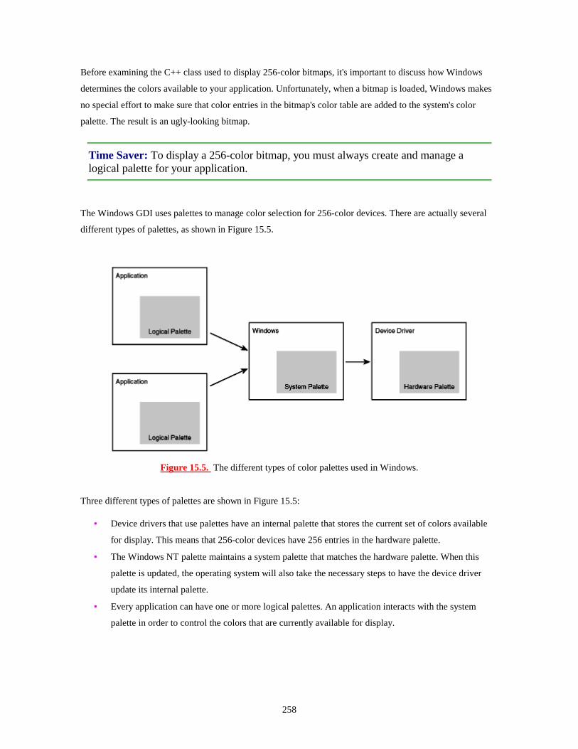
258
Before examining the C++ class used to display 256-color bitmaps, it's important to discuss how Windows
determines the colors available to your application. Unfortunately, when a bitmap is loaded, Windows makes
no special effort to make sure that color entries in the bitmap's color table are added to the system's color
palette. The result is an ugly-looking bitmap.
Time Saver: To display a 256-color bitmap, you must always create and manage a logical palette for your application.
The Windows GDI uses palettes to manage color selection for 256-color devices. There are actually several
different types of palettes, as shown in Figure 15.5.
Figure 15.5. The different types of color palettes used in Windows.
Three different types of palettes are shown in Figure 15.5:
• Device drivers that use palettes have an internal palette that stores the current set of colors available
for display. This means that 256-color devices have 256 entries in the hardware palette.
• The Windows NT palette maintains a system palette that matches the hardware palette. When this
palette is updated, the operating system will also take the necessary steps to have the device driver
update its internal palette.
• Every application can have one or more logical palettes. An application interacts with the system
palette in order to control the colors that are currently available for display.
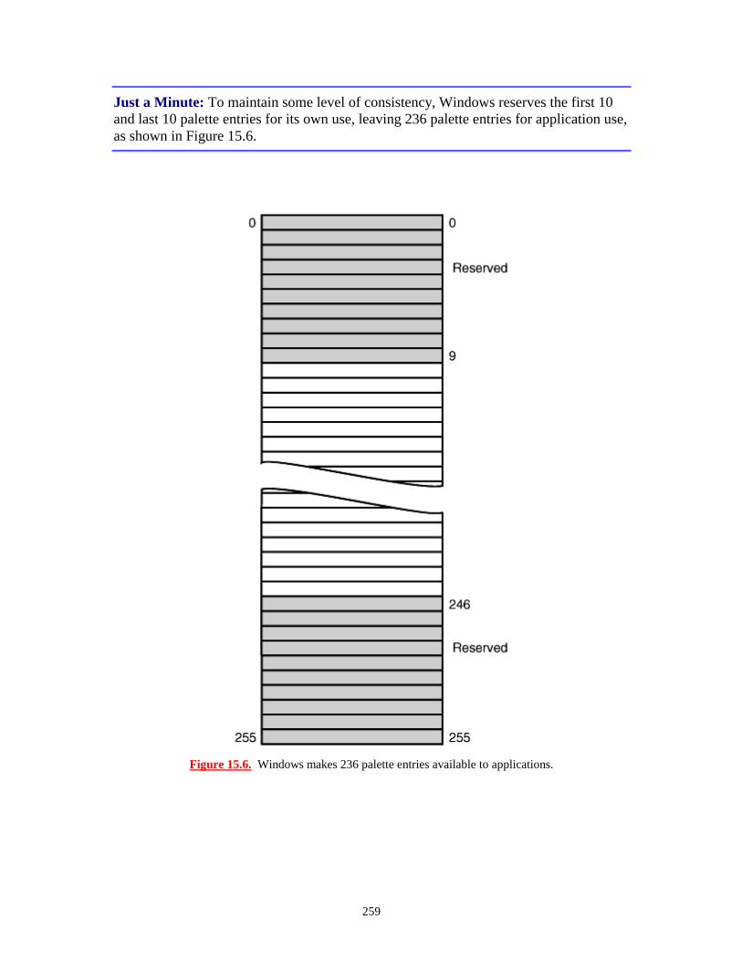
259
Just a Minute: To maintain some level of consistency, Windows reserves the first 10 and last 10 palette entries for its own use, leaving 236 palette entries for application use, as shown in Figure 15.6.
Figure 15.6. Windows makes 236 palette entries available to applications.

260
Just a Minute: At first glance, it might seem unfair for 20 entries to be removed from the system palette. These entries are removed to keep the basic window display predictable. The 20 reserved palette entries include the colors used by 16-color VGA devices. As long as these palette entries are available, Windows applications that don't use the palette are displayed as expected.
The System Palette
A palette is one of the attributes that belong to a DC. After you have decided to use a palette in your
application, you must follow these basic steps:
1. Create a logical palette. This is the process of allocating space for the palette entries and describing the colors that will be included in the palette. As you'll learn, this process is much easier than it sounds. In most cases, when you must create a palette you copy the colors from a bitmap or other object into the new palette. This step is usually performed once, and the logical palette is stored by the application so that it can be used whenever needed. 2. Select the palette into a DC. Unlike other GDI objects, SelectObject doesn't work for logical palettes. You must use the SelectPalette function. 3. Realize the palette. Basically, realizing the palette asks the Windows Palette Manager to add your palette to the system palette or map your palette to a reasonably close substitute. Selecting and realizing the palette always happens at the same time; there's no point in selecting a palette unless you intend to realize it immediately. 4. Use the palette. If the system palette was updated, the application should redraw itself. This is usually done by invalidating any windows that depend on palette entries. 5. Deselect the palette by selecting the previous palette back into the DC. 6. Delete the palette object. This step is usually performed only when you're sure the palette is no longer needed.
Two messages related to palettes are sent to your application:
When a window moves into the foreground, Windows sends it a WM_QUERYNEWPALETTTE
message. In response to this message, your application should realize its palette.
If the system palette is changed, all windows in the background receive a WM_PALETTECHANGED
message. An application in the background should realize its palette to attempt to reassert colors in the system
palette. If no free positions in the system palette are available, the Palette Manager maps the requested color
to the closest palette entry.
261
In any case, you should invalidate any parts of your application that depend on your logical palette if the
system palette is updated.
The Dib Example
As an example of how 256-color bitmaps are displayed, you will now create an MFC example named Dib.
The design of the Dib project uses a basic AppWizard SDI skeleton with these modifications:
• A reusable class that handles the display of DIBs, CDIBitmap
• A reusable class that handles the creation of a new 256-color palette, CBmpPalette
• Additional palette message-handling functions
The CDIBitmap Class
The CDIBitmap class does most of the work in the Dib project. The CDIBitmap class provides an easy-
to-use interface for handling 256-color DIBs. The class interface for CDIBitmap is shown in Listing 15.2.
Save this file as dib256.h.
TYPE: Listing 15.2. The CDIBitmap class interface.
#ifndef DIBMP_TYS #define DIBMP_TYS class CDIBitmap {
friend class CBmpPalette; //constructors public:
CDIBitmap(); virtual ~CDIBitmap();
private: CDIBitmap( const CDIBitmap& dbmp ){};
//operations public:
inline BITMAPINFO* GetHeaderPtr(); inline BYTE* GetPixelPtr(); virtual void DrawDIB ( CDC* pDC, int x, int y ); virtual BOOL Load( CFile* pFile ); RGBQUAD* GetColorTablePtr();
protected:
int GetPalEntries() const; int GetPalEntries( BITMAPINFOHEADER& infoHeader ) const;

262
protected: int GetWidth() const; int GetHeight() const;
//implementation private:
BITMAPINFO* m_pInfo; BYTE* m_pPixels;
}; #endif
Note that CDIBitmap isn't derived from CBitmap, or CObject for that matter. The class itself consumes
only a few bytes, requiring space for two pointers and a virtual function table. CDIBitmap has five public
functions:
• GetHeaderPtr: Returns a pointer to the BITMAPINFO structure.
• GetPixelPtr: Returns a pointer to the beginning of the pixel image array.
• DrawDIB: Draws the DIB at a specified location.
• Load: Reads a DIB from a .BMP file and initializes the CDIBitmap object.
• GetColorTablePtr: Returns a pointer to the color table.
The source code for the implementation of CDIBitmap is provided in Listing 15.3. Save this file as
dib256.cpp, and add it to the Dib project.
TYPE: Listing 15.3. The implementation of the CDIBitmap class.
#include "stdafx.h" #include "dib256.h" CDIBitmap::CDIBitmap() {
m_pInfo = 0; m_pPixels = 0;
}
CDIBitmap::~CDIBitmap() {
delete [] (BYTE*)m_pInfo; delete [] m_pPixels;
}

263
BOOL CDIBitmap::Load( CFile* pFile ) {
ASSERT( pFile ); BOOL fReturn = TRUE; delete [] (BYTE*)m_pInfo; delete [] m_pPixels; m_pInfo = 0; m_pPixels = 0; DWORD dwStart = pFile->GetPosition(); // Check to make sure we have a bitmap. The first two
bytes must // be `B' and `M'. BITMAPFILEHEADER fileHeader; pFile->Read(&fileHeader, sizeof(fileHeader)); if( fileHeader.bfType != 0x4D42 )
return FALSE; BITMAPINFOHEADER infoHeader; pFile->Read( &infoHeader, sizeof(infoHeader) ); if( infoHeader.biSize != sizeof(infoHeader) )
return FALSE; // Store the sizes of the DIB structures int cPaletteEntries = GetPalEntries( infoHeader ); int cColorTable = 256 * sizeof(RGBQUAD); int cInfo = sizeof(BITMAPINFOHEADER) + cColorTable; int cPixels = fileHeader.bfSize - fileHeader.bfOffBits; // Allocate space for a new bitmap info header, and copy // the info header that was loaded from the file. Read
the // the file and store the results in the color table. m_pInfo = (BITMAPINFO*)new BYTE[cInfo]; memcpy( m_pInfo, &infoHeader, sizeof(BITMAPINFOHEADER) ); pFile->Read( ((BYTE*)m_pInfo) + sizeof(BITMAPINFOHEADER),
cColorTable ); // // Allocate space for the pixel area, and load the pixel // info from the file. m_pPixels = new BYTE[cPixels]; pFile->Seek(dwStart + fileHeader.bfOffBits,
CFile::begin); pFile->Read( m_pPixels, cPixels );
return fReturn;
}
// DrawDib uses StretchDIBits to display the bitmap. void CDIBitmap::DrawDIB( CDC* pDC, int x, int y ) {

264
HDC hdc = pDC->GetSafeHdc(); if( m_pInfo )
StretchDIBits( hdc, x, y, GetWidth(), GetHeight(), 0, 0, GetWidth(), GetHeight(), GetPixelPtr(), GetHeaderPtr(), DIB_RGB_COLORS, SRCCOPY );
}
BITMAPINFO* CDIBitmap::GetHeaderPtr() {
return m_pInfo; }
RGBQUAD* CDIBitmap::GetColorTablePtr() {
RGBQUAD* pColorTable = 0; if( m_pInfo != 0 ) {
int cOffset = sizeof(BITMAPINFOHEADER); pColorTable = (RGBQUAD*)(((BYTE*)(m_pInfo)) +
cOffset); } return pColorTable;
}
BYTE* CDIBitmap::GetPixelPtr() {
return m_pPixels; }
int CDIBitmap::GetWidth() const {
return m_pInfo->bmiHeader.biWidth; }
int CDIBitmap::GetHeight() const {
return m_pInfo->bmiHeader.biHeight; }
int CDIBitmap::GetPalEntries() const

265
{ return GetPalEntries( *(BITMAPINFOHEADER*)m_pInfo );
}
int CDIBitmap::GetPalEntries( BITMAPINFOHEADER& infoHeader )const {
int nReturn; if( infoHeader.biClrUsed == 0 ) {
nReturn = ( 1 << infoHeader.biBitCount ); } else
nReturn = infoHeader.biClrUsed; return nReturn;
}
Most of the work in the CDIBitmap class is done by the CDIBitmap::Load member function. This
member function takes a pointer to an MFC CFile object as its only parameter. Later in this hour, you will
see how the sample program provides a CFile pointer to this function during serialization.
After verifying that the CFile object refers to a Windows bitmap, the Load function reads each part of the
bitmap data structure and creates a DIB dynamically. Note that there actually are two calls to the new
operator; there is no requirement that the DIB exist in one solid chunk of memory. The
BITMAPINFOHEADER is stored in one location, and the pixel image array is stored in another
location.
The CDIBitmap::DrawDIB member function calls StretchDIBits to display the DIB. Very little work
is actually done in this function. For example, the width and height of the DIB are calculated using
CDIBitmap member functions.
The remaining member functions are used to calculate various bits of information about the DIB. Only a
pointer to the beginning of the BITMAPINFO structure and a pointer to the beginning of the pixel image
array are stored; all other information is calculated as it is needed.
The CBmpPalette Class
You use the CBmpPalette class to create a logical palette that contains the colors used by a CDIBitmap
object. Although the MFC class library includes a CPalette class, you must derive your own class from it in

266
order to do any meaningful work. Listing 15.4 contains the declaration for CBmpPalette. Save this file as
dibpal.h.
TYPE: Listing 15.4. The CBmpPalette class interface.
#ifndef BMP_PAL_TYS #define BMP_PAL_TYS class CBmpPalette : public CPalette { public:
CBmpPalette( CDIBitmap* pBmp ); }; #endif
All the work done by CBmpPalette is done in the constructor; there are no member functions other than the
function inherited from CPalette, the MFC base class. The CBmpPalette class is always used with
CDIBitmap. A pointer to a CDIBitmap object is passed to CBmpPalette as a constructor parameter.
CBmpPalette allocates a logical palette with enough entries to store the palette required by the
CDIBitmap object. After storing some basic palette information, the palette entries are filled in, using the
values collected from the CDIBitmap object. After the palette is created, the logical palette is deleted. The
implementation from CBmpPalette is provided in Listing 15.5 and is included in the Dib project as
dibpal.cpp.
TYPE: Listing 15.5. The implementation of the CBmpPalette class.
#include "stdafx.h" #include "dib256.h" #include "dibpal.h" CBmpPalette::CBmpPalette( CDIBitmap* pBmp ) {
ASSERT( pBmp ); int cPaletteEntries = pBmp->GetPalEntries(); int cPalette = sizeof(LOGPALETTE) +
sizeof(PALETTEENTRY) * cPaletteEntries; // Since the LOGPALETTE structure is open-ended, you // must dynamically allocate it. LOGPALETTE* pPal = (LOGPALETTE*)new BYTE[cPalette]; RGBQUAD* pColorTab = pBmp->GetColorTablePtr();
267
pPal->palVersion = 0x300; pPal->palNumEntries = cPaletteEntries; // Roll through the color table, and add each color to // the logical palette. for( int ndx = 0; ndx < cPaletteEntries; ndx++ ) {
pPal->palPalEntry[ndx].peRed =pColorTab[ndx].rgbRed;
pPal->palPalEntry[ndx].peGreen =pColorTab[ndx].rgbGreen;
pPal->palPalEntry[ndx].peBlue =pColorTab[ndx].rgbBlue;
pPal->palPalEntry[ndx].peFlags = NULL; } VERIFY( CreatePalette( pPal ) ); delete [] (BYTE*)pPal;
}
CDibDoc Class Changes
In the Dib example, the CDibDoc class will be responsible for the bitmap objects and will have two new
member functions:
GetBitmap will return a pointer to a CDIBitmap object.
GetPalette will return a pointer to a CBmpPalette object.
The CDibDoc class will contain a CDIBitmap object and a pointer to a CBmpPalette object. The
CDibDoc class header is shown in Listing 15.6. Add the source code in Listing 15.6 to the DibDoc.h
source file, just after the //Operations comments in the CDibDoc class declaration.
TYPE: Listing 15.6. Changes to CDibDoc class declaration.
// Operations public:
CDIBitmap* GetBitmap(); CPalette* GetPalette();
protected: CDIBitmap m_dib; CBmpPalette* m_pPal;
Add the following two #include directives just before the CDibDoc class declaration:
#include "dib256.h"

268
#include "dibpal.h"
The CDIBitmap object will be loaded during serialization. After it has been loaded, the CBmpPalette
object will be created dynamically. m_pPal, the pointer to CBmpPalette, will be initialized in the
constructor and deleted in the destructor. The changes for the constructor, destructor, OnNewDocument,
and Serialize member functions for the CDibDoc class are shown in Listing 15.7.
TYPE: Listing 15.7. Changes to CDibDoc member functions.
CDibDoc::CDibDoc() {
m_pPal = 0; }
CDibDoc::"CDibDoc() {
delete m_pPal; }
BOOL CDibDoc::OnNewDocument() {
if (!CDocument::OnNewDocument()) return FALSE;
delete m_pPal; m_pPal = 0; return TRUE;
}
void CDibDoc::Serialize(CArchive& ar) {
if (ar.IsStoring()) {
TRACE( TEXT("Storing a bitmap is not supported") ); ASSERT(FALSE);
} else {
CFile* pFile = ar.GetFile(); ASSERT( pFile ); ar.Flush(); BOOL fLoaded = m_dib.Load( pFile ); if( fLoaded != FALSE ) {

269
delete m_pPal; m_pPal = new CBmpPalette( &m_dib ); UpdateAllViews( NULL );
} else
AfxMessageBox( TEXT("Error Loading Bitmap") ); }
}
As discussed earlier, the CDibDoc class has two new member functions to return pointers to the bitmap and
palette data members. Add the source code provided in Listing 15.8 to the dibdoc.cpp file.
TYPE: Listing 15.8. New CDibDoc member functions to return the bitmap and
palette pointers.
CDIBitmap* CDibDoc::GetBitmap() {
return &m_dib; } CPalette* CDibDoc::GetPalette() {
return m_pPal; }
Main Frame Class Changes
When the Dib application receives a palette message, Windows sends the message to the application, where it
will be routed to the CMainFrame class. Because the CMainFrame class has no knowledge about how
the bitmap or palette is organized, it must determine the active view and send it the message.
Using ClassWizard, add message-handling functions for WM_PALETTECHANGED and
WM_QUERYNEWPALETTE. Edit the functions using the source code provided in Listing 15.9.
TYPE: Listing 15.9. The new CMainFrame message-handling functions.
void CMainFrame::OnPaletteChanged(CWnd* pFocusWnd) {
CView* pView = GetActiveView(); if( pView ) {

270
HWND hWndFocus = pView->GetSafeHwnd(); pView->SendMessage( WM_PALETTECHANGED,
(WPARAM)hWndFocus, (LPARAM)0 );
} } BOOL CMainFrame::OnQueryNewPalette() {
CView* pView = GetActiveView(); if( pView ) {
HWND hWndFocus = pView->GetSafeHwnd(); pView->SendMessage( WM_QUERYNEWPALETTE,
(WPARAM)hWndFocus, (LPARAM)0 );
} return TRUE;
}
CDibView Class Changes
The CDibView class has two main functions: drawing the 256-color bitmap and responding to palette
messages. The CDibView::OnDraw function must be modified to draw the bitmap, as shown in Listing
15.10.
TYPE: Listing 15.10. A new version of CDibView::OnDraw.
void CDibView::OnDraw(CDC* pDC) {
CDibDoc* pDoc = GetDocument(); ASSERT_VALID(pDoc); CPalette* pPal = pDoc->GetPalette(); CPalette* pOldPal = pDC->SelectPalette( pPal, FALSE ); pDC->RealizePalette(); CDIBitmap* pBmp = pDoc->GetBitmap(); pBmp->DrawDIB( pDC, 0, 0 ); pDC->SelectPalette( pOldPal, FALSE );
}
OnDraw fetches pointers to the bitmap and palette from CDibDoc, using the new member functions added
to the document class earlier. The palette is selected and realized, and then the bitmap is drawn. After drawing
the bitmap, the previous palette is selected back into the DC.

271
The CMainFrame class forwards WM_PALETTECHANGED and
WM_QUERYNEWPALETTE messages to the view class. However, there is one small problem:
ClassWizard doesn't offer direct support for palette messages sent to child window classes such as
CDibView. Therefore, some trickery is required. To add the palette-handling functions, follow these steps:
1. Open ClassWizard. 2. Select the CDibView class. 3. Select the Class Info tab. 4. In the Advanced Options group, click the Message Filter combo box, and select Topmost Frame instead of Child Window. 5. Select the Message Maps tab and add the message-handling functions for WM_PALETTECHANGED and add WM_QUERYNEWPALETTE to the CDibView class. 6. Select the Class Info tab. 7. In the Advanced Options group, click the Message Filter combo box and select Child Window instead of Topmost Frame. 8. Close ClassWizard.
The source code for the palette message-handling function is provided in Listing 15.11.
TYPE: Listing 15.11. New functions added to the CDibView class.
// OnPaletteChanged - Handles WM_PALETTECHANGED, which is a // notification that a window has changed the currentpalette. If // this view did not change the palette, forward this messageto // OnQueryNewPalette so the palette can be updated, andredrawn // if possible. void CDibView::OnPaletteChanged(CWnd* pFocusWnd) {
if( pFocusWnd != this ) OnQueryNewPalette();
}
// Notification that the view is about to become active, // and the view should realize its palette.

272
BOOL CDibView::OnQueryNewPalette() {
CDibDoc* pDoc = GetDocument(); ASSERT_VALID(pDoc);
CBmpPalette* pPal = (CBmpPalette*)pDoc->GetPalette(); if( pPal ) {
CDC* pDC = GetDC(); CPalette* pOldPal = pDC->SelectPalette( pPal, FALSE
); UINT uChanges = pDC->RealizePalette(); pDC->SelectPalette( pOldPal, FALSE ); ReleaseDC( pDC ); if( uChanges != 0 )
InvalidateRect( NULL ); } return TRUE;
}
In most cases, OnPaletteChanged calls the OnQueryNewPalette function directly. The only exception
is when the WM_PALETTECHANGED message was sent because this view had updated the system
palette. If this view is the foreground window, the Windows NT Palette Manager gives you first crack at
setting the system's palette. If you are in the background, you have access to the unused entries only. If there's
no more room in the palette, your palette is mapped to the closest possible match.
Remember to include the declarations for the CDIBitmap class at the top of the DibView.cpp source file,
after the existing #include directives:
#include "dib256.h"
Compile and run the Dib example. If you have a 256-color display, load a 256-color bitmap and notice that
you receive all the colors. If you run several instances of the program using different 256-color bitmaps, you
might notice the palette change if you switch between windows. Figure 15.7 shows the Dib example
displaying the 256-color Windows NT logo.
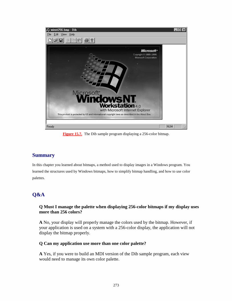
273
Figure 15.7. The Dib sample program displaying a 256-color bitmap.
Summary
In this chapter you learned about bitmaps, a method used to display images in a Windows program. You
learned the structures used by Windows bitmaps, how to simplify bitmap handling, and how to use color
palettes.
Q&A
Q Must I manage the palette when displaying 256-color bitmaps if my display uses more than 256 colors? A No, your display will properly manage the colors used by the bitmap. However, if your application is used on a system with a 256-color display, the application will not display the bitmap properly. Q Can my application use more than one color palette? A Yes, if you were to build an MDI version of the Dib sample program, each view would need to manage its own color palette.

274
Workshop
The Workshop is designed to help you anticipate possible questions, review what you've learned, and begin
thinking ahead to putting your knowledge into practice. The answers to the quiz are in Appendix B, "Quiz
Answers."
Quiz
1. What MFC class is used to manage bitmaps stored in your resource file? 2. What MFC base class is used to manage color palettes? 3. What type of device context is used to draw into a bitmap off-screen? 4. What function is used to transfer bitmaps to an output device? 5. How many colors are kept by Windows in the system color palette? 6. How many entries in the system color palette are reserved by Windows? 7. What two messages must be handled in order to manage the color palette? 8. What are the differences between the two palette messages?
Exercises
1. Modify the Bitmap project so that the bitmap image is displayed three times in a row across the view instead of once. 2. Modify the CBmpPalette class used in the Dib example so that it is monochromatic, with only various shades of one color selected for the palette instead of colors from the bitmap.
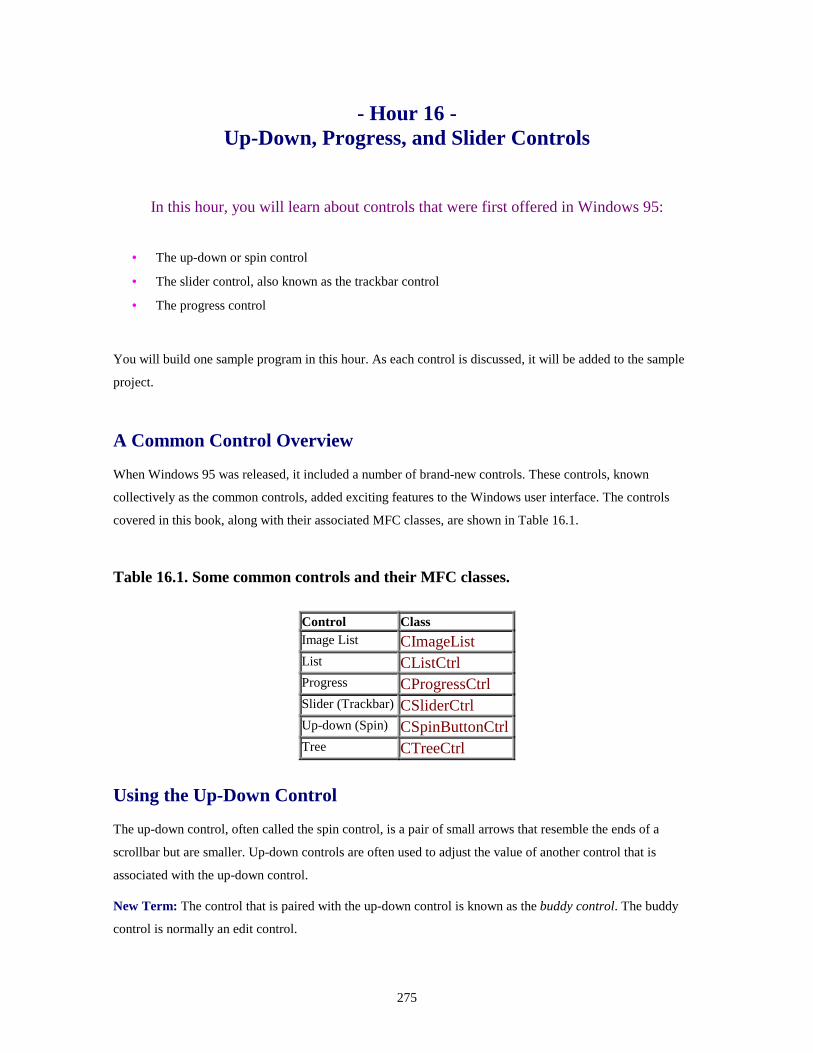
275
- Hour 16 - Up-Down, Progress, and Slider Controls
In this hour, you will learn about controls that were first offered in Windows 95:
• The up-down or spin control
• The slider control, also known as the trackbar control
• The progress control
You will build one sample program in this hour. As each control is discussed, it will be added to the sample
project.
A Common Control Overview
When Windows 95 was released, it included a number of brand-new controls. These controls, known
collectively as the common controls, added exciting features to the Windows user interface. The controls
covered in this book, along with their associated MFC classes, are shown in Table 16.1.
Table 16.1. Some common controls and their MFC classes.
Control Class Image List CImageList List CListCtrl Progress CProgressCtrl Slider (Trackbar) CSliderCtrl Up-down (Spin) CSpinButtonCtrlTree CTreeCtrl
Using the Up-Down Control
The up-down control, often called the spin control, is a pair of small arrows that resemble the ends of a
scrollbar but are smaller. Up-down controls are often used to adjust the value of another control that is
associated with the up-down control.
New Term: The control that is paired with the up-down control is known as the buddy control. The buddy
control is normally an edit control.

276
An up-down control can also be aligned horizontally. A horizontal up-down control is not called a left-right
control; it keeps its original name.
By default, clicking the up arrow decreases the value of the buddy control, and clicking the down arrow
increases the value contained in the buddy control. The up and down arrows work a lot like a scrollbar in a
word-processing document--clicking the up arrow moves you to a lower-numbered page, clicking the down
arrow moves you to a higher-numbered page. This behavior is confusing to most people; fortunately, it's easy
to change, as you see in the section "Changing the Behavior of the Up-Down Control."
Up-down controls are ideal for situations where a set of values can be scrolled by a user. If the user needs to
adjust the values by only a few units, an up-down control is perfect because it enables the user to select a new
value with only a few mouse clicks.
An up-down control is very easy to use. To use the default functionality of the up-down control, you need to
write exactly zero lines of source code! Even the most advanced uses for up-down controls require just a few
lines of source code; most of the code is written by ClassWizard.
The Sample Program
For the examples created in this hour, you use a dialog box-based project named Controls. This project starts
with an up-down control; later in the chapter, you add a slider and a progress control.
To create the Controls project, use AppWizard to create a new project workspace. Select a dialog box-based
project and click the Finish button.
Adding an Up-Down Control to a Dialog Box
Adding an up-down control to the Controls dialog box is just like adding other controls. Open the main dialog
box in the dialog box editor by selecting the ResourceView tab in the project workspace and opening the
Dialog folder. Open the IDD_CONTROLS_DIALOG by double-clicking the dialog box icon or by
right-clicking the icon and selecting Open from the pop-up menu. To place the up-down control, you can
either drag and drop the control from the control palette to the main dialog box, or you can select the up-down
control on the tool palette using the mouse and then click the desired position in the main dialog box.
Open the Properties dialog box for the up-down control by right-clicking the control and selecting Properties
from the pop-up menu. Change the control's resource ID to IDC_SPIN. All other properties should be set to
their default values.

277
Up-Down Control Properties
As with other controls, up-down controls have properties that you can change using the Developer Studio
resource editor. The properties available for an up-down control include the following:
• ID is used for the up-down control's resource ID. A default resource ID, such as IDC_SPIN1, is
supplied by Developer Studio.
• Visible is used to indicate that the control is initially visible. This check box is usually checked.
• Disabled is used to indicate the control should be initially disabled. This check box is usually cleared.
• Group is used to mark the first control in a group. This check box is usually cleared.
• Tab Stop indicates that this control can be reached by pressing Tab on the keyboard. This check box is
usually left unchecked; this is different from most controls, due to the fact that the up-down control is
typically used to change the value of the buddy control. Normally the buddy control has the tabstop
property enabled.
• Help ID indicates that a context-sensitive help ID should be generated for this control.
• Orientation indicates whether the up-down control should be vertical or horizontal. The default
selection is vertical.
• Alignment specifies how the buddy control and up-down control are associated with each other.
Possible values are Right, Left, and Unattached. The default value is Unattached, but in most cases,
you should select Left or Right.
• Auto Buddy indicates whether the up-down control should use the previous control in the tab order as
its buddy control. This check box is cleared by default but should be checked in most cases. If this
box is not checked, the up-down control will not be associated with a buddy control. You can still
form this association by command, which is discussed in the next section.
• Set Buddy Integer indicates that the up-down control should set the value of the attached buddy
control. This check box is cleared by default but should be checked in most cases.
• No Thousands indicates that no separator should be provided for a value greater than 1,000 in the up-
down control. This check box is usually cleared.
• Wrap indicates that the up-down control should "wrap around" after reaching its minimum or
maximum value. If this option is not selected, the up-down control stops after reaching its minimum
or maximum limit. This check box is usually cleared.
• Arrow Key indicates that the keyboard's arrow keys can be used to change the value of the up-down
control. This check box is usually cleared.

278
Adding a Buddy Control
The easiest way to add a buddy control to an up-down control requires no source code; instead, you use the
dialog box editor. Follow these steps to associate an edit control with an up-down control:
1. Add an edit control to the dialog box. Most users expect the up-down control to be placed against the buddy control; it helps emphasize the connection between the two controls. 2. Open the properties dialog box for the edit control and change the resource ID to IDC_EDIT. All other properties should be set to their default values. 3. Set the tab order for the edit control so that it is the control immediately before the up-down control. You can select the tab order by choosing Tab Order from the Layout menu (or press Ctrl+D). Each control is displayed with a small label that represents the control tab order. To change the tab order, use the mouse to click each control in the new tab order sequence. 4. Open the properties dialog box for the up-down control and set the alignment value to Right. This aligns the up-down control on the right side of the buddy control. 5. Keep the Properties dialog box open and check the Auto Buddy and Set Buddy Integer check boxes.
The IDD_CONTROLS_DIALOG with an up-down control and the buddy edit control is shown in
Figure 16.1.
Figure 16.1. The main dialog box used in the Controls sample program, including the up-down control and
buddy control.
Believe it or not, that's all there is to using an up-down control. If you compile and execute the Controls
project, you can use the up-down control to change the value contained in the edit control.
CAUTION: Assigning a tab stop to an up-down control tends to confuse the user. The focus feedback given to the user is very subtle and easily overlooked. Also, the buddy control and up-down button are normally paired into a single logical control. For these reasons, you should not set the tab stop property for the up-down control in most cases.

279
To set, validate, or retrieve the value of the edit control, use ClassWizard to associate a CEdit object with the
edit control or use one of the other techniques discussed in Chapter 6, "Using Edit Controls."
DO/DON'T: DO associate a buddy control with the up-down control. DO set a limit for the up-down control. DO make the buddy control precede the up-down control in the tab order. DON'T set the tabstop property for the up-down control.
Using the CSpinButtonCtrl Class
The MFC class CSpinButtonCtrl can be used to manage an up-down control. Use ClassWizard to associate
the IDC_SPIN control with a CSpinButtonCtrl object, using the values from Table 16.2.
Table 16.2. Values used to add a CSpinButtonCtrl member variable for
CControlsDlg.
Control ID Variable Name Category Type IDC_SPIN m_spin Control CSpinButtonCtrl
Changing the Behavior of the Up-Down Control
As discussed earlier, the default behavior for an up-down control is to increment the control if the down arrow
is clicked and decrement the control if the up arrow is clicked. You can change this behavior by reversing the
range of the up-down control.
To change the range of an up-down control, use the CSpinButtonCtrl's SetRange function.
SetRange has two parameters: the first parameter is the lower-limit value for the control, the second
parameter is the upper limit:
m_spin.SetRange( 100, 0 );
To set a new range for the up-down control, add the source code from Listing 16.1 to the
CControlsDlg::OnInitDialog member function. This source code should be added just after the //
TODO comment.

280
TYPE: Listing 16.1. Setting the range for an up-down control.
// TODO: Add extra initialization here m_spin.SetRange( 0, 100 );
Compile and execute the Controls project. The up-down control increments the edit control when its up arrow
is clicked and decrements the edit control when the down arrow is clicked.
Using the Slider Control
New Term: A slider control, also known as a trackbar control, is a control that contains a slide bar that you
can move between two points. A slider is used in the Display applet that is part of the Windows Control
Panel. The Settings property page uses a slider to set the screen resolution.
The user moves the slide bar by dragging it with the mouse or by setting the keyboard focus to the slider and
using the arrow keys on the keyboard. You can create sliders with optional tick marks that help the user to
judge the position of the slide bar.
Deciding When to Use a Slider Control
Sliders are useful when a user is asked to select a value within a certain range. A slider gives the user
immediate feedback about the control's current value, as well as the value's relationship to the high and low
ranges.
Sliders are added to dialog boxes just like other controls; just drag and drop the control from the controls
palette to the dialog box. Although you can create a slider from scratch, it's much easier to add one in the
Developer Studio dialog box editor.
Open the IDD_CONTROLS_DIALOG resource and add a slider control by dragging a slider control
from the control palette and dropping it on the dialog box. Figure 16.2 shows the Controls dialog box after
you add the slider control.
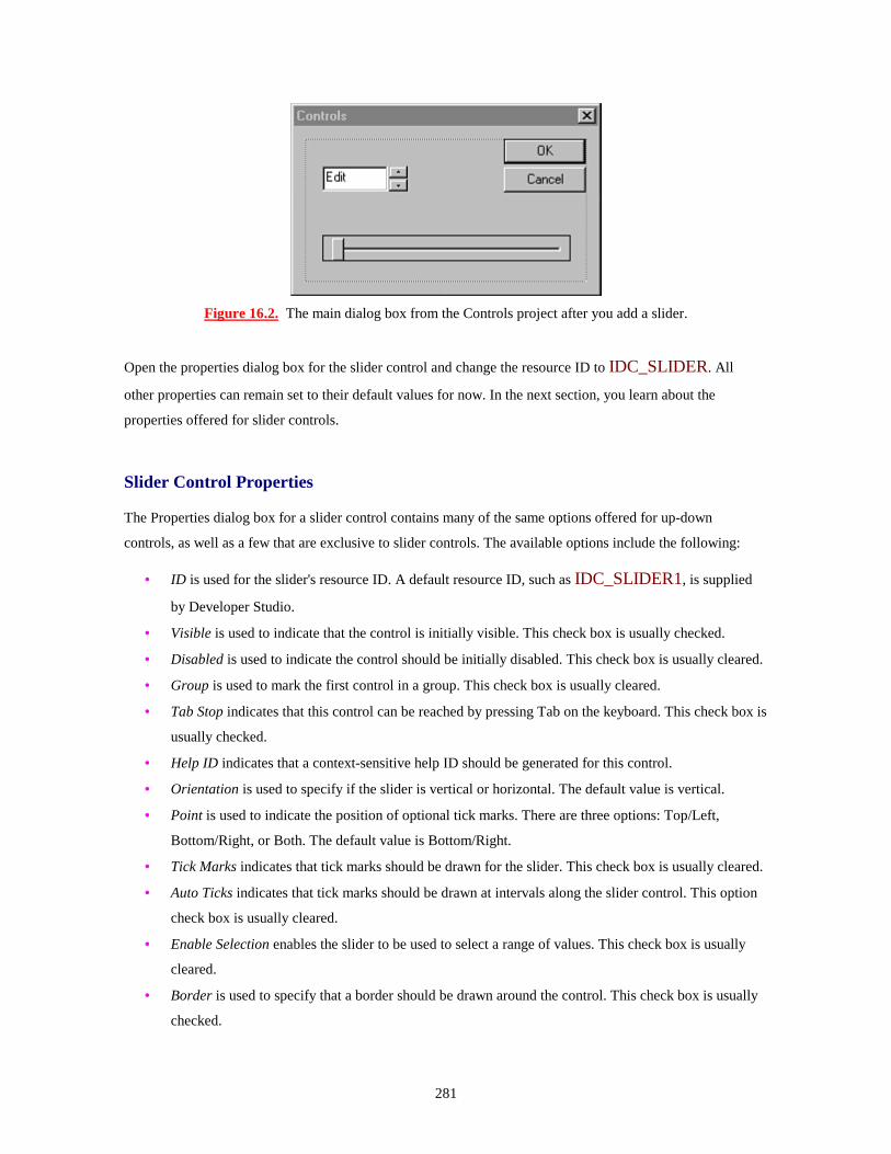
281
Figure 16.2. The main dialog box from the Controls project after you add a slider.
Open the properties dialog box for the slider control and change the resource ID to IDC_SLIDER. All
other properties can remain set to their default values for now. In the next section, you learn about the
properties offered for slider controls.
Slider Control Properties
The Properties dialog box for a slider control contains many of the same options offered for up-down
controls, as well as a few that are exclusive to slider controls. The available options include the following:
• ID is used for the slider's resource ID. A default resource ID, such as IDC_SLIDER1, is supplied
by Developer Studio.
• Visible is used to indicate that the control is initially visible. This check box is usually checked.
• Disabled is used to indicate the control should be initially disabled. This check box is usually cleared.
• Group is used to mark the first control in a group. This check box is usually cleared.
• Tab Stop indicates that this control can be reached by pressing Tab on the keyboard. This check box is
usually checked.
• Help ID indicates that a context-sensitive help ID should be generated for this control.
• Orientation is used to specify if the slider is vertical or horizontal. The default value is vertical.
• Point is used to indicate the position of optional tick marks. There are three options: Top/Left,
Bottom/Right, or Both. The default value is Bottom/Right.
• Tick Marks indicates that tick marks should be drawn for the slider. This check box is usually cleared.
• Auto Ticks indicates that tick marks should be drawn at intervals along the slider control. This option
check box is usually cleared.
• Enable Selection enables the slider to be used to select a range of values. This check box is usually
cleared.
• Border is used to specify that a border should be drawn around the control. This check box is usually
checked.

282
In the next section, you use a slider to control a progress control. To prepare for that example, open the
properties dialog box and make sure the following slider properties are selected:
• Tick Marks
• Auto Ticks
• Enable Selection
Using the Progress Control
A progress control, also known as a progress bar, is commonly used to indicate the progress of an operation
and is usually filled from left to right as the operation is completed. You can also use progress controls to
indicate temperature, water level, or similar measurements. In fact, an early term for this type of control was
"Gas Gauge," back in the old days when programmers had mules and most Windows programs were written
in C.
Progress controls are used in Developer Studio to indicate the progress of saving or loading a project
workspace. Progress controls are also used by the Windows Explorer when copying or moving files.
Just a Minute: Progress controls are an easy way to give feedback to the user about the status of a task. Instead of waiting an unknown length of time, the user can see what portion of a job has yet to be completed.
A progress control is added to a dialog box in the same way as the up-down and slider controls discussed
earlier. Using the Developer Studio dialog box editor, add a progress control to the Controls project main
dialog box. Figure 16.3 shows the main dialog box from the Controls project after the progress control has
been added.
Figure 16.3. The Controls dialog box after adding the progress control.

283
After you add the control, open the properties dialog box and change the resource ID to
IDC_PROGRESS. A progress control doesn't have optional properties other than those available on all
controls:
• ID is used for the progress control's resource ID. A default resource ID, such as
IDC_PROGRESS1, is supplied by Developer Studio.
• Visible is used to indicate that the control is initially visible. This check box is usually checked.
• Disabled is used to indicate the control should be initially disabled. This check box is usually cleared.
• Group is used to mark the first control in a group. This check box is usually cleared.
• Tab Stop indicates that this control can be reached by pressing Tab on the keyboard. This check box is
usually checked.
• Help ID indicates that a context-sensitive help ID should be generated for this control.
• Border is used to specify that a border should be drawn around the control. This check box is usually
checked.
For this example, you can set the progress control properties to their default values.
Using a Slider to Update a Progress Control
In this section, you use the IDC_SLIDER slider control to change the value displayed by the progress
control. Using ClassWizard, add two new member variables associated with the slider and progress controls
to the CControlsDlg class. Use the values from Table 16.3 for the new controls.
Table 16.3. Values for slider and progress control member variables.
Control ID Variable Name Category Type IDC_SLIDER m_slider Control CSliderCtrl IDC_PROGRESS m_progress Control CProgressCtrl
Initializing the Slider and Progress Controls
The slider and progress controls must be initialized before you can use them. The CProgressCtrl and
CSliderCtrl classes each provide a SetRange function that is used to set minimum and maximum values
for their respective controls.
m_slider.SetRange( 0, 100 );

284
The slider also enables tick marks to be placed along the slider control if the Autoticks check box has been
selected. Use the SetTicFreq function to specify the distance between each tick mark. To add tick marks
every 10 positions, pass a value of 10 to SetTicFreq.
m_slider.SetTicFreq( 10 );
Listing 16.2 contains new source code for the initialization section of OnInitDialog. Add this source code
just after the // TODO comment.
TYPE: Listing 16.2. Initializing the controls in CControlsDlg::OnInitDialog.
// TODO: Add extra initialization here m_spin.SetRange( 0, 100 ); m_slider.SetRange( 0, 100 ); m_slider.SetTicFreq( 10 ); m_progress.SetRange( 0, 100 );
Handling Messages from the Slider to the Progress Control
When a slider is moved, it notifies its parent using WM_SCROLL and WM_HSCROLL messages.
Because the slider in this example is a horizontal slider, it sends WM_HSCROLL messages to the main
dialog box. Using ClassWizard, add a message-handling function to the CControlsDlg class for the
WM_HSCROLL message. The source code for the OnHScroll function is provided in Listing 16.3.
TYPE: Listing 16.3. Using slider scroll messages to update the progress control.
void CControlsDlg::OnHScroll(UINT nSBCode, UINT nPos, CScrollBar* pScrollBar )
{ int nSliderPos = m_slider.GetPos(); m_progress.SetPos( nSliderPos );
}
The code in Listing 16.3 is called whenever the trackbar position is changed. The CSliderCtrl::GetPos
function is used to collect the current slider position, which is then used to update the progress control using
the CProgressCtrl::SetPos function.

285
Just a Minute: There are many ways to use the progress control. Many times, you will update the progress control after receiving events that you don't have direct control over. For example, when copying a large number of files, your program might update a progress control after copying each file. During an installation, you might want to update a progress control after each phase of the installation is complete.
Compile and run the Controls project. You can adjust the value displayed in the progress control by moving
the slider control. The completed project is shown in Figure 16.4.
Figure 16.4. The finished Controls project.
Summary
In this hour, you looked at up-down, slider, and progress controls, three of the simpler controls offered by
Windows. You examined the uses for each control and the MFC classes used to interact with them and
created a small dialog box-based project that used all three controls.
Q&A
Q The up-down control is paired with the wrong control when I run my program--what's wrong? A The up-down control must immediately follow the buddy control in the tab order. If the tab order isn't set correctly, the up-down control will latch on to whatever control precedes it. When you are working with your dialog box in Developer Studio, press Ctrl+D to see the tab order. Q Is there an easy way to increase the value displayed in the progress control by a specific amount, rather than setting a new value?

286
A Use CProgressCtrl's OffsetPos function: void CMyDlg::OnBump() {
m_progress.OffsetPos(5); }
Workshop
The Workshop is designed to help you anticipate possible questions, review what you've learned, and begin
thinking ahead to putting your knowledge into practice. The answers to the quiz are in Appendix B, "Quiz
Answers."
Quiz
1. What property is used to change the up-down control arrows to left-right instead of up-down? 2. What property is used to indicate that the up-down control is associated with a buddy control? 3. What function is used to set the limits of the up-down control? 4. How do you specify which control is the buddy control? 5. What property is used to add division lines on the slider control? 6. What function is used to set the limits of the slider control? 7. What function is used to set the limits of the progress control?
Exercises
1. Change the Controls project so that the value of the up-down control controls the progress control. 2. Experiment with changing the up-down control's alignment and orientation from right to left, and from vertical to horizontal.

287
- Hour 17 - Using Image Lists and Bitmaps
Image lists can be used to store collections of bitmaps, making them useful when several
bitmaps are needed, such as in tree view and list view controls. In this hour, you learn
• How to create an image list
• The properties and methods that can be applied to an image list
• How to use an image list as a bitmap container
• The advanced drawing features offered by image lists
Also, in this hour you will build a sample program that creates an image list and uses it as a storage location
for bitmap images. This hour will build a foundation that you will use later in Hour 18, "List View Controls,"
and Hour 19, "Tree Views."
What Is an Image List?
An image list is similar to an array of bitmaps, just like a roll of film is an array of images, as shown in Figure
17.1. Unlike rolls of film, an image list can grow, if needed, as extra images are added to the list. Each bitmap
stored in an image list is associated with an index, which can be used to retrieve a particular image.
Figure 17.1. An image list is like a roll of bitmap images.
Time Saver: Image lists can also be used outside these new controls, and they provide an easy way to store a series of bitmaps, because you must handle only a single image-list object instead of separate objects for each bitmap.

288
If you want to display bitmaps in tree views or list views, you must use an image list. If your program needs
to manage several different bitmapped images, a single image list is easier to use than a series of bitmaps.
Accessing and displaying multiple images from an image list is much easier than handling multiple
CBitmap objects. Windows Explorer has a much richer user interface than the older File Manager used in
Windows 3.1. Much of this richness is achieved through the use of image lists, which offer an easy way to
store and manage bitmaps.
In addition, image lists offer two features that are difficult to duplicate with regular bitmaps:
Transparent images
Overlaid images
New Term: A transparent image is an image that allows the background to be seen through part of the
image, as if part of the bitmap were transparent.
A transparent image is difficult to achieve using a normal bitmap. In the simplest cases, about twice as many
lines of code are required to draw a bitmap transparently as are required to draw it as an opaque image against
a drawing surface. Using an image list, drawing a transparent bitmap is almost effortless, requiring little more
than parameters that are set correctly.
New Term: An overlaid image is created by combining two images to form a single, combined image.
An overlaid image is useful when showing special attributes for items represented by images stored in an
image list. For example, when a shared directory is shown in the Explorer, a server "hand" is superimposed
over the directory's folder. This is an overlaid image.
How Is an Image List Used?
As for almost everything else in Windows, there is an MFC class for image lists, too. The CImageList class
is used to create, display, and otherwise manage image lists in an MFC-based Windows program.
Image lists often are used to provide item images for the CListCtrl class that is covered in Hour 18, and the
CTreeCtrl class that is covered in Hour 19. However, you can also use an image list as a collection of
bitmaps, which you will do in this chapter. Using image lists in this way helps show off the different things
you can do with image lists before they are used with the common controls.
As an example of using image lists, create an SDI project named ImageList. This project uses an image list to
display a series of bitmaps in the program's client area.

289
Creating an Image List
The first step in creating an image list is to create a series of bitmaps, each of which is the same size.
Although the images can be any size, the sample code in this section assumes the bitmaps are 32 pixels on
each side. The bitmaps used in the example are shown in Figure 17.2.
Figure 17.2. The bitmaps used in the ImageList example are all the same size.
Create the three bitmaps, and name them as shown in Table 17.1.
Table 17.1. Bitmaps used in the ImageList project.
ID Description IDB_CROSS Cross mark
IDB_CHECK Check mark
IDB_BANG Exclamation point
Storing a bitmap image in an image list consists of three steps:
1. Load the bitmap.

290
2. Create a new image index in the image list that contains a copy of the bitmap. 3. Delete the bitmap object.
The bitmap object is deleted because the image list makes a copy of the bitmap and stores the image
internally. As a rule of thumb, any time a Windows GDI object is loaded, it should be deleted to prevent
memory leaks. The preceding steps are handled by AddBitmapToImageList, a new function added to the
CImageListView class. Add the function provided in Listing 17.1 to the ImageListView.cpp source
file.
TYPE: Listing 17.1. The CImageListView::AddBitmapToImageList function.
BOOL CImageListView::AddBitmapToImageList( UINT nResourceID ) {
BOOL bReturn; CBitmap bmp;
bReturn = bmp.LoadBitmap( nResourceID ); if( bReturn != FALSE ) {
int nReturn = m_imageList.Add( &bmp, RGB(255,255,255));
bmp.DeleteObject(); } return bReturn;
}
The AddBitmapToImageList function is used because three bitmap resources are added to the image list.
Adding the bitmaps using a new member function reduces the amount of code you must write and helps
reduce the chance of errors, because every bitmap is loaded using the same function.
The CImageList::Add member function is used to add an image to the image list. The version of Add
used in Listing 17.1 takes two parameters:
• The address of the CBitmap image to be copied into the image list
• A COLORREF value that represents the background color of the bitmap
Time Saver: The background color is used when drawing transparent images using masked bitmaps. If you aren't using a masked image list, the COLORREF value is ignored.

291
After adding the member function to the ImageListView.cpp file, add the source code from Listing 17.2
to the CImageListView class, found in the file ImageListView.h. Add the source code in the class
implementation section, which is marked by the // Implementation comment. After the comment, there is a
protected: label inserted by AppWizard for user- supplied variables and functions.
TYPE: Listing 17.2. Source code to be added to the CImageListView class.
protected: BOOL AddBitmapToImageList( UINT nResourceID );
CImageList m_imageList; The actual work of creating the image list is done when the view is
constructed. The image list can be built at any time; however, it is costly to create an image list in terms of
computing power. Creating the image list in the constructor lets you build it once, rather than each time it is
used. Add the source code from Listing 17.3 to the constructor for CImageViewList.
TYPE: Listing 17.3. The CImageListView constructor.
CImageListView::CImageListView() {
m_imageList.Create( 32, 32, TRUE, 3, 1 );
AddBitmapToImageList( IDB_CROSS ); AddBitmapToImageList( IDB_CHECK ); AddBitmapToImageList( IDB_BANG );
}
The image list is created using one of the CImageList::Create functions. This version of Create is useful
when an image list is used as a bitmap collection; I use other versions of Create in the following chapters.
This version of Create has five parameters:
• The height of each bitmap; in this case, 32 pixels
• The width of each bitmap; in this case, 32 pixels
• Whether or not the image list is masked for transparency; in this case, TRUE
• The number of bitmaps stored initially in the image list; in this case, three
• The "grow-by," or the number of bitmaps added when the image list is expanded; in this case, one

292
New Term: A masked image list is an image list that contains two bitmaps for each image--the second bitmap
is a mask that is used when drawing transparent images. Parts of the image that are visible are colored black
in the mask, parts that are transparent are colored white in the mask.
Displaying an Image List Using the CImageList::Draw Function
Individual items stored in an image list can be drawn using the CImageList::Draw member function, as
shown in Listing 17.4.
TYPE: Listing 17.4. Using CImageList::Draw to display a bitmap from an image list.
void CImageListView::OnDraw(CDC* pDC) {
CPoint ptImage( 0, 0 ); for( int nImage = 0; nImage < 3; nImage++ ) {
m_imageList.Draw( pDC, nImage, ptImage, ILD_NORMAL ); ptImage.x += 50;
} }
The Draw member function has four parameters:
• The device context that represents the drawing surface
• The image list index of the image to be drawn
• The location of the image, represented by a CPoint object
• The type of drawing operation to be performed
Compile and run the ImageList project. Figure 17.3 shows the current version of the ImageList application
running.

293
Figure 17.3. Using ILD_NORMAL to display the contents of the image list.
There are eight different types of drawing operations:
• ILD_NORMAL draws the image directly onto the drawing surface. If the image is masked, the
image will be drawn transparently if the background color for the image list is the default value of
CLR_NONE.
• ILD_TRANSPARENT draws the image transparently. If the image is not masked, the image is
drawn normally.
• ILD_MASK draws the image mask. If the image list doesn't have a mask, the image is drawn
normally.
• ILD_BLEND25 draws the image and blends it 25 percent with the system highlight color. If the
image list doesn't have a mask, the image is drawn normally.
• ILD_FOCUS is identical to ILD_BLEND25.
• ILD_BLEND50 draws the image and blends it 50 percent with the system highlight color. If the
image list doesn't have a mask, the image is drawn normally.
• ILD_BLEND is identical to ILD_BLEND50.
• ILD_SELECTED is identical to ILD_BLEND50.
Figure 17.4 shows the image list items drawn using the ILD_MASK style. This allows you to see the image
mask generated by the image list.

294
Figure 17.4. Image list items mask drawn using ILD_MASK.
The individual image bitmaps stored in an image list can also be extracted as icons using the ExtractIcon
member function:
HICON hicon = m_imageList.ExtractIcon( nImage );
The only parameter needed for ExtractIcon is the image index. You can then use the icon extracted just like
any icon handle. Icons were discussed in Hour 14, "Icons and Cursors."
Displaying a Transparent Image
There are two methods you can use to display an image transparently:
• Define a background color for the images stored in the image list.
• Use the ILD_TRANSPARENT flag for the draw operation.
Using a Background Color
A simple method for drawing a transparent image is to define the background color that is used on the image
background. The background color of the image list will then be adjusted to match the surface background
color, allowing the drawing surface to "shine through," giving the image a transparent effect. Replace the
CImageList::OnDraw function with the code provided in Listing 17.5, and then recompile and run the
ImageList program.

295
TYPE: Listing 17.5. Using the CImageList::Draw function to display a bitmap
transparently.
void CImageListView::OnDraw(CDC* pDC) {
m_imageList.SetBkColor( RGB(0,255,0) ); CPoint ptImage( 0, 0 ); for( int nImage = 0; nImage < 3; nImage++ ) {
m_imageList.Draw( pDC, nImage, ptImage, ILD_NORMAL); ptImage.x += 50;
} }
If you compile and run the ImageList project, the background of the images will be set to green. By changing
the RGB COLORREF value passed to the CImageList::SetBkColor function, you can match any
background color.
Using the ILD_TRANSPARENT Flag
Another transparent drawing method is to use the ILD_TRANSPARENT flag when
CImageList::Draw is called. This tells the image list to combine the image mask with the bitmap, if a
mask exists. If the image list is not masked, the image is drawn as if ILD_NORMAL was used.
Displaying an Overlapped Image
An overlapped image is two images from the same bitmap, with one image superimposed on the other. Before
using an image as an overlay, it must be defined as an overlay image. You can define up to four bitmaps per
image list as overlays using the CImageList::SetOverlayImage function:
m_imageList.SetOverlayImage( 0, 1 );
The SetOverlayImage function takes two parameters: the image index used as the overlay, and the overlay
index used to identify the overlay.
Just a Minute: Just to make things more interesting, unlike almost every other index used in Windows, the overlay index starts at one instead of zero.

296
To use an overlaid image, the CImageList::Draw function is used as in previous examples, except that the
ILD_OVERLAYMASK flag is used. The INDEXTOOVERLAYMASK macro is combined with
the ILD_OVERLAYMASK flag to specify the overlay image index to be combined with the base image.
Listing 17.6 is a new version of OnDraw that displays an overlaid image using an image list.
TYPE: Listing 17.6. Using the CImageList::Draw function to display an overlapped
image.
void CImageListView::OnDraw(CDC* pDC) {
m_imageList.SetBkColor( CLR_NONE ); CPoint ptOverlay( 50, 80 ); m_imageList.SetOverlayImage( 0, 1 ); m_imageList.Draw( pDC,
2, ptOverlay,
INDEXTOOVERLAYMASK(1) ); }
Summary
In this chapter, you learned about image lists, a convenient way to display images in a Windows program.
You used image lists to draw a series of bitmaps that were opaque, transparent, or overlaid with a second
image.
Q&A
Q I have a bitmap that has a white background color, and also uses white in the bitmap. How can I draw the background transparently and still draw the white parts of the bitmap? A Use the bitmap image mask instead of the color mask. One version of the CImageList::Add member function allows you to add two bitmaps to the image list: nReturn = m_imageList.Add( &bmpImage, &bmpMask );
The second bitmap is a mask bitmap. The parts of the image bitmap that correspond to black pixels on the mask bitmap will be drawn. The parts of the image bitmap that correspond to white pixels will be transparent in the final image. Q How can I store an icon image in an image list?

297
A A version of the CImageList::Add member function accepts an icon handle: nReturn = m_imageList.Add( hIcon );
Workshop
The Workshop is designed to help you anticipate possible questions, review what you've learned, and begin
thinking ahead to putting your knowledge into practice. The answers to the quiz are in Appendix B, "Quiz
Answers."
Quiz
1. What are the two basic types of image lists? 2. Why would you want to have a "grow-by" parameter greater than one when creating an image list? 3. What is a transparent image? 4. The color mask is passed as a parameter when adding a bitmap image to the image list. What is the color mask used for? 5. What drawing style is used to draw the mask for a transparent image? 6. What are the drawing styles that begin with ILD_BLEND used for? 7. After a bitmap has been added to the image list, are you required to destroy the bitmap object or will the image list destroy it for you? 8. What is an overlapped image?
Exercises
1. Use an overlay image to combine two images. 2. Experiment by using the Draw function with the ILD_BLENDxx values to see how the system highlight color is combined with different types of images.
298
- Hour 18 - List View Controls
List views are extremely flexible controls that allow information to be displayed in a
variety of ways. In this hour, you will learn
• How to use image lists with the list view control
• How to switch between different display styles in a list view control
• How to allow the user to edit individual list items
What Is a List View Control?
List view controls are one of the new common controls first released with Windows 95. A list view control is
used to display information and an associated icon in one of four different formats:
• Icon view displays rows of 32x32 pixel icons.
• Small icon view displays rows of smaller 16x16 pixel icons.
• List view displays small icons and list items arranged in a column.
• Report view displays items and their associated icons, along with subitems that are arranged in
columns.
When you use a list view control, you can provide a menu or other method to enable the user to switch
between the different viewing modes.
The Windows Explorer uses a list view control and offers all four view styles. The Explorer is shown in
Figure 18.1 with the contents of the C:\ directory contained in a large icon view.
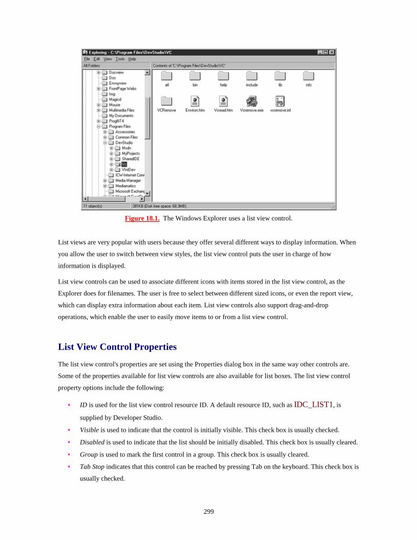
299
Figure 18.1. The Windows Explorer uses a list view control.
List views are very popular with users because they offer several different ways to display information. When
you allow the user to switch between view styles, the list view control puts the user in charge of how
information is displayed.
List view controls can be used to associate different icons with items stored in the list view control, as the
Explorer does for filenames. The user is free to select between different sized icons, or even the report view,
which can display extra information about each item. List view controls also support drag-and-drop
operations, which enable the user to easily move items to or from a list view control.
List View Control Properties
The list view control's properties are set using the Properties dialog box in the same way other controls are.
Some of the properties available for list view controls are also available for list boxes. The list view control
property options include the following:
• ID is used for the list view control resource ID. A default resource ID, such as IDC_LIST1, is
supplied by Developer Studio.
• Visible is used to indicate that the control is initially visible. This check box is usually checked.
• Disabled is used to indicate that the list should be initially disabled. This check box is usually cleared.
• Group is used to mark the first control in a group. This check box is usually cleared.
• Tab Stop indicates that this control can be reached by pressing Tab on the keyboard. This check box is
usually checked.

300
• Help ID indicates that a context-sensitive help ID should be created for this control. This check box is
normally cleared.
• View specifies the initial view used by the list view control. Possible values are Icon, Small Icon, List,
or Report.
• Align specifies whether the items are aligned to the top or left sides of the control. This property
applies only in the icon or small icon views.
• Sort enables items to be sorted based on their labels as they are entered into the list view control.
• Auto Arrange specifies that items should be kept arranged when viewed in the icon or small icon
views.
• Single Selection enables a single list view item to be selected.
• No Label Wrap specifies that each item label must be displayed on a single line rather than wrapped,
as is the standard behavior.
• Edit Labels enables labels to be edited by the user. If this property is enabled, you must handle edit
notification messages sent by the control.
• Owner Draw Fixed indicates that the owner of the control, instead of Windows, is responsible for
drawing the control.
• No Scroll disables scrolling.
• No Column Header removes the header control that is usually included in the report view.
• No Sort Header disables the sorting function that is available through the header control.
• Share Image List indicates that the image list used by the list view control is shared with other image
lists. You must destroy the image list manually after the last list view control has been destroyed.
• Show Selection Always indicates that a selected item is always highlighted, even if the list view
control doesn't have the focus.
• Border indicates that a border should be drawn around the control.
A List View Control Example
As an example of how the basic properties of list view controls are used, create a dialog box-based
application. This program displays a list view control containing three items. You can use radio buttons to
switch between the different view styles.
Use AppWizard to create a dialog box-based application named ListEx. Feel free to accept any of the options
offered by AppWizard; this example works with any AppWizard parameters.
Adding Controls to the ListEx Dialog Box
You must add a total of five controls to the ListEx main dialog box: four radio buttons and one list view
control. Add the controls to the dialog box as shown in Figure 18.2.

301
Figure 18.2. The ListEx main dialog box in the dialog editor.
Properties for the list view and radio button controls are listed in Table 18.1. All properties that aren't listed
should be set to the default values.
Table 18.1. Property values for controls in the ListEx main dialog box.
Control Resource ID Caption Icon view radio IDC_RADIO_ICON &Icon Small radio IDC_RADIO_SMALL &Small List radio IDC_RADIO_LIST &List Report radio IDC_RADIO_REPORT &Report List view control IDC_LIST None
Use ClassWizard to associate a CListCtrl member variable with IDC_LIST, using the values from Table
18.2.
Table 18.2. Values for a new CListCtrl member variable in CListExDlg.
Control ID Variable Name Category Type IDC_LIST m_listCtrl Control CListCtrl

302
Next, use ClassWizard to create message-handling functions that are called when the radio buttons are
selected. Add a total of four member functions to the CListExDlg class, using the values from Table 18.3.
Table 18.3. Values for new CListCtrl member functions in CListExDlg.
Object ID Class Name Message Function IDC_RADIO_ICON CListExDlg BN_CLICKED OnRadioIcon IDC_RADIO_SMALL CListExDlg BN_CLICKED OnRadioSmall IDC_RADIO_LIST CListExDlg BN_CLICKED OnRadioList IDC_RADIO_REPORT CListExDlg BN_CLICKED OnRadioReport
Associating Image Lists with a List Control
The images displayed in the list view next to each item are stored in image lists that are associated with the
list view control. Constructing and managing image lists was discussed in Hour 17, "Using Image Lists and
Bitmaps." An image list is added to a list view control with the SetImageList function:
m_listCtrl.SetImageList( &m_imageSmall, LVSIL_SMALL );
Two parameters are passed to the list view control: the address of the image list and a style parameter that
indicates the type of images stored in the image list. There are three image list types.
• LVSIL_NORMAL is used for the image list used in the icon view.
• LVSIL_SMALL is used for the image list used in the small icon view.
• LVSIL_STATE is used for optional state images, such as check marks.
Just a Minute: After the image list control has been added to the list view control, the list view control takes responsibility for destroying the image list.
CAUTION: If the Share image list property has been selected, the list view control will not destroy the image list. You must destroy it yourself after the list view has been destroyed. If you don't destroy the image list, you will create a memory leak. If you destroy the image list too early, the list view control will behave unpredictably.

303
Creating the Image Lists
You must create two bitmaps for the ListEx application. One bitmap is used for the large icon bitmap and one
for the small icon bitmap. The two bitmaps are shown in Figure 18.3. Each of the bitmaps contains two balls
of the same size, and each ball is a different color.
Figure 18.3. Bitmaps used for the ListEx image lists.
The properties for the two bitmaps are provided in Table 18.4.
Table 18.4. Properties for the ListEx image list bitmaps.
Resource ID Width Height BackgroundIDB_BALLS 64 32 White
IDB_SM_BALLS 32 16 White
Adding Items to a List View Control
The LV_ITEM structure is used to represent an item in a list view control. This structure is used when
adding, modifying, or fetching list view items. The data members for the LV_ITEM structure include the
following:

304
• mask is used to indicate which members are being used for the current function call. Possible values
for this member are given later in this section.
• item contains the List View index of the item referred to by this structure. The first item contained in
the list view control has an index of zero, the next has an index of one, and so on.
• iSubItem contains the index of the current subitem. A subitem is a string that is displayed in a
column to the right of an item's icon and label in the report view. The first subitem has an index of
one. The zero index is used by the actual list view item.
• state and stateMask contain the current state of the item and the valid states of the item.
• pszText contains the address of a string that is used as the item's label. This member must be
assigned the LPSTR_TEXTCALLBACK value if a callback function is used to set the item's
text.
• cchTextMax specifies the size of the buffer provided in the pszText member if the structure is
receiving item attributes. Otherwise, this member is not used.
• iImage contains the image list index for this item.
The LV_ITEM structure's mask member is used to indicate which parts of the structure are valid or should
be filled in. It can be one or more of the following values:
• LVIF_TEXT indicates that the pszText member is valid.
• LVIF_IMAGE indicates that the iImage member is valid.
• LVIF_PARAM indicates that the lParam member is valid.
• LVIF_STATE indicates that the state member is valid.
Time Saver: When more than one value is needed, combine them using the C++ OR | operator:
listItem.mask = LVIF_TEXT | LVIF_IMAGE;
Inserting a List View Item
The InsertItem function is used to add an item to a list view control:
m_listItem.InsertItem( &listItem );
A pointer to an LV_ITEM structure is passed as the parameter to InsertItem. LV_ITEM data members
are filled with data for the new item before it is inserted.

305
listItem.mask = LVIF_TEXT; listItem.iItem = 0; listItem.pszText = szText; m_listCtrl.InsertItem( &listItem );
Adding Column Information for the Report View
Unlike the other three list view styles, the report view displays additional information for each item contained
in the list. The extra items are subitems that are arranged in columns. Each list view item must have the same
number of subitems. For example, in the Windows Explorer, the subitems are used for file information such
as file size, file type, and modified date.
Columns for subitems are added to a list view control in two steps: first, the LV_COLUMN data structure
is initialized and then the columns are added. List view columns are inserted using LV_COLUMN
structures and the InsertColumn function. The LV_COLUMN structure has the following members:
• mask indicates the member variables that are used for the current function call. Values for the mask
member variable are discussed at the end of this section.
• fmt specifies the alignment used for the column. There are three possible values:
LVCFMT_LEFT, LVCFMT_RIGHT, and LVCFMT_CENTER. The first column must
use the LVCFMT_LEFT value.
• cx specifies the width of the column in pixels.
• pszText points to a string containing the column text. If the structure is used to fetch information,
this member holds the address of the buffer that contains the column heading text.
• cchTextMax stores the size of the buffer that is pointed to by pszText. This member is used only
when receiving data.
• iSubItem specifies the column number.
The mask member variable is used to specify which member values are valid. Possible values include the
following:
• LVCF_FMT indicates that the fmt member is valid.
• LVCF_SUBITEM indicates that the iSubItem member is valid.
• LVCF_TEXT indicates that the pszText member is valid.
• LVCF_WIDTH indicates that the cx member is valid.

306
After you fill in the values for an LV_COLUMN structure, the column is added to the list view control
using the InsertColumn function:
m_listCtrl.InsertColumn( nColumn, &listColumn );
Determining Which Items Are Selected
Unlike a list box control, no single message or function exists to determine which items are selected in a list
view control. Instead, you must use the CListCtrl::GetNextItem function, as in this example:
int nSel = m_listCtrl.GetNextItem( -1, LVNI_SELECTED );
This code returns the index of the first selected item in the list view control. GetNextItem has two
parameters: the start item and a search flag. If the start item is -1, the search starts with the first item. The flag
variable can include one geometric value and one state value. The following are the geometric values:
• LVNI_ABOVE: Searches for an item above the start item.
• LVNI_ALL: Searches for the next indexed item. This is the default value.
• LVNI_BELOW: Searches for an item below the start item.
• LVNI_TOLEFT: Searches for an item to the left of the start item.
• LVNI_TORIGHT: Searches for an item to the right of the start item.
The following are the possible state values:
• LVNI_DROPHILITED: Searches for an item that has the LVIS_DROPHILITED state flag
set.
• LVNI_FOCUSED: Searches for an item that has the LVIS_FOCUSED state flag set.
• LVNI_HIDDEN: Searches for an item that has the LVIS_HIDDEN state flag set.
• LVNI_MARKED: Searches for an item that has the LVIS_MARKED state flag set.
• LVNI_SELECTED: Searches for an item that has the LVIS_SELECTED state flag set.
If no item can be found that matches the search parameters, -1 is returned. Otherwise, the index of the first
list item that satisfies the criteria is returned.
Modifications to the CListExDlg Class
The CListExDlg class must have two small modifications made to its class declaration:

307
• You must add two CImageList member variables for the list view control.
• You must add a SetListView member function. This function handles switching between different
list view styles.
Add the source code provided in Listing 18.1 to the implementation section of the CListExDlg class
declaration.
TYPE: Listing 18.1. Changes to the CListExDlg class declaration.
// Implementation protected:
void SetListView( DWORD dwView ); CImageList m_imageLarge; CImageList m_imageSmall;
The CListExDlg::OnInitDialog member function is called when the main dialog box is initialized. Add
the source code in Listing 18.2 to the OnInitDialog function, just after the // TODO comment provided by
AppWizard.
TYPE: Listing 18.2. Changes to the CListExDlg class implementation.
// TODO: Add extra initialization here // Create and set image lists m_imageLarge.Create( IDB_BALLS, 32, 1, RGB(255,255,255) ); m_imageSmall.Create( IDB_SM_BALLS, 16, 1, RGB(255,255,255) ); m_listCtrl.SetImageList( &m_imageLarge, LVSIL_NORMAL ); m_listCtrl.SetImageList( &m_imageSmall, LVSIL_SMALL ); // Create list view columns LV_COLUMN listColumn; LV_ITEM listItem; char* arColumns[3] = { "City", "Football", "Baseball"}; listColumn.mask = LVCF_FMT|LVCF_WIDTH|LVCF_TEXT|LVCF_SUBITEM; listColumn.fmt = LVCFMT_LEFT; listColumn.cx = 60; for( int nColumn = 0; nColumn < 3; nColumn++ ) {
listColumn.iSubItem = nColumn; listColumn.pszText = arColumns[nColumn]; m_listCtrl.InsertColumn( nColumn, &listColumn );

308
} // Add list items listItem.mask = LVIF_TEXT | LVIF_IMAGE; listItem.iSubItem = 0; char* arCity[3] = { "Oakland", "San Diego", "Seattle" }; char* arFootball[3] = { "Raiders", "Chargers", "Seahawks" }; char* arBaseball[3] = { "Athletics", "Padres", "Mariners" }; for( int nItem = 0; nItem < 3; nItem++ ) {
listItem.iItem = nItem; listItem.pszText = arCity[nItem]; listItem.iImage = nItem % 2; m_listCtrl.InsertItem( &listItem ); m_listCtrl.SetItemText( nItem, 1, arFootball[nItem] ); m_listCtrl.SetItemText( nItem, 2, arBaseball[nItem] );
}
The source code provided in Listing 18.2 creates two image lists for the list view control and then creates the
list view's column headers. After the columns are created, the three list items are inserted into the list view.
The SetItemText function is used to add subitem text strings to each list item--in this case, the name of the
professional football and baseball teams for each city.
Changing the Current View for a List View Control
Switching views in a list view control requires just a few lines of code. The current view style is stored in a
structure maintained by Windows. This information can be retrieved using the GetWindowLong function:
DWORD dwOldStyle = GetWindowLong( hWndList, GWL_STYLE );
The GetWindowLong function has two parameters:
A window handle to the list view control
A GWL constant that specifies the type of information requested--in this case, GWL_STYLE
The return value from GetWindowLong contains all the Windows style information for the list view
control. If you are interested in the current view, the unnecessary information should be masked off using
LVS_TYPEMASK.
dwOldStyle &= ~LVS_TYPEMASK; // Mask off extra style info After the mask has been applied, the style information is one of the following values:
• LVS_ICON
309
• LVS_SMALLICON
• LVS_LIST
• LVS_REPORT
To change to another view, you use the SetWindowLong function. When applying a new list view style,
you must make sure that the style bits that are not associated with the list view style are left undisturbed. This
is usually done in the following four steps:
1. Get the existing window style bit information using GetWindowLong. 2. Strip off the list view style information, leaving the other style information intact. 3. Combine a new list view style with the old style information. 4. Apply the new style information using SetWindowLong.
These steps are often combined into a few lines of code in the following way:
DWORD dwNewStyle = LVS_ICON; // Changing to icon view DWORD dwOldStyle = GetWindowLong( hWndList, GWL_STYLE ); dwNewStyle |= ( dwOldStyle &= ~LVS_TYPEMASK ); SetWindowLong( hWndList, GWL_STYLE, dwNewStyle );
Switching Between View Styles
The source code provided in Listing 18.3 is used to switch between list view styles. When a radio button is
selected, its message-handling function is called. Each message-handling function passes a different list view
style parameter to the SetListView member function. The SetListView function uses the
SetWindowLong function to change the list view to the selected style.
TYPE: Listing 18.3. Functions used to change the control's view style.
void CListExDlg::OnRadioIcon() {
SetListView( LVS_ICON ); }
void CListExDlg::OnRadioList() {
SetListView( LVS_LIST ); }

310
void CListExDlg::OnRadioReport() {
SetListView( LVS_REPORT ); }
void CListExDlg::OnRadioSmall() {
SetListView( LVS_SMALLICON ); }
void CListExDlg::SetListView( DWORD dwNewStyle ) {
DWORD dwOldStyle; HWND hWndList;
hWndList = m_listCtrl.GetSafeHwnd();
dwOldStyle = GetWindowLong( hWndList, GWL_STYLE );
if( (dwOldStyle & LVS_TYPEMASK) != dwNewStyle ) {
// Don't forget the tilde before LVS_TYPEMASK ! dwOldStyle &= ~LVS_TYPEMASK; dwNewStyle |= dwOldStyle; SetWindowLong( hWndList, GWL_STYLE, dwNewStyle );
} }
Compile and run the ListEx sample program. The list view initially displays its contents in the icon view. Try
using the radio buttons to switch between views. When the report view is displayed, use the header control to
change the spacing between columns. Figure 18.4 shows the ListEx program running.

311
Figure 18.4. The ListEx sample program shows subitems and small icons in Report view.
Congratulations! You now have an example of a basic list view control. In the next few sections, you will add
label editing and drag-and-drop functionality.
Editing Items in Place
The list view control offers a built-in edit control that you can use to edit items contained in the control. You
can add this feature to the ListEx example in a few minutes. In order to take advantage of this capability, the
list view control must have the LVS_EDITLABELS style, which is set by clicking the Edit Labels check
box on the list view's property page.
In addition to setting the list view control's style, you must handle two notification messages that relate to
label editing:
• LVN_BEGINLABELEDIT is sent just before editing begins.
• LVN_ENDLABELEDIT is sent after editing has been completed.
When your application receives the LVN_BEGINLABELEDIT message, you have the opportunity to
allow or prevent editing of the label. As with other notification messages, one of the parameters passed to
your handler for the notification messages is *pResult. You should set this value to FALSE or zero to
allow the label edit to begin, or TRUE to prevent the label edit from starting.
Time Saver: To access the edit control used to edit the label, use the GetEditControl member function in the CListCtrl class.

312
In most cases, you respond to the LVN_ENDLABELEDIT message and update the application's data.
To allow a change, set *pResult to TRUE; to reject a label change, set *pResult to FALSE.
CAUTION: If you allow the user to change a label, you might need to update the underlying data. There are two cases in which you should not update your data: if the LV_ITEM pszText member passed with the message is NULL, or if the LV_ITEM iItem member is set to -1. In these cases, the user has canceled the label-editing operation.
To add label editing to the ListEx example, begin by opening the IDD_LISTEX_DIALOG dialog box
resource. Check the Edit Labels check box in the styles property sheet for the list control. Next, add message-
handling functions for the label editing messages, using the values from Table 18.5.
Table 18.5. Values for drag-and-drop functions in CListExDlg.
Object ID Class Name Message Function IDC_RADIO_LIST CListExDlg LVN_BEGINEDIT OnBeginlabeleditList IDC_RADIO_LIST CListExDlg LVN_ENDEDIT OnEndlabeleditList
Listing 18.4 shows the source code for the message-notification handlers to be added to the CListExDlg
class.
TYPE: Listing 18.4. Handling the LVN_ENDLABELEDIT and
LVN_ENDLABELEDIT messages.
void CListExDlg::OnBeginlabeleditList(NMHDR* pNMHDR, LRESULT* pResult)
{ *pResult = FALSE;
} void CListExDlg::OnEndlabeleditList(NMHDR* pNMHDR,
LRESULT* pResult) {
LV_DISPINFO* pDispInfo = (LV_DISPINFO*)pNMHDR;
if((pDispInfo->item.pszText != NULL)&& (pDispInfo->item.iItem != -1))
{

313
// Label edit not cancelled by user } *pResult = TRUE;
}
Just a Minute: Remember that the Edit control updates only what is displayed in the list view control; you must update your document or other database in response to LVN_ENDLABELEDIT.
DO/DON'T: DO set the Edit labels property for the list control. DO handle the LVN_BEGINLABELEDIT message and set *pResult to FALSE to allow an edit to begin. DO handle the LVN_ENDLABELEDIT message and set *pResult to TRUE to allow an edit to be completed. DO remember to update your application's data after an edit has been completed. DON'T forget to test iItem and pszText to see whether the user has canceled the edit operation.
Summary
In this hour, you learned about the list view control and how it is used in an MFC-based program. You have
also learned how this control interacts with image lists and header controls, and you built a sample application
to demonstrate how a list view control is used.
Q&A
Q How can I limit the amount of text the user can enter when editing a label? A When handling the LVN_BEGINLABELEDIT message, set the maximum text limit by calling the edit control's LimitText member function: void CListExDlg::OnBeginlabeleditList(NMHDR* pNMHDR,LRESULT* pResult) {
LV_DISPINFO* pDispInfo = (LV_DISPINFO*)pNMHDR; CEdit* pEdit = m_listCtrl.GetEditControl(); pEdit->LimitText( 15 ); *pResult = 0;
}
Q In a multiple selection list view, how can I determine which items have been selected? A As discussed earlier this hour, you can use CListCtrl's GetNextItem member function

314
to determine the first selected item in a list view control. To determine all selected items, you must use a while loop to continue to search for selected items until you reach the end of the list, like this: void CListExDlg::OnTest() {
int nTotalSelected = 0; int nSel = m_listCtrl.GetNextItem(-1,
LVNI_SELECTED); while(nSel != -1) {
nTotalSelected++; nSel = m_listCtrl.GetNextItem(nSel,
LVNI_SELECTED); } TRACE("Total selected = %d\n", nTotalSelected);
}
Workshop
The Workshop is designed to help you anticipate possible questions, review what you've learned, and begin
thinking ahead to put your knowledge into practice. The answers to the quiz are in Appendix B, "Quiz
Answers."
Quiz
1. What styles are available for the list view? 2. What are the sizes of the icons used by the list view control? 3. What messages must be handled when the user edits a label? 4. How do you discover that the user has canceled a label edit? 5. What Windows function is used to change list view styles? 6. What steps are required to add a column to a list view? 7. How do you add text for a list view subitem? 8. What is the return value when the InsertItem function fails?

315
Exercises
1. Make it possible for a user to add new items to the list view control in the ListEx project. 2. Add a pop-up menu to the ListEx project that enables the user to select which list view style should be used. Display the pop-up menu when the user right-clicks the list view control.

316
- Hour 19 - Tree Views
One of the most popular controls released with Windows 95 is the tree view control. In this
hour, you will learn
• How to use the tree view control in a dialog box
• How to use the tree view control as a view in an SDI application
• How to use the MFC classes that support the tree view control
• How to implement drag-and-drop and label editing in a tree view control
What Is a Tree View Control?
Tree controls are similar to the list box controls discussed in Hour 7, "Using List Box and Combo Box
Controls," except that they display information in a tree, or hierarchy. Tree view controls are often used to
display disk directories or the contents of books or other documents.
New Term: In a tree view, parent items are located at the root, or top level, of the tree. In a tree view, child
items are located under parent items.
Items in a tree view control are arranged into groups, with child items located under parent items. Child items
are also indented, or nested, under a parent. A child item at one level can be the parent of child items at lower
levels. The Windows Explorer is one of the applications that uses the new tree control, shown in Figure 19.1.

317
Figure 19.1. The Windows Explorer is one of the many applications that use tree view controls.
The tree control is a popular control because it enables you to display a great deal of information in a
hierarchy. Unlike a list box, a small amount of high-level information can be presented initially, enabling the
user to decide which parts of the tree should be expanded. The tree control also enables information to be
displayed so that relationships between different items in the control can be seen. For example, in the
Explorer, subdirectories are nested in order to show their positions in the directory.
Tree views are also popular because they offer a wide range of options. As with list view controls, which were
discussed in Hour 18, "List View Controls," tree view controls put the user in charge. As you see in an
example later in this hour, it's very easy to enable a user to perform drag-and-drop operations in a tree view
control. With a few lines of code, you can also enable a user to edit the labels for individual tree view items.
You can create tree view controls with several different styles. For example, many tree view controls display
a bitmap next to each item. Many also display a tree control button next to each item. This button contains a
plus sign if an item can be expanded. If the button is clicked, the tree view expands to display the item's
children. When it is expanded, the item displays a button with a minus sign.
Tree controls often contain a large amount of information. The user can control the amount of information
displayed by expanding or collapsing tree items. When more horizontal or vertical room is needed, the tree
control automatically displays scrollbars.

318
MFC Support for Tree View Controls
There are two ways to use tree controls in your MFC-based programs. When a tree control is used in a dialog
box, the control is added just as buttons, list boxes, and other controls have been added in previous hours. The
MFC class CTreeCtrl is used to interact with tree controls and is associated with a tree view control using
ClassWizard.
Tree view controls can also be used in a view. The CTreeView class is a specialized view that consists of a
single tree control. The CTreeView class is derived from CCtrlView, which is itself derived from
CView.
Because CTreeView is derived from CView, it can be used just like CView. For the first example in this
hour, you use CTreeView as the main view in an MFC-based application.
Using a Tree View Control as a View
For this example, create an SDI project named TreeEx using AppWizard. In AppWizard step six, a checkered
flag is displayed along with a list box containing classes that are generated for the application. Follow these
steps to use a tree view as the application's main view:
1. Select the view class in the class list box, in this case CTreeExView. 2. Select CTreeView from the Base Class combo box. 3. Click the Finish button to end the AppWizard process and display the New Project Information dialog box. 4. Click OK to generate the code for the TreeEx project.
You can compile and run the TreeEx application; however, no items have been added to the tree control yet.
In the next section, you see how items are added to a tree view.
Adding Items to a CTreeView
As discussed earlier, the CTreeView class is derived from CView and contains a tree view control that
covers the entire view surface. To get access to the tree view control, you use the GetTreeControl function.
CTreeCtrl& tree = GetTreeCtrl();
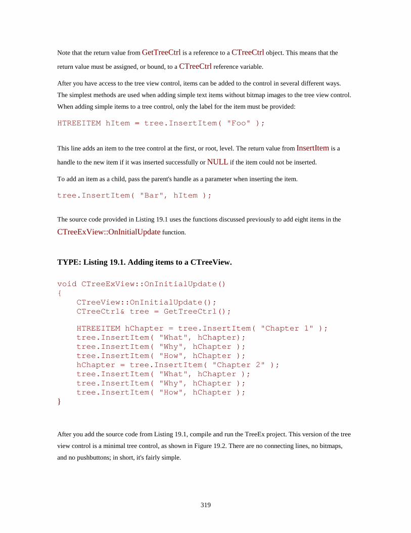
319
Note that the return value from GetTreeCtrl is a reference to a CTreeCtrl object. This means that the
return value must be assigned, or bound, to a CTreeCtrl reference variable.
After you have access to the tree view control, items can be added to the control in several different ways.
The simplest methods are used when adding simple text items without bitmap images to the tree view control.
When adding simple items to a tree control, only the label for the item must be provided:
HTREEITEM hItem = tree.InsertItem( "Foo" );
This line adds an item to the tree control at the first, or root, level. The return value from InsertItem is a
handle to the new item if it was inserted successfully or NULL if the item could not be inserted.
To add an item as a child, pass the parent's handle as a parameter when inserting the item.
tree.InsertItem( "Bar", hItem );
The source code provided in Listing 19.1 uses the functions discussed previously to add eight items in the
CTreeExView::OnInitialUpdate function.
TYPE: Listing 19.1. Adding items to a CTreeView.
void CTreeExView::OnInitialUpdate() {
CTreeView::OnInitialUpdate(); CTreeCtrl& tree = GetTreeCtrl();
HTREEITEM hChapter = tree.InsertItem( "Chapter 1" ); tree.InsertItem( "What", hChapter); tree.InsertItem( "Why", hChapter ); tree.InsertItem( "How", hChapter ); hChapter = tree.InsertItem( "Chapter 2" ); tree.InsertItem( "What", hChapter ); tree.InsertItem( "Why", hChapter ); tree.InsertItem( "How", hChapter );
}
After you add the source code from Listing 19.1, compile and run the TreeEx project. This version of the tree
view control is a minimal tree control, as shown in Figure 19.2. There are no connecting lines, no bitmaps,
and no pushbuttons; in short, it's fairly simple.
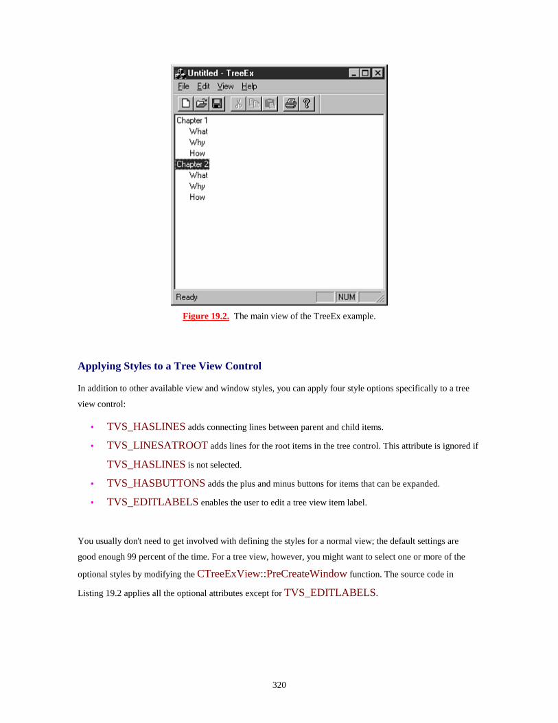
320
Figure 19.2. The main view of the TreeEx example.
Applying Styles to a Tree View Control
In addition to other available view and window styles, you can apply four style options specifically to a tree
view control:
• TVS_HASLINES adds connecting lines between parent and child items.
• TVS_LINESATROOT adds lines for the root items in the tree control. This attribute is ignored if
TVS_HASLINES is not selected.
• TVS_HASBUTTONS adds the plus and minus buttons for items that can be expanded.
• TVS_EDITLABELS enables the user to edit a tree view item label.
You usually don't need to get involved with defining the styles for a normal view; the default settings are
good enough 99 percent of the time. For a tree view, however, you might want to select one or more of the
optional styles by modifying the CTreeExView::PreCreateWindow function. The source code in
Listing 19.2 applies all the optional attributes except for TVS_EDITLABELS.

321
TYPE: Listing 19.2. Modifying the tree view style in PreCreateWindow.
BOOL CTreeExView::PreCreateWindow(CREATESTRUCT& cs) {
cs.style |= ( TVS_HASLINES|TVS_LINESATROOT|TVS_HASBUTTONS);
return CTreeView::PreCreateWindow(cs); }
Compile and run the TreeEx example, and you'll see that the example now has lines and buttons, as shown in
Figure 19.3. It might sound like a small addition, but it makes the control much easier to use, especially if the
tree must be expanded and collapsed frequently.
Figure 19.3. The TreeEx application after modifying the Tree View styles.
Just a Minute: At first glance, you might think that the list view and tree view controls are almost identical as far as the API goes. The key word, unfortunately, is almost.

322
The biggest difference between the list view and tree view controls is in how individual items are referenced. In the list view control, an item index is used when communicating with the control. Because tree view controls allow items to be expanded and collapsed, however, the idea of an absolute index doesn't work. An item handle, or HTREEITEM, is used when referring to a tree view item. In addition, several smaller differences can tend to be a bit aggravating. For example, CListCtrl::CreateDragImage takes two parameters, whereas the equivalent CTreeCtrl function takes only one parameter.
Adding Tree View Controls to Dialog Boxes
For the second example in this hour, you add a tree view control to the TreeEx About dialog box. This version
of the tree view control supports drag and drop and also displays bitmaps for each item.
Adding a tree control to a dialog box is almost exactly like adding any other control to a dialog box. Select the
ResourceView tab in the project workspace window and open the Dialog folder. Open the
IDD_ABOUTBOX dialog box resource by double-clicking the IDD_ABOUTBOX icon or by right-
clicking the icon and selecting Open from the pop-up menu.
Remove the current controls except for the OK button from IDD_ABOUTBOX. Add a tree view control
to the dialog box by dragging the tree view icon onto the dialog box or by selecting a tree view control and
clicking on the dialog box. The modified dialog box is shown in Fig-ure 19.4.
As shown in Figure 19.4, the tree view control displays a simulated tree to assist in sizing the control.

323
Figure 19.4. Adding a tree view control to a dialog box.
Just a Minute: A tree control is often larger than a list box due to the space required for indenting the nested child items.
Setting Tree View Control Properties
The tree view control's properties are set using the Properties dialog box. Some of the properties available for
tree view controls are also available for list boxes. The tree control property options include the following:
• ID is used for the tree view control resource ID. A default resource ID, such as IDC_TREE1, is
supplied by Developer Studio.
• Visible is used to indicate that the control is initially visible. This check box is usually checked.
• Disabled is used to indicate the list should be initially disabled. This check box is usually cleared.
• Group is used to mark the first control in a group. This check box is usually cleared.
• Tab Stop indicates that this control can be reached by pressing Tab on the keyboard. This check box is
usually checked.
• Help ID indicates that a context-sensitive help ID should be generated for this control.
• Has Buttons indicates that the control should be drawn with buttons. Each tree control item that can
be expanded has a button drawn to the left of the item. This check box is usually cleared.
324
• Has Lines is used to indicate that lines should be drawn connecting items in the control. This check
box is usually cleared.
• Border is used to indicate that a border should be drawn around the tree control. This check box is
usually checked.
• Lines at Root indicates that lines should be drawn at the first, or "root," level of the control. This
option is ignored if the Has Lines check box is not selected.
• Edit Labels enables a user to change the values of labels in the control. This check box is usually
cleared.
• Disable Drag Drop prevents drag and drop for items contained in the tree view control. This item is
usually cleared.
• Show Selection Always uses the system highlight colors for selected items. This item is usually
cleared.
Open the Properties dialog box for the tree view control and change the resource ID to IDC_TREE. All
other properties should be set to their default values except for the following items, which should be checked:
• Has Lines
• Lines at Root
• Has Buttons
Using ClassWizard, associate a CTreeCtrl member variable with the new tree control, using the values from
Table 19.1.
Table 19.1. Values used to add a CTreeCtrl member variable for CAboutDlg.
Control ID Variable Name Category Type IDC_TREE m_tree Control CTreeCtrl
Creating an Image List Control
The version of the tree view control contained in the About dialog box displays two bitmaps next to tree view
items:
A notebook icon for root-level items
A document page icon for second-level items

325
As discussed in Hour 17, "Using Image Lists and Bitmaps," an image list can consist of a single bitmap that
has one or more segments. The bitmap shown in Figure 19.5 contains both images used by the tree view
control.
Figure 19.5. Bitmaps displayed in the tree view control.
Use the image editor to create the bitmap in Figure 19.5. Use red as a background color for the bitmap to
make it easier to draw the bitmap transparently. Use the values from Table 19.2 for the bitmap.
Table 19.2. Attributes for the image list bitmap used in TreeEx.
Resource ID Height Item Width Total WidthIDB_TREE 14 14 28
Modifying the Dialog Box Class
The CAboutDlg class must be modified in order to handle the tree view control. You must add a total of
four new member variables to the CAboutDlg class:
• A CImageList variable is used to supply the images displayed next to each item in the tree control.
• A BOOL flag is used to indicate that a drag-and-drop operation is in progress.
• An HTREEITEM variable refers to an item being dragged.
• Another HTREEITEM variable refers to the current drop target.
Add the source code provided in Listing 19.3 to the implementation section of the CAboutDlg class
declaration.
TYPE: Listing 19.3. Additions to the CAboutDlg class declaration.
// Implementation protected:
CImageList m_imageList;

326
BOOL m_bIsDragging; HTREEITEM m_dragItem;
HTREEITEM m_dragTarget;
The tree control is initialized when the CAboutDlg class receives the WM_INITDIALOG message.
Using ClassWizard, add a message-handling function for WM_INITDIALOG and accept the suggested
name of OnInitDialog. Add the source code in Listing 19.4 to the OnInitDialog member function. A
little cut-and-paste editing can save you some typing here because this source code is similar to the source
code used earlier in Listing 19.1.
TYPE: Listing 19.4. The CAboutDlg::OnInitDialog member function.
BOOL CAboutDlg::OnInitDialog() {
CDialog::OnInitDialog(); m_bIsDragging = FALSE; m_dragTarget = NULL; m_dragItem = NULL; m_imageList.Create( IDB_TREE, 14, 1, RGB(255,0,0) ); m_tree.SetImageList( &m_imageList, TVSIL_NORMAL ); HTREEITEM hChapter; hChapter = m_tree.InsertItem( "Chapter 1", 0, 0 ); m_tree.InsertItem( "What", 1, 1, hChapter ); m_tree.InsertItem( "Why", 1, 1, hChapter ); m_tree.InsertItem( "How", 1, 1, hChapter ); hChapter = m_tree.InsertItem( "Chapter 2", 0, 0 ); m_tree.InsertItem( "What", 1, 1, hChapter ); m_tree.InsertItem( "Why", 1, 1, hChapter ); m_tree.InsertItem( "How", 1, 1, hChapter ); return TRUE;
}
There are a few small differences between Listing 19.1 and Listing 19.4. In Listing 19.4, an image list is first
created and then associated with the tree view control by calling the SetImageList function. In addition, the
InsertItem function uses two extra parameters.
m_tree.InsertItem( "How", 1, 1, hChapter );

327
As in Listing 19.1, the first parameter is the text label associated with the tree item. The second parameter is
the image index associated with the item when it's not selected; the third parameter is the selected image
index. This enables you to specify different images for selected and non-selected items. As before, the last
parameter is a handle to the item's parent item, or it can be omitted if the item is added at the root level.
Compile and run the TreeEx project. The modified TreeEx About dialog box is shown in Figure 19.6.
Figure 19.6. The modified About dialog box from TreeEx.
Deleting Items from a Tree View Control
Of course, any control that enables items to be inserted must also enable them to be removed. The
CTreeCtrl::DeleteItem member function is used to delete an item from the tree view control:
BOOL fResult = m_tree.DeleteItem(hTreeItem);
CAUTION: When an item is removed from the tree control, any child items that are nested below it are also removed.
The return value from DeleteItem is FALSE, or zero, if the item could not be deleted, or non-zero if the
item was deleted successfully.
Time Saver: To delete all the items in a tree view control, use the CTreeCtrl::DeleteAllItems member function:
BOOL fResult = m_tree.DeleteAllItems();
To show how these functions are used in a real application, add two buttons to the About dialog box. Figure
19.7 shows the About dialog box after adding Remove and Remove All buttons.
Figure 19.7. The About dialog box after adding new push- button controls.
Use the values from Table 19.3 to assign properties to the new controls added to the About dialog box.

328
Table 19.3. Property values for controls added to the About dialog box.
Control Resource ID Caption Remove button IDC_REMOVE &Remove Remove All button IDC_REMOVEALL Remove &All
Use ClassWizard to add message-handling functions for the new controls, as shown in Table 19.4.
Table 19.4. Message-handling functions used for the new controls.
Class Name Object ID Message Function CAboutDlg IDC_REMOVE BN_CLICKED OnRemove CAboutDlg IDC_REMOVEALL BN_CLICKED OnRemoveall
The source code used to implement the Remove and Removeall functions is provided in Listing 19.5. Add
this source code to the CAboutDlg::Remove and CAboutDlg::Removeall functions found in
TreeEx.cpp.
TYPE: Listing 19.5. Deleting items from the About TreeEx dialog box.
void CAboutDlg::OnRemove() {
HTREEITEM hItem = m_tree.GetSelectedItem(); if(hItem != NULL) {
VERIFY(m_tree.DeleteItem(hItem)); } else {
AfxMessageBox("Please select an item first"); }
} void CAboutDlg::OnRemoveall() {
m_tree.DeleteAllItems(); }

329
Compile and run the TreeEx project. The modified About TreeEx dialog box is shown in Figure 19.8.
Experiment with removing items from the dialog box. Note that removing a node at the root level also
removes all of its children.
Tree View Control Notifications
Like the list view control discussed in Hour 18, tree view controls communicate with their parent windows
using notification messages. In the next section, you learn about TVN_BEGINDRAG, the message used
to start a drag-and-drop process.
Figure 19.8. The modified About dialog box from TreeEx.
Adding Drag-and-Drop Functionality to a Tree View Control
In order to handle drag-and-drop functionality inside a tree view control, you must handle the following three
messages:
• TVN_BEGINDRAG notifies the tree view control's parent that a drag has been started. For this
example, you will allow only second-level items to be dragged.
• WM_MOUSEMOVE is sent as the mouse is moved. If a drag is in progress, the drag image is
moved to the new cursor position.
• WM_LBUTTONUP is sent as the left mouse button is released. If a drag is in progress, the drag
is completed by moving the drag item into the new position.
Using ClassWizard, add message-handling functions for these messages to the CAboutDlg class, using the
values from Table 19.5.
Table 19.5. Message-handling functions used for drag-and-drop processes.
Object ID Message Function IDC_TREE TVN_BEGINDRAG OnBegindragTreeCAboutDlg WM_MOUSEMOVE OnMouseMove CAboutDlg WM_LBUTTONUP OnLButtonUp

330
The source code for the three functions is provided in Listing 19.6.
TYPE: Listing 19.6. Functions used to implement simple drag and drop.
void CAboutDlg::OnBegindragTree(NMHDR* pNMHDR, LRESULT*pResult) {
NM_TREEVIEW* pNMTreeView = (NM_TREEVIEW*)pNMHDR; m_dragItem = pNMTreeView->itemNew.hItem; if( m_tree.GetParentItem( m_dragItem ) != NULL ) {
CImageList* pDragImage; pDragImage = m_tree.CreateDragImage( m_dragItem ); m_tree.SelectItem( m_dragItem ); pDragImage->BeginDrag( 0, CPoint(0,0) ); pDragImage->DragEnter( &m_tree, pNMTreeView->ptDrag
); SetCapture(); m_bIsDragging = TRUE; delete pDragImage;
} *pResult = 0 ;
}
void CAboutDlg::OnMouseMove(UINT nFlags, CPoint point) {
if( m_bIsDragging != FALSE ) {
CPoint ptTree( point ); MapWindowPoints( &m_tree, &ptTree, 1 ); CImageList::DragMove( ptTree ); UINT uHitTest = TVHT_ONITEM; m_dragTarget = m_tree.HitTest( ptTree, &uHitTest );
} CDialog::OnMouseMove(nFlags, point);
}
void CAboutDlg::OnLButtonUp(UINT nFlags, CPoint point) {
if( m_bIsDragging != FALSE ) {
CImageList::DragLeave( &m_tree ); CImageList::EndDrag(); ReleaseCapture(); m_bIsDragging = FALSE; if( m_dragTarget != NULL )

331
{ HTREEITEM hParent; hParent = m_tree.GetParentItem( m_dragTarget ); CString szLabel = m_tree.GetItemText( m_dragItem
); if( hParent != NULL )
m_tree.InsertItem( szLabel, 1, 1, hParent, m_dragTarget );
else m_tree.InsertItem( szLabel, 1, 1,
m_dragTarget, TVI_FIRST );
m_tree.DeleteItem( m_dragItem ); }
} else
CDialog::OnLButtonUp(nFlags, point); }
The source code in Listing 19.6 is all you need to perform a drag-and-drop operation inside a single control.
The drag sequence begins with the tree view control sending the TVN_DRAGBEGIN to the control's
parent--in this case, the TreeEx About dialog box. The MFC framework translates this message into a
CAboutDlg::OnBegindragTree function call. Inside this function, the handle to the drag item is stored
in m_dragItem.
Just a Minute: In this example, you aren't dragging items at the first, or root level, so GetParentItem is used to get a handle to the drag item's parent; if NULL is returned, the item is at the root level, and the drag never starts.
As the mouse is moved across the screen during the drag and drop, WM_MOUSEMOVE messages are
sent to the dialog box, just as in the ListEx example from Hour 18.
At some point, the user releases the left mouse button, resulting in a WM_LBUTTONUP message, which
is translated into a call to the CAboutDlg::OnLButtonUp function. If a drag and drop is in progress, the
operation is completed by calling the DragLeave and EndDrag functions. The mouse capture is released,
and the m_bIsDragging flag is set to FALSE.
The completion of a drag and drop is slightly more complicated in a tree view control than in a list view
control. If the drop target is a second-level item, the drag item is inserted just after the drop target. If the drop
332
target is a root-level item, the drag item is inserted as the first child item. These calls to the InsertItem
function use a fourth parameter, which is a handle for the item just before the new item. This parameter can
be one of three predefined values:
• TVI_FIRST inserts the item as the first child, as used in this example.
• TVI_LAST inserts the item as the last child.
• TVI_SORT sorts the item alphabetically.
After the drag item has been inserted in a new position, the old position is removed using the DeleteItem
function. In order to implement a copy-drag, just eliminate the call to DeleteItem.
Performing In-Place Label Editing
Like the list view control, the tree view control offers a built-in Edit control that you can use to edit items
contained in the control. In order to take advantage of this capability, the tree view control must have its Edit
labels property checked.
In addition to setting the tree view control style, there are two messages that relate to label editing:
• TVN_BEGINLABELEDIT, which is sent just before the label editing begins.
• TVN_ENDLABELEDIT, which is sent after editing is completed or after the user has cancelled
the editing operation.
These messages are handled exactly as they are for a list view control. When you receive
TVN_BEGINLABELEDIT, you can prevent a label from being edited by setting *pResult to TRUE,
and you can allow editing to proceed by setting *pResult to FALSE. In addition, you can use the
TVN_BEGINLABELEDIT message to take control of the tree view's edit control.
The TVN_ENDLABELEDIT message is used exactly like the LVN_ENDLABELEDIT message is
used with a list view control.
CAUTION: If you use the newly edited label text in your application, make sure to look out for situations in which the user has cancelled the label editing operation. When this happens, the TV_ITEM pszText member variable is set to NULL, or the iItem member variable is set to -1.
Add new message-handling functions for the label editing messages using the values in Table 19.6.

333
Table 19.6. Message-handling functions used for label editing.
Class Name Object ID Message Function CAboutDlg IDC_TREE TVN_BEGINLABELEDIT OnBeginlabeleditTree CAboutDlg IDC_TREE TVN_ENDLABELEDIT OnEndlabeleditTree
The source code for these functions is provided in Listing 19.7.
TYPE: Listing 19.7. Functions used to implement simple drag and drop.
void CAboutDlg::OnBeginlabeleditTree(NMHDR* pNMHDR, LRESULT*pResult) {
*pResult = FALSE; } void CAboutDlg::OnEndlabeleditTree(NMHDR* pNMHDR, LRESULT*pResult) {
*pResult = TRUE; }
Compile and run the TreeEx project. Experiment with editing item labels, drag and drop, and removing items
in the About dialog box.
Summary
In this hour, you learned about the tree view control and created two examples: a tree view used as an SDI
main view and a tree view control in a dialog box. You also learned about drag and drop as well as edit
notifications.
Q&A
Q How can I allow or deny label editing based on the text the user has entered into a label? A When you receive the TVN_ENDLABELEDIT message, you can check the value stored in the pszText member of the item structure. If the string is valid, set *pResult to TRUE, otherwise, set it to FALSE to reject the change.

334
Q How can I force the tree view control to scroll to a particular position? A You can force a particular item to be visible by calling the CTreeCtrl::EnsureVisible function: m_tree.EnsureVisible(hItem);
The tree view control will scroll if necessary to display the item referred to by hItem. If the item is hidden under a parent, the tree will be expanded to show the item.
Workshop
The Workshop is designed to help you anticipate possible questions, review what you've learned, and begin
thinking ahead to putting your knowledge into practice. The answers to the quiz are in Appendix B, "Quiz
Answers."
Quiz
1. What messages are sent when a user edits a tree view label? 2. What messages must be handled to implement drag and drop? 3. Why are two image list indexes specified when adding an item that displays an image to a tree view control? 4. What CTreeCtrl member function is used to remove all items in a tree view control? 5. How do you change the properties for a tree view control that is part of the CTreeView class? 6. What properties are available specifically for tree view controls, and what are their equivalent window styles? 7. How are individual tree view items referred to? 8. What is the size of the images used by the tree view control? 9. How do you insert an item as the first child under a parent?
Exercises
1. Modify the CAboutDlg so that you can add an item to the tree view control. 2. Add an additional item to the IDB_TREE image list. Use the new image list item

335
when a top-level tree view control item is selected.
336
- Hour 20 - Using ActiveX Controls
ActiveX controls enable you to reuse custom controls written for Windows. In this hour, I
discuss ActiveX controls and how they are used. In this hour, you will learn
• How ActiveX controls are used to replace OLE controls and VBX controls
• How you can use ActiveX controls to easily add functionality to your project
• How to use the Microsoft FlexGrid control included with Visual C++
A small example at the end of the hour uses one of the ActiveX controls included with Visual C++.
What Is an ActiveX Control?
New Term: An ActiveX control is a reusable control that is packaged and available for use in your
applications. ActiveX controls use Object Linking and Embedding (OLE) interfaces for communication to
and from the control.
ActiveX controls can be developed for both the 16-bit and 32-bit versions of Windows. In addition, they have
features that make them more attractive for distribution, such as support for licensing and localization into
different languages.
A wide range of ActiveX controls is available. Later in this hour, you can follow the steps required to use the
Microsoft FlexGrid control that is included with Visual C++, which enables you to write simple spreadsheet
applications.
Why Use an ActiveX Control?
ActiveX controls are easy to use in your MFC-based applications because they have been designed for reuse.
Developer Studio includes the Component and Controls Gallery, a tool that helps you easily integrate
ActiveX controls into your MFC programs.
New Term: ActiveX controls communicate over well-defined interfaces that are understood by ActiveX
controls and the programs that use them. These interfaces are used to pass information and events to and from
the control.
Because ActiveX controls use a standard interface that is not specific to any particular programming
language, ActiveX controls can be used by a variety of development tools. The ActiveX controls that you use

337
today in a Visual C++ program can also be used with other tools, such as Access 95, Visual FoxPro, and
Visual Basic.
ActiveX controls offer more functionality than is available with standard controls offered by Windows. For
example, before the release of Windows 95, many VBX vendors offered VBX controls that were similar to
tree view controls; these vendors are now offering ActiveX controls with features that are not available when
using standard controls.
How Is an ActiveX Control Used?
New Term: An ActiveX event is a message that is sent from the control to the application that contains the
control.
An ActiveX control always communicates with an ActiveX control container. Control containers understand
the ActiveX control interfaces, as shown in Figure 20.1. An ActiveX control container is responsible for
providing an environment in which the control can pass events to its owner and receive information from the
outside world. The ActiveX control sends events to the ActiveX container when an event occurs inside the
control. Mouse clicks, pressed buttons, and expiring timers are examples of events. The ActiveX container
provides information to the control such as the natural or "ambient" background color and the default font.
Figure 20.1. Messages sent to and from ActiveX controls in an MFC program.
New Term: An ActiveX property is an attribute that is applied to the control, such as a color or the height of
a button.
New Term: An ActiveX method is a function that is exposed by the control and is called by the control's
container.

338
When an ActiveX control container must communicate with an ActiveX control, it interacts with a set of
properties and methods that are exposed by the ActiveX control. An example of an ActiveX property is the
font or background color used by a control. An example of an ActiveX method is a function that sorts the
items in a list control.
Every class derived from CWnd in an MFC application can be used as an ActiveX control container. The
MFC class COleControl is used as a base class for all ActiveX controls created using MFC.
Using the Components and Controls Gallery
The Developer Studio Components and Controls Gallery is used to store reusable components that can be
used in your MFC-based Windows projects. If you develop a class that you would like to reuse in future
projects, you can add the class to the Gallery by following these steps:
1. Open the ClassView in the project workspace. 2. Right-click on the class name, and select Add to Gallery from the shortcut menu.
The most frequently used components stored in the Components and Controls Gallery are ActiveX controls.
To display all the ActiveX controls available on your machine, open the Components and Controls Gallery by
selecting Project | Add to Project | Components and Controls from the main menu.
After the Component Gallery dialog box is displayed, select Registered ActiveX Controls from the list box;
this displays all the available ActiveX controls, as shown in Figure 20.2.

339
Figure 20.2. Displaying available ActiveX controls in the Component Gallery.
Adding an ActiveX Control to the Dialog Editor
Before using an ActiveX control in a dialog box, you must insert the control into the dialog editor's control
palette. To add an ActiveX control to the dialog editor, follow these steps:
1. Select one of the displayed ActiveX control icons. 2. From the Components and Controls Gallery dialog box, click the Insert button. 3. A message box will be displayed asking if you would like to insert the component. Click OK. 4. A list box containing classes that will be added to your project is displayed inside the Confirm Classes dialog box. Click OK to add the classes to your project. 5. Click the Close button to dismiss the Components and Controls Gallery dialog box.
The ActiveX control you selected is now included in the dialog editor's control palette. Open a dialog box for
editing, and you see the new control palette, including the new ActiveX control.
340
You can use the new ActiveX control as you would any other control. To add it to a dialog box resource, drag
and drop the control on the dialog box, or select the ActiveX control's icon and click on the dialog box
resource.
Using ClassWizard to Configure an ActiveX Control
Before you can use the ActiveX control, it must be integrated into your project. As with any other control
added to a dialog box, use ClassWizard to add message-handling functions and associate the control with an
MFC object.
When adding a member variable associated with an ActiveX control, you can use ClassWizard as you would
if the control were a button, list box, or another standard Windows control. Unlike standard Windows
controls, each ActiveX control has a large number of variable types. In addition to the object used to interact
with the control, every property exposed by the control can be associated with a variable.
An Example Using an ActiveX Custom Control
As an example of using an ActiveX control in an MFC-based project, you will now use the Microsoft
FlexGrid control in a dialog box-based application. The grid control is used to create a small spreadsheet in
the main dialog box.
To get started with the sample project, use AppWizard to create a dialog box-based application named
CustomCtrl. In contrast to most of the book's other AppWizard examples, for this project you must keep one
of the default options offered by the wizard. On the second AppWizard page, make sure the ActiveX Controls
check box is selected. Selecting this option causes AppWizard to configure the project to be ActiveX control-
ready.
What Is a Grid Control?
New Term: A grid control is a popular reusable component that is similar to a spreadsheet. Many suppliers of
Visual Basic controls offer grid controls, and Microsoft includes with Developer Studio an ActiveX grid
control named FlexGrid.
As you can probably guess by its name, a grid control is divided into a series of rectangles, or grids. Vertical
lines separate the controls into columns, and horizontal lines divide the control into rows. The intersection of
a row and column is known as a cell.
A grid control can contain a mixture of images and text. In most cases, text is used. You cannot directly edit
the individual cells in a grid control. The grid control is strictly a read-only window, although there are ways
to simulate cell editing that are discussed later this hour.

341
The most common use for a grid control is creating a small spreadsheet. If you want to display a small budget
or other information, a grid control is ideal. In addition, you can use a grid control whenever you must arrange
information into rows and columns. For example, a calendar dialog box might use a grid control to provide
access to the individual days of the month.
A grid control spares you the work of creating and maintaining a large number of smaller controls. The grid
control tracks the active cell, as well as the size and contents of each cell. When you need access to a
particular cell, the grid control can provide that information through a function call. At a minimum, grid
controls enable you to do the following:
• Retrieve current row, cell, and column information.
• Set attributes for the current cell, such as font, size, and contents.
• Retrieve the attributes of the current cell.
Adding a Grid ActiveX Control to the Dialog Editor
To add a grid ActiveX control to the CustomCtrl project's main dialog box, you must first add the grid control
to the dialog editor's control palette by following these steps:
1. Open the Components and Controls Gallery by selecting Project | Add to Project | Components and Controls from the main menu. 2. Display the available ActiveX controls by clicking Registered ActiveX Controls from the list box. 3. Select the Microsoft FlexGrid, version 5.0 Control icon and then click the Insert button; then click OK on the message box. 4. Accept the list of classes that will be added to the project by clicking OK. 5. Close the Components and Controls Gallery dialog box.
Adding a Grid Control to the Main Dialog Box
Before adding the grid control to the main dialog box, you must first load the dialog box resource into the
dialog editor. Open the ResourceView in the project workspace. Open the dialog box resource folder and
double-click the IDD_CUSTOMCTRL_DIALOG icon. This opens the dialog box resource inside the
Developer Studio dialog editor.
To add a grid control, drag and drop the grid control from the control palette to the dialog box resource. For
this example, you must also add an edit control with a resource ID of IDC_EDIT and a pushbutton control

342
with an ID of IDC_CALC to the dialog box. The finished main dialog box resource is shown in Figure
20.3.
Figure 20.3. The main dialog box resource for the CustomCtrl project.
The properties for the ActiveX grid control are provided in Table 20.1. Use the default properties for the edit
control.
Table 20.1. Properties used for the ActiveX grid control.
Property Value ID IDC_GRID Rows 5 Cols 5 FixedRows 1 FixedCols 1 ScrollBars None
Initializing the Grid Control
Before adding the source code used to initialize the grid control, add member variables to the
CCustomCtrlDlg class associated with the grid and edit controls. Using ClassWizard, add the member
variables using the values from Table 20.2.
Table 20.2. Values used for the grid and edit control member variables.
Class Name Resource ID Category Type Variable Name CCustomCtrlDlg IDC_EDIT Control CEdit m_edit CCustomCtrlDlg IDC_GRID Control CMSFlexGrid m_grid

343
Just a Minute: Due to the way in which the Developer Studio tools are integrated, ClassWizard knows all about the Microsoft FlexGrid control and understands that the CMSFlexGrid class is used to interact with the control.
The main dialog box class, CCustomCtrlDlg, uses three new member variables to interact with the grid
control.
• m_nRow is used to store the current cell row when a cell is being edited.
• m_nCol is used to store the current cell column when a cell is being edited.
• m_bEditing is set to TRUE when a cell is being edited and FALSE otherwise.
Add the declarations for these variables to the CCustomCtrlDlg class, as shown in Listing 20.1. Add the
source code to the implementation section, just after the // Implementation comment.
TYPE: Listing 20.1. Modifications to the CCustomCtrlDlg class declaration.
// Implementation protected:
BOOL m_bEditing; int m_nRow;
int m_nCol;
The grid control must be initialized during the main dialog box's OnInitDialog member function. Add the
source code from Listing 20.2 to the CCustomCtrlDlg::OnInitDialog member function, just after the //
TODO comment.
TYPE: Listing 20.2. Initializing the ActiveX grid control in OnInitDialog.
// TODO: Add extra initialization here m_bEditing = FALSE; m_nRow = 1; m_nCol = 1; char* arCols[4] = { "Jan", "Feb", "Mar", "Apr" }; char* arRows[4] = { "Gas", "Phone", "MSN", "Total" };

344
m_grid.SetRow( 0 ); for( int nCol = 0; nCol < 4; nCol++ ) {
m_grid.SetCol( nCol + 1 ); m_grid.SetText( arCols[nCol] );
} m_grid.SetCol( 0 ); for( int nRow = 0; nRow < 4; nRow++ ) {
m_grid.SetRow( nRow + 1 ); m_grid.SetText( arRows[nRow] );
}
The source code added to the OnInitDialog function first initializes the new member variables added in
Listing 20.1. The remaining code initializes the grid control.
The first for loop in Listing 20.2 sets the column headings to the first four months of the year. The next for
loop sets the text used as row titles in the grid control. This short snippet of code shows how a grid control is
typically used: Select a cell and then set or retrieve the text stored in that cell.
Detecting Grid Control Events
When an event occurs in the grid control, the control fires an event message to its container. The MFC
framework translates this event message into a function call. To define the Click event message that is
handled by the main dialog box, you use ClassWizard to add a message-handling function for the message, as
shown in Table 20.3.
Table 20.3. ActiveX event messages handled by the CCustomCtrlDlg class.
Object ID Class Name Message Function IDC_GRID CCustomCtrlDlg Click OnClickGrid
Add the source code for the CCustomCtrlDlg::OnClickGrid function provided in List- ing 20.3.
TYPE: Listing 20.3. Handling a mouse click event from the ActiveX grid control.
void CCustomCtrlDlg::OnClickGrid() {

345
CString szText = m_grid.GetText(); if( m_bEditing == FALSE ) {
// Save the current grid position and set the editflag.
m_nRow = m_grid.GetRow(); m_nCol = m_grid.GetCol(); m_bEditing = TRUE; // Get the current grid text, and display it in the
edit // control. szText = m_grid.GetText(); m_edit.SetWindowText( szText ); m_edit.ShowWindow( SW_SHOW ); m_edit.SetFocus(); m_edit.SetSel( 0, -1 );
} else {
// Roll up the edit control, and update the previous // grid position. You must save the current position, // go back to the old position, and then return to
the // current position. int nCurrentRow = m_grid.GetRow(); int nCurrentCol = m_grid.GetCol(); m_grid.SetRow( m_nRow ); m_grid.SetCol( m_nCol ); m_grid.SetFocus();
CString szEntry; m_edit.GetWindowText( szText ); szEntry.Format("%01.2f", atof(szText) );
m_edit.ShowWindow( SW_HIDE ); m_grid.SetText( szEntry ); m_bEditing = FALSE; m_grid.SetRow( nCurrentRow ); m_grid.SetCol( nCurrentCol );
} }
If the program receives a Click event, the m_bEditing flag is checked to see whether a cell is currently
being edited. If not, the current row and column are collected from the grid control. This information is used
later when the editing job is finished. The text stored in the current grid cell is retrieved and displayed in the

346
edit control. Finally, the edit control text is selected, which makes it easy for a user to overwrite the current
contents.
If a cell is being edited, the text contained in the edit control is stored in the grid. However, it must be stored
in the cell that was originally clicked to open the edit control. This cell position was stored when the edit
control was opened and is now used to reset the current row and column. The edit control text is reformatted
into a standard dollars-and-cents format and stored in the original cell position.
The GetRow and GetCol functions provided by CGridCtrl are examples of ActiveX control methods that
are exposed by the grid control. For a complete list of exposed methods, open the project workspace view and
click the ClassView tab. Open the CGridCtrl class icon, and you see a list of the available member
functions.
Recalculating the Grid Control Contents
Each column in the spreadsheet is recalculated when you click the Calculate button. Add a message-handling
function to the CCustomCtrlDlg class that handles messages from the Calculate button, using the values
from Table 20.4.
Table 20.4. Messages handled by the CCustomCtrlDlg class.
Object ID Class Name Message FunctionIDC_CALC CCustomCtrlDlg BN_CLICKED OnCalc
Add the source code in Listing 20.4 to the CCustomCtrlDlg::OnCalc member function.
TYPE: Listing 20.4. Recalculating the contents of the ActiveX grid control.
void CCustomCtrlDlg::OnCalc() {
// Close current editing job, if any. if( m_bEditing != FALSE ) {
CString szEntry, szText; m_edit.GetWindowText( szText ); szEntry.Format("%01.2f", atof(szText) ); m_edit.ShowWindow( SW_HIDE ); m_grid.SetText( szEntry ); m_bEditing = FALSE;
}

347
for( int nCol = 1; nCol < 5; nCol++ ) {
double dTotal = 0.0; m_grid.SetCol( nCol ); for( int nRow = 1; nRow < 4; nRow++ ) {
m_grid.SetRow( nRow ); CString szCell = m_grid.GetText(); dTotal += atof( szCell );
} CString szTotal; szTotal.Format( "%01.2f", dTotal ); m_grid.SetRow( 4 ); m_grid.SetText( szTotal );
} }
Compile and run the CustomCtrl example. The grid control is initially empty. Clicking on a cell displays
the edit control, which enables you to enter or change the cell's contents. If you click on the cell again, the
value from the edit control is moved into the cell, and the edit control is hidden. Clicking the Calculate button
totals each column in the grid control and hides the edit control. Figure 20.4 shows the CustomCtrl main
dialog box with some of the grid cells filled in.
Figure 20.4. The CustomCtrl project's main dialog box.
Summary
In this hour, you learned about ActiveX controls and the Developer Studio tools that are used with them. As
part of the discussion, you created an example that used an ActiveX grid control as a small spreadsheet.
348
Q&A
Q How can I determine which events are provided by an ActiveX control? A After the ActiveX control is added to your project, you can use ClassWizard to examine the events that are generated by the control. Q How can I reuse controls installed on my computer by other applications? A Most commercial controls are licensed; they cannot be used to design new applications without the proper ActiveX licensing file. Some controls can be used for evaluation purposes, even without a license--to be sure, contact the control vendor.
Workshop
The Workshop is designed to help you anticipate possible questions, review what you've learned, and begin
thinking ahead to putting your knowledge into practice. The answers to the quiz are in Appendix B, "Quiz
Answers."
Quiz
1. Where are reusable components stored in Developer Studio? 2. What are some other development tools that support creating and using ActiveX controls? 3. What are some examples of events sent from an ActiveX control? 4. What are some examples of properties exposed by ActiveX controls? 5. What ActiveX control is often used to model a small spreadsheet? 6. True or False: You can edit directly in a grid cell. 7. What AppWizard option must be selected to allow an ActiveX control to work properly? 8. What is an ActiveX method? 9. True or False: ActiveX controls can be developed only for 32-bit systems.

349
Exercises
1. Modify the CustomCtrl project so that 12 months are displayed in the grid and totals are provided for each row as well as for columns. 2. Modify the CustomCtrl project so that the grid is recalculated automatically.

350
- Hour 21 - Printing
There are two primary output devices in Windows: the screen and the printer. Printing
using the MFC class library is much simpler than printing in a straight SDK and C
environment.
In this hour, you will learn
• The support provided for printing using the Document/View architecture
• The differences between printer and screen display output
• How to manage GDI resources used for printing
You also will create a sample program to demonstrate how printing is done for a Document/View application.
What Is Printing in a Windows Program?
Programs written for Windows should be hardware independent. This extends to the printer, where all output
is performed through device contexts, much as displays to the screen are done.
Many programs written for Windows need no hard copy output. However, many programs can benefit by
providing reports or other information in a printout. The Document/View architecture and MFC class library
provide standard printing functionality to all SDI and MDI applications.
Historically, printing in a program written for Windows has been a nightmare. Using the traditional SDK
approach, seemingly dozens of function calls and structures must be used to send output to a printer. Because
Windows supports literally hundreds of printers, en-suring that printed output is printed correctly can be
difficult.
The Document/View architecture and the MFC class library help make creating hard-copy printouts in a
Windows program much easier. You can use the Common Print dialog box and reuse view functions that are
used to display information on the screen.
Printing in an MFC program is almost effortless. If your program uses the Document/View architecture and
does all of its drawing in the OnDraw function, you might not need to do anything to get basic printing to
work. The source code provided in Listing 21.1 is an example of a simple OnDraw function that can be used
for screen and printer output.

351
TYPE: Listing 21.1. A simple OnDraw function that works for the screen and the
printer.
void CPrintView::OnDraw(CDC* pDC) {
CString szMsg = "Hello printer and view example.";
pDC->TextOut( 0, 50, szMsg ); }
Using the view's OnDraw member function is an easy way to take advantage of the hardware independence
offered by Windows. If your code is portable enough to run on a variety of screen displays, you probably will
get an acceptable printout using most printers available for Windows.
On the other hand, there are many cases in which you might want to get more involved in the printing. For
example, if your view is not WYSIWYG, the printed output might not be suitable. If your view is a form
view, for example, you might want to print your document's data in another form, such as a list of items in the
entire document or detailed information about an item in the current form.
When you customize the view functions that are responsible for printing, you can also offer nice user
interface elements such as headers, footers, page numbers, or special fonts.
Understanding the MFC Printing Routines
The following lists the CView routines used to print a view:
• OnPreparePrinting, called before the Common Print dialog box is displayed
• OnBeginPrinting, where GDI resources specific to using the printer should be allocated
• OnPrepareDC, called once per page, just before the printout begins
• OnPrint, called to actually draw to the printer's DC
• OnEndPrinting, called once after all pages have been printed or after the job is canceled; this is
where GDI resources specific to using the printer are released
These member functions are called by the MFC framework as the print routine progresses. The relationship
between these routines is shown in Figure 21.1.

352
Figure 21.1. CView member functions called while printing a document.
As shown in Figure 21.1, only the OnPrepareDC and OnPrint member functions are called for every page
sent to the printer. The other functions are used to initiate variables in preparation of the printout or to clean
up and free resources after the printout has been completed.
When AppWizard creates a view class for your program, the OnPreparePrinting, OnBeginPrinting, and
OnEndPrinting functions are automatically provided for you. You can add the other member functions
with ClassWizard if you must override the basic functionality.
Creating an MFC Printing Example
As an example of the MFC print functions, create a small program that displays information to the screen and
the printer. To begin, create an SDI or MDI project named MFCPrint using ClassWizard.
With ClassWizard, add two message-handling functions for the CMFCPrintView class: OnPrepareDC
and OnPrint. You'll find out more about OnPrepareDC and OnPrint in the next few sections. The other
printing functions have already been included in the CMFCPrintView class by AppWizard.
Add five new member variables and two new functions to the implementation section of the
CMFCPrintView class, as shown in Listing 21.2.

353
TYPE: Listing 21.2. New CPrintView member variables.
protected: int m_nCurrentPrintedPage; CFont* m_pFntBold; CFont* m_pFntBanner; CFont* m_pFntHighlight; CPen m_penBlack; void PrintHeader(CDC* pDC);void PrintFooter(CDC* pDC);
These new member variables and functions are used during the printout.
Exploring the CPrintInfo Class
The CPrintInfo class is used to store information about the current state of a printout. A pointer to a
CPrintInfo object is passed as a parameter to functions involved in the printout. You can access attributes of
the CPrintInfo object for information about the printout, or in some cases you can change the attributes to
customize the printout. Here are the most commonly used CPrintInfo members:
• m_bPreview is a flag that is set to TRUE if the document is being previewed.
• m_bContinuePrinting is a flag that is set to FALSE to stop the print loop.
• m_nCurPage contains the currently printing page number.
• m_rectDraw contains the current printout rectangle.
• SetMinPage sets the document's first page number.
• SetMaxPage sets the document's last page number.
• GetMinPage returns the value previously set as the document's first page number.
• GetMaxPage returns the value previously set as the document's last page number.
• GetFromPage returns the number of the first page being printed.
• GetToPage returns the number of the first page being printed.
Some of these members are used in a particular function. As you learn about each function in the next few
sections, commonly used CPrintInfo members will be discussed.

354
Using the OnPreparePrinting Function
AppWizard generates the OnPreparePrinting function for a project's initial view class. This function is
called before the Common Print dialog box is displayed, and it gives you an opportunity to change the values
displayed in the Print dialog box.
If your document has more than one page, you should calculate the number of pages, if possible. This allows
the maximum number of pages to be displayed in the Print dialog box. You can set the number of pages by
calling the CPrintInfo::SetMaxPages function:
pInfo->SetMaxPages( 2 );
CAUTION: You should not allocate resources in the CPrintInfo::SetMaxPages func-tion because you are not notified if the user cancels the Print dialog box.
Using the OnBeginPrinting Function
The OnBeginPrinting function is called after the user has pressed OK in the Print dialog box in order to
start the printout. This function is the proper place to allocate resources such as fonts, brushes, and pens that
might be needed for the printout. In the example you work with later, this function is used to create CFont objects.
This function is called only once for each printout. If this function is called, the OnEndPrinting function is
called after the printout is finished in order to give you a chance to free resources allocated in the
OnBeginPrinting function.
Using the OnPrepareDC Function
The OnPrepareDC function is called just before a page is printed or displayed in the view. If
OnPrepareDC is called with the CPrintInfo pointer set to NULL, the document is not being printed.
This function often is overridden for multiple-page documents in order to continue the printout over multiple
pages. To print another page, set the CPrintInfo::m_bContinue member variable to TRUE:
pInfo->m_bContinuePrinting = TRUE;
Time Saver: By default, only one page will be printed unless you override this function and set m_bContinuePrinting to TRUE.

355
Using the OnPrint Function
The OnPrint function is the printing counterpart to OnDraw. In fact, many programs can just use the
default version of OnPrint, which calls OnDraw. However, most printouts can benefit from providing page
numbers, headers, footers, or special fonts that aren't displayed in the view.
New Term: A twip is one-twentieth of a point. A point, in turn, is almost exactly 1/72 of an inch. This works
out to about 1,440 twips per inch.
When printing, the MM_TWIPS mapping mode is used. The really odd thing about MM_TWIPS is that
the mapping mode begins with the upper-left corner at (0,0) and runs in a negative direction down the page,
making the point one inch below the origin (0,-1440). Like other modes, the mapping mode extends in a
positive direction to the right side of the page.
The OnPrint function is called once for every page. If you're printing data that is arranged so that the page
number can easily be determined, it's a good idea to use the CPrintInfo parameter to determine the current
page number.
Just a Minute: Remember, the user might ask for a range of pages to be printed, not just the entire document.
Using the OnEndPrinting Function
The OnEndPrinting function is called after the printout is finished. This function can be called because the
job was completed successfully or because it has failed; you don't really know. The purpose of this function is
to release any resources that were allocated in the OnBeginPrinting function.
Querying the Printing Device Context
Unlike video displays, printing devices offer a wide variation in their capabilities. It's a good idea to examine
the capabilities of a printout device before attempting graphics functions.
As shown in Listing 21.3, you can use the CDC::GetDeviceCaps function to retrieve information about a
selected output device.
TYPE: Listing 21.3. Using GetDeviceCaps to determine whether BitBlt is supported.
int nRasterFlags = pDC->GetDeviceCaps(RASTERCAPS); if(nRasterCaps & RC_BITBLT)

356
{ // BitBlt is allowed
} else {
// BitBlt is not allowed }
GetDeviceCaps accepts an index as a parameter. This index specifies the type of information returned from
the function. In Listing 21.2, the RASTERCAPS index results in a return value that contains flags which
indicate the raster capabilities of the device. If the RC_BITBLT flag is set, the BitBlt function can be
applied to that device.
Time Saver: You can use this function for any type of device--not just printers. This function can be used to return all types of information. Check the online documentation for details.
Adding More Functionality to MFCPrint
The remaining part of this hour is used to add printing functionality to the MFCPrint example, using the
functions discussed in the earlier sections. The OnPreparePrinting function supplied by AppWizard isn't
changed for this example.
The CMFCPrintView Constructor and Destructor
The member variables added to the CMFCPrintView class must be initialized in the CMFCPrintView
constructor, and any allocated resources must be released in the destructor. The source code for the
constructor and destructor is provided in Listing 21.4.
TYPE: Listing 21.4. The constructor and destructor for CMFCPrintView.
CMFCPrintView::CMFCPrintView() {
COLORREF clrBlack = GetSysColor(COLOR_WINDOWFRAME); m_penBlack.CreatePen(PS_SOLID, 0, clrBlack); m_pFntBold = 0; m_pFntBanner = 0; m_pFntHighlight = 0;

357
} CMFCPrintView::~CMFCPrintView() {
// The fonts must be released explicitly // since they were created with new. delete m_pFntBold; delete m_pFntBanner; delete m_pFntHighlight;
}
The usual practice with GDI objects is to defer actually creating the object until it is needed. The constructor
for CMFCPrintView sets each of the CFont pointer variables to 0; these objects are created on the heap
when the print job begins.
The destructor for CMFCPrintView deletes the dynamically allocated CFont objects. Under normal
execution, these pointers do not need to be freed because resources are released at the end of a print job.
However, this code protects you in case of abnormal program termination, and because it is always safe to
delete a pointer to NULL, no harm will come to your program in the normal case.
Allocating Resources in the OnBeginPrinting Function
As you learned earlier, the OnBeginPrinting function is called just before printing begins. Add the source
code provided in Listing 21.5 to the OnBeginPrinting function. This version of OnBeginPrinting
creates three new fonts that are used in the printout. (You learned about creating fonts in Hour 13, "Fonts.")
Just a Minute: To prevent compiler warnings about unused variables, AppWizard comments out the pDC and pInfo parameters. If you use these parameters, you must remove the comments, as shown in Listing 21.5.
TYPE: Listing 21.5. Allocating new fonts in the OnBeginPrinting function.
void CMFCPrintView::OnBeginPrinting(CDC* pDC, CPrintInfo*pInfo) {
ASSERT( m_pFntBold == 0 ); ASSERT( m_pFntBanner == 0 ); ASSERT( m_pFntHighlight == 0 );
m_nCurrentPrintedPage = 0;

358
pDC->SetMapMode( MM_TWIPS );
// Create the bold font used for the fields. TimesRoman, // 12 point semi-bold is used. m_pFntBold = new CFont; ASSERT( m_pFntBold ); m_pFntBold->CreateFont( -240,
0, 0, 0, FW_SEMIBOLD, FALSE, FALSE, 0, ANSI_CHARSET, OUT_TT_PRECIS, CLIP_DEFAULT_PRECIS, DEFAULT_QUALITY, DEFAULT_PITCH | FF_ROMAN, "Times Roman" );
// Create the normal font used for the Headline banner. // TimesRoman, 18 point italic is used. m_pFntBanner = new CFont; ASSERT( m_pFntBanner ); m_pFntBanner->CreateFont( -360,
0, 0, 0, FW_NORMAL, TRUE, FALSE, 0, ANSI_CHARSET, OUT_TT_PRECIS, CLIP_DEFAULT_PRECIS, DEFAULT_QUALITY, DEFAULT_PITCH | FF_ROMAN, "Times Roman" );
// Create the normal font used for the Headlinehighlight.
// This is the text used under the headline banner, andin
// the footer. TimesRoman, 8 point is used. m_pFntHighlight = new CFont; ASSERT( m_pFntHighlight ); m_pFntHighlight->CreateFont( -160,
0,

359
0, 0, FW_NORMAL, TRUE, FALSE, 0, ANSI_CHARSET, OUT_TT_PRECIS, CLIP_DEFAULT_PRECIS, DEFAULT_QUALITY, DEFAULT_PITCH | FF_ROMAN, "Times Roman" );
CView::OnBeginPrinting(pDC, pInfo); }
Handling Multiple Pages in the OnPrepareDC Function
The OnPrepareDC function is called just before each page is printed. The default version of this function
allows one page to be printed. By modifying the bContinuePrinting flag, you can use this function to
continue the printout. Add the source code provided in Listing 21.6 to the OnPrepareDC function.
TYPE: Listing 21.6. The OnPrepareDC function.
void CMFCPrintView::OnPrepareDC(CDC* pDC, CPrintInfo* pInfo) {
CView::OnPrepareDC(pDC, pInfo); if( pInfo ) {
if( pInfo->m_nCurPage < 3 ) pInfo->m_bContinuePrinting = TRUE;
else pInfo->m_bContinuePrinting = FALSE;
} }
Modifying the MFCPrint OnPrint Function
The default implementation of OnPrint calls the OnDraw member function. For this example, add the
source code from Listing 21.7 to OnPrint, which sends a header followed by several rows of text and a
footer to the printer.

360
TYPE: Listing 21.7. Printing a header and text using the OnPrint function.
void CMFCPrintView::OnPrint(CDC* pDC, CPrintInfo* pInfo) {
CPoint pt( 5000, -7000 ); TEXTMETRIC tm;
//Since the DC has been modified, it's always a good idea
to reset //the mapping mode, no matter which one you use. In our
case, since //we use MM_TWIPS, we have to reset the mapping mode for
each page. pDC->SetMapMode( MM_TWIPS ); PrintHeader( pDC ); CFont* pOldFont = pDC->SelectObject( m_pFntBold ); pDC->GetTextMetrics( &tm ); int cyText = tm.tmHeight + tm.tmExternalLeading;
m_nCurrentPrintedPage++; pDC->TextOut( pt.x, pt.y, "Hello Printer!!!" );
pt.y += cyText; CString szPageInfo; szPageInfo.Format( TEXT("Page number %d"),
m_nCurrentPrintedPage ); pDC->TextOut( pt.x, pt.y, szPageInfo );
pDC->SelectObject( pOldFont ); PrintFooter( pDC );
}
Listing 21.8 provides the source code used to print the header and footer. Add these two functions to the
MFCPrintView.cpp source file.
TYPE: Listing 21.8. Printing the header and footer.
void CMFCPrintView::PrintFooter( CDC* pDC ) {
ASSERT( pDC ); TEXTMETRIC tm; CPoint pt( 0, -14400 );
//Select the smaller font used for the file name. ASSERT( m_pFntHighlight );

361
CFont* pOldFont = pDC->SelectObject( m_pFntHighlight ); ASSERT( pOldFont ); pDC->GetTextMetrics( &tm ); int cyText = tm.tmHeight + tm.tmExternalLeading;
// Print the underline bar. This is the same pen used to
draw // black lines in the control. 10000 twips is about 7
inches or so. CPen* pOldPen = pDC->SelectObject( &m_penBlack ); ASSERT( pOldPen ); pt.y -= (cyText / 2); pDC->MoveTo( pt ); pDC->LineTo( 10000, pt.y );
pt.y -= cyText; pDC->TextOut( pt.x, pt.y, TEXT("Every page needs a
footer") ); // Restore GDI objects. pDC->SelectObject( pOldFont ); pDC->SelectObject( pOldPen );
} void CMFCPrintView::PrintHeader( CDC* pDC ) {
ASSERT( pDC ); TEXTMETRIC tm; CPoint pt( 0, 0 );
// Select the banner font, and print the headline. CFont* pOldFont = pDC->SelectObject( m_pFntBanner ); ASSERT( pOldFont ); pDC->GetTextMetrics( &tm ); int cyText = tm.tmHeight + tm.tmExternalLeading; pt.y -= cyText; pDC->TextOut( pt.x, pt.y, " Teach Yourself Visual C++ in
24 Hours" ); // Move down one line, and print and underline bar. This
is the same // pen used to draw black lines in the control. 10000
twips is about // 7 inches or so. CPen* pOldPen = pDC->SelectObject( &m_penBlack ); ASSERT( pOldPen ); pt.y -= cyText; pDC->MoveTo( pt ); pDC->LineTo( 10000, pt.y ); // We move down about 1/2 line, and print the report type
using the

362
// smaller font. VERIFY( pDC->SelectObject( m_pFntHighlight ) ); pDC->GetTextMetrics( &tm ); cyText = tm.tmHeight + tm.tmExternalLeading; pt.y -= (cyText / 2); pDC->TextOut( pt.x, pt.y, "Printing Demonstration" ); // Restore GDI objects. pDC->SelectObject( pOldFont ); pDC->SelectObject( pOldPen );
}
Using the OnEndPrinting Function to Release Resources
The OnEndPrinting function is called once per print job, but only if the OnBeginPrinting function has
been called. Use this function to release the resources allocated in OnBeginPrinting.
CAUTION: You must match all of your allocations made in OnBeginPrinting with deallocations in OnEndPrinting. If you don't, you will get a memory or resource leak.
Listing 21.9 provides the source code for the OnEndPrinting function used in MFCPrintView. As in the
OnBeginPrinting function presented in Listing 21.5, AppWizard comments out the pDC and pInfo
parameters. If you use these parameters, you must remove the comments.
TYPE: Listing 21.9. Releasing resources in the OnEndPrinting function.
void CMFCPrintView::OnEndPrinting(CDC* pDC, CPrintInfo*pInfo) {
delete m_pFntBold; delete m_pFntBanner; delete m_pFntHighlight; // Since the destructor also deletes these fonts, we have // to set pointers to 0 to avoid dangling pointers and
exceptions // generated by invoking delete on a non-valid pointer. m_pFntBold = 0; m_pFntBanner = 0; m_pFntHighlight = 0; CView::OnEndPrinting(pDC, pInfo);
}

363
Compile and run the Print project, and send the output to the printer using either the File menu or the toolbar
icon. Send the sample printout pages to the printer.
Summary
In this hour you learned about the print functions and support offered by MFC and the Document/View
architecture. You also created a small sample program that sent three pages of text to the printer.
Q&A
Q How can I draw graphics such as rectangles and ellipses on my printouts? A The same way that you draw them to the screen--you can use all the basic GDI functions when printing; this includes Ellipse and Rectangle. Q How can I change my printout to have landscape instead of portrait orientation? A To change the page orientation to landscape, you must change a printing attribute attached to the device context. Due to minor differences in the way in which Windows 95 and Windows NT handle printing details, this must be done for each page during the OnPrepareDC function. Add the following code at the top of CMFCPrintView::OnPrepareDC: if(pDC->IsPrinting()) {
LPDEVMODE pDevMode; pDevMode = pInfo->m_pPD->GetDevMode(); pDevMode->dmOrientation = DMORIENT_LANDSCAPE; pDC->ResetDC(pDevMode);
}
Workshop
The Workshop is designed to help you anticipate possible questions, review what you've learned, and begin
thinking ahead to putting your knowledge into practice. The answers to the quiz are in Appendix B, "Quiz
Answers."
Quiz
1. How can you determine whether a printer supports BitBlt operations?

364
2. What are the five MFC view functions that are most commonly overridden for printing? 3. Which MFC view functions are called once for every printed page, and which functions are called once per print job? 4. What class is used to store information about the state of a print job? 5. Which view function is used to allocate resources used to render the printout? 6. Approximately how many twips are in an inch? 7. What CPrintInfo member variable must be set for multiple page printouts? 8. When using the MM_TWIPS mapping mode, which direction is positive: up or down? 9. When using the MM_TWIPS mapping mode, which direction is positive: left or right? 10. Which MFC view function should be used to release resources allocated for printing?
Exercises
1. Modify the MFCPrint project so that it prints the page number at the foot of each page. 2. Modify the MFCPrint project so that it prints the time printed at the top of each page.

365
- Hour 22 - Serialization
Serialization is the method used by MFC programs to read and write application data to
files. In this hour, you will learn about
• Persistence and serialization
• Serialization support in commonly used MFC classes
• Macros and other MFC features that are used when implementing serialization
You will also create an example that uses serialization in a Document/View application.
What Is Serialization?
New Term: Serialization is the process of storing the state of an object for the purpose of loading it at another
time.
New Term: The property of an object to be stored and loaded is persistence, which is also defined as the
capability of an object to remember its state between executions.
Serialization is the way in which classes derived from CDocument store and retrieve data from an archive,
which is usually a file. Figure 22.1 shows the interaction between a serialized object and an archive.

366
Figure 22.1. Serializing an object to and from an archive.
When an object is serialized, information about the type of object is written to the storage along with
information and data about the object. When an object is deserialized, the same process happens in reverse,
and the object is loaded and created from the input stream.
Why Use Serialization?
The goal behind serialization is to make the storage of complex objects as simple and reliable as the storage of
the basic data types available in C++. You can store a basic type, such as an int, in a file in the following
way:
int nFoo = 5; fileStream << nFoo;
If a file contains an int value, it can be read from the stream in the following way:
fileStream >> nFoo;
A persistent object can be serialized and deserialized using a similar syntax, no matter how complicated the
object's internal structure. The alternative is to create routines that understand how every object is
implemented and handle the process of storing and retrieving data from files.
Using serialization to store objects is much more flexible than writing specialized functions that store data in a
fixed format. Objects that are persistent are capable of storing themselves, instead of relying on an external

367
function to read and write them to disk. This makes a persistent object much easier to reuse because the object
is more self-contained.
Persistent objects also help you easily write programs that are saved to storage. An object that is serialized
might be made up of many smaller objects that are also serialized. Because individual objects are often stored
in a collection, serializing the collection also serializes all objects contained in the collection.
A Document/View Serialization Example
Using AppWizard, create an MDI project named Customers. This project uses serialization to store a very
simple list of customer names and email addresses, using a persistent class named CUser. This project will
serve as the basis for examples and source code used in the remainder of this hour.
Serializing the Customers Project
In Hour 1, "Introducing Visual C++ 5," you used the insertion operator, or <<, to output a value to the screen.
This operator is actually the C++ left-shift operator, but it is overloaded so that whenever an output object and
variable are separated by a <<, as in the following code line, the variable is written to the output object:
file_object << data
In a similar way, whenever input is performed and the objects are separated by a >>, as in the following code
line, a new value for the variable is retrieved from the input object:
file_object >> data
In C++, unlike some other languages, input and output are controlled by the interaction between file and
variable objects. The exact process used for input and output is controlled by the way in which the classes
implement the >> and << operators.
For the topics in this hour, you create a persistent class named CUser, along with the helper functions
required to serialize a collection of CUser objects. Each CUser object contains a customer name and email
address.
The MFC Classes Used for Serialization
You use two MFC classes to serialize objects:

368
• CArchive is almost always a file and is the object that other persistent objects are serialized to or
from.
• CObject defines all the interfaces used to serialize objects to or from a CArchive object.
Objects are serialized in one of two ways. As a rule of thumb, if an object is derived from CObject, that
object's Serialize member function is called in the following way:
myObject.Serialize( ar );
If the object isn't derived from CObject--such as a CRect object--you should use the inser-tion operator in
the following way:
ar << rcWnd;
This insertion operator is overloaded in the same way it is for cout, cin, and cerr, which were used in the
first two hours for console mode input and output.
Using the CObject Class
You must use the CObject class for all classes that use the MFC class library's built-in support for
serialization. The CObject class contains virtual functions that are used during serialization. In addition, the
CArchive class is declared as a "friend" class for CObject, providing it access to private and protected
member variables.
The most commonly used virtual function in CObject is Serialize, which is called to serialize or deserialize
the object from a CArchive object. This function is declared as virtual so that any persistent object can be
called through a pointer to CObject in the following way:
CObject* pObj = GetNextObject(); pObj->Serialize( ar );
As discussed later in the section "Using the Serialization Macros," when you're deriving a persistent class
from CObject, you must use two macros to help implement the serialization functions.

369
The CArchive Class
The CArchive class is used to model a generic storage object. In most cases, a CArchive object is attached
to a disk file. In some cases, however, the object might be connected to an object that only seems to be a file,
like a memory location or another type of storage.
When a CArchive object is created, it is defined as used for either input or output but never both. You can
use the IsStoring and IsLoading functions to determine whether a CArchive object is used for input or
output, as shown in Listing 22.1.
TYPE: Listing 22.1. Using the CArchive::IsStoring function to determine the
serialization direction.
CMyObject:Serialize( CArchive& ar ) {
if( ar.IsStoring() ) // Write object state to ar
else // Read object state from ar
}
Using the Insertion and Extraction Operators
The MFC class library overloads the insertion and extraction operators for many commonly used classes and
basic types. You often use the insertion operator, <<, to serialize--or store--data to the CArchive object.
You use the extraction operator, >>, to deserialize--or load--data from a CArchive object.
These operators are defined for all basic C++ types, as well as a few commonly used classes not derived from
CObject, such as the CString, CRect, and CTime classes. The insertion and extraction operators return a
reference to a CArchive object, enabling them to be chained together in the following way:
archive << m_nFoo << m_rcClient << m_szName;
When used with classes that are derived from CObject, the insertion and extraction operators allocate the
memory storage required to contain an object and then call the object's Serialize member function. If you
don't need to allocate storage, you should call the Serialize member function directly.

370
As a rule of thumb, if you know the type of the object when it is deserialized, call the Serialize function
directly. In addition, you must always call Serialize exclusively. If you use Serialize to load or store an
object, you must not use the insertion and extraction operators at any other time with that object.
Using the Serialization Macros
There are two macros that you must use when creating a persistent class based on CObject. Use the
DECLARE_SERIAL macro in the class declaration file and the IMPLEMENT_SERIAL macro in
the class implementation file.
Declaring a Persistent Class
The DECLARE_SERIAL macro takes a single parameter: the name of the class to be serialized. An
example of a class that can be serialized is provided in Listing 22.2. Save this source code in the Customers
project directory in a file named Users.h.
Time Saver: A good place to put the DECLARE_SERIAL macro is on the first line of the class declaration, where it serves as a reminder that the class can be serialized.
TYPE: Listing 22.2. The CUser class declaration.
#ifndef CUSER #define CUSER class CUser : public CObject {
DECLARE_SERIAL(CUser); public:
// Constructors CUser(); CUser( const CString& szName, const CString& szAddr ); // Attributes void Set( const CString& szName, const CString& szAddr ); CString GetName() const; CString GetAddr() const; // Operations virtual void Serialize( CArchive& ar ); // Implementation
private: // The user's name CString m_szName;
371
// The user's e-mail addresss CString m_szAddr;
}; #endif CUSER
Defining a Persistent Class
The IMPLEMENT_SERIAL macro takes three parameters and is usually placed before any member
functions are defined for a persistent class. The parameters for IMPLEMENT_SERIAL are the
following:
The class to be serialized
The immediate base class of the class being serialized
The schema, or version number
The schema number is a version number for the class layout used when you're serializing and deserializing
objects. If the schema number of the data being loaded doesn't match the schema number of the object reading
the file, the program throws an exception. The schema number should be incremented when changes are made
that affect serialization, such as adding a class member or changing the serialization order.
The member functions for the CUser class, including the IMPLEMENT_SERIAL macro, are provided
in Listing 22.3. Save this source code in the Customers project directory as Users.cpp.
TYPE: Listing 22.3. The CUser member functions.
#include "stdafx.h" #include "Users.h" IMPLEMENT_SERIAL( CUser, CObject, 1 ); CUser::CUser() { } CUser::CUser( const CString& szName, const CString& szAddr ) {
Set( szName, szAddr ); }
void CUser::Set( const CString& szName, const CString& szAddr) {
m_szName = szName; m_szAddr = szAddr;
}

372
CString CUser::GetName() const {
return m_szName; }
CString CUser::GetAddr() const {
return m_szAddr; }
Overriding the Serialize Function
Every persistent class must implement a Serialize member function, which is called in order to serialize or
deserialize an object. The single parameter for Serialize is the CArchive object used to load or store the
object. The version of Serialize used by the CUser class is shown in Listing 22.4; add this function to the
Users.cpp source file.
TYPE: Listing 22.4. The CUser::Serialize member function.
void CUser::Serialize( CArchive& ar ) {
if( ar.IsLoading() ) {
ar >> m_szName >> m_szAddr; } else {
ar << m_szName << m_szAddr; }
}
Creating a Serialized Collection
You can serialize most MFC collection classes, enabling large amounts of information to be stored and
retrieved easily. For example, you can serialize a CArray collection by calling its Serialize member
function. As with the other MFC template-based collection classes, you cannot use the insertion and
extraction operators with CArray.
By default, the template-based collection classes perform a bitwise write when serializing a collection and a
bitwise read when deserializing an archive. This means that the data stored in the collection is literally
written, bit by bit, to the archive. Bitwise serialization is a problem when you use collections to store pointers

373
to objects. For example, the Customers project uses the CArray class to store a collection of CUser objects.
The declaration of the CArray member is as follows:
CArray<CUser*, CUser*&> m_setOfUsers; Because the m_setOfUsers collection stores CUser pointers, storing the collection using a bitwise write
will only store the current addresses of the contained objects. This information becomes useless when the
archive is deserialized.
Most of the time, you must implement a helper function to assist in serializing a template-based collection.
Helper functions don't belong to a class; they are global functions that are overloaded based on the function
signature. The helper function used when serializing a template is SerializeElements. Figure 22.2 shows
how you call the SerializeElements function to help serialize items stored in a collection.
Figure 22.2. The SerializeElements helper function.
A version of SerializeElements used with collections of CUser objects is provided in List- ing 22.5.
TYPE: Listing 22.5. The SerializeElements function.
void AFXAPI SerializeElements( CArchive& ar, CUser** pUser, int nCount )
{ for( int i = 0; i < nCount; i++, pUser++ ) {
if( ar.IsStoring() ) {
(*pUser)->Serialize(ar);

374
} else {
CUser* pNewUser = new CUser; pNewUser->Serialize(ar); *pUser = pNewUser;
} }
}
The SerializeObjects function has three parameters:
• A pointer to a CArchive object, as with Serialize.
• The address of an object stored in the collection. In this example, pointers to CUser are stored in a
CArray, so the parameter is a pointer to a CUser pointer.
• The number of elements to be serialized.
In this example, when you're serializing objects to the archive, each CUser object is individually written to
the archive. When you're deserializing objects, a new CUser object is created, and that object is deserialized
from the archive. The collection stores a pointer to the new object.
What Is Document/View Serialization?
The Document/View architecture uses serialization to save or open documents. When a document is saved or
loaded, the MFC framework in cooperation with the application's document class creates a CArchive object
and serializes the document to or from storage.
The CDocument member functions required to perform serialization in a Document/View application are
mapped onto the New, Open, Save, and Save As commands available from the File menu. These member
functions take care of creating or opening a document, tracking the modification status of a document, and
serializing it to storage.
When documents are loaded, a CArchive object is created for reading, and the archive is deserialized into
the document. When documents are saved, a CArchive object is created for writing, and the document is
written to the archive. At other times, the CDocument class tracks the current modification status of the
document's data. If the document has been updated, the user is prompted to save the document before closing
it.

375
The Document/View support for serialization greatly simplifies the work required to save and load documents
in a Windows program. For a typical program that uses persistent objects, you must supply only a few lines of
source code to receive basic support for serialization in a Document/View program. The Customers project
has about a page of Document/View source code; most of it is for handling input and output required for the
example.
The routines used by CArchive for reading and writing to storage are highly optimized and have excellent
performance, even when you're serializing many small data objects. In most cases, it is difficult to match both
the performance and ease of use that you get from using the built-in serialization support offered for
Document/View applications.
How Are Document/View Applications Serialized?
As discussed in Hour 9, "The Document/View Architecture," data stored in a Document/View application is
contained by a class derived from CDocument. This class also is responsible for controlling the
serialization of all data contained by the document class. This includes tracking modifications to the
document so that the program can display a warning before the user closes an unsaved document.
There are five phases in a document's life cycle:
• Creating a new document
• Modifying the document
• Storing, or serializing, the document
• Closing the document
• Loading, or deserializing, the document
You learned about most of these phases in earlier hours. The following sections discuss how each phase
affects document serialization.
Creating a New Document
As discussed in Hour 9, you create MDI and SDI documents differently. An MDI application creates a new
CDocument class for every open document, whereas an SDI program reuses a single document.
Both SDI and MDI applications call the OnNewDocument function to initialize a document object. The
default version of OnNewDocument calls the DeleteContents function to reset any data contained by
the document. ClassWizard can be used to add a DeleteContents function to your document class. Most
applications can just add code to DeleteContents instead of overriding OnNewDocument.

376
Storing a Document
When the user saves a document by selecting File | Save, the CWinApp::OnFileSave function is called.
This function is almost never overridden; it's a good idea to leave it alone because it calls the
CDocument::OnOpenDocument function to serialize the document's data. The default version of
OnOpenDocument creates a CArchive object and passes it to the document's Serialize member
function. Usually, you serialize the data contained in the document in the same way that other member data
was serialized earlier this hour. After the document's data has been serialized, the dirty bit is cleared, marking
the document as unmodified. The steps involved in storing a document are shown in Figure 22.3.
Figure 22.3. The major functions called when you store a document.
The default version of OnOpenDocument is sufficient for most applications. However, if your application
stores data in a different way--for example, in several smaller files or in a database--you should override
OnOpenDocument.
When the user selects Save As from the File menu, a Common File dialog box collects filename information.
After the user selects a filename, the program calls the same CDocument functions, and the serialization
process works as described previously.
Closing a Document
When the user closes a document, the MFC Document/View framework calls the document object's
OnCloseDocument member function, as shown in Figure 22.4. The default version of this function checks
the document to make sure that no unsaved changes are lost by calling the IsModified function. If the user
did not modify the document object, DeleteContents is called to free the data stored by the document, and
all views for the document are closed.
Figure 22.4. The major functions called when you close a document.
If the user made changes to the document, the program displays a message box that asks the user whether the
document's unsaved changes should be saved. If the user elects to save the document, the Serialize function
is called. The document is then closed by calling DeleteContents and closing all views for the document.
377
Loading a Document
When you're loading a document, the MFC framework calls the document object's OnOpenDocument
function. The default version of this function calls the DeleteContents member function and then calls
Serialize to load, or deserialize, the archive. The default version of OnOpenDocument, shown in Figure
22.5, is sufficient for almost any application.
Modifying the Document Class
The document class used in the Customers project has one new data member, a CArray object that stores a
collection of CUser pointers representing a customer list. The document class also has two member
functions used to access the array of CUser pointers. Add declarations for m_setOfUsers and two member
functions to the CCustomersDoc class, as shown in List- ing 22.6.
Figure 22.5. The major functions called when you open a document.
TYPE: Listing 22.6. Adding a CArray member variable to the CCustomersDoc class.
// Attributes public:
int GetCount() const; CUser* GetUser( int nUser ) const;
protected: CArray<CUser*, CUser*&> m_setOfUsers;
You should make two other changes to the CustomersDoc.h header file. First, because the CArray
template m_setOfUsers is declared in terms of CUser pointers, you must add an #include statement for
the Users.h file. Second, you use a version of the SerializeElements helper function so you need a
declaration of that global function. Add the source code provided in Listing 22.7 to the top of
CustomersDoc.h.
TYPE: Listing 22.7. Changes to the CustomersDoc.h header file.
#include "Users.h"

378
void AFXAPI SerializeElements( CArchive& ar, CUser** pUser, int nCount );
Because the CCustomerDoc class contains a CArray member variable, the template collection
declarations must be included in the project. Add an #include statement to the bottom of the StdAfx.h file:
#include "afxtempl.h"
Creating a Dialog Box
The dialog box used to enter data for the Customers example is similar to dialog boxes you created for
previous examples. Create a dialog box that contains two edit controls, as shown in Figure 22.6.
Figure 22.6. The dialog box used in the Customers sample project.
Give the new dialog box a resource ID of IDD_USER_DLG. The two edit controls are used to add user
names and email addresses to a document contained by the CCustomerDoc class. Use the values from
Table 22.1 for the two edit controls.
Table 22.1. Edit controls contained in the IDD_USER_DLG dialog box.
Edit Control Resource ID Name IDC_EDIT_NAME Address IDC_EDIT_ADDR
Using ClassWizard, add a class named CUsersDlg to handle the new dialog box. Add two CString
variables to the class using the values from Table 22.2.
Table 22.2. New CString member variables for the CUsersDlg class.
Resource ID Name Category Variable TypeIDC_EDIT_NAME m_szName Value CString IDC_EDIT_ADDR m_szAddr Value CString

379
Adding a Menu Item
Use the values from Table 22.3 to add a menu item and message-handling function to the CCustomersDoc
class. Add the new menu item, labeled New User..., to the Edit menu in the IDR_CUSTOMTYPE menu
resource. To reduce the amount of source code required for this example, handle the menu item directly with
the document class. However, the dialog box can also be handled by a view class or CMainFrame.
Table 22.3. New member functions for the CCustomersDoc class.
Menu ID Caption Event Function Name ID_EDIT_USER Add User... COMMAND OnEditUser
Listing 22.8 contains the complete source code for the OnEditUser function, which handles the message
sent when the user selects the new menu item. If the user clicks OK, the contents of the dialog box are used to
create a new CUser object, and a pointer to the new object is added to the m_setOfUsers collection. The
SetModifiedFlag function is called to mark the document as changed. Add the source code provided in
Listing 22.8 to the CCustomersDoc::OnEditUser member function.
TYPE: Listing 22.8. Adding a new CUser object to the document class.
void CCustomersDoc::OnEditUser() {
CUsersDlg dlg;
if( dlg.DoModal() == IDOK ) {
CUser* pUser = new CUser( dlg.m_szName, dlg.m_szAddr);
m_setOfUsers.Add( pUser ); UpdateAllViews( NULL ); SetModifiedFlag();
} }
Add the source code provided in Listing 22.9 to the CustomersDoc.cpp source file. These functions
provide access to the data contained by the document. The view class, CCustomerView, calls the two
CCustomersDoc member functions provided in Listing 22.9 when updating the view window.

380
TYPE: Listing 22.9. Document class member functions used for data access.
int CCustomersDoc::GetCount() const {
return m_setOfUsers.GetSize(); } CUser* CCustomersDoc::GetUser( int nUser ) const {
CUser* pUser = 0; if( nUser < m_setOfUsers.GetSize() )
pUser = m_setOfUsers.GetAt( nUser ); return pUser;
}
Every document needs a Serialize member function. The CCustomersDoc class has only one data
member so its Serialize function deals only with m_setOfUsers, as shown in Listing 22.10. Add this
source code to the CCustomersDoc::Serialize member function.
TYPE: Listing 22.10. Serializing the contents of the document class.
void CCustomersDoc::Serialize(CArchive& ar) {
m_setOfUsers.Serialize( ar ); }
As discussed earlier in this hour, the CArray class uses the SerializeElements helper function when the
collection is serialized. Add the SerializeElements function that was provided earlier in Listing 22.5 to the
CustomersDoc.cpp source file.
Add two #include statements to the CustomersDoc.cpp file so that the CCustomersDoc class can
have access to declarations of classes used by CCustomersDoc. Add the source code from Listing 22.11
near the top of the CustomersDoc.cpp file, just after the other #include statements.
TYPE: Listing 22.11. Include statements used by the CCustomersDoc class.
#include "Users.h" #include "UsersDlg.h"

381
Modifying the View
The view class, CCustomersView, displays the current contents of the document. When the document is
updated, the view is repainted and displays the updated contents. You must update two functions in the
CCustomersView class: OnDraw and OnUpdate.
AppWizard creates a skeleton version of the CCustomersView::OnDraw function. Add the source code
from Listing 22.12 to OnDraw so that the current document contents are displayed in the view. Because this
isn't a scrolling view, a limited number of items from the document can be displayed.
TYPE: Listing 22.12. Using OnDraw to display the current document's contents.
void CCustomersView::OnDraw(CDC* pDC) {
CCustomersDoc* pDoc = GetDocument(); ASSERT_VALID(pDoc); // Calculate the space required for a single // line of text, including the inter-line area. TEXTMETRIC tm; pDC->GetTextMetrics( &tm ); int nLineHeight = tm.tmHeight + tm.tmExternalLeading; CPoint ptText( 0, 0 ); for( int nIndex = 0; nIndex < pDoc->GetCount(); nIndex++
) {
CString szOut; CUser* pUser = pDoc->GetUser( nIndex ); szOut.Format( "User = %s, email = %s",
pUser->GetName(), pUser->GetAddr() );
pDC->TextOut( ptText.x, ptText.y, szOut ); ptText.y += nLineHeight;
} }
As with most documents, the CCustomersDoc class calls UpdateAllViews when it is updated. The
MFC framework then calls the OnUpdate function for each view connected to the document.
Use ClassWizard to add a message-handling function for CCustomersView::OnUpdate and add the
source code from Listing 22.13 to it. The OnUpdate function invalidates the view; as a result, the view is
redrawn with the updated contents.

382
TYPE: Listing 22.13. Invalidating the view during OnUpdate.
void CCustomersView::OnUpdate( CView* pSender, LPARAM lHint, CObject* pHint)
{ InvalidateRect( NULL );
}
Add an #include statement to the CustomersView.cpp file so that the view can use the CUser class.
Add the include statement beneath the other include statements in CustomersView.cpp.
#include "Users.h"
Compile and run the Customers project. Add names to the document by selecting Add User from the Edit
menu. Figure 22.7 shows an example of the Customers project running with a few email addresses.
Figure 22.7. The Customers example with some email addresses.
Serialize the contents of the document by saving it to a file, and close the document. You can reload the
document by opening the file.
Summary
In this hour, you learned about serialization and persistence and how they are used in a Document/View
application. You also learned about the CDocument functions used for serialization and created a small
Document/View serialization example.
Q&A
Q I'm having a problem using serialization with classes that have an abstract base class. What's wrong? A The MFC serialization process is incompatible with abstract base classes. You can never have an instance of an abstract class; because each serialized object is created as it is read from an instance of CArchive, MFC will attempt to create an abstract class. This isn't allowed by the C++ language definition.

383
Q Does it matter where I put the DECLARE_SERIAL macro in my class declaration? I added the macro to my source file, and now I receive compiler errors. A The serialization macros can go anywhere, but you must be sure to specify the access allowed for the class declaration after the macro. Place a public, private, or protected label immediately after the macro and your code should be fine.
Workshop
The Workshop is designed to help you anticipate possible questions, review what you've learned, and begin
thinking ahead to putting your knowledge into practice. The answers to the quiz are in Appendix B, "Quiz
Answers."
Quiz
1. What is persistence? 2. What is serialization? 3. What is the difference between serialization and deserialization? 4. What MFC class is used to represent a storage object? 5. What virtual function is implemented by all persistent classes? 6. What is the name of the helper function that assists in serializing a template collection that contains pointers?
Exercises
1. Modify the CUser class so that it also contains the postal address for a user persistently. Modify the Customers project to use the new version of the CUsers class. 2. Modify the Customers project so that the number of items stored in a document is displayed when the application starts or a file is opened.

384
- Hour 23 - Advanced Views
In this hour you learn more about MFC and Document/View, expanding on the material
covered in Hour 9, "The Document/View Architecture." In this hour, you will learn about
• Form views, a convenient way to use controls in your views, much like dialog boxes
• The MFC CFormView class that supports form views
• How to associate multiple views with one document
In this hour, you will also modify the DVTest project from Hour 9 so that it includes form views as well as
multiple views for a document.
What Is a Form View?
New Term: A form view is a view that can contain controls, much like a dialog box.
You usually add controls to a form view using a dialog resource, the same way you build dialog boxes.
However, unlike dialog boxes, a form view is never modal; in fact, several form views can be open
simultaneously, just like other views.
The most common reason to use a form view is because it's an easy-to-use view that looks like a dialog box.
With practice, you can create a form view in a few minutes. You can add controls used in a form view to the
form view's dialog resource, just as you add controls to a resource used by a normal dialog box. After you add
the controls, you can associate them with MFC objects and class member variables, just as you associate
controls with dialog boxes.
Using form views enables you to easily adapt the DDX and DDV routines used by dialog boxes to a view.
Unlike a modal dialog box, several different form views can be open at once, making your program much
more flexible. Like other views, a form view has access to all the Document/View interfaces, giving it direct
access to the document class.
It's common for a form view to be one of several possible views for a document. In an MDI application, it's
common to have more than one view for each document type. For example, a form view can be used as a data
entry view, and another type of view can be used for display purposes. Figure 23.1 presents a class diagram
showing some of the classes derived from CView.

385
Figure 23.1. The MFC view classes.
What Are the Other Types of Views?
New Term: A scroll view is a view that can be larger than its visible area.
In a scroll view, the invisible part of the view can be made visible using scrollbars associated with the view.
An easy way to visualize how scrolling works is to imagine a large virtual view, hidden except for a small
window used as a viewport, as shown in Figure 23.2.
Only a portion of the entire view is visible in Figure 23.2. The view window scrolls to different parts of the
document; the underlying large view retains its original position. Although you can implement scrolling
yourself for any class derived from CView, much of the work is done for you if you use CScrollView.
Figure 23.2. Scrolling a view using CScrollView.
New Term: The edit view is a view that consists of an edit control. The edit view automatically supports
printing, using the clipboard cut, paste, and copy functions, and Find and Replace. The edit view is supported
by the CEditView class, so it can be associated with a document just like any other view.
Just a Minute: The edit view does not support true what-you-see-is-what-you-get (WYSIWYG) editing; only one font is supported for the entire view, and the display is not always 100 percent accurate with regard to a printed page.
Using a Form View
Just a Minute: Using a form view requires only a few more steps than using a dialog box. All the hard work is handled by the framework and the MFC CFormView class. Using ClassWizard, you can add a form view to a project using 30 or 40 lines of your own code.
To illustrate how form views are used, add a form view to a project that was built using AppWizard. To
reduce the amount of code that must be entered, you can reuse the DVTest project built in Hour 9. To recap,
the DVTest project stored a collection of names in its document class. In this hour, you will associate a form
386
view with the document and use it to display and input names into the program. For now, the form view is the
only view associated with the document; you will learn about multiple views later this hour.
Creating a Dialog Resource for a Form View
Although a form view uses a dialog resource to lay out its controls, a form view isn't really a dialog box;
instead, a form view uses the dialog resource as a template when the view is created. For this reason, the
CFormView class has special requirements for the dialog resources it uses. Use the properties shown in
Table 23.1 for dialog resources used by form views.
Table 23.1. Properties for dialog resources used by form views.
Property Value Style Child Border None Visible Unchecked Titlebar Unchecked
Other than the values listed in Table 23.1, there are no other limitations for dialog box properties or controls.
Any controls you can add to a dialog box can be used in a form view.
Developer Studio enables you to add a dialog box resource to your project that has all of the properties needed
for a form view. Follow these steps:
1. Right-click the tree inside the ResourceView window. 2. Select Insert from the context menu. A dialog box will be displayed containing a tree of resources that can be added to your project. 3. Expand the Dialog tree; a list of dialog box templates is displayed. 4. Select the IDD_FORMVIEW template, and click the New button.
To get started on the form view example, add a dialog resource to the DVTest project. This dialog resource
will be used in a form view, as shown in Figure 23.3.
Figure 23.3. The dialog resource used as a form view in the CDVTest sample project.

387
Set the dialog resource and control resource IDs as listed in Table 23.2. The list box should not be
automatically sorted by Windows for this example, so clear the Sort attribute for the list box control. Use
default properties for all other controls.
Table 23.2. Properties for the CDVTest form view dialog resource.
Property ID Dialog IDD_FORM_VIEWEdit Control IDC_EDIT List Control IDC_LIST Close Button IDC_CLOSE Apply Button IDC_APPLY
Adding a Form View Class to a Project
Use ClassWizard to add a form view class to a project, much as you would add a dialog box class to a project.
After creating the dialog resource, add the form view class using the following steps:
1. Open ClassWizard. Because ClassWizard knows that a new resource has been added, a dialog box prompts you to choose between two options for the new dialog resource. Select the option labeled Create a New Class. 2. Fill in the Add Class dialog box using the values from Table 23.3, then click OK.
Table 23.3. Sample values for the Add Class dialog box.
Control Value Name CFormTest Base Class CFormView File FormTest.cpp Dialog ID IDD_FORM_VIEW Automation None
Use ClassWizard to add two member variables to the CFormTest class, as shown in Table 23.4.
Table 23.4. Control variables added to the CFormTest class.
Control ID Control Type Variable Type Variable Name IDC_LIST Control CListCtrl m_lbNames

388
IDC_EDIT Control CEdit m_edNames
Using CFormView Instead of CView
Because CFormView is a subclass derived from CView, you can substitute it for CView in most cases.
As was discussed in Hour 9, a document class is associated with a view class using a CMultiDocTemplate
object in MDI programs. You can change the view associated with a particular document by editing the
parameters used when the CMultiDocTemplate object is constructed.
Listing 23.1 associates the CFormTest view class with the CDVTestDoc document class. Update the
code that creates the document template in the CDVTestApp::InitInstance function, found in the
CDVTestApp.cpp source file. You must change only the fourth parameter to the constructor, as shown by
the comment.
TYPE: Listing 23.1. Constructing a CMultiDocTemplate object that associates
CDVTestDoc and CFormTest.
CMultiDocTemplate* pDocTemplate; pDocTemplate = new CMultiDocTemplate(
IDR_DVTESTTYPE, RUNTIME_CLASS(CDVTestDoc), RUNTIME_CLASS(CChildFrame), // custom MDI child frame RUNTIME_CLASS(CFormTest)); // Change this line
AddDocTemplate(pDocTemplate); Because CFormTest is now used, the class declaration for
CFormTest must be included into the DVTest.cpp source file. Add the following line after all other
#include directives at the top of the DVTest.cpp source file:
#include "FormTest.h"
Handling Events and Messages in the Form View Class
A form view must handle a wide variety of messages. Just like any view, it must support several interfaces as
part of the Document/View architecture. However, unlike other views, a form view must also handle any
controls contained by the view. For example, two events generated by controls must be handled in the
CFormTest class:
• When the button labeled Apply is pressed, the view should update the document and prepare for a
new entry.

389
• When the button labeled Close is pressed, the view should be closed.
Use ClassWizard to add two message-handling functions for these events, using the values from Table 23.5.
Table 23.5. Message-handling events added to the CFormTest class.
Object ID Message Function Name IDC_APPLY BN_CLICKED OnApply IDC_CLOSE BN_CLICKED OnClose
The code to handle control events is fairly straightforward. Edit the new functions added to the CFormTest class so that they look like the code in Listing 23.2.
TYPE: Listing 23.2. CFormTest functions used to handle control messages.
void CFormTest::OnApply() {
CDVTestDoc* pDoc; pDoc = (CDVTestDoc*)GetDocument(); ASSERT_VALID( pDoc );
CString szName; m_edNames.GetWindowText( szName ); m_edNames.SetWindowText( "" ); m_edNames.SetFocus();
if( szName.GetLength() > 0 ) {
int nIndex = pDoc->AddName( szName ); m_lbNames.InsertString( nIndex, szName ); m_lbNames.SetCurSel( nIndex );
} } void CFormTest::OnClose() {
PostMessage( WM_COMMAND, ID_FILE_CLOSE ); }

390
You must manually add an include statement for the document class. At the top of the FormView.cpp file,
add the following line just after all the other #include directives:
#include "DVTestDoc.h"
The OnApply function is split into three main parts:
• The document pointer is retrieved and verified, as in the OnDraw function discussed in Hour 9.
• The contents of the edit control are collected and stored in a CString object. After the string is
collected, the control is cleared and the input focus is returned to the edit control. This enables the
user to immediately make a new entry.
• If a string was entered, szName will have a length greater than zero. If so, the name is added to the
document and the list box is updated. The SetCurSel function is used to scroll to the new list box
item.
The OnClose member function uses the PostMessage function to send an ID_FILE_CLOSE message
to the application. This has the same effect as selecting Close from the File menu.
Handling OnInitialUpdate
When using a form view, update it during OnInitialUpdate, as the view is initially displayed. In Hour 9,
CDVTestView used OnDraw to retrieve the document's contents and display the items in the view. The
OnInitialUpdate function uses similar code, as shown in Listing 23.3. Before editing the code, add the
OnInitialUpdate function to the CFormTest class using ClassWizard.
TYPE: Listing 23.3. Using OnInitialUpdate to retrieve data from the document.
void CFormTest::OnInitialUpdate() {
CFormView::OnInitialUpdate();
CDVTestDoc* pDoc = (CDVTestDoc*)GetDocument(); ASSERT_VALID(pDoc);
for( int nIndex = 0; nIndex < pDoc->GetCount(); nIndex++
) {
CString szName = pDoc->GetName( nIndex );

391
m_lbNames.AddString( szName ); }
}
Time Saver: When a dialog box is displayed, the dialog resource is used to size the dialog box's window. A form view is not automatically sized this way, which leads to an unexpected display if you aren't aware of this behavior. However, you can resize the view to the exact dimensions of the dialog resource by using the ResizeParentToFit function. Add the following two lines of code to the CFormTest::OnInitialUpdate member function:
ResizeParentToFit( FALSE );
ResizeParentToFit();
Nope, it's not a typo; you must call ResizeParentToFit twice to make sure that the size is calculated correctly. The first call allows the view to expand and the second call shrinks the view to fit the dialog resource.
Preventing a View Class from Being Resized
Like all views, you can resize a form view in three ways:
• By dragging the view's frame with the mouse
• By pressing the minimize icon
• By pressing the maximize icon
Although the minimize button is handy, the other sizing methods are a problem for form views. Because a
form view looks like a dialog box and the control layout is specified in the dialog resource, preventing the
user from resizing is a good idea.
The form view class doesn't actually have any control over the minimize and maximize buttons--they belong
to the frame, which also controls the capability to change the size of the view by dragging it with a mouse.
The CChildFrame class is the frame used by default in MDI applications, although you can change the
frame class by using a different class name when the document template is created.
To remove the sizable frame and minimize button from the frame class, add two lines of code to the frame
class PreCreateWindow member function. The PreCreateWindow function is called just before the
window is created. This enables you to change the style of the window, as shown in Listing 23.4.
TYPE: Listing 23.4. Using the PreCreateWindow function to change CChildFrame

392
style attributes.
BOOL CChildFrame::PreCreateWindow(CREATESTRUCT& cs) {
// Mask away the thickframe and maximize button stylebits.
cs.style &= ~WS_THICKFRAME; cs.style &= ~WS_MAXIMIZEBOX; return CMDIChildWnd::PreCreateWindow(cs);
}
The &= operator is the C++ bitwise AND operator, which is used to clear or remove a bit that is set in a
particular value. The tilde (~) is the C++ inversion operator, used to "flip" the individual bits of a particular
value. These two operators are commonly used together to mask off attributes that have been set using the
bitwise OR operator. In Listing 23.4, the WS_THICKFRAME and WS_MAXIMIZEBOX attributes
are cleared from the cs.style variable.
Compile and run the DVTest project. Figure 23.4 shows DVTest after a few names have been added to the list
box.
Figure 23.4. DVTest after adding a form view to the project.
Using Multiple Views
Programs written for Windows sometimes offer multiple views for their data. For example, many word
processors offer print preview and layout views of a document, in addition to the normal WYSIWYG view
that's used most of the time. Providing multiple views for a single document is a different issue than allowing
several different documents to be open at the same time; each view actually is connected to a single
document, as shown in Figure 23.5.
Figure 23.5. Multiple views connected to a single document in an MDI application.
The most common reason to use multiple views is because there are different ways of looking at information
contained in a document. For example, a form view often is used to give detailed information about a
particular item in a database; another view might be used for data entry; still another type of view might be

393
used to provide a summary of all items in the same database. Offering several views at the same time provides
maximum flexibility for users of the program.
Because each of these views is connected to a single document, there must be some way to update the views
when needed to keep them synchronized. When one of the views changes the document, all views must
immediately be updated.
Just a Minute: Using multiple views allows each view to be specialized for a particular purpose. If only a single view were allowed, that view would have to be extremely flexible to suit the needs of every user of your program. Creating specialized views for particular purposes allows each of these views to do a single job for which they are well suited.
How to Use Multiple Views
Using multiple views in an MDI application is easy because the Document/View architecture keeps the
document and view classes separate from each other. The document class is mainly passive; it notifies the
framework when views should be updated, but otherwise relies on the view classes to change or request data
stored in the document.
A new view is easily associated with an existing document. After a document class has been modified to work
with multiple views, any number of view classes can be added to the program without further modifications to
the document class. The following steps are required to modify an MDI program to use multiple views:
• Create a new view class in addition to any existing view associated with the document.
• Create shared resources, if needed, for the new view class.
• Add code to the view classes to properly handle the OnInitialUpdate and OnUpdate virtual
functions.
• Modify the document class to call UpdateAllViews when the data contained in the document
changes.
• Modify the application class so that it stores pointers to document templates it creates.
• Add code to the main frame class to handle menu selections that select a particular view.
You will learn about each of these steps in the following sections. Because the Document/View architecture is
designed to support multiple views, you can rely on ClassWizard to write much of the code for you. To
reduce the amount of typing needed, continue to modify the DVTest program from Hour 9.

394
Creating a New View
The first step in adding a new view to an existing document is to define the view by creating a view class.
Any type of view can be added to an existing MDI program. In this set of examples, the new view displays
the names contained in the document class. The existing form view is used to add names to the DVTestDoc
document.
The new view class, CDisplayView, is derived directly from CView. Because CDisplayView only
displays information, it must support only two new interfaces:
• OnInitialUpdate, called when the view is first created
• OnUpdate, called when the document updates its views
To create a new view to add to the CDVTest project, follow these steps:
1. Open ClassWizard. 2. Press the button labeled Add Class and select the New option from the drop-down menu. 3. Use the values from Table 23.6 to fill in the Add Class dialog box. 4. Click OK and close ClassWizard.
Table 23.6. Values used to add the CDisplayView class.
Control Value Name CDisplayView Base Class CView OLE Automation None
ClassWizard adds the new view to the project and creates some default initialization functions. However, the
view class isn't useful until you do some additional work to associate it with the document class and define
how it displays information.
When you create a new view using ClassWizard, you must add functions to handle the Document/View
interfaces; they aren't automatically created as they are for views created by AppWizard when a new project is
created. Using ClassWizard, add two message-handling functions to the CDisplayView class using the
values from Table 23.7.

395
Table 23.7. New member functions for the CDisplayView class.
Class Name Object ID Message CDisplayView CDisplayView OnInitialUpdateCDisplayView CDisplayView OnUpdate
Modifying the OnDraw Function
As discussed earlier, when you complete it, the CDisplayView class will list the names contained in the
CDVTestDoc document class. Like other OnDraw functions, CDisplayView::OnDraw retrieves a
pointer to the document class and collects information about the items to be displayed in the view. The source
code for CDisplayView::OnDraw is provided in Listing 23.5.
TYPE: Listing 23.5. Source code for CDisplayView::OnDraw.
void CDisplayView::OnDraw(CDC* pDC) {
CDVTestDoc* pDoc = (CDVTestDoc*)GetDocument(); ASSERT_VALID(pDoc);
// Calculate the space required for a single // line of text, including the inter-line area. TEXTMETRIC tm; pDC->GetTextMetrics( &tm ); int nLineHeight = tm.tmHeight + tm.tmExternalLeading;
CPoint ptText( 0, 0 ); for( int nIndex = 0; nIndex < pDoc->GetCount(); nIndex++
) {
CString szName = pDoc->GetName( nIndex ); pDC->TextOut( ptText.x, ptText.y, szName ); ptText.y += nLineHeight;
} }
Notice that the OnDraw function used in CDisplayView is the same as the CDVTestView::OnDraw
function in Listing 9.14. Although that view had exclusive access to its document, the same source code
works when the document is shared by multiple views. You add the code for the OnInitialUpdate and
396
OnUpdate member functions later, in the section "Adding the OnInitialUpdate and OnUpdate Member
Functions."
Because the OnDraw function must access the CDVTestDoc class, add this #include directive for the
CDVTestDoc class:
#include "DVTestDoc.h"
Add this include statement after the other include statements near the beginning of the DisplayView.cpp
source file.
Creating and Maintaining Multiple Document Templates
When a single view and document are associated with each other, a CMultiDocTemplate is passed to the
MFC framework, and the application never sees it again. When multiple views are created, the application
class must keep track of the document templates used for the document and view associations. The
application class stores these pointers and provides them to the CMainFrame class when needed. Add the
source code in Listing 23.6 to the implementation section of the CDVTestApp class declaration. These
additions declare two member variables that are used to cache pointers to the document templates and two
member functions used to get access to the pointers.
TYPE: Listing 23.6. Changes to the CDVTestApp class declaration.
public: CDocTemplate* GetDisplayTemplate() const; CDocTemplate* GetFormTemplate() const;
private: CDocTemplate* m_pDisplayTemplate;CDocTemplate* m_pFormTemplate;
The two document template pointers are set during the CDVTestApp::InitInstance member function.
Instead of creating a CMultiDocTemplate object and passing it immediately to the AddDocTemplate
function, CMultiDocTemplate objects are created, and their pointers are stored in the new member
variables. Replace the current code used to create the document templates in CDVTestApp::InitInstance
with the source code provided in Listing 23.7.
TYPE: Listing 23.7. Changes to CDVTestApp::InitInstance creating two document
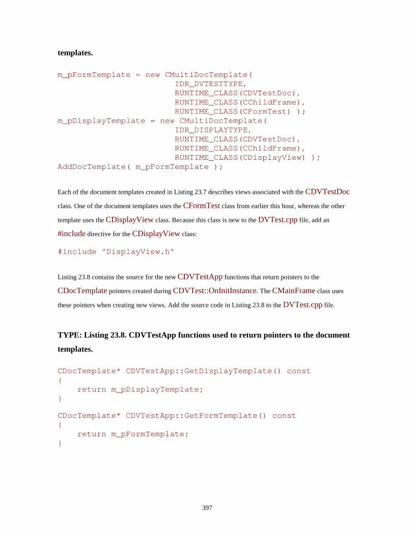
397
templates.
m_pFormTemplate = new CMultiDocTemplate( IDR_DVTESTTYPE, RUNTIME_CLASS(CDVTestDoc), RUNTIME_CLASS(CChildFrame), RUNTIME_CLASS(CFormTest) );
m_pDisplayTemplate = new CMultiDocTemplate( IDR_DISPLAYTYPE, RUNTIME_CLASS(CDVTestDoc), RUNTIME_CLASS(CChildFrame), RUNTIME_CLASS(CDisplayView) );
AddDocTemplate( m_pFormTemplate ); Each of the document templates created in Listing 23.7 describes views associated with the CDVTestDoc
class. One of the document templates uses the CFormTest class from earlier this hour, whereas the other
template uses the CDisplayView class. Because this class is new to the DVTest.cpp file, add an
#include directive for the CDisplayView class:
#include "DisplayView.h"
Listing 23.8 contains the source for the new CDVTestApp functions that return pointers to the
CDocTemplate pointers created during CDVTest::OnInitInstance. The CMainFrame class uses
these pointers when creating new views. Add the source code in Listing 23.8 to the DVTest.cpp file.
TYPE: Listing 23.8. CDVTestApp functions used to return pointers to the document
templates.
CDocTemplate* CDVTestApp::GetDisplayTemplate() const {
return m_pDisplayTemplate; } CDocTemplate* CDVTestApp::GetFormTemplate() const {
return m_pFormTemplate; }

398
Adding Shared Resources
One of the parameters used when creating a document template is the shared-resource identifier. This
resource ID is used to identify several different resources used by the view:
• A resource string; specifying the file type, file extension, and document name for the document
template
• An icon for the view
• A menu used when the view is active
Each of these resources must be created for a new view. Although sharing an existing resource ID is possible,
providing at least a customized icon for the new view is a much better practice. The name of the current
shared resource ID is IDR_DVTESTTYPE; for the new view, you will create a shared resource ID named
IDR_DISPLAYTYPE.
Creating a Menu for the New View
Click the IDR_DVTESTTYPE menu item, and use Copy and Paste to create a new menu item. Rename
the new item as IDR_DISPLAYTYPE; you can open the property page by right-clicking the icon and
selecting Properties from the pop-up menu.
Creating an Icon for the New View
Create an IDR_DISPLAYTYPE icon by opening the Icon folder on the resource tree. Create a copy of
the existing IDR_DVTESTTYPE icon by using the Edit menu to copy and paste the icon, or by pressing
Ctrl+C, then Ctrl+V.
Using a Resource String
The resource string for each document template is stored in a String Table resource. Go to the ResourceView
window and click the String Table icon. In the DVTest project, the resource string for the current document
template is stored under the name IDR_DVTESTTYPE. You can add a new string to the String Table by
pressing the Insert key on the keyboard. Create a new string resource named IDR_DISPLAYTYPE with
the following string value:
\nDVTest\n\n\n\nDVTest.Document\nDVTest Document

399
The contents of the resource string are split into seven sections, and each section is separated by \n. Each of
the seven sections has a particular purpose, as shown in Table 23.8.
Table 23.8. Values for subsections of resource strings used in DVTest.
Section IDR_DVTEST IDR_DISPLAYTYPETitle Document Name DVTest DVTest New File Name DVTest Filter Name Filter Extension Type ID DVTest.Document DVTest.Document Type Name DVTest Document DVTest Document
The new resource string is almost the same as the original string. The only difference is that there is no entry
for the section marked New File Name. This is a clue to the MFC framework that this document template is
not used to create new documents; instead, it is used only to open a new view on an existing document. You
don't have to worry too much about the purpose of each segment. The MFC framework uses these segments
when registering your application with Windows, and when opening new views and documents.
Adding Menu Items for New Views
You add new views by selecting a menu item from the Window menu. Add the menu items using the
Developer Studio resource editor, as you learned in Hour 10, "Menus." Use the values from Table 23.9 to add
the menu items to the IDR_DISPLAYTYPE and IDR_DVTESTTYPE menus, and to add message-
handling functions to the CMainFrame class.
Table 23.9. New member functions for the CMainFrame class.
Menu ID Caption Event Function Name ID_WINDOW_DISPLAY &Display View COMMAND OnWindowDisplayID_WINDOW_FORM &Form View COMMAND OnWindowForm
CAUTION: You must add the new menu items to both the IDR_DISPLAYTYPE and IDR_DVTESTTYPE menus. If you don't, you won't be able to access the new menu items when either view is active.

400
Listing 23.9 provides the source code for the message-handling functions.
TYPE: Listing 23.9. CMainFrame member functions used to create new views.
void CMainFrame::OnWindowForm() {
CMDIChildWnd* pActiveChild = MDIGetActive(); if( pActiveChild != 0 ) {
CDocument* pDocument = pActiveChild->GetActiveDocument();
if( pDocument != 0 ) {
CDVTestApp* pApp = (CDVTestApp*)AfxGetApp(); CDocTemplate* pTemp; CFrameWnd* pFrame; pTemp = pApp->GetFormTemplate(); pFrame = pTemp-
>CreateNewFrame(pDocument,pActiveChild); if( pFrame != 0 ) {
pTemp->InitialUpdateFrame(pFrame, pDocument); }
} }
} void CMainFrame::OnWindowDisplay() {
CMDIChildWnd* pActiveChild = MDIGetActive(); if( pActiveChild != 0 ) {
CDocument* pDocument = pActiveChild->GetActiveDocument();
if( pDocument != 0 ) {
CDVTestApp* pApp = (CDVTestApp*)AfxGetApp(); CDocTemplate* pTemp; CFrameWnd* pFrame; pTemp = pApp->GetDisplayTemplate(); pFrame = pTemp-
>CreateNewFrame(pDocument,pActiveChild); if( pFrame != 0 ) {
pTemp->InitialUpdateFrame(pFrame, pDocument); }

401
} }
}
These functions are nearly identical: the only difference between them is the call to either
GetDisplayTemplate or GetFormTemplate. The functions provided in Listing 23.9 follow these steps
when creating a new view:
1. Get a pointer to the active child window. 2. Get a pointer to the active document. 3. Get a pointer to the application. 4. Using the application pointer, get the document template for the new view. 5. Using the document template, create a new frame associated with the active frame from step 1 and the document pointer from step 2. 6. Update the frame.
These basic steps can be followed no matter what classes are involved or how many views and documents are
being managed by the application.
Updating Multiple Views
One of the most important issues when a document has more than one view is ensuring that each view is
accurate. If one view changes data loaded in the document, all views must be notified about the change;
otherwise, they will present out-of-date information. The mechanism used by Document/View applications to
keep documents and views synchronized is shown in Figure 23.6.
Figure 23.6. The document class controls the updating of all views.
Every document should provide updates to its associated views by calling the UpdateAllViews function
when data contained by the document has been changed. To update all views associated with a document, you
can use a line like this:
UpdateAllViews( NULL ); The default implementation of UpdateAllViews notifies every view that the document has been changed
by calling each view object's OnUpdate member function. The NULL parameter causes all views to be

402
updated. If a view pointer is passed as a parameter, that view is not updated. Listing 23.10 provides the new
source code for the CDVTestDoc::AddName function.
TYPE: Listing 23.10. A new version of CDVTestDoc::AddName that causes views to
be updated.
int CDVTestDoc::AddName( const CString& szName ) {
TRACE("CDVTestDoc::AddName, string = %s\n",(LPCSTR)szName);
int nPosition = m_arNames.Add( szName ); UpdateAllViews( NULL ); return nPosition;
}
Adding the OnInitialUpdate and OnUpdate Member Functions
The OnInitialUpdate and OnUpdate member functions for CDisplayView invalidate the view area,
causing the view to be repainted. When Windows sends a WM_PAINT message to the view, the OnDraw
member function is called, redrawing the view with the new contents. Edit the OnInitialUpdate and
OnUpdate functions as shown in Listing 23.11.
TYPE: Listing 23.11. Source code the CDisplayView update functions.
void CDisplayView::OnInitialUpdate() {
CView::OnInitialUpdate(); InvalidateRect( NULL );
} void CDisplayView::OnUpdate(CView* pSender, LPARAM lHint,
CObject* pHint) {
InvalidateRect( NULL ); }
All view classes should provide OnUpdate member functions that are called by the MFC framework after
the document class calls UpdateAllViews. Note that the entire view is redrawn whenever the document
has been updated.

403
The current view, CFormTest, must also support OnUpdate. Add the OnUpdate function to the
CFormTest class using ClassWizard. Listing 23.12 provides the source code for
CFormTest::OnUpdate.
TYPE: Listing 23.12. Source code for the CFormTest::OnUpdate function.
void CFormTest::OnUpdate(CView* pSender, LPARAM lHint, CObject* pHint)
{ CDVTestDoc* pDoc = (CDVTestDoc*)GetDocument(); ASSERT_VALID(pDoc);
m_lbNames.ResetContent(); for( int nIndex = 0; nIndex < pDoc->GetCount(); nIndex++
) {
CString szName = pDoc->GetName( nIndex ); m_lbNames.AddString( szName );
} }
Now that you have implemented OnUpdate, change the OnInitialUpdate member function so that it
performs only work that must be done when the view is initially displayed. Remove source code from
CFormTest::OnInitialUpdate so it looks like the function provided in Listing 23.13.
TYPE: Listing 23.13. CFormTest::OnInitialUpdate after removing unnecessary code.
void CFormTest::OnInitialUpdate() {
CFormView::OnInitialUpdate(); ResizeParentToFit( FALSE ); ResizeParentToFit();
}
Because OnUpdate handles the insertion of new items into the list box, you should change the OnApply
member function so that it does not add strings to the list box. Edit the OnApply member function so it
looks like the code in Listing 23.14.

404
TYPE: Listing 23.14. CFormTest::OnApply after removing list box AddString code.
void CFormTest::OnApply() {
CDVTestDoc* pDoc = (CDVTestDoc*)GetDocument(); ASSERT_VALID(pDoc);
CString szName; m_edNames.GetWindowText( szName ); m_edNames.SetWindowText( "" ); m_edNames.SetFocus(); if( szName.GetLength() > 0 ) {
pDoc->AddName( szName ); }
}
Compile and run the DVTest project. Figure 23.7 shows DVTest with new names added to the document, and
multiple open views.
Figure 23.7. DVTest after adding the display view.
Summary
In this hour you learned about using form views in place of standard views or dialog boxes. Form views
enable you to easily use controls in a view, just as they are used in dialog boxes. You also learned about
associating multiple views with a document class. The DVTest program from Hour 9 was modified to take
advantage of form views and multiple views.
Q&A
Q I have a view that must populate the menu with different menu items than other views. How should I handle the different menu choices? A There is no requirement that all view menus have the same items; each view menu can be customized to suit the needs of each view. You should give each menu item a unique identifier--two menu items that perform different tasks should have different identifiers, even if they have the same names.
405
Q Why is it useful to pass a CView pointer as a parameter in UpdateAllViews and prevent that view from receiving an OnUpdate notification? A Often, a view that causes a document to be updated can efficiently update its own view. In this case, there is no need for that particular view to be updated.
Workshop
The Workshop is designed to help you anticipate possible questions, review what you've learned, and begin
thinking ahead to putting your knowledge into practice. The answers to the quiz are in Appendix B, "Quiz
Answers."
Quiz
1. What are some differences between a form view and a dialog box? 2. What are the special requirements for dialog box resources used in a form view? 3. How do you size the frame of a form view so that it is the same size as its dialog box resource? 4. What is the difference between OnInitialUpdate and OnUpdate? 5. How do you prevent an MDI child window from being resized? 6. What function is called by a document class to notify views that the document has been changed? 7. What resources are identified through a shared resource identifier? 8. What view class enables you to use an edit control as a view? 9. What view class enables your view to have a large virtual area that is seen through a smaller scrolling viewport? 10. What class is used in an MDI application to associate a view class and a document class?
Exercises
1. Because the CChildFrame class was modified to prevent resizing, the instances of the CDisplayView class cannot be resized. Modify DVTest so that display views can be resized and form views cannot be resized.

406
2. Modify the form view in DVTest so that it displays the number of items stored in the document.

407
- Hour 24 - Creating ActiveX Controls
As discussed in Hour 20, "Using ActiveX Controls," ActiveX controls are components that
can be used to easily add new functionality to your application. In this hour, you will learn
about
• Some of the internal plumbing that is required for an ActiveX control
• The support provided by MFC for ActiveX control development
• How to test ActiveX controls using tools supplied with Visual C++
To help demonstrate these topics, you also will create and test an ActiveX control that you can use in your
own projects.
What Is an ActiveX Control?
New Term: The Component Object Model, or COM, is a specification that defines how software components
should cooperate with each other. ActiveX technologies are all built on top of the COM specification.
New Term: In COM, an interface is a group of related functions that are implemented together. All interfaces
are named beginning with I, such as IDataObject.
At a minimum, an ActiveX control must be a COM object. This means that an ActiveX control must support
IUnknown, the interface supported by all COM objects. This allows for a great deal of latitude when
deciding how a control is to be implemented; previously, the OLE custom control architecture required
support of at least 14 interfaces.
Just a Minute: Support for the IUnknown interface is provided automatically when you use MFC and ControlWizard to build your control.
Reducing the number of required interfaces allows ActiveX controls to be much smaller than the older OLE
controls. It also makes it feasible to use ActiveX controls to implement functionality where the size of the
control is an important factor. Web pages can be more intelligent when a control is downloaded and activated
to your browser. For example, Microsoft's Internet Explorer has support for downloading ActiveX controls
408
from a Web page. Although this opens a lot of exciting functionality, the size of the control to be downloaded
must be kept as small as possible.
ActiveX Control Properties, Events, and Methods
Interaction with an ActiveX component takes place via properties, events, and methods.
• A property is an attribute associated with the control.
• An event is a notification message passed to the container by the control.
• A method is an exposed function that can be applied to the control via IDispatch.
You'll learn about each of these interaction methods in the next few sections.
Properties
Properties are exposed by ActiveX controls, as well as by the client where the control is located. There are
four basic types of properties:
• Ambient properties are provided to the control by the container. The control uses these properties in
order to "fit in" properly. Commonly used ambient properties include the container's background
color, default font, and foreground color.
• Extended properties are implemented by the container but appear to be generated by the control. For
example, the tab order of various controls in a container is an extended property.
• Stock properties are control properties implemented by the ActiveX control development kit.
Examples of stock properties are the control font, the caption text, and the foreground and background
colors.
• Custom properties are control properties that you implement.
Events
An event is used to send a notification message to the control's container. Typically, events are used to notify
the container when mouse clicks or other events take place. There are two basic types of events:
• Stock events are implemented by the ActiveX control development kit and are invoked just like a
function call, such as FireError.
• Custom events are implemented by you, although the MFC class library and ClassWizard handle
much of the work for you.
409
Methods
New Term: OLE Automation, now often referred to as just Automation, is a way of enabling a COM object to
be controlled by another party. Automation is provided through the IDispatch interface.
Automation was originally developed so that interpreted languages such as Visual Basic could control COM
objects. Now most ActiveX controls use Automation to allow all sorts of programs--even those built using
scripting languages such as JScript and VBScript--access to the methods of ActiveX controls.
An ActiveX Control Example
New Term: Subclassing is a method of borrowing functionality from an existing window or control. By
subclassing an existing window or control, you can concentrate on adding only the new features offered by
your control. The control from which the functionality is borrowed is known as the superclass.
As an example of creating an ActiveX control, you will now create an ActiveX control named OleEdit that
subclasses the existing Windows edit control. The OleEdit control is similar to the basic Windows edit
control, except that it exposes properties that allow it to accept only numbers, letters, or a combination of
both.
The control works by performing extra processing when the WM_CHAR message is received by the
control. Windows sends WM_CHAR to notify the edit control that the user has pressed a key on the
keyboard. Ordinarily, the edit control would simply add the new character to the edit control. When the
WM_CHAR message is received by the OleEdit control, it is processed as shown in Figure 24.1.
Figure 24.1. Handling WM_CHAR in OleEdit.
The property flags m_fTextAllowed and m_fNumbersAllowed are exposed as properties that can be
changed by the OleEdit control's container.
Creating the Project
To begin creating the OleEdit control, use the ControlWizard. Using ControlWizard to build a control is very
much like using AppWizard to build applications. To start ControlWizard and create the OleEdit control,
follow these steps:
1. Select New from the File menu. The New dialog box is displayed.
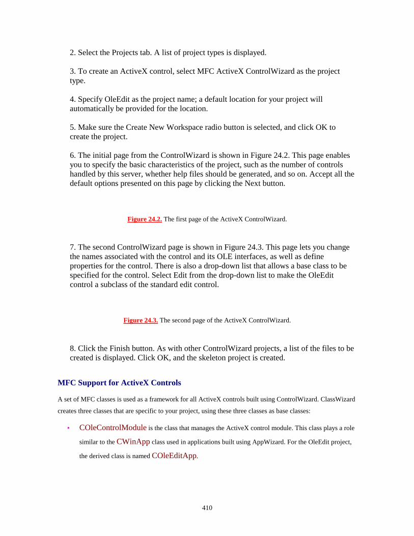
410
2. Select the Projects tab. A list of project types is displayed. 3. To create an ActiveX control, select MFC ActiveX ControlWizard as the project type. 4. Specify OleEdit as the project name; a default location for your project will automatically be provided for the location. 5. Make sure the Create New Workspace radio button is selected, and click OK to create the project. 6. The initial page from the ControlWizard is shown in Figure 24.2. This page enables you to specify the basic characteristics of the project, such as the number of controls handled by this server, whether help files should be generated, and so on. Accept all the default options presented on this page by clicking the Next button.
Figure 24.2. The first page of the ActiveX ControlWizard.
7. The second ControlWizard page is shown in Figure 24.3. This page lets you change the names associated with the control and its OLE interfaces, as well as define properties for the control. There is also a drop-down list that allows a base class to be specified for the control. Select Edit from the drop-down list to make the OleEdit control a subclass of the standard edit control.
Figure 24.3. The second page of the ActiveX ControlWizard.
8. Click the Finish button. As with other ControlWizard projects, a list of the files to be created is displayed. Click OK, and the skeleton project is created.
MFC Support for ActiveX Controls
A set of MFC classes is used as a framework for all ActiveX controls built using ControlWizard. ClassWizard
creates three classes that are specific to your project, using these three classes as base classes:
• COleControlModule is the class that manages the ActiveX control module. This class plays a role
similar to the CWinApp class used in applications built using AppWizard. For the OleEdit project,
the derived class is named COleEditApp.

411
• COleControl is the base class that represents the actual control window. This class is derived from
CWnd and includes extra ActiveX functionality for communicating with containers. For the OleEdit
project, the derived class is named CTestCtrl.
• COlePropertyPage is the base class used to manage the property page for the control. For the
OleEdit project, the derived class is named CTestPropPage.
Drawing the Control
All visible OLE controls must be capable of drawing themselves. Even controls that aren't visible when active
should draw something as an aid during program development. The OleEdit control is visible at runtime, and
it should appear to be a standard edit control.
CAUTION: You might think that because OleEdit is subclassed from the standard edit control, it can draw itself. Unfortunately, very few controls actually draw themselves properly; the edit control is not one that handles drawing properly. For most controls, you must be prepared to handle the drawing yourself.
When an ActiveX control project is initially created, the control's OnDraw function draws an ellipse inside
the bounding rectangle. This is extremely useful if you happen to be creating an ellipse control. However,
because OleEdit must look like an edit control, you must change the OnDraw function. The changes to
OnDraw required for the OleEdit control are provided in Listing 24.1.
TYPE: Listing 24.1. The OnDraw function used by COleEditCtrl.
void COleEditCtrl::OnDraw( CDC* pdc, const CRect& rcBounds, const CRect& rcInvalid)
{ COLORREF clrBackground = TranslateColor(GetBackColor()); CBrush* pOldBrush; CBrush brBackground( clrBackground ); pdc->FillRect( rcBounds, &brBackground ); pOldBrush = pdc->SelectObject( &brBackground ); pdc->SelectObject( pOldBrush ); DoSuperclassPaint(pdc, rcBounds); CRect rc(rcBounds); pdc->DrawEdge( rc, EDGE_SUNKEN, BF_RECT );
}

412
The code provided in Listing 24.1 does three things. First, it fills the control's bounding rectangle with the
ambient background color. Next, it calls DoSuperclassPaint to give the edit control a chance to attempt to
draw itself properly. Finally, it draws a three-dimensional edge along the control's bounding rectangle.
Defining Properties for OleEdit
OleEdit uses four properties: the Font and Text stock properties and the fTextAllowed and
fNumbersAllowed custom properties. Using ClassWizard, add the stock properties for the OleEdit control.
Select the Automation tab, and click the Add Property button. Fill in the dialog box using the values provided
in Table 24.1.
Table 24.1. Stock properties for the OleEdit control.
External Name ImplementationFont Stock
Text Stock
Use ClassWizard to add a custom property name fNumbersAllowed to the OleEdit project. Click the Add
Property button and use the values provided in Table 24.2.
Table 24.2. The fNumbersAllowed custom property for the OleEdit control.
Control Value External name fNumbersAllowed Type BOOL Member variable name m_fNumbersAllowed Notification function OnFNumbersAllowedChangedImplementation Member variable
Use ClassWizard to add the fTextAllowed property, following the steps used to add the previous
properties. Use the values provided in Table 24.3.
Table 24.3. The fTextAllowed custom property for the OleEdit control.
Control Value

413
External name fTextAllowed Type BOOL Variable name m_fTextAllowed Notification function OnFTextAllowedChangedImplementation Member variable
Modify the COleEditCtrl class constructor to contain code that initializes the custom properties added in
the previous steps. The modified constructor is shown in Listing 24.2.
TYPE: Listing 24.2. Modifications to the COleEditCtrl constructor.
ColeEditCtrl::COleEditCtrl() {
InitializeIIDs(&IID_DOleEdit, &IID_DOleEditEvents); m_fTextAllowed = TRUE; m_fNumbersAllowed = TRUE;
}
Every control created using ControlWizard includes a default property page. The OleEdit property page is
modified by adding two check boxes that control the states of the m_fTextAllowed and
m_fNumbersAllowed flags. Open the IDD_PROPPAGE_OLEEDIT dialog box resource and add
two check box controls, as shown in Figure 24.4.
Figure 24.4. The property page used in OleEdit.
Table 24.4 lists the properties for the check box controls. All properties that aren't listed should be set to the
default values.
Table 24.4. Property values for check box controls in the OleEdit property page.
Control Resource ID Caption Numbers check box IDC_CHECK_NUMBERS &Numbers Allowed Text check box IDC_CHECK_TEXT &Text Allowed
Use ClassWizard to associate COleEditPropPage member variables with the controls, using the values
shown in Table 24.5.

414
Table 24.5. Values for new member variables in COleEditPropPage.
Control ID Variable Name Category Type Property Name IDC_CHECK_NUMBERS m_fNumbersAllowed Value BOOL fNumbersAllowedIDC_CHECK_TEXT m_fTextAllowed Value BOOL fTextAllowed
ClassWizard uses the optional Property Name field to generate source code that exchanges the values from
the property sheet to the control class. The DDP and DDX macros are used to transfer and validate property
page data. The code used to transfer the value of the IDC_CHECK_TEXT control looks like this:
//{{AFX_DATA_MAP(COleEditPropPage) DDP_Check(pDX, IDC_CHECK_TEXT, m_fTextAllowed,_T("fTextAllowed")); DDX_Check(pDX, IDC_CHECK_TEXT, m_fTextAllowed; //}}AFX_DATA_MAP DDP_PostProcessing(pDX);
Inside the control class, you must collect the values from the property page during DoPropExchange, as
shown in Listing 24.3.
TYPE: Listing 24.3. Collecting property page data during DoPropExchange.
void COleEditCtrl::DoPropExchange(CPropExchange* pPX) {
ExchangeVersion(pPX, MAKELONG(_wVerMinor, _wVerMajor)); COleControl::DoPropExchange(pPX);
PX_Bool(pPX, _T("fNumbersAllowed"), m_fNumbersAllowed ); PX_Bool(pPX, _T("fTextAllowed"), m_fTextAllowed );
}
The OleEdit control supports the stock font property. An easy way to give the control access to all the
available fonts is to add the standard font property page to the control. The property pages associated with an
ActiveX control are grouped together between the BEGIN_PROPPAGEIDS and
END_PROPPAGEIDS macros in the control class implementation file.
Listing 24.4 shows how the standard font property page is added to the control using the PROPPAGEID
macro. Remember to change the second parameter passed to the BEGIN_PROPPAGEIDS macro, the
number of property pages used by the control object. Locate the existing BEGIN_PROPPAGEIDS

415
macro in the OleEditCtl.cpp file, and change that section of the file so that it looks like the code in Listing
24.4.
TYPE: Listing 24.4. Adding the standard font property page to OleEdit.
BEGIN_PROPPAGEIDS(COleEditCtrl, 2) // changed PROPPAGEID(COleEditPropPage::guid) PROPPAGEID(CLSID_CFontPropPage) // changed
END_PROPPAGEIDS(COleEditCtrl)
As you will see when you test the control later in the hour, adding the font property page, along with exposing
the stock font property, enables a user to easily change the control font. The only code that is written to allow
the user to change the control's font is in Listing 24.4.
Handling Character Input
As discussed earlier, OleEdit uses exposed properties to determine whether characters entered on the
keyboard are stored in the edit control. If an invalid character is input, an Error event is fired to the control's
container. The message sent to the control as characters are input to the control is WM_CHAR. Using
ClassWizard, add a message-handling function to the COleEditCtrl class, using the values from Table 24.6.
Table 24.6. Handling the WM_CHAR message in COleEditCtrl.
Class Name Object ID Message Function COleEditCtrl COleEditCtrl WM_CHAR OnChar
The source code for the COleEditCtrl::OnChar function is provided in Listing 24.5.
TYPE: Listing 24.5. Handling the WM_CHAR message in COleEditCtrl::OnChar.
void COleEditCtrl::OnChar(UINT nChar, UINT nRepCnt, UINTnFlags) {
if(_istdigit(nChar) ) {
if( m_fNumbersAllowed == FALSE ) {

416
FireError( CTL_E_INVALIDPROPERTYVALUE, _T("Numbers not allowed") );
} else {
COleControl::OnChar(nChar, nRepCnt, nFlags); }
} else if( _istalpha(nChar) ) {
if( m_fTextAllowed == FALSE ) {
FireError( CTL_E_INVALIDPROPERTYVALUE, _T("Characters not allowed") );
} else {
COleControl::OnChar(nChar, nRepCnt, nFlags); }
} else
COleControl::OnChar (nChar, nRepCnt, nFlags); }
The OnChar handler tests for valid characters based on the property flags m_fTextAllowed and
m_fNumbersAllowed. Valid characters are passed to COleControl::OnChar, the base class handler
for WM_CHAR. If an invalid character is detected, an Error event is fired to the control's container.
Modifying the Control's Bitmap
When an ActiveX control is used in a tool such as Developer Studio, Visual Basic, or the ActiveX control test
container, a bitmap associated with the control is displayed to the user. In Developer Studio, the bitmap is
added to the control palette used to design dialog box resources. In the test container, a toolbar button
displaying the bitmap is added to the container's toolbar.
Open the IDB_OLEEDIT bitmap resource and edit the bitmap image as shown in Figure 24.5. Save the
bitmap and compile the OleEdit project.
Figure 24.5. The IDB_OLEEDIT bitmap resource.
417
Time Saver: To ensure that the text fits properly in the bitmap, use a regular (non-bold) 8-point Arial font.
Build the OleEdit project. As part of the build process, the control will be registered with the operating
system. In the next section, you will learn how to test your control.
Testing an ActiveX Control
After following the steps in the previous sections, you are in possession of an OleEdit ActiveX control.
However, because the control is a component rather than an executable program, it can't be run as an EXE.
Testing an ActiveX control requires a few extra steps, which are discussed in this section.
Choosing a Test Container for Your Control
Every ActiveX control requires a control container. The simplest control container is the ActiveX control test
container included with Developer Studio and the Win32 SDK. Other ActiveX control containers include
Microsoft Access and Visual Basic 5.0. In this section, you will test the OleEdit control with
TSTCON32.EXE, the test container included with Developer Studio.
Using the TSTCON32 Test Container
In order to launch the OleEdit control in the Developer Studio debugger, you must specify the application to
be used to load the control. You can do this by following these steps:
1. Select Settings from the Project menu in Developer Studio. The Project Setting dialog box is displayed. 2. Click the Debug tab. 3. A small button with a right-arrow icon is located next to the Executable for Debug Session edit control. Click this button and choose ActiveX Control Test Container from the menu that is displayed. 4. Click OK to dismiss the dialog box and save your changes.
After you have made these changes, you can use the Developer Studio debugger to launch the test container.
Click the Go icon in the toolbar or otherwise start a debug session to display the test container, as shown in
Figure 24.6.

418
Just a Minute: You can also launch the ActiveX control test container by selecting its menu item from the Tools menu. This doesn't start your control inside the Visual C++ debugger.
Figure 24.6. The ActiveX control test container.
When an ActiveX control created by ControlWizard is compiled, the control is automatically registered. To
display a list of all registered controls, select Insert OLE Control... from the Edit menu. A dialog box
containing all available ActiveX controls is displayed. Select the OleEdit edit control, and click OK. The
OleEdit control is inserted into the test container, as shown in Figure 24.7. Note that an OleEdit icon is also
added to the test container toolbar.
Figure 24.7. The ActiveX control test container and OleEdit control.
Testing Properties
You can use the test container to test your control's properties in two ways:
Through an Automation interface that lists all exposed properties
Through your control's property sheet
To access all the properties implemented by an ActiveX control, select Properties from the View menu. A
Properties dialog box is displayed, as shown in Figure 24.8.
Figure 24.8. Accessing the properties exposed by OleEdit.
To display the list of properties exposed by the control, click the drop-down list. Every property can be
accessed and changed through the control's property sheet. To change a particular property's value, select the
property name from the drop-down list, set the property value, and click Apply.
A slightly easier way to use the interface is provided through the control's property sheet. You can use the test
container to invoke the control's property sheet by selecting Properties from the Edit menu. The property
sheet for OleEdit is shown in Figure 24.9.
419
Figure 24.9. The property sheet used by OleEdit.
Summary
In this hour you learned how to create and test ActiveX controls. ActiveX controls are smaller and simpler
versions of OLE custom controls. Developer Studio helps to simplify the task of creating an ActiveX control.
ControlWizard is very similar to AppWizard and guides you through the steps required to create a skeleton
version of your control.
Q&A
Q If I test my ActiveX control in the test container, is it reasonable to assume that it will work in all control containers? A You might think so, but in reality you should test your control in as many containers as you can find. The test container is very useful for performing basic tests on your control. You should also test your control in whatever environment it will be used. For example, if your control will be used in Visual Basic programs, you should test your control using VB as a container. Q Why does ControlWizard offer the Invisible at Runtime option? What use is an invisible control? A There actually are a large number of controls that don't have a need for a user interface. For example, an ActiveX control that performs protocol conversion for data communications might never be presented to the user; it can just perform work for its container. By offering this option, the control is easier to develop because the control doesn't need to handle user-interface issues. The control is also easier to use because it will hide itself automatically.
Workshop
The Workshop is designed to help you anticipate possible questions, review what you've learned, and begin
thinking ahead to putting your knowledge into practice. The answers to the quiz are in Appendix B, "Quiz
Answers."
Quiz
1. What is an ActiveX interface?

420
2. What interface must be supported by an ActiveX control? 3. What are some examples of ActiveX control containers? 4. What four types of properties are supported by an ActiveX control? 5. What are the two types of events generated by ActiveX controls? 6. What macros are used to transfer data to and from property pages in an ActiveX control? 7. What MFC base classes provide support for ActiveX controls? 8. What type of properties are supplied to the ActiveX control by its container? 9. What is subclassing? 10. What function is called by an ActiveX control to request that the subclassed control repaint itself?
Exercises
1. Change the OleEdit project so that hexadecimal numbers can be entered when the Numbers Only flag is set. 2. Change the OleEdit project so that only letters, numbers, and backspaces can be entered into the control.

421
- Appendix A - The Developer Studio IDE
This appendix covers some basic information about the Developer Studio Integrated Development
Environment.
What Is the Developer Studio Editor?
Developer Studio includes a sophisticated editor as one of its tools. The editor is integrated with the other
parts of Developer Studio; files are edited in a Developer Studio child window. You use the Developer Studio
editor to edit C++ source files that will be compiled into Windows programs. The editor supplied with
Developer Studio is similar to a word processor, but instead of fancy text-formatting features, it has features
that help make writing source code easy.
Why Use the Developer Studio Editor?
You can use almost any editor to write C++ source code, but there are several reasons to consider using the
editor integrated with Developer Studio. The editor includes many features that are found in specialized
programming editors.
Automatic syntax highlighting colors keywords, comments, and other source code in different colors.
Automatic "smart" indenting helps line up your code into easy-to-read columns.
Emulation for keystrokes used by other editors helps if you are familiar with editors such as Brief and
Epsilon.
Integrated keyword help enables you to get help on any keyword, MFC class, or Windows function just by
pressing F1.
Drag-and-drop editing enables you to easily move text by dragging it with the mouse.
Integration with the compiler's error output helps you step through the list of errors reported by the compiler
and positions the cursor at every error. This enables you to make corrections easily without leaving Developer
Studio.
Using the Developer Studio Editor
The easiest way to learn about the Developer Studio editor is to edit a file and run through a few common
actions, such as creating a new source file, saving and loading files, and using a few keyboard commands.

422
Editing a New Source File
To edit a new source file, click the New Text File icon on the toolbar. The New Text File icon looks like a
blank piece of paper with a yellow highlight in one corner. You can also open a new source file using the
menu by following these steps:
1. Select New from the File menu. This displays the New dialog box, which enables you to create a new text file, project, or other type of file. 2. Select the Files tab. Several different types of files will be displayed. Select the C++ Source File icon in the list box. 3. Click OK to close the New dialog box and open the new file for editing.
Each of the preceding methods creates an empty source file ready for editing. Type the source code from
Listing A.1 into the new file.
TYPE: Listing A.1. A minimal C++ program.
// This is a comment int main() {
return 0; } The source code in Listing A.1 is a legal C++ program, although it doesn't actually do anything. As you
typed the source code into the editor, the colors for some of the words should have changed. This is called
syntax highlighting, and it's one of the features of Developer Studio's editor.
The first line in Listing A.1 begins with //, which is used to mark the beginning of a single-line comment in a
C++ program. By default, comments are colored green by the Developer Studio editor. In contrast, int and
return are colored blue to indicate that they are C++ keywords.
Another editor feature is called smart indenting. This feature automatically arranges your text as you type,
applying formatting rules to your text as each word or line is entered into the editor. For example, enter the
source code from Listing A.2 into the text editor. Press Return at the end of each line, but do not add spaces or
tabs. As each line is typed, the editor rearranges the text into a standard format for you.
TYPE: Listing A.2. A simple C++ class declaration.
class CFoo {
int nFoo; int nBar;
public:

423
CFoo(); }
The source code provided in this book follows the same formatting convention used by the Developer Studio
editor. Although some coding styles might be more compact, this style is very easy to read.
Saving a Source File
To save the contents of the editor, click the Save icon on the toolbar. The Save icon looks like a small floppy
disk. You can also press Ctrl+S or select Save from the File menu.
When updating an existing source file, you don't see a dialog box, and no further action is needed on your
part. The existing file is updated using the current contents of the editor. If you save a new file, you see the
Save As dialog box, and you must choose a location and filename for the new source file. Save the contents of
Listing A.2 in the C:\ directory using the name CFoo.cpp. After saving the file, close CFoo.cpp by
selecting Close from the File menu.
To save a file under a new name, select Save As from the File menu or press F12. Enter the new path and
filename using the Save As dialog box as described previously.
Opening an Existing Source File
To open an existing source file, click the Open icon on the toolbar. The Open icon looks like a folder that is
partially open. You can also press Ctrl+O or select Open from the File menu. Any of these methods brings up
the File Open dialog box.
To open the CFoo.cpp file for editing, pop up the File Open dialog box and navigate to the C:\ directory.
Select the CFoo.cpp file and click the button labeled Open. The CFoo.cpp file is loaded into the editor.
Using Editor Commands
As discussed in the first hour, a large set of editing commands is available from the keyboard. Although most
editor commands are also available from the menu or toolbar, the following commands are frequently used
from the keyboard:
Undo, which reverses the previous editor action, is performed by pressing Ctrl+Z on the keyboard. The
number of undo steps that can be performed is configurable in the Options dialog box.

424
Redo, which is used to reverse an undo, is performed by pressing Ctrl+Y.
LineCut, which removes or "cuts" the current line and places it on the Clipboard, is performed by pressing
Ctrl+L.
Cut removes any marked text from the editor and places it on the Clipboard. This command is performed by
pressing Ctrl+X.
Copy copies any marked text to the Clipboard but unlike the Cut command, doesn't remove the text from the
editor. If no text is marked, the current line is copied. This command is performed by pressing Ctrl+C.
Paste copies the Clipboard contents into the editor at the insertion point. This command is performed by
pressing Ctrl+V.
This is only a small list of the available keyboard commands. To see a complete list, select Keyboard from the
Help menu.
What Is InfoViewer?
InfoViewer is the online help system integrated into Developer Studio. Usually, the indexes used by the
InfoViewer are copied to your hard disk, and the actual database remains on the CD. This spares a great deal
of hard disk space. If you would like to speed up InfoViewer, run Visual C++ setup again and install
InfoViewer to the hard disk. Select a custom installation procedure and make sure you check the InfoViewer
box.
Why Use InfoViewer?
Because Visual C++ is not sold with a documentation set, InfoViewer is the only documentation that is
included with the product. Although the online documentation is also available from Microsoft in book form,
it costs you extra.
InfoViewer has several advantages over hard-copy documentation:
It is fully searchable. There's a saying, "You can't search dead wood," and it applies perfectly to the difference
between hard copy documentation and Developer Studio's InfoViewer. Suppose you're having a problem with
a list box control. In a few seconds, you can search the entire documentation set, including the MSDN library
if you have it, and immediately begin looking up relevant information.
You can add annotations. You can add Post-it notes to your hard-copy documentation too, but InfoViewer's
annotations are guaranteed to stick to the page.
You get context-sensitive help that brings up InfoViewer when you press the F1 key. When's the last time you
pressed F1 and had a book fall off the bookshelf and open to the correct page?

425
InfoViewer is completely integrated into Developer Studio. One of the tabs in the project workspace window
displays the InfoViewer table of contents. The current topic is displayed in a Developer Studio child window.
Last, but not least, you can always print out a hard copy when needed, and you don't even need a copying
machine.
Using InfoViewer
You interact with the InfoViewer help system in two windows:
The contents pane is displayed in the project workspace window.
The information topic is an MDI child window.
Getting Context-Sensitive Help
To get context-sensitive help from InfoViewer, press F1. You select a topic based on the current window and
cursor position, and you see the InfoViewer window containing context-sensitive help. If you press F1 while
editing a source file, help is provided for the word under the cursor. If there is more than one possible help
topic, you see a list of choices.
Open a new document for editing, as described earlier in this chapter, and enter the source code provided in
Listing A.3.
TYPE: Listing A.3. Testing InfoViewer's context-sensitive help.
int main() {
return 0; } Every word in this example has a help topic. To get context-sensitive help, move the cursor to any word in
Listing A.3 and press the F1 key. The help topic is displayed in a dockable window next to your source code.
To return the windows to their original sizes and hide the InfoViewer window, press Escape.
Searching for Help Using a Keyword
To search the InfoViewer keyword list, open the Search dialog box by selecting Search from the Help menu
or by right-clicking in the InfoViewer window. The Search dialog box enables you to select a help topic by
entering a keyword. The keyword list box scrolls as you make your entry, which is helpful when you're not
quite sure how to spell a keyword.

426
The Search dialog box also enables you to create a query in order to find a topic. You can use a query to
search the entire contents, a subset of the contents, or the results of the last query. The last option is useful
when you're narrowing the scope of a search. You can apply the query to the entire contents of InfoViewer or
to only the titles of each topic.
A query can be as simple as a single word, or it can be used to look for words that are adjacent or close to
each other. You can use the AND, OR, NEAR, and NOT operators to create queries. Operators aren't
required to be capitalized, although it helps to set off the operator from your search items. For example, to
find all the topics where the words dialog and tab are close to each other, use the following query:
dialog NEAR tab
To look for topics where the word main is found but exclude any topics that contain the word WinMain, use
the following query:
main NOT WinMain
Browsing Through the Contents Window
A third way to use InfoViewer is to browse through the contents pane in the project workspace window. The
contents pane displays the titles for every available topic, arranged in an easy-to-use tree view.
When the InfoViewer contents tree is completely collapsed, the contents pane displays the titles for the top
level of the available topics. The titles displayed at the top level are somewhat like the titles of a series of
books; the icon even looks like a book. When the book icon is closed, a plus sign appears next to the book
title, indicating that the book can be opened to display its contents. Click the plus sign to open the book icon
and expand the contents tree to display the contents of the open book. Topics are represented by icons that
look like a page of text. To display the selected topic, click the topic icon; the InfoViewer topic window
opens. Clicking the plus sign also changes the plus sign to a minus, which you can click to close the book.

427
- Appendix B - Quiz Answers
This appendix lists the answers to the quiz questions in the Workshop sections at the end of each hour.
Hour 1 Quiz
1. A library is a collection of reusable source code or compiled code that can be used in a program. The MFC class library and the standard C++ library are examples of commonly used libraries. 2. A project is built by using one of these steps:
Pressing F7 on the keyboard
Clicking the Build button on the toolbar
Selecting Build | Build from the main menu
3. A wizard is a tool similar to a dialog box that guides you through a series of steps. 4. AppWizard, ClassWizard, and ControlWizard 5. Press the F1 function key. 6. ClassView, FileView, ResourceView, and InfoView 7. OnDraw 8. The F7 function key 9. Ctrl+Z
10. Undo reverses an action; Redo reverses an Undo.
Hour 2 Quiz
1. The cout iostream object is used to display output to a console-mode window. The cin iostream object is used to collect input from the keyboard. 2. When including project-specific files that are located in the project directory, use quotes around the header filename, as in the following:
#include "myfile.h"
When including library files that are located in a standard location, use angle brackets around the filename, like this:
#include <myfile.h>
3. Character values are stored in variables that have the char type.

428
4. A C++ namespace provides a container for a set of names. This prevents identical names in two parts of your application from conflicting with each other. 5. To declare multiple variables on one line, separate the variable names with a comma, like this:
int nFoo, nBar, nBaz;
6. Type-safety refers to the capability of a C++ compiler to enforce rules that ensure that variables and functions are used as they are intended. This helps the compiler detect a large number of common errors. 7. The floating-point variable types are float, double, and long double. 8. The C++ assignment operator is the equals sign, =, as in nFoo = 5;. 9. Integer values are normally stored in variables that have the int type. To save space, smaller values may be stored in the char and short int types.
10. If you know that a value will not be negative, you can double the maximum value stored in the variable by declaring it as unsigned.
Hour 3 Quiz
1. Dialog boxes, menus, toolbars, and controls are all examples of windows. 2. A function is a group of computer instructions that are grouped together to perform a well-defined task. 3. The function's name, return value, parameter list, and function body. 4. Classes are exactly like structures, except that members of a class cannot be accessed from outside the class by default. 5. The constructor 6. The destructor 7. The non-client area contains the borders, menu, and caption area; the client area is the area that is left over. 8. 42 9. The * symbol is used for multiplication. 10. The / symbol is used for division.
Hour 4 Quiz
1. A modal dialog box prevents the user from interacting with the program until the dialog box is dismissed. A modeless dialog box does not prevent the user from interacting with the program.

429
2. WM_INITDIALOG 3. .h 4. .cpp 5. The warning icon, MB_ICONEXCLAMATION 6. The stop sign icon, MB_ICONSTOP 7. CDialog 8. DoModal 9. IDYES
10. IDNO
Hour 5 Quiz
1. A Cancel button is used to close the dialog box and discard any changes that have been made. A Close button is used to close the dialog box and keep any changes that have been made. 2. An OK button is used to close the dialog box and keep any changes that have been made. An Apply button keeps changes that have been made but does not close the dialog box; this button is often used when the Apply button is used to update the application that displays the dialog box. 3. CButton 4. Check boxes, radio buttons, pushbuttons, group boxes, and owner-drawn buttons. 5. Clear the Tab Stop property for the control. 6. Enable 7. ShowWindow 8. The default label is selected when no case labels match the switch expression. 9. The = operator is used for assignment. The == operator is used to test for equality. 10. SetWindowText
Hour 6 Quiz
1. CEdit

430
2. An MLE is a multiline edit control and accepts multiple lines of text as input. An SLE is a single-line edit control and accepts single lines of text as input. 3. A DDV routine is used to validate data input stored in a control. A DDX routine is used to transfer data to or from a control. 4. UpdateData 5. GetWindowText 6. SetWindowText 7. Password 8. Ctrl+V 9. Ctrl+C 10. Ctrl+X
Hour 7 Quiz
1. CListBox 2. LBN_DBLCLCK 3. AddString and InsertString 4. GetCount 5. GetCurSel 6. Single-selection, multiple-selection, and extended-selection 7. for, while, and do-while 8. CComboBox 9. InsertString 10. Simple, drop-down, and drop list
Hour 8 Quiz
1. The default window procedure is a special function supplied by Windows that handles messages that aren't handled by the application. 2. Messages are physical chunks of data and are easily prioritized. They are not processor or language dependent.
431
3. When the mouse cursor passes over a window, the window receives the WM_MOUSEMOVE and WM_NCMOUSEMOVE messages. 4. A message map is used to associate a message with a function used to process that message. 5. CObject is the base class for most MFC classes. 6. The Dump function is used to display debug information about the current state of an object. 7. The ASSERT macro is used to test an expression that is not needed when the program is compiled for release mode. The VERIFY macro is used to test an expression that is used when the program is compiled for release mode. When compiled for release mode, the ASSERT macro and the expression contained inside it will be removed; the VERIFY macro is also removed, but its contained expression is compiled. 8. WM_LBUTTONDOWN 9. The message map entries reserved for use by ClassWizard begin with //{{AFX_MSG_MAP and end with //}}AFX_MSG_MAP.
Hour 9 Quiz
1. The sizeof operator returns the number of bytes required to hold an object. 2. A pointer that points to one variable can be changed to point to another variable; references must be bound to a single variable for their lifetime. A reference to a class uses . to access a member, a pointer to a class uses the -> operator. 3. Passing a point to an object rather than the object itself is almost always more efficient. Passing a pointer parameter is a 32-bit variable; passing an object such as a class instance requires that a copy be made of the instance--and not only must the copy be made, it must be destroyed after the copy is no longer needed. 4. The new keyword is used to dynamically allocate memory. 5. The delete keyword is used to release memory allocated with new. 6. Classes derived from CView are responsible for the user interface. 7. The four classes are
Document classes derived from CDocument
View classes derived from CView
Frame classes derived from CFrameWnd
Application classes derived from CWinApp
8. The document class is responsible for an application's data.

432
9. The GetDocument function returns a pointer to the document associated with a view. 10. A document class uses UpdateAllViews to notify views associated with the document that their user interfaces might need to be updated.
Hour 10 Quiz
1. The CMenu class 2. The WM_CONTEXTMENU message 3. An ellipsis (...) after the menu item 4. A letter that is used to represent the menu item, such as x in Exit 5. A keyboard shortcut to a message-handling function
Hour 11 Quiz
1. An information context cannot be used for output. 2. SelectStockObject 3. Approximately 1440 4. A pen 5. A brush 6. Use the GetTextMetrics function. 7. RGB is used to create a COLORREF value. 8. CDC 9. If SelectObject returns NULL, the call failed.
10. MM_TEXT
Hour 12 Quiz
1. Width, color, and style 2. Cosmetic and geometric 3. CPen

433
4. BLACK_PEN, WHITE_PEN, and NULL_PEN 5. PS_SOLID, PS_DASH, PS_DOT, PS_DASHDOT, PS_DASHDOTDOT, PS_NULL, PS_INSIDEFRAME, and PS_ALTERNATE 6. PS_SOLID, PS_DASH, PS_DOT, PS_DASHDOT, PS_DASHDOTDOT, PS_NULL, and PS_INSIDEFRAME 7. Solid, hatch, pattern, and stock 8. BLACK_BRUSH, DKGRAY_BRUSH, GRAY_BRUSH, HOLLOW_BRUSH, LTGRAY_BRUSH, NULL_BRUSH, and WHITE_BRUSH 9. CBrush 10. Ellipse
Hour 13 Quiz
1. Serif fonts include Courier, Garamond, and Times Roman; sans-serif fonts include Arial, Tahoma, and MS Sans Serif. 2. ANSI_FIXED_FONT, ANSI_VAR_FONT, DEVICE_DEFAULT_FONT, DEFAULT_GUI_FONT, OEM_FIXED_FONT, and SYSTEM_FONT 3. The font escapement is the angle in tenths of a degree that a line of text forms with the bottom of the page. 4. A glyph is an individual character. 5. CFont 6. Decorative, Modern, Roman, Script, Swiss, and Dontcare 7. DEFAULT_PITCH, FIXED_PITCH, and VARIABLE_PITCH 8. SetFont
Hour 14 Quiz
1. SetIcon 2. The hotspot 3. ClipCursor 4. SetCapture 5. SetCursor

434
6. WM_SETCURSOR 7. 16x16 8. BeginWaitCursor
Hour 15 Quiz
1. CBitmap 2. CPalette 3. Memory DC 4. BitBlt 5. 256 6. 20 7. WM_QUERYNEWPALETTE and WM_PALETTECHANGED 8. WM_QUERYNEWPALETTE is sent to an application when it moves into the foreground. WM_PALETTECHANGED is sent to an application after the system palette has been updated.
Hour 16 Quiz
1. The Orientation property can be set to either horizontal (left-right) or vertical (up-down). 2. Auto-buddy 3. The CSpinButtonCtrl::SetRange member function is used to set the minimum and maximum limits for an up-down control. 4. The control tab order determines which control is paired with the up-down control. The up-down control must follow the buddy control in the tab order. 5. Tick marks 6. The CSliderCtrl::SetRange member function is used to set the minimum and maximum limits for an up-down control. 7. The CProgressCtrl::SetRange member function is used to set the minimum and maximum limits for an up-down control.
435
Hour 17 Quiz
1. Masked and unmasked. Masked image lists include a mask used to draw the image transparently. 2. If items are often added to the image list, the grow-by parameter reduces the number of costly internal resize operations performed by the image list. 3. A transparent image is an image that allows part of the background surface to be visible. 4. The color mask is used to determine the color in the bitmap that is treated as the transparent color. The image list uses this information to create a mask for the image. 5. ILD_TRANSPARENT 6. The ILD_BLENDxx styles are used to combine the image with the system highlight color. 7. You are always responsible for destroying the bitmap or icon used as a source for the image stored in the image list. The image list will keep a copy of the image internally.
8. An overlapped image is made up of two combined image list items.
Hour 18 Quiz
1. There are four list view styles: Icon, Small Icon, Report, and List. 2. Icon view uses a 32x32 icon. Small icon view uses a 16x16 icon. 3. LVN_BEGINLABELEDIT and LVN_ENDLABELEDIT 4. You will receive LVN_ENDLABELEDIT with the LV_ITEM pszText member set to NULL or the iItem member set to -1. 5. SetWindowLong 6. First, you must initialize the LV_COLUMN structure, then call CListCtrl's InsertColumn member function. 7. Call CListCtrl's SetItem text member function. 8. -1
Hour 19 Quiz
1. TVN_BEGINLABELEDIT and TVN_ENDLABELEDIT 2. TVN_BEGINDRAG is sent when the drag operation begins, WM_MOUSEMOVE is sent when the mouse is being moved, and WM_LBUTTONUP is sent when the user releases the primary mouse button.

436
3. The first image is displayed when the tree view item is in its normal state. The second image is displayed when the item is selected. 4. CTreeCtrl::DeleteAllItems() 5. The properties for any view can be changed in the PreCreateWindow function. 6. The TVS_HASLINES is equivalent to the Has lines property; TVS_LINESATROOT is the same as the Lines at root property, TVS_BUTTONS is the same as the Has buttons property, and the TVS_EDITLABELS style is equivalent to the Edit labels property. 7. Unlike the list view control, where items are referred to by an index, items in a tree view control are referred to through an HTREEITEM handle. 8. Images stored in a tree view control can be any size.
9. Use the TVI_FIRST symbol when calling CTreeCtrl::InsertItem:
m_tree.InsertItem( szLabel, 1, 1, hParent,TVI_FIRST );
Hour 20 Quiz
1. In the Components and Controls Gallery 2. Visual Fox Pro, Visual Basic, Access 95, and Delphi are just a few of the development tools that support ActiveX controls. 3. Examples of events fired from ActiveX controls include mouse clicks, pressed buttons, and expiring timers. 4. Examples of properties exposed by ActiveX controls are the font and background color used by a control. 5. A grid control, such as the Microsoft FlexGrid 6. False 7. In AppWizard step two, the ActiveX Controls check box must be selected. 8. A function that is exposed by the control and called by the control's container
9. False
Hour 21 Quiz
1. Call the GetDeviceCaps function and ask for RASTERCAPS information. Check the RC_BITBLT bit in the result. (See Listing 21.2.) 2. The five MFC view functions that are most commonly overridden for printing are
437
OnPreparePrinting
OnBeginPrinting
OnPrepareDC
OnPrint
OnEndPrinting
3. These functions are called once for each print job:
OnPreparePrinting
OnBeginPrinting
OnEndPrinting
These functions are called once for each printed page:
OnPrepareDC
OnPrint
4. CPrintInfo 5. OnBeginPrinting 6. About 1,440 7. Set the CPrintInfo::m_bContinue member variable to TRUE 8. The positive direction is up--the bottom of the page is usually a large negative number. 9. The positive direction is to the right.
10. OnEndPrinting
Hour 22 Quiz
1. Persistence is the capability of an object to remember its state between executions. 2. Serialization is the act of storing the state of an object for the purpose of loading it at another time. 3. Serialization is the act of storing the state of a persistent object to an archive; deserialization is the act of reading data from an archive and re-creating a persistent object.

438
4. CArchive 5. Serialize 6. SerializeElements
Hour 23 Quiz
1. A form view is always modeless, whereas a dialog box can be either modal or modeless. A form view fits into the Document/View architecture and receives view messages from the MFC framework; a dialog box does not. 2. A dialog box resource used in a form view must have the following attributes:
• Style: Child
• Border: None
• Visible: Unchecked
• Titlebar: Unchecked
3. You must call ResizeParentToFit twice during OnInitialUpdate:
ResizeParentToFit( FALSE ); ResizeParentToFit();
4. OnInitialUpdate is called when the form view is initially displayed and is a good place to perform one-time initializations for your form view. OnUpdate is called when the document wants to notify the view that the document has been updated; it's also called after OnInitialUpdate. 5. To prevent an MDI child window from being resized, you must change the style of the frame that contains the form window. By default, this is the CChildFrame class. Masking off the WS_THICKFRAME style bits during PreCreateWindow will create a frame window that cannot be resized. If you make this modification, you might also want to mask off the WS_MAXIMIZEBOX style bit; this will disable the Maximize button on the form view. 6. UpdateAllViews 7. A document template resource string, an icon used for the view, and the menu used for the view 8. CEditView 9. CScrollView
10. CMultiDocTemplate
439
Hour 24 Quiz
1. An ActiveX interface is a group of related functions that are grouped together. 2. IUnknown 3. The ActiveX Control Test Container, Visual Basic, Internet Explorer, Access, Word, Excel, PowerPoint, and many others. 4. Ambient, Extended, Stock, and Custom 5. Stock and Custom 6. DDP and DDX 7. COleCtrl, COleControlModule, and COlePropertyPage 8. Ambient properties 9. Subclassing is a method of borrowing functionality from another window or control. 10. DoSuperclassPaint