Hit the ground running - Top tips to immediately improve your user experience
63
Hit the ground running Top tips to immediately improve your user experience David Sommer Product Director and Co-Founder of Kudos @growkudos @DavidLSommer #UKSGforum15
-
Upload
kudos-innovations-ltd -
Category
Science
-
view
905 -
download
0
Transcript of Hit the ground running - Top tips to immediately improve your user experience

Hit the ground runningTop tips to immediately improve your user experience
David SommerProduct Director and Co-Founder of Kudos
@growkudos @DavidLSommer #UKSGforum15

Topics• A/B Testing• Single Call to Action• Avoiding Context Switching• Are you human?• Forms• Gradual Engagement• Consistency• Be friendly!• Analytics• How not to do it!• References
Try This

UX and UI
UX ≠ UIUser Experience (UX)
User Interface (UI)
User experience design (UXD or UED) is the process of enhancing customer satisfaction and loyalty by improving the usability, ease of use, and pleasure provided in the interaction between the customer and the product. It is about workflow, interaction, positive confirmation, reward and taking action. It is all about how the user FEELS.
User Interface – the graphical layer informed by the UX architecture, but based on branding/style guide and visual design principles. It is all about how the pages LOOK.
Adapted from http://blog.careerfoundry.com/the-difference-between-ux-and-ui-design-a-laymans-guide/ and http://www.quora.com/Whats-the-difference-between-UI-and-UX-design

A/B Testing

A/B Testing

A/B Testing
50% of users see version A
43% conversion
50% of users see version B
12% conversion

A/B TestingChange one variable at a time, e.g.:
• Headlines• Sub headlines• Paragraph Text• Call to Action text• Call to Action Button• Links• Images• Awards and badges• Email subject lines and body text

A/B Testing

A/B Testing

A/B Testing
Set up a simple A/B test, change text on a button use Google Analytics to run the experiment
Try This
SingleCall to Action

Single call to action

Single call to action

Single call to action

Single call to action
Review the key pages on your site. What is the main action you want users to take? Are you offering too many choices?
Try This

Avoid Context Switching

Avoid Context Switching

Avoid Context Switching

Avoid Context Switching

Avoid Context Switching

Dec-10 Jan-11 Feb-11 Mar-11 Apr-11 May-11 Jun-11
Monthly Percentage Growth Rate of Authors using the Kudos tools
Avoid Context Switching
Introduced new interface to avoid context switching

Avoid Context Switching

Avoid Context Switching
Identify where you are making your users switch context. Are there simple changes you can make to avoid context switching?
Try This

Are you human?
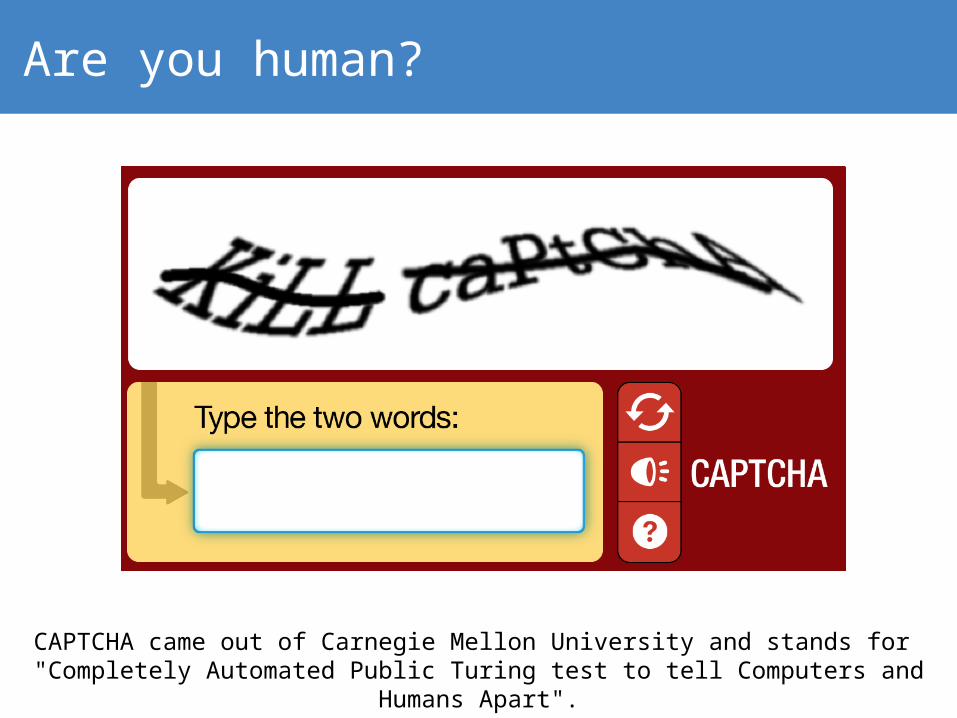
Are you human?
CAPTCHA came out of Carnegie Mellon University and stands for "Completely Automated Public Turing test to tell Computers and Humans Apart".

Are you human?

Are you human?
If you MUST use CAPTCHA, use the new simplified version. But, seriously, consider if you REALLY do need this!
Try This

Forms

Forms
First name:
Last name:
First name:
Last name:
First name: Last name:
Left aligned labels
Right aligned labels
Fields aligned with how a user thinks

Forms
First name:
Last name:
First name:
Last name:
First name: Last name:
Make it easy for your usersSee Luke Wroblewski’s work in this area

Forms
Password:
Retype password:
********
********
Password:
Retype password:
********
********
Provide continual positive
feedback

Forms
Password:
Please choose a password:
Type your chosen password here
What password would you like to use for Kudos?
Ask questions rather than making demands

Forms

Forms
Review the forms on your site. Can you simplify the layout? Are you provide reinforcing feedback? Can you ask questions? A/B test.
Try This

Gradual Engagement

Gradual Engagement

Gradual Engagement

Gradual Engagement
“Most users probably won’t do much on the site and will never come back so we might as well ask for a ridiculous amount of information when users register so at least we have some good data for the handful of people that do use the site!!”

Gradual Engagement

Gradual Engagement

Gradual Engagement
Ask for minimal (ideally no) data
up front.
Get them using the site.
Reduce risk for them
Let users play and see the
value of what you offer
As they get more engaged, you
can ask for additional
information (and explain how
it will help you help them)
Give us loads of stuff that is of value to us…
Then we will give you something
that might be of value to you
vs.

Gradual Engagement
Do you have an engagement strategy? How can you make it easier for users try your services immediately at no risk to them? How will you then gradually build engagement for users that are interested?
Try This

Consistency

Consistency
Register
Register

Buttons that look like buttons
35.8% increase
in conversion at 98% statistical confidence

Consistency
For more information, please contact us.
For more information, please contact us.

Consistency
Audit your site. Do buttons look like buttons? Are your links formatted consistently? Do you have a style guide? Do some A/B testing!
Try This

Be friendly!

Be friendly!
SUBMIT

Be friendly!
Instead of “Click here”, “Buy Now”, “Try a Demo”, try a call to action written in the first person that answers the question “I want to __________”. E.g.:
See my results
Start now
Get my custom report

Be friendly!
Never submit! Write for humans not machines! Try first person language on call to action buttons.
Try This

Analytics

Analytics

Analytics
Single call to action
Offering me immediate value for no
commitment from me
Great use of a question
More info only for those that want it
No pressure to sign in or register
It’s personal. “My” heatmap – it already exists who wouldn’t
want to see it?!

Analytics

Analytics
Analytics
Start using some basic analytics tools e.g. Google Analytics (free) and Crazy Egg. Whose job is it to analyze site usage and user behavior?
Try This

How not to do it!

How not to do it!

Things to Try and References

61
Try this• Set up a simple A/B test, change text on a button use Google Analytics to run
the experiment • Review the key pages on your site. What is the main action you want users
to take? Are you offering too many choices?• Identify where you are making your users switch context. Are there simple
changes you can make to avoid context switching?• If you MUST use CAPTCHA, use the new simplified version. But, seriously,
consider if you REALLY do need this!• Review the forms on your site. Can you simplify the layout? Are you provide
reinforcing feedback? Can you ask questions? A/B test.• Do you have an engagement strategy? How can you make it easier for users
try your services immediately at no risk to them? How will you then gradually build engagement for users that are interested?
• Audit your site. Do buttons look like buttons? Are your links formatted consistently? Do you have a style guide? Do some A/B testing!
• Never submit! Write for humans not machines! Try first person language on call to action buttons.
• Start using some basic analytics tools e.g. Google Analytics (free) and Crazy Egg. Whose job is it to analyze site usage and user behavior?
Try This

62
ReferencesThere are lots of great resources on UX / UI design, best practice and examples. Here are a few resources:
http://www.lukew.com
http://www.bypeople.com/how-to-design-an-awful-looking-sign-up-form-10-step-guide/
http://www.jeffbullas.com/2015/09/10/5-practical-ways-increase-conversions-website/
http://www.noupe.com/development/beautiful-forms.html
http://positionly.com/blog/inbound-marketing/call-to-action
http://designmodo.com/ux-tips-registration-forms/
https://www.google.com/design/spec/material-design/introduction.html#introduction-principles
Don’t make me think, Steven Krug:http://www.amazon.co.uk/Dont-Make-Me-Think-Usability/dp/0321965515

Thank you!
David SommerProduct Director and Co-Founder of Kudos