Higher Tier – Handling Data revision Contents :Questionnaires Sampling Scatter diagrams Pie charts...
20
-
Upload
gary-lawson -
Category
Documents
-
view
225 -
download
3
Transcript of Higher Tier – Handling Data revision Contents :Questionnaires Sampling Scatter diagrams Pie charts...
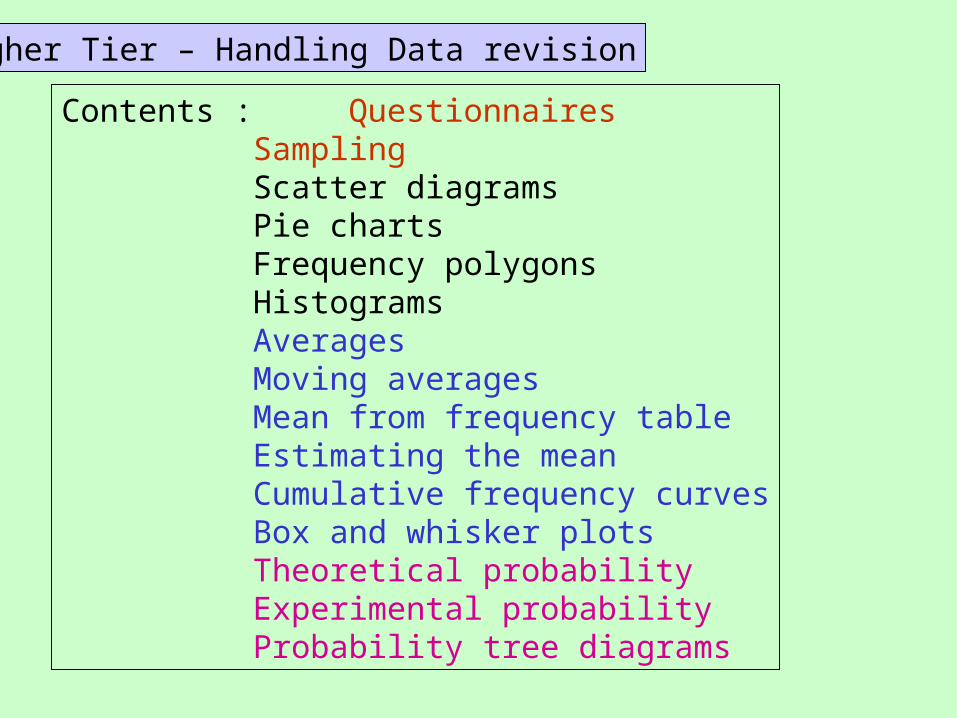
Higher Tier – Handling Data revision
Contents : QuestionnairesSamplingScatter diagramsPie chartsFrequency polygonsHistogramsAveragesMoving averagesMean from frequency tableEstimating the meanCumulative frequency curvesBox and whisker plots Theoretical probabilityExperimental probability Probability tree diagrams
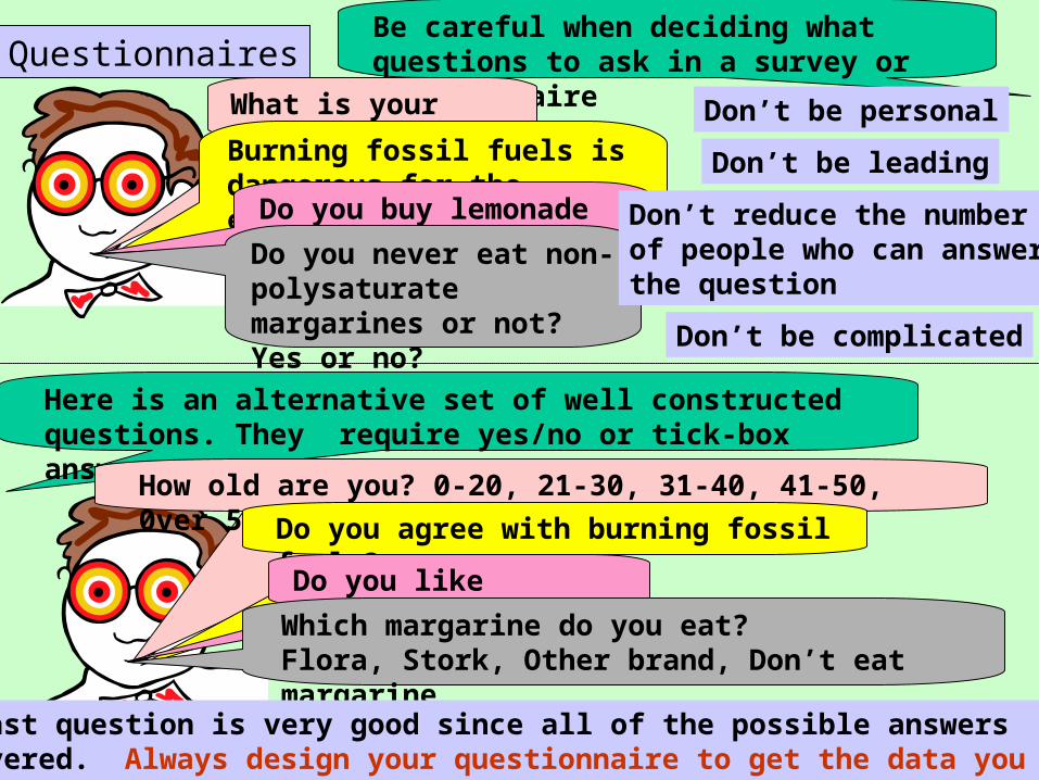
QuestionnairesBe careful when deciding what questions to ask in a survey or questionnaire
What is your age?Burning fossil fuels is dangerous for the earth’s future, don’t you agree?
Do you buy lemonade when you are at Tescos?Do you never eat non-polysaturate margarines or not? Yes or no?
Don’t be personal
Don’t be leading
Don’t reduce the number of people who can answer the question
Don’t be complicated
Here is an alternative set of well constructed questions. They require yes/no or tick-box answers.
How old are you? 0-20, 21-30, 31-40, 41-50, 0ver 50 Do you agree with burning fossil
fuels?Do you like lemonade?Which margarine do you eat?
Flora, Stork, Other brand, Don’t eat margarine
This last question is very good since all of the possible answers are covered. Always design your questionnaire to get the data you want.
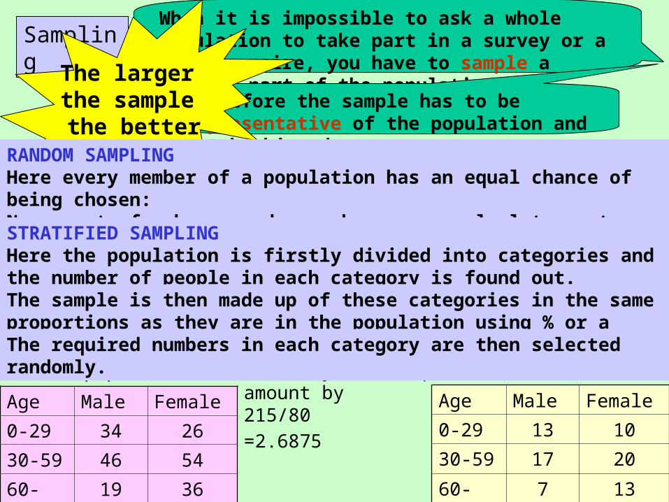
SamplingWhen it is impossible to ask a whole population to take part in a survey or a questionnaire, you have to sample a smaller part of the population.
Therefore the sample has to be representative of the population and not be biased.
The larger the sample the better
RANDOM SAMPLINGHere every member of a population has an equal chance of being chosen:Names out of a bag, random numbers on a calculator, etc.
STRATIFIED SAMPLINGHere the population is firstly divided into categories and the number of people in each category is found out.
Age Male Female
0-29 34 26
30-59 46 54
60- 19 36
The sample is then made up of these categories in the same proportions as they are in the population using % or a scaling down factor.
The whole population = 215 Age Male Female
0-29 13 10
30-59 17 20
60- 7 13
Lets say the sample is 80 so we divide eachamount by 215/80
=2.6875
The required numbers in each category are then selected randomly.
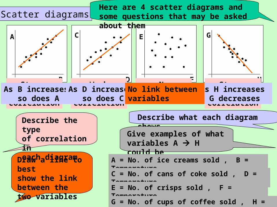
Scatter diagrams
E
F
C
D
A
B H
G
Draw a line to best show the link between the two variables
Here are 4 scatter diagrams and some questions that may be asked about them
Strongpositive
correlation
Weakpositive
correlation
Nocorrelation
Strongnegative
correlation
Describe what each diagram showsDescribe the type of correlation in each diagram
As B increases so does A
As D increases so does C
No relationship between E and F
As H increases G decreases
No link between variables
Give examples of what variables A H could be
A = No. of ice creams sold , B = Temperature
C = No. of cans of coke sold , D = Temperature
E = No. of crisps sold , F = Temperature
G = No. of cups of coffee sold , H = Temperature
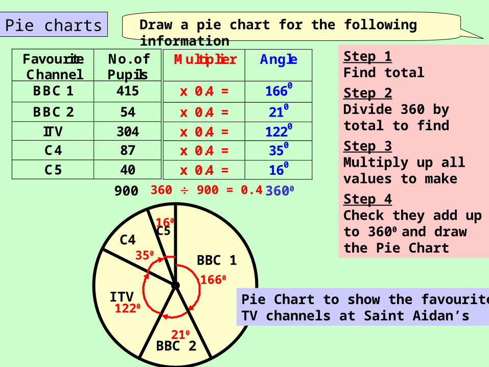
Pie charts
Favourite Channel
No. of Pupils
BBC 1 415
BBC 2 54
ITV 304 C4 87
C5 40
Multiplier
Angle
x 0.4 = 1660
x 0.4 = 210
x 0.4 = 1220 x 0.4 = 350
x 0.4 = 160
Draw a pie chart for the following information
Step 1Find total
Step 2Divide 360 by total to find multiplier
Step 3Multiply up all values to make angles
900 360 900 = 0.4 3600
Step 4Check they add up to 3600 and draw the Pie Chart
1660
210
1220
350
160
BBC 1
BBC 2
ITV
C4C5
Pie Chart to show the favourite TV channels at Saint Aidan’s
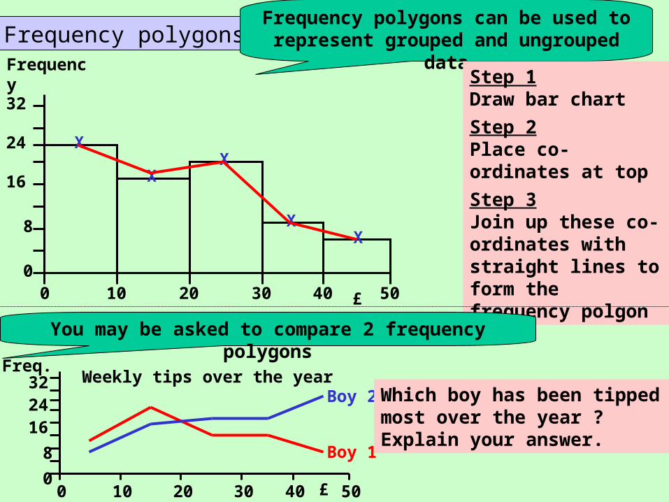
Frequency polygonsFrequency polygons can be used to
represent grouped and ungrouped data
Step 1Draw bar chart
Step 2Place co-ordinates at top of each bar
Step 3Join up these co-ordinates with straight lines to form the frequency polgon0 10 20 30 40 50
0
8
16
24
32
Frequency
£
X
XX
XX
You may be asked to compare 2 frequency polygons
Boy 1
Boy 2
0 10 20 30 40 500
8
162432
Freq.
£
Weekly tips over the yearWhich boy has been tipped most over the year ? Explain your answer.
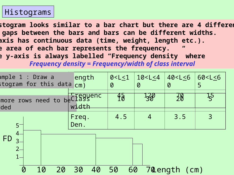
HistogramsHistograms
A histogram looks similar to a bar chart but there are 4 differences:• No gaps between the bars and bars can be different widths.• x-axis has continuous data (time, weight, length etc.).• The area of each bar represents the frequency.• The y-axis is always labelled “Frequency density” where
Frequency density = Frequency/width of class interval
Length (cm)
0<L<10
10<L<40
40<L<60
60<L<65
Frequency 45 120 70 15
Example 1 : Draw a histogram for this data
2 more rows need to be added
Class width 10 30 20 5
Freq. Den. 4.5 4 3.5 3
0 10 20 4030 50 60 70
12345
Length (cm)
FD
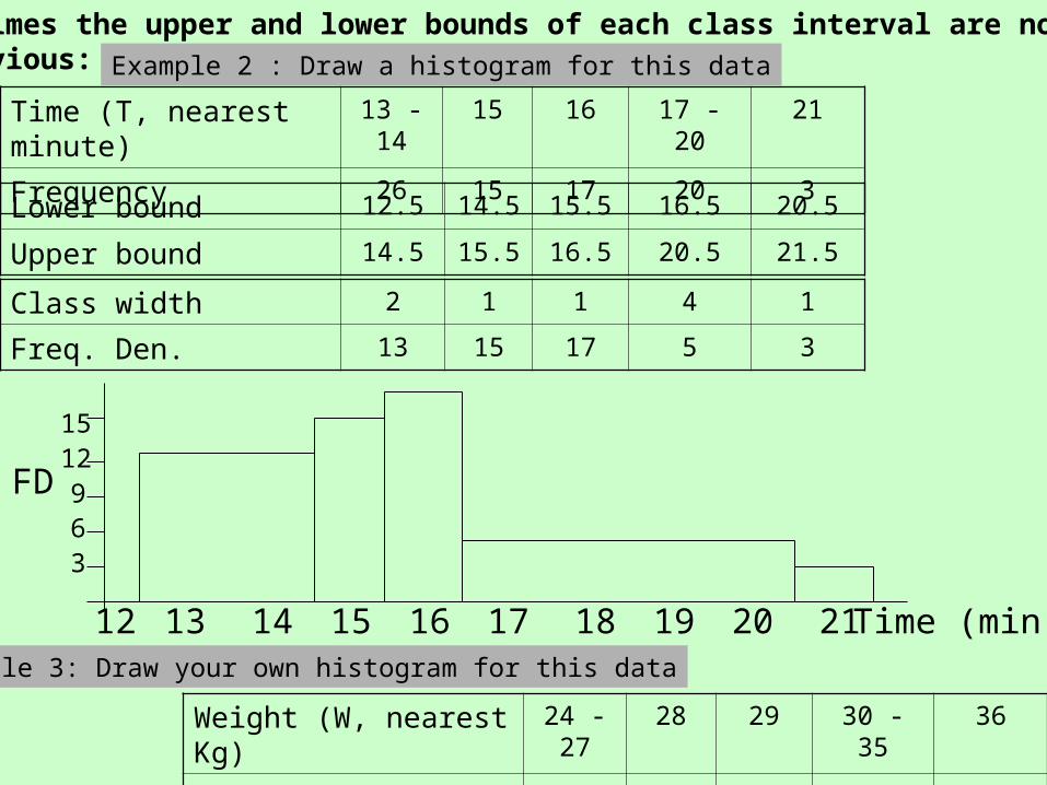
Sometimes the upper and lower bounds of each class interval are not as obvious:
Time (T, nearest minute) 13 -14 15 16 17 - 20 21
Frequency 26 15 17 20 3
Example 2 : Draw a histogram for this data
Lower bound 12.5 14.5 15.5 16.5 20.5
Upper bound 14.5 15.5 16.5 20.5 21.5
Class width 2 1 1 4 1
Freq. Den. 13 15 17 5 3
12 13 14 1615 17 18 19
369
1215
Time (min)
FD
20 21
Weight (W, nearest Kg) 24 -27 28 29 30 - 35 36
Frequency 40 13 14 120 18
Example 3: Draw your own histogram for this data
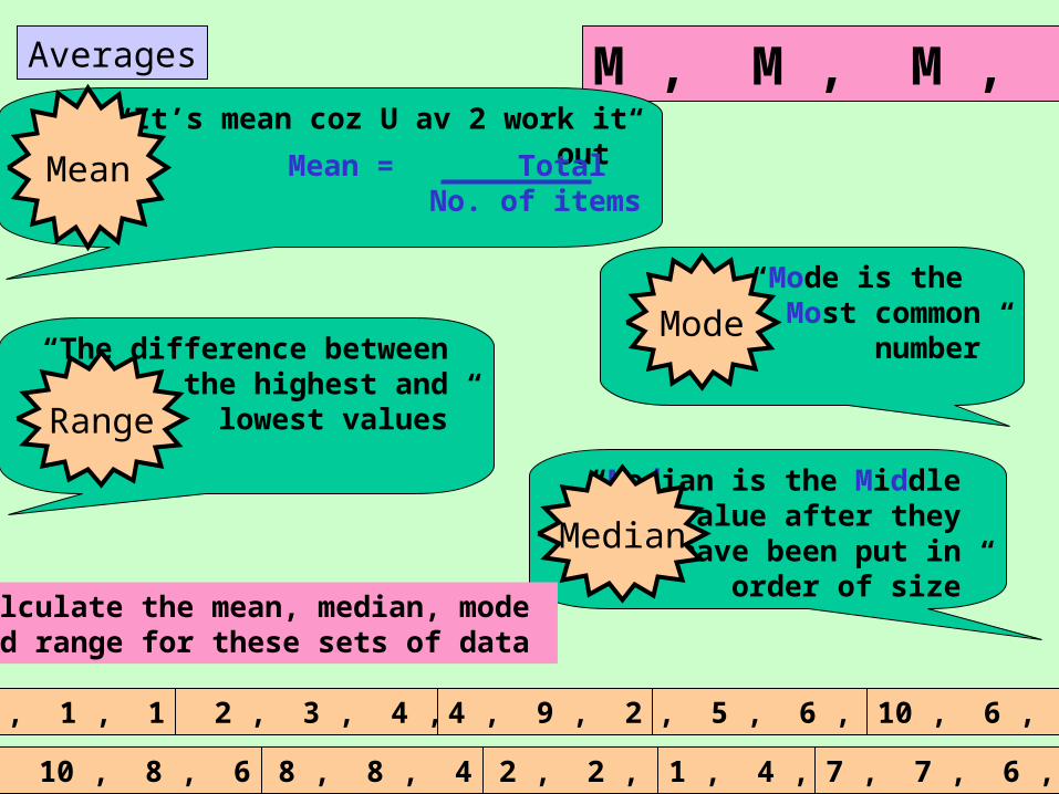
Averages
1 , 2 , 3 , 4 , 5
1 , 2 , 2 , 3 1 , 4 , 4
3 , 5 , 6 , 6
8 , 8 , 8 , 46 , 10 , 8 , 6
4 , 1 , 1 4 , 9 , 2 10 , 6 , 5
7 , 7 , 6 , 4
M , M , M , R
“The difference between the highest and
lowest values”Range
“Mode is the Most common
number”Mode
“Median is the Middle value after they
have been put in order of size”
Median
“It’s mean coz U av 2 work it out”
Mean = Total No. of items
Mean
Calculate the mean, median, mode and range for these sets of data
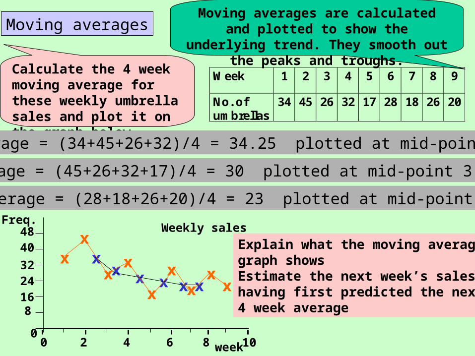
Moving averagesMoving averages are calculated and plotted to show the underlying trend.
They smooth out the peaks and troughs.
Calculate the 4 week moving average for these weekly umbrella sales and plot it on the graph below
Week 1 2 3 4 5 6 7 8 9
No. of umbrellas
34 45 26 32 17 28 18 26 20
1st average = (34+45+26+32)/4 = 34.25 plotted at mid-point 2.5
2nd average = (45+26+32+17)/4 = 30 plotted at mid-point 3.5 etc.
Last average = (28+18+26+20)/4 = 23 plotted at mid-point 7.5
x
x xx
xx
Weekly sales
0 2 4 6 8 100
162432
Freq.
week
4048
8
x
x
xx
xx
x x
xExplain what the moving average graph shows Estimate the next week’s sales having first predicted the next 4 week average
Mean from frequency table
50 pupils were asked how many coins they had in their pockets - Here are the results
No. COINS 0 1 2 3 4 5 6
No. PUPILS 7 9 10 13 8 3 0xx x xx xx
= = = == == = 50
Total no. = 0 + 9 + 20 +39 +32+15+ 0 = 115 of coins
Calculate the mean no. of coins per pupil
Mean = Total coins = 115 No. of pupils 50
= 2.3 coins per pupilCalculate the median,
mode and range Median at 25/26 pupil (50 in total)000000011111111122222222223333333333333..
Median = 2 coins 25th 26th
Mode (from table) = 3 coinsRange = 5 - 0 = 5
Now work out the Mean , Median , Mode , Range for this set of pupils
No. COINS 0 1 2 3 4
No. PUPILS 2 5 10 8 5
2.17 2 2 4
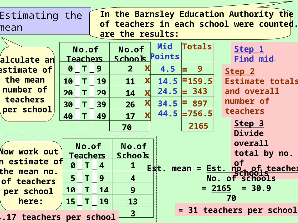
Estimating the mean
No. ofTeachers
No. ofSchools
0 < T < 9 2
10 < T < 19 11
20 < T < 29 1430 < T < 39 26
40 < T < 49 17
No. ofTeachers
No. ofSchools
0 < T < 4 1
5 < T < 9 4
10 < T < 14 915 < T < 19 13
20 < T < 24 3
In the Barnsley Education Authority the number of teachers in each school were counted. Here are the results:
Calculate an estimate of the mean number of teachers
per school
Step 1Find mid-points
MidPoints
4.5
14.524.5
34.544.5
Step 2Estimate totals and overall number of teachers
Step 3Divide overall total by no. of schools
xx
xx
x
=====
Totals
9
159.5343
897756.5
216570
Now work out an estimate of the mean no. of teachers per school
here:
14.17 teachers per school
Est. mean = Est. no. of teachersNo. of schools
= 2165 = 30.9 70
= 31 teachers per school
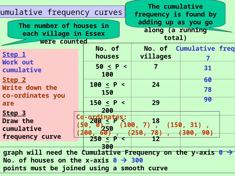
Cumulative frequency curves
No. of houses No. of villages
50 < P < 100 7
100 < P < 150 24
150 < P < 200 29
200 < P < 250 18
250 < P < 300 12
The cumulative frequency is found by adding up as you go along (a running
total)The number of houses in each village in Essex were counted
Cumulative freq.
7
31
60
78
90
Step 1Work out cumulative frequencies
Step 2Write down the co-ordinates you are going to plot
Step 3Draw the cumulative frequency curve
Co-ordinates:(50, 0) , (100, 7) , (150, 31) , (200, 60) , (250, 78) , (300, 90)
The graph will need the Cumulative Frequency on the y-axis 0 90and No. of houses on the x-axis 0 300All points must be joined using a smooth curve
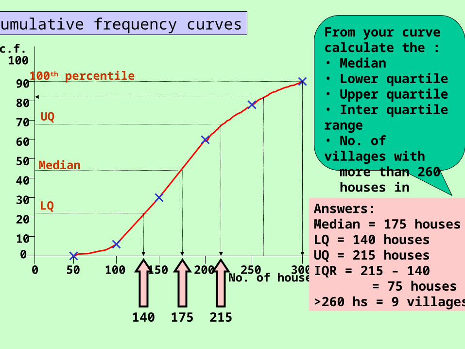
Cumulative frequency curves
90
80
70
60
50
40
20
30
100
0 50 100 150 200 250 300
100c.f.
No. of houses
From your curve calculate the :• Median• Lower quartile• Upper quartile• Inter quartile range• No. of villages with more than 260 houses in
100th percentile
Median
LQ
UQ
140 175 215
Answers:Median = 175 housesLQ = 140 housesUQ = 215 housesIQR = 215 – 140 = 75 houses>260 hs = 9 villages
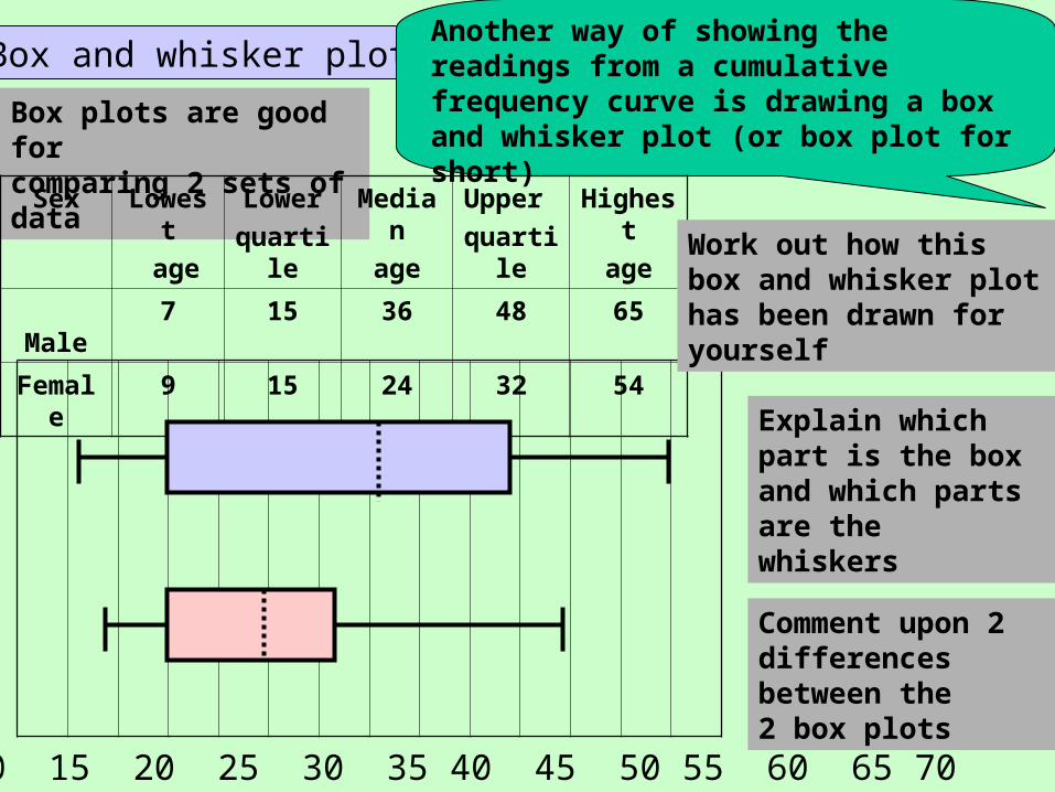
Box and whisker plotsBox and whisker plotsAnother way of showing the readings from a cumulative frequency curve is drawing a box and whisker plot (or box plot for short)
Box plots are good for comparing 2 sets of data
Sex Lowest
age
Lower
quartile
Median
age
Upper
quartile
Highest
age
Male 7 15 36 48 65
Female 9 15 24 32 54
0 5 10 15 20 25 30 35 40 45 50 55 60 65 70
Work out how this box and whisker plot has been drawn for yourself
Comment upon 2 differences between the 2 box plots
Explain which part is the box and which parts are the whiskers
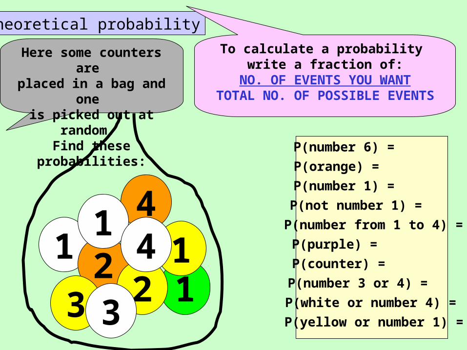
Theoretical probability
1 23
4
11
23
14
P(counter) =
P(number 3 or 4) =
P(white or number 4) =
P(yellow or number 1) =
P(orange) =
P(number 1) =
P(not number 1) =
P(purple) =
P(number 6) =
P(number from 1 to 4) =
To calculate a probability write a fraction of:
NO. OF EVENTS YOU WANTTOTAL NO. OF POSSIBLE EVENTS
Here some counters are placed in a bag and one is picked out at random. Find these probabilities:
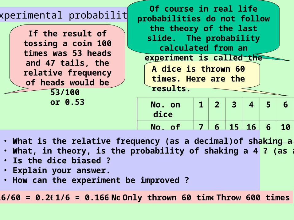
Experimental probability
If the result of tossing a coin 100 times was 53 heads and 47 tails, the relative frequency of
heads would be 53/100 or 0.53
Of course in real life probabilities do not follow the theory of the last slide. The probability calculated from an experiment is called the
RELATIVE FREQUENCY
No. on dice 1 2 3 4 5 6
No. of times 7 6 15 16 6 10
A dice is thrown 60 times. Here are the results.
• What is the relative frequency (as a decimal)of shaking a 4 ?• What, in theory, is the probability of shaking a 4 ? (as a decimal) • Is the dice biased ?• Explain your answer.• How can the experiment be improved ?
16/60 = 0.266 1/6 = 0.166 No Only thrown 60 times Throw 600 times
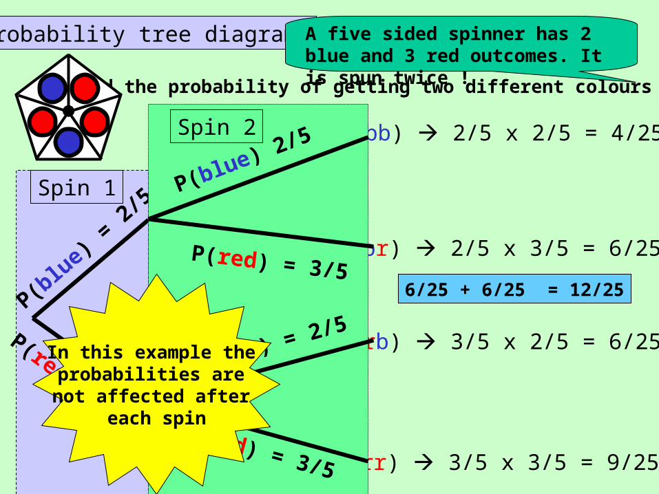
Probability tree diagrams
Find the probability of getting two different colours
A five sided spinner has 2 blue and 3 red outcomes. It is spun twice !
P(bb) 2/5 x 2/5 = 4/25
P(br) 2/5 x 3/5 = 6/25
P(rb) 3/5 x 2/5 = 6/25
P(rr) 3/5 x 3/5 = 9/25
6/25 + 6/25 = 12/25
Spin 1
P(blu
e) =
2/5
P(red) = 3/5
Spin 2
P(blue) 2/5
P(red) = 3/5
P(blue) = 2/5
P(red) = 3/5
In this example the probabilities are not affected after
each spin
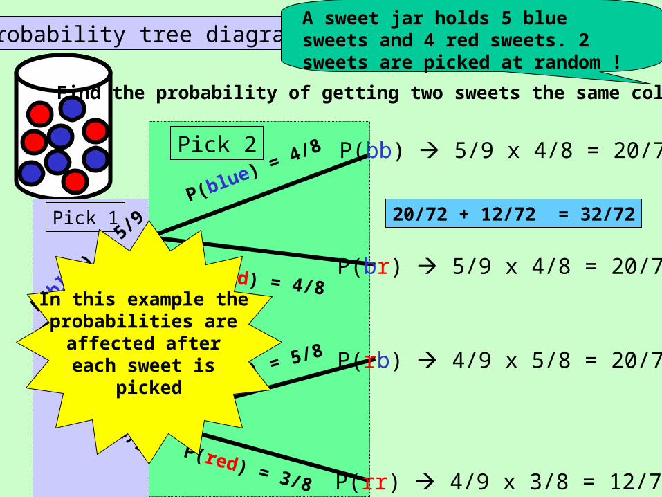
Probability tree diagrams
Find the probability of getting two sweets the same colour
A sweet jar holds 5 blue sweets and 4 red sweets. 2 sweets are picked at random !
Pick 1
P(blu
e) =
5/9
P(red) = 4/9
Pick 2
P(blue) = 4/8
P(blue) = 5/8
P(red) = 3/8
P(red) = 4/8
P(bb) 5/9 x 4/8 = 20/72
P(br) 5/9 x 4/8 = 20/72
P(rb) 4/9 x 5/8 = 20/72
P(rr) 4/9 x 3/8 = 12/72
20/72 + 12/72 = 32/72
In this example the probabilities are
affected after each sweet is
picked