Henry's Evaluation
14
Section 2) – Evaluation
-
Upload
roshan6596 -
Category
Education
-
view
105 -
download
1
Transcript of Henry's Evaluation
Section 2) – Evaluation

In what ways does your Media product use, develop or challenge forms and conventions of real media products?
My media magazine repeats Steve Neale different codes and convention used by real life media products, the magazine that I picked as inspiration is XXL, as it is my inspiration I copied some codes and convention from it. This includes colour scheme, which was to keep having the same or similar colours through out the magazine, I researched other successful Hip Hop magazines to see what they do to make their magazine appealing and successful so that I can apply it to my magazine. For the front cover I made sure I included the main image + headline, masthead, strapline and a unique selling point. Where used to catch a readers attention, they act as encouragement to the reader to look at the magazine, by using those does and convention you are persuading the reader into buying my magazine, while the date/ price, cover lines and issue number are used to inform the reader.
On my contents page I used page numbers, subtitles, web link, twitter and Facebook account, this will give the reader more information on a specific topic that they have seen in the magazine, the social media accounts, will give readers news that are happening daily so that they feel connected to the Hip hop community. On my contents page I have used page numbers, exclusive, sublines, sections and web links, I also had the editors note this will give the reader and insight into what we are doing and what our aim is, the editors page had information about the editor, it has the contact details and it also had detail of the main topics/ headline of the magazine. I added page numbers to make it easier for the reader to find the topic they are looking for since the magazine has a lot of pages and information will be hard to find what you are looking for without page numbers. I got most of the details from my magazine of inspiration which is XXL I used most of the codes and convention they used because it makes reading their magazine easier and looks more professional.
My double page spread uses codes and convention for example page number, magazine logo, page numbers and question and answer. I used an introduction paragraph to explain to they user what we are going to talk about on this page, it then has the picture on the left side page, by having an introduction, I can give a little detail of who I am interviewing and who they are and what they do. I moved a lot of the words and images around to find the right position. I also used a lot codes and conventions, for example I used question and answer, page numbers, name of magazine. I also used different fonts on different sections on the pages for example on the front cover I used a big font on the masthead and the headline so that it is large and easy to see and other parts then I used small fonts on the issue number, price, this is because it is not the main feature and I don’t want the attention to be diverted by something else other than the headlines. For the question and answer I used different colour to differentiate the people speaking so that the reader are not confused, I also use quote so that they know that it is actually what they are saying. I also added contact detail so that if the reader wants more information, they know where to go to find the information they want, the social media pages where also added so that the audience know here to go to see daily news about the hip-hop community. I tried to keep the amount of colours used to a minimum because according to my magazine of inspiration XXL they do not use a lot of colours and when more colours are used they are linked to each other so they can have the same traits and will look alike but have different texture.
How does your media product represent particular social groups?
My media product is a magazine called Unleash that focus on the Hip Hop genre of music. This will mean that the magazine needs to represent the social group of Hip Hop artists in a particular ways. The media represents the Hip Hop audience as young black men and young people. 60% of the audience of Hip Hop are young people which means that they have the most disposable income which means that they have the most money to spend, which means that the magazine needs to be catered to their needs so that they will be interested in the magazine. When creating my magazine I stuck to traditional music magazine codes and conventions as much as I could, and looked towards other music magazines to set an example for my own. I made the style and layout of my music magazine similar to that of other magazines of the Hip hop genre. For instance, I made sure not to use too many colours because the other magazines of the same genre used similar colours or kept the types of colours used to a minimum.. The magazine has being made to represent the social group of Hip Hop artist in a particular way, one way this had being done is through the pictures used in the front cover, contents page and double page, for example I used normal people and got them to dress and look like a particular Hip Hop star which means wearing clothes that are not formal for example most Hip Hop artists don’t wear suits or formal attire, by dressing in that particular way it helps represent the social groups in term of the clothes that they often wear.
Hip Hop has been condemned by a lot of people, it has being displayed by the media as a violence source and does not bring anything good, it is almost seen as a sin to the eyes of many so Rap has being viewed by many as wrong so I decided to choose unleash as the name of my magazine, this means that the magazine is perceived as dangerous which is how people already view rap/Hip Hop, therefore will appeal to
The target audience because they all share the same feeling of rap, therefore the title represents the social group of black men and teenagers.I have also chosen to price my magazine at £2.50, because I am appealing to a predominantly ABC1 audience profile. I think that this is the type of audience profile that would be prepared to pay more money for magazines as they are likely to have a higher disposable income, the price is reasonable because although they have high disposable income they are teenagers and young adults which means that they are not working for their money which can make them feel like spending less. The benefit of selling a Hip Hop magazine cheap is because there are too many magazine and competitors in the same market so it is unrealistic to sell a magazine expensive where they are lots of it, by selling it cheap but high enough to mage profit you will get more people to buy your magazine. It also benefits publishing Hip Hop magazine because it has a lot of people who are will to buy it.
What kind of media institution (Publisher) might distribute your media product and why?
ABOUT BAUER“Bauer Media is a division of the Bauer Media Group, Europe’s largest privately owned publishing Group. The Group is a worldwide media empire offering over 300 magazines in 15 countries, as well as online, TV and radio stations.Bauer Media joined the Bauer Media Group in January 2008 following acquisition of Emap plc’s consumer and specialist magazines, radio, TV, online and digital businesses. Collectively, the Group employs some 6,400 people. Bauer Media spans over 80 influential brand names covering a diverse range of interests including heat – the must have weekly celebrity title, Parkers, MATCH!, CAR and Yours. For a full list our powerful brands, click here. “
From the research that was completed pre-production, I would envisage that Bauer may publish ‘Unleash magazine’ because it my magazine has social networks, phone number, website and address, this is done to get the readers engaged with the magazine, it shows them that we care about and we care about there opinion this will help build a relationship between the producers and the audience, this is similar to Bauer aims to build personal relationships with readers. My magazine would appeal to Bauer media because they have no Hip hop magazines on their market, but instead has magazine such as kerrang and Q. so by adding a a different type of music magazine will increase the amount of people reading Bauer's media product.
The similarities of my magazine to Bauer is that my magazine “Unleash” tries to get audiences of different music genre, this is done by adding Artists from different genre, having competitions, this will get the readers involved in my magazine this will helps us grow. Some of the similar conventions of Unleash magazine to Bauer is the posters, and changes to win free concert tickets, it uses codes and conventions used in similar magazine like kerrang which is successful, this means that Bauer will be more inclined to publish my magazine

Who would be the audience for your media product and why?
According to Hartley’s seven subjectivities, my magazine “Unleash” target audience are 16-24 years olds young black males, these are the older teenagers who are turning into young mature adults, who are trying to build their confidence and become independent(Hartley) the artist featured in the magazine are mostly male because there are not a lot of female Hip Hop artists, this means that the audience are mostly male. The audience look up to their favorite artist.
According to Katz’ Uses & Gratifications theory, the audience uses the “Unleash” magazine as a great way to escape from everything(Katz) that is going on around them as they can sit back and read about their favorite artist and also learn about the new songs coming out, “Unleash” magazine has sections where you can find out the latest news which can allow them to keep up to date with their favorite artists and find out what is going on.
According to Maslow’s hierarchy of needs, since the audience are teenagers who are becoming adults, they want to belong to a group(Maslow), most of the readers are social climbers because they are young black male, who in society are seen as delinquent, they are driven by improving their status in society.
How did you attract/address your audience?
In order to attract the intended target audience I decided to reduce the price of my magazine to £2.50, this is because my target audience are they are teenagers and young adults which means that they are not working for their money which can make them feel like spending less, this is why the magazine should be cheap so that it is easy to afford.
I used word like Exclusive to draw attention from the user, the words were written in bold and in bright colors so that it stands, the Exclusive was used to show the main attraction of that issue of my magazine, which was an interview with Drake, next to the word it had a quote from Drake which will help attract the reader.
The inclusion of codes & conventions such as the Masthead helped to appeal to the target audience because a picture of a Hip hop Artist on the front page will draw readers as they recognise the artist and therefore want to look more closely at the magazine. I used black and blue colour as the front cover to create a Hip Hop feel for the magazine and I also called the magazine “Unleash” because Hip Hop is associate with danger. These features of the magazine will attract readers as they carry the connotations of Hip hop and the title gives away the fact that the magazine has something to do with Hip hop, prompting readers to take a closer look.
What have you learnt about technologies from the process of constructing this product?
The denotation of the software used to construct the media product entitled ‘Unleash’ was Adobe Photoshop, it helped me enhance , alter and remove background and filter my images to make them look as eye – catching and amazing as possible, this technology allows me to edit photos and then insert text and other features on top e.g. Masthead and a bar code. The layers allow me to move features around so that they are either underneath or on top of other features.Before this task I had no idea how to use such a programme but at the end I had understanding that helped make sure my magazine looked professional and carefully put together. For example, putting the title behind my artist as if to make her the main feature. In addition, I used shadowing and contrasting effects on text to give them a bold appearance and airbrushed my photograph to give it a smooth, professional look. I used the quick selection tool a lot because I needed to remove the backgrounds for the pictures I added, this took a lot of time because I needed to get it right, if this was done wrong then some parts of the picture that is important will be removed which will mean that it looks more professional and matches the background.
I used the gradient overly to make the background of the magazine, this was done to add texture and make the magazine look appealing, the colours used was black and blue, this works well because it is colours associated with Hip hop, I went on cool text to find fonts that may be suitable for my magazine but I did not find anything I liked so I decided to use Photoshop's font, the size I used was 89 because I wanted it to be large but if I went any bigger then it would not fit the magazine. The colour of the masthead was red, this was done so that it stands out from the background which is black. I used black on my background because hip hop is associated as dark, by making this my background it will appeal to my target audience because they will like it relates to them. I learned how to change the appearance of an image to meet the theme this helped me a lot during this project because I changed the ways my pictures looked to match the background or the theme which was hip hop.
Overall throughout this project my skills on Photoshop has improved a lot, during the start of this project I my Photoshop skills were poor, this was because I never used it and I was more familiar with fireworks, fireworks is a lot more different that Photoshop because it was easier, but throughout the lessons, I my skills and knowledge of Photoshop has drastically improved I am now able to edit pictures into what I want without any help from anyone, I also learned how to created things through shapes, I learned how to use different tools like stamp tools for example I used it to keep the colour of the models skin the same because there where parts of the face which was darker than the other. By gaining all this new skills on Photoshop I was able to create a magazine and make it look professional.
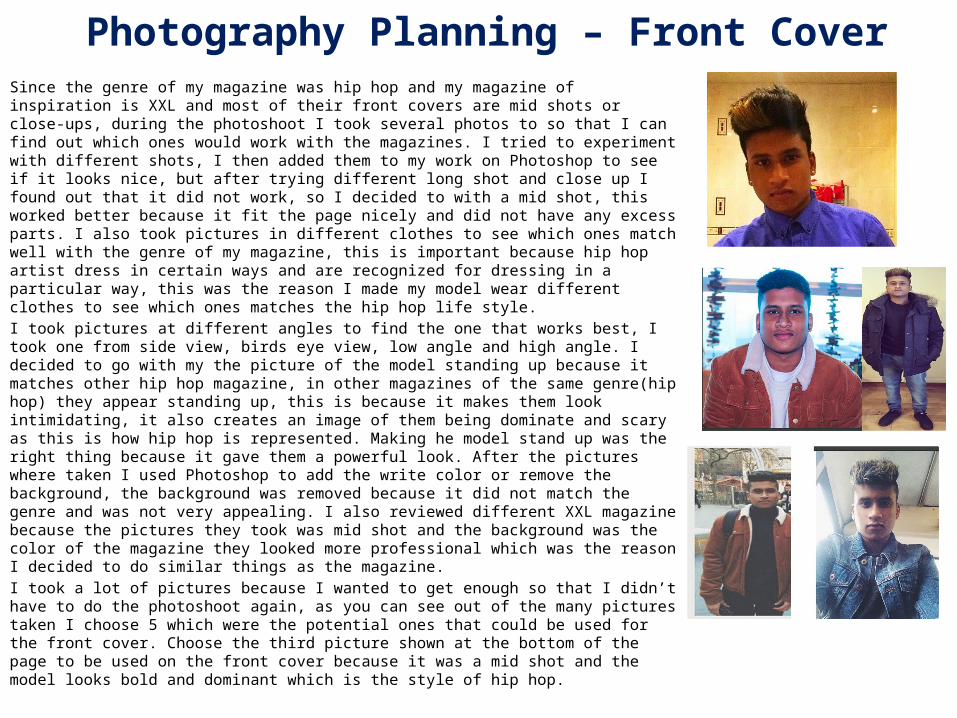
Photography Planning – Front CoverSince the genre of my magazine was hip hop and my magazine of inspiration is XXL and most of their front covers are mid shots or close-ups, during the photoshoot I took several photos to so that I can find out which ones would work with the magazines. I tried to experiment with different shots, I then added them to my work on Photoshop to see if it looks nice, but after trying different long shot and close up I found out that it did not work, so I decided to with a mid shot, this worked better because it fit the page nicely and did not have any excess parts. I also took pictures in different clothes to see which ones match well with the genre of my magazine, this is important because hip hop artist dress in certain ways and are recognized for dressing in a particular way, this was the reason I made my model wear different clothes to see which ones matches the hip hop life style.I took pictures at different angles to find the one that works best, I took one from side view, birds eye view, low angle and high angle. I decided to go with my the picture of the model standing up because it matches other hip hop magazine, in other magazines of the same genre(hip hop) they appear standing up, this is because it makes them look intimidating, it also creates an image of them being dominate and scary as this is how hip hop is represented. Making he model stand up was the right thing because it gave them a powerful look. After the pictures where taken I used Photoshop to add the write color or remove the background, the background was removed because it did not match the genre and was not very appealing. I also reviewed different XXL magazine because the pictures they took was mid shot and the background was the color of the magazine they looked more professional which was the reason I decided to do similar things as the magazine.I took a lot of pictures because I wanted to get enough so that I didn’t have to do the photoshoot again, as you can see out of the many pictures taken I choose 5 which were the potential ones that could be used for the front cover. Choose the third picture shown at the bottom of the page to be used on the front cover because it was a mid shot and the model looks bold and dominant which is the style of hip hop.

Photography Planning - ContentsFor the contents page I needed a picture that fits into the hip hop genre, I used the research I did on the log book to find out that how the pictures should look for example my magazine of inspiration XXL tries to make the picture look friendly and also powerful and dominant, this gave me an idea to have more than one person the page, this will make the page look more appealing because it will have Hip hop artists. I wanted to have more pictures on the contents page but there was not enough space which is one of the reason I decided to take pictures with more that one person in it. I took the images at different angles to find the best one that suits the magazine. I took a lot of picture with the stars so that I have a variety to choose from and I am not limited to what I can use. Several pictures where take so that I could find the ones most suitable for the magazine, this was important because I needed it to match and not be contradicting, since the hip hop genre is unique I felt that I needed to capture the picture well so that it suits the genre.After taking the pictures and choosing the most suitable, I choose the contrast/filter, this is because it needs to be compatible to the magazine. I had my star wear different clothes for example in the 3rd pictures the model wears a denim jacket and timberland boots, this has become the new trend in hip hop over the years, this meant that fans are also dressing the same and they will feel included I also had my model take picture with different stars because it needs to include other people because other hip hop magazine does the same so that it attracts fans of other artists.The image chosen was the 3rd picture this was the most suitable and matched the genre perfectly, this is because it shows the star in a typical hip hop fashion which is fearless or intimidating, which is how other contents page of the same genre is made
1
23
4
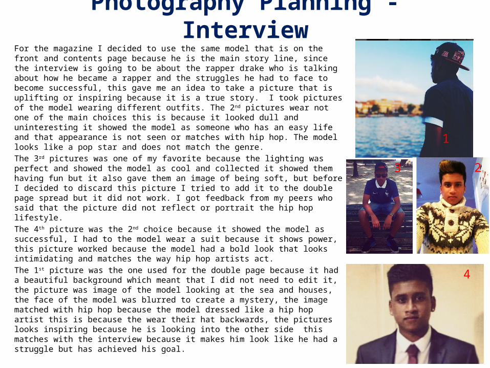
Photography Planning - InterviewFor the magazine I decided to use the same model that is on the front and contents page because he is the main story line, since the interview is going to be about the rapper drake who is talking about how he became a rapper and the struggles he had to face to become successful, this gave me an idea to take a picture that is uplifting or inspiring because it is a true story. I took pictures of the model wearing different outfits. The 2nd pictures wear not one of the main choices this is because it looked dull and uninteresting it showed the model as someone who has an easy life and that appearance is not seen or matches with hip hop. The model looks like a pop star and does not match the genre.The 3rd pictures was one of my favorite because the lighting was perfect and showed the model as cool and collected it showed them having fun but it also gave them an image of being soft, but before I decided to discard this picture I tried to add it to the double page spread but it did not work. I got feedback from my peers who said that the picture did not reflect or portrait the hip hop lifestyle.The 4th picture was the 2nd choice because it showed the model as successful, I had to the model wear a suit because it shows power, this picture worked because the model had a bold look that looks intimidating and matches the way hip hop artists act.The 1st picture was the one used for the double page because it had a beautiful background which meant that I did not need to edit it, the picture was image of the model looking at the sea and houses, the face of the model was blurred to create a mystery, the image matched with hip hop because the model dressed like a hip hop artist this is because the wear their hat backwards, the pictures looks inspiring because he is looking into the other side this matches with the interview because it makes him look like he had a struggle but has achieved his goal.
23
1
4
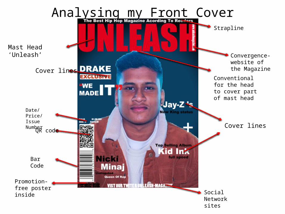
Analysing my Front CoverStrapline
Cover lines
Cover lines
QR code
Bar Code
Promotion- free poster inside
Date/Price/Issue Number
Mast Head ‘Unleash’ Convergence- website of the Magazine
Conventional for the head to cover part of mast head
Social Network sites

Analysing my Contents PageA smaller version of the masthead
Main Image
Sections
Anchored Numbers
Social Medias Website - convergence
Editors picture
Editors letter
Page number

Analysing my Double Page spread Interview
Quote
Main Image
Credit to the photographer and editor/ byline
Website Page number
Question in different style( Italics) and from bold to normal sized for font
Introduction of the ‘star’- Richard Dyer
Smaller masthead, so each page is identifiable to the magazine.
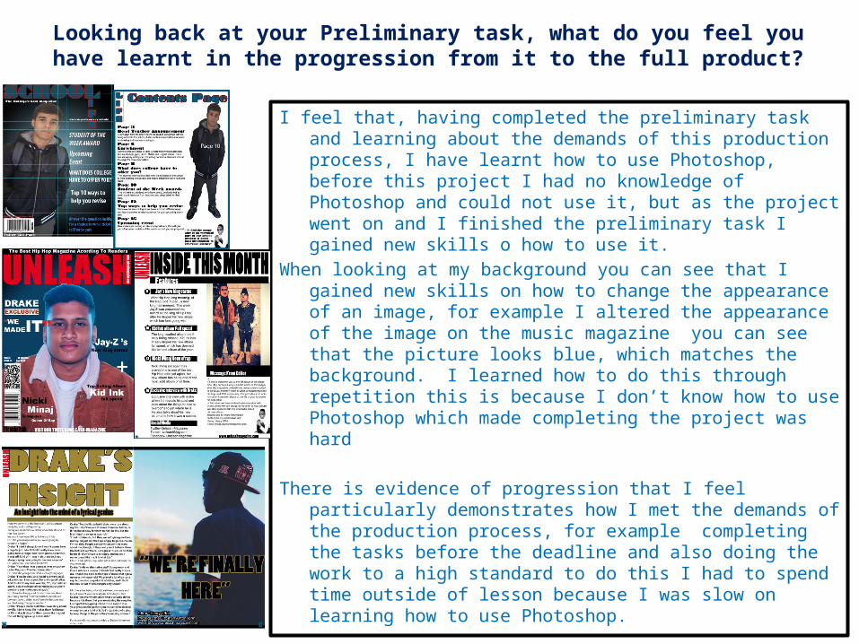
Looking back at your Preliminary task, what do you feel you have learnt in the progression from it to the full product?
I feel that, having completed the preliminary task and learning about the demands of this production process, I have learnt how to use Photoshop, before this project I had no knowledge of Photoshop and could not use it, but as the project went on and I finished the preliminary task I gained new skills o how to use it.
When looking at my background you can see that I gained new skills on how to change the appearance of an image, for example I altered the appearance of the image on the music magazine you can see that the picture looks blue, which matches the background. I learned how to do this through repetition this is because I don’t know how to use Photoshop which made completing the project was hard
There is evidence of progression that I feel particularly demonstrates how I met the demands of the production process, for example completing the tasks before the deadline and also doing the work to a high standard to do this I had to spend time outside of lesson because I was slow on learning how to use Photoshop.