Health Disparities in Appalachia: Community ... · one-and-a-half minutes longer than for the...
22
171 Community Characteristics Travel Time to Work Grocery Store Availability Student-Teacher Ratio Further Reading
Transcript of Health Disparities in Appalachia: Community ... · one-and-a-half minutes longer than for the...

171
Community Characteristics Travel Time to Work Grocery Store Availability Student-Teacher Ratio Further Reading

172

Travel Time to Work
CO
MM
UN
ITY
CH
AR
AC
TER
ISTI
CS
173
Travel Time to Work
KEY FINDINGS | Average Travel Time to Work
The average travel time to work in the Appalachian Region is 24.8 minutes, which is comparable to the national average of 25.7 minutes.
Three of the five Appalachian subregions have commute times roughly equal to the nation, and both Northern and South Central Appalachia have average commute times slightly lower than the national average.
The average travel time to work for the Appalachian Region’s rural counties is five minutes less than for the Region’s large metro counties.
The average travel time to work for the Appalachian Region’s distressed counties is nearly one-and-a-half minutes longer than for the Region’s non-distressed counties.
Background The average travel time to work measures the average number of minutes commuting to work using any transportation mode. This measure is collected by the U.S. Census Bureau in the American Community Survey and covers the period 2010–2014. Travel time captures multiple factors that may impact health status, including sedentary behavior, social isolation (from either driving alone or time spent away from family and friends), and risk of injury while commuting. Research has found that people who spend an extra 60 minutes of their day commuting spend less time sleeping and exercising, suggesting that long commute times may be a predictor of poor health outcomes (Christian T. , 2012). One study found that longer commuting distances were associated with less physical activity and higher body mass index (BMI), waist circumference, and blood pressure (Hoehner, Barlow, Allen, & Schootman, 2012). Long commutes also occur at the expense of time spent at home and other social activities, and are thus associated with stress on family and relationships (Besser, Marcus, & Frumkin, 2008). Negative effects related to longer commuting times are not limited to those who commute by automobile. The British Office of National Statistics found higher anxiety and lower happiness levels among survey respondents who had time-consuming commutes by public transit, walking, and private motor vehicle.

CREATING A CULTURE OF HEALTH IN APPALACHIA Travel Time to Work | COMMUNITY CHARACTERISTICS
174
Overview: Travel Time to Work in the Appalachian Region Average commute times throughout the Appalachian Region are comparable to the national average. The average travel time to work in the Appalachian Region is 24.8 minutes, which is comparable to the national average of 25.7 minutes. The average commuting times in three of the five Appalachian subregions are at or below the national average. With an average commute time of 22.9 minutes, South Central Appalachia has the lowest average among the five subregions. There is little variation among the subregions in Appalachia, with a difference of only three-and-a-half minutes between the longest and shortest average commutes. Rural areas in Appalachia have lower average commute times than more urbanized areas. Large metropolitan areas in Appalachia have an average commute of 28.6 minutes, compared to the national average of 25.7 minutes. The Appalachian Region’s rural counties have average commute times of 23.7 minutes, which is lower than the average time in the Region’s large metro counties, as well as in the nation as a whole. The pattern of commuting times in the Region is consistent with national trends, which show that commuting times are longer in large metropolitan areas. There is little variation between counties of different economic status levels, with just over one minute difference in commute times between the Appalachian Region’s distressed counties (26.1 minutes) and its non-distressed counties (24.7 minutes). At 20.7 minutes, Appalachian New York has the lowest average commute time in the Region, while non-Appalachian New York has the highest average commute of 32.7 minutes—the largest intrastate disparity. With the exceptions of Maryland and New York, differences in the average commuting times between the Appalachian and non-Appalachian portions of the 13 states are relatively small. After Appalachian New York, the Appalachian portions of both North Carolina and South Carolina report the next lowest average commute times among the Appalachian portions of states in the Region, at just over 22 minutes. Figure 89 shows the average travel time to work for Appalachian counties, grouped by national quintiles. Darker colors indicate higher commute times; for this measure, higher values are associated with worse health. The distribution of commute times varies throughout the Region, although few counties rank in the best-performing quintile. Longer commutes appear near large metro areas, such as Atlanta, Birmingham, Cincinnati, Pittsburgh, and Tuscaloosa. Longer commutes also appear in southeast Ohio, a number of counties in eastern Pennsylvania, and throughout much of West Virginia. Figure 90 aggregates the data for a variety of geographies useful for comparison: the Region compared to both the U.S. as a whole and the non-Appalachian portion of the country, subregions throughout Appalachia, levels of rurality in Appalachia, and economic status in Appalachia. State-level aggregation is done at three levels: the entire state, and then both the Appalachian and non-Appalachian portions of each state.

CREATING A CULTURE OF HEALTH IN APPALACHIA Travel Time to Work | COMMUNITY CHARACTERISTICS
175
Figure 89: Map of Average Travel Time to Work in the Appalachian Region, 2010–2014
GEORGIA
SOUTH CAROLINA
NORTH CAROLINA
ALABAMA
MISSISSIPPI
TENNESSEE
KENTUCKY
OHIO PENNSYLVANIA
MARYLAND
VIRGINIA
NEW YORK
WESTVIRGINIA
N o r t h e r n
S o u t h e r n
C e n t r a l
S o u t h C e n t r a l
N o r t h C e n t r a l
0 10050
Miles
U.S. quintiles
27.5–42.9
24.1–27.4
21.5–24.0
18.6–21.4
4.6–18.5
Suppressed
Average Travel Timeto Work in Minutes
Data source: United States Census Bureau. “Summary File." 2010–2014 American Community Survey. U.S. Census Bureau's American Community Survey Office, 2015. Web. 13 January 2016 https://www.census.gov/programs-surveys/acs/.

CREATING A CULTURE OF HEALTH IN APPALACHIA Travel Time to Work | COMMUNITY CHARACTERISTICS
176
Figure 90: Chart of Average Travel Time to Work, 2010–2014
25.724.8
25.8
24.026.4
25.722.9
26.0
28.623.0
24.424.9
23.7
26.124.724.8
24.327.2
29.6
24.324.8
23.427.0
29.226.0
23.024.7
22.332.0
25.732.3
24.223.4
24.432.1
20.732.7
23.722.5
24.023.2
25.122.7
26.224.8
27.423.8
22.324.424.4
23.725.0
27.623.6
28.125.8
0 5 10 15 20 25 30 35
UNITED STATESAppalachian Region
Non-Appalachian U.S.
SUBREGIONS IN APPALACHIANorthern
North CentralCentral
South CentralSouthern
RURALITY IN APPALACHIALarge Metros (pop. 1 million +)Small Metros (pop. <1 million)
Nonmetro, Adjacent to Large MetrosNonmetro, Adjacent to Small MetrosRural (nonmetro, not adj. to a metro)
ECONOMIC STATUS IN APPALACHIADistressed
Non-DistressedAt-Risk
TransitionalCompetitiveAttainment
STATES IN APPALACHIAAlabama
Appalachian AlabamaNon-Appalachian Alabama
GeorgiaAppalachian Georgia
Non-Appalachian GeorgiaKentucky
Appalachian KentuckyNon-Appalachian Kentucky
MarylandAppalachian Maryland
Non-Appalachian MarylandMississippi
Appalachian MississippiNon-Appalachian Mississippi
New YorkAppalachian New York
Non-Appalachian New YorkNorth Carolina
Appalachian North CarolinaNon-Appalachian North Carolina
OhioAppalachian Ohio
Non-Appalachian OhioPennsylvania
Appalachian PennsylvaniaNon-Appalachian Pennsylvania
South CarolinaAppalachian South Carolina
Non-Appalachian South CarolinaTennessee
Appalachian TennesseeNon-Appalachian Tennessee
VirginiaAppalachian Virginia
Non-Appalachian VirginiaWest Virginia (entire state)
Data source: United States Census Bureau. “Summary File." 2010–2014 American Community Survey. U.S. Census Bureau's American Community Survey Office, 2015. Web. 13 January 2016 https://www.census.gov/programs-surveys/acs/.
CREATING A CULTURE OF HEALTH IN APPALACHIA Travel Time to Work | COMMUNITY CHARACTERISTICS
177
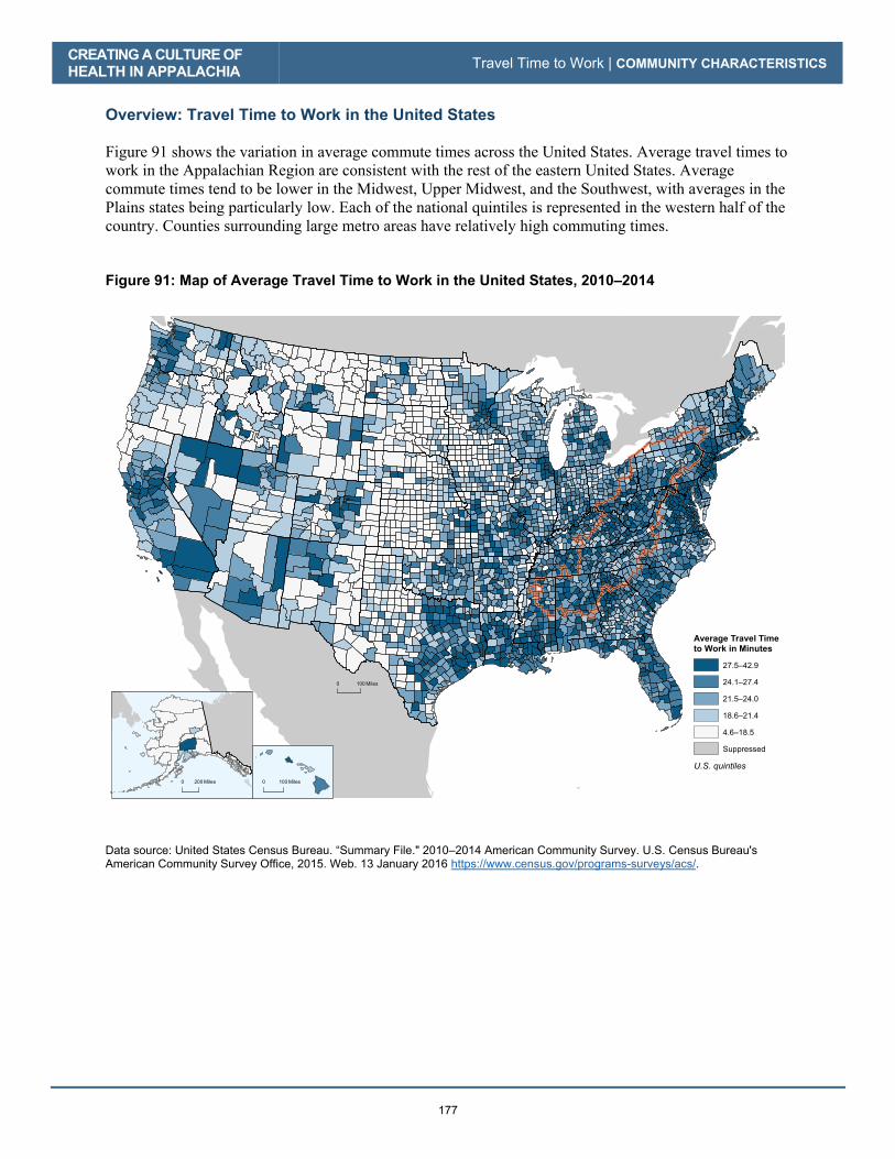
Overview: Travel Time to Work in the United States Figure 91 shows the variation in average commute times across the United States. Average travel times to work in the Appalachian Region are consistent with the rest of the eastern United States. Average commute times tend to be lower in the Midwest, Upper Midwest, and the Southwest, with averages in the Plains states being particularly low. Each of the national quintiles is represented in the western half of the country. Counties surrounding large metro areas have relatively high commuting times. Figure 91: Map of Average Travel Time to Work in the United States, 2010–2014
0 100 Miles
0 100 Miles0 200 Miles
27.5–42.9
24.1–27.4
21.5–24.0
18.6–21.4
4.6–18.5
Suppressed
U.S. quintiles
Average Travel Timeto Work in Minutes
Data source: United States Census Bureau. “Summary File." 2010–2014 American Community Survey. U.S. Census Bureau's American Community Survey Office, 2015. Web. 13 January 2016 https://www.census.gov/programs-surveys/acs/.

CREATING A CULTURE OF HEALTH IN APPALACHIA Travel Time to Work | COMMUNITY CHARACTERISTICS
178
Distribution of Travel Time to Work Figure 92 shows the distribution of average travel times to work by geography and economic status. The shaded boxes show the middle 50 percent of all values for each group, with dots representing unusually high or low values. The gray line stretching across the width of the graph indicates the national average, and the black lines inside the shaded boxes indicate the median for each respective group. Figure 92: Box Plot of Average Travel Time to Work by Geography and Economic Status, 2010–2014
Data source: United States Census Bureau. “Summary File." 2010–2014 American Community Survey. U.S. Census Bureau's American Community Survey Office, 2015. Web. 13 January 2016 https://www.census.gov/programs-surveys/acs/.
The distribution of the average travel time to work among national quintiles for Appalachian counties is shown in Table 34. Of the 420 counties in the Region, 142 (34 percent) rank in the worst-performing national quintile, while 5 (1 percent) rank in the best-performing national quintile. Table 34: Distribution of Average Travel Time to Work among National Quintiles for Appalachian Counties
Indicator Best
Quintile 2nd Best Quintile
Middle Quintile
2nd Worst Quintile
Worst Quintile
# Pct. # Pct. # Pct. # Pct. # Pct. Travel time to work 5 1% 62 15% 101 24% 110 26% 142 34%
Data source for authors’ calculations shown above: Appalachian_Health_Disparities_Data.xlsx. The number of counties across all five quintiles for this indicator may not sum to 420 due to missing or suppressed values.
Subregionsin Appalachia
Economic Statusin AppalachiaAppalachia and U.S.
01
02
03
04
0A
vera
ge T
rave
l Tim
e to
Wor
k
Appalachia Non-Appalachian U.S. Northern North Central Central South Central Southern Distressed Non-Distressed
Grey line denotes national average. 0 of 3113 counties have a missing value for this indicator.For this indicator, higher values are associated with worse health.

Grocery Store Availability
CO
MM
UN
ITY
CH
AR
AC
TER
ISTI
CS
179
Grocery Store Availability
KEY FINDINGS | Grocery Store Availability
There are 14 percent fewer grocery stores per 1,000 population in Appalachia than in the United States as a whole.
Among the five subregions, only Central Appalachia has more grocery stores per 1,000 population than the national average. Southern Appalachia has the lowest rate in the Region, a figure 24 percent lower than the national mark.
Rural areas throughout the Region have 41 percent more grocery stores per 1,000 population than large metro areas.
Economically distressed counties in Appalachia have 28 percent more grocery stores per 1,000 population than non-distressed counties.
Background This indicator measures the number of grocery stores in a county per 1,000 population in 2012, as reported by the U.S. Department of Agriculture. Grocery stores typically offer healthier food options than other outlets such as dollar stores, neighborhood markets, and convenience stores. Making healthy dietary choices is associated with better health outcomes, and as such, the availability of nutritious and affordable foods can have a large impact on community health (Centers for Disease Control and Prevention, Healthy Foods, 2016); (Bell, Mora, Hagan, Rubin, & Karpyn, 2013). Communities that have limited access to healthier food options—and instead have higher numbers of restaurants and stores that provide processed, sugar- and fat-laden foods—face higher obesity rates and other related health problems (Treuhaft & Karpyn, 2010). Residents of communities with full-service grocery stores often eat more fruits and vegetables, which can help combat obesity and may have other direct health benefits, such as decreasing the risk of cancer (Centers for Disease Control and Prevention, Increase Access to Healthy Foods and Beverages, 2016). The number of grocery stores is just one way to gauge a community’s access to healthy food options; other possibilities include the presence of superstores and farmers markets. While this measure shows the presence (or absence) of grocery stores in a county per 1,000 population, it doesn’t indicate the distance to grocery stores or whether the population has transportation to a store, which can be a particularly important consideration in rural areas. Ideally, this variable would include the average distance—and not merely presence/supply—to the nearest healthy food option in any given county.

CREATING A CULTURE OF HEALTH IN APPALACHIA Grocery Store Availability | COMMUNITY CHARACTERISTICS
180
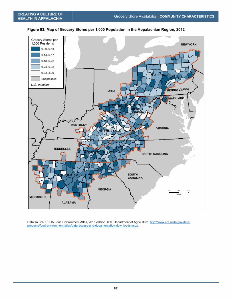
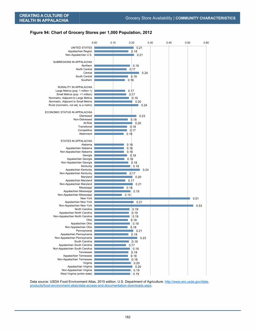
Overview: Grocery Store Availability in the Appalachian Region The average number of grocery stores per 1,000 population in the Appalachian Region is 0.18, which is 14 percent less than the national average of 0.21 per 1,000. The number of grocery stores in all five of the Appalachian subregions is below the national average except for Central Appalachia, whose rate of 0.24 is 14 percent above the national average. Southern Appalachia has the lowest rate in the Region with 0.16 grocery stores per 1,000 population, a figure 24 percent less than the national mark. There are higher numbers of grocery stores in rural counties; this may be a function of population, as counties with higher and denser populations may have larger, busier grocery stores leading to lower numbers of grocery stores on a per capita basis. Large metro counties in Appalachia have a rate of 0.17 grocery stores per 1,000 population, versus 0.24 grocery stores per 1,000 population in rural areas. The Appalachian Region’s distressed counties have 0.23 grocery stores per 1,000 population, while non-distressed counties have a lower rate of 0.18 stores per 1,000 population. The Appalachian portions of Georgia, Maryland, New York, Pennsylvania, and South Carolina all have fewer grocery stores than the non-Appalachian portions of those states, while Appalachian Kentucky has more grocery stores than non-Appalachian Kentucky. For the remaining states throughout the Region, intrastate differences are marginal. Figure 93 shows the number of grocery stores per 1,000 population in the Appalachian Region, grouped by national quintiles. Darker blue indicates a lower number of grocery stores; for this indicator, lower values are associated with worse health. There is considerable variation in the number of grocery stores throughout the Region. There are clusters of counties in Appalachia that have few, if any, grocery stores, while other areas throughout the Region perform quite well. Figure 94 aggregates the data for a variety of geographies useful for comparison: the Region compared to both the U.S. as a whole and the non-Appalachian portion of the country, subregions throughout Appalachia, levels of rurality in Appalachia, and economic status in Appalachia. State-level aggregation is done at three levels: the entire state, and then both the Appalachian and non-Appalachian portions of each state.
CREATING A CULTURE OF HEALTH IN APPALACHIA Grocery Store Availability | COMMUNITY CHARACTERISTICS
181
Figure 93: Map of Grocery Stores per 1,000 Population in the Appalachian Region, 2012
GEORGIA
SOUTH CAROLINA
NORTH CAROLINA
ALABAMA
MISSISSIPPI
TENNESSEE
KENTUCKY
OHIO PENNSYLVANIA
MARYLAND
VIRGINIA
NEW YORK
WESTVIRGINIA
N o r t h e r n
S o u t h e r n
C e n t r a l
S o u t h C e n t r a l
N o r t h C e n t r a l
0 10050
Miles
U.S. quintiles
0.00–0.13
0.14–0.17
0.18–0.22
0.23–0.32
0.33–3.00
Suppressed
Grocery Stores per1,000 Residents
Data source: USDA Food Environment Atlas, 2015 edition. U.S. Department of Agriculture. http://www.ers.usda.gov/data-products/food-environment-atlas/data-access-and-documentation-downloads.aspx.
CREATING A CULTURE OF HEALTH IN APPALACHIA Grocery Store Availability | COMMUNITY CHARACTERISTICS
182
Figure 94: Chart of Grocery Stores per 1,000 Population, 2012
0.21 0.18
0.21
0.19 0.17
0.24 0.18
0.16
0.17 0.17
0.19 0.20
0.24
0.23 0.18
0.20 0.18 0.17
0.16
0.16 0.16 0.16
0.18 0.16
0.18 0.19
0.24 0.17
0.20 0.17
0.21 0.16
0.19 0.15
0.51 0.21
0.53 0.19 0.19 0.19
0.18 0.19
0.18 0.21
0.18 0.23
0.19 0.17
0.19 0.18 0.18 0.18
0.20 0.20
0.19 0.19
0.00 0.10 0.20 0.30 0.40 0.50 0.60
UNITED STATESAppalachian Region
Non-Appalachian U.S.
SUBREGIONS IN APPALACHIANorthern
North CentralCentral
South CentralSouthern
RURALITY IN APPALACHIALarge Metros (pop. 1 million +)Small Metros (pop. <1 million)
Nonmetro, Adjacent to Large MetrosNonmetro, Adjacent to Small MetrosRural (nonmetro, not adj. to a metro)
ECONOMIC STATUS IN APPALACHIADistressed
Non-DistressedAt-Risk
TransitionalCompetitiveAttainment
STATES IN APPALACHIAAlabama
Appalachian AlabamaNon-Appalachian Alabama
GeorgiaAppalachian Georgia
Non-Appalachian GeorgiaKentucky
Appalachian KentuckyNon-Appalachian Kentucky
MarylandAppalachian Maryland
Non-Appalachian MarylandMississippi
Appalachian MississippiNon-Appalachian Mississippi
New YorkAppalachian New York
Non-Appalachian New YorkNorth Carolina
Appalachian North CarolinaNon-Appalachian North Carolina
OhioAppalachian Ohio
Non-Appalachian OhioPennsylvania
Appalachian PennsylvaniaNon-Appalachian Pennsylvania
South CarolinaAppalachian South Carolina
Non-Appalachian South CarolinaTennessee
Appalachian TennesseeNon-Appalachian Tennessee
VirginiaAppalachian Virginia
Non-Appalachian VirginiaWest Virginia (entire state)
Data source: USDA Food Environment Atlas, 2015 edition. U.S. Department of Agriculture. http://www.ers.usda.gov/data-products/food-environment-atlas/data-access-and-documentation-downloads.aspx.

CREATING A CULTURE OF HEALTH IN APPALACHIA Grocery Store Availability | COMMUNITY CHARACTERISTICS
183
Overview: Grocery Store Availability in the United States Figure 95 shows the variation in the number of grocery stores per 1,000 population across the United States. Much of the eastern United States hovers around the national average. There is less access in the South, throughout parts of Texas, and into the Southwest. Parts of the northern Rocky Mountains, as well as pockets in the Plains states, have high grocery store availability. Overall, there is substantial variation from region to region, as well as within individual states. Figure 95: Map of Grocery Stores per 1,000 Population in the United States, 2012
0 100 Miles
0 100 Miles0 200 Miles
0.00–0.13
0.14–0.17
0.18–0.22
0.23–0.32
0.33–3.00
Suppressed
U.S. quintiles
Grocery Stores per1,000 Residents
Data source: USDA Food Environment Atlas, 2015 edition. U.S. Department of Agriculture. http://www.ers.usda.gov/data-products/food-environment-atlas/data-access-and-documentation-downloads.aspx.
CREATING A CULTURE OF HEALTH IN APPALACHIA Grocery Store Availability | COMMUNITY CHARACTERISTICS
184
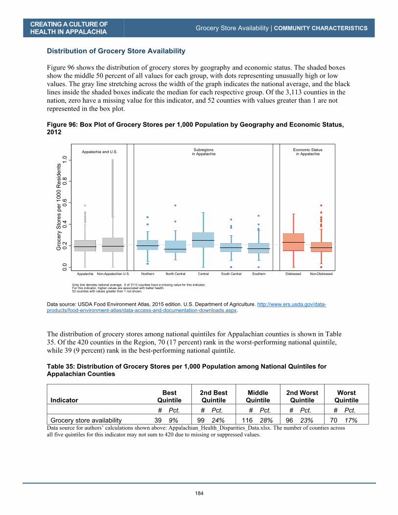
Distribution of Grocery Store Availability Figure 96 shows the distribution of grocery stores by geography and economic status. The shaded boxes show the middle 50 percent of all values for each group, with dots representing unusually high or low values. The gray line stretching across the width of the graph indicates the national average, and the black lines inside the shaded boxes indicate the median for each respective group. Of the 3,113 counties in the nation, zero have a missing value for this indicator, and 52 counties with values greater than 1 are not represented in the box plot. Figure 96: Box Plot of Grocery Stores per 1,000 Population by Geography and Economic Status, 2012
Data source: USDA Food Environment Atlas, 2015 edition. U.S. Department of Agriculture. http://www.ers.usda.gov/data-products/food-environment-atlas/data-access-and-documentation-downloads.aspx.
The distribution of grocery stores among national quintiles for Appalachian counties is shown in Table 35. Of the 420 counties in the Region, 70 (17 percent) rank in the worst-performing national quintile, while 39 (9 percent) rank in the best-performing national quintile. Table 35: Distribution of Grocery Stores per 1,000 Population among National Quintiles for Appalachian Counties
Indicator Best
Quintile 2nd Best Quintile
Middle Quintile
2nd Worst Quintile
Worst Quintile
# Pct. # Pct. # Pct. # Pct. # Pct. Grocery store availability 39 9% 99 24% 116 28% 96 23% 70 17%
Data source for authors’ calculations shown above: Appalachian_Health_Disparities_Data.xlsx. The number of counties across all five quintiles for this indicator may not sum to 420 due to missing or suppressed values.
Subregionsin Appalachia
Economic Statusin AppalachiaAppalachia and U.S.
0.0
0.2
0.4
0.6
0.8
1.0
Gro
cery
Sto
res
per
100
0 R
esi
dent
s
Appalachia Non-Appalachian U.S. Northern North Central Central South Central Southern Distressed Non-Distressed
Grey line denotes national average. 0 of 3113 counties have a missing value for this indicator.For this indicator, higher values are associated with better health.52 counties with values greater than 1 not shown.

Student-Teacher Ratio
CO
MM
UN
ITY
CH
AR
AC
TER
ISTI
CS
185
Student-Teacher Ratio
KEY FINDINGS | Student-Teacher Ratio
The Appalachian Region’s student-teacher ratio is 14.3, which is a lower (better) ratio than the national average of 16.5.
There is little difference in the student-teacher ratios among the five Appalachian subregions, with values ranging from 13.6 to 15.0, all of which are lower (better) than the national mark.
The Appalachian Region’s student-teacher ratio in rural counties is 13.7, which is better than the 14.7 ratio in the Region’s metro counties.
The Appalachian Region’s student-teacher ratio in distressed counties is 14.7, which is only slightly higher than the 14.3 in the Region’s non-distressed counties.
Background The student-teacher ratio measures the supply of teachers per K–12 student. The data cover the 2013–14 period and are reported by the U.S. Department of Education’s National Center for Education Statistics. Higher quality education is associated with greater levels of health literacy, which allows students and then adults, to make smarter, more-informed decisions regarding their health. Research has shown that class size is a significant predictor of student achievement and that lower student-teacher ratios represent better educational systems. These improved educational outcomes—and greater health literacy—can then be expected to lead to better overall health over a lifetime (National Institutes of Health, Office of Behavioral and Social Sciences Research, 2015). This measure differs from other class size variable calculations, as it includes resource teaching staff members along with teachers. However, it remains comparable in interpretation. The student-teacher ratio gives an approximation of the amount of individualized attention from teachers that is available to each student. Higher values represent lower availability of teaching staff, and thus suggest lower education quality.
CREATING A CULTURE OF HEALTH IN APPALACHIA Student-Teacher Ratio | COMMUNITY CHARACTERISTICS
186
Overview: Student-Teacher Ratios in the Appalachian Region The average student-teacher ratio in the Appalachian Region is 14.3, which is lower (better) than the national average of 16.5. All of the subregions in Appalachia have lower student-teacher ratios than the national average. The Central Appalachian subregion has the highest ratio, at 15.0, while the Northern Appalachian subregion has the lowest ratio, at 13.6. The Appalachian Region’s student-teacher ratio in rural counties is 13.7, which is somewhat better than the 14.7 reported in the Region’s metro counties. The Appalachian Region’s student-teacher ratio in distressed counties is 14.7, compared to 14.3 in non-distressed counties. Among the Appalachian portions of states, Appalachian New York has the lowest student-teacher ratio at 11.2 and Appalachian Georgia has the highest student-teacher ratio at 16.1. This ratio in Appalachian Georgia is slightly below the national average. Outside of Georgia and South Carolina, the Appalachian portions of each state in the Region report lower (better) student-teacher ratios than the non-Appalachian portions.
Figure 97 shows the student-teacher ratios for Appalachian counties, grouped by national quintiles. Darker blue indicates higher numbers of students per teacher; for this measure, higher values are associated with worse health. There is considerable variation throughout the Region for this measure. There are concentrations of counties with high student-teacher ratios in all five of the subregions. Likewise, there are counties with low student-teacher ratios in each subregion, with noticeable pockets in both Northern and Southern Appalachia. Figure 98 aggregates the data for a variety of geographies useful for comparison: the Region compared to both the U.S. as a whole and the non-Appalachian portion of the country, subregions throughout Appalachia, levels of rurality in Appalachia, and economic status in Appalachia. State-level aggregation is done at three levels: the entire state, and then both the Appalachian and non-Appalachian portions of each state.

CREATING A CULTURE OF HEALTH IN APPALACHIA Student-Teacher Ratio | COMMUNITY CHARACTERISTICS
187
Figure 97: Map of Student-Teacher Ratios in the Appalachian Region, 2013–2014
GEORGIA
SOUTH CAROLINA
NORTH CAROLINA
ALABAMA
MISSISSIPPI
TENNESSEE
KENTUCKY
OHIO PENNSYLVANIA
MARYLAND
VIRGINIA
NEW YORK
WESTVIRGINIA
N o r t h e r n
S o u t h e r n
C e n t r a l
S o u t h C e n t r a l
N o r t h C e n t r a l
0 10050
Miles
U.S. quintiles
16.3–38.9
14.9–16.2
13.6–14.8
11.9–13.5
1.9–11.8
Suppressed
Students per Teacher
Data source: National Center for Education Statistics. U.S. Department of Education. https://nces.ed.gov/ccd/elsi/tableGenerator.aspx.

CREATING A CULTURE OF HEALTH IN APPALACHIA Student-Teacher Ratio | COMMUNITY CHARACTERISTICS
188
Figure 98: Chart of Student-Teacher Ratios, 2013–2014
16.5 14.3
16.7
13.6 14.8 15.0
14.5 14.8
14.7 14.5
13.7 14.1
13.7
14.7 14.3
14.2 14.3
13.9 16.7
14.2 13.5
15.6 15.7
16.1 15.5
16.2 15.4
16.5 14.8
14.4 14.8
13.9 12.6
14.2 13.4
11.2 13.6
15.1 14.4
15.2 16.3
15.4 16.5
14.4 13.7
15.0 15.5 15.7
15.4 15.1
14.9 15.2
14.2 13.3
14.3 14.1
0 2 4 6 8 10 12 14 16 18
UNITED STATESAppalachian Region
Non-Appalachian U.S.
SUBREGIONS IN APPALACHIANorthern
North CentralCentral
South CentralSouthern
RURALITY IN APPALACHIALarge Metros (pop. 1 million +)Small Metros (pop. <1 million)
Nonmetro, Adjacent to Large MetrosNonmetro, Adjacent to Small MetrosRural (nonmetro, not adj. to a metro)
ECONOMIC STATUS IN APPALACHIADistressed
Non-DistressedAt-Risk
TransitionalCompetitiveAttainment
STATES IN APPALACHIAAlabama
Appalachian AlabamaNon-Appalachian Alabama
GeorgiaAppalachian Georgia
Non-Appalachian GeorgiaKentucky
Appalachian KentuckyNon-Appalachian Kentucky
MarylandAppalachian Maryland
Non-Appalachian MarylandMississippi
Appalachian MississippiNon-Appalachian Mississippi
New YorkAppalachian New York
Non-Appalachian New YorkNorth Carolina
Appalachian North CarolinaNon-Appalachian North Carolina
OhioAppalachian Ohio
Non-Appalachian OhioPennsylvania
Appalachian PennsylvaniaNon-Appalachian Pennsylvania
South CarolinaAppalachian South Carolina
Non-Appalachian South CarolinaTennessee
Appalachian TennesseeNon-Appalachian Tennessee
VirginiaAppalachian Virginia
Non-Appalachian VirginiaWest Virginia (entire state)
Data source: National Center for Education Statistics. U.S. Department of Education. https://nces.ed.gov/ccd/elsi/tableGenerator.aspx.
CREATING A CULTURE OF HEALTH IN APPALACHIA Student-Teacher Ratio | COMMUNITY CHARACTERISTICS
189
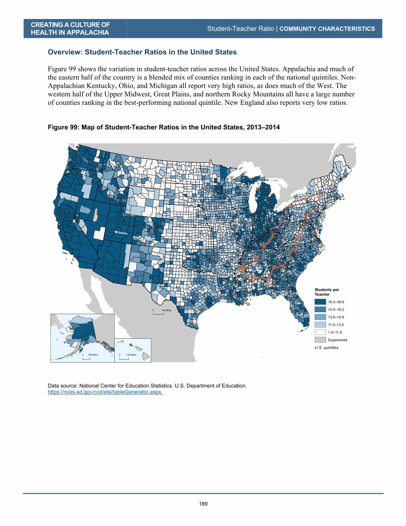
Overview: Student-Teacher Ratios in the United States Figure 99 shows the variation in student-teacher ratios across the United States. Appalachia and much of the eastern half of the country is a blended mix of counties ranking in each of the national quintiles. Non-Appalachian Kentucky, Ohio, and Michigan all report very high ratios, as does much of the West. The western half of the Upper Midwest, Great Plains, and northern Rocky Mountains all have a large number of counties ranking in the best-performing national quintile. New England also reports very low ratios. Figure 99: Map of Student-Teacher Ratios in the United States, 2013–2014
0 100 Miles
0 100 Miles0 200 Miles
16.3–38.9
14.9–16.2
13.6–14.8
11.9–13.5
1.9–11.8
Suppressed
U.S. quintiles
Students perTeacher
Data source: National Center for Education Statistics. U.S. Department of Education. https://nces.ed.gov/ccd/elsi/tableGenerator.aspx.

CREATING A CULTURE OF HEALTH IN APPALACHIA Student-Teacher Ratio | COMMUNITY CHARACTERISTICS
190
Distribution of Student-Teacher Ratios Figure 100 shows the distribution of student-teacher ratios by geography and economic status. The shaded boxes show the middle 50 percent of all values for each group, with dots representing unusually high or low values. The gray line stretching across the width of the graph indicates the national average, and the black lines inside the shaded boxes indicate the median for each respective group. Of the 3,113 counties in the nation, 58 have a missing value for this indicator, and two counties with values greater than 30 are not represented. For this measure, higher values are associated with worse health. Figure 100: Box Plot of Student-Teacher Ratios by Geography and Economic Status, 2013–2014
Data source: National Center for Education Statistics. U.S. Department of Education. https://nces.ed.gov/ccd/elsi/tableGenerator.aspx.
The distribution of student-teacher ratios among national quintiles for Appalachian counties is shown in Table 36. Of the 420 counties in the Region, 52 (12 percent) rank in the worst-performing national quintile, while 37 (9 percent) rank in the best-performing national quintile. Table 36: Distribution of Student-Teacher Ratios among National Quintiles for Appalachian Counties
Indicator Best
Quintile 2nd Best Quintile
Middle Quintile
2nd Worst Quintile
Worst Quintile
# Pct. # Pct. # Pct. # Pct. # Pct. Student-teacher ratio 37 9% 85 20% 116 28% 115 27% 52 12%
Data source for authors’ calculations shown above: Appalachian_Health_Disparities_Data.xlsx. The number of counties across all five quintiles for this indicator may not sum to 420 due to missing or suppressed values.
Subregionsin Appalachia
Economic Statusin AppalachiaAppalachia and U.S.
01
02
03
0S
tude
nts
per
Tea
cher
Appalachia Non-Appalachian U.S. Northern North Central Central South Central Southern Distressed Non-Distressed
Grey line denotes national average. 58 of 3113 counties have a missing value for this indicator.For this indicator, higher values are associated with worse health.2 counties with values greater than 30 not shown.
Further Reading
CO
MM
UN
ITY
CH
AR
AC
TER
ISTI
CS
191
Further Reading Travel Time to Work Brody, Jane E. “Commuting’s Hidden Cost.” New York Times. October 28, 2013. http://well.blogs.nytimes.com/2013/10/28/commutings-hidden-cost/ Grocery Store Availability USDA. Food Access Research Atlas. June 29, 2016. Available at: http://www.ers.usda.gov/data-
products/food-access-research-atlas.aspx Handbury J, Rahkovsky I, Schnell M. What Drives Nutritional Disparities? Retail Access and Food
Purchases Across the Socioeconomic Spectrum. National Bureau of Economic Research Working Paper No. 21126. Issued in April 2015. Available at: http://www.nber.org/papers/w21126
Student-Teacher Ratio West P, Sweeting H, Leyland A. School effects on pupils’ health behaviours: evidence in support of the
health promoting school. Research Papers in Education 2004; 19(3), pp. 261–291.

CREATING A CULTURE OF HEALTH IN APPALACHIA Further Reading | COMMUNITY CHARACTERISTICS
192