DIANA Research Group -- HCI & VR Lab. -- (University of Málaga; Spain)
Upload
weilong1113Category
view
156download
3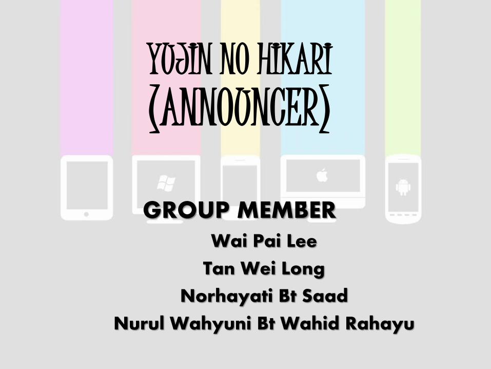
YUJIN NO HIKARI(ANNOUNCER)
GROUP MEMBERWai Pai Lee
Tan Wei Long
Norhayati Bt Saad
Nurul Wahyuni Bt Wahid Rahayu

1. Problem

User Problem?• Social messaging function widely used for
unofficial announcement.
• Announcement is not rigid and kept.
• Calendar system can be used but needed to be set manually.
• Information is not centralized.

Users?•Students
•Lecturers
•Company workers
•Supervisors
•Normal users
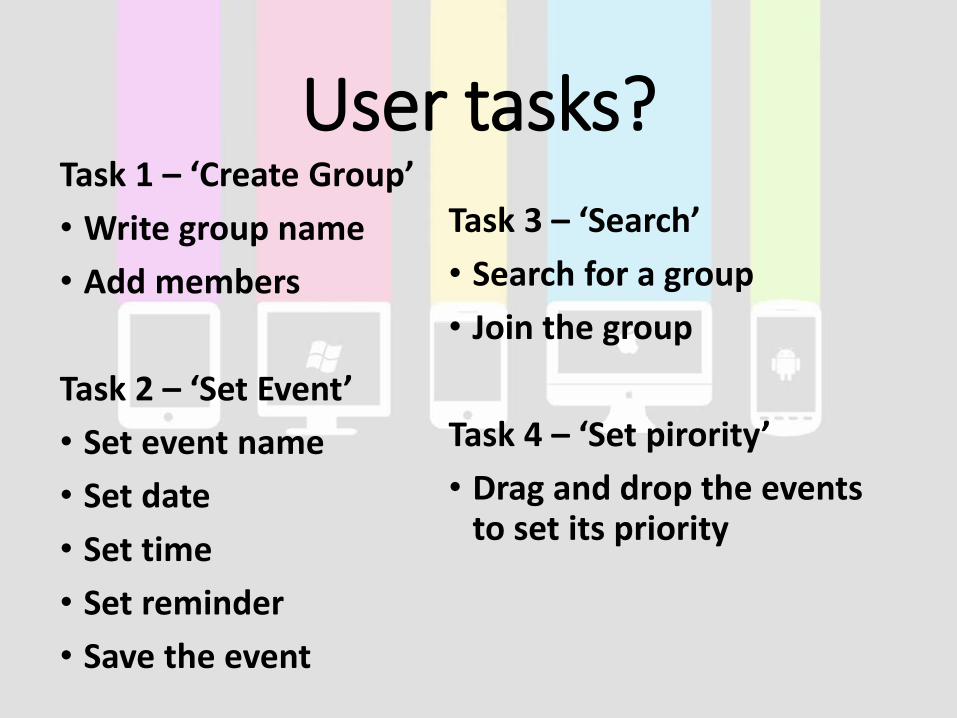
User tasks?Task 1 – ‘Create Group’
• Write group name
• Add members
Task 2 – ‘Set Event’
• Set event name
• Set date
• Set time
• Set reminder
• Save the event
Task 3 – ‘Search’
• Search for a group
• Join the group
Task 4 – ‘Set pirority’
• Drag and drop the events to set its priority

Please wait after end of slides.
2. DEMONSTRATION
3. Evaluation3. EVALUATION

Paper Prototyping User Feedback(LOW FIDELITY)User 1 (Group 7)
Task 1 – ‘Create Group’
• the apps is easy, but for the icon for creating group is not clearly mention
• the process is not too difficult
Task 2 – ‘Search Group’
• the process is easy, just nice
Task 3 – ‘Set Priority’
• it really confusing
• the instruction is not clear
• I wouldn't use the task

User 2 (Group 9)
Task 1 – ‘Create Group’
• add event is easy as it is stated clearly
• the create button is quite confusing as it just show the symbol '+'
• yes! I would really use the task as I always manage my schedule using calendar
Task 2 – ‘Search Group’
• easy to join group
• metaphor for searching is really confusing
• SUGGESTION : use magnifying glass as search button
Task 3 – ‘Set Priority’
• I do not know how to set the priority
• SUGGESTION: add button arrow to indicate the drag box
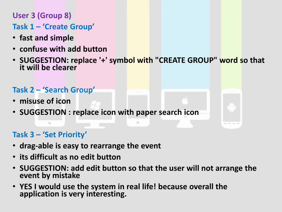
User 3 (Group 8)
Task 1 – ‘Create Group’
• fast and simple
• confuse with add button
• SUGGESTION: replace '+' symbol with "CREATE GROUP" word so that it will be clearer
Task 2 – ‘Search Group’
• misuse of icon
• SUGGESTION : replace icon with paper search icon
Task 3 – ‘Set Priority’
• drag-able is easy to rearrange the event
• its difficult as no edit button
• SUGGESTION: add edit button so that the user will not arrange the event by mistake
• YES I would use the system in real life! because overall the application is very interesting.

User Testing User Feedback
(HIGH FIDELITY)User 1
• Easy-piecey-like-a-cheesy.
• I can always get the update from lecturer.
User 2
• Cannot differentiate between icons of set alarm and create event but overall is good.

User 3
• It’s an attractive app maybe because its first time for me to use this kind of application. It’s also convenient as I can organize my schedule so that I won’t miss any. Tehe~
User 4
• I found it attractive because of its colour but it is quite confusing as for its flow.
User 5
• Simple and clean, quite attractive. Not confusing, understandable icon. Not quite convenient, very helpful and not very challenging. It is an simple application and understandable.
User 6
• Clean and simple.

Measuring Goals• Performance measurement
User 1 Constant, C (s)
Percentage
completed, P
(%)
Time spent by
user, T (s)
Performance
Score, S (%)
Task 1 30 100 38 78.95
Task 2 30 100 42 71.43
Task 3 20 100 25 80.00
Task 4 5 100 8 62.50
User 2 Constant, C (s)
Percentage
completed, P
(%)
Time spent by
user, T (s)
Performance
Score, S (%)
Task 1 30 100 41 73.17
Task 2 30 100 51 58.82
Task 3 20 100 25 80.00
Task 4 5 100 5 100.00
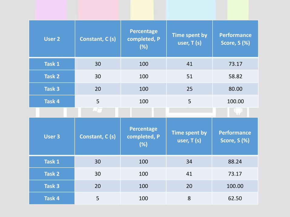
User 3 Constant, C (s)
Percentage
completed, P
(%)
Time spent by
user, T (s)
Performance
Score, S (%)
Task 1 30 100 34 88.24
Task 2 30 100 41 73.17
Task 3 20 100 20 100.00
Task 4 5 100 8 62.50
User 2 Constant, C (s)Percentage
completed, P (%)
Time spent by
user, T (s)
Performance
Score, S (%)
Task 1 30 100 41 73.17
Task 2 30 100 51 58.82
Task 3 20 100 25 80.00
Task 4 5 100 5 100.00
User 3 Constant, C (s)Percentage
completed, P (%)
Time spent by user, T
(s)
Performance Score, S
(%)
Task 1 30 100 34 88.24
Task 2 30 100 41 73.17
Task 3 20 100 20 100.00
Task 4 5 100 8 62.50
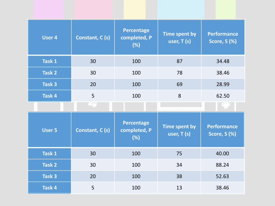
User 4 Constant, C (s)
Percentage
completed, P
(%)
Time spent by
user, T (s)
Performance
Score, S (%)
Task 1 30 100 87 34.48
Task 2 30 100 78 38.46
Task 3 20 100 69 28.99
Task 4 5 100 8 62.50
User 5 Constant, C (s)
Percentage
completed, P
(%)
Time spent by
user, T (s)
Performance
Score, S (%)
Task 1 30 100 75 40.00
Task 2 30 100 34 88.24
Task 3 20 100 38 52.63
Task 4 5 100 13 38.46

User 6 Constant, C (s)Percentage
completed, P (%)
Time spent by user,
T (s)
Performance Score,
S (%)
Task 1 30 100 51 58.82
Task 2 30 100 56 53.57
Task 3 20 100 47 42.55
Task 4 5 100 20 25.00
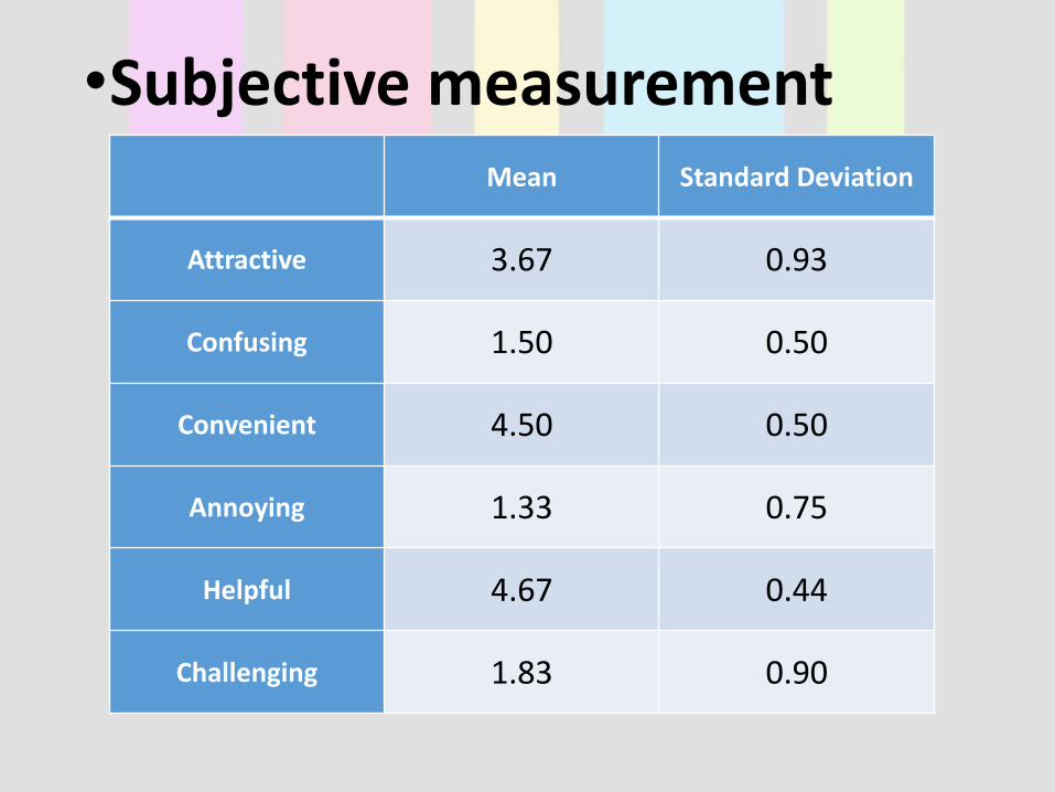
•Subjective measurementMean Standard Deviation
Attractive 3.67 0.93
Confusing 1.50 0.50
Convenient 4.50 0.50
Annoying 1.33 0.75
Helpful 4.67 0.44
Challenging 1.83 0.90

Discussion
• The results are not as expected. There are different types of users with different backgrounds.
• There are 3 positive and negative experiences respectively.
• Our expectations for positive and negative experiences are of mean >=4 and of mean <2respectively. While for standard deviation, our expectations for positive and negative experiences are both of <0.5.
• The lower the standard deviation, the more stable the data set, which means less variation.
DISCUSSION
Positive experiences
• The actual mean are mostly near to expected mean (5). The lowest is 3.67 for attractive which shows some of the users are not satisfied with the design of the prototype.
• While for standard deviation, highest is 0.93 (attractive) while lower is 0.44 (Helpful). It shows that there are variation in users’ opinions towards the experiences. There are user who does not like the design of the prototype. The lowest is of helpful. This shows users are mostly satisfied with the ‘helpful’ experience.

Negative experiences,
• The actual mean of the 3 negative experiences are all less than 2. The highest is ‘challenging’ (1.83). It shows that some users think it is challenging. From our opinion, most probably users stuck at the last task which is set priority. The last task uses ‘drag and drop’ mechanism which it cannot be implemented in Justinmind prototyper.
• For standard deviation, the lowest is ‘confusing’ (0.5) while the highest is ‘challenging’ (0.90). This is due to the reason mentioned in mean above which is users stuck at the last task.

Which task seems to be easiest and which is the most difficult?
• Task 3 seems to be easier because most user complete this task fast. This might be due to the magnifying glass icon clearly conveys the message of ‘search’. Although task 4 has the similar performance score as task 3, however it is not taken into consideration because it involves only one step and not really implemented well due to fault from prototyper.
• Task 2 seems to be the most difficult. This is because most user spends time on understanding the function and there are users confused between the icons.
Conclusion on the usability of prototype
• The icons clearly conveys the message of the functions. User can identify and understands the function easier.
• It is effective to use because most users achieve the goals of the tasks.
• Users are satisfy with the prototype as well as it is comfortable to use and users easily accepted the prototype.

Conclusion on the user experience
• Most users have good experience on the prototype. However, some of the users are not really satisfy on certain parts of the experiences for example attraction. Besides, there is fault from the prototyper which is ‘drag and drop’ mechanism for the last task. This had confused certain users on completing the task.

How should we improve the prototype? Conclusion
• We may have alternatives for the set event icon because there are users who could not differentiate in between set alarm and set event icon.
• For priority set, which had been an issue to our prototyper due to the ‘drag and drop’ mechanism which cannot be implemented in the prototyper.
• In create group, the button for adding members should be made clearer using icon instead of text field.
• For set event, the ‘done’ button of the pop out of set date should not be at the same position as the save event button. As there are some users accidentally click the done button twice and save the event without even setting the name, time and reminder.

4. Summarize

The BIG take away
• Evaluation ways, performance measurement.
• Indication of the goal measurement
Learnt
• Use of prototyper tool
• Process of user testing and evaluation
• Communication on guiding and coaching
Things should have be done differently
• Online prototyper should be used instead of offline prototyper so that we can edit the content and do user testing anywhere anytime.

THE 3ND


![HCI Research as Problem-Solving [CHI'16, presentation slides]](https://static.fdocuments.in/doc/165x107/58eb37221a28ab71028b4613/hci-research-as-problem-solving-chi16-presentation-slides.jpg)