Graphical Representations of Data, Mean, Median … Charts The pie charts corre-spond to the...
45
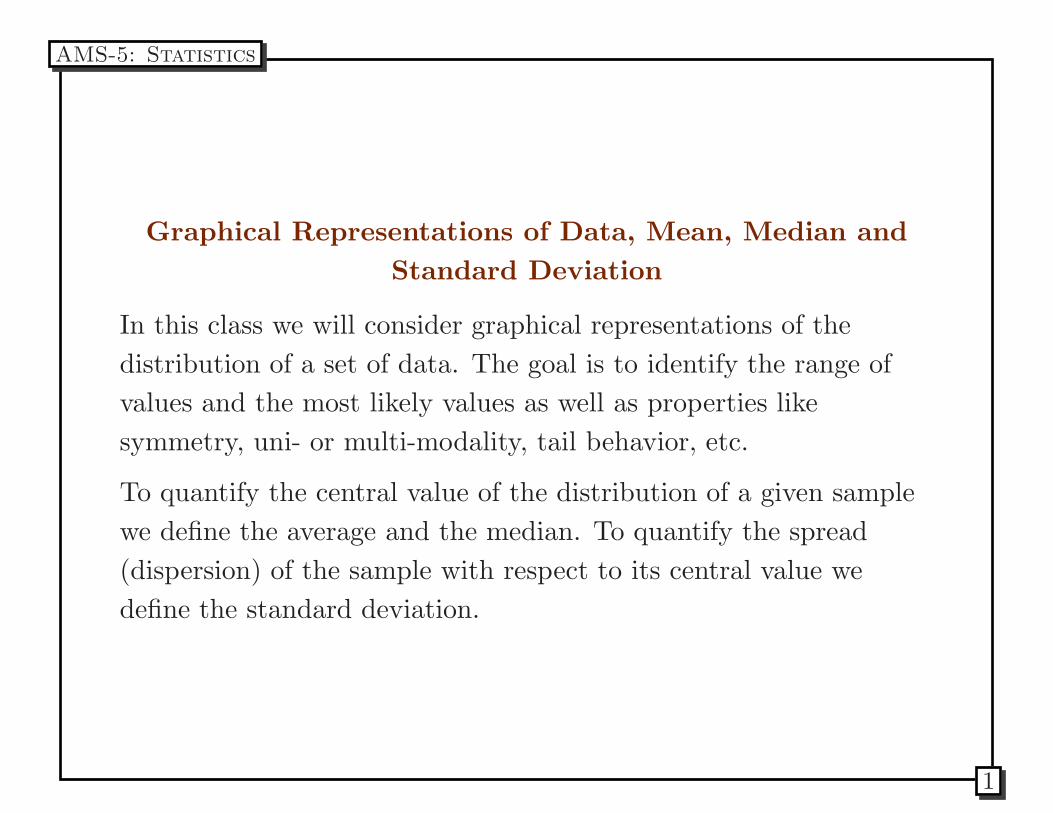
Graphical Representations of Data, Mean, Median and Standard Deviation In this class we will consider graphical representations of the distribution of a set of data. The goal is to identify the range of values and the most likely values as well as properties like symmetry, uni- or multi-modality, tail behavior, etc. To quantify the central value of the distribution of a given sample we define the average and the median. To quantify the spread (dispersion) of the sample with respect to its central value we define the standard deviation. AMS-5: Statistics 1
-
Upload
truongcong -
Category
Documents
-
view
219 -
download
2
Transcript of Graphical Representations of Data, Mean, Median … Charts The pie charts corre-spond to the...
Graphical Representations of Data, Mean, Median and
Standard Deviation
In this class we will consider graphical representations of the
distribution of a set of data. The goal is to identify the range of
values and the most likely values as well as properties like
symmetry, uni- or multi-modality, tail behavior, etc.
To quantify the central value of the distribution of a given sample
we define the average and the median. To quantify the spread
(dispersion) of the sample with respect to its central value we
define the standard deviation.
AMS-5: Statistics
1
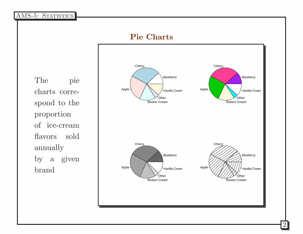
Pie Charts
The pie
charts corre-
spond to the
proportion
of ice-cream
flavors sold
annually
by a given
brand
Blueberry
Cherry
Apple
Boston CreamOther
Vanilla Cream
Blueberry
Cherry
Apple
Boston CreamOther
Vanilla Cream
Blueberry
Cherry
Apple
Boston CreamOther
Vanilla Cream
Blueberry
Cherry
Apple
Boston CreamOther
Vanilla Cream
AMS-5: Statistics
2
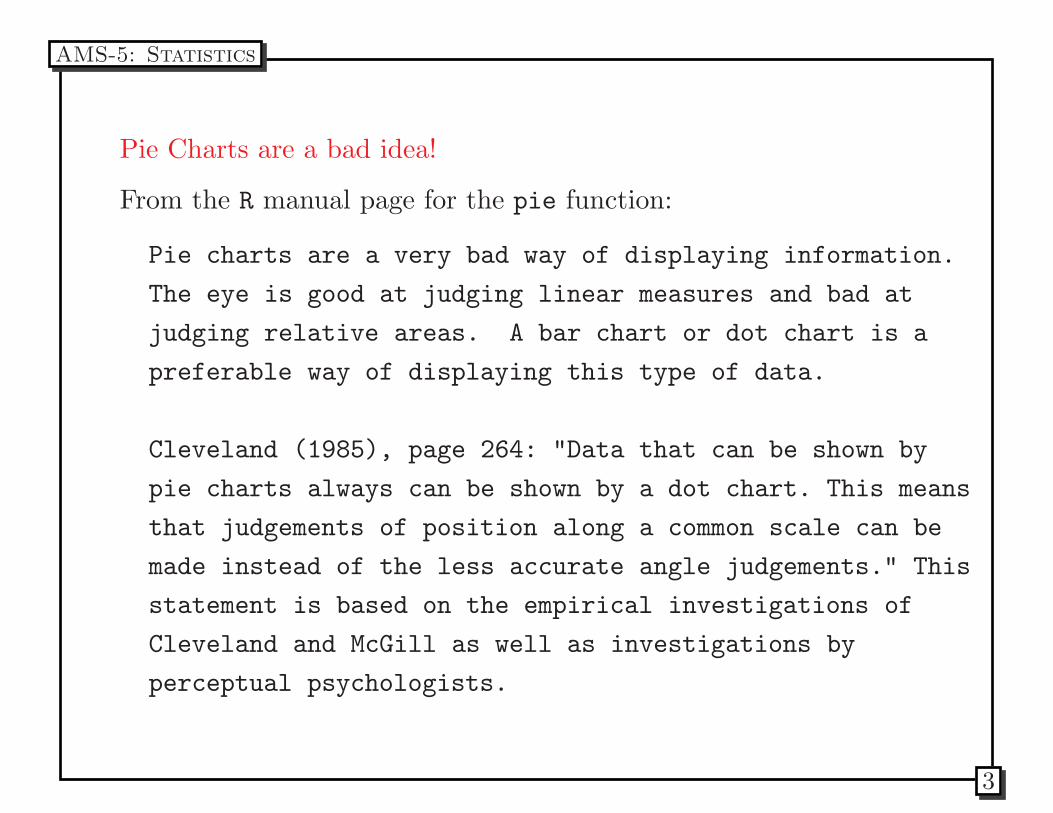
Pie Charts are a bad idea!
From the R manual page for the pie function:
Pie charts are a very bad way of displaying information.
The eye is good at judging linear measures and bad at
judging relative areas. A bar chart or dot chart is a
preferable way of displaying this type of data.
Cleveland (1985), page 264: "Data that can be shown by
pie charts always can be shown by a dot chart. This means
that judgements of position along a common scale can be
made instead of the less accurate angle judgements." This
statement is based on the empirical investigations of
Cleveland and McGill as well as investigations by
perceptual psychologists.
AMS-5: Statistics
3
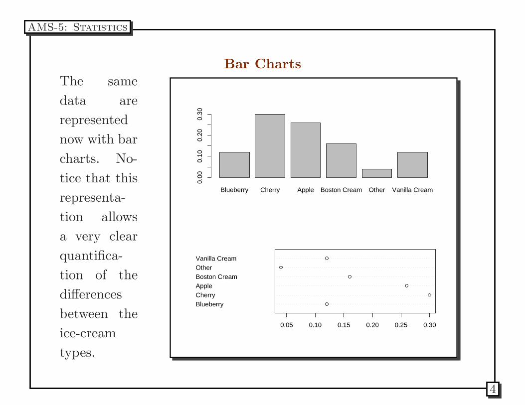
Bar Charts
The same
data are
represented
now with bar
charts. No-
tice that this
representa-
tion allows
a very clear
quantifica-
tion of the
differences
between the
ice-cream
types.
Blueberry Cherry Apple Boston Cream Other Vanilla Cream0.
000.
100.
200.
30
BlueberryCherryAppleBoston CreamOtherVanilla Cream
0.05 0.10 0.15 0.20 0.25 0.30
AMS-5: Statistics
4
Bar Charts
Strictly speaking bar charts can be used for drawing a summary of
either quantitative or qualitative data types. Qualitative data
types, such as nominal or ordinal variables, can be visualized using
bar charts.
The next data summary graphing techniques, Stem and Leaf Plots
and Histograms are used for quantitative variables.
AMS-5: Statistics
5
Stem and Leaf Plots
A similar technique used to graphically represent data is to use
stem and leaf plots. Take a look at the Healthy Breakfast data set.
This datafile contains nutritional information and grocery shelf
location for 77 breakfast cereals. Current research states that
adults should consume no more than 30 % of their calories in the
form of fat, they need about 50 grams (women) or 63 grams (men)
of protein daily, and should provide for the remainder of their
caloric intake with complex carbohydrates. One gram of fat
contains 9 calories and carbohydrates and proteins contain 4
calories per gram. A ”good” diet should also contain 20-35 grams
of dietary fiber.
Check out R code.
AMS-5: Statistics
6
AMS-5: Statistics
7
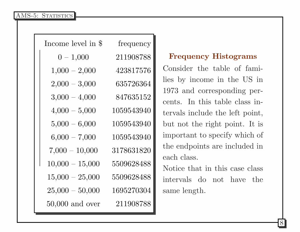
Income level in $ frequency
0 – 1,000 211908788
1,000 – 2,000 423817576
2,000 – 3,000 635726364
3,000 – 4,000 847635152
4,000 – 5,000 1059543940
5,000 – 6,000 1059543940
6,000 – 7,000 1059543940
7,000 – 10,000 3178631820
10,000 – 15,000 5509628488
15,000 – 25,000 5509628488
25,000 – 50,000 1695270304
50,000 and over 211908788
Frequency Histograms
Consider the table of fami-
lies by income in the US in
1973 and corresponding per-
cents. In this table class in-
tervals include the left point,
but not the right point. It is
important to specify which of
the endpoints are included in
each class.
Notice that in this case class
intervals do not have the
same length.
AMS-5: Statistics
8
We can draw a frequency histogram for each of the income level
ranges specified by dividing the frequency counts by the total
number of families. However, the ranges are different widths, so
that the area of each block is NOT equally proportional to the
number of families with incomes in the corresponding class interval.
We really WANT the areas of each block to equally represent the
proportion of families within the income class interval, so instead
we use a density histogram.
AMS-5: Statistics
9
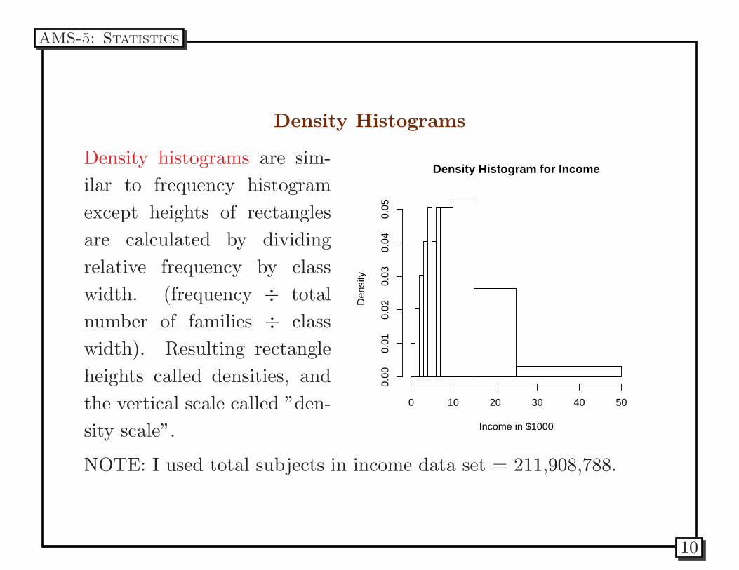
Density Histograms
Density histograms are sim-
ilar to frequency histogram
except heights of rectangles
are calculated by dividing
relative frequency by class
width. (frequency ÷ total
number of families ÷ class
width). Resulting rectangle
heights called densities, and
the vertical scale called ”den-
sity scale”.
Density Histogram for Income
Income in $1000
Den
sity
0 10 20 30 40 50
0.00
0.01
0.02
0.03
0.04
0.05
NOTE: I used total subjects in income data set = 211,908,788.
AMS-5: Statistics
10
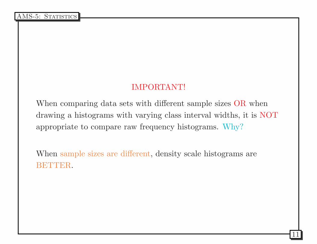
IMPORTANT!
When comparing data sets with different sample sizes OR when
drawing a histograms with varying class interval widths, it is NOT
appropriate to compare raw frequency histograms. Why?
When sample sizes are different, density scale histograms are
BETTER.
AMS-5: Statistics
11
Drawing Density Histograms
Once the distribution table of percentages is available the next step
is to draw a horizontal axis specifying the class intervals.
Then we draw the blocks remembering that
In a density histogram
the areas of the blocks represent percentages
So, it is a mistake to set the heights of the blocks equal to the
percentages in the table. (that would be a relative frequency
histogram, which we’ll talk about next.)
To figure out the height of a block divide the percentage by the
class width of the interval.
The table needed to calculate the heights of the blocks looks like
AMS-5: Statistics
12
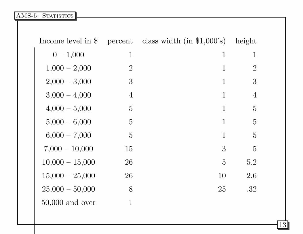
Income level in $ percent class width (in $1,000’s) height
0 – 1,000 1 1 1
1,000 – 2,000 2 1 2
2,000 – 3,000 3 1 3
3,000 – 4,000 4 1 4
4,000 – 5,000 5 1 5
5,000 – 6,000 5 1 5
6,000 – 7,000 5 1 5
7,000 – 10,000 15 3 5
10,000 – 15,000 26 5 5.2
15,000 – 25,000 26 10 2.6
25,000 – 50,000 8 25 .32
50,000 and over 1
AMS-5: Statistics
13
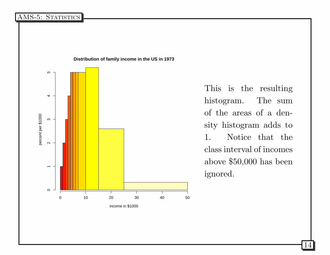
Distribution of family income in the US in 1973
income in $1000
perc
ent p
er $
1000
01
23
45
0 10 20 30 40 50
This is the resulting
histogram. The sum
of the areas of a den-
sity histogram adds to
1. Notice that the
class interval of incomes
above $50,000 has been
ignored.
AMS-5: Statistics
14
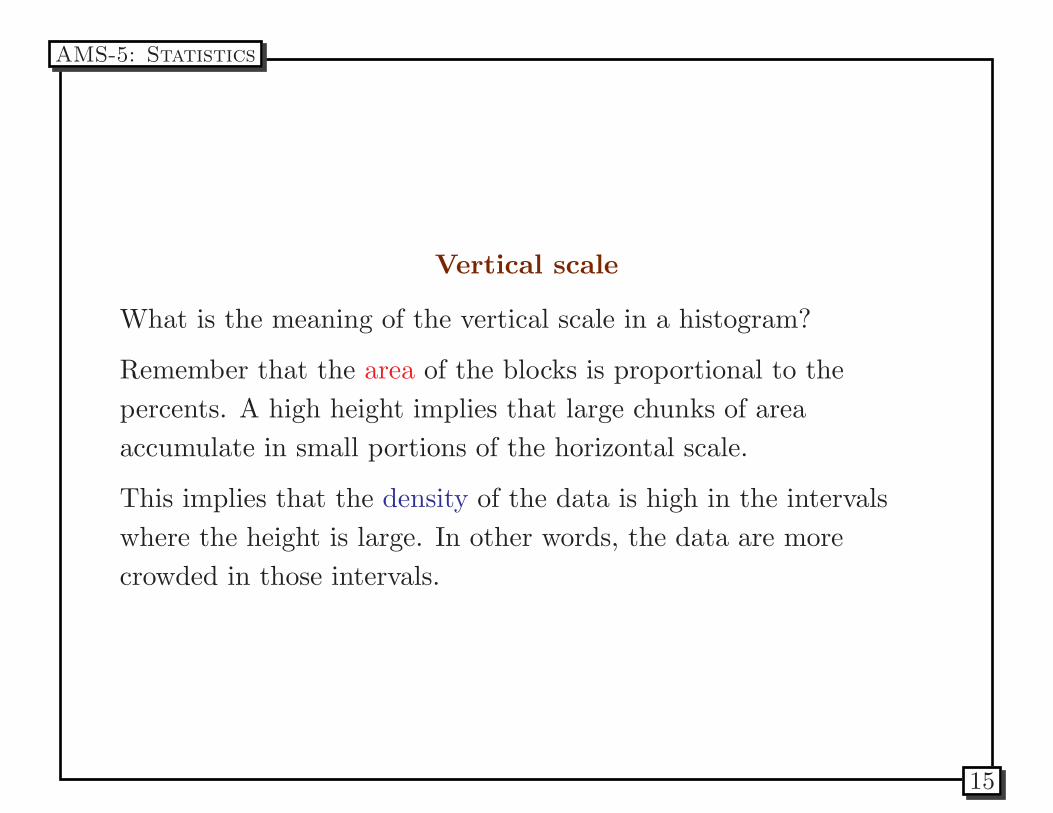
Vertical scale
What is the meaning of the vertical scale in a histogram?
Remember that the area of the blocks is proportional to the
percents. A high height implies that large chunks of area
accumulate in small portions of the horizontal scale.
This implies that the density of the data is high in the intervals
where the height is large. In other words, the data are more
crowded in those intervals.
AMS-5: Statistics
15
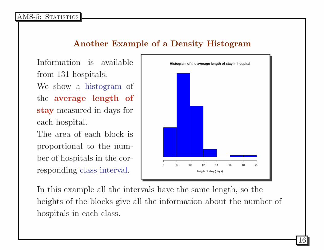
Another Example of a Density Histogram
Information is available
from 131 hospitals.
We show a histogram of
the average length of
stay measured in days for
each hospital.
The area of each block is
proportional to the num-
ber of hospitals in the cor-
responding class interval.
Histogram of the average length of stay in hospital
length of stay (days)
6 8 10 12 14 16 18 20
In this example all the intervals have the same length, so the
heights of the blocks give all the information about the number of
hospitals in each class.
AMS-5: Statistics
16
There are 7 class intervals corresponding to
• 6 to 8 days
• 8 to 10 days
• 10 to 12 days
• 12 to 14 days
• 14 to 16 days
• 16 to 18 days
• 18 to 20 days
Note that the class that corresponds to 14 to 16 days is empty and
that the class with the highest count of hospitals is the one of 8 to
10 days.
AMS-5: Statistics
17
Cross tabulation
In many situations we need to perform an exploratory analysis of
data to observe possible associations with a discrete variable. For
example, consider measuring the blood pressure of women and
divide them in two groups: one taking the contraceptive pill and
the other not taking it.
We can produce a table with the distribution of one group in one
column and the distribution of the other in another column. This
can be used to produce two histograms in order to make a visual
comparison of the the two groups.
The variable that is used for the cross-tabulation is usually referred
to as a covariable.
AMS-5: Statistics
18
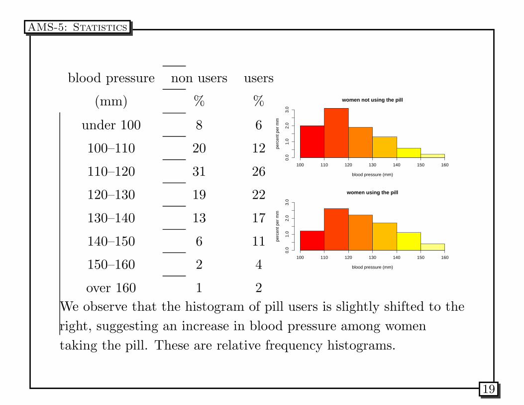
blood pressure non users users
(mm) % %
under 100 8 6
100–110 20 12
110–120 31 26
120–130 19 22
130–140 13 17
140–150 6 11
150–160 2 4
over 160 1 2
women not using the pill
blood pressure (mm)
perc
ent p
er m
m
0.0
1.0
2.0
3.0
100 110 120 130 140 150 160
women using the pill
blood pressure (mm)
perc
ent p
er m
m
0.0
1.0
2.0
3.0
100 110 120 130 140 150 160
We observe that the histogram of pill users is slightly shifted to the
right, suggesting an increase in blood pressure among women
taking the pill. These are relative frequency histograms.
AMS-5: Statistics
19
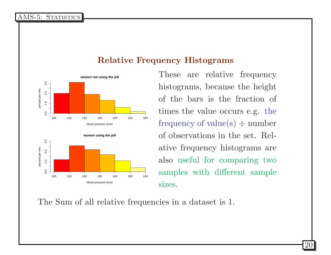
Relative Frequency Histograms
women not using the pill
blood pressure (mm)
perc
ent p
er m
m
0.0
1.0
2.0
3.0
100 110 120 130 140 150 160
women using the pill
blood pressure (mm)
perc
ent p
er m
m
0.0
1.0
2.0
3.0
100 110 120 130 140 150 160
These are relative frequency
histograms, because the height
of the bars is the fraction of
times the value occurs e.g. the
frequency of value(s) ÷ number
of observations in the set. Rel-
ative frequency histograms are
also useful for comparing two
samples with different sample
sizes.
The Sum of all relative frequencies in a dataset is 1.
AMS-5: Statistics
20
Problems
Data from the 1990 Census produce the following for houses in the
New York City area that are either occupied by the owner or
rented out.
1. The owner-occupied percents add up to 99.9% and the
renter-occupied percents add up to 100.1%, why?
2. The percentage of one-room units is much larger for
renter-occupied housing. Is that because there is more
renter-occupied housing in total?
3. Which are larger on the whole: the owner-occupied units or the
renter-occupied units?
AMS-5: Statistics
21
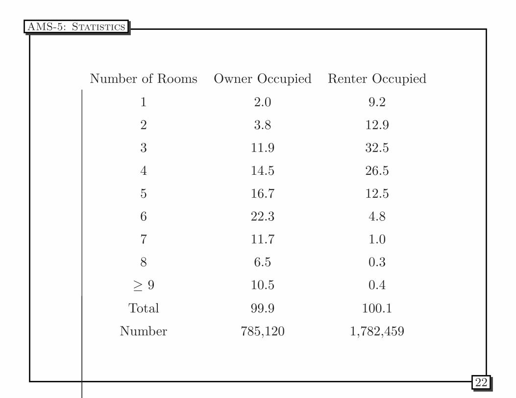
Number of Rooms Owner Occupied Renter Occupied
1 2.0 9.2
2 3.8 12.9
3 11.9 32.5
4 14.5 26.5
5 16.7 12.5
6 22.3 4.8
7 11.7 1.0
8 6.5 0.3
≥ 9 10.5 0.4
Total 99.9 100.1
Number 785,120 1,782,459
AMS-5: Statistics
22
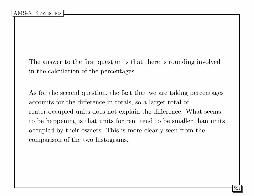
The answer to the first question is that there is rounding involved
in the calculation of the percentages.
As for the second question, the fact that we are taking percentages
accounts for the difference in totals, so a larger total of
renter-occupied units does not explain the difference. What seems
to be happening is that units for rent tend to be smaller than units
occupied by their owners. This is more clearly seen from the
comparison of the two histograms.
AMS-5: Statistics
23
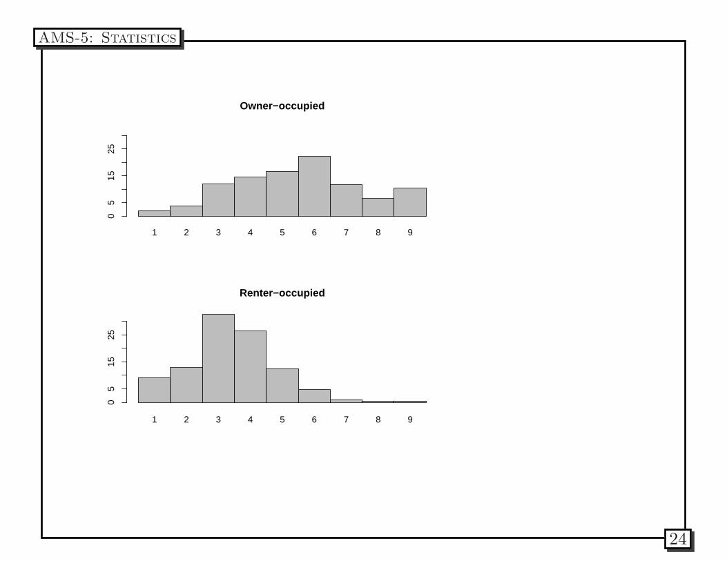
1 2 3 4 5 6 7 8 9
Owner−occupied0
515
25
1 2 3 4 5 6 7 8 9
Renter−occupied
05
1525
AMS-5: Statistics
24
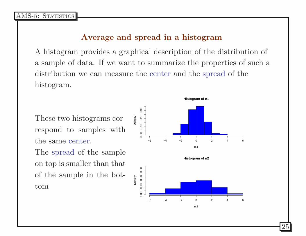
Average and spread in a histogram
A histogram provides a graphical description of the distribution of
a sample of data. If we want to summarize the properties of such a
distribution we can measure the center and the spread of the
histogram.
These two histograms cor-
respond to samples with
the same center.
The spread of the sample
on top is smaller than that
of the sample in the bot-
tom
Histogram of n1
n.1
Den
sity
−6 −4 −2 0 2 4 60.
000.
100.
200.
30
Histogram of n2
n.2
Den
sity
−6 −4 −2 0 2 4 6
0.00
0.10
0.20
0.30
AMS-5: Statistics
25
Average and median
In addition to summarizing a variable graphically to look for
patterns, it’s also useful to summarize it numerically.
The three most useful measures of center (or central tendency) are
the mean, the median (and other quantiles, or percentiles), and the
mode.
It turns out the the mean has the graphical interpretation of the
center of gravity of the data. If you visualize the histogram of a
variable as made of bricks that are sitting on a number line made of
plywood, which in turn is put on top of a saw-hours, the mean is
the place where the histogram would exactly balance.
AMS-5: Statistics
26
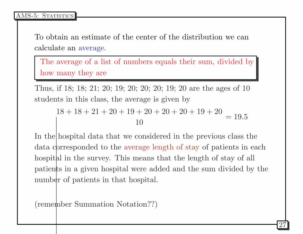
To obtain an estimate of the center of the distribution we can
calculate an average.
The average of a list of numbers equals their sum, divided by
how many they are
Thus, if 18; 18; 21; 20; 19; 20; 20; 20; 19; 20 are the ages of 10
students in this class, the average is given by
18 + 18 + 21 + 20 + 19 + 20 + 20 + 20 + 19 + 20
10= 19.5
In the hospital data that we considered in the previous class the
data corresponded to the average length of stay of patients in each
hospital in the survey. This means that the length of stay of all
patients in a given hospital were added and the sum divided by the
number of patients in that hospital.
(remember Summation Notation??)
AMS-5: Statistics
27
Average and median
The median of a column of numbers is found by sorting the data,
from smallest to highest, and finding the middle value in the list. If
the sorted list has an odd number of elements, then the median is
uniquely defined. If the sorted list has an even number of elements,
the median is the mean of the two middle values.
AMS-5: Statistics
28
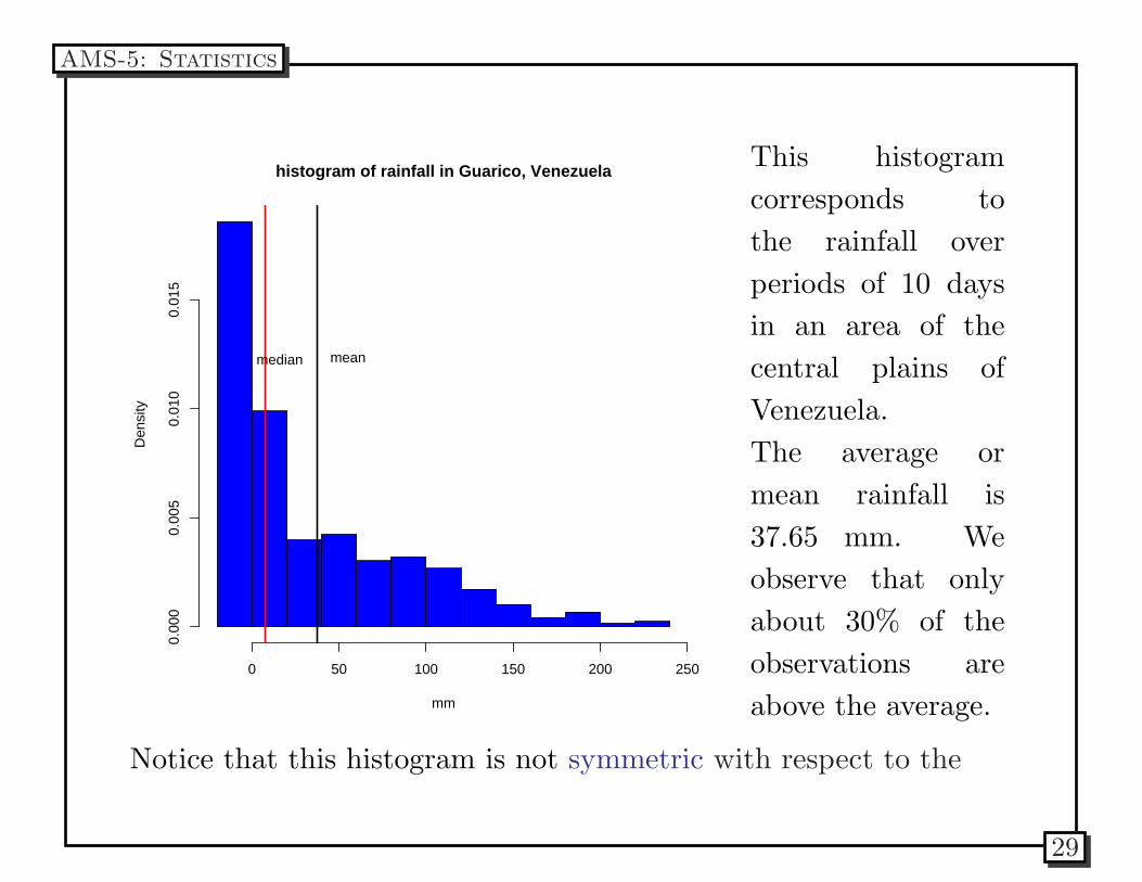
histogram of rainfall in Guarico, Venezuela
mm
Den
sity
0 50 100 150 200 250
0.00
00.
005
0.01
00.
015
meanmedian
This histogram
corresponds to
the rainfall over
periods of 10 days
in an area of the
central plains of
Venezuela.
The average or
mean rainfall is
37.65 mm. We
observe that only
about 30% of the
observations are
above the average.
Notice that this histogram is not symmetric with respect to the
AMS-5: Statistics
29
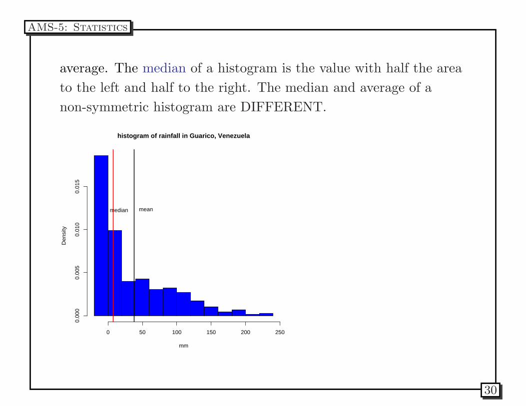
average. The median of a histogram is the value with half the area
to the left and half to the right. The median and average of a
non-symmetric histogram are DIFFERENT.
histogram of rainfall in Guarico, Venezuela
mm
Den
sity
0 50 100 150 200 250
0.00
00.
005
0.01
00.
015
meanmedian
AMS-5: Statistics
30
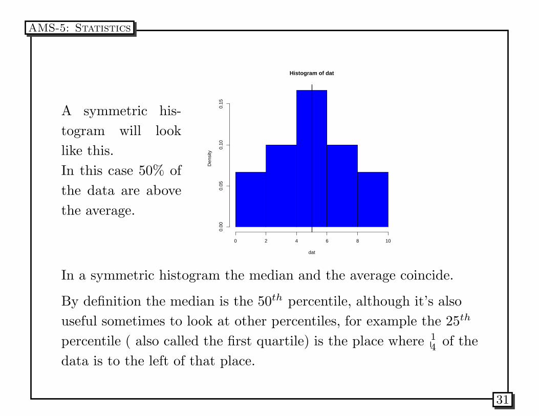
A symmetric his-
togram will look
like this.
In this case 50% of
the data are above
the average.
Histogram of dat
dat
Den
sity
0 2 4 6 8 10
0.00
0.05
0.10
0.15
In a symmetric histogram the median and the average coincide.
By definition the median is the 50th percentile, although it’s also
useful sometimes to look at other percentiles, for example the 25th
percentile ( also called the first quartile) is the place where 1
4of the
data is to the left of that place.
AMS-5: Statistics
31
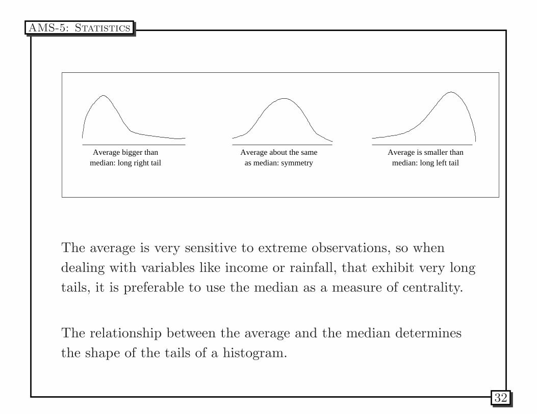
Average bigger thanmedian: long right tail
Average about the sameas median: symmetry
Average is smaller thanmedian: long left tail
The average is very sensitive to extreme observations, so when
dealing with variables like income or rainfall, that exhibit very long
tails, it is preferable to use the median as a measure of centrality.
The relationship between the average and the median determines
the shape of the tails of a histogram.
AMS-5: Statistics
32
Problem 1:According to the Department of Commerce, the mean
and median price of new houses sold in the United States in mid
1988 were 141, 200 and 117, 800. Which of these numbers is the
mean and which is the median? Explain your answer.
Problem 2: The number of deaths from cancer in the US has
risen steadily over time. In 1985, about 462,000 people died of
cancer, up from 331.000 deaths in 1970. A member of Congress
says that these numbers show that these numbers show that no
progress has been made in treating cancer. Explain how the
number of people dying of cancer could increase even if treatment
of the disease were improving. Then describe at least one variable
that would be a more appropriate measure of the effectiveness of
medical treatment for a potentially fatal disease.
AMS-5: Statistics
33
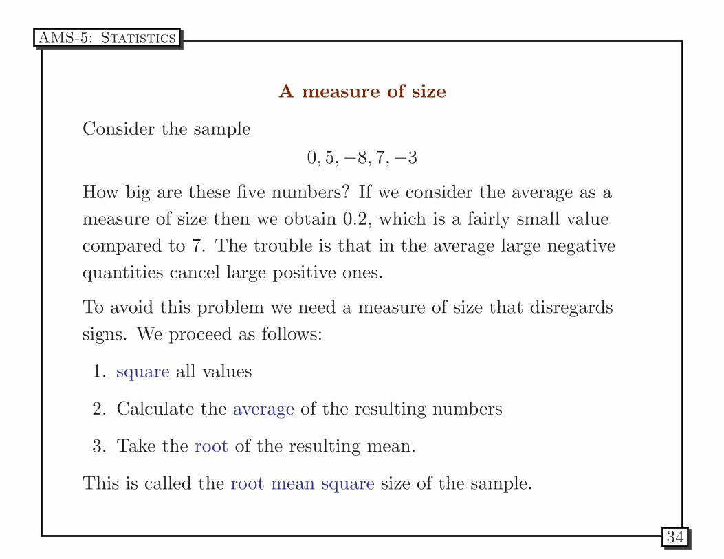
A measure of size
Consider the sample
0, 5,−8, 7,−3
How big are these five numbers? If we consider the average as a
measure of size then we obtain 0.2, which is a fairly small value
compared to 7. The trouble is that in the average large negative
quantities cancel large positive ones.
To avoid this problem we need a measure of size that disregards
signs. We proceed as follows:
1. square all values
2. Calculate the average of the resulting numbers
3. Take the root of the resulting mean.
This is called the root mean square size of the sample.
AMS-5: Statistics
34
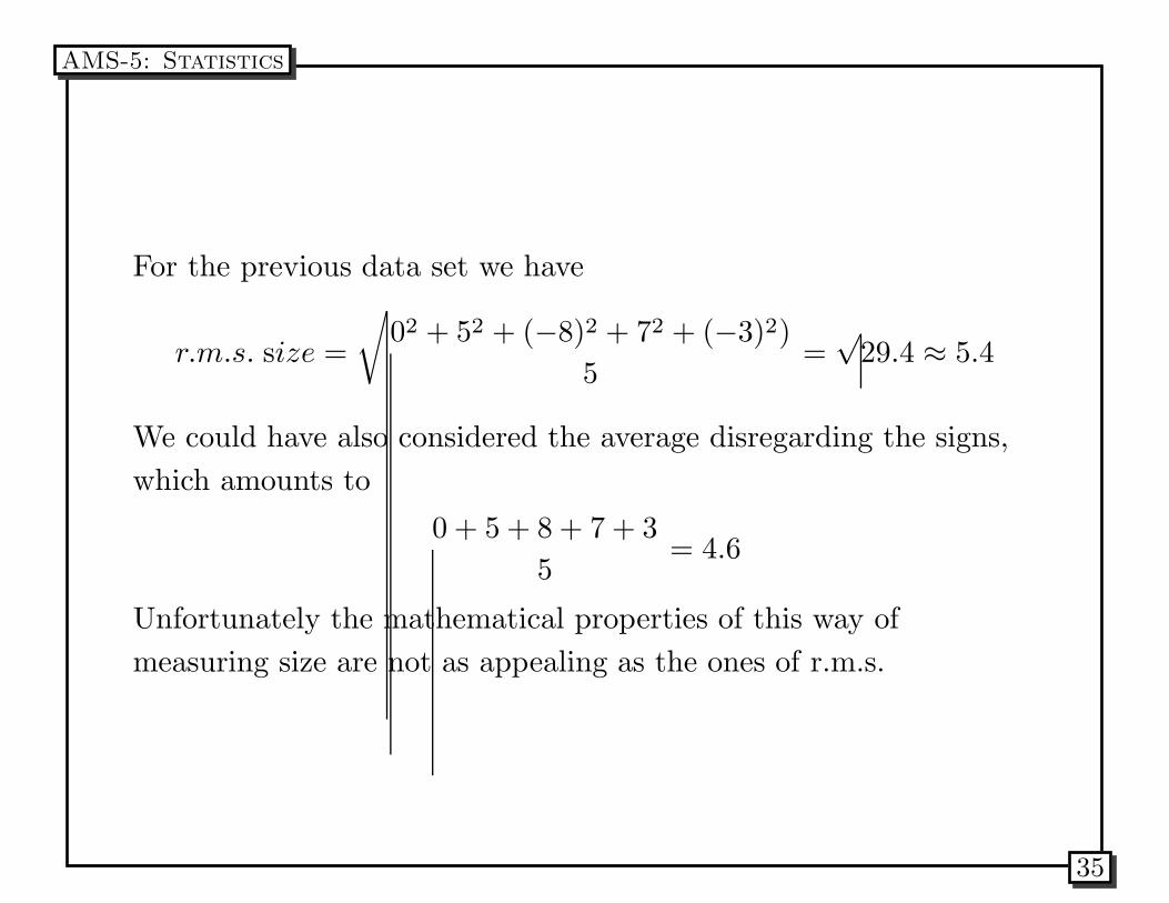
For the previous data set we have
r.m.s. size =
√
02 + 52 + (−8)2 + 72 + (−3)2)
5=
√29.4 ≈ 5.4
We could have also considered the average disregarding the signs,
which amounts to
0 + 5 + 8 + 7 + 3
5= 4.6
Unfortunately the mathematical properties of this way of
measuring size are not as appealing as the ones of r.m.s.
AMS-5: Statistics
35
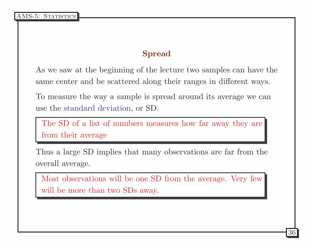
Spread
As we saw at the beginning of the lecture two samples can have the
same center and be scattered along their ranges in different ways.
To measure the way a sample is spread around its average we can
use the standard deviation, or SD.
The SD of a list of numbers measures how far away they are
from their average
Thus a large SD implies that many observations are far from the
overall average.
Most observations will be one SD from the average. Very few
will be more than two SDs away.
AMS-5: Statistics
36
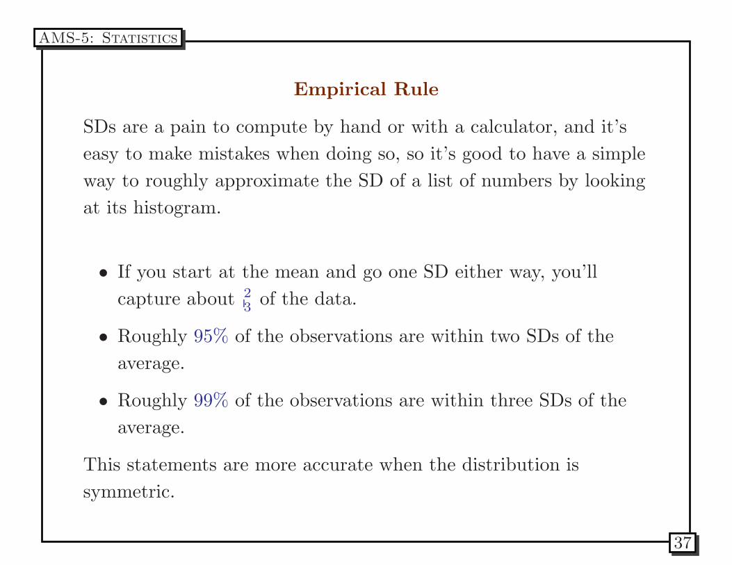
Empirical Rule
SDs are a pain to compute by hand or with a calculator, and it’s
easy to make mistakes when doing so, so it’s good to have a simple
way to roughly approximate the SD of a list of numbers by looking
at its histogram.
• If you start at the mean and go one SD either way, you’ll
capture about 2
3of the data.
• Roughly 95% of the observations are within two SDs of the
average.
• Roughly 99% of the observations are within three SDs of the
average.
This statements are more accurate when the distribution is
symmetric.
AMS-5: Statistics
37
Generally, more data is better than less data because
more data mean less uncertainty (or smaller give or
take).
AMS-5: Statistics
38
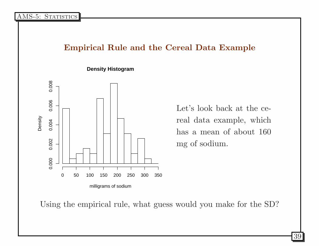
Empirical Rule and the Cereal Data Example
Density Histogram
milligrams of sodium
Den
sity
0 50 100 150 200 250 300 350
0.00
00.
002
0.00
40.
006
0.00
8
Let’s look back at the ce-
real data example, which
has a mean of about 160
mg of sodium.
Using the empirical rule, what guess would you make for the SD?
AMS-5: Statistics
39
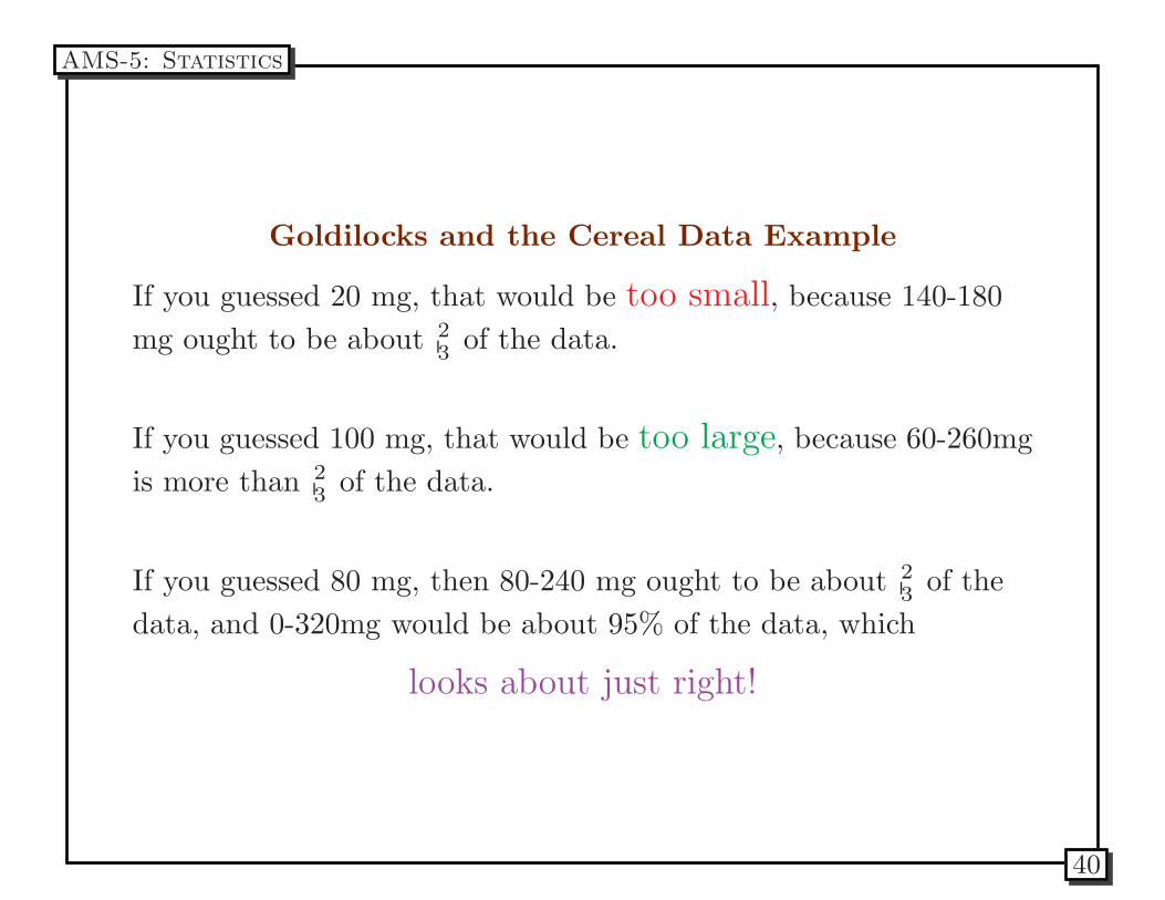
Goldilocks and the Cereal Data Example
If you guessed 20 mg, that would be too small, because 140-180
mg ought to be about 2
3of the data.
If you guessed 100 mg, that would be too large, because 60-260mg
is more than 2
3of the data.
If you guessed 80 mg, then 80-240 mg ought to be about 2
3of the
data, and 0-320mg would be about 95% of the data, which
looks about just right!
AMS-5: Statistics
40
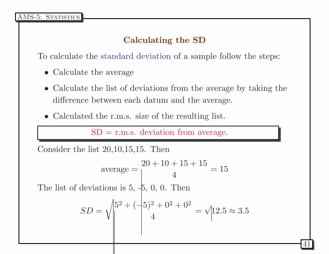
Calculating the SD
To calculate the standard deviation of a sample follow the steps:
• Calculate the average
• Calculate the list of deviations from the average by taking the
difference between each datum and the average.
• Calculated the r.m.s. size of the resulting list.
SD = r.m.s. deviation from average.
Consider the list 20,10,15,15. Then
average =20 + 10 + 15 + 15
4= 15
The list of deviations is 5, -5, 0, 0. Then
SD =
√
52 + (−5)2 + 02 + 02
4=
√12.5 ≈ 3.5
AMS-5: Statistics
41
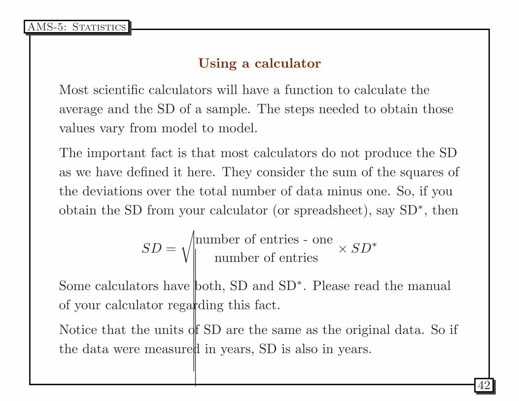
Using a calculator
Most scientific calculators will have a function to calculate the
average and the SD of a sample. The steps needed to obtain those
values vary from model to model.
The important fact is that most calculators do not produce the SD
as we have defined it here. They consider the sum of the squares of
the deviations over the total number of data minus one. So, if you
obtain the SD from your calculator (or spreadsheet), say SD∗, then
SD =
√
number of entries - one
number of entries× SD∗
Some calculators have both, SD and SD∗. Please read the manual
of your calculator regarding this fact.
Notice that the units of SD are the same as the original data. So if
the data were measured in years, SD is also in years.
AMS-5: Statistics
42
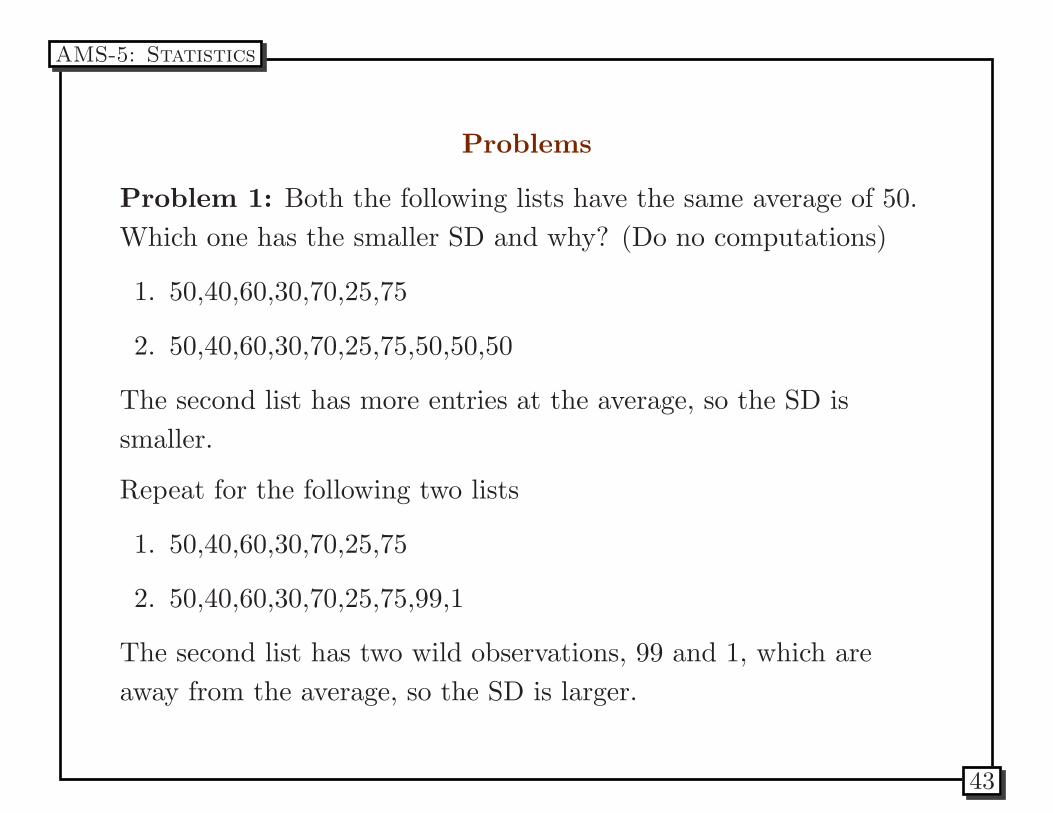
Problems
Problem 1: Both the following lists have the same average of 50.
Which one has the smaller SD and why? (Do no computations)
1. 50,40,60,30,70,25,75
2. 50,40,60,30,70,25,75,50,50,50
The second list has more entries at the average, so the SD is
smaller.
Repeat for the following two lists
1. 50,40,60,30,70,25,75
2. 50,40,60,30,70,25,75,99,1
The second list has two wild observations, 99 and 1, which are
away from the average, so the SD is larger.
AMS-5: Statistics
43
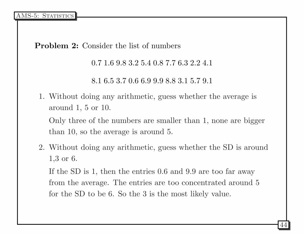
Problem 2: Consider the list of numbers
0.7 1.6 9.8 3.2 5.4 0.8 7.7 6.3 2.2 4.1
8.1 6.5 3.7 0.6 6.9 9.9 8.8 3.1 5.7 9.1
1. Without doing any arithmetic, guess whether the average is
around 1, 5 or 10.
Only three of the numbers are smaller than 1, none are bigger
than 10, so the average is around 5.
2. Without doing any arithmetic, guess whether the SD is around
1,3 or 6.
If the SD is 1, then the entries 0.6 and 9.9 are too far away
from the average. The entries are too concentrated around 5
for the SD to be 6. So the 3 is the most likely value.
AMS-5: Statistics
44
Problem 3: The usual method for determining heart rate is to
take the pulse and count the number of beats in a given time
period. The results are generally reported as beats per minute; for
instance, if the time period is 15 seconds, the count is multilied by
four. Take your pulse for two 15-sec. periods, two 30-sec. periods,
and two 1-minute periods. Convert the counts to beats per minute
and report the results. Which procedure do you think gives the
best results?? Why?
AMS-5: Statistics
45