Good font. Bad font. - Amazon Web Services4ormat-asset.s3.amazonaws.com/vfs/38127/public... · Good...
1
Good font. Bad font. (Part 1) Typography is the practice of arranging type in order to make language (or a message) visible. So what makes typography an institution? Typography affects the way we receive information, which in turn affects our responsive behaviour to that particular message. There are explicit rules; the way typefaces and layouts are constructed for example, and there are implicit rules; constructing type faces and layout so that the message is legible and appropriate for the given message. Good design and application of type (or font) is vital in the discourse of typography. Type is ubiquitous and although it is not isolated to one specific location, it forms a part to an institution that has impact on our everyday life. Typography is an institution perpetuated by the need to communicate messages in print form and without typefaces (or fonts) the message loses its opportunity to direct the viewer’s reaction and subsequent behaviour. Fonts are 560 years old and there are over 100,000 of them. We need type to read language, but we need typefaces (fonts) to help us understand the message. I asked five people what they thought about the notion of Typography as an institution. 1 2 3 4 5 6 7 8 Design and photography by Bianca Jenkins. Photograph (6) by Mathew Woodward. Special thanks to Bruno Maag and Giorgio Del Buono. Font: ‘Lexia’ (Dalton Maag). 1 Bruno Maag Craig Burston Nokia Pure (font) publication Anna Gomez Da Silva Giorgio Del Buono Carby Tuckwell Nokia Pure (font) publication Screen print, Giorgio Del Buono 9 Deus Ex Machina tote bag Type Designer. Bruno Maag. Director, Dalton Maag. How long does it take to design a typeface? It depends on how much you want. Basically – a 6 weight font family (light regular and bold matching italics) in a western EU character set, about 350 characters to print ready, about 3 – 4 months from first sketch to final approval by client then 8 weeks to it being screen ready for digital use. Typography directly effects the way we receive and react to a message. How do you go about injecting an emotion like charm or warmth? I think again you have to look back at what is the company does and you have to play to what people are used to seeing and to certain stereotypes. There are two basic differences. There are humanist designs and there are more geometric designs. Geometric designs for example tend to feel a bit more mechanic a bit more constructed. Humanist designs feel a bit more like they come out of the hand. They have open shapes they are a bit more friendlier etc. So those are in essence the two directions you can go. I like how you have said in the past that if you ask someone the difference between two fonts they wouldn’t be able to tell you rationally but emotionally they would tell you which feels nicer. Yes, it’s a difficult thing to quantify – that emotional difference and yes, I as a type designer can tell you where the differences are, I’ve been doing that for 30 years now, but the client who is not so trained finds it difficult to look at the difference technically but will say – that feels different. Parting thoughts? Typography needs to function. The point of typography is to convey a message. (Adriam) Frutiger said “A good typeface is here to be read and not seen”. “ I think as long as we are human beings and everyone is unique we will want different fonts. It’s like music. ” Educator. Craig Burston. Head of Graphics, University For The Creative Arts, Farnham. “ Type is the clothes words wear to give them meaning. It is a way of producing a means of enhancing a message. ” The course here is called ‘Graphic Communication’. What inclusion or allowance for typography is written into the curriculum? In the first year there are two subjects. One called Design Skills for Type and Typography. Type is seen as being central to what we do. It’s seen as an integral part of graphic communication. The reality in practice is that graphic communication is two fold, it’s text and image where as the First years have historically been taught that these are two different principles. To combat this, there will be a new unit called ‘Guiding principles and ways of working’ to embed typography into the whole of the first year – not as a stand alone way of working. Including specialist workshops, lectures on the history of, discussions and sessions on contemporary typographic movements/changes and so on. What do you think are the implicit rules associated with typography as an institution? If there are any implicit rules, I don’t think they fall into a hierarchical structures so I don’t believe that it’s expression above legibility or legibility above expression or modernity above tradition or tradition above modernity. But think if there is any implicit rules then it has to be type is a means of conveying information. Ultimately if it can’t be read, it can’t communicate and if it can’t communicate it doesn’t work. If I was forced into making a hierarchy for myself I would say legibility first, enhance the message second. Do you think that typography trends move in cycles? I’m not sure whether they work in cycles. There possibly or probably are trends, or people have ways of working but I’m not sure it’s the fashionable equivalent of the width of your jeans! 2 3 Consumer. Anna Gomez Da Silva, Events Manager, Transport For London. “ A font can give you clues about the product - like whether it is high quality, conservative, or innovative. ” Is there a font that you particularly like? Why? I really like the font that is used on vintage products and in the posters designed by Toulous Lautrec. I much prefer a font that is not completely uniform. It’s not something I can really explain, but I just find it pleasing to look at. Equally, is there a font/style of font that you don’t like and why? Yes, I have a real aversion to Times New Roman. If i’m sent an email in that font and I click to reply, I have to change it before I start writing. I’m not exactly sure why, it seems very rigid and I tend to prefer rounder text. Do you think fonts affect the way you make decisions about consumption? Why? Yes, I think fonts can give a sense of quality, or lack of quality, and I also think you can associate personally with a font, so it can make you feel that an item is the right thing for you just because it uses a font that you particularly like. They can also make an item seem more interesting if the font stands out as being creative or new, and similarly make something seem boring or ordinary. With so much competition around, all these things could be crucial in the decision to consume or not. Do you associate fonts with emotions? Yes I really believe that different fonts can prompt different emotions. My response to Times New Roman is definitely emotional because it’s certainly not rational! A Gothic type font can create an association with something scary, a very round and spaced font can make something seem childish, there are particular decorated fonts that I would associate with religion. I think fonts can be evocative - a bit like smells, and create an emotional response linked to a memory. 4
Transcript of Good font. Bad font. - Amazon Web Services4ormat-asset.s3.amazonaws.com/vfs/38127/public... · Good...
Good font. Bad font. (Part 1)
Typography is the practice of arranging type in order to make language (or a message) visible.So what makes typography an institution? Typography affects the way we receive information, which in turn affects our responsive behaviour to that particularmessage. There are explicit rules; the way typefaces and layouts are constructed for example, and there are implicit rules; constructing type faces and layout so that the message is legible and appropriate for the given message. Good design and application of type (or font) is vital in the discourse of typography. Type is ubiquitous andalthough it is not isolated to one specific location, it forms a part to an institution that has impact on our everyday life.
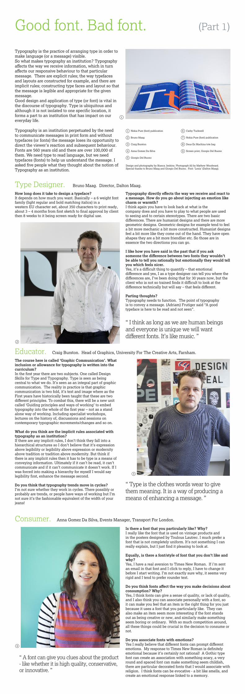
Typography is an institution perpetuated by the need to communicate messages in print form and without typefaces (or fonts) the message loses its opportunity to direct the viewer’s reaction and subsequent behaviour. Fonts are 560 years old and there are over 100,000 of them. We need type to read language, but we need typefaces (fonts) to help us understand the message. I asked five people what they thought about the notion of Typography as an institution.
1
2
3
4
5
6
7
8
Design and photography by Bianca Jenkins. Photograph (6) by Mathew Woodward. Special thanks to Bruno Maag and Giorgio Del Buono. Font: ‘Lexia’ (Dalton Maag).
1
Bruno Maag
Craig Burston
Nokia Pure (font) publication
Anna Gomez Da Silva
Giorgio Del Buono
Carby Tuckwell
Nokia Pure (font) publication
Screen print, Giorgio Del Buono 9
Deus Ex Machina tote bag
Type Designer. Bruno Maag. Director, Dalton Maag.
How long does it take to design a typeface?It depends on how much you want. Basically – a 6 weight font family (light regular and bold matching italics) in a western EU character set, about 350 characters to print ready, about 3 – 4 months from first sketch to final approval by client then 8 weeks to it being screen ready for digital use.
Typography directly effects the way we receive and react to a message. How do you go about injecting an emotion like charm or warmth?I think again you have to look back at what is the company does and you have to play to what people are used to seeing and to certain stereotypes. There are two basic differences. There are humanist designs and there are more geometric designs. Geometric designs for example tend to feel a bit more mechanic a bit more constructed. Humanist designs feel a bit more like they come out of the hand. They have open shapes they are a bit more friendlier etc. So those are in essence the two directions you can go.
I like how you have said in the past that if you ask someone the difference between two fonts they wouldn’t be able to tell you rationally but emotionally they would tell you which feels nicer.Yes, it’s a difficult thing to quantify – that emotional difference and yes, I as a type designer can tell you where the differences are, I’ve been doing that for 30 years now, but the client who is not so trained finds it difficult to look at the difference technically but will say – that feels different.
Parting thoughts?Typography needs to function. The point of typographyis to convey a message. (Adriam) Frutiger said “A good typeface is here to be read and not seen”.
“ I think as long as we are human beings and everyone is unique we will want different fonts. It’s like music. ”
Educator. Craig Burston. Head of Graphics, University For The Creative Arts, Farnham.
“ Type is the clothes words wear to give them meaning. It is a way of producing a means of enhancing a message. ”
The course here is called ‘Graphic Communication’. What inclusion or allowance for typography is written into the curriculum?In the first year there are two subjects. One called Design Skills for Type and Typography. Type is seen as being central to what we do. It’s seen as an integral part of graphic communication. The reality in practice is that graphic communication is two fold, it’s text and image where as the First years have historically been taught that these are two different principles. To combat this, there will be a new unit called ‘Guiding principles and ways of working’ to embed typography into the whole of the first year – not as a stand alone way of working. Including specialist workshops, lectures on the history of, discussions and sessions on contemporary typographic movements/changes and so on.
What do you think are the implicit rules associated with typography as an institution?If there are any implicit rules, I don’t think they fall into a hierarchical structures so I don’t believe that it’s expression above legibility or legibility above expression or modernity above tradition or tradition above modernity. But think if there is any implicit rules then it has to be type is a means of conveying information. Ultimately if it can’t be read, it can’t communicate and if it can’t communicate it doesn’t work. If I was forced into making a hierarchy for myself I would say legibility first, enhance the message second.
Do you think that typography trends move in cycles?I’m not sure whether they work in cycles. There possibly or probably are trends, or people have ways of working but I’m not sure it’s the fashionable equivalent of the width of your jeans!
2
3
Consumer. Anna Gomez Da Silva, Events Manager, Transport For London.
“ A font can give you clues about the product - like whether it is high quality, conservative, or innovative. ”
Is there a font that you particularly like? Why?I really like the font that is used on vintage products and in the posters designed by Toulous Lautrec. I much prefer a font that is not completely uniform. It’s not something I can really explain, but I just find it pleasing to look at.
Equally, is there a font/style of font that you don’t like and why? Yes, I have a real aversion to Times New Roman. If i’m sent an email in that font and I click to reply, I have to change it before I start writing. I’m not exactly sure why, it seems very rigid and I tend to prefer rounder text.
Do you think fonts affect the way you make decisions about consumption? Why?Yes, I think fonts can give a sense of quality, or lack of quality, and I also think you can associate personally with a font, so it can make you feel that an item is the right thing for you just because it uses a font that you particularly like. They can also make an item seem more interesting if the font stands out as being creative or new, and similarly make something seem boring or ordinary. With so much competition around, all these things could be crucial in the decision to consume or not.
Do you associate fonts with emotions?Yes I really believe that different fonts can prompt different emotions. My response to Times New Roman is definitely emotional because it’s certainly not rational! A Gothic type font can create an association with something scary, a very round and spaced font can make something seem childish, there are particular decorated fonts that I would associate with religion. I think fonts can be evocative - a bit like smells, and create an emotional response linked to a memory.
4