Good Flag, Bad Flag, and the Great NAVA Flag Survey of 2001 · 2015-08-10 · Good Flag, Bad Flag...
28
11 Raven, Vol. 8, 2001, pp. 11-38 ISSN 1071-0043 ©2001 NAVA Good Flag, Bad Flag, and the Great NAVA Flag Survey of 2001 Edward B. Kaye Flag Design Vexillology—the study of flags, often overlaps with vexillography—the design of flags. It’s no wonder, since most of us who look at thousands of flags in the course of our study cannot help but form opinions about their design as well. The flag community accepts this shift from the descriptive to the prescriptive as long as the boundary is clear: those who document flags should accept all flags as meriting study without regard to their quality, while those who seek to create or improve flags should disclose that their agenda is not scholarly but activist. As Whitney Smith has noted, the allied field of Heraldry does not differentiate between the descriptive and prescriptive, it combines them; in fact, its avowed purpose is establishing, maintaining, applying, and enforcing its rules for the design of coats of arms and documenting the results [“American Perspectives on Heraldry and Vexillology”, Raven 6 (1999), p. 52]. Peter Orenski has gone so far as to propose a new role: the vexillologue engagé [engaged vexillologist], or the more dashing term vexillonnaire, to describe a person actively addressing poor flag design or inaccurate flag renditions in actual flags, as well as promoting broad usage of flags, enhancing their appreciation, and teaching their history.
Transcript of Good Flag, Bad Flag, and the Great NAVA Flag Survey of 2001 · 2015-08-10 · Good Flag, Bad Flag...

Good Flag, Bad Flag and the Great NAVA Survey of 2001 11
11Raven, Vol. 8, 2001, pp. 11-38 ISSN 1071-0043 ©2001 NAVA
Good Flag, Bad Flag, andthe Great NAVA Flag Survey of 2001
Edward B. Kaye
Flag Design
Vexillology—the study of flags, often overlaps with vexillography—the
design of flags. It’s no wonder, since most of us who look at thousands
of flags in the course of our study cannot help but form opinions about
their design as well. The flag community accepts this shift from the
descriptive to the prescriptive as long as the boundary is clear: those who
document flags should accept all flags as meriting study without regard
to their quality, while those who seek to create or improve flags should
disclose that their agenda is not scholarly but activist.
As Whitney Smith has noted, the allied field of Heraldry does not
differentiate between the descriptive and prescriptive, it combines them;
in fact, its avowed purpose is establishing, maintaining, applying, and
enforcing its rules for the design of coats of arms and documenting the
results [“American Perspectives on Heraldry and Vexillology”, Raven 6
(1999), p. 52].
Peter Orenski has gone so far as to propose a new role: the vexillologue
engagé [engaged vexillologist], or the more dashing term vexillonnaire,
to describe a person actively addressing poor flag design or inaccurate
flag renditions in actual flags, as well as promoting broad usage of flags,
enhancing their appreciation, and teaching their history.

12 Edward B. Kaye
I commend this effort, and consider myself a vexillonnaire. How-
ever, in observing flag design discussions over the 15 years since I first
participated in the Flag Design Contest at the San Francisco County
Fair, I noted that we in North America lacked a standard presentation
of guiding principles. While many wiser and more experienced col-
leagues had created some form of guidelines (most specifically William
Crampton’s excellent Flag Design, a Flag Institute Guide), they needed
to be combined into a “how-to” focus that would enable the novice to
apply them in a short, usable format.
In my work on Raven 3/4 “Flags of the Native Peoples of the United
States”, I noted the poor design of most of the over 100+ tribal flags
documented, nearly all adopted in the past 20 years. Most showed a
lack of understanding of sound flag design principles, probably due to
emulating many poorly designed U.S. state flags. However, this
vexillonnaire, before attempting to help a tribe with a new flag or a re-
design of an old flag, needed a tool to educate, influence, and guide the
participants in the process. This spurred me to create Good Flag, Bad
Flag, a 16-page guide to flag design.
Good Flag, Bad Flag
While GFBF is original in structure, most of it represents a compilation
of sound flag-design principles and concepts as described by colleagues
in papers, seminars, guidelines, and conversations. Its intended audi-
ence is the person standing at the flag-store counter wanting to design a
flag, a state legislator or county commissioner considering a constituent’s
flag proposal, a designer pondering a commission to create a flag, or a
member of a flag-design committee for any organization.
I believe it condenses the best thinking on flag design into five basic
principles in a short, usable format that can guide the novice to create a

Good Flag, Bad Flag and the Great NAVA Survey of 2001 13
great flag. The principles are generally non-overlapping as well as all-
encompassing.
The Five Principles:
1. Keep It Simple (The flag should be so simple that a child can draw
it from memory…)
2. Use Meaningful Symbolism (The flag’s images, colors, or patterns
should relate to what it symbolizes…)
3. Use 2–3 Basic Colors (Limit the number of colors on the flag to
three, which contrast well and come from the standard color set…)
4. No Lettering or Seals (Never use writing of any kind or an
organization’s seal…)
5. Be Distinctive or Be Related (Avoid duplicating other flags, but
use similarities to show connections…)
GFBF does allow that all rules have exceptions. But it says to de-
part from these five principles only with caution and purpose.
The key innovation of GFBF is its unapologetic use of examples of
flags that follow the principles and flags that violate the principles. Illus-
trating “good” and “bad” flags can provide the reader with a better sense
of sound design than showing just “good” flags.
Good Flag, Bad Flag is downloadable free from the NAVA website
(www.nava.org). It can help any organization, tribe, company, family,
neighborhood, city, county, state, or even country design a great flag.
Already several cities, counties, and other groups are using GFBF as
they pursue new or revised designs.
14 Edward B. Kaye
The Flag Survey
While developing GFBF, I envisioned a survey of NAVA members’ opin-
ions of U.S. state flags as an entertaining exercise and an external vali-
dation of GFBF principles. It would also provide the NAVA consensus
when identifying “good” flags in GFBF.
With the encouragement of NAVA officers Peter Orenski and Dave
Martucci, and the competent web wizardry of Dick Gideon (funded by
an anonymous donor), we designed a survey form for NAVA’s website.
It went on-line February 14, 2001, and stayed up until the end of May.
Casting our net wide, we asked respondents to rate 72 different flags,
representing states of the U.S. and provinces of Canada, as well as some
current and former territories.
The instructions stated: “Based on their design qualities, rather than
any political, historical, or geographic considerations, please rate each
flag from 0 to 10, where 0 is the worst score and 10 is the best. Use
your personal opinion about what constitutes a good flag design.” One
reason we asked people to exclude political/historical/geographic con-
siderations was to prevent them from downgrading good flag designs
that used controversial symbols, such as the Confederate flag. GFBF
and its principles were not yet available. The survey form took 10 to 20
minutes to fill out, so it represented a significant investment of the
responder’s time.
Responses came in from 100 NAVA members and 337 members of
the public. They came from at least 20 countries (as indicated by their
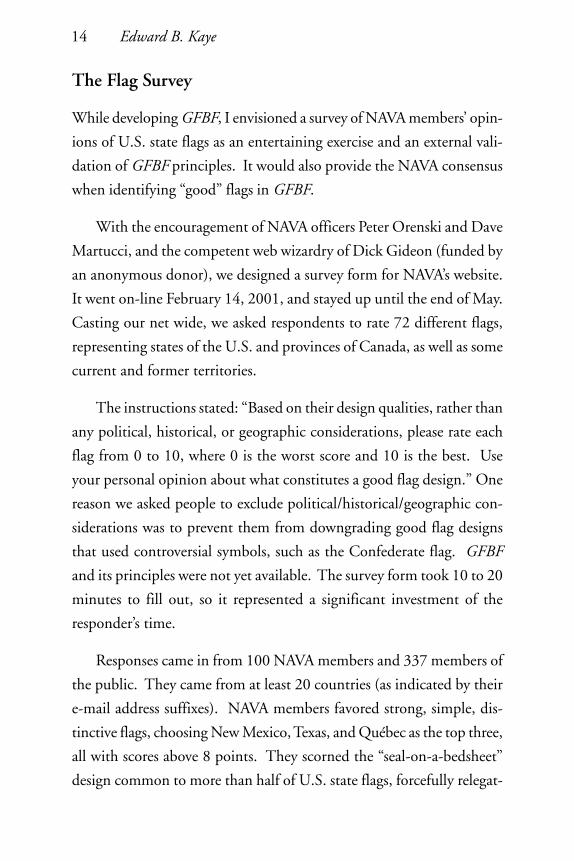
e-mail address suffixes). NAVA members favored strong, simple, dis-
tinctive flags, choosing New Mexico, Texas, and Québec as the top three,
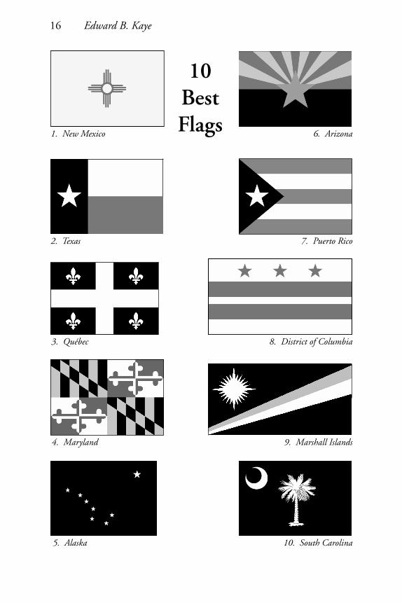
all with scores above 8 points. They scorned the “seal-on-a-bedsheet”
design common to more than half of U.S. state flags, forcefully relegat-

Good Flag, Bad Flag and the Great NAVA Survey of 2001 15
ing all those flags to the bottom of the heap with scores averaging 3.6
points. [see Appendix 2 for full scores.]
For a brief period in March, Texas led the rankings after NAVA
president Dave Martucci mentioned the survey in a radio interview on
Texas Flag Day. But the subsequent three-day flurry of responses (likely
from Texans) was eventually diluted by other responses and Texas fell
back into second place. Others betrayed their partisanship in their com-
ments, such as “Long live the green flag” from a Washingtonian.
Canadian flags fared significantly better than U.S. flags, with an
average score of 6 points versus 5 points, likely because Canada’s pro-
vincial flags generally avoid seals and tend towards simpler designs.
I tested GFBF by giving each flag in the survey a score of 0, 1, or 2
points on each of the five principles, for a minimum of 0 and maxi-
mum of 10 points. The results predicted the survey’s consensus on
“best” and “worst” flags with 85% accuracy! That is, those flags ranked
“best” in the survey generally also scored the highest on GFBF prin-
ciples, and those ranked “worst” scored lowest, providing a strong vali-
dation of GFBF.
The public’s overall responses paralleled those of NAVA members
quite closely, although the public scored flags a half point lower, on
average. As might be expected, the public’s scores dispersed a bit more
broadly, with a slightly higher standard deviation. However, their in-
sightful comments showed a strong intuitive grasp of flag design and
confirmed NAVA members’ opinions on design principles. One doesn’t
need to be a flag expert to recognize a good flag design.
In a surprise result, the combined rankings of NAVA and the public
handed the top flags a three-way tie, with less than 1/100th of a point
16 Edward B. Kaye
10BestFlags1. New Mexico
2. Texas
3. Québec
4. Maryland
5. Alaska
6. Arizona
7. Puerto Rico
8. District of Columbia
9. Marshall Islands
10. South Carolina
Good Flag, Bad Flag and the Great NAVA Survey of 2001 17
10WorstFlags63. New Hampshire
64. Idaho
65. Wisconsin
66. Kentucky
67. Minnesota
68. South Dakota
69. Kansas
70. Montana
71. Nebraska
72. Georgia

18 Edward B. Kaye
separating their scores (that margin was so small that one person chang-
ing his vote could have altered the first-place score).
The survey also invited comments. A few representative ones:
A flag should be the simplest possible design consistent with bearing
a unique, easily distinguished identity…those with complex detail in
their composition defeat the purpose of a flag.
The main purpose of a flag is identification. Yet half of the US’s
states have flags that to the untrained eye, or from a distance, look iden-
tical.
Simple flags, clear colors, not too busy. Shields on fields are bad.
… a flag which needs to indicate its significance by spelling out the
state signified…is defeating the very purpose of a flag, that is, to signal
“visually” without need of written signs.
A ‘good’ design for a flag, in my opinion, is one that can be identi-
fied at a glance (even in a stiff breeze!) and which is easy for, e.g., school
students to sketch... everyone ought to be able to draw those flags that
have significance for them.
Recognition, simplicity, color, and uniqueness make, in my opin-
ion, a pleasing design.
The whole purpose of flags, I thought, was to distinguish one from
another.
Public Response
After closing the survey and tabulating the responses in early June,
I summarized the results in a press release for NAVA News and for NAVA’s
Good Flag, Bad Flag and the Great NAVA Survey of 2001 19
website. We had discussed getting media coverage for the survey, since
it promoted an interest in flags and would bring the results to people
beyond our website and our other publications. The press release was
available a few days before U.S. Flag Day, June 14—an inadvertent but
strategic bit of timing.
Coverage began when Lee Hill, an Arizona TV producer, brought
the story to local newspapers and TV stations in her state and in New
Mexico. Rick Broadhead tackled the Canadian media and the Cana-
dian Press Newswire picked it up, followed by the Associated Press and
Reuters. Within a week, the story was running in hundreds of newspa-
per and magazine articles and radio and TV programs. Those of us
listed as media contacts on the NAVA website were giving several inter-
views a day. National coverage appeared in USA Today, the Washington
Post, U.S. News & World Report, the BBC, and Canada’s Globe & Mail
(front page!) and National Post. Radio stations from Yellowknife, North-
west Territories to Gainesville, Florida reported on the survey, com-
mented on the results, and invited listener participation. Several newspa-
pers called for contests to design new flags, including the Winnipeg Free
Press in Manitoba and the Capital Times in Madison, Wisconsin. The
NAVA website, with usual traffic of 100,000 hits per month, was regis-
tering 100,000 hits per day.
The media coverage tended to take one of two approaches. The
first, generally in states or provinces whose flags received high ratings,
would say “our flag is great, we should be proud”. Reporting in New
Mexico, Québec, Arizona, Nova Scotia, Texas, Maryland, and the Dis-
trict of Columbia emphasized this approach. The second, generally in
states or provinces whose flags received low ratings, would say “our flag
has been rated low, but we still like it”.

20 Edward B. Kaye
Where flags rated high, the articles emphasized the history of the
flag and how it compared to those of neighboring states or provinces,
and described NAVA in neutral or positive tones. Vexillology usually
received a good explanation, and often the basic principles from Good
Flag, Bad Flag were described. “We’re proud of Maryland’s distinctive
state flag,” said Secretary of State John T. Willis. The secretary of the
District of Columbia said she hoped the DC flag’s ranking would spur
interest in the city’s history. The Canadian Press headlined an article
“Les connaisseurs considèrent que le drapeau du Québec est l’un des plus
beaux”. In New Mexico, the Albuquerque Journal editorialized “Flag
Poll Should Have State Flipping”. The Halifax Daily News headlined:
“Flag fans’ hearts aflutter over Nova Scotia banner, Scottish-based em-
blem rates second in Canada, only trails 10 U.S. entries”. The Colum-
bus Dispatch said “Ohioans may not realize it, but a triumph of design
has fluttered atop flagpoles across the state for almost a century.”
However, where flags were rated low, the commentary often turned
bitter, asking “Who is NAVA to criticize our flag?” It seems that the
NAVA-sponsored survey of public opinion of flag designs became in-
terpreted as criticism of the low-rated flags and, indirectly, of the states
or provinces themselves. Many in those states or provinces responded
as did the Kansas secretary of state, Ron Thornburgh, who said “I think
our flag does a nice job of talking about the traditions and history of
Kansas.” The Boston Globe demanded, “We want a recount!”.
A reporter asked me to guess why the Arkansas flag rated 45th out
of 72. I ventured that the problem was the word “Arkansas”, saying
“the underlying issue is that a flag is a graphic symbol; by putting words
on a flag you’re showing insecurity in your symbolism”. Arkansas Gov-
ernor Mike Huckabee responded: “They had a problem with the word
Good Flag, Bad Flag and the Great NAVA Survey of 2001 21
‘Arkansas’? It’s the name of our state!” He thought the criticism was
what he might expect from “idiots who have nothing better to do than
rank state flags. What a stupid way to spend their time.”
Minnesota Governor Jesse Ventura said in an e-mail to the Grand
Forks Herald: “I think it’s kind of funny that someone can call them-
selves ‘experts’ on something as subjective as judging aesthetics. If I’m
an expert on dogs, does that mean I know better than anyone which
breed is the prettiest?”
Another Minnesotan who signed himself “Flag Lover”, wrote me to
say, “The flag of the Great State of Minnesota may not meet with your
ideas of a good flag, but has served us very well for a very long
time…Minnesota’s blue background is quite distinctive; South Dakota
is the only one that really comes close. No, your standards are only
good for flag makers and designers. As for those of us who live beneath
the flags; I think we’ll keep them.” Another wrote “I think [Wisconsin’s]
is a great flag, regardless of what everybody else thinks. As a member of
the Air Force I respect all Flags.”
In an interesting explanation of the blue “seal-on-a-bedsheet” de-
sign common to nearly half of all U.S. state flags, the Las Vegas, Nevada
Review-Journal quoted former NAVA VP Jim Ferrigan: “Most states use
the blue field, and for good reason: they won the Civil War.” He as-
serted that the flag’s color, and not its details, were intended to be dis-
tinguished from far away. His comments formed an intriguing coun-
terpoint to the debate over the use of the Confederate Battle Flag in the
flags of some states in the South.
“I’ll match our flag up against any of the other provinces,” said
Manitoba’s Transportation Minister Steve Ashton. “I think most
22 Edward B. Kaye
Manitobans like the flag the way it is.” And a columnist in the Winnipeg
Sun said “You’re probably asking yourself what a vexillologist is. I know
I did. Apparently it’s a bunch of morons that fancy themselves as flag
experts.”
Most ominously, one Nebraska legislator pointed out that it is ille-
gal for someone to cast contempt or ridicule upon the state’s flag, say-
ing: “…some vexillologists are going to be reaping the vengeance of
Nebraska state law.”!
Such responses must be expected from public officials, who have
little to gain from joining any perceived criticism of their state symbols,
or from newspaper writers, for whom the safer course is picking on
NAVA rather than on their state’s flag. However, some columnists and
many members of the public chimed in with comments such as “Our
state flag is a joke”, indicating that partisanship, not sound design, spurs
the reflexive defense of state and provincial flags.
Several people e-mailed me to bemoan the low quality of their state
flag’s design, sometimes with a plea that we “do something about it”.
Certainly the line between vexillology and vexillography would be tested
there—calling all vexillonaires! Some newspaper stories quoted citizens’
negative comments, for example, from a flag store manager in Omaha:
“There’s a lot of pride in the Cornhusker football team; there’s not a lot
of pride in the Nebraska flag.” A few columnists wrote patently tongue-
in-cheek defenses of their state flags, telegraphing their actual agree-
ment with the low scores.
The Wisconsin State Journal said that no topic it had asked its read-
ers about in years had drawn as much mail as the state flag. While most
respondents defended it, one wrote, “I strongly agree with the

Good Flag, Bad Flag and the Great NAVA Survey of 2001 23
Vexillological Association in regards to Wisconsin’s state flag. It is aw-
ful.”
A designer in the advertising field wrote: “I have always thought
that the Wisconsin flag was unattractive. Does that make me less loyal
to my home state? No way! I love everything about Wisconsin. As a
defender of good design, I feel all design needs to be scrutinized whether
it is a logo, a package, an advertisement, or even a flag. For those who
have gotten their noses bent out of shape, I say don’t take it so person-
ally. It is not an attack on our state or its history. It is simply an art
review.”
Georgia’s New Flag
Nothing compared to the rating of the new state flag of Georgia
and the public’s reaction to the survey there.
That flag drew far more attention in the survey than did all others.
NAVA members and the public gave the new Georgia flag the lowest
score—2.4 points—by the largest margin of any flag. Some even asked
to give it negative points. They disparaged Georgia’s flag as “desolat-
ing”, “simply awful”, “hideous”, and “by far the ugliest”. One person
derided it as “Five Flags Under Georgia”. Another said, “… the new
Georgia state flag certainly is a shame to any flag designer. What a
mess!” My favorite comment came from Portugal: “Seals on blue stink.
The new Georgia flag even stinks harder!”
24 Edward B. Kaye
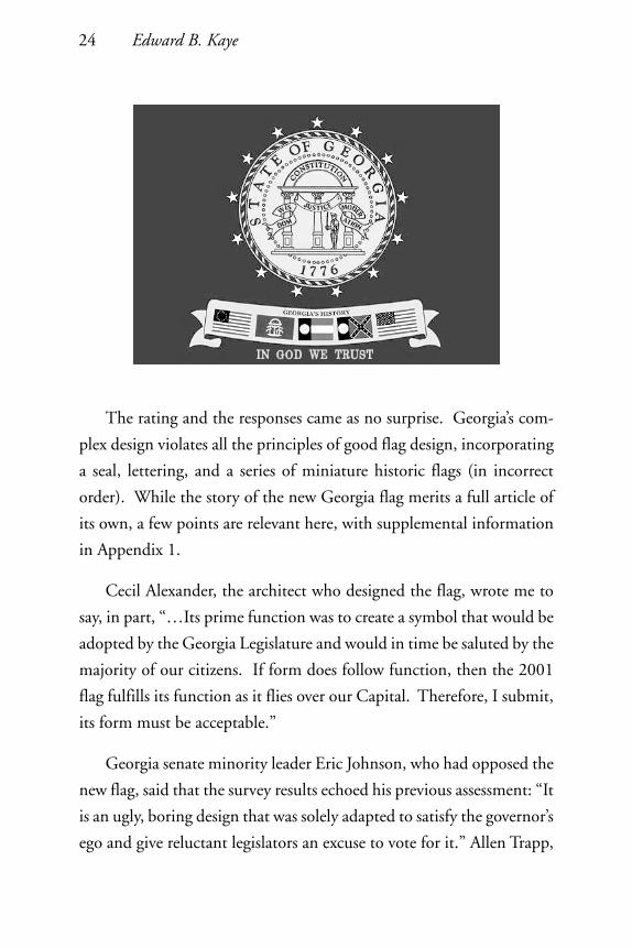
The rating and the responses came as no surprise. Georgia’s com-
plex design violates all the principles of good flag design, incorporating
a seal, lettering, and a series of miniature historic flags (in incorrect
order). While the story of the new Georgia flag merits a full article of
its own, a few points are relevant here, with supplemental information
in Appendix 1.
Cecil Alexander, the architect who designed the flag, wrote me to
say, in part, “…Its prime function was to create a symbol that would be
adopted by the Georgia Legislature and would in time be saluted by the
majority of our citizens. If form does follow function, then the 2001
flag fulfills its function as it flies over our Capital. Therefore, I submit,
its form must be acceptable.”
Georgia senate minority leader Eric Johnson, who had opposed the
new flag, said that the survey results echoed his previous assessment: “It
is an ugly, boring design that was solely adapted to satisfy the governor’s
ego and give reluctant legislators an excuse to vote for it.” Allen Trapp,
Good Flag, Bad Flag and the Great NAVA Survey of 2001 25
commander of Georgia’s Sons of the Confederate Veterans, had been
calling the new flag a “Denny’s placemat” but said he was backing off
out of fear the restaurant chain would sue for slander!
While Governor Barnes had no comment, state representative Tyrone
Brooks, one of the new flag’s staunchest supporters during the legisla-
tive debate, reacted to the survey respondents, saying “They don’t have
good taste, I’m sorry”.
The Atlanta Journal-Constitution wrote a balanced story, headlined
“Experts vote Georgia’s redesigned flag ‘the ugliest’—by far”. The story
ended by saying “Vexillologist Kaye suggested Georgians should move
beyond the flag flap and, in the process, ‘join the community of good
flags’”. The paper held an on-line poll in which Georgians voted against
the new flag by a 70%-30% margin. And one of its columnists wrote:
“Hallelujah! Somebody has come out and said what I’ve been afraid to
say out of fear of being branded as a politically incorrect racist: The new
Georgia flag is ugly. Not just common ordinary ugly, but hard-down
ugly.”
Even other states chimed in. The Patriot-News (Harrisburg, Penn-
sylvania) opined: “Jeers to Georgia state legislators whose unwillingness
to take a stand resulted in what the North American Vexillological As-
sociation, a group dedicated to the study of flag design, termed the
worst state flag flying over the continent. Only five months old, the
Peach State’s new flag represents a determination to appease die-hard
rebs who fought like Stonewall to preserve elements of the Confederate
battle flag. The result is a generic blue flag with state seal and a strip of
smaller flags—including the rebel one—across the bottom. But don’t
expect Georgia to revisit the issue any time soon; just working out the
unsightly compromise was difficult enough.”
26 Edward B. Kaye
Apparently our survey picked the scab off a recent wound in Geor-
gia. Ironically, the state had gone from a flag with a relatively good
design but a difficult history, to a flag that is so bland it’s supposed to
please everybody but has a very disappointing design. In an unintended
consequence, our survey may have strengthened the case of those who
would restore the old flag.
The Possibility of New Flags
I had a stock response to any reporter asking about a poorly designed
state flag: “A great state deserves a great flag”. Who could argue with
that?
The Utne Reader, a Minnesota-based alternative magazine, an-
nounced a contest soon after the NAVA survey appeared, commission-
ing professional designers to create five new state and provincial flags.
It wrote: “In an era when visual icons, from the Nike swoosh to anar-
chists’ black banners, have such cultural power, it seems baffling that so
many states pass up the chance for a symbol that could win people’s
attention and stir their souls.” However, the professionals’ results showed
disappointing complexity and a fundamental failure to understand the
principles of good flag design. But when the magazine followed up
with a public competition, some stunning new flags appeared!
I believe the steps to actually getting a state flag changed to a suc-
cessful design go something like this:
1. Stir up public discontent with the flag (this requires an exter-
nal event).
2. Get state government agreement that a change is necessary.
3. Create a process to receive designs.

Good Flag, Bad Flag and the Great NAVA Survey of 2001 27
4. Name the appropriate committee to judge them.
5. Have the legislature vote yes/no.
It is unlikely that a low score on the NAVA survey is adequate to
reach step 1. However, it might pave the way for public awareness
when a more significant event occurs (for example, a threat of a boycott
or the potential for a major occasion such as the Olympics). The least
likely way to change a state flag is to propose an alternative design in the
absence of step 1—the new design simply becomes a target.
Three recent cases demonstrate these steps. Mississippi, in seeking
to replace its Confederate-dominated flag in February 2001, failed on
step 5 when its legislature referred the new design to the public in a
referendum. Jim Ferrigan got Nevada’s April 1991 re-specification
through the state’s legislature successfully, even skipping step 1, perhaps
because the change would not be noticeable to the casual observer. Geor-
gia, in January 2001, actually progressed through all five steps due to
the forceful action of its governor, but a stumble on step 4 led to a poor
design.
Conclusions
What have the creation of GFBF, the survey, and the resulting press
coverage accomplished?
As good vexillonnaires, we’ve created a tool for the public to use in
flag creation and re-design. It is consistently the most-downloaded fea-
ture on the NAVA website. While we cannot expect much feedback,
we do hear that it is being put to use. It has already been translated into
Spanish, French, and Latvian!

28 Edward B. Kaye
The survey validated the basic design principles of GFBF. Those
principles are not just expert opinions, but very likely underlie the flag-
design opinions of the general public as well.
We raised awareness. Tens of millions of people were exposed to
the word “vexillology”—perhaps multiple times—and a large fraction
had the opportunity to encounter NAVA.
The survey by itself may not have much immediate impact on state
or provincial flag designs, despite the huge publicity, but it has sparked
debate in many states and provinces, and may well have sown the seeds
of change. Peter Orenski calls it “the most ambitious attempt to bring
before the national consciousness the generally poor design of U.S. state
flags”.
And while NAVA invited each survey respondent to become a mem-
ber, it will take more than a single exposure to recruit most people, so
any membership increase will likely be gradual.
One NAVA member wrote: “The media reaction to your survey is
the greatest thing to ever happen to NAVA, because it has established
vexillological legitimacy before the general public. All kinds of good
things will derive from this down the road—I’m sure of it.”
As a vexillonnaire, I hope so too. Thank you.
This paper was delivered at the 35th NAVA meeting in Norfolk, Virginia,
in October 2001.

Good Flag, Bad Flag and the Great NAVA Survey of 2001 29
Appendix 1: Opinions on the New Georgia State Flag
Cecil A. Alexander, the Designer
To: Mr. Ted Kaye, NAVA
From: Cecil A. AlexanderFellow American Institute of ArchitectsLt. Col. U.S. Marine Corps (Retired)
Re: The new state flag of Georgia
I am the designer of the 2001 Georgia flag. I am not ashamed of it.
Rating the flags solely on “design qualities” and ignoring “political,historical or geographic consideration” is simplistic and does not ad-dress the political and historical considerations required for the newGeorgia flag. I doubt that many flags ever demanded such politicalacceptance.
In 1956, Georgia adopted a new flag featuring the Confederate BattleFlag. It was adopted in defiance of the civil rights decisions of theSupreme Court and new Federal laws against discrimination. It is stillflown by racists, state’s rightists, and hate groups as a vibrant symbol ofwhite supremacy. (Some do, indeed, fly it only to honor the Confeder-ate dead.) The 1956 flag has been a constant source of divisiveness,threats to our economy, and damaging to the State’s role as a leader ofthe “New South.”
I drew the original concept in 1993. It is basically unchanged inconcept, i.e. presenting Georgia’s past with historical flags rather thanusing them in defiance. There was and still is the NAVA rejected bluefield and the Great Seal of Georgia surrounded by thirteen stars repre-senting the original states which include Georgia. The gold ribbon atthe bottom contained the flags that have flown over Georgia since pre-colonial days up to the present. They were: the Spanish, French, En-glish, American Revolution, Confederate “Stars and Bars”, and thepresent U.S. flag.

30 Edward B. Kaye
During the first weeks of January this year, I modified the flag toaccommodate the political realities required for the flag to be accepted.In all, there were seven different versions. Finally the design incorpo-rated three past Georgia flags—the 1897 flag, the 1920-1956 flag, andthe 1956-2001 flag—flanked on the left by the first U.S. flag and onthe right by the present flag. These flags honor all who served ourcountry from the American Revolution to Desert Storm. “Georgia’sHistory” was added to emphasize that the small flags are in an historicalcontext. “In God We Trust” was added via an amendment in the House.
Through Governor Barnes’ outstanding leadership and superb speechto the House, the 2001 flag was adopted in one week, after forty-fiveyears of acrimony.
The flag does have a lot going on, it is true. As an architect whoreceived his Masters in Architecture under Walter Gropius at Harvardafter World War II, I was heavily influenced by the Bauhaus philosophythat “Less is More.” I accept the beauty of simplicity. I also believe that“form follows function.” In my fifty years as an architect, I designed mybuildings to reflect both these concepts.
But the function of the new Georgia flag was not to satisfy NAVAor even Gropius. Its prime function was to create a symbol that wouldbe adopted by the Georgia Legislature and would in time be saluted bythe majority of our citizens. If form does follow function, then the2001 flag fulfills its function as it flies over our Capital. Therefore, Isubmit, its form must be acceptable.
I have been asked to address numerous groups about my flag. With-out fail, I have been given standing ovations from audiences from gradeschool students to Rotary members.
Strangers, black and white, who recognize me from published pho-tographs and television clips, have approached me on the streets and inmalls to thank me for solving the State’s agonizing dilemma.
One of the original flags with my signature on it was auctioned offat a school benefit for $3,200 and later two more at another schoolbrought in $5,200 each. Except for “experts” and those who resistedany change, I have been told many times that the flag is beautiful.
Good Flag, Bad Flag and the Great NAVA Survey of 2001 31
Yes, I have had some acid criticism even prior to your survey andcomments, both on the design and its symbolism. Dr. Whitney Smith,who I understand is the dean of vexillologists, was quoted in an APrelease as saying, “It is a great example of how not to design a flag.” Wehave since exchanged friendly calls. As an expert on “how not to designa flag,” I offered to conduct a class for him.
One local graphic designer called it a “dog’s breakfast.” Since it nowis the official State flag, I think it is, rather, the “cat’s meow!”
I hope that your negative appraisal does not encourage groups suchas the Sons of Confederate Veterans to redouble their efforts to lobbyour law makers to return to the divisive flag we just replaced or, Godforbid, one emblazoned with a peach—no longer a major Georgia prod-uct. If you think the peach should represent today’s Georgia of eightmillion striving to make our state a center for scientific research, highereducation, international commerce, and cultural pursuits, you are cer-tainly ignorant of what Georgia has become. Why not the cotton ginor Old Mammy harvesting cotton?
One letter I received from a second grader stands against all criti-cism: “Dear Mr. Alexander, I am sure after you are dead you will behonored. Your friend, Mary.”
Cecil A. Alexander
P.S. I do not agree that the three historic flags on the ribbon ofDahlonega Gold are out of order—please explain.

32 Edward B. Kaye
Ted Kaye, author of Good Flag, Bad Flag and originator of the Survey
Dear Mr. Alexander,
You make a solid, impassioned, and persuasive case for your re-cently adopted flag for the state of Georgia. It is clear to me and anythinking observer that the new design responded admirably (and, it isto be hoped) successfully to the political-historical challenges posed bythe placement of the Confederate Battle Flag on Georgia’s flag in 1956.
In your letter to me, you make clear the difference between yourapproach and that of the organizers of our flag design survey: “Ratingthe flags solely on ‘design qualities’ and ignoring ‘political, historical orgeographic consideration’ is simplistic and does not address the politi-cal and historical considerations required for the new Georgia flag.”And that, indeed, accounts for the difference between our views.
Respondents to the survey, rating flags only on their design quali-ties, gave the new Georgia flag the lowest score. I surmise that its rank-ing resulted from an implicit application of the basic principles of flagdesign, none of which (with the possible exception of “meaningful sym-bolism”) the new flag followed.
On the other hand, you and many other Georgians assert that thebeauty of a flag can lie in a realm beyond its design qualities, such as inits political/historical role. And Georgia’s flag indeed is beautiful inthat sense, as a replacement for a flag that brought divisiveness andcontempt to a great state.
You say “… the function of the new Georgia flag was … to create asymbol that would be adopted by the Georgia Legislature and would intime be saluted by the majority of our citizens.” If form follows func-tion, you are likely right. The new flag was in fact adopted by theLegislature, with admirable leadership from the governor. And sincecitizens of a majority of U.S. states salute flags that experts deem poorlydesigned, Georgians may well come to salute their new flag, too.
But the fundamental difference between our two positions cannotbe resolved, because we are answering different questions. On the one
Good Flag, Bad Flag and the Great NAVA Survey of 2001 33
hand, asking “is the new Georgia flag a good flag design?”, the survey of100 “experts” and over three times as many public respondents said“No”, confirming that it violates the basic principles of flag design. Onthe other hand, asking “is the new Georgia flag a political success?”, itsacceptance by the Legislature and the governor proves the answer to be“Yes”. If the new design were the only one that could have succeededpolitically, it is a successful flag. We must agree to disagree.
It is indeed unfortunate, however, that any assertion of poor designqualities in the new flag might provide ammunition for those who seekto restore the old flag. I sincerely regret that consequence of our survey.
As for using the peach to represent Georgia, I merely mentioned itwhen a reporter asked if I could think of a unique symbol for the state.I too doubt it would make a recognizable flag symbol (although thecolor “peach” might be used somehow). But the peach does representGeorgia on the new state quarter and on the state’s license plate, andGeorgia is indeed the “Peach State”, so although possibly outdated itremains a state symbol.
You asked about my comment that the flags on the new Georgiaflag are not in correct order. The U.S. flag should be displayed on itsown right (that is, the far left as seen by the viewer), so I believe the 50-star current version is at the wrong end of the scroll.
I want to thank you for writing. Few people engaged in flag designhave had to contend with such contentious underlying issues as youhave, and I salute you for it. Flags generate deep emotions; that’s onereason they draw people to their study and design, and that’s why thisissue has drawn such attention from all over the world.
As an architect trained in the Bauhaus style, your comments on thedraft booklet “Good Flag, Bad Flag” would be useful to me, and I wouldappreciate your visiting our website to see it (www.nava.org).
Regards,
Ted KayeManaging Editor,
Raven, A Journal of Vexillology

34 Edward B. Kaye
Judith Augustine, the Designer’s Daughter
Dear Peter [Orenski],
Thanks for your kind letter regarding my comments on the Geor-gia flag…
In the interest of full disclosure, I want you and Mr. Kaye to knowthat in addition to my being a proud Georgian, passionate about thisparticular issue, I am also the daughter of Cecil Alexander, the flag’sdesigner. Yes, that makes me biased to some degree, but in my 50 yearson the planet, I have certainly developed my own mind and have dis-agreed with my father plenty! But my values, I’m proud to say, werederived, in great part, from him and my late mother, both civil rightsactivists.
In all candor, I was, for a long time, in favor of returning to the pre-1956 flag, a much simpler flag—a flag that did contain the dreadedSeal of the State of Georgia nonetheless. Efforts to get that flag reestab-lished, however, went nowhere. When I heard that Dad’s design wasbeing proposed by the Governor earlier this year, I was, to say the least,shocked. And thrilled. I had feared that, in my lifetime, I’d never seethe former flag, which is abhorrent to me, removed. Thankfully, I waswrong.
My father has written a letter to you, Mr. Kaye, in reaction to theNAVA survey. I think you will find that he is the expert, not myself.I’m just a passionate believer in the beauty of a flag that could makesuch a profound change—regardless of who designed it. And I also feelstrongly that any flag that had to face the struggle this one did must bejudged not only on its aesthetics but also on the politics involved.
Sincerely,
Judith Augustine

Good Flag, Bad Flag and the Great NAVA Survey of 2001 35
Roy Barnes, Governor of Georgia
Text of his speech on the proposed new flag (to the Georgia state senate)
Last weekend I went with my family to the North Georgia moun-tains, and I brought some reading with me. I reread President Lincoln’sinaugural address, where he prayed that the better angels of our naturewould allow unity and peace to prevail over division and conflict. AndChurchill’s warning during Britain’s darkest hour “that if we open aquarrel between the past and the present, we shall find that we have lostthe future.”
I read a letter from a former member of this body, Sen. Clint Day,that contained these wise words: “People of faith must be guided by amoral compass that goes beyond political expedience.
The Christian faith may ask ‘What would Jesus do?’ about the stateflag. I believe Jesus would change the flag to unite people.” The presi-dent of the Southern Baptist Convention, Dr. James Merritt, wrote meto say, “I support the proposal for a new state flag” and “I pray that theoutcome of all of this will be increased racial harmony and peace thatwe may focus on the deep spiritual and moral issues that face our greatstate.”
And I read letters from people all over Georgia. A woman fromMaysville wrote: “I am not a Democrat. ... I have been opposed tochanging the flag until today, but feel that you have proposed a reason-able compromise that should be applauded by everyone.” This camefrom a man in Toccoa: “I am a white male, 42 years old and would bewilling to die for the Confederacy today. The changing of the state flagis of the utmost importance and the sooner the better. I can only hopethat our legislators do the right thing.”
Another woman wrote: “I hate to see the current flag go, but I un-derstand. To me it is a beautiful flag, but to others it is a source of pain.... I think it is the Christian thing to do, to try to ease the hurt that theflag causes. I want all of the children of Georgia to be proud of theirflag. When I go places (recently a park in Rome, Ga.) and the Georgiaflag is not flown, I am hurt. ... I want a flag that Georgians can fly with
36 Edward B. Kaye
pride and that no organization will refuse to fly. Most of all, I am proudto be a Georgian, and I don’t want to be anywhere where my flag is leftout.”
“I have been committed to keeping the flag unaltered,” said an-other. “I am from a family who like yourself had a grandfather killed atVicksburg. He is buried in an unmarked grave which I’ve had no suc-cess in finding. His young widow raised the small children of theirmarriage (my great grandmother and her brother) in rural PauldingCounty. The Union Army then came over the farm land leaving neartotal devastation in its wake. ... Thank you for your sensitivity.”
And this was from a grandmother in Tifton: “I must admit at thebeginning that I have never voted for you before. ... I am proud to bethe great granddaughter of a Confederate soldier. But I am also a grand-mother who wants her granddaughter to grow up in a state where peoplecare about each other. Where race is not the first thing that matters. Ipray the new flag passes the Senate. Thanks again for caring about thepast, but caring more about the future.”
I have read these letters to you because I know you have receivedothers from those who claim we can never satisfy the “other side” or sayany change to our flag will dishonor our heritage.
Well, there is no “other side” in Georgia. We are all one—or at leastwe should be—and it is our job, our duty, and our great challenge tofight the voices of division and seek the salve of reconciliation.
And to those who say this would dishonor our heritage, I say thatnothing could be further from the truth. This new flag does not, how-ever, value one Georgian’s heritage over another. We will never forgetthose like my great grandfather who fought at Vicksburg. But neitherwill we forget those who served at Yorktown or those who died on thebeaches of Normandy or in the jungles of Vietnam.
The flag you will vote on today honors all Georgians.
I have spoken with many of you in the last few days and told each ofyou to do what you think is right and in the best interest of Georgia.

Good Flag, Bad Flag and the Great NAVA Survey of 2001 37
There are some among you who do not like the process that bringsus here today. I think I can defend that process, but it really does notmatter. If you dislike the process, take it out on me. I am fair game.But don’t put our people to anguish because of something that is nottheir fault.
Others have expressed concerns about demagoguery—on this andother issues. Neither political party is clean when it comes to tacticsthat divide our people. And as we put this issue behind us, we shouldalso put an end to such tactics. Today, I ask you once more to rise aboveparty and to heal our people.
Before I go, I want to read to you from two speeches made by amember of this body—the first on the opening day of this session of theGeneral Assembly and the second a week later. Here’s what he had tosay: “It is important that Georgia avoids what we saw across the river inSouth Carolina. ... If any state can resolve this kind of issue peacefully,it’s Georgia; and if anybody can take the lead in this issue, it is thisSenate. We can starve hate and feed love. We can take away despairand provide hope. We can heal instead of hurt. But we cannot accom-plish this if we remain divided by race or party.” Senator Johnson wasright when he said those things.
Today, you have that opportunity. And, when this day is done, maythese words from Alan Dunn of Austell, Georgia, apply to each of us:“Your action today ... may very well propel Georgia into the role ofleadership in a nation struggling to find the middle ground where quietlives and sane men walk. Today you took steps to make Georgia betterfor your girls, my son, and our grandchildren. And you have honoredyour great grandfather and his memory far beyond what any flag ormemorial could ever achieve. He did not fight for that flag, but for hishome, his state, his Georgia. Today you fought for Georgia.”
Thank you.
38 Edward B. Kaye
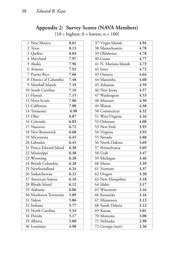
1 New Mexico 8.612 Texas 8.133 Québec 8.044 Maryland 7.975 Alaska 7.966 Arizona 7.927 Puerto Rico 7.668 District of Columbia 7.489 Marshall Islands 7.19
10 South Carolina 7.1611 Hawaii 7.1512 Nova Scotia 7.0613 California 7.0014 Tennessee 6.9815 Ohio 6.8716 Colorado 6.8317 Nunavut 6.7218 New Brunswick 6.6819 Micronesia 6.4520 Labrador 6.4521 Prince Edward Island 6.3022 Mississippi 6.3023 Wyoming 6.2824 British Columbia 6.2825 Newfoundland 6.2426 Saskatchewan 6.2227 American Samoa 6.1628 Rhode Island 6.1229 Alabama 6.0630 Northwest Territories 5.8931 Yukon 5.8632 Indiana 5.7733 North Carolina 5.3434 Florida 5.1735 Alberta 5.0036 Louisiana 4.98
37 Virgin Islands 4.9438 Massachusetts 4.7839 Oklahoma 4.7840 Guam 4.7741 N. Mariana Islands 4.7342 Iowa 4.7243 Ontario 4.6444 Manitoba 4.6045 Arkansas 4.5946 New Jersey 4.5747 Washington 4.5348 Missouri 4.5049 Illinois 4.3850 Connecticut 4.3251 West Virginia 4.1652 Delaware 4.0853 New York 3.9354 Virginia 3.9355 Nevada 3.8856 North Dakota 3.6957 Pennsylvania 3.6958 Utah 3.4759 Michigan 3.4660 Maine 3.3961 Vermont 3.3762 Oregon 3.3063 New Hampshire 3.1864 Idaho 3.1765 Wisconsin 3.1666 Kentucky 3.1667 Minnesota 3.1368 South Dakota 3.1269 Kansas 3.0170 Montana 3.0071 Nebraska 2.9872 Georgia (new) 2.36
Appendix 2: Survey Scores (NAVA Members)[10 = highest; 0 = lowest; n = 100]