GIS TRAINING - Florida International University
23
GIS TRAINING Presented by: Daniela Waltersdorfer & Nohely Alvarez
Transcript of GIS TRAINING - Florida International University

GIS TRAINING
Presented by: Daniela Waltersdorfer & Nohely Alvarez

Introduction to GIS & Mapping
➔ What is Geographic Information Systems (GIS)?◆ System of computer software, hardware and data where one can
analyze and present the information that is tied to a spatial location
➔ Why is it important?◆ Information, news, reports, natural disasters, localizing
◆ Exploring data using GIS turns makes it visible
➔ What are the tools needed to proceed?◆ Data, software, a question*
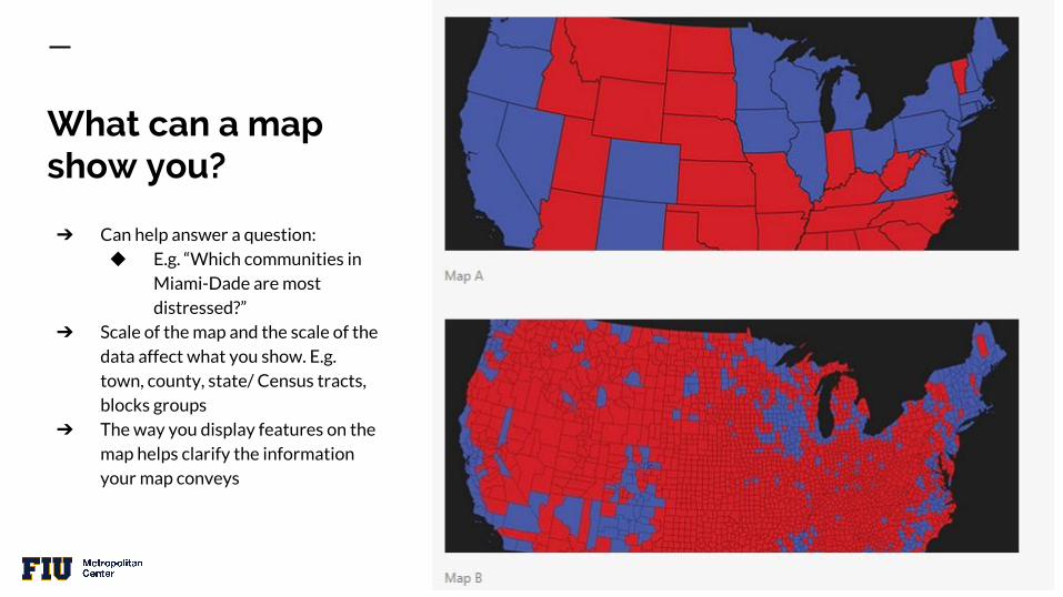
What can a map show you?
➔ Can help answer a question:◆ E.g. “Which communities in
Miami-Dade are most distressed?”
➔ Scale of the map and the scale of the data affect what you show. E.g.
town, county, state/ Census tracts, blocks groups
➔ The way you display features on the map helps clarify the information your map conveys
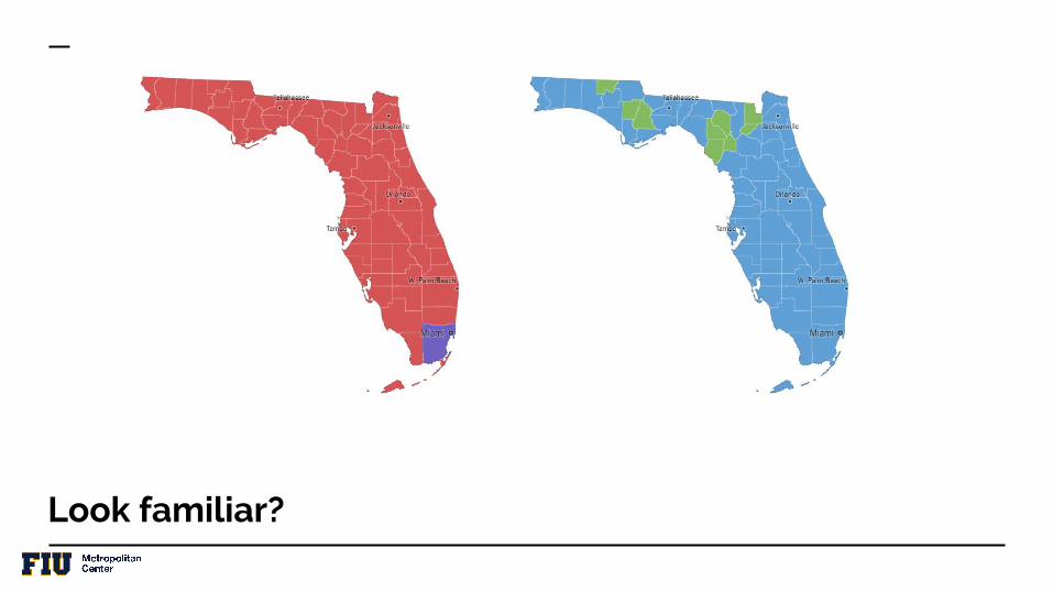
Look familiar?

Flo
rid
a P
rim
ary
Ele
ctio
n
2016
Source: NYTimes

Types of Data
● Attribute Data○ Says what a feature is○ Examples:
■ Statistics■ Text■ Images
● Spatial Data○ Says where the feature is○ Coordinate based○ Vector Data
■ Points■ Lines
■ Polygons (zones or
areas)○ Raster Data:
■ A continuous surface
Two types of data can be used in a GIS database
Image source:ArcGIS

Examples of Local MapsPolygon vs. Point Data++ Basic Spatial Analysis Tool


Buffering, or “Buffer Analysis” allows you to spatially see proximity.
This tool allows you to form hypotheses, prove a hypothesis, or simply show data.
In this case the “Intersection of Focus” was selected due to its high number of crashes, but are there any correlations between the number of crashes and geographic location?
This was the first map created for this study to analyze certain intersections and why they had a high number of crashes.
In-depth data from the FDOT allowed to analyze each accident. (Kernel Density)

Effective Data Viz
➔ Green is good, unless there are parks being mapped➔ Purple and Orange is good since they don’t have many
connotations◆ Orange scale can be good for negative connotations
➔ Differentiate Hue and Saturation Values◆ Easier for the eyes

Identifying Bad Maps
“Dark Green – Very nice, perfectly maintained, very safe.
Standard Green – Quite nice, very maintained, quite safe.Light Green – Above average areas, mostly maintained, mostly well-kept and safe.Blue – Decent to reasonable areas, decently maintained, partially safe.Light Blue – Mostly Non-Residential Areas – Neutral/Variable.Yellow – Below average areas, below average maintained, partially/mostly unsafe.Orange – Mostly bad areas, poorly maintained, unsafe.Red – Bad areas, very unsafe.”
AVOID: “BEST/ WORST” ScalesDefinitions of best and worst differ among people and their preferences
Source: www.MiamiRealEstateGuy.com

AVOID CONFUSING LEGENDS
There are 7 categories in the legend
with the same color. How can you
differentiate them?
It could be that some categories
match geographically with some
others, but do they all share the same
geographic location?
Source: http://bmp.ifas.ufl.edu/~brecc/FloridaBMPmap.shtmlUniversity of Florida for the Florida Office of Agricultural Water Policy

The boundaries of Miami-Dade County do not match, and yet this map was reported in a newspaper stating, “In Florida, Miami-Dade ranked the second highest for length of life behind only its ritzy neighbor to the west, Collier County. Dade ranked 20th overall for quality of life”
Source: Miami New Times/ University of Wisconsin

WATCH YOUR CLASSES
What are you trying to show?Different Ranges = Different Maps
Source: City Lab - Andrew Wiseman

How do we start mapping?Applications:
● ArcGIS
● QGIS*
● CartoDB
● Mapbox
● Mapzen
● Leaflet
● OpenStreetMap*
● Shapefiles
● CSV
● KML
● GeoJson
Features needed:

Lo
cal O
pe
n S
ou
rce
Map
pin
g:

Your turn to map!

Download Census Data: Median Household Income

Open Miami-Dade’s Open County Portal

Create a CartoDB account

Additional Open Source Mapping:
● OpenStreetMap● QGIS
Other forms of visualizing data:
Little Havana InfographicPopulation ChangesStop n Frisk - NYC

Thank you.Follow us on:
@FIUMetroCenter
/SIPAMetropolitan