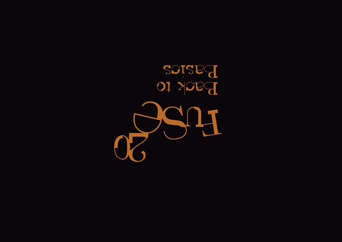
Fuse 20
44
-
Upload
dan-clayton -
Category
Documents
-
view
212 -
download
0
description
Fuse 20 Limited Edition Book
Transcript of Fuse 20

I
Io
I I
Welcome back Fuse fans, at last the long
awaited 20th Issue has arrived, and are you in
for a shock.
Seventeen years have passed since the first
edition of Fuse was produced and it has been
a fascinating journey. The constraints of the
commercial world have been broken and
our specially commissioned typefaces have
become progressively more exciting and
unconventional along the way. Whilst we can
appreciate the level of experimentation we
have reached, I feel it is about time that we
took a step back from thinking ‘outside the
box’, after all as proud graphic designers and
typographers our job is to design for function.
It is for this reason I see this 20th celebratory
issue, as an appropriate opportunity to revisit
the fundamental rules and letterforms of
functional typography. Although the word
‘rules’ is one many of you fuse reader’s do not
like to hear, it is important to remember that
to break the rules of typography we must first
understand them.
So join us in going back to basics and
climbing back ‘into the box’, as Fuse’s
limited 20th edition celebrates the rules
and letterforms of the functional, legible
typography, that we should all know and love.
Neville Brody
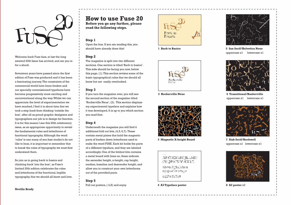
How to use Fuse 20Before you go any further, please read the following steps.
Step 1Open the box. If you are reading this, you
should have already done this!
Step 2The magazine is split into two different
sections. One section is titled ‘Back to basics’.
This side should be facing you now, below
this page, (1). This section revises some of the
basic typographical rules that we should all
know but are easily overlooked.
Step 3If you turn the magazine over, you will see
the second section of the magazine titled
‘Rockerville Neue’, (2). This section displays
my experimental typeface and explains how
it was developed. It is up to you which section
you read first.
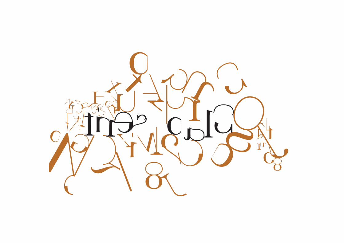
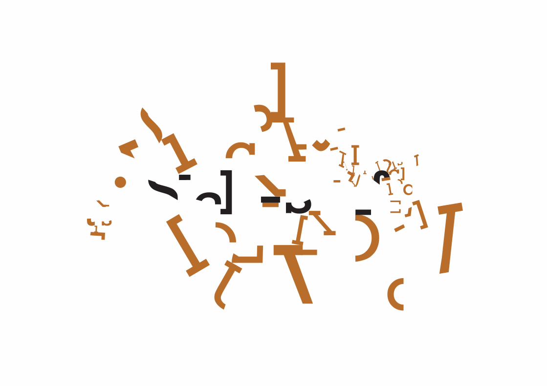
Step 4Underneath the magazine you will find 4
additional fold out kits, (4,5, 6,7). These
contain metal plates that hold the magnetic
parts of broken down letterforms used to
make the word FUSE. Each kit holds the parts
of a different typeface, and they are labeled
accordingly. One of the foldout kits contains
a metal board with lines on, these indicate
the ascender height, x-height, cap height,
median, baseline and descender height, and
allow you to construct your own letterforms
out of the provided parts.
Step 5Pull out posters, ( 4,8) and enjoy.
II
o
o
5 San Serif/Helvetica Neueuppercase x1 lowercase x1
7 Slab Serif/Rockwelluppercase x1 lowercase x1
6 Transitional/Baskervilleuppercase x1 lowercase x1
3 Magnetic X-height Board
1 Back to Basics
2 Rockerville Neue
8 A2 poster x3
I
o
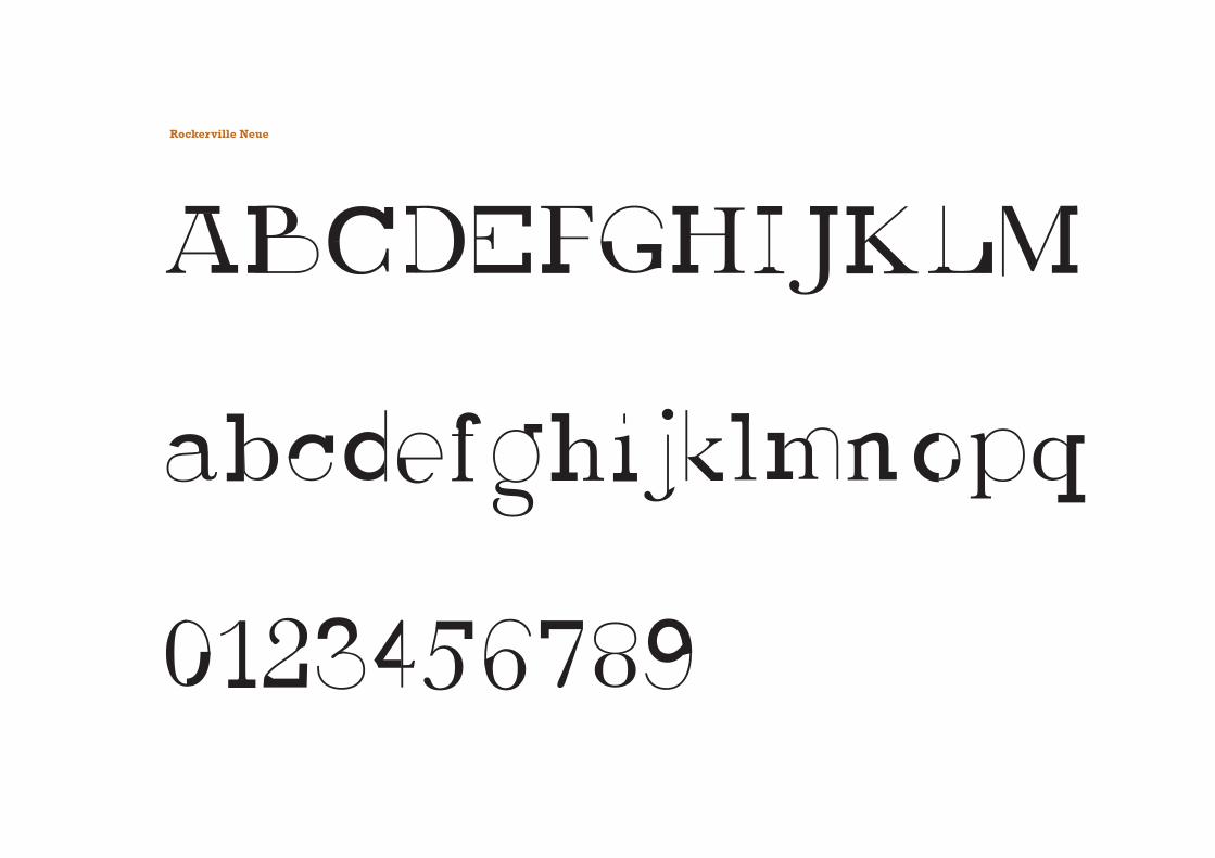
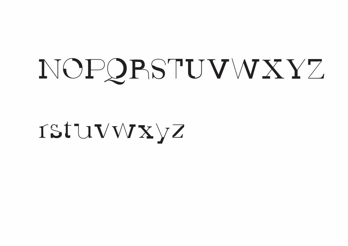
Rockerville Neue
4 A3 Typeface poster
I o
I
o
o

o
I
o
o
I
o

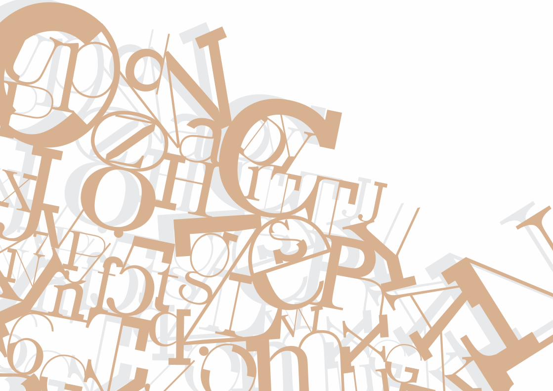
Describing letterformsAs with any craft that has evolved over
500 years, typography employs a number
of technical terms. These mostly describe
specific parts of letterforms. It is a good
idea to familiarize yourself with this lexicon.
Knowing a letterform’s component parts
makes it much easier to identify
specific typefaces.
ascender height
cap height
median
baseline
descender height
(In the entries on the following pages,
boldface text indicates terms described
elsewhere on the list.)
Type Rules
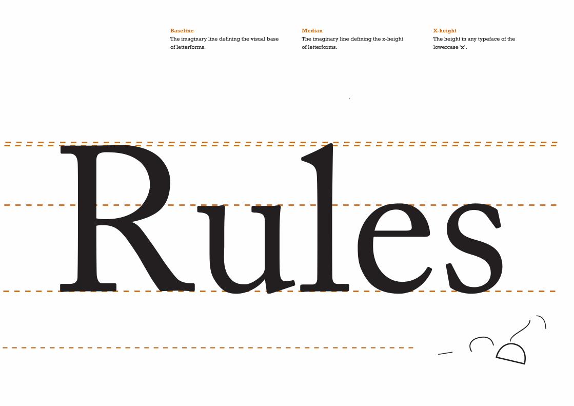
BaselineThe imaginary line defining the visual base
of letterforms.
MedianThe imaginary line defining the x-height
of letterforms.
X-heightThe height in any typeface of the
lowercase ‘x’.
Type Rules

1
2
3
4
5
6
7
8
9
10
11
12
13
14
15
A M V
F T Y
b d h k
C G S
E T L
b d p q
T l
a d P C
A H
f t
K V
p q y
M d p
f a
g r
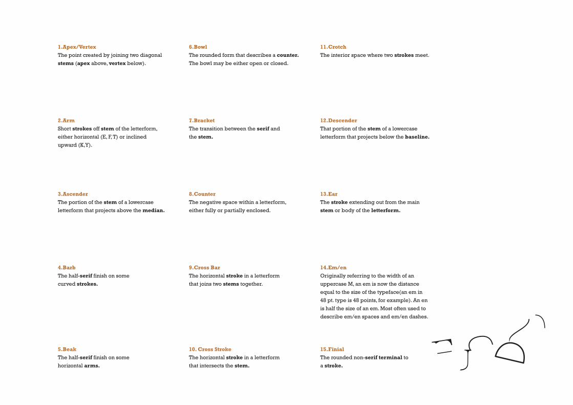
1.Apex/VertexThe point created by joining two diagonal
stems (apex above, vertex below).
2.ArmShort strokes off stem of the letterform,
either horizontal (E, F, T) or inclined
upward (K,Y).
3.AscenderThe portion of the stem of a lowercase
letterform that projects above the median.
4.BarbThe half-serif finish on some
curved strokes.
5.BeakThe half-serif finish on some
horizontal arms.
6.BowlThe rounded form that describes a counter. The bowl may be either open or closed.
7.BracketThe transition between the serif and
the stem.
8.CounterThe negative space within a letterform,
either fully or partially enclosed.
9.Cross BarThe horizontal stroke in a letterform
that joins two stems together.
10. Cross StrokeThe horizontal stroke in a letterform
that intersects the stem.
11.CrotchThe interior space where two strokes meet.
12.DescenderThat portion of the stem of a lowercase
letterform that projects below the baseline.
13.EarThe stroke extending out from the main
stem or body of the letterform.
14.Em/enOriginally referring to the width of an
uppercase M, an em is now the distance
equal to the size of the typeface(an em in
48 pt. type is 48 points, for example). An en
is half the size of an em. Most often used to
describe em/en spaces and em/en dashes.
15.FinialThe rounded non-serif terminal to
a stroke.

26
27
28
21
22
23
24
25
A T W
Q j
T t
O O e eAT M
h n
S
b q G
T V b pg
L K R
f ifi f l fl
g
16
17
18
19
20

16.LegShort stroke off the stem of the letterform,
either at the bottom of the stroke (L) or
inclined downward (K,R).
17.LigatureThe character formed by the combination of
two or more letterforms.
18.Link The stroke that connects the bowl and the
loop of a lowercase G.
19.LoopIn some typefaces, the bowl created in the
descender of the lowercase G.
20.SerifThe right-angled or oblique foot at end of
the stroke.
21.ShoulderThe curved stroke that is not part of bowl.
22.SpineThe curved stem of the S.
23.SpurThe extension that articulates the junction of
a curved and rectilinear stroke.
24.StemThe significant vertical or oblique stroke.
25.StressThe orientation of the letterform, indicated
by the thin stroke in round forms.
26.SwashThe flourish that extends the stroke of
a letterform.
27.TailThe curved or diagonal stroke at the finish
of certain letterforms.
28.TerminalThe self-contained finish of stroke without a
serif. This is something of a catch-all term.
Terminals may be flat(‘T’), flared, acute, (‘t’),
grave concave, convex, or rounded as a ball
or a teardrop (see finial).

razorsrazors
Maintaining x-heightAs you already know, the x-height
generally describes the size of lowercase
forms. However, you should keep in mind
that curved strokes, such as in ‘s’, must
rise above the median (or sink below the
baseline) in order to appear the same size
as the vertical and horizontal strokes
they adjoin.
Compare the ‘a’ in the large examples above
with the ‘o’ and ‘s’. The latter two characters
clearly seem too small, and bounce
around within the perceived x-height of
the typeface, because they do not extend
beyond the median or baseline.
median
baseline
ERG
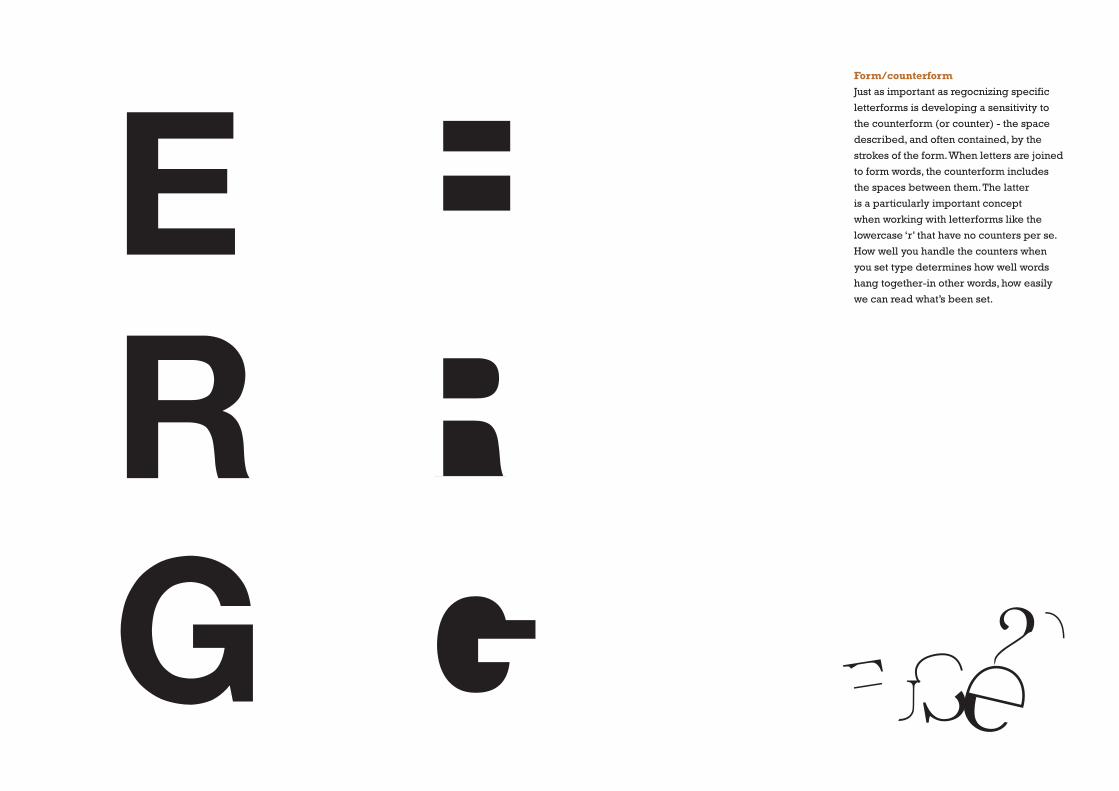
Form/counterformJust as important as regocnizing specific
letterforms is developing a sensitivity to
the counterform (or counter) - the space
described, and often contained, by the
strokes of the form. When letters are joined
to form words, the counterform includes
the spaces between them. The latter
is a particularly important concept
when working with letterforms like the
lowercase ‘r’ that have no counters per se.
How well you handle the counters when
you set type determines how well words
hang together-in other words, how easily
we can read what’s been set.
TYL
U jwH
fp
IK
Bt yev
iGu
l
kbM
Fl
xd
n
vc
Q
im A
r
N2
5
4
l
W
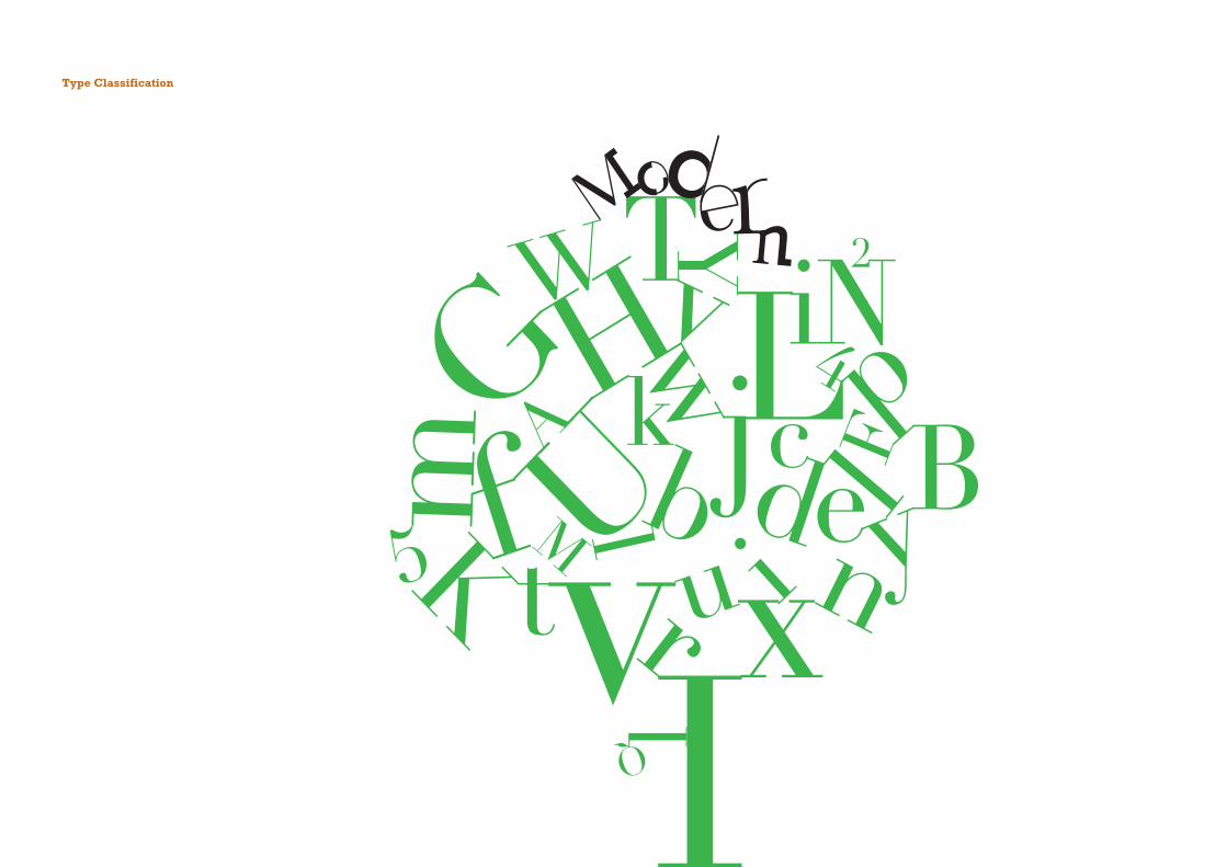
Type Classification

ModernThis style represents a further
rationalization of Oldstlye letterforms.
Serifs were unbracketed, and the contrast
between thick and thin strokes was extreme.
English versions (like Bell) are also known
as Scotch Romans and more closely
resemble transitional forms.
ExamplesBell
Bondoni
Calendonia
Didot
Walbaum
Didot
abcdefghijklmnopqrstuvwxyzABCDEFGHIJKLMNOPQRSTUVWXYZ0123456789
g
HH
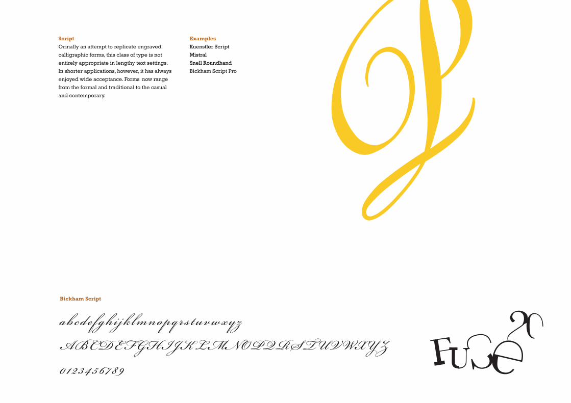
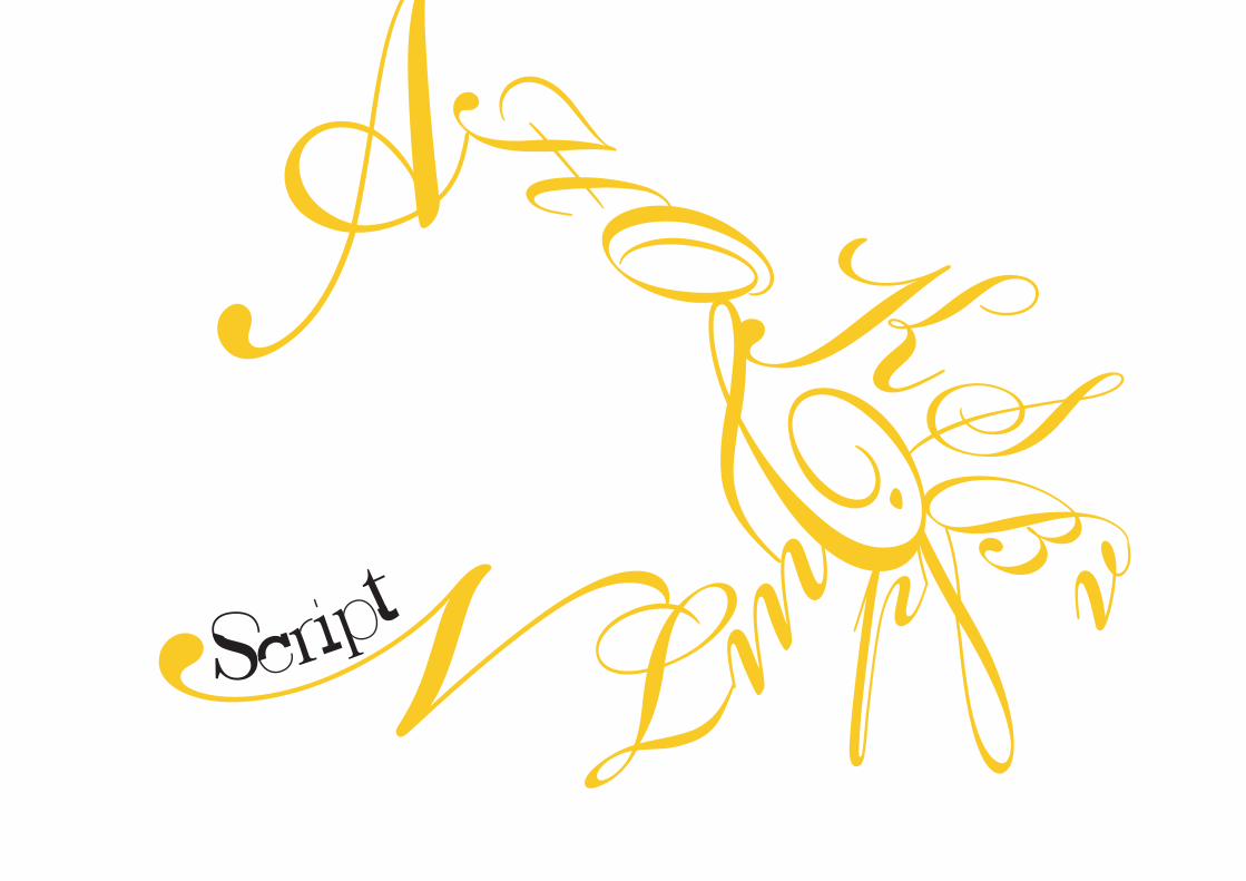
ScriptOrinally an attempt to replicate engraved
calligraphic forms, this class of type is not
entirely appropriate in lengthy text settings.
In shorter applications, however, it has always
enjoyed wide acceptance. Forms now range
from the formal and traditional to the casual
and contemporary.
ExamplesKuenstler Script
Mistral
Snell Roundhand
Bickham Script Pro
Bickham Script
abcd e f gh i jk lmnopq r s tuvwxyz
ABCDEFGHIJKLMNOPQRSTUVWXYZ
0123456 7 89P
4 SL
Cz
H
f
KM
X

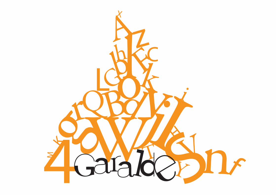
Garalde/OldstyleBased upon the lowercase forms used by
Italian humanist scholars for book copying
(themselves based upon the ninth-century
Caroline miniscule) and the uppercase
letterforms found inscribed on Roman
ruins, the forms evolved away from their
calligraphic origins over 200 years, as they
migrated across Europe, from Italy
to England.
ExamplesBembo
Caslon
Dante
Garamond
Janson
Jenson
Palatinod
WGaramond
abcdefghijklmnopqrstuvwxyzABCDEFGHIJKLMNOPQRSTUVWXYZ0123456789

oI
-
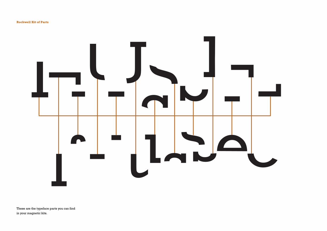
Rockwell Kit of Parts
These are the typeface parts you can find
in your magnetic kits.
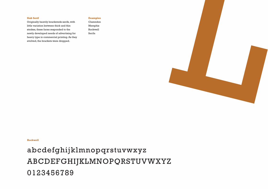
Slab SerifOriginally heavily bracketeds serifs, with
little variation between thick and thin
strokes, these faces responded to the
newly developed needs of advertising for
heavy type in commercial printing. As they
evolved, the brackets were dropped.
ExamplesClarendon
Memphis
Rockwell
Serifa
Rockwell
abcdefghijklmnopqrstuvwxyz
ABCDEFGHIJKLMNOPQRSTUVWXYZ
0123456789
L

I

Baskerville Kit of Parts
These are the typeface parts you can find
in your magnetic kits.
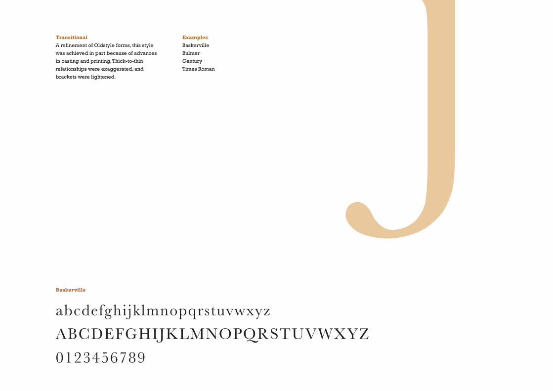
TransitionalA refinement of Oldstyle forms, this style
was achieved in part because of advances
in casting and printing. Thick-to-thin
relationships were exaggerated, and
brackets were lightened.
ExamplesBaskerville
Bulmer
Century
Times Roman
Baskerville
abcdefghijklmnopqrstuvwxyz
ABCDEFGHIJKLMNOPQRSTUVWXYZ
0123456789
j

I
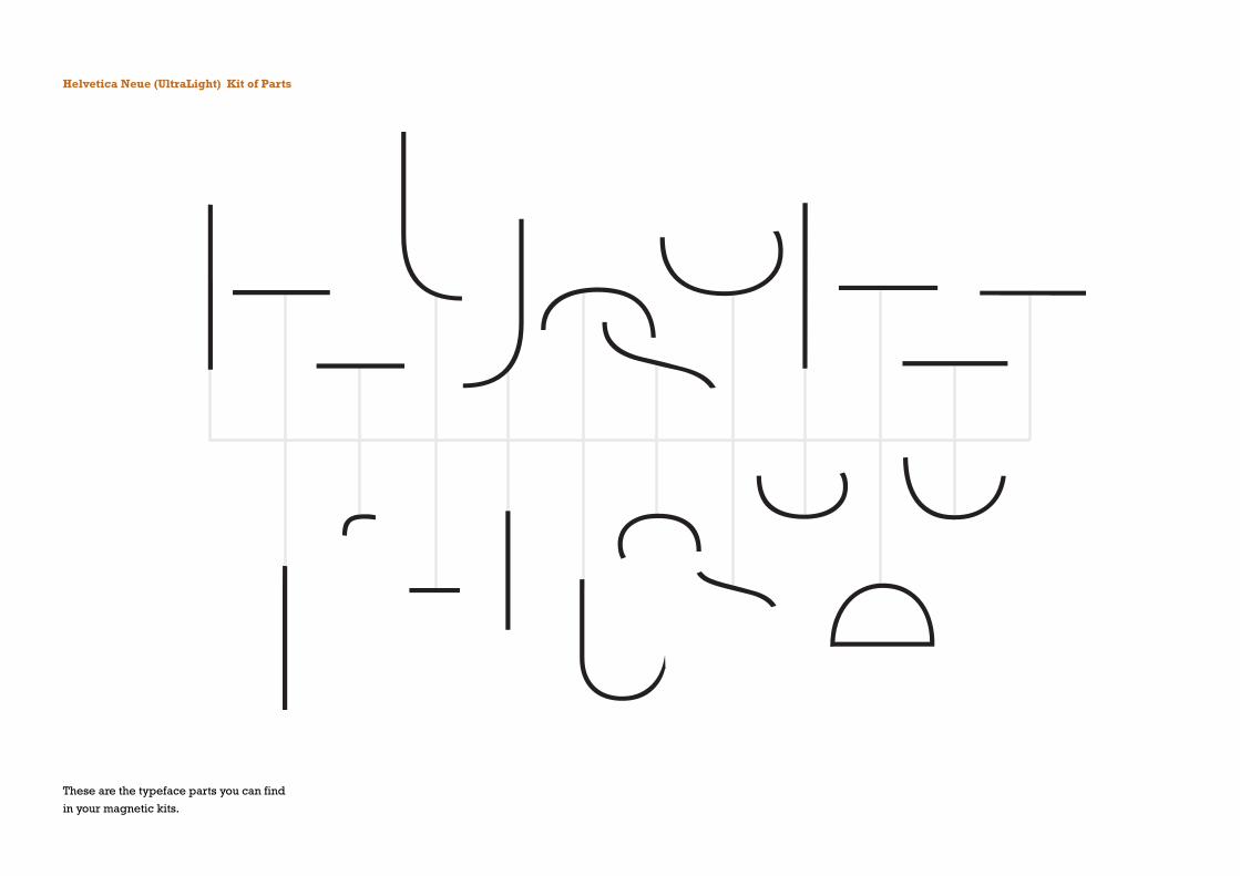
Helvetica Neue (UltraLight) Kit of Parts
These are the typeface parts you can find
in your magnetic kits.

Sans serifAs their name implies, these type-faces
eliminated serifs altogether. Although
the form was first introduced by William
Caslon IV in 1896, its use did not become
widespread until the beginning of the
twentieth century. Variations tended toward
either huminist forms (Gill Sans) or the
rigidly geometric (futura). Occasionally,
strokes were flared to suggest the
calligraphic origins of the form (Optima).
Sans serif is also referred to as grotesque
(from the German ‘grotesk’) and gothic.
Helvetica Neue
abcdefghi jk lmnopqrstuvwxyz
ABCDEFGHIJKLMNOPQRSTUVWXYZ
0123456789
ExamplesAkzidenz Grotesk
Grotesque
Gill Sans
Franklin Gothic
Frutiger
Futura
Helvetica
Meta
News Gothic
Optima
Syntax
Trade Gothic
Univers
G
I
o
Rockerville Neue


I

I
oo