Fundamentals of Secure Computingbayanbox.ir/view/7497397820508642956/SecComp-Part1-HCI-1...Usability...
176
1
Transcript of Fundamentals of Secure Computingbayanbox.ir/view/7497397820508642956/SecComp-Part1-HCI-1...Usability...

1

Fundamentals of Secure Computing
Ali ShakibaVali-e-Asr University of Rafsanjan
[email protected] 2017

What are we going to learn in the class?
3
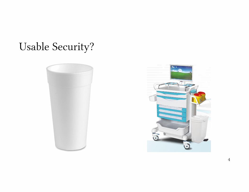
Usable Security?
4
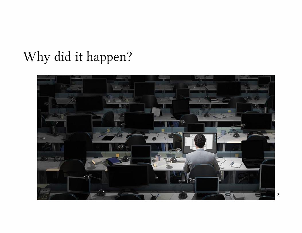
Why did it happen?
5
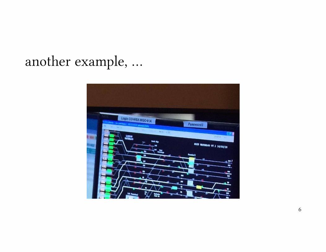
another example, …
6

Human Computer Interaction or HCI
7

Unfortunately, HCI is ignored in “Security Design”, most of the time …
8
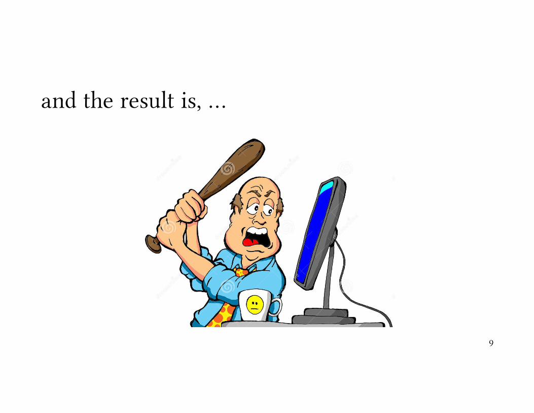
and the result is, …
9
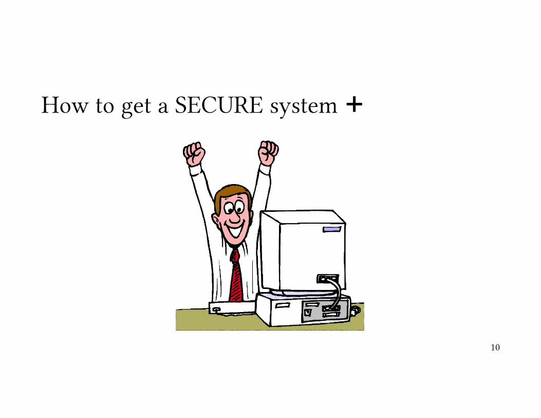
How to get a SECURE system +
10

What about “Privacy”?
11

So, we are going to study the “HCI” and its applications in “Cyber Security”HCI Basics
• What’s HCI?• Usability• Mental Models
Design• Design Methodologies• Case Study: SSL Warnings
Evaluation• Qualitative Evaluation & Controlled Experiments• Usability Studies• Case Study: Phishing Emails
Guidelines for Usable Security
• Authority Guidelines• Authorization & Communication Guidelines• Interface Guidelines for Usable Security• Case Study: Phishing Warnings
Usable Authentication
• Passwords & 2-factor Authentication• Biometric Authentication• Gesture-based Authentication• Case Study: Smudgy Attacks
Usable Privacy
• Privacy Policies & User Understanding• Informed Consent for Privacy• Inferring personal Data & Policy
12
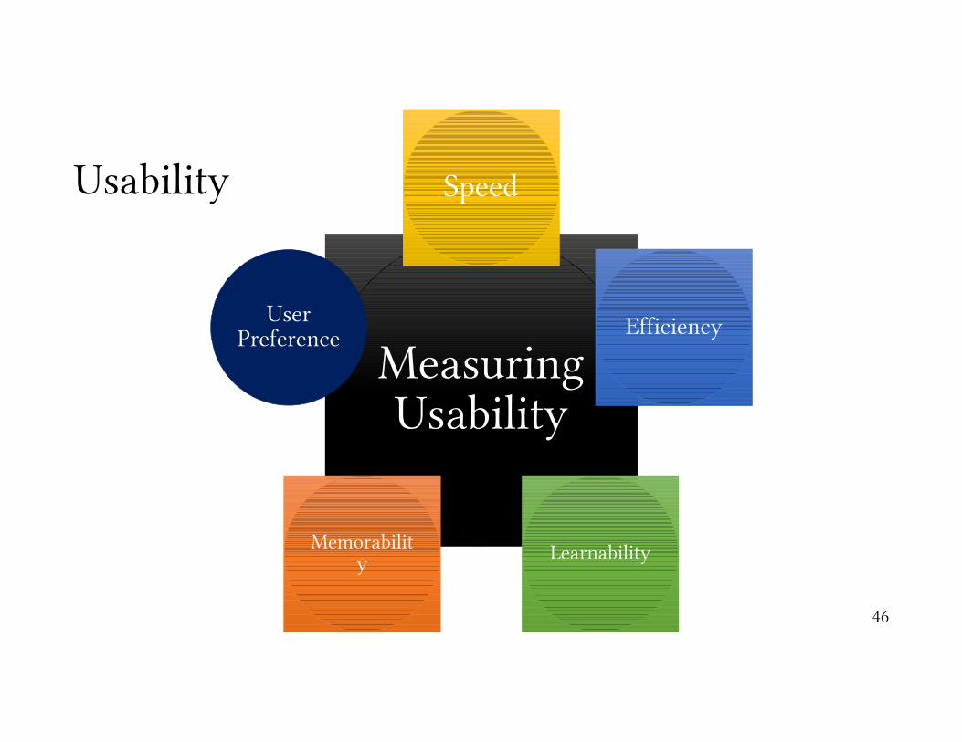
Measuring Usability
Speed
Efficiency
LearnabilityMemorability
User Preference
Usability
46
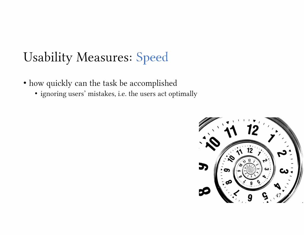
Usability Measures:
• how quickly can the task be accomplished• ignoring users’ mistakes, i.e. the users act optimally
47
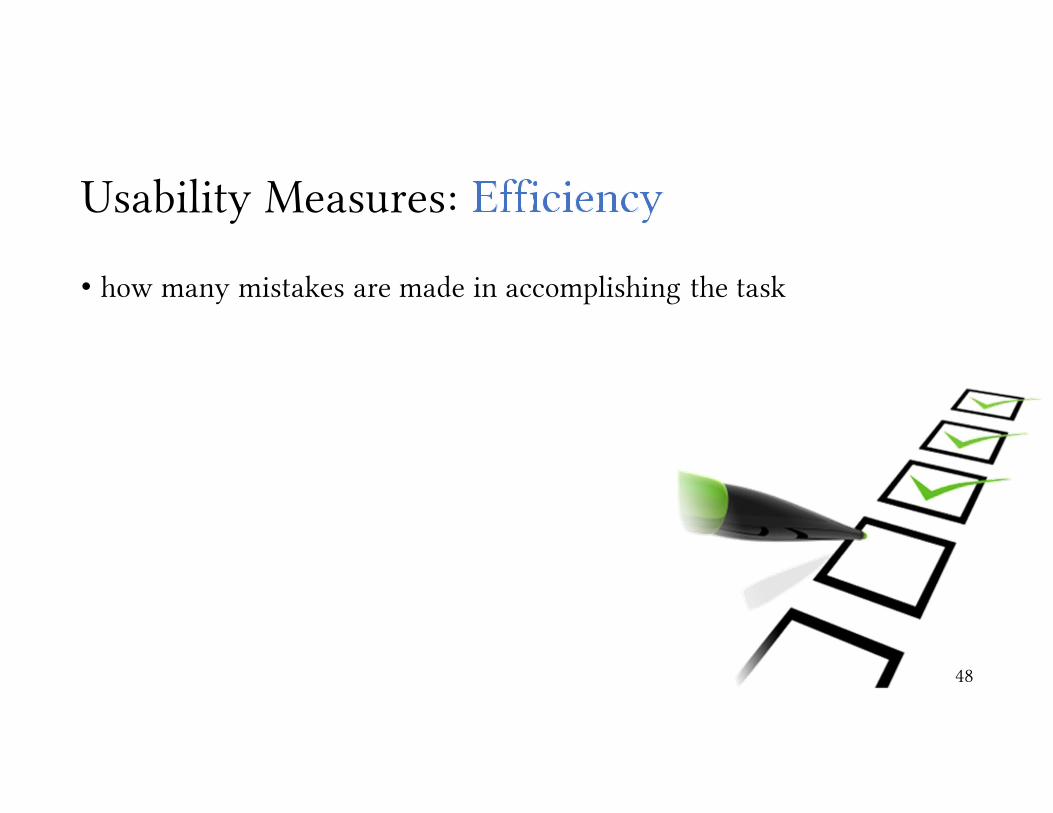
Usability Measures:
• how many mistakes are made in accomplishing the task
48
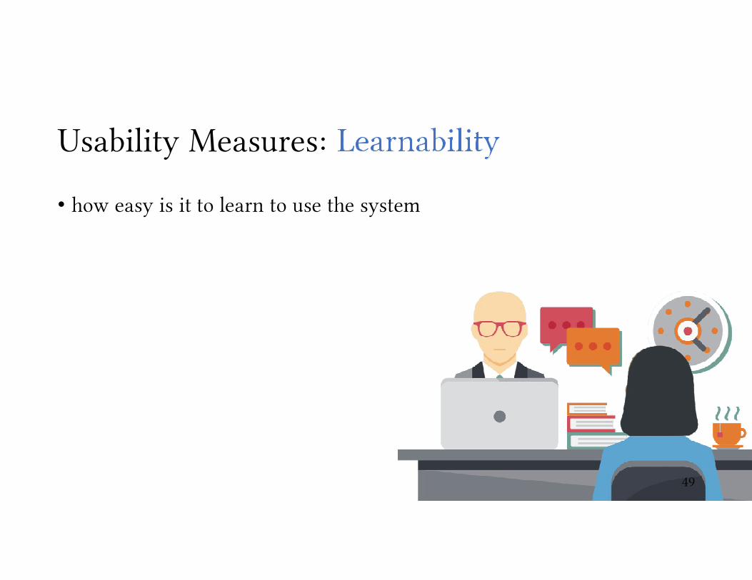
Usability Measures:
• how easy is it to learn to use the system
49

Usability Measures:
• once learned, how easy is it to remember how to use the system
50
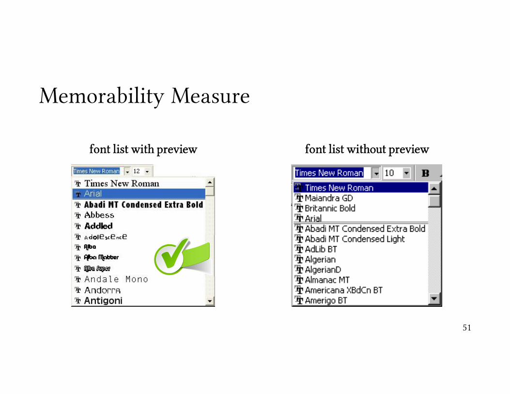
Memorability Measure
font list with preview font list without preview
51
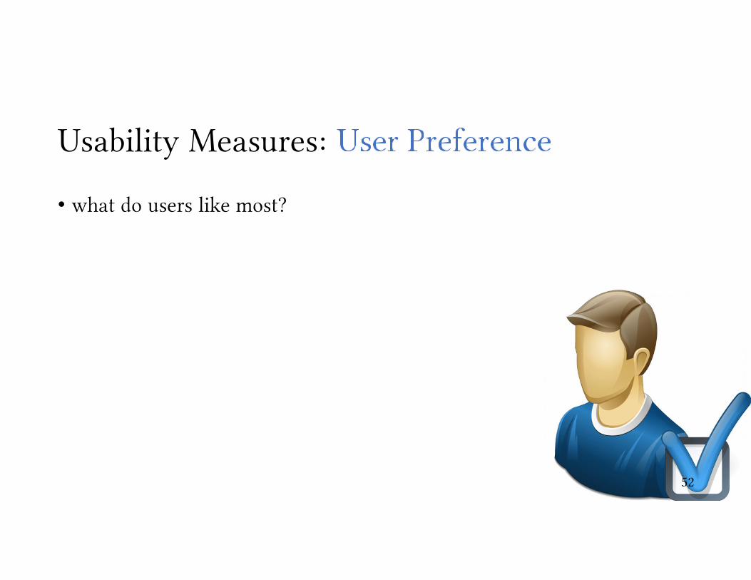
Usability Measures:
• what do users like most?
52

Usability Measures & User Preferencezooming + no overview interface zooming + overview interface
[HBP02] Kasper Hornbæk, Benjamin B. Bederson, and Catherine Plaisant. 2002. Navigation patterns and usability of zoomable user interfaces with and without an overview. ACM Trans. Comput.-Hum. Interact. 9, 4 (December 2002), 362-389.
Speed Efficiency User Preference
53

How do we measure these factors?
• speed• timing
• efficiency• counting errors
• learnability• ?
• memorability• ?
• user preferences• ?
54
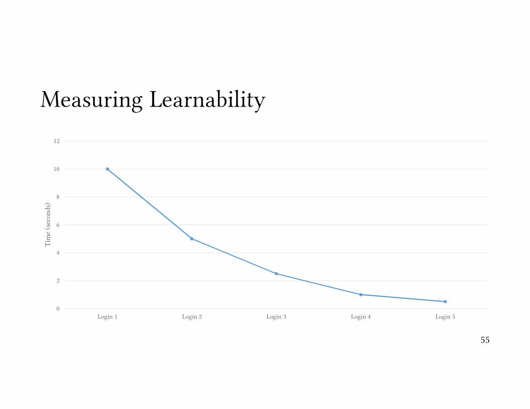
Measuring Learnability
0
2
4
6
8
10
12
Login 1 Login 2 Login 3 Login 4 Login 5
Tim
e (s
econ
ds)
55

Measuring Memorability
0
2
4
6
8
10
12
Login 1 Login 2 Login 3 Login 4 Login 5 Login aftersometime
Tim
e (s
econ
ds)
BAD
GOOD
56

Measuring User Preference
57
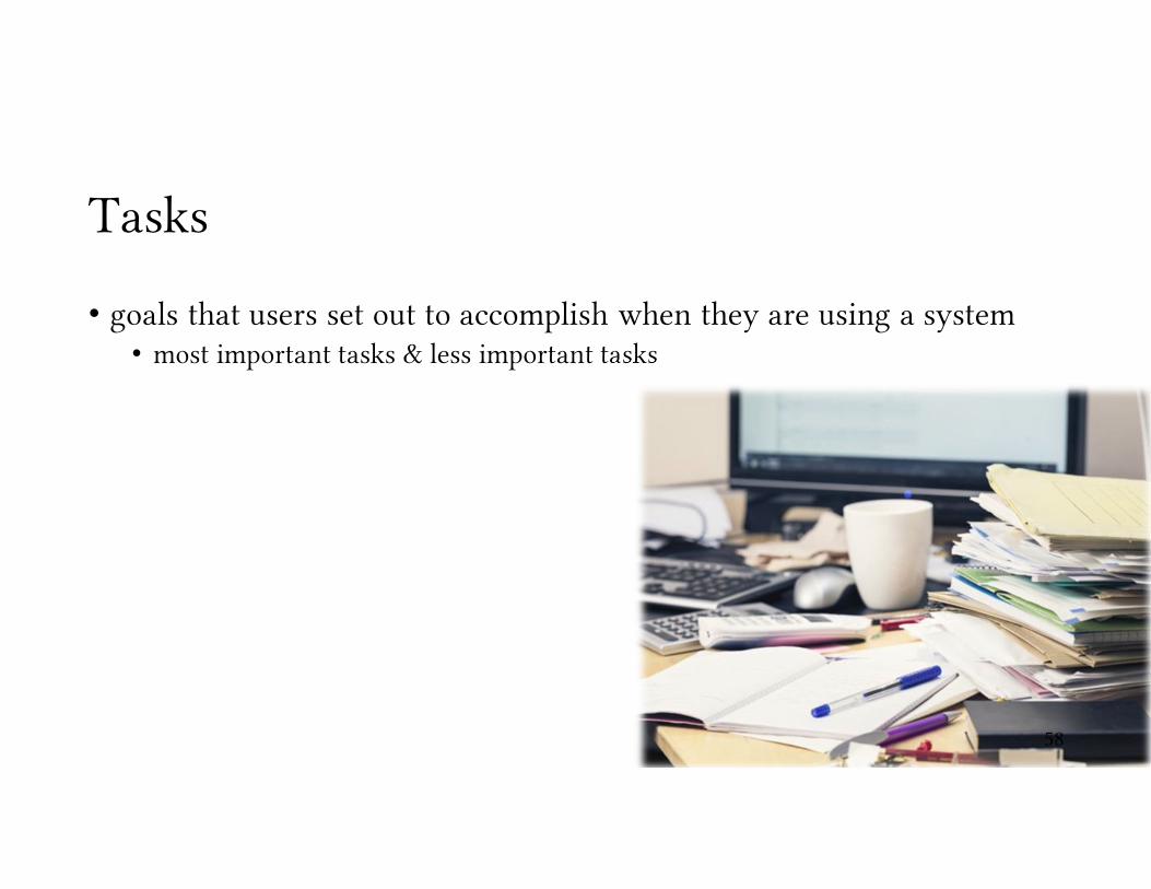
Tasks
• goals that users set out to accomplish when they are using a system• most important tasks & less important tasks
58
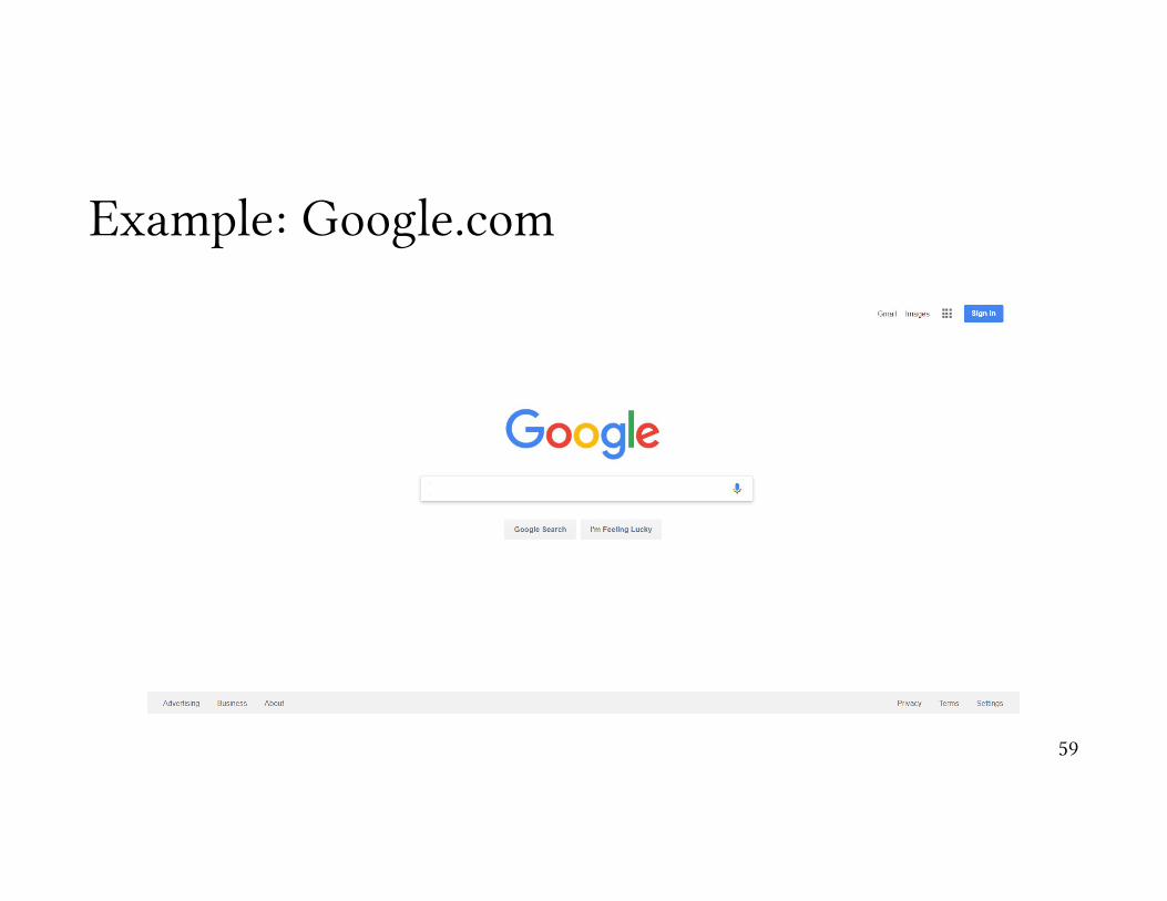
Example: Google.com
59

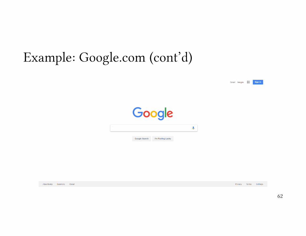
Example: Google.com (cont’d)
60

Example: Google.com (cont’d)
61
Example: Google.com (cont’d)
62

Tasks are goals users set out to accomplish in a system
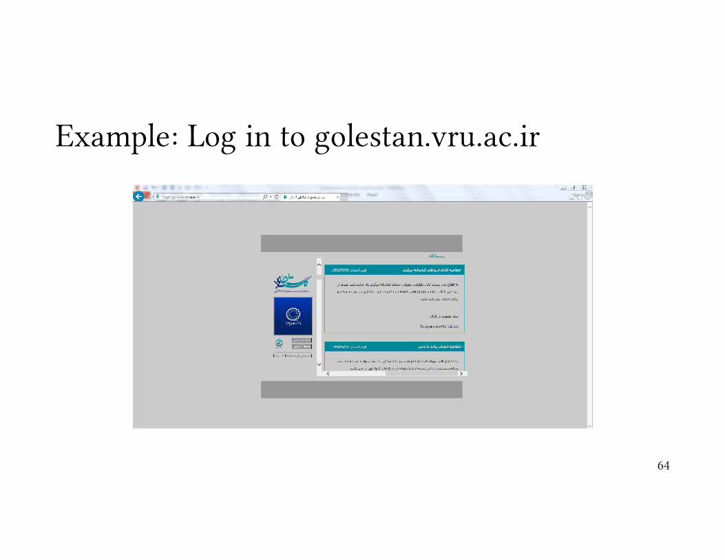
Example: Log in to golestan.vru.ac.ir
64

Example: Check the Bank Card Balance
65

Example: Read the Headlines
66
Measuring the Usability of a Task
1. Speed
2. Efficiency
3. Learnability
4. Memorability
5. User Preference
67

Example: Windows Fingerprint Sign in
68

Common Errors in Task Creation
• Too leading or too descriptive• e.g. click on the username box at the upper right ofthe screen and enter your
username. Then click the password box underneath itand enter your password and click submit …
• Specific questions• What is the 2nd headline in the website of the university?
• Directing users toward things you want to tell them, not what they want to know
• What are the names of the website developers?
69

Comparing tasks between systems
• Task: “Giving people write access to a file”• Mode: command line vs. GUI
70
$ chmod +w super-magic-hacker-script.sh
Comparing tasks between systems
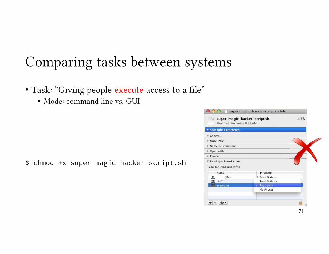
• Task: “Giving people execute access to a file”• Mode: command line vs. GUI
71
$ chmod +x super-magic-hacker-script.sh

Tasks and Task Analysis

Memory
73

Working Memory – Short-term Memory
• George A. Miller (1956)• The magical number 7 ± 2.• The working memory can hold between 5 to 9 pieces of information.
• Revisions on this limit:• Broadbent (1975): 4-6• LeCompte (1999): 3
Common Practice: 4 ± 174

Chunking
3.141592653589793238462643383279502884197169399375105820974944592307816406286208998628034825342117067982148086513282306647093844609550582231725359408128481117450284102701938521105559644622948954930381964428810975665933446128475648233786783165271201909145648566923460348610454326648213393607260249141273724587006606315588174881520920962829254091715364367892590360011330530548820466521384146951941511609433057270365759591953092186117381932611793105118548074462379962749567351885752724891227938183011949129833673362440656643086021394946395224737190702179860943702770539217176293176752384674818467669405132000568127145263560827…
oomgydliev
old veg me yo
video gym lo
i love my dog
75

Chunking
3.141592653589793238462643383↓
3.14 1592653589793238462643383↓
3.14 15 926 535 8979 323 846 264 3383
76
98343131227098 (34) 3131 22709780124055315823728912
Ready for a test?
77
037581295485624055296075232097281357261234567891011122244668112233441234567890

Ready for a test?
983431312270 209
98 (34) 3131 2270 728
978012405531582 135
3728912 726
03758129 123456789101112
54856 2244668
24055 11223344
29607 12345
523 6789078

Example: Information Chunking & Security
• The password must be at least eight characters long, and can contain letters, numerals, and punctuation.
• It cannot contain spaces.• It must contain at least one alpha character [a-z; A-Z].• It cannot contain your login ID.• The first eight characters cannot be the same as your
previous password.• Passwords are treated as case sensitive.
1. password2. 123453. 123456784. abc1235. qwerty6. monkey7. letmein8. dragon9. 11111110. baseball
79
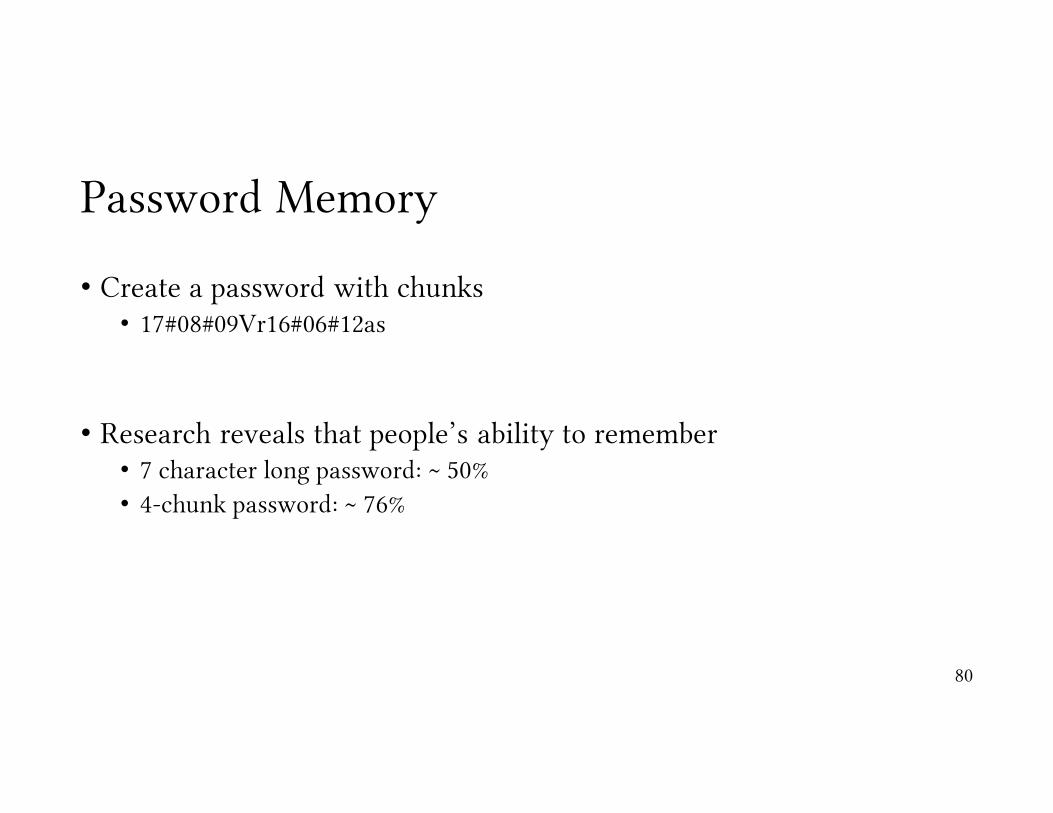
Password Memory
• Create a password with chunks• 17#08#09Vr16#06#12as
• Research reveals that people’s ability to remember• 7 character long password: ~ 50%• 4-chunk password: ~ 76%
80
Mental Models
• let us understand how users perceive systems
81
Mental Models
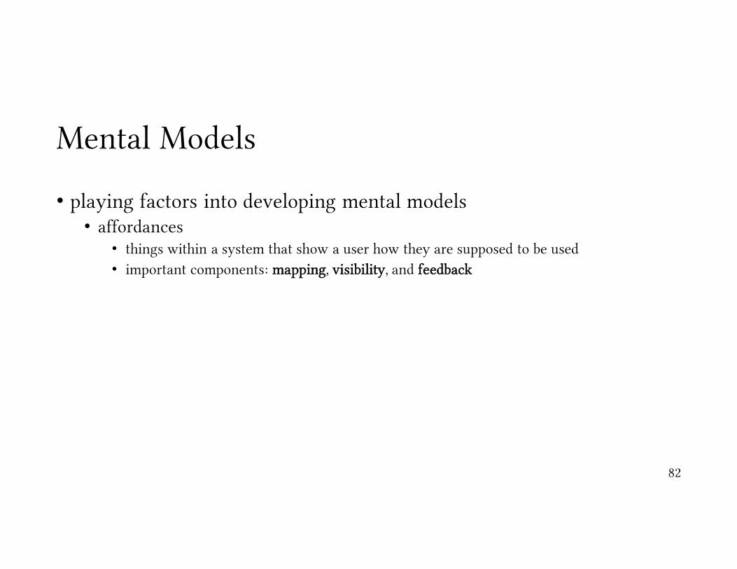
• playing factors into developing mental models• affordances
• things within a system that show a user how they are supposed to be used• important components: mapping, visibility, and feedback
82
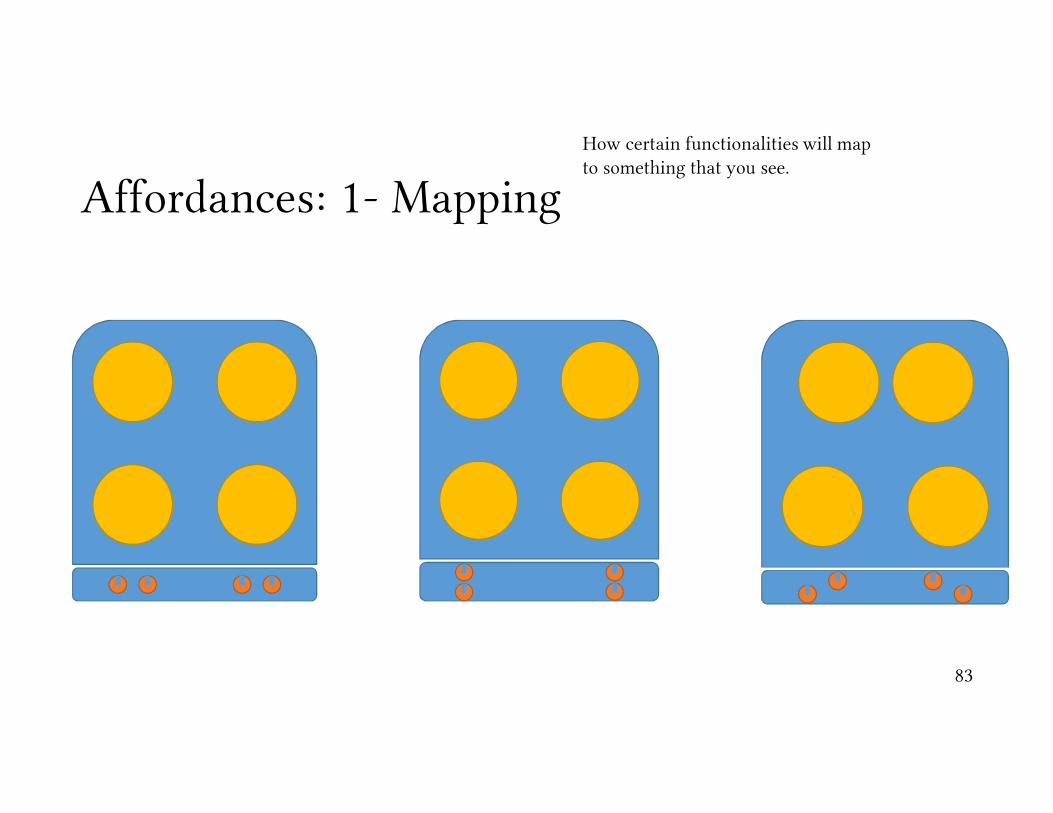
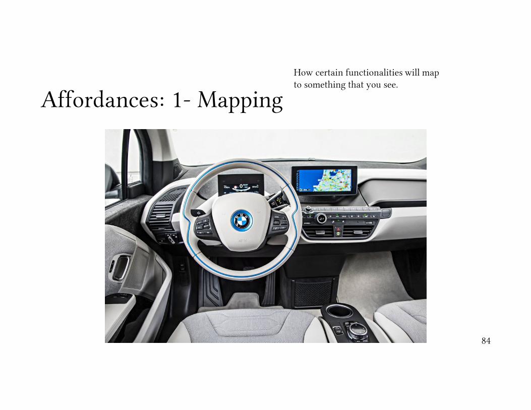
Affordances: 1- MappingHow certain functionalities will map to something that you see.
83
Affordances: 1- MappingHow certain functionalities will map to something that you see.
84

Affordances: 2- Visibility
85

Affordances: 3- Feedback
86

Mental Models
• playing factors into developing mental models• affordances
• things within a system that show a user how they are supposed to be used• important components: mapping, visibility, and feedback
• constraints
87

Constraints
88
how a system can prevent us from doing things that we should not and how the design of it can encourage us to do things the right way

Constraints
how a system can prevent us from doing things that we should not and how the design of it can encourage us to do things the right way
89

Mental Models
• playing factors into developing mental models• affordances
• things within a system that show a user how they are supposed to be used• important components: mapping, visibility, and feedback
• constraints• conventions
90
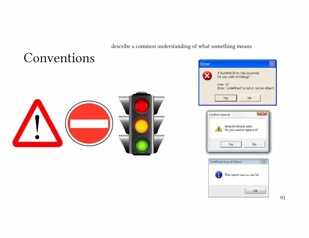
Conventionsdescribe a common understanding of what something means
91
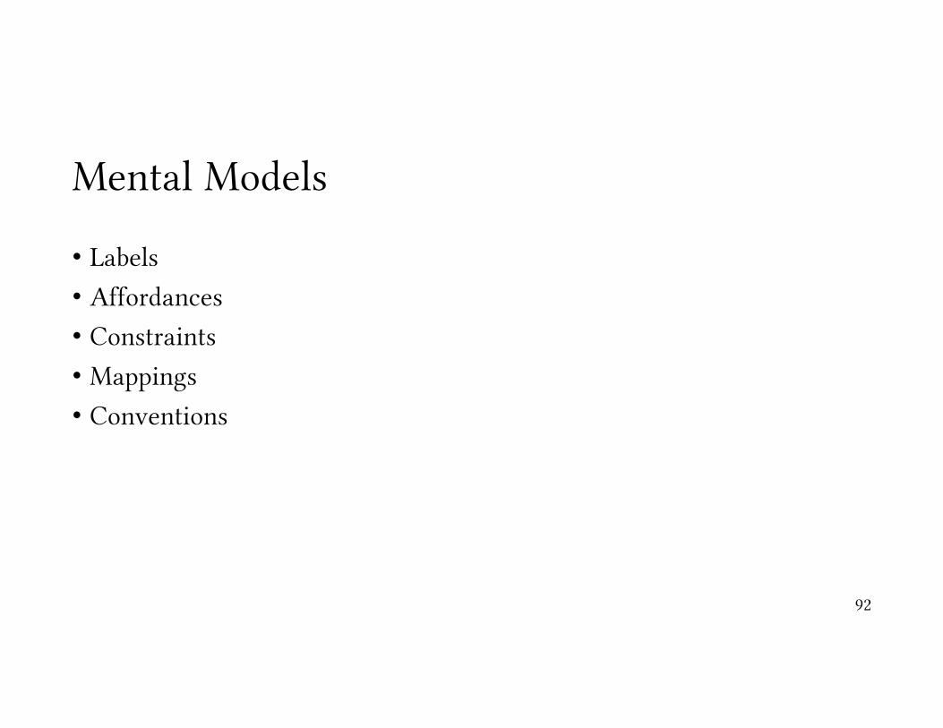
Mental Models
• Labels
• Affordances
• Constraints
• Mappings
• Conventions
92

Assignment
• find at least six security or privacy interface element that you love or hate and share it with us. It could be a login screen, authentication mechanism, an option for sending secure email, a privacy setting interface, etc. It should NOT be an entire application or software program. In the discussion, you must:
1. Provide a screen shot of the interface element.2. Describe what you think is great or terrible about the interface. This MUST
be justified by and connected to the principles of usability we have discussed. It is not enough to say you love it or hate it. Tell us why is has good or bad usability using the things we have learned.
93

You will evaluate it, too.
1. Plagiarizing immediately results in 0 points for a question. Plagiarism is copying someone's words that are not your own, for example, by inserting an answer from a blog on the Web or Wikipedia.
2. The best answers are concise and to the point. A lot of words and a rambling response will fail to get your point across and confuse the student evaluating your answers.
3. You need to evaluate at least 5 of your classmates.
4. The reviews are anonymous.
94

Design Process
• where do ideas come from?
• many processes:• iterative design• system centered design• user centered design• participatory design• design centered design
95

Iterative DesignRequirements
Design
Development
Testing
96

System Centered Design
• what can be built easily on this platform?
• what can I create from the available tools?
• what do I as a programmer find interesting to work on?
97

User Centered Design
• design is based upon a user’s • abilities & real needs• context• work• tasks
98
Golden Rule of Interface Design“Know the User”

Did you remember this?
99
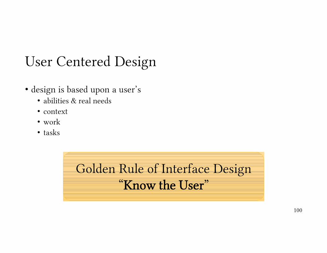
User Centered Design
• design is based upon a user’s • abilities & real needs• context• work• tasks
100
Golden Rule of Interface Design“Know the User”

Participatory Design
• problem• wrong intuitions • interviews & etc. are not precise• designer cannot know the user sufficiently well to answer all issues that come
up during the design
• solution• designers should have access to pool of representative users
• the END users, not their managers
101

Brainstorming Observation
Ideation
Rapid Prototyping
User Feedback
Iteration
Implementation
102
DesignProcess

Designer Centered Design
“It isn’t the consumers’ job to know what they want.”--- Steve Jobs
103

Conclusions
• users can give a lot of valuable insights for design• tasks• context• needs
• support designers coming up with ideas
• iterate to build better systems
104

Example: Usability of Firefox’s Untrusted Connection Error
105
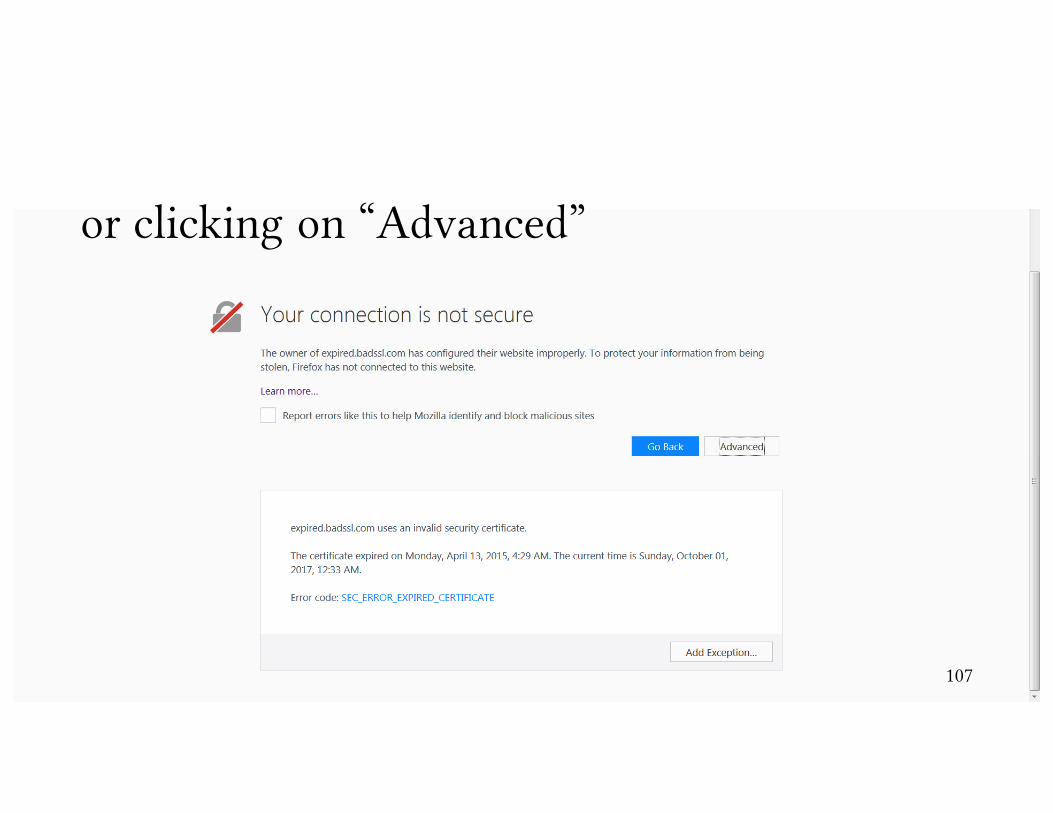
https://expired.badssl.com/ .

If one clicks on “Learn More”
106
107
or clicking on “Advanced”

Adding Exception
108
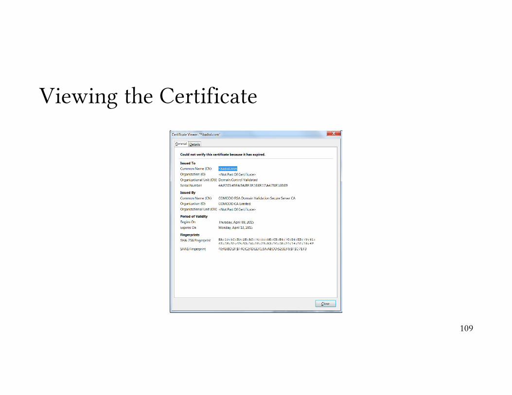
Viewing the Certificate
109
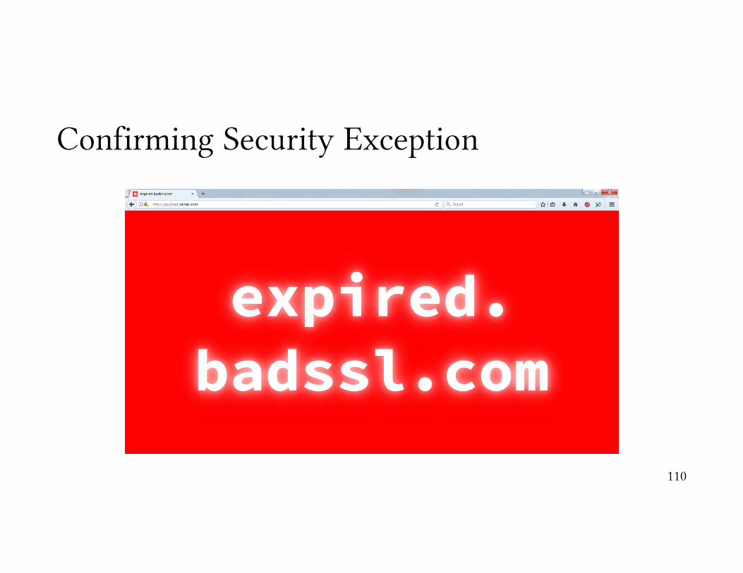
Confirming Security Exception
110

Removing the Certificate Exception
111

Lessons
• user knows something bad is happening, however not what.
• user has good general strategies (worry more about sites with sensitive info).
• error message relies on a lot of information users don’t understand.
112
How could we improve this?
Case Study: SSL Warnings
We will study the following paper:
Joshua Sunshine, Serge Egelman, Hazim Almuhimedi, Neha Atri,and Lorrie Faith Cranor. 2009. Crying wolf: an empirical study ofSSL warning effectiveness. In Proceedings of the 18th conferenceon USENIX security symposium (SSYM'09). USENIX Association,Berkeley, CA, USA, 399-416.
113

Warnings Studied:
114
Firefox 2
Firefox 3
Internet Explorer 7

Responses to the question: “If you saw this message, would you attempt to continue to the website?”
115

Comments of People who Continued …
• “I use a Mac so nothing bad would happen.”
• “Since I use FreeBSD, rather than Windows, not much [risk].”
• “On my Linux box, nothing significantly bad would happen.”
116

Redesigned Warnings
117
Page 1
Page 2

Users Ignoring Warnings
0
10
20
30
40
50
60
70
80
90
100
FF2 FF3 IE7 Single Red Multi Yellow + Red
Perc
enta
ge
Browser
Bank
Library
118

Users who logged in
Condition Read Didn’t Read Understood Didn’t Understand
FF2 20% 70% 35% 55%
FF3 10% 45% 20% 35%
IE7 20% 70% 40% 50%
Single Red Page 20% 25% 20% 25%
Multi Yellow Red Pages 40% 20% 35% 25%
119

Lessons
• different interfaces can have major impacts on the security behavior of users.
• what do we want users to do?
• what do they need to understand to do that?
• how can we make it more natural for them to do the “right” thing?
120
Assignments
121

Evaluation
• how to evaluate the usability of systems• a critical component of building usable systems for security• how usable your system is• identify specific problems with the usability
• often, evaluations are large-scale and expensive• there are options that are easy to do on your own that follow good guidelines
• Systems can be evaluated • quantitatively (with numbers) or ,• qualitatively (through experience and description)
122
The main goal of evaluation
The goal of evaluation is ultimately to identify usability problems so the interface can be refined and improved.
123

Qualitative Evaluation
124

Cognitive Walkthrough
• requirements• description or prototype of interface• task description• list of actions to complete task• user background
• what you look for?• will users know to perform the action?• will users see the control?• will users know the control does what they want?• will users understand the feedback?
125
Demo of Cognitive Analysis of Mobile Authentication System
126

Heuristic Analysis
• follow “rules of thumb” or suggestions about good design
• can be done by experts / designers, fast & easy
• may miss problems users would catch
127
What are these “rules of thumb”?

Nielsen’s Heuristics
• simple & natural dialog• speak the user language• minimize user memory load• consistency• feedback• clearly marked exits• shortcuts• prevent errors• good error messages• provide help & documentation
128
Demo of Nielsen’s Heuristics for Mobile Authentication System
129
Personas
• a fictitious user representing a class of users
• reference point for design & analysis
• has a goal or goals they want to accomplish • in general or in the system
130

Persona: Ali
wants encryption but in a simple, low-effort way.
Goalswants easy to use email & social media tools that are encrypted to protect his privacy
Undergraduate Student• 20 years old• Literature Major• Cultural Activist• Savvy computer user, but not expert
About AliAli is an undergraduate student of literature at the Vali-e-Asruniversity of Rafsanjan. He enjoys playing tennis & watchingmovies. He always carries his smart phone which is anandroid phone. He also has a laptop. His mobile phone isconstantly connected to the Internet through the carrier’s dataconnection. He is always worried that his activities aremonitored by his parents.
131
Demo of Using Personas for Analysis of the Mobile Authentication System
132
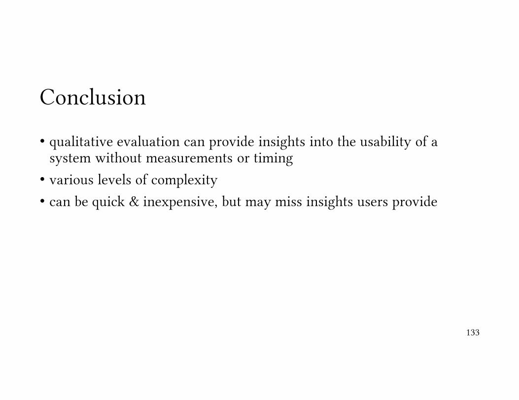
Conclusion
• qualitative evaluation can provide insights into the usability of a system without measurements or timing
• various levels of complexity
• can be quick & inexpensive, but may miss insights users provide
133

Running Controlled Experiments
134
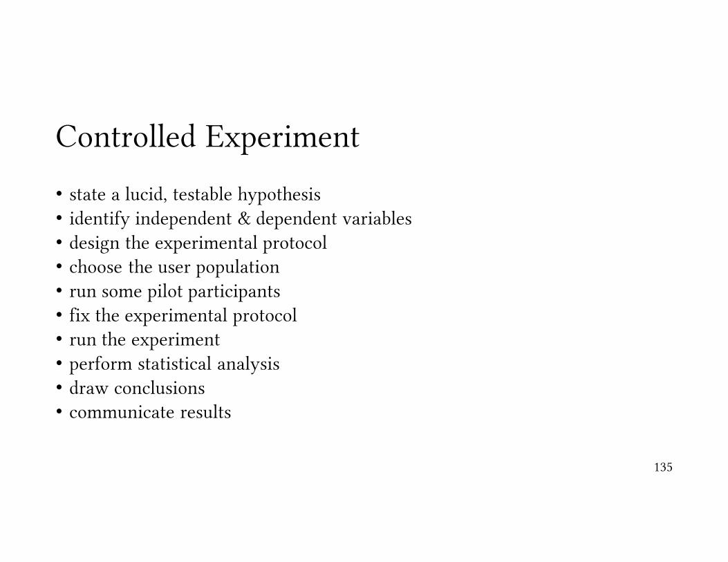
Controlled Experiment
• state a lucid, testable hypothesis• identify independent & dependent variables• design the experimental protocol• choose the user population• run some pilot participants• fix the experimental protocol• run the experiment• perform statistical analysis• draw conclusions • communicate results
135

Demo: Compare the Gesture-based Authentication on Android Phones with Password-based Authentication
136

State a Lucid, Testable Hypothesis
mobile phone login with gesture is faster than with password entry
137

Choose the Variables
• manipulate one or more independent variables (the thing you change)• login method
• observe effect on one or more dependent variables (the thing that you measure)
• time to login
138

Design the Experimental Protocol
• choose tasks
• between or within subjects?• between subjects
• each subject runs one condition
• within subjects• each subject runs several conditions
139

140
http
s://
goo.
gl/f
orm
s/ab
tZzg
0mfi
iGew
6v2
141
http
s://
goo.
gl/f
orm
s/ab
tZzg
0mfi
iGew
6v2

142
http
s://
goo.
gl/f
orm
s/ab
tZzg
0mfi
iGew
6v2

143
http
s://
goo.
gl/f
orm
s/ab
tZzg
0mfi
iGew
6v2
Gesture Coding Rules
144
1 2 3
4 5 6
7 8 9

Run the experiment
• run a pilot study
• have a checklist of steps, so all users are the same
• collect data
145
Analysis
• statistical comparison (e.g. t-test)
• report results
146

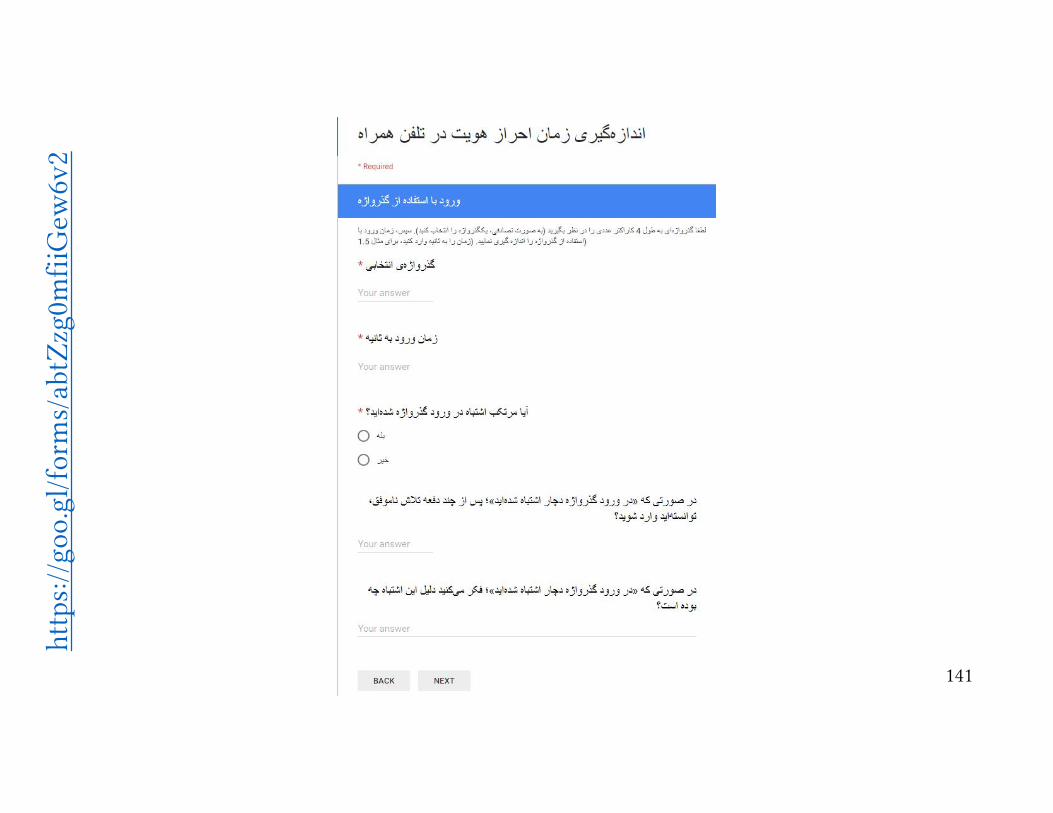
Now, it’s your turn …
• go & fill the form at https://goo.gl/forms/abtZzg0mfiiGew6v2• every student needs to do the experiment with 10 different passwords & 10
different gestures, interleavingly. • to measure the timing, ask your friends for help :-)
• and next week, I’ll show you the analysis & communicate the result.
147

How to Run a Usability Study?
148

Evaluating Usability
• run a usability study to judge how an interface facilitates tasks with respect to the aspects of usability
• speed, efficiency, learnability, memorability, and user preferences
149

Testing Usability of Security
• security is rarely the task users set out to accomplish
• good security is a seamless part of the task
150
Usability Study Process
• define tasks (and their importance)
• developing questionnaires
151

Selecting Tasks
• what are the most important things a user would do with this interface?
• present it as a task, not a question• good: create an itinerary from Rafsanjan to Tehran, departing October, 8th &
returning October, 15th.• bad: how many flights are available from Rafsanjan to Tehran, departing on
October, 8th & arriving on October, 15th.• users come to plan itineraries, not to count them.
152

Selecting Tasks (cont’d)
• be specific• good: find the calories, vitamins, and minerals in 1 mL of apple juice.• bad: find nutrition information.• users shouldn’t have to be creative to figure out what you want them to do.
• don’t give instructions• good: using Google map, find a street view of the city hall of Kerman.• bad: go to maps.google.com and type “city hall of Kerman” in the search box.
Then, click on “search maps”. Using the zooming toolbox on the left, click on the person to see the street view, if it is available.
• You aren’t testing anything if you give step by step instructions.
153

Selecting Tasks (cont’d)
• don’t be vague or provide tiny insignificant tasks• good: using Google map, find a close up view that just shows the block of the
Kerman’s city hall.• bad: zoom in on a Google map.• users don’t come up to the site to zoom. Zooming is something that needs to be
done as part of a real task.
154

Selecting Tasks (cont’d)
• choose representative tasks that reflect the most important things a user would do with the interface.
• good: for Google, tasks could include a web search, a map search with directions, changing the language, conducting an advanced search, etc.
• bad: do 5 basic web searches for different things.• repeated tasks do not provide new insights.
155
Security Tasks
• security is almost never a task!
• good tasks for a banking web site• check account balance• make a transfer
• bad tasks for a banking web site• login to your account
156

Pre-Test Questionnaires
• learn any relevant background about the subjects• age, gender, education level, experience with this kind of websites, experience
with this site in particular, etc. • perhaps more specific questions based on the site, e.g. color blindness, if the
user has children, etc.
157
Post-Test Questionnaires
• have users provide feedback on the interface• Overall, I found this interface/website
• (difficult) 1 2 3 4 5 (easy)
• Finding directions on a map was• (difficult) 1 2 3 4 5 6 7 8 9 10 (easy)
• can rate multiple features for each question
158
Evaluation
• users are given a list of tasks & asked to perform each task
• interaction with the user is governed by different observation protocols• silent observer• think aloud• constructive interaction
159
Interview
• ask users to give you feedback
• easier for the user than writing it down
• they will tell you things that you never thought to ask
160
Reporting
• after the evaluation, report your results
• summarize the experiences of the users
• emphasize your insights with specific examples or quotes
• offer suggestions for improvement for tasks that were difficult to perform
161
Lessons
• what parts of an application are easy and hard to use
• how usable is the site for each task
• what improvements can be made to improve the usability
• for security, can you make it more seamless?
162

Assignment
• Design a controlled experiment on the interface you have designed for SSL warnings.
• Evaluate the design of security elements of the first assignment.
163
A/B Testing
164

165

Case Study: Phishing Warnings
• it is based on the following paper• S. Egelman et. al., “You've been warned: an empirical study of the effectiveness
of web browser phishing warnings,” in ACM SIGCHI Conference on Human Factors in Computing Systems, 2008, pp. 1065-1074.
166
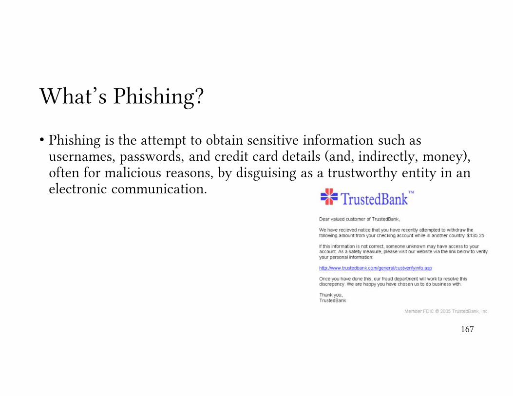
What’s Phishing?
• Phishing is the attempt to obtain sensitive information such as usernames, passwords, and credit card details (and, indirectly, money), often for malicious reasons, by disguising as a trustworthy entity in an electronic communication.
167

https://itisatrap.org/firefox/its-a-trap.html
168

https://itisatrap.org/firefox/its-a-trap.html
169
Case Study: Phishing Warnings
• it is based on the following paper• S. Egelman et. al., “You've been warned: an empirical study of the effectiveness
of web browser phishing warnings,” in ACM SIGCHI Conference on Human Factors in Computing Systems, 2008, pp. 1065-1074.
170

Measures of Usability
• Speed
• Efficiency
• Learnability
• Memorability
• User prefrences
171

Measures of Usability
• Speed
• Efficiency
• Learnability
• Memorability
• User prefrences
172
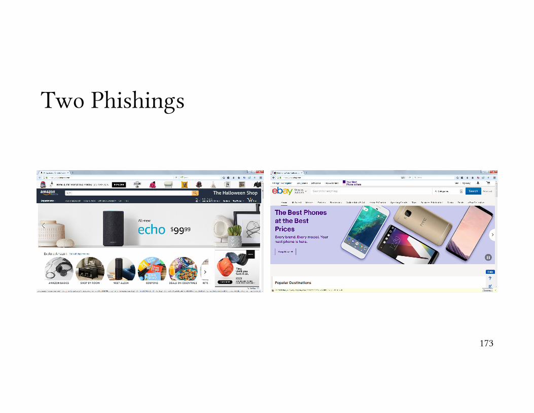
Two Phishings
173

IE Active Phishing Warning
174

IE Passive Phishing Warning
175

FF2 Active Phishing Warning
176

and the results …
177
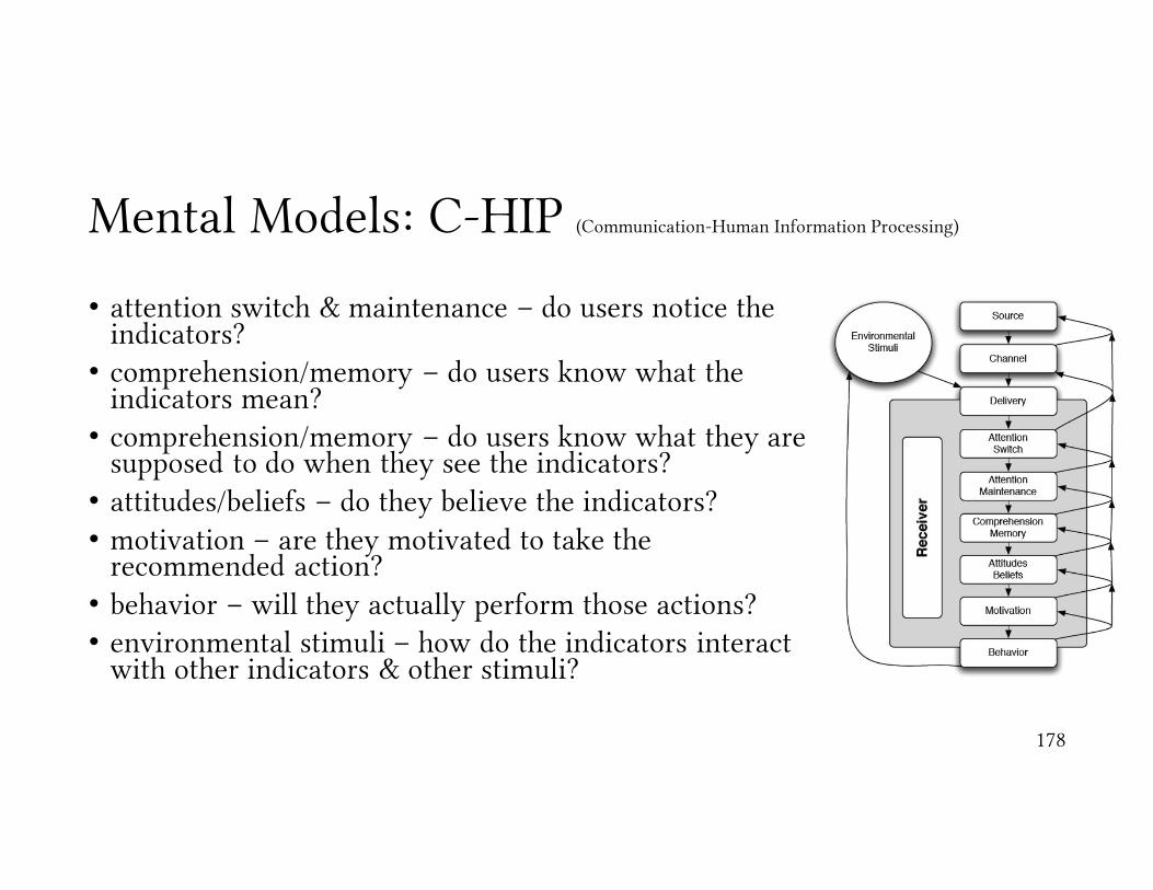
Mental Models: C-HIP (Communication-Human Information Processing)
• attention switch & maintenance – do users notice the indicators?
• comprehension/memory – do users know what the indicators mean?
• comprehension/memory – do users know what they are supposed to do when they see the indicators?
• attitudes/beliefs – do they believe the indicators?• motivation – are they motivated to take the
recommended action?• behavior – will they actually perform those actions?• environmental stimuli – how do the indicators interact
with other indicators & other stimuli?
178
Conclusions
• the interface can have measurable impacts on the usability of security features
• better interfaces = more secure behavior
• mental models• active warnings capture & hold more attention than passive ones, and yield
better results
179
Usable Security Guidelines
180

Two Main Strategies for Building Usable Secure Systems• security designation
• user-assigned identifiers
181
Some Background
• secure interaction design• deals with how to design a system which is both secure & usable
• mental models
• sources of conflict between usability & security
182

Permission vs. Authority
• permission• settings within a system that say who can access a file
• authority• who has the power to access something regardless of the permissions
183

Security & AuthorityAuthority Granting Guidelines
184
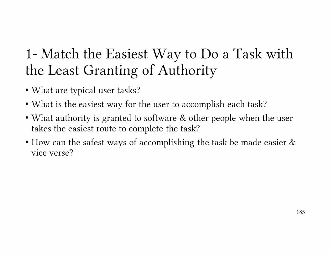
1- Match the Easiest Way to Do a Task with the Least Granting of Authority• What are typical user tasks?
• What is the easiest way for the user to accomplish each task?
• What authority is granted to software & other people when the user takes the easiest route to complete the task?
• How can the safest ways of accomplishing the task be made easier & vice verse?
185

2- Grant Authority to Others in Accordance with User Actions Indicating Consent.• When does the system give access to the user’s resources?
• What user action grants that access?
• Does the user understand that action grants access?
186

3- Offer the User Ways to Reduce Others’ Authority to Access the User’s Resources• What kinds of access does the user grant to software and other users?
• Which types of access can be revoked?
• How can the interface help the user find & revoke access?
187

Summary
• follow the principle of least privilege
• make the easiest way to complete a task the most secure
• make sure the user consents to the access they allow
• make it easy to reduce others’ access
188

Authorization & Communication Guidelines
189
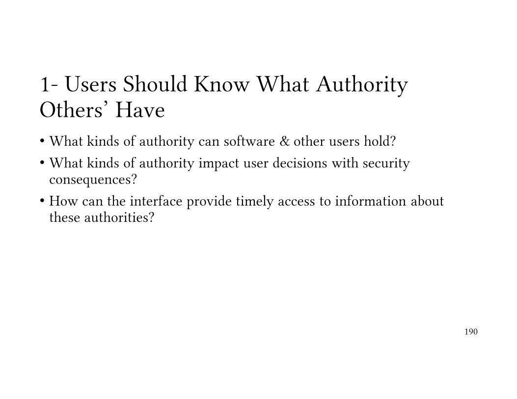
1- Users Should Know What Authority Others’ Have• What kinds of authority can software & other users hold?
• What kinds of authority impact user decisions with security consequences?
• How can the interface provide timely access to information about these authorities?
190

2- Users Should Know What Authority They Themselves Have• What kinds of authority does the user hold?
• How does the user know they have that authority?
• What might the user decide based on their expectation of authority?
191

3- Make Sure Users Trust the Software Acting on Their Behalf• What agents manipulate authority on the user’s behalf?
• How can users be sure they are communicating with the intended agent?
• How might the agent be impersonated?
• How might the user’s communication with the agent be corrupted/intercepted?
192

Conclusions
• Make sure that users know what authority they have granted & what that means for security decisions
• Make sure users know what authority they hold
• Create interfaces that make it clear what agent (software) the user is interacting with & providing information to
193

Interface Guidelines for Usable Security
194

1- Enable the User to Express Safe Security Policies that Fit the User’s Task• What are some examples of security policies that users might want
enforced for typical tasks?
• How can the user express these policies?
• How can the expression of policy be brought closer to the task?
195
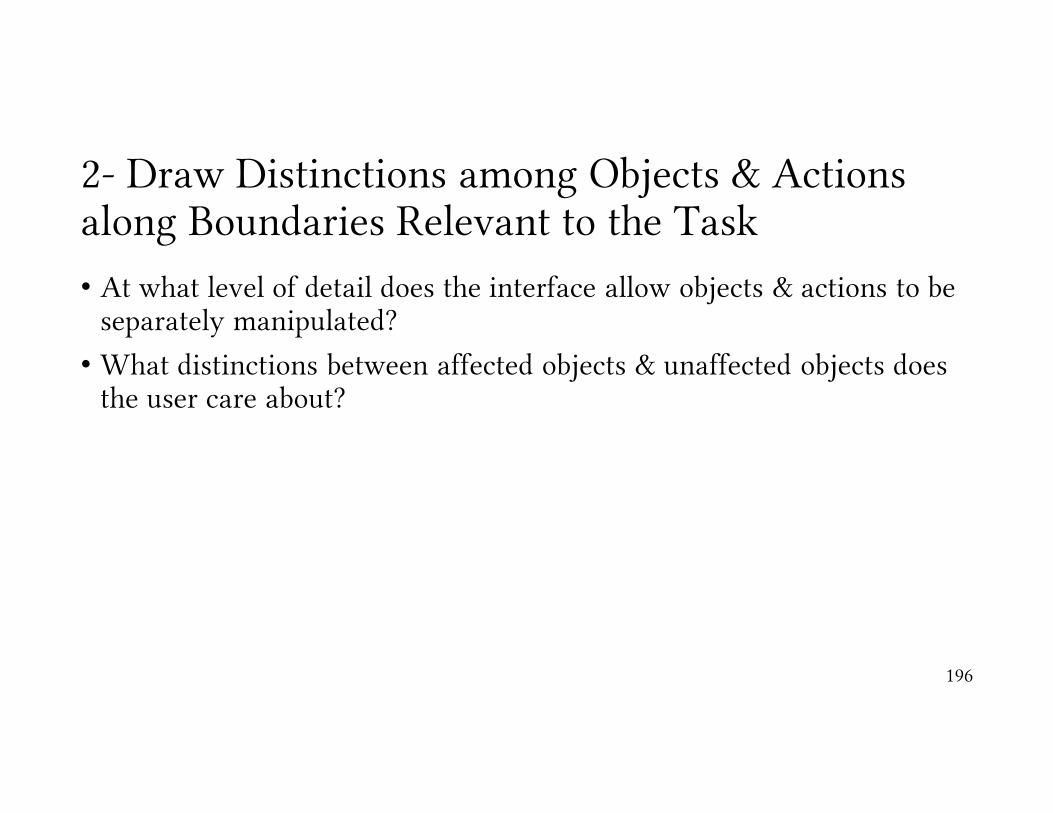
2- Draw Distinctions among Objects & Actions along Boundaries Relevant to the Task• At what level of detail does the interface allow objects & actions to be
separately manipulated?
• What distinctions between affected objects & unaffected objects does the user care about?
196

3- Present Objects & Actions using Distinguishable, Truthful Appearances• How does the user identify & distinguish different objects & actions?
• In what ways can the means of identification be controlled by other parties?
• What aspects of an object’s appearance are under system control?
• How can those aspects be chosen to best prevent deception?
197
Conclusions
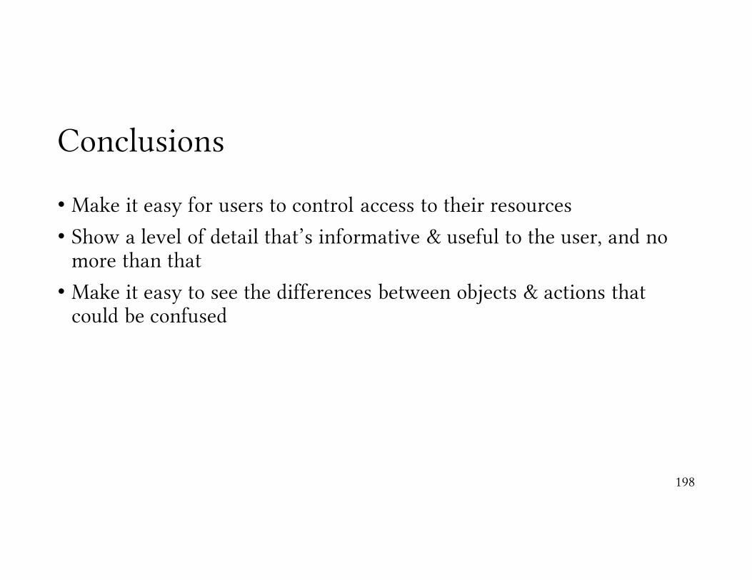
• Make it easy for users to control access to their resources
• Show a level of detail that’s informative & useful to the user, and no more than that
• Make it easy to see the differences between objects & actions that could be confused
198

Case Study: Phishing Warnings
199

Case Study: Phishing Warnings
200
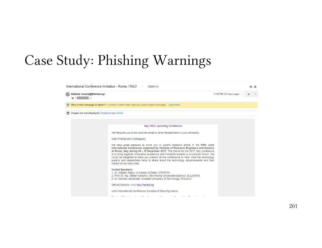
Case Study: Phishing Warnings
201

Case Study: Phishing Warnings
202
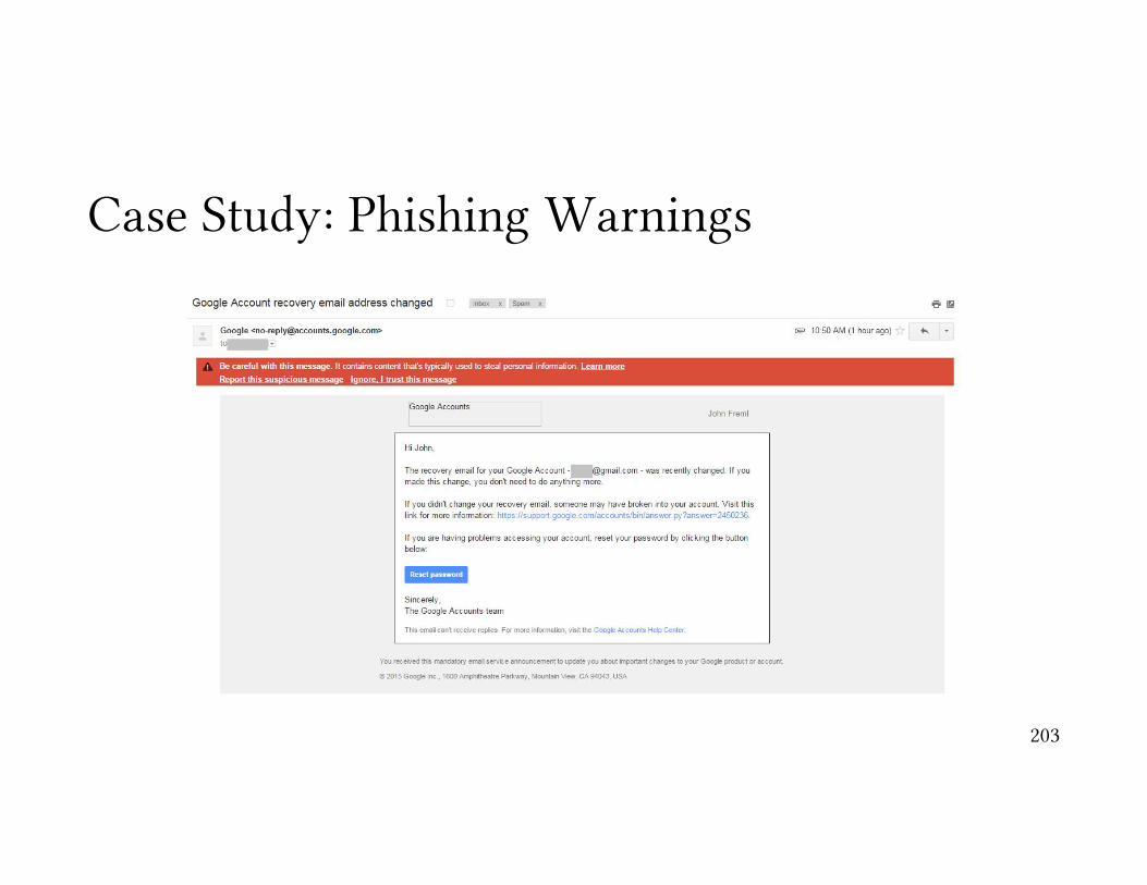
Case Study: Phishing Warnings
203

Enable the user to express safe security policies that fit the user’s task
204

Petname Tool Add-on for Firefox
205

Petname Tool Add-on for Firefox (cont’d)
https://paypal.com https://paypaI.com
206
It is capital I …

Enable the user to express safe security policies that fit the user’s task
207

Conclusion
• Automated security controls are good, but not the only solution
• Giving users control can be more secure
• Assist them in the process
208
Usable Authentication & Passwords
209