Front Cover Screen grabs
15
Front Cover Production Process
Transcript of Front Cover Screen grabs

Front Cover Production
Process
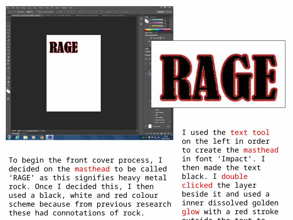
To begin the front cover process, I decided on the masthead to be called ‘RAGE’ as this signifies heavy metal rock. Once I decided this, I then used a black, white and red colour scheme because from previous research these had connotations of rock.
I used the text tool on the left in order to create the masthead in font ‘Impact’. I then made the text black. I double clicked the layer beside it and used a inner dissolved golden glow with a red stroke outside the text to give the magazine a unique title.

I then wanted to create the strap line but make it stand out from other text. Therefore, I decided to use the shape tool and insert a rectangle and align it at the very top of the page and fill it black. I then used the text tool with font ‘impact’ in capital letters typed “WE SMASH IT WITH EXTREME VOLUME!” and put it in white in order for it to stand out above the black shape.
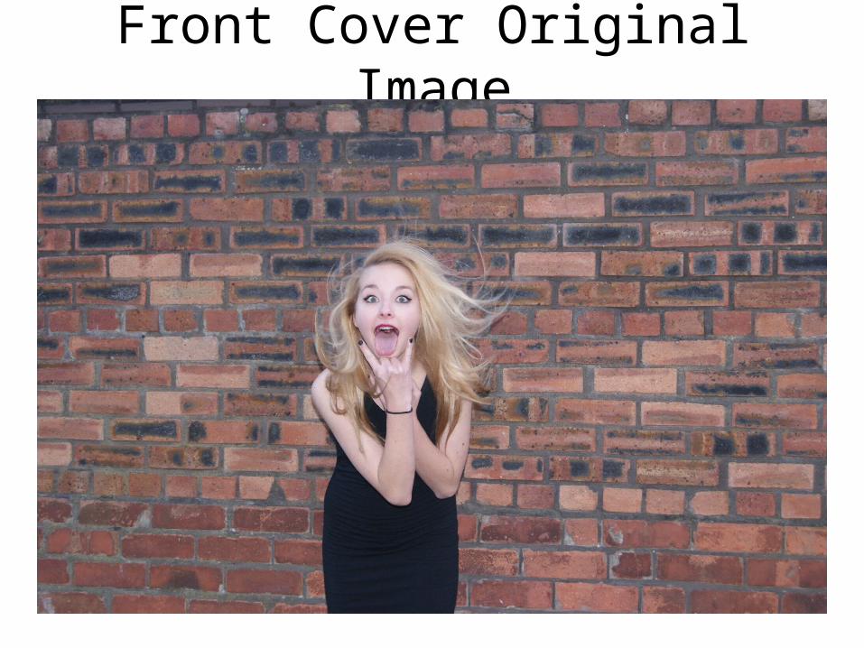
Front Cover Original Image

Original Picture
To create the image, I created a new layer and inserted my front cover image. Once I had inserted the front cover image I aligned it to the middle. I decided I wanted to change the original images background so I used the ‘blur’ tool and blurred out the background. This symbolises my genre as it could connote rage and the artist being rebellious blurring out time and anything that gets in her way.

I decided to change the masthead style so I used a font called ‘Lucida Calligraphy’. Although I kept the colour scheme; I decided to double click the masthead layer and add a inner effect on the black to make it look dissolved with a darker red on the outside using the stroke effect. I then used ‘ctrl & T’ and adjusted the size to fit the top of the page.

The next step was to start creating the coverlines. I used text tool to create all coverlines, here I mainly used the font ‘impact’ following the black, white and red colour scheme. However, the two main artists that would be featured in my magazine ‘Sian Toni’ and ‘Ashley’ in font ‘Mistral’ to make it stand out from the rest, I used a dark red colour using the colour tool on the left.
I then created a dark red circle, to ensure it was the same red as the rest I used the colour drop tool. I then aligned the circle to the left of the page. For all coverlines I followed the colour scheme.
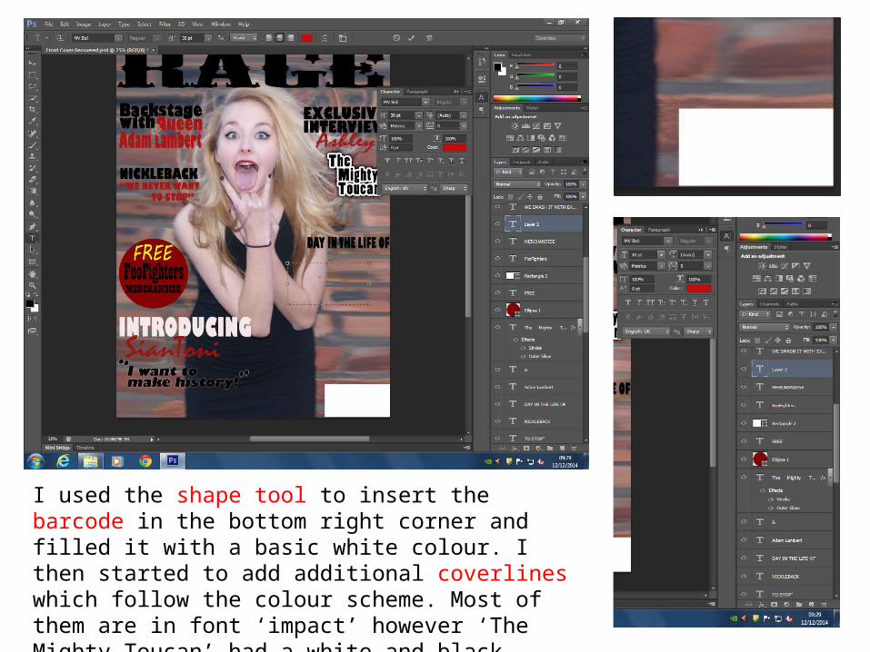
I used the shape tool to insert the barcode in the bottom right corner and filled it with a basic white colour. I then started to add additional coverlines which follow the colour scheme. Most of them are in font ‘impact’ however ‘The Mighty Toucan’ had a white and black stroke to make it stand out which is just below the first coverline on the right.

The front cover is finally coming together as I add more coverlines and change the title. The inserted a barcode and then added the price, issue number above the white block. I then used the text tool and put the layer above he circle. I made the buzzword ‘FREE’ in yellow because I wanted it to stand out.I also changed the masthead again by adding a outer white glow with a dissolved effect.
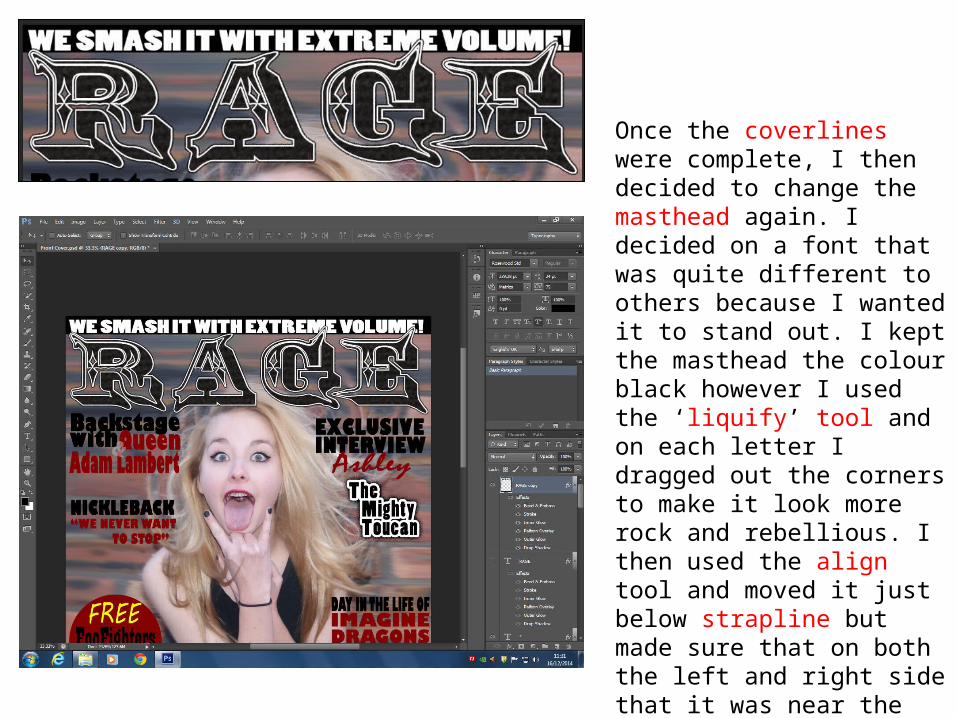
Once the coverlines were complete, I then decided to change the masthead again. I decided on a font that was quite different to others because I wanted it to stand out. I kept the masthead the colour black however I used the ‘liquify’ tool and on each letter I dragged out the corners to make it look more rock and rebellious. I then used the align tool and moved it just below strapline but made sure that on both the left and right side that it was near the edge.

On the graphic feature (the red circle) I decided to use the ‘liquify’ tool and make the circle look spikey. I done this in order for it to look more rock and rebellious. It also anchors in the title of the magazine. I then moved the graphic feature more to the left so it was in line with the other coverlines.

When I went back and looked at the product I decided to make some changes. Firstly, the coverlines, I decided to make the text underneath smaller and in lowercase caps to follow the codes and conventions of magazines. It also shaped the main image better. I changed all the coverlines to font ‘Haettenschweiler’ using the text tool.
I also moved the graphic feature at the very top so that the main image was centre of attention. This also helped the coverlines shape the image better.
I then just below the masthead added the date of the issue and the website for the magazine. The font was white as it follows my colour scheme but also stands out, Using the text tool I used font ‘Haettenschweiler’ which I also changed all my coverlines to be so it was consistent.

This is my final masthead which I changed to make it look more professional but also connote rock. Here I use the font ‘Arial’ with a black filling but then I
Double clicked the layer and added a red stroke to make it stand out better. In order, for my magazine to have its own identity I used the liquify tool to add what may look like devil horns or spikes on the ‘A’. This makes the masthead unique. I then decided to use the lasso tool and erase tool in order to bring the artists head above the masthead to make the image stand out more but also to put emphasis on the title.
Here I used the shape tool and added a white rectangle. I then used text tool with font ‘Haettenschweiler’ and added a buzzword ‘Plus!’ in capitals and the colour red and then black text in lower case underneath with more description.
This coverline anchors the main image, as the artist on the front is what this coverline is about therefore the font is a lot larger. I then used shape tool to add a black triangle with opacity at 45%. This makes it stand out without it taking away all the attention from the other coverlines. I aligned it to the left and used ‘ctrl & T’ in order to make it fit the coverline.

Once I looked over the magazine front cover, I decided I should change the colour of the box behind ‘Sian Toni’ because the black blended too much with the colour of the outfit the artist is wearing. Therefore, I changed it to white with 41% opacity which I think look effective without it disturbing the other coverlines. I also decided to change the size of the ‘PLUS!’ in the white graphic feature to the right so it stood out more but also filled the slight white gap.

Finished Product