
Front cover analysis
6
Front Cover Analysis •This magazine cover is the front of NME magazine from the 27 th of October. •The masthead is bold and large in the left third of the magazine in the •corner, which works effectively because it stands out and catches the eye. •The use of the central cover photo is very effective. It portrays Mike Skinner as being serious and business orientated, from his formal clothing. This is continued, from the use of the basic bold fonts as lead lines. These suggest that they will present Mike Skinner as being very straightforward and simple in the interview, rather than the glamorous and extravagant way many pop stars are shown as. His posture relates to the lead line of “why so glum” and connotes a slightly miserable theme to how he is presented. This is orientated to the audience of the magazine, because many of them take music seriously and value honest views and opinions. Therefore, the cover photo is cut back to give primary focus on how Mike is really feeling, without being obscured into the image of someone that may be more positive and cheerful which some people may prefer. The central focus is put on thee eyes, to drag thee reader in and pick up the magazine. His eyes will stand out on the page, and readers will feel like he is watching them which will draw their attention. Focus is further put on Mike, by the placement of all the lead lines surrounding his face. This gives the idea that he is the center of attention. •The banner running along the top, advertises the availability of a freebie in the magazine. This draws the attention of a reader, as they will see that something free is included and makes them want to pick up the magazine. •The magazine makes use of bold basic sans serif fonts. This relates to the theme of the magazine being stripped back and about the music, rather than appearance. The simplicity is effective, as the cover lines stand out on the page. The name of the artists featured stand out more, as they are written in capital letters. This effectively prioritizes the musicians that are featured, and will catch the eye of a fan that passes it on a magazine wrack.
-
Upload
kieran-raza -
Category
Documents
-
view
78 -
download
1
Transcript of Front cover analysis

Front Cover Analysis• This magazine cover is the front of NME magazine from the 27th of October. • The masthead is bold and large in the left third of the magazine in the• corner, which works effectively because it stands out and catches the eye. • The use of the central cover photo is very effective. It portrays Mike Skinner
as being serious and business orientated, from his formal clothing. This is continued, from the use of the basic bold fonts as lead lines. These suggest that they will present Mike Skinner as being very straightforward and simple in the interview, rather than the glamorous and extravagant way many pop stars are shown as. His posture relates to the lead line of “why so glum” and connotes a slightly miserable theme to how he is presented. This is orientated to the audience of the magazine, because many of them take music seriously and value honest views and opinions. Therefore, the cover photo is cut back to give primary focus on how Mike is really feeling, without being obscured into the image of someone that may be more positive and cheerful which some people may prefer. The central focus is put on thee eyes, to drag thee reader in and pick up the magazine. His eyes will stand out on the page, and readers will feel like he is watching them which will draw their attention. Focus is further put on Mike, by the placement of all the lead lines surrounding his face. This gives the idea that he is the center of attention.
• The banner running along the top, advertises the availability of a freebie in the magazine. This draws the attention of a reader, as they will see that something free is included and makes them want to pick up the magazine.
• The magazine makes use of bold basic sans serif fonts. This relates to the theme of the magazine being stripped back and about the music, rather than appearance. The simplicity is effective, as the cover lines stand out on the page. The name of the artists featured stand out more, as they are written in capital letters. This effectively prioritizes the musicians that are featured, and will catch the eye of a fan that passes it on a magazine wrack.
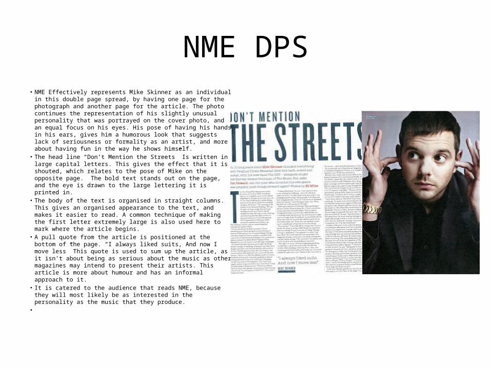
NME DPS• NME Effectively represents Mike Skinner as an individual in this
double page spread, by having one page for the photograph and another page for the article. The photo continues the representation of his slightly unusual personality that was portrayed on the cover photo, and an equal focus on his eyes. His pose of having his hands in his ears, gives him a humorous look that suggests lack of seriousness or formality as an artist, and more about having fun in the way he shows himself.
• The head line “Don’t Mention the Streets” Is written in large capital letters. This gives the effect that it is shouted, which relates to the pose of Mike on the opposite page. The bold text stands out on the page, and the eye is drawn to the large lettering it is printed in.
• The body of the text is organised in straight columns. This gives an organised appearance to the text, and makes it easier to read. A common technique of making the first letter extremely large is also used here to mark where the article begins.
• A pull quote from the article is positioned at the bottom of the page. “I always liked suits, And now I move less” This quote is used to sum up the article, as it isn’t about being as serious about the music as other magazines may intend to present their artists. This article is more about humour and has an informal approach to it.
• It is catered to the audience that reads NME, because they will most likely be as interested in the personality as the music that they produce.
•
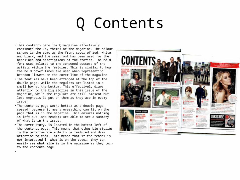
Q Contents• This contents page for Q magazine effectively continues
the key themes of the magazine. The colour scheme is the same as the front cover of red, white and black, and the same font has been used for the headlines and descriptions of the stories. The bold font used relates to the renowned success of the artists within the features. This is similar to how the bold cover lines are used when representing Brandon Flowers on the cover line of the magazine.
• The features have been arranged at the top of the double page, while the regulars are listed in a small box at the bottom. This effectively draws attention to the big stories in this issue of the magazine, while the regulars are still present but less emphasis is put on them as they are in every issue.
• The contents page works better as a double page spread, because it means everything can fit on the page that is in the magazine. This ensures nothing is left out, and readers are able to see a summary of what is in the issue.
• The cover story, is located in the bottom left of the contents page. This means that other big stories in the magazine are able to be featured and draw attention to them. This means that if the reader is not interested in what is on the cover, they can easily see what else is in the magazine as they turn to the contents page.
•

Rolling Stones• Most of the cover is taken up by the cover photo of Adele. The cover
lines run down the left of the page, and do not obstruct Adele’s face. This gives the impression of her standing out independently, without any obstructions. The photograph will catch the reader’s eye, as it is very large and bold and will stand out on the new stand.
• The Mast head is the name of the magazine written as a banner running across the top of the page. The font used, relates to the formal and classical qualities the Rolling Stone magazine has a reputation for as a publication. Above it, is a banner for their “Exclusive Report” on Pete Townshend. This stands out on the page, and will attract readers as they will see the flash box that says “Exclusive Excerpt”. This is written in bold capital letters, to stand out and grab the attention of the reader.
• The close up portrait of Adele is used as a cover photo effectively, as it draws in the reader to pick up the magazine. Her eyes are put into strong focus, so the reader will feel as if she is watching them and drawing them in to pick up the magazine.
• A colour scheme of yellow and white has been used on the cover. The yellow goes with the photograph, as it compliments Adele’s blonde hair. The colour also has connotations of gold, relating to the quality of the publication that the editors want to give across.
• A Basic Sans Serif font has been used for the cover lines. This gives the magazine a simple but clean cut appearance that they may wish to achieve. This is because they are mostly relying on their reputation as a sophisticated publication, so no exciting fonts are required to be used.
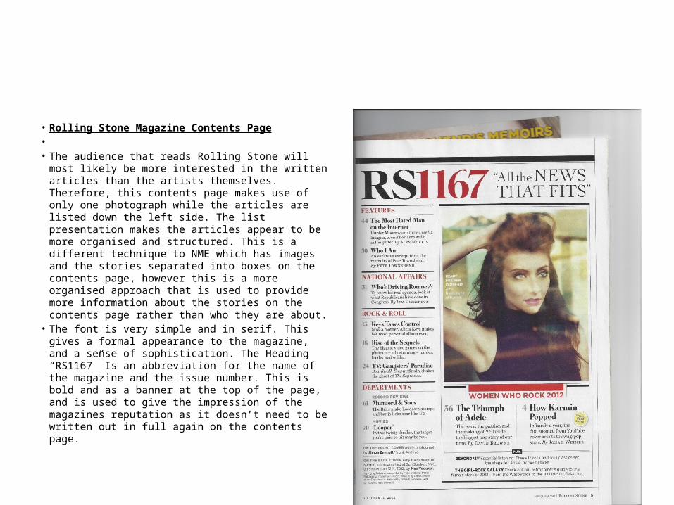
• Rolling Stone Magazine Contents Page• • The audience that reads Rolling Stone will most likely
be more interested in the written articles than the artists themselves. Therefore, this contents page makes use of only one photograph while the articles are listed down the left side. The list presentation makes the articles appear to be more organised and structured. This is a different technique to NME which has images and the stories separated into boxes on the contents page, however this is a more organised approach that is used to provide more information about the stories on the contents page rather than who they are about.
• The font is very simple and in serif. This gives a formal appearance to the magazine, and a sense of sophistication. The Heading “RS1167” Is an abbreviation for the name of the magazine and the issue number. This is bold and as a banner at the top of the page, and is used to give the impression of the magazines reputation as it doesn’t need to be written out in full again on the contents page.

Rolling Stones DPS• Rolling Stone double-page spread• • Rolling Stone is a more sophisticated publication that deals with other
topics as well as music, that the more mature reader would be interested in reading. Therefore, this double-page spread is designed to cater to that certain target audience.
• • The black and white photograph makes Adele stand out as independent
strong. The shadows give the photograph a more formal, mature appearance, say, than a band may be presented in NME. She is shown on a separate page with no text around her, to emphasise her independence as an artist and to draw focus onto her. This is also indicated, by the lack of any colour within the double-page spread.
• • The headline is written in a large, bold font, which makes it stand out. It
also relates to the renowned and big profile Adele has as an international artist. It is printed in serif font to continue the sophisticated feel, and thin letters to relate to the femininity of her personality.
• • The body copy is positioned around the photograph, so it is clear and
easy to read. It also frames the photograph on the following page and does not overlap it. This ensures that the photograph is not obstructed, and the text is easy to read as it does not blend into the background. The article starts off with the drop-cap “I” in a very large and bold serif font. This draws attention to the start of the article.
• • I feel that this double-page spread works well for the publication, as it
continues to the sophisticated feel of the magazine well and presents the artist in the way intended as being very independent, and strong.
