Friday the 13th Presentation Friday The 13th, we will be showing you information on the followed...
9
Friday the 13th Presentation Friday The 13th, we will be showing you information on the followed film we believe it is a great film, one of the best in the slasher/horror genre. Friday the 13th is an American horror franchise that consists of twelve slasher films, a television show, novels, comic books, and tie-in merchandise. The franchise mainly focuses on the fictional character of Jason Voorhees, who drowned at Camp Crystal Lake as a boy due to the negligence of the camp staff. The first film was created to cash in on the success of Halloween!!! By Mabel, Michael and Jeff
-
Upload
hollie-jemimah-thomas -
Category
Documents
-
view
214 -
download
0
Transcript of Friday the 13th Presentation Friday The 13th, we will be showing you information on the followed...

Friday the 13th Presentation
Friday The 13th, we will be showing you information on the followed film we believe it is a great film, one of the best in the slasher/horror
genre.Friday the 13th is an American horror franchise that consists of twelve
slasher films, a television show, novels, comic books, and tie-in merchandise. The franchise mainly focuses on the fictional character
of Jason Voorhees, who drowned at Camp Crystal Lake as a boy due to the negligence of the camp staff.
The first film was created to cash in on the success of Halloween!!!
By Mabel, Michael and Jeff

Reviews Although the films were not popular with critics, Friday the
13th is considered one of the most successful media franchises in America—not only for the success of the films,
but also because of the extensive merchandising and repeated references to the series in popular culture. The franchise's popularity has generated a fan base who have
created their own Friday the 13th films, replica Jason Voorhees costumes, and tattooed their bodies with Friday the 13th artwork. Jason’s hockey mask has even become one of the most recognizable images in popular culture.

Production After the1st sequel, the movie became very popular and its own success led Paramount Pictures to purchase the full licensing rights to the Friday the 13th franchise. Frank Mancuso, Jr., who produced the films, also developed the television show Friday the 13th: The Series.
This is important as films tend to do better when under major company's such as paramount pictures, as the film is under good hands, who have worked in the industry and gained a lot of success, this highlights the difference between independent movie and Hollywood.

Trailer
• We Will Now Watch The Trailer, Try Make Notes, You May Find What We Didn't !!!!!
http://www.youtube.com/watch?v=VKfE5NrE7K8&feature=related

Editing Editing is a important process to the final product of a movie, editing is the process in which
bits of the movie and taken out or put together, adding special effects etc. Furthermore this movie is editing in a interesting way, the movie sets of with a calm. The fact that we do not see anyone for the first 21 seconds, builds a ominous film to trailer, suddenly the mood of the trailer the changes at there is a low angled shot of a car fly over, the music changes to a more up-tempo song, this is interesting as the begging tricks the audience to think something was going happen. Then as soon as they audience a relaxed with music, and exposed to young people with alcohol and sex, as there Is a short fade to black the transformation comes again, there is a ominous silence with a low score.
There is they a scream a pale face in the dark, this informs the audience that something bad is happening, the pace gradually picks up, and the tempo of the trailer get faster and faster, and there are more screams and vision deaths. I believe the film was edited like this in order to deliver the story to the audience, as a before and after, showing the effect the “killers” have on the characters.
Representation: Poster
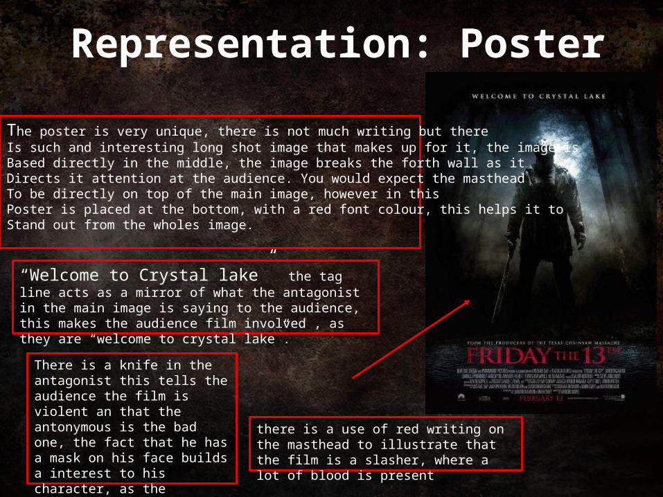
The poster is very unique, there is not much writing but there Is such and interesting long shot image that makes up for it, the image is Based directly in the middle, the image breaks the forth wall as itDirects it attention at the audience. You would expect the mastheadTo be directly on top of the main image, however in thisPoster is placed at the bottom, with a red font colour, this helps it toStand out from the wholes image.
“Welcome to Crystal lake” the tag line acts as a mirror of what the antagonist in the main image is saying to the audience, this makes the audience film involved , as they are “welcome to crystal lake”.
There is a knife in the antagonist this tells the audience the film is violent an that the antonymous is the bad one, the fact that he has a mask on his face builds a interest to his character, as the audience wants to find out who he is.
there is a use of red writing on the masthead to illustrate that the film is a slasher, where a lot of blood is present
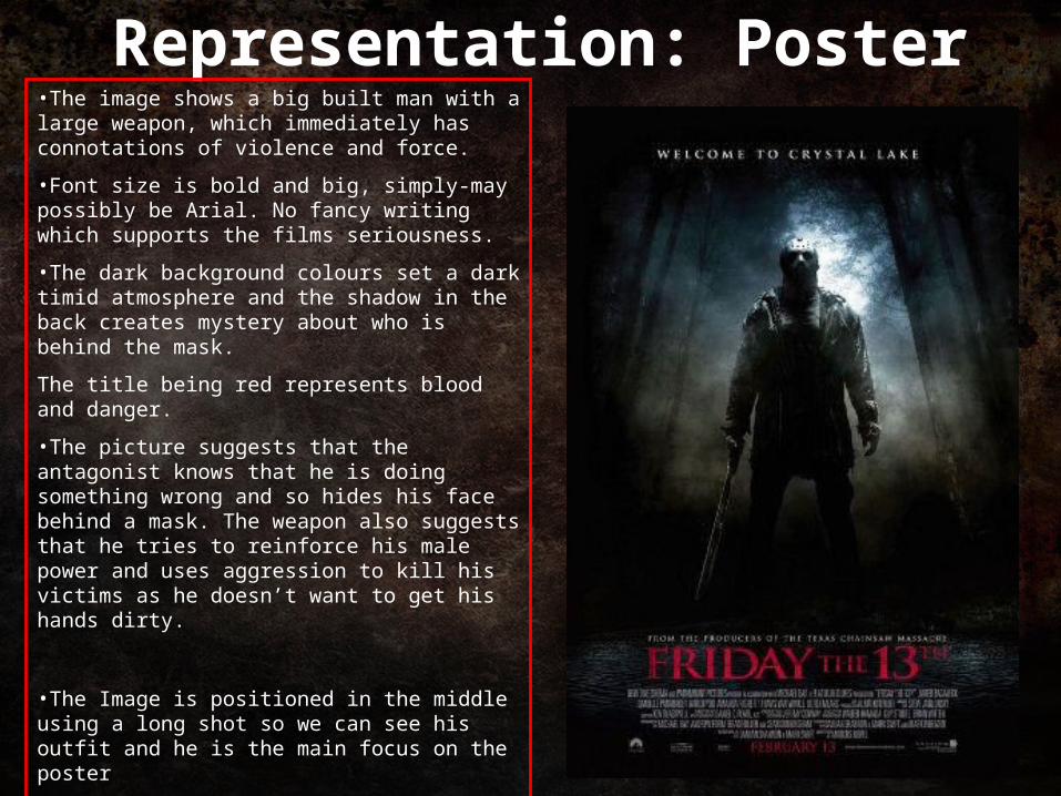
Representation: Poster•The image shows a big built man with a large weapon, which immediately has connotations of violence and force.
•Font size is bold and big, simply-may possibly be Arial. No fancy writing which supports the films seriousness.
•The dark background colours set a dark timid atmosphere and the shadow in the back creates mystery about who is behind the mask.
The title being red represents blood and danger.
•The picture suggests that the antagonist knows that he is doing something wrong and so hides his face behind a mask. The weapon also suggests that he tries to reinforce his male power and uses aggression to kill his victims as he doesn’t want to get his hands dirty.
•The Image is positioned in the middle using a long shot so we can see his outfit and he is the main focus on the poster
-The tagline is at the top and indicates to the audience where the murders will take place, the tagline also invites the viewer by using the word “welcome”.

Representation: Magazine Cover
This magazine is fairly interesting, the masthead uses the head of the main image to fill in the “o” in “Fangoria” this shows the creative though that went into the magazine, when looking a the magazine, the image is positioned as if its a hangman. There is a full image of the character, the audience get to see the character in Dept, unlike the poster its out of the dark, a shown with studio lights, making the image stand out, again there is a use of red writing on the masthead to illustrate that the film is a slasher, where a lot of blood is present

The image is positioned not entirely in the middle of the cover, more over to the right which breaks usual magazine conventions.Masthead positioning:-The magazine name is in a bold red font with blood behind it which supports the fact that this is a horror magazine and horror films always contain blood and violence.-The font size is big which makes the title stand out and easily seen by people, the font used is not adventurous as the features inside the magazine are it’s main focus.Mainly the most important feature articles are on the cover of the magazine so it attracts people as maybe this is what people are most interested in.“10 pages of Jason's new slays” is the sell line of the magazine, by this being stated on the cover it attracts old fans who would like to read and know about what is coming up in the film. Attracts people because it gives them an early insight.The colour scheme of the magazine cover is red and yellow which stands out! The colours are bright and easily seen. Red may symbolise blood and pain while the yellow writing helps the dialogue be seen by people.On the cover of the magazine there are photographs of other films that have feature articles in the magazine, there are small so the main focus is still on our antagonist.
Representation: Magazine Cover