
FQC Documentation
32
FQC Documentation Release 3 Joe Brown May 17, 2019
Transcript of FQC Documentation

FQC DocumentationRelease 3
Joe Brown
May 17, 2019


Getting Started
1 Example Site 3
2 Citation 52.1 Install . . . . . . . . . . . . . . . . . . . . . . . . . . . . . . . . . . . . . . . . . . . . . . . . . . . 52.2 Example Workflow . . . . . . . . . . . . . . . . . . . . . . . . . . . . . . . . . . . . . . . . . . . . 62.3 Groups . . . . . . . . . . . . . . . . . . . . . . . . . . . . . . . . . . . . . . . . . . . . . . . . . . 112.4 Configuration File . . . . . . . . . . . . . . . . . . . . . . . . . . . . . . . . . . . . . . . . . . . . 122.5 Plot Tabs . . . . . . . . . . . . . . . . . . . . . . . . . . . . . . . . . . . . . . . . . . . . . . . . . 132.6 Area Range . . . . . . . . . . . . . . . . . . . . . . . . . . . . . . . . . . . . . . . . . . . . . . . . 132.7 Bar . . . . . . . . . . . . . . . . . . . . . . . . . . . . . . . . . . . . . . . . . . . . . . . . . . . . 162.8 Heatmap . . . . . . . . . . . . . . . . . . . . . . . . . . . . . . . . . . . . . . . . . . . . . . . . . 182.9 Histogram . . . . . . . . . . . . . . . . . . . . . . . . . . . . . . . . . . . . . . . . . . . . . . . . 202.10 Line . . . . . . . . . . . . . . . . . . . . . . . . . . . . . . . . . . . . . . . . . . . . . . . . . . . . 222.11 Plate Heatmap . . . . . . . . . . . . . . . . . . . . . . . . . . . . . . . . . . . . . . . . . . . . . . 252.12 Table . . . . . . . . . . . . . . . . . . . . . . . . . . . . . . . . . . . . . . . . . . . . . . . . . . . 27
i

ii

FQC Documentation, Release 3
FQC is designed to better group FastQC result data across groups where each group is comprised of FASTQs relatedto an experiment or sequencing batch. Individual samples are grouped into paired-end sets when available and thedashboard’s extensibility allows a user to add plots or tables as desired.
Getting Started 1

FQC Documentation, Release 3
2 Getting Started

FQC Documentation, Release 3
4 Chapter 1. Example Site

CHAPTER 2
Citation
Joseph Brown, Meg Pirrung, Lee Ann McCue; FQC Dashboard: integrates FastQC results into a web-based, interac-tive, and extensible FASTQ quality control tool. Bioinformatics 2017 doi: 10.1093/bioinformatics/btx373
2.1 Install
2.1.1 Requires
Parsing the table and running FastQC is performed with code written for Python 3. We recommend using Anaconda(https://www.continuum.io/downloads) to install the FastQC dependency.
Set Up BIOCONDA channels
conda config --add channels conda-forgeconda config --add channels defaultsconda config --add channels bioconda
Install Dependency
conda install fastqc
2.1.2 Install
The dashboard reads local files, so install where you will eventually be serving the site:
git clone https://github.com/pnnl/fqc.gitcd fqcpython setup.py install
5

FQC Documentation, Release 3
This installs fqc command-line tool to process FASTQs and create the dashboard.
Then to deploy a local copy from within the fqc directory, you can run:
python -m http.server --bind localhost 8000
And navigate to localhost:8000 in your browser.
By default, this will show the test data QC as determined by the data directory in js/fqc.js:
var filePath = "/example/plot_data/"
Edit fqc.js to your local path within the fqc directory tree.
2.2 Example Workflow
Using the example data set provided in the repo, let’s walk through creating the example site with paired-end data andsome custom plots.
In our example, we’re looking at highly replicated 16S amplicon data, so we will be omitting non-informative plotsfrom our display using --exclude.
2.2.1 Running QC
After installation, run QC over the first sample and generate the dashboard from within fqc repository:
$ cd example$ fqc qc -t 8 -e 'Basic Statistics' \
-e 'Overrepresented Sequences' \-e 'Count by Length' \-e 'Kmer Content' \2016 160912_M03018 data/fastqs/160912_M03018_R1.fastq.gz
6 Chapter 2. Citation

FQC Documentation, Release 3
2.2.2 Adding Custom Plots
Next, add the Lorenz curve which gives us an idea of how equitably the sequences were distributed among barcodes.This plot will be added as the top tab using --prepend:
$ fqc add --prepend --x-value FractionOfSamples --y-value Equal \--y-value Actual --x-label 'Fraction of Samples' \--y-label 'Fraction of On Target Reads' \plot_data/2016/160912_M03018/config.json \'Read Distribution' \line \data/tables/160912_lorenz.csv
The JSON entry in the output above is just for confirmation as it has already been added to this run’s configuration.
Our display now shows the new tab in the first position:
2.2. Example Workflow 7

FQC Documentation, Release 3
Tip: Based on the distribution of barcodes, the user could have specified a fail or warning condition on using theGini Coefficient and set a tab icon using --status fail in the previous command. For more information see TabStatus.
To add the sequence summary table, we need to append another tab:
$ fqc add --prepend \plot_data/2016/160912_M03018/config.json \'Run Stats' \table \data/tables/160912_summary.csv
8 Chapter 2. Citation

FQC Documentation, Release 3
Another plot we typically add shows read abundance across primer plates. This is valuable to observe positive andnegative control wells in addition to seeing the effects on neighboring wells. Run 160912 did not have any controls,so we’ll just add abundance for its plate:
$ fqc add --x-value WELL_COL --y-value WELL_ROW \--value TOTAL_PAIRED_READS --label LABEL \--label-color LABEL_COLOR \plot_data/2016/160912_M03018/config.json \'Abundance by Plate' \plateheatmap \data/tables/160912_plate_1.csv
2.2. Example Workflow 9

FQC Documentation, Release 3
And finally, sometimes things go wrong and barcode plates get mixed up, so we display the top barcodes and theircounts. Usually we simply add it as a table, but lets display it as a bar plot:
$ fqc add --x-value Barcode --y-value Count \plot_data/2016/160912_M03018/config.json \"Barcode Counts" \bar \data/tables/160912_top50barcodes.csv
10 Chapter 2. Citation

FQC Documentation, Release 3
The remainder of the example site iterates over these steps for the remainder of the samples.
2.3 Groups
Located within the plot_data directory, this holds metadata for each group and samples within the groups:
[{
"group_id": "group_01","uids": [
"test_01"]
},{
"group_id": "group_00","uids": [
"test_00"]
}]
Renders as:
2.3. Groups 11
FQC Documentation, Release 3
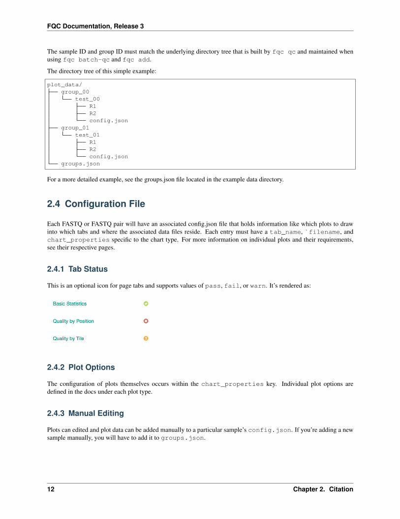
The sample ID and group ID must match the underlying directory tree that is built by fqc qc and maintained whenusing fqc batch-qc and fqc add.
The directory tree of this simple example:
plot_data/group_00
test_00R1R2config.json
group_01test_01
R1R2config.json
groups.json
For a more detailed example, see the groups.json file located in the example data directory.
2.4 Configuration File
Each FASTQ or FASTQ pair will have an associated config.json file that holds information like which plots to drawinto which tabs and where the associated data files reside. Each entry must have a tab_name, `filename, andchart_properties specific to the chart type. For more information on individual plots and their requirements,see their respective pages.
2.4.1 Tab Status
This is an optional icon for page tabs and supports values of pass, fail, or warn. It’s rendered as:
2.4.2 Plot Options
The configuration of plots themselves occurs within the chart_properties key. Individual plot options aredefined in the docs under each plot type.
2.4.3 Manual Editing
Plots can edited and plot data can be added manually to a particular sample’s config.json. If you’re adding a newsample manually, you will have to add it to groups.json.
12 Chapter 2. Citation

FQC Documentation, Release 3
2.5 Plot Tabs
Tabs can be added to the plot area using a list of lists for the filename attribute. The first position is the name of thetab while the second is the file path. An example JSON entry for this in a sample’s config.json looks like:
"filename": [[
"Plate 1","plt1_counts.csv"
],[
"Plate 2","plt2_counts.csv"
]]
Which will render as:
2.6 Area Range
The area range plot is automatically generated from FastQC output for inspecting read quality as a function of positionalong the sequence.
2.6.1 Example Data
An example table after parsing output from FastQC looks like:
Base Mean Lower Quartile Upper Quartile1 32.193 32.0 33.02 32.365 32.0 33.03 32.570 32.0 33.0
2.5. Plot Tabs 13

FQC Documentation, Release 3
2.6.2 Plot Options
Option Valuefilename supports either a single file path or list of lists with [plot tab name, file path] pairs (see Plot
Tabs)tab_name left main menu entrystatus left main menu icon – supports ‘pass’, ‘fail’, ‘warn’, or alternatively, omitted (see Tab Status)chart_properties See table below
2.6.3 Chart Properties
Option Valuetype the required entry is ‘arearange’x_label x-axis labelx_value the header label defined in filename corresponding to x-valuesy_label y-axis labellower_quartile the header label defined in filename corresponding to lower quartile valuesupper_quartile the header label defined in filename corresponding to upper quartile valuesmean the header label defined in filename corresponding to mean valueszones defined as ‘value’:’color’ with an initial ‘color’ as the base; see example below
Example JSON entry:
{"filename": "R1/Per_base_sequence_quality.csv","tab_name": "Quality by Position","status": "pass","chart_properties": {
"type": "arearange","x_label": "Position","x_value": "Base","y_label": "Quality (Phred score)","lower_quartile": "Lower Quartile","upper_quartile": "Upper Quartile","mean": "Mean"
}}
14 Chapter 2. Citation

FQC Documentation, Release 3
There is support for adding zones as well, if you’re going for the classic FastQC look and feel:
{"filename": [
["R1", "R1/Per_base_sequence_quality.csv"],["R2", "R2/Per_base_sequence_quality.csv"]
],"tab_name": "Quality by Position","status": "warn","chart_properties": {
"type": "arearange","x_label": "Position","x_value": "Base","y_label": "Quality (Phred score)","lower_quartile": "Lower Quartile","upper_quartile": "Upper Quartile","mean": "Mean","zones": [
{"value": 30, "color": "#e5afb0"},{"value": 34, "color": "#e6d6b1"},{"color": "#b0e5b1"}
]}
}
2.6. Area Range 15

FQC Documentation, Release 3
2.7 Bar
No bar plots are automatically generated from FastQC output, but can optionally be added for custom data tables.
2.7.1 Example Data
Barcode CountTCACGGGAGTTG 579558AGTTCAGACGCT 250808ATTTCGACATGC 245063TAATGACCACGC 230339CGATCCGTATTA 215466
2.7.2 Usage to Add
Given the example data for barcode counts:
$ fqc add --x-value Barcode --y-value Count \plot_data/2016/160912_M03018/config.json \"Barcode Counts" \bar \example/data/tables/160912_top50barcodes.csv
16 Chapter 2. Citation

FQC Documentation, Release 3
2.7.3 Plot Options
Option Valuefilename supports either a single file path or list of lists with [plot tab name, file path] pairs (see Plot
Tabs)tab_name left main menu entrystatus left main menu icon – supports ‘pass’, ‘fail’, ‘warn’, or alternatively, omitted (see Tab Status)chart_properties See table below
2.7.4 Chart Properties
Option Valuetype the required entry is ‘bar’subtitle an optional subtitle for the plotx_label x-axis labelx_value the header label defined in filename corresponding to x-valuesy_label y-axis labely_value the header label defined in filename corresponding to y-values
Example JSON entry:
{"filename": "bar_plot_example.csv","tab_name": "Barcode Counts","chart_properties": {
"type": "bar","x_value": "Barcode","x_label": "Barcode","y_value": [ "Count" ],"y_label": "Count"
}
2.7. Bar 17

FQC Documentation, Release 3
2.8 Heatmap
A heatmap is generated using tile quality data from FastQC, but a custom one can be generated using data with an x,a y, and value associated with the coordinate.
2.8.1 Example Data
Tile Base Mean1101 1 0.43051101 2 0.15251101 3 0.0202
2.8.2 Usage to Add
Tile example data from FastQC can be added manually using:
$ fqc add --x-value Barcode --y-value Count --min-value -10 --max-value 10 \plot_data/2016/160912_M03018/config.json \"Barcode Counts" \bar \example/data/tables/160912_top50barcodes.csv
18 Chapter 2. Citation
FQC Documentation, Release 3
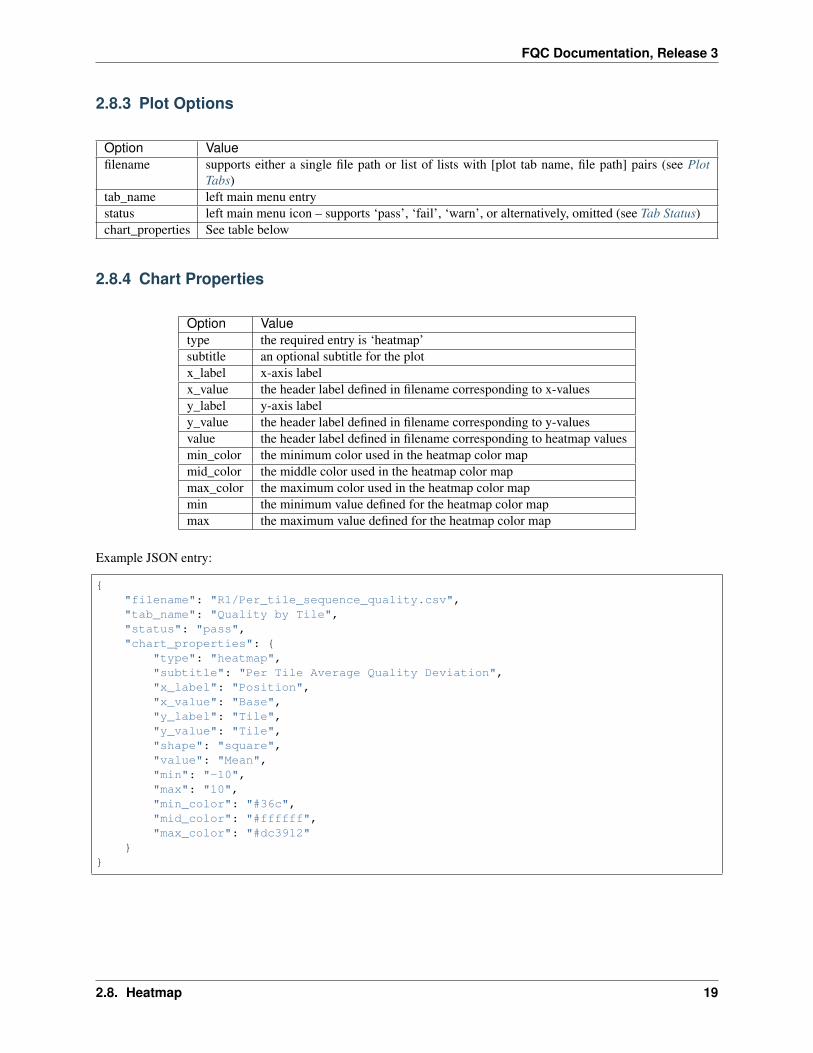
2.8.3 Plot Options
Option Valuefilename supports either a single file path or list of lists with [plot tab name, file path] pairs (see Plot
Tabs)tab_name left main menu entrystatus left main menu icon – supports ‘pass’, ‘fail’, ‘warn’, or alternatively, omitted (see Tab Status)chart_properties See table below
2.8.4 Chart Properties
Option Valuetype the required entry is ‘heatmap’subtitle an optional subtitle for the plotx_label x-axis labelx_value the header label defined in filename corresponding to x-valuesy_label y-axis labely_value the header label defined in filename corresponding to y-valuesvalue the header label defined in filename corresponding to heatmap valuesmin_color the minimum color used in the heatmap color mapmid_color the middle color used in the heatmap color mapmax_color the maximum color used in the heatmap color mapmin the minimum value defined for the heatmap color mapmax the maximum value defined for the heatmap color map
Example JSON entry:
{"filename": "R1/Per_tile_sequence_quality.csv","tab_name": "Quality by Tile","status": "pass","chart_properties": {
"type": "heatmap","subtitle": "Per Tile Average Quality Deviation","x_label": "Position","x_value": "Base","y_label": "Tile","y_value": "Tile","shape": "square","value": "Mean","min": "-10","max": "10","min_color": "#36c","mid_color": "#ffffff","max_color": "#dc3912"
}}
2.8. Heatmap 19

FQC Documentation, Release 3
2.9 Histogram
This plot is useful in the context of 16S amplicon sequencing after we’ve quality trimmed reads then joined paired-endreads. Tabulating observed read lengths and their respective counts can give insights into the quality of the sequenceends.
2.9.1 Example Data
Length153179177191198
2.9.2 Usage to Add
Given the example data for read length counts:
$ fqc add -x Length -Y "Read Count" --step 10 \plot_data/2016/160912_M03018/config.json \"Joined Read Lengths" \histogram \data/tables/histogram_example.csv
20 Chapter 2. Citation

FQC Documentation, Release 3
2.9.3 Plot Options
Option Valuefilename supports either a single file path or list of lists with [plot tab name, file path] pairs (see Plot
Tabs)tab_name left main menu entrystatus left main menu icon – supports ‘pass’, ‘fail’, ‘warn’, or alternatively, omitted (see Tab Status)chart_properties See table below
2.9.4 Chart Properties
Option Valuetype the required entry is ‘histogram’subtitle an optional subtitle for the plotx_label x-axis labelx_value the header label defined in filename corresponding to valuesy_label y-axis labelstep histogram bin size
Example JSON entry:
{"filename": "histogram_example.csv","tab_name": "Joined Read Lengths","chart_properties": {
"type": "histogram","x_value": "Length","x_label": "Length","y_label": "Read Count","step": 10
}}
2.9. Histogram 21

FQC Documentation, Release 3
2.10 Line
2.10.1 Example Data
Quality Count18 1.019 14.020 46.021 111.022 141.0
2.10.2 Usage to Add
Given quality data across read positions, we can add this plot using:
$ fqc add --x-value Barcode --y-value Count \plot_data/2016/160912_M03018/config.json \"Barcode Counts" \bar \example/data/tables/160912_top50barcodes.csv
22 Chapter 2. Citation

FQC Documentation, Release 3
2.10.3 Plot Options
Option Valuefilename supports either a single file path or list of lists with [plot tab name, file path] pairs (see Plot
Tabs)tab_name left main menu entrystatus left main menu icon – supports ‘pass’, ‘fail’, ‘warn’, or alternatively, omitted (see Tab Status)chart_properties See table below
2.10.4 Chart Properties
Option Valuetype the required entry is ‘bar’subtitle an optional subtitle for the plotx_label x-axis labelx_value the header label defined in filename corresponding to x-valuesy_label y-axis labely_value the header label defined in filename corresponding to y-values
Example JSON entry:
{"filename": "simple_line.csv","tab_name": "Quality by Position","chart_properties": {
"type": "line","x_value": "Quality","x_label": "Quality","y_value": ["Count"],"y_label": "Count"
}}
2.10. Line 23

FQC Documentation, Release 3
2.10.5 Multi-line Plots
When multiple y-values are being plotted:
Base G A T C1 45.96 51.62 1.38 1.042 0.8999999999999999 7.26 1.5 90.343 8.14 79.12 11.72 1.024 1.1199999999999999 5.1 4.5 89.285 1.82 1.0999999999999999 1.32 95.76
These data are added by specifying -y multiple times:
$ fqc add -x Base -X Position \-y G -y A -y C -y T \-Y Percent \plot_data/2016/160912_M03018/config.json \"Content by Position" \line \data/tables/multiple_line.csv
Example JSON entry:
{"filename": "multiple_line.csv","tab_name": "Content by Position","chart_properties": {
"type": "line",
(continues on next page)
24 Chapter 2. Citation

FQC Documentation, Release 3
(continued from previous page)
"x_label": "Position","x_value": "Base","y_label": "Percent","y_value": [
"G","A","C","T"
]}
}
2.11 Plate Heatmap
This plot is intended to be a nicely spaced heatmap specifically for showing trends over sample plates. Definitions forcolors are optional and will be used to outline their respective coordinates.
An example for this plot type is executed in the workflow at plate-heatmap-example.
2.11.1 Example Data
This is an alternate example from the workflow to show how to deal with multiple label colors.
2.11. Plate Heatmap 25
FQC Documentation, Release 3
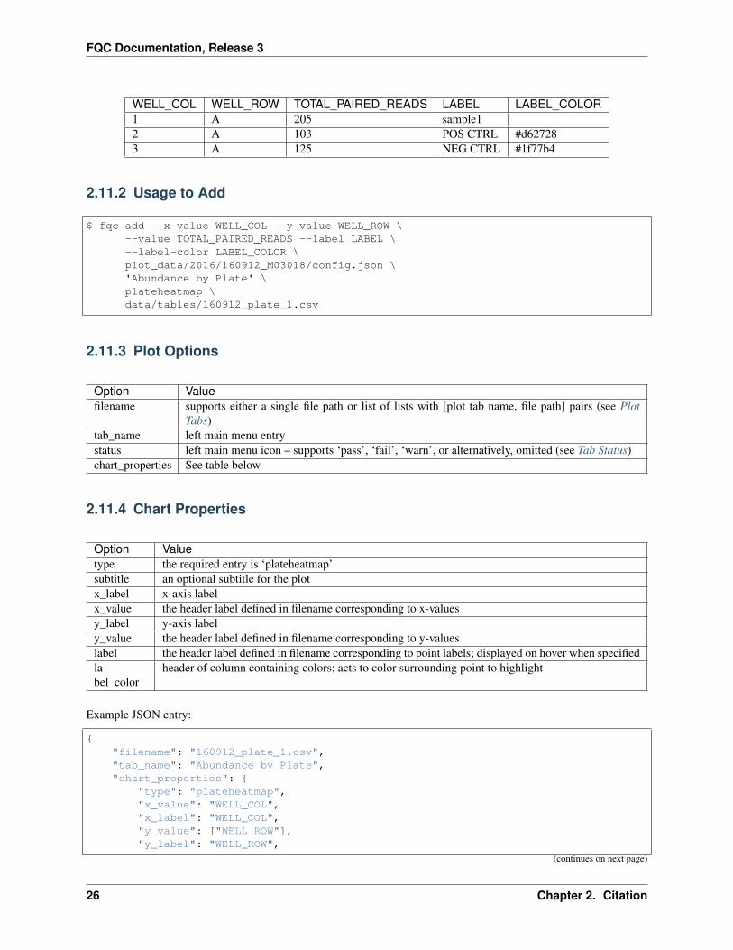
WELL_COL WELL_ROW TOTAL_PAIRED_READS LABEL LABEL_COLOR1 A 205 sample12 A 103 POS CTRL #d627283 A 125 NEG CTRL #1f77b4
2.11.2 Usage to Add
$ fqc add --x-value WELL_COL --y-value WELL_ROW \--value TOTAL_PAIRED_READS --label LABEL \--label-color LABEL_COLOR \plot_data/2016/160912_M03018/config.json \'Abundance by Plate' \plateheatmap \data/tables/160912_plate_1.csv
2.11.3 Plot Options
Option Valuefilename supports either a single file path or list of lists with [plot tab name, file path] pairs (see Plot
Tabs)tab_name left main menu entrystatus left main menu icon – supports ‘pass’, ‘fail’, ‘warn’, or alternatively, omitted (see Tab Status)chart_properties See table below
2.11.4 Chart Properties
Option Valuetype the required entry is ‘plateheatmap’subtitle an optional subtitle for the plotx_label x-axis labelx_value the header label defined in filename corresponding to x-valuesy_label y-axis labely_value the header label defined in filename corresponding to y-valueslabel the header label defined in filename corresponding to point labels; displayed on hover when specifiedla-bel_color
header of column containing colors; acts to color surrounding point to highlight
Example JSON entry:
{"filename": "160912_plate_1.csv","tab_name": "Abundance by Plate","chart_properties": {
"type": "plateheatmap","x_value": "WELL_COL","x_label": "WELL_COL","y_value": ["WELL_ROW"],"y_label": "WELL_ROW",
(continues on next page)
26 Chapter 2. Citation

FQC Documentation, Release 3
(continued from previous page)
"value": "TOTAL_PAIRED_READS","label": "LABEL","label_color": "LABEL_COLOR"
}}
2.12 Table
2.12.1 Example Data
Measure ValueTotal Reads 15752091Fraction On Target 0.67042235853Fraction Off Target 1.0284348916e-05Fraction Unmatched 0.329567357121Coefficient of Distribution (G) 0.260394791718
2.12. Table 27

FQC Documentation, Release 3
2.12.2 Usage to Add
$ fqc add --prepend \plot_data/2016/160912_M03018/config.json \'Run Stats' \table \data/tables/160912_summary.csv
2.12.3 Plot Options
Option Valuefilename supports either a single file path or list of lists with [plot tab name, file path] pairs (see Plot Tabs)tab_name left main menu entrystatus left main menu icon – supports ‘pass’, ‘fail’, ‘warn’, or alternatively, omitted (see Tab Status)
Example JSON entry:
{"filename": "160912_summary.csv","chart_properties": {
"type": "table"},"tab_name": "Run Stats"
}
28 Chapter 2. Citation