Forms Learning Web Design: Chapter 9 Supplemental Material: Fancy Form Design Using CSS By Cameron...
64
Forms Learning Web Design: Chapter 9 Supplemental Material: Fancy Form Design Using CSS By Cameron Adams
-
Upload
janel-warren -
Category
Documents
-
view
217 -
download
0
Transcript of Forms Learning Web Design: Chapter 9 Supplemental Material: Fancy Form Design Using CSS By Cameron...
Forms
Learning Web Design: Chapter 9Supplemental Material:
Fancy Form Design Using CSSBy Cameron Adams
What is a Form?
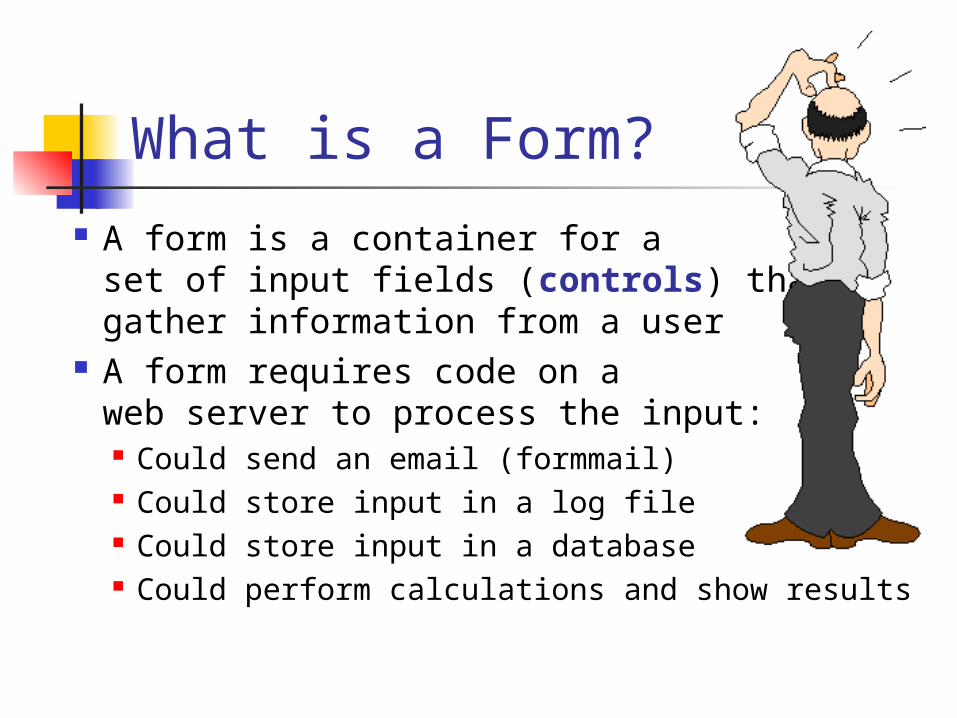
A form is a container for a set of input fields (controls) that gather information from a user
A form requires code on a web server to process the input: Could send an email (formmail) Could store input in a log file Could store input in a database Could perform calculations and show results
Web Form Types
There are many different kinds of Web page forms
Some common forms include: Requests Registration Contact Information Surveys Customer Service
Contact Information Guest Book Order, Shipping, Billing Log On
Form Design The designer must first consider the
purpose of the form Next, they must decide what data must be
gathered The designer should work with the
organization to determine how the data will be stored
Finally, the designer must map each piece of data needed to a specific input field that will be responsible for getting that data
Design Choices
Choose the most appropriate input field for the type of information needed
Try to restrict the choices the user can make to eliminate data entry errors Instead of using a textbox where the user can
enter anything, you can provide an explicit list of things from which to choose
If restricting user input …Make sure all possible choices are provided or provide an “other” option
User-Friendly Forms
Make sure controls that are logically related are placed near each other i.e. Address, State, and Zipcode controls
Add tab order to controls for accessibility and ease of data entry
Provide meaningful labels Strive for clean organization
Some whitespace between controls can help with readability
Required Fields
Part of the design decisions include which of your form fields you will require the user to complete
What data does the organization absolutely have to gather?
Err on the side of “less is more” Do not require every field
What if they do not have a phone?
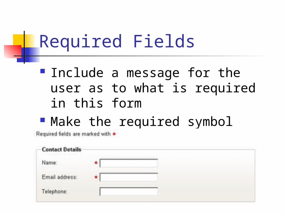
Required Fields
Include a message for the user as to what is required in this form
Make the required symbol stand out
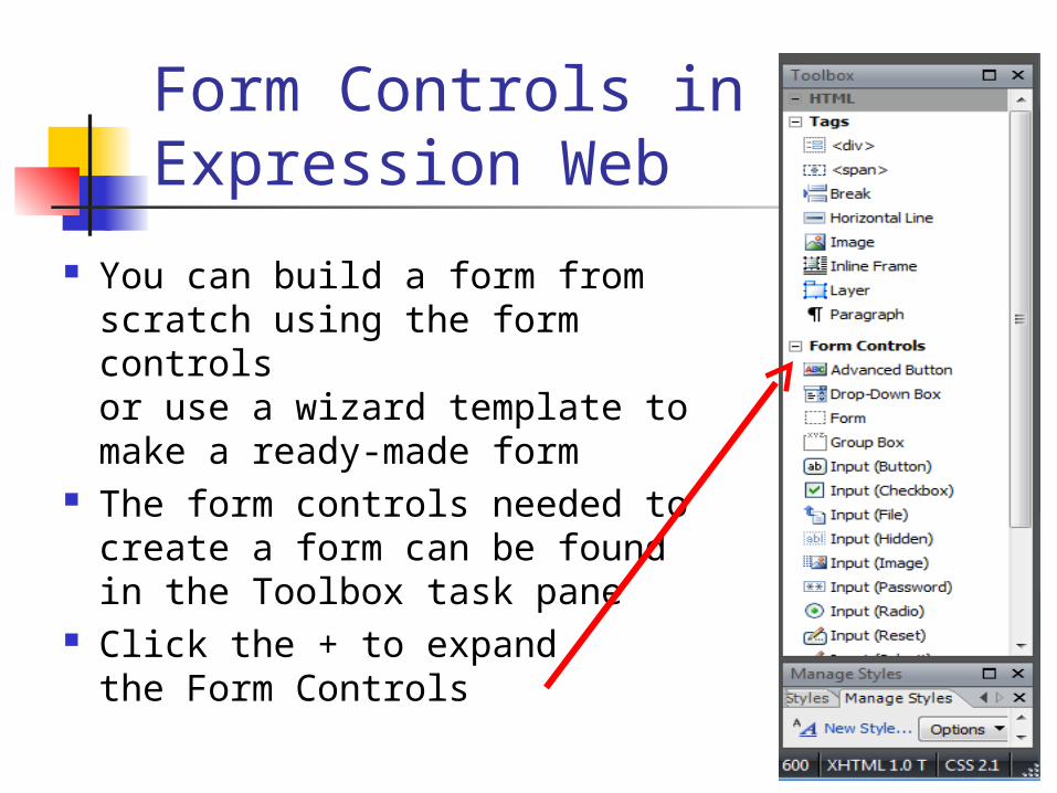
Form Controls in Expression Web
You can build a form from scratch using the form controls or use a wizard template to make a ready-made form
The form controls needed to create a form can be found in the Toolbox task pane
Click the + to expand the Form Controls
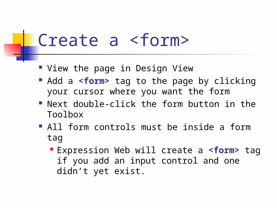
Create a <form> View the page in Design View Add a <form> tag to the page by clicking
your cursor where you want the form Next double-click the form button in the
Toolbox All form controls must be inside a form tag
Expression Web will create a <form> tag if you add an input control and one didn’t yet exist.
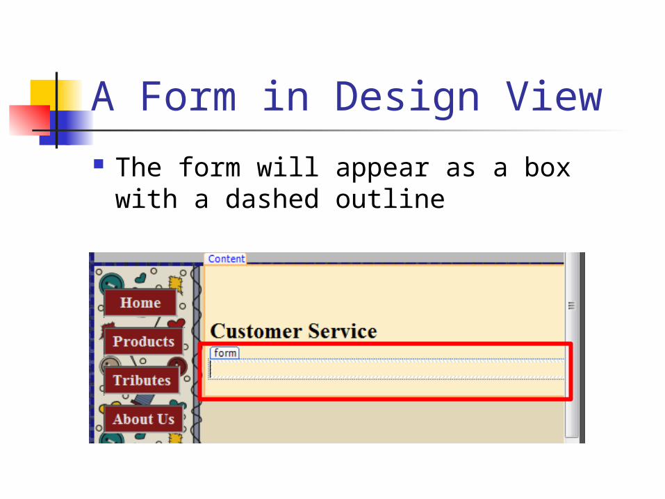
A Form in Design View
The form will appear as a box with a dashed outline
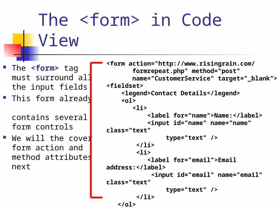
The <form> in Code View The <form> tag
must surround all the input fields
This form already contains several form controls
We will the cover form action and method attributesnext
<form action="http://www.risingrain.com/ formrepeat.php" method="post" name="CustomerService" target="_blank"><fieldset> <legend>Contact Details</legend> <ol> <li> <label for="name">Name:</label> <input id="name" name="name" class="text" type="text" /> </li> <li> <label for="email">Email address:</label> <input id="email" name="email" class="text" type="text" /> </li> </ol> </fieldset></form>
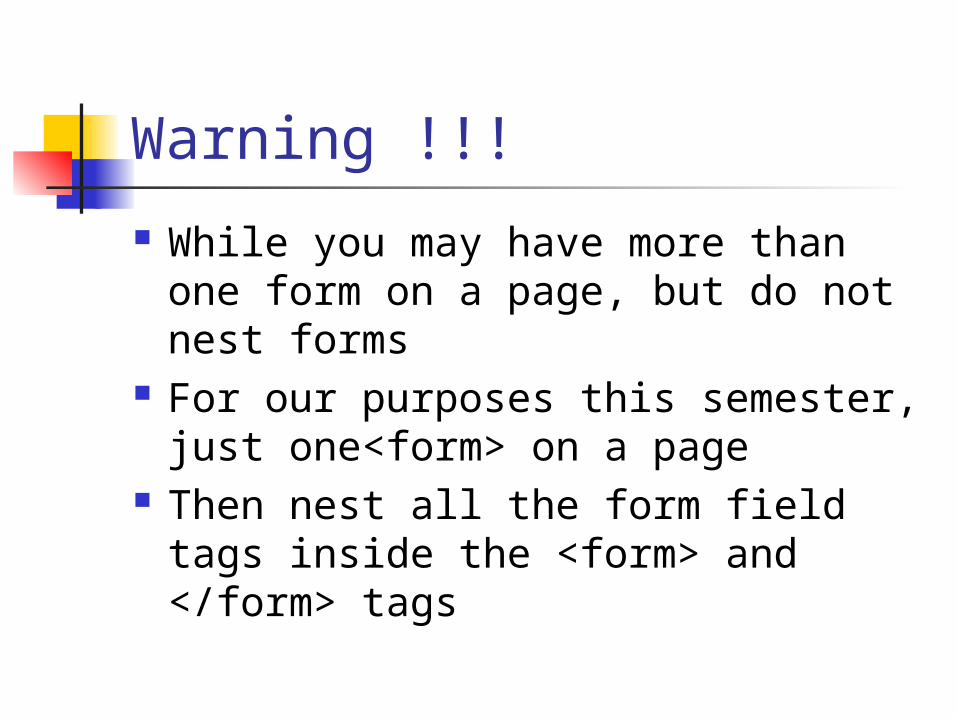
Warning !!!
While you may have more than one form on a page, but do not nest forms
For our purposes this semester, just one<form> on a page
Then nest all the form field tags inside the <form> and </form> tags
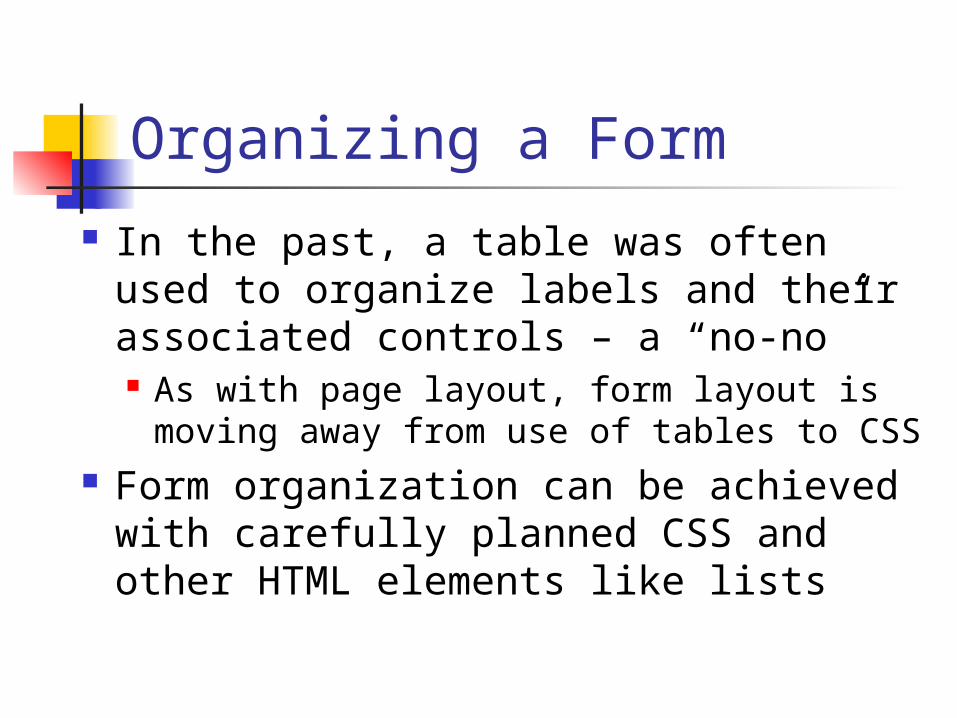
Organizing a Form
In the past, a table was often used to organize labels and their associated controls – a “no-no” As with page layout, form layout is
moving away from use of tables to CSS Form organization can be achieved
with carefully planned CSS and other HTML elements like lists
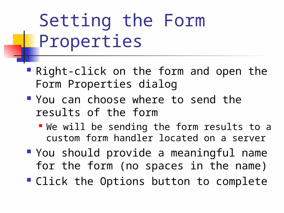
Setting the Form Properties
Right-click on the form and open the Form Properties dialog
You can choose where to send the results of the form We will be sending the form results to a custom
form handler located on a server You should provide a meaningful name
for the form (no spaces in the name) Click the Options button to complete

Form Properties Dialog Click on
Send to other Set the Form
Name Set the Target
to be New Window (_blank)
Click the Options button to set the action URL and method
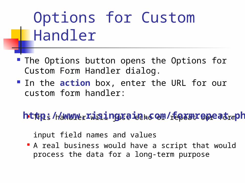
Options for Custom Handler
The Options button opens the Options for Custom Form Handler dialog.
In the action box, enter the URL for our custom form handler:
This handler will just echo or repeat our form input field names and values
A real business would have a script that would process the data for a long-term purpose
http://www.risingrain.com/formrepeat.php
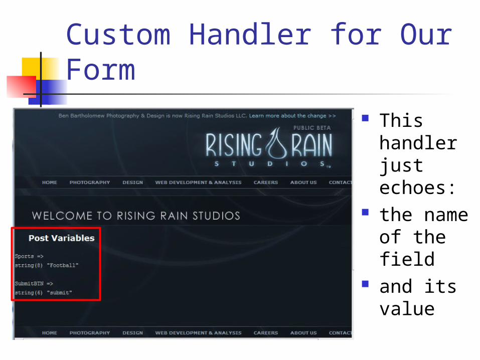
Custom Handler for Our Form
This handler just echoes:
the name of the field
and its value
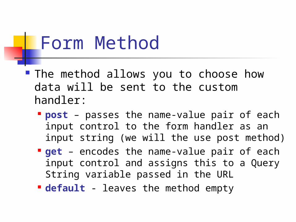
Form Method
The method allows you to choose how data will be sent to the custom handler: post – passes the name-value pair of each
input control to the form handler as an input string (we will the use post method)
get – encodes the name-value pair of each input control and assigns this to a Query String variable passed in the URL
default - leaves the method empty
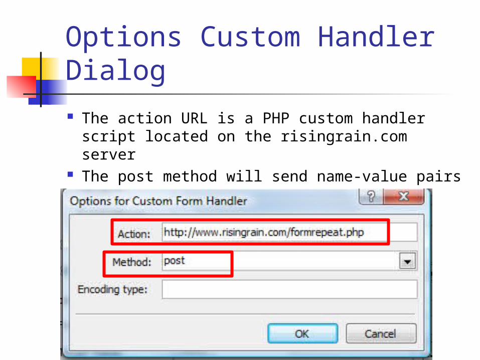
Options Custom Handler Dialog The action URL is a PHP custom handler script
located on the risingrain.com server The post method will send name-value pairs
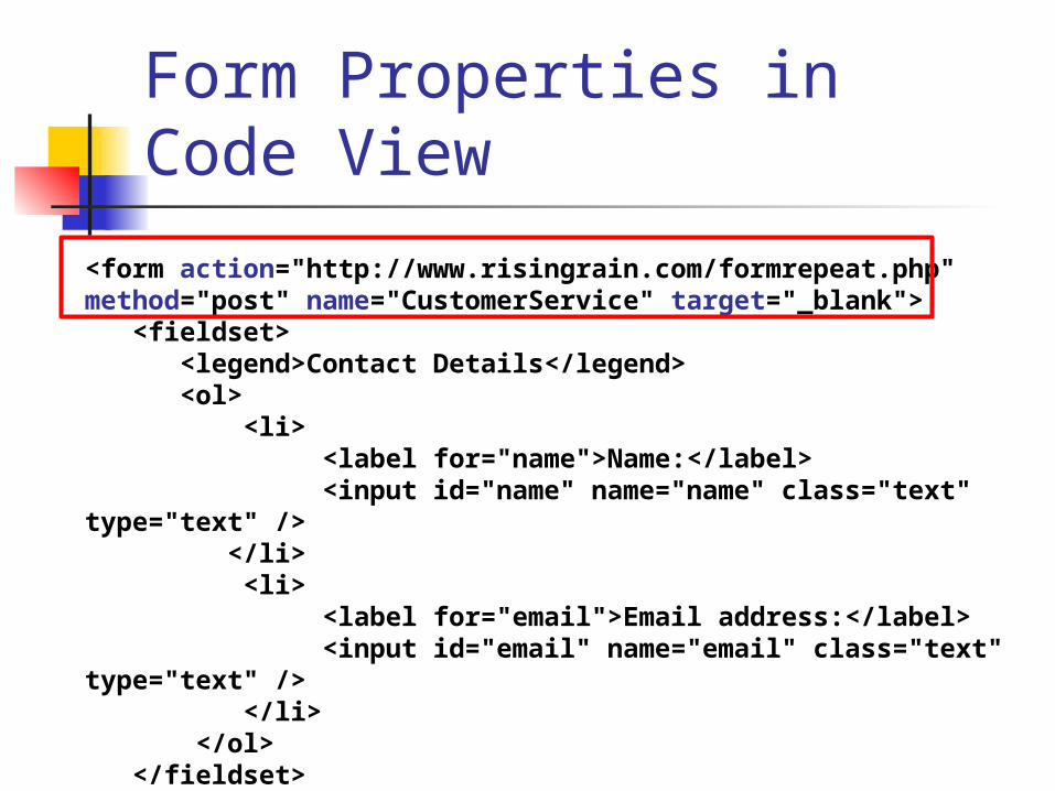
Form Properties in Code View
<form action="http://www.risingrain.com/formrepeat.php" method="post" name="CustomerService" target="_blank"> <fieldset> <legend>Contact Details</legend> <ol> <li> <label for="name">Name:</label> <input id="name" name="name" class="text" type="text" /> </li> <li> <label for="email">Email address:</label> <input id="email" name="email" class="text" type="text" /> </li> </ol> </fieldset></form>
Variables and Content
Web forms use a variety of controls (widgets) that allow users to enter information Text entry fields, buttons, menus, file,
check boxes, radio buttons etc. As a Web designer, it is your job to be
familiar with each control options so you can make your forms easy to use
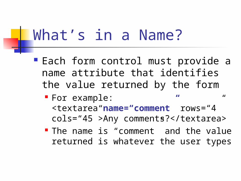
What’s in a Name?
Each form control must provide a name attribute that identifies the value returned by the form For example:
<textarea name=“comment” rows=“4” cols=“45”>Any comments?</textarea>
The name is “comment” and the value returned is whatever the user types
Naming Variables
Provide meaningful names for each of your form controls
As values are returned they are associated with the name in a name/value pair
TextArea22 is not a meaningful name Garbage in, garbage out should not
apply to form control names!!!
Adding Form Controls
You can insert form fields using the Insert =>Forms menu options or add them using the Form Controls in the Toolbox
You can set properties for each field including: length of text allowed options in a list
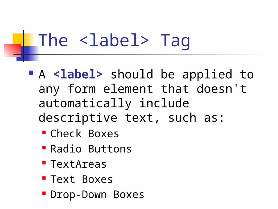
The <label> Tag
A <label> should be applied to any form element that doesn't automatically include descriptive text, such as: Check Boxes Radio Buttons TextAreas Text Boxes Drop-Down Boxes
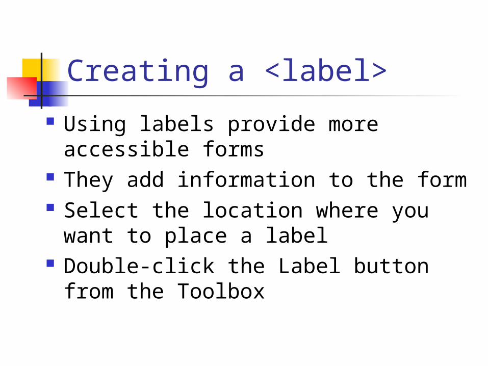
Creating a <label>
Using labels provide more accessible forms
They add information to the form Select the location where you want
to place a label Double-click the Label button from
the Toolbox
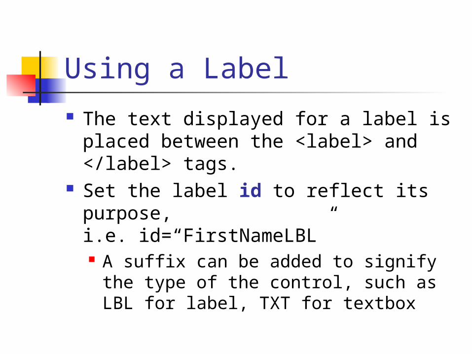
Using a Label
The text displayed for a label is placed between the <label> and </label> tags.
Set the label id to reflect its purpose,i.e. id=“FirstNameLBL” A suffix can be added to signify the
type of the control, such as LBL for label, TXT for textbox
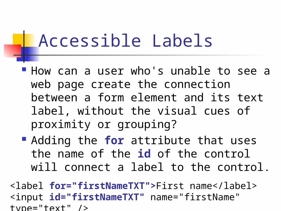
Accessible Labels
How can a user who's unable to see a web page create the connection between a form element and its text label, without the visual cues of proximity or grouping?
Adding the for attribute that uses the name of the id of the control will connect a label to the control.<label for="firstNameTXT">First name</label>
<input id="firstNameTXT" name="firstName" type="text" />
Positioning Labels
For each element in a left-to-right reading system, it is logical to position a label using one of three methods: directly above the form element positioned left, aligned left positioned left, aligned right
Check Boxes and Radio Button labels may be aligned with the control before the label
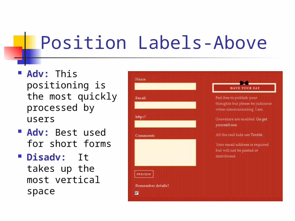
Position Labels-Above
Adv: This positioning is the most quickly processed by users
Adv: Best used for short forms
Disadv: It takes up the most vertical space
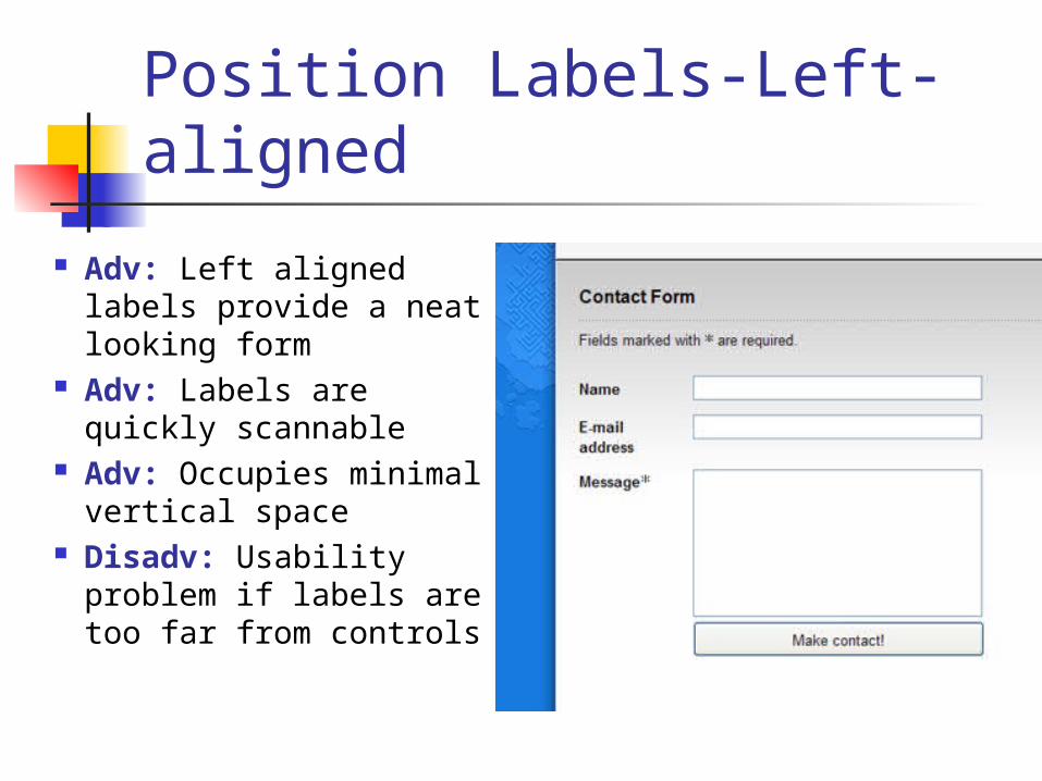
Position Labels-Left-aligned
Adv: Left aligned labels provide a neat looking form
Adv: Labels are quickly scannable
Adv: Occupies minimal vertical space
Disadv: Usability problem if labels are too far from controls
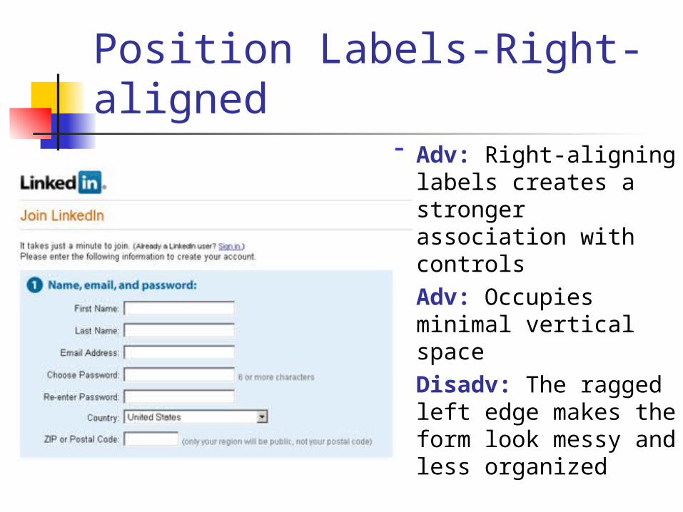
Position Labels-Right-aligned
Adv: Right-aligning labels creates a stronger association with controls
Adv: Occupies minimal vertical space
Disadv: The ragged left edge makes the form look messy and less organized
Styling Labels
You can easily style the text inside the label using CSS, so you can format the label text in your forms in the same way as if you were using a span, p, or div
But a label has the benefit of being much more accessible than any of those elements.
Inserting Text Boxes A text box allows the user to input any
kind of data, i.e. characters, numbers, currency, passwords.
Select the location where you want the text box
Double-click on the Input (Text) button from Toolbar to insert an <input> tag
You can resize the text box by clicking it and dragging its handles

Types of Text Boxes
There are three types of text boxes:text box, password, and textarea <input type=“text”> should be used for
short information <input type=“password”> should be used to
enter a password does not encrypt the password, just shows
***** characters upon entry of text <textarea> should be used for multi-line
input
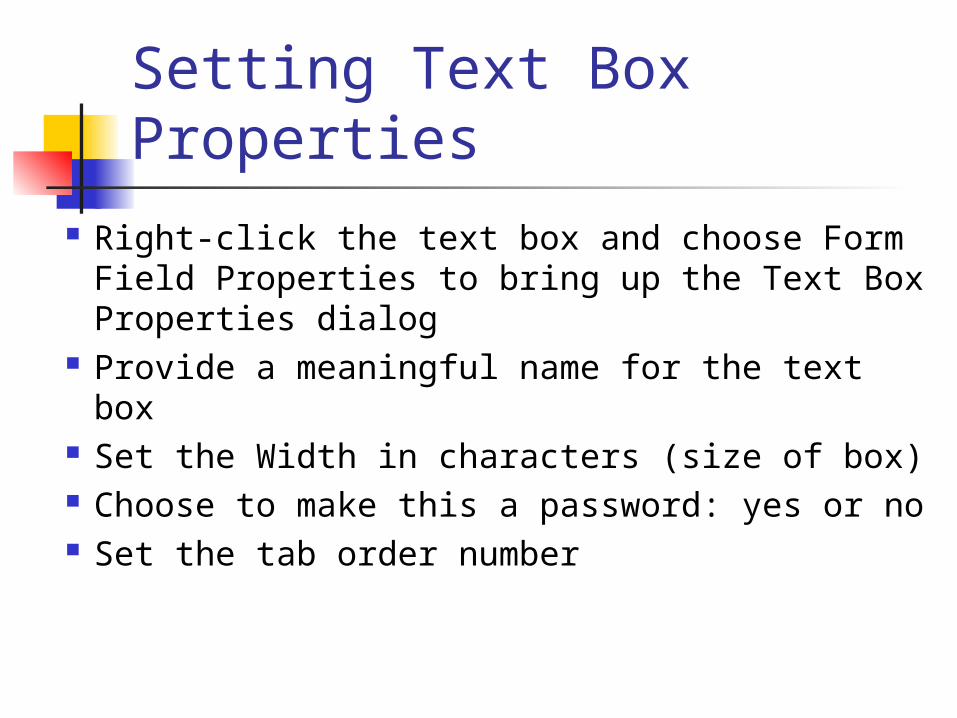
Setting Text Box Properties
Right-click the text box and choose Form Field Properties to bring up the Text Box Properties dialog
Provide a meaningful name for the text box
Set the Width in characters (size of box) Choose to make this a password: yes or no Set the tab order number
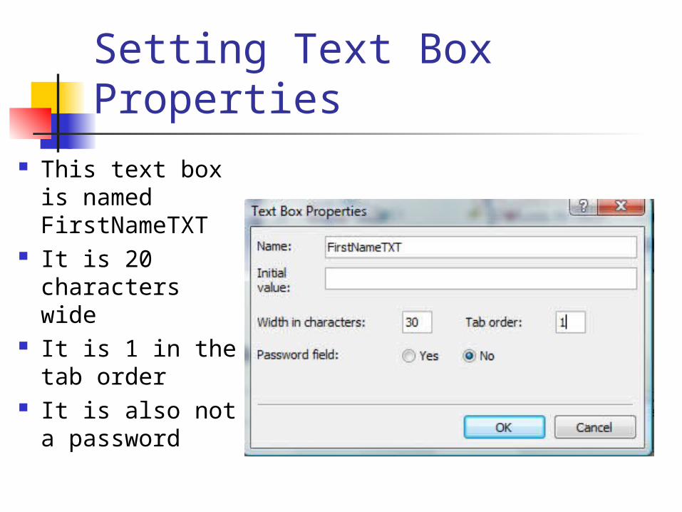
Setting Text Box Properties
This text box is named FirstNameTXT
It is 20 characters wide
It is 1 in the tab order
It is also not a password
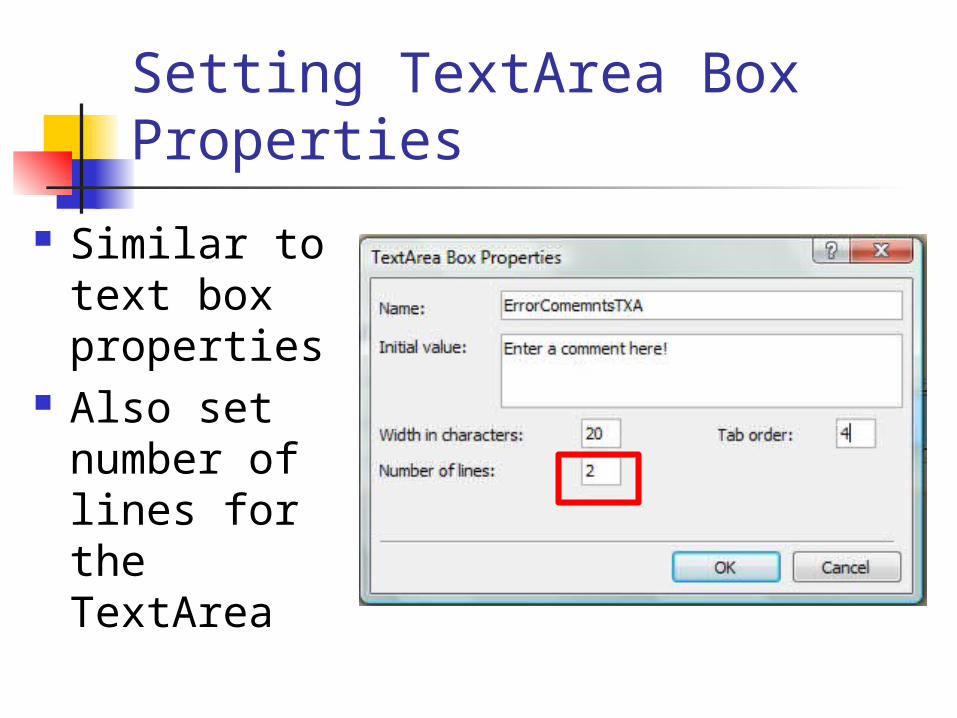
Setting TextArea Box Properties
Similar to text box properties
Also set number of lines for the TextArea
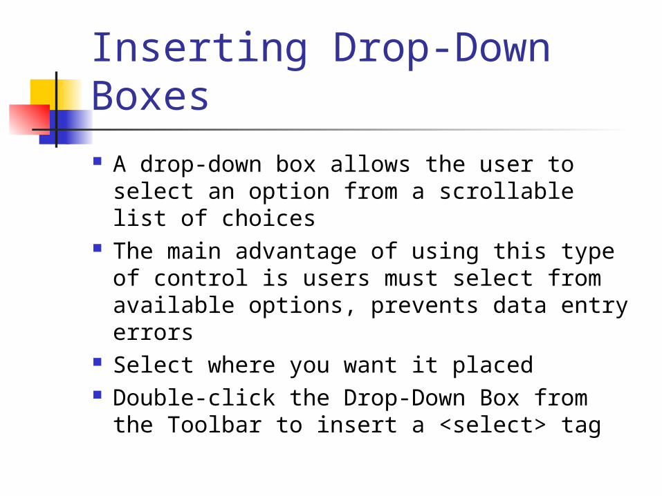
Inserting Drop-Down Boxes A drop-down box allows the user to select
an option from a scrollable list of choices The main advantage of using this type of
control is users must select from available options, prevents data entry errors
Select where you want it placed Double-click the Drop-Down Box from the
Toolbar to insert a <select> tag
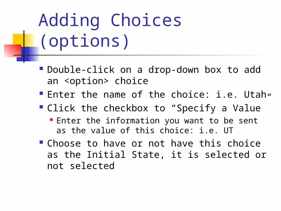
Adding Choices (options) Double-click on a drop-down box to add
an <option> choice Enter the name of the choice: i.e. Utah Click the checkbox to “Specify a Value”
Enter the information you want to be sent as the value of this choice: i.e. UT
Choose to have or not have this choice as the Initial State, it is selected or not selected
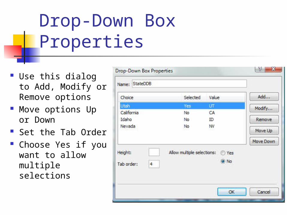
Drop-Down Box Properties
Use this dialog to Add, Modify or Remove options
Move options Up or Down
Set the Tab Order Choose Yes if you
want to allow multiple selections
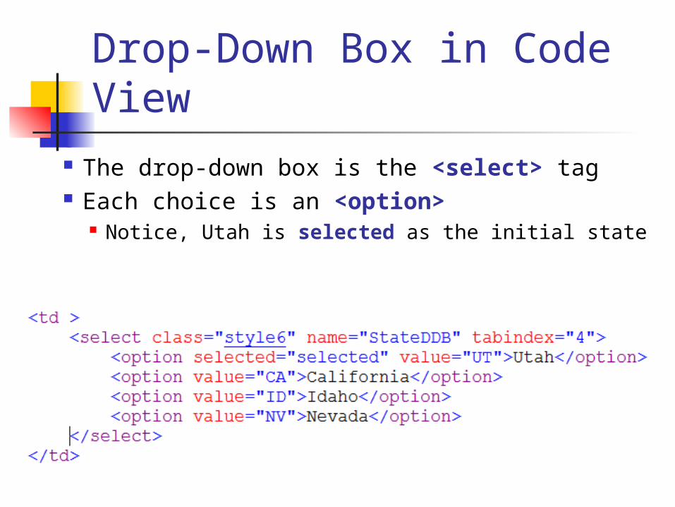
Drop-Down Box in Code View
The drop-down box is the <select> tag Each choice is an <option>
Notice, Utah is selected as the initial state
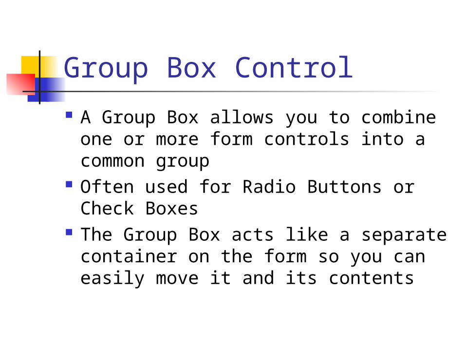
Group Box Control
A Group Box allows you to combine one or more form controls into a common group
Often used for Radio Buttons or Check Boxes
The Group Box acts like a separate container on the form so you can easily move it and its contents
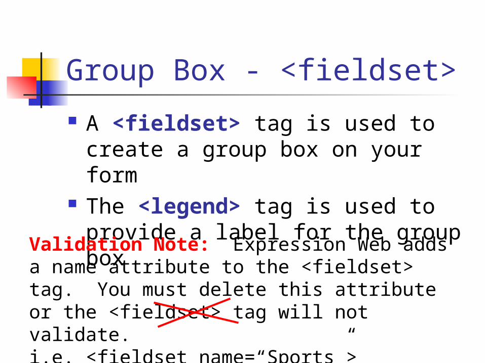
Group Box - <fieldset>
A <fieldset> tag is used to create a group box on your form
The <legend> tag is used to provide a label for the group box
Validation Note: Expression Web adds a name attribute to the <fieldset> tag. You must delete this attribute or the <fieldset> tag will not validate.i.e. <fieldset name=“Sports”>
Radio Button Controls
A Radio Button (or option button) allows a choice of one option from a group of choices
If you want only one Radio Button to be selected in the group all the buttons must have the exact the same Group Name
Allowing only one selection among a group is known as mutual exclusion
You can also place Radio Buttons in a Group Box to make dealing with them easier
Inserting Radio Buttons
Select where you want a radio button to go (possibly in a Group Box)
Double-click on the Input (Radio) button in the Toolbar to add an <input type=“radio”> tag
To open up the Option Button Properties dialog, double-click on the radio button
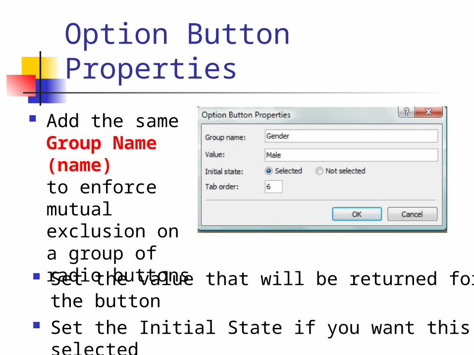
Option Button Properties
Add the same Group Name (name)to enforce mutual exclusion on a group of radio buttons Set the value that will be returned for the button
Set the Initial State if you want this selected Set the Tab Order
Check Box Controls Check Boxes provide a user multiple
choices from a list or group of options When the user checks a box, it is selected Unlike Radio Buttons, you cannot enforce
mutual exclusion on a group of Check Boxes
Provide a meaningful name for each Check Box as well as a value the will be submitted with the form
Inserting Checkboxes
Select where you want the Check Box to be placed (may be a Group Box)
Double-click the Input (Checkbox) button from the Toolbar to insert an <input type=“checkbox”> tag
To open the Check Box Properties dialog, double-click on a checkbox
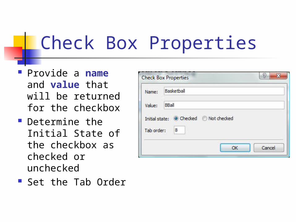
Check Box Properties Provide a name
and value that will be returned for the checkbox
Determine the Initial State of the checkbox as checked or unchecked
Set the Tab Order

Button Controls There are many types of button
controls in HTML: <input type=“submit”> – default button
behavior causes form to be submitted <input type=“reset”> – clears the form
so the user can start over <input type=“normal”> - designer can
decide the purpose of the button <input type=“image”> - an image is
displayed for the button
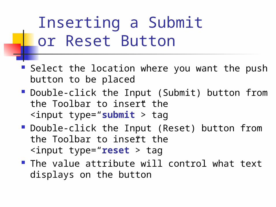
Inserting a Submit or Reset Button
Select the location where you want the push button to be placed
Double-click the Input (Submit) button from the Toolbar to insert the <input type=“submit”> tag
Double-click the Input (Reset) button from the Toolbar to insert the <input type=“reset”> tag
The value attribute will control what text displays on the button
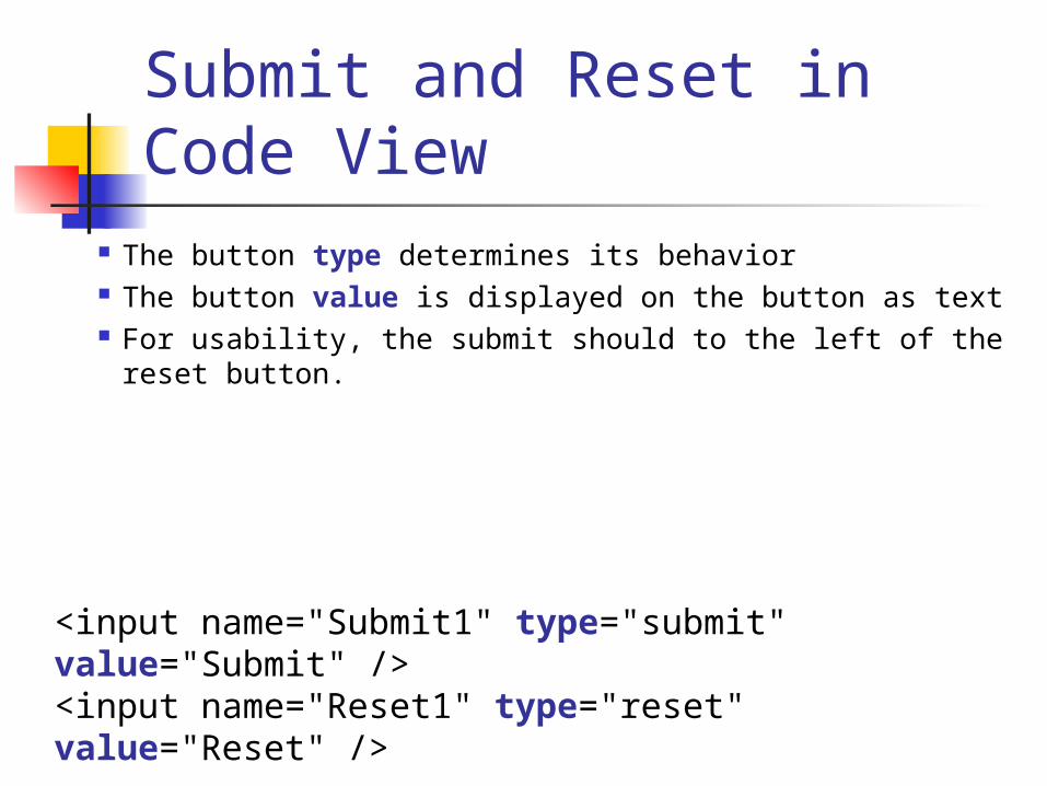
Submit and Reset in Code View
The button type determines its behavior The button value is displayed on the button as text For usability, the submit should to the left of the reset
button.
<input name="Submit1" type="submit" value="Submit" /><input name="Reset1" type="reset" value="Reset" />
Why Use an Image Button
An image button can allow for a graphic to behave like a button in a form i.e. a picture of a shopping cart may link
to a Checkout page when clicked Should use these sparingly. The user
may not know these are clickable unless they mouse over the image.
Inserting an Image Button Select where you want to locate the
image button on your form Double-click the Input (Image) button in
the Toolbar to insert an <input type=“image”> tag
Browse to find the image Provide alternative text for the image To add a link URL, click on the
Parameters button
The File Upload Control An organization may want a user to
provide a file when they submit a form The File control allows the user to
Browse to find a file and upload it The file is sent when the form is
submitted Some network administrators do not
allow file uploads
Inserting a File Upload Control
Select where you want the file upload control to be placed on your form
Double-click the Input (File) button from the Toolbar to insert an <input type=“file”> tag
To open the File Upload Properties dialog, double-click on the file control
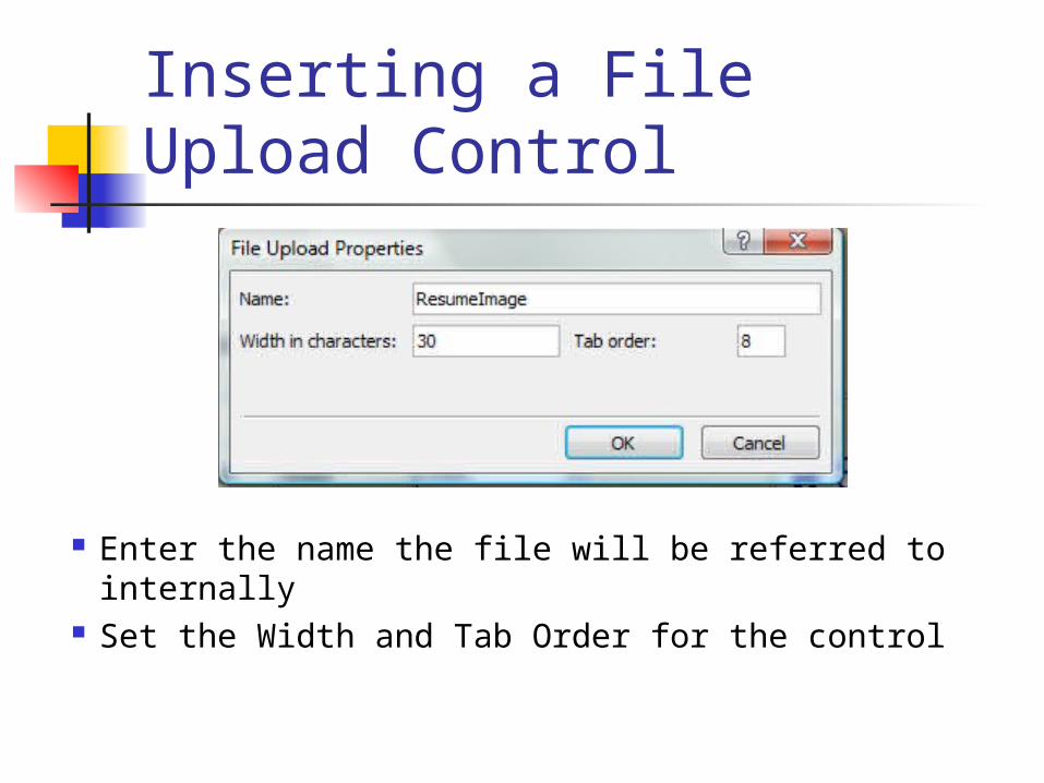
Inserting a File Upload Control
Enter the name the file will be referred to internally
Set the Width and Tab Order for the control
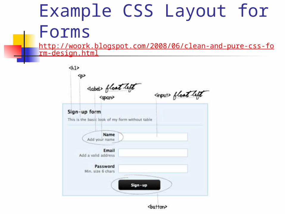
Example CSS Layout for Formshttp://woork.blogspot.com/2008/06/clean-and-pure-css-form-design.html
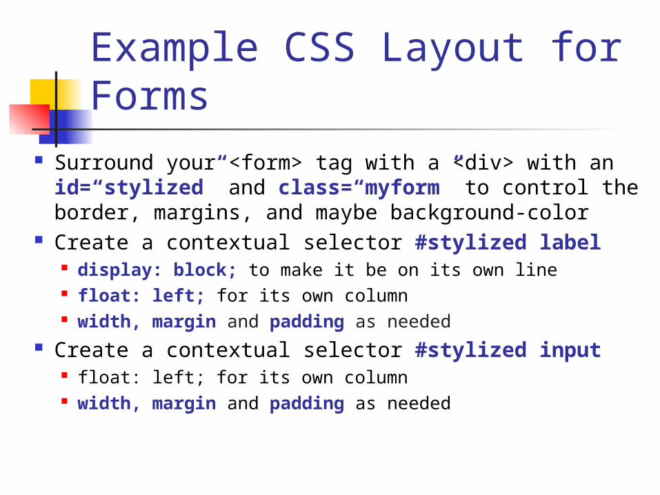
Example CSS Layout for Forms
Surround your <form> tag with a <div> with an id=“stylized” and class=“myform” to control the border, margins, and maybe background-color
Create a contextual selector #stylized label display: block; to make it be on its own line float: left; for its own column width, margin and padding as needed
Create a contextual selector #stylized input float: left; for its own column width, margin and padding as needed
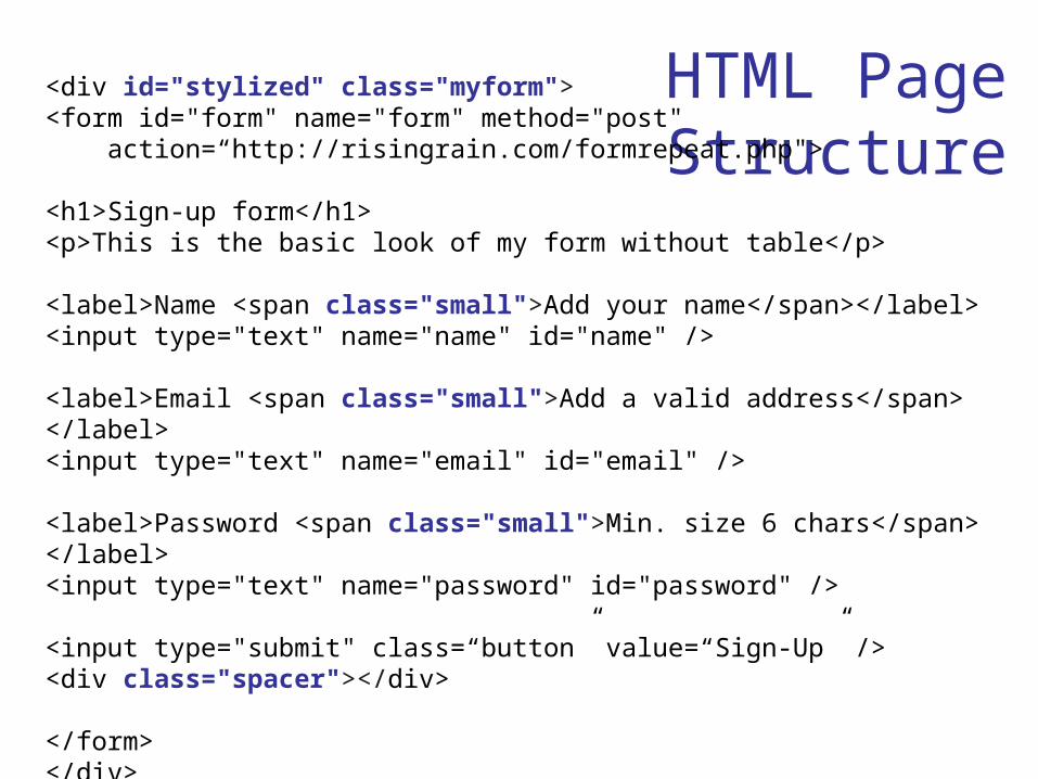
HTML Page Structure
<div id="stylized" class="myform"><form id="form" name="form" method="post" action=“http://risingrain.com/formrepeat.php">
<h1>Sign-up form</h1><p>This is the basic look of my form without table</p>
<label>Name <span class="small">Add your name</span></label><input type="text" name="name" id="name" />
<label>Email <span class="small">Add a valid address</span> </label><input type="text" name="email" id="email" />
<label>Password <span class="small">Min. size 6 chars</span> </label><input type="text" name="password" id="password" />
<input type="submit" class=“button” value=“Sign-Up” /><div class="spacer"></div>
</form></div>
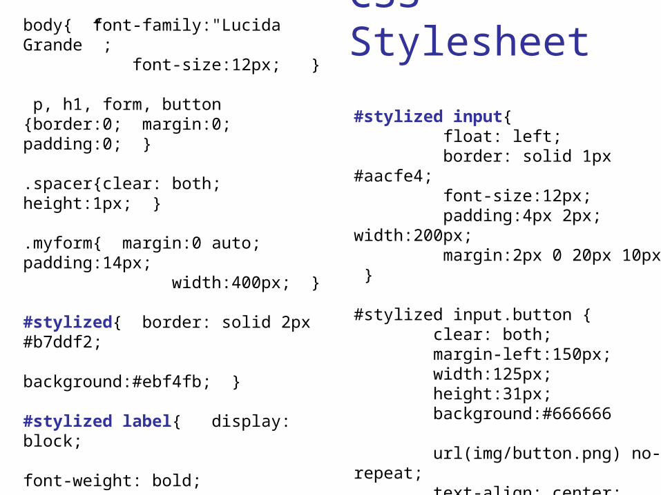
CSS Stylesheet
body{ font-family:"Lucida Grande” ; font-size:12px; }
p, h1, form, button{border:0; margin:0; padding:0; }
.spacer{clear: both; height:1px; }
.myform{ margin:0 auto; padding:14px; width:400px; }
#stylized{ border: solid 2px #b7ddf2; background:#ebf4fb; }
#stylized label{ display: block; font-weight: bold; text-align: right; width:140px; float:left; }
#stylized .small{ display:block; color:#666666; font-size:11px; font-weight:normal; text-align:right; width:140px; }
#stylized input{ float: left; border: solid 1px #aacfe4; font-size:12px; padding:4px 2px; width:200px; margin:2px 0 20px 10px; }
#stylized input.button { clear: both; margin-left:150px; width:125px; height:31px; background:#666666 url(img/button.png) no-repeat; text-align: center; line-height:31px; color:#FFFFFF; font-size:11px; font-weight: bold; }
Forms Summary
Almost every organization with a Web site will find a use for Web form(s)
Form validation, security issues and other types of server-side processing will be addressed in INFO 3420
A designer should give thoughtful consideration as to the layout and structure of a Web form