Fonts
7
Fonts Khristie Lawton
-
Upload
khristie-lawton -
Category
Education
-
view
209 -
download
0
Transcript of Fonts

FontsKhristie Lawton

Fonts can be one of the major recognisable trade marks for a film and it’s distribution. A font sets the
genre of the film from just looking at it. It is important to get the right font, so you can create the desired effect on
your audience.

For example leading media products such as ‘Saw’ have a recognisable font, that suits
the story of the films, and has relevance.
The text is distorted covered with sepia effect. The ‘W’ is in a shape of a instrument
used, it does look like a regular W and stands out in the image.

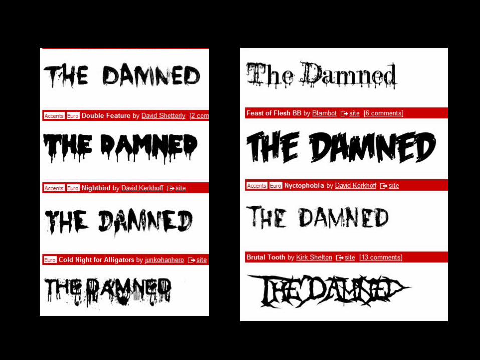
I tried to find suitable fonts that I believed instantly informed the audience
that my product is a horror film.The Damned The DamnedThe Damned The Damned
I do not believe that any of the above fonts work effectively to promote my
horror product. Therefore, I am going to look in to creating my own font from
ideas of other products.

I like the effect of this font, and the way that it looks like ‘splattered blood’ there are droplets of ‘blood’ across the image. I want to create a text like this
for my ancillary texts.
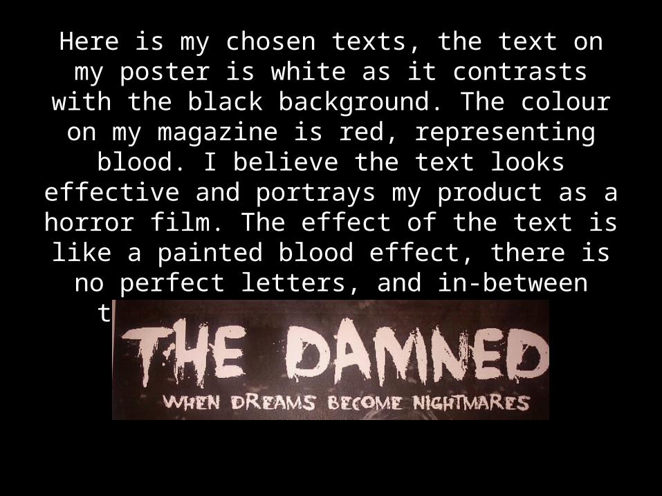
Here is my chosen texts, the text on my poster is white as it contrasts with the black background. The colour on my magazine is red, representing blood. I believe the text
looks effective and portrays my product as a horror film. The effect of the text is like a painted blood effect, there is no perfect
letters, and in-between there are splashes of ‘blood’.