Foliage techniques in watercolour - Shelley's...
11
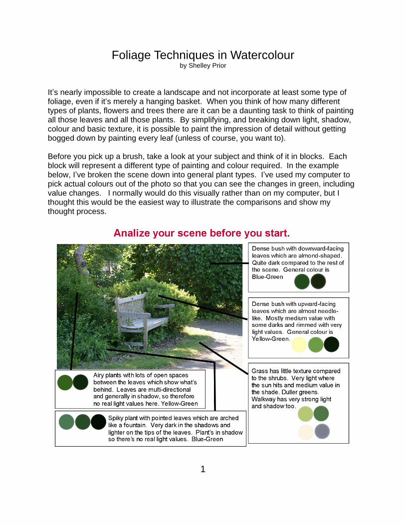
Foliage Techniques in Watercolour by Shelley Prior It s nearly impossible to create a landscape and not incorporate at least some type of foliage, even if it s merely a hanging basket. When you think of how many different types of plants, flowers and trees there are it can be a daunting task to think of painting all those leaves and all those plants. By simplifying, and breaking down light, shadow, colour and basic texture, it is possible to paint the impression of detail without getting bogged down by painting every leaf (unless of course, you want to). Before you pick up a brush, take a look at your subject and think of it in blocks. Each block will represent a different type of painting and colour required. In the example below, I ve broken the scene down into general plant types. I ve used my computer to pick actual colours out of the photo so that you can see the changes in green, including value changes. I normally would do this visually rather than on my computer, but I thought this would be the easiest way to illustrate the comparisons and show my thought process. 1
Transcript of Foliage techniques in watercolour - Shelley's...
Foliage Techniques in Watercolour by Shelley Prior
It s nearly impossible to create a landscape and not incorporate at least some type of foliage, even if it s merely a hanging basket. When you think of how many different types of plants, flowers and trees there are it can be a daunting task to think of painting all those leaves and all those plants. By simplifying, and breaking down light, shadow, colour and basic texture, it is possible to paint the impression of detail without getting bogged down by painting every leaf (unless of course, you want to).
Before you pick up a brush, take a look at your subject and think of it in blocks. Each block will represent a different type of painting and colour required. In the example below, I ve broken the scene down into general plant types. I ve used my computer to pick actual colours out of the photo so that you can see the changes in green, including value changes. I normally would do this visually rather than on my computer, but I thought this would be the easiest way to illustrate the comparisons and show my thought process.
1
Value
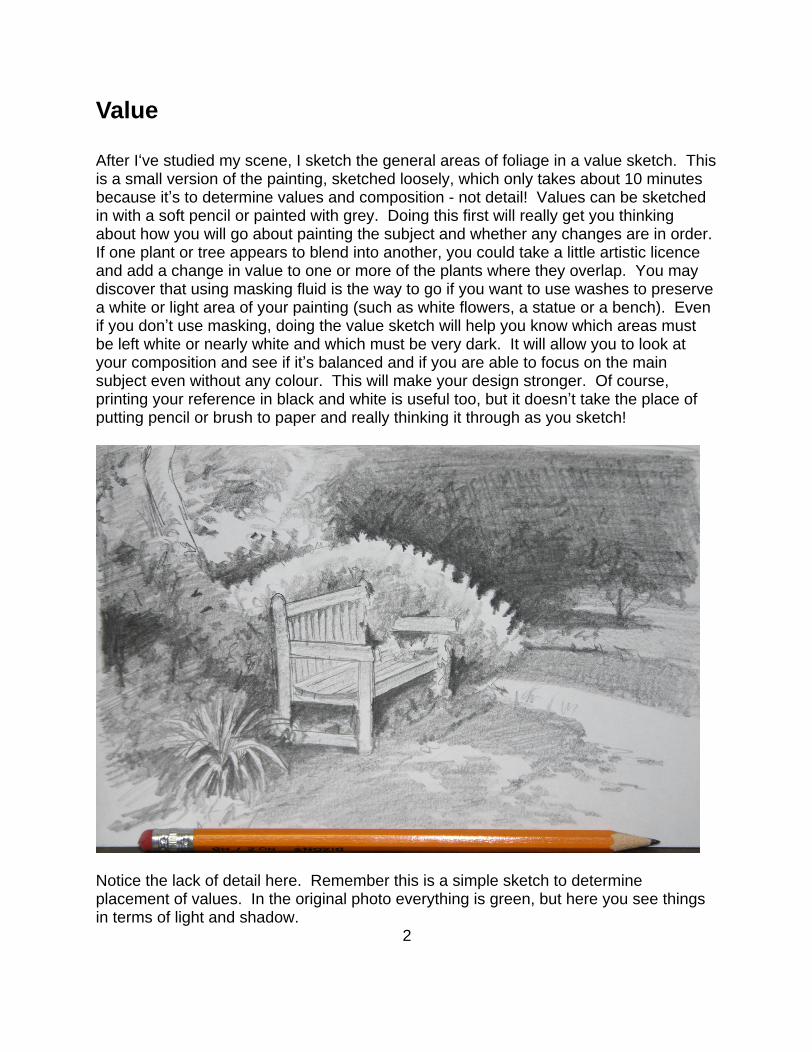
After I ve studied my scene, I sketch the general areas of foliage in a value sketch. This is a small version of the painting, sketched loosely, which only takes about 10 minutes because it s to determine values and composition - not detail! Values can be sketched in with a soft pencil or painted with grey. Doing this first will really get you thinking about how you will go about painting the subject and whether any changes are in order. If one plant or tree appears to blend into another, you could take a little artistic licence and add a change in value to one or more of the plants where they overlap. You may discover that using masking fluid is the way to go if you want to use washes to preserve a white or light area of your painting (such as white flowers, a statue or a bench). Even if you don t use masking, doing the value sketch will help you know which areas must be left white or nearly white and which must be very dark. It will allow you to look at your composition and see if it s balanced and if you are able to focus on the main subject even without any colour. This will make your design stronger. Of course, printing your reference in black and white is useful too, but it doesn t take the place of putting pencil or brush to paper and really thinking it through as you sketch!
Notice the lack of detail here. Remember this is a simple sketch to determine placement of values. In the original photo everything is green, but here you see things in terms of light and shadow.
2
Colour
When I started in watercolour, I was over-cautious about maintaining my lights. What if I go too dark, or it gets muddy, or I can t fix it? Of course I kept forgetting how much lighter it would dry too! This hesitation resulted in very washed out paintings with no contrast at all. Blah! It took me quite a while to get braver with my paint.
The other main problem that I had in the beginning was that I mixed a batch of green on my palette and painted a bush or tree, simply putting more pigment where I wanted it darker. I wasn t looking closely at the changes in greens from warmer yellow-green in the sun to a cooler purple-green or blue-green in the shade. I didn t understand the importance of using cool and warm colours and I wasn t allowing any colour to mingle on the paper! Simply changing the amount of water in your paint just isn t enough.
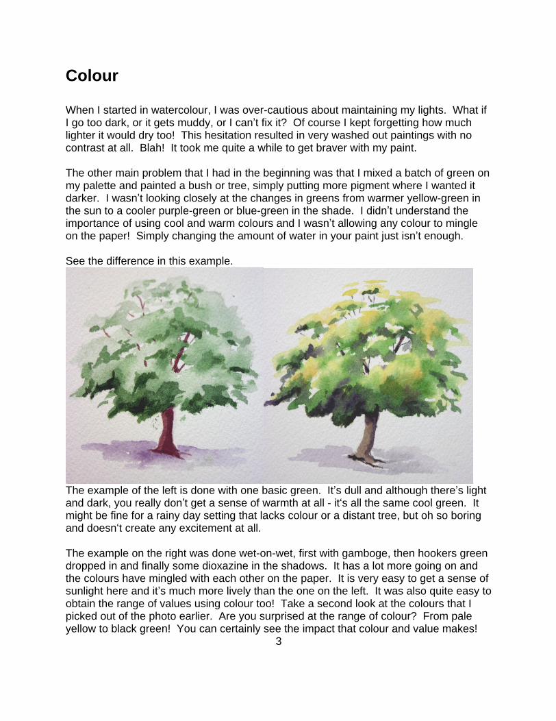
See the difference in this example.
The example of the left is done with one basic green. It s dull and although there s light and dark, you really don t get a sense of warmth at all - it s all the same cool green. It might be fine for a rainy day setting that lacks colour or a distant tree, but oh so boring and doesn t create any excitement at all.
The example on the right was done wet-on-wet, first with gamboge, then hookers green dropped in and finally some dioxazine in the shadows. It has a lot more going on and the colours have mingled with each other on the paper. It is very easy to get a sense of sunlight here and it s much more lively than the one on the left. It was also quite easy to obtain the range of values using colour too! Take a second look at the colours that I picked out of the photo earlier. Are you surprised at the range of colour? From pale yellow to black green! You can certainly see the impact that colour and value makes!
3
Shape & Texture
Ever notice how some paintings look almost childlike? I think the main reason for this is that we keep recalling our childhood ideas of how a tree should look you know, that same old Christmas tree shape with a straight trunk and branches sticking straight out from the sides, shaping the tree like a perfect triangle or a big ball with a straight stick for a trunk. It s almost like a computer glitch in our brains! Try to forget those old habits and really learn to look at shape with your eyes. Some trees and plants are dense while others are sparse or crooked. Seldom are they perfectly uniform unless someone comes along with a hedge trimmer! Things look unnatural when they are too perfect.
Texture is also important spiky, sparse, dense, smooth, droopy, leafy, gnarly, etc. These are considerations too.
Of course, I could go on and on about all the different type of plants and trees there are but the question is how to paint them. Generally, I take it one plant-type at a time. I try to look closely at the differences in texture, size, shape and colour. Landscapers always consider these aspects when designing!
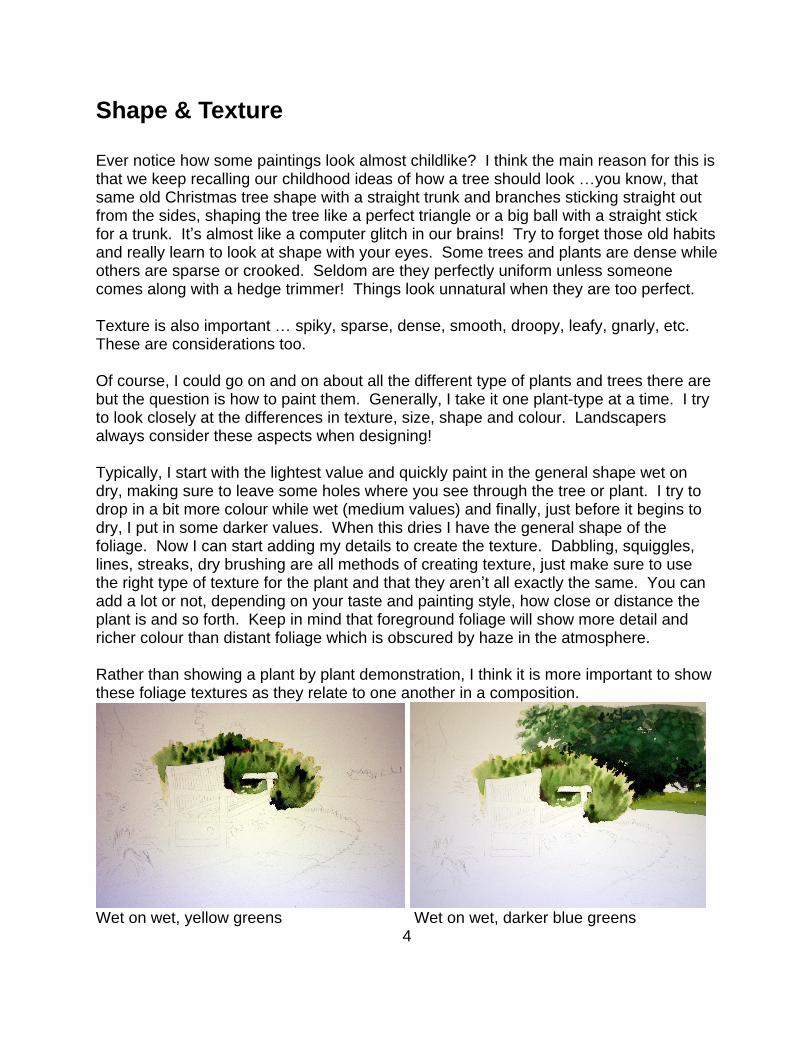
Typically, I start with the lightest value and quickly paint in the general shape wet on dry, making sure to leave some holes where you see through the tree or plant. I try to drop in a bit more colour while wet (medium values) and finally, just before it begins to dry, I put in some darker values. When this dries I have the general shape of the foliage. Now I can start adding my details to create the texture. Dabbling, squiggles, lines, streaks, dry brushing are all methods of creating texture, just make sure to use the right type of texture for the plant and that they aren t all exactly the same. You can add a lot or not, depending on your taste and painting style, how close or distance the plant is and so forth. Keep in mind that foreground foliage will show more detail and richer colour than distant foliage which is obscured by haze in the atmosphere.
Rather than showing a plant by plant demonstration, I think it is more important to show these foliage textures as they relate to one another in a composition.
Wet on wet, yellow greens Wet on wet, darker blue greens 4
Mixture of greens on left side Open spaces in the tree s foliage
Duller, yellowy grass with little texture. Warm tones in the bark chips and path.
Shadows on grass and path. Starting to build texture on dry surface.
5
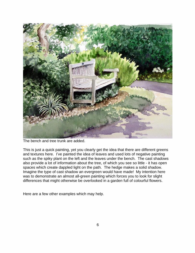
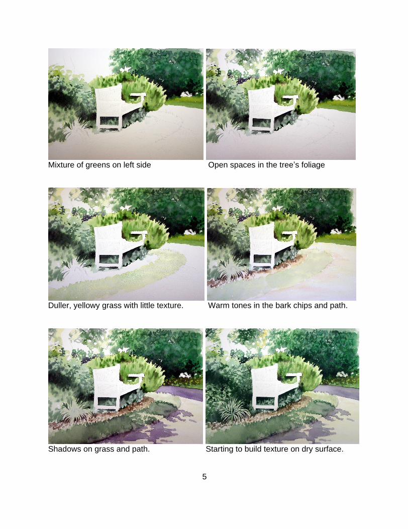
The bench and tree trunk are added.
This is just a quick painting, yet you clearly get the idea that there are different greens and textures here. I ve painted the idea of leaves and used lots of negative painting such as the spiky plant on the left and the leaves under the bench. The cast shadows also provide a lot of information about the tree, of which you see so little - it has open spaces which create dappled light on the path. The hedge makes a solid shadow. Imagine the type of cast shadow an evergreen would have made! My intention here was to demonstrate an almost all-green painting which forces you to look for slight differences that might otherwise be overlooked in a garden full of colourful flowers.
Here are a few other examples which may help.
6
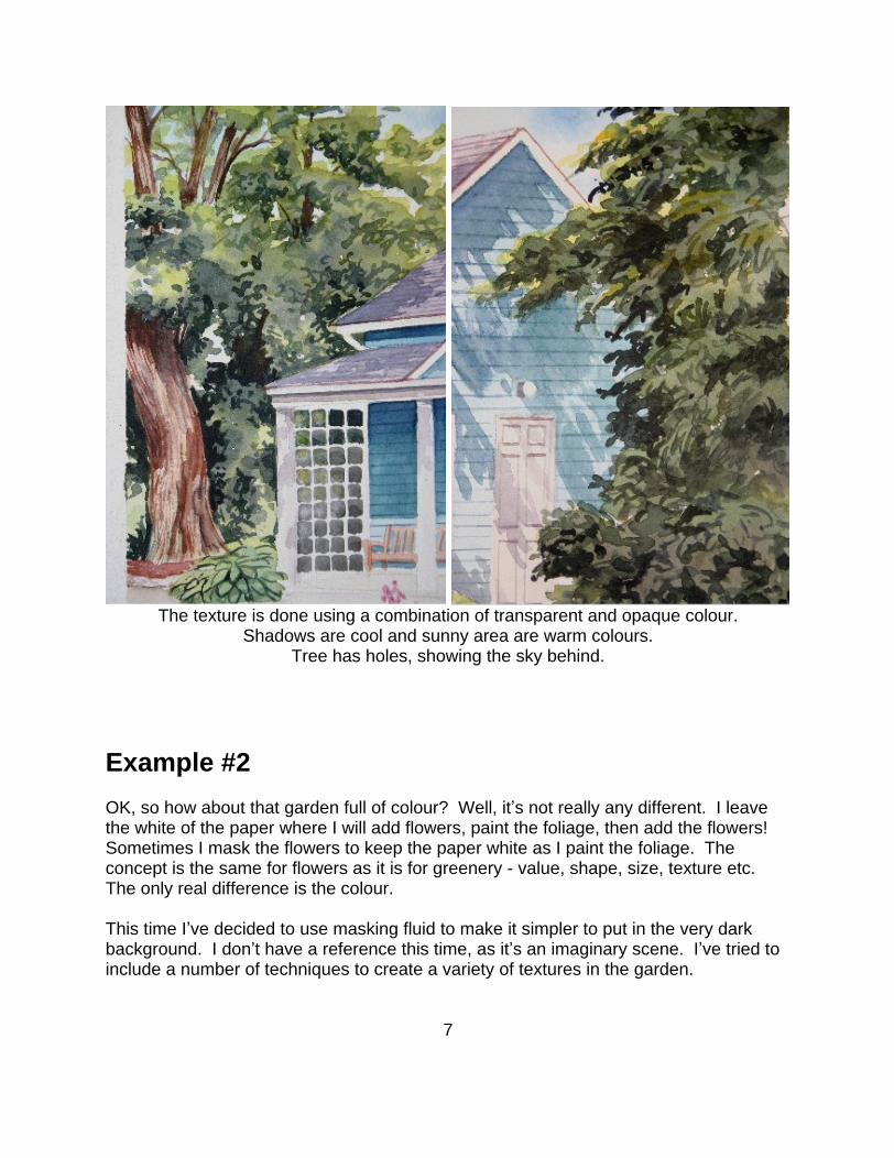
The texture is done using a combination of transparent and opaque colour. Shadows are cool and sunny area are warm colours.
Tree has holes, showing the sky behind.
Example #2
OK, so how about that garden full of colour? Well, it s not really any different. I leave the white of the paper where I will add flowers, paint the foliage, then add the flowers! Sometimes I mask the flowers to keep the paper white as I paint the foliage. The concept is the same for flowers as it is for greenery - value, shape, size, texture etc. The only real difference is the colour.
This time I ve decided to use masking fluid to make it simpler to put in the very dark background. I don t have a reference this time, as it s an imaginary scene. I ve tried to include a number of techniques to create a variety of textures in the garden.
7
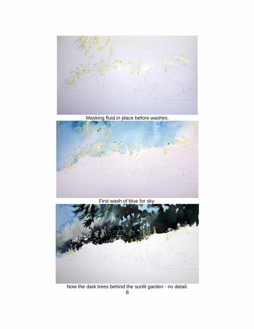
Masking fluid in place before washes.
First wash of blue for sky.
Now the dark trees behind the sunlit garden - no detail. 8
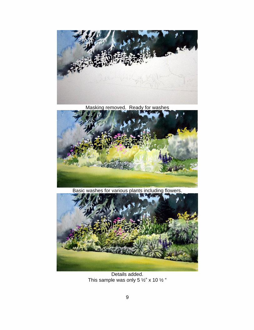
Masking removed. Ready for washes
Basic washes for various plants including flowers.
Details added. This sample was only 5 ½ x 10 ½
9
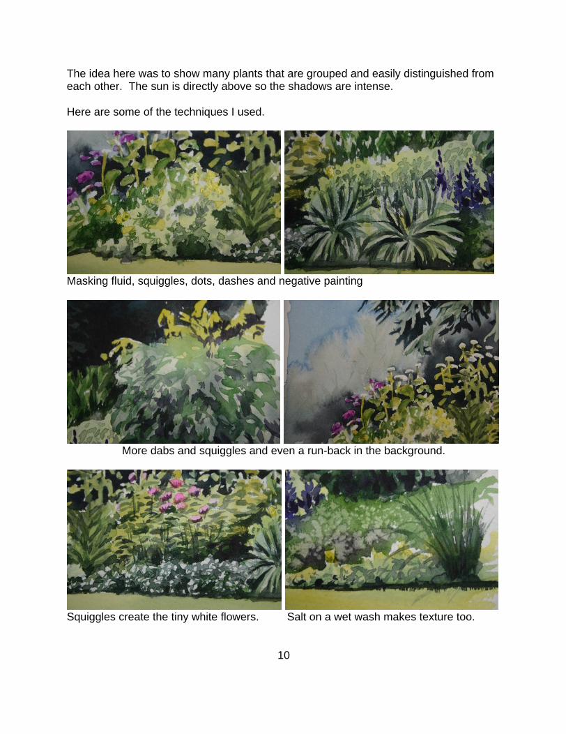
The idea here was to show many plants that are grouped and easily distinguished from each other. The sun is directly above so the shadows are intense.
Here are some of the techniques I used.
Masking fluid, squiggles, dots, dashes and negative painting
More dabs and squiggles and even a run-back in the background.
Squiggles create the tiny white flowers. Salt on a wet wash makes texture too.
10

This document was created with Win2PDF available at http://www.daneprairie.com.The unregistered version of Win2PDF is for evaluation or non-commercial use only.