Flicking the Switch: How Fee and Return Disclosures Drive ...
74
1 Flicking the Switch: How Fee and Return Disclosures Drive Retirement Plan Choice Hazel Bateman, a Isabella Dobrescu, b Ben R. Newell, c Andreas Ortmann, d Susan Thorp e Abstract Short standardized disclosures should make comparisons between competing financial products easier, motivate switches to better products, and reduce welfare losses. In an incentivized experimental setting we asked Australian retirement plan members to review mandatory short-form product disclosures and choose between hypothetical retirement plans. We investigate the relative power of prescribed fee and return information to prompt timely and efficient switches between plans. Evaluation of plan comprehension revealed deficiencies in the fixed format, especially related to the graphical representations of returns. However choice data suggested accurate reliance on changing fee information but a reluctance to use returns information as a basis for switching plans – even when a switch was warranted. Additionally, simplifications to the prescribed format led to more efficient comparisons of changing returns, significantly reducing the losses from poor choices by up to one third. These results have important implications for the design of comparative information on pension plans and retail investment vehicles (i.e., which attributes are understood and influence decisions), as well as for the implementation of disclosure testing. The authors are especially grateful to Jacs Davis and other UniSuper staff, and to Ang Li for excellent research assistance. Research support from the Australian Research Council LP110100489, the Australian Research Council Future Fellowship FT110100151 (Newell) and the Centre of Excellence in Population Ageing Research (CEPAR) under project CE110001029 (Dobrescu) is gratefully acknowledged. a School of Risk and Actuarial Studies, University of New South Wales, NSW 2052, Australia. E‐mail address: [email protected] b CEPAR and School of Economics, University of New South Wales, NSW 2052, Australia. E‐mail address: [email protected] c School of Psychology, University of New South Wales, NSW 2052, Australia. E‐mail address: [email protected] d School of Economics, University of New South Wales, NSW 2052, Australia. E‐mail address: [email protected] e Corresponding author. Discipline of Finance, The University of Sydney Business School, University of Sydney, NSW 2006, Australia. Tel.: +61 2 0290366354. E‐mail address: [email protected]
Transcript of Flicking the Switch: How Fee and Return Disclosures Drive ...

1
Flicking the Switch:
How Fee and Return Disclosures Drive Retirement Plan Choice
Hazel Bateman,a Isabella Dobrescu,b Ben R. Newell,c Andreas Ortmann,d Susan Thorpe
Abstract
Short standardized disclosures should make comparisons between competing financial products easier, motivate switches to better products, and reduce welfare losses. In an incentivized experimental setting we asked Australian retirement plan members to review mandatory short-form product disclosures and choose between hypothetical retirement plans. We investigate the relative power of prescribed fee and return information to prompt timely and efficient switches between plans. Evaluation of plan comprehension revealed deficiencies in the fixed format, especially related to the graphical representations of returns. However choice data suggested accurate reliance on changing fee information but a reluctance to use returns information as a basis for switching plans – even when a switch was warranted. Additionally, simplifications to the prescribed format led to more efficient comparisons of changing returns, significantly reducing the losses from poor choices by up to one third. These results have important implications for the design of comparative information on pension plans and retail investment vehicles (i.e., which attributes are understood and influence decisions), as well as for the implementation of disclosure testing.
The authors are especially grateful to Jacs Davis and other UniSuper staff, and to Ang Li for excellent research
assistance. Research support from the Australian Research Council LP110100489, the Australian Research Council Future Fellowship FT110100151 (Newell) and the Centre of Excellence in Population Ageing Research (CEPAR) under project CE110001029 (Dobrescu) is gratefully acknowledged. a School of Risk and Actuarial Studies, University of New South Wales, NSW 2052, Australia. E‐mail address: [email protected] b CEPAR and School of Economics, University of New South Wales, NSW 2052, Australia. E‐mail address: [email protected] c School of Psychology, University of New South Wales, NSW 2052, Australia. E‐mail address: [email protected] d School of Economics, University of New South Wales, NSW 2052, Australia. E‐mail address: [email protected] e Corresponding author. Discipline of Finance, The University of Sydney Business School, University of Sydney, NSW 2006, Australia. Tel.: +61 2 0290366354. E‐mail address: [email protected]
2
1. Introduction
Disclosure standards are the stock-in-trade of financial regulators. Setting standards for transparency and
comparability is a way to promote free markets and individual autonomy while reducing market
inefficiency (Loewenstein et al. 2014). Over the past decade financial regulators have begun to tighten the
rules around disclosures in response to the increasingly complex financial choices being offered to
consumers, and the significant losses associated with mistakes (Campbell 2016). As a result, investment
fund disclosures in the U.S. and Europe, for example, have been corseted into a few pages of strictly
controlled information (SEC 2007; European Commission 2009, 2012). These short, identically
structured disclosures are meant to make comparisons between competing products easier, improve
choices and reduce welfare losses. Such benefits, however, do not come without costs, including
unforeseen effects on consumer decisions.
Whether and how regulated disclosures improve consumer choices remains an open question (Beshears et
al. 2011; Venti 2011). The information disclosed can be ignored, it can be misunderstood, and it might
not lead to better outcomes (Gillis 2015; Colaert 2016). In this study, we ask whether standardized
retirement plan product disclosures have the intended effects on plan member choice. In particular, we
investigate whether prescribed fee and return information triggers a timely decision to switch out of an
underperforming plan. In an experimental setting, we ask retirement plan members to review short
disclosures and choose between two plans over repeated rounds. Our results have implications for the
design of comparative information on pension plans and retail investment vehicles – which items and
formats are understood and influence decisions - and for the implementation of disclosure testing.
Our vehicle for exploring these questions is the recently introduced MySuper dashboard, in the context of
the mandatory Australian retirement savings (superannuation) system. In this system, low engagement
among plan members is common (Bateman et al. 2014), market discipline appears to be weak, and there
is compelling evidence that many retirement plan providers are operating inefficiently (Financial System
Inquiry 2014, Chapter 2). Minifie et al. (2015), for example, estimated that the $1,000 (AUD) paid by the
average Australian plan member in administrative and investment fees each year could be reduced by
around one quarter if enough competitive pressure was applied to providers. In response, the regulators
developed a dashboard to encourage people to compare – across a standardized format and set of
information – different retirement savings plans (see Section 2). The concept of the dashboard is similar
to the Summary Prospectus for mutual funds required by the U.S. Securities and Exchange Commission
(SEC, 2007) and the Key Investor Information Disclosure (KIID) document required in the EU (European
Commission, 2012). All three of these standardized formats mandate summary information about risks,
fees and performance.

3
In our experiment we simulate this comparison and choice process by presenting participants with two
hypothetical plans that change across rounds in systematic ways. At the start of a treatment, one plan
clearly dominates. Across rounds, however, the characteristics of the plans – principally fees and returns -
change in such a way that there is an optimal point at which to switch from one plan to the other.
Participants should then stick with the new plan after making the switch.
Our set-up allows us to ask (and answer) several questions of theoretical and applied significance. To
start, we ask which aspects of the prescribed dashboard consumers find easy (or difficult) to understand,
and why. Do they appear to rely on the right kind of information to make the right kind of choices? Going
deeper, we are able to identify whether consumers switch between plans once (as they should), or more
than once; whether they switch at or near the best time; what information they use to choose a plan; and,
importantly, how much it costs them – in terms of the impact on their final account balance – if they
switch and choose sub-optimally. By design, our experiment tests the relative power of high fees and low
returns to instigate a plan switch. Drawing on our results from the initial four treatments, we go beyond
the prescribed dashboard and explore the same set of questions for a simplified template in three
additional treatments.
Loewenstein et al. (2014) suggest that there is likely to be a widespread belief that the benefit of
providing standardized information about alternative products is obvious. But a wealth of prior research
shows that consumers often find such choices difficult and do not use prescribed information in optimal
ways (Navarro-Martinez et al., 2011; Salisbury, 2014; Bateman et al., 2016a). Our novel contribution to
this literature is the detailed and systematic comparison of the influence of a large set of retirement plan
characteristics in a standardized format, until recently rarely considered within the same overall product
disclosure context. Numerous studies have investigated presentation format for risk, fees and returns
individually (see below), and several have compared simplified against comprehensive disclosure (e.g.,
Kozup et al., 2008; Beshears et al., 2011; Walther 2015); yet few have jointly evaluated the multiple
elements of a standardized format.
Unlike many studies that focus on the effect of different risk formats (e.g., Kaufmann et al., 2013;
Bateman et al., 2016b), we keep risk information constant across plans. This allows us to focus directly
on the impact of changing fees and returns information while controlling for risk. Performance
differences in each treatment are driven by either fees or investment returns, enabling us to get a clear
idea of the impact of each on sub-optimal switching. This novel feature of our approach means that we
are able to identify which of the two dynamic signals – fees and returns – consumers are best able to track
and respond to. Khorana et al. (2008) show that investment fund fees are generally lower in countries

4
where investors are more protected by regulation, while Grinblatt et al. (2015) find that more intelligent
consumers minimize mutual fund fees. Other studies of disclosures, however, suggest that fund-related
fee information is often overlooked or misunderstood (e.g., Barber et al. 2005; Choi et al., 2010; Beshears
et al. 2011; see also Venti 2011). We also test the same plan fee differentials in two formats (nominal and
annual percentage) to get a more precise measure of whether they are understood and indeed minimized
by consumers.
Additionally, past studies suggest an opposite impact of returns, finding historical returns information to
be over-emphasised relative to its predictive value (Sirri and Tufano 1998; Del Guercio and Tkac 2002).
Investors accept more risk when shown longer term (rather than short term) returns and excessively
extrapolate runs of positive returns (Benartzi and Thaler; 1999; Benartzi 2001; Choi et al., 2010). Our
approach allows us to tease apart the influence of short-term (1 year) and longer term (10 year) historical
return information on plan choice. We are also able to manipulate – still within the same overall
dashboard context – the relative volatility of returns information. This is important because it sheds light
on whether consumers’ ability to track (and trust) returns depends on discerning the ‘signal’ from the
‘noise’ in a high volatility situation, or is affected by a general suspicion about the predictive value of
returns; suspicion possibly generated by well-meaning unconditional statements such as “past
performance is not necessarily an indicatory of future returns”. A failure to switch on the basis of returns
in a low volatility situation – where the signal should be easier to discern – is indicative of the latter,
suspicion-based, interpretation.
The dashboard context also permits displaying returns information in different formats. Building on prior
literature comparing graphs and alpha-numeric displays (e.g., Jarvenpaa 1990; de Goeij et al. 2014), we
compared returns presented in graphs (as prescribed by regulation) with tables containing the same
information. Some research suggests that graphical displays facilitate better understanding and investment
choice (e.g. Kaufmann et al., 2013; Goldstein et al., 2008) – but again this is often related to risk
communication. The influence of graphical versus tabular representations of returns on choice is less
clear. Graphs can “reduce cognitive overhead by shifting some of the information acquisition burden to
our visual perception system freeing cognitive resources for other steps in the problem solving task”
(Lohse 1997 p. 298). But the advantages of presenting information in graphs depends on whether the
specific format is fit for purpose (Vessey 1991). In our set up, we ask whether the graphical
representation of returns in this dashboard is fit for purpose and indeed enables better plan choices.
To foreshadow the results of the initial treatments, we find that nominal fees are a more effective switch
trigger than returns. Plan members are able to track nominal, up-front fee information well and typically
5
switch plans near the optimal point when fees are the ‘signal’ to be monitored. By contrast, return
differentials appear more difficult to track, and consumers seem to treat returns information with
scepticism – not switching when they should. We also find that the graphs of returns tend to confuse
people. In light of these findings, our final treatments compared versions of a highly-simplified dashboard
– one that only presented the information that earlier treatments suggested consumers could understand
and use optimally. The key finding from these treatments was that consumers responded more promptly
and consistently to returns signals, reducing the wealth losses caused by poor choices by up to one third,
compared with when the ‘full’ prescribed dashboard was used. The implication of these findings for
development, testing and delivery of product disclosures is considered in the discussion to follow.
2. Context
The efficiency of retirement savings systems depends on the investment decisions of plan managers and
members. When the system operates through automatic enrolment into defined contribution (DC) plans,
as in Australia, default settings are very influential with fewer than one third of members opting out of
key defaults (Butt et al. 2015; Minifie et al. 2015). Since 2014, members who do not choose their own
plans or investment strategies must be defaulted into a plan that is a registered “MySuper” retirement
savings product. The MySuper products are simplified and (purportedly) low cost DC retirement savings
strategies that conform to regulations on investment strategy, service provision and fees. The dashboard
we study here was developed to allow potential members or employers (deciding on defaults for their
employees) to compare MySuper products easily. Regulators and industry agreed on a common format
for the dashboard, consisting of information about returns, risk and fees (Treasury 2011, Commonwealth
of Australia 2013). By law, the product dashboard must be placed prominently on the website of each
pension provider offering a MySuper product and the government has plans to host all MySuper
dashboards on a single website.6
6 The product dashboard was a response to concerns about high fees and lack of competition in Australia’s private pension (superannuation) system (Cooper 2009). The concept originated with the Super System Review (Cooper 2010) and the specific content and design of the dashboard was developed by the regulators (the Australian Prudential Regulation Authority – APRA, and the Australian Securities and Investment Commission – ASIC), in close consultation with the pension industry and other stakeholders. The key features and format of the product dashboard as implemented evolved somewhat from the recommendations of the Cooper Review: the dashboard as legislated has a more complicated format which includes a graph of past and target returns and the standard risk measure, neither of which featured in the format proposed by the Review Panel.

6
The MySuper product dashboard must display a return target, realized returns, a comparison between the
return target and the realized returns, the level of investment risk and a statement of fees and other costs,
as follows: 7
Return target: calculated as the mean annualized estimate of the percentage rate of net return
above CPI growth over 10 years.
Return: calculated as the net return for each of the past 10 financial years by subtracting
administration and advice fees, costs and taxes from the net investment return.
Comparison between the return target and returns: shown on a graph that must include the returns
for 10 previous financial years (presented as a percentage rate of net return and shown on the
graph as a column), and the moving average return target and moving average return (both shown
as lines).
Level of investment risk: presented using the standard risk measure format, where investment risk
is shown as the anticipated number of negative returns for the product over 20 years and is
accompanied by a risk description that ranges from very low to very high (FSC & ASFA 2011).
Fees and other costs: calculated as the dollar amount of fees and other costs for an account
balance of $50,000.8
While not mandatory, it is recommended that the dashboard include “warnings” about past returns and
fees and other costs not being necessarily the same in future years. The dashboard may also include
features such as links, roll-over mouse clicks or similar tools, but cannot include extra information. As a
way of facilitating compliance with these requirements, the regulator ASIC, developed an ‘example
product dashboard’ for pension funds to follow (see Appendix A).9,10 The ASIC example dashboard (that
we tested) warns consumers in two places, namely: i) the statement “Future returns cannot be guaranteed.
7 The Corporations Act and Regulations and APRA Reporting Standards set out the precise presentation format for these measures. Specifically Section 1017AB of the Corporations Act, the Corporations Regulations 2001 as amended by the Superannuation Legislation Amendment (MySuper Measures) Regulations 2013 (Commonwealth of Australia 2013) and APRA Reporting Standards SRS 700.0 Product Dashboard (APRA 2015). 8 The precise method of calculation is set out in the Corporations Regulations and the relevant APRA reporting standards (Commonwealth of Australia 2014, ASIC 2014, APRA 2015) . The prescribed format is slightly different for a lifecycle MySuper product. 9 Examples of actual MySuper dashboards for two of Australia’s largest pension funds can be found at https://www.australiansuper.com/~/media/Files/MySuper%20dashboard/FS%20ProductDashboard.ashx and https://www.unisuper.com.au/mysuper/mysuper-dashboard. 10 The Australian government is continuing to develop the ‘product dashboard’ concept. In late 2015, the Australian Treasury invited feedback on a proposal to enhance the MySuper product dashboard with a comparative fee measure (Australian Government 2015), while amendments to the Corporations Act and Regulations are in progress to extend the product dashboard to choice products - see http://www.treasury.gov.au/ConsultationsandReviews/Consultations/2015/Improved-Superannuation-Transparency and ASIC (2015).

7
This is a prediction.” is shown in the same box as the return target, and ii) the returns graph carries the
warning that “[p]ast performance is not necessarily an indicatory of future returns”. By contrast, the 10
year average net of fees return is reported at the top of the dashboard without any adjacent explicit
warning, and fees are reported without any hint they could change in the future.
The regulator commissioned consumer testing of various aspects of the dashboard; a research firm
conducted eight focus groups (consisting of 54 people) and three in-depth interviews. The researchers
asked consumers about their reactions to the product dashboard (what they liked/disliked, their
understanding of the key information and their attitudes towards the look and feel/presentation of the
information). However the consumer research did not explore how people actually used the prescribed
information – and whether they used the information in expected ways (see Bateman et al. 2016a). Even
though the participants found i) the format dated, ii) the proposed returns graph comprising lines overlaid
on a bar chart too complex, iii) the references to ‘return target’ and ‘current return target’ confusing, and
iv) risk difficult to understand (ASIC 2013), few of the identified concerns were addressed.
This method for testing the dashboard disclosure is standard internationally. While it represents an
improvement on the previous subjective views of regulators as to what may help consumers, the focus of
testing is comprehension rather than whether the disclosure assists decision-making. Bateman et al.
(2016a) showed for a relatively simplified product disclosure template that i) the prescribed information
items are not processed by most people in the intended way, and ii) the well-intentioned use of a graph
distracted the focus of most subjects away from the risk-return trade-off that they arguably should have
paid attention to. This suggests that a better approach to disclosure testing would be to test real decisions
using randomized controlled trials and/or designing experiments to capture real-life decisions (Gillis
2015).
3. Theory and experimental design
We use a systematic and incentive compatible approach to identify how individuals actually use
performance information to select a My Super retirement plan. (We do not deal with the question of
whether people will direct their attention to the plan dashboard and use it for decisions.) We used seven
separate treatments and over 1800 participants (see Table 1) to examine how specific features of the
dashboard influence investment choice. The surveys were fielded between July 2014 and October 2015.
In all treatments participants faced a sequence of 20 choices, each between one of two artificial but
typical pension plans. Information about each plan was presented side-by-side on the screen, thereby
8
simulating (but somewhat simplifying) the regulator’s suggestion that consumers do so when comparing
competing plans. Figure 1 provides a screenshot from Treatment 4 (T4) (see Table 1).
Each of the elements prescribed by the regulator are shown for each plan. In all treatments we varied fees
and returns between plans, but not target returns or investment risk. This allowed us to focus on testing
the consensus of past studies that people chase returns and overlook fee differences, without the
complications of communicating investment risk (Beshears et al., 2011; Choi et al. 2010; Wilcox 2003).
Varying only realized net returns and fees meant that the 10 year average net return and the fee amount
changed between choice sets, while the return target and investment risk information did not. Appendix B
shows screenshots of the entire Treatment 1 (T1) survey, live links to all treatments, and screenshots of
the variations in the dashboard used in later treatments.
Fee and return variation
We calibrated the fee and returns information in the experiment to the most common (default) MySuper
investment product, a Strategic Asset Allocation (SAA) fund, matching the average mix of assets in an
SAA MySuper product, that is, 70% growth and 30% defensive (Chant et al. 2014, Table 2). We
computed gross returns to the plan investments using bootstrapped historical asset class index returns and
then applying portfolio weights that mimic the allocation of a typical SAA default fund. Appendix D
gives a detailed description of the fee and return computations for each treatment.
Poor performance in managed investments can arise from high fees and expenses, and from poor security
selection and trading. We tested both these possibilities separately. In T1 and T5, differences in plan
performance originated in relatively high fees and expenses, not in gross investment returns. We
implemented this by setting the base fees for the benchmark fund (XYZ) at the average MySuper fee on a
$50K account balance of 1.06% or $530 p.a., and varying the fee in the alternative fund from either a high
($800 p.a.) or low ($270 p.a.) starting point, thus approximating observed variation in MySuper SAA
default fees (Chant et al. 2014, Table 5). In T2-4, T6 and T7, differences in gross investment returns, not
fees drive the differences in performance between the constant and alternative plans. In these treatments
we maintain fees for both the constant and alternative plans at 1.06% of a $50K balance with a small
random adjustment at each choice set. But to mimic poor or skilful security selection and trading, we
penalize or boost gross returns for the alternative plan by an amount equal to the penalty (bonus) applied
to plan fees in T1 and T5. The dollar value of the differences between the constant and alternative plans
are thus the same in all treatments, but they show up either in fees (and therefore also net returns) (T1 and
T5) or only in net returns (T2-4, T6 and T7).

9
We introduced variation in the volatility of returns by changing the relative allocation to growth and
defensive assets. In Treatments T1-3 and T5-6 we mimicked the allocation of a typical SAA fund by
including a weighted mix of growth and defensive assets. This gave us our high volatility treatments. In
Treatments T4 and T7 only defensive assets were included, thus yielding a lower target return and low
volatility realized returns.
The other key manipulation was the nature of the changes in fees and returns of one plan relative to the
other. In each treatment there were approximately equal numbers of participants allocated to an
“increasing” and a “decreasing” condition. We define the “increasing” condition as the case where the
returns to the alternative plan (HIJ) are increasing relative to the returns to the constant plan (XYZ) over
the 20 choice sets, and the “decreasing” condition as the case where the alternative plan (ABC) returns are
decreasing relative to the returns to the constant plan (XYZ). We examine both of these patterns to test for
potential asymmetric participant responses to changing relative performance due to rising versus falling
returns. Asymmetric responses of investors to mutual fund performance relatives have been well
documented in aggregated studies (e.g., Sirri and Tufano, 1998), showing up as a higher and more rapid
flow of funds to out-performing managers compared with a slower movement of funds away from poor
performers.
Format variation
Treatments 1 to 4 aimed to mirror the appearance of the ASIC prescribed dashboard as closely as
possible. Treatments 3 and 4 varied the prescribed dashboard slightly in some conditions by displaying
returns information in tabular rather than graphical form. This change was implemented to explore the
consumer testing finding that participants were confused by the over-laid lines on the graph (ASIC, 2013)
in contrast to findings that graphs improve comprehension (Vessey 1991; de Goeij et al. 2014).
Treatments 5 to 7 used a ‘simplified’ dashboard, which departed from the ASIC prescriptions in an
attempt to present the relevant information in a more salient manner. Specifically, we stripped out the
graphical/tabular presentation of returns information and used a common percentage scale to
communicate the 1 year and 10 year average returns as well as the fee information. That is, rather than
providing fees in dollar amounts they were described as a percentage of the current balance. The intuition
behind this change comes from studies demonstrating scale compatibility effects: information presented
on the same scale is more readily integrated and understood than when different metrics are used (Harries
& Harvey, 2000). A final change in the simplified dashboard was the use of a more direct statement of the
level of investment risk. Rather than stating the number of possible negative returns in a 20 year period,
we simply stated the risk of a negative return in any given year. We expected that this change would

10
mitigate erroneous ‘gamblers-fallacy’-like reasoning, that can be precipitated by considering runs of
returns within a specified time-window (e.g., Ayton & Fischer, 2004). Note that this change in the
investment risk description was made for both plans considered in Treatments 5 to 7. In other words, we
tested this simplification with comprehension questions about the dashboard, not in the choice task.
As shown in Table 2, this systematic comparison of different formats (graphical, tabular, simplified),
dynamics (increasing, decreasing), information (fees, returns) and volatility (low, high) provides
comprehensive insights into how these different features affect understanding and choice. In addition, we
tested whether the dashboard was used differently by people with different education, experience or
financial literacy.
We implemented the seven treatments on seven samples (of between 250 and 286) from the Pureprofile
online panel of over 600,000 Australians. All participants were 18 or over and had to be enrolled into a
pension plan. Each treatment sample also had a 50:50 split gender-wise and there were specific age
quotas in place (one third of subjects were aged 18-34, 35-49 and 50-64, respectively). The age group
members were then assigned to either the increasing or decreasing condition. In each treatment,
participants first made 20 choices between two pension plans using the prescribed dashboard information.
They then answered questions related to i) their comprehension of the information presented in the
dashboard, ii) financial literacy and numeracy, iii) pension system knowledge, and iv) demographics.
Participants were recruited by email invitation from the panel provider and were paid around $4 for
completing the survey as well as a bonus based randomly on i) average return to plans selected in the
choice task, applied to a $3 account balance, ii) proportion of correct answers to comprehension questions
on the dashboard or iii) proportion of correct answers to financial literacy, numeracy and pension system
knowledge questions. We informed participants they would receive a bonus based on their performance in
one of those sections, but did not tell them which section would determine their payment.11 The average
bonus payment was $2.18 with a standard deviation of $1.10. The median participant took under 20
minutes to complete the survey. The sample demographics and summary of the 1,818 participants
Treatments T1 to T7 are summarised in Appendix D.
11 Appendix A shows a screenshot of the incentive information page. In Treatment 1, 148 of the 286 total participants were not offered an incentive. While there was no substantial difference, the quality of answers (lower error rate, higher median mean in percentage of correct answers for financial literary questions) was somewhat higher in the incentivized condition, we hence incentivized all later treatments [T2 – 7]. The differences between the incentivized and non-incentivized groups that had been evident in financial literacy scores in the first treatment was not significant when comparing disappeared in later treatments.
11
4. Results and Discussion
We analyse results with two goals in mind. First, we evaluate comprehension - how well people
understand the information items, which parts of the disclosure they prefer or find engaging, and how
they compare alternative plans. In this respect we follow a similar approach to the first stage of the EU
testing of the UCITS KIID (European Commission 2009) and phase 3 of the Consumer Financial
Protection Bureau’s Mortgage Disclosure Project (CFPB 2012). Second, we evaluate the quality of the
choices they made by comparing participants’ 20 rounds of plan choices with optimal, wealth maximizing
choices. This stage of the experiment has some similarity with Walther’s (2015) study of the influence of
KIID vs. long form Prospectuses on investment choices and diversification strategies, and with part of the
CFPB’s process. In our study, however, we construct an optimal choice sequence to benchmark the plan
choices of participants rather than measure the use of heuristics (Walther, 2015)12 or review participants’
comments (CFPB).
Comparison between plans
We first asked participants which dashboard items helped them choose between the plans. A majority of
participants (62%) chose the 10 year average (net of fees) return information as the most useful item
when deciding between plans (Table 2). A smaller group (21% over all conditions) ranked the fee
information as most useful, but that proportion rose to 35% of participants in the condition where plans
differed only by their fees and charges (Treatment 1). This is not surprising: the 10 year average return is
easy to see at the top left of the dashboard, is shown as an annualized percentage, and has no adjacent
warning against using past returns as a prediction of future returns. Similarly, the nominal fee amount is
clearly expressed in dollars at the bottom right of the screen, and carries no warning about the possibility
of fee changes in the future or of the fact that as account balances deviate from $50K, the fees will likely
change non-linearly. The fee and 10 year return are salient, and participants might have inferred that they
are more reliable than the information items that are located next to warnings.
By contrast, if participants want to see the 1 year return, they have to look at the bars on the graph. They
are then also likely to notice the warning immediately beneath the graph that “[p]ast performance is not
necessarily an indication of future returns”. Even though the 10 year average return series is shown in a
line on the graph, it is possible that participants might not connect the warning near the graph with the 10
12 Two other differences between our study and Walther (2015), apart from the specific disclosures being studied, is that he tests the KIID on a sample of students more educated than the general population of investors and does not offer a performance-related incentive.

12
year average return percentage reported at the top of the dashboard. What’s more, if participants view the
returns distributions of the plans as constant through time, and assume that fees will not change in the
future, the 10 year average return is objectively a better predictor of the future investment returns of the
plan than the most recent 1 year return.13
The target return is clearly identified at the top of the dashboard but carries a disclaimer that it is only a
“target” not a “prediction”. The target return and standard risk measure are the only forward-looking
information items on the dashboard, but we held these constant between the two plans throughout the
tasks. Our approach is consistent with industry practice, since these items are determined by the strategic
asset allocation of the MySuper investment product on offer. In essence, these items describe the “style”
of the default investment product, a feature of the MySuper product that is hardly ever changed by the
provider.
Whether participants saw the returns history of the plan in a table or graph did not affect their rating of the
usefulness of that information relative to the other items. Only a small proportion of participants in the
full dashboard condition (15-17%) included the table or graph in the set of items they used most often to
distinguish between the plans. Fewer than 10% of participants rated the graph or table as the most useful
item. Graphs depict spatial relationships – facilitating comparisons between variables or trends - whereas
tables facilitate the extraction of discrete data values or point estimates (Vessey 1991). The color and
central position of the graph on the dashboard is likely to attract participants’ attention, but the visual
salience of graphed information depends on people discerning physical differences between images
(Jarvenpaa 1990). The similarity between the graphs of the two plans and the complexity of the combined
bars and lines might partly explain why the graph was not useful. Furthermore, while the graph on the
dashboard could facilitate comparison of returns within the same plan, and while the table facilitates the
extraction of the value of a specific return of one plan, neither facilitates direct comparison between the
two plans. To ascertain which plan has the strongest performance history, participants needed to shift
attention and eye gaze from one half of the screen to other in order to sequentially compare each attribute
in the table or graph. This sequential comparison of attributes could place undue load on working memory
thereby increasing the difficulty of determining the superior plan on any given trial. (Perhaps a more
useful approach would be to incorporate information about both plans into the same graph (or table).)
A higher proportion of participants relied on the 10 year average returns information when using the
simplified dashboard than the full dashboard (Table 2, Panel B). Even though the 1 year return is much
13 We do not know how participants think about returns distributions or control what outside information about plan investments they might bring to their choices.

13
easier to see in the simplified dashboard, it again carries the warning against inferring future returns from
past performance, while the 10 year average return does not. This tendency of participants to place higher
weight on the longer term return is consistent with experimental results in Wilcox (2003) and evaluation
of aggregate revealed preference data by Benartzi (2001). Participants using the simplified dashboard also
noticed the fees information less than in the full dashboard treatments, even when fee changes caused the
differences between the plans. It could be that changing the fees information to a percentage of a $50K
account balance (instead of showing a dollar amount), and listing returns information directly above the
fee percentage made fees less noticeable (Wilcox 2003; Barber et al. 2005). In addition, changes in fees
affected only the decimal place of the fee percentage through the 20 rounds of the simplified dashboard,
possibly making the changes less noticeable.
These results give a nuanced interpretation of how people might use past performance information. The
EU (2009) study reported that survey participants paid most attention to, and found easiest to understand,
the KIID past performance section that includes a bar chart and table comparing the fund’s returns and a
benchmark. Similarly, aggregate empirical studies of consumer choices of mutual funds find that
investors choose funds with strong recent performance (Sirri and Tufano 1998; Del Guercio et al. 2002).
While we find that participants often compared plans on the basis of the simple 10 year average return
percentage, the majority did not use the past performance graph (or table). This difference is probably
driven by the relative complexity of the two items in the MySuper dashboard that was foreshadowed in
ASIC’s consumer testing (ASIC 2013). It could also be related to the placement of warnings in the
MySuper dashboard – next to the graph but away from the 10 year average return.
The relatively simple presentation format of fees and charges in the MySuper dashboard can also explain
why participants in our study rank fees information fairly high in usefulness, and relatively low in the EU
study. The KIID reports entry and exit charges, as well as ongoing charges as a percentage of the fund
and any performance fees; in testing, participants reported this to be the hardest section to understand in
the document (European Commission 2009). In addition, other studies (e.g., Wilcox 2003; Barber et al.
2005) have shown that mutual fund investors pay more attention to nominal up-front fees than percentage
expense ratios. Our finding that participants gave more weight to fees when expressed as nominal dollars
in the full dashboard, rather than comparable percentages in the simplified dashboard, also supports this
interpretation.
Comprehension of information
Not all information items were well understood by participants. Table 3 reports responses to
comprehension questions about the dashboard. It also summarizes participants’ scores on standard

14
financial literacy and numeracy tests not related to the dashboard. The best understood item on the
dashboard was the fee information, expressed in dollars relative to a $50K account balance.
Communicating fees as a nominal dollar value makes them “salient, in-your-face expenses” (Barber et al.
2005, p. 2097) that investors will minimize. Furthermore, around half of participants gave correct answers
to questions about returns.
Risk information, however, was very poorly understood. The full dashboard shows investment risk as an
estimate of the number of years in 20 that the investment is predicted to earn negative returns, but this
number is a restatement of an estimated annual (i.i.d) probability. In other words, a risk of negative
returns stated as “4 years in every 20” is actually equal to a 20% probability of negative returns each year.
Less than one fifth of participants answered questions about risk comprehension correctly, confirming
results from Bateman et al. (2016b) that this format for communicating investment risk is inferior to
simple alternatives.
Comprehension of some plan features improved markedly when we simplified the dashboard (Table 3,
Panel B). The percentage of participants who understood that returns were reported net of fees increased
by 18 points over the percentage in the full dashboard treatments. This improvement in understanding,
along with showing fees as percentages rather than annual dollar amounts, partly explains why people
focused more on returns and less on fees per se in the simplified conditions. The change in describing the
chance of negative returns (risk information) caused a modest improvement in the rate of correct
responses to risk comprehension, increasing by around 2 and 8 percentage points for each of the
questions. Still, less than one quarter of participants answered risk comprehension questions correctly.
In summary, many plan members appear not to understand much of the dashboard information, although
it was designed for ordinary people to use. This is probably due both to weak financial literacy among
plan members14, and the complexity of the disclosure itself. In the next section we examine how this
limited understanding of the features of the dashboard plays out when it comes to choosing the optimal
plan on each trial of the experiment.
14 Participants answered financial literacy and numeracy questions correctly at rates similar to earlier surveys of the Australian population and of other developed countries (Agnew et al. 2013). Consistent with general financial literacy studies, we found that participants gave the most wrong answers to questions related to investment risk and diversification, and probabilities. In terms of specific plan knowledge, we found that most participants understood correctly that contributions to retirement savings plans are compulsory, tax preferred, and inaccessible until the regulated age, but fewer knew the details of contribution rates and actual access ages that are critical to life cycle planning.

15
Do people use the form to make the right choices?
a) Do they switch once?
Participants could maximize retirement plan wealth (and incentive payments) by choosing the plan
offering the highest net of fees returns at each point in the choice task. We structured the sequences of 20
plan comparisons so that there was one optimal point to switch plans, in most cases at the 11th or 12th
choice set in the sequence. In other words, participants that used plan information well switched once at
the ideal point and then stayed with the plan they switched to for the remainder of the tasks. There were
no advantages to switching back and forth between the plans.
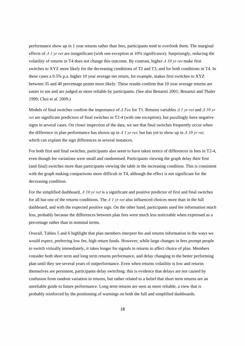
There are dramatic variations across the conditions of the experiment in the proportions of participants
who made a single switch. Table 4 Panel A reports the percentage of participants in each condition who
made one switch. For the full dashboard treatments (Columns 1-4), rates of single switching were above
75% for the fee condition, but fell to around 21% when differences between plans showed up in returns
rather than fees. The rate of single switches improved when low volatility returns were shown (T4), but
was still less than 40% of participants. By contrast, participants were more decided in their choices in the
simplified dashboard treatments (Columns 5-7) where around two thirds of respondents made one switch,
regardless of whether differences between plans showed up in fees or returns.
The simplified dashboard helped more numerate participants to make a single switch. Table 4 Panel B
reports marginal effects from logit models’ estimations of the probability that a participant made a single
switch. The explanatory variables include demographics and financial literacy measures collected in the
remainder of the survey, as well as an indicator for the decreasing conditions. We find that participants
who answered an additional numeracy question correctly were between 6 and 11 percentage points more
likely to make single switches in the simplified dashboard (T5-7) and in the full dashboard fee treatment
(T1). However better numeracy did not seem to help in the full dashboard returns treatments (T2-4).
Studies of the relation between cognitive ability, financial literacy and investment choices have reached
apparently conflicted conclusions. Grinblatt et al. (2015) find that high IQ and financially literate
investors minimize fees, and Choi et al. (2010) find that more financially literate investors avoided higher
mutual fund fees. However, Wilcox (2003) and Müller and Weber (2010) show that financially savvy
investors tend to minimize up-front fees but not more obscure and costly expense ratios. Thus up-front fee
minimization is a goal of savvy investors, but figuring out expense ratios looks to be a much harder task.
Our results confirm the ability of numerate participants to minimize the nominal, up-front fees that were
important in the full dashboard fee treatment. But we show that simplifying the dashboard to common

16
annual percentage measures enabled numerate people to discern the dominant fund more clearly, in terms
of returns, though fees become slightly less influential.
The participants who were allocated to the decreasing conditions in T2-4 were around 24 percentage
points less likely to make a single switch than those in the increasing conditions. It thus looks like
participants found it more difficult to evaluate changing relative performance due to declining returns
than increasing returns. The indecision we observe here could be related to the same tendency that mutual
fund investors display in less readily withdrawing from poorly performing funds than moving to highly
performing funds (Sirri and Tufano 1998). Otherwise, demographics and financial capability measures
did not consistently and significantly explain the probability of a single switch.
b) Do they switch near the best point?
Participants switched closest to the optimal points in the fee treatments, but delayed switching well past
the optimal point in the returns conditions. When combined with switching back and forth, this delay
reduced final account balances. However no single piece of dashboard information on its own explains
switching patterns, which points to participants using several information items jointly to make their
decisions (Wilcox 2003; de Goeij et al. 2014).
The patterns of switches are reported in Table 5, with Panel A showing results for the full dashboard
treatments and Panel B for the simplified dashboard treatments. Table 5 reports the choice set at which
participants made their first and their final switches, and also separates out the choice patterns of single
switch participants. The dark grey shading highlights the optimal switching point in each treatment/
condition and the pale grey shading shows the choice sets where the 10 year average return information
was either equal between the funds or unequivocally higher (lower) for the alternative fund.
The majority of participants in the fee treatments chose to switch plans at, or immediately after, the
optimal point. People could compare and minimize the nominal dollar fee (consistent with Barber et al.,
2005), despite small random variations in the fees of the different plans between choice sets. However,
most participants delayed switching in the returns treatments. In the full dashboard returns treatments
(Treatments 2-3), the majority of switches were delayed by 3-6 sets after the optimal point. In the low
volatility Treatment 4, switches were still delayed by around 5 sets, with participants apparently waiting
until 10 year average net returns indicated that one plan was performing better than the other, thus
clustering switches around choice 15.
“Simplifying” the fee information by expressing it as a percentage of (a $50K) account balance rather
than in absolute dollars made the fees less salient. This is similar to the findings of Barber et al. (2005)

17
and Wilcox (2003) that investors were aware of, and learned to minimize, mutual fund front-end-load
fees, seen in dollars and paid up front, but failed to minimize more obscure on-going expense ratios.
When the dashboard was simplified (Panel B), in the fee T5 we also see more clustering of switches
around the 15th choice set, again pointing to the importance of the 10 year average return over the fee.
Participants paid less attention to the fee information as it became harder to evaluate. Then again, the fact
that most switches in T2-3 and T6 occur before the cells where the 10 year average net return show a
clearly dominant fund suggests that participants are not only relying on that information when making
their decisions, but also considering the 1 year returns.
c) What information explains choice of plan?
To investigate the way that participants use dashboard information items we estimate panel logit models
of switching patterns. Table 6 reports average marginal effects from models of first switches (Panel A)
and final switches (Panel B) for each of the treatments and conditions. The dependent variable in each
model equals one when the participant chooses XYZ (the left hand side plan) and zero when the
participant chooses the alternative plan.15 We define three information variables: Δ 1 yr ret is the
difference between 1 year net return to plan XYZ (on the left hand side of the dashboard) less the 1 year
net return to plan ABC or HIJ (on the right hand side). Similar definitions apply to the differences in the
10 year average net return (Δ 10 yr ret) and the difference in fees (Δ Fee). It follows that we expect
positive differences in returns (higher values of Δ 1 yr ret and Δ 10 yr ret) to increase the probability of
choosing XYZ and the reverse response for fees. In addition, in T4, half of the participants were shown
historical returns information in a table and half in a graph, so we include a binary indicator for the graph
condition (Graph), and interact this with the return and fee variables. We also include an indicator
variable for participants who switched only once (Single) in each model.16 We omitted Δ 1 yr ret and Δ 10
yr ret from the models for T1, and we omitted Δ Fee from the model for T6 (increasing) because of
collinearity.
Models of first switches show that the marginal effects of Δ Fee from the T1 models have the expected
negative sign: we estimate a 20 percentage point lower probability of choosing XYZ plan for fees $100
p.a. higher than the alternative. However results from T2-4 show that when similar differences in
15 For increasing conditions, for example, if a participant first switches from XYZ to HIJ at the 4th choice set, the dependent variable for first switch will be a vector where the first three elements are ones and the remaining 17 are zeros. If they then switch back and forth, finally choosing HIJ consistently from 15th choice set, the dependent variable for final switch will be a vector where the first 14 elements are ones and the remaining 6 are zeros. For decreasing conditions, the participants begin in the alternative plan ABC and switch to XYZ, generating vectors of zeros followed by ones. First and final switch vectors are identical for participants making single switches. 16 Standard errors are clustered by participant.
18
performance show up in 1 year returns rather than fees, participants tend to overlook them. The marginal
effects of Δ 1 yr ret are insignificant (with one exception at 10% significance). Surprisingly, reducing the
volatility of returns in T4 does not change this outcome. By contrast, higher Δ 10 yr ret make first
switches to XYZ more likely for the decreasing conditions of T2 and T3, and for both conditions in T4. In
these cases a 0.5% p.a. higher 10 year average net return, for example, makes first switches to XYZ
between 35 and 40 percentage points more likely. These results confirm that 10 year average returns are
easier to see and are judged as more reliable by participants. (See also Benartzi 2001; Benartzi and Thaler
1999; Choi et al. 2009.)
Models of final switches confirm the importance of Δ Fee for T1. Returns variables Δ 1 yr ret and Δ 10 yr
ret are significant predictors of final switches in T2-4 (with one exception), but puzzlingly have negative
signs in several cases. On closer inspection of the data, we see that final switches frequently occur when
the difference in plan performance has shown up in Δ 1 yr ret, but has yet to show up in Δ 10 yr ret,
which can explain the sign differences in several instances.
For both first and final switches, participants also seem to have taken notice of differences in fees in T2-4,
even though fee variations were small and randomised. Participants viewing the graph delay their first
(and final) switches more than participants viewing the table in the increasing condition. This is consistent
with the graph making comparisons more difficult in T4, although the effect is not significant for the
decreasing condition.
For the simplified dashboard, Δ 10 yr ret is a significant and positive predictor of first and final switches
for all but one of the returns conditions. The Δ 1 yr ret also influenced choices more than in the full
dashboard, and with the expected positive sign. On the other hand, participants used fee information much
less, probably because the differences between plan fees were much less noticeable when expressed as a
percentage rather than in nominal terms.
Overall, Tables 5 and 6 highlight that plan members interpret fee and returns information in the ways we
would expect, preferring low fee, high return funds. However, while large changes in fees prompt people
to switch virtually immediately, it takes longer for signals in returns to affect choice of plan. Members
consider both short term and long term returns performance, and delay changing to the better performing
plan until they see several years of outperformance. Even when returns volatility is low and returns
themselves are persistent, participants delay switching: this is evidence that delays are not caused by
confusion from random variation in returns, but rather related to a belief that short term returns are an
unreliable guide to future performance. Long term returns are seen as more reliable, a view that is
probably reinforced by the positioning of warnings on both the full and simplified dashboards.

19
d) What does it cost to choose wrongly?
Inefficient switching would be costly to plan members. To investigate the costs of choosing the wrong
plan, we compute the final account balance after 20 choices for each participant, assuming that they begin
with a $50K balance and do not contribute or withdraw any savings. (In the returns conditions, for
example, average final account balances are around $155K.) We also compute the final account balance
achieved by the optimal choice of plan and calculate the average percentage difference between
participants’ realized balances and the optimum. The last row in each panel of Table 5 reports the average
(per participant) percentage of final account balances that was lost due to inefficient switches. We also
test for equality of average percentage losses between the full and simplified dashboard conditions.
Average losses are lowest in the full dashboard fee conditions, at less than 0.30% of final account
balance. But losses are three or four times these percentages in the returns conditions using the full
dashboard, going as high as 1.3% of final account balance. In addition, a few rudimentary changes to the
format of the dashboard made a dramatic difference to losses. On one hand, losses in the fee treatment
rose by around 0.1%. On the other hand, participants viewing the simplified dashboard in all but one of
the returns conditions incurred losses that were around one third less than for the full dashboard
conditions, amounting to a difference up to 0.5% of their final account balance.
Concluding Remarks
Today’s consumers are being asked to make more financial decisions than ever and such decisions are
becoming increasingly complex. What’s more, making mistakes can bring severe consequences to their
current and future wellbeing (Campbell 2016). As a result, financial regulators have begun tightening the
rules around product disclosures, significantly condensing the crucial information that informs consumer
choices in an attempt to ease the comparisons between competing products. But such short, standardized
product disclosures can have unforeseen effects on consumer decisions. For instance, consumers can
ignore the information provided or worse still, misuse it and end up with worse financial outcomes.
This study provides a detailed and systematic comparison of the influence on choice of a full set of
standardized retirement plan characteristics. Our experimental results provide three key contributions to
advancing understanding about how best to communicate plan information to consumers.
The first one is related to how people react to the returns and fees information: For instance, plan
members rate long term average net returns as the most reliable information item for plan comparisons.
They respond fairly immediately to out-performance that shows up in nominal fee differences. However,
they do not react immediately to out-performance in 1 year net-of-fees returns, but reserve their

20
judgement until performance differences show up in long-term average returns. One possible reason for
this delay could be related to “volatility aversion”, but even when the returns volatility is low, members
do not seem to be responding as quickly to out-performance in the 1 year net-of-fees returns as they do to
differences in nominal fees. It follows that plans that have changed investment strategy or reduced their
costs in ways that they expect will improve future returns performance relative to past average
performance will need to communicate that well to convince potential members of the advantages of
switching.
Regulators wanting to simplify disclosures, on the other hand, should find out what information items are
used, and how they are used, before they settle on simplifications. Techniques that might be expected to
improve comprehension can be ineffective. For example, the performance graph in the full MySuper
dashboard was no more effective than a table of numbers, and was largely ignored by participants
(probably because it was complicated). By contrast, reducing the information items on the dashboard and
presenting them in a way that facilitated integration and comparison enabled better choices in the returns-
changing treatments and consequently led to higher account balances.
But standardization goes only part of the way towards making comparison easier. The MySuper
dashboard ensures that plans report the same set of information calculated in the same standard way, but
does not allow the comparable information of two plans to be presented simultaneously (on the same
page). Although we provided this type of comparison to the participants in our study, such a method of
presentation still has limitations. Because the information is presented by “alternatives” rather than by
“attributes”, it encourages members to collect all the information about one plan and then the other, rather
than facilitating direct comparisons. Such ‘alternative-wise’ search and comparison strategies are known
to take longer to execute (Payne et al. 1993) and are argued to be more cognitively taxing than ‘attribute-
wise’ strategies (Russo and Dosher 1983). Perhaps a “smart” interactive disclosure where members could
populate a single table with attribute(s) data from two or three plans at once would emphasize differences
and facilitate choice. Recent research examining the communication of risk in portfolio choice highlights
the significant potential of such interactive tools (Goldstein et al. 2008).
Future research into these better methods for comparing and contrasting plans could also benefit from
information about how consumers use existing comparison sites and on the way consumers have been
using the MySuper Dashboard since its introduction. These data might also shed light on how consumers
view the cost – in terms of the administrative burden – of switching plans; an aspect that was not captured
in our experimental environment.

21
Last but not least, our results support previous views that testing via focus groups and in-depth interviews
is insufficient when it comes to informing product design and policy in general (Gillis 2015). Focus
groups are usually made up of a very small number of people who voluntarily participate, and one cannot
assume that their views and perceptions represent those of the general population. In-depth interviews, on
the other hand, depend greatly on (and can be easily biased by) the interviewers, who act more as
moderators than external parties. Hence, our systematic experimental testing also reveals the importance
of going beyond such methods for drawing conclusions about the comprehension, use and effectiveness
of product disclosures.

22
References
Agnew, J., H. Bateman, and S. Thorp. 2013. Financial literacy and retirement planning in Australia. Numeracy. 6: Article 7.
APRA 2015. Reporting Standard SRS 700.0 Product Dashboard, https://www.comlaw.gov.au/Details/F2015L01008
Australian Securities and Investment Commission (ASIC). 2013. Report 378, Consumer testing of the MySuper product dashboard, December 2013.
Australian Securities and Investment Commission (ASIC). 2014. Information Sheet 170: MySuper product dashboard requirements for superannuation trustees, November 2013 (reissued in August 2014).
Australian Securities and Investment Commission (ASIC). 2015. Report 455: Consumer testing of the Choice product dashboard, December 2015.
Australian Government. 2015. Product Dashboard Comparison Metric, Consultation Paper, December 2015.
Ayton, P., & Fischer, I. 2004. The hot hand fallacy and the gambler’s fallacy: Two faces of subjective randomness? Memory & Cognition. 32: 1369-1378.
Barber, B. M., T. Odean and L. Zheng. 2006. Out of sight, out of mind: The effects of expenses on mutual fund flows. Journal of Business. 78(6): 2095-2119.
Bateman, H., L.I. Dobrescu, B.R. Newell, A. Ortmann, and S. Thorp. 2016a. As easy as pie: How retirement savers use prescribed investment disclosures. Journal of Economic Behavior & Organization. 121: 60-76.
Bateman, H., C. Eckert, J. Geweke, J. Louviere, S. Satchell, and S. Thorp. 2016b. Risk presentation and portfolio choice. Review of Finance. 20: 201-229.
Bateman, H., J. Deetlefs, L.I. Dobrescu, B.R. Newell, A. Ortmann, and S. Thorp. 2014. Just interested or getting involved: An analysis of superannuation attitudes and actions. Economic Record. 90: 160-178.
Benartzi, S. 2001. Excessive extrapolation and the allocation of 401 (k) accounts to company stock. The Journal of Finance. 56: 1747-1764.
Benartzi, S., and R.H. Thaler. 1999. Risk aversion or myopia? Choices in repeated gambles and retirement investments. Management Science. 45: 364–381.
Beshears, J., J.J. Choi, D.Laibson, and B.C. Madrian. 2011. How does simplified disclosure affect individuals' mutual fund choices? In Explorations in the Economics of Aging, edited by D.A. Wise, 75–96. Chicago: University of Chicago Press.
Butt, A., M.S. Donald, F.D. Foster, S. Thorp and G. J. Warren. 2015. Design of MySuper default funds: influences and outcomes. Accounting and Finance. DOI: 10.1111/acfi.12134
Campbell, J.Y. 2016. Restoring rational choice: The challenge of consumer financial regulation, Ely Lecture delivered at the annual meeting of the American Economic Association, January 3, 2016.
Chant, W., M. Mohankumar and G. Warren. 2014. MySuper: A new landscape for default superannuation funds. Working Paper No. 020/2014. www.cifr.edu.au

23
Choi, J.J., D. Laibson, and B. Madrian. 2010. Why does the law of one price fail? An experiment on mutual index funds. Review of Financial Studies. 5(1): 1405-32.
Colaert, V. 2016. The Regulation of PRIIPs: Great ambitions, insurmountable challenges. Available at SSRN. http://papers.ssrn.com/sol3/papers.cfm?abstract_id=2721644
Commonwealth of Australia. 2013. Superannuation Legislation Amendment (MySuper Measures) Bill 2013, Explanatory Memorandum.
Consumer Financial Protection Bureau (CFPB). 2012. Know before you owe: Evolution of the integrated TILA-RESPA disclosures. http://files.consumerfinance.gov/f/201207_cfpb_report_tila-respa-testing.pdf
Cooper, J. 2010. Super System Review, Final Report – Part Two, Commonwealth of Australia.
de Goeij, P., T. Hogendoorn and G.V. Campenhout. 2014. Pictures are worth a thousand words: graphical information and investment decision making. Mimeo.
Del Guercio, D. and P. A. Tkac 2002. The determinants of the flow of funds of managed portfolios: Mutual funds vs. pension funds. Journal of Financial and Quantitative Analysis. 37: 523-557.
European Commission. EU (2009) UCITS Disclosure Testing Research Report, prepared for the European Commission by IFF Research and YouGov, June 200. http://ec.europa.eu/internal_market/investment/docs/other_docs/research_report_en.pdf
European Commission. 2012. Press Release, July 3 2012, Commission proposes legislation to improve consumer protection in financial services. http://europa.eu/rapid/press-release_IP-12-736_en.htm?locale¼en Financial Services Council (FSC) & Association of Superannuation Funds of Australia (ASFA). 2011. Standard risk measure, Guidance Paper for Trustees, July 2011.
Financial System Inquiry (FSI). 2014. Financial system inquiry: Final report. Commonwealth of Australia.
Gillis, T.B. 2015. Putting disclosure to the test: Toward better evidence-based policy. Available at. SSRN: http://ssrn.com/abstract=2638958 or http://dx.doi.org/10.2139/ssrn.2638958
Goldstein, D., E. Johnson and W Sharpe. 2008. Choosing outcomes versus choosing products: consumer-focussed retirement investment advice. Journal of Consumer Research, 35: 440-456.
Grinblatt, M., S. Ikäheimo, M. Keloharju and S. Knüpfer 2015. IQ and mutual fund choice. Management Science. Forthcoming.
Harries, C., & Harvey, N. 2000. Taking advice, using information and knowing what you are doing. Acta Psychologica. 104, 399– 416.
Jarvenpaa, S.L. 1990. Graphic displays in decision making – the visual salience effect. Behavioral Decision Making. 3(4): 247-62.
Kaufmann, C., M. Weber, and E.C. Haisley. 2013. The role of experience sampling and graphical displays on one's investment risk appetite. Management Science. 59(2), 323-340.
Khorana, A., H. Servaes and P. Tufano. 2008. Mutual fund fees around the world. The Review of Financial Studies. 22(3): 1279-1310.

24
Kozup, J., E. Howlett, and M. Pagano. 2008. The effects of summary information on consumer perceptions of mutual fund characteristics. The Journal of Consumer Affairs. 42(1): 37-59.
Loewenstein, G., C. R. Sunstein, and R. Golman, 2014. Disclosure: Psychology changes everything. Annual Review of Economics. 6: 391-419.
Lohse, G.L. 1997. The role of working memory on graphical information processing. Behaviour & Information Technology. 16: 297-308.
Minifie, J., T. Cameron and J. Savage. 2015. Super savings, Grattan Institute, Melbourne, VIC.
Müller, S. and M. Weber. 2010. Financial literacy and mutual fund investments: Who buys actively managed funds? Schmalenbach Business Review. 62:126-153.
Navarro-Martinez, D., L.C. Salisbury, K.N. Lemon, N. Stewart, W.J. Matthews, and A.J.L Harris. 2011. Minimum required payment and supplemental information disclosure effects on consumer debt repayment decisions. Journal of Marketing Research. 48 (Special Issue 2011): S60–S77.
Payne, J.W., J.R. Bettman and E.J. Johnson 1993. The adaptive decision maker. Cambridge University Press.
Russo, J.E and B.A. Dosher 1983. Strategies for multi-attribute binary choice. Journal of Experimental Psychology: Learning, Memory, and Cognition. 9(4): 676-96.
Salisbury, L.,C. 2014. Minimum payment warnings and information disclosure effects on consumer debt repayment decisions, Journal of Public Policy and Marketing. 33(1): 49-64.
Securities Exchange Commission (SEC), 2007, RIN 3235-AJ44 Enhanced disclosure and new prospectus delivery option for registered open-end management investment companies. Release Nos. 33-8998; IC-28584; File No. S7-28-07. Available at http://www.sec.gov/rules/final/2009/33-8998.pdf.
Sirri, E.R. and P. Tufano. 1998. Costly search and mutual fund flows. Journal of Finance. 53: 1589-1622.
Treasury. 2011. Regulation Impact Statement, Stronger Super Implementation, September 2011, Commonwealth of Australia.
Venti, S.F. 2011. Comment. Beshears, J., J.J. Choi, D.Laibson, and B.C. Madrian. 2011. How does simplified disclosure affect individuals' mutual fund choices? In Explorations in the Economics of Aging, edited by D.A. Wise, 75–96. Chicago: University of Chicago Press.
Vessey, I. 1991. Cognitive fit: A theory‐based analysis of the graphs versus tables literature. Decision Sciences. 22: 219-240.
Walther, T. 2015. Key investor documents and their consequences on investor behavior. Journal of Business Economics. 85: 129-156.
Wilcox, R.T. 2003. Bargain hunting or star gazing? How consumers choose mutual funds. Journal of Business. 76(4): 645-665.

25
Figure 1: Screenshot from Treatment 4

26
Table 1: Description of the properties in each treatment
Treatment
Number (n)
Date Dashboard Type Changing
Information
Returns
Volatility
Returns Display
Format
1 (286*) Jul 2014 Prescribed
(‘Full’)
Fees High Graph
2 (274) Sep 2014 Prescribed
(‘Full’)
Returns High Graph
3 (252) Feb 2015 Prescribed
(‘Full’)
Returns High Table
4 (247) Jun 2015 Prescribed
(‘Full’)
Returns Low Graph/Table
5 (251) Aug 2015 Simplified Fees High N/A
6 (250) Oct 2015 Simplified Returns High N/A
7 (258) Oct 2015 Simplified Returns Low N/A
* 138 Incentivized, 148 Non‐incentivized – all participants in remaining treatments were incentivized – see text for explanation of incentive implementation. Notes: Prescribed (Full) identifies the use in the treatment of the MySuper template described in Treasury (2011) and Commonwealth of Australia (2013), return target, returns, a comparison between the return target and the returns, the level of investment risk and a statement of fees and other costs, as explained in the text. Simplified identifies the use of radically simplified templates, for details see body of text. Variation in the volatility of returns was engineered by changing the relative allocation to growth and defensive assets. In Treatments T1‐3 and T5‐6 we mimicked the allocation of a typical Strategic Asset Allocation fund by including a weighted mix of growth and defensive assets, which gave us our high volatility treatments. In Treatments T4 and T7 only defensive assets were included, thus yielding a lower target return and low volatility realized returns.

27
Table 2: Information use reported by participants
Panel A: Full Dashboard %
What is the most useful piece of information? (Choose one)
10 year average return 62.3
Return target 8.7
Table 8.2
Graph 9.5
Level of investment risk 4.5
Fees and costs (Treatments 1‐4) 21.2
Fee condition (Treatment 1) 35.0
Returns conditions (Treatments 2‐4) 16.2
What pieces of information did you use most often? (Choose any that apply)
10 year average return 70.5
Return target 23.3
Table 15.4
Graph 16.8
Level of investment risk 21.1
Fees and costs 59.2
Fee condition (Treatment 1) 72.4
Returns conditions (Treatments 2‐4) 54.3
Panel B: Simplified Dashboard %
What is the most useful piece of information? (Choose one)
10 year average return 68.6
1 year return 10.5
Level of investment risk 9.2
Fees and costs 11.6
Fee condition (Treatment 5) 19.5
Returns conditions (Treatments 6‐7) 7.7
What pieces of information did you use most often? (Choose any that apply)
10 year average return 76.4
1 year return 28.7
Level of investment risk 21.3
Fees and costs 35.7
Fee condition (Treatment 5) 53.0
Returns conditions (Treatments 6‐7) 27.2
Notes: Table reports percentage of participants reporting use of full dashboard (Panel A) and simplified dashboard
(Panel B) information items. Total number of participants in Treatments 1‐4 is 1059; of which there were 286 in
Treatment 1 (fee condition with graph); 274 in Treatment 2 (returns condition with graph); 252 in Treatment three
(returns conditions with table not graph); 247 in Treatment 4 (low volatility returns condition with table or graph).
Total number of participants in Treatments 5‐7 is 759 of which there were 251 in Treatment 5 (fee condition); 250
in Treatment 6 (low noise returns condition); and 258 in Treatment 7 (high noise returns condition). Participants
were randomly assigned to either view increases or decreases in fees or returns over the 20 choices.

28
Table 3: Dashboard comprehension and financial literacy, full dashboard (Treatments 1‐4)
Panel A: Full Dashboard % correct answers
Increasing Decreasing Table
Graph High vol
Low vol
Treatments 1‐4
Relative fees and costs
fee treatment 70.7 57.6 64.3
return treatments 56.1 52.1 55.2 53.0 59.2
48.6
56.8
Relative returns
return treatments 49.1 48.2 53.6 43.9 45.1
56.3
48.6
Returns net of fees 43.9
Returns relative to target 54.5 38.4 46.0
Negative returns 47.5
Standard risk measure (5 yrs) 17.0
Standard risk measure (15 yrs) 13.2
Numeracy (3 Qs) 62.6
Financial Literacy (3 Qs) 72.6
Superannuation Literacy (12 Qs) 58.0
Panel B: Simplified dashboard % correct answers
Increasing Decreasing Hig Low Treatments
Relative fees and costs
fee treatment 47.3 46.7
return treatments 63.8 58.7 59. 63.
56.5
Relative returns
return treatments 76.0 73.3 77. 71. 73.9
Returns net of fees 61.7
Simplified risk measure (5 yrs) 19.1
Simplified risk measure (15 yrs) 22.3
Numeracy (3 Qs) 61.2
Financial Literacy (3 Qs) 70.3
Superannuation Literacy (12 Qs) 56.2
Notes: Table reports percentage of participants correctly answering comprehension questions on full dashboard,
numeracy, financial literacy and superannuation literacy questions. Questions are reproduced in Appendix C. Total
number of participants in Treatments 1‐4 is 1059; of which there were 286 in Treatment 1 (fee condition with
graph); 274 in Treatment 2 (returns condition with graph); 252 in Treatment 3 (returns conditions with table not
graph); 247 in Treatment 4 (low volatility returns condition with table or graph). Total number of participants in

29
Treatments 5‐7 is 759 of which there were 251 in Treatment 5 (fee condition); 250 in Treatment 6 (low noise
returns condition); and 258 in Treatment 7 (high noise returns condition).
30
Table 4. Rates of single interior switching: counts and logit estimation
Full Dashboard Simplified Dashboard
Treatment
1 Treatment
2 Treatment
3 Treatment
4 Treatment
5 Treatment
6 Treatment
7
Panel A: Single switching Fee Return (Graph)
Returns(Table)
Returns(Low Vol)
Fee Returns Returns
(Low Vol)
Single switchers (count) 218 58 89 98 178 177 165
Single switchers (%) 76.2 21.2 35.3 39.7 70.9 70.8 64.0
Panel B: Marginal effects from logit estimations (Dependent variable: single interior switch = 1, 0 otherwise)
Decreasing condition 0.023 ‐0.274 ‐0.244 ‐0.334 ‐0.021 0.041 ‐0.099
(0.044) (0.044) (0.058) (0.055) (0.053) (0.049) (0.055)
Female 0.147 ‐0.003 0.078 ‐0.072 0.067 0.062 0.115
(0.051) (0.047) (0.064) (0.065) (0.058) (0.053) (0.057)
Age 40‐59 yrs 0.018 0.066 ‐0.051 0.024 0.068 ‐0.014 0.133
(0.051) (0.050) (0.064) (0.064) (0.068) (0.058) (0.064)
Age 60+ yrs 0.097 0.231 ‐0.082 0.072 0.223 0.135 0.124
(0.081) (0.107) (0.118) (0.099) (0.092) (0.069) (0.103)
High School Graduate 0.097 0.078 0.073 ‐0.009 ‐0.014 ‐0.042 0.070
(0.070) (0.055) (0.088) (0.076) (0.067) (0.059) (0.074)
College diploma/degree ‐0.102 ‐0.002 ‐0.094 ‐0.018 0.004 ‐0.015 ‐0.077
(0.050) (0.050) (0.058) (0.064) (0.058) (0.053) (0.061)
Employed ‐0.048 ‐0.033 0.204 0.089 0.026 ‐0.094 ‐0.115
(0.063) (0.090) (0.091) (0.108) (0.081) (0.082) (0.081)
Retired 0.055 ‐0.189 0.509 0.083 ‐0.244 ‐0.168 ‐0.019
(0.105) (0.088) (0.160) (0.139) (0.139) (0.156) (0.117)
Married/de facto ‐0.019 0.024 ‐0.047 0.151 ‐0.038 ‐0.110 ‐0.005
(0.058) (0.067) (0.084) (0.075) (0.065) (0.065) (0.070)
Financial decision maker ‐0.022 0.049 ‐0.005 0.033 0.029 ‐0.055 ‐0.082
(0.054) (0.049) (0.067) (0.067) (0.057) (0.055) (0.059)
No dependents ‐0.027 ‐0.021 ‐0.025 0.101 ‐0.022 ‐0.011 0.138
(0.060) (0.059) (0.072) (0.068) (0.067) (0.068) (0.064)
Weekly inc. ($1‐$399) ‐0.005 0.171 0.176 ‐0.169 0.057 ‐0.103 ‐0.414
(0.098) (0.132) (0.142) (0.170) (0.161) (0.153) (0.118)
Weekly inc. ($400‐$999) ‐0.045 0.089 0.084 ‐0.118 ‐0.044 ‐0.102 ‐0.111
(0.098) (0.128) (0.161) (0.167) (0.180) (0.162) (0.111)
Weekly inc. ($1000+) 0.061 0.082 0.122 ‐0.192 0.045 0.022 ‐0.139
(0.102) (0.136) (0.170) (0.165) (0.181) (0.165) (0.123)
Retirement balance (ln$) ‐0.010 ‐0.019 0.010 0.001 0.005 ‐0.007 ‐0.014
(0.012) (0.010) (0.010) (0.013) (0.011) (0.010) (0.014)
Comprehension 0.023 ‐0.002 0.024 0.085 ‐0.014 0.016 0.010
(0.019) (0.035) (0.046) (0.043) (0.049) (0.044) (0.052)
Financial literacy 0.097 0.044 0.008 0.038 0.005 0.060 0.051
(0.025) (0.037) (0.042) (0.048) (0.034) (0.028) (0.043)
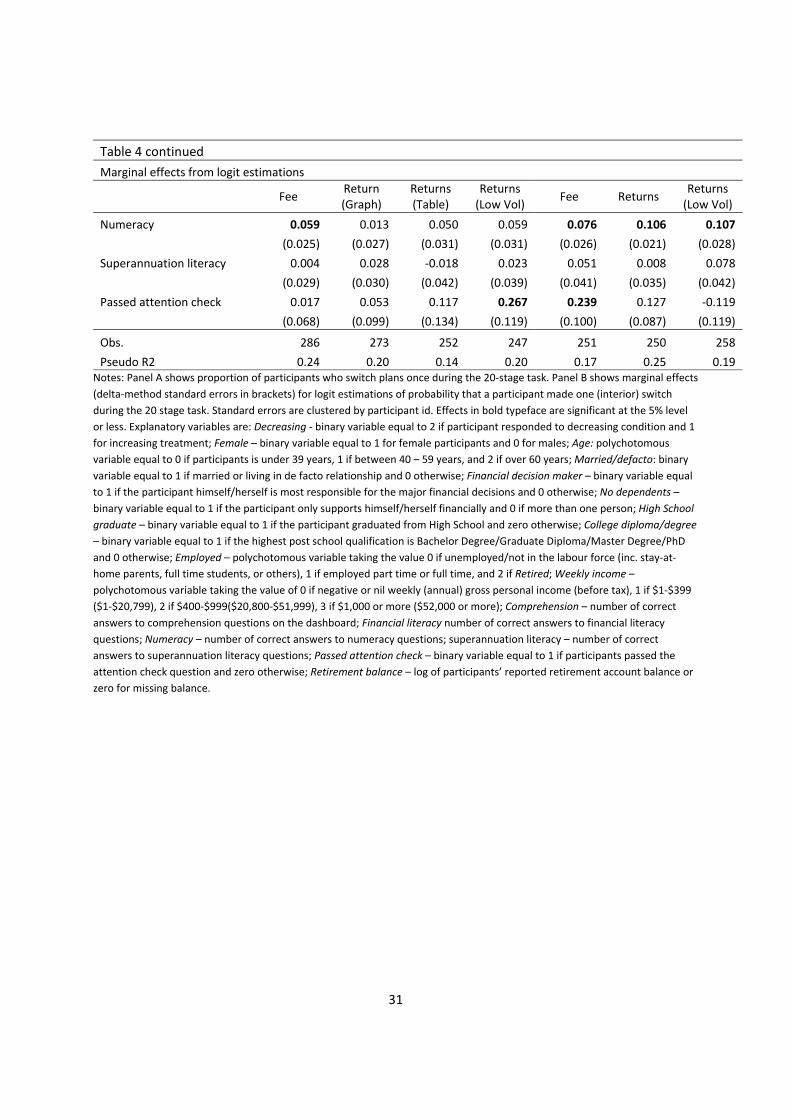
31
Table 4 continued
Marginal effects from logit estimations
Fee
Return (Graph)
Returns(Table)
Returns(Low Vol)
Fee Returns Returns(Low Vol)
Numeracy 0.059 0.013 0.050 0.059 0.076 0.106 0.107
(0.025) (0.027) (0.031) (0.031) (0.026) (0.021) (0.028)
Superannuation literacy 0.004 0.028 ‐0.018 0.023 0.051 0.008 0.078
(0.029) (0.030) (0.042) (0.039) (0.041) (0.035) (0.042)
Passed attention check 0.017 0.053 0.117 0.267 0.239 0.127 ‐0.119
(0.068) (0.099) (0.134) (0.119) (0.100) (0.087) (0.119)
Obs. 286 273 252 247 251 250 258
Pseudo R2 0.24 0.20 0.14 0.20 0.17 0.25 0.19 Notes: Panel A shows proportion of participants who switch plans once during the 20‐stage task. Panel B shows marginal effects
(delta‐method standard errors in brackets) for logit estimations of probability that a participant made one (interior) switch
during the 20 stage task. Standard errors are clustered by participant id. Effects in bold typeface are significant at the 5% level
or less. Explanatory variables are: Decreasing ‐ binary variable equal to 2 if participant responded to decreasing condition and 1
for increasing treatment; Female – binary variable equal to 1 for female participants and 0 for males; Age: polychotomous
variable equal to 0 if participants is under 39 years, 1 if between 40 – 59 years, and 2 if over 60 years; Married/defacto: binary
variable equal to 1 if married or living in de facto relationship and 0 otherwise; Financial decision maker – binary variable equal
to 1 if the participant himself/herself is most responsible for the major financial decisions and 0 otherwise; No dependents –
binary variable equal to 1 if the participant only supports himself/herself financially and 0 if more than one person; High School
graduate – binary variable equal to 1 if the participant graduated from High School and zero otherwise; College diploma/degree
– binary variable equal to 1 if the highest post school qualification is Bachelor Degree/Graduate Diploma/Master Degree/PhD
and 0 otherwise; Employed – polychotomous variable taking the value 0 if unemployed/not in the labour force (inc. stay‐at‐
home parents, full time students, or others), 1 if employed part time or full time, and 2 if Retired; Weekly income –
polychotomous variable taking the value of 0 if negative or nil weekly (annual) gross personal income (before tax), 1 if $1‐$399
($1‐$20,799), 2 if $400‐$999($20,800‐$51,999), 3 if $1,000 or more ($52,000 or more); Comprehension – number of correct
answers to comprehension questions on the dashboard; Financial literacy number of correct answers to financial literacy
questions; Numeracy – number of correct answers to numeracy questions; superannuation literacy – number of correct
answers to superannuation literacy questions; Passed attention check – binary variable equal to 1 if participants passed the
attention check question and zero otherwise; Retirement balance – log of participants’ reported retirement account balance or
zero for missing balance.
32
Table 5: Numbers of participants switching at each choice set. Panel A: full dashboard
Fee (Treatment 1) Returns/Graph (Treatment2) Returns/Table (Treatment3) Returns/Low vol (Treatment4)
Single First Final Single First Final Single First Final Single First Final
I D I D I D I D I D I D I D I D I D I D I D I D
Set
2 5 6 1 8 12 2 1 1 5 7 5 1 2 5 7 1
3 3 2 3 3 7 6 7 5 4 1
4 1 2 2 2 2 11 2
5 2 2 1 3 1 2 2 2 4
6 2 3 2 1 1 1 2 4
7 1 2 2 5 1 1 4 1
8 2 2 1 2 1 1 3 2
9 2 3 3 3
10 1 7 2 7 1 10 4 1
11 2 52 3 56 4 56 3 1 7
12 29 17 32 21 30 18 1 2 2 2 1 2
13 34 21 34 21 37 25 5 6 2 5 1 6 2 1 3 3 3
14 19 6 19 6 23 14 56 1 2 2 45 2 7 22 10 15 40 16 6
15 16 10 16 12 19 10 4 12 9 29 4 46 5 49 5 16 4 8 3 12 6
16 1 1 3 3 37 51 51 1 11 1 14 1 14 5 80 12 45 9 44 40
17 1 1 3 3 3 8 4 12 6 81 4 14 4 15 5 47 10 10 5 5 8 32
18 2 3 2 2 1 9 6 7 7 8 4 6 4 5 2 8 7
19 5 4 1 2 1 4 36 34 3 4 3 5 8 34 4 8 2 4 9 14
20 4 19 4 3 2 3 2 10 10 2 1 14 5
% Loss I: ‐0.26** D: ‐0.29* I: ‐0.98 D: ‐1.20 I: ‐0.82 D: ‐1.30 I: ‐0.78 D: ‐0.95

33
Table 5 continued. Panel B: simplified dashboard
Fee (Treatment 5) Returns; (Treatment6) Returns; Low vol (Treatment7)
Single First Final Single First Final Single First Final
I D I D I D I D I D I D I D I D I D
Set
2 7 3 4 3 9 4
3 1 1 2 6 3 3
4 2 4 4 7 1
5 1 1 3 1
6 2 3 4 1 2
7 1 1 2 1 1
8 1 1
9 1 1 1 1
10 1 4 3 1 1 1 1 1 11 1 1
11 1 2 2 1 1 2 6 5 9 1
12 29 13 36 15 35 13 1 9 12 12
13 16 44 17 52 18 47 6 6 9 6 9 7 1 14 5 14 2 26
14 13 9 13 11 17 9 1 70 10 71 11 76 56 59 2 72
15 18 24 18 24 23 38 60 2 62 3 68 8 10 5 11 5 15 9
16 1 1 1 1 3 5 6 6 8 4 49 2 49 2 62 7
17 1 1 1 1 4 2 1 8 1 8 5 12 12 2 12 2 15 3
18 2 2 2 2 6 5 3 1 3 1 7 4 1 1 7
19 2 5 4 2 3 4
20 3 1 1 1 8 5 2
% Loss I: ‐0.40 D: ‐0.45 I: ‐0.59*** D: ‐0.75*** I: ‐0.81 D: ‐0.49*** Notes: Table shows number of participants switching plans at each of 19 choice sets. We exclude suboptimal switches at the first set. “Single” column shows participants who
made one switch in 20 choices; “First” column shows first switching point for all participants who made one or more switches: “Final” column shows last switching point for all
participants who made one or more switches. “I” indicates conditions where the returns to alternative plan (HIJ) are increasing relative to constant plan (XYZ); “D” indicates
conditions where the alternative plan returns (ABC) are decreasing relative to constant plan (XYZ). Dark grey cells show optimal switching points. Pale grey cells show sets where
the 10 year average returns to HIJ (ABC) were equal to or higher (lower) than (XYZ). Maximum switches in Bold. Last row: average % of lost balance due to sub‐optimal switching
and t‐test for equality of means between full and simplified dashboard treatments. * p<0.1; **p<0.05; ***p<0.01.

34
Table 6: Marginal effects of information variables on plan switches
Panel A First switch
Δ1 yr ret Δ10 yr ret ΔFee Single Graph Ps. R2 Obs.
Full dashboard
Treatment 1 (FEE, GRAPH)
Increasing ‐0.002*** ‐0.024* 0.433 2780
0.000 0.070
Decreasing ‐0.002*** ‐0.156* 0.595 2940
0.000 0.049
Treatment 2 (RETURNS, GRAPH)
Increasing 0.515 0.318 0.002 0.058 0.232 2720
0.325 0.364 0.001 0.037
Decreasing 0.269 0.727*** ‐0.005*** ‐0.228*** 0.267 2760
0.245 0.283 0.001 0.034
Treatment 3 (RETURNS, TABLE)
Increasing 0.473* 0.440 ‐0.004* 0.055 0.287 2520
0.255 0.315 0.001 0.044
Decreasing 0.258 0.693** ‐0.004*** ‐0.149*** 0.261 2520
0.255 0.293 0.001 0.046
Treatment 4 (LOW VOLATILITY RETURNS, GRAPH or TABLE)
Increasing 0.187 0.751** ‐0.005*** 0.250*** ‐0.148*** 0.395 2460
0.293 0.331 0.001 0.044 0.042
Decreasing 0.193 0.805** 0.003*** ‐0.180*** 0.039 0.315 2480
0.280 0.318 0.001 0.047 0.047
Simplified Dashboard
Treatment 5 (FEE)
Increasing 0.505*** ‐0.556*** 0.073 0.395 2460
0.081 0.063 0.059
Decreasing ‐0.313*** ‐1.270*** ‐0.101* 0.518 2620
0.079 0.061 0.054
Treatment 6 (RETURNS)
Increasing 0.984*** ‐0.020 0.032 0.414 2460
0.041 0.046 0.062
Decreasing ‐0.019 1.189*** ‐1.843*** ‐0.215*** 0.481 2540
0.088 0.100 0.220 0.057
Treatment 7 (LOW VOLATILITY RETURNS)
Increasing ‐0.041 1.030*** ‐1.399*** 0.032*** 0.413 2460
0.068 0.086 0.095 0.055
Decreasing 2.551*** 6.094*** 1.678 ‐0.131 0.419 2700
0.451 0.622 1.266 0.400
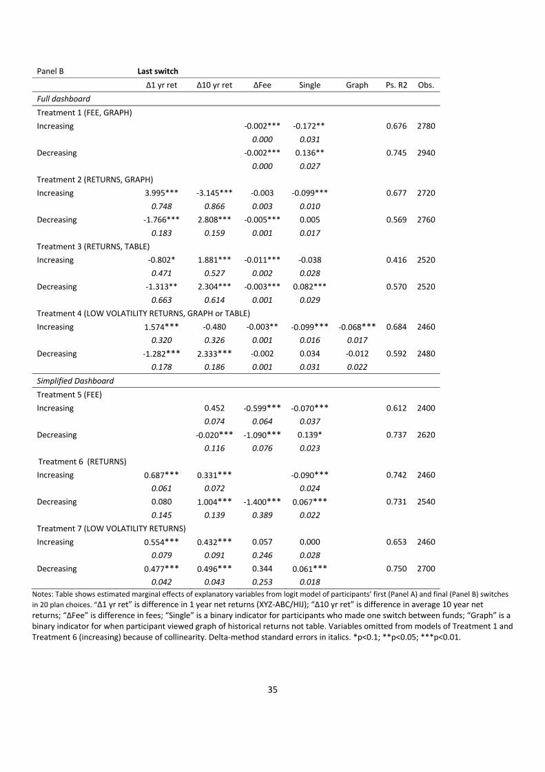
35
Panel B Last switch
Δ1 yr ret Δ10 yr ret ΔFee Single Graph Ps. R2 Obs.
Full dashboard
Treatment 1 (FEE, GRAPH)
Increasing ‐0.002*** ‐0.172** 0.676 2780
0.000 0.031
Decreasing ‐0.002*** 0.136** 0.745 2940
0.000 0.027
Treatment 2 (RETURNS, GRAPH)
Increasing 3.995*** ‐3.145*** ‐0.003 ‐0.099*** 0.677 2720
0.748 0.866 0.003 0.010
Decreasing ‐1.766*** 2.808*** ‐0.005*** 0.005 0.569 2760
0.183 0.159 0.001 0.017
Treatment 3 (RETURNS, TABLE)
Increasing ‐0.802* 1.881*** ‐0.011*** ‐0.038 0.416 2520
0.471 0.527 0.002 0.028
Decreasing ‐1.313** 2.304*** ‐0.003*** 0.082*** 0.570 2520
0.663 0.614 0.001 0.029
Treatment 4 (LOW VOLATILITY RETURNS, GRAPH or TABLE)
Increasing 1.574*** ‐0.480 ‐0.003** ‐0.099*** ‐0.068*** 0.684 2460
0.320 0.326 0.001 0.016 0.017
Decreasing ‐1.282*** 2.333*** ‐0.002 0.034 ‐0.012 0.592 2480
0.178 0.186 0.001 0.031 0.022
Simplified Dashboard
Treatment 5 (FEE)
Increasing 0.452 ‐0.599*** ‐0.070*** 0.612 2400
0.074 0.064 0.037
Decreasing ‐0.020*** ‐1.090*** 0.139* 0.737 2620
0.116 0.076 0.023
Treatment 6 (RETURNS)
Increasing 0.687*** 0.331*** ‐0.090*** 0.742 2460
0.061 0.072 0.024
Decreasing 0.080 1.004*** ‐1.400*** 0.067*** 0.731 2540
0.145 0.139 0.389 0.022
Treatment 7 (LOW VOLATILITY RETURNS)
Increasing 0.554*** 0.432*** 0.057 0.000 0.653 2460
0.079 0.091 0.246 0.028
Decreasing 0.477*** 0.496*** 0.344 0.061*** 0.750 2700
0.042 0.043 0.253 0.018 Notes: Table shows estimated marginal effects of explanatory variables from logit model of participants’ first (Panel A) and final (Panel B) switches
in 20 plan choices. “Δ1 yr ret” is difference in 1 year net returns (XYZ‐ABC/HIJ); “Δ10 yr ret” is difference in average 10 year net returns; “ΔFee” is difference in fees; “Single” is a binary indicator for participants who made one switch between funds; “Graph” is a binary indicator for when participant viewed graph of historical returns not table. Variables omitted from models of Treatment 1 and Treatment 6 (increasing) because of collinearity. Delta‐method standard errors in italics. *p<0.1; **p<0.05; ***p<0.01.
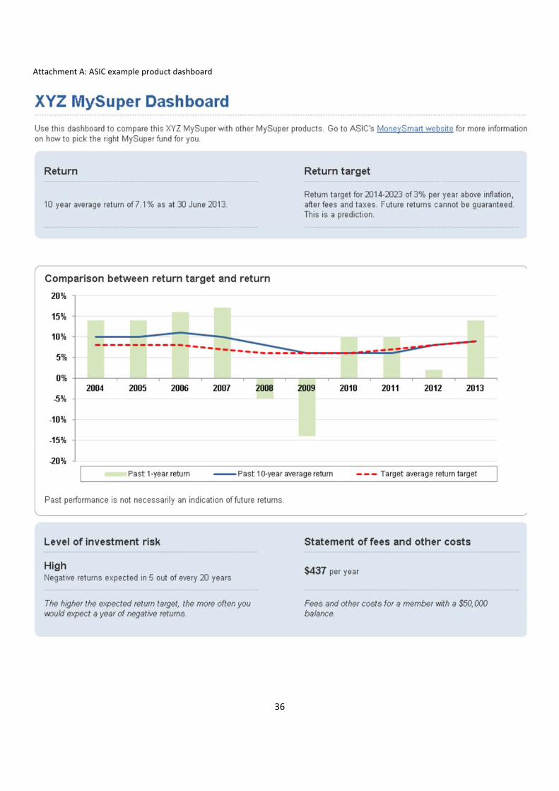
36
Attachment A: ASIC example product dashboard

Flicking the Switch: How Fee and Return Disclosures Drive Retirement Plan Choice
Appendix B: Screenshots of Treatment 1 survey; live links to all surveys; screenshots of choice tasks for all treatments; and screenshot of incentive page.


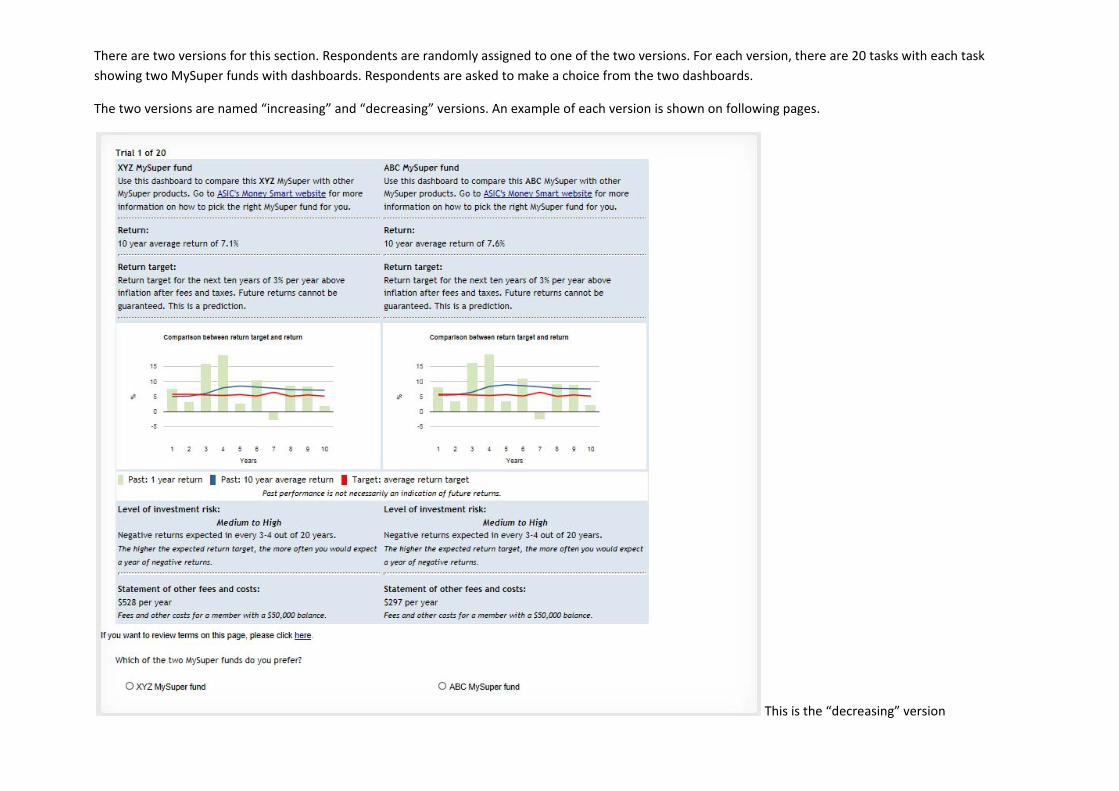
There are two versions for this section. Respondents are randomly assigned to one of the two versions. For each version, there are 20 tasks with each task
showing two MySuper funds with dashboards. Respondents are asked to make a choice from the two dashboards.
The two versions are named “increasing” and “decreasing” versions. An example of each version is shown on following pages.
This is the “decreasing” version

This is the “increasing” version

On each page, we show the following example to assist respondents in answering these questions.


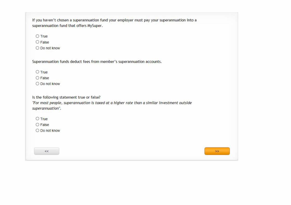
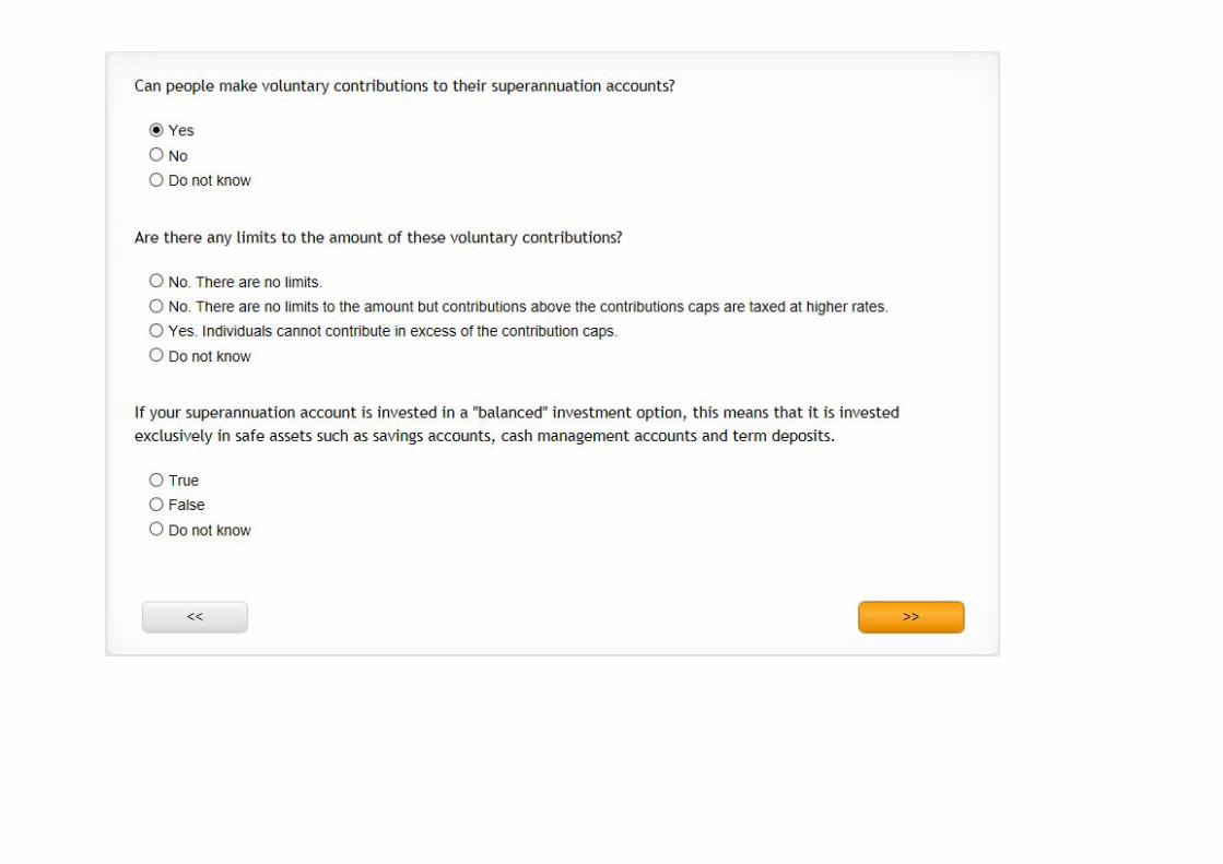

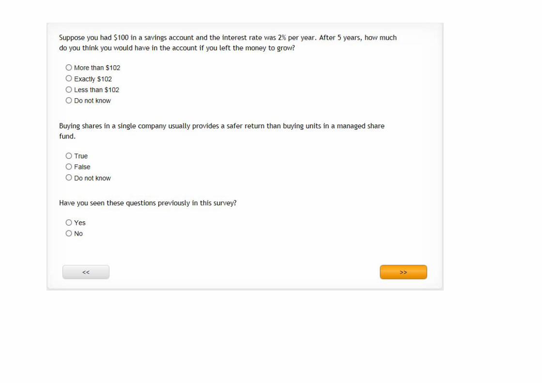


Links to complete surveys:
Treatment 1 (Incentive) – http://survey.confirmit.com/wix/p3069758398.aspx
Treatment 1 (Non‐incentivised) – http://survey.confirmit.com/wix/p3069758526.aspx
Treatment 2 (Incentive) – http://survey.confirmit.com/wix/p3070646490.aspx
Treatment 3 (Incentive) – http://survey.confirmit.com/wix/p3072417780.aspx
Treatment 4 (Incentive – Low volatility) – http://survey.confirmit.com/wix/p3074055240.aspx
Treatment 5 (Incentive) – http://survey.confirmit.com/wix/p3074907823.aspx
Treatment 6 (Incentive) – http://survey.confirmit.com/wix/p3076090311.aspx
Treatment 7 (Incentive – Low Volatility) – http://survey.confirmit.com/wix/p3076090642.aspx
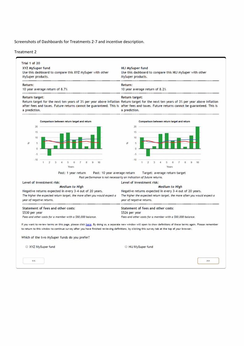
Screenshots of Dashboards for Treatments 2‐7 and incentive description.
Treatment 2
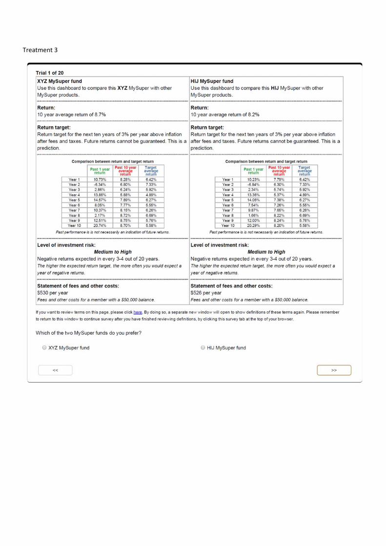
Treatment 3

Treatment 4
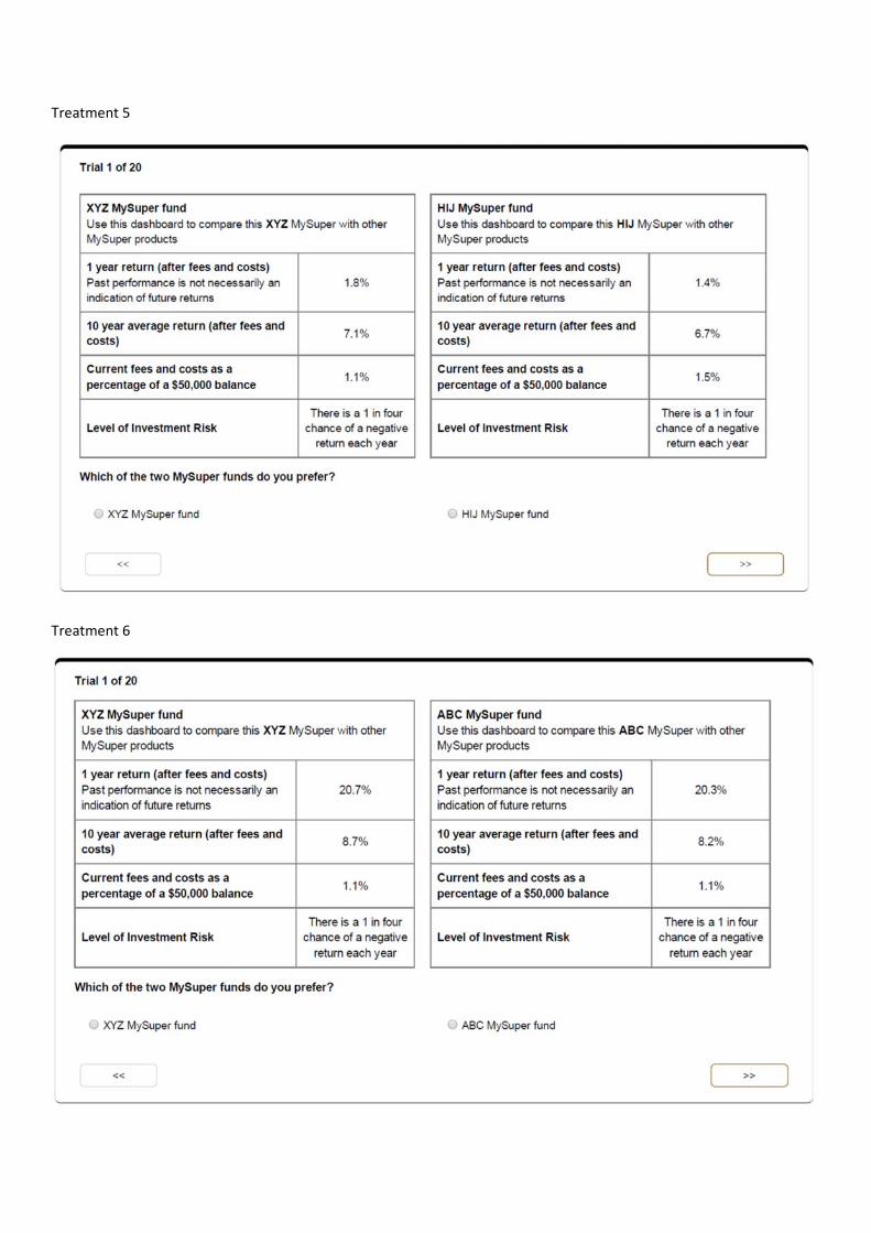
Treatment 5
Treatment 6

Treatment 7
Incentive page

1
Flicking the Switch: How Fee and Return Disclosures Drive Retirement Plan Choice.
Appendix C: Calculation of dashboard data
We calibrated the experiment to the most common (default) MySuper investment product, a Strategic
Asset Allocation fund. The average mix of assets in an SAA MySuper product is close to 70% growth and
30% defensive (Chant et al. 2014, Table 2). The weights we chose for six asset classes mimic the
allocation of a typical SAA default fund (T1‐3 and T5‐6). Growth assets consist of Australian and
international equities and property; defensive assets consist of Australian and international bonds and
Australian cash (Table D1). For the low volatility treatments (T4 and T7), only defensive Australian assets
are included.
We set the base fees for the constant fund (XYZ) at the average MySuper fee on a $50K account balance
of 1.06% p.a., or $530.00 (Chant et al. 2014, Table 5). At each choice set, we added random variation to
the fees by adding draws from a normal distribution with mean zero and standard deviation of 3.33 to
the base fee level. We calibrated the high starting fee level for T1 and T5 to $800 (increasing condition)
and the low fee level to $270 (decreasing condition) approximating observed variation in MySuper SAA
default fees.
Steps:
1. We computed 288 gross monthly portfolio returns , Σ , , 1 Σ where is
the weight allocated to asset class n and , is the gross monthly return to asset class n in
month t in Australian dollars.
2. From the 288 monthly portfolio returns we bootstrapped 31 x 12 months of portfolio returns
and the associated monthly changes in the CPI and computed annual gross nominal portfolio
returns as , Π , , where 1,… , 31. and compute the average 10 year gross nominal
return , Π ,/ . The 31 bootstraps give us 20 years of data for the choice set,
preceded by 10 years of “historical returns” used to calculate the 10 year average net return in
the first choice set and lines for the returns graph.
3. For the constant fund, we calculate the nominal 1 year return net of fees (1.06% of a $50K
balance) and 7% taxes on earnings as , 0.0106 0.93 1 where is the
random adjustment to the base fee described above. The 10 year average net return is ̅
Π 1 / 1. (We sum the return target plus the average CPI over the same 10
years as used to calculate ̅ to compute the blue line on the dashboard graph.)
4. For Treatments 1 and 5, difference in fees drive the differences in performance between the
constant and alternative funds. For the increasing condition in Treatment 1 (and 5), we follow
step 3, but starting with a fee level of $800/$50000 or 1.6%. At each choice set this fee
decreased by a randomly drawn dollar amount between $20‐$30, e.g. $775/$50000,
$751/$50000 etc. until it equals the fee for the constant fund (1.06%) and then decreases lower.
This decline in fees also means that the net returns of the alternative fund gradually increases

2
over the 20 choice sets. For the decreasing condition, the starting fee is $270/$50000 or 0.54%.
At each choice set this fee increases by a randomly drawn dollar amount between $20‐$30, e.g.
$300/$50000, $326/$50000 etc., until it equals and exceeds the constant fund fee. This increase
in fees also ensures a gradual decline in the net returns of the alternative fund over the 20
choice sets.
5. For Treatments 2, 3, 4, 6 and 7 difference in returns, not fees drive the differences in
performance between the constant and alternative funds. (This treatment mimics differences in
performance due to investment management such as asset or fund manager selection or market
timing). For the increasing and decreasing conditions in Treatment 2 (3, 4, 6, and 7) differences
in performance are evident in returns not fees. Fees for both the constant and alternative funds
are calculated as for the constant fund at step 3, that is, as 1.06% of a $50K balance with a small
random adjustment at each choice set. However the fee penalty (bonus) from step 4 is applied
to net returns of the alternative fund in the decreasing (increasing) condition. The high
(Treatments 2, 3, and 6) and low (Treatments 4, and 7) volatility settings are generated by
changes to asset allocation in the underlying portfolio. (Low volatility returns are computed
from bootstrapping historical returns to cash and fixed interest assets.)
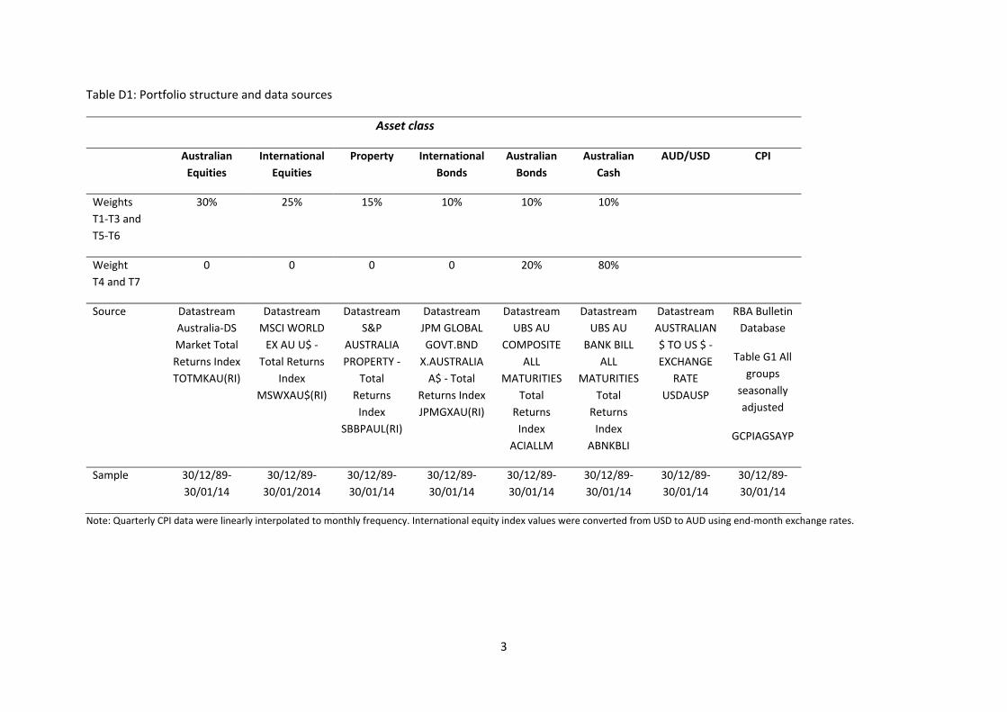
3
Table D1: Portfolio structure and data sources
Asset class
Australian
Equities
International
Equities
Property International
Bonds
Australian
Bonds
Australian
Cash
AUD/USD CPI
Weights
T1‐T3 and
T5‐T6
30% 25% 15% 10% 10% 10%
Weight
T4 and T7
0 0 0 0 20% 80%
Source
Datastream
Australia‐DS
Market Total
Returns Index
TOTMKAU(RI)
Datastream
MSCI WORLD
EX AU U$ ‐
Total Returns
Index
MSWXAU$(RI)
Datastream
S&P
AUSTRALIA
PROPERTY ‐
Total
Returns
Index
SBBPAUL(RI)
Datastream
JPM GLOBAL
GOVT.BND
X.AUSTRALIA
A$ ‐ Total
Returns Index
JPMGXAU(RI)
Datastream
UBS AU
COMPOSITE
ALL
MATURITIES
Total
Returns
Index
ACIALLM
Datastream
UBS AU
BANK BILL
ALL
MATURITIES
Total
Returns
Index
ABNKBLI
Datastream
AUSTRALIAN
$ TO US $ ‐
EXCHANGE
RATE
USDAUSP
RBA Bulletin
Database
Table G1 All
groups
seasonally
adjusted
GCPIAGSAYP
Sample 30/12/89‐
30/01/14
30/12/89‐
30/01/2014
30/12/89‐
30/01/14
30/12/89‐
30/01/14
30/12/89‐
30/01/14
30/12/89‐
30/01/14
30/12/89‐
30/01/14
30/12/89‐
30/01/14
Note: Quarterly CPI data were linearly interpolated to monthly frequency. International equity index values were converted from USD to AUD using end‐month exchange rates.
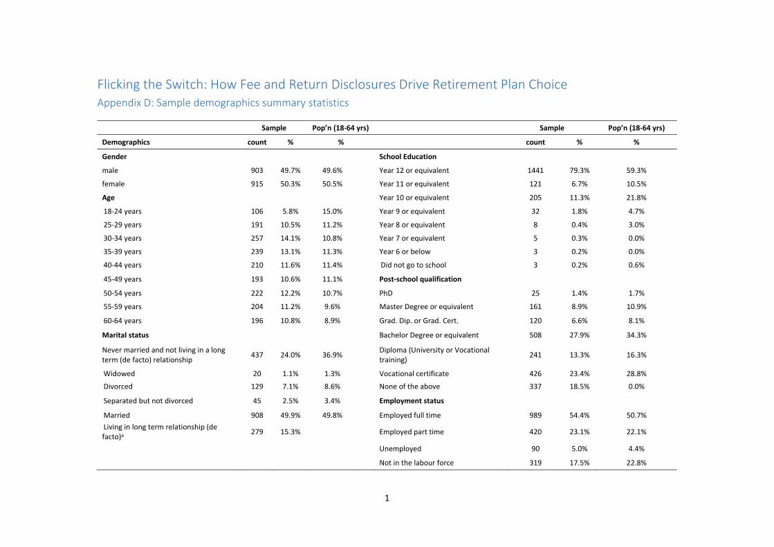
1
Flicking the Switch: How Fee and Return Disclosures Drive Retirement Plan Choice Appendix D: Sample demographics summary statistics
Sample Pop’n (18‐64 yrs) Sample Pop’n (18‐64 yrs)
Demographics count % % count % %
Gender School Education
male 903 49.7% 49.6% Year 12 or equivalent 1441 79.3% 59.3%
female 915 50.3% 50.5% Year 11 or equivalent 121 6.7% 10.5%
Age Year 10 or equivalent 205 11.3% 21.8%
18‐24 years 106 5.8% 15.0% Year 9 or equivalent 32 1.8% 4.7%
25‐29 years 191 10.5% 11.2% Year 8 or equivalent 8 0.4% 3.0%
30‐34 years 257 14.1% 10.8% Year 7 or equivalent 5 0.3% 0.0%
35‐39 years 239 13.1% 11.3% Year 6 or below 3 0.2% 0.0%
40‐44 years 210 11.6% 11.4% Did not go to school 3 0.2% 0.6%
45‐49 years 193 10.6% 11.1% Post‐school qualification
50‐54 years 222 12.2% 10.7% PhD 25 1.4% 1.7%
55‐59 years 204 11.2% 9.6% Master Degree or equivalent 161 8.9% 10.9%
60‐64 years 196 10.8% 8.9% Grad. Dip. or Grad. Cert. 120 6.6% 8.1%
Marital status Bachelor Degree or equivalent 508 27.9% 34.3%
Never married and not living in a long term (de facto) relationship
437 24.0% 36.9% Diploma (University or Vocational training)
241 13.3% 16.3%
Widowed 20 1.1% 1.3% Vocational certificate 426 23.4% 28.8%
Divorced 129 7.1% 8.6% None of the above 337 18.5% 0.0%
Separated but not divorced 45 2.5% 3.4% Employment status
Married 908 49.9% 49.8% Employed full time 989 54.4% 50.7%
Living in long term relationship (de facto)a
279 15.3% Employed part time 420 23.1% 22.1%
Unemployed 90 5.0% 4.4%
Not in the labour force 319 17.5% 22.8%
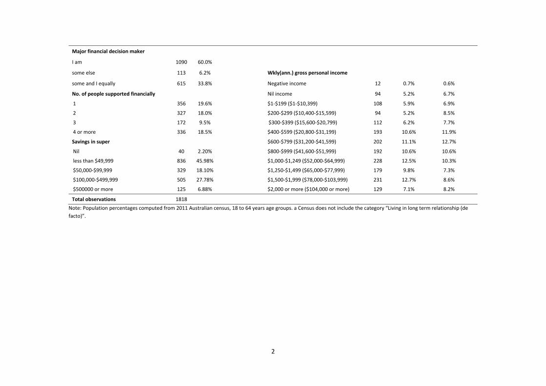
2
Major financial decision maker
I am 1090 60.0%
some else 113 6.2% Wkly(ann.) gross personal income
some and I equally 615 33.8% Negative income 12 0.7% 0.6%
No. of people supported financially Nil income 94 5.2% 6.7%
1 356 19.6% $1‐$199 ($1‐$10,399) 108 5.9% 6.9%
2 327 18.0% $200‐$299 ($10,400‐$15,599) 94 5.2% 8.5%
3 172 9.5% $300‐$399 ($15,600‐$20,799) 112 6.2% 7.7%
4 or more 336 18.5% $400‐$599 ($20,800‐$31,199) 193 10.6% 11.9%
Savings in super $600‐$799 ($31,200‐$41,599) 202 11.1% 12.7%
Nil 40 2.20% $800‐$999 ($41,600‐$51,999) 192 10.6% 10.6%
less than $49,999 836 45.98% $1,000‐$1,249 ($52,000‐$64,999) 228 12.5% 10.3%
$50,000‐$99,999 329 18.10% $1,250‐$1,499 ($65,000‐$77,999) 179 9.8% 7.3%
$100,000‐$499,999 505 27.78% $1,500‐$1,999 ($78,000‐$103,999) 231 12.7% 8.6%
$500000 or more 125 6.88% $2,000 or more ($104,000 or more) 129 7.1% 8.2%
Total observations 1818
Note: Population percentages computed from 2011 Australian census, 18 to 64 years age groups. a Census does not include the category “Living in long term relationship (de
facto)”.

1
Flicking the Switch: How Fee and Return Disclosures Drive Retirement Plan Choice
Appendix E: Dashboard comprehension and financial literacy questions
Dashboard comprehension
Correct answers in italics
C1. What do you think is the most useful piece of information for comparing funds? (Choose only one) a.
10 year average return; b. Return target; c. Graph; d. Level of investment risk; e. Fees and costs
C2. Which piece(s) of information did you most often use when choosing a fund? (Choose any that
apply.) a. 10 year average return; b. Return target; c. Graph; d. Level of investment risk; e. Fees and
costs.
C3. (Treatments 1, 2 and graph condition in Treatment 4) On the graph, if the red line is ABOVE the blue
line, this means: a. That on average, the fund has returned more than the target return over the past; b.
That on average, the fund has not kept up with inflation over the past 10 years; c. That on average, the
fund has returned more than other funds over the past 10 years; d. That on average, the fund has
returned less than the target return over the past 10 years.
C3b (Treatment 3 and table condition in Treatment 4) In the table, if the 10 year average return is
HIGHER THAN the target average return, this means: a. That on average, the fund has returned more
than the target return over the past; b. That on average, the fund has not kept up with inflation over the
past 10 years; c. That on average, the fund has returned more than other funds over the past 10 years;
d. That on average, the fund has returned less than the target return over the past 10 years.
C4. (Treatments 1, 2 and graph condition in Treatment 4) If the fund loses money one year, for that year,
the graph always shows: a. The blue line below the red line; b. The red line below the blue line; c. The
green bar below the horizontal axis; d. The green bar lower than last year's green bar.
C4b (Treatment 3, and table condition in Treatment 4) If the fund loses money one year, for that year,
the table always shows: a. The target average return below the 10 year average return; b. The 10 year
average return below the target average return; c. The 1 year return below 0%; d. The 1 year return
lower than last year's 1 year return.
C5. (Treatments 1‐4) The level of investment risk for this fund is "negative returns expected every 3‐4
out of 20 years". If the first 5 years in the graph (table) showed four (4) negative returns, how many
negative returns would you expect to see in the NEXT 5 years of the graph? a. 0; b. 1; c. 2; d. Answers a,
b and c are all equally likely.

2
C5b. (Treatments 5‐7) The level of investment risk for this fund is a "1 in four chance of a negative return
each year". If the first 5 years showed four (4) negative returns, how many negative returns would you
expect to see in the NEXT 5 years? ? a. 0; b. 1; c. 2; d. Answers a, b and c are all equally likely.
C6. (Treatments 1‐4) The level of investment risk for this fund is "negative returns expected every 3‐4
out of 20 years". If the first 5 years in the graph (table) showed four (4) negative returns, how many
negative returns would you expect to see in the NEXT 15 years of the graph? a. 0; b. 2; c. 3; d. Answers a,
b and c are all equally likely.
C6b. (Treatments 5‐7) The level of investment risk for this fund is a "1 in four chance of a negative return
each year". If the first 5 years showed four (4) negative returns, how many negative returns would you
expect to see in the NEXT 15 years? a. 0; b. 2; c. 3; d. Answers a, b and c are all equally likely.
C7. In the previous part of the survey when you compared the two funds, what did you notice about
fees and costs? a. I didn't notice the fees and costs; b. The fees for one fund mainly went up while the
other stayed about the same c. The fees for one fund mainly went down while the other stayed about
the same; d. The fees for both funds stayed about the same. (Correct answer varied by Treatment and
condition.)
C7b. (Treatments 2‐7) In the previous part of the survey when you compared the two funds, what did
you notice about returns? a. I didn't notice the returns; b. The returns for one fund started lower but
then rose higher compared with the other fund; c. The returns for both funds were about the same.
C8. The returns information on the table (returns and target returns): a. Have fees and costs still
included; b. Have fees and costs deducted; c. Have fees deducted but administration costs included.
Financial Literacy
FL 1. Suppose you had $100 in a savings account and the interest rate was 2% per year. After 5 years,
how much do you think you would have in the account if you left the money to grow? a. More than
$102; b. Exactly $102; c. Less than $102; d. Do not know.
FL 2. Imagine that the interest rate on your savings account was 1% per year and inflation was 2% per
year. After 1 year, how much would you be able to buy with the money in this account? a. More than
today; b. Exactly the same; c. Less than today; d. Do not know.
FL 3. Buying shares in a single company usually provides a safer return than buying units in a managed
share fund. a. True; b. False; c. Do not know
Numeracy
N1 Imagine that we rolled a fair, six‐sided die 1,000 times. Out of 1,000 rolls, how many times do you
think the die would come up even? 500
N2 In a lottery, the chance of winning a $500 prize is 1%. What is your best guess of how many people
would win the prize if 1,000 people each buy a single ticket in the lottery? 10

3
N3 In a raffle, the chance of winning a car is 1 in 1,000. What per cent of tickets in the raffle win a car?
0.1
Superannuation (retirement plan) literacy
S1 Employers are required to pay superannuation contributions into the superannuation accounts of
most of their employees. Is there a mandatory minimum employer contribution rate? a. Yes; b. No; c. Do
not know.
S2 What % of an employee's salary is an employer currently required to contribute to superannuation?
S3 If you haven’t chosen a superannuation fund your employer must pay your superannuation into a
superannuation fund that offers MySuper. a. True; b. False; c. Do not know.
S4 Superannuation funds deduct fees from members' superannuation accounts. a. True; b. False; c. Do
not know.
S5 Is the following statement true or false? "For most people, superannuation is taxed at a higher rate
than a similar investment outside superannuation". a. True; b. False; c. Do not know.
S6 Can people make voluntary contributions to their superannuation accounts? a. Yes; b. No; c. Do not
know.
S7 Are there any limits to the amount of these voluntary contributions? a. Yes; b. No; c. Do not know.
S8 If your superannuation account is invested in a "balanced" investment option, this means that it is
invested exclusively in safe assets such as savings accounts, cash management accounts and term
deposits. a. True; b. False; c. Do not know.
S9 You are allowed to borrow from your superannuation account. a. True; b. False; c. Do not know.
S10 If you have any superannuation, you will not qualify for the Age Pension. a. True; b. False; c. Do not
know.
S11 Do you know the minimum age at which you can spend the money in your superannuation account?
a. Yes; b. No; c. Do not know.
S12 The minimum age at which I can spend money in my superannuation account is: (Open question).
The correct answer depends on participant age and varies between 55 and 60 years.