Film poster review comparison
9
Film Poster Review Comparison By Adam Burton
-
Upload
adam-burton -
Category
Education
-
view
166 -
download
0
Transcript of Film poster review comparison
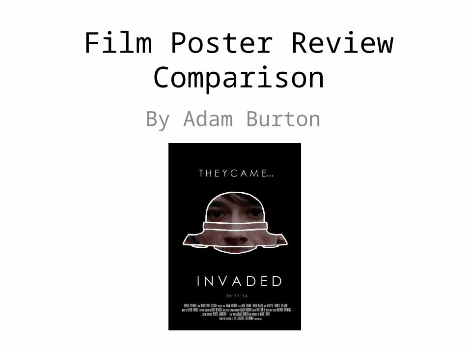
Film Poster Review Comparison
By Adam Burton

The Teaser poster• Despite the film poster being a specific type of advertisement,
there numerous types which all hold different conventions and visual codes. After deciding on the teaser poster for my product I researched a series of minimal design products in order to gain a full understand of the concept. Within the following slides I break down each convention of the teaser poster and compare it directly to my final product.
Dimensions and Shape• Due to the physical nature of the poster it can be placed in many locations
and therefore the shape and size of the text can vary. I decided early on within the planning process that my product was going to be placed outside cinemas and within magazines to advertise the film. Beginning in A4 my poster originally broke the typical dimension codes of the text. Once I began recieving feedback however I realised that my product would be more suitable larger and therefore enhanced the poster to A3.
• Despite A3 (297*420mm) being considerably smaller than the standard Film poster size (685*1016mm) I ensured the resolution was high enough to cope with such size and therefore my design could be applied to a larger material. This ensures that the product abides by the conventions very well.

Imagery and Iconography.• As the poster is fairly two dimensional in turns of features, professional
designers often rely upon connotation to build the genre, tone and generate enigma.
• As previously mentioned within the post on genre, I use the shape of the UfO to set Sci-fi as the dominant genre despite it arguably being a hybrid between several genres. By contrasting it to the background, it ensures it stands out and as I take the Rule of thirds into account it attracts a potential consumer first.

Imagery and Iconography• During the research stage of the poster I realised that any stills or images
taken from the film must represent the narrative. • The placement of my protagonist within the UFO creates the idea of being
trapped. This perhaps foreshadows the effect the aliens have had in the film and hints at a number of conclusions. Is he abducted? Does he ride one of their ships? By creating this mystery it attracts audiences in.
• Within the marketing campaign for Black Swan, they give the protagonist cracks across her face. Similarly to my own product this also creates enigma and encourages the consumer to guess at her fate.

Titling and information• As a short film, my product would have a low influence within the industry and therefore I
needed to include as much detail as I could on the poster without transforming it fully into a theatrical poster.
• Obviously the title is critical to nearly all film posters with the exception to very well known franchises such as Harry Potter ( example below) and therefore the second largest element on my poster is the title.
• When deciding on the typography for the poster I had to make a decision. Previously I had developed a font in the early stages of planning but I found that it was no longer relevant. The large blocky, green characters I had previously created would remove the enigma and mystery suggested by my posters simplistic design and therefore I experimented with letter weight and spacing until I was happy with the result.
• The thin type face I selected breaks the traditional conventions of film posters. Other than a select few, the title of the film is large and weighty to attract the audience. I felt that a subtler title would suit my product better.

Titling and information• If my product was going to be exhibited formally, it would be a new IP and
therefore the audience only have the film and it’s marketing to create judgement. One thing I wanted to include within my poster was an extract from the film. ‘They Came’. Not only does this link the two products together but plays on a quote known by many. “I came, I saw, I conquered”. Without giving them any more details I have encouraged the thought of conquest and linked it to something many consumers know about. My chosen diction ‘they’ suggests that the invaders are something seperate from mankind and this is exactly what they are.
• Within one of the posters for Inception the tagline, ‘Your mind is the scene of crime’ is used. Similarly to how I’ve used my tagline it introduces one element of the film or theme, the mind.

Titling and information• As I wanted to create a strong sense of enigma I only featured
the date of release as additional information for my film. Despite breaking the convention of including ‘Coming Soon’ I feel that it was right decision as the date already alludes to this. Furthermore I feel that just a series of digits is far more dramatic. Also connotations of binary and advancement interfaces is created which again reinforces the genre of my short film.

Crediting• Often, the director’s or lead actor’s name is displayed largely on a poster
in order to attract consumers through borrowed interest. As in both cases each person is not well-known I felt that this would have been a waste of time and valuable space on my poster.
• However, unlike many teaser posters, I included a billing block to credit everyone involved in the production of my film. This does break the general conventions of a teaser poster however it is particularly effective when marketing a smaller budget film as it adds to the professionalism.
• When I created the credits I followed the traditional layout used on posters and after its creation I compared it directly to the industries’ products and it conforms very well.