Figures for Thompson and Smeeding ... - Tobin Project
40
Figures for Thompson and Smeeding, “Inequality in the Great Recession” - July 19, 2011 1 Inequality in the Great Recession – The Case of the United States FRDB International Income Inequality Project By Jeffrey Thompson, PERI, University of Massachusetts-Amherst and Timothy Smeeding IRP, University of Wisconsin-Madison SECOND DRAFT: JULY 19, 2011 COMMENTS WELCOME
Transcript of Figures for Thompson and Smeeding ... - Tobin Project

Figures for Thompson and Smeeding, “Inequality in the Great Recession” - July 19, 2011
1
Inequality in the Great Recession – The Case of the United States
FRDB International Income Inequality Project
By Jeffrey Thompson,
PERI,
University of Massachusetts-Amherst
and
Timothy Smeeding
IRP,
University of Wisconsin-Madison
SECOND DRAFT: JULY 19, 2011
COMMENTS WELCOME

Figures for Thompson and Smeeding, “Inequality in the Great Recession” - July 19, 2011
2
1. Introduction and Overview
The ―Great Recession‖ (GR) is the most dramatic economic downturn the U.S. has experienced
in more than six decades. Tumbling stock and housing markets erased more than $15 trillion in
national wealth in 2008, or nearly 10 percent of real total national financial assets, the largest
drop on record (since 1945). As financial markets and the rest of the economy slowed to a halt,
real Gross Domestic Product did not grow in 2008 and fell by 2.6 percent in 2009, the largest
decline in six decades. In addition house prices have dropped 30 percent since their 2005 peak
(Kowalski, 2011). Overall, the GR has resulted in over $7,300 in foregone consumption per
person, or about $175 per person per month by 2011 (Lansing, 2011).
With the nation’s economic growth abruptly halted, millions of workers lost their jobs. Between
July of 2008 and 2009 the U.S. economy shed 6.8 million jobs. Total nonfarm employment fell
by 5 percent, more than any point since the nation returned to a peace-time economy following
World War II. The employment population ratio (number of adults 16 and over with jobs relative
to same population) fell to its lowest level since 1990, 58.2 percent, even as older workers
increased their employment. A full 20 percent of 25-54 prime age male workers were not in
work in April 2011, the lowest fraction since1948 and a full 5 points below the trough of any
previous recession (Leonhardt, 2011; US Department of Labor, 2011). And the unemployment
rate climbed to over 10 percent at its highest, but remains at 9.2 percent 24 months after the
―recession‖ was declared ended in summer 2009 (US Department of Labor, 2011).
All of these powerful economic shocks have also resulted in stagnant wages and declining
incomes for most households (Levy, 2011). In this chapter we explore the distributional impacts
of those changes. Inequality had steadily risen in the decades leading up to the Great Recession.
This chapter addresses the question: ―Has the impact of the GR halted or hastened those trends,
or not had any impact whatsoever?‖
This chapter covers the impacts of the GR on inequality, for both wages and family incomes, and
poverty, comparing these impacts to those in the previous three recessions primarily using data
from the Current Population Survey and secondarily from the Congressional Budget Office after
Figures for Thompson and Smeeding, “Inequality in the Great Recession” - July 19, 2011
3
tax income series (CBO, 2010). We also explore the degree to which the tax and transfer system
mitigated these impacts in the GR and several other recent recessions.
The main findings from this analysis include:
1. Inequality growth has been mixed during the GR. Some measures of inequality have
risen, others remained flat, and others declined. The choice of measure matters, as does
the inclusion of taxes and transfer programs and the age groups analyzed. Most measures
of inequality, however, remain at or near historic high levels, and inequality has
increased for everyone but the elderly.
2. Flat and falling real hourly wages at the bottom and the middle of the distribution,
alongside marked growth at the top of the distribution produced a surge in wage
inequality in the U.S., with the Gini index and the P90/P10 and P90/P50 ratios reaching
30-year highs.
3. After adjusting for taxes, transfers, and household size, the P90/P10 ratio for net,
equivalized income for all households declined between 2007 and 2009, while the Gini
Index and P90/P50 ratio were flat. But among non-elderly households each of these
inequality measures climbed sharply.
4. Inequality measures using ―top incomes‖ data sources indicate that, at least through 2008
and 2009, the long-term trends toward rising top income shares were halted. The income
share of the top one percent of households, though, has fallen only slightly below modern
peak levels reached in 2007. But history and recent evidence suggests that the rich
recover incomes and shares much more rapidly than does the middle class. Indeed the
very best us data source, unfortunately running only through 2007, suggests that the
income share of the entire bottom 80 percent of Americans is lower now than in 2002,
and far less than their peak values in 1993
5. Poverty increased during the Great Recession, but the poverty rate for all households
remains below levels reached during the economic downturns of the early 1980s and
early 1990s. For households with younger heads (under 34), and childless households
(with heads under 55), though, poverty has climbed substantially, reaching 30-year highs.

Figures for Thompson and Smeeding, “Inequality in the Great Recession” - July 19, 2011
4
6. Public transfers have risen, and taxes have decline, as a share of income across the
distribution since 2007, indicating the public sector policy action has softened the impact
of the GR on household well-being.
7. Average household size has increased across the income distribution, but particularly
among the lowest-income groups, since 2007, suggesting households are opting to live
together – or stay together – as a coping mechanism. Even with this movement, poverty
and inequality rose amongst the non-elderly during and now just after the GR.
With income data only available through 2009, and labor markets still a long way from fully
recovering, the final chapter on the distributional and poverty impacts of the Great Recession
will have to wait. Events unfolding between 2009 and 2011, though, suggest the full picture
will likely be even worse than what we have described in this chapter. Unemployment
remains high and the value of the primary assets of middle-income households – their homes
– will take years to recover the value lost since 2007. Stock markets, though, have
rebounded. Indeed, the share of post-recession income growth since the trough that is
accruing to capital (businesses, corporation, stockholders) has been over 85 percent. And, the
public sector actions – both increased transfers and decreased taxes – that softened the impact
on poverty and even more than offset trends in some inequality measures, are phasing out.
Temporary transfer increases in the federal stimulus package phased out in mid-2011.
Further reductions in transfer programs are a likely outcome as policy makers in the US have
turned their attention away from the recession and toward the deficit.
1.2 Method:
1.21. Household income and poverty
In the analysis we use the Annual Social and Economic (ASEC) Supplement to the Current
Population Survey (CPS). The ASEC, or ―March CPS‖ as it is conducted in March of each year,
is a survey of approximately 50,000 households that has been conducted annually in the United
States for more than 50 years. The ASEC asks respondents to provide detailed income, family,
and demographic detail for the previous calendar year.

Figures for Thompson and Smeeding, “Inequality in the Great Recession” - July 19, 2011
5
Our analysis uses data from the surveys conducted between 1980 and 2010, covering household
income for the calendar years between 1979 and 2009. Our baseline figures use the Census
Bureau’s ―money income.‖ Money income is a broad income concept, and includes earnings,
social insurance benefits, public assistance transfers, pensions and other retirement income,
capital income, and other forms of income. Money income does not include capital gains
income or reflect personal income taxes, social security taxes, union dues, or Medicare
deductions. Money income also does not include noncash benefits, such as food stamps,
employer subsidized health benefits, rent-free housing, and goods produced and consumed on the
farm. In addition, money income does not reflect the fact that noncash benefits are also received
by some nonfarm residents which often take the form of the use of business transportation and
facilities, full or partial payments by business for retirement programs, medical and educational
expenses, etc. In order to capture these elements of income as well as all taxes and benefits, we
also use the Congressional Budget Office (CBO) income data, the most complete source in the
United States, but with the proviso that it does not include data beyond 2007.
In addition to calculating measures of inequality using money income, we also calculate
equivalized disposable income by netting out taxes, adding some transfer payments that are not
included in ―money income‖ and dividing by a standard equivalence scale to account for
household economies of scale (the square root of household size.) Taxes are estimated using the
National Bureau of Economic Research TAXSIM model (Feenberg and Coutts, 1993). Using the
household income and demographic data from the March CPS, TAXSIM produces state and
federal income taxes, including the Earned Income Tax Credit (EITC), as well as FICA social
insurance taxes. We further supplement the baseline Census ―money income‖ definition by
adding estimated food stamp benefits, now referred to as the Supplemental Nutrition Assistance
Program (SNAP). This estimate combines the CPS variables for food stamps receipt status,
number of beneficiaries, and months of receipt with average monthly benefit amounts from the
USDA. When considering long-term trends in any income measure, we include adjustments for
top-coding in the March CPS, using the consistent cell mean series made available by Larrimore,
et al. (2008), and also account for the 1994 (Survey Year) series break by smoothing the relevant
series at the break-point, similar to approach used by Atkinson, Piketty, and Saez (2011).
Figures for Thompson and Smeeding, “Inequality in the Great Recession” - July 19, 2011
6
We calculate several measures of inequality, including the Gini Index and ratios of key income
percentiles, such as the P90/P50 and P90/P10 ratios, and also describe the composition of income
(earnings, transfers, and capital income) and how those have changed in the GR. We calculate
poverty rates, based on both the official poverty thresholds determined by the US Census
Bureau, and also the relative measure of poverty (60 percent of median household income) used
by the European Union. We calculate measures of poverty and inequality for the overall
population, and also for different age groups and educational attainment levels.
1.22. Top Incomes
One important limitation of the March CPS is that it does not adequately capture income
received by those at the very top of the distribution. The CPS income data are not only ―top-
coded,‖ but the survey itself does not include sufficient numbers of high-income households to
make reliable estimates of incomes at the very top of the distribution, the top one percent or the
top one-tenth of one percent, for example. For a thorough discussion of top-coding in the CPS
and how it impacts measuring inequality at the top of the distribution, see Burkhauser, et al.
(2008).
A number of data sources do exist that can be used to assess inequality levels at the top of the
distribution, including the CBO’s ―comprehensive household income,‖ Internal Revenue Service
(IRS) income tax records and the Survey of Consumer Finances. We supplement the findings
from our analysis of data from the March CPS by reporting some key findings from research that
has analyzed inequality trends using these top-incomes data sources (Atkinson, Piketty, and
Saez, 2011; and Smeeding and Thompson, 2011). Each of the income sources we use are more
fully described in the Income Definition Appendix.
1.23. Wages, Unemployment and Labor Force Participation
We use the Outgoing Rotation Group files of the Current Population Survey (CPS ORG), with
data covering the period from 1979 to 2010, to examine how the Great Recession and other

Figures for Thompson and Smeeding, “Inequality in the Great Recession” - July 19, 2011
7
recent recessions have impacted worker’s wages and the extent of inequality in wages. As with
income inequality, we calculate the Gini Index, and ratios of key wage percentiles.
We also calculate unemployment rates across the total workforce, and labor force participation
rates for the total working-age population. We look at wage inequality measures for the all
employed workers, as well as for different age groups and educational attainment levels.
2. Labor Market Impacts of the Great Recession
The labor market fallout from the Great Recession has proven to be both dramatic and persistent.
With output shrinking throughout 2008, unemployment accelerated, with millions of workers
losing their jobs. Overall unemployment averaged 9.6 percent in 2010, which is slightly lower
than the 9.7 percent unemployment from 1982. In mid-2011, it is still over 9 percent. Compared
to that earlier downturn, long-term unemployment is considerably greater, and the general rate of
unemployment among most labor market groups is actually higher than in the early 1980s.
2.1. Rising Unemployment and Falling Labor Force Participation
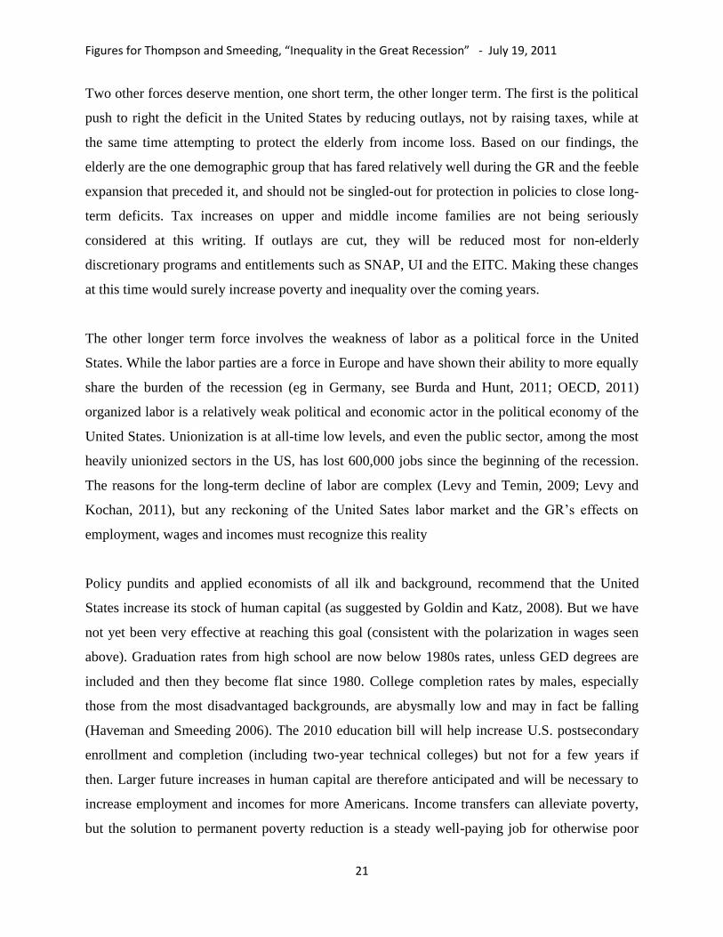
In 2010 the unemployment rates for all major educational-attainment and age groups hit 30-year
highs. Among college graduates, the unemployment rate jumped from 2.4 percent in 2006 to 5.6
percent in 2010, and among those with advanced degrees it rose from 1.5 percent to 3.5 percent
in the same period (Figure 1, Appendix Table 1). But he largest increases – in absolute terms –
were felt by younger workers with the lowest levels of education. Unemployment among
workers with only a high school degree jumped from 5.3 to 12.2 percent between 2006 and 2010,
and among those lacking a diploma it climbed from 8.6 to 17.4 percent. Highly educated workers
continue to have lower unemployment rates, but the increases experienced since 2006 are
proportionally as large as less educated workers. All age groups also saw dramatic increases in
their unemployment rates, with rates roughly doubling between 2007 and 2010. Workers
between 35 and 64 saw their unemployment rates go from around 3 percent to nearly 8 percent
(Appendix Table 1). The youngest workers – those ages 18 to 24 – saw their unemployment rate

Figures for Thompson and Smeeding, “Inequality in the Great Recession” - July 19, 2011
8
quickly shoot up from 9 percent to 17 percent, and unemployment for somewhat more
experienced workers – between 25 and 35 – went from 4.3 to 9.7 percent.
The official unemployment rate excludes ―discouraged‖ workers who have ceased looking for
work. In fact, 35 percent of prime aged (25-54) men without a high school diploma are out of the
labor force (and they are clearly also not in school), compared with less than 10 percent of those
with a college degree (U.S. Bureau of Labor Statistics, 2011). Labor force participation also
declined for most age and education groups, although less dramatically than the rise in
unemployment. The decline in labor force participation has been most prominent among
younger and less educated workers. Participation fell by 0.7 percent among college graduates
and 0.2 percent among those with advanced degrees, but it dropped by roughly 2 percent for all
workers with education below the BA-level (Appendix Table 1). For workers with less than a
high school degree, the rate of labor force participation slid from 61.6 percent in 2007 to just
59.4 in 2010.
Most age groups also decreased their participation in the labor force. Among more experienced
workers, including the age 36 to 45 and 46 to 54 age groups, the declines were relatively minor,
dipping by 0.4 and 0.9 percent, respectively, between 2006 and 2009. Among younger workers
(ages 18 to 24), however the labor force drop off has been sizeable, falling nearly 4.5 percent
from 69.5 in 2006 to 65 percent in 2010. This recent labor force decline among young workers
continues a trend present since the early 1990s. In each of the last three recessions, labor force
participation has declined among young workers, and not recovered in the ensuing recovery,
with the decline in the GR being the greatest. Between 1979 and 2009, the labor force
participation of 18 to 24 year olds declined 10 percent, while the share enrolled full-time in post-
secondary education rose by 10 percent (Snyder and Dillow, 2011). The opposite trend has held
for older workers, who have steadily raised their participation rates since the late 1980s, through
good and bad economic times. The participation rate in the 55 to 64 year old population climbed
from 63.7 to 65.1 percent between 2006 and 2010, continuing a trend where participation rose in
21 of the last 24 years. And the over 65 group has also increased both its labor force participation
and employment (US Department of Labor, 2011).

Figures for Thompson and Smeeding, “Inequality in the Great Recession” - July 19, 2011
9
In sum, the picture is one of continuing mass labor market devastation as of middle 2011. Both
Farber (2011) and Sum, et al. (2011b; 2011c) suggest that the numbers of displaced workers—
those losing their jobs – and the numbers of long term unemployed were at an all-time high in
2010. Howell and Azizoglu (2011) show that new hires and job openings were at a decade long
low in 2010, while permanent job losers were at an all-time high over this same period. And the
full effect of the GR on employment is not known with certainty. According to one popular
estimate (Greenstone and Looney, 2011) it might take 8-10 years for getting back to the number
of jobs we had before the GR. Both of the main routes to the middle class for those with only a
high school education, manufacturing and construction are closed (Smeeding, et. al, 2011;
Glaeser, 2010). In fact, the two major forces driving job opportunity polarization are
technological change, with workers being replaced by machines, creating demand for fewer,
more-skilled workers to run and repair the machines (Goldin and Katz, 2008). The second is
trade, the staggering magnitude of growth in imports from China of goods that had been
produced in the United States by U.S. workers. While Autor et al (2011) refute the assertion that
his findings suggest a need for trade restrictions, this trend deserves more analysis and suggests a
need for more-skilled U.S. workers in non-manufacturing jobs.
While many argue that job losses are cyclical, there are therefore good reasons to note they are
secular as well. But even a cyclical job loss that extends for 3-5 years becomes a secular issue
almost by definition. Long term joblessness is very damaging to the career and life chances of all
workers, especially younger workers and also negatively impacts family stability and the future
of children in these households (Von Wachter, 2010). These issues are especially damaging to
young men with a high school degree or less, 72 percent of whom are fathers by age 30, and only
38 percent of whom earned more than $20,000 in 2002 when the economy was in far better
shape than it is today (Smeeding, Garfinkel and Mincy, 2011).
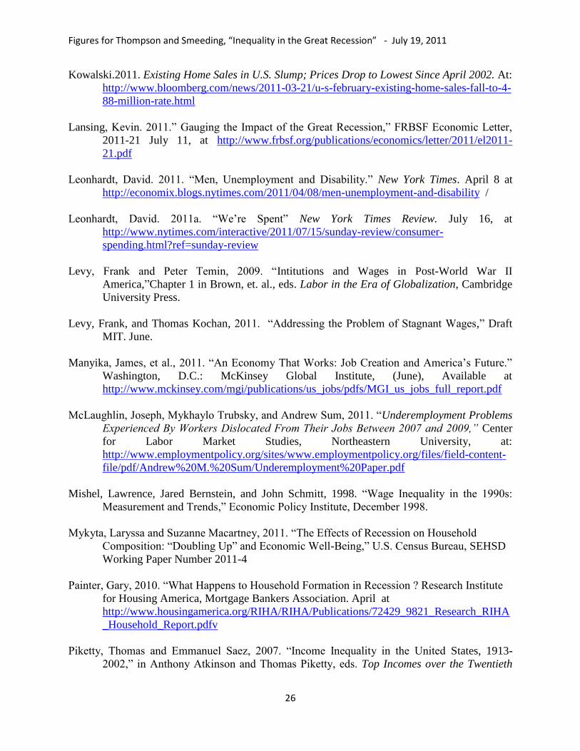
2.2. Record High Levels of Wage Inequality
In the face of a deep and sustained labor market downturn, real hourly wages can be expected to
decline. Because so many workers have lost their jobs, however, the accompanying composition
shifts in the employed workforce may potentially obscure falling wages. Trends in average real

Figures for Thompson and Smeeding, “Inequality in the Great Recession” - July 19, 2011
10
hourly wages, in fact, suggest modest wage growth in the Great Recession. Between 2007 and
2010, mean hourly wages rose from $20.26 to $20.57, although they did fall back 0.6 percent
after 2009 (Appendix Table 2, Panel A). These wage trends, however, were not shared across
the distribution; between 2007 and 2010 real hourly wages fell roughly 1.5 percent at the 10th
percentile and at the median, but rose by nearly five percent at the 90th
percentile.
These divergent wage trends – rising at the top and falling in the middle and at the bottom of the
distribution – drove several measures of wage inequality to 30-year highs in 2010 (Figure 2).
Figure 2 indicates that over the 15-years preceding the GR, there were only relatively modest
changes in these measures. (The impact of the series break, which is the result of a general
redesign in the CPS, including a move to computer-assisted interviewing and expanded use of
internal censoring for top-coded values, on measures of wage inequality in the CPS ORG is
discussed in Mishel, Bernstein, and Schmitt (1998). The P90/P50 ratio fluctuated from year-to-
year, but by 2006 remained at the same levels as in the late 1980s. After falling during most of
the 1990s, the P90/P10 ratio did exhibit modest increases starting in 2001, so that, by 2006, it
had returned to 1994 levels. Starting in 2008, though, each of these inequality measures
increased sharply. The P90/P10 ratio of real hourly wages, however, rose in each year since
2007, climbing from 4.4 to 4.8 (Appendix Table 2, Panel B).
Downward wage pressures over this period have been most evident among younger and less
educated workers, while older and more highly educated workers have registered wage increases
(Appendix Table 2, Panel C). Obtaining a bachelor’s degree, however, did not make workers
immune from wage pressures in the GR. Young workers (25 to 34 years old) with a BA saw their
wages fall 0.5 percent per year between 2007 and 2010 (Table 1). Even older workers (55 to 64
years old) with a BA experienced falling wages of a similar magnitude. The only workers to
experience rising wages during this period were workers with post-graduate degrees and training
(limited to those under age 55) and 45 to 54 year old experienced workers with a bachelor’s
degree.

Figures for Thompson and Smeeding, “Inequality in the Great Recession” - July 19, 2011
11
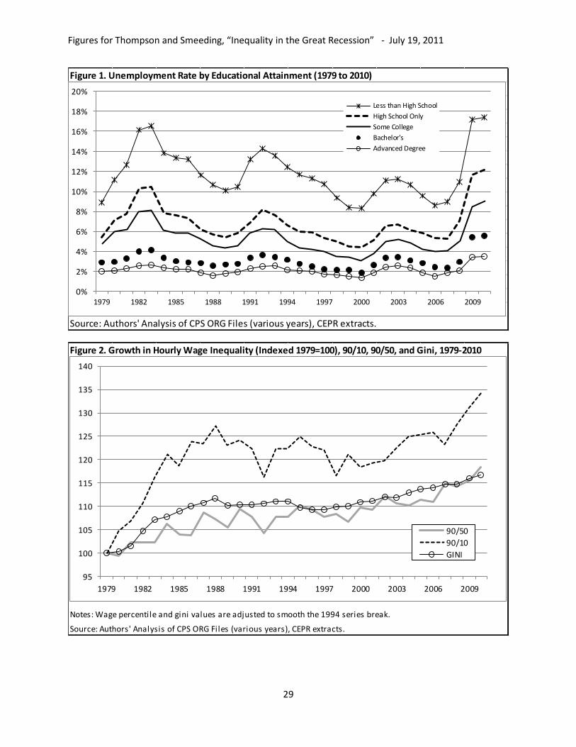
3. Income Impacts of the Great Recession
Because workers are typically part of a household unit that shares resources across several
members, oftentimes including multiple earners, and because households are able to draw upon
non-labor sources of income, it is important to go beyond wages or earnings and explore the
impacts of the Great Recession on household income. Inflation-adjusted average household
income (Census ―money income‖) fell in both 2008 and 2009, the most recent years of data in
the March CPS. (Inflation adjustments are made using the US CPI-U, and in all cases years are
referred to according to the year in which the income was received, not the survey year.) In 2009
average real household income was 2.9 percent lower than it had been in 2007, hitting the lowest
level in twelve years (Figure 3, Panel A). While average money income fell for all households,
and for non-elderly households, it actually rose somewhat for households headed by someone
age 65 and older, reflecting a long term trend in elder incomes. Median income for all
households fell 3.7 percent over the same period, and increases in the Gini Index and the
P90/P10 and P90/P50 ratios all indicate modest increases in income inequality during the GR
using this income definition (Appendix Table 3, Panel A).
3.1 Adjusting for Taxes, Transfers, and Household Size: Net, Equivalized Income (NEI)
In addition to the market factors driving employment losses and depressing wages, a host of
actions by the public sector and households as well, combined to influence household well-being
during the GR. Automatic ―stabilizers‖ (including Unemployment Insurance (UI), SNAP, and
the Temporary Assistance to Needy Families program (TANF)) and discretionary fiscal policy
all injected hundreds of billions of dollars into household incomes between 2008 and 2010. Total
SNAP benefits rose from $37 billion in 2008 to $54 billion 2009, with 2.5 million new
households getting ―food stamps.‖ Although it was only signed into law in February, 2009,
hundreds of billions of the tax cuts and increased benefits in the Obama Administration’s
―American Recovery and Reinvestment Act‖ (ARRA) impacted household during that year
(CBO, 2009).

Figures for Thompson and Smeeding, “Inequality in the Great Recession” - July 19, 2011
12
The baseline Census ―money income‖ definition does include some sources of transfer income
(UI, TANF, and Social Security), but it does not include others (such as the Earned Income Tax
Credit (EITC) and SNAP, and it also excludes taxes. To reflect the influence of these transfers
and taxes, we calculate a measure of net income which subtracts taxes (including federal and
state income taxes and the employee share of social insurance FICA taxes) and additional
transfer payments (including the EITC and SNAP benefits) from money income. To reflect
household economies of scale, we then divide real net household income by the square root of
the household size. The resulting measure, ―net, equivalized income‖ (NEI) is a superior measure
of household well-being, since an equivalent amount of gross money income results in a lower
standard of living if family size is larger or applicable taxes are higher.
Accounting for taxes, transfers, and household size, average household income declined by only
two-thirds as much - falling just 2 percent between 2007 and 2009, and actually rising slightly
after 2008 (Figure 3, Panel B). Non-elderly households follow a similar trend, except income is
flat after 2008, but elderly households saw their incomes rise over this period. The rise in
inequality is also muted once these factors are included (Appendix Table 3, Panel B). Instead of
rising, the P90/P10 ratio is shown to decline modestly between 2007 and 2009 once taxes,
transfers, and household size are incorporated into the measure (Figure 4, Panel A). Figure 4
suggests, as Burkhauser and Larrimore (2011) have argued, that taxes and transfers are
impacting income distribution in a different way than during previous recessions. In the 1980s,
policy changes exacerbated inequality trends measured by the P90/P10 ratio for all households,
but during the GR, taxes and transfers have reduced this measure of inequality.
The difference between the two series using the P90/P50 ratio is less pronounced, as inequality
continues to rise, however faintly, using NEI (Figure 4, Panel B). The longer-term trends in
both the P90/P10 and P90/P50 ratios, however, indicate that inequality is indeed different in the
Great Recession than in previous downturns. In the deep recession of the early 1980s, and during
and immediately following the mild recession of the 2001, inequality increased sharply.
Inequality also appears to have increased somewhat during the early 1990s recession, although
the pattern is more difficult to discern given the 1993 series break in the March CPS (the result
of a general redesign of the survey, including switching to automated coding and expanded use

Figures for Thompson and Smeeding, “Inequality in the Great Recession” - July 19, 2011
13
of top-code censoring of income values) (Ryscavage, 1995). Trends in the Gini Index, a broader
measure that includes the entire distribution, also suggest that any change in inequality between
2007 and 2009 was very slight, rising just one-half of one percent, owing most likely to the
rising real incomes of the elderly as we see below (Appendix Table 3, Panel B.)
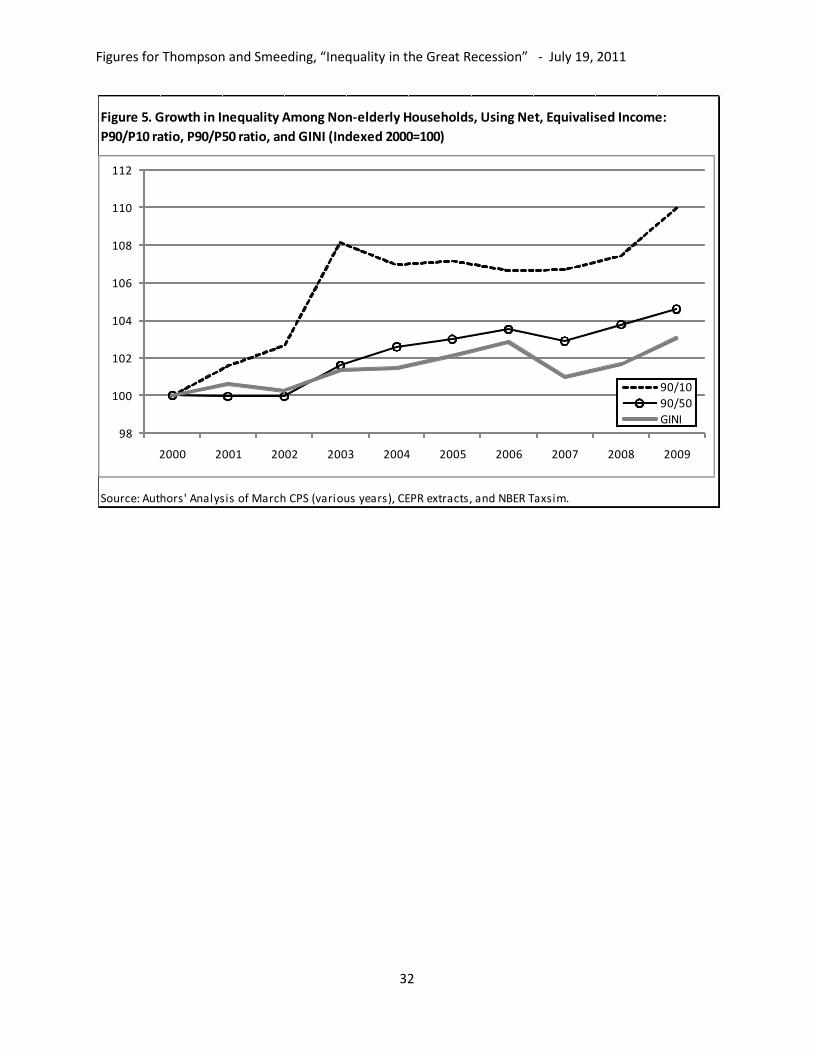
When we restrict the focus to include only non-elderly households, though, a very different
pattern emerges for inequality measures in the Great Recession. Among non-elderly households,
the Gini Index and the P90/P50 and P90/P10 ratios all increased substantially between 2007 and
2009, and more generally since 2000 (Figure 5). Figure 5 is limited to the most recent decade, a
period with consistent treatment of top-coded incomes, including assignment of cell means by
income source to top-coded observations. For non-elderly households, net equivalized incomes
fell less at the top of the distribution than for the non-rich , causing the P90/P10 ratio to climb 3
percent, and the P90/P50 ratio and the Gini Index to rise approximately 2 percent (Appendix
Table 3, Panel C) (see also Smeeding, et al., 2011).
These comparisons suggest that households headed by the elderly and non–elderly have
experienced different income paths though the great recession. Why did the elderly do better
than the non-elderly? The elderly depend much more on income transfers (Social Security) and
sources of investment income and far less on the labor market than do the non-elderly. The
elderly who were already retired in 2008 lost some home value along with most other owners,
but were generally invested in relatively safe portfolios, which protected their assets and income
flows (Gustman, Steinmeier, and Tabatabai, 2010). Older worker take up Social Security benefits
at high rates once they pass age 62. The 46 percent of elders who take up benefits between ages
52and 65 are subject to an earnings test which discourages work in these age ranges (Smeeding
et al, 2011). But those who wait until they are at least 65 not only receive higher benefits than at
age 62, but are allowed to receive these social pensions without any penalty for earnings.
Amongst the higher skilled elderly, employment has increased throughout the recession, owing
in part to reluctance to retire (in terms of not working) and increased work after retirement
(likely reflecting falling home prices). The success of the tax and transfer system in sustaining
the incomes of, and mitigating inequality among, older households, and its failure to do so for
non-elderly households is consistent with Ben-Shalom et al’s (2011) assessment of US anti-

Figures for Thompson and Smeeding, “Inequality in the Great Recession” - July 19, 2011
14
poverty programs increasingly directed toward the elderly (and the disabled) and away from the
young.
3.2 Growth in Top Incomes
Because of income top-coding and the presence of few extremely high income households in the
sample, it is not possible to use the March CPS to estimate inequality at the very top of the
income distribution. In recent years a number of studies have demonstrated that much of the
growth in inequality since the 1970s has been isolated to the top few percentiles of the
distribution. To the extent that the top few percentiles are driving inequality, the P90/P10 ratios
and Gini indexes calculated with the March CPS will understate the level of inequality at any
point in time and possibly the trends toward greater inequality over time. Because of differences
in the income composition, it is possible that the Great Recession is having different impacts of
inequality at the very top of the distribution.
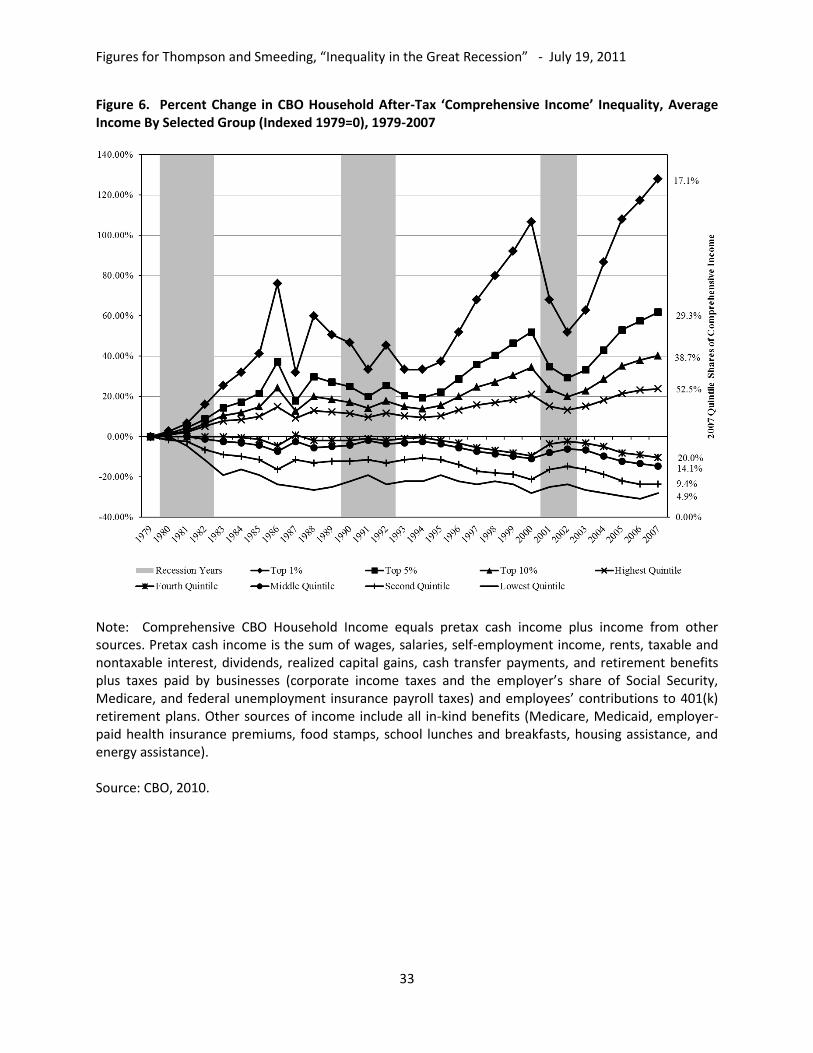
The Congressional Budget Offices’ ―comprehensive income‖ measure, while only available up
through 2007, demonstrates the impotence of accounting for trends at the very top of the
distribution (CBO 2010). CBO ―Comprehensive Income‖ is much more expansive than Census
―money income,‖ and by statistically matching the Census data to IRS tax return data, it includes
much more in realized property income. Moreover, comprehensive income shows an even larger
rise in inequality up to 2007, especially driven by changes in incomes at the very top of the
distribution (Figure 6). These data show that inequality contracted in the 1990 to 1993 and 2001
to 2002 recessions, but rose dramatically after 2002. The top quintile group’s share is 52.5
percent of after-tax net income in 2007 according to the CBO series compared to 48.5 percent in
the Census money income inequality series (DeNavas-Walt, 2010, Table A.5). The trend toward
inequality is driven here by the top 1 percent share (which rises by 228 percent, from 7.5 percent
in 1979 to 17.1 percent in 2007), but also by a 15.2 percent increase in the share of the next 4
percent of household units, with no change in the share of the next 10 to 15 percent. Hence,
inequality in the CBO data since 1993 and through 2007 is driven almost exclusively by gains in
the income of the 95th percentile and higher percentiles of households. We also note that the
CBO share of net income in the bottom quintile group is 4.9 percent by their measure in 2007,

Figures for Thompson and Smeeding, “Inequality in the Great Recession” - July 19, 2011
15
compared to 3.7 percent in the 2007 Census income data (DeNavas-Walt, 2010). But the trends
in both series are the same, with the CBO showing declining shares for all of the bottom four
quintile groups since 2002, though especially for the bottom two quintile groups. We now turn to
the high income group.
While comprehensive income is only available through 2007, several other top income data
sources can be used to estimate inequality trends during the GR. These include income tax
records from the IRS (analyzed in Piketty and Saez (2007) and Atkinson, et al (2011) and the
Federal Reserve Board’s Survey of Consumer Finances (SCF) (defined in the Income
Definitions Appendix). Analysis using these data sources suggests that income inequality has
risen dramatically at the very top of the distribution (Figure 7). Saez’ (2010) analysis the IRS
data finds that share of federal Adjusted Gross Income held by the richest 1 percent of
households more than doubled between 1979 and 2007, rising from 10 percent to 23.5 percent
(including capital gains).
The CBO ―comprehensive income‖ measure (not adjusted for taxes) shows that the top 1 percent
share of total income rose from 9.3 to 19.4 percent over the same period (Figure 7). However,
even these enriched CBO data exclude the vast majority of capital income that is not realized in a
given year, including imputed rent on owner-occupied homes as well as accumulated financial
and business wealth and changes in such incomes over the 2007 to 2009 recession and earlier
recessions. Smeeding and Thompson (2011) use the SCF data and calculated a ―more
comprehensive income - (MCI)‖ measure which combines standard income flows with imputed
income to assets. They show that the top 1 percent share of MCI rose from 18 percent in 1989 to
22 percent in 2007.
The data sources for top incomes experience an even longer lag-time than the standard household
surveys, but we do have some preliminary evidence on the impact of the GR on inequality at the
very top of the distribution. Saez (2010) finds that between 2007 and 2008 the income share of
the top 1 percent, including capital gains, dropped from 23.5 percent to 21 percent, and
excluding capital gains income it dropped from 18.3 percent to 17.7 percent. Projecting the SCF
data into 2009, Smeeding and Thompson (2011) estimate that the top 1 percent share of MCI fell
from 22.3 to 21.9 percent. Both sets of results suggest that there have been small declines in top

Figures for Thompson and Smeeding, “Inequality in the Great Recession” - July 19, 2011
16
income shares during in the Great Recession, but that levels are now only slightly lower than the
previous peak levels from 2007.
Finally we must mention the most recent evidence on incomes from capital compared to labor
over the recession. Sum, et al (2011a), show that since the beginning of the recovery in June
2011, 88 percent of the growth in US national incomes through (through March 2011) accrued to
owners of capital (mainly business owners and corporations, but also pensions, rental property
owners and stockholders) and less than 12 percent to workers in the form of wages or benefits,
with wage declines almost the same as employer benefit increases. The drop in aggregate wages
and salaries is almost surely because of the lack of job growth over this period. The failure of
real wages and salaries to grow over the first 7 quarters of recovery is unprecedented in any post
World War II recovery. These data suggest than the working class and prime age employees are
not gaining from the recovery at this point, and that any increases in aggregate personal incomes
since trough of the recession are accruing to the owners of capital other than owned homes—the
top percentiles of the income distribution, stockholders and retirees.
4. Poverty Impacts of the Great Recession
As income has declined, dramatically so for young and less educated families, poverty has risen.
According to the official U.S. Government definition of poverty, 13.4 percent of households
(using the Census ―money income‖ definition) were poor in 2009 (Appendix Table 3, Panel D).
Poverty rose sharply in 2008 and 2009, but overall household poverty rates remain below levels
reached during the economic downturns in the early 1980s and early 1990s (Figure 8). The
broader definition of poverty adopted by the European Union – set at 60 percent of median
household income – is considerably higher than the official US definition and fluctuates less over
time. Over most of the last 30 years this poverty measure hovered at 30 percent in good
economic times and bad. Between 2007 and 2009, though, this measure of poverty rose from
30.2 percent to 30.5 percent.
These figures suggest that despite large-scale job losses, the Great Recession’s impact on poverty
is unremarkable relative to previous recessions. The impact on poverty, though, differs markedly

Figures for Thompson and Smeeding, “Inequality in the Great Recession” - July 19, 2011
17
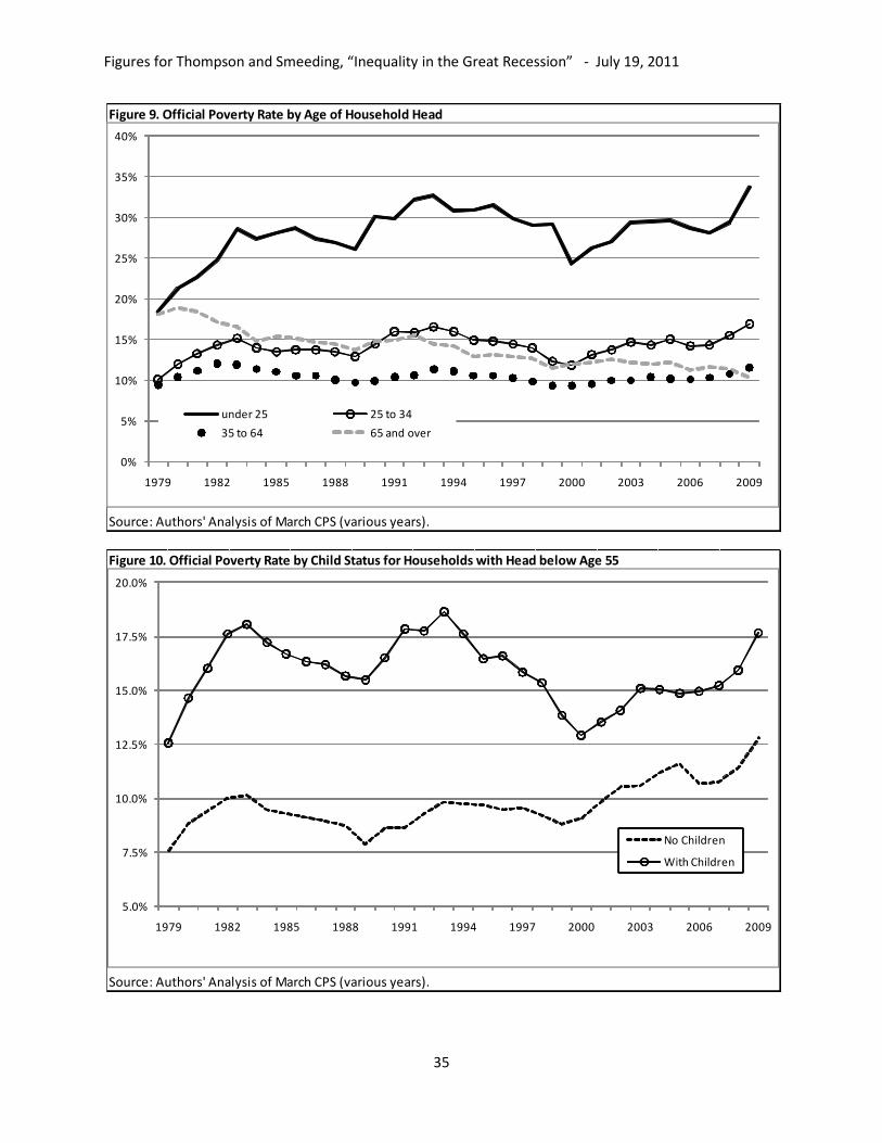
for different demographic groups. Amongst younger households, including those headed by
individuals under age 35, poverty rates hit 30-year highs in 2009 (Figure 9). Between 2007 and
2009, the official poverty rate rose from 28.1 percent to 33.7 percent for households headed by
individuals under age 25, and for households with heads between 25 and 34, poverty rose from
14.3 to 16.9 percent. Indeed poverty rates ticked up for all types of units, except for those headed
by a person 65 or over. Consistent with the other data reviewed above, poverty among elderly
households fell during the GR, from 11.6 percent in 2007 to 10.3 percent in 2009, hitting a new
30-year low.
The rate of official poverty among households with children is typically several percentage
points higher than it is among households without children. This remains true during the GR, but
over the last decade the gap has narrowed (Figure 10). Poverty fell dramatically for households
(with heads below age 55) with children during the 1990s, while it declined only slightly among
those without children. For those households with children, the poverty rate rose 2.5 points
between 2007 and 2009, returning to levels near, but still below, previous high-points from the
early 1980s and early 1990s. Among households without children, poverty rose by similar levels,
but now exceeds high-points from those previous recessions by more than 25 percent.
5. Shifting Income Composition
The dramatic changes in labor market conditions, as well as government tax and transfer policies
have resulted in substantial shifts in the sources of total household income. For most households,
earnings share of total gross household income (―money income‖ plus SNAP benefits and the
refundable portions of federal and state EITC benefits) declined between 2007 and 2009 (Table
2, Panel A). For the middle quintile group of all households and the bottom quintile group of
non-elderly households, the drop was approximately five percentage points. In the top fifth,
though (for both elderly and non-elderly households) the wage share of total income increased
between 2007 and 2009, partially offsetting a declining capital income share experienced by both
groups.

Figures for Thompson and Smeeding, “Inequality in the Great Recession” - July 19, 2011
18
The impact of public policy was relatively broad-based, with the transfer share of income rising
and the tax share declining for nearly every quintile group (Table 2, Panels B and D). The
distribution of transfer income beneficiaries is very different for elderly and non-elderly
households. (Transfer income here includes Social Security, Supplemental Security Income,
Survivor's Benefits, Disability Payments, Public Assistance, Workers Compensation, Veteran
Payments, Child Support, Alimony, Unemployment Compensation, SNAP benefits and the
refundable portions of the federal and state EITC benefits and the child tax credit.) The transfer
share of income rose 4.7 percent for non-elderly households in the bottom quintile group and 3.4
percent of those in the middle quintile group, but less than one percent for those in the top
quintile group. Among elderly households in the bottom quintile group, though, there was no
change in the transfer share of income. The transfer share of elderly households in the middle
fifth rose more than 6 percent, but it also rose more than 3 percent among elderly households in
the top fifth.
The capital income share of household income also declined in the GR across most of the
distribution, for elderly and non-elderly households (Table 2, Panel C). Capital income in the
Census Bureau’s Money Income definition includes only interest, rental income, dividends, rent,
trust, and retirement savings income. It does not include capital gains income. The decline in the
capital income share was most notable for the top quintile group, where the capital share fell
from 7.1 to 6.2 percent for non-elderly households and from 38.3 to 32.6 percent for elderly
households.
6. Increasing Household Size as a Coping Mechanism
Measures of net equivalized income divide by household size to reflect the economies of scale
associated with sharing a household. Because of these economies of scale, some people opt to
combine households as a coping mechanism during difficult economic times. In fact, the
economic stresses from the Great Recession seem to have inspired an increase of ―doubling up‖
or other forms of shared housing and sharp decline in household formation (Painter, 2010;
Mykyta and Macartney, 2011). Figure 11 traces the trends in average household size (indexed to
1979=100) by income quintile group, and suggests that the long trend toward falling household
Figures for Thompson and Smeeding, “Inequality in the Great Recession” - July 19, 2011
19
size has been reversed, or at least halted during the Great Recession. The average household size
of the bottom quintile group rose from nearly five percent between 2007 and 2009, climbing
from 1.8 to 1.9 persons per household. Average household size in the highest income quintile
group rose a little more than one percent, going from 3.09 to 3.13 people per household.
The extent to which young adults delay home-leaving, join households, or families combine into
households in response to economic stress suggest that younger adults and those who were not in
the labor force were more likely to be doubled-up in 2010 than in 2008. Moreover, doubled-up
householders and adults were more disadvantaged and experienced a larger increase in poverty
rates during the recession than their counterparts who were not doubled-up (Mykyta and
Macartney, 2011).
But this is only part of the story. The official poverty increases noted above took place despite
the fact that there was an increase of 8.4 percent in young adults (ages twenty-four to thirty-five)
living with their parents; as well as an 11.6 percent increase in families who moved in with
relatives in large part to avoid poverty. If these two groups instead lived alone, their poverty rates
based on their own income would be 43 percent (Sherman, 2011). And so, while doubled up
households had poverty rates higher than those who did not experience this change, the situation
would have been far worse had the units who were forced to double up not been able to do so.
7. Conclusion and Discussion
This paper suggests that income inequality and poverty in the United States has risen with high
and continuing joblessness, but primarily among non-elderly households. When all households
are included, we can see that some of the increases in poverty are not as severe past recessions
and standard measures of inequality are unchanged or have even declined (in the case of the
P90/P10 ratio) during the Great Recession. And, the public transfer and tax policy during the GR
has played an important role in limiting the rise in inequality. When we focus on non-elderly
households, however, the Great Recession is shown to have a dramatic effect on inequality and
poverty, producing 30-year record high levels of wage inequality, and household poverty, despite
the lower poverty rates experienced by doubling up.
Figures for Thompson and Smeeding, “Inequality in the Great Recession” - July 19, 2011
20
The elderly, owners of capital and most high income households are also doing quite well as we
recover from the recession, and as capital markets and executive pay have recovered faster than
wages or jobs. Middle and lower-income households – those relying on earning to provide
essentially all of their income, those whose primary asset is their home, and those with
something less than an advanced degree – are faring much worse. The very steep decline in
housing values (about 30 percent from 2005 to early 2011) has reduced mobility, led to higher
rates of default and foreclosure and negatively affected aggregate consumption (Leonhardt,
2011a; Smeeding and Thompson, 2011). Discretionary service spending (including non-housing,
energy, food, transportation, education, entertainment, restaurant meals and insurance spending)
fell by 6.9 percent in the current recession, after never falling below 2.9 percent in any previous
post-war recession. Without a revival in consumer spending, employment growth will remain
weak, and the incomes of those relying on earnings will continue to suffer. The large overhang of
household debt from before the GR, though, continues to put considerable pressure on
households. Indeed Greenspan and Kennedy (2007, updated to 2011), suggest that at the peak of
the housing bubble in 2004-2006 US households were annually withdrawing about 9 percent of
home equity for spending. By the end of the first quarter of 2011, that fraction had fallen to
negative 4 percent.
An extended period of high unemployment also threatens to have long-term consequences.
Rising poverty, especially among young jobless adults and families, is permanently scarring the
futures of millions of unemployed younger (under age 30) unskilled adults. Unless short-term
action is taken to improve employment prospects for these particular workers, and to support the
incomes of their children as we come out of the recession, poverty will remain high among this
group. Over the longer term, traditional upward routes to the middle class, in manufacturing and
construction jobs, will continue to disappear as high school and below wages and employment
drop. It is estimated that it will take 8 years or longer for employment to rise to levels where low-
skill workers can find good jobs. These individuals need more-productive skills than they have at
this time, given their current levels of education and human capital.
Figures for Thompson and Smeeding, “Inequality in the Great Recession” - July 19, 2011
21
Two other forces deserve mention, one short term, the other longer term. The first is the political
push to right the deficit in the United States by reducing outlays, not by raising taxes, while at
the same time attempting to protect the elderly from income loss. Based on our findings, the
elderly are the one demographic group that has fared relatively well during the GR and the feeble
expansion that preceded it, and should not be singled-out for protection in policies to close long-
term deficits. Tax increases on upper and middle income families are not being seriously
considered at this writing. If outlays are cut, they will be reduced most for non-elderly
discretionary programs and entitlements such as SNAP, UI and the EITC. Making these changes
at this time would surely increase poverty and inequality over the coming years.
The other longer term force involves the weakness of labor as a political force in the United
States. While the labor parties are a force in Europe and have shown their ability to more equally
share the burden of the recession (eg in Germany, see Burda and Hunt, 2011; OECD, 2011)
organized labor is a relatively weak political and economic actor in the political economy of the
United States. Unionization is at all-time low levels, and even the public sector, among the most
heavily unionized sectors in the US, has lost 600,000 jobs since the beginning of the recession.
The reasons for the long-term decline of labor are complex (Levy and Temin, 2009; Levy and
Kochan, 2011), but any reckoning of the United Sates labor market and the GR’s effects on
employment, wages and incomes must recognize this reality
Policy pundits and applied economists of all ilk and background, recommend that the United
States increase its stock of human capital (as suggested by Goldin and Katz, 2008). But we have
not yet been very effective at reaching this goal (consistent with the polarization in wages seen
above). Graduation rates from high school are now below 1980s rates, unless GED degrees are
included and then they become flat since 1980. College completion rates by males, especially
those from the most disadvantaged backgrounds, are abysmally low and may in fact be falling
(Haveman and Smeeding 2006). The 2010 education bill will help increase U.S. postsecondary
enrollment and completion (including two-year technical colleges) but not for a few years if
then. Larger future increases in human capital are therefore anticipated and will be necessary to
increase employment and incomes for more Americans. Income transfers can alleviate poverty,
but the solution to permanent poverty reduction is a steady well-paying job for otherwise poor

Figures for Thompson and Smeeding, “Inequality in the Great Recession” - July 19, 2011
22
people. Unfortunately these jobs are not currently on the horizon for low-skilled workers, and
especially not for low-skilled men.

Figures for Thompson and Smeeding, “Inequality in the Great Recession” - July 19, 2011
23
INCOME DEFINITIONS APPENDIX
Census ―Money Income,‖ Net, Equivalized Income, CBO ―Comprehensive Income,‖ SCF
Income, and MCI Income
Census ―money income‖ is defined as income received on a regular basis (exclusive of certain
money receipts such as capital gains) before payments for personal income taxes, social security,
union dues, Medicare deductions, and other items.
We calculated ―Net, Equivalized Income‖ by starting with ―money income‖ and then, 1) adding
transfer income not included in ―money income‖ (food stamps benefits, and refundable tax
credits, including the EITC and the child tax credit, 2) subtracting taxes (state and federal income
taxes the employee share of social insurance (FICA) taxes (with taxes and refundable credits
estimated using the NBER TAXSIM program), and 3) adjusting for differences in household size
using an equivalence scale, dividing net income by the square root of household size.
SCF Income is defined by the Federal Reserve Board as household income for previous calendar
year as the following: wages, self-employment and business income, taxable and tax-exempt
interest, dividends, realized capital gains, food stamps and other support programs provided by
the government, pension income and withdrawals from retirement accounts, Social Security
income, alimony and other support payments, and miscellaneous sources of income. See
Smeeding and Thompson (2011) for more on this measure.
MCI Income: is SCF income as defined above less income from wealth (interest, dividends,
rent, royalties, and income from trusts and non-taxable investments, including bonds, as well as
some self-employment income) + imputed flows to stocks, bonds, annuities, and trusts +
imputed flows to quasi-liquid retirement accounts (401(k), IRA, etc.) + imputed flow to primary
residence + imputed flow to other residences and investment real estate, transaction accounts,
CDs and whole life insurance + imputed flow to other assets and businesses + imputed flow to
vehicle wealth - imputed interest flow for remaining debt (after adjusting for negative incomes).
See Smeeding and Thompson (2011) for more on this measure.
CBO ―Comprehensive Household Income‖ equals pretax cash income plus income from other
sources. Pretax cash income is the sum of wages, salaries, self-employment income, rents,
taxable and nontaxable interest, dividends, realized capital gains, cash transfer payments, and
retirement benefits plus taxes paid by businesses (corporate income taxes and the employer’s
share of Social Security, Medicare, and federal unemployment insurance payroll taxes) and
employees’ contributions to 401(k) retirement plans. Other sources of income include all in-kind
benefits (Medicare, Medicaid, employer-paid health insurance premiums, food stamps, school
lunches and breakfasts, housing assistance, and energy assistance).
Individual Income Taxes are attributed directly to households paying those taxes. Social
insurance, or payroll, taxes are attributed to households paying those taxes directly or paying
them indirectly through their employers. Corporate income taxes are attributed to households
according to their share of capital income. Federal excise taxes are attributed to them according
to their consumption of the taxed good or service. For more information on CBO comprehensive
income, see www.cbo.gov/publications/collections/collections.cfm?collect=13

Figures for Thompson and Smeeding, “Inequality in the Great Recession” - July 19, 2011
24
References—
Atkinson, Anthony, Thomas Piketty, and Emmanuel Saez, 2011. ―Top Incomes in the Long Run
of History,‖ Journal of Economic Literature, Vol. 49(1), 3-71.
Autor, David. 2010. ―The Polarization of Job Opportunities in the U.S. Labor Market:
Implications for Employment and Earnings.‖ Paper jointly released by the Center for
American Progress and the Hamilton Project. Available at
http://www.americanprogress.org/issues/2010/04/job_polarization.html.
D. Autor, D. Dorn, and G. Hanson, ―The China Syndrome: Local Labor Market Effects of
Import Competition in the United States,‖ MIT Working Paper, March 2011. Available at
http://econ-www.mit.edu/files/6613.
Ben-Shalom, Yonatan, Robert Moffitt, and John Karl Scholz, 2011. ―An Assessment of the
Effectiveness of Anti-Poverty Programs in the United States,‖ National Bureau of
Economic Research, Working Paper No. 17042.
Blank, Rebecca M, 2009. ― Economic Change and the Structure of Opportunity for Less-Skilled
Workers,‖ in M. Cancian and S. Danziger, eds., Changing Poverty ,Changing Policy,
Russell Sage Foundation Press, pp 63-91.
Burda, Michael and Jennifer Hunt, 2011. ―What Explains the German Labor Market Miracle in
the Great Recession?‖ National Bureau of Economic Research, Working Paper No.
17187, June. At http://www.nber.org/papers/w17187
Burkhauser, Richard, Shauizhang Feng, Stephen Jenkins, and Jeff Larrimore, 2008. ―Estimating
Trends in US Income Inequality Using the Current Population Survey: The Importance of
Controlling for Censoring,‖ National Bureau of Economic Research, Working Paper No.
14247.
Burkhauser, Richard, Shuaizhang Feng, and Stephen Jenkins, 2009. ―Using the P90/P10 Index to
Measure U.S. Inequality Trends with Current Population Survey Data: A View from
Inside the Census Bureau Vaults,‖ The Review of Income and Wealth, 55(1), March.
Burkhauser, Richard and Jeff Larrimore, 2011. ―Median Income and Income Inequality during
Economic Declines: Why the First Two Years of the Great Recession (2007-2009) are
Different, Mimeo January, 2011.
Congressional Budget Office, 2009. ―Macro Effects of ARRA, Letter to Senator Charles
Grassley,‖ March 2, 2009.

Figures for Thompson and Smeeding, “Inequality in the Great Recession” - July 19, 2011
25
Damme, Lauren. 2011. ―A Future of Low Paying, Low Skill Jobs?‖ New America Foundation,
May 23. At
http://newamerica.net/publications/policy/a_future_of_low_paying_low_skill_jobs
DeNavas-Walt, Carmen, Bernadette D. Proctor, and Jessica C. Smith, 2010. ―Income, Poverty,
and Health Insurance Coverage in the United States, 2009.‖ Current Population Reports,
P60-238. Washington D.C.: U.S. Census Bureau. Available at
http://www.census.gov/prod/2006pubs/p60-238.pdf
Farber, Henry, 2010. ―Job Loss in the Great Recession: Historical Perspective from the
Displaced Workers Survey, 1984-2010,‖ National Bureau of Economic Research
(NBER), Working Paper No. w17040 May.
Feenberg, Daniel and Elisabeth Coutts, 1993. "An Introduction to the TAXSIM Model", Journal
of Policy Analysis and Management Vol. 12 (1), Winter 1993.
Glaeser, E. 2010. ―Children Moving Back Home and the Construction Industry.‖ New York
Times, February 16. Available at http://economix.blogs.nytimes.com/2010/02/16/kids-
moving-back-home-and-the-construction-industry/
Goldin, Claudia, and Larry Katz. 2008. The Race between Education and Technology.
Cambridge, MA: Harvard University Press.
Greenspan, Alan and James Kennedy, 2007. ‖Sources and Uses of Equity Extracted from
Homes,‖ Finance and Economics Discussion Series, Divisions of Research & Statistics
and Monetary Affairs Federal Reserve Board, Washington, D.C. Working Paper 2007-20.
Updated data at: http://www.efxtraders.com/market-updates/financial-news/q1-2011-
mortgage-equity-withdrawal-strongly-negative.html
Greenstone, Michael and Adam Looney, 2011. The Great Recession May Be Over, but American
Families Are Working Harder than Ever Wages, Jobs and the Economy, U.S. Economic
Growth, Children & Families, Hamilton Project at Brookings Institution. Access at
http://www.brookings.edu/opinions/2011/0708_jobs_greenstone_looney.aspx
Gustman, Alan, Thomas Steinmeier, and Nahid Tabatabai. 2010. ―What the Stock Market
Decline Means for the Financial Security and Retirement Choices of the Near-Retirement
Population.‖ Journal of Economic Perspectives 24(1): 181–82.
Haveman, Robert, and Timothy M. Smeeding. 2006. ―The Role of Higher Education in Social
Mobility.‖ Future of Children 16(2): 125–50.
Howell, David and Bert Azizoglu, 2011. ‖Unemployment Benefits and Work Incentives: The US
Labor Market in the Great Recession . Oxford Review of Economic Policy. in press, draft
paper . New School for Social Research. New York. July 6
Figures for Thompson and Smeeding, “Inequality in the Great Recession” - July 19, 2011
26
Kowalski.2011. Existing Home Sales in U.S. Slump; Prices Drop to Lowest Since April 2002. At:
http://www.bloomberg.com/news/2011-03-21/u-s-february-existing-home-sales-fall-to-4-
88-million-rate.html
Lansing, Kevin. 2011.‖ Gauging the Impact of the Great Recession,‖ FRBSF Economic Letter,
2011-21 July 11, at http://www.frbsf.org/publications/economics/letter/2011/el2011-
21.pdf
Leonhardt, David. 2011. ―Men, Unemployment and Disability.‖ New York Times. April 8 at
http://economix.blogs.nytimes.com/2011/04/08/men-unemployment-and-disability /
Leonhardt, David. 2011a. ―We’re Spent‖ New York Times Review. July 16, at
http://www.nytimes.com/interactive/2011/07/15/sunday-review/consumer-
spending.html?ref=sunday-review
Levy, Frank and Peter Temin, 2009. ―Intitutions and Wages in Post-World War II
America,‖Chapter 1 in Brown, et. al., eds. Labor in the Era of Globalization, Cambridge
University Press.
Levy, Frank, and Thomas Kochan, 2011. ―Addressing the Problem of Stagnant Wages,‖ Draft
MIT. June.
Manyika, James, et al., 2011. ―An Economy That Works: Job Creation and America’s Future.‖
Washington, D.C.: McKinsey Global Institute, (June), Available at
http://www.mckinsey.com/mgi/publications/us_jobs/pdfs/MGI_us_jobs_full_report.pdf
McLaughlin, Joseph, Mykhaylo Trubsky, and Andrew Sum, 2011. ―Underemployment Problems
Experienced By Workers Dislocated From Their Jobs Between 2007 and 2009,” Center
for Labor Market Studies, Northeastern University, at:
http://www.employmentpolicy.org/sites/www.employmentpolicy.org/files/field-content-
file/pdf/Andrew%20M.%20Sum/Underemployment%20Paper.pdf
Mishel, Lawrence, Jared Bernstein, and John Schmitt, 1998. ―Wage Inequality in the 1990s:
Measurement and Trends,‖ Economic Policy Institute, December 1998.
Mykyta, Laryssa and Suzanne Macartney, 2011. ―The Effects of Recession on Household
Composition: ―Doubling Up‖ and Economic Well-Being,‖ U.S. Census Bureau, SEHSD
Working Paper Number 2011-4
Painter, Gary, 2010. ―What Happens to Household Formation in Recession ? Research Institute
for Housing America, Mortgage Bankers Association. April at
http://www.housingamerica.org/RIHA/RIHA/Publications/72429_9821_Research_RIHA
_Household_Report.pdfv
sehold_Report.pdf old_Report.pdf
Piketty, Thomas and Emmanuel Saez, 2007. ―Income Inequality in the United States, 1913-
2002,‖ in Anthony Atkinson and Thomas Piketty, eds. Top Incomes over the Twentieth
http://www.nytimes.com/interactive/2011/07/15/sunday-review/consumer-spending.html?ref=sunday-review

Figures for Thompson and Smeeding, “Inequality in the Great Recession” - July 19, 2011
27
Century: A Contrast Between European and English Speaking Counties, Oxford: Oxford
University Press, 141-225.
Ryscavage, Paul, 1995. ―A Surge in Growing Income Inequalty?,‖ Monthly Labor Review, U.S.
Department of Labor, Bureau of Labor Statistics, August, 1995.
Saez, Emmanuel, 2010. ―Striking it Richer: The Evolution of Top Incomes in the United States,"
updated July 2010, Available at: http://elsa.berkeley.edu/~saez/saez-UStopincomes-
2008.pdf
Sherman, Arloc, 2011. ―Despite Deep Recession and High Unemployment, Government Efforts
— Including the Recovery Act — Prevented Poverty from Rising in 2009, New Census
Data Show,‖ Center on Budget and Policy Priorities, January 2011, at:
http://www.cbpp.org/cms/index.cfm?fa=view&id=3361
Smeeding, Timothy and Jeffrey Thompson, 2011. ―Recent trends in Income Inequality: Labor,
Wealth and More Complete Measures of Income,‖ Research in Labor Economics, Vol.
32.
Smeeding, Timothy, Irwin Garfinkel, and Ronald Mincy. 2011. ―Introduction to Young
Disadvantaged Men: Fathers, Families, Poverty, and Policy.‖ Annals of the American
Academy of Political and Social Science Vol. 635, May: pages 6-23
Smeeding, Timothy, 2006. ―Poor People in Rich Nations: The United States in Comparative
Perspective.‖ Journal of Economic Perspectives 20(1): 69–90.
Snyder, T, and Dillow, S., 2011. Digest of Education Statistics 2010 (NCES 2011-015). National
Center for Education Statistics, Institute of Education Sciences, U.S. Department of
Education. Washington, DC.
Sum, Andrew, Ishwar Khatiwada, Joseph McLaughlin, and Sheila Palma, 2011a. ―The ‘Jobless
and Wageless’ Recovery from the Great Recession of 2007-2009: The Magnitude and
Sources of Economic Growth Through 2011 I and Their Impacts on Workers, Profits, and
Stock Values, Northeastern University Center for Labor Market Studies, May.
Sum, Andrew,Mykhaylo Trubskyy, and Sheila Palma. 2011b The Unemployment Experiences of
Workers in the U.S. Who Were Displaced from Their Jobs During the Great Dislocation
of 2007-2009,Center for Labor Market Studies, Northeastern UniversityBoston,
Massachusetts, June at
http://www.employmentpolicy.org/sites/www.employmentpolicy.org/files/field-content-
file/pdf/Andrew%20M.%20Sum/June%202011%20Unemployment%20Dislocated%20W
orker%20Paper.pdf
Sum, Andrew, Ishwar Khatiwada, Joseph McLaughlin, and Sheila Palma. 2011c. ―No Country
for Young Men.‖ In Smeeding, Timothy, Irwin Garfinkel, and Ronald Mincy, eds. Young

Figures for Thompson and Smeeding, “Inequality in the Great Recession” - July 19, 2011
28
Disadvantaged Men: Fathers, Families, Poverty, and Policy. Annals of the American
Academy of Political and Social Science Vol. 635, May: 24-55
U.S. Department of Labor. 2010a. ―Characteristics of the Insured Unemployed.‖ Washington,
D.C.: U.S. Department of Labor. December. Available at
http://workforcesecurity.doleta.gov/unemploy/chariu.asp
U.S. Department of Labor. 2010b. ―Issues in Labor Statistics: Sizing up the 2007-2009: Sizing
up the 2007-2009 Recession with Earlier Downturns Recession‖ Summary 10-11,
December Accessed at http://www.bls.gov/opub/ils/pdf/opbils88.pdf
U.S. Department of Labor. 2011. BLS Statistics of Unemployment and Employment. Accessed
at http://www.bls.gov/bls/unemployment.htm
Von Wachter, Till. 2010. ―Avoiding a Lost Generation: How to Minimize the Impact of the
Great Recession on Young Workers.‖ Testimony before the Joint Economic Committee
of the U.S. Congress. May 26. Available at
http://jec.senate.gov/public/?a=Files.Serve&File_id=c868a8d3-3837-4585-9074-
48181c5320e6
Figures for Thompson and Smeeding, “Inequality in the Great Recession” - July 19, 2011
29
Source: Authors' Analysis of CPS ORG Files (various years), CEPR extracts.
Figure 1. Unemployment Rate by Educational Attainment (1979 to 2010)
0%
2%
4%
6%
8%
10%
12%
14%
16%
18%
20%
1979 1982 1985 1988 1991 1994 1997 2000 2003 2006 2009
Less than High School
High School Only
Some College
Bachelor's
Advanced Degree
Figure 2. Growth in Hourly Wage Inequality (Indexed 1979=100), 90/10, 90/50, and Gini, 1979-2010
Notes: Wage percentile and gini values are adjusted to smooth the 1994 series break.
Source: Authors' Analysis of CPS ORG Files (various years), CEPR extracts.
95
100
105
110
115
120
125
130
135
140
1979 1982 1985 1988 1991 1994 1997 2000 2003 2006 2009
90/50
90/10
GINI
Figures for Thompson and Smeeding, “Inequality in the Great Recession” - July 19, 2011
30
Panel A. Census "Money Income"
Panel B. Net, Equivalized Income
Figure 3. Mean Inflation-adjusted Household Income, by Major Age Group and Income
Definition, 1979-2009
Note: Top-coded income values adjusted using Larrimore, et al. (2008) consistent cell means, and series smoothed
to adjust for 1993 series break.
Source: Authors' Analysis of March CPS (various years), CEPR extracts. Adjusted for inflation using US CPI-U.
$25,000
$35,000
$45,000
$55,000
$65,000
$75,000
$85,000
1979 1982 1985 1988 1991 1994 1997 2000 2003 2006 2009
Infl
atio
n-a
dju
ste
d (
20
10
) d
olla
rs
All Households
Under Age 65
65 and Older
$15,000
$20,000
$25,000
$30,000
$35,000
$40,000
1979 1982 1985 1988 1991 1994 1997 2000 2003 2006 2009
Infl
atio
n-a
dju
ste
d (
20
10
) d
olla
rs
All Households
Under Age 65
65 and Older

Figures for Thompson and Smeeding, “Inequality in the Great Recession” - July 19, 2011
31
Panel A. P90/P10 Ratios
Panel B. P90/P50 Ratios
Source: Authors' Analysis of March CPS (various years), CEPR extracts, and NBER Taxsim.
Note: Top-coded income values adjusted using Larrimore, et al. (2008) consistent cell means, and series smoothed
to adjust for 1993 series break.
Figure 4. Growth in Selected Household Income Inequality Measures, Using Census "money income"
and Net, Equivalized Household Income (Indexed 1979=100)
95
100
105
110
115
120
125
1979 1982 1985 1988 1991 1994 1997 2000 2003 2006 2009
Census "money income"
Net, Equivalized Income
95
100
105
110
115
120
125
1979 1982 1985 1988 1991 1994 1997 2000 2003 2006 2009
Census "money income"
Net, Equivalized Income
Figures for Thompson and Smeeding, “Inequality in the Great Recession” - July 19, 2011
32
Source: Authors' Analysis of March CPS (various years), CEPR extracts, and NBER Taxsim.
Figure 5. Growth in Inequality Among Non-elderly Households, Using Net, Equivalised Income:
P90/P10 ratio, P90/P50 ratio, and GINI (Indexed 2000=100)
98
100
102
104
106
108
110
112
2000 2001 2002 2003 2004 2005 2006 2007 2008 2009
90/10
90/50
GINI
Figures for Thompson and Smeeding, “Inequality in the Great Recession” - July 19, 2011
33
Figure 6. Percent Change in CBO Household After-Tax ‘Comprehensive Income’ Inequality, Average Income By Selected Group (Indexed 1979=0), 1979-2007
Note: Comprehensive CBO Household Income equals pretax cash income plus income from other sources. Pretax cash income is the sum of wages, salaries, self-employment income, rents, taxable and nontaxable interest, dividends, realized capital gains, cash transfer payments, and retirement benefits plus taxes paid by businesses (corporate income taxes and the employer’s share of Social Security, Medicare, and federal unemployment insurance payroll taxes) and employees’ contributions to 401(k) retirement plans. Other sources of income include all in-kind benefits (Medicare, Medicaid, employer-paid health insurance premiums, food stamps, school lunches and breakfasts, housing assistance, and energy assistance). Source: CBO, 2010.

Figures for Thompson and Smeeding, “Inequality in the Great Recession” - July 19, 2011
34
Sources: See Smeeding and Thompson, 2011.
Figure 7. Top One-Percent Income Shares for Various Top-Incomes Data Sources
0
5
10
15
20
25
1979 1982 1985 1988 1991 1994 1997 2000 2003 2006 2009
Shar
e o
f To
tal
Inco
me
Re
ceiv
ed
by
Top
On
e P
ere
nt
IRS w/o CG
IRS with CG
CBO
SCF (MCI)
Source: Authors' Analysis of March CPS (various years).
Figure 8. Household Poverty Rates, US Official and 60% of Median, (Census "Money Income") (Indexed 1979=100)
90
95
100
105
110
115
120
125
130
1979 1982 1985 1988 1991 1994 1997 2000 2003 2006 2009
official poverty
below_60%ofmedian
Figures for Thompson and Smeeding, “Inequality in the Great Recession” - July 19, 2011
35
Source: Authors' Analysis of March CPS (various years).
Figure 9. Official Poverty Rate by Age of Household Head
0%
5%
10%
15%
20%
25%
30%
35%
40%
1979 1982 1985 1988 1991 1994 1997 2000 2003 2006 2009
under 25 25 to 34
35 to 64 65 and over
Source: Authors' Analysis of March CPS (various years).
Figure 10. Official Poverty Rate by Child Status for Households with Head below Age 55
5.0%
7.5%
10.0%
12.5%
15.0%
17.5%
20.0%
1979 1982 1985 1988 1991 1994 1997 2000 2003 2006 2009
No Children
With Children

Figures for Thompson and Smeeding, “Inequality in the Great Recession” - July 19, 2011
36
Source: Authors' Analysis of March CPS (various years).
Figure 11. Average Household Size by Income Quintile (Index 1979=100)
80
85
90
95
100
105
110
1979 1982 1985 1988 1991 1994 1997 2000 2003 2006 2009
Bottom Quintile
Middle Quintile
Top Quintile
Ages 25 to 34 Ages 35 to 44 Ages 45 to 54 Ages 55 to 64
High School Degree Only -0.6% -0.7% -0.2% 0.1%
Bachelor's Degree Only -0.5% 0.1% 1.2% -0.6%
Post-Graduate Education
or Degree0.5% 1.3% 1.4% -0.1%
Note: Hourly wages for non-union workers.
Source: Authors' Analysis of CPS ORG files, CEPR extacts.
Table 1. Real Wage Growth for Selected Age, Education Groups, 2007 to 2010
( Average Annual Percent Change in Inflation (2010$) Adjusted Hourly Wages)

37
Bottom
Fifth
Middle
Fifth
Top
Fifth
Bottom
Fifth
Middle
Fifth
Top
Fifth
Bottom
Fifth
Middle
Fifth
Top
Fifth
Panel A. Earnings Share
2007 27.9% 79.8% 86.6% 43.5% 89.9% 91.0% 2.7% 27.7% 46.1%
2009 26.8% 74.5% 87.1% 39.3% 87.0% 91.4% 3.3% 23.0% 48.6%
Change -1.1% -5.2% 0.5% -4.2% -2.9% 0.4% 0.6% -4.8% 2.5%
Panel B. Transfer Share
2007 66.5% 12.2% 3.2% 52.5% 6.3% 1.8% 89.3% 42.4% 15.6%
2009 68.2% 17.2% 4.1% 57.2% 9.6% 2.4% 89.0% 48.6% 18.8%
Change 1.7% 5.1% 0.9% 4.7% 3.4% 0.6% -0.3% 6.2% 3.1%
Panel C. Capital (including retirement income) Share
2007 5.5% 8.1% 10.2% 4.0% 3.9% 7.1% 8.0% 29.8% 38.3%
2009 5.0% 8.3% 8.8% 3.5% 3.4% 6.2% 7.7% 28.4% 32.6%
Change -0.6% 0.2% -1.4% -0.5% -0.5% -1.0% -0.3% -1.4% -5.7%
Panel D. Tax Share
2007 2.1% 13.2% 24.9% 3.4% 14.5% 25.2% 0.0% 6.2% 21.8%
2009 2.0% 11.9% 24.5% 3.0% 13.6% 24.9% 0.1% 5.1% 21.1%
Change -0.2% -1.3% -0.3% -0.5% -1.0% -0.3% 0.0% -1.1% -0.7%
Sources: Authors' Analysis of March CPS (various years), NBER TAXSIM.
All Households Non-elderly Households
Table 2. Composition Shifts in Total Household Income, for Selected Quintile and Age Groups, 2007 to 2009
Elderly Households
Notes: Total Household Income is equal to Census "Money Income" plus the refundable portion of federal and state EITC and child
tax credit benefts and estimated SNAP benefits. Transfer share includes estimated SNAP benefits and refundable portion of state and
federal EITC and child tax credit benefits, as well as the transfer income included in Censsus "money income". Tax share excludes the
state and federal EITC as well as the refundable child tax credit. All quintile groups are based on the distribution of total household
income for all households.

38
1979 1983 1989 1992 2000 2003 2006 2007 2008 2009 2010
Unemployment Rate
Total Labor Force 5.5% 9.5% 5.1% 7.2% 3.6% 5.6% 4.2% 4.3% 5.4% 9.0% 9.3%
By Educational Attainment:
Less than High
School8.9% 16.6% 10.1% 14.3% 8.3% 11.2% 8.6% 8.9% 10.9% 17.2% 17.4%
High School Only 5.4% 10.4% 5.4% 8.2% 4.4% 6.7% 5.3% 5.3% 7.0% 11.6% 12.2%
Some College, No
Degree4.8% 8.1% 4.3% 6.3% 3.0% 5.2% 3.9% 4.0% 5.0% 8.5% 9.0%
Bachelor's 2.9% 4.1% 2.7% 3.7% 1.9% 3.4% 2.4% 2.3% 2.9% 5.4% 5.6%
Advanced Degree 2.0% 2.6% 1.8% 2.4% 1.3% 2.6% 1.5% 1.8% 2.0% 3.4% 3.5%
By Age Group:
18to24 10.7% 16.5% 10.0% 12.7% 8.0% 11.2% 9.1% 9.0% 11.4% 16.1% 17.0%
25to35 5.1% 9.6% 5.1% 7.4% 3.5% 5.8% 4.3% 4.3% 5.6% 9.6% 9.7%
36to45 3.5% 6.9% 3.6% 5.6% 3.0% 4.6% 3.4% 3.3% 4.4% 7.7% 8.0%
46to54 3.2% 6.3% 3.4% 5.4% 2.4% 4.0% 3.0% 3.1% 3.9% 7.2% 7.4%
55to64 3.0% 5.8% 3.2% 5.2% 2.4% 4.2% 2.8% 3.2% 3.6% 6.5% 7.2%
Labor Force Participation
1979 1983 1989 1992 2000 2003 2006 2007 2008 2009 2010
All 18 to 64 year
olds73.9% 75.0% 78.1% 78.4% 78.8% 77.7% 77.5% 77.5% 77.5% 76.9% 76.2%
By Educational Attainment:
Less than High
School63.0% 61.2% 62.5% 60.0% 62.4% 61.4% 61.6% 61.6% 60.7% 60.3% 59.4%
High School Only 75.3% 76.1% 78.7% 78.0% 77.3% 76.1% 75.3% 75.2% 75.1% 74.2% 73.5%
Some College, No
Degree75.6% 77.2% 80.3% 80.9% 80.8% 79.3% 78.6% 78.3% 78.3% 77.5% 76.4%
Bachelor's 83.9% 85.7% 87.4% 87.3% 85.9% 84.9% 85.1% 84.8% 84.8% 84.9% 84.4%
Advanced Degree 90.2% 90.0% 90.5% 91.2% 88.7% 87.3% 87.1% 87.4% 87.5% 87.2% 86.9%
By Age Group:
18to24 74.9% 74.0% 75.1% 73.1% 73.2% 70.3% 69.5% 68.9% 68.4% 66.7% 65.1%
25to35 79.3% 81.5% 83.9% 84.0% 84.4% 82.7% 83.0% 83.1% 83.0% 82.5% 81.9%
36to45 79.1% 81.7% 85.3% 85.3% 84.8% 83.9% 83.7% 84.0% 84.0% 83.9% 83.2%
46to54 74.1% 75.7% 80.1% 81.0% 82.3% 81.7% 81.7% 81.7% 81.7% 81.2% 80.7%
55to64 56.9% 54.7% 55.7% 56.4% 59.1% 62.5% 63.7% 63.9% 64.6% 64.9% 65.1%
Source: Authors' Analysis of CPS ORG (various years), CEPR Extracts
Appendix Table 1. Unemployment Rate and Labor Force Attachment (18 to 64 year olds)

39
1979 1983 1989 1992 2000 2003 2006 2007 2008 2009 2010
Panel A. Mean, Median and Selected PTILE Wages
mean 17.51 17.07 17.57 17.63 19.47 20.18 20.06 20.26 20.24 20.70 20.57
p10 8.40 7.28 7.21 7.61 8.17 8.30 8.11 8.34 8.10 8.13 8.00
p50 14.79 14.56 14.85 14.95 15.55 16.21 16.22 15.77 15.95 16.26 16.00
p90 28.90 29.12 30.60 30.45 34.62 36.38 36.50 36.80 37.00 38.12 38.45
p95 34.98 36.41 37.94 38.06 44.12 45.59 46.77 47.79 47.71 48.87 48.56
Panel B. Key Inequality Measures
P90/P50 Ratio 1.95 2.00 2.06 2.04 2.23 2.24 2.25 2.33 2.32 2.34 2.40
P90/P10 Ratio 3.44 4.00 4.24 4.00 4.24 4.38 4.50 4.41 4.57 4.69 4.81
Gini Index 0.289 0.309 0.318 0.319 0.333 0.337 0.343 0.345 0.345 0.349 0.351
Panel C. Mean Wages by Educational and Age Groups
By Educational Attainment:Less than High
School14.45 13.12 12.36 11.73 11.52 11.90 11.58 11.77 11.69 11.85 11.49
High School Only 16.16 15.23 15.00 14.67 15.44 15.94 15.69 15.65 15.52 15.87 15.54
Some College, No
Degree17.28 16.54 16.81 16.63 17.63 18.00 17.62 17.70 17.44 17.72 17.46
Bachelor's 22.68 22.57 23.63 23.81 26.93 27.48 27.22 27.40 27.19 27.29 27.33
Advanced Degree 26.69 26.82 29.40 30.12 33.75 34.31 34.27 34.29 34.22 35.29 35.07
By Age Group:
18to24 12.46 11.00 10.75 10.31 11.40 11.34 11.16 11.34 11.21 11.29 11.04
25to35 18.07 17.25 17.14 16.92 18.67 18.96 18.56 18.59 18.63 18.86 18.74
36to45 19.75 19.75 20.37 20.13 21.65 22.57 22.48 22.74 22.81 23.24 23.18
46to54 19.93 19.83 20.59 20.96 22.83 23.17 23.14 23.18 23.15 23.69 23.56
55to64 18.85 19.06 19.35 19.28 21.29 22.99 22.93 23.40 23.02 23.66 23.47
For Selected Age-Education Groups:
1979 1983 1989 1992 2000 2003 2006 2007 2008 2009 2010
Ages 25 to 34
HS only 16.39 15.24 14.68 14.17 14.84 15.22 14.78 14.62 14.45 14.55 14.36
BA only 20.95 20.55 21.90 21.99 24.72 24.52 23.95 23.87 23.59 23.82 23.53
Advanced 23.68 23.31 25.41 25.99 29.20 29.15 28.77 28.92 29.32 29.19 29.38
Ages 35 to 44
HS only 17.71 16.90 16.40 15.97 16.94 17.34 17.08 17.16 16.87 17.23 16.80
BA only 26.15 25.99 26.07 26.12 29.63 30.75 30.28 30.46 30.58 30.48 30.59
Advanced 29.70 29.26 30.86 31.06 35.21 36.54 36.12 36.16 36.25 37.56 37.52
Ages 45 to 54
HS only 18.07 17.57 17.26 16.98 17.20 17.82 17.78 17.59 17.55 17.93 17.51
BA only 28.63 27.94 27.81 28.13 29.91 30.09 30.49 30.61 30.83 31.02 31.69
Advanced 30.01 31.14 32.45 33.18 35.64 35.81 36.65 36.86 36.66 38.58 38.46
Ages 55 to 64
HS only 17.99 17.31 16.74 16.50 16.69 17.46 17.14 17.25 17.02 17.58 17.30
BA only 27.55 28.47 28.23 27.87 28.77 30.85 29.81 30.38 29.32 29.38 29.86
Advanced 29.95 30.09 33.29 32.16 35.64 36.20 36.25 36.16 35.49 36.82 36.07
Source: Authors' Analysis of CPS ORG (various years), CEPR Extracts
Appendix Table 2. Real Hourly Wage (2010$) by Educational Attainment and Age Group

40
Panel A. Inflation-Adjusted Household Income
1979 1983 1989 1992 2000 2003 2006 2007 2008 2009
mean 57,923 54,640 63,055 59,502 71,186 68,888 70,840 69,985 68,183 67,964
p10 12,181 11,201 12,457 11,484 13,181 12,285 12,770 12,584 12,118 12,120
p50 48,617 44,728 50,042 46,638 52,326 50,370 51,125 51,735 49,822 49,806
p90 111,332 108,238 124,490 119,272 140,060 138,421 142,382 141,189 138,300 138,000
90/10 9.14 9.66 9.99 10.39 10.63 11.27 11.15 11.22 11.41 11.39
90/50 2.29 2.42 2.49 2.56 2.68 2.75 2.78 2.73 2.78 2.77
GINI 0.399 0.409 0.427 0.429 0.456 0.457 0.462 0.455 0.458 0.459
Panel B. Inflation-Adjusted, Net, Equivalised Household Income for All Households
mean 28,032 26,657 31,984 30,420 35,500 35,692 36,507 36,280 35,430 35,539
p10 9,596 8,766 9,694 9,288 11,049 10,666 11,012 10,944 10,735 10,790
p50 25,518 23,903 27,381 26,122 29,193 29,215 29,525 29,681 28,831 28,824
p90 48,288 47,228 57,093 54,593 63,714 65,193 66,393 66,666 64,950 64,858
90/10 5.03 5.39 5.89 5.88 5.77 6.11 6.03 6.09 6.05 6.01
90/50 1.89 1.98 2.09 2.09 2.18 2.23 2.25 2.25 2.25 2.25
GINI 0.315 0.331 0.359 0.355 0.369 0.374 0.378 0.373 0.373 0.375
Panel C. Inflation-Adjusted, Net, Equivalised Household Income for Non-Elderly Households
mean 29,573 27,454 33,388 31,785 37,336 37,538 38,156 37,861 36,851 36,797
p10 10,824 8,904 10,205 9,759 12,082 11,402 11,774 11,765 11,400 11,114
p50 27,406 24,991 29,087 27,886 31,189 31,321 31,321 31,491 30,455 30,181
p90 49,361 47,879 58,403 56,029 65,545 66,896 68,133 68,088 66,429 66,337
90/10 4.56 5.38 5.72 5.74 5.43 5.87 5.79 5.79 5.83 5.97
90/50 1.80 1.92 2.01 2.01 2.10 2.14 2.18 2.16 2.18 2.20
GINI 0.296 0.322 0.348 0.345 0.361 0.366 0.371 0.364 0.367 0.372
Panel D. Household Poverty Measures (Using Census "Money Income")
Official 12.1% 14.7% 12.2% 13.9% 11.2% 12.4% 12.1% 12.2% 12.7% 13.4%
60% of
Median29.3% 29.9% 30.1% 30.2% 30.0% 30.4% 29.9% 30.2% 30.2% 30.5%
By Age Group:
Under 25 18.5% 28.5% 26.1% 32.2% 24.4% 29.4% 28.7% 28.1% 29.4% 33.7%
25 to 34 10.1% 15.1% 12.9% 15.9% 11.8% 14.6% 14.2% 14.3% 15.4% 16.9%
35 to 64 9.4% 11.9% 9.7% 10.6% 9.3% 10.0% 10.1% 10.3% 10.8% 11.6%
65 and over 18.1% 16.6% 13.8% 15.5% 12.0% 12.1% 11.3% 11.6% 11.4% 10.3%
By Child Status (Heads Under 55):
No Child 7.6% 10.1% 7.9% 9.3% 9.1% 10.6% 10.7% 10.8% 11.4% 12.8%
Any Child 12.5% 18.0% 15.5% 17.8% 12.9% 15.1% 15.0% 15.2% 15.9% 17.6%
Source: Authors' Analysis of March CPS (various years), NBER TAXSIM.
Appendix Table 3. Income and Poverty