
FHA, Fannie Mae, Freddie Mac, and the Great … and Wachter (2005) provide more detailed information...
47
Finance and Economics Discussion Series Divisions of Research & Statistics and Monetary Affairs Federal Reserve Board, Washington, D.C. FHA, Fannie Mae, Freddie Mac, and the Great Recession Wayne Passmore and Shane M. Sherlund 2016-031 Please cite this paper as: Passmore, Wayne, and Shane M. Sherlund (2016). “FHA, Fannie Mae, Freddie Mac, and the Great Recession,” Finance and Economics Discussion Series 2016-031. Washington: Board of Governors of the Federal Reserve System, https://doi.org/10.17016/FEDS.2016.031r1. NOTE: Staff working papers in the Finance and Economics Discussion Series (FEDS) are preliminary materials circulated to stimulate discussion and critical comment. The analysis and conclusions set forth are those of the authors and do not indicate concurrence by other members of the research staff or the Board of Governors. References in publications to the Finance and Economics Discussion Series (other than acknowledgement) should be cleared with the author(s) to protect the tentative character of these papers.
Transcript of FHA, Fannie Mae, Freddie Mac, and the Great … and Wachter (2005) provide more detailed information...

Finance and Economics Discussion SeriesDivisions of Research & Statistics and Monetary Affairs
Federal Reserve Board, Washington, D.C.
FHA, Fannie Mae, Freddie Mac, and the Great Recession
Wayne Passmore and Shane M. Sherlund
2016-031
Please cite this paper as:Passmore, Wayne, and Shane M. Sherlund (2016). “FHA, Fannie Mae, Freddie Mac, and theGreat Recession,” Finance and Economics Discussion Series 2016-031. Washington: Boardof Governors of the Federal Reserve System, https://doi.org/10.17016/FEDS.2016.031r1.
NOTE: Staff working papers in the Finance and Economics Discussion Series (FEDS) are preliminarymaterials circulated to stimulate discussion and critical comment. The analysis and conclusions set forthare those of the authors and do not indicate concurrence by other members of the research staff or theBoard of Governors. References in publications to the Finance and Economics Discussion Series (other thanacknowledgement) should be cleared with the author(s) to protect the tentative character of these papers.
FHA, Fannie Mae, Freddie Mac,
and the Great Recession
By WAYNE PASSMORE AND SHANE M. SHERLUND*
Did government mortgage programs mitigate the adverse economic effects of the financial crisis? We find that counties with greater participation in traditional government mortgage programs experienced less severe economic downturns during the Great Recession. In particular, counties with higher levels of participation in FHA, Fannie Mae, and Freddie Mac lending had relatively smaller increases in mortgage delinquency rates; smaller declines in purchase originations, home sales, home prices, and new automobile purchases; and smaller increases in unemployment rates. These results hold both in 2009 (soon after the peak of the financial crisis) and in 2014 (six years after the crisis). The persistence of better economic outcomes in these counties is consistent with a view that mortgage originators’ access to a liquidity outlet (in this case, government-backed securitization) is key to maintaining credit flows and economic growth during financial turmoil.
* Passmore: Board of Governors of the Federal Reserve System, 20th and C Streets, NW, Mail Stop 66, Washington, DC,
20551 (e-mail: [email protected]). Sherlund: Board of Governors of the Federal Reserve System, 20th and C
Streets, NW, Mail Stop K1-149, Washington, DC, 20551 (e-mail: [email protected]). We thank Robert Adams,
Vladimir Atanasov, Scott Frame, Ben Keys, Gary Painter, and Joseph Tracy for helpful comments and suggestions. Jessica
Hayes and Alex von Hafften provided excellent research assistance. An earlier version of this paper circulated under the
title “Government-Backed Mortgage Insurance, Financial Crisis, and the Recovery from the Great Recession.” The views
expressed herein are those of the authors and not necessarily those of the FOMC, its principals, or the Board of Governors
of the Federal Reserve System.
JEL Codes: G01, G21, G28
Keywords: Financial crisis, Great Recession, mortgages, government policy

1
I. Introduction
Did traditional government mortgage programs do what they were designed to
do, to mitigate the adverse economic effects of a financial crisis? This paper
establishes that government mortgage programs did indeed lessen the economic
downturn resulting from the financial crisis and promoted economic recovery
afterward.
The U.S. government has a long history of involvement in mortgage finance.
During the 1930s, the government created the Federal Home Loan Banks (FHLBs),
the Federal Housing Administration (FHA), and the Federal National Mortgage
Association (Fannie Mae). Since then, these programs have grown in size and
scope, and the government has introduced additional programs, e.g., the Federal
Home Loan Mortgage Corporation (Freddie Mac) in 1970 and the Government
National Mortgage Association (Ginnie Mae) in 1968. Green and Wachter (2005)
provide more detailed information on the federal legislation that created mortgage
programs from 1933 to 1989.1
Mortgage lending and the dramatic rise in mortgage delinquency rates has been
cited as one major cause of the financial crisis. As shown in Figure 1, mortgage
delinquency rates rose from under 2 percent during 2000-2006 to 8.5 percent in
2009. Coincident with the rise in default activity was a general pullback from
mortgage lending, particularly away from the types of loans exhibiting the highest
default rates (subprime and alt-A mortgages). After the onset of the financial crisis,
aggregate mortgage lending fell from more than 6 million purchase originations per
1
Official histories can be found at http://www.hud.gov/offices/adm/about/admguide/history.cfm and http://fhfaoig.gov/LearnMore/History. During the most recent financial crisis, government focus concerning mortgage finance was primarily on mortgage debt relief and mortgage refinancing, particularly for households that had experienced large declines in home values. In particular, the Home Affordable Modification Program (HAMP) and the Home Affordable Refinance Program (HARP) helped homeowners who experienced losses in income, unaffordable increases in expenses, or declines in home values. Most of the analytical work concerning these programs focused on re-defaults and strategic behavior by homeowners (Holden et al., 2012).
2
year during 2004-2006 to around 3 million mortgages per year. As a result (and
because the demand for housing also decreased), home sales declined from a pace
of 7-8 million units per year during 2004-2006 to around 4.5 million units, and
home prices fell by more than 25 percent, and new auto purchases declined from a
pace of nearly 11 million vehicles per year during 2004-2006 to 7 million vehicles
per year. The national unemployment rate increased from about 4.5 percent in 2006
to nearly 10 percent in 2009.
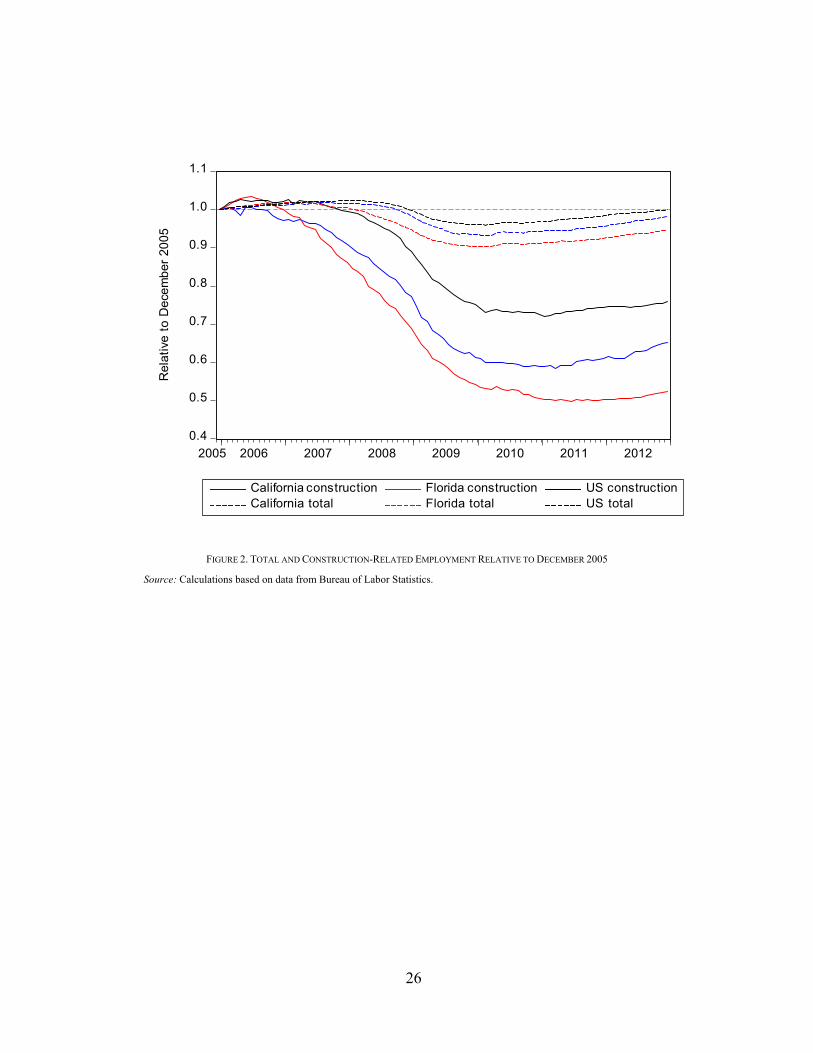
These employment losses were not shared evenly across industries. As shown in
Figure 2, from the end of 2005 to the end of 2009, total employment in the U.S.
declined by 4 percent, while construction employment declined nearly 25 percent.
Even though construction employment comprised only 5.6 percent of total
employment in 2005, construction-related employment losses accounted for over a
third of total employment losses.
Nor were the employment losses spread evenly across states and counties. In
California and Florida, total employment declined 7 to 10 percent from 2005 to
2009, while construction employment declined 40-45 percent. Furthermore,
construction-related employment losses in these states accounted for around 40
percent of the total. Given the effects of lower construction activity, lower lending
activity, the decline in wealth resulting from lower home prices, and lower spending
on durable consumption, we posit that the direct and indirect effects on
unemployment rates could be economically meaningful for many counties.
Drawing on a wide variation across counties in government mortgage program
participation and economic outcomes during and after the financial crisis, we find
a strong correlation between counties that participated more heavily in government
mortgage programs and better economic outcomes, and, further, that these better
outcomes can be attributed directly to greater program participation. In particular,
counties with higher levels of FHA participation had smaller increases in
unemployment rates; smaller declines in purchase originations, homes sales, and

3
home prices; and smaller increases in mortgage delinquency rates. These results
hold both in 2009 (immediately following the financial crisis) and in 2014 (six years
after the crisis). To a lesser extent, counties with substantial participation in GSE
programs (Fannie Mae and Freddie Mac) also had better economic outcomes. In
contrast, counties more reliant on bank portfolio and private-label securitization for
funding mortgage originations experienced larger changes.
We use generalized propensity score (GPS) methods to identify and estimate the
effects of government mortgage programs on economic outcomes. We control for
counties’ abilities to select their level of program participation, or selection of
treatment doses, based on pre-crisis county characteristics. In addition, we show
that our results are robust to varying degrees of unobserved heterogeneity in
counties’ selection of treatment doses. These techniques have not been previously
used to analyze the empirical effects of mortgage credit on real economic outcomes;
we provide a comprehensive approach to applying these techniques in this area.
We proceed as follows. Section II discusses mortgage market structures and
describes the data we use in our analysis. Section III summarizes the GPS
methodology, which we use to identify the effects of the intensity of government
mortgage program participation on county-level delinquency rates, purchase
originations, home sales, home prices, new auto purchases, and unemployment
rates. Section IV tests some of the underlying assumptions of the GPS methodology
(the common support and balancing conditions). Sections V and VI discuss and
summarize the estimated dose-response functions. These dose-response functions
show that government mortgage programs can be effective at mitigating the effects
of financial crisis on real economic activity. Sections VII and VIII discuss the
policy implications of our results and conclude.

4
II. Mortgage Markets and Data
We segment the mortgage market into four methods of origination and financing:
(1) government-guaranteed mortgages (Fannie Mae and Freddie Mac), (2)
government-insured mortgages (FHA/VA), (3) private-label securitization (PLS),
and (4) bank balance sheets (portfolios). The data are aggregated to the county level
using data from the Home Mortgage Disclosure Act (HMDA), CoreLogic, and
McDash Analytics.2
Fannie Mae and Freddie Mac are implicitly subsidized by the government
(Acharya et al., 2011, Passmore et al., 2005, Passmore, 2005). On September 6,
2008, the Federal Housing Finance Agency placed Fannie Mae and Freddie Mac
into conservatorship and the U.S. Department of the Treasury agreed to provide
strong financial support for these entities, solidifying the perception of government
support. Fannie Mae and Freddie Mac both remain under government
conservatorship.3 At the end of 2015, Fannie Mae and Freddie Mac guaranteed
about $2.8 trillion and $1.7 trillion of MBS, respectively.
The FHA provides mortgage insurance for mortgages extended by FHA-
approved lenders. FHA mortgages are typically securitized by Ginnie Mae or held
in bank portfolios. Ginnie Mae mortgage-backed securities (MBS) carry the full
faith and credit of the U.S. government. At the end of 2015, the FHA had about
$1.3 trillion of insurance in force.
Private-label securitization (PLS) typically consists of mortgages deemed to be
outside GSE parameters, either in terms of loan size—jumbo loans whose initial
balances exceed the conforming loan limits—or in terms of underwriting—alt-A
2
We make adjustments for differential data coverage across mortgage-market segments. For example, our data have nearly complete coverage of FHA and PLS lending, but incomplete coverage of GSE and portfolio lending.
3 For a history of the GSEs’ troubles, see Frame and White (2005) and Frame et al. (2015). For the current status of the
GSEs, see CBO (2014).

5
loans whose income is not fully documented or subprime loans whose credit scores
or loan-to-value ratios are too low or too high, respectively (Mayer et al., 2009).
PLS activity accounted for about $700 billion of mortgages outstanding at the end
of 2015.
Mortgages not securitized but held in bank portfolios often consist of very high
credit quality mortgages and/or very low credit quality mortgages (Passmore and
Sparks, 1996; Hancock and Passmore, 2011). Part of the motivation for these
stricter underwriting standards is a desire to maintain the option to sell the
mortgages to the government later, if needed. Part of the motivation for looser
underwriting is to extend the mortgage market beyond those mortgages that could
be securitized. Portfolio lending accounted for nearly $3.25 trillion at the end of
2015.
These four mortgage origination channels can be ranked by their government-
backed financing and underwriting standards. FHA/VA uses government insurance
and has the most generous underwriting standards. Fannie Mae and Freddie Mac
have tighter underwriting standards than FHA/VA, and their government backing
is more limited than FHA/VA. Although banks have government deposit insurance
on some of their liabilities, they also have non-government-backed liabilities. In
addition, their underwriting for fixed-rate mortgages typically follow either FHA
or GSE underwriting standards, and is thus stricter than underwriting standards
used by FHA, Fannie Mae, or Freddie Mac alone. PLS has no government backing
and has the tightest underwriting standards, at least following the financial crisis.
Before the crisis, of course, most PLS had notoriously loose underwriting
standards.
As shown in Figure 3, the bulk of mortgage debt outstanding in the United States
is held in bank portfolios or securitized by Fannie Mae or Freddie Mac. Private-
label securitization grew rapidly leading up to the financial crisis, at the expense of
FHA and GSE lending, but new PLS activity essentially ceased with the onset of
6
the financial crisis (Mayer et al., 2009, Nadauld and Sherlund, 2013). FHA insured
a relatively small portion of outstanding mortgage debt in 2005, but its share grew
rapidly following the financial crisis.
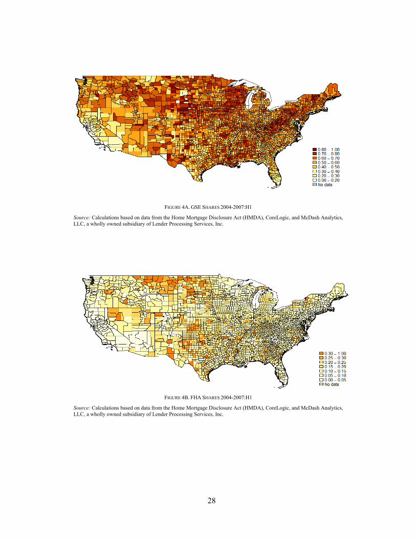
A map of counties across the United States illustrates the wide variation in
government involvement in mortgage lending prior to the financial crisis. The use
of government mortgage programs (Figures 4A and 4B) appears to be concentrated
away from the Coasts, dominating in the Midwest, Mountain West, Mississippi
River Valley, and Appalachia. Most of California, South Florida, and the largest
MSAs relied more heavily on private funding (Figures 4C and 4D).
Moreover, the empirical distributions of market shares further suggest significant
variation in government mortgage program use across counties prior to the financial
crisis (Figure 5). The bulk of GSE shares ranged from about 35 to 80 percent of
originations in a county, while FHA shares ranged from 2 to 28 percent. The bulk
of bank portfolio shares ranged from 4 to 27 percent, while PLS shares, even at its
heyday prior to the financial crisis, ranged from 4 to 31 percent of mortgage
originations in a county. Summary statistics are provided in Table 1.
Of course, the four market shares necessarily sum to 1, so Table 2 shows how the
various market shares tend to co-vary with each other.4 PLS and portfolio shares
tend to decline as GSE or FHA shares increase, while GSE and FHA shares exhibit
an inverse-U shape relationship with each other. Similarly, GSE and FHA shares
tend to decline as PLS or portfolio shares increase, whereas PLS and portfolio
funding exhibit more of a direct relationship with each other.
In addition to the mortgage market share data, we use county-level data from a
variety of other sources (also summarized in Table 1). Mortgage delinquency rates,
home sales, and home prices come from CoreLogic. New automobile purchase
registration data comes from R.L. Polk. Unemployment rates come from the Bureau
4
We use nonparametric kernel regression techniques to estimate these average shares.

7
of Labor Statistics. Median Equifax risk scores and the percentage of households
with risk scores within risk score buckets are aggregated from the FRBNY
Consumer Credit Panel / Equifax data. These data contain credit records for 5
percent of U.S. households with credit files as of 2005:Q4. Information on tax
returns, including wages and salaries, exemptions, dividends and interest, and the
percentage of returns within income buckets come from the IRS 2005 Statistics of
Income data. The number of lenders and purchase originations are calculated from
the Home Mortgage Disclosure Act (HMDA) data. Population, age, gender, race
and ethnicity, poverty rate, and education statistics for 2005 come from the Census
Bureau.
III. Estimation of the Generalized Propensity Score
Ultimately, we want to estimate how the intensity of GSE, FHA, PLS, and
portfolio exposures influence the state of the real economy. Unlike the ideal natural
experiment setting, in which treatment and control groups are clearly and randomly
assigned, the intensity of GSE, FHA, PLS, portfolio market shares take on a
continuum of values and can vary based on county characteristics. That is, a
county’s particular market share structure might not be independent of the same
conditions that influence economic performance. Thus, we control for the
propensity of a county to select its GSE, FHA, PLS, and portfolio market shares,
conditional on economic fundamentals such as average income, home price
appreciation, and the unemployment rate. The GSE, FHA, PLS, and portfolio
market shares for each county can then be considered a random treatment once each
county’s underlying characteristics have been taken into account. We can then
estimate the effect of the mortgage market shares on economic activity.
Propensity scoring has been used in other financial studies. For example, Casu et
al. (2013) use propensity scoring to identify the effects of securitization on bank

8
performance. They find that banks that securitize loans seem to have similar risk-
adjusted returns as banks that do not securitize loans. Bharath et al. (2009)
investigate lending relationships and loan contract terms. They use propensity
scores to create a matched sample of firms with lender relationships and those
without such relationships, and find that relationships yield a small but significant
funding advantage for borrowers. Finally, Chemmanur et al. (2014) use propensity
scores to assess and to rule out the possibility that corporate venture capital firms
are simply better at selecting innovative projects. They find that corporate venture
capital firms have a superior ability to nurture innovative ventures than independent
venture capital firms. Our approach is similar in spirit to Rosenbaum and Rubin
(1983) and most similar to Hirano and Imbens (2004). We use generalized
propensity scores, in which the probability of a particular county receiving a
particular dose or market share is a function of its pre-existing, underlying
characteristics.
Our identification strategy relies on the variation in government involvement in
mortgage markets across counties. Counties with significant government
involvement are subject to liquidity, credit risk pricing, and underwriting standards
that are set at the national level by FHA, Fannie Mae, and Freddie Mac. In contrast,
counties with little government involvement are more likely subject to more local
liquidity, credit risk pricing, and underwriting standards, as set by local banks,
thrifts, mortgage banks, and private-sector mortgage securitization conduits (whose
underwriting standards may or may not be set at the national level, and whose
underwriting standards are more likely correlated with local market conditions).
The extent of a county’s participation in government mortgage programs can be
characterized as a “treatment” administered by the government to augment the
financial infrastructure and support homeownership in a county. We assume that
each county’s mortgage market structure changes only slowly over time, and
reflects the characteristics of the population and economic conditions within each
9
county. We therefore model county-level GSE, FHA, PLS, and portfolio market
shares as a function of county characteristics during the 2004-2007 pre-crisis
period. We use only counties for which we have complete data on home prices
during our 2004-2014 observation period, resulting in 972 county-level
observations.5 Not surprisingly, as shown in Figure 6, the counties that remain are
predominantly located in metropolitan areas. Moreover, these counties account for
85-90 percent of purchase originations and home sales and 82 percent of new auto
purchases observed in the full data set.
We perform a set of first-stage regressions of the four treatment levels on county-
level characteristics:
(1) ti = β0 + β1 Xi + ei,
where ti is the market share, Xi the vector of observed county characteristics, and ei
is an error term. As the market shares necessarily sum to 1 for each county, we
restrict the regression so that the sum of β0 across the equations equals 1, and the
sum of each element of β1 across the equations equals 0. We also include state fixed
effects.
We include pre-crisis, county-level measures of credit quality, income,
population and demographics, economic fundamentals, housing affordability,
market competition, and conforming loan limits in Xi. The credit quality measures
consist of median risk scores, the proportion of the population with a credit report,
and the proportion of reports with risk scores in several bins: <580, 580-619, 620-
679, 680-739, 740-799, and 800+. Our income measures include average wages
and salaries, average exemptions, average dividends and interest, and the
proportion of returns with income in several bins: $0-10K, $10-25K, $25-50K, $50-
5
Our initial, incomplete data set started with 3,141 counties. Missing or incomplete house price data accounts for the majority of the dropped observations.

10
75K, $75-100K, and $100K+. The population and demographic measures consist
of total population, age proportion bins, gender proportion bins, race and ethnicity
proportion bins, poverty rates, and education proportion bins. Our economic
fundamentals include 12-month house price appreciation and the unemployment
rate, while our housing affordability measure is the median home price over average
income. Finally, the mortgage market competition measures consist of the total
number of lenders reporting to HMDA in 2005 as well as the change from 1998,
while the conforming loan limit measures consist of the difference between the
median home price and the conforming loan limit and the proportion of home sales
that occur at or below 125 percent the conforming loan limit.
As shown in Table 3, these measures do a decent job in explaining the variation
in the four market shares, with R-squared values of 54 to 80 percent. Furthermore,
credit scores, income, population and demographics, economic fundamentals,
housing affordability, mortgage market competition, and conforming loan limits
each contribute in ways that make sense across the equations. For instance, GSE
shares tended to be larger with higher average incomes, while FHA and PLS shares
tended to be lower. GSE and FHA shares tended to be higher when the proportion
of home sales at or below 125 percent of the conforming loan limit was higher,
while PLS and portfolio shares tended to be lower.
The generalized propensity score (GPS) estimates are then
(2) ri = ϕ((ti – β0 – β1 Xi)/σ),
where ϕ is the standard normal probability density function. The inclusion of the
estimated GPS in our subsequent analysis accounts for the selection of counties into
their particular treatment levels.

11
IV. Testing the Estimated GPS
The adequacy of the estimated GPS relies on two important assumptions: the
common support condition and the balancing condition. The common support
assumption assures that treated observations have similar untreated observations
with which to compare. The balancing condition ensures that the covariates are
orthogonal to the doses conditional on the GPS, so that differences in county
characteristics do not implicitly bias our results. In other words, when we estimate
the impact of mortgage market shares on real economic activity, we can be
confident that the estimates causal effects are coming from changes in market
shares as opposed to changes in the underlying characteristics of the counties. We
explore each of these conditions next.
To assess the common support condition, we follow the approach of Hirano and
Imbens (2004) and estimate the GPS for all counties at each quartile of treatment,
and then compare these estimates across quartile groups. Observations that lie
outside the support of the comparison group are dropped.6 In each case, we compare
observations with actual market shares within 25 percentiles of the assumed
treatment (treated group) with those with actual market shares outside 25
percentiles of the assumed treatment level (control group). If a particular GPS
estimate lies outside the support of its comparison group then we drop that
observation. This procedure reduces the sample size to 916 counties for our GSE
analysis (6.8 percent dropped), 879 counties for our FHA analysis (9.6 percent
dropped), 837 counties for our PLS analysis (13.9 percent dropped), and 949
6
For example, we estimate the GPS for each county assuming GSE market shares of 46.7, 54.3, and 61.3 percent—the 25th, 50th, and 75th percentiles. We then compare the GPS based on the 25th-percentile market share across two groups: those with actual GSE market shares below the 50th percentile and those with actual GSE market shares above the 50th percentile. Similarly, we compare the GPS based on the 75th-percentile market share across two groups: those with actual GSE markets shares above the 50th percentile and those with actual GSE market shares below the 50th percentile. Finally, we compare the GPS based on the 50th-percentile market share across two groups: those with actual GSE market shares between the 25th and 75th percentiles and those with actual GSE market shares below the 25th percentile or above the 75th percentile.

12
counties for our bank portfolio analysis (2.4 percent dropped). The remaining
counties satisfy the common support condition, which ensures that each county has
at least one counterpart to which it can be compared.
To test the balancing property, we also follow the approach of Hirano and Imbens
(2004) and discretize market shares into three equal-sized groups and the estimates
GPS into five equal-sized groups. We then test for the equality of covariate means
across treatment groups, conditional on the GPS.7 Adjusting for the GPS
substantially improves the balance, reducing the magnitudes of the t-statistics
reported in Tables 4A-4D. More generally, the GPS adjustment substantially
reduces the magnitudes of the t-statistics—in fact, most are statistically
insignificant once adjusted by the estimated GPS. Thus our estimated GPS balances
the covariates in our sample. We therefore take some comfort in that we can isolate
the pure effect of government involvement in the mortgage market on the economic
variables of interest.
V. Estimation of the Dose-Response Functions
Now that we have verified the common support and balancing conditions, we
regress the economic outcomes of four periods on their pre-determined mortgage
market structures and on their estimated GPS. The four subsequent periods we
study are 2007:H2-2008 (early crisis period), 2009 (crisis period), 2010-2012 (early
post-crisis period), and 2013-2014 (post-crisis period). The six economic outcomes
of interest we evaluate include: (1) mortgage delinquency rates, (2) purchase
7
For example, as shown in Table 4A, when we test the equality of average credit score medians for counties with GSE market shares of 49 percent or less against those with GSE market shares greater than 49 percent, counties with GSE market shares of 49 percent or less tend to have lower median credit scores than counties with GSE market shares above 49 percent (t-statistic of -10.4). Similarly, counties with GSE market shares above 59 percent tend to have higher median credit scores than counties with GSE market shares of 59 percent or less (t-statistic of 9.9). To adjust for the GPS, we compute the GPS for an assumed GSE market share of 43 percent (the median for counties with GSE market shares of 50 percent or less) for each county. For each GPS quintile, we compute the t-statistic for the equality of median credit scores across counties with GSE market shares of 49 percent or less versus those with GSE market shares greater than 49 percent, then compute the weighted average across GPS quintiles to arrive at the overall t-statistic.

13
originations, (3) home sales, (4) home prices, (5) new auto purchases, and (6)
unemployment rates. We also consider the evolution of mortgage market shares.
For each time period, mortgage delinquency rates, home prices, and unemployment
rates are measured relative to their 2005 year-end values, while purchase
originations, home sales, and new auto purchases are measured relative to their
2004-2007:H1 monthly averages.
We estimate the dose-response functions using nonparametric local-linear
regression and weight by the estimated GPS to account for selection into treatment
levels. In particular,
(3) yi = m(ti , ri ) + ei,
where yi is the economic variable of interest, ti is the treatment level or market share,
ri is the estimated GPS evaluated at the actual market share and the observed county
characteristics, and m is an arbitrary nonparametric function.8 We specify a
Gaussian kernel and use a rule of thumb bandwidth throughout.9
VI. Graphical Dose-Response Functions
Graphical dose-response functions provide a convenient summary of the
estimated dose-response functions. They show the expected value of the economic
outcome conditional on a level of treatment and the estimated GPS. Confidence
bands are generated from 2,500 bootstrap replications (with replacement), and are
shown for 2009 and 2014; those for 2008 and 2012 are of similar size.
8
We also explored estimating the dose-response functions using parametric functions with linear and higher-order polynomials of ti and ri ,as well as an unweighted multivariate local-linear regression of yi on ti and ri. Our qualitative results remain the same.
9 Using optimal, cross-validated bandwidths produces similar results, although a bit more “wiggly.”

14
A. Mortgage Delinquencies
Overall, mortgage delinquency rates increased by a factor of about 4.5 from 2005
to 2009. Delinquency rates (Figure 7) rose the most in counties with the highest
exposures to PLS or portfolio lending and lowest exposures to GSE or FHA
lending. This is consistent with the findings of Mian and Sufi (2009) and Mayer et
al. (2009), who all attribute higher delinquency rates and foreclosures to the use of
private-label securitization and portfolio lending activity. By 2014, mortgage
delinquency rates had declined, but still remained about twice as high as in 2005.
The rise in delinquency rates remained the highest in counties with the highest
exposures to PLS or portfolio lending and lowest exposures to GSE or FHA
lending.
In particular, by 2009 mortgage delinquency rates had risen by a factor of 16 in
the lowest FHA-share counties compared to a factor of 3 in the highest FHA-share
counties. Similarly, delinquency rates had risen by a factor of 12 in the lowest GSE-
share counties compared to a factor of about 3.5 in the highest GSE-share counties.
In contrast, by 2009 mortgage delinquency rates had increased by a factor of 3 in
the lowest PLS-share counties, compared to a factor of 10 in the highest PLS-share
counties; and had increased by a factor of about 3 in the lowest portfolio-share
counties, compared to a factor of 18 in the highest portfolio-share counties.
B. Mortgage Market Shares
Given the large increases in delinquencies associated with PLS-funded
originations, in particular, mortgage originators (and investors) moved away from
private funding sources during and following the financial crisis—both in an
absolute and a relative (market share) sense. As shown in Figure 8, PLS funding
fell to essentially zero and portfolio shares declined somewhat, most notably for
higher portfolio-share counties. FHA and GSE funding made up some of these

15
losses: FHA shares increased notably across the board (FHA shares increased
parallel to the 45-degree line), while GSE shares increased for lower GSE-share
counties. Note that GSE shares ultimately declined among the higher GSE-share
counties, likely reflecting increased guarantee fees and the increased FHA
presence. Overall, this is the primary mechanism through which we expect FHA
and GSE lending to provide positive economic impetus during a financial crisis.
When other sources of mortgage financing become less available, either because of
higher credit risk, higher liquidity premiums, or because of tighter underwriting
standards, FHA and GSE lending (broadly speaking) remains available at roughly
unchanged prices.
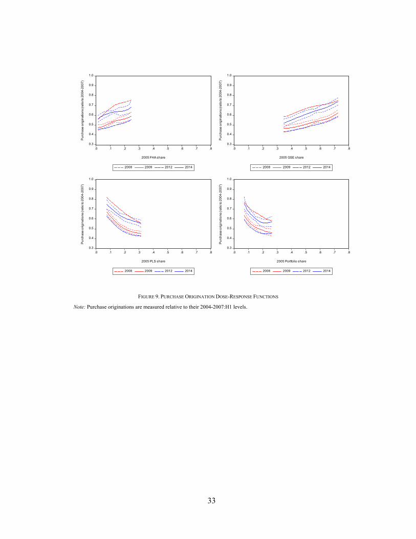
C. Purchase Originations
Overall, monthly purchase originations fell by about half from the 2004-2007:H1
period to 2009. Purchase originations (Figure 9) declined the most in counties with
the highest exposures to PLS or portfolio lending and lowest exposures to GSE or
FHA lending. By 2014, purchase originations had increased slightly, but remained
well below their levels in 2005. The decline in purchase originations remained the
largest in counties with the highest exposures to PLS or portfolio lending and lowest
exposures to GSE or FHA lending.
In particular, by 2009 purchase originations had fallen by over 50 percent in the
lowest FHA-share counties compared to about 40 percent in the highest FHA-share
counties. Similarly, purchase originations had fallen by over 50 percent in the
lowest GSE-share counties compared to 38 percent in the highest GSE-share
counties. In contrast, by 2009 purchase originations had declined by 33 percent in
the lowest PLS-share counties, compared to 55 percent in the highest PLS-share
counties; and 36 percent in the lowest portfolio-share counties, compared to 54
percent in the highest portfolio-share counties.
16
D. Home Sales and Home Prices
Given the vital link between home financing and home sales, one might expect
to find similar results for home sales. Overall, monthly home sales fell by about
half from the 2004-2007:H1 period to 2009. Home sales (Figure 10) declined the
most in counties with the highest exposures to PLS or portfolio lending and lowest
exposures to GSE or FHA lending. By 2014, home sales had increased slightly, but
remained well below their levels in 2004-2007:H1. The decline in home sales
remained the largest in counties with the highest exposures to PLS or portfolio
lending and lowest exposures to GSE or FHA lending.
In particular, by 2009 home sales had fallen by about 50 percent in the lowest
FHA-share counties compared to about 35 percent in the highest FHA-share
counties. Similarly, home sales had fallen by 46 percent in the lowest GSE-share
counties compared to 35 percent in the highest GSE-share counties. In contrast, by
2009 home sales had declined by 26 percent in the lowest PLS-share counties,
compared to over 50 percent in the highest PLS-share counties; and 32 percent in
the lowest portfolio-share counties, compared to 46 percent in the highest portfolio-
share counties.
Home prices, the primary store of wealth for many Americans, also exhibited
stark differences across mortgage market structures. Home prices (Figure 11)
declined the most in counties with the highest exposures to PLS or portfolio lending
and lowest exposures to GSE or FHA lending. By 2014, home prices had increased
somewhat, but remained below their 2005 levels on average. The decline in home
prices remained sizable in counties with the highest exposures to PLS or portfolio
lending and lowest exposures to GSE or FHA lending, while home price declines
were largely erased in counties (if not somewhat higher) with the highest exposures
to GSE or FHA lending and lowest exposures to PLS and portfolio lending.

17
In particular, by 2009 home prices had fallen by 22 percent in the lowest FHA-
share counties compared to only 4 percent in the highest FHA-share counties.
Similarly, home prices had fallen by 22 percent in the lowest GSE-share counties
compared to only 4 percent in the highest GSE-share counties. In contrast, by 2009
home prices were essentially unchanged from 2005 in the lowest PLS-share
counties, compared to having fallen 20 percent in the highest PLS-share counties;
and essentially unchanged in the lowest portfolio-share counties, compared to
having fallen 23 percent in the highest portfolio-share counties.
E. New Auto Purchases
Given the effects on home prices, it is natural to ask if there were any wealth
effects on consumption, particularly of durable goods. To evaluate this, we consider
new auto purchase registrations. Overall, new auto purchases fell about 40 percent
from the 2004-2007:H1 period to 2009. New auto purchases (Figure 10) declined
the most in counties with the highest exposures to PLS or portfolio lending and
lowest exposures to GSE or FHA lending. By 2014, new auto purchases had
increased significantly, but remained below their levels in 2004-2007:H1. The
decline in new auto purchases remained the largest in counties with the highest
exposures to PLS or portfolio lending and lowest exposures to GSE or FHA
lending.
In particular, by 2009 new auto purchases had fallen by about 40 percent in the
lowest FHA-share counties compared to about 30 percent in the highest FHA-share
counties. Similarly, new auto purchases had fallen by 40 percent in the lowest GSE-
share counties compared to 25 percent in the highest GSE-share counties. In
contrast, by 2009 home sales had declined by 27 percent in the lowest PLS-share
counties, compared to 43 percent in the highest PLS-share counties; and 28 percent

18
in the lowest portfolio-share counties, compared to 44 percent in the highest
portfolio-share.
F. Unemployment Rates
As we showed before, declines in construction employment comprised an
outsized share of the overall declines in employment. Moreover, declines in real
estate and real-estate finance employment likely added to employment declines.
Declines in home prices decreased household wealth, which likely affected
household saving and consumption decisions, such as automobile purchases,
possibly leading to other types of employment losses. To explore this further, we
evaluate the relationship between pre-crisis mortgage market shares and post-crisis
unemployment rates.
Overall, unemployment rates increased from an about 5 percent in 2005 to almost
10 percent in 2009. Unemployment rates (Figure 12) increased the most in counties
with the highest exposures to PLS or portfolio lending and lowest exposures to GSE
or FHA lending. In particular, by 2009 unemployment rates had more than doubled
in the lowest FHA-share counties compared to increasing by almost 70 percent in
the highest FHA-share counties. Similarly, unemployment rates had increased by
93 percent in the lowest GSE-share counties compared to 72 percent in the highest
GSE-share counties. In contrast, by 2009 unemployment rates had increased by 64
percent in the lowest PLS-share counties, compared to nearly doubling in the
highest PLS-share counties; and 62 percent in the lowest portfolio-share counties,
compared to more than doubling in the highest portfolio-share counties.
What is clear is that the financial crisis was a substantial shock which influenced
all counties, but the effects were larger in counties with lower government
involvement (higher private involvement) in mortgage markets prior to the shock.
By the end of 2012, unemployment rates had fallen across the board, but remained

19
83 percent higher in low FHA-share counties—and 51 percent higher in high FHA-
share counties—relative to before the crisis. For comparison, unemployment rates
remained 43 percent higher in low PLS-share counties and 72 percent higher in
high PLS-share counties. By the end of 2014, unemployment rates remained 34 and
21 percent higher than in 2005 for low and high FHA-share counties, respectively.
For comparison, unemployment rates remained 18 percent higher in low PLS-share
counties and 30 percent higher in high PLS-share counties.10 Here, it is evident that
the effects of the financial crisis still remain, and that those effects are larger for
lower FHA- and GSE-share counties, and higher PLS- and portfolio-share counties.
Overall, our results suggest that counties more reliant on some form of
government funding for mortgages were more insulated from the financial crisis;
the effects of the (negative) liquidity and funding shocks had smaller economic
impacts on counties that utilized government mortgage more heavily prior to the
financial crisis. Counties that relied on private sources of funding, however,
experienced greater effects from the initial liquidity and funding shocks: even
higher unemployment rates, even lower home sales, and even lower home prices.
These effects were still apparent in 2014, though the effects of the initial shocks
had decayed substantially.11,12
10
If we showed our charts in levels, rather than relative to 2005, the interpretation of our results might be even stronger. The results for GSE, PLS and portfolio channels are similar, but for FHA, the effects are more dramatic. Prior to the crisis, counties with higher FHA shares tended to also have higher unemployment rates. During the crisis, however, this relationship flipped: Counties with higher pre-crisis FHA shares tended to have lower unemployment rates. By 2014, counties with higher pre-crisis FHA shares again tended to have higher unemployment rates, restoring the pre-crisis relationship.
11 The average treatment effect is commonly reported to characterize differences between treated and untreated groups.
Here, our treatment is continuous, so the average treatment effect is the derivative of the dose-response function. 12
In results not reported here, we compute Mantel-Haenszel (1959) test statistics and Rosenbaum bounds around those test statistics to assess the sensitivity of our results to unobserved heterogeneity. Our results are fairly robust to mild to moderate cases of unobserved heterogeneity. These results are available upon request from the authors.

20
VIII. Why Does Government Involvement Prior to the Crisis Speed a
Recovery?
We find large economic effects across counties because of differences in
participation in mortgage channels, even though such channels would likely have
only small differences in mortgage rates or credit costs. Indeed, mortgage
borrowers likely choose among mortgages across these different channels, creating
competitive pressures that minimize the cost differences across channels. Since we
have accounted for variations county market shares across both aggregate
individual mortgage borrower characteristics and across country characteristics
(e.g. home prices), it seems even more likely the share of mortgage originations
flowing through a particular mortgage channel within a county does not reflect
relative price differences. As we show above, after our first-stage regression, the
shares of mortgages originated through a particular channel in a particular county
become randomized.
As a result, the variation in economic outcomes across counties during the
financial crisis should only reflect variations by what each mortgage channel
provided lenders and/or borrowers during the financial crisis. The possible behavior
of mortgage-related institutions during a financial crisis was rarely discussed, much
less priced into mortgage rates, during the housing boom.
In particular, we would point to how the mortgage channels varied in their ability
to provide mortgage originators liquidity, via securitization, during the prolonged
period financial turmoil. The PLS channel shutdown down during the crisis and, to
date, has not returned. The crisis revealed the inability of this channel to provide
liquidity during financial turmoil, and it may be that this inability to persist during
a crisis will remain a serious problem for PLS activity in the future.13
13
Many observers have argued that without a credible legal framework for handling disputes related to mortgage defaults, private sector investors will remain unwilling to invest again (Goodman, 2015).

21
Similarly, the crisis revealed that the banking sector seems poorly suited to
provide mortgage credit during a financial crisis and afterwards. Many banks
moved from originating and financing mortgages to only originating mortgages and
then securitizing them through government-backed mortgage channels.14
The mortgage channels that both prospered and created relative prosperity during
the crisis were the securitization channels that had either implicit or explicit
government-backing. Government backing of a mortgage securitization outlet for
mortgage originators during a crisis may be a key ingredient for a quicker economy
recovery during a prolonged financial crisis.15
IX. Conclusion
Do government mortgage programs mitigate the adverse economic effects of a
financial crisis? Do they promote faster recovery? Drawing on the wide variation
across counties in government mortgage program participation and economic
outcomes during and after the financial crisis, we find a strong correlation between
counties that participated more heavily in government-backed mortgage programs
and better economic outcomes. Moreover, we find that these better outcomes can
be attributed directly to greater participation in these government mortgage
programs. In particular, counties with higher levels of participation in FHA, Fannie
Mae, and Freddie Mac lending had smaller increases in delinquency rates; smaller
declines in purchase originations, home sales, home prices, and new auto
purchases; and smaller increase in unemployment rates. These results hold both in
2009 (right after the peak of the financial crisis) and in 2014 (six years after the
14
Again, the legal framework for bearing the costs of default for both mortgage servicing and mortgage defaults seems partly responsible for the financial fragility of bank financing during and after a crisis.
15 Of course, providing government guarantees for the performance of financial assets has well-known moral hazard
problems. However, well-targeted government insurance programs (clear participation requirements and relatively small target-populations) in non-crisis states can potentially limit moral hazard concerns, while mitigating negative consequences during a crisis (Hancock and Passmore, 2011, Krishnamurthy, 2010). And, of course, selling into the secondary market leads to adverse selection and other agency problems (Passmore and Sparks, 2000, Demarzo, 2005, Heuson et al., 2001).

22
crisis). The persistence of better outcomes in counties with heavy participation in
government mortgage programs is consistent with a view that mortgage originators’
access to a liquidity outlet (in this case, government-backed securitization) is key
to maintaining credit flows and economic growth during financial turmoil.
REFERENCES
Acharya, Viral V., Matthew Richardson, Stijn Van Nieuwerburgh, and Lawrence
J. White, 2011. Guaranteed to Fail: Fannie Mae, Freddie Mac and the Debacle of
Mortgage Finance, Princeton and Oxford: Princeton University Press.
Allen, Franklin and Douglas Gale, 1998. “Optimal Financial Crisis,” Journal of
Finance, 53, 1245-1284.
Bharath, Sreedhar T., Sandeep Dahiya, Anthony Saunders, and Anand Srinivasan,
2009. “Lending Relationships and Loan Contract Terms,” Review of Financial
Studies, 24(4), 1141-1203.
Casu, Barbara, Andrew Clare, Anna Sarkisyan, and Stephen Thomas, 2013.
“Securitization and Bank Performance, Journal of Money, Credit and Banking,
45(8), 1617-1658.
Chemmanur, Thomas J., Elena Loutskina, and Xuan Tian, 2014. “Corporate
Venture Capital, Value Creation, and Innovation,” Review of Financial Studies,
27(8), 2434-2473.
Congressional Budget Office (CBO), 2014. “Transitioning to Alternative
Structures for Housing Finance,” http://www.cbo.gov/publication/49765.
DeMarzo, P., 2005. “The Pooling and Tranching of Securities: A Model of
Informed Intermediation,” Review of Financial Studies, 18(1), 1-35.
Frame, W. Scott, Andreas Fuster, Joseph Tracy, and James Vickery, 2015. “The
Rescue of Fannie Mae and Freddie Mac,” Journal of Economic Perspectives,

23
29(2), 25-52.
Frame, W. Scott, and Lawrence J. White, 2005. “Fussing and Fuming over Fannie
and Freddie: How Much Smoke, How Much Fire?” Journal of Economic
Perspectives, 19(2), 159-184.
Goodman, Laurie, 2015. “The Rebirth of Securitization: Where Is the Private-Label
Mortgage Market,” Housing Finance Policy Center, Urban Institute.
Green, Richard K., and Susan M. Wachter, 2005. “The American Mortgage in
Historical and International Context,” Journal of Economic Perspectives, 19(4),
93-114.
Hancock, Diana, and Wayne Passmore, 2011. “Catastrophic Mortgage Insurance
and the Reform of Fannie Mae and Freddie Mac” In The Future of Housing
Finance: Restructuring the U.S. Residential Mortgage Market, ed. Martin N.
Baily. Washington, DC: Brookings Institution Press.
Heuson, Andrea, S. W. Passmore, and Roger Sparks, 2001. “Credit Scoring and
Mortgage Securitization: Implications for Mortgage Rates and Credit
Availability,” Journal of Real Estate Finance and Economics, 23, 337-363.
Hirano, Keisuke, and Guido W. Imbens, 2004. “The Propensity Score with
Continuous Treatments” In Applied Bayesian Modeling and Causal Inference
from Incomplete-Data Perspectives, eds. Andrew Gelman and Xiao-Li Meng. 73-
84. West Sussex: John Wiley and Sons.
Holden, Steve, Austin Kelly, Douglas McManus, Therese Scharlemann, Ryan
Singer, and John D. Worth, 2012. “The HAMP NPV Model: Development and
Early Performance,” Real Estate Economics.
Krishnamurthy, Arvind, 2010. “Amplification Mechanisms in Liquidity Crises,”
American Economic Journal: Macroeconomics, 2(3), 1-30.
Mantel, N., and W. Haenszel, 1959. “Statistical Aspects of the Analysis of Data
from Retrospective Studies of Disease,” Journal of the National Cancer Institute,
22, 719-748.

24
Mayer, Christopher, Karen Pence, and Shane M. Sherlund, 2009. “The Rise in
Mortgage Defaults,” Journal of Economic Perspectives, 23, 27-50.
Mian, Atif and Amir Sufi, 2009. “The Consequences of Mortgage Credit
Expansion: Evidence from the U.S. Mortgage Default Crisis,” Quarterly Journal
of Economics, 124(4), 1449-1496.
Nadauld, Taylor, and Shane M. Sherlund, 2013. “The Impact of Securitization on
the Expansion of Subprime Credit,” Journal of Financial Economics, 107, 454-
476.
Passmore, Wayne, 2005. “The GSE Implicit Subsidy and the Value of Government
Ambiguity,” Real Estate Economics, 33(3), 465-486.
Passmore, S. Wayne, Shane M. Sherlund, and Gillian Burgess, 2005. “The Effect
of Housing Government-Sponsored Enterprises on Mortgage Rates,” Real Estate
Economics, 33(3), 427-463.
Passmore, S. Wayne, and Roger Sparks, 2000. “Automated Underwriting and the
Profitability of Mortgage Securitization,” Real Estate Economics, 28(2), 285-
305.
Passmore, S.W. and R. Sparks, 1996, “Putting the Squeeze on a Market for Lemons:
Government-Sponsored Mortgage Securitization,” Journal of Real Estate
Finance and Economics, vol. 96, no 13, 27-43.
Rosenbaum, P.R., and D.B. Rubin, 1983. “The Central Role of the Propensity Score
in Observational Studies for Causal Effects,” Biometrika, 70, 41-55.

25
1
2
3
4
5
6
7
8
9
00 01 02 03 04 05 06 07 08 09 10 11 12 13 14
Del
inqu
ency
rat
e (p
erce
nt)
2
3
4
5
6
7
8
00 01 02 03 04 05 06 07 08 09 10 11 12 13 14
Pur
chas
e or
igin
atio
ns (
mill
ions
)
4
5
6
7
8
9
00 01 02 03 04 05 06 07 08 09 10 11 12 13 14
Hom
e sa
les
(mill
ions
)
100
120
140
160
180
200
00 01 02 03 04 05 06 07 08 09 10 11 12 13 14
Hom
e pr
ices
(Ja
nuar
y 20
00 =
100
)
6
7
8
9
10
11
12
00 01 02 03 04 05 06 07 08 09 10 11 12 13 14
New
aut
o pu
rcha
ses
(mill
ions
)
3
4
5
6
7
8
9
10
00 01 02 03 04 05 06 07 08 09 10 11 12 13 14
Une
mpl
oym
ent r
ate
(per
cent
)
FIGURE 1. DELINQUENCY RATES, PURCHASE ORIGINATIONS, HOME SALES, HOME PRICES, NEW AUTO PURCHASES AND
UNEMPLOYMENT RATES
Source: Delinquency rates, home sales, and home prices from CoreLogic. Purchase originations based on data from the Home Mortgage Disclosure Act (HMDA), CoreLogic, and McDash Analytics, LLC, a wholly owned subsidiary of Lender Processing Services, Inc. New auto purchases from RL Polk. Unemployment rates from the Bureau of Labor Statistics.
26
0.4
0.5
0.6
0.7
0.8
0.9
1.0
1.1
2005 2006 2007 2008 2009 2010 2011 2012
California construction Florida construction US constructionCalifornia total Florida total US total
Re
lati
ve t
o D
ece
mb
er
20
05
FIGURE 2. TOTAL AND CONSTRUCTION-RELATED EMPLOYMENT RELATIVE TO DECEMBER 2005
Source: Calculations based on data from Bureau of Labor Statistics.

27
0
2,000,000
4,000,000
6,000,000
8,000,000
10,000,000
12,000,000
04 05 06 07 08 09 10 11 12 13 14
GSE FHA/VA Portfolio Private-label securitization
Outs
tandin
g (
$)
FIGURE 3. MORTGAGE DEBT OUTSTANDING
Source: Federal Reserve Board’s Financial Accounts of the United States.
28
FIGURE 4A. GSE SHARES 2004-2007:H1
Source: Calculations based on data from the Home Mortgage Disclosure Act (HMDA), CoreLogic, and McDash Analytics, LLC, a wholly owned subsidiary of Lender Processing Services, Inc.
FIGURE 4B. FHA SHARES 2004-2007:H1
Source: Calculations based on data from the Home Mortgage Disclosure Act (HMDA), CoreLogic, and McDash Analytics, LLC, a wholly owned subsidiary of Lender Processing Services, Inc.

29
FIGURE 4C. PLS SHARES, 2004-2007:H1
Source: Calculations based on data from the Home Mortgage Disclosure Act (HMDA), CoreLogic, and McDash Analytics, LLC, a wholly owned subsidiary of Lender Processing Services, Inc.
FIGURE 4D. PORTFOLIO SHARES, 2004-2007:H1
Source: Calculations based on data from the Home Mortgage Disclosure Act (HMDA), CoreLogic, and McDash Analytics, LLC, a wholly owned subsidiary of Lender Processing Services, Inc.

30
0
1
2
3
4
5
6
7
8
0.0 0.1 0.2 0.3 0.4 0.5 0.6 0.7 0.8 0.9 1.0
FHA GSE PLS Portfolio
De
nsi
ty
Market share
FIGURE 5. MORTGAGE MARKET SHARES, 2004-2007:H1
Source: Calculations based on data from the Home Mortgage Disclosure Act (HMDA), CoreLogic, and McDash Analytics, LLC, a wholly owned subsidiary of Lender Processing Services, Inc.
FIGURE 6. DATA COVERAGE

31
0
4
8
12
16
20
24
.0 .1 .2 .3 .4 .5 .6 .7 .8
2005 FHA share
2008 2009 2012 2014
De
linq
ue
ncy
rate
s (r
atio
to 2
00
5)
0
4
8
12
16
20
24
.0 .1 .2 .3 .4 .5 .6 .7 .8
2005 GSE share
2008 2009 2012 2014
De
linq
ue
ncy
rate
s (r
atio
to 2
00
5)
0
4
8
12
16
20
24
.0 .1 .2 .3 .4 .5 .6 .7 .8
2005 PLS share
2008 2009 2012 2014
De
linq
ue
ncy
rate
s (r
atio
to 2
00
5)
0
4
8
12
16
20
24
.0 .1 .2 .3 .4 .5 .6 .7 .8
2005 Portfolio share
2008 2009 2012 2014
De
linq
ue
ncy
rate
s (r
atio
to 2
00
5)
FIGURE 7. MORTGAGE DELINQUENCY RATE DOSE-RESPONSE FUNCTIONS
Note: Mortgage delinquency rates are measured relative to their December 2005 levels.

32
.0
.1
.2
.3
.4
.5
.6
.7
.8
.0 .1 .2 .3 .4 .5 .6 .7 .8
2005 FHA share
2008 2009 2012 2014
FH
A s
ha
re
.0
.1
.2
.3
.4
.5
.6
.7
.8
.0 .1 .2 .3 .4 .5 .6 .7 .8
2005 GSE share
2008 2009 2012 2014
GS
E s
ha
re
.0
.1
.2
.3
.4
.5
.6
.7
.8
.0 .1 .2 .3 .4 .5 .6 .7 .8
2005 PLS share
2008 2009 2012 2014
PL
S s
ha
re
.0
.1
.2
.3
.4
.5
.6
.7
.8
.0 .1 .2 .3 .4 .5 .6 .7 .8
2005 Portfolio share
2008 2009 2012 2014
Po
rtfo
lio s
ha
re
FIGURE 8. MARKET SHARE DOSE-RESPONSE FUNCTIONS
Note: Market shares are measured over 2004-2007:H1 (denoted 2005), 2007:H2-2008 (denoted 2008), 2009 (denoted 2009), 2010-2012 (denoted 2012), and 2013-2014 (denoted 2014).
33
0.3
0.4
0.5
0.6
0.7
0.8
0.9
1.0
.0 .1 .2 .3 .4 .5 .6 .7 .8
2005 FHA share
2008 2009 2012 2014
Pu
rch
ase
ori
gin
atio
ns
(ra
tio to
20
04
-20
07
)
0.3
0.4
0.5
0.6
0.7
0.8
0.9
1.0
.0 .1 .2 .3 .4 .5 .6 .7 .8
2005 GSE share
2008 2009 2012 2014
Pu
rch
ase
ori
gin
atio
ns
(ra
tio to
20
04
-20
07
)
0.3
0.4
0.5
0.6
0.7
0.8
0.9
1.0
.0 .1 .2 .3 .4 .5 .6 .7 .8
2005 PLS share
2008 2009 2012 2014
Pu
rch
ase
ori
gin
atio
ns
(ra
tio to
20
04
-20
07
)
0.3
0.4
0.5
0.6
0.7
0.8
0.9
1.0
.0 .1 .2 .3 .4 .5 .6 .7 .8
2005 Portfolio share
2008 2009 2012 2014
Pu
rch
ase
ori
gin
atio
ns
(ra
tio to
20
04
-20
07
)
FIGURE 9. PURCHASE ORIGINATION DOSE-RESPONSE FUNCTIONS
Note: Purchase originations are measured relative to their 2004-2007:H1 levels.
34
0.3
0.4
0.5
0.6
0.7
0.8
0.9
1.0
.0 .1 .2 .3 .4 .5 .6 .7 .8
2005 FHA share
2008 2009 2012 2014
Ho
me
sa
les
(ra
tio to
20
04
-20
07
)
0.3
0.4
0.5
0.6
0.7
0.8
0.9
1.0
.0 .1 .2 .3 .4 .5 .6 .7 .8
2005 GSE share
2008 2009 2012 2014
Ho
me
sa
les
(ra
tio to
20
04
-20
07
)
0.3
0.4
0.5
0.6
0.7
0.8
0.9
1.0
.0 .1 .2 .3 .4 .5 .6 .7 .8
2005 PLS share
2008 2009 2012 2014
Ho
me
sa
les
(ra
tio to
20
04
-20
07
)
0.3
0.4
0.5
0.6
0.7
0.8
0.9
1.0
.0 .1 .2 .3 .4 .5 .6 .7 .8
2005 Portfolio share
2008 2009 2012 2014
Ho
me
sa
les
(ra
tio to
20
04
-20
07
)
FIGURE 10. HOME SALES DOSE-RESPONSE FUNCTIONS
Note: Home sales are measured relative to their 2004-2007:H1 levels.
35
0.6
0.7
0.8
0.9
1.0
1.1
1.2
1.3
.0 .1 .2 .3 .4 .5 .6 .7 .8
2005 FHA share
2008 2009 2012 2014
Ho
me
pri
ces
(ra
tio to
20
05
)
0.6
0.7
0.8
0.9
1.0
1.1
1.2
1.3
.0 .1 .2 .3 .4 .5 .6 .7 .8
2005 GSE share
2008 2009 2012 2014
Ho
me
pri
ces
(ra
tio to
20
05
)
0.6
0.7
0.8
0.9
1.0
1.1
1.2
1.3
.0 .1 .2 .3 .4 .5 .6 .7 .8
2005 PLS share
2008 2009 2012 2014
Ho
me
pri
ces
(ra
tio to
20
05
)
0.6
0.7
0.8
0.9
1.0
1.1
1.2
1.3
.0 .1 .2 .3 .4 .5 .6 .7 .8
2005 Portfolio share
2008 2009 2012 2014
Ho
me
pri
ces
(ra
tio to
20
05
)
FIGURE 11. HOME PRICES DOSE-RESPONSE FUNCTIONS
Note: Home prices are measured relative to their December 2005 levels.

36
0.4
0.5
0.6
0.7
0.8
0.9
1.0
1.1
1.2
.0 .1 .2 .3 .4 .5 .6 .7 .8
2005 FHA share
2008 2009 2012 2014
New
aut
o pu
rcha
ses
(rat
io to
200
4-20
07)
0.4
0.5
0.6
0.7
0.8
0.9
1.0
1.1
1.2
.0 .1 .2 .3 .4 .5 .6 .7 .8
2005 GSE share
2008 2009 2012 2014
New
aut
o pu
rcha
ses
(rat
io to
200
4-20
07)
0.4
0.5
0.6
0.7
0.8
0.9
1.0
1.1
1.2
.0 .1 .2 .3 .4 .5 .6 .7 .8
2005 PLS share
2008 2009 2012 2014
New
aut
o pu
rcha
ses
(rat
io to
200
4-20
07)
0.4
0.5
0.6
0.7
0.8
0.9
1.0
1.1
1.2
.0 .1 .2 .3 .4 .5 .6 .7 .8
2005 Portfolio share
2008 2009 2012 2014
New
aut
o pu
rcha
ses
(rat
io to
200
4-20
07)
FIGURE 12. NEW AUTO PURCHASES DOSE-RESPONSE FUNCTIONS
Note: New auto purchases are measured relative to their 2004-2007:H1 levels.
37
0.8
1.0
1.2
1.4
1.6
1.8
2.0
2.2
2.4
.0 .1 .2 .3 .4 .5 .6 .7 .8
2005 FHA share
2008 2009 2012 2014
Un
em
plo
yme
nt r
ate
(ra
tio to
20
05
)
0.8
1.0
1.2
1.4
1.6
1.8
2.0
2.2
2.4
.0 .1 .2 .3 .4 .5 .6 .7 .8
2005 GSE share
2008 2009 2012 2014
Un
em
plo
yme
nt r
ate
(ra
tio to
20
05
)
0.8
1.0
1.2
1.4
1.6
1.8
2.0
2.2
2.4
.0 .1 .2 .3 .4 .5 .6 .7 .8
2005 PLS share
2008 2009 2012 2014
Un
em
plo
yme
nt r
ate
(ra
tio to
20
05
)
0.8
1.0
1.2
1.4
1.6
1.8
2.0
2.2
2.4
.0 .1 .2 .3 .4 .5 .6 .7 .8
2005 Portfolio share
2008 2009 2012 2014
Un
em
plo
yme
nt r
ate
(ra
tio to
20
05
)
FIGURE 13. UNEMPLOYMENT RATE DOSE-RESPONSE FUNCTIONS
Note: Unemployment rates are measured relative to their December 2005 levels.

38
TABLE 1—SUMMARY STATISTICS
Mean Median Std. Dev. Minimum Maximum
GSE share, 2004-2007:H1 .530 .543 .121 .090 .850 GSE share, 2007:H2-2008 .568 .575 .115 .159 .868 GSE share, 2009 .409 .395 .144 .044 .861 GSE share, 2010-2012 .449 .446 .126 .051 .866 GSE share, 2013-2014 .498 .508 .107 .098 .818 FHA share, 2004-2007:H1 .116 .107 .079 .0001 .633 FHA share, 2007:H2-2008 .253 .253 .103 .0001 .766 FHA share, 2009 .483 .494 .135 .004 .900 FHA share, 2010-2012 .445 .451 .133 .012 .889 FHA share, 2013-2014 .365 .362 .131 .001 .862 PLS share, 2004-2007:H1 .206 .185 .106 .015 .655 PLS share, 2007:H2-2008 .007 .004 .008 .000 .066 PLS share, 2009 .0004 .000 .001 .000 .014 PLS share, 2010-2012 .0003 .000 .001 .000 .020 PLS share, 2013-2014 .0007 .000 .002 .000 .033 Portfolio share, 2004-2007:H1 .148 .139 .058 .034 .572 Portfolio share, 2007:H2-2008 .172 .163 .064 .032 .494 Portfolio share, 2009 .107 .094 .060 .017 .486 Portfolio share, 2010-2012 .105 .096 .046 .021 .406 Portfolio share, 2013-2014 .136 .118 .078 .000 .704 Mortgage delinquency rate, 2005 1.974 1.650 1.995 0.100 42.540 Mortgage delinquency rate, 2008 4.292 3.790 2.333 0.460 19.110 Mortgage delinquency rate, 2009 6.861 6.165 3.479 1.070 29.040 Mortgage delinquency rate, 2012 5.910 5.260 3.084 0.470 20.890 Mortgage delinquency rate, 2014 4.123 3.695 2.254 0.440 15.910 Purchase originations, 2004-2007:H1 .409 .162 .785 .013 10.092 Purchase originations, 2007:H2-2008 .246 .109 .415 .009 4.665 Purchase originations, 2009 .202 .088 .371 .005 5.137 Purchase originations, 2010-2012 .186 .082 .338 .006 4.843 Purchase originations, 2013-2014 .233 .101 .402 .009 4.958 Home sales, 2004-2007:H1 .339 .099 .769 .010 10.609 Home sales, 2007:H2-2008 .184 .067 .352 .007 4.450 Home sales, 2009 .172 .057 .394 .006 5.934 Home sales, 2010-2012 .150 .049 .348 .007 5.294 Home sales, 2013-2014 .166 .056 .343 .006 4.523 Home prices, 2005 1.610 1.429 .446 .992 3.110 Home prices, 2008 1.436 1.402 .305 .653 2.610 Home prices, 2009 1.382 1.356 .276 .601 2.440 Home prices, 2012 1.355 1.345 .285 .578 2.578 Home prices, 2014 1.500 1.470 .339 .680 3.173 Median home prices, 2005 .191 .154 .110 .038 .760 Median home prices, 2008 .170 .150 .084 .021 .820 Median home prices, 2009 .166 .146 .082 .045 .740 Median home prices, 2012 .169 .150 .088 .038 1.100 Median home prices, 2014 .182 .155 .097 .035 1.000 New auto purchases, 2004-2007:H1 .773 .328 1.542 .030 27.406 New auto purchases, 2007:H2-2008 .624 .278 1.179 .024 19.348 New auto purchases, 2009 .504 .221 .902 .017 13.651 New auto purchases, 2010-2012 .567 .255 1.011 .019 15.423 New auto purchases, 2013-2104 .682 .302 1.292 .023 20.360
Notes: Purchase originations and market shares are based on data from the Home Mortgage Disclosure Act (HMDA), CoreLogic, and McDash Analytics, LLC, a wholly owned subsidiary of Lender Processing Services, Inc. Mortgage delinquency rates measured (percent) at year end, purchase originations (thousands per month) over period, home sales (thousands per month) over period, home price indexes (1.000=January 2000) at year end, median home prices ($millions) at year end, and new auto purchases (thousands per month) over period.
39
TABLE 1—SUMMARY STATISTICS (CONTINUED)
Mean Median Std. Dev. Minimum Maximum
Unemployment rate, 2005 5.119 4.900 1.458 2.300 16.100 Unemployment rate, 2008 5.821 5.600 1.831 2.100 22.400 Unemployment rate, 2009 9.329 8.900 2.756 2.900 27.900 Unemployment rate, 2012 8.027 7.800 2.407 1.600 27.200 Unemployment rate, 2014 6.179 6.000 1.904 1.500 25.200 Median Equifax risk score1 702.5 708 32.5 601 782 Equifax risk scores < 580 .187 .179 .063 .043 .419 Equifax risk scores 580-619 .098 .098 .022 .027 .173 Equifax risk scores 620-679 .148 .148 .016 .084 .222 Equifax risk scores 680-739 .168 .168 .018 .108 .235 Equifax risk scores 740-799 .260 .261 .045 .118 .386 Equifax risk scores 800+ .139 .137 .046 .031 .319 Population with credit reports .780 .782 .053 .565 .952 Average wages and salaries 37.738 35.491 9.520 20.317 80.122 Average exemptions 2.178 2.170 .152 1.598 2.813 Average dividends and interest 2.075 1.791 1.223 .419 12.006 Income < $10K .189 .189 .022 .105 .293 Income $10-25K .244 .246 .044 .087 .427 Income $25-50K .250 .252 .024 .134 .333 Income $50-75K .142 .142 .018 .067 .206 Income $75-100K .081 .079 .020 .031 .141 Income $100K+ .094 .081 .048 .026 .349 Poverty rate .127 .124 .049 .025 .407 House price appreciation, 2005 11.047 8.950 8.551 -7.170 45.340 Median house price / Average income 5.047 4.088 2.592 1.264 22.411 Median house price – 2005 CLL -.169 -.206 .110 -.321 .400 Home sales le 125% CLL .899 .988 .176 .000 1.000 No. HMDA lenders, 2005 .290 .253 .149 .054 1.005 No. HMDA lenders, 1998 .214 .186 .109 .034 .814 Census county population .252 .107 .509 .010 9.786 Ages < 20 .276 .275 .030 .130 .394 Ages 20-29 .131 .124 .034 .067 .330 Ages 30-39 .131 .130 .017 .082 .213 Ages 40-49 .153 .153 .015 .094 .226 Ages 50-59 .132 .132 .016 .071 .200 Ages 60-69 .085 .082 .020 .043 .220 Ages 70+ .092 .090 .027 .023 .251 Female .506 .508 .014 .362 .544 White .770 .815 .172 .039 .979 African American .089 .042 .114 .001 .666 American Indian .011 .003 .032 .001 .449 Asian .022 .011 .035 .001 .442 Other .017 .013 .020 .001 .336 Hispanic .091 .047 .119 .005 .952 High school or less .502 .508 .109 .146 .788 Some college .282 .280 .048 .156 .428 Bachelor’s degree or higher .216 .193 .092 .056 .605
1 Equifax risk scores aggregated from the FRBNY Consumer Credit Panel / Equifax data.
Note: Unemployment rates (percent) at year end; average wages and salaries, exemptions, and dividends and interest measured ($thousands) during 2005; house price appreciation (percent) during 2005; median house prices and average income during 2005; median house prices relative to 2005 conforming loan limit of $359,650 ($millions); proportion of home sales under 125-percent of the 2005 conforming loan limit; number of lenders reporting to HMDA (thousands) during 2005 and 1998; population (millions) in 2005; and Equifax risk score, age, gender, race and ethnicity, income proportions, poverty rate, and education during 2005.

40
TABLE 2—EMPIRICAL MARKET SHARES, 2004-2007:H1
Market Shares
Panel A. GSE Market Share FHA PLS Portfolio 10 0 61 30 20 8 48 25 30 12 37 21 40 14 28 18 50 13 21 15 60 11 16 13 70 8 12 10 80 5 7 8
Panel B. FHA Market Share GSE PLS Portfolio 0 32 43 24 10 57 19 14 20 49 17 14 30 45 12 13 40 40 9 12 50 29 10 10 60 22 9 8
Panel C. PLS Market Share GSE FHA Portfolio 0 71 16 13 10 61 16 13 20 54 12 14 30 46 8 13 40 37 5 18 50 27 2 21 60 15 1 24
Panel D. Portfolio Market Share GSE FHA PLS 0 74 19 7 10 59 13 17 20 45 9 26 30 35 5 29 40 33 6 22 50 23 5 22
Source: Calculations based on data from the Home Mortgage Disclosure Act, CoreLogic, and McDash Analytics, LLC, a wholly owned subsidiary of Lender Processing Services, Inc.

41
TABLE 3—FIRST-STAGE GPS RESULTS
GSE … FHA … PLS … Portfolio
Constant 4.488 ** -.814 -5.013 ** 2.369 Median Equifax risk score1 -1.122 ** .541 * .606 ** -.026 Pct. Equifax risk scores < 580 -.927 ** .261 .232 .434 ** Pct. Equifax risk scores 580-619 -.288 .471 * -.147 -.036 Pct. Equifax risk scores 620-679 -.977 ** .494 ** .232 .251 Pct. Equifax risk scores 680-739 .141 -.361 ** .097 .123 Pct. Equifax risk scores 740-799 .900 ** -.433 ** -.394 ** -.072 Pct. with credit reports -.188 ** .112 ** .131 ** -.054 Average wages and salaries .275 ** -.161 ** -.163 ** .049 Average exemptions -.079 -.031 .265 ** -.156 ** Average dividends and interest .002 -.018 ** .003 .013 * Pct. income < $10K -.305 -.134 1.467 ** -1.029 ** Pct. income $10-25K .290 .262 1.021 ** -1.573 ** Pct. income $25-50K -.761 ** -.409 2.110 ** -.940 ** Pct. income $50-75K -.761 * .882 ** 1.745 ** -1.867 ** Pct. income $75-100K .691 -.626 2.065 ** -2.131 ** Poverty rate .440 ** -.601 ** .230 ** -.068 House price appreciation, 2005 .030 -.054 ** .042 * -.018 Median house price / average income .028 ** -.018 ** -.010 ** .001 Unemployment rate, 2005 -.006 ** -.005 ** .007 ** .004 ** Median house price – CLL -.001 ** .000 ** .001 ** .000 Pct. home sales le 125 CLL .096 ** .018 -.034 ** -.080 ** No. HMDA lenders, 2005 -.038 ** -.078 ** .082 ** .034 ** No. HMDA lenders, 2005 – 1998 .000 ** .000 ** .000 ** .000 ** Census county population .011 ** .017 ** -.012 ** -.016 ** Pct. ages < 20 .239 .237 -.700 ** .223 Pct. ages 20-29 .971 ** .305 -1.074 ** -.202 Pct. ages 30-39 .325 -.253 -.470 ** .399 ** Pct. ages 40-49 .614 * 1.338 ** -1.378 ** -.573 * Pct. ages 50-59 1.560 ** -1.905 ** .483 * -.138 Pct. ages 60-69 1.302 ** .750 ** -3.127 ** 1.075 ** Pct. female 1.333 ** -.538 ** -.211 -.584 ** Pct. African American -.128 ** .085 ** .077 ** -.035 Pct. American Indian .061 .028 -.116 ** .027 Pct. Asian -.022 -.172 ** .121 .072 Pct. Other -.167 .273 ** -.010 -.096 Pct. Hispanic -.116 ** .050 ** .117 ** -.052 ** Pct. high school or less .008 -.115 ** .032 .075 ** Pct. some college -.364 ** .177 ** .136 ** .052 No. obs. 972 972 972 972 R-squared .705 .662 .803 .541
1 Equifax risk scores aggregated from the FRBNY Consumer Credit Panel / Equifax data.
** Significant at the 5-percent level.
* Significant at the 10-percent level.

42
TABLE 4A—COVARIATE BALANCING FOR FHA SHARES
Unadjusted Adjusted for GPS 0-33rd 33-66th 66-100th 0-33rd 33-66th 66-100th
Equifax risk score1 10.5 .2 -10.3 1.5 -.7 -1.2 Pct. Equifax risk scores < 580 -11.2 .9 9.7 -1.8 1.1 1.2 Pct. Equifax risk scores 580-619 -10.1 .7 9.9 -1.6 1.1 1.2 Pct. Equifax risk scores 620-679 -6.5 -1.0 8.2 -.7 .0 1.3 Pct. Equifax risk scores 680-739 7.9 -2.9 -5.0 1.1 -1.5 -.9 Pct. Equifax risk scores 740-799 7.3 1.0 -8.3 .9 -.3 -.9 Pct. with credit reports 3.0 .3 -3.7 .9 -.2 -.1 Average wages and salaries 5.1 .3 -7.4 .5 -.3 -2.0 Average exemptions -6.0 .9 6.1 -1.6 1.0 .5 Average dividends and interest 13.2 -1.4 -13.8 2.2 -.9 -2.6 Pct. income < $10K -2.9 .5 2.3 -.3 .6 .5 Pct. income $10-25K -4.4 -1.1 6.0 -.2 .1 .0 Pct. income $25-50K -2.6 -1.1 3.7 .1 -.3 .6 Pct. income $50-75K 1.3 1.7 -3.0 -.3 .3 -.3 Pct. income $75-100K 5.3 .7 -7.0 .2 -.3 -1.5 Poverty rate -5.3 .6 4.9 -1.0 .6 1.0 House price appreciation, 2005 9.6 -4.2 -6.3 1.7 -1.7 -1.1 Median house price / Average income 15.7 -8.4 -13.0 3.1 -3.5 -2.9 Unemployment rate, 2005 -2.5 1.9 1.0 -.4 .3 .7 Median house price – CLL 17.0 -7.7 -15.6 3.3 -3.4 -4.3 Pct. home sales le 125 CLL -9.5 4.6 8.1 -1.6 1.4 1.4 No. HMDA lenders, 2005 11.1 -.4 -11.4 1.6 -.9 -2.6 No. HMDA lenders, 2005 – 1998 10.3 -3.6 -10.2 1.8 -1.9 -3.2 Census county population 5.7 .1 -6.8 .7 -.5 -1.8 Pct. ages < 20 -5.6 .8 5.8 -1.2 .6 .3 Pct. ages 20-29 -1.5 .0 1.7 .5 -.1 -.3 Pct. ages 30-39 -.2 .4 -.1 .0 -.1 -1.2 Pct. ages 40-49 1.7 .1 -2.2 -.2 -.3 -.2 Pct. ages 50-59 4.4 -.1 -5.1 .2 -.4 .2 Pct. ages 60-69 3.0 -1.3 -2.8 .5 -.4 .4 Pct. female .1 1.0 -1.2 .1 .1 .0 Pct. African American -2.5 .7 1.7 -.2 .2 -.1 Pct. American Indian -.8 -1.9 2.2 -.8 .0 .7 Pct. Asian 7.1 -4.8 -7.5 1.9 -2.0 -3.2 Pct. Other 1.8 -2.5 -.6 .2 -.7 -.1 Pct. Hispanic 3.5 -3.8 -.1 .6 -1.4 -.2 Pct. high school or less -9.0 2.2 7.2 -1.7 1.2 1.7 Pct. some college 2.0 -1.1 -1.0 .7 -.3 -.6
1 Equifax risk scores aggregated from the FRBNY Consumer Credit Panel / Equifax data.
Note: 33rd and 66th percentiles for 2005 FHA share: 7.6 and 14.0 percent.

43
TABLE 4B—COVARIATE BALANCING FOR GSE SHARES
Unadjusted Adjusted for GPS 0-33rd 33-66th 66-100th 0-33rd 33-66th 66-100th
Equifax risk score1 -10.6 1.7 10.7 -2.1 .4 1.7 Pct. Equifax risk scores < 580 9.5 -.3 -9.9 1.9 -.2 -1.6 Pct. Equifax risk scores 580-619 11.2 -.8 -10.3 3.1 -.7 -1.7 Pct. Equifax risk scores 620-679 9.0 -.3 -8.6 1.9 -.2 -1.7 Pct. Equifax risk scores 680-739 -3.7 -1.6 5.5 -1.2 -.4 .8 Pct. Equifax risk scores 740-799 -12.7 .4 12.5 -2.7 .2 2.2 Pct. with credit reports -1.0 .5 .6 .1 -.5 .5 Average wages and salaries -2.6 .4 2.1 -1.5 .1 .2 Average exemptions .1 2.4 -2.6 -.6 1.0 -.8 Average dividends and interest -3.6 .0 4.4 -1.1 .0 1.0 Pct. income < $10K -5.0 1.6 4.1 -.8 .9 1.4 Pct. income $10-25K 5.7 -.6 -5.3 1.7 -.1 -.7 Pct. income $25-50K 7.9 -.8 -7.8 2.3 -.5 -2.4 Pct. income $50-75K -4.1 .3 4.3 -1.2 -.3 .5 Pct. income $75-100K -3.9 .1 3.7 -1.7 -.1 .6 Poverty rate 3.8 -.2 -3.6 1.2 .2 -.4 House price appreciation, 2005 6.6 -2.4 -5.7 .7 -.6 -.9 Median house price / Average income 6.6 -2.8 -5.4 .6 -.9 -.5 Unemployment rate, 2005 1.9 2.7 -5.1 1.0 1.2 -1.2 Median house price – CLL 5.2 -2.3 -4.1 .2 -.9 -.6 Pct. home sales le 125 CLL -2.9 .7 2.6 .2 .2 -.3 No. HMDA lenders, 2005 6.3 -1.1 -5.7 1.1 -.7 -1.3 No. HMDA lenders, 2005 – 1998 7.0 -4.8 -4.9 1.5 -2.1 -.7 Census county population 3.3 .7 -4.6 .5 .4 -1.5 Pct. ages < 20 2.8 1.4 -4.7 .1 .8 -1.5 Pct. ages 20-29 1.6 -2.1 .3 -.1 -.1 .4 Pct. ages 30-39 4.9 -1.1 -4.5 .6 -.4 .2 Pct. ages 40-49 -2.3 .1 2.0 -.8 -.4 .2 Pct. ages 50-59 -5.3 1.6 3.8 -.9 .2 .9 Pct. ages 60-69 -1.4 .3 1.2 .3 -.3 .6 Pct. female -1.7 1.2 .8 .3 .2 .3 Pct. African American 6.6 -.2 -8.6 1.0 .1 -1.9 Pct. American Indian .8 .0 -1.0 .6 -.1 .1 Pct. Asian 2.0 .7 -3.4 -.2 .8 -1.0 Pct. Other 2.7 .3 -4.4 .7 .2 -1.9 Pct. Hispanic 7.2 -1.5 -9.4 1.2 .0 -2.6 Pct. high school or less 2.0 .1 -2.0 1.5 -.2 -.4 Pct. some college 1.7 .5 -2.4 -.3 .4 -.6
1 Equifax risk scores aggregated from the FRBNY Consumer Credit Panel / Equifax data.
Note: 33rd and 66th percentiles for 2005 GSE share: 49.4 and 59.0 percent.

44
TABLE 4C—COVARIATE BALANCING FOR PLS SHARES
Unadjusted Adjusted for GPS 0-33rd 33-66th 66-100th 0-33rd 33-66th 66-100th
Equifax risk score1 1.1 -.9 -.3 -.1 .0 -.2 Pct. Equifax risk scores < 580 -1.8 2.1 -.3 -.2 .4 .1 Pct. Equifax risk scores 580-619 -.9 .3 .7 .0 -.1 .5 Pct. Equifax risk scores 620-679 .8 -1.8 .9 .6 -.7 .1 Pct. Equifax risk scores 680-739 3.8 -3.5 -.3 1.1 -1.0 -.2 Pct. Equifax risk scores 740-799 3.6 -1.1 -2.7 .6 -.3 -.7 Pct. with credit reports -5.3 4.4 .9 -2.4 1.9 .6 Average wages and salaries -5.6 -.1 4.8 -1.2 -.1 .6 Average exemptions .9 -1.1 .2 1.4 -.6 -.6 Average dividends and interest -3.7 -.3 3.4 -1.7 .2 .7 Pct. income < $10K 5.1 1.8 -6.7 .2 1.0 -1.3 Pct. income $10-25K 2.7 .3 -2.7 .5 1.0 -1.3 Pct. income $25-50K -1.3 -1.4 2.5 .2 -1.1 1.4 Pct. income $50-75K -1.7 -.5 2.0 -.1 -.4 .1 Pct. income $75-100K -5.1 .0 4.5 -.9 .0 .4 Poverty rate 2.7 .2 -2.6 .0 .3 -.4 House price appreciation, 2005 -6.9 -1.9 7.3 -1.6 .2 1.3 Median house price / Average income -9.4 -3.0 10.0 -1.6 -.5 2.1 Unemployment rate, 2005 -3.1 2.7 .2 -.9 1.2 .3 Median house price – CLL -12.5 -3.1 11.9 -2.6 -.5 2.4 Pct. home sales le 125 CLL 2.0 2.5 -4.2 -.1 .7 -1.3 No. HMDA lenders, 2005 -16.4 2.1 12.9 -4.8 1.1 1.9 No. HMDA lenders, 2005 – 1998 -9.1 -2.0 8.6 -2.9 .1 .6 Census county population -9.4 1.8 6.0 -3.2 1.0 .4 Pct. ages < 20 -2.0 -.8 2.3 .7 -.5 .2 Pct. ages 20-29 3.4 -2.2 -2.0 1.0 -1.1 -.2 Pct. ages 30-39 -5.4 -.4 4.7 -.4 -.5 .7 Pct. ages 40-49 -4.1 1.1 2.7 -.5 .4 .2 Pct. ages 50-59 -2.1 2.9 -.6 -1.4 1.4 -.1 Pct. ages 60-69 .9 1.0 -1.8 -.7 .7 -.2 Pct. female -1.9 3.5 -1.2 -1.5 1.5 .0 Pct. African American -5.9 1.7 3.1 -.5 .4 .4 Pct. American Indian 2.7 -1.6 -1.2 .4 .1 -.6 Pct. Asian -3.6 -3.1 5.2 -1.0 -.5 .7 Pct. Other 2.4 -2.4 -.7 .7 -.3 -.6 Pct. Hispanic -5.6 -2.5 6.1 -.9 -.2 .8 Pct. high school or less 3.8 1.5 -5.1 .6 .2 -.6 Pct. some college -2.7 -1.7 4.1 .3 -.4 .1
1 Equifax risk scores aggregated from the FRBNY Consumer Credit Panel / Equifax data.
Note: 33rd and 66th percentiles for 2005 PLS share: 14.6 and 22.3 percent.

45
TABLE 4D—COVARIATE BALANCING FOR PORTFOLIO SHARES
Unadjusted Adjusted for GPS 0-33rd 33-66th 66-100th 0-33rd 33-66th 66-100th
Equifax risk score1 6.0 -1.0 -4.7 .8 -.4 -.5 Pct. Equifax risk scores < 580 -6.3 1.5 4.4 -1.0 .6 .6 Pct. Equifax risk scores 580-619 -5.8 1.1 4.6 -.7 .5 .4 Pct. Equifax risk scores 620-679 -2.7 .7 2.1 -.2 .4 .1 Pct. Equifax risk scores 680-739 2.8 -.8 -1.9 .5 -.1 -.3 Pct. Equifax risk scores 740-799 7.0 -1.2 5.9 1.3 -.6 -1.0 Pct. with credit reports -1.9 -1.2 2.8 -.1 -.8 .9 Average wages and salaries 1.4 1.3 -2.6 -1.0 .3 -.5 Average exemptions 2.7 1.0 -3.5 .5 .3 -1.5 Average dividends and interest -.6 -1.8 2.0 -.5 -.7 .9 Pct. income < $10K 1.9 1.1 -2.9 .8 .6 -.9 Pct. income $10-25K -4.0 -.3 4.4 -.1 .2 .7 Pct. income $25-50K -6.3 -.6 6.5 -1.4 -.3 1.8 Pct. income $50-75K 4.9 -.1 -5.0 .5 -.5 -.8 Pct. income $75-100K 3.3 .5 -4.0 -.1 -.1 -.8 Poverty rate -2.3 .4 1.9 -.1 .5 .0 House price appreciation, 2005 -5.3 -3.5 7.3 -.5 -1.1 1.6 Median house price / Average income -8.6 -4.3 9.6 -1.7 -1.1 2.4 Unemployment rate, 2005 -5.2 1.7 2.6 -1.2 1.0 .4 Median house price – CLL -7.6 -3.6 7.9 -2.3 -1.0 2.1 Pct. home sales le 125 CLL 8.5 4.2 -8.9 2.0 1.1 -2.5 No. HMDA lenders, 2005 -6.3 1.2 4.6 -2.8 .5 1.1 No. HMDA lenders, 2005 – 1998 -7.2 -2.6 6.8 -2.7 -.9 1.6 Census county population -2.9 1.9 .8 -2.1 .7 .4 Pct. ages < 20 3.2 2.0 -5.0 .0 .7 -1.7 Pct. ages 20-29 3.8 -.8 -3.4 .6 -.2 -.5 Pct. ages 30-39 -3.0 2.3 .6 -1.7 .9 .0 Pct. ages 40-49 -.9 2.4 -1.3 -.8 .7 -.5 Pct. ages 50-59 -2.2 -.7 2.9 .0 -.3 .8 Pct. ages 60-69 -5.4 -1.8 6.0 .1 -.4 1.3 Pct. Female -1.5 1.8 -.4 -.6 .5 .0 Pct. African American -6.3 .4 4.8 -1.7 .1 1.1 Pct. American Indian -1.2 .0 .9 .1 .1 .1 Pct. Asian -4.2 .1 2.8 -2.6 .3 .8 Pct. Other -2.8 -.9 2.3 -1.0 -.5 1.1 Pct. Hispanic -2.0 .3 1.7 -.8 .6 .1 Pct. high school or less -4.4 .8 3.4 -.3 .5 .4 Pct. some college 4.7 -1.3 -3.2 1.2 -.9 -.6
1 Equifax risk scores aggregated from the FRBNY Consumer Credit Panel / Equifax data.
Note: 33rd and 66th percentiles for 2005 portfolio share: 12.0 and 15.6 percent.


![[Survey] Public Attitudes on Fannie Mae, Freddie Mac & Housing Reform](https://static.fdocuments.in/doc/165x107/54bfcc984a795996348b45fc/survey-public-attitudes-on-fannie-mae-freddie-mac-housing-reform.jpg)