Faculty Guide: Microsoft Word Best Practices for Accessibility
12
Faculty Guide: Microsoft Word Best Practices for Accessibility Teaching Resource Center Online@SUNY Broome http://www.sunybroome.edu/trc http://www.sunybroome.edu/online FACULTY GUIDE: Microsoft Word Best Practices for Accessibility SUNY Broome Community College (Updated Fall 2020)
Transcript of Faculty Guide: Microsoft Word Best Practices for Accessibility

Faculty Guide: Microsoft Word Best Practices for Accessibility
Teaching Resource Center Online@SUNY Broome http://www.sunybroome.edu/trc http://www.sunybroome.edu/online
FACULTY GUIDE: Microsoft Word Best Practices for Accessibility
SUNY Broome Community College (Updated Fall 2020)

Microsoft Word Best Practices for Accessibility Online@SUNY Broome Page 1 http://www.sunybroome.edu/online
CONTENTS Microsoft Word Accessibility Checker ........................................................................................................................2
Images, Graphs, and Charts ........................................................................................................................................4
Alternative Text ......................................................................................................................................................4
Image Location (In Line) .........................................................................................................................................4
Tables ..........................................................................................................................................................................5
Table Headers .........................................................................................................................................................5
Alt Text for Tables ...................................................................................................................................................6
Hyperlinks ...................................................................................................................................................................6
Paragraph Headings (Styles) .......................................................................................................................................7
Additional Tips and Best Practices for Accessibility ...................................................................................................9
Text and Paragraph Spacing ...................................................................................................................................9
Bullets and Numbered Lists ....................................................................................................................................9
Font Formatting ................................................................................................................................................... 10
Font Typeface and Size .................................................................................................................................... 10
Flashing or Blinking Text .................................................................................................................................. 10
Use of Color ..................................................................................................................................................... 10
Summary .................................................................................................................................................................. 11
Microsoft Word Best Practices for Accessibility Online@SUNY Broome Page 2 http://www.sunybroome.edu/online
Microsoft Word makes it easy to create documents that are both visually appealing and accessible! This Faculty Guide will introduce you to many of the built-in tools that Microsoft Word has to offer and teach you the best practices to keep in mind when creating new documents or editing existing documents to be more accessible. The guide begins with an overview of the Accessibility Checker in Word and how it can be used to improve the overall accessibility of your documents. It will then take a closer look at common accessibility pitfalls and the steps you can take up front as you create new documents in the future. Instructions in this guide focus on users of Microsoft 2016, which is our campus standard. Additional notes have been added for users of Office 365 in areas where the instructions differ between versions of Word.
MICROSOFT WORD ACCESSIBILITY CHECKER Microsoft Word has a built-in tool to scan a document for accessibility issues. Using the tool, you can see which elements of your document need attention and receive guidance in fixing the items it found.
To check a document for accessibility, first open the document in Microsoft Word.
1. Click on the “File” menu in the upper left of the window, then click on the “Check for Issues” button. A drop-down menu will appear from which you will select “Check Accessibility” Note to Office 365 Users: You will need to click on “File” then Select “Info” to bring up the screen to "Check for Issues.” Alternatively, you can click on the Review Ribbon and click the button to “Check Accessibility”
2. The Accessibility Checker panel will open on the right side of the screen. As you can see from the screenshot on the next page, several issues with the example document were identified.
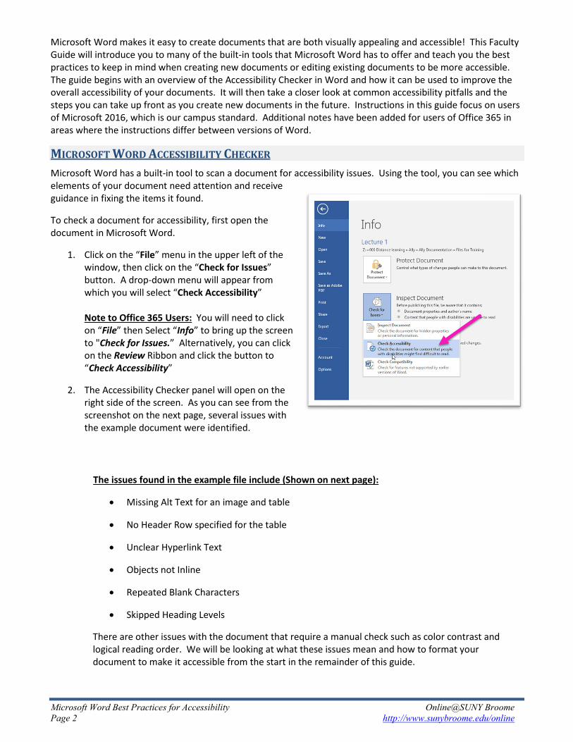
The issues found in the example file include (Shown on next page):
• Missing Alt Text for an image and table
• No Header Row specified for the table
• Unclear Hyperlink Text
• Objects not Inline
• Repeated Blank Characters
• Skipped Heading Levels
There are other issues with the document that require a manual check such as color contrast and logical reading order. We will be looking at what these issues mean and how to format your document to make it accessible from the start in the remainder of this guide.
Microsoft Word Best Practices for Accessibility Online@SUNY Broome Page 3 http://www.sunybroome.edu/online
Inspection results are divided into three categories:
Errors: Content that makes the document difficult or impossible to read and understand for people with disabilities
Warnings: Content that in most (but not all) cases makes the document difficult to understand for people with disabilities
Tips: Content that people with disabilities can understand but that could be presented in a different way to improve the user’s experience
Note: To quickly see the area of the document where Word found an issue, click on it in the Accessibility Checker and the location in the document will become highlighted!
Also pay attention to the “Why Fix:” area of the Accessibility Checker. It explains why that item is a concern for the purposes of accessibility.

Microsoft Word Best Practices for Accessibility Online@SUNY Broome Page 4 http://www.sunybroome.edu/online
We will now take a look at common issues found by the Microsoft Word Accessibility Checker and will begin with those involving images, graphs, and charts. We will then move on to tables, hyperlinks, and paragraph headings (styles). The guide will conclude with additional tips and best practices for formatting text and paragraphs with accessibility in mind.
IMAGES, GRAPHS, AND CHARTS Images are used extensively in documents and within online courses. While they are often very beneficial and necessary to convey information, they can also be a barrier to those with a disability when not used or formatted in an accessible manner. We will focus on two of the major issues found with images and show you how to make them accessible in Microsoft Word.
Alternative Text Alternative text (Alt Text) is text contained within the settings of an image that describes the appearance or function of the image to those who are unable to see it. A screen reader for a visually impaired user will read the alternative text to them out loud so that they have a better understanding of its content. Microsoft Word makes it easy to add alternative text to images. To do this:
1. Right Click on the image and select “Format Picture” Note to Office 365 Users: With Office 365, you can simply right-click the image and select “Edit Alt Text”
2. The Task Pane will appear on the right side of the Word menu. From it, select the option for “Layout & Properties” (the third one from the left) (This step is not necessary in Office 365)
3. Expand the area for “Alt Text” and enter text that describes the image in the Description field. The Alt Text should be descriptive, specific, and should provide context. Use the “Title” area to give the image a very brief description (Title option does not appear in Office 365).
4. When finished, click the “X” in the upper right corner to close the Format Picture Task Pane.
Image Location (In Line) Another common issue with images or other objects placed within a Microsoft Word document has to do with how the image is positioned within the text body. When you add an image to a document, you can choose whether to place it on its own (floating) or In Line (connected to and associated with the surrounding text). Making an image or object In Line with text will help screen reader software read the image description properly (in a linear fashion) as it reads the associated text directly before and after the image. By default, an image is placed In Line at the location of where the insertion point was when you inserted the image. Wrapping text in any way will change the image to a non In Line state, but it can be corrected.

Microsoft Word Best Practices for Accessibility Online@SUNY Broome Page 5 http://www.sunybroome.edu/online
If you have an image that has been flagged by the accessibility checker that is not In Line:
1. Right-click the image and select “Wrap Text”
2. From the short-cut menu, select “In Line with Text”
Your image may move around a bit to a new location but you can drag it to where you would like it to be so that it corresponds to the text that is around it.
TABLES The use of tables should be limited to organize data that have logical relationships in grids. When they are used, they need to be marked up properly for accessibility. In our example, the table displays data, but does not contain any header information. The table also does not contain an Alt Text, similar to the issue we had with the image.
Specifying Table Header 1. Select the top row of your table that contains the headings and make sure that the “Header Row” option
is checked for the Table Design.
2. Click on the “Layout” tab at the top of the Microsoft Word window and then click the button to “Repeat Header Rows” from the ribbon.

Microsoft Word Best Practices for Accessibility Online@SUNY Broome Page 6 http://www.sunybroome.edu/online
Alt Text for Tables Like images, tables need Alternative Text that will be read by a screen reader. The alt text for a table should provide the summary information that sighted users get when quickly browsing a table. To add alt text to tables:
1. Right click in the upper left corner of the table and select “Table Properties…”
2. Click on the “Alt Text” tab and fill in the information as you did for Images. The actual alt text should go in the Description field.
3. Click OK when finished
You can also format the table in other ways and maintain accessibility. Just be sure that there is enough color contrast between text and background and that the font is easily readable!
HYPERLINKS For individuals who use assistive technology, links within documents should convey clear information about the destination. Rather than displaying the URL as the hyperlink text or linking through text labeled “click here,” you should include descriptive text around the link to explain its destination.
Example of an inaccessible link: “For more information click here.”
Example of a more accessible version: For more information on web accessibility, visit the Online@SUNY Broome webpage. (if the document is meant to be posted online)
Or For more information on web accessibility, visit the Online@SUNY Broome webpage at http://www.sunybroome.edu/online. (if the document is meant to be printed)
Or For more information on web accessibility, visit the Online@SUNY Broome webpage (http://www.sunybroome.edu/online). (for a combination of web viewing and print)

Microsoft Word Best Practices for Accessibility Online@SUNY Broome Page 7 http://www.sunybroome.edu/online
To add or edit a hyperlink in a document:
1. Type the text which will contain the hyperlink and select the text that will become the portion that links to the website.
2. Right click on the selected text and select “Hyperlink…”
3. You should see the text that you have selected in the “Text to display:” field. In the “Address:” field, type (or paste from the web) the address of the website you would like to link to.
4. When finished, click the OK button.
PARAGRAPH HEADINGS (STYLES) Headings provide context and a way to navigate quickly for users of assistive technologies like screen readers. These technologies ignore text size and formatting to provide emphasis (bold, italic, underline) unless certain styles, such as Headings, are applied. Headings communicate order and levels of importance within a document. Without the use of heading styles, the entire document will look like regular text to a screen reader even if certain text has been manually made larger (and/or bold) to indicate its significance.
Headings should be selected based on their hierarchy in the document. Microsoft Word has a number of built-in heading styles for formatting paragraphs and text. The most common ones are the Normal style (the default style for text in a new document) and the Heading styles (Heading 1, Heading 2, Heading 3, and so on). Default styles are available in the Styles Gallery on the Home Tab. A complete listing of additional styles can be accessed by expanding the styles area in the ribbon. See below.

Microsoft Word Best Practices for Accessibility Online@SUNY Broome Page 8 http://www.sunybroome.edu/online
To apply a paragraph style to an area of text:
1. Select the paragraph for which you want to set the style and click on the style name in the Style Gallery. For accessibility purposes and reading order, headings should begin at the Heading 1 level and additional headings should follow sequentially. Skipped Heading Levels may be flagged by the Accessibility Checker.
2. Continue applying styles as needed throughout the document
To change the look of a style:
1. Right click on the style name in the Style Gallery and select “Modify” from the shortcut menu
2. Click on the Format button in the lower left corner and select the item that you wish to modify.
3. When you are done, click OK on both the formatting dialog box and on the modify style window.
Anything that has been assigned that style will have the formatting change applied to it.
Styles can be used for all paragraphs in a document, not only headings. As you become comfortable with using styles, you will see how valuable they are and how they can make formatting a lengthy document a breeze!

Microsoft Word Best Practices for Accessibility Online@SUNY Broome Page 9 http://www.sunybroome.edu/online
ADDITIONAL TIPS AND BEST PRACTICES FOR ACCESSIBILITY In addition to the guidelines we have discussed so far, there are several other best practices you should keep in mind when creating or editing a document in Microsoft Word.
Text and Paragraph Spacing When positioning text on a page within Microsoft Word, you should use the paragraph formatting options rather than the space bar or enter key. Blank spaces manually typed on a page cause confusion to a screen reader and make the document inaccessible. Tabs and indents should be used to position individual text on a line (horizontal space) and paragraph formatting should be used to adjust spacing between paragraphs of text (vertical space). To adjust paragraph spacing:
1. Select the paragraph for which you would like to add text before or after and click the right mouse button while pointing to it. This will bring up the shortcut menu.
2. Select “Paragraph”
3. Use the up and down arrows in the “Spacing” area of the dialog box to adjust the amount of white space left before and after the paragraph. When you are done, click the OK button
4. After spacing is adjusted for all paragraphs, be sure to remove the extra manually entered paragraph marks in the document and readjust the paragraph spacing as needed.
Tip: Spacing between paragraphs can also be set for a style which makes it really easy to apply the change throughout the document!
Bullets and Numbered Lists Bulleted and numbered lists should be used not only to organize information into meaningful chunks or present sequencing so that they can be easily scanned by sighted users, they also provide the hierarchy and coding necessary for assistive technologies to interpret properly. When creating bullets or numbered lists in Microsoft Word always use the built-in functionality (the buttons on the toolbar). Never create lists manually by simply typing numbers, characters, images or other symbols before list items.

Microsoft Word Best Practices for Accessibility Online@SUNY Broome Page 10 http://www.sunybroome.edu/online
Font Formatting Font Typeface and Size Stick to simple, sans-serif fonts that are at least 12 points in size, particularly for longer text blocks and paragraphs – Arial, Helvetica, Tahoma, and Verdana are good choices, particularly for content that will be displayed on the web. They are all examples of sans-serif font, a grouping of typeface that does not have small decorative lines as part of the characters. Times New Roman is an example of a serif font. Notice the added decorative shapes that form the letters. These shapes (serifs) can make the text appear more crowded and less readable to individuals with certain disabilities such as dyslexia.
Flashing or Blinking Text Content that flashes or blinks on the screen should be avoided as it can trigger seizures in susceptible individuals. It can also be very distracting for those with cognitive disabilities and also for those with no disability at all.
Use of Color When formatting text in a document, there are a few guidelines to keep in mind with respect to the use of color. Below are the several of the most common design tips for creating accessible text and using color.
• Never use color alone to show emphasis – Individuals with color blindness, low-vision, or those who are simply viewing your content in black and white or in bright sunlight, would have difficulty distinguishing emphasis of information if color is its only cue. If you would like to use color for emphasis, be sure to pair it with another formatting option, such as bold, italics, or text size. In charts and graphs, color should be paired with a pattern.
• Make sure your foreground and background have strong contrast between them – Web Accessibility Guidelines require specific contrast ratios based on the size of the text. If you are unsure whether your particular choice of colors fall within these ratios, you can visit the WebAim color contrast checker (https://webaim.org/resources/contrastchecker/). Also pay particular attention to text that is overlaid on a background image, as some or all of the image may not have sufficient contrast in relation to the text.
• Avoid certain color combinations – In addition to contrast, there are certain color combinations that should be avoided whenever possible. These include: green/red, green/brown, blue/purple, green/blue, light-green/yellow, blue/grey, green/grey, green/black. Individuals with color blindness are often unable to distinguish between these color pairs, particularly green and red.
• Avoid using color for coding – We’ve all seen this done, particularly in email. (“Please see my answers typed in purple…”). Formatting text this way in a document, particularly one that will be viewed on a webpage, presents a challenge to those with colorblindness or a visual impairment that relies on a screen reader. As screen readers do not allow for a way to search on text color, another form of emphasis should be used in addition to the color (such as italics).

Microsoft Word Best Practices for Accessibility Online@SUNY Broome Page 11 http://www.sunybroome.edu/online
SUMMARY Applying a few basic guidelines will make your content more accessible to all learners. In conclusion, we have made all of the changes suggested in this document and re-ran the Microsoft Word Accessibility Checker. As you can see No accessibility issues are now found, so it is good to go!
Online@SUNYBroome
Please visit the Online@SUNYBroome website (www.sunybroome.edu/online) for additional information pertaining to distance education. The site contains information for Students, Faculty, and Chairs. A repository of informational/instructional documentation is included on the site as well as a listing of training opportunities and frequently asked questions.