Extract from elemental north 2015
9
the elemental north JAKE ATTREE
description
Â
Transcript of Extract from elemental north 2015

the elemental north
JAKE ATTREE

David Blackburn worked almost exclusively in pastel, achieving velvety colour gradations and unbroken surfaces that highlight his economy of line and form. His technique is practically unique in contemporary art. Colin Self used pastel (and graphite) to make powerfully uniform surfaces in his highly stylised, cinematic images. Avigdor Arikha also noted that he could realise unadulterated colour working in pastel more immediately than he could in oil. Likewise, Paula Rego used pastel in many of her autobiographical (often unsettling) pictures, albeit with very painterly handling. Blackburn, on the other hand, used pastel to pursue something specifically sublime, even spiritual in his work and found forms that could evoke the meditative complexity of a Scholar’s rock or the radiance of a prism.
Jake Attree’s paintings are equally marked by idiosyncratic technique, one that balances subtle tone with sculpturally impasto surfaces. Artists have been testing the potential of impasto for centuries, but Attree takes the practice to a whole new level painting works inspired variously by Roman mosaics, medieval stonework, Flemish masters and contemporary art. He also works in pastel, and his recent series display lush,
tarry, surfaces that suggest woollen tapestries, once a staple trade between Flanders and Attree’s native York.
Initially, we conceived this show as a study in contrasts that point to a deeper sympathy: two artists (both Yorkshiremen), who work in highly specialised techniques, which appear to test the limits of their chosen medium. While obviously united (and inspired) by their surroundings, Attree and Blackburn share more than geography, however. Their work differs in execution and appearance, but nevertheless shares a common language. Balanced between poetry and reason, their works speak of where substance meets symbol and challenge both their surfaces and what lies beneath.
Surface Tensions
Jake Attree2. St Margaret’s, York Centre for Early Music oil on board 61 x 71 cms 24 x 28 ins
David Blackburn3. Across the Viaduct, 2005 pastel 48 x 36 cms 187⁄8 x 141⁄8 ins

Painting and poetry both speak through images, because whether formed of words or brushstrokes, they are meant to invoke the visual. Prof. Barre Toelken once compared epic poetry to works by Breughel, because he used vast detail to create drama. Folk ballads, however, Toelken considered to be the opposite of epic poetry, because like Japanese ink paintings (for example), ballads are ‘painted’ with as few details as possible in order to form a powerfully immediate picture.
Attree’s work falls somewhere between the epic and the folkloric: the high impasto surfaces of his panoramic studies centred on York Minster and his earlier homages to Breughel show an eye for the infinite, enduring details of his ancient city. At the same time, however, many of his populated views convey a very modern sense of cinema. His figures appear to walk by, towards and away from the viewer as individuals, rather than part of a crowd, in some cases, even conveying a kind of inner life.
His earlier series of View[s] over an Ancient City were mosaic abstractions that combined limited palettes with Byzantine formal complexity. More recent rooftop or bird’s-eye studies of York, however, bring the city’s architectural mass and density right up to the viewer, compelling them into the picture like a
garden maze. One of the most surprising aspects of these bold new paintings is just how much fun they can be to look at; what joy there is to be had in de-coding Attree’s rich, rectilinear forms to find clues that might lead down medieval streets and possibly towards the centre of a whole.
His recent oils share pride of place with a new series of oil pastels. Executed in pure, unadultered strokes or combined with acrylic or emulsion, Attree achieves a range of effects in this demanding technique. His complexly layered surfaces and vertical handling in The Canal at Hebden Bridge (no. 17) suggest the tactile depth of a woollen tapestry (this market town was once a centre of the local wool trade). Studies of St. Mary’s Abbey, which explore the ruins from various perspectives, appear more translucent, like film stills shot in diffused light. This silvery filtered quality also adds a sense of elegy to dense, deeply toned riverside views (nos. 24–26). In other landscapes, his recognisibly ‘mosaic’ style re-emerges in delicate ‘square’ hatching (nos. 27 & 28). Similar handling has an altogether different effect, however, on his various studies of winter trees (nos. 31–34), which seemingly capture a double-exposure effect, adding movement and atmosphere to images that otherwise appear frozen in time. This effect of seeing something simultaneously appear and disappear is perhaps most evident in Attree’s two contrasting views of the City and the Minster from Mansion House, wherein one (no. 7) suggests the limpid view from a rain-soaked window; while the other (no. 9) demonstrates how sunlight breaking after a shower can reform a view into something more dazzling than it might appear in fair weather.
Richard Feynman wrote: ‘Nature uses only the longest threads to weave her patterns, so that each small piece of her fabric reveals the organisation of the entire tapestry’. This was the closing sentence of part of his 1965 lecture series The Character of Physical Law, and as in most of his writings, Feynman stressed the inherent beauty of what is rational and interconnected. Initially, his use of the word ‘tapestry’ made me think of Attree’s work, but reading on, this quote appeared even more relevant. Feynman believed that the success of (Western) civilisation depended on two guiding principles: the spirit of adventure and the humility of the spirit. To anyone who might argue that these two qualities are mutually exclusive, I can think of few artists whose work could so elegantly refute this as Jake Attree.
JAKE ATTREE

15. Four Figures Walking by a River oil pastel on card 71 x 74 cms 277⁄8 x 29 ins
16. Figures Beneath the West Door II oil on panel 61 x 71 cms 237⁄8 x 28 ins
JAKE ATTREE

17. The Canal at Hebden Bridge oil pastel on paper 54 x 74 cms 211⁄8 x 29 ins
18. Montpelier Parade – Harrogate oil pastel on paper 54 x 74 cms 21 1⁄8 x 29 ins
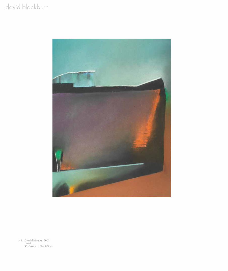
44. Coastal Memory, 2001 pastel 48 x 36 cms 187⁄8 x 141⁄8 ins
A visionary in both genre and medium, Blackburn’s greatest contribution to contemporary British art is arguably his reworking of landscape’s syntax. His glowing pastels challenge the elemental hierarchies of horizon line and human viewpoint, often encapsulating Blake’s ‘world in a grain of sand’. Constantly balanced between the macro and
the microscopic, his work has a sense of a worm’s eye swapping places with that of a bird. Blackburn’s sense of focal inversion, crystalline colour and biological approach to form were all inspired by a childhood love for exploring and sketching the nearby moors.
After studying at Huddersfield School of Art as a textile artist, in 1959, he enrolled at the Royal College of Art and focused on landscape – not a popular genre in the 1960s, a decade devoted to conceptual and pop art. However, unlike his contemporaries (such as Hockney and Kitaj), Blackburn was not interested in topical culture. Instead, his love of landscape drew him to the work of Prunella Clough (particularly her lithographs) and, above all, Gerhart Frankl.
An Austrian artist, Frankl (1901–1965) was unusually opposed to contemporary expressionism, and before National Socialism forced him into exile, often made sketching trips throughout the Alps. His prints particularly reflect an ability to balance typology, space and light. He became one of Blackburn’s greatest formative influences when he introduced him to pastels: a notoriously difficult technique to master (and retain). But pastels’ inherently fugitive quality fascinated Blackburn and he later said: “I may get something that is totally unexpected and… magical forms continually emerge, then disappear.”
At the RCA he also found an important advocate and patron in Sir Kenneth Clark, who bought three works from his 1962 degree show and many years later wrote: …’I don’t know any artist to whom I can compare him. [Blackburn] is not a landscape painter, not an abstractionist in the ordinary sense… He is a painter of metamorphosis.’
After graduation, Blackburn taught at the Royal Melbourne Institute of Technology, where he made Creation (1963–1966); and Metamorphosis (1966–1968): large serial arrangements of small charcoals inspired by abstracts ideas of genesis, growth and decay. However, further exposure to Australian art inspired him to combine abstraction with saturated colour, and his perspective became more subjective, alternately shifting from a close-up of a leaf at ground level to an aerial panorama. Blackburn found the outback so antithetical to European landscape that it completely freed him from traditional concepts of the genre (since he had always credited Claude as one of his greatest influences, this influence must have been cataclysmic). When Malcolm Yorke later asked him to describe the effect of Australia on his work, he replied: “I think it’s Paradise. At first…it was difficult to come to terms with…I couldn’t understand how one could draw where there was no apparent foreground, middle distance and background – only space.”
In 1981, he began a lectureship at Georgetown University, and his formerly horizontal compositions became replaced by more rectilinear, vertical arrangements, which he believed defined American topography. He developed an urban, diagrammatic style (partly reflecting his admiration of Diebenkorn) and evoked what he called the “visual geometry” of American cities by using strong directional lines and intensely Californian tones of orchid, orange and cerulean blue.
During the 1980s and 1990s, Blackburn travelled to Canada, sold works to the Phillips Collection, had a major show at the Dulwich Picture Gallery and in 1989, a retrospective at the Yale Centre for British Art. In addition, he gave interviews for documentaries commissioned by the BBC and ITV. However, at the peak of his career, his mother’s ill health compelled him to return to Huddersfield, where he nursed her until her death in 1993. Apart from a period in Australia and trips to Melbourne and Chicago, after 1995, he remained in Huddersfield, which he considers his home: “It’s what I know – the hills and valleys, the history, the mix of urban and rural, old and new: the sheer texture of the place.”
In recent years, Blackburn’s declining health has limited his work, but until 2012, he continued to exhibit landscapes that open a doorway to the divine and illustrate landscape as a series of elements re-shaped to assert “the relationship between the unnoticed and the infinite”. His most recent pastels incorporating collage use form, texture, polarised contrasts and electric colours that suggest the backlit view through a microscope, hinting at worlds beyond the slide’s edge.
phot
o R
icha
rd L
ittle
woo
d an
d W
Fed
iw
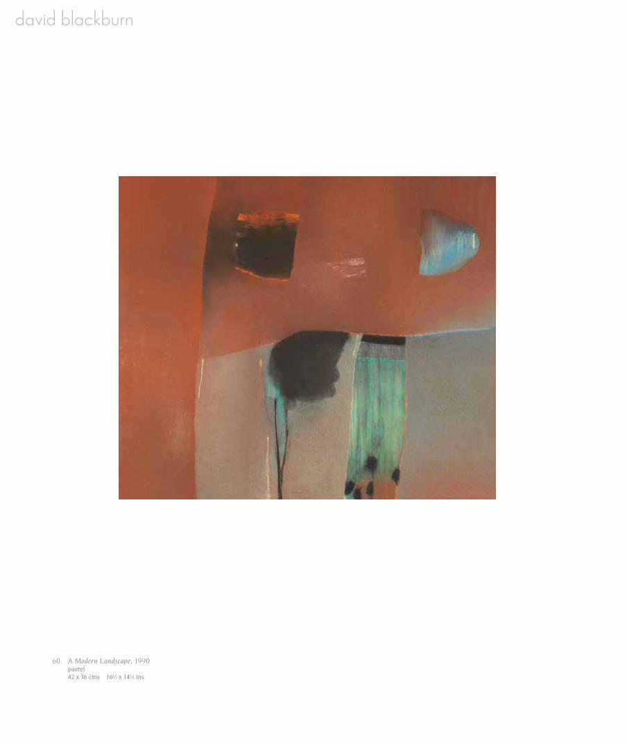
60. A Modern Landscape, 1990 pastel 42 x 36 cms 161⁄2 x 141⁄8 ins

61. Dark Night Flower, 1983 pastel 66 x 51 cms 26 x 201⁄8 ins