ExplainIt!– A declarative root-cause analysis engine for ... · and drill down to narrow the...
20
ExplainIt!– A declarative root-cause analysis engine for time series data Vimalkumar Jeyakumar Cisco Tetration Analytics jvimal@tetrationanalytics.com Omid Madani Cisco Tetration Analytics omadani@tetrationanalytics.com Ali Parandeh Cisco Tetration Analytics aparande@tetrationanalytics.com Ashutosh Kulshreshtha Cisco Tetration Analytics ashutkul@tetrationanalytics.com Weifei Zeng Cisco Tetration Analytics weifzeng@tetrationanalytics.com Navindra Yadav Cisco Tetration Analytics nyadav@tetrationanalytics.com ABSTRACT We present ExplainIt!, a declarative, unsupervised root- cause analysis engine that uses time series monitoring data from large complex systems such as data centres. ExplainIt! empowers operators to succinctly specify a large number of causal hypotheses to search for causes of interesting events. ExplainIt! then ranks these hypotheses and summarises causal dependencies between hundreds of thousands of vari- ables for human understanding. We show how a declarative language, such as SQL, can be effective in declaratively enu- merating hypotheses that probe the structure of an unknown probabilistic graphical causal model of the underlying sys- tem. Our thesis is that databases are in a unique position to enable users to rapidly explore the possible causal mecha- nisms in data collected from diverse sources. We empirically demonstrate how ExplainIt! had helped us resolve over 30 performance issues in a commercial product since late 2014, of which we discuss a few cases in detail. ACM Reference Format: Vimalkumar Jeyakumar, Omid Madani, Ali Parandeh, Ashutosh Kulshreshtha, Weifei Zeng, and Navindra Yadav. 2019. ExplainIt!– A declarative root-cause analysis engine for time series data. In 2019 International Conference on Management of Data (SIGMOD ’19), June 30-July 5, 2019, Amsterdam, Netherlands. ACM, New York, NY, USA, 20 pages. https://doi.org/10.1145/3299869.3314048 1 INTRODUCTION In domains such as data centres, econometrics [2], finance, systems biology [31], and many others [6], there is an explo- sion of time series data from monitoring complex systems. For instance, our product Tetration Analytics is a server and network monitoring appliance, which collects millions of ob- servations every second across tens of thousands of servers at our customers. Tetration Analytics itself consists of hun- dreds of services that are monitored every minute. One reason for continuous monitoring is to understand the dynamics of the underlying system for root-cause analy- sis. For instance, if a server’s response latency shows a spike and triggered an alert, knowing what caused the behaviour can help prevent such alerts from triggering in the future. In our experience debugging our own product, we find that root-cause analysis (RCA) happens at various levels of ab- straction mirroring team responsibilities and dependencies: an operator is concerned about an affected service, the in- frastructure team is concerned about the disk and network performance, and a development team is concerned about their application code. To help RCA, many tools allow users to query and classify anomalies [14], correlations between pairs of variables [9, 30]. We find that the approaches taken by these tools can be unified in a single framework—causal probabilistic graphical models. This unification permits us to generalise these tools to more complex scenarios, apply various optimisations, and address some common issues: • Dealing with spurious correlations: It is not uncom- mon to have per-minute data, yet hundreds of thousands of time series. In this regime the number of data points over even days is in the thousands, and is at least two orders of magnitude fewer than the dimensionality (hun- dreds of thousands). It is no surprise that one can always find a correlation if one looks at enough data. • Addressing specificity: Some metrics have trend and seasonality (i.e., patterns correlated with time). It is impor- tant to have a principled way to remove such variations and focus on events that are interesting to the user, such as a spike in latency §3.4. • Generating concise summaries: We firmly believe that summarising into human-relatable groups is key to scale understanding §3.2. Thus, it becomes important to organ- ise time series into groups—dynamically determined at users’ direction—and summarise dependencies between groups of variables in a theoretically sound way. We created ExplainIt!, a large-scale root-cause inference engine and explicitly addressed the above issues. ExplainIt! is based on three principles: First, ExplainIt! is designed to put humans in the loop by exposing a declarative inter- face (using SQL) to interactively query for explanations of arXiv:1903.08132v1 [cs.DB] 19 Mar 2019
Transcript of ExplainIt!– A declarative root-cause analysis engine for ... · and drill down to narrow the...

ExplainIt!– A declarative root-cause analysis enginefor time series data
Vimalkumar JeyakumarCisco Tetration Analytics
Omid MadaniCisco Tetration Analytics
Ali ParandehCisco Tetration Analytics
Ashutosh KulshreshthaCisco Tetration Analytics
Weifei ZengCisco Tetration Analytics
Navindra YadavCisco Tetration Analytics
ABSTRACTWe present ExplainIt!, a declarative, unsupervised root-cause analysis engine that uses time series monitoring datafrom large complex systems such as data centres. ExplainIt!empowers operators to succinctly specify a large number ofcausal hypotheses to search for causes of interesting events.ExplainIt! then ranks these hypotheses and summarisescausal dependencies between hundreds of thousands of vari-ables for human understanding. We show how a declarativelanguage, such as SQL, can be effective in declaratively enu-merating hypotheses that probe the structure of an unknownprobabilistic graphical causal model of the underlying sys-tem. Our thesis is that databases are in a unique position toenable users to rapidly explore the possible causal mecha-nisms in data collected from diverse sources. We empiricallydemonstrate how ExplainIt! had helped us resolve over30 performance issues in a commercial product since late2014, of which we discuss a few cases in detail.
ACM Reference Format:Vimalkumar Jeyakumar, Omid Madani, Ali Parandeh, AshutoshKulshreshtha, Weifei Zeng, and Navindra Yadav. 2019. ExplainIt!–A declarative root-cause analysis engine for time series data. In2019 International Conference on Management of Data (SIGMOD ’19),June 30-July 5, 2019, Amsterdam, Netherlands. ACM, New York, NY,USA, 20 pages. https://doi.org/10.1145/3299869.3314048
1 INTRODUCTIONIn domains such as data centres, econometrics [2], finance,systems biology [31], and many others [6], there is an explo-sion of time series data from monitoring complex systems.For instance, our product Tetration Analytics is a server andnetwork monitoring appliance, which collects millions of ob-servations every second across tens of thousands of serversat our customers. Tetration Analytics itself consists of hun-dreds of services that are monitored every minute.One reason for continuous monitoring is to understand
the dynamics of the underlying system for root-cause analy-sis. For instance, if a server’s response latency shows a spikeand triggered an alert, knowing what caused the behaviour
can help prevent such alerts from triggering in the future.In our experience debugging our own product, we find thatroot-cause analysis (RCA) happens at various levels of ab-straction mirroring team responsibilities and dependencies:an operator is concerned about an affected service, the in-frastructure team is concerned about the disk and networkperformance, and a development team is concerned abouttheir application code.
To help RCA, many tools allow users to query and classifyanomalies [14], correlations between pairs of variables [9, 30].We find that the approaches taken by these tools can beunified in a single framework—causal probabilistic graphicalmodels. This unification permits us to generalise these toolsto more complex scenarios, apply various optimisations, andaddress some common issues:• Dealing with spurious correlations: It is not uncom-mon to have per-minute data, yet hundreds of thousandsof time series. In this regime the number of data pointsover even days is in the thousands, and is at least twoorders of magnitude fewer than the dimensionality (hun-dreds of thousands). It is no surprise that one can alwaysfind a correlation if one looks at enough data.• Addressing specificity: Some metrics have trend andseasonality (i.e., patterns correlated with time). It is impor-tant to have a principled way to remove such variationsand focus on events that are interesting to the user, suchas a spike in latency §3.4.• Generating concise summaries: We firmly believe thatsummarising into human-relatable groups is key to scaleunderstanding §3.2. Thus, it becomes important to organ-ise time series into groups—dynamically determined atusers’ direction—and summarise dependencies betweengroups of variables in a theoretically sound way.We created ExplainIt!, a large-scale root-cause inference
engine and explicitly addressed the above issues. ExplainIt!is based on three principles: First, ExplainIt! is designedto put humans in the loop by exposing a declarative inter-face (using SQL) to interactively query for explanations of
arX
iv:1
903.
0813
2v1
[cs
.DB
] 1
9 M
ar 2
019

an observed phenomena. Second, ExplainIt! exploits side-information available in time series databases (metric namesand key-value annotations) to enable the user to group met-rics into meaningful families of variables. And finally, Ex-plainIt! takes a principled approach to rank candidate fami-lies (i.e., “explanations”) using causal data mining techniquesfrom observational data. ExplainIt! ranks these familiesby their causal relevance to the observed phenomenon ina model-agnostic way. We use statistical dependence as ayardstick to measure causal relevance, taking care to addressspurious correlations.
We have been developing ExplainIt! to help us diagnoseand fix performance issues in our product. A key distinguish-ing aspect of ExplainIt! is that it takes an ab-initio approachto help users uncover interactions between system compo-nents by making as few assumptions as necessary, whichhelps us be broadly applicable to diverse scenarios. The userworkflow consists of three steps: In step 1, the user selectsboth the target metric and a time range they are interested in.In step 2, the user selects the search space among all possiblecauses. Finally in step 3, ExplainIt! presents the user with aset of candidate causes ranked by their predictability. Steps2–3 are repeated as needed. (See Figure 11 in Appendix forprototype screenshots.)Key contributions: We substantially expand on our earlierwork [24] and show how database systems are in a uniqueposition to accomplish the goal of exploratory causal dataanalysis by enabling users to declaratively enumerate andtest causal hypotheses. To this end:• We outline a design and implementation of a pipelineusing a unified causal analysis framework for time seriesdata at a large scale using principled techniques fromprobabilistic graphical models for causal inference (§3).• We propose a ranking-based approach to summarise de-pendencies across variables identified by the user (§4).• We share our experience troubleshooting many real worldincidents (§5): In over 44 incidents spanning 4 years, wefind that ExplainIt! helped us satisfactorily identify met-rics that pointed to the root-cause for 31 incidents in tensof minutes. In the remaining 13 incidents, we could notdiagnose the issue because of insufficient monitoring.• We evaluate concrete ranking algorithms and show whya single ranking algorithm need not always work (§6).Although correlation does not imply causation, having
humans in the loop of causal discovery [35] side-steps manytheoretical challenges in causal discovery from observationaldata [28, Chap. 3]. Furthermore, we find that a declarative ap-proach enables users to both generate plausible explanationsamong all possible metric families, or confirm hypothesesby posing a targeted query. We posit that the techniques in
Exogenous Input:Events/sec
Processing:Runtime (s)
File System:Usage (kB)Read, Write Latency (ms)
Y = (Y1)
?
X = (X1, X2, X3)Z = (Z1)
Figure 1: A simplified representation of a data pro-cessing pipeline, whose five performance indicators(X1, . . . ,Y1,Z1) can be used by ExplainIt! for offlineanalysis.
ExplainIt! are generalisable to other systems where thereis an abundance of time series organised hierarchically.
2 BACKGROUNDWe begin by describing a familiar target environment for Ex-plainIt!, where there is an abundance of machine-generatedtime series data: data centres. Various aspects of data centres,from infrastructure such as compute, memory, disk, network,to applications and services’ key performance metrics, arecontinuously monitored for operational reasons. The scaleof ingested data is staggering: Twitter/LinkedIn report over1B metrics/minute of data. On our own deployments, we seeover 100 Million flow observations every minute across tensof thousands of machines, with each observation collectingtens of features per flow.A unifying trend in these environments is that the time
series data is structured: An event/observation has an as-sociated timestamp, a list of key-value categorical/dimen-sional attributes, and a key-value list of numerical measure-ments. For example: The network activity between two hostsdatanode-1 and datanode-2 can be represented as:
timestamp=0flow{src=datanode-1, dest=datanode-2,
srcport=100, destport=200, protocol=TCP}bytecount=1000 packetcount=10 retransmits=1
Here, the tag keys are src, dest and srcport, destport
joined with three measurements (bytecount, packetcount,and retransmits). Such representations are commonly usedin many time series database and analytics tools [5, 39].Throughout this paper, when we use the term metric werefer to a one-dimensional time series; the above example isthree-dimensional.
3 APPROACHTo illustrate our approach we will use an application shownin Figure 1: a real-time data processing pipeline with threecomponents that are monitored. First, the input to the systemis an event streamwhose input rate events/second is the timeseries Z(t) = (Z1(t)). The second component is a pipelinethat produces summaries of input, and its average processing
2
Total time range
Range to explain
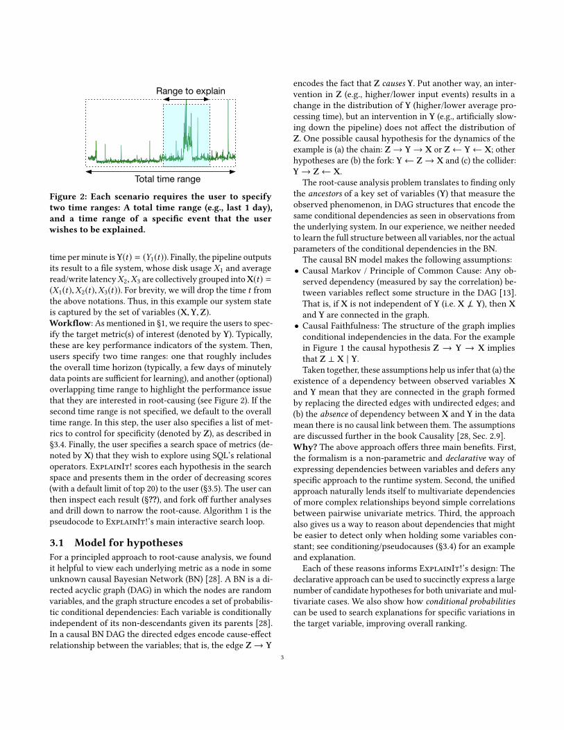
Figure 2: Each scenario requires the user to specifytwo time ranges: A total time range (e.g., last 1 day),and a time range of a specific event that the userwishes to be explained.
time per minute isY(t) = (Y1(t)). Finally, the pipeline outputsits result to a file system, whose disk usage X1 and averageread/write latencyX2,X3 are collectively grouped intoX(t) =(X1(t),X2(t),X3(t)). For brevity, we will drop the time t fromthe above notations. Thus, in this example our system stateis captured by the set of variables (X,Y,Z).Workflow: As mentioned in §1, we require the users to spec-ify the target metric(s) of interest (denoted by Y). Typically,these are key performance indicators of the system. Then,users specify two time ranges: one that roughly includesthe overall time horizon (typically, a few days of minutelydata points are sufficient for learning), and another (optional)overlapping time range to highlight the performance issuethat they are interested in root-causing (see Figure 2). If thesecond time range is not specified, we default to the overalltime range. In this step, the user also specifies a list of met-rics to control for specificity (denoted by Z), as described in§3.4. Finally, the user specifies a search space of metrics (de-noted by X) that they wish to explore using SQL’s relationaloperators. ExplainIt! scores each hypothesis in the searchspace and presents them in the order of decreasing scores(with a default limit of top 20) to the user (§3.5). The user canthen inspect each result (§??), and fork off further analysesand drill down to narrow the root-cause. Algorithm 1 is thepseudocode to ExplainIt!’s main interactive search loop.
3.1 Model for hypothesesFor a principled approach to root-cause analysis, we foundit helpful to view each underlying metric as a node in someunknown causal Bayesian Network (BN) [28]. A BN is a di-rected acyclic graph (DAG) in which the nodes are randomvariables, and the graph structure encodes a set of probabilis-tic conditional dependencies: Each variable is conditionallyindependent of its non-descendants given its parents [28].In a causal BN DAG the directed edges encode cause-effectrelationship between the variables; that is, the edge Z→ Y
encodes the fact that Z causes Y. Put another way, an inter-vention in Z (e.g., higher/lower input events) results in achange in the distribution of Y (higher/lower average pro-cessing time), but an intervention in Y (e.g., artificially slow-ing down the pipeline) does not affect the distribution ofZ. One possible causal hypothesis for the dynamics of theexample is (a) the chain: Z→ Y→ X or Z← Y← X; otherhypotheses are (b) the fork: Y← Z→ X and (c) the collider:Y→ Z← X.
The root-cause analysis problem translates to finding onlythe ancestors of a key set of variables (Y) that measure theobserved phenomenon, in DAG structures that encode thesame conditional dependencies as seen in observations fromthe underlying system. In our experience, we neither neededto learn the full structure between all variables, nor the actualparameters of the conditional dependencies in the BN.
The causal BN model makes the following assumptions:• Causal Markov / Principle of Common Cause: Any ob-served dependency (measured by say the correlation) be-tween variables reflect some structure in the DAG [13].That is, if X is not independent of Y (i.e. X ⊥ Y), then Xand Y are connected in the graph.• Causal Faithfulness: The structure of the graph impliesconditional independencies in the data. For the examplein Figure 1 the causal hypothesis Z → Y → X impliesthat Z ⊥ X | Y.Taken together, these assumptions help us infer that (a) the
existence of a dependency between observed variables Xand Y mean that they are connected in the graph formedby replacing the directed edges with undirected edges; and(b) the absence of dependency between X and Y in the datamean there is no causal link between them. The assumptionsare discussed further in the book Causality [28, Sec. 2.9].Why? The above approach offers three main benefits. First,the formalism is a non-parametric and declarative way ofexpressing dependencies between variables and defers anyspecific approach to the runtime system. Second, the unifiedapproach naturally lends itself to multivariate dependenciesof more complex relationships beyond simple correlationsbetween pairwise univariate metrics. Third, the approachalso gives us a way to reason about dependencies that mightbe easier to detect only when holding some variables con-stant; see conditioning/pseudocauses (§3.4) for an exampleand explanation.Each of these reasons informs ExplainIt!’s design: The
declarative approach can be used to succinctly express a largenumber of candidate hypotheses for both univariate and mul-tivariate cases. We also show how conditional probabilitiescan be used to search explanations for specific variations inthe target variable, improving overall ranking.
3

3.2 Feature FamiliesGrouping univariate metrics into families is useful to reducethe complexity of interpreting dependencies between vari-ables. Hence, grouping is a critical operation that precedeshypothesis generation. Each metric has tags that can be usedto group; for example, consider the following metrics:
Name Tagsinput_rate type=event-1
input_rate type=event-2
runtime component=pipeline-1
disk host=datanode-1, type=read_latency
disk host=datanode-2, type=read_latency
disk host=namenode-1, type=read_latency
We can group metrics their name, which gives us threehypotheses: input_rate{*}, runtime{*}, disk{*}. Or, wecan group the metrics by their host attribute, which gives usfour families:
*{host=datanode-1}, *{host=datanode-2},*{host=namenode-1}, *{host=NULL}
The first family captures all metrics on host datanode-1,can be used to create a hypothesis of the form “Does any ac-tivity in datanode-1 . . . ?” Using SQL, users also have the flex-ibility to group by a pattern such as disk{host=datanode*},which can be used to create a hypothesis of the form “Doesany activity in any datanode . . . ?” They can incorporate othermeta-data to apply even more restrictions. For example, ifthe users have a machine database that tracks the OS versionfor each hostname, users can join on the hostname key andselect hosts that have a specific OS version installed. We listmany example queries in Appendix C.
3.3 Generating hypothesesA causal hypothesis is a triple of feature families (X,Y,Z),organised as (a) an explainable feature—X, (b) the targetvariable—Y, and (c) another list of metrics to condition on—Z. Clearly, there should be no overlap in metrics betweenX, Y and Z. While X and Y must contain at least one metric,Z could be empty. Testing any form of dependency (chains,forks, or colliders) in the causal BN can be reduced to scoringa hypothesis for appropriate choices of X,Y,Z; see the PC al-gorithm for more details [33]. While one could automaticallygenerating exponentially many hypotheses for all possiblegroupings, we rely on the user to constrain the search spaceusing domain knowledge.The hypothesis specification is guided by the nature of
exploratory questions focusing on subsystems of the originalsystem. In Figure 1, this would mean: “does some activity inthe file system X explain the increase in pipeline runtimesY that is not accounted for by an increase in input size Z?”Contrast this to a very specific (atypical) query such as, “doesdisk utilisation on server 1 explain the increase in pipeline
Actual causes of seasonality
Actual causes of residual
Ys Yr
Y1 = Ys + Yr
Cs Cr
Conditioning on Ys blocksassociations between Cs
and Y1, revealing Cr.
Figure 3: Conceptual Bayes Network to illustrate pseu-docauses that can be derived from decomposing Y1into its constituent parts. Conditioning on Ys is an op-timisation that allows us to boost Cr ’s ranking with-out having to find Cs .
runtime?”We can operationalise the questions by convertingthem into probabilistic dependencies: The first question askswhether X ⊥ Y | Z. We can evaluate this by testing whetherY is conditionally independent of X given Z, i.e., whetherP(Y | X,Z) = P(Y | Z) (§3.5).
3.4 Conditioning and pseudocausesThe framework of causal BNs also help the user focus on aspecific variation pattern inherent in the data in the presenceof multiple confounding variations. Consider a scenario inwhich Y1 (in Figure 1) has two sources of variation: a sea-sonal component Ys and a residual spike Yr , and the user isinterested in explaining Yr .We can conceptualise this problem using the causal BN
shown in Figure 3 under the assumption that there are inde-pendent causes for Yr and Ys . By conditioning on the causesof Ys , we can find variables that are correlated only with Yrand not with Ys , which helps us find specific causes of Yr .
However, we often run into scenarios where the user doesnot know or is not interested in finding what caused Ys (i.e.,the parents of Ys ). The causal BN shown in Figure 3 offers animmediate graphical solution: to explain Yr , it is sufficient tocondition on the pseudocause Ys (derived from Y ) to “block”the effect of the true causes of seasonality (Cs ) without find-ing it. Although prior work [14] has shown how to expresssuch transformations (trend identification, seasonality, etc.)our emphasis here is to show how techniques from causalinference offer a principled way of reasoning about such opti-misations, helping ExplainIt! generate explanations specificto the variation the user is interested in.
3.5 Hypothesis rankingRecall that scoring a hypothesis triple (X,Y,Z) quantifiesthe degree of dependence between X and Y controlling for Z.Each element of the triple contains one or more univariate
4

Algorithm 1: Pseudocode for the core ranking and in-teractive loop in ExplainIt!. Naturally, once the usersreview the results they can pose additional queries tofurther narrow down the candidate metrics of interest.Data:Metric names, key-value attributes, time seriesInput: Target metric (or family) Y
1 while user not satisfied do2 SearchFamilies← All families or user defined subset;3 Z←� or user defined subset to condition or
pseudocause derived from Y;4 foreach family Xi ∈ SearchFamilies except Y,Z do
“assoc” returns a value between 0 (low score) and 1(high score) for the dependence Y ∼ Xi | Zscore(Xi ) ← assoc(Y,Xi | Z);
5 ;6 Show Xi ’s to user sorted by decreasing score(Xi );
Feature Family Table Hypothesis Table Score Tablefeature_family { ts: datetime name: string v: map<string, double>}
External Data
Sources(Druid,
Parquet, tsdb, etc.)
hypothesis { X: feature_family Y: feature_family Z: feature_family}
score { H: hypothesis score: double viz: image}
Complexqueries Join Map
+TopK
Figure 4: ExplainIt!’s end-to-end pipeline combiningcomplex event parsing and extraction in the first stageto generate and score hypotheses.
variables. We implemented several scoring functions that canbe broadly classified into (a) univariate scoring to only lookat marginal dependencies (when Z = �), and (b) multivariatescoring to account for joint dependencies.Univariate scoring: When Z = �, we can summarise thedependency between X and Y by first computing the matrixof Pearson product-moment correlation ρi j between eachunivariate element Xi ∈ X and Yj ∈ Y. To summarise thedependency into a single score, we can either compute theaverage or the maximum of their absolute values:
CorrMean = meani j|ρi j |
CorrMax = maxi j|ρi j |
When Z is non-empty, we use the scoring mechanismoutlined below that unifies joint and conditional scoring intoa single method.Multivariate and conditional scoring: To handle morecomplex hypothesis scoring, we seek to derive a single num-ber that quantifies to what extent X ∼ Y | Z. When Z = �,we perform a regression where the input data points are from
the same time instant, i.e. (X(t),Y(t)). 1 One could use non-linear regression techniques such as spline regression, orneural networks, but we empirically found that linear regres-sion is sufficient. The regression minimises mean squaredloss function L between the predicted Y and the observedY over T data points. After training the model, we computethe prediction Y, and the residual RY;X = Y − Y, which is the“unexplained” component in Y after regressing on X. Thevariance in this residual relative to the variance in the orig-inal signal Y (call it 1 − r 2
Y;X) varies between 0 (X perfectlypredicts Y) and 1 (X does not predict Y). The score is thisvalue r 2.
When Z is not empty, we require multiple regressions.First, we regress Y ∼ Z to compute the residuals RY;X. Simi-larly, we regress X ∼ Z to compute the residual RX;Z. Finally,we regress RY;Z ∼ RX;Z and compute the percentage of vari-ance r 2
Y;X |Z in the residual RY;Z explained by RX;Z as outlinedabove. This percentage of variance is conditional on Z; in-tuitively, if the score (percent variance explained) is high, itmeans that there is still some residual in Y | Z that can beexplained by X | Z, which means that Y ⊥ X | Z. If X, Y,and Z are jointly normally distributed, and the regressionsare all ordinary least squares, then one can show that theabove procedure gives a zero conditional score iff X ⊥ Y | Z.The proof is in Appendix B.
The score obtained by the above procedure has an overfit-ting problemwhenwe have a large number of predictors inXand a small number of observations. To combat this, we usetwo standard techniques: First, we apply a penalty (we exper-imented with both L1 penalty (Lasso) and L2 penalty (Ridge))on the coefficients of the linear regression. Second, we use k-fold cross-validation for model selection (with k = 5), whichensures that the r 2 score is an estimate of the model per-formance on unseen data (also called the adjusted r 2; seeAppendix A). Since we are dealing with time series data thathas rich auto-correlation, we ensure that the validation set’stime range does not overlap the training set’s time range [11,§ 8.1]. In practice we find that while Lasso and Ridge regres-sions both work well, it is preferable to use Ridge regressionas its implementation is often faster than Lasso on the samedata.
In §6, we compare the behaviour of the above scoring func-tions, but we briefly explain their qualitative behaviour: Theunivariate scoring mechanisms are cheaper to compute, butonly look at marginal dependencies between variables. Thiscan miss more complex dependencies in data, some of whichcan only be ranked higher when we look at joint and/or con-ditional dependencies. Thus, the joint mechanisms havemorestatistical power of detecting complex dependencies between
1The user could specify lagged features from the past when preparing theinput data (by using LAG function in SQL).
5

variables, but also run the risk of over-fitting and producingmore false-positives; Appendix A gives more details aboutcontrolling false-positives.
4 IMPLEMENTATIONOur implementation had two primary requirements: It shouldbe able to integrate with a variety of data sources, such asOpenTSDB, Druid, columnar data formats (e.g., parquet),and other data warehouses that we might have in the future.Second, it should be horizontally scalable to test and scorea large number of hypotheses. Our target scale was tens ofthousands of hypotheses, with a response time to generatea scoring report was in the order of a few minutes (for thetypical scale of hundreds of hypotheses) to an hour (for thelargest scale).
We implemented ExplainIt! using a combination of ApacheSpark [40] and Python’s scikit machine learning library [29].We used Apache Spark as a distributed execution frame-work and to interface with external data sources such asOpenTSDB, compressed parquet data files in our data ware-house, and to plan and execute SQL queries using SparkSQL [12]. We leveraged Python’s scikit machine learning li-brary’s optimised machine learning routines. The user inter-face is a web application that issues API calls to the backendthat specifies the input data, transformations, and displayresults to the user.In our use case, time series observations are taken every
minute. Most of our root cause analysis is done over 1–2days of data, which results in at most 1440–2880 data pointsper metric. With F features per family, the maximum dimen-sion of the Xi feature matrix is 2880 × F . Realistically, wehave seen (and tested) scenarios up to F ≤ 80000. For F inthe order of tens of thousands, the cost of interpreting therelevance of a group of F variables in a scenario already out-weighs the benefit of doing a joint analysis across all thosevariables. For feature matrices in this size range, a hypothesiscan be scored easily on one machine; thus, our unit of paral-lelisation is the hypothesis. This avoids the parallelisationcost and complexity of distributed machine learning acrossmultiple machines. Thus, in our design each Spark executorcommunicates to a local Python scikit kernel via IPC (we useGoogle’s gRPC).
4.1 PipelineThe ExplainIt! pipeline can be broken down into three mainstages. In the first stage, we implemented connectors in Javato interface with many data sources to generate records, andUser-Defined Functions (UDFs) in Spark SQL to transformthese records into a standardised Feature Family Table (seeFigure 4 for schema). Thus, we inherit Spark’s support forjoins and other statistical functions at this stage. In this
first stage, users can write multiple Spark SQL queries tointegrate data from diverse sources, and we take the union ofthe results from each query. Then, we generate a HypothesisTable by taking a cross-product of the Feature Family Tableand applying a filter to select the target variable and thevariables to condition. In the final stage, we run a scoringfunction on the Hypothesis Table to return the Top-K (K =20) results. The Score Table also stores plots for visualisationand debugging.
4.2 OptimisationsThe declarative nature of the hypothesis query permits vari-ous optimisations that can be deferred to the runtime system.We describe three such optimisations: Dense arrays, broad-cast joins, and random projections.Dense arrays: We converted the data in the Feature FamilyTable into a numpy array format stored in row-major order.Most of our time series observations are dense, but if datais sparse with a small number of observations, we can alsotake advantage of various sparse array formats that are com-patible with the underlying machine learning libraries. Thisoptimisation is significant: A naïve implementation of ourscorer on a single hypothesis triple in Spark MLLib with-out array optimisations was at least 10x slower than theoptimised implementation in scikit libraries.Broadcast join: In most scenarios we have one target vari-able Y and one set of auxiliary variables Z to condition on.Hence, instead of a cross-product join on Feature FamilyTable, we select Y and Z from the Feature Family table, anddo a broadcast join to materialise the Hypothesis Table.Random projections: To speed up multivariate hypothe-sis testing (§6.2), we also use random projections to reducethe dimensionality of features before doing penalised linearregressions. We sample a matrix Pd , a matrix of dimensionsT × d , whose are drawn independently from a standard nor-mal distribution and project the data (X,Y,Z) into this a newspace (P(X), P(Y), P(Z)) if the dimensionality of the matrixexceeds d ; that is,
P(XT×nx ) ={X if nx ≤ d
XPd otherwise
If we use random projections, we sample a new matrix ev-ery time we project and take the average of three scores.In practice, we find there is little variance in these projec-tions, so even one projection is mostly sufficient for initialanalysis. Moreover, we prefer random projection as it is sim-pler to implement, computationally more efficient comparedto dimensionality reduction techniques such as PrincipalComponent Analysis, with similar overall result quality.
6

4.3 Asymptotic CPU costForT data points, and matrices of dimensionsT ×nx ,T ×ny ,and T × nz , denote the cost of doing a single multivariateregression X ∼ Y as Cx,y = O(ny min(Tn2
x ,T2nx )). Note
that each joint/conditional regression runs k separate timesfor k-fold cross-validation, and does a grid-search over Lvalues of the penalisation parameter for Ridge regression.Typically, k and L are small constants: k = 5 and L = 5. Giventhese values, Table 1 lists the compute cost for each scoringalgorithm.Method CostCorrMean, CorrMax O(nxnyT )Joint, Multivariate O(kL(Cx,y +Cy,z +Cz,x ))Random Projection d O(kLTd(nx + ny + nz + d))
Table 1: The asymptoticCPU cost of scoring ahypothe-sis (X,Y,Z). As expected, the univariate method is thecheapest, and the joint and conditional methods aremore expensive, with randomprojection intod dimen-sions spanning the spectrum between the two.
5 CASE STUDIESWe now discuss a few case studies to illustrate how Ex-plainIt! helped us diagnose the root-cause of undesirableperformance behaviour. In all these examples, the setting is amore complex version of the example in Figure 1. The maininternal services include tens of data processing and visual-isation pipelines, operating on over millions of events persecond, writing data to the Hadoop Distributed File System(HDFS). Our key performance indicator is overall runtime—the amount of time (in seconds) it takes to process a minute’sworth of input real time data to generate the final output.This runtime is our target metric Y in all our case studies, andthe focus is on explaining runtimes that consistently averagemore than a minute; these are problematic as it indicates thatthe system is unable to keep up with the input rate. Over theyears, we found that the root-cause for high runtimes werequite diverse spanning many components as summarised inTable 2. Unless otherwise mentioned, we start our analysiswith feature families obtained by grouping metrics by theirname (and not any specific key-value attribute).
5.1 Controlled experiment: Injecting afault into a live system
In our first example, we discuss a scenario in which weinjected a fault into a live system. Of all possible placeswe can introduce faults, we chose the network as it affectsalmost every component causing system-wide performancedegradation. In this sense, this fault is an example of a hardcase for our ranking as there could be a lot of correlatedeffects.
Component Example causesPhysical Infrastructure Slow disksVirtual Infrastructure NUMA issues, hypervisor network dropsSoftware Infrastructure Kernel paging performance, Long JVM
Garbage CollectionsServices Slow dependent servicesInput data Straggelers due to skew in dataApplication code Memory leaks
Table 2: ExplainIt! hash helped us identify root-causesthat belong to a diverse set of components.
Rank FeatureFamily
Interpretation
1–3, 5, 7 Runtime andlatency of var-ious pipelines
It took longer to save data. Runtimeis the sum of save times, so thesedependencies are expected.
4 TCP Retrans-mit Count
Increased number of TCP retrans-missions.
6 75th per-centilelatency
Increase in database RPC latency.
8 Number of ac-tive jobs onthe cluster
Increase in the number of activejobs scheduled on the cluster.
9 HDFSPacketAck-RoundTriptime
Increase in the round-trip time forRPC acknowledgements betweenDatanodes.
Table 3: Global search across all metric families pin-pointed to a network packet retransmission issue.
We injected packet drops at all datanodes by installinga Linux firewall (iptables) rule to drop 10%2 of all packetsdestined to datanodes. After a couple of minutes, we removedthe firewall rule and allowed the system to stabilise. Figure 5shows a screenshot of the runtime time series, where theeffect if dropping network packets is clearly visible.
We ran ExplainIt! against all metrics in the system groupedby their name to rank them based on the causal relevanceto the observed performance degradation (see Table 3 forthe ranking results). The final results showed the follow-ing: (1) The first set of metrics were the runtimes of a fewother pipelines that were ranked with high scores (about 0.7).This was expected, and we ignored these effects of the inter-vention. (2) The second set of metrics were the latencies ofthe above pipelines whose runtimes were high. Once again,these were expected since the latency is a measure of the“realtime-ness” of the pipelines: the difference between thecurrent timestamp and the last timestamp processed.The third set of metrics were related to TCP retransmis-
sion counts measured across all nodes in our cluster. These2We chose 10% as that was the smallest drop probability needed to cause asignificant perceptual change in the observed runtime.
7

Figure 5: A graph of pipeline runtime over time high-lighting a period of high runtimes caused due to highpacket retransmissions.
counters, tracked by the Linux kernel, measure the totalnumber of packets that were retransmitted by the TCP stack.Packet drops induced by network congestion, high bit er-ror rates, and faulty cables are usually the top causes whendealing on observing high packet retransmissions. For thisscenario, these counters were clear evidence that pointed toa network issue.This example also showed us that although metrics in
families 1–3, 5, and 7 belonged to different groups by virtueof their names, they are semantically similar and could befurther grouped together in subsequent user interactions.The key takeaway is that ExplainIt! was able to generatean explanation for the underlying behaviour (increased TCPretransmissions). In this case, the actual cause could be at-tributed to packet drops that we injected, but as we shallsee in the next example, the real cause can be much morenuanced.
5.2 The importance of conditioning:Disentangling multiple sources ofvariation
Our next case study is a real issue we encountered in a pro-duction cluster running at scale. There was a performanceregression compared to an earlier version that was evidentfrom high pipeline runtimes. Although the two versions werenot comparable (the newer version had new functionality),it was important for us to understand what could be done toimprove performance.We started by scoring all variables in the system against
the target pipeline runtime. We found many explanations forvariation. At the infrastructure level, CPU usage, networkand disk IO activity, were all ranked high. At the pipelineservice level, variations in task runtimes, IO latencies, theamount of time spent in Java garbage collection, all qualifiedas explanations for pipeline runtime to various degrees ofpredictability. Given the sheer scale of the number of possiblesources of variation, no single metric/feature family servedas a clear evidence for the degradation we observed.To narrow down our search, we first noticed that it was
reasonable to expect high runtime at large scale. Our load
generator was using a copy of actual production traffic thatitself had stochastic variation. To separate out sources ofvariation into its constituent parts, we conditioned the systemstate on the observed load size prior to ranking.The ranking had significantly changed after condition-
ing: The top ranking families pointed to a network stackissue: metrics tracking the number of retransmissions andthe average network latency were at the top, with a scoreof about 0.3. However, unlike the previous case-study, wedid not know why there were packet retransmissions but wewere motivated to look for causes.
Since TCP packet retransmissions arise due to networkpacket drops, we looked at packet drops at every layer in ournetwork stack: at the virtual machines (VM), the hypervisors,the network interface card on the servers, and within thenetwork. Unfortunately, we could not continue the analysiswithin ExplainIt! as we did not monitor these counters. Wedid not find drops within the network fabric, but one of ourengineers found that there were drops at the hypervisor’sreceive queue because that the software network stack didnot have enough CPU cycles to deliver the packets to theVM.3 Thus, we had a valid reason to hypothesise that packetdrops at the hypervisors were causing variations in pipelineruntimes that were not already accounted for in the size ofthe input.Experiment: To establish a causal relationship, we opti-mised our network stack to buffer more packets to reducethe likelihood of packet drops. After making this change ona live system, we observed a 10% reduction in the pipelineruntimes across all pipelines. This experiment confirmed ourhypothesis. Figure 6 shows the distribution in runtime be-fore/after the change. ExplainIt!’s approach to conditionon an understood cause (input size) of variation in pipelineruntime helped us debug a performance issue by focusingon alternate sources of variation. Although our monitoreddata was insufficient to satisfactorily identify the root-cause(dropped packets at the hypervisor), it helped us narrow itdown sufficiently to come up with a valid hypothesis that wecould test. By fixing the system, we validated our hypothesis.A second analysis after deploying the fix showed that packetretransmissions was no longer the top ranking feature; infact the fix had eliminated packet drops.
5.3 Correlated with time: Periodic pipelineslowdown
Our third case study is one in which there was a periodicspike in the pipeline runtime, even when the cluster wasrunning at less than 10% its peak load capacity. On visual
3We found that the time_squeeze counter in /proc/net/softnet_statwas continuously being incremented.
8

Figure 6: Distributions of pipeline runtime for thesame input data before and after the fix to reducepacket drops. The bimodal nature of the graph is dueto variations in input.
Rank FeatureFamily
Interpretation
1–4, 6–8 Runtime andlatency of var-ious pipelines
It took longer to save data. Runtimeis the sum of save times, so thesevariables are redundant.
5 Namenodemetrics
Namenode service slowdown anddegradation.
9 Detailed RPC-level metrics
Further evidence corroborating Na-menode feature family at an RPClevel.
27 JVM-levelmetrics
Increase in Datanode and Namen-ode waiting threads.
Table 4: Global search across all metric families pin-pointed to an issue at the Namenode.
inspection, we saw that there was a spike in the pipeline run-time from 10s to more than a minute every (approximately)15 minutes, and the spike lasted for about 5 minutes. Thisabnormality was puzzling and pointed out to certain periodicactivity in the system. We used ExplainIt! to find out thesources of variation and found that metrics from the Namen-ode family were ranked high. See Table 4 for a summary ofthe ranking, and Figure 7 for the behaviour.When we narrowed our scope to Namenode metrics, we
saw that there were two classes of behaviour: positive andnegative correlation with respect to the pipeline runtime.We observed that the Namenode’s average response latencywas positively correlated with the pipeline runtime (i.e., highresponse latency during high runtime intervals), whereasNamenode Garbage Collection times were negatively corre-lated to the runtime: i.e., smaller garbage collection whenthe pipeline runtimes were high. Thus, we ruled out garbagecollection and tried to investigate why the response latencieswere high.
A crucial piece of evidence was that the number of liveprocessing threads on the Namenode was also positivelycorrelated with the pipeline runtime. Since the Namenodespawns a new thread for every incoming RPC, we realisedthat a high request rate was causing the Namenode to slow
Figure 7: Periodic spikes in the pipeline runtime (be-fore 9:30) disappear after the offending service wasfixed and restarted (at around 10:10).
down. We looked at the Namenode log messages and ob-served a GetContentSummary RPC call that was repeatedlyinvoked; this prompted one engineer to suspect a particularservice that used this RPC call frequently. When she lookedat the code, she found that the service made periodic calls tothe Namenode with exactly the same frequency: once every15 minutes. These calls were expensive because they werebeing used to scan the entire filesystem.Experiment: To test this hypothesis, the engineer quicklypushed a fix that optimised the number of GetContentSummarycalls made by the service. Within the next 15 minutes, wesaw that the periodic spikes in latency had vanished, anddid not observe any more spikes. This example shows how itis important to reason about variations in metric behaviourwith respect to a model of how the system operates as theinput load changes. This helped us eliminate Garbage Col-lection as a root-cause and dive deeper into why there weremore RPC calls.
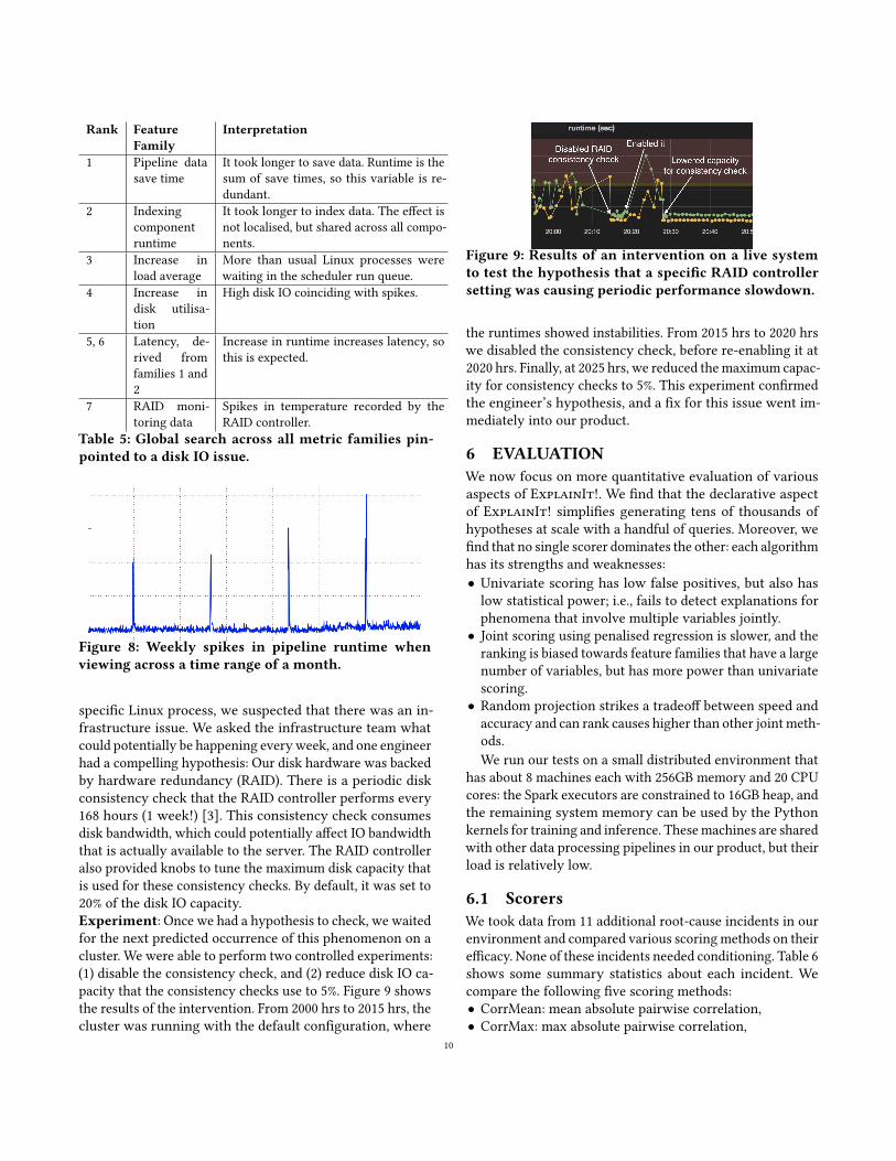
5.4 Weekly spikes: Importance of timerange
Our final example illustrates another example of pipeline run-time that was correlated with time: occasionally, all pipelineswould run slow. We observed no changes in input sizes (ahandful of metrics that we monitor along with the runtime)that could have explained this behaviour, so we used Ex-plainIt! to dive deeper. The top five feature families areshown in Table 5. We dismissed the first two feature fami-lies as irrelevant to the analysis because the variables wereeffects, which we wanted to explain in the first place. Thethird and fourth variables were interesting. When we reranthe search to rank variables restricting the search space toonly load and disk utilisation, we noticed that the hoststhat ran our datanodes explained the increase in runtimeswith high score. However, ExplainIt! did not have accessto per-process disk usage, so we resorted to monitoring theservers manually to catch the offender. Unfortunately, theissue never resurfaced in a reasonable amount of time.
However, these issues occurred sporadically across manyof our clusters. When we looked at time ranges of over amonth, we noticed a regularity in the spikes: they had aperiod of 1 week, and it lasted for about 4 hours (see Fig-ure 8). Since we could not account the disk usage to any
9
Rank FeatureFamily
Interpretation
1 Pipeline datasave time
It took longer to save data. Runtime is thesum of save times, so this variable is re-dundant.
2 Indexingcomponentruntime
It took longer to index data. The effect isnot localised, but shared across all compo-nents.
3 Increase inload average
More than usual Linux processes werewaiting in the scheduler run queue.
4 Increase indisk utilisa-tion
High disk IO coinciding with spikes.
5, 6 Latency, de-rived fromfamilies 1 and2
Increase in runtime increases latency, sothis is expected.
7 RAID moni-toring data
Spikes in temperature recorded by theRAID controller.
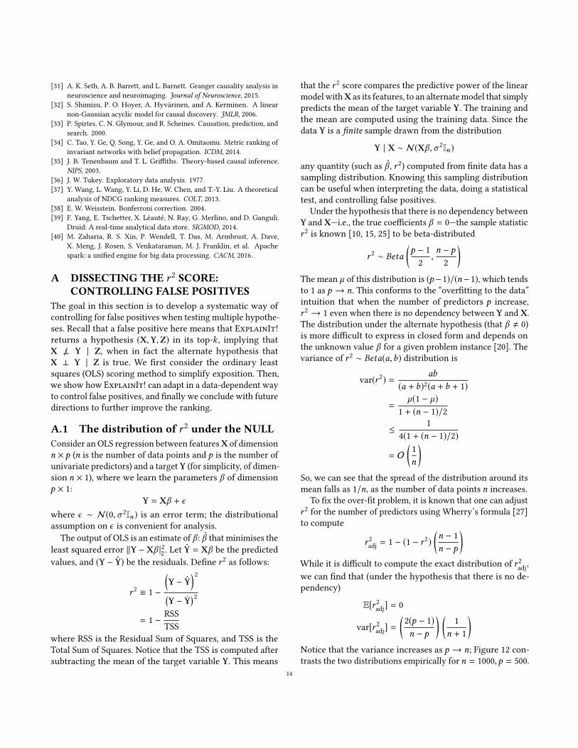
Table 5: Global search across all metric families pin-pointed to a disk IO issue.
Figure 8: Weekly spikes in pipeline runtime whenviewing across a time range of a month.
specific Linux process, we suspected that there was an in-frastructure issue. We asked the infrastructure team whatcould potentially be happening everyweek, and one engineerhad a compelling hypothesis: Our disk hardware was backedby hardware redundancy (RAID). There is a periodic diskconsistency check that the RAID controller performs every168 hours (1 week!) [3]. This consistency check consumesdisk bandwidth, which could potentially affect IO bandwidththat is actually available to the server. The RAID controlleralso provided knobs to tune the maximum disk capacity thatis used for these consistency checks. By default, it was set to20% of the disk IO capacity.Experiment: Once we had a hypothesis to check, we waitedfor the next predicted occurrence of this phenomenon on acluster. We were able to perform two controlled experiments:(1) disable the consistency check, and (2) reduce disk IO ca-pacity that the consistency checks use to 5%. Figure 9 showsthe results of the intervention. From 2000 hrs to 2015 hrs, thecluster was running with the default configuration, where
Figure 9: Results of an intervention on a live systemto test the hypothesis that a specific RAID controllersetting was causing periodic performance slowdown.
the runtimes showed instabilities. From 2015 hrs to 2020 hrswe disabled the consistency check, before re-enabling it at2020 hrs. Finally, at 2025 hrs, we reduced themaximum capac-ity for consistency checks to 5%. This experiment confirmedthe engineer’s hypothesis, and a fix for this issue went im-mediately into our product.
6 EVALUATIONWe now focus on more quantitative evaluation of variousaspects of ExplainIt!. We find that the declarative aspectof ExplainIt! simplifies generating tens of thousands ofhypotheses at scale with a handful of queries. Moreover, wefind that no single scorer dominates the other: each algorithmhas its strengths and weaknesses:• Univariate scoring has low false positives, but also haslow statistical power; i.e., fails to detect explanations forphenomena that involve multiple variables jointly.• Joint scoring using penalised regression is slower, and theranking is biased towards feature families that have a largenumber of variables, but has more power than univariatescoring.• Random projection strikes a tradeoff between speed andaccuracy and can rank causes higher than other joint meth-ods.We run our tests on a small distributed environment that
has about 8 machines each with 256GB memory and 20 CPUcores: the Spark executors are constrained to 16GB heap, andthe remaining system memory can be used by the Pythonkernels for training and inference. Thesemachines are sharedwith other data processing pipelines in our product, but theirload is relatively low.
6.1 ScorersWe took data from 11 additional root-cause incidents in ourenvironment and compared various scoringmethods on theirefficacy. None of these incidents needed conditioning. Table 6shows some summary statistics about each incident. Wecompare the following five scoring methods:• CorrMean: mean absolute pairwise correlation,• CorrMax: max absolute pairwise correlation,
10

Scenario # # Families # Features CorrMean CorrMax L2L2L2 L2 − P50L2 − P50L2 − P50 L2 − P500L2 − P500L2 − P5001 816 130259 0.167 1.000 0.143 1.000 0.3332 2337 158253 0.143 0.071 - 0.077 -3 902 61229 1.000 1.000 0.200 1.000 1.0004 2156 141082 - - 0.333 0.167 0.3335 800 63797 - 1.000 0.100 1.000 0.0776 436 29689 - - 0.333 0.167 0.5007 751 61231 - 0.111 1.000 - 0.2008 603 100486 - 1.000 0.250 1.000 1.0009 622 51230 0.050 0.053 0.500 0.062 0.25010 601 71227 - 0.500 1.000 0.333 0.25011 509 27902 0.333 0.083 - - -
Summary CorrMean CorrMax L2L2L2 L2 − P50L2 − P50L2 − P50 L2 − P500L2 − P500L2 − P500Harmonic mean (discounted gain) 0.002 0.004 0.009 0.009 0.009
Average (discounted gain) 0.154 0.438 0.351 0.437 0.359Stdev of average discounted gain 0.300 0.465 0.353 0.456 0.350Perfect score / success (%) top-1 7 23 15 23 15
Success (%) top-5 19 46 64 46 73Success (%) top-10 37 55 82 64 73Success (%) top-20 46 82 82 82 82
Table 6: A summary of the sizes of input datasets, and performance of various scoring methods. The featurefamily grouping is by the name of the metric. The mean number of features per feature family in a scenariovaries between 50–180, and the maximum is between 2000–75000. For each scenario, we compute the discountedgain, a measure of ranking accuracy. The summary shows that both CorrMax and L2 − P50L2 − P50L2 − P50 work quite well, withL2 − P50L2 − P50L2 − P50 being a superior method that has power to detect joint effects just like L2L2L2. The failures are marked with ahyphen; we use a small score of 0.0010.0010.001 when including failures for computing the harmonic mean summary. Notethat in all cases given the large number of features, a random ranking results in a low score (much worse thanCorrMean). The boldface highlighted numbers are the best overall results.
• L2: joint ridge regression scoring,• L2−P50: joint ridge regression after projecting to (at most)50 dimensional space,• L2 − P500: joint ridge regression after projecting to (atmost) 500 dimensional space (L2 − P500).We manually labelled only the top-20 results in each sce-
nario as either a cause, an effect, or irrelevant (happens onlyfor scores). The scores in top-20 were large enough that novariables were marked irrelevant. To compare methods, welook at the following metrics for a single scenario:• Ranking accuracy: If r is the rank of the first cause, de-fine the accuracy to be 1/r . This measures the discountedranking gain [23, 37], with a binary relevance of 0 for ef-fect, 1 for cause, and a Zipfian discount factor of 1/r (cutoffof top-20). We also report the arithmetic and harmonicmean of accuracy across scenarios.• Success rate (in top-k): Define precision p for a singlescenario as 1 if there is a cause in the top k results, 0otherwise. We also report average success rate (acrossscenarios) of the top-k ranking for various k .
Table 6 shows the results. The experiments reveal a fewinsights, which we discuss below. First, univariate scoringmethods complement the joint scoring methods that are notrobust to feature families with a large number of features.Univariate methods shine well if the cause itself is univari-ate. However, multivariate methods outperform univariatemethods if, by definition, there are multiple features thatjointly explain a phenomenon (e.g., §5.4). On further inspec-tion, we found that the true causes did have a non-zero scorein the multivariate scorer, but they were ranked lower andhence did not appear in top-20. Second, random projectionserves as a good balance of tradeoff between univariate meth-ods and multivariate joint methods. We observed a similarbehaviour for discounted cumulative ranking gain with adiscount factor of 1/log(1 + r ) instead of 1/r .Takeaway: The complementary strengths of the two meth-ods highlight how the user can choose the inexpensive uni-variate scoring if they have reasons to believe that a singleunivariate variable might be the cause, or the more expensivemultivariate scoring if they are unsure. This tradeoff further
11

L2
L2−P500
L2−P50
CorrMean
CorrMax
0 1 2 3 4 5
Mean score time per feature family (seconds)
Sco
rer
L2
L2−P500
L2−P50
CorrMean
CorrMax
0 50 100 150 200 250
Max score time for a feature family (seconds)
Sco
rer
Figure 10: Density plot of runtimes of all scenarios,normalised tomean (top) andmax (bottom) score timeper feature family (regardless of the number of fea-tures) for various scoring techniques. All multivari-ate techniques use k = 5-fold cross-validation, a gridsearch over 3 values of the ridge regression penaltyhyper-parameter. Random projection returns the av-erage score of 3 random samples of the projection ma-trix. The data points are marked with •, and the meanof each distribution is marked with ▲.
demonstrates how declarative queries can be exploited to de-fer such decisions to the runtime system. We are working ontechniques to automatically select the appropriate methodwithout user intervention.
6.2 ScalabilitySince ExplainIt! supports adhoc queries for generating hy-potheses from many data sources, the end-to-end runtimedepends on the query and size of the input dataset, the num-ber of scored hypotheses/feature families, and the numberof metrics per hypothesis. We found that the scoring timeis predominantly determined by the number of hypotheses,and hence normalise the runtime for the 11 scenarios listedabove per feature family. Figure 10 shows the scatter plot ofscenario runtimes for the five different scoring algorithms.Despite multivariate techniques being computationally ex-pensive, the actual runtimes are within a 2–3x of the simplerscorer (on average), and within 1.5x (for max). Note that thiscost includes the data serialisation cost of communicating theinput matrix and the score result between the Java processand the Python process, which likely adds a significant costto computing the scores. On further instrumentation, we
find that serialisation accounts on average about 25% of thetotal score time per feature family for the univariate scorers,and only about 5% for the multivariate joint scorers.
7 RELATEDWORKExplainIt! builds on top of fundamental techniques andinsights from a large body of work that on troubleshootingsystems from data. To our knowledge, ExplainIt! is the firstsystem to conduct and report analysis at a large scale.Theoretical work: Pearl’s work on using graphical modelsas a principled framework for causal inference [28] is foun-dation for our work. Other algorithms for causal discoverysuch as PC/SGS [33, Sec. 5.4.1] algorithm, LiNGAM [32] alluse pairwise conditional independence tests to discover thefull causal structure; we showed how key ideas from theabove works can be improved by also considering a joint setof variables. As we saw in §3, root-cause analysis in a practi-cal setting rarely requires the full causal structure of the datagenerating process. Moreover, we simplified identifying acause/effect by taking advantage of metadata that is readilyavailable, and by allowing the user to query for summariesat a desired granularity that mirrors the system structure.Systems: ExplainIt! is an example of a tool for ExploratoryData Analysis [36], and one recent work that shares ourphilosophy is MacroBase [14]. MacroBase makes a case forprioritising attention to cope with the volume of data thatwe generate, and prioritising rapid interaction with the userto enable better decision making. ExplainIt! can be thoughtof as a specific implementation of the key ideas in MacroBasefor root-cause analysis, with added techniques (conditioningand pseudo-causes) to further prioritise attention to specificvariations in the data.
The declarativeway of specifying hypotheses in ExplainIt!is largely inspired by the formula syntax in the R language forstatistical computing [7, 8]. In a typical R workflow for modelfitting, a user prepares her data into a tabular data-frameobject, where the rows are observations and the columns arevarious features. The formula syntax is a compact way tospecify the hypothesis in a declarative way: the user can spec-ify conditioning, the target features, interactions/transfor-mations of those features, lagged variables for time series [1],and hierarchical/nested models. However, this formula stillrefers to one model/hypothesis. ExplainIt! takes this ideafurther to use SQL to generate the candidate models.Practical experience: Prior tools designed for a specificuse-case rely on labelled data (e.g., [21] for network oper-ators), which we did not have when encountering failuremodes for the first time. ExplainIt! also employs hierarchiesto scale understanding (similar to [26]); however, we demon-strated the need for conditioning to filter out uninterestingevents. Early work [19] proposed using a tree-augmented
12

Bayesian Network as a building block for automated systemdiagnosis. Our experience is that a hierarchical model of sys-tem behaviour needs to be continuously updated to reflectthe reality. ExplainIt! is particularly useful in bootstrappingnew models when the old model does not reflect reality.Another line of work on time series data [17, 18, 34] has
focused primarily on detecting anomalies, by looking for van-ishing (weakening) correlations among variables (when ananomaly occurs) [17]. Subsequent work uses similar tech-niques to both detect and rank possible causes based ontimings of change propagation or other features of time se-ries’ interactions [18, 34]. In our use cases, we have oftenfound a diversity of causes, and existing correlations amongvariables do not weaken sufficiently during a period of inter-est. Moreover, our work also shows the importance of humanin the loop to discern the likely causes from what is shown,and by further interaction and conditioning as necessary.
8 CONCLUSIONSWhen we started this work, our goal was to build a data-driven root-cause analysis tool to speed up troubleshootingto harden our product. Our experience in building it taughtus that the fewer assumptions we make, the better the toolgeneralises. Over the last four years, the diversity of trou-bleshooting scenarios taught us that it is hard to completelyautomate root-cause analysis without humans in the loop.The results from ExplainIt! helped us not only identifyissues, but also fix them. We found that the time series meta-data (names and tags) has a rich hierarchical structure thatcan be effectively utilised to group variables into human-relatable entities, which in practice we found to be sufficientfor explainability. We are continuing to develop ExplainIt!and incorporate other sources of data, particularly text timeseries (log messages).
REFERENCES[1] Dynamic Linear Models and Time-Series Regression. http:
//math.furman.edu/~dcs/courses/math47/R/library/dynlm/html/dynlm.html. [Retrieved 01-January-2016].
[2] FRED: Economic Research Data. https://fred.stlouisfed.org/. [Re-trieved 01-January-2016].
[3] LSi Megaraid Patrol Read and Consistency Check schedulerecommendations. https://community.spiceworks.com/topic/1648419-lsi-megaraid-patrol-read-and-consistency-check-schedule-recommendations. [Retrieved 01-January-2016].
[4] Multivariate normal distribution: Conditionaldistributions. https://en.wikipedia.org/wiki/Multivariatenormaldistribution#Conditionaldistributions. [Re-trieved 01-January-2016].
[5] OpenTSDB: Open Time Series Database. http://opentsdb.net. [Re-trieved 01-January-2016].
[6] Prognostic Tools for Complex Dynamical Systems. https://www.nasa.gov/centers/ames/research/technology-onepagers/prognostic-tools.html. [Retrieved 01-January-2016].
[7] R: Model Formulae. https://www.rdocumentation.org/packages/stats/versions/3.5.1/topics/formula. [Retrieved 01-January-2016].
[8] Statistical formula notation in R. http://faculty.chicagobooth.edu/richard.hahn/teaching/formulanotation.pdf. [Retrieved 01-January-2016].
[9] vmWare WaveFront. https://www.wavefront.com/user-experience/.[Retrieved 01-January-2016].
[10] What is the distribution of r 2 in OLS? https://stats.stackexchange.com/a/130082. [Retrieved 01-January-2016].
[11] S. Arlot, A. Celisse, et al. A survey of cross-validation procedures formodel selection. Statistics surveys, 2010.
[12] M. Armbrust, R. S. Xin, C. Lian, Y. Huai, D. Liu, J. K. Bradley, X. Meng,T. Kaftan, M. J. Franklin, A. Ghodsi, et al. Spark sql: Relational dataprocessing in spark. SIGMOD, 2015.
[13] F. Arntzenius. Reichenbach’s Common Cause Principle. The StanfordEncyclopedia of Philosophy, 2010.
[14] P. Bailis, E. Gan, S. Madden, D. Narayanan, K. Rong, and S. Suri. Mac-robase: Prioritizing attention in fast data. SIGMOD, 2017.
[15] A. Barten. Note on unbiased estimation of the squared multiple corre-lation coefficient. Statistica Neerlandica, 1962.
[16] Y. Benjamini and Y. Hochberg. Controlling the false discovery rate:a practical and powerful approach to multiple testing. Journal of theroyal statistical society. Series B (Methodological), 1995.
[17] H. Chen, H. Cheng, G. Jiang, and K. Yoshihira. Exploiting local andglobal invariants for the management of large scale information sys-tems. ICDM, 2008.
[18] W. Cheng, K. Zhang, H. Chen, G. Jiang, Z. Chen, andW.Wang. Rankingcausal anomalies via temporal and dynamical analysis on vanishingcorrelations. SIGKDD, 2016.
[19] I. Cohen, J. S. Chase, M. Goldszmidt, T. Kelly, and J. Symons. Corre-lating Instrumentation Data to System States: A Building Block forAutomated Diagnosis and Control. OSDI, 2004.
[20] J. S. Cramer. Mean and variance of R2 in small and moderate samples.Journal of econometrics, 1987.
[21] S. Deb, Z. Ge, S. Isukapalli, S. Puthenpura, S. Venkataraman, H. Yan,and J. Yates. AESOP: Automatic Policy Learning for Predicting andMitigating Network Service Impairments. SIGKDD, 2017.
[22] M. L. Eaton. Multivariate statistics: a vector space approach. Wiley,1983.
[23] K. Järvelin and J. Kekäläinen. Cumulated gain-based evaluation of IRtechniques. TOIS, 2002.
[24] V. Jeyakumar, O. Madani, A. Parandeh, A. Kulshreshtha, W. Zeng, andN. Yadav. ExplainIt!: Experience from building a practical root-causeanalysis engine for large computer systems. CausalML Workshop,ICML, 2018.
[25] J. Koerts and A. P. J. Abrahamse. On the theory and application of thegeneral linear model. 1969.
[26] V. Nair, A. Raul, S. Khanduja, V. Bahirwani, Q. Shao, S. Sellamanickam,S. Keerthi, S. Herbert, and S. Dhulipalla. Learning a hierarchical moni-toring system for detecting and diagnosing service issues. SIGKDD,2015.
[27] S. Olejnik, J. Mills, and H. Keselman. Using Wherry’s adjusted R 2 andMallow’s Cp for model selection from all possible regressions. TheJournal of experimental education, 2000.
[28] J. Pearl. Causality. 2009.[29] F. Pedregosa, G. Varoquaux, A. Gramfort, V. Michel, B. Thirion,
O. Grisel, M. Blondel, P. Prettenhofer, R. Weiss, V. Dubourg, J. Vander-plas, A. Passos, D. Cournapeau, M. Brucher, M. Perrot, and E. Duches-nay. Scikit-learn: Machine Learning in Python. JMLR, 2011.
[30] T. Pelkonen, S. Franklin, J. Teller, P. Cavallaro, Q. Huang, J. Meza, andK. Veeraraghavan. Gorilla: A fast, scalable, in-memory time seriesdatabase. VLDB, 2015.
13
[31] A. K. Seth, A. B. Barrett, and L. Barnett. Granger causality analysis inneuroscience and neuroimaging. Journal of Neuroscience, 2015.
[32] S. Shimizu, P. O. Hoyer, A. Hyvärinen, and A. Kerminen. A linearnon-Gaussian acyclic model for causal discovery. JMLR, 2006.
[33] P. Spirtes, C. N. Glymour, and R. Scheines. Causation, prediction, andsearch. 2000.
[34] C. Tao, Y. Ge, Q. Song, Y. Ge, and O. A. Omitaomu. Metric ranking ofinvariant networks with belief propagation. ICDM, 2014.
[35] J. B. Tenenbaum and T. L. Griffiths. Theory-based causal inference.NIPS, 2003.
[36] J. W. Tukey. Exploratory data analysis. 1977.[37] Y. Wang, L. Wang, Y. Li, D. He, W. Chen, and T.-Y. Liu. A theoretical
analysis of NDCG ranking measures. COLT, 2013.[38] E. W. Weisstein. Bonferroni correction. 2004.[39] F. Yang, E. Tschetter, X. Léauté, N. Ray, G. Merlino, and D. Ganguli.
Druid: A real-time analytical data store. SIGMOD, 2014.[40] M. Zaharia, R. S. Xin, P. Wendell, T. Das, M. Armbrust, A. Dave,
X. Meng, J. Rosen, S. Venkataraman, M. J. Franklin, et al. Apachespark: a unified engine for big data processing. CACM, 2016.
A DISSECTING THE r 2 SCORE:CONTROLLING FALSE POSITIVES
The goal in this section is to develop a systematic way ofcontrolling for false positives when testing multiple hypothe-ses. Recall that a false positive here means that ExplainIt!returns a hypothesis (X,Y,Z) in its top-k , implying thatX ⊥ Y | Z, when in fact the alternate hypothesis thatX ⊥ Y | Z is true. We first consider the ordinary leastsquares (OLS) scoring method to simplify exposition. Then,we show how ExplainIt! can adapt in a data-dependent wayto control false positives, and finally we conclude with futuredirections to further improve the ranking.
A.1 The distribution of r 2 under the NULLConsider an OLS regression between featuresX of dimensionn × p (n is the number of data points and p is the number ofunivariate predictors) and a target Y (for simplicity, of dimen-sion n × 1), where we learn the parameters β of dimensionp × 1:
Y = Xβ + ϵwhere ϵ ∼ N(0,σ 2In) is an error term; the distributionalassumption on ϵ is convenient for analysis.
The output of OLS is an estimate of β : β that minimises theleast squared error ∥Y − Xβ |22 . Let Y = Xβ be the predictedvalues, and (Y − Y) be the residuals. Define r 2 as follows:
r 2 ≡ 1 −
(Y − Y
)2(Y − Y
)2
= 1 − RSSTSS
where RSS is the Residual Sum of Squares, and TSS is theTotal Sum of Squares. Notice that the TSS is computed aftersubtracting the mean of the target variable Y. This means
that the r 2 score compares the predictive power of the linearmodel withX as its features, to an alternatemodel that simplypredicts the mean of the target variable Y. The training andthe mean are computed using the training data. Since thedata Y is a finite sample drawn from the distribution
Y | X ∼ N(Xβ ,σ 2In)
any quantity (such as β , r 2) computed from finite data has asampling distribution. Knowing this sampling distributioncan be useful when interpreting the data, doing a statisticaltest, and controlling false positives.
Under the hypothesis that there is no dependency betweenY and X—i.e., the true coefficients β = 0—the sample statisticr 2 is known [10, 15, 25] to be beta-distributed
r 2 ∼ Beta
(p − 1
2,n − p
2
)The mean µ of this distribution is (p−1)/(n−1), which tendsto 1 as p → n. This conforms to the “overfitting to the data”intuition that when the number of predictors p increase,r 2 → 1 even when there is no dependency between Y and X.The distribution under the alternate hypothesis (that β , 0)is more difficult to express in closed form and depends onthe unknown value β for a given problem instance [20]. Thevariance of r 2 ∼ Beta(a,b) distribution is
var(r 2) = ab
(a + b)2(a + b + 1)
=µ(1 − µ)
1 + (n − 1)/2
≤ 14(1 + (n − 1)/2)
= O(
1n
)So, we can see that the spread of the distribution around itsmean falls as 1/n, as the number of data points n increases.
To fix the over-fit problem, it is known that one can adjustr 2 for the number of predictors using Wherry’s formula [27]to compute
r 2adj = 1 − (1 − r 2)
(n − 1n − p
)While it is difficult to compute the exact distribution of r 2
adj,we can find that (under the hypothesis that there is no de-pendency)
E[r 2adj] = 0
var[r 2adj] =
(2(p − 1)n − p
) (1
n + 1
)Notice that the variance increases as p → n; Figure 12 con-trasts the two distributions empirically for n = 1000,p = 500.
14
Step 1: Select a target time series Step 2: Declaratively specify hypotheses using SQL Step 3: Review hypotheses ranked by a causal relevance score
Figure 11: Screenshots of ExplainIt! workflow for the end-user.
0.2 0.0 0.2 0.4 0.6 0.8 1.0r2adj
0.0
2.5
5.0
7.5
10.0
12.5
15.0
17.5
Bin
coun
t
OLS r2
OLS r2adj
Figure 12: A density plot of samples drawn from thedistribution of r 2 and r 2
adj when n = 1000,p = 500, underthe hypothesis that there is no relationship betweenX(of dimension n × p) and a univariate Y (of dimensionn × 1).
In ExplainIt! we use Ridge regression, which is harderto analyse than OLS. However, we calculated the empiricaldistribution under the hypothesis that there is no dependencybetween X and Y, by sampling the feature matrix X and Ywhose entries are each drawn i.i.d@ from N(0, 1). As weincreased the ridge penalty parameter λ in the loss function(T is the number of data points)
Lλ(X,Y) =1T∥Y − Xβ ∥22 + λ∥β ∥22
and did model selection using cross-validation. We find thatr 2 value from Ridge regression behaved similar to the ad-justed r 2
adj from OLS for the cross-validated λ, in the sensethat it tends towards the true value 0 under the NULL (witha smaller variance; see Figure 13). In fact, we can bound thevariance of the score for Ridge and show that it decreasesmonotonically with increasing regularisation strength λ, andsample size n. We omit this proof in the interest of space.Takeaways: There are three takeaways from the above anal-ysis. First, it highlights why the plain r 2 is biased towards
0.2 0.0 0.2 0.4 0.6 0.8 1.0r2
0
10
20
30
40
50
Bin
coun
t
r2 for Ridge regression10 1
106
Figure 13: The empirical density of r 2 calculated fromsampling 100 problem instances (n = 1000,p = 500)under the NULL hypothesis with univariate Y. Wesee that for a small λ, Ridge behaves similar to OLS’sr 2. However, if we run Ridge regression with a gridsearch to select λ using cross-validation, it selectedλ ≈ 5 × 10⁵ for which Ridge regression’s empirical r 2
behaves more like r 2adj of OLS (biased towards 0), but
it also has a lower variance. The bimodal behaviourarose because the regression chose two different val-ues of λ in the samples across problem instances.
1 even when there is no relationship in the data and it isimportant to adjust for the bias to get r 2
adj. Second, it showsthat r 2
adj is a sample statistic that has a mean and variance asa function of the number of predictors p and data points n.In the OLS case, we find that the variance drops as O(1/n),where n is the number of data points if the number of pre-dictors p < n also increases linearly with n. Third, althoughthe analysis does not directly applicable to Ridge regression,the cross-validated r 2 statistic output by ExplainIt! behavesqualitatively like OLS’s r 2
adj.
15

A.2 False-positives: The p-value of thescore
The score output by ExplainIt! is equivalent to r 2adj of OLS.
With knowledge about the mean and variance of the score,we can approximate the p-value to each score s to quantify:“What is the probability that a score at least as large as scould have occurred purely by chance, assuming the NULLhypothesis H0 is true?” This quantity, P(r 2
adj ≥ s | H0), canbe estimated as follows using Chebyshev’s inequality (wedrop H0 for brevity):
P(r 2adj ≥ s) ≤
var (r 2adj)
s2
=
(2(p − 1)
(n − p)(n − 1)
)1s2
Consider the scoring method L2 − P50, where there are50 predictors. If we have one day’s worth of data at minutegranularity (n = 1440) the p-value for a score s can be ap-proximated as p(s) ≈ 4.9 × 10⁻⁵/s2. The inequality can bebounded more sharply using higher moments of r 2
adj andhigher powers of s , but this approximation is sufficient togive us a few insights and help us control false positives sinceExplainIt! is scoring multiple hypotheses simultaneously.Controlling false-positives: Given a ranking of scores(s1, . . . , sk ) (in decreasing order) and their correspondingp-values (p1(s1), . . . ,pk (sk )), we can compute a new set ofp-values using different techniques, such as Boneferroni’scorrection [38] or Benjamini-Hochberg [16] method, to de-clare l < k hypotheses “statistically significant” for furtherinvestigation. With the number of data points usually in thethousands in our experiments, we find that the p-values foreach score are low enough that the top-20 results could nothave occurred purely by chance (assuming no dependency).This is even after applying the strict Boneferroni’s correctionfor p-values, which means that controlling for false-positivesin the classical sense of NULL-hypothesis significance testingis not much of a concern unless the r 2 scores are very low;for instance when s = 0.03, the p-value for n = 1000,p = 50is ≈ 0.05.Ridge Regression We outline an asymptotic argument forRidge regression for completeness, which is also used incases where p ≥ n. In general, it is difficult to compute theexact distribution of the residual sum of squares (RSS) to ob-tain a bound on its variance. However, we can approximateit and show that its variance has two properties: (1) a similarasymptotic behaviour as r 2
adj from OLS, and (2) a monotoni-cally decreasing function of λ. First, note that the solution toRidge regression at a specific regularisation strength λ canbe written as: Y = HY, where H = X(XTX + λI )−1XT . Then,
RSS can be computed as follows:
RSS = ∥Y − Y∥22= ∥(I − H )Y∥22= YT (I − 2H + HTH )Y
Under the NULL hypothesis, if Y ∼ N(0,σ 2I ), the RSS isa quadratic of the form YTAY, where A = (I − 2H + HTH ),and is distributed as RSS ∼ χ 2
trace(A). It can be shown that thedegrees of freedom of this distribution can be written as:
trace(A) = trace(I − 2H + HTH )
= n − 2p∑j=1
d2j
d2j + λ
+
p∑j=1
(d2j
d2j + λ
)2
where d2j ’s are the eigenvalues of X
TX. Note that the traceis a monotonically decreasing function of λ.Similarly, we can work out that the total sum of squares
TSS is distributed as TSS ∼ χ 2n−1. The score r
2adj for Ridge
regression is simply:
r 2adj = 1 − RSS
TSS
= 1 −ϵT
(I − 2H + HTH
)ϵ
ϵT(I − J
n
)=ϵT
(2H − J
n − HTH)ϵ
ϵT(I − J
n
)ϵ
To bound the variance of the fraction (call itU /V ), we willuse proceed in three steps: First, for large n, we can invokeCentral Limit Theorem and show that U and V approachnormal distributions: U ∼ N(µu , 2µu ) and V ∼ N(µv , 2µv ).Second, let us assume that the joint distribution ofU ,V canbe characterised by their means µu , µv , marginal variancesσu ,σv and some correlation coefficient ρ, satisfying −1 ≤ρ ≤ 1. Third, we will use the fact that if a random variable isbounded to an interval [l ,h], the variance is ≤ (h − l)2/4.To bound the variance of the fraction, we will consider
typical values ofV , and identify a region whereU ,V are mostlikely to be jointly concentrated, and bound the variance inthis region. SinceV is asymptotically normal, using Chernoffbounds, we can show:
P(V ≥ µv − γvσv ) = 1 − P(V ≤ µv − γv√
2v)
≥ 1 − eO(γ 2v )
Hence, V marginally lies in this range with overwhelmingprobability:
V ∈ [µv − γv√
2µv , µv + γv√
2µv ]16

However, since U and V are not independent of each other,we should consider the behaviour ofU | V = v in the ratioU /V . For any V = v , we can show that:
U | (V = v) ∼ N(µu + ρ
σuσv(v − µv ), (1 − ρ2)σ 2
u
)Hence, for any V = v the mean shifts linearly in v and thevariance is independent of v . So, it is sufficient to considerthe behaviour of U at the endpoints of the interval in whichV is most likely to be concentrated. When V = Vmin = µv −γv√
2µv , we have:
U | (V = Vmin) ∼ N(µu + ρ
√µuµv(−γv
√2µv ), 4(1 − ρ2)µu )
)∼ N
(µu − ργv
√2µu ), 4(1 − ρ2)µu
)Notice that the √µv factor cancels out: that is, the range ofU | V does not depend on the mean or variance of V at all.Also note that U will be largest when ρ < 0, which agreeswith our intuition thatU /V will be large whenU and V arenegatively correlated. Thus, for typical values of V , U | Vwill be concentrated in the range:
U | V ∈ [µu − (ρ + O(√
1 − ρ2))O(√µu ),
µu − (ρ − O(√
1 − ρ2))O(√µu )]Conditional on V , we can see that U lies in an interval ofwidth O(√µu ). Thus, the random variable U /V lies in thisinterval with high probability:
U
V∈
[µu − O(
õu )
µv + O(√µv ),µu + O(
õu )
µv − O(√µv )
]Therefore, the variance can be bounded by:
var[U
V
]≤ 1
4
(µu + O(
õu )
µv − O(√µv )−
µu − O(√µu )
µv + O(√µv )
)2
≈ O(µu
µ2v
)SettingU and V appropriately, we can see that:
var(r 2adj) = var
[ϵT
(2H − diag( 1
n ) − HTH)ϵ
ϵT (I − J/n)ϵ
]= O
(df
(n − 1)2
)where the effective degrees of freedom df is the trace of thenumerator:
df =p∑j=1
©«2d2
j
d2j + λ
− 1n−
(d2j
d2j + λ
)2ª®¬Here, d2
j are the eigenvalues of XTX , and p is the number
of features. Note that the effective degrees of freedom isalso monotonically decreasing with higher λ, and can be
approximated in a data-dependent fashion. As λ → 0, df →p − 1 (OLS case), and as λ → ∞, df → 0, and r 2
adj → 0.Moreover, it does not depend on the variance σ 2.
B CORRECTNESS OF THE CONDITIONALREGRESSION PROCEDURE
In §3.5, we used a procedure to score to what extent X ⊥ Y |Z, where a zero score means X ⊥ Y | Z. We provide a proofof this standard procedure: if X,Y,Z are jointly multivariatenormally distributed, then a zero score is equivalent to stat-ing that X ⊥ Y | Z. Without loss of generality, we assumethat the variables X,Y,Z are centred so their mean is 0.If (X,Y,Z) ∼ N(0, Σ), where the covariance matrix Σ is
partitioned into the following block matrices
Σ = E[[X Y Z
] [X Y Z
]T ]=
Σxx Σxy ΣxzΣyx Σyy ΣyzΣzx Σzy Σzz
then the conditional variance Σxy ;z can be written as [4, 22]:
Σxy ;z =
[Σxx ΣxyΣyx Σyy
]−
[ΣxzΣyz
]Σ−1zz
[Σxz Σyz
]=
[. . . Σxy − ΣxzΣ−1
zzΣzy(Σxy − ΣxzΣ−1
zzΣzy )T . . .
]Hence, to prove that X ⊥ Y | Z, we just need to show that
the off-diagonal entry—the cross-covariance matrix betweenX and Y conditional on Z—i.e., Σxy − ΣxzΣ
−1zzΣzy = 0. Now
recall that the procedure involves three regressions:(1) X ∼ Z, with predictions X and residuals RX;Z,(2) Y ∼ Z, with predictions Y and residuals RY;Z,(3) RX;Z ∼ RY;Z, with residuals RX,Y,Z, and the score being
the r 2 of this final regression.Consider the regression X ∼ Z, which denotes X = βxZ+
ϵ , whose solution βx is the minimiser of the squared lossfunction ∥X− βxZ∥2F .4 It can be shown by differentiating theloss with respect to βx that the solution is the matrix:
βx = XZT (ZZT )−1
Hence, the residuals RX;Z (and similarly, RY;Z) can be writ-ten as:
RX;Z = X − βxZ= X − XZT (ZZT )−1Z
RY;Z = Y − βyZ= Y − YZT (ZZT )−1Z
Now, consider the geometry of the third OLS regression,RX;Z ∼ RY;Z, whose score is the one ExplainIt! returns. A4Since X is a matrix, ∥X∥2F =
∑X 2i j .
17

zero (low) score means there is no (low) explanatory powerin this regression. Since the OLS regression considers linearcombinations of the independent variable (RY;Z), considerwhat happens if we view the dependent and independentvariables as vectors: a zero score can happen only when thedependent and independent variables are orthogonal to eachother. That is,
RX;ZRTY;Z = 0 (1)
Substituting the values in the above equation and expand-ing, we get:
RX;ZRTY;Z = (X − βxZ)(Y − βyZ)T
= XYT − XZT βTy − βxZYT + βxZZT βTyConsider the last term in the product, and substitute the
values for βx and βy in it using the identity that (A−1)T =(AT )−1, and (AB)T = BTAT , we have:
βxZZT βTy = βx (ZZT )(YZT (ZZT )−1
)T= βx (ZZT )
((ZZT )−1
)TZYT
= βx (ZZT )(ZZT )−1ZYT
= βxZYT
Hence, we can see that the dot product between the resid-uals simplifies to:
RX;ZRTY;Z = XYT − XZT βTy − βxZYT + βxZZT βTy= XYT − XZT βTy= XYT − XZT (ZZT )−1ZYT
From equation 1, we know that:XYT −XZT (ZZT )−1ZYT =0. The first term XYT is a sample estimate of the populationcovariance Σxy . Using that fact, we can get the desired result:(
XYT)
︸ ︷︷ ︸Σxy
−(XZT
)︸ ︷︷ ︸
Σxz
((ZZT )−1
)︸ ︷︷ ︸
Σ−1zz
(ZYT
)︸ ︷︷ ︸
Σzy
= 0
□
C EXAMPLE SQL QUERIESIn ExplainIt!, the user writes SQL queries at three phases:(1) prepare data for the target metric family (Y), (2) constrainthe search space of hypotheses from various data sources (X),and (3) a set of variables to condition on (Z). The results fromeach phase is then used to construct the hypothesis tableusing a simple join (in Figure 4). We provide examples forSQL queries in each phase that we used to diagnose issues inthe case studies listed in §5. The tables used in these querieshave more features than listed below.
First, the user writes a query to identify the target metricthat they wish to explain. In our implementation, we wrote
an external data connector to interface to expose data in ourOpenTSDB-based monitoring system to Spark SQL in thetable tsdb. The schema for the table is simple: each row hasa timestamp column (epoch minute), a metric name, a mapof key-value tags, and a value denoting the snapshot of themetric. This result is stored in a temporary table tied to theinteractive workflow session with the user; here, we willrefer to it as Target in subsequent queries.SELECT
timestamp , tag['pipeline_name '],
AVG(value) as runtime_sec
FROM tsdb
WHERE metric_name = 'pipeline_runtime '
GROUP BY
timestamp , tag['pipeline_name ']
ORDER BY timestamp ASC
Listing 1: Taget metric family
Next, the user specifies multiple queries to narrow downthe feature families. We list network, and process-level fea-tures below. The flow and processes tables in these queriesare from another time series monitoring system.SELECT
timestamp , CONCAT(src_address , service_port),
AVG(pkts), AVG(bytes),
AVG(network_latency), AVG(retransmissions),
AVG(handshake_latency), AVG(burstiness)
FROM flows
GROUP BY timestamp , CONCAT(src_address , dst_port)
ORDER BY timestamp ASC
Listing 2: Network features
The above query produces 6 network performance fea-tures for every source IP address, for every service that ittalks to (identified by service port), for every timestamp(granularity is minutes). The second stage in Figure 4 inter-prets the 6 aggregated columns (pkts, bytes, network latency,retransmissions, and burstiness) as a map whose keys arethe column names, and values are the aggregates. Hence, wecan union results from multiple queries even though theyhave different number of columns in their schema.SELECT
timestamp ,
CONCAT(service_name , SPLIT(hostname , '-')[0]),
AVG(stime+utime) as cpu ,
AVG(statm_resident) as mem ,
AVG(read_b)
AVG(greatest(write_b -cancelled_write_b ,0)),
FROM processes
WHERE
SPLIT(hostname ,'-')[0] IN
('web', 'app', 'db', 'pipeline ')
GROUP BY
timestamp ,
18

CONCAT(service_name , SPLIT(hostname , '-')[0])
ORDER BY timestamp ASC
Listing 3: Process-level features
The above query also illustrates how we can group host-names that are numbered (e.g., web-1, web-2, ..., app-1,... etc.) into meaningful groups (web, app). Enterprisesalso frequently maintain an inventory database containingother useful machine attributes that can identify featuressuch as the datacentre, network fabric, and even rack-levelinformation to each hostname.
The use of SQL also opens up more possibilities:• User-defined functions (UDFs) for common operations.For example, we define a hostgroup UDF instead ofSPLIT(hostname, ’-’)[0].• Windowing functions allow us to look back or lookahead in the time series to do smoothening and run-ning averages.• Ranking functions, such as percentiles, allow us tocompute histograms that can be used to identify out-liers. For example, in a distributed service, the 99thpercentile latency across a set of servers is often auseful performance indicator.• Commonly used feature family aggregates (such as99th percentile latency) can be made available as ma-terialised views to avoid expensive aggregations.
Finally, the user specifies a query to generate a list ofvariables to condition on. Here, wewould like to condition onthe total number of input events to the respective pipelines.This result is stored in a temporary table called Condition.
SELECT
timestamp , tag['pipeline_name '],
AVG(value) as input_events
FROM tsdb
WHERE metric_name = 'pipeline_input_rate '
GROUP BY
timestamp , tag['pipeline_name ']
ORDER BY timestamp ASC
Listing 4: Conditioning variables
Generating hypotheses: Next, ExplainIt! generates hy-potheses by automatically writing join queries in the back-end. With SQL, ExplainIt! also has the flexibility to imposeconditions on the join to ensure additional constraints onthe join operation, which we show in the example below.Let FFi denote the resulting tables from the feature fam-ily queries listed above, after transforming them into thefollowing normalised schema:
timestamp: datetimename: stringvalue: map<string, double>
Next, ExplainIt! runs the following query to generate allhypotheses. Note that the inputs to the pipelines are matchedcorrectly in the JOIN condition. We use X... for brevity toavoid listing all columns.
SELECT
timestamp , X..., Y..., Z...
FROM
(FF_1 UNION FF_2 UNION ... FF_n) FF
INNER JOIN
Target ON
(FF.timestamp = Target.timestamp)
INNER JOIN
Condition ON
Target.timestamp = Condition.timestamp AND
Target.pipeline_name = Condition.pipeline_name
ORDER BY timestamp ASC
Listing 5: Generating hypotheses
The result from this query is a multidimensional timeseries that is then used by ExplainIt! for ranking. At thisstage, ExplainIt! optimises the representation into densenumpy arrays, scores each hypothesis, and returns the top20 results to the user.
D LESSONS LEARNTIn this section we chronicle some important observationsthat we learnt from our experience.Visualisations are important: We found substantial ben-efits in adding diagnostic plots to the results output by Ex-plainIt!, primarily to diagnose errors in ExplainIt!, andalso as a visual aid to the operator for instances where asingle confidence score is not adequate. When scoring Xagainst Y conditioned on Z, we show two plots for every X:the time series Y | Z and the predicted value E[Y | X,Z] (e.g.,Figure 15). This helped us draw conclusions and instill confi-dence in our approach of using data to reason about systemperformance. For example, Figure 14 shows how ExplainIt!is unable to explain the spike in the blue time series, but itsconfidence in explaining the saw-tooth behaviour is high.
The case study in §5.2 was another instance where visuali-sations helped build confidence in the ranking: let Yr denotethe runtime after conditioning on input size. In Figure 15the blue plot shows Yr , and the green plot shows E[Yr | X],where X is the feature family denoting packet retransmis-sions.We see that the spikes inYr that are above themean areexplained by X, but the spikes below the mean are not. Thisis interesting because it says that retransmissions explainincreases in runtimes, but not dips.Attributing metadata: In our experience, we found thatsystems troubleshooting is useful only if the outcome isconstructive and actionable. Thus, it is important to identifythe key owners of metrics and services, and it is important
19

Figure 14: The blue plot is our target runtime Y , andthe green plot is the predicted values E[Y | X ] usingCPU temperature values. Short of a precise loss func-tion, a single score does not distinguish a good from abad prediction. Visualisations come in handy to ruleout such explanations.
Figure 15: The time series plot shows how spikesabove the mean are well explained by packet retrans-missions, whereas variations below the mean are notexplained. (Best viewed in colour.)
for them to understand what the metrics mean. For example,we find that broad infrastructure metrics such as “percentCPU utilisation” are not useful unless the CPU utilisationcan be attributed to a service that can then be investigated.Fortunately, this arises naturally, as many of the metrics wesee in our data are published by individual services.
20