Evidence part 1
12
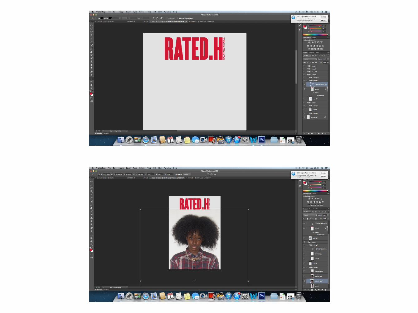
I used the website www.myfonts.com to find the typography I wanted my masthead on all three pages, the headline on the front cover, the heading and stand first for the DPS to be. The tools and techniques I used to create my front cover: • Rectangle tool: - I used it to create the underlining of the masthead ad strap line on the front page. It was also used to create part of the DPS and Contents layout. • Text: - I used the Langdon, Calibri and TW Cen MT to produce the sell lines, subheadings, issue date, article and page numbers. • Pen tool: - The tool was used to create a vector path that makes smoother selection such as selecting the model out from the background, or selecting a specific part of the model. • Magic wand: this is another selection tool I used. It allowed me to select more than one area at one time, such as each letter of the masthead. • Paint bucket tool: used to fill in the rectangles, the text/lettering • Gradient: used to create the fade in the background of the front cover as well as changing colour gradient of the paint splash effect on the DPS • Transformation: This technique was used repeatedly to resize and rotate the components using the keys Ctrl+T. • Content away: the technique was used to delete unwanted areas, then it in with is surroundings,
-
Upload
mercadom123 -
Category
Technology
-
view
28 -
download
1
Transcript of Evidence part 1

I used the website www.myfonts.com to find the typography I wanted my masthead on all three pages, the headline on the front cover, the heading and stand first for the DPS to be. The tools and techniques I used to create my front cover:• Rectangle tool: - I used it to create the underlining of the masthead ad strap
line on the front page. It was also used to create part of the DPS and Contents layout.
• Text: - I used the Langdon, Calibri and TW Cen MT to produce the sell lines, subheadings, issue date, article and page numbers.
• Pen tool: - The tool was used to create a vector path that makes smoother selection such as selecting the model out from the background, or selecting a specific part of the model.
• Magic wand: this is another selection tool I used. It allowed me to select more than one area at one time, such as each letter of the masthead.
• Paint bucket tool: used to fill in the rectangles, the text/lettering• Gradient: used to create the fade in the background of the front cover as
well as changing colour gradient of the paint splash effect on the DPS• Transformation: This technique was used repeatedly to resize and rotate the
components using the keys Ctrl+T.• Content away: the technique was used to delete unwanted areas, then it in
with is surroundings, for example I used it to take the creases from the background out to look smoother.
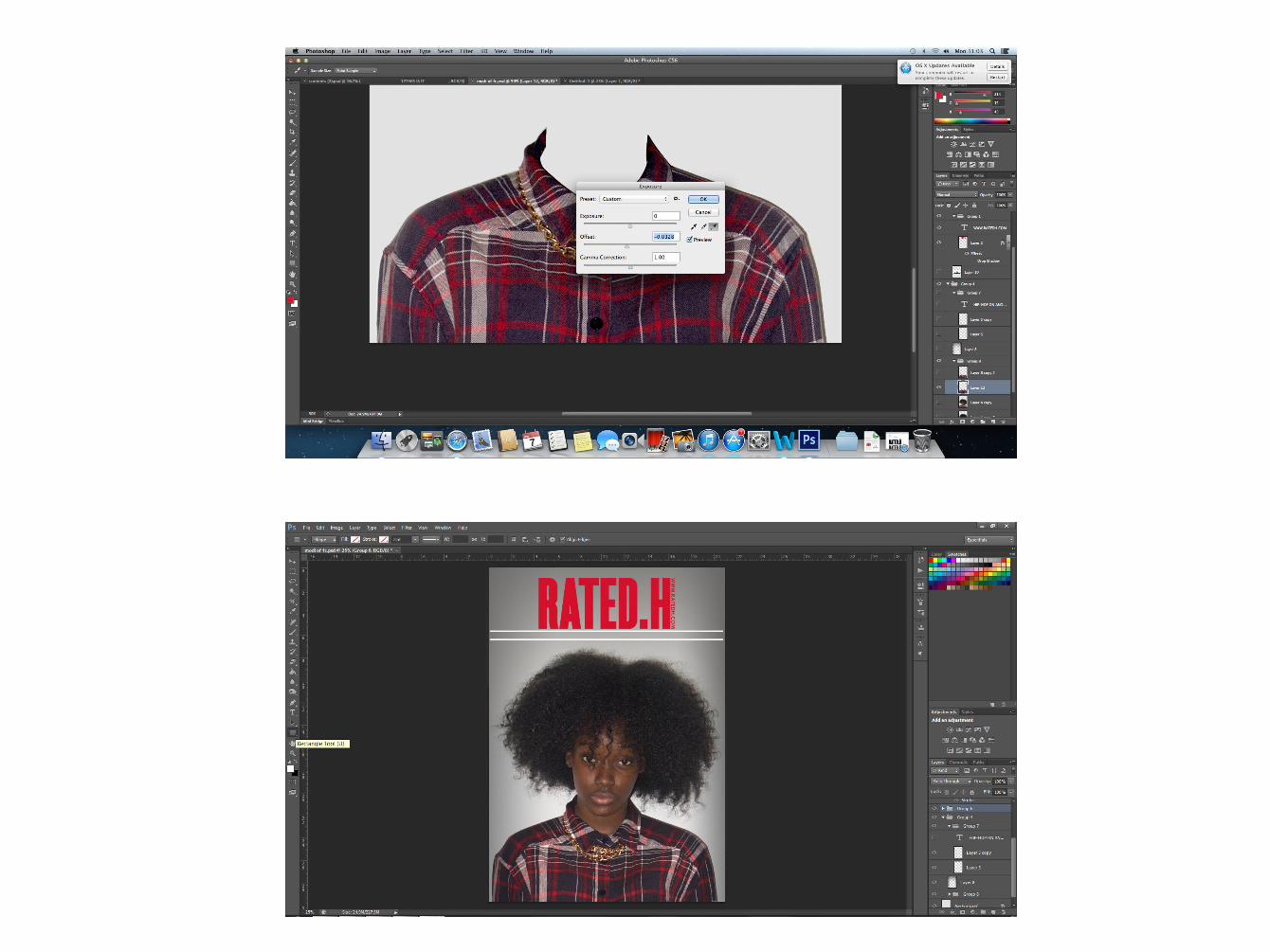
• Blending option: One of the blending options I used was the stroke; it creates a border of any colour I wanted around the headline and on the images.
• Exposure: I used it to change the brightness of the background and main image on the DPS, plus the shirt of the main model on the front cover, by changing the three settings; exposure, offset and gamma correction.
• Opacity: This changed the opaqueness of the sub images of the DPS, the text, ‘features’, and the layout of the contents page.
• Blur tool: to smoothen the edges of the images.