Evidence of the Most Popular Technical Indicators ... · a hierarchy of the most popular technical...
48
P1: OTA/XYZ P2: ABC JWBT531-c01 JWBT531-Ciana August 1, 2011 22:26 Printer Name: Courier Westford CHAPTER 1 Evidence of the Most Popular Technical Indicators Paul Ciana, CMT Bloomberg LP The application of various technical indicators is nothing new to the majority of financial market participants. The opportunity to trade a moving average cross or an overbought market is a frequent observation during normal market hours worldwide. The challenge that many ponder is which technical indica- tors to use. In an effort to resolve that challenge, market participants wonder what others are using. If this information can be identified and verified, mar- ket participants will likely monitor those indicators to understand what others are thinking and seeing. Therefore, it might be possible to develop a trading strategy based on the most popular technical indicators. Although I cannot prove the latter as statistically true, this chapter reveals a hierarchy of the most popular technical indicators on the Bloomberg Pro- fessional Service. Then it presents the indicators’ commonly accepted signals. But first, it attempts to define what technical analysis represents; it would be ill advised to discuss only indicators when technical analysis is much more than that. 1 COPYRIGHTED MATERIAL
Transcript of Evidence of the Most Popular Technical Indicators ... · a hierarchy of the most popular technical...

P1: OTA/XYZ P2: ABCJWBT531-c01 JWBT531-Ciana August 1, 2011 22:26 Printer Name: Courier Westford
CHAPTER 1
Evidence of the MostPopular TechnicalIndicators
Paul Ciana, CMTBloomberg LP
The application of various technical indicators is nothing new to the majorityof financial market participants. The opportunity to trade a moving averagecross or an overbought market is a frequent observation during normal markethours worldwide. The challenge that many ponder is which technical indica-tors to use. In an effort to resolve that challenge, market participants wonderwhat others are using. If this information can be identified and verified, mar-ket participants will likely monitor those indicators to understand what othersare thinking and seeing. Therefore, it might be possible to develop a tradingstrategy based on the most popular technical indicators.
Although I cannot prove the latter as statistically true, this chapter revealsa hierarchy of the most popular technical indicators on the Bloomberg Pro-fessional Service. Then it presents the indicators’ commonly accepted signals.But first, it attempts to define what technical analysis represents; it would beill advised to discuss only indicators when technical analysis is much morethan that.
1
COPYRIG
HTED M
ATERIAL
P1: OTA/XYZ P2: ABCJWBT531-c01 JWBT531-Ciana August 1, 2011 22:26 Printer Name: Courier Westford
2 New Frontiers in Technical Analysis
Defining Technical Analysis
Sometimes it seems that the majority of market participants may be misledabout the broad scope of theories used in the application of technical analysiswhen trying to understand and forecast the financial markets. My gut feelingis that if we were to sample a random group of market participants to definetechnical analysis, they would present terms such as price, moving averages,charts, and oscillators. A simple Internet search confirmed my suspicions aboutwhat words we would hear. Some of the definitions that can be easily founddo a good job of describing parts of the theory, while others should not beread by a technician who lacks a sense of humor.
Three of the better definitions are:
1. Analysis of past price changes in the hope of forecasting future pricechanges.
2. Analysis based on market action through chart study, moving averages,volume, open interest, formations, and other technical indicators.
3. An approach to forecasting commodity prices that examines the patternsof price change, rates of change, and changes in volume of trading andopen interest, without regard to underlying fundamental market factors.∗
Technical analysis offers much more than these definitions suggest. Thefirst is so generic it could be used to describe many fields of analysis. It suggestsmarket participants study prices and fails to elaborate on the variety of datatypes that can be analyzed. The second mentions market action, a commonterm used in describing technical analysis, but then repeats itself by listing thedata sets that represent market action. It assumes that most of the methodsof a technical analyst are focused on technical indicators and therefore it doesnot elaborate on the variety and depth of the theories in this field of study.The third suggests that technical analysis is used in the commodity markets,which is true, but the application of technical analysis is not restricted to onlythe commodity markets. Technical analysis can be applied to nearly all typesof financial markets.
The methods of a technician span a wide array of theories and use count-less different tools to strategize, quantify, and discuss the financial markets inways that other types of analyses don’t or can’t. One of my goals in writing this
∗Definition one from wordnetweb.princeton.edu/perl/webwn; definition two fromwww.worldwidemoneyexchange.com/terminology.html; and definition three fromwww.lind-waldock.com/education/glossary/technical_analysis_terms.shtml.
P1: OTA/XYZ P2: ABCJWBT531-c01 JWBT531-Ciana August 1, 2011 22:26 Printer Name: Courier Westford
Evidence of the Most Popular Technical Indicators 3
chapter is to create a one-sentence definition that broadens the scope of theknown definitions. It has proved to be very challenging to come up with onesentence that defines technical analysis in its entirety. I believe this is a debatefor the entire industry to continuously weigh in on, especially as technicalanalysis evolves; furthermore, I do not mean to suggest that any one definitionwould ever be universally acceptable. At present, and with the input of a fewfriends, I lean toward the following definition:
Technical analysis is the extraction of information from market data intoobjective visualizations through the use of mathematics with an emphasison investor behavior and supply and demand to explain the current andanticipate the future path of the financial markets.
This definition suggests that technical analysis comprises the followingfive attributes:
1. Market data: Represents a variety of data sets that includes the mostfrequently used ones such as price, volume, and open interest, butdoes not exclude data sets such as volatility, ticks, ratios, and dividendyields.
2. Objective visualizations: A preference for analyzing information in a chart,but visualizations could be more than a chart, such as a figure, table, scatterplot, or query of results.
3. Use of mathematics: The application of measurements and calculations tomeasure the market actions of an individual security or a group of securities.
4. Emphasis on investor behavior and supply and demand: We have a bias foridentifying rational and irrational market actions and look for imbalancesin the availability or desire for a security.
5. Explain the current and anticipate the future: We are attempting to under-stand what the market is telling us about itself to estimate where it may goin the future.
To further explain the definition, we will summarize the three premises oftechnical analysis (see Figure 1.1) and explain some of the most popular tools(certainly not all) used for this method of analyzing the financial markets.
The first principle states that market actions discount everything . Thispremise suggests that all publicly available information—such as company-specific news, political changes, weather, and so forth—is already priced intothe current value of a security. Therefore we do not necessarily need to knowwhy something is happening; we need only to understand the reaction of

P1: OTA/XYZ P2: ABCJWBT531-c01 JWBT531-Ciana August 1, 2011 22:26 Printer Name: Courier Westford
4 New Frontiers in Technical Analysis
FIGURE 1.1 Defining Technical Analysis Principles
What IsTechnical Analysis?
The Study of Market Actions
Three Premises
History repeats itselfMarket actions discount everything
Prices move in trends
investors to what is happening. If the reaction is positive, market participantswill push markets higher. If the reaction is negative, market participants willpush markets lower. We then employ a host of tools to decipher the impactof that action on the existing trend.
The second principle states that prices move in trends. This relates to IsaacNewton’s first law of motion. It suggests that an object in motion remains inmotion until acted upon by an equal or stronger force. This force, dependingon its strength, can change the direction of motion from its prior path. Intechnical analysis, this can be thought of as an event or group of events beingdiscounted into the price of a security, causing price to change direction.
The third principle is that history repeats itself —I can still hear my highschool history teacher’s voice as he quoted, “Those who do not learn history aredoomed to repeat it.” This principle suggests that as the dominant generationor the largest group of market participants transitions out of the financialmarkets, the incoming generation does not learn or receive enough of thepreviously accumulated information. Therefore we have an inherent bias torepeat many of the same investment and trading decisions, both correct andincorrect, as did previous generations. Some of this tendency to repeat historyis represented by price patterns that form on the chart (i.e., a triangle or headand shoulders).
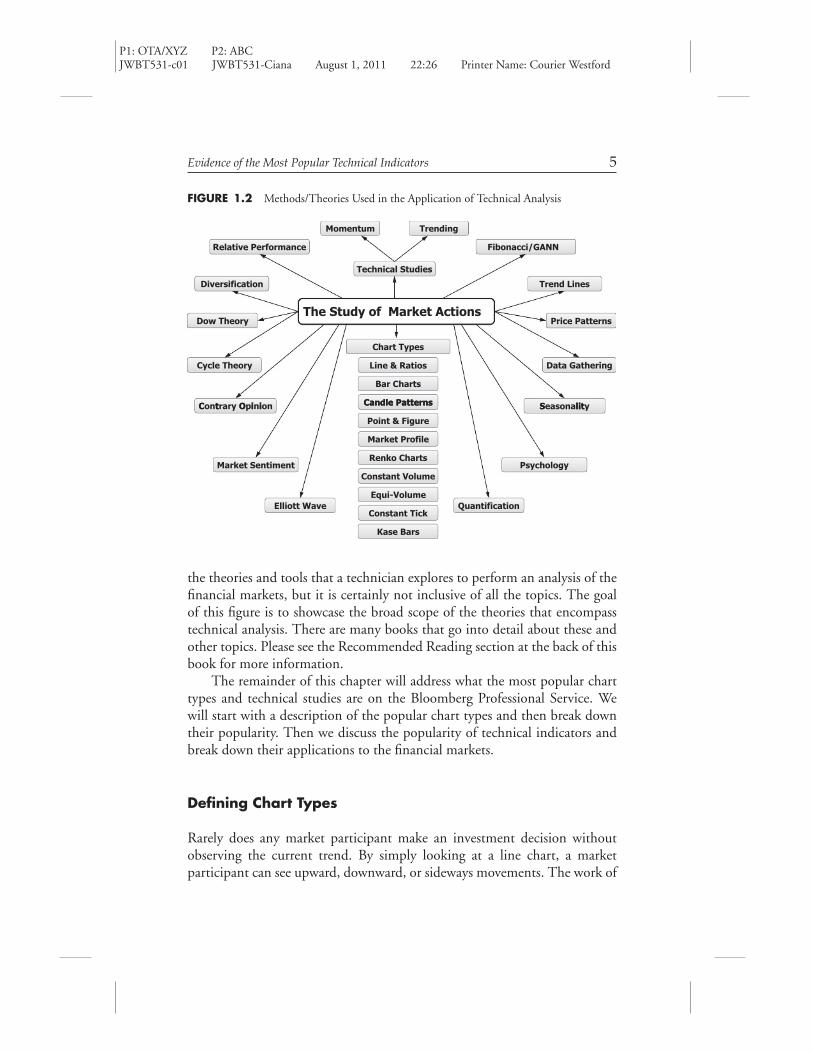
Now that we have a basis for what technical analysis is, we can discussthe tools that a technician uses. Figure 1.2 is a diagram presenting many of
P1: OTA/XYZ P2: ABCJWBT531-c01 JWBT531-Ciana August 1, 2011 22:26 Printer Name: Courier Westford
Evidence of the Most Popular Technical Indicators 5
FIGURE 1.2 Methods/Theories Used in the Application of Technical Analysis
Fibonacci/GANNRelative Performance
Momentum Trending
Trend Lines
Technical Studies
Diversification
The Study of Market ActionsDow Theory Price Patterns
Chart Types
Data GatheringCycle Theory
PatternsCandle
Line & Ratios
Bar Charts
litSiiOtC
Point & Figure
Market Profile
Candle Patterns SeasonalityContrary Opinion
Market Sentiment
Constant Volume
ChartsRenko
Equi-Volume
Psychology
Elliott WaveConstant Tick
Kase Bars
Quantification
the theories and tools that a technician explores to perform an analysis of thefinancial markets, but it is certainly not inclusive of all the topics. The goalof this figure is to showcase the broad scope of the theories that encompasstechnical analysis. There are many books that go into detail about these andother topics. Please see the Recommended Reading section at the back of thisbook for more information.
The remainder of this chapter will address what the most popular charttypes and technical studies are on the Bloomberg Professional Service. Wewill start with a description of the popular chart types and then break downtheir popularity. Then we discuss the popularity of technical indicators andbreak down their applications to the financial markets.
Defining Chart Types
Rarely does any market participant make an investment decision withoutobserving the current trend. By simply looking at a line chart, a marketparticipant can see upward, downward, or sideways movements. The work of

P1: OTA/XYZ P2: ABCJWBT531-c01 JWBT531-Ciana August 1, 2011 22:26 Printer Name: Courier Westford
6 New Frontiers in Technical Analysis
FIGURE 1.3 Line Chart Showing Stock Price, U.S. GDP, and P/E Ratio
150
100
504.02.00.0–2.0–4.0
201510
20112010200920082007200620052004200320022001
P/E Ratio - IBM
US GDP Chained CYOY
International Business Machines Corp.
a technician starts with price, and to look at price we use many different typesof charts, such as those listed in Figure 1.2. Although this list is plentiful,it is far from being all-inclusive. Throughout this book, we will familiarizeourselves with the line, bar, candle, log, and intraday charts and identify theirranks in popularity among market participants. Later, we will do the same forthe most-preferred technical indicators.
A line chart is a very elegant and simple type of chart to look at. Itprovides convenience for faster analysis because it shows the overall directionof trend. It is typically used by an economist analyzing economic data sets,a fundamental analyst scanning a list of securities for performance changesand fundamental trends, and overall very long-term analysis. For example, itcould be a historical look at an economic release like gross domestic product(GDP), the price/earnings (P/E) ratio of a stock, or the closing price of asecurity. Figure 1.3 displays these data sets with added line-chart featuresthat help in differentiating data sets from one another. The middle panel hasmarkers on GDP emphasizing where the closing value was and the bottompanel has shading below the line (P/E ratio) to emphasize the slope of the line.
A bar chart is slightly more complex than a line chart in that it offersthree more data points per occurrence, when such data exists. It shows theopen, high, and low price in addition to the last or closing price.
A candle chart is similar to a bar chart in that it displays the same data—theopen, high, low and closing prices—but it does so in a more descriptive andartistic fashion to allow for a quicker analysis and a clearer understanding ofprice movement. Figure 1.4 displays all three chart types. The candle chartdiffers the most because of the “body,” or the rectangular shape in the middle,representing the opening and closing price for a period of time. Typically,

P1: OTA/XYZ P2: ABCJWBT531-c01 JWBT531-Ciana August 1, 2011 22:26 Printer Name: Courier Westford
Evidence of the Most Popular Technical Indicators 7
FIGURE 1.4 Three Types of Charts: Line, Bar, and Candle
Line Bar Candle
HighHigh
Close
High
Close
OpenOpen
LowLow
OpenClose
High
Open
ClLow
Low
Cl ose
when this body is hollow, it represents an up period. When it is dark or filledin, it represents a down period.
Figure 1.5 is a historical representation comparing all three chart typesand shows an example of how the clarity of a candle chart can offer anadvantage in identifying more information faster than other chart types. Herewe can quickly see that 13 of the 18 trading days in February were up-days(or hollow-bodied candles) and the other six were down-days (or dark-bodiedcandles).
A logarithmic chart is designed to represent the percent change betweenprice increments on the y-axis. As the values on the y-axis get larger, thedistance between them will shrink to a distance that is relative to the per-centage change. For example, a security that goes from $10 to $20 has ex-perienced a $10 change or an increase of 100 percent. A security that goesfrom $100 to $110 has also experienced a $10 change but only a 10 percentincrease. Therefore the vertical distance on the y-axis should be greater for the100 percent increase and smaller for the 10 percent increase. A good rule ofthumb is to consider a log chart, in addition to an arithmetic chart, when thevalue has changed about 30 percent or more and always as an alternative forlong-term analysis.
Figure 1.6 displays the price of the S&P 500 from the lows of March2009 to March 2011, when price gained about 100 percent. The top panel

P1: OTA/XYZ P2: ABCJWBT531-c01 JWBT531-Ciana August 1, 2011 22:26 Printer Name: Courier Westford
FIG
URE
1.5
AH
isto
rica
lCom
pari
son
ofa
Line
,Bar
,and
Can
dle
Cha
rtof
the
S&P
500
Inde
x
Jan
7Ja
n 14
Jan
21Ja
n 31
Feb
7F
eb 1
420
11F
eb 2
2F
eb 2
8S
pan
18
Spa
n 18
Spa
n 18
Mar
8M
ar 1
5
1300
1279
.20
1350
1300
1250
1350
1300
1250
1279
.20
1279
.20
8

P1: OTA/XYZ P2: ABCJWBT531-c01 JWBT531-Ciana August 1, 2011 22:26 Printer Name: Courier Westford
FIG
URE
1.6
Tren
dLi
neA
naly
sis
Show
ing
Ari
thm
etic
vers
usLo
gSc
ale
Cha
rts
1300
1200
1100
1000
900
800
700
700
Mar
Dec
Sep
Jun
Mar
Dec
Sep
Jun
Mar101.57%
101.57%
+ +
2011
2010
2009
800
900
1500
1000
9

P1: OTA/XYZ P2: ABCJWBT531-c01 JWBT531-Ciana August 1, 2011 22:26 Printer Name: Courier Westford
10 New Frontiers in Technical Analysis
is an arithmetic chart, showing equal price increments on the y-axis, and thebottom panel is a log chart, which adjusts the distance between incrementson the y-axis to correspond with percentage change. In the top chart, priceis about 50 points above the upward-sloping trend line. In the bottom chart,price is already starting to trade below the upward-sloping trend line. Thisdifference in the display of market actions highlights why it is important toconsider both chart types.
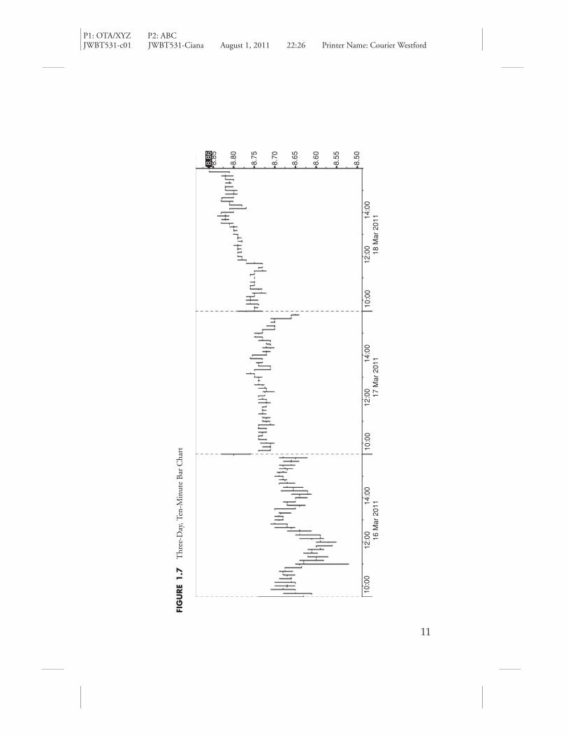
The last chart type to introduce is the intraday chart. This chart is usedprimarily by traders who have a short investment horizon or holding period,in order to track the current day or past few days of price movement. Itprovides a quick glimpse into what is happening right now for the value of asecurity and is designed to update in real time. An example of a 10-minutebar chart for the past three days is displayed in Figure 1.7. Each bar displaysthe open, high, low, and close for that 10-minute period of market activity.
Evidence of Chart Type Popularity
Now that we are familiar with the line, bar, candle, log, and intraday charts,we can discuss the preference of these chart types by market participantswho analyze the financial markets through interaction with the BloombergProfessional Service.
The measurable sample size of these regions is approximately 44 percentin the Americas, 38 percent in Europe, 12 percent in Asia, and 2 percent inthe Middle East and South Africa (MESA). In other words, of a hypothetical100 market participants, 44 were in the Americas, 38 in Europe, 12 in Asia,and 2 in MESA.
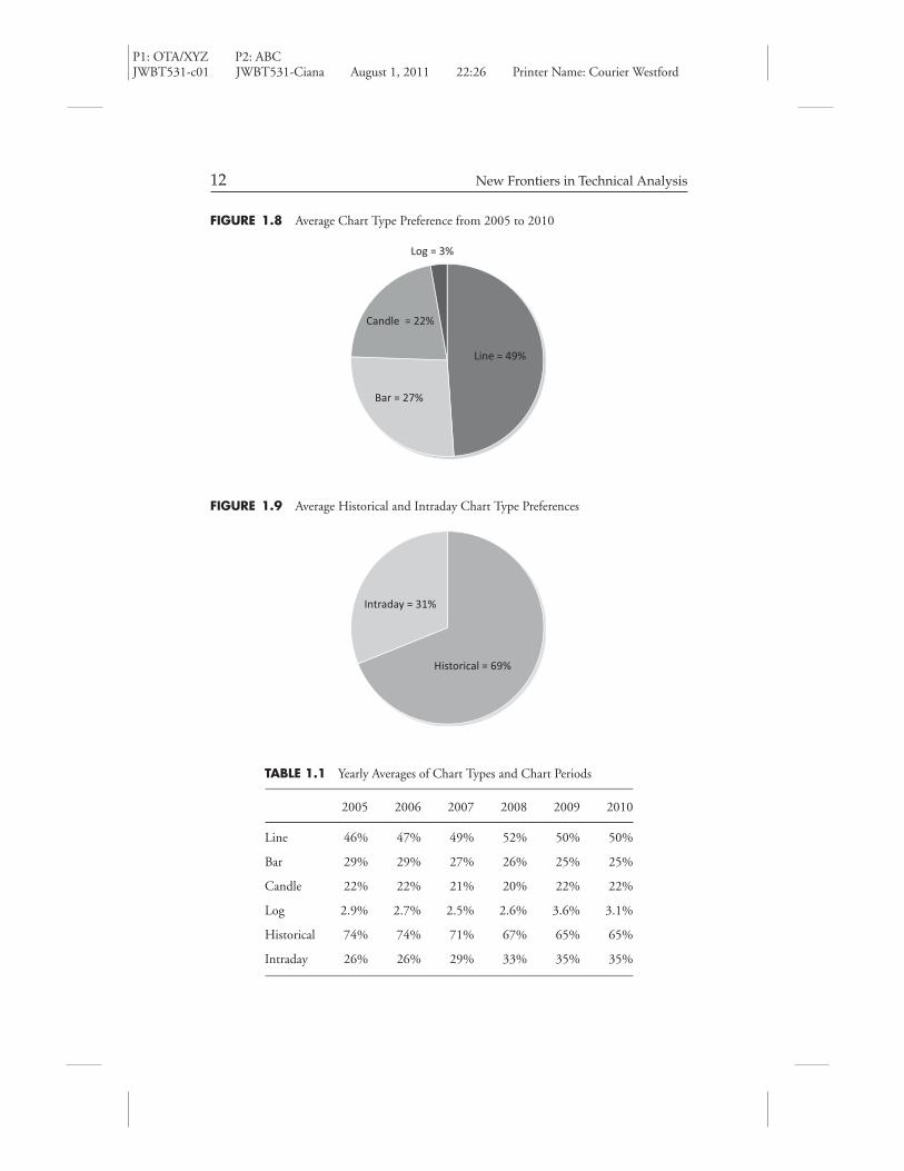
Figure 1.8 displays the average chart-type preference of market partic-ipants from 2005 to 2010. This reveals, on average, that the line chart ispreferred about half the time, the bar chart about one quarter of the time,the candle chart about one fifth of the time, and that the log chart is rarelypreferred.
Figure 1.9 displays the average preference for historical charts and intradaycharts by market participants from 2005 to 2010. This reveals, on average,that the historical chart is chosen more than twice as often as the intradaychart, or about 69 percent of the time, while the intraday chart is preferredabout 31 percent of the time.
Table 1.1 reveals the average preference for each year of the statisticsshown in Figure 1.8 and 1.9. This data suggests that the preference for linecharts is slowly growing, the preference for bar charts is gradually declining,
P1: OTA/XYZ P2: ABCJWBT531-c01 JWBT531-Ciana August 1, 2011 22:26 Printer Name: Courier Westford
FIG
URE
1.7
Thr
ee-D
ay,T
en-M
inut
eB
arC
hart
8.85
8.86
8.80
8.75
8.70
8.65
8.60
8.55
8.50
10:0
016
Mar
201
117
Mar
201
118
Mar
201
112
:00
14:0
010
:00
12:0
014
:00
10:0
012
:00
14:0
0
11
P1: OTA/XYZ P2: ABCJWBT531-c01 JWBT531-Ciana August 1, 2011 22:26 Printer Name: Courier Westford
12 New Frontiers in Technical Analysis
FIGURE 1.8 Average Chart Type Preference from 2005 to 2010
Line = 49%
Bar = 27%
Candle = 22%
Log = 3%
FIGURE 1.9 Average Historical and Intraday Chart Type Preferences
Historical = 69%
Intraday = 31%
TABLE 1.1 Yearly Averages of Chart Types and Chart Periods
2005 2006 2007 2008 2009 2010
Line 46% 47% 49% 52% 50% 50%
Bar 29% 29% 27% 26% 25% 25%
Candle 22% 22% 21% 20% 22% 22%
Log 2.9% 2.7% 2.5% 2.6% 3.6% 3.1%
Historical 74% 74% 71% 67% 65% 65%
Intraday 26% 26% 29% 33% 35% 35%

P1: OTA/XYZ P2: ABCJWBT531-c01 JWBT531-Ciana August 1, 2011 22:26 Printer Name: Courier Westford
Evidence of the Most Popular Technical Indicators 13
and the preference for candle charts is steady. It also shows that the preferencefor historical charts is declining and the preference for intraday charts is rising.
There are three large shifts in the data in this table. The first is in log chartpreference from 2008 to 2009. The second is the historical chart preferencefrom 2007 to 2009. The third is the intraday chart from 2007 to 2009.During this two-year period, from high to low, the S&P 500 declined about56 percent. Therefore the rise in preference for log-scale charts makes sensebecause the markets experienced a large percentage move. The decline inhistorical chart preference and the rise in intraday chart preference couldrepresent a few things. It could represent the urgent and repeated desire ofmarket participants to see short-term impacts on the value of their holdings. Itcould represent investor indecision about what to do with their holdings. Orit could also represent the fear of further losses or hopes of a reversal. Overallit suggests that market participants choose intraday charts more frequently inbear markets than they do in bull markets.
Table 1.2 measures chart type preference of market participants withrespect to a region. It answers the question, “What chart type does a regionprefer?” Based on the average user preference in 2010, we can conclude:
� The Americas, Europe, and MESA prefer a line chart about half the time.� After the line chart, the Americas prefer bar charts considerably more than
candle charts, while Europe has equal preference for bar and candle charts.� Asia is the only region that does not prefer the line chart more than the candle
chart. Asia prefers the candle chart the most, and prefers it considerably morethan the other regions.
� MESA, like Europe, prefers first the line chart and then the candle chart.� Log chart preference is higher in Europe and the Americas than in Asia and
MESA.
TABLE 1.2 Chart Type Preference of Each Region
Americas Europe Asia MESA
Line Chart 51% 55% 41% 48%
Bar Chart 32% 20% 14% 20%
Candle Chart 14% 21% 43% 31%
Log Chart 3% 4% 1% 1%
Total 100% 100% 100% 100%

P1: OTA/XYZ P2: ABCJWBT531-c01 JWBT531-Ciana August 1, 2011 22:26 Printer Name: Courier Westford
14 New Frontiers in Technical Analysis
TABLE 1.3 Comparison of Regional Chart Type Preference to World Preference
Americas (44%) Europe (38%) Asia (12%) MESA (2%) Total
Line Chart 43% 40% 15% 1.5% 100%
Bar Chart 58% 30% 11% 1.3% 100%
Candle Chart 27% 34% 37% 2.2% 100%
Log Chart 44% 47% 8.7% 0.6% 100%
Table 1.3 allows us to understand the figures in Table 1.2 in more detailby comparing chart type preference of a region to chart type preference of theworld. In other words, the Americas, or 44 percent of the sample size, preferthe line chart 43 percent of the time, or they about equally prefer the use ofthe line chart. The conclusions we can draw from this table that weren’t clearin Table 1.2 are:
� Although Asia used line charts the least of all the regions in Table 1.2, itspreference for line charts in Table 1.3 is 25 percent greater than its samplesize. Asia’s preferences for a bar or line chart is about equal.
� Although MESA preferred the line chart most of all charts in Table 1.2, itscandle chart preference in Table 1.3 is greater than its sample size, and theline chart preference is less. Candle chart preference is well represented byMESA.
� The log chart is greatly preferred in Europe and equally preferred in theAmericas, while Asia and MESA do not prefer it.
Evidence of Technical Indicator Popularity
Regardless of the chart type that you prefer, chartists and technicians takeprice and apply an abundance of calculations to it in order to gain a betterunderstanding of what price or market actions are telling them. A question Ifrequently hear from those who are starting to use technical analysis is “Whatindicators (calculations) should I use?” In my opinion, there is no “right”technical indicator. The selection and application of one or a handful ofstudies is based on a person’s investment style, trading strategy, risk tolerance,goals, and available time commitment to learn the ins and outs of thoseindicators independently and together. We could back-test these indicators
P1: OTA/XYZ P2: ABCJWBT531-c01 JWBT531-Ciana August 1, 2011 22:26 Printer Name: Courier Westford
Evidence of the Most Popular Technical Indicators 15
and strategies, but perhaps that will be in another book. Overall indicatorpreference can be defined with the data we discuss in the next few pages.
The first step to learning about them is to read some reliable informationthat provides an introduction into the many indicators that exist. Whilereading about them, you could select half a dozen studies and dig deeperinto their calculations and tendencies. A strong recommendation would be tochoose a set of indicators that have different objectives, such as a smoothingstudy like MACD, a momentum study like RSI, and a distribution study likeBollinger Bands. The next step would be to start applying them individuallyto a chart to see how they react to price movements, and finally applying themtogether.
For reference, the following studies and abbreviations will be used whendiscussing the indicators. Simple Moving Average (SMA), Exponential Mov-ing Average (EMA), Relative Strength Index (RSI), Moving Average Con-vergence Divergence (MACD), Bollinger Bands (BOLL), Stochastics (STO),Ichimoku (GOC), Directional Movement Index (DMI), Average DirectionalMovement (ADX), Volume at Time (VAT).
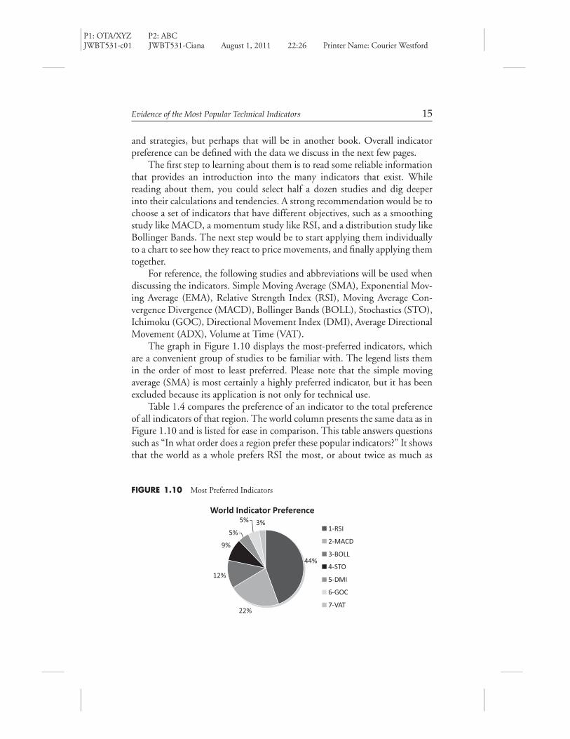
The graph in Figure 1.10 displays the most-preferred indicators, whichare a convenient group of studies to be familiar with. The legend lists themin the order of most to least preferred. Please note that the simple movingaverage (SMA) is most certainly a highly preferred indicator, but it has beenexcluded because its application is not only for technical use.
Table 1.4 compares the preference of an indicator to the total preferenceof all indicators of that region. The world column presents the same data as inFigure 1.10 and is listed for ease in comparison. This table answers questionssuch as “In what order does a region prefer these popular indicators?” It showsthat the world as a whole prefers RSI the most, or about twice as much as
FIGURE 1.10 Most Preferred Indicators
World Indicator Preference
44%
22%
12%
9%
5%
5% 3%1-RSI
2-MACD
3-BOLL
4-STO
5-DMI
6-GOC
7-VAT

P1: OTA/XYZ P2: ABCJWBT531-c01 JWBT531-Ciana August 1, 2011 22:26 Printer Name: Courier Westford
16 New Frontiers in Technical Analysis
TABLE 1.4 Comparing Regional Indicator Preferences to All Indicator Preferences
Americas Europe Asia MESA World
RSI 46.1% 45.1% 39.4% 50.1% 44.4%
MACD 20.0% 23.2% 23.2% 20.6% 22.0%
BOLL 11.7% 12.8% 11.4% 9.9% 12.0%
STO 10.3% 9.3% 8.0% 8.7% 9.3%
DMI 4.2% 5.0% 5.6% 6.1% 4.9%
GOC 2.5% 2.8% 10.8% 2.6% 4.5%
VAT 5.3% 1.8% 1.6% 2.0% 2.9%
Total 100% 100% 100% 100% 100%
it prefers MACD. The Americas favor volume at time (VAT) over DMI andIchimoku. It also shows that Asia prefers GOC over DMI and STO.
Table 1.5 displays how much a specific indicator is preferred in a par-ticular region relative to the indicators’ total preference worldwide. AlthoughTable 1.4 showed RSI as the most-used indicator, it is less preferred by the44 percent of the sample size in the Americas, about equally preferred by the38 percent in Europe, is preferred more by the 12 percent in Asia, and muchmore by the 2 percent in MESA.
Some bigger-picture conclusions we can draw from this table are as fol-lows. First, the preference for almost all technical indicators in MESA is
TABLE 1.5 Regional Indicator Preferences Compared to Total Indicator Preference
Americas (44%) Europe (38%) Asia (12%) MESA (2%) Total
RSI 33.9% 40.5% 20.2% 5.3% 100.0%
MACD 29.6% 42.0% 23.9% 4.4% 100.0%
BOLL 31.8% 42.6% 21.7% 3.9% 100.0%
STO 35.9% 40.0% 19.6% 4.4% 100.0%
DMI 27.9% 40.4% 25.9% 5.8% 100.0%
GOC 18.2% 24.6% 54.4% 2.7% 100.0%
VAT 59.0% 25.3% 12.4% 3.3% 100.0%

P1: OTA/XYZ P2: ABCJWBT531-c01 JWBT531-Ciana August 1, 2011 22:26 Printer Name: Courier Westford
Evidence of the Most Popular Technical Indicators 17
FIGURE 1.11 Growth Rates of Popular Technical Indicators Adjusted for User Growth
0
0.05
0.1
0.15
0.2
0.25
0.3
0.35
GOCVATDMISTOBOLLMACDRSI
2009 Growth
2010 Growth
more than double its sample size. This shows a strong overall preference fortechnical indicators in this region. Asia’s preference for technical indicatorssubstantially outperforms its sample size, but not as much as MESA. Europe’spreference for the top five technical indicators is slightly more than its samplesize. The Americas substantially underperform in all categories except VAT.
Figure 1.11 displays the overall growth in indicator use in 2009 and 2010and is normalized for changes to sample size. This answers a question such as“What indicators are market participants preferring more often?” The averagegrowth of technical indicators over these two years is quite substantial. Theirpreference on average grew 23 percent in 2009 and another 10 percent in2010. Interestingly, the most-preferred study, RSI, had double-digit growthrates for both years. Of all the studies, preference for RSI, VAT, and BOLLgrew more than average during both years.
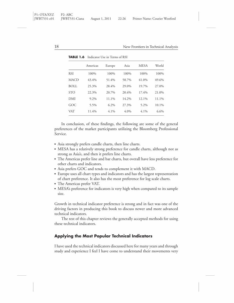
Table 1.6 is displaying the preference of the other six studies in terms ofRSI. We already know the order of the most-preferred studies but this tableaddresses a question like “What indicator does a region prefer in addition toRSI?” For example, Asia prefers MACD 59 percent of the time that RSI ispreferred, which didn’t stand out nearly as much in the other tables. Europeprefers MACD about half of the time, and the Americas and MESA prefer itabout two fifths of the time. MESA’s lack of preference in STO is emphasizedhere. Further confirmation for the Americas’ preference for VAT and Asia’spreference for GOC is also provided.
P1: OTA/XYZ P2: ABCJWBT531-c01 JWBT531-Ciana August 1, 2011 22:26 Printer Name: Courier Westford
18 New Frontiers in Technical Analysis
TABLE 1.6 Indicator Use in Terms of RSI
Americas Europe Asia MESA World
RSI 100% 100% 100% 100% 100%
MACD 43.4% 51.4% 58.7% 41.0% 49.6%
BOLL 25.3% 28.4% 29.0% 19.7% 27.0%
STO 22.3% 20.7% 20.4% 17.4% 21.0%
DMI 9.2% 11.1% 14.2% 12.1% 11.1%
GOC 5.5% 6.2% 27.3% 5.2% 10.1%
VAT 11.4% 4.1% 4.0% 4.1% 6.6%
In conclusion, of these findings, the following are some of the generalpreferences of the market participants utilizing the Bloomberg ProfessionalService.
� Asia strongly prefers candle charts, then line charts.� MESA has a relatively strong preference for candle charts, although not as
strong as Asia’s, and then it prefers line charts.� The Americas prefer line and bar charts, but overall have less preference for
other charts and indicators.� Asia prefers GOC and tends to complement it with MACD.� Europe uses all chart types and indicators and has the largest representation
of chart preference. It also has the most preference for log scale charts.� The Americas prefer VAT.� MESA’s preference for indicators is very high when compared to its sample
size.
Growth in technical indicator preference is strong and in fact was one of thedriving factors in producing this book to discuss newer and more advancedtechnical indicators.
The rest of this chapter reviews the generally accepted methods for usingthese technical indicators.
Applying the Most Popular Technical Indicators
I have used the technical indicators discussed here for many years and throughstudy and experience I feel I have come to understand their movements very
P1: OTA/XYZ P2: ABCJWBT531-c01 JWBT531-Ciana August 1, 2011 22:26 Printer Name: Courier Westford
Evidence of the Most Popular Technical Indicators 19
well. This is something I highly recommend to all readers, as it will increaseyour confidence in using them as part of an investment decision-makingprocess. Having spent a significant amount of time discussing indicators withmarket participants, I’ve come up with succinct yet informative descriptionsto explain their workings. Once you’ve read about the indicators, refer to thebox presented further on in the chapter, titled “Generally Accepted Rules forPopular Indicators.”
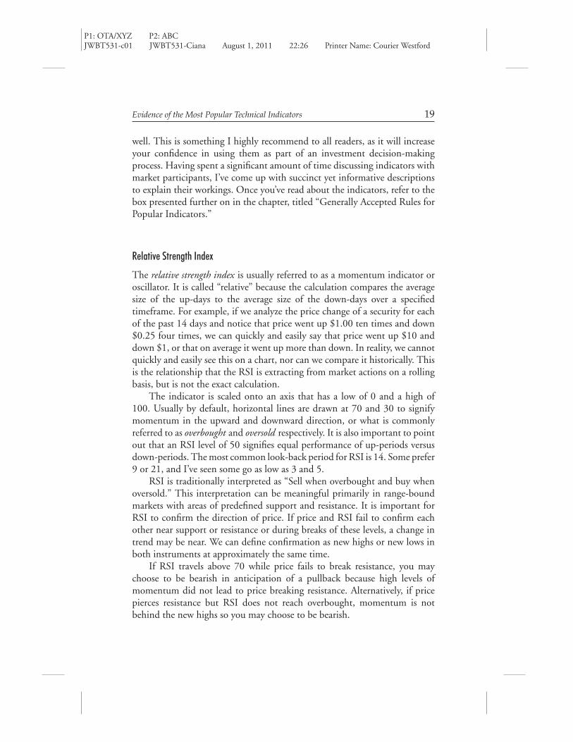
Relative Strength Index
The relative strength index is usually referred to as a momentum indicator oroscillator. It is called “relative” because the calculation compares the averagesize of the up-days to the average size of the down-days over a specifiedtimeframe. For example, if we analyze the price change of a security for eachof the past 14 days and notice that price went up $1.00 ten times and down$0.25 four times, we can quickly and easily say that price went up $10 anddown $1, or that on average it went up more than down. In reality, we cannotquickly and easily see this on a chart, nor can we compare it historically. Thisis the relationship that the RSI is extracting from market actions on a rollingbasis, but is not the exact calculation.
The indicator is scaled onto an axis that has a low of 0 and a high of100. Usually by default, horizontal lines are drawn at 70 and 30 to signifymomentum in the upward and downward direction, or what is commonlyreferred to as overbought and oversold respectively. It is also important to pointout that an RSI level of 50 signifies equal performance of up-periods versusdown-periods. The most common look-back period for RSI is 14. Some prefer9 or 21, and I’ve seen some go as low as 3 and 5.
RSI is traditionally interpreted as “Sell when overbought and buy whenoversold.” This interpretation can be meaningful primarily in range-boundmarkets with areas of predefined support and resistance. It is important forRSI to confirm the direction of price. If price and RSI fail to confirm eachother near support or resistance or during breaks of these levels, a change intrend may be near. We can define confirmation as new highs or new lows inboth instruments at approximately the same time.
If RSI travels above 70 while price fails to break resistance, you maychoose to be bearish in anticipation of a pullback because high levels ofmomentum did not lead to price breaking resistance. Alternatively, if pricepierces resistance but RSI does not reach overbought, momentum is notbehind the new highs so you may choose to be bearish.
P1: OTA/XYZ P2: ABCJWBT531-c01 JWBT531-Ciana August 1, 2011 22:26 Printer Name: Courier Westford
20 New Frontiers in Technical Analysis
The opposite would be true for a bullish view. When RSI travels below30 and price is holding above support, you might choose to be bullish becauselarge downside momentum did not force a break of support. Alternatively,when RSI is above 30 and price pierces support you may choose to be bullishbecause momentum to the downside is not strong and the break of supportmay only be temporary.
Volume analysis is very complementary to these methods of using RSI.If volume is light near resistance or support, it suggests market participantshave finished pushing price in that direction. There will be more discussionof volume later.
RSI in a trending market is viewed differently. When a market is trending,all we want to know is if it’s going to continue or reverse. If the overall trendis down and RSI reaches an overbought reading, the trend may be changingto an upward direction. The start of a trend change usually appears likesideways movement. Therefore the rally that occurred in the downtrend tocause the overbought reading is likely to at least partially correct itself becausethe market isn’t fully confident in a change in trend yet. A trend change canbe confirmed if RSI stays above oversold in the correction and when pricestarts to break resistance or set higher highs.
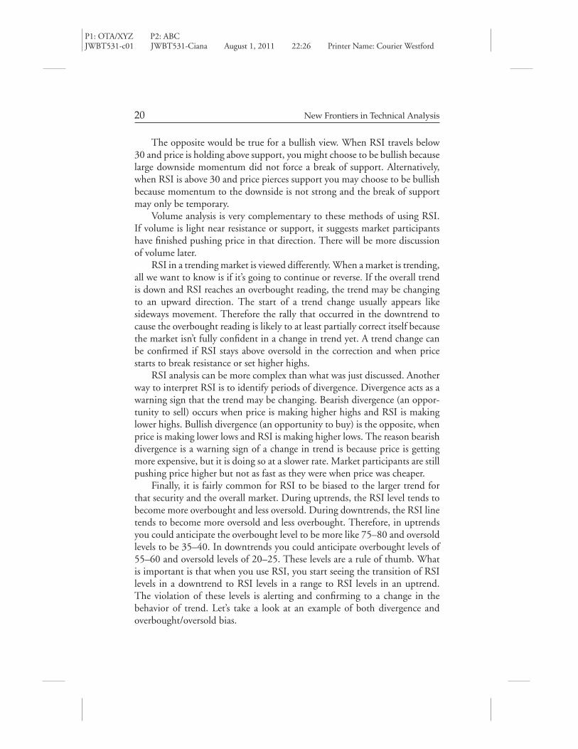
RSI analysis can be more complex than what was just discussed. Anotherway to interpret RSI is to identify periods of divergence. Divergence acts as awarning sign that the trend may be changing. Bearish divergence (an oppor-tunity to sell) occurs when price is making higher highs and RSI is makinglower highs. Bullish divergence (an opportunity to buy) is the opposite, whenprice is making lower lows and RSI is making higher lows. The reason bearishdivergence is a warning sign of a change in trend is because price is gettingmore expensive, but it is doing so at a slower rate. Market participants are stillpushing price higher but not as fast as they were when price was cheaper.
Finally, it is fairly common for RSI to be biased to the larger trend forthat security and the overall market. During uptrends, the RSI level tends tobecome more overbought and less oversold. During downtrends, the RSI linetends to become more oversold and less overbought. Therefore, in uptrendsyou could anticipate the overbought level to be more like 75–80 and oversoldlevels to be 35–40. In downtrends you could anticipate overbought levels of55–60 and oversold levels of 20–25. These levels are a rule of thumb. Whatis important is that when you use RSI, you start seeing the transition of RSIlevels in a downtrend to RSI levels in a range to RSI levels in an uptrend.The violation of these levels is alerting and confirming to a change in thebehavior of trend. Let’s take a look at an example of both divergence andoverbought/oversold bias.

P1: OTA/XYZ P2: ABCJWBT531-c01 JWBT531-Ciana August 1, 2011 22:26 Printer Name: Courier Westford
Evidence of the Most Popular Technical Indicators 21
In Figure 1.12 there are seven zones to discuss where price and RSImovements depict trend direction. In zone 1, price is in a downtrend andis being coffered lower by a downward-sloping resistance line. Price setfour lower lows while RSI made three higher lows and did not get over-sold on the fourth low (and was only .37 below the third low). This tellsus price is reaching the lowest levels in a long time but at a slower andslower rate. Bullish divergence had presented itself and warned of a potentialbottom.
In zone 2, price breaks above the downward sloping resistance line butRSI fails at 60, the overbought level for a downtrend. In zone 3, price staysabove the lows of zone 1 and RSI reaches 34, which is closer to oversold inan uptrend than a downtrend. June, July, and August is starting to look moreand more like a range-bound market, or a double bottom, than a downtrend,as RSI stays above 30 and below 70.
In zone 4, price breaks the range-bound highs and RSI breaks above 60and then through 70, confirming the uptrend. All RSI lows between zone 4,5, and 6 are above the oversold level of 40; in fact they are at least 45, orshowing very bullish momentum. In zone 6, price has a huge thrust to theupside with RSI exceeding 80. Price continued to higher highs after that, butRSI did not reach overbought, showing lack of momentum into higher prices.Price and momentum were diverging, bearishly, warning that price may beforming a top.
In zone 7, RSI crossed below 45 for the first time in a long time whileprice broke down through multiple support levels. We can look for one of twosituations to occur that will specify a change in trend from up to sideways.The first is if price continues to decline and RSI reaches 30–35. The secondwould be if price moves higher and fails to exceed the prior highs of 17–17.50,all while RSI does not exceed 60 (the overbought level for a downtrend).
Moving Average Convergence/Divergence
Also known as MACD, moving average convergence/divergence, this indicatorfalls in the trending category of studies mostly because it is based on movingaverages. By design, trending studies will experience some lag in their signals,so they are best when used to confirm signals from other indicators. Somethingthat is noteworthy about MACD and perhaps contributes to its popularityis that it weights the most recent data points more, or exponentially calculatesto reduce its lag.
The default settings for this study across all systems are largely the same.The MACD1 line is the spread between the 12- and 26-period exponential

P1: OTA/XYZ P2: ABCJWBT531-c01 JWBT531-Ciana August 1, 2011 22:26 Printer Name: Courier Westford
FIG
URE
1.1
2A
lcoa
,Inc
.,w
ith
Exa
mpl
esof
Bul
lish
and
Bea
rish
RSI
Div
erge
nce
and
Mul
tipl
eO
verb
ough
tand
Ove
rsol
dLe
vels
12
35
67
18.0
0
17.0
0
16.0
0
15.0
0
14.0
0
13.0
0
12.0
0
11.0
0
10.0
0
100
80 60 40 20 0
4
Bul
lish
Div
erge
nce
Bul
lish
Div
erge
nce
Bea
rish
Div
erge
nce
Apr
May
Jun
Jul
Aug
Sep
Oct
Nov
Dec
Jan
Feb
Mar
2011
2010
22

P1: OTA/XYZ P2: ABCJWBT531-c01 JWBT531-Ciana August 1, 2011 22:26 Printer Name: Courier Westford
Evidence of the Most Popular Technical Indicators 23
moving average. The signal line is the 9-period exponential moving averageof the MACD1 line. I find that very few people actually change these periods.Hopefully this explanation will encourage you to experiment. In Chapter 2,by Julius de Kempenaer, you’ll see that he prefers the spread between the 10-and 30-week moving averages. Interestingly enough, almost everyone seemsto keep the signal at a period of 9.
This produces an indicator that will oscillate between a positive andnegative value. A rule of thumb for many indicators is that when the value ofa line in an indicator turns positive, it is bullish, and when it turns negative, itis bearish. A second rule of thumb to consider is that when a faster-moving line(in this case the MACD1 line) crosses above a slower-moving line (signal),a buy signal has occurred, and when a faster-moving line crosses below aslower-moving line, a sell signal has occurred. Remember, these are rules ofthumb, not guarantees.
In Figure 1.13 there are two exponential moving averages on the pricechart. The dashed line is a 12-day average and the solid line is a 26-day average.Below that is the MACD indicator where the MACD1 line is dashed and thesignal line is solid. According to the legends, the EMAVG (12) is 70.315 andthe EMAVG (26) is 68.4248. The 12-day average minus the 26-day averageequals 1.8902, which is equal to the MACD1 line in the bottom panel. Ifthe shorter-term average is less than the longer-term average, the MACD1line value will be negative. If the shorter-term average is greater than thelonger-term average, the MACD1 line value will be positive. Therefore, theMACD1 line is visualizing the crossing of the exponential moving averageson the price chart.
The other component of the MACD indicator is the signal line. Thisline is plotted to trail or smooth the MACD1 line for two reasons. First, itallows the indicator to generate earlier signals of a potential change in trend.It provides earlier sell signals when the MACD1 line crosses below the signalline and earlier buy signals when the MACD1 line crosses above the signalline. Considering where these crosses occur is important. The MACD1 linecrossing below the signal line while positive is an early sell signal. If theMACD1 line crosses above the signal line while positive and far from the zeroline, a buy signal has not occurred because the trend is already very bullish.Second, the signal line confirms a trend change when it turns into a positiveor negative value after the MACD1 line turns.
Last, the slope of the MACD1 and signal line—positive, negative, ortransitioning—can have a bearing on the overall direction of trend. In sit-uations shown in zone 2 of Figure 1.13, you’ll see how this can becomeimportant.

P1: OTA/XYZ P2: ABCJWBT531-c01 JWBT531-Ciana August 1, 2011 22:26 Printer Name: Courier Westford
FIG
URE
1.1
3M
ovin
gA
vera
geC
onve
rgen
ce/D
iver
genc
eE
xam
ple:
Boe
ing
Com
pany
80
43
21
60
Jun
BA
US
MA
CD
(12
,26)
1.8
902
Boe
ing
Co/
The
- L
ast P
rice
71.6
4 -.
16
2008
Sig
(9)
1.5
122E
MA
VG
(12
) on
clo
se 7
0.31
5E
MA
VG
(26
) on
clo
se 6
8.42
48
2009
2010
2011
Sep
Dec
Mar
Bul
lish
Div
erge
nce
Bul
lish
Div
erge
nce
Jun
Sep
Dec
Mar
Jun
Sep
Dec
Mar
50 40 30 6.00
4.00
1.89
020.
00
71.6
466
.421
0
-2.0
0
-4.0
0
-6.0
0
-8.0
0
24

P1: OTA/XYZ P2: ABCJWBT531-c01 JWBT531-Ciana August 1, 2011 22:26 Printer Name: Courier Westford
Evidence of the Most Popular Technical Indicators 25
In Figure 1.13, four zones have been highlighted to provide an exampleof how the indicator works. In zone 1, price is in a downtrend as defined bythe resistance of the downward-sloping trend line and the 12-day exponentialmoving average. As price reaches lower lows in March 2009, MACD makeshigher lows. This can be considered bullish divergence, as we discussed in theRSI example. I find that fewer people consider divergence on MACD, butI have come across some who do. In this instance, the divergence betweenMACD and price means the rolling spread between the two moving averagesof price has become smaller despite price going lower. In other words, themoving averages are closer to a bullish cross than at the last low in price, andnow price is even lower.
In the transition from zone 1 into zone 2, price broke above the trend lineand both moving averages. In the center of zone 2, the MACD1 line turnedpositive. If you were using just the moving averages on price, you may havebeen concerned because price dipped below them and then they bearishlycrossed. Deeper interpretation of the MACD can help in situations like this.The MACD1 line did not cross the signal line and it hovered at, and to justbelow, the zero line. Most important, it stayed above the signal line and thesignal line maintained a bullish direction, or a positive slope. At the end ofzone 2, the signal line turned positive.
In zone 3, price had its first bearish signal in the uptrend, which isrepresented by the MACD1 line crossing below the signal line. From zone 3to the end of the chart a range-bound market formed where defined supportand resistance is present, at about $58 and $74 respectively.
In zone 4, the moving averages on price turned flat or sideways and theMACD1 and signal line took a dive, coming very close to the baseline (orzero). At this point we can still consider the trend as up. For it to continue,we will need to see price close above prior highs of $74.22, and the MACDlines to be pointing higher (positive slope). If price breaks below $58.78, theMACD lines will likely have turned negative already and a downtrend will bepresent.
Bollinger Bands
In basic theory, the Bollinger Bands study attempts to point out overboughtor oversold markets. It does so by calculating a moving average of priceand measuring two standard deviations above and below it. The traditionalapplication will measure two standard deviations above and below a 20-periodmoving average. Therefore, in general terms, price should be inside of thesebands about 95 percent of the time.

P1: OTA/XYZ P2: ABCJWBT531-c01 JWBT531-Ciana August 1, 2011 22:26 Printer Name: Courier Westford
26 New Frontiers in Technical Analysis
The generally accepted signals are to sell if price closes above the upperband (+2sd) and buy if price closes below the lower band (–2sd). In doingso, a market participant expects price to revert to the mean, which is wherehe or she would exit the trade.
Because of the chosen method of calculating this study, the distancebetween the bands will vary. Narrower bands signify a low-volatility market,or a smaller average dispersion of data points. Wider bands signify a morevolatile market, or a larger average dispersion of data points. Knowing whichscenario to trade and how to do it is important.
From my experiences, wider bands offer better opportunities than narrowbands for a mean reversion trade. Narrow bands are more useful for determin-ing the future direction of trend. In Figure 1.14, there are two shaded zones,zone 1 and zone 2. There is also a derivative of the Bollinger Band in thelower panel called bandwidth. The bandwidth is a measure of how far apartthe upper and lower deviation bands have been. The horizontal line drawnon the bandwidth is an average of the bandwidth over that timeframe. Thistells us if the security is experiencing high or low volatility on a relative basis.A regression line or average line with standard deviations could be applied aswell.
Zone 1 is an ideal situation for a mean reversion trade. The arrow pointsto a bar and is labeled “Sell” where price closed above the upper band. Noticethe bar before it opened above it but did not close above it. The level of theclose is most important in this scenario, and in many other indicators. Theday after the sell bar, price actually crept slightly higher, but then revertedto the mean, providing a gain of $0.67. This was an ideal situation to sellbecause the bandwidth was well above the average and price traded above theupper band the day.
There is also a “Buy” signal in zone 1. This signal wasn’t as ideal as the sellsignal because the bands were at average distance. You may notice when thebandwidth is average to wide, price tends to ride the band for just a coupleof periods. So the first break or test of the band is likely followed by another.If you were going to buy at that point on the chart, you waited through fourperiods of sideways movement for price to revert higher. If you were long, itwas encouraging to see that price never closed below the close of the buy bar.Then price reverted to the mean for a gain of $0.91.
Zone 2 is an application I see or hear less of than the one shown inzone 1. The concept of low volatility suggests a pause in the prior directionof trend. Essentially, investors are done chasing price higher or lower andprice begins moving sideways. Price doesn’t move sideways forever. Thereforethe identification of narrow bands over a period of time combined with a

P1: OTA/XYZ P2: ABCJWBT531-c01 JWBT531-Ciana August 1, 2011 22:26 Printer Name: Courier Westford
FIG
URE
1.1
4B
ollin
ger
Ban
ds:M
icro
soft
Cor
pora
tion
30.0
0
29.0
0
28.0
0
27.0
0
26.0
0
25.0
0
24.0
0
23.0
0
14.0
012
.00
10.0
0
6.00
4.00
Feb
28
Feb
14
2011
Jan
31Ja
n 14
Dec
31
Dec
15
Oct
15
Sep
30
Bol
lW (
MS
FT
) 8.
1725
Mic
roso
ft C
orp
- La
st P
rice
25.5
128
Sel
l
12
Sel
l?
Buy
?B
uy?
Buy
.268
2+
Oct
29
2010
Nov
30
Nov
15
27
.32
52
26
.25
24
25
.51
28
25
.17
97
8.1
72
5
27

P1: OTA/XYZ P2: ABCJWBT531-c01 JWBT531-Ciana August 1, 2011 22:26 Printer Name: Courier Westford
28 New Frontiers in Technical Analysis
breakthrough of those bands suggests a new direction of trend, not a meanreversion trade. That trade will likely come again a little later after volatility,or a greater-than-average bandwidth, returns.
In zone 2, there is an arrow pointing to a bar marked “Sell?” At that pointin time, the bandwidth was very narrow. Since price was in an uptrend andvolatility declined, suggesting a pause or potential reversal in trend, it is notadvisable to sell because the profit opportunity is much less than the zone 1examples because the moving average is closer to the deviation bands. Thenext arrow in zone 2 says “Buy?” The same logic can be applied here. Thebands are narrow, there is low volatility to profit from, and we’re uncertain ifprice is forming a topping or continuation pattern.
Toward the end of zone 2 is a second “Buy?” point. Once you see pricesetting lower lows and the bandwidth rising above average, a new trend islikely beginning, in this instance to the downside. In this scenario you couldattempt to sell the riding of the lower band to profit from the continuallyexpanding volatility. The “riding of the bands” mentioned earlier tends tooccur for longer timeframes when bands go from narrow to expanding. Youcould also wait for a few volatile bars where price gaps below the two-standard-deviation band while bandwidth expands and consider a mean reversion tradelike zone 1.
Stochastics
Stochastics (STO) is a momentum study similar to RSI. It oscillates between0 and 100 and has overbought and oversold levels that are typically set at 80and 20. The indicator has one line that calculates the actual stochastic andthen three additional lines that smooth the stochastic repeatedly. These linesare called %K, %D, %DS, and %DSS respectively. For some undisclosedreason, the calculations of this study on multiple charting applications differfrom one another. According to the Bloomberg Professional Service, the %Dand %DS, or the once- and double-smoothed stochastic, tend to be the go-toseries of the indicator, so we will focus our discussion on these.
The goal of the study is to tell a market participant if price is closing closerto the highs or lows over time. As you can imagine, in an uptrend we wouldexpect price to be closing closer to the highs, and in a downtrend closer tothe lows. Therefore, the turning down of the stochastic while overbought andcrossing back into the neutral zone (below 80) is a bearish signal. The turningup of the stochastic while oversold and crossing back into the neutral zone(above 20) is a bullish signal. Divergence, as discussed with RSI and MACD,

P1: OTA/XYZ P2: ABCJWBT531-c01 JWBT531-Ciana August 1, 2011 22:26 Printer Name: Courier Westford
Evidence of the Most Popular Technical Indicators 29
can most certainly be applied to the stochastic indicator and is somethingCynthia Kase delves into further in Chapter 4.
Figure 1.15 displays the previously discussed signals. Zone 1 is a classicsignal of bearish divergence. The %D and %DS lines stayed overbought forquite some time and finally began diverging from rising price. When the %Dand %DS lines both exited overbought territory, or crossed below 80, is alsowhen the bearish divergence was confirmed.
Zone 2 just barely had a buy signal from the stochastic lines as the %Dreached 17 and the %DS reached 20. It is ideal to question signals like thisuntil a clearer, more opportunistic situation appears, like the bullish divergencethat occurred right after it.
Zone 3 had a few signals going on. Price broke above a downward-slopingtrend line and the highs of the prior consolidation. You may have noticedthat this is a candle chart, which allows us to apply candle pattern theory,an important part of interpreting market actions. During the three tradingdays after the break above the prior consolidation highs, three doji candlesappeared. (A doji candle represents market participant indecision and balancebetween supply and demand. The buyers balance out the sellers and viceversa. It signals a pause in the prior trend.)
The first candle in zone 3 gapped higher at the open and closed lower onthe day, engulfing the prior doji candle, or forming a bearish engulfing pattern.This pattern is a trend-reversal signal because the current day’s trading activitycompletely reversed throughout the course of the day and turned yesterday’sindecision to bearish by closing lower. Therefore, the bullish trend line breakand the highs above the prior consolidation highs were being reconsidered.The second candle in zone 3 caused a bearish cross of the stochastic linesand shortly thereafter they crossed below 80, providing a sell signal. If candlepattern analysis is of interest to you, I would strongly suggest you review therecommended readings at the end of this chapter.
In zone 4, price formed a long-legged doji and then reversed to the upside.In zone 5, we received a sell signal from a possible position taken from zone4. Zone 6 is another example of a standard buy signal.
Directional Movement Indicator
The directional movement indicator (DMI) falls into the category of a trendingstudy. The calculation is somewhat in-depth, so I’ve come to explain it asfollows. In an uptrend, we should expect price to make higher highs andhigher lows. In a downtrend, we should expect price to make lower lows andlower highs. The mapping of this relationship over time is more or less the
P1: OTA/XYZ P2: ABCJWBT531-c01 JWBT531-Ciana August 1, 2011 22:26 Printer Name: Courier Westford
FIG
URE
1.1
5St
ocha
stic
son
the
S&P
500
Bul
lish
Div
erge
nce
Bul
lish
Div
erge
nce
Bea
rish
Div
erge
nce
12
34
56
1250
1200
1150
1100
1050
100
80 60 40 0A
ug 3
1A
ug 1
6Ju
l 30
Jul 1
5Ju
n 30
Jun
1520
10M
ay 2
8M
ay 1
4A
pr 3
0A
pr 1
5M
ar 3
1
1080
.29
26.3
519
19.0
659
Beari
shD
iverg
ence
30

P1: OTA/XYZ P2: ABCJWBT531-c01 JWBT531-Ciana August 1, 2011 22:26 Printer Name: Courier Westford
Evidence of the Most Popular Technical Indicators 31
goal of the +DMI and –DMI lines, which represent up movement and downmovement, respectively. In theory, if the +DMI is greater than the –DMI,it is bullish. If the –DMI is greater than the +DMI, it is bearish. We can’tjump to these conclusions, however, until we consider the average directionalmovement (ADX).
Derived from the +DMI and –DMI lines, the ADX line suggests thatthe market is trending in the direction of the greater DMI line if it is above25. If it is below 25, it suggests that the trend is weak or range bound. If theADX comes from 15 to 23, a trend could be developing. If the ADX goesfrom 32 to 25, the trend may be coming to an end.
Figure 1.16 displays the DMI and ADX indicator together. The solidline is the +DMI, the dashed line is the –DMI line, and the thick dottedline is the ADX. Prior to zone 1 there is a range-bound market as price wasnot making consistently higher highs or lower lows and the ADX line wasbelow 25.
In zone 1, price declined below the range-bound lows and a downward-sloping trend line began. The –DMI continued to rise while the +DMIcontinued to fall. Then at the end of zone 1, the ADX confirmed a downtrendin progress when it rose from 16 to above 25.
In zone 2, price tested the downward-sloping resistance line and failed.At the same time, the ADX line went below 25, suggesting that the priordowntrend was ending (this does not necessarily mean reversing).
In zone 3, price broke above the trend line and the +DMI began risingwhile the –DMI line was falling. Shortly thereafter, the ADX line crossedabove 25, confirming the trend had turned to up.
Ichimoku
The sixth-most-preferred technical study, and the one that is most often usedin Asia, is ichimoku. This study can be classified as a trending study becauseits calculations are primarily averages. It is comprised of three parts. The firstpart is the conversion line and base line. The second part is the cloud , whichis made up of two lines named leading span 1 and leading span 2. The thirdpart is the lagging line. Note also that candle pattern analysis is essential inichimoku charting.
The first four lines mentioned are averages of price, but not movingaverages. The conversion line is typically the midpoint of the highest high andlowest low over the past nine periods. The baseline is typically the midpointof the highest high and lowest low over the past 26 periods. The calculation

P1: OTA/XYZ P2: ABCJWBT531-c01 JWBT531-Ciana August 1, 2011 22:26 Printer Name: Courier Westford
FIG
URE
1.1
6D
irec
tion
alM
ovem
entI
ndic
ator
App
lied
toth
eE
uro
Ran
ge
EU
RO
SP
OT.
.. 1.
2754
–.0
126
EU
R B
GN
Mar
31
May
14
May
31
2010
Jun
15Ju
n 30
Jul 1
5A
pr 3
0A
pr 1
5
23
1.35
00
1.25
00
1.30
00
1.20
00
45 40 35 30 25 20 15 10 5D
MI(
14)
27.5
113
-DM
I 14.
2961
AD
X 3
0.15
42
1
32

P1: OTA/XYZ P2: ABCJWBT531-c01 JWBT531-Ciana August 1, 2011 22:26 Printer Name: Courier Westford
Evidence of the Most Popular Technical Indicators 33
will roll in the same way that a moving average does but will only considerthose defined points.
Leading span 1 is the midpoint of the base line and the conversion lineplotted 26 periods forward on the chart. Leading span 2 takes the midpointof the highest high and lowest low of twice the period of leading span 1 andplots it 26 periods forward. These two lines form the cloud on the chart.
The cloud is an integral part of the indicator. The direction of the cloudinto the future suggests the overall direction of trend. When it is thick andsloping down, it indicates a bearish trend. When it is thick and sloping up, itindicates a bullish trend. The thickness of the cloud suggests the amount ofsupport or resistance present when price is trying to break through it. Whenit is thin, price stands a better chance of breaking through it. The inversion ofthe cloud is important to confirming a change in direction of the prior trend.When leading span 1 crosses above leading span 2, it is bullish, and when itcrosses below, it is bearish.
The intersection of the conversion line and base line is important fortrend change signals. A bullish signal occurs when the conversion line crossesabove the base line. A bearish signal occurs when the conversion line crossesbelow the base line. These lines are subject to support and resistance of thecloud. A good confirmation of a change in trend is when these lines followprice through the cloud.
Last to examine is the lagging line. This line is the current price plotted26 periods prior. It allows us to quickly and easily see if today’s price is greaterthan or less than it was 26 periods ago. If the lagging line is above price, itmeans price today is greater than price then, so it is bullish. If the lagging lineis below price, it means price today is less than price then, so it is bearish.The candle pattern formations of today versus the patterns where the laggingline falls can be taken into consideration. The lagging line is also subject tosupport and resistance at the cloud.
Figure 1.17 displays a five-year period during which the Japanese yen wasstrengthening against the U.S. dollar and shows the power of the resistancefrom the cloud at points 3, 4, 5, and, in theory, 6. Point 1 presents multipleindications that signaled the start of this trend. I’ve annotated where 26 barsprior to and after the point exist so that we can orient ourselves with theinformation we were seeing during that time. Remember, the cloud is pushedforward 26 periods and the lagging line is pushed back 26 periods. Let’s lookat Figure 1.18, which gives a more detailed image of the trend change thatoccurred in 2007.
At point A, price made a strong move lower, breaking below the conver-sion and baselines, and found support at the top of the cloud. At this point,

P1: OTA/XYZ P2: ABCJWBT531-c01 JWBT531-Ciana August 1, 2011 22:26 Printer Name: Courier Westford
FIG
URE
1.1
7Ic
him
oku
Indi
cato
ron
the
Japa
nese
Yen
12
3
4
5
Lagg
ing
Line
Lead
-2
Lead
-1
Con
v6
Bas
e
Spa
n 26
Spa
n 26
2007
2008
2009
2010
2011
8090100
110
120
JPY
Cur
ncy
- La
st P
rice
81.1
2–1.
7682
.37
Con
v(9)
Bas
e(26
)La
g(26
)Le
ad1(
26)
Lead
2(26
)
84.6
981
.12
83.5
387
.60
34

P1: OTA/XYZ P2: ABCJWBT531-c01 JWBT531-Ciana August 1, 2011 22:26 Printer Name: Courier Westford
FIG
URE
1.1
8T
heSt
reng
then
ing
Yen
and
the
Wea
keni
ngU
S$Le
adto
aTr
end
Cha
nge
ofth
ePo
pula
rC
ross
in20
07
124.
00
122.
00
JPY
BG
NC
onv
Bas
eLa
gLe
ad1
Lead
2
Lead
2
C
AB
D
Spa
n 26
Spa
n –
26
Jan
Feb
Mar
Apr
May
Jun
Jul
2007
Aug
Sep
Oct
Nov
Dec
Jan
Feb
Mar
2008
Apr
May
Lead
1
120.
00
116.
00
114.
00
112.
00
117.
88
116.
58
115.
28
112.
63
35

P1: OTA/XYZ P2: ABCJWBT531-c01 JWBT531-Ciana August 1, 2011 22:26 Printer Name: Courier Westford
36 New Frontiers in Technical Analysis
we can look forward and backward on the chart to see what the leading andlagging lines are doing. At point B, the lagging line crossed below price, in-dicating that current price was less than it was 26 periods prior. Some wouldconsider the two candles at point B, a hanging man and a long-legged doji, asadditional bearish signs because price stalled at these higher lagged levels. Atpoint C, the leading spans (cloud) were narrowing and very close to a bearishcross. These components were not encouraging signs for the currently wideor supportive cloud at point A.
A couple of periods to the right of point A, price made a fast move down,breaking through the bottom of the cloud, or breaking support. Two morebearish indications happened at this point. The first was the bearish cross ofthe conversion line and baseline. The second (Point C) was leading span 1crossing below leading span 2.
At point D, the top of the cloud provided resistance while price attemptedto break back above it. In that attempt, the baseline was adding to the strengthof resistance and the conversion line bearishly exited down through the cloud.When price closed below the cloud just to the right of point D, the trend wasconfidently down.
Volume at Time
The last of the seven most popular studies is not applied to a price series ofa security, as the rest of the studies are. Volume at time (VAT), as the nameimplies, is applied to the volume of a security that has been traded. Unlike amoving average, VAT is sensitive to the historical volume for that time period.It works differently on a daily chart than an intraday chart, so we will discussboth. But first we will discuss the generally accepted rules for analyzing priceand volume together.
Volume is most prevalent in the equity, options, futures, and commoditymarkets. It represents the number of shares, the number of contracts, thenumber of barrels, the number of anything that has changed hands on a givenday, or week, or even hour or minute. It can be described as a measure of marketliquidity, the level of demand for a security, or a measure of momentum. Itrepresents the amount of interest market participants have in a security. Highlevels of volume suggest an increased interest, while low levels of volumesuggest a decrease or lack of interest.
As a measurement, volume alone is not as useful as it can be whencompared to, for example, an average. If you’re looking at a daily chart of priceand volume, you might consider applying a 5-day, 20-day, and/or a 60-dayaverage, giving you the rolling one-week, one-month, and three-month

P1: OTA/XYZ P2: ABCJWBT531-c01 JWBT531-Ciana August 1, 2011 22:26 Printer Name: Courier Westford
Evidence of the Most Popular Technical Indicators 37
comparison. When looking to confirm a change in trend, you can thencompare the actual volume data to an average or one average to another.
The generally accepted rules for price and volume are as follows.
� Price is rising and volume is rising and/or above average = bullish market;the uptrend is being supported by market participants.
� Price is rising and volume is falling or below average = a warning sign thata top or consolidation of trend is near.
� Price is falling and volume is rising or above average = bearish market; thedowntrend is being supported by market participants.
� Price is falling and volume is falling or below average = a warning of abottom or a consolidation of the trend is near.
For more detailed scenarios to consider when comparing price and volumemoves, see Table 1.7 and the corresponding visuals in Figures 1.19–1.21.
Historical Volume at Time
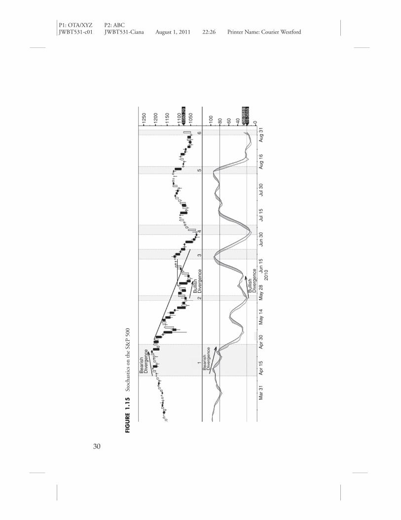
The previous theory of volume can be applied to all timeframes. On a dailychart, a moving average of volume can become unjustly skewed higher orlower due to the volume that occurred over the duration of that average.The older that volume becomes, the less influence it has on estimating trenddirection. From a historical perspective, VAT considers the volume that hasoccurred on that day over the past X years to create the average for that day.Therefore, it can be considered a seasonal approach to volume analysis. Froman intraday perspective, VAT creates an average of volume from the actualvolume that occurred during that time-slice for the past X days. In bothapplications VAT can be projected into the future to get an idea of expectedvolume.
Figure 1.22 displays a daily chart of price and volume with a movingaverage and VAT on the volume histogram. There are four zones that highlightthe benefits of using a time-sensitive study like VAT instead of a movingaverage. In zone 1, price was declining. Volume, when compared to themoving average, was equal to it, suggesting the market was equally interestedin the down move. When compared to VAT, the actual volume was at least50 percent greater and in some instances more than 100 percent greater.VAT was suggesting the market was more bearish in the down move thanthe moving average. More specifically, the first and second candle in zone 1formed a bearish engulfing pattern on volume that was twice the VAT, butonly equal to the moving average. This is very important information forthose applying candle-pattern theories.

P1: OTA/XYZ P2: ABCJWBT531-c01 JWBT531-Ciana August 1, 2011 22:26 Printer Name: Courier Westford
TABLE
1.7
Dee
per
Inte
rpre
tati
onof
Pric
ean
dV
olum
eSc
enar
ios
Inte
rpre
tati
onof
Pric
ean
dV
olum
eTr
ends
#O
vera
llTr
end
Pric
eV
olum
eSi
gnal
Exp
ecta
tion
1U
pSe
ttin
gne
whi
ghs
Ato
rab
ove
aver
age
Bul
lish
Pric
ese
ttin
ghi
gher
high
s/lo
ws
and
brea
king
resi
stan
ce
2U
pTe
stin
ghi
ghs
Ligh
t/de
clin
ing
Topp
ing
poin
t,co
nsol
idat
ion
near
Con
solid
atio
nof
prio
rtr
end
3U
pSi
dew
ays
Abo
veav
erag
eD
istr
ibut
ion,
pote
ntia
ltop
Look
for
supp
ortt
oho
ld;i
fitf
ails
,ach
ange
intr
end
islik
ely
4U
pD
rift
ing
low
erLi
ght
Som
edi
stri
buti
on,
cons
olid
atio
nLo
okfo
ra
cont
inua
tion
orre
vers
alpr
ice
patt
ern
5D
own
Sett
ing
new
low
sA
tor
abov
eav
erag
eB
eari
shLo
wer
low
s/hi
ghs,
pric
eco
ntin
ues
tobr
eak
supp
ort
6D
own
Sett
ing
new
low
sLi
ght/
decl
inin
gPo
tent
ialb
otto
m,
cons
olid
atio
nne
arC
onso
lidat
ion
ofpr
ior
tren
d
7D
own
Side
way
sA
bove
aver
age
Acc
umul
atio
n,bu
llish
Look
for
ase
quen
ceof
high
erhi
ghs/
low
sbr
eaki
ngre
sist
ance
8D
own
Dri
ftin
ghi
gher
Ligh
tSh
orts
taki
ngpr
ofit,
som
eac
cum
ulat
ion
Look
for
aco
ntin
uati
onor
reve
rsal
pric
epa
tter
n
Inte
rpre
tati
onof
Vol
ume
Spik
esD
urin
gPr
ice
Tren
ds
#O
vera
llTr
end
Pric
eV
olum
eSi
gnal
Exp
ecta
tion
9U
pG
appi
ngup
Spik
ing
high
erO
vera
llbu
llish
Be
care
ful,
too
far
too
fast
?
10U
pN
om
ove
high
erSp
ikin
ghi
gher
Beg
inni
ngof
dist
ribu
tion
Smar
tmon
eyge
ttin
gou
t,la
tem
oney
gett
ing
in
11D
own
Gap
ping
dow
nSp
ikin
ghi
gher
Ear
lyca
pitu
lati
onM
ajor
dow
ntre
ndoc
curi
ng,e
vent
ualb
ounc
e
12D
own
No
mov
elo
wer
Spik
ing
high
erB
egin
ning
ofac
cum
ulat
ion
Pote
ntia
lbot
tom
pric
epa
tter
nfo
rmin
g
38

P1: OTA/XYZ P2: ABCJWBT531-c01 JWBT531-Ciana August 1, 2011 22:26 Printer Name: Courier Westford
Evidence of the Most Popular Technical Indicators 39
FIGURE 1.19 Overall Trend Is Up
1 2
43
FIGURE 1.20 Overall Trend Is Down
5 6
7 8

P1: OTA/XYZ P2: ABCJWBT531-c01 JWBT531-Ciana August 1, 2011 22:26 Printer Name: Courier Westford
40 New Frontiers in Technical Analysis
FIGURE 1.21 Interpreting Volume Spikes
9 10
11 12
In zone 2, the moving average was skewed slightly higher so that itlooked as if volume was light in the sideways move at support of $33.25. VATsuggested volume was greater than average. Table 1.7 suggests this can meanaccumulation in a downtrend, particularly when a support level becomesevident ($33.26).
In zone 3, volume was less than average and about equal to the VATlevels while price rallied from support and retraced part of the down move inzone 1. The highest high formed another bearish engulfing pattern. The firstcandle of the pattern had volume that was less than average, but equal to VAT.The second candle had volume that was less than average, but greater thanVAT. From the VAT perspective, price on the first candle went up on averagevolume and the second candle went down on greater-than-average volume.The market was more interested in the selling of the security than the buyingof it. This is something we could not see by using the moving average.
Zone 4 highlights the impact of a spike in volume on a moving aver-age versus VAT. The candle that broke support (see arrow on chart) did soon volume slightly greater than VAT, while being half the moving average.Clearly, the skewing of the moving average lessens the impact of its use, when
P1: OTA/XYZ P2: ABCJWBT531-c01 JWBT531-Ciana August 1, 2011 22:26 Printer Name: Courier Westford
FIG
URE
1.2
2H
isto
rica
lCha
rtC
ompa
ring
aV
olum
eA
vera
gean
dV
AT
40.0
0
38.0
0
36.0
0
34.0
0
32.0
0
30m
25m
20m
15m
10m
5m 02
6/30
6/22
6/15
6/8
2625
2418
1711
104
32
5/29
5/22
5/15
5/8
2720
1312
65
12
34
41
1920
09
41

P1: OTA/XYZ P2: ABCJWBT531-c01 JWBT531-Ciana August 1, 2011 22:26 Printer Name: Courier Westford
42 New Frontiers in Technical Analysis
comparing to actual volume. Price then attempted to reverse higher withvolume less than VAT and failed at resistance. The final bar had volumegreater than VAT, but price still didn’t break resistance and it was a down day,suggesting that market participants were still bearish.
It is also worth knowing that VAT can anticipate future volume levelsbecause it can look historically to calculate those averages and plot theminto the future. In zone 4, VAT is showing the next two average volumelevels.
Intraday Volume at Time
Intraday volume on a chart tends to look like a smile. It is typically heavy at theopen, light in the middle of the day, and heavy approaching the close. Whenyou’re trading the open, a moving average is calculated from the prior day’sclosing volume. This is not an apples-to-apples comparison. It makes moresense to compare the volume from the prior morning’s open to this morning’sopen, the prior midday’s trading to today’s, and the prior end-of-day’s tradingto today’s.
VAT applied to an intraday chart is a time-sensitive average. It showsyou the average volume for a specific time-slice over the past X days. Forexample, if you’re looking at a stock on a 10-minute chart with VAT set toconsider the past five periods, it will show you the volume for each 10-minuteperiod and the average volume for that 10-minute period from the priorX days. If you are looking at the 10:00–10:10 A.M. volume, the VAT levelis the sum of the volume for that same time period from the past X days,divided by X .
The indicator will display a dashed line on the volume histogram thatrepresents the average volume level for that time-slice. It will also show asecond panel that totals the sum of the accumulated volume (AV, solid line)and the accumulated average volume (AAV, dashed line) on the day.
Figure 1.23 shows a three-day, 10-minute chart. During the first twodays when price gained 2.36 percent, it did so while AV was less than AAV.Volume was not supporting this two-day rally. During the second day ofdiverging price and volume, AAV was projected to be lower than the firstday. The AV was still less than AAV. In the middle panel, at the end of day2, the last 70 minutes of trading, or seven bars, had about equal volumebut little to no price gains. The next morning, volume was greater thanVAT and price declined, kicking off the retracement, with AV slightly greaterthan AAV.

P1: OTA/XYZ P2: ABCJWBT531-c01 JWBT531-Ciana August 1, 2011 22:26 Printer Name: Courier Westford
FIG
URE
1.2
3In
trad
ayC
hart
Com
pari
nga
Vol
ume,
Ave
rage
Vol
ume
and
Vol
ume
atT
ime
31.2
0
31.1
0
31.0
0
30.8
8
30.8
0
30.7
0
30.6
0
30.5
0
0.2m
0.10
4m
0 2.03
5m
1.53
3m
1m 0.5m
10:0
012
:00
14:0
010
:00
12:0
014
:00
12:0
010
:00
14:0
007
Feb
201
104
Feb
201
103
Feb
201
1
Vol
ume
SM
Avg
Vol
ume
His
togr
am
KF
T U
S E
quity
10 M
inut
es 3
Day
sLa
st01
.10
01.2
5
31.4
531
.16T
Low
on
02/0
3 10
:40
Ave
rage
Hig
h on
02/
05 1
5:10
- V
AT
Dai
ly A
ccum
Avg
Vol
2.62
2m1.
421m
Dai
ly A
ccum
Vol
0.57
0m
0.10
4m0.
135m Less
than
ave
rage
vol
ume
+2.
36%
Spa
n 77
Ris
ing
Pric
e
Slig
htly
abo
ve a
vera
ge v
olum
e
43
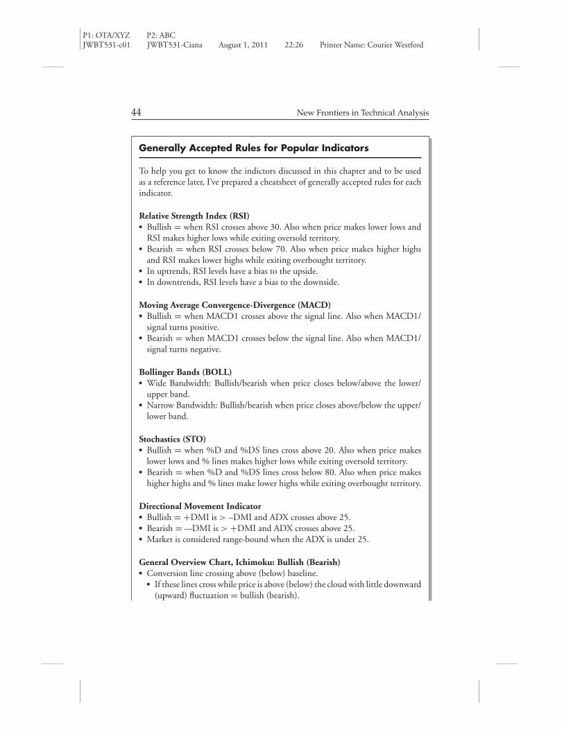
P1: OTA/XYZ P2: ABCJWBT531-c01 JWBT531-Ciana August 1, 2011 22:26 Printer Name: Courier Westford
44 New Frontiers in Technical Analysis
Generally Accepted Rules for Popular Indicators
To help you get to know the indictors discussed in this chapter and to be usedas a reference later, I’ve prepared a cheatsheet of generally accepted rules for eachindicator.
Relative Strength Index (RSI)� Bullish = when RSI crosses above 30. Also when price makes lower lows and
RSI makes higher lows while exiting oversold territory.� Bearish = when RSI crosses below 70. Also when price makes higher highs
and RSI makes lower highs while exiting overbought territory.� In uptrends, RSI levels have a bias to the upside.� In downtrends, RSI levels have a bias to the downside.
Moving Average Convergence-Divergence (MACD)� Bullish = when MACD1 crosses above the signal line. Also when MACD1/
signal turns positive.� Bearish = when MACD1 crosses below the signal line. Also when MACD1/
signal turns negative.
Bollinger Bands (BOLL)� Wide Bandwidth: Bullish/bearish when price closes below/above the lower/
upper band.� Narrow Bandwidth: Bullish/bearish when price closes above/below the upper/
lower band.
Stochastics (STO)� Bullish = when %D and %DS lines cross above 20. Also when price makes
lower lows and % lines makes higher lows while exiting oversold territory.� Bearish = when %D and %DS lines cross below 80. Also when price makes
higher highs and % lines make lower highs while exiting overbought territory.
Directional Movement Indicator� Bullish = +DMI is > –DMI and ADX crosses above 25.� Bearish = –-DMI is > +DMI and ADX crosses above 25.� Market is considered range-bound when the ADX is under 25.
General Overview Chart, Ichimoku: Bullish (Bearish)� Conversion line crossing above (below) baseline.
� If these lines cross while price is above (below) the cloud with little downward(upward) fluctuation = bullish (bearish).

P1: OTA/XYZ P2: ABCJWBT531-c01 JWBT531-Ciana August 1, 2011 22:26 Printer Name: Courier Westford
Evidence of the Most Popular Technical Indicators 45
� If these lines cross while the closing price is beneath (above) or within thecloud and has shown upward (downward) movement over the past fewdays = bullish (bearish).
� Closing price is within the cloud with little fluctuation = neutral.� Lagging span is greater (less) than the lagged closing price = buy (sell).� Cloud composition: When leading span 1 is above (below) leading span 2,
this is a sign of a rising (falling) market. The thicker the cloud, the greater thesupport or resistance.
Volume Confirmation� Bullish = price is rising and volume is rising.� Weakening uptrend = price rising and volume declining.� Bearish = price is declining and volume is rising.� Weakening downtrend = price declining and volume declining.� Accumulation = spiking volume at market lows.� Distribution = spiking volume at market highs.
The power of these traditional and preferred indicators is still alive and welltoday. If you’d like to learn more about them, consider learning directly fromthe creators. They have certainly been leaders in the evolution of technical anal-ysis and their work should be recognized and reviewed. See the RecommendedReading section at the back of this book.
Conclusion
I encourage you to start looking at the indicators presented in this chapterindividually and then together. One suggestion for getting started is to applytwo studies to a chart and look at different securities and timeframes tobecome familiar with the movement of the indicators in response to price.The following two figures are examples of combining one trending and onemomentum study.
Figure 1.24 shows the range-bound market that the price of IBM wasin from April to September 2010. During that time, RSI oscillated between62 and 33 and MACD frequently whipsawed around the baseline. Realizingthis allows us to see a change in trend when price breaks support or resistancewhile RSI breaks out of the 62–33 zone and the MACD lines make a newhigh or new low.
In the shaded zone, a new trend emerged. First, we can see from thehorizontal dashed lines that price was setting higher lows and higher highs.

P1: OTA/XYZ P2: ABCJWBT531-c01 JWBT531-Ciana August 1, 2011 22:26 Printer Name: Courier Westford
FIG
URE
1.2
4D
eter
min
ing
Tren
dw
ith
RSI
and
MA
CD
Com
bine
d
46

P1: OTA/XYZ P2: ABCJWBT531-c01 JWBT531-Ciana August 1, 2011 22:26 Printer Name: Courier Westford
FIG
URE
1.2
5D
eter
min
ing
Tren
dw
ith
DM
I,ST
O,a
ndV
ATC
ombi
ned
19.6
519
.60
19.5
519
.50
19.4
519
.40
19.3
519
.30
19.2
401
4m 2m 0 40 39.9
3
19.0
1
10 100
09:4
01
3
2
4
4
09:5
010
:00
10:1
010
:20
10:3
010
:40
17 M
ar 2
011
10:5
011
:00
11:1
011
:20
11:3
011
:40
50 16.7
601.
520m
47
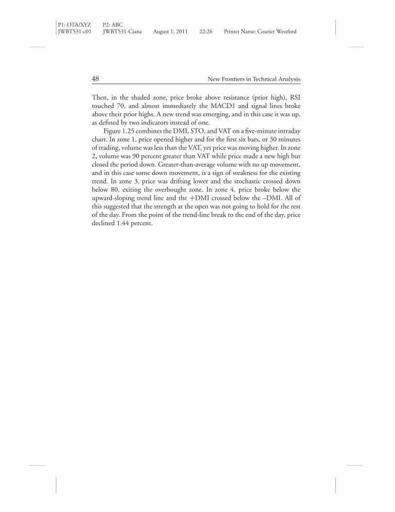
P1: OTA/XYZ P2: ABCJWBT531-c01 JWBT531-Ciana August 1, 2011 22:26 Printer Name: Courier Westford
48 New Frontiers in Technical Analysis
Then, in the shaded zone, price broke above resistance (prior high), RSItouched 70, and almost immediately the MACD1 and signal lines brokeabove their prior highs. A new trend was emerging, and in this case it was up,as defined by two indicators instead of one.
Figure 1.25 combines the DMI, STO, and VAT on a five-minute intradaychart. In zone 1, price opened higher and for the first six bars, or 30 minutesof trading, volume was less than the VAT, yet price was moving higher. In zone2, volume was 90 percent greater than VAT while price made a new high butclosed the period down. Greater-than-average volume with no up movement,and in this case some down movement, is a sign of weakness for the existingtrend. In zone 3, price was drifting lower and the stochastic crossed downbelow 80, exiting the overbought zone. In zone 4, price broke below theupward-sloping trend line and the +DMI crossed below the –DMI. All ofthis suggested that the strength at the open was not going to hold for the restof the day. From the point of the trend-line break to the end of the day, pricedeclined 1.44 percent.