Evaluation Task 2
7
Evaluation Activity 2 How effective is the combination of your main product and your ancillary texts?
-
Upload
infinityscope -
Category
Education
-
view
123 -
download
0
Transcript of Evaluation Task 2

Evaluation Activity 2How effective is the combination of your main product and your ancillary texts?
Overview Our coursework consisted of creating a short film, approximately 5 minutes long, and
also completing a film poster and film review as our ancillary tasks.
These two products are key when any film is released for public viewing; they allow an increase in promotion, as people are extremely likely to view a poster, whether it’s on a billboard, a bus or an ad on the internet. Film reviews are read every time someone buys a magazine, allowing readers to gain more information about the film, and see if it interests them further.
Both products represent the film, its genre and the themes addressed in the film. Viewing each product will instantly create an impression on the audience.
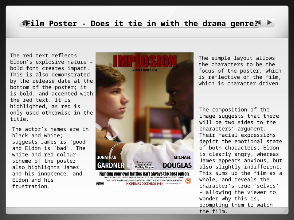
The red text reflects Eldon’s explosive nature – bold font creates impact.This is also demonstrated by the release date at the bottom of the poster; it is bold, and accented with the red text. It is highlighted, as red is only used otherwise in the title.
The composition of the image suggests that there will be two sides to the characters’ argument. Their facial expressions depict the emotional state of both characters; Eldon is clearly angry, whereas James appears anxious, but also slightly indifferent. This sums up the film as a whole, and reveals the character’s true ‘selves’ - allowing the viewer to wonder why this is, prompting them to watch the film.
The actor’s names are in black and white; suggests James is ‘good’ and Eldon is ‘bad’. The white and red colour scheme of the poster also highlights James and his innocence, and Eldon and his frustration.
Film Poster - Does it tie in with the drama genre?
The simple layout allows the characters to be the focus of the poster, which is reflective of the film, which is character-driven.
Fonts Used
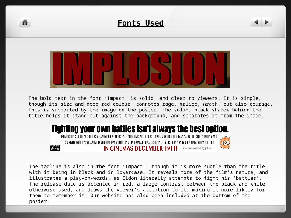
The bold text in the font ‘Impact’ is solid, and clear to viewers. It is simple, though its size and deep red colour connotes rage, malice, wrath, but also courage. This is supported by the image on the poster. The solid, black shadow behind the title helps it stand out against the background, and separates it from the image.
The tagline is also in the font ‘Impact’, though it is more subtle than the title with it being in black and in lowercase. It reveals more of the film’s nature, and illustrates a play-on-words, as Eldon literally attempts to fight his ‘battles’. The release date is accented in red, a large contrast between the black and white otherwise used, and draws the viewer’s attention to it, making it more likely for them to remember it. Our website has also been included at the bottom of the poster.
Film Review - How does it represent your film?
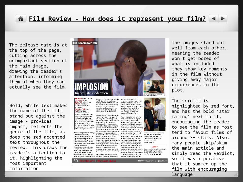
Bold, white text makes the name of the film stand out against the image - provides impact, reflects the genre of the film, as does the red accented text throughout the review. This draws the reader’s attention to it, highlighting the most important information.
The images stand out well from each other, meaning the reader won’t get bored of what is included - they show key moments in the film without giving away major occurrences in the plot.
The release date is at the top of the page, cutting across the unimportant section of the main image, drawing the reader’s attention, informing them of when they can actually see the film.
The verdict is highlighted by red font, and has the bold ‘star rating’ next to it, encouraging the reader to see the film as most tend to favour films of around 3+ stars. Also, many people skip/skim the main article and simply read the verdict, so it was imperative that it summed up the film with encouraging language.
Film Review - Images Used
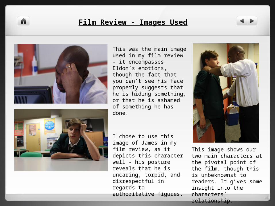
This was the main image used in my film review - it encompasses Eldon’s emotions, though the fact that you can’t see his face properly suggests that he is hiding something, or that he is ashamed of something he has done.
I chose to use this image of James in my film review, as it depicts this character well - his posture reveals that he is uncaring, torpid, and disrespectful in regards to authoritative figures.
This image shows our two main characters at the pivotal point of the film, though this is unbeknownst to readers. It gives some insight into the characters’ relationship.
Common features The colour scheme is constant through both ancillary tasks, and is
represented in the film e.g. the colour red serves as a motif, such as Eldon’s tie
The images used are all within the classroom, which holds the main scene of the film, in which James confronts Eldon. The small insights given to the audience here means that they build an interest in what happens beforehand, and the impact of these actions.
Both are simplistic in their design, allowing both to have more impact on the viewers, reflecting the drama genre