
Evaluation Question 7
10
Looking back at your preliminary task, what do you feel you have learnt in the progression from it to the full product? Billy Ingram Question 7
-
Upload
billybetterknow -
Category
Technology
-
view
21 -
download
0
Transcript of Evaluation Question 7

Looking back at your preliminary task, what do you feel you have learnt in the progression from it to the full product?Billy Ingram
Question 7

PRELIMINARY FINAL PRODUCTION
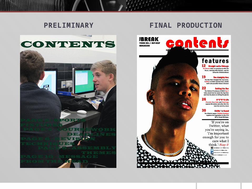
PRELIMINARY FINAL PRODUCTION

Progression I was able to make the improvements I wanted to make during progression from the
preliminary task to the final production, those improvements were;
In my preliminary task there was very little use of lighting which shows a lack of professionalism so this was something I wanted to change, also the use of photoshop to adjust the brightness and contrast to improve the quality of the image would have been done better. I’m not a big fan of the font I used and the use of the colours but this was something that was easily changed and experimented with during my final production. The house style was kept the same over both pieces but it would have been better to have outcomes that weren’t so similar and that show a variation of skills that were learnt.
It is clear in my final production that I was able to use lighting to improve the professionalism of the images by creating shadows and also the use of photoshop to adjust the brightness and contrast was done better. I prefer the range of fonts used over both pieces because it gives it more of a professional look and the house style uses more common colours.

LearningThere are other factors I feel I have learnt during the course of creating my preliminary task and final production, one being photoshop. I used almost every part of photoshop and became familiar with it, even more familiar with how to enhance text and make it stand out by using a drop shadow and an outer glow. An example is on my double page spread:
I figured that by using this technique it give the text a more 3-Dimensional effect so it doesn’t look so flat against the image, it makes the contents more appealing and eye catching for the reader.
I learnt how to change the angle of the drop shadow and how far and the direction it would fade. Also I learnt how to change the colour of the outer glow and change the opacity too.

My layout has changed quite drastically as well, I learnt how to add new layers and how to move and edit them. Prior to this I had
very limited knowledge of how to do so which resulted in me using few layers in my preliminary task but in my final production I
used many more layers to give more of a structured layout of different layers. Also the complexity has increased because I have learnt some common conventions of this genre of magazine like
the use of quotes and the use of rectangular bars to separate pieces of text.
By going with own advice following my preliminary task into my final production I was able to stick to a structured layout when I
was creating my piece, always referring back to my research.

I also learnt about the importance of the masthead in a magazine. In my preliminary task the masthead was fairly small and only covered a fraction of the space at the top of the image whereas in my final production the masthead is larger, bolder and covers the width of the page at the top. The font and the colour of my preliminary task wasn’t very appealing to the younger audience, realising this I researched into common codes and conventions of mastheads in magazines and found that colours should be brighter and contrasting to each other so the use of red and black was more prominent than just a darker shade of green.

All of the skills that I have learnt during the production on both my front cover and contents page I was able to use and include in the construction of my double page spread.

With the use of images I was able to create a more professional and eye-catching front cover, contents and double page spread. I learnt how to position the model using the rule of thirds which contributed to the images looking more professional. The use of direct mode of address on my front cover and contents help to create and establish relationships with the reader(uses and grats) and although it was used in my preliminary task it wasn’t used over both images so it doesn’t create as much of an effect on the reader. On my preliminary task I hadn’t really edited and adjusted my images so much which meant there was a lack of a professional look, I used tutorials so I was able to enhance the images for my final production to obtain an image of very good quality and not dull as an outcome compared to my preliminary task.
Before
After

In conclusion my final product shows a mass of progression and a huge increase in quality compared to my preliminary task. This is greatly because of the skills I have learnt and acquired during the process of construction, assisted by techniques such as the use of a drop shadow to give the 3D effect. Another example would be
the use of lighting and the manual setting on the digital camera to help to have a good quality image as an outcome. There were
other factors that helped me with the progression like the research into the codes and conventions, the variety of fonts and also the use of tutorials to aid the quality of the piece. The main
factor being how to use photoshop and all of its features because without photoshop I would have been much more difficult to have
this final production.


