
Evaluation - Question 1
9
EV. 1. IN WHAT WAYS DOES YOUR MEDIA PRODUCT USE, DEVELOP OR CHALLENGE FORMS AND CONVENTIONS OF REAL MEDIA PRODUCTS? MUSIC VIDEO For our music video, we chose the song ‘Not So Sad’ by a local unsigned band, ‘Faux Pas’. They are an indie-rock band and therefore, when planning our video and how we would produce it, we did a lot of research into the existing genre and products. We analysed music videos by various bands in the indie-rock genre as well as the official music video for the chosen song. Originally, we had chosen the song ‘Not Nineteen Forever’ by The Courteeners, however we made a unanimous decision to switch due to the pace, tone and general feel of the song, as we felt it would make a much stronger music video than the original song. Furthermore, we also looked at a number of theorists who have studied music videos and genre conventions. A key one was Andrew Goodwin who wrote ‘Dancing in the Distraction Factory’ in 1992. According to him: 1. Music videos demonstrate genre characteristics (e.g. stage performance in rock video, dance routine.) 2. There is a relationship between lyrics and visuals. 3. There is a relationship between music and visuals. 4. The demands of the record label will include the need for lots of close ups of the artist and the artist may develop motifs which recur across their work (a visual style). 5. There is frequently reference to notion of looking (screens within screens, telescopes, etc.) and particularly voyeuristic treatment of the female body. 6. There is often intertextual reference (to films, TV programmes, other music videos etc.). When planning the production of our music video, we made sure that we focused on these conventions and included as many of them as we could where possible. Genre was very key when we were creating our text and we paid particular attention to making sure that we stuck to genre conventions of rock and indie music videos. The importance of this is represented through Jacque Derrida’s theory, which says ‘A text cannot belong to no genre. It cannot be without a genre. Every single text participates in one or more genres, as there is no genreless text’. As a group, we believe that our products support this statement. One very popular genre characteristic in the indie-rock genre is live performance. From our research and existing music video studies, we found that this is used in almost all music videos which fit into this genre. As a group, we decided that since we wanted our genre to be clear and obvious, we would follow this convention. We discussed this idea and instead of filming in a studio, we felt that this would look too staged, so instead we filmed our live
-
Upload
tom-ibbott -
Category
Education
-
view
42 -
download
0
Transcript of Evaluation - Question 1

EV. 1. IN WHAT WAYS DOES YOUR MEDIA PRODUCT USE, DEVELOP OR CHALLENGE FORMS AND CONVENTIONS OF REAL MEDIA PRODUCTS? MUSIC VIDEO For our music video, we chose the song ‘Not So Sad’ by a local unsigned band, ‘Faux Pas’. They are an indie-rock band and therefore, when planning our video and how we would produce it, we did a lot of research into the existing genre and products. We analysed music videos by various bands in the indie-rock genre as well as the official music video for the chosen song. Originally, we had chosen the song ‘Not Nineteen Forever’ by The Courteeners, however we made a unanimous decision to switch due to the pace, tone and general feel of the song, as we felt it would make a much stronger music video than the original song. Furthermore, we also looked at a number of theorists who have studied music videos and genre conventions. A key one was Andrew Goodwin who wrote ‘Dancing in the Distraction Factory’ in 1992. According to him:
1. Music videos demonstrate genre characteristics (e.g. stage performance in rock video, dance routine.)
2. There is a relationship between lyrics and visuals. 3. There is a relationship between music and visuals. 4. The demands of the record label will include the need for lots of close ups of the
artist and the artist may develop motifs which recur across their work (a visual style).
5. There is frequently reference to notion of looking (screens within screens, telescopes, etc.) and particularly voyeuristic treatment of the female body.
6. There is often intertextual reference (to films, TV programmes, other music videos etc.).
When planning the production of our music video, we made sure that we focused on these conventions and included as many of them as we could where possible. Genre was very key when we were creating our text and we paid particular attention to making sure that we stuck to genre conventions of rock and indie music videos. The importance of this is represented through Jacque Derrida’s theory, which says ‘A text cannot belong to no genre. It cannot be without a genre. Every single text participates in one or more genres, as there is no genreless text’. As a group, we believe that our products support this statement. One very popular genre characteristic in the indie-rock genre is live performance. From
our research and existing music video studies, we found that this is used in almost all music videos which fit into this genre. As a group, we decided that since we wanted our genre to be clear and obvious, we would follow this convention. We discussed this idea and instead of filming in a studio, we felt that this would look too staged, so instead we filmed our live

performance at an actual concert for the band. We ensured that our camera was set up in a decent position, where the band could be seen clearly. Analysing the quality of this, I believe it worked very well in the end, as we cross-cutted between the storyline and the live performance, which had a positive effect on the audience as they didn’t get bored of each section, because we regularly switched between them both, providing entertainment and variety in the text. Returning to the conventions of Andrew Goodwin, he says that there should be a relationship between music and visuals in all music videos. We followed this convention in a number of ways. For example, a lot of the cuts between shots were done on the beat of the music to help the video flow better. This also makes for a more professional looking video and ultimately enhances the quality of video. Furthermore, this convention was also followed towards the end of the video when there was a slow guitar solo and we had the protagonist playing his guitar slowly to make it look as though he was the one playing the music. This received positive feedback from our audience and fitted well with the storyline as well as the music. This was also another reason for our decision to use live performance as there were a lot of times in the music that the opportunity was clearly there to show the music being played by the band. For example, in the middle of the song there is a lengthy instrumental and we took this opportunity to use shots that we filmed of the band playing the song, which made it clear for the audience to see that that was what they were playing as the electric guitars and strumming patterns linked clearly with the audio track. In my opinion, I believe we followed all of Andrew Goodwin’s characteristics of a good music video. However, we did pay more attention to some than others. Another one that we paid particular attention to was frequent reference to the notion of looking. We felt
that this was important, because it can help create a personal connection with the protagonist. A good example of this was the shot early on in the video where the character is looking at himself in the mirror. Though this involved skilful camerawork to avoid getting the cameraperson in the shot, it was an effective shot and the audience can recognise that he’s looking determined
and is ready to make a big life change. They do not get this impression simply from this shot; however it works nicely with the previous shots to build this story in the mind of the audience. Looking was also made reference to through the point of view shot outside the clothes store. As the protagonist looks down at his own clothes, a cut is made from a long shot to a point of view shot to give the effect of being able to see things from the character’s personal perspective. Again, here the audience gets to understand the protagonist more and build more of a personal connection.

As our music video is in two parts, narrative and live performance, we had to pay particular attention to both and look at how they are represented in existing products and what theorists have had to say about them. I have already spoken about the live performance aspect, however the narrative was just as important, if not more so. Andrew Goodwin, once again, had a lot to say on this topic and argued that a music video’s narrative can connect back to the actual song and these are through illustration,
amplification and disjuncture. Illustration is where the video is a literal representation of the song, for example if the song says ‘walking down the street’ there would be a shot of somebody walking through the street. Amplification is where the lyrics and visuals still link in this way, but often through connotations and they can commonly use live performance to balance out the narrative.
Disjuncture is where the video intentionally ignores the content of the song and creates a whole new set of meanings for the lyrics. In our group, we decided to use amplification in our narrative as we liked the general meaning of the song so didn’t want to change it completely, yet we didn’t want a completely literal video, as we felt this would look too staged and cheesy. We wanted to have that link, but for the video to be a slightly unpredictable at the same time. When planning our filming for the narrative, we also had to consider what kind of narrative structure we would like our video to follow, be that linear, episodic or circular. We decided that for the story we were hoping to represent, the best to use would be the simple single-strand linear structure, as we did not want a confusing storyline or one that had to be interpreted. As a group, we made the decision that our video should be easy to follow and there should be no arguing over what the storyline was trying to show. Therefore, our narrative begun at the start of the story, it continued throughout and then the end of the story was at the end of the video. One theorist who studied story narrative was Vladimir Propp. He proposed that there are six stages in which a narrative takes place. These are:
1. Preparation – The scene is set 2. Complication – A problem/evil occurs 3. Transference – Hero gets help and leaves on quest 4. Struggle – There is a fight between hero and some kind of villain 5. Return – The hero returns, his quest fulfilled 6. Recognition – Villains punished, hero rewarded
Our video narrative was all based around one person and there weren’t any physical villains. However, I still believe that we followed Propp’s theory to an extent: PREPARATION – We see the character get out of bed and get changed, which sets the scene and it is recognised that this is the main character and we, as an audience, will be getting to know him. COMPLICATION – Nothing goes particularly wrong, however we see what the complication is by him putting a note up saying ‘Get it together’, which tells the audience that there is a complication and not all is well.
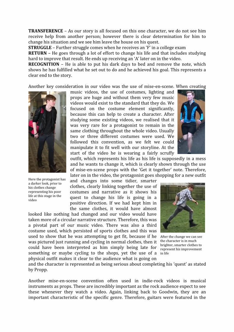
TRANSFERENCE – As our story is all focused on this one character, we do not see him receive help from another person; however there is clear determination for him to change his situation and we see him leave the house on his quest. STRUGGLE – Further struggle comes when he receives an ‘F’ in a college exam RETURN – He goes through a lot of effort to change his life and that includes studying hard to improve that result. He ends up receiving an ‘A’ later on in the video. RECOGNITION – He is able to put his dark days to bed and remove the note, which shows he has fulfilled what he set out to do and he achieved his goal. This represents a clear end to the story. Another key consideration in our video was the use of mise-en-scene. When creating
music videos, the use of costumes, lighting and props are huge and without them very few music videos would exist to the standard that they do. We focused on the costume element significantly, because this can help to create a character. After studying some existing videos, we realised that it was very rare for a protagonist to remain in the same clothing throughout the whole video. Usually two or three different costumes were used. We followed this convention, as we felt we could manipulate it to fit well with our storyline. At the start of the video he is wearing a fairly scruffy outfit, which represents his life as his life is supposedly in a mess and he wants to change it, which is clearly shown through the use of mise-en-scene props with the ‘Get it together’ note. Therefore, later on in the video, the protagonist goes shopping for a new outfit and changes into some tidier, smarter clothes, clearly linking together the use of costumes and narrative as it shows his quest to change his life is going in a positive direction. If we had kept him in the same clothes, it would have almost
looked like nothing had changed and our video would have taken more of a circular narrative structure. Therefore, this was a pivotal part of our music video. There was also a third costume used, which persisted of sports clothes and this was used to show that he was attempting to get fit, because if he was pictured just running and cycling in normal clothes, then it could have been interpreted as him simply being late for something or maybe cycling to the shops, yet the use of a physical outfit makes it clear to the audience what is going on and the character is represented as being serious about completing his ‘quest’ as stated by Propp. Another mise-en-scene convention often used in indie-rock videos is musical instruments as props. These are incredibly important as the rock audience expect to see these whenever they watch a video. Again, linking back to Goodwin, they are an important characteristic of the specific genre. Therefore, guitars were featured in the
Here the protagonist has a darker look, prior to his clothes change representing his poor life at this stage in the video
After the change we can see the character is in much brighter, smarter clothes to represent his improvement in life

live performance clips, while the protagonist also possessed a guitar, which we used to link into the narrative of him changing his life. He finds a guitar in a cupboard and learns it to add another positive influence to his changing life. The guitars are also used in the live performance clips as a way of linking the music to the visuals as they are often being played in sync with the music, particularly in the lengthy instrumental.
Overall, our music video clearly followed a lot of conventions of other music videos, particularly those in the indie-rock genre, by using live performance clips as intercuts, while also dictating the narrative through mise-en-scene, such as props and costumes. Goodwin’s seven music video characteristics conventions are clearly followed and Vladimir Propp’s narrative structure is also. MAGAZINE ADVERT
Just like for our main product, prior to creating our first ancillary text, research had to be done to find the popular conventions and decide which ones would work well with our product. From research, we found that one of the key conventions for our magazine advert was the use of the band name as a masthead. All the adverts that we analysed used this convention understandably, as it provides the audience with instant information regarding who it is about. The reader can then make an instinctive decision
whether or not this advert is something worth investing their time into, as if it is a band they like, they are likely to read it, while if it is someone they are not a fan of, they would know instantly to flip the page. Therefore, we followed this convention, as it will draw in our target audience instantly. One more key convention that we felt it was important to conform to was the use of links. On all the adverts we analysed, there was some form of link that direct the audience somewhere to find out more information. For example, social media usernames, iTunes logo, etc. As ours is about a local, unsigned band, we thought that this was especially important as a limited number of people will know who they are, therefore it was important to bring in as many fans as possible through this. Therefore we attached the band’s social media usernames as well as website address, because these are all popular ways of communicating information on our society and would be good ways for new fans to find an ‘entry point’ into the band and explore them a bit more. This is also used to then direct them to the music video and other products, because these would all be shared on social media and the website. Therefore, the use of cross-media convergence and synergy is important here as the magazine advert can be used to direct the audience to somewhere that they can access the other synergistic products, such as the video or such as the digipak.
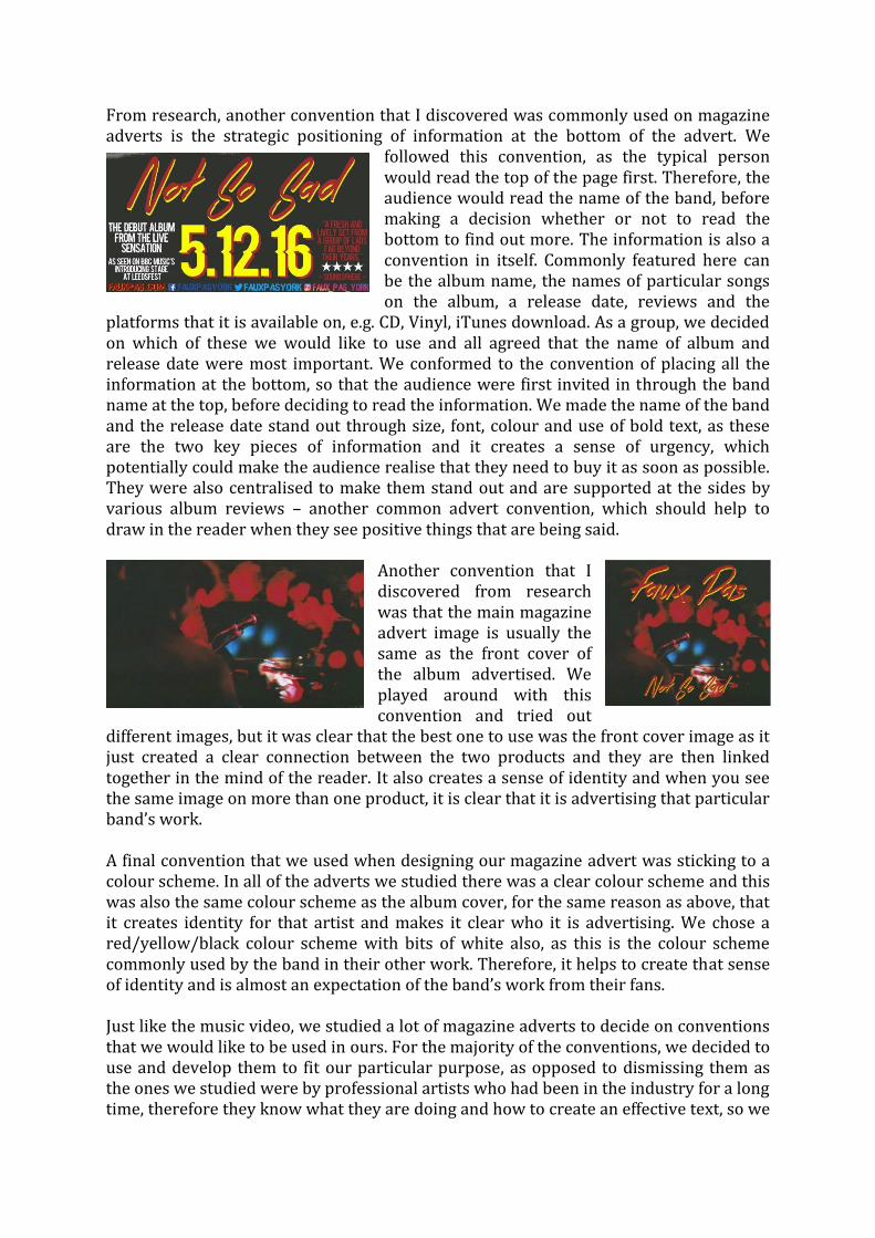
From research, another convention that I discovered was commonly used on magazine adverts is the strategic positioning of information at the bottom of the advert. We
followed this convention, as the typical person would read the top of the page first. Therefore, the audience would read the name of the band, before making a decision whether or not to read the bottom to find out more. The information is also a convention in itself. Commonly featured here can be the album name, the names of particular songs on the album, a release date, reviews and the
platforms that it is available on, e.g. CD, Vinyl, iTunes download. As a group, we decided on which of these we would like to use and all agreed that the name of album and release date were most important. We conformed to the convention of placing all the information at the bottom, so that the audience were first invited in through the band name at the top, before deciding to read the information. We made the name of the band and the release date stand out through size, font, colour and use of bold text, as these are the two key pieces of information and it creates a sense of urgency, which potentially could make the audience realise that they need to buy it as soon as possible. They were also centralised to make them stand out and are supported at the sides by various album reviews – another common advert convention, which should help to draw in the reader when they see positive things that are being said.
Another convention that I discovered from research was that the main magazine advert image is usually the same as the front cover of the album advertised. We played around with this convention and tried out
different images, but it was clear that the best one to use was the front cover image as it just created a clear connection between the two products and they are then linked together in the mind of the reader. It also creates a sense of identity and when you see the same image on more than one product, it is clear that it is advertising that particular band’s work. A final convention that we used when designing our magazine advert was sticking to a colour scheme. In all of the adverts we studied there was a clear colour scheme and this was also the same colour scheme as the album cover, for the same reason as above, that it creates identity for that artist and makes it clear who it is advertising. We chose a red/yellow/black colour scheme with bits of white also, as this is the colour scheme commonly used by the band in their other work. Therefore, it helps to create that sense of identity and is almost an expectation of the band’s work from their fans. Just like the music video, we studied a lot of magazine adverts to decide on conventions that we would like to be used in ours. For the majority of the conventions, we decided to use and develop them to fit our particular purpose, as opposed to dismissing them as the ones we studied were by professional artists who had been in the industry for a long time, therefore they know what they are doing and how to create an effective text, so we

felt we should follow their lead, as they are much more experienced at creating such products than we are. DIGIPAK The final product that we chose to create was a digipak for the album. As a group, we
found this the most challenging of all the products as there were so many different routes that we could have chosen to go down. However, in the end we managed to find some effective images and created a quality package. For the front cover of the package, we looked at the most significant conventions used across the analysed
digipaks. One convention that we noticed was that there seems to be a clear connection between the font used on the cover to the font used in their other work and other albums. However, our band are yet to release a full album so it was hard for us to choose one font to use consistently. Throughout their other work, they have used two different fonts irregularly. Therefore, we decided that we would have to scrap this convention and instead we would use two different fonts on the magazine advert and the front cover of the digipak, as their identity seems to be two fonts rather than just the one. Thus, we followed the conventions of the band instead of the common conventions of digipaks and used one on the cover and another on the disc. We made sure that these stood out on the disc, while still following the main colour scheme. The image is red and black so, we made the text red also, but to stand out off the background we added a yellow outline, which conformed to the colour scheme (also used in the advert) and still looked good. A further convention that we discovered is used on the front cover of most digipaks is that the image tends to link to the band in some way. Sometimes it can link to a certain song and the fans will understand this and sometimes it can be similar to an image used elsewhere and sometimes it can be the same image that has been used in a number of places. We decided to use this convention and we made sure that we used the same image for the digipak cover and for the magazine advert for continuity and identity purposes, as discussed in the magazine advert section of the evaluation. For the back of the digipak, the most common convention is that it includes a list of contents of the product. The audience is investing in it, so they should be aware of what they are buying. If this was not featured, then this would create insecurity for the audience as they wouldn’t know exactly what they were buying, so this would most likely prevent them from buying it. In our digipak, we listed the contents of both the CD and the DVD on the back page rather than placing the DVD contents elsewhere, as we felt it was important that they were visible on the outside covers of the package, as it would likely be wrapped up in plastic for packaging purposes, so if we featured the DVD

contents inside, they would not be seen when the digipak was picked up in the shop, due to this packaging. Furthermore, all of the back cover text is backed by a black box to help it to stand out from the background image, as without the colours of text would merge in and it would be difficult to read. One convention that we challenged through our digipak was the use of images. Generally, there will be a different image on each page or there will be one image spread across three of the pages. However, we used the same image four times, with two different overlay effects and two other similar images to create a sense of continuity throughout the product. We also felt that this would benefit the band as they are unsigned and not very well known, so this image that we are creating for them will help to build up that sense of identity which is still not quite there yet. It helps make them more recognisable and build them up a lot. With the discs, we decided to use the same image on both, but change the image effect
to show that the content is different. However, as previously mentioned, the constant use of this image across the various products and platforms will help them to stick in the mind of the audience and build them up in their head. Furthermore, we challenged the conventions of most indie-rock bands, who tend to have simple colours on the
discs and do not really experiment heavily with the discs. We added some more experimental colours, while still fitting with our colour scheme to make it stand out, as we felt that there was nothing exciting or special about a simple black and white disc, which is used fairly commonly in indie-rock albums. Our choice of colours though are much more exciting and are more likely to get the band out there since they are not very well known yet and need a unique selling point. We discussed that this could be it, as it challenges the conventions of most digipaks and would certainly stand out in a line of indie-rock discs. In conclusion, the use of conventions was very important in the production of our digipak. Just like the video and the magazine advert, we had to do a lot of prior research to create the best digipak that we could. We studied the conventions of front covers, discs and back covers to create a professional digipak that could easily be sold in a shop. We tried to balance out the traditional conventions with the wants and needs of the band when creating and I believe we have come up with a decent result. CONCLUSION I think I have proved through my evaluation that my media products all make use of conventions of existing products, while they also develop other conventions and challenge others. Having made use of prior research, academic theories and band conventions, we managed to produce three very good products that all complement each other and all support each other. For the video, we paid particular attention to the theories of Andrew Goodwin and Vladimir Propp to create an effective text, while also making sure genre conventions were focused on as Jacque Derrida said that ‘A text cannot belong to no genre’. With both the digipak and magazine advert however, we paid particular attention to existing products, rather than studying theorists as we could not find many theorists that had a lot to say about the print products interestingly. But,

after studying the conventions of existing products and also researching the band and any conventions that they tend to stick to, we had many conventions to choose from and used the ones that we felt were most fitting, while also developing and manipulating some to suit our purpose, such as the use of font on the digipak. Others we had to dismiss completely, such as the use of song names on the magazine advert, due to the fact that our band are unsigned and fairly unknown, so this would not have much of an effect on the audience, thus we focused more on playing up the band, since few people will know who they are and that would have more of an effect on the audience as they will look at it and think ‘Wow, I need to hear them if they’re that good’, however if we listed songs they would likely think something along the lines of ‘I haven’t heard of them, so they can’t be that good’. Ultimately, we have chosen and developed the best conventions that suited our products and it has all worked out well in the end.


