Evaluation question 1
8
1. In what ways does your media product use, develop or challenge forms and conventions of real media products?
Transcript of Evaluation question 1

1. In what ways does your media product use, develop or challenge forms and conventions of real media products?

The main function of a magazine cover is to attract and draw in your target audience, this is usually done with bright colours, a deliberately eye-catching image and interesting font. They also clearly display the house style of a magazine and this directly relates to the image
The masthead, (usually at the top of the page) It is usually a logo or a header and this will create a brand image
There is usually a variety of fonts and sizes and.
Strap lines. These are used to usually describe a band or artist that are featuring in the magazine.
Most pages will have a colour pallet a defined colour that sets a house style.
The gaze of the model is direct and the eye line is set high on the page so that it is easily seen when on display to be bought. The gaze is also welcoming and sets a bond between the audience and the reader.
The photo is usually a head and shoulder shot, or a mid shot (a mid shot is usually chose to show off their models costuming).

I have kept to the convention of keeping the gaze/ eye line of my model direct at the camera drawing in the audience. The model high upon the page so the eye line will be more visible when it is staked and amongst other magazines in a store.
I chose to use a mid-shot of my model, this was to show the costuming which was a important part as it allows my target audience to see the genre of my magazine as it is more hippy, retro, alternative clothing.
The strapline was of a bands name, which was in the font that the band always uses. The different font attracts people eyes
The masthead is, by keeping to the conventions, at the top of the cover, the colour and font sets a house colour/style. It is setting a recurring brand logo as it appear in other locations in my magazine, for example in my double page spread.
There is a clear colour scheme, of warm tones of orange. This sets a warm, friendly, and relaxed vibe.

How I decided on my colour scheme.I wanted to create a warm, friendly, and relaxed vibe. This is because my magazine is new and would therefore not be well known, yet I wanted my magazine to be different and not follow the same colour scheme as other music magazines, such as Q magazine and a red colour scheme. After researching what certain colour connate to people and what emotion they relate to I chose a warm orange colour scheme. I kept with the convention as it is known that the orange colour scheme is related with emotions such as cheerful, confidence, and friendly.

Conventions of a contents page
- Set in columns
- One main or larger image
- Page numbers on the images which anchor their content.
- Name of the magazine at the top
- Sub lines giving more detail about the feature

Keeping with the convention of having a clear colour scheme throughout.
Most magazine and companies/ businesses in general need to keep up with technology. Especially with my target audience being young they would be more current with new technologies. So keeping with this convention I have included the app store symbol that informs my audience that my magazine would be able to buy to view via the app store.
I have kept to the convention of having a full page advert on the inside of my front cover. My advert is colourful, so therefore exciting and energetic.
Layout is structured into columns, to give the reader clarity.
Following the convention of having one main, or larger image.
Page numbers are over the top of the images which are relevant to where the feature.
Short sub lines which briefly outline what the feature is about.
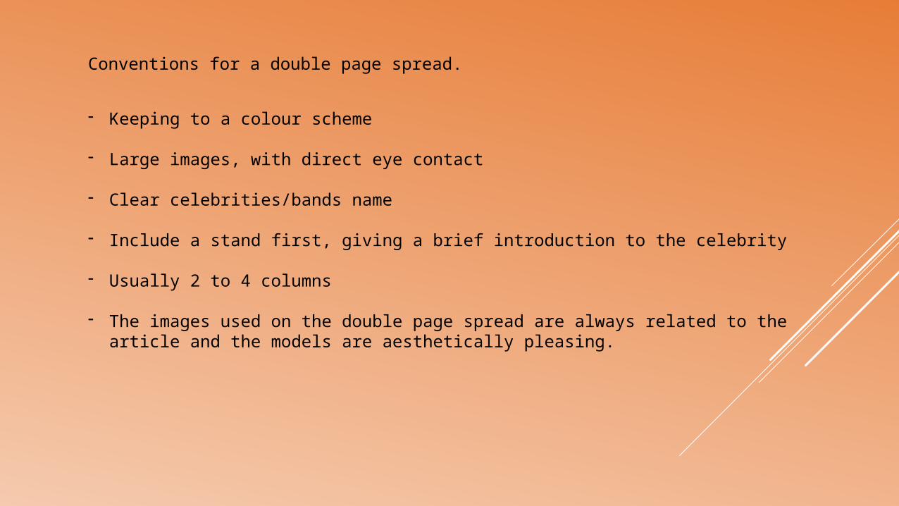
Conventions for a double page spread.
- Keeping to a colour scheme
- Large images, with direct eye contact
- Clear celebrities/bands name
- Include a stand first, giving a brief introduction to the celebrity
- Usually 2 to 4 columns
- The images used on the double page spread are always related to the article and the models are aesthetically pleasing.

The colour scheme is current as is the same as the previous pages creating a house colour scheme. It also puts emphasis on the same colour which is current in the costuming of my model.
There is larger images with direct eye contact, drawing the reader in.
The Retro. logo is current reinforcing the brand image.
Clear celebrities and bands name at the top of the page making it easy for reader to view.
Included a stand first, giving a quick summary of the band/singer.
Kept within the boundaries of 2 to 4 columns.
The image is of the person in question when it comes to the article.