Evaluation question 1
10
1) In what ways does your media product use , develop , or challenge forms and conventions of real media products? (I.e. Of music magazine) Bar code Title Interview Contents page Colour scheme People Layout Extras Posters Below is the list of the 9 elements that I will be writing about to answer this question .
-
Upload
georgiadaltonx -
Category
Documents
-
view
68 -
download
0
Transcript of Evaluation question 1
1) In what ways does your media product use , develop , or challenge forms and conventions of real media products? (I.e.
Of music magazine)
Bar code Title
InterviewContents pageColour scheme
PeopleLayoutExtras
Posters
Below is the list of the 9 elements that I will be writing about to answer this question .


Bar codeI have added a bar code to the bottom of my magazine , the reason I have added a bar code to my magazine is because it makes my magazine look more authentic .
Typically magazines have the barcodes in a corner (usually the bottom right) which is why I have
positioned my barcode in the bottom right as this is a typical convention to all magazines not just music
ones.

Title
The title to my magazine is the biggest font on the front cover and is located at the top of the page. I have made the font with no main fill to it , just a coloured outline , I think it gives it more effect this way as it stand out very clearly and will grab the audience’s attention as soon as they look at the magazine. Also I feel that my magazine front cover is quite pact’d so by making the font with just an outline it doesn't clash with the rest of my cover.
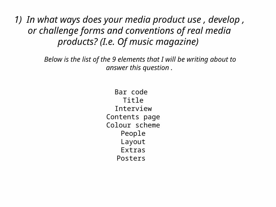
Interview/ExtrasFor my double page spread I included an interview with artist ‘Roxxxan’ , the interview took up the majority of the two pages . The reason I included an interview is because typically music magazines include interviews with artists that represent the genre of their magazine. I would include my interview as an extra as well because instead of making up an interview with someone off the top of my head I managed to have a real interview with the rapper ‘Roxxxan’ during her sound check for her show in the evening , i contacted her myself and arranged everything too. It was a good way to research for my magazine as it fits well with my target audience and as its a real interview it is what they want to read. After the interview I attended the show in the evening where I then managed to get photographs of her performing too which I also used in my magazine.

Contents PageFor my contents page i feel like I followed a regular layout for a general contents page , I have the information of the content on the right side of the page and next to each sentence there is a page number . The colour scheme for my contents page follows the same scheme as my front cover I made sure of this because i feel like overall a magazine should follow the same scheme for the majority of it. The rest of my contents page is made up of pictures and writing . I do think i could have made my contents page look better however I had some trouble accessing my work from school at home therefore I had to re do the majority of the contents page.

Colour schemeFor my colour scheme I used the colours purple , orange , blue ,yellow , red , green and black.
For my front cover and my contents page I used the colours purple orange and blue , I dont know why I chose these 3 colours , as I was creating the pages these colours were the three I felt best suited the pages and they seemed to work well with each other and also the photos I used.
I changed my colour scheme for my double page spread to yellow , red and green. The reason I changed the colour scheme for the DPS is because when I used my original colours ( purple orange and blue) they did not work well with the colour of my images therefore I changed them to work with the colours of my images.

PeopleI included 4 artists in my magazine , 2 of them being famous artists , another being a unknown artists and then for my last person I used my friend . I'm lucky enough to know a few famous people which allowed me to have real artists in my magazine. The main artist in my magazine is rapper ‘Roxxxan’ my main photo on the front cover is her and my double page spread is also her. The girl group Stooshe who i used are for posters in the magazine along with my friend Chris. The other artists ‘Milks’ /Elz is used for a competition in my magazine. All my artists feature on my front cover.

LayoutI knew exactly how I wanted my magazine to be set out. I drew up a sketch for my DPS and my contents page. As you can tell I followed my mock ups when making the final piece of work . For my front cover instead of a sketch I done it on the computer as I felt it needed to be more detailed than a drawing as the first thing you see when you pick up a magazine is the front cover therefore it has to be very detailed and organised.
I think making mock ups definitely helped as it made it easier to create my final pieces of work as I already knew what the page would look like and what it was going to include.
I think my layout follows a regular music magazine layout in the sense that the double page spread is an interview ect.

PostersI included free posters in my magazine and made it very clear on the front of my magazine as you can see. I think it is important to include posters within the magazine as alot of people are interested in the posters and some people only buy magazines to collect the posters of artists ect. The reason i advertised the posters on the front cover is because having ‘Free posters’ on the front of the magazine is a good way to get people to buy your product as they feel they are getting more for there money .