Evaluation question 1
22
In what ways does your media product use, develop or challenge forms and conventions of real media products? Billy Ingram Question 1
-
Upload
billybetterknow -
Category
Technology
-
view
40 -
download
1
Transcript of Evaluation question 1
In what ways does your media product use, develop or challenge forms and conventions of real media products?
Billy Ingram
Question 1
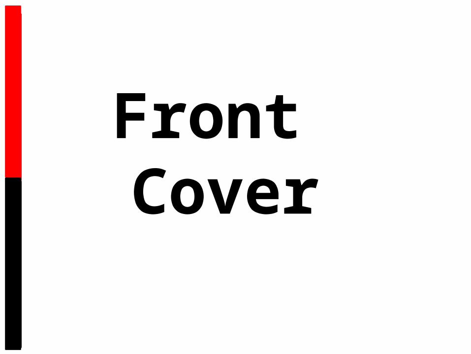
Front Cover
Tag LineMasthead
Anchor Text
Main Cover Line
Main Image
Features
Sell Line
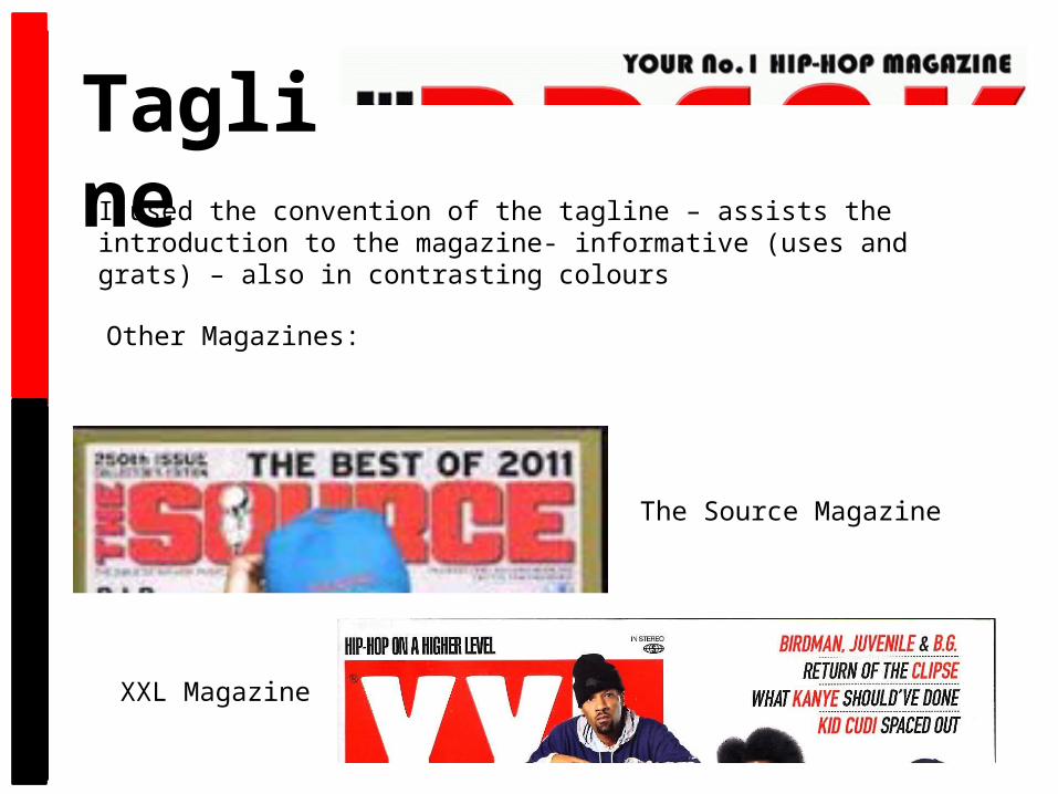
TaglineI used the convention of the tagline – assists the introduction to the magazine- informative (uses and grats) – also in contrasting colours
Other Magazines:
The Source Magazine
XXL Magazine
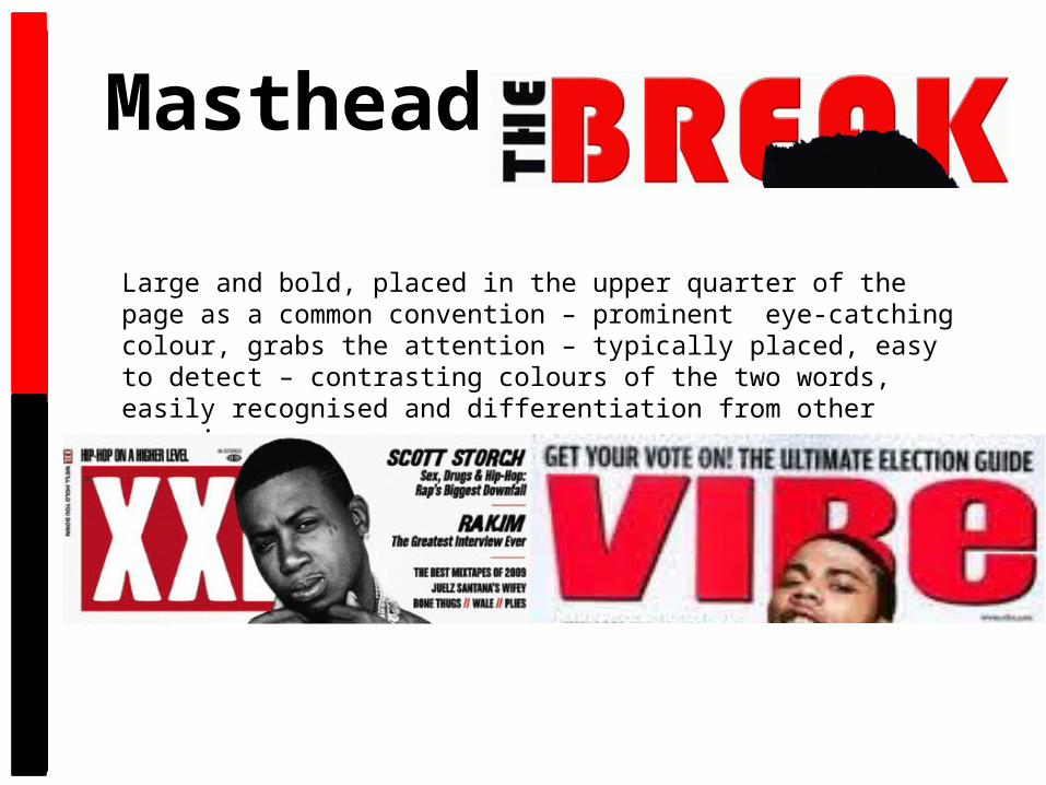
Masthead
Large and bold, placed in the upper quarter of the page as a common convention – prominent eye-catching colour, grabs the attention – typically placed, easy to detect – contrasting colours of the two words, easily recognised and differentiation from other magazines.

Main ImageMedium close up of a single person covering the main story used as a commonly used convention – direct mode of address, connects to the audience, personal relationships (uses and grats) -

Anchor TextName – anchors to image – relates to main story – bold and contrasting – link to the house style, same colour scheme – drop shadow gives a 3D effect on the white background – encourages fans to buy.
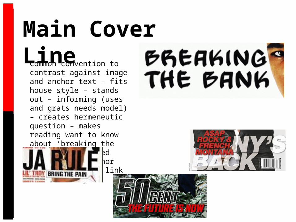
Main Cover LineCommon convention to contrast against image and anchor text – fits house style – stands out – informing (uses and grats needs model) – creates hermeneutic question – makes reading want to know about ‘breaking the bank’ – positioned close to the anchor text to show the link to main story.
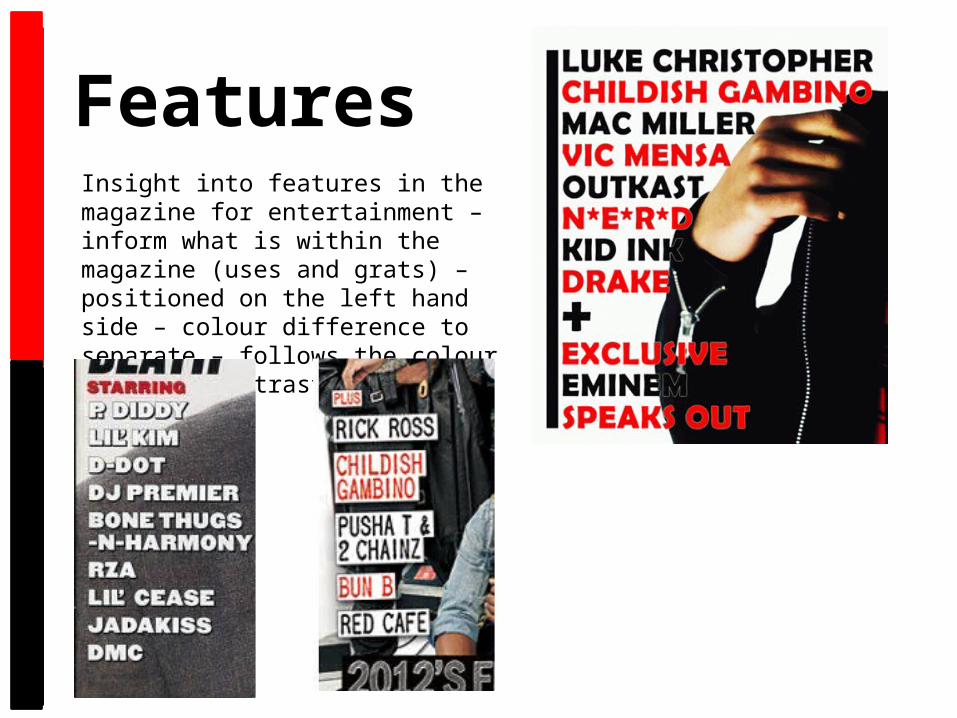
FeaturesInsight into features in the magazine for entertainment – inform what is within the magazine (uses and grats) – positioned on the left hand side – colour difference to separate – follows the colour scheme – contrasts against background.
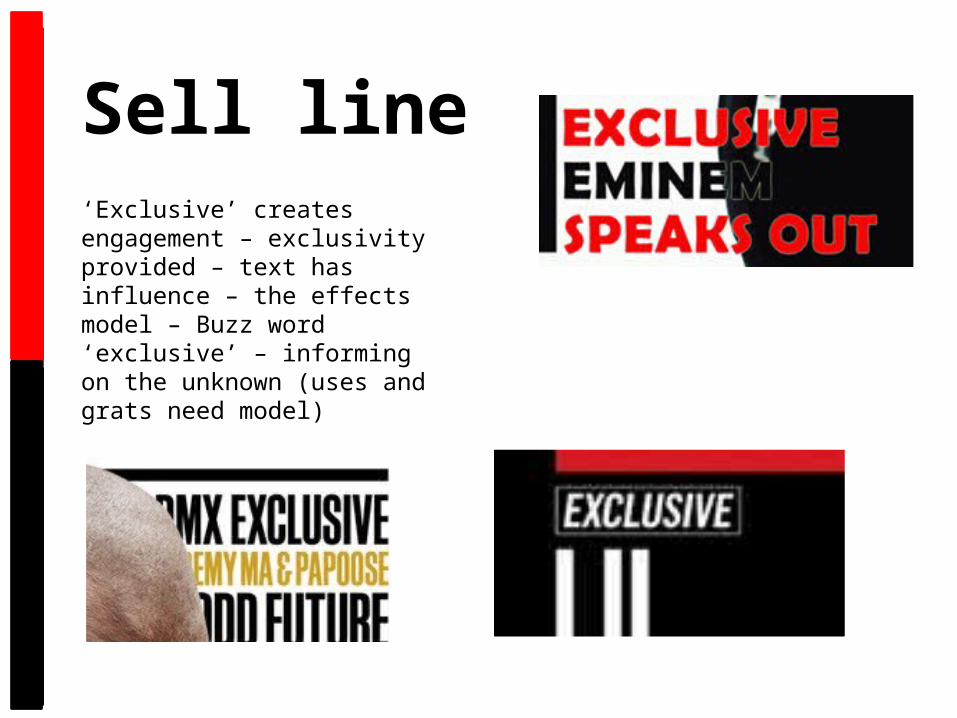
Sell line‘Exclusive’ creates engagement – exclusivity provided – text has influence – the effects model – Buzz word ‘exclusive’ – informing on the unknown (uses and grats need model)

House StyleBlack/white/red. I chose to use these colours because they contrast well against each other and these colours are commonly used on the vast majority of XXL’s covers. I suited the mise en scene of the model to the black and red side of the colour scheme and placed the image on a white background. The masthead and the anchor text being in red to draw surveillance. Using black and white with another colour is a common convention in a magazine.
Contents

Masthead
Numbering
Social Networking
Features
Layout
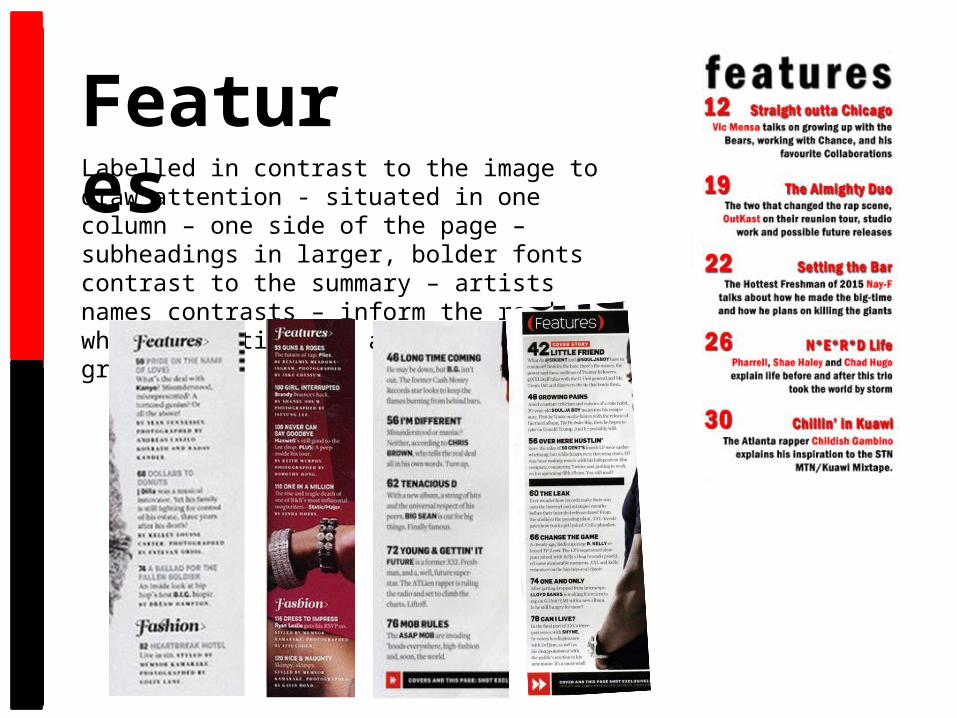
FeaturesLabelled in contrast to the image to draw attention - situated in one column – one side of the page – subheadings in larger, bolder fonts contrast to the summary – artists names contrasts – inform the reader of what the article is about (uses and grats)
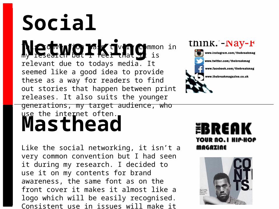
Social NetworkingThis convention wasn’t very common in my research but I feel that it is relevant due to todays media. It seemed like a good idea to provide these as a way for readers to find out stories that happen between print releases. It also suits the younger generations, my target audience, who use the internet often.
MastheadLike the social networking, it isn’t a very common convention but I had seen it during my research. I decided to use it on my contents for brand awareness, the same font as on the front cover it makes it almost like a logo which will be easily recognised. Consistent use in issues will make it more professional.
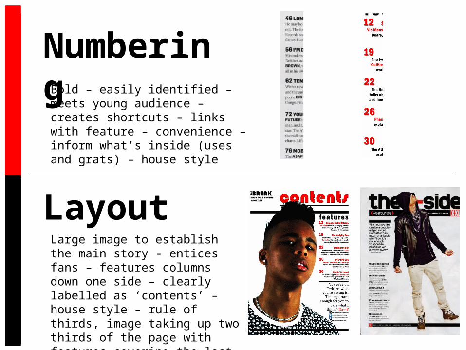
NumberingBold – easily identified – meets young audience – creates shortcuts – links with feature – convenience – inform what’s inside (uses and grats) – house style
LayoutLarge image to establish the main story - entices fans – features columns down one side – clearly labelled as ‘contents’ – house style – rule of thirds, image taking up two thirds of the page with features covering the last third – corresponding black bars for separation.

Double Page Spread
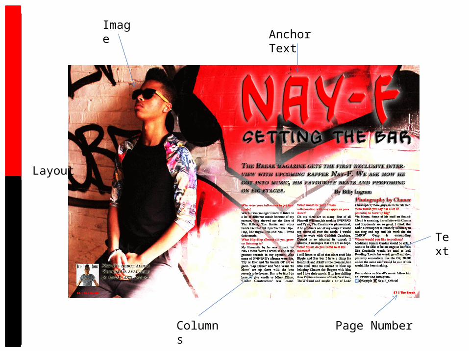
ImageAnchor Text
Text
Columns
Layout
Page Number
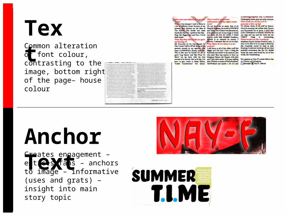
TextCommon alteration of font colour, contrasting to the image, bottom right of the page– house colour
Anchor TextCreates engagement – entices fans – anchors to image – informative (uses and grats) – insight into main story topic
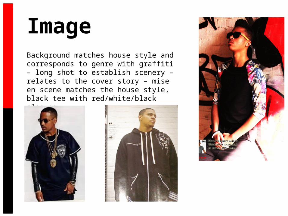
ImageBackground matches house style and corresponds to genre with graffiti – long shot to establish scenery – relates to the cover story – mise en scene matches the house style, black tee with red/white/black sleeves.
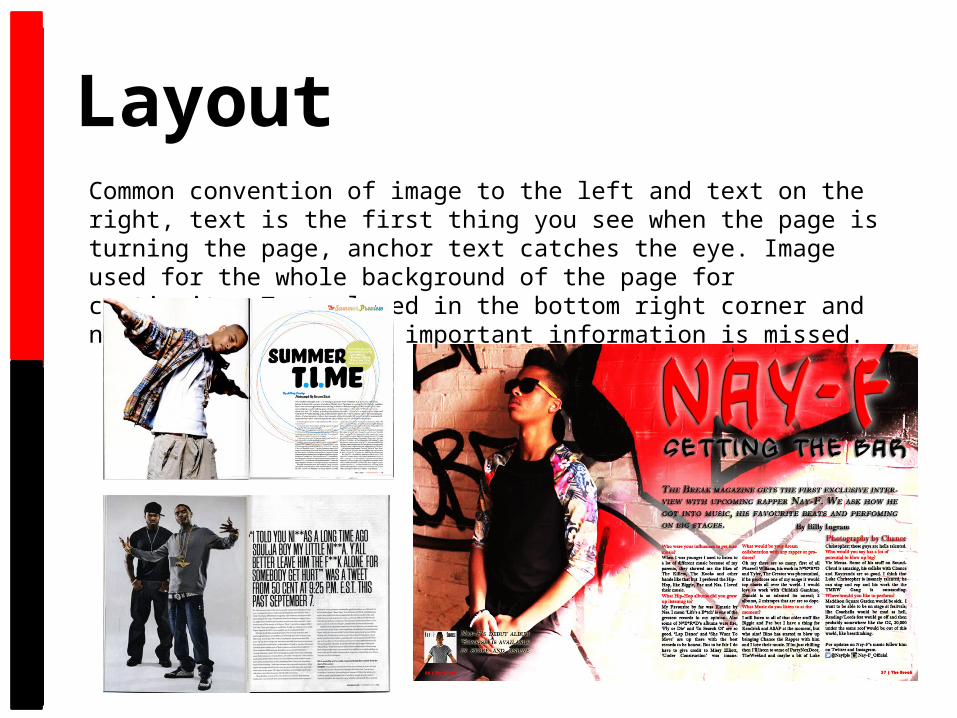
LayoutCommon convention of image to the left and text on the right, text is the first thing you see when the page is turning the page, anchor text catches the eye. Image used for the whole background of the page for continuity. Text placed in the bottom right corner and not in the fold so no important information is missed.
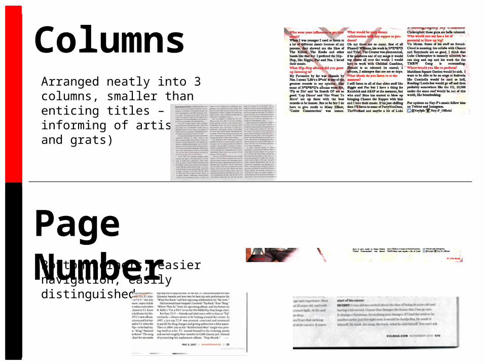
ColumnsArranged neatly into 3 columns, smaller than enticing titles – informing of artist (uses and grats)
Page NumberBottom corners, easier navigation, easily distinguished.