Evaluation q.2
15
Evaluation//Q.2 How effective is the combination of your main products with ancillary texts?
-
Upload
larsosmedia -
Category
Education
-
view
94 -
download
0
Transcript of Evaluation q.2

Evaluation//Q.2 How effective is the combination of your main products with ancillary texts?
Digipak FormatMy Digipak was a 6 sided design, with
each panel corresponding to
the numbers in the diagram to the left. The bottom images
are of the completed Digipak,
laid out into its final design.

Digipak Panel 1: [Front]The front panel of my Digipak [A] uses a direct reference to a scene from my music video. In my music
video, there is a scene where the main character arranges rose petals around the iPad [B] , and this image was developed and clarified for my cover. This is a direct link between the 2 products, with the same, prop, scene and bedcovers. I did however, change the lighting, angle and position of the props to make the image more aesthetically appealing. I found this image strongly mirrored the use of the romance genre combined with elements of the mise en scene of science fiction in my music video.
[A] [B]
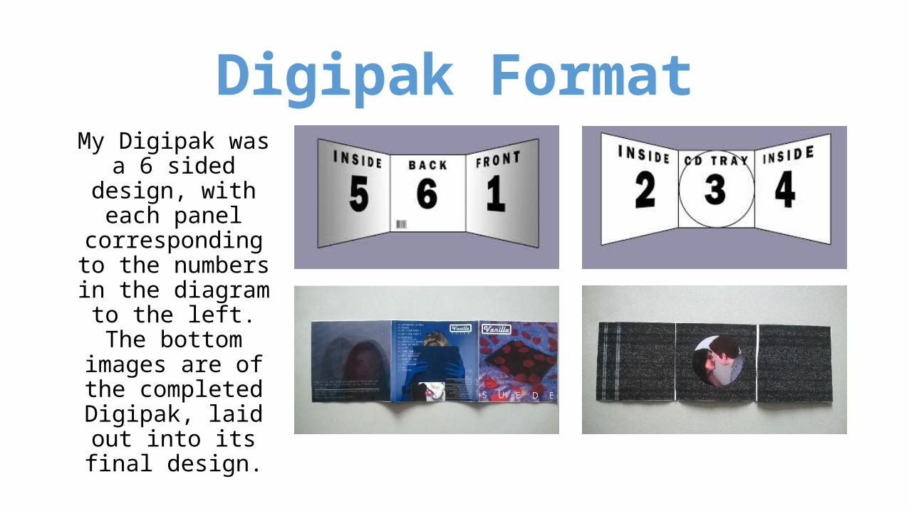
Digipak Panel 1: [Front]In addition, My front panel links with the music video through the repeated use of the Vanilla Logo, seen at the start of the music video[A]. It is not identical to the logo in the video, but uses the same font, font colour and white soft edged border [B]. This links the artist identity strongly between the
music video and Digipak, and helps to build a loyal audience. This is a recurring motif that I also repeat across the Digipak, using the logo on the rear panel[C].
[A] [B] [C]

Digipak panel 6: [rear] The main image on this panel is not a direct link to the
narrative of the music video, and features an anonymous unrelated character. However, through the repeated use of the iPad prop, the mixture of blue and white lighting it links strongly with the front panel. It does link with the music video thematically however, sharing the themes of technology and romance.
In this panel I have also introduced the design element and motif of the record label logo. I used this to solidify the indie appeal of the record, and repeat its use in my A4 advert.
I repeat the use of the Vanilla logo from the music video and front panel on this panel as well, linking it with both the rest of the Digipak and the music video itself. I used the same fonts as used on the front panel, just scaled down so as to fit better within the design.

Digipak Panel 5: [Inside]
This panel, like the front panel, is a development of an image used in my music video that was particularly striking or appealing [A]. In my music video, we see the light of dawn through the slats on the main character’s windows and this was an image I found aesthetically appealing. I used a different photo to capture the image in my Digipak, but the basic concept is the same. However, I developed this with a series of over-laid images of the same actress used in the music video and panel 3 of this Digipak. The combination of these images means it is not a direct narrative link to the video, but does link it visually.
This panel builds strong aesthetic links with the rest of the Digipak through the lighting and colouration, blue and purple dominating the palette like in panels 1+6.
[A]

Digipak Panel 5: [Inside]The continued theme of technology and romance is also featured in this
panel, though it is developed from its use in other panels. It does not directly feature technology in its mise en scene, but links with the idea that technology obscures and confuses romance. The face of the actress, an objectified and sexualised symbol, is obscured and confused by the layering of the image, linking also to the aspect of fantasy and the blurred lines between fantasy and reality caused by technology. This thematically and visually links to panel 6, in which the character’s face is also obscured and confused.
The actress used in this panel is also the same as used in panel 3.

Digipak Panel 2,3+4: [Inside + Cradle]
These panels are all very strongly linked, and carry a singular theme. They are most obviously linked by the visual link of the Television White noise which appears across all 3 inside panels. The effect of this is to give the entirety of the inside panels the appearance of a de-tuned television screen. This links to the mise en scene of technology used in the rest of the Digipak as well as the music video. It also links thematically to the idea of technology as an obscuring force, as the white noise makes the Digipak more visually busy and confusing.
[A]

Digipak Panel 2,3+4: [Inside + Cradle]
Panel 3, which encompasses a cradle for the CD is a direct reference to the ending of my music video [A], and is a screenshot taken from the actual video. It is also
suggested through association with panel 6, that the character on panel 6 could be viewing this image on her screen. The fact that the image on panel 3 is surrounded
by TV Noise could also suggest the theme of technology’s disorienting effect like many of the other panels. The image in panel 3 links very strongly to the cliché film
ending with the couple kissing, linking strongly with the idea of the way that the media affects our perception of romance.

Digipak Panel 2,3+4: [Inside + Cradle]
This is a strong thematic link between the video and Digipak, with the one main underlying theme of the video, the way the media and technology effect our relationship with the world, leaving us viable to delusion and alienation. The
female is the fantasy and the male is the one who is replacing the fantasy romance for a one based in reality. This is an exaggeration of a contemporary
issue in which people tend to emotional or social needs through the media, for example, replacing relationships with on-screen romances.

Magazine AdvertMy magazine advert links strongly to the
Print production and the music video through the use of the Digipak front cover. This directly links to the music video through the repeated use of the rose petal image I also used in the music video.
It also links with the Digipak through the minimal and stripped back design, and the use of sans-serif fonts for ‘Suede’ on the album cover, and across the advert.
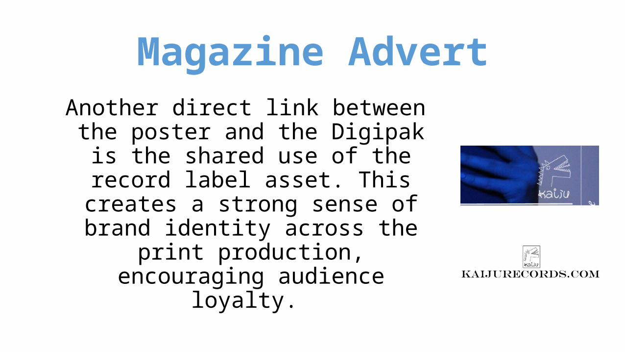
Magazine AdvertAnother direct link between the poster and the Digipak is the shared use of the record label asset. This creates a strong sense of brand identity across the print
production, encouraging audience loyalty.

Uses of coherent packages + Music
Videos in real TextsThe artwork for the release cycle of Daft Punk’s 2005 album ‘Human After All’ carries a strong aesthetic theme. All of the artwork, including the main release and all of it’s singles, feature usage of the television
screen motif. The cover for the album itself is a development of the artwork theme used throughout much of Daft Punk’s discography, which is the variation of the same basic Daft Punk logo. The artwork for this album combines the typical Daft Punk motif with the albums motif of the television, linking it well both
with their wider discography and the general release cycle. This aesthetic choice allows the band to maintain a loyal audience, whilst also noting the change in style of music, hopefully potentially attracting
new audiences as well
Uses of coherent packages +music
videos in real textsWith the exception of ‘Human after all’ which did not have an official music video, all of the covers for the single feature a
prop from their respective music videos. The artwork for ‘Robot Rock’ and ‘Technologic’ both feature the guitars played
by daft punk in the music videos for the songs, and ‘Prime Time of your Life’ features an image that is featured directly in
the music video. As well as through the featuring of props, the music videos link to the artwork thematically too.

Uses of coherent packages + Music
Videos in real TextsAll of the music videos revolve around the idea of watching and television, ‘Technologic’ [A] features an unsettling animatronic watching a TV before copying its message, ‘Prime Time of Your Life’ [B] sees it’s protagonist watching television, with all people replaced by animated skeletons
and ‘Robot Rock’ [C] is a deliberate send up of 70s live music shows, with the band performing on a gaudily lit set, complete with 70s style screen noise. The representations of ‘TV culture’ all also feature highly unsettling or ironic elements, suggesting the bad consequences of such culture. In this way, this Album and it’s artwork share a similar theme to my own Digipak design, and use it
inter-textually in a similar way, a good example of a real life use of coherence between Music videos and album artwork.
[A] [B] [C]