Evaluation of my product
9
This PowerPoint will summarise all of the technical thought processes and methods I went through as a product developer to create my music magazine ‘Alto’ and if I achieved the best I could. Evaluation of my product
-
Upload
carolinadefreitas -
Category
Documents
-
view
757 -
download
0
Transcript of Evaluation of my product
This PowerPoint will summarise all of the technical thought processes and methods I went through as a
product developer to create my music magazine ‘Alto’ and if I achieved the best I could.
Evaluation of my product
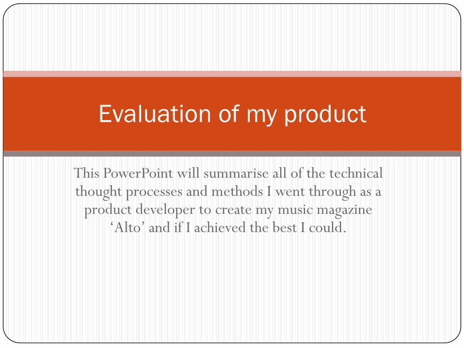
Does my product adopt, develop or challenge
conventions of media products?
As a product, I believe that my music magazine ‘Alto’ adopts features
that are conventional for the media sector, whilst introducing original
aspects to establish a unique brand identity. Typical convention such as
using enticing buzzwords and strap lines are crucial in order to attract
magazine readers through subjects they wish to read about, particularly
interviews with global artists. However, for my magazine I decided to
challenge these micro features and adapt them to my magazine. With
my product, thus was done through the use of diverse, young models,
introducing social media and using a quirky, yet simple layout to follow.
In conjunction, these features should create a USP that puts my
Independent music magazine in a
competitive position among others.
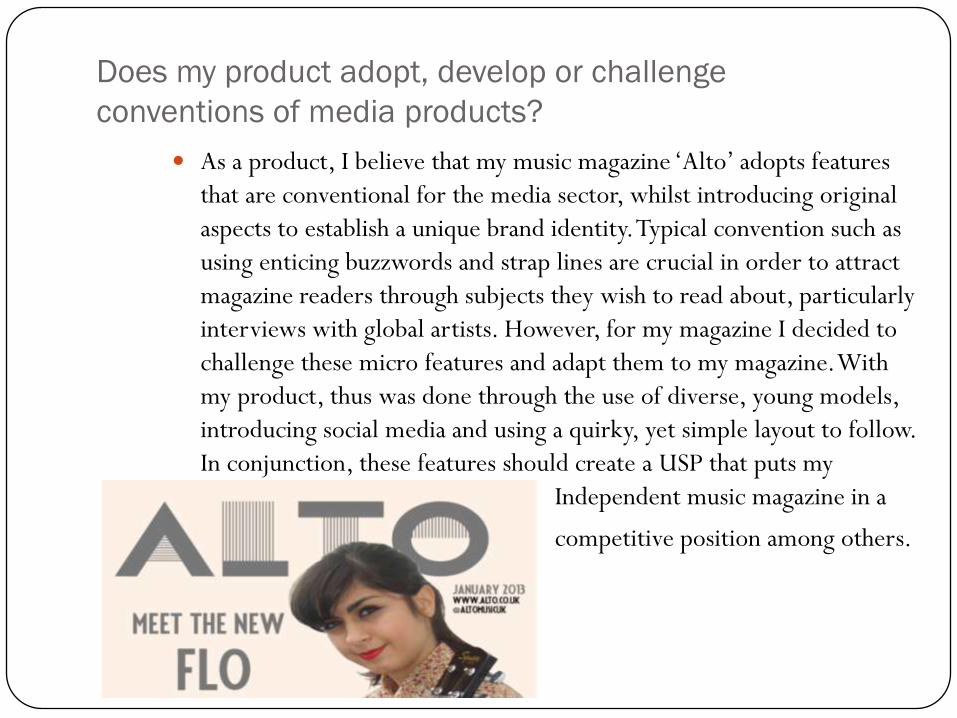
How does my media product represent particular social
groups?
Firstly, I recognised that my chosen target demographic
should be young adults between 16-25 year olds. This is
because after conducting my initial market research I
found that most music magazines (e.g. Q and NME) attract
an older clientele with more acquired musical tastes.
Although I had chosen to create and Independent music
magazine, I still wanted my product to appeal to a wide
audience. Within Indie magazines, I found that the
majority of the artists used to represent each issue were
male, hinting at a patriarchal based genre. I decided to
challenge this through the use of using completely female
models in order to not detach my magazine from female
readers. I should have perhaps used a group of both sexes
to model for my magazine, thus maintaining equilibrium,
but due to timing issues and individuality as a brand, I
decided not to.
What kind of media institution would distribute my
media product?
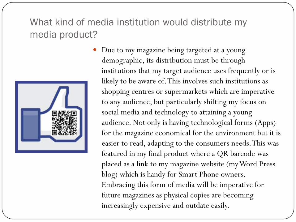
Due to my magazine being targeted at a young
demographic, its distribution must be through
institutions that my target audience uses frequently or is
likely to be aware of. This involves such institutions as
shopping centres or supermarkets which are imperative
to any audience, but particularly shifting my focus on
social media and technology to attaining a young
audience. Not only is having technological forms (Apps)
for the magazine economical for the environment but it is
easier to read, adapting to the consumers needs. This was
featured in my final product where a QR barcode was
placed as a link to my magazine website (my Word Press
blog) which is handy for Smart Phone owners.
Embracing this form of media will be imperative for
future magazines as physical copies are becoming
increasingly expensive and outdate easily.

Who would be the audience for my media product?
As mentioned earlier, my target demographic for my product is 16-25 year old
young adults, of both sexes and from any background. This however changed
throughout the planning process of my magazine where I realised that within the
Indie sector of music magazines women are underrepresented, thus changing my
magazine to a female dominated brand. With this in mind, I used all female models
for the photo shoot for my issue, using a range of mid-shots to close ups to capture
more than is regularly shown in photo journalism. This will positively effect my
target audience as it doesn’t portray women as sexualised or objectified like other
magazine; it is empowering. Using females predominately in my product however
wouldn’t shun male readers, as in the end of the day it remains a music magazine
with useful articles and freebies. My demographic
is also reflected in the pricing of my magazine; I
chose to keep it at £1.50 for a paper copy, with my
App being free to access. This is due to the fact that
the paper copy includes vouchers and freebies that
are useful to have in conjunction with the magazine.
How did I attract/address my audience?
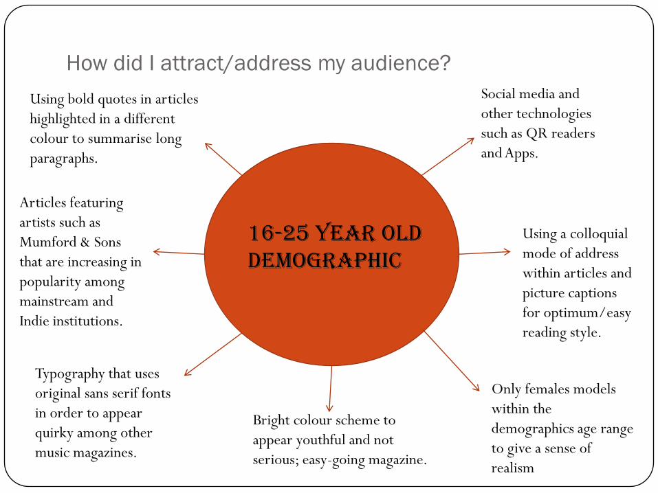
16-25 year old demographic
Social media and
other technologies
such as QR readers
and Apps.
Using a colloquial
mode of address
within articles and
picture captions
for optimum/easy
reading style.
Only females models
within the
demographics age range
to give a sense of
realism
Bright colour scheme to
appear youthful and not
serious; easy-going magazine.
Typography that uses
original sans serif fonts
in order to appear
quirky among other
music magazines.
Articles featuring
artists such as
Mumford & Sons
that are increasing in
popularity among
mainstream and
Indie institutions.
Using bold quotes in articles
highlighted in a different
colour to summarise long
paragraphs.
What have you learnt about technologies from the
process of constructing this product?
During the construction of my magazine I found
adapting to the general use of the software difficult to
grasp. After trialling the Indesign application in both
my preliminary and final product, I found the
composition of the device too complex and time
consuming to complete within the timeframe given. I
then began to use Photoshop, and after following
YouTube tutorials on how to use it, I felt more at ease
with the widgets and tools given, hence using this
software for my final product. I did encounter
difficulties during the making of the product, such as
using the selection and magic eraser tool to detach the
model from the background (as some items in the
mise-en-scene of certain photos did not correlate with
the image I wanted to convey). However, I overcame
these difficulties and thus now know how to configure
programmes such as Indesign and Photoshop.

What have I learnt from the preliminary task and how did
it help with my final product?
From my preliminary task, particularly due to the timeframe given to
complete it in, I found that the overall aesthetic quality, particularly in
the contents page was poor. This is due to micro features such as font
and colour codes not functioning well together; I should have paid
more attention to detail to amend this in order to create a more
harmonious, simple page. In my final product however, I believe I
rectified these issues as I have had more time and was more
accustomed to the Photoshop programme. I have also learnt more
about the meta language of music journalism and applied this to my
product; similarly to MOJO’s journalistic qualities. Overall, with the
use of a preliminary magazine, I have been able to address issues prior
to constructing my final product which had aided the progression of
my media product and helping to fulfil my criteria.
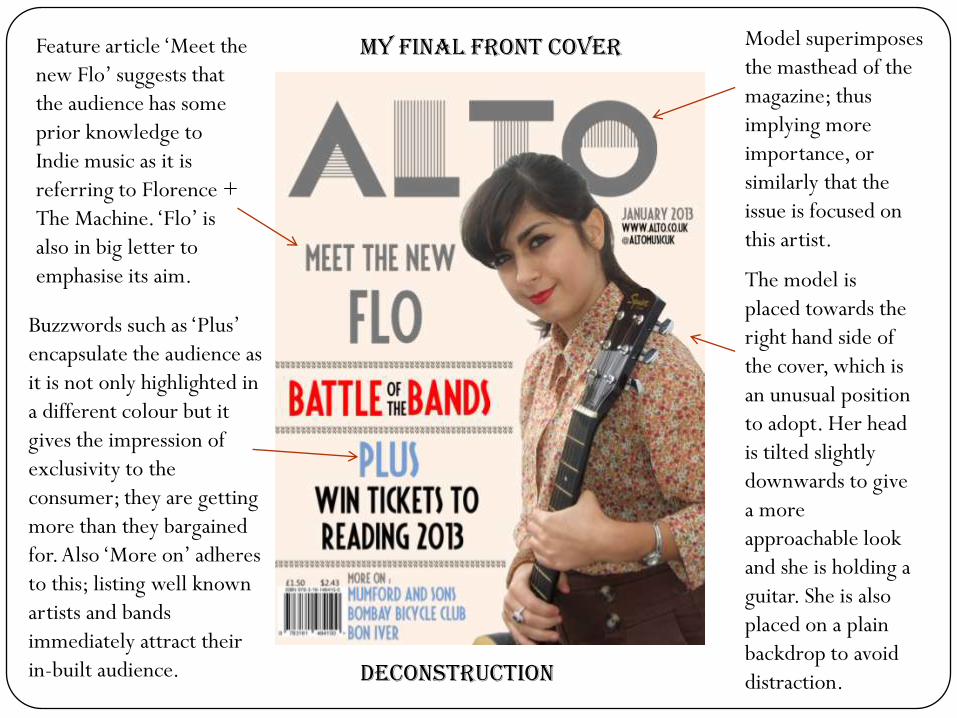
Model superimposes
the masthead of the
magazine; thus
implying more
importance, or
similarly that the
issue is focused on
this artist.
The model is
placed towards the
right hand side of
the cover, which is
an unusual position
to adopt. Her head
is tilted slightly
downwards to give
a more
approachable look
and she is holding a
guitar. She is also
placed on a plain
backdrop to avoid
distraction.
Feature article ‘Meet the
new Flo’ suggests that
the audience has some
prior knowledge to
Indie music as it is
referring to Florence +
The Machine. ‘Flo’ is
also in big letter to
emphasise its aim.
Buzzwords such as ‘Plus’
encapsulate the audience as
it is not only highlighted in
a different colour but it
gives the impression of
exclusivity to the
consumer; they are getting
more than they bargained
for. Also ‘More on’ adheres
to this; listing well known
artists and bands
immediately attract their
in-built audience.
My final front cover
Deconstruction


![· Web viewPost Until: [Date] PRODUCT RECALL. PRODUCT RECALL. PRODUCT RECALL. PRODUCT LIABILITY EVALUATION. PRODUCT LIABILITY EVALUATION. PRODUCT LIABILITY EVALUATION. PRODUCT LIABILITY](https://static.fdocuments.in/doc/165x107/5e58b356d7aea8615859438c/web-view-post-until-date-product-recall-product-recall-product-recall-product.jpg)