Evaluation muniba naveed
30
Evaluation Evaluation Muniba Naveed
-
Upload
muniba-naveed -
Category
Entertainment & Humor
-
view
66 -
download
1
Transcript of Evaluation muniba naveed

EvaluationEvaluationMuniba Naveed

Planning and Planning and PreparationPreparation
I researched a range of music magazines to inspire me how to start my own one off. These included: Uncut, Kerrang!, NME and Q magazine.
I mainly focused on NME because I wanted my magazine to have the same ‘too cool for school’ look and as it is called “Indie-Pendent” it relates to 14-25 year olds that love to listen to Indie artists, go to gigs and find out about new/older artists just by independently buying the magazine.
Bands on the front cover look natural and happy, which is the same way I want to make my band on the front cover look like so it looks fun yet not fake.Use of left side third is
what I have a preference to use as it looks better and can be seen on the shelf in newsagents if put on it’s side

How does your media product represent social How does your media product represent social groups?groups?

My media product focuses on a certain social group,
this group are14 – 25 year old students either studying at secondary school, college and university. These people are up to date with technology, love to look good through fashion and are very outgoing.
These young people mainly listen to indie pop/rock music, will like to go to festivals and gigs that are big and small. They appreciate small gigs as it gives them an insight on how musicians become successful, they also like to attend small gigs as it gives them a sense of originality and are able to meet the musicians more easily.
They would also value music before their generation and continue to rediscover old music.
Some would class this social group as “Indie” or “Hipsters”. They would be my main readers as it is acquired to their style and evidently represents this social group but my magazine also welcomes any other social groups too.
Magazine Magazine ProposalProposal My aim is to create an Indie magazine that encourages 14-25 year olds of any
ethnicity or sex, that love indie music to create music of their own and make them feel that they have got what it takes to make money out of doing what they love if that is their wish.
This is one of the reasons why I have chosen the title “Indie- Pendent” already. The second reason is that I plan to price my magazine at £3.00 because I would like to make mainly teenagers who feel they are somewhat too much of a liability to their parents feel more independent by being able to buy the magazine with their own money. It is an affordable price for the average teenager but not too cheap to make them think that it won’t be worth their time as well as money.
Teenagers who do not want to aspire to be a musician but really enjoy discovering both upcoming artists and old ones that may have been forgotten by their generation, are able to rediscover them and their songs to listen to so that they do not miss out on great music similar to UNCUT magazine.
My magazine will be similar to NME magazine as it will be similar to the genre of musicians they choose to talk about.
I have chosen the Indie music genre as I feel it is becoming a more well-liked genre of music among certain teenagers and as it is still not hugely popular they’d want to find as much of this music as they can and my magazine will intend to fill that hole.
The pictures I plan to take and manipulate will have a more darker look in comparison to other music magazines published today because I want to challenge the normal forms and conventions. This is because most music magazine publishing's try to attract the eye by being brightly coloured therefore making a magazine like mine stand out and look out of the ordinary.
The written style will be informal, entertaining and amusing but at the same time informative so that young people will not be overwhelmed with difficult words but comfortable and learn a few new things at the same time.

Front Page Research Front Page Research

My Front My Front PagePage
I used a dark colour scheme with a warped background pattern to give a ‘cool’ feel to the magazine rather than a colourful scheme as I thought it’d look to childish and tacky.
I used the font “Akoom” for the masthead and for the name of the band because it looked different to normal magazines that are big and bold. I also used it because when I wrote out “INDIEPENDENT” the ‘p’ separated the word into two as it leans forward which I liked so I decided to use this font.
This font only uses capitals which grabs readers attention as people automatically think it’s shouting out at you to reach your mind.
I chose to use white for the text because the background is very dark, black in some parts which contrasts hugely and makes all the text stand out.
I put other well known indie bands and artists as the side headings
because this would encourage readers to look at the magazine
and get the impression that the main band on the front cover is a new
very successful band.
How I attracted my How I attracted my audience audience
To attract my audience I decided that my main story in my magazine is going to be about young people achieving a successful career in the music industry to show that the target audience (14 -21 year old females & males) can achieve their dreams of being a successful musicians.
I also made a pun in the name of the magazine as younger people find that witty and fun.

My Contents My Contents PagePage I used this layout as I could fit in a lot of storied this way to make it look
packed full of appealing stories. Then I added more articles and now it looks worth the amount of money it costs, and looks organised. I also boxed the articles into two separate ones to give a structure to the page as to where the reader should look first.
I added an unusual article about “Veronica Wire” as an entertainment article. It’s about someone who is quite crazy which people like to read about and laugh at and it brings diversity to the magazine.
I also added a competition in the contents page to give the opportunity for youngsters to win tickets to a big festival as they can be quite expensive especially if recognised artists are playing there like the ones I have mentioned in the contents.
I used the Akoom font again for “INSIDE” as it is like the
running theme and usual font for this magazine along with
the background pattern.
Double Page Spread Double Page Spread ResearchResearch
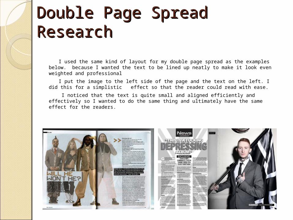
I used the same kind of layout for my double page spread as the examples below. because I wanted the text to be lined up neatly to make it look even weighted and professional
I put the image to the left side of the page and the text on the left. I did this for a simplistic effect so that the reader could read with ease.
I noticed that the text is quite small and aligned efficiently and effectively so I wanted to do the same thing and ultimately have the same effect for the readers.
My Double Page My Double Page SpreadSpread
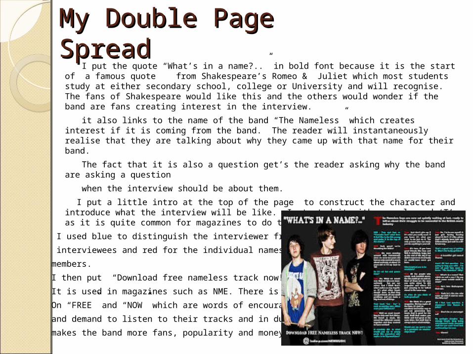
I put the quote “What’s in a name?..” in bold font because it is the start of a famous quote from Shakespeare’s Romeo & Juliet which most students study at either secondary school, college or University and will recognise. The fans of Shakespeare would like this and the others would wonder if the band are fans creating interest in the interview.
it also links to the name of the band “The Nameless” which creates interest if it is coming from the band. The reader will instantaneously realise that they are talking about why they came up with that name for their band.
The fact that it is also a question get’s the reader asking why the band are asking a question
when the interview should be about them.
I put a little intro at the top of the page to construct the character and introduce what the interview will be like. I started it with an enlarged ‘T’ as it is quite common for magazines to do this and is pleasing to the eye.
I used blue to distinguish the interviewer from the
interviewees and red for the individual names of the band
members.
I then put “Download free nameless track now!” because
It is used in magazines such as NME. There is an emphasis
On “FREE” and “NOW” which are words of encouragement
and demand to listen to their tracks and in due course
makes the band more fans, popularity and money.
Audience FeedbackAudience FeedbackI used social network and blogging sites like Tumblr and Facebook to find out
what young people who are up to date with technology and social networking sites music taste’s were and if they’d like my magazine. I used both qualitative and quantitative questions so that not only would I be able to count up numbers but also be able to get an insight of what people like and think. I asked the same 7 questions and got 4 responses back on Tumblr and 3 on Facebook.
These were the questions :
1. Are you male or female?
2. How old are you?
3. What is your favourite genre of music?
4. How much would you normally pay for a music magazine?
5. Would you buy my magazine?
6. If so how much would you pay for my magazine?
7. Do you subscribe to or buy any music magazines? If so please state.
8. What could I improve on?

Here were the responses:
Tumblr –
1. Male
2. 24
3. Jazz/Indie
4. £4
5. Yes
6. £3
7. I subscribe to NME and buy a Q magazine every once in a while
8. Longer interviews
1. Female
2. 16
3. Indie/alternative
4. £5
5. Yes
6. £2.75
7. NME
8. The contents page looks too neat
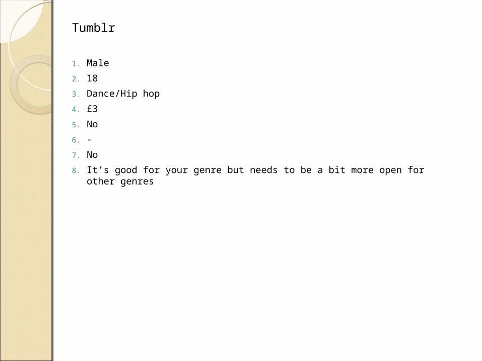
Tumblr
1. Male
2. 18
3. Dance/Hip hop
4. £3
5. No
6. -
7. No
8. It’s good for your genre but needs to be a bit more open for other genres

Facebook-
1. Male
2. 17
3. Indie/ Punk rock
4. £3.60
5. Yes
6. £2.80
7. I sometimes buy NME
8. Nothing
1. Female
2. 22
3. RnB
4. £4
5. No
6. -
7. RWD
8. It’s good but I just don’t like the genre of music it mainly focuses on
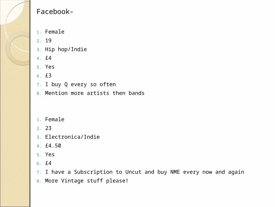
Facebook-
1. Female
2. 19
3. Hip hop/Indie
4. £4
5. Yes
6. £3
7. I buy Q every so often
8. Mention more artists then bands
1. Female
2. 23
3. Electronica/Indie
4. £4.50
5. Yes
6. £4
7. I have a Subscription to Uncut and buy NME every now and again
8. More Vintage stuff please!
How my magazine uses, develops and challenges forms How my magazine uses, develops and challenges forms and conventionsand conventions
‘Indie Pendent’ uses forms and conventions of other factual music magazines as it is a informative way of educating youngsters about new and vintage bands/artists, big and small music events, albums and singles.
However it also challenges the forms and conventions of other magazines as the band are not posing in the particular “serious” way that you see most of the time on the front covers of magazines.
The colour scheme of my magazine challenges it because it is very unusual as published magazines usually have one colour throughout.
I have included another little name under the main story “The Nameless” on the front cover which challenges the forms and conventions because more often than not magazines put one main Image only and is followed by a big quote from them which I have not done.
I tried to research magazine contents pages but could not find a structure I wanted to be similar to so I structured it my own way
The media institution I might choose to distribute my The media institution I might choose to distribute my media product and whymedia product and why

I think this media house publishing company would publish my magazine because it produces both UNCUT and NME magazine which are similar products to mine.
Most of it’s media brands reach women at about 66.7% in the UK and men at 42% which is nearly even which means I will most likely get around an almost even readership.
What I have learnt about technologies from the process What I have learnt about technologies from the process of constructing this product.of constructing this product.

PhotograPhotography phy
The camera I used was an Olympus E-420 DSLR.
I didn’t know how to use a DSLR camera properly before the project.
As it was my friends camera he showed me how to use it before I took the pictures.
I also had to think of other aspects to shape my pictures. These were:
Mise - en - SceneCostume : I told my main models to wear what they want because I wanted them to look natural and not overdressed. I did this because as they are a ‘new successful band’ in my magazine I wanted to give the notion that they’re still adjusting to their newer life as they still feel normal. I also wanted to give the impression that just because they’re famous now that they’re not going to change and this is their own. They wore skinny jeans and t-shirts which is a common thing to wear amongst their social groups.
Background Imagery: Most of the images were taken with Graffiti in the background. Although I was told to use a blank background as it would be easier to edit I wanted to keep the graffiti as I thought I’d use it because it said “Music” at the background but manipulate it to make it stand out a bit more. I also deliberately kept it in my shots because it would reflect the inner-city areas that some young people like ‘The Nameless’ come from that have talent.The other images were taken on stage, this was in a youth club that the band regularly visit to practice in.
Props: The props I used were the instruments on stage I asked them to start playing a track while I took some shots to make it look natural and like they were playing at an actual gig.
Camera shot distance :
I took mainly Medium close up shots and long shots. This was because I wasn’t focusing on the individuals of the band but as a group so if I wanted to fit them all in one image I'd have to use those two shots. Also I knew that if I wanted a close up image I could crop it later on in the editing stage.
Composition: I took over 36 pictures of the band alone and 19 shots of Libby who posed
as “Talulah Moon”
This allowed me to choose from a variety instead of being limited with a few. It also helped get used to the camera and help me improve on the quality of pictures that I took so my images got better and better.
Photography Photography Cont. Cont.
Photoshop CS5Photoshop CS5 I also had very basic knowledge of Photoshop before I took up AS media so
after playing around with my images and tips shown by me by my college mentor I picked up key skills. This included:
Improving skin quality:- Although I didn’t want to make the boys look perfect or superficial some of them had sore looking skin at the time which made him stand out too much so I calmed it down using the spot healing tool and the healing brush tool.
Cropping:– I used this tool quite often to get rid of bit or people in the background or to separate the band members into individual images so that I could drag them and make them appear to be closer together which I did on my double page spread. I did this by selecting the tool and dragging the cursor over the bit of the image that I wanted and deleted the rest.
Burn tool : - I used this tool a lot on images to make it look darker and to cast shadows on the bands faces on the front page.

Original Original ImagesImages
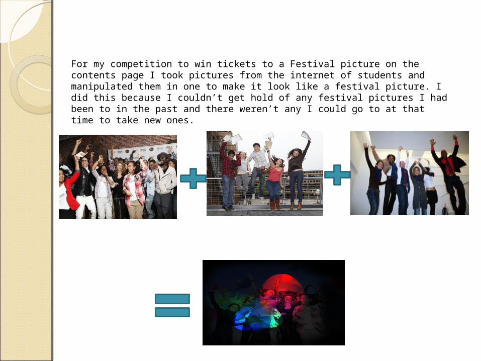
For my competition to win tickets to a Festival picture on the contents page I took pictures from the internet of students and manipulated them in one to make it look like a festival picture. I did this because I couldn’t get hold of any festival pictures I had been to in the past and there weren’t any I could go to at that time to take new ones.
What I feel I have learnt in progression from my preliminary task to the full product
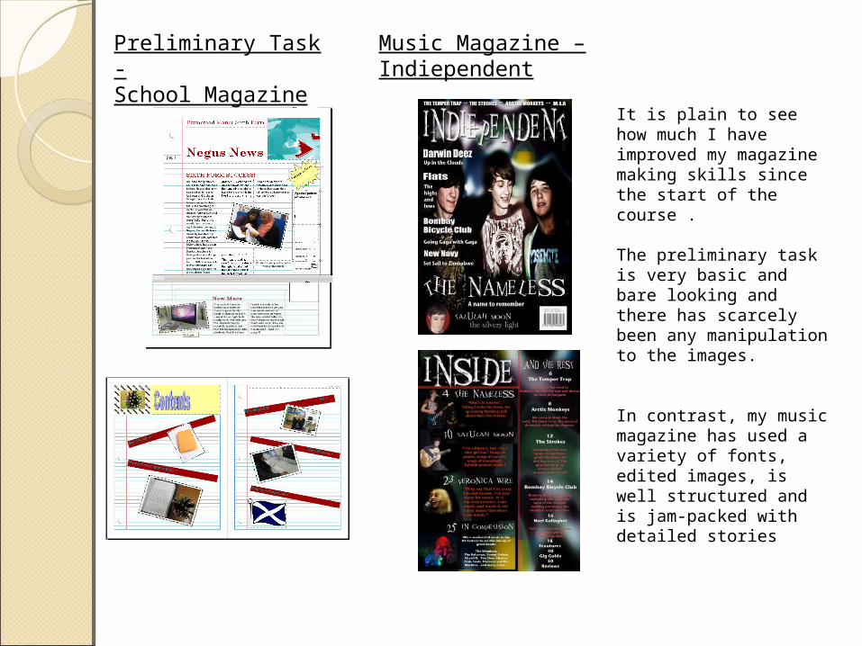
Preliminary Task -School Magazine
Music Magazine –Indiependent
It is plain to see how much I have improved my magazine making skills since the start of the course .
The preliminary task is very basic and bare looking and there has scarcely been any manipulation to the images.
In contrast, my music magazine has used a variety of fonts, edited images, is well structured and is jam-packed with detailed stories
Evaluation of skillsEvaluation of skills
on the whole, I have improved greatly and developed skills throughout the course. I know now how to use Photoshop effectively and to a high measure. I have learnt how to edit images to a high standard, structure my text with a lot of detail and create convincing and professional style magazine pages using the Photoshop software in depth. These editing techniques have and will aid me in future also.