Evaluation - College Magazine
20
-
Upload
chloe-scott -
Category
Documents
-
view
106 -
download
1
Transcript of Evaluation - College Magazine

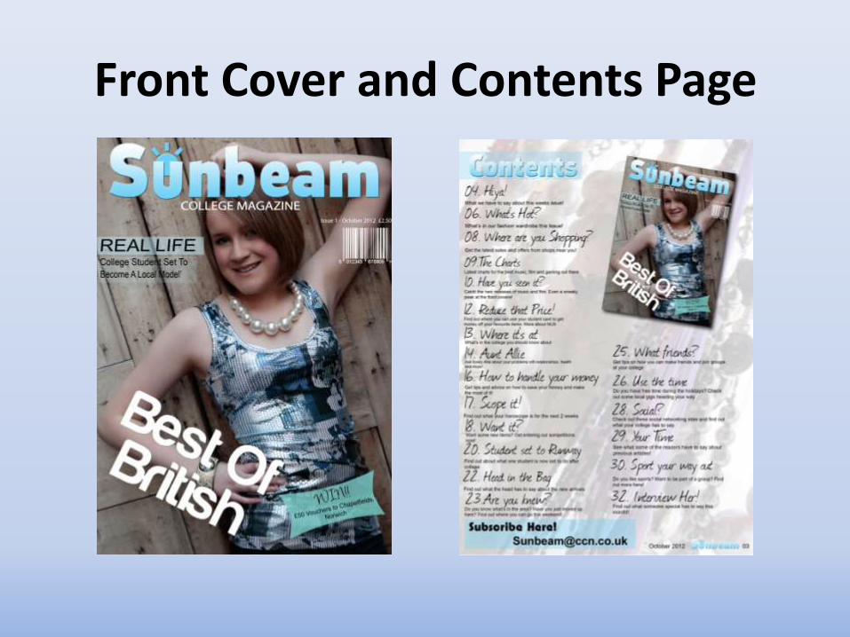
Front Cover and Contents Page

Front Cover Evaluation
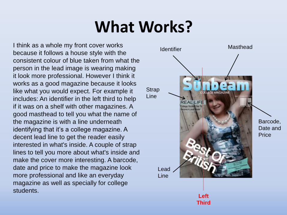
What Works? I think as a whole my front cover works
because it follows a house style with the
consistent colour of blue taken from what the
person in the lead image is wearing making
it look more professional. However I think it
works as a good magazine because it looks
like what you would expect. For example it
includes: An identifier in the left third to help
if it was on a shelf with other magazines. A
good masthead to tell you what the name of
the magazine is with a line underneath
identifying that it’s a college magazine. A
decent lead line to get the reader easily
interested in what's inside. A couple of strap
lines to tell you more about what's inside and
make the cover more interesting. A barcode,
date and price to make the magazine look
more professional and like an everyday
magazine as well as specially for college
students. Left
Third
Identifier Masthead
Lead
Line
Strap
Line
Barcode,
Date and
Price
…continued
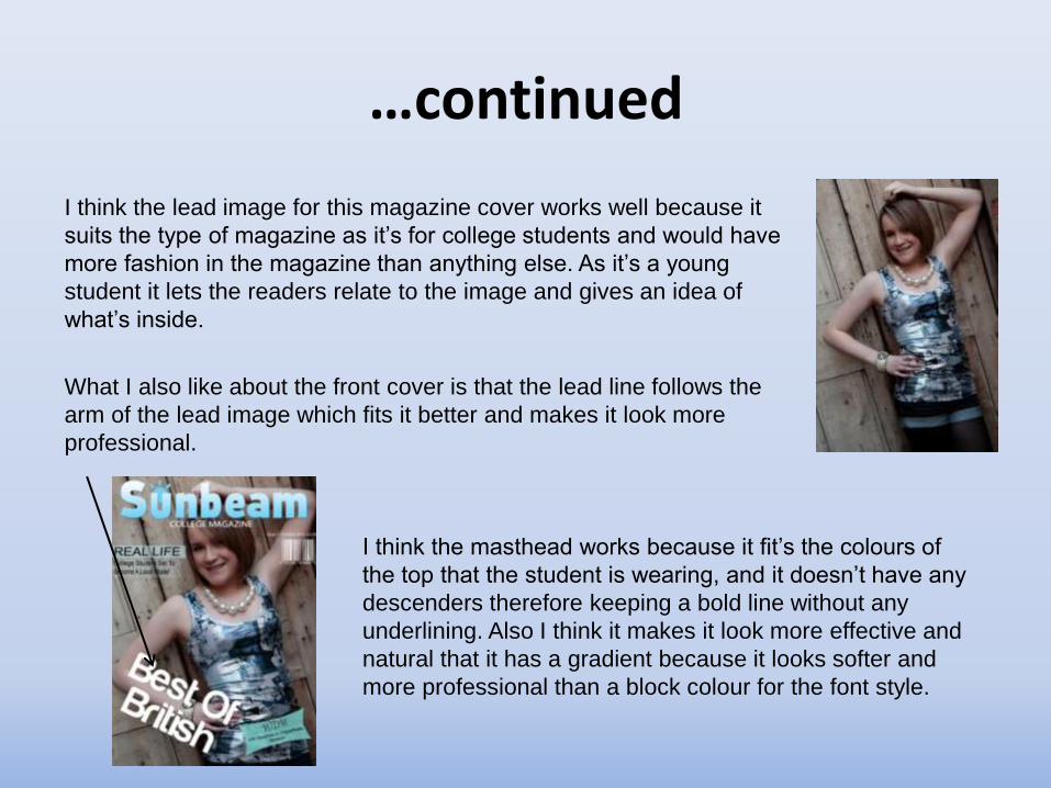
I think the lead image for this magazine cover works well because it
suits the type of magazine as it’s for college students and would have
more fashion in the magazine than anything else. As it’s a young
student it lets the readers relate to the image and gives an idea of
what’s inside.
What I also like about the front cover is that the lead line follows the
arm of the lead image which fits it better and makes it look more
professional.
I think the masthead works because it fit’s the colours of
the top that the student is wearing, and it doesn’t have any
descenders therefore keeping a bold line without any
underlining. Also I think it makes it look more effective and
natural that it has a gradient because it looks softer and
more professional than a block colour for the font style.

What Doesn’t Work?
I think the overall front cover works however I
could have made it work better by changing the
size of the lead image or masthead so that the
head of the student is shown more as the
masthead covers quite a bit of the head up.
Also I could have made a better identifier so it
looks more professional and fitted the masthead
better. If I changed the colour so that it had a
gradient that may have worked better because it
would have matched however because of where
it is it may have made it look less professional

What was Difficult?
As most of what I did on the front page were
simple processes I didn’t find it very difficult,
however the main area I found hard was
creating the right gradient on the mast head.
Because I wanted the colour to suit the lead
image I had to make sure I had a suitable
colour as well as producing a gradient for
the masthead.
Also even though I didn’t find it hard when I
worked out how simple it was I found it hard
initially to get the barcode white and have
no background as the original barcode was
black with a white background which I
thought was less professional and didn’t suit
the magazine as well.
Suitable gradient to fit the colour of
the front cover
What was Easy?
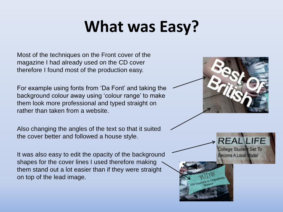
Most of the techniques on the Front cover of the
magazine I had already used on the CD cover
therefore I found most of the production easy.
For example using fonts from ‘Da Font’ and taking the
background colour away using ‘colour range’ to make
them look more professional and typed straight on
rather than taken from a website.
Also changing the angles of the text so that it suited
the cover better and followed a house style.
It was also easy to edit the opacity of the background
shapes for the cover lines I used therefore making
them stand out a lot easier than if they were straight
on top of the lead image.
What have you learnt?
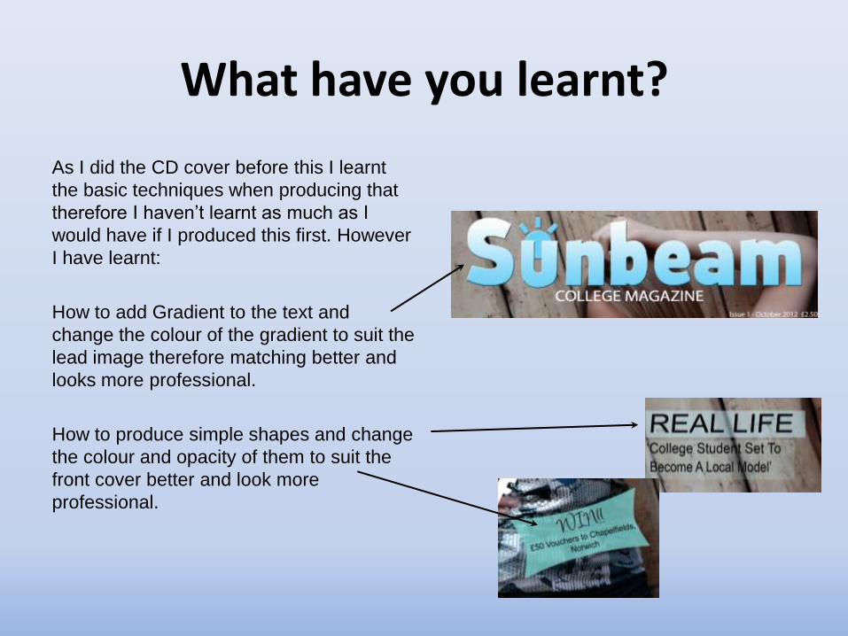
As I did the CD cover before this I learnt
the basic techniques when producing that
therefore I haven’t learnt as much as I
would have if I produced this first. However
I have learnt:
How to add Gradient to the text and
change the colour of the gradient to suit the
lead image therefore matching better and
looks more professional.
How to produce simple shapes and change
the colour and opacity of them to suit the
front cover better and look more
professional.

If you had all the time and money in the world what would you change?
If I had all the time and money I would
change the masthead because although it
suits the cover of the magazine and matched
the colours of the lead image I think it could
look more finished off and have a more
professional look. For instance the ‘U’ has
some rough edges where I have edited it
and this could have looked smoother.
Also I would think of other strap lines to fill
the cover more and a better lead line to suit
the magazine better as I don’t think the lead
line matches the type of magazine very well.
I would also think about using other fonts for
some of the texts like the word ‘WIN’ as I
don’t think it stands out very well and could
be bolder to make it more obvious.
Are there any magazines you can compare it to?
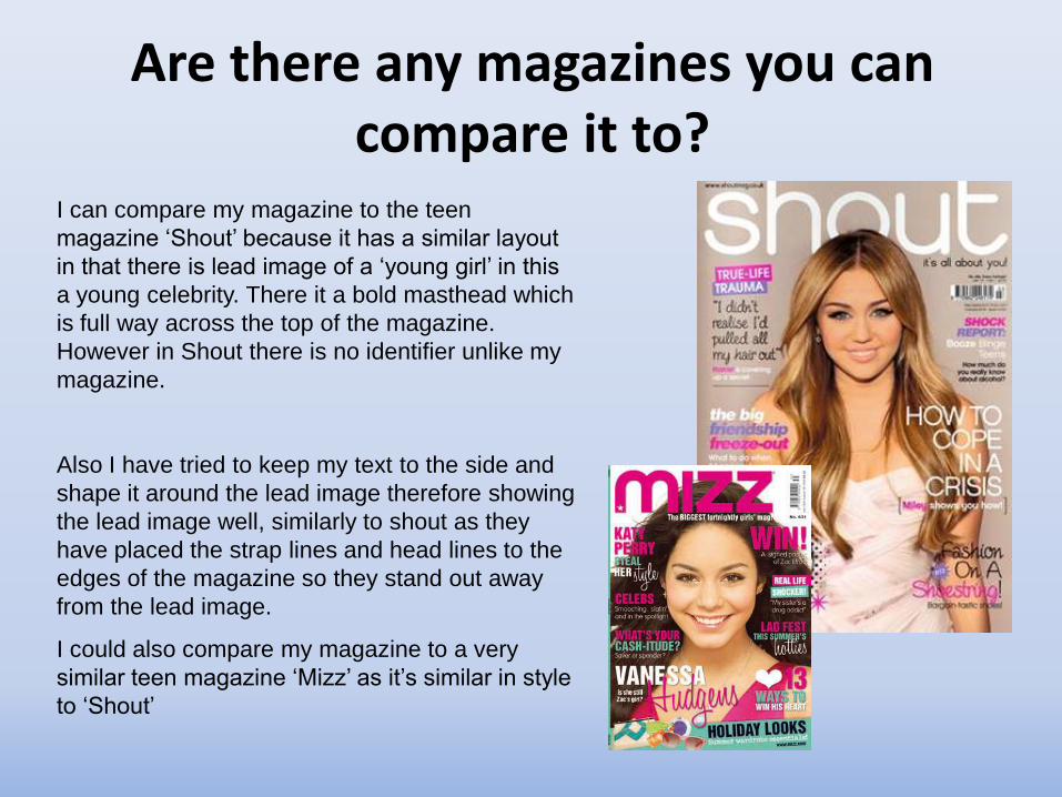
I can compare my magazine to the teen
magazine ‘Shout’ because it has a similar layout
in that there is lead image of a ‘young girl’ in this
a young celebrity. There it a bold masthead which
is full way across the top of the magazine.
However in Shout there is no identifier unlike my
magazine.
Also I have tried to keep my text to the side and
shape it around the lead image therefore showing
the lead image well, similarly to shout as they
have placed the strap lines and head lines to the
edges of the magazine so they stand out away
from the lead image.
I could also compare my magazine to a very
similar teen magazine ‘Mizz’ as it’s similar in style
to ‘Shout’

Contents Page Evaluation

What Works?I think overall my contents page works
because it follows a house style from the front
cover therefore you are able to relate it easily
back to the magazine. Also it follows the same
colours of the front cover of the magazine
making it suit this issue separately to any
more that would be produced it was a real
magazine.
I think it works because it includes all the
basics of a contents page as it includes: A title
identifying it as the contents page of which the
style would be copied to other pages creating
a house style. Good article names with text to
explain them. An image of the front cover so
the article names can be easily related to it
and the reader can tell it’s part of the same
magazine. Also it has a page number, issue
and title of the magazine at the bottom of the
page to create a house style and make it look
more professional.
TitleFront
Cover
image
Article namesPage Number, Issue
and Title of Magazine

…continuedI think the background image works in this
because it suits the magazine type as it is
of jewellery on a stand therefore has a
fashion aspect. Also I made the image
translucent therefore you can see text on it
much easier but still get some interest
from the background.
I also think the fact that I used a
handwritten font for the article names but
a sans serif front for the information
underneath works because it is easier to
read as the articles are small sections of
text.
I think as I followed the same colour
scheme on the contents page to the front
cover it helps to fit the magazine together
and make it look more professional.
However this may not apply to future
magazine if this was a real production.
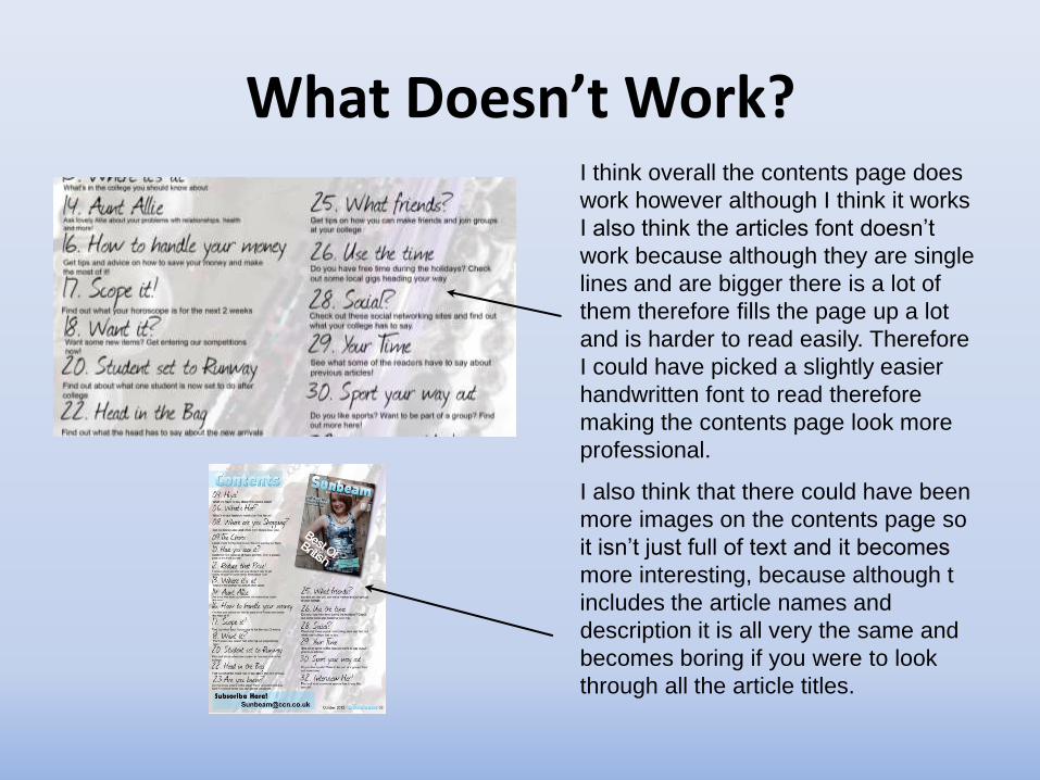
What Doesn’t Work?I think overall the contents page does
work however although I think it works
I also think the articles font doesn’t
work because although they are single
lines and are bigger there is a lot of
them therefore fills the page up a lot
and is harder to read easily. Therefore
I could have picked a slightly easier
handwritten font to read therefore
making the contents page look more
professional.
I also think that there could have been
more images on the contents page so
it isn’t just full of text and it becomes
more interesting, because although t
includes the article names and
description it is all very the same and
becomes boring if you were to look
through all the article titles.
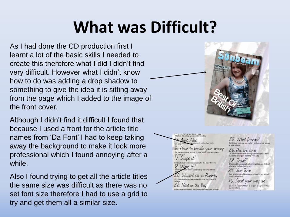
What was Difficult?As I had done the CD production first I
learnt a lot of the basic skills I needed to
create this therefore what I did I didn’t find
very difficult. However what I didn’t know
how to do was adding a drop shadow to
something to give the idea it is sitting away
from the page which I added to the image of
the front cover.
Although I didn’t find it difficult I found that
because I used a front for the article title
names from ‘Da Font’ I had to keep taking
away the background to make it look more
professional which I found annoying after a
while.
Also I found trying to get all the article titles
the same size was difficult as there was no
set font size therefore I had to use a grid to
try and get them all a similar size.

What was easy?
As I used most of the skills that I used
for the CD production I found most of the
contents page production easy as I used
the skills I had learnt before.
For example I used ‘Colour Range’ to
get the words off ‘Da font’ and take away
the white background caused by the
print screen off the website.
Also changing the opacity was easy
because I had already used this in
creating the translucent boxes for the
front cover so the text is easier to read
and stands out more.

What have you learnt?
Again as I produced the CD before I
used most of the skills I needed for
this production from that. However I
did learn how to add a drop shadow
to an image making it look like it’s on
top of the page or floating slightly
away from it.

If you had all the time and money in the world what would you change?
Overall I am happy with the contents page
however if I had all the time and money in
the world I would change the font of the
article names as I think they are hard to read
when there is a lot of them all on the same
page
Also I would add some more images to the
contents page as I think it would make the
readers more interesting and it wouldn’t look
as dull and boring as there would be more
colour to fill the page drawing the reader in
Finally I would think about changing it to a
double page spread because I think there
would be more room so that the article
names aren’t as packed in, but I could also
include snippets of the rest of the magazine
and add more images and detail.
Are there any magazines you can compare it to?
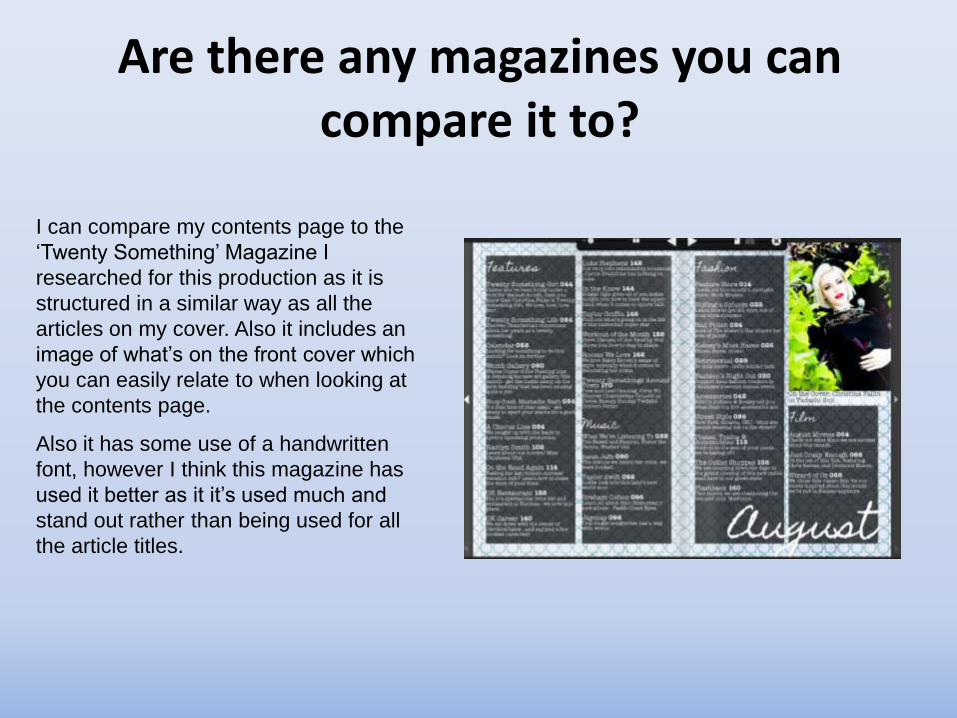
I can compare my contents page to the
‘Twenty Something’ Magazine I
researched for this production as it is
structured in a similar way as all the
articles on my cover. Also it includes an
image of what’s on the front cover which
you can easily relate to when looking at
the contents page.
Also it has some use of a handwritten
font, however I think this magazine has
used it better as it it’s used much and
stand out rather than being used for all
the article titles.