Evaluation
5
EVALUATION AS Media Music Magazine
-
Upload
asmediad14 -
Category
Data & Analytics
-
view
74 -
download
0
Transcript of Evaluation

EVALUATIONAS Media Music Magazine

Front Cover Screen Print
Skills Learnt:I learnt how to use the pen tool in Adobe Photoshop in order to remove the background from my main image. I feel that the background that was originally in the image did not reflect my chosen genre well enough, and so I removed it in order to portray my genre more effectively.
I also used different layer styles, such as the outer glow effect in order to make my main image a lot more attractive. I used an orange outer glow in order to remain consistent with my colour scheme and give an effective effect. Without the glow, the image blended in with the background and didn’t fulfil an attractive main image. I wanted to follow magazine cover conventions and make the image stand out, so I added the glow in order to do this.
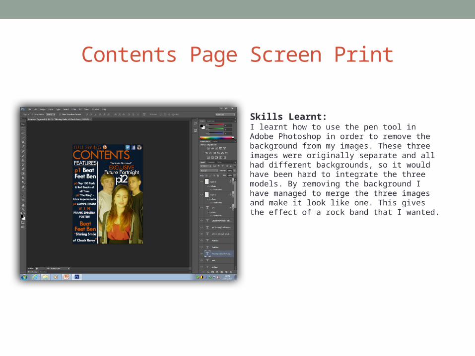
Contents Page Screen Print
Skills Learnt:I learnt how to use the pen tool in Adobe Photoshop in order to remove the background from my images. These three images were originally separate and all had different backgrounds, so it would have been hard to integrate the three models. By removing the background I have managed to merge the three images and make it look like one. This gives the effect of a rock band that I wanted.

Article Screen Print
Skills Learnt:Adobe InDesign was a completely new piece of software to me, so I had to do my own research on how to use the different tools. One thing I managed to learn specifically was the drop cap feature. I wanted to use this to give a classic feel to my article and I managed to learn how to implement this feature into my text.
I also learnt how to place an image onto my workspace and spread it across my two double pages. I wanted to do this as it merges the two pages and makes the article come together as one piece of writing, rather than it appearing as two separate topics. This also works well, as the image is of my article subject, making it even more relevant to my genre.

What Did People Think of My Magazine?I produced some questions, asking my target audience what they thought of my magazine. I began with; “Can you clearly identify the genre of my magazine and if so, how?”All of my responses could identify it was the rock and roll genre, due to the mise-en-scene of my model for the main image. They said the way he was dressed was very stereotypical of a rock and roll artist, with the shirt, bracers and bow tie. My models hair was styled in a slick quiff which also gave it away. My masthead was also genre specific, said my audience, as ‘Full Swing’ is clearly associated with the ‘swing music’ style associated with this genre.
My next question was “If you saw this magazine in a store, would you be willing to pay the £2.99 price?”My audience’s response was varied, some said they would be more than willing due to the professional look of the magazine and the cover page was designed well enough to attract them to it. They also said the cover lines were interesting and they would love to find out more about what is inside the magazine. Others said the magazine was obviously designed by a student, due to the model looking quite young and they said that they wouldn’t pay more than £1.50. If the model looked older and pulled off a mature look, then they said they would definitely pay the asking price as the magazine would be more reliable.
“Does the contents page give you enough information as to where to find the magazine features?”The answers to this were very straightforward. They said the contents page did an excellent job in providing the required information and did so whilst also looking like it belonged in a rock and roll magazine. The inclusion of ‘Future Fortnight’ added diversity and made the page more interesting to look at. The audience found it very easy to use the contents page and said the page numbers were very easy to identify.