Evaluation
8
Evaluation By Chloe Whittle
-
Upload
simpleplanfan -
Category
News & Politics
-
view
47 -
download
0
Transcript of Evaluation
Evaluation
By Chloe Whittle
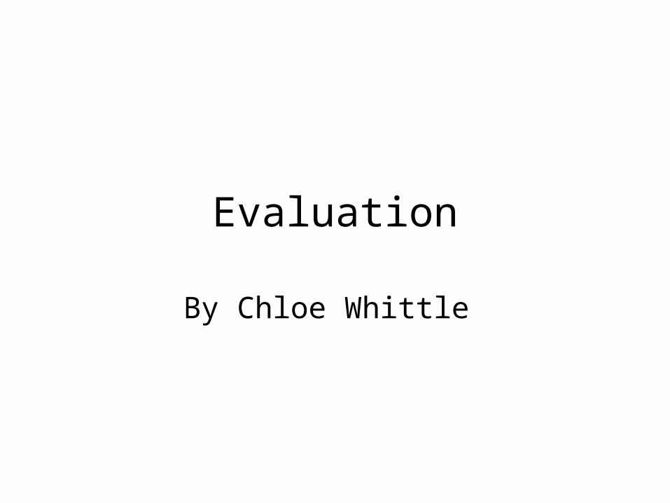
In what ways does your media product use, develop or
challenge forms and conventions of real media products? From looking at real media products such as existing music magazines has
helped me decide how to set out my magazine and what kind of genre to set it on. I developed my magazine idea from the rock magazine ‘Kerrang’ and choose to use the rock genre.
Gutenberg Design
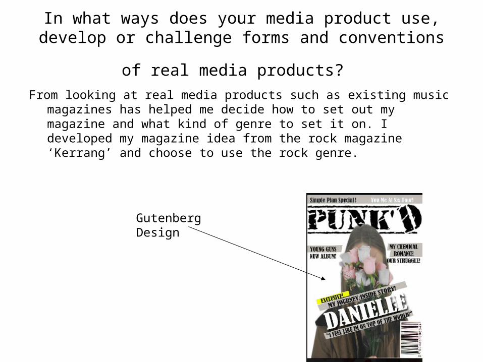
How does your media product represent particular
social groups? • By looking at my market research it allowed me see what kind of social
group my magazine would appeal to and what I would I have to include. For instance I have chosen to base my magazine on the genre of ‘rock’ therefore I used a certain font in my magazine which would be associated with rock and this was called ‘retro font’. From looking at my questionnaire I realised most of the people I asked where mostly students who wouldn’t pay to much for a magazine which made me think about the price I would sell my magazine for and how i would attract them to my magazine.
Dark colours reflects the music
Rock genre bands used as coverlines
What kind of media institution might distribute your
media product and why? • By looking at Bauer Media I think my magazine would fit perfectly into their
range of magazines because it features new and up coming artist and is similar to Kerrang magazine which they distribute. I also think IPC could distribute my music magazine because it also distributes similar magazine styles such as NME.
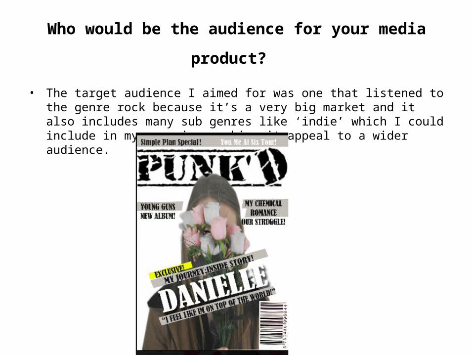
Who would be the audience for your media product?
• The target audience I aimed for was one that listened to the genre rock because it’s a very big market and it also includes many sub genres like ‘indie’ which I could include in my magazine, making it appeal to a wider audience.
How did you attract/address your audience?
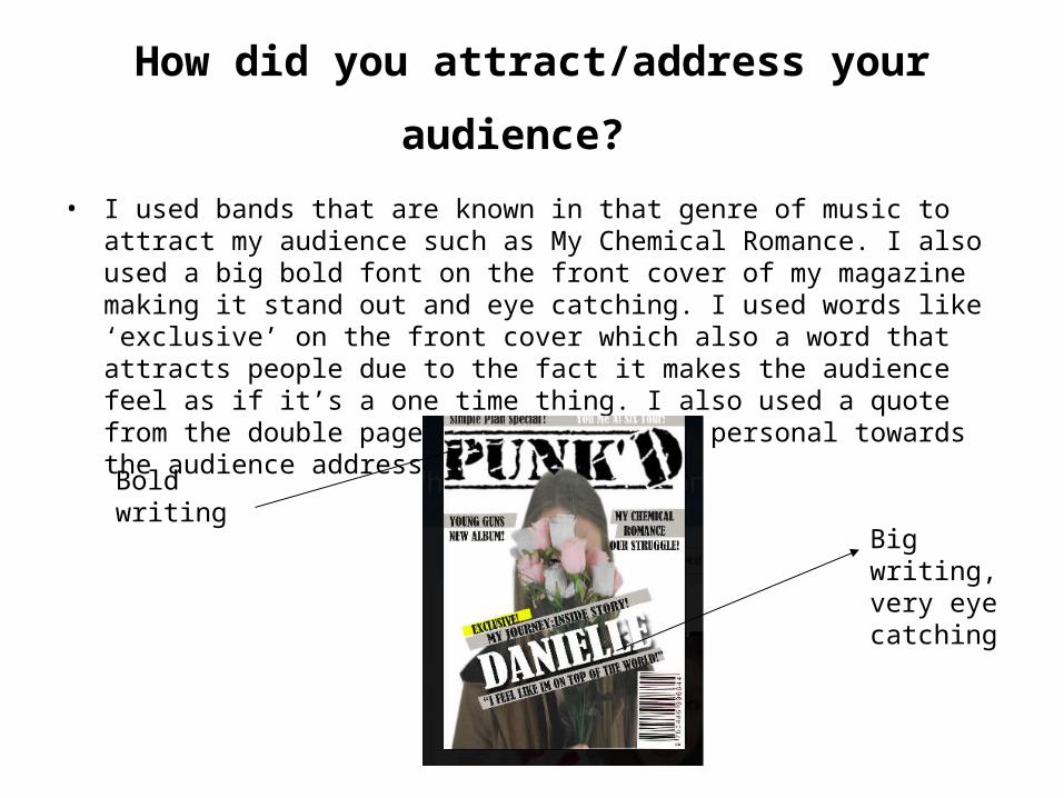
• I used bands that are known in that genre of music to attract my audience such as My Chemical Romance. I also used a big bold font on the front cover of my magazine making it stand out and eye catching. I used words like ‘exclusive’ on the front cover which also a word that attracts people due to the fact it makes the audience feel as if it’s a one time thing. I also used a quote from the double page spread making it personal towards the audience addressing them.
Bold writing
Big writing, very eye catching
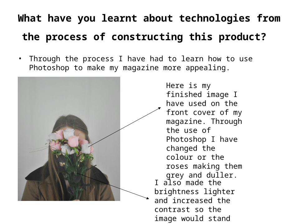
What have you learnt about technologies from the
process of constructing this product? • Through the process I have had to learn how to use Photoshop to make my
magazine more appealing.
Here is my finished image I have used on the front cover of my magazine. Through the use of Photoshop I have changed the colour or the roses making them grey and duller.
I also made the brightness lighter and increased the contrast so the image would stand out better.
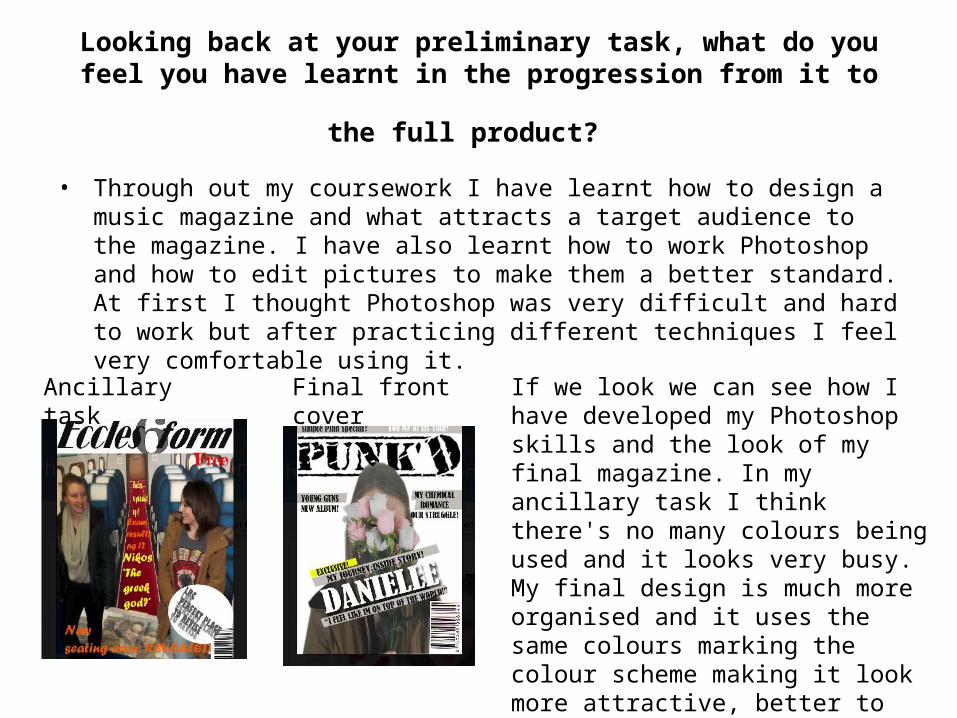
Looking back at your preliminary task, what do you feel you have
learnt in the progression from it to the full product? • Through out my coursework I have learnt how to design a music magazine
and what attracts a target audience to the magazine. I have also learnt how to work Photoshop and how to edit pictures to make them a better standard. At first I thought Photoshop was very difficult and hard to work but after practicing different techniques I feel very comfortable using it.
Ancillary task Final front cover If we look we can see how I have developed my Photoshop skills and the look of my final magazine. In my ancillary task I think there's no many colours being used and it looks very busy. My final design is much more organised and it uses the same colours marking the colour scheme making it look more attractive, better to read.