Evaluation Q2: Combination of Production and Ancillary Texts

Rhianna Morse
Evaluation 2 How effective is the combination of your main and ancillary
texts?

There are var ious ways in wh ich our products a re l i nked, but the ma in way in wh ich we have connected our products i s by us ing love and luck. Luck i s represented by the c lover and by how they are p lay ing bowl ing and ge t a ‘ l ucky s t r i ke ’ . Love i s represented by the red hear t in the c lover and the fac t that they are on a date .
HOW HAVE YOU CONNECTED ALL 3 OF YOUR PRODUCTS?
Mag
azin
e A
dver
t
Dig
ipak

On our digipak and magazine we used the same font and
colour for each specific word, for example ‘Lucky
Strike’ and ‘Maroon 5’.
In our music video, digipak and magazine advert we have made sure to have the artist displayed so that the
audience can recognise him in the music video and on the print products.
The digipak, magazine advert and music video are connected by the element of darkness. In the music video we find out
that the artist had dreamt the entire date and had not managed to get the girl of his dreams , presenting a sad story
to the audience. Furthermore on the digipak and poster the back ground is black and dark saturated colours are used to further amplify the dark side of love and that when it comes
to love you can only create your own luck .
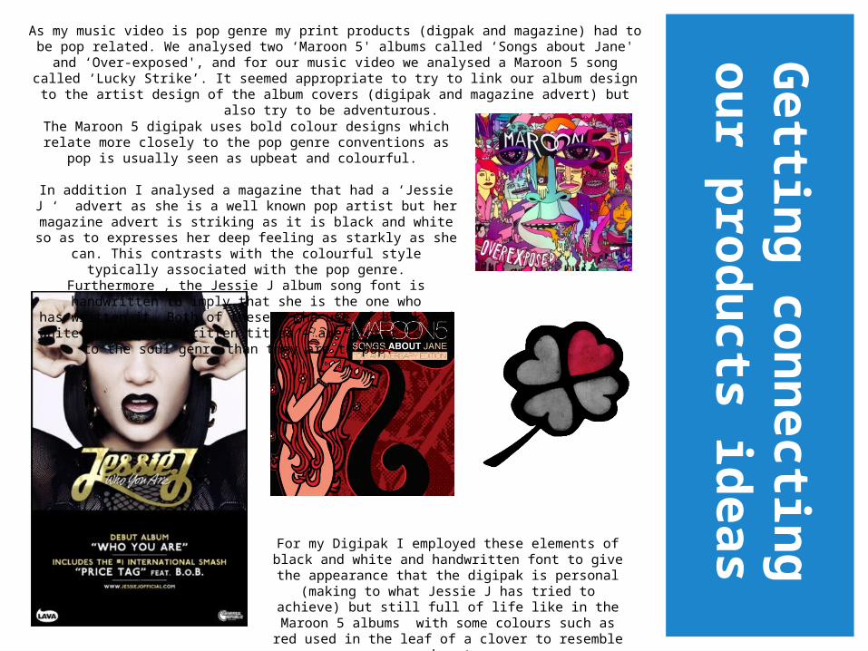
As my music video is pop genre my print products (digpak and magazine) had to be pop related. We analysed two ‘Maroon 5' albums called ‘Songs about Jane' and ‘Over-
exposed', and for our music video we analysed a Maroon 5 song called ‘Lucky Strike’. It seemed appropriate to try to link our album design to the artist design of the album covers
(digipak and magazine advert) but also try to be adventurous.
For my Digipak I employed these elements of black and white and handwritten font to give
the appearance that the digipak is personal (making to what Jessie J has tried to achieve) but still full of life like in the Maroon 5 albums with some colours such
as red used in the leaf of a clover to resemble a heart.
The Maroon 5 digipak uses bold colour designs which relate more closely to the pop genre conventions as pop is usually
seen as upbeat and colourful.
In addition I analysed a magazine that had a ‘Jessie J ‘ advert as she is a well known pop artist but her magazine advert is striking as it is black and white so as to expresses her deep
feeling as starkly as she can. This contrasts with the colourful style typically associated with the pop genre. Furthermore , the Jessie J album song font is handwritten to imply that she is the
one who has written it. Both of these – the use of black and white and the handwritten titles – are closer to the to the soul
genre than they are to pop.
Getting connecting our
products ideas
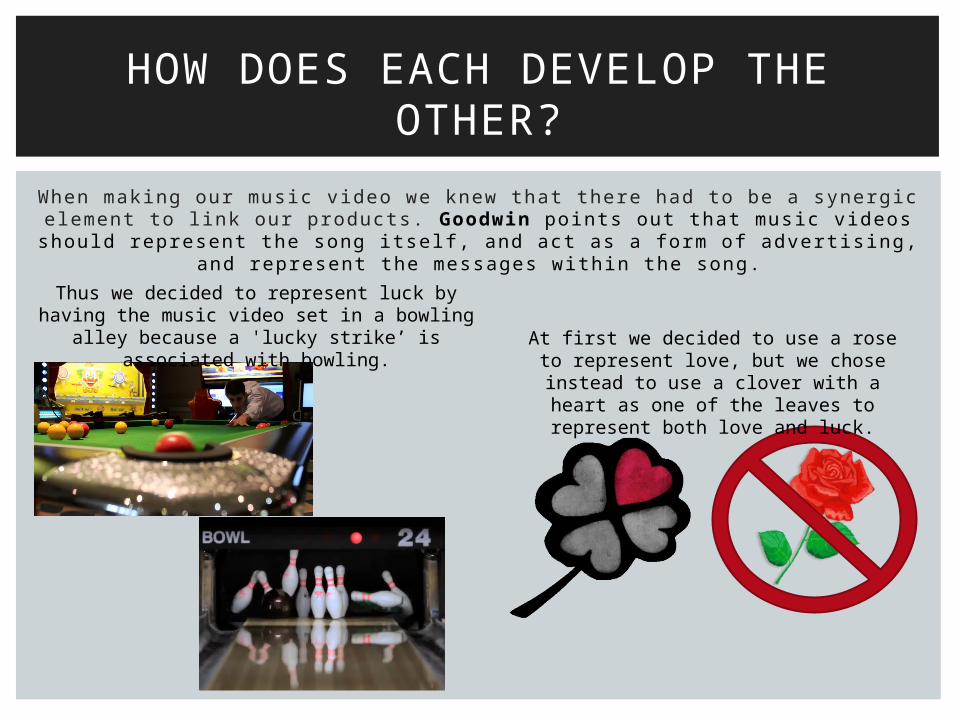
When making our music video we knew that there had to be a synergic element to l ink our products. Goodwin points out that music videos should
represent the song itsel f, and act as a form of advert is ing, and represent the messages within the song.
HOW DOES EACH DEVELOP THE OTHER?
Thus we decided to represent luck by having the music video set in a bowling alley because
a 'lucky strike’ is associated with bowling. At first we decided to use a rose to represent love, but we chose instead to use a clover with a heart as one of the leaves to represent both love and luck.

When thinking of the names for our songs we decided to use names that represented love and luck, e.g.
“Lucky Strike” and “Kiss”. We also wanted to highlight that love can have a dark side and can be dangerous,
we did this by using a dark background with colour saturation in order to decrease the brightness of the colours. This contrasted with the notions of love and luck represented by the song names. However, we
also wanted to show that love can have a ‘light side’ and can be pure, we did this by using a bright white
font for the words “Lucky Strike”.
In the music video we couldn’t use text to represent the dark side of love and that it can be dangerous and so we used other methods. The main way we did this was to have the protagonist dream the date, meaning
that he hadn’t met the love of his life.

Because the songs in the album are written by the artist/protagonist we wanted him to be on the front cover of the digipak and the magazine in order to highlight that the songs in the album are personal and come from his
own personal experience from a date that he imagined/dreamt.
We also put the artist in a narrative setting and a green screen in order to expand on how the songs of the album
are written him.
We also added upon this by
making the font look handwritten.

Anc i l l a ry tex ts enhances the products as i t g ives more in fo rmat ion about the ar t i s t /band, wh i le the main tex t is b lun t and s t ra igh t to the po in t as to what the produc t is .
WHAT DO YOUR ANCILLARY TEXTS ADD TO YOUR MAIN TEXT?
Website address is shown and this allows fans to access more
information about Maroon 5 and the album.
'Parental Advisory' logo is required because of the sexual nature of the
lyrics which are not suitable for children. Company logo, 'RSM'
originates from the initial of our forenames and we made this visible on our front cover. The record logo
(RSM records) can be used to recognise other albums from the
same company
The iTunes icon is to show that you can buy the product online as well as in store. This helps the audience to have an alternative way for them to buy the album instead of going
to the shops.

The Facebook and twitter icon show that the artist is
also on these social networking sites. This
allows the audience to be more interactive with the
artist and it also helps promote the artist.
QRCode– the audience can scan the QRCode in order to
get more information and treats. The same goes for the
back cover of the digipak. When inserting the CD into
the computer there is bonus material. This helps attract the audience because they are not just getting songs
they are getting extra treats, making the audience more likely to buy the album than
download it online.
Lyrics – on the booklet help the audience sing with the songs as well as analyse them so that they can fully understand
the artists intentions

Each of the products has a picture of the art ist on i t so as to show that the album is about him and how he feels.
DO YOUR 3 PRODUCTS HAVE A SHARED IDENTITY?
The digipak, magazine advert and music video have a shared identity; primarily the darkness of the design. In the music video
we discover that the artist was dreaming all along making it quiet sad that he has not
managed to get the girl of his dreams. Furthermore on the digipak and poster the
back ground is black and the dark saturated colours further amplify the darkness of love.

We came up with the idea of the clover when making our digipak and thus we were unable to include it in the music video. Instead we used another denotation of ‘Lucky Str ike’ as a bowl ing bal l hitt ing pins and in snooker.
Another way we could have developed the products so as to increase their synergy would be by incorporating the clover in the music video; perhaps
by the art ist/singer Michael giving the girl a pin that was a clover as a gi ft to further indicate that she is his lucky str ike and increase the appearance
of affection between the two. Audience feedback of the music video said that the art ist and girl in a relationship didn't seem real ist ic enough. So
when the audience see the music video then the digipak and magazine or vice versa they would immediately l ink them together. However one
problem with this is how we would make a pin with our clover on it as we are just A2 students who don't have the resources to produce a pin that
looked l ike our clover. However, i t can be argued that any clover would do just to symbol ise lucky and we could have coloured i t in to look l ike our
clover.
HOW COULD YOU HAVE DEVELOPED YOUR PRODUCTS TO INCREASE THEIR SYNERGY?
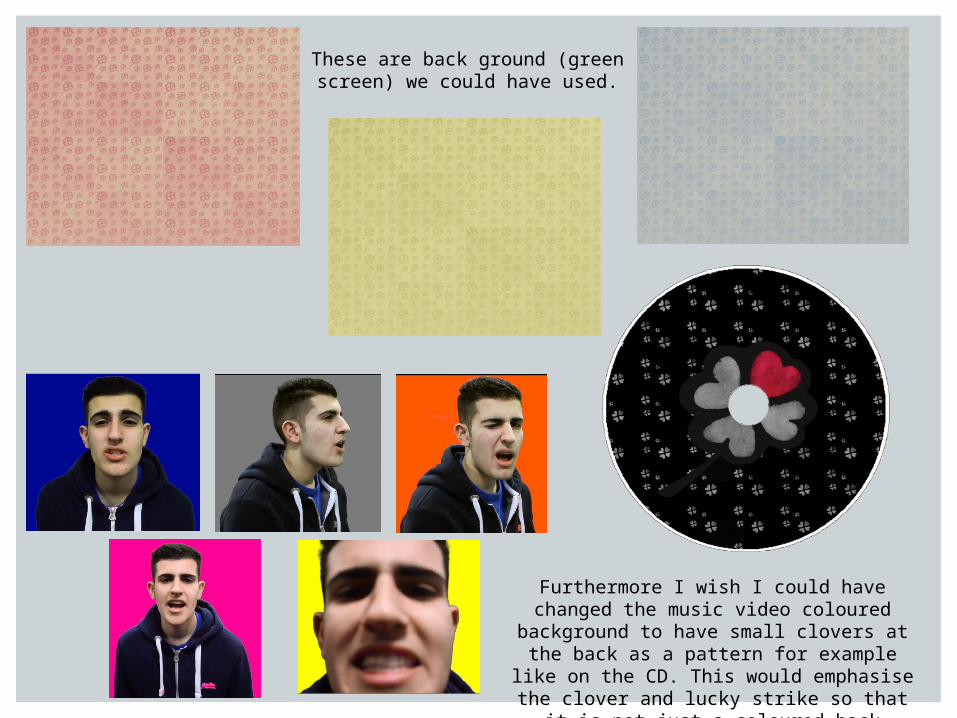
Furthermore I wish I could have changed the music video coloured background to have small clovers at the back as a pattern for
example like on the CD. This would emphasise the clover and lucky strike so that it is not just a coloured back ground.
These are back ground (green screen) we could have used.

Persona l l y I f ee l t ha t the ou tcome o f ou r p r in t p roduc ts we re be t te r t han the mus ic v ideo pure ly because they looked more p ro fess iona l and be l ievab le as a d ig ipak and magaz ine adver t and had more t ime to fu l l y unde rs tand and deve lop the idea o f ‘ lucky S t r ike ’ such as coming up w i th the c lover. As A2 s tuden ts we d id no t have the techn ica l equ ipment and sk i l l s ava i lab le to p ro fess iona l d i rec to rs , such as the cameras , se t t i ng , l igh ts and ed i t ing p rog rammes; we on ly have the sk i l l s f rom our las t years th r i l le r open ings and p re l im inary tasks .
However I am p roud o f my f ina l p roduc ts because they d id seem be l ievab le and p ro fess iona l to a A2 s tuden t s tandard wh ich was p leas ing . A t f i r s t I was wo rr ied abou t how we wou ld ach ieve our i deas bu t by p rac t i ce and deve lop ing ou r sk i l l s th rough camera sho ts and ang les ed i t ing e tc thus we were ab le to improve .
Wi th our mus ic v ideo the re cou ld have inc luded more l inks to the c lover i dea , A lso , on the d ig ipak and magaz ine we cou ld have had a bowl ing p in o r bowl to fu r the r amp ly the synergy and the ‘Lucky S t r ike ' f o rm the mus ic v ideo .
By research and p lann ing he lped me to fu l l y assess wh ich idea was bes t fo r ou r p roduc ts and how we wan ted them to look and fo r the aud ience to unders tand the in i t i a l idea o f wha t we were t ry ing to ach ieve . For examp le look ing a t the ‘ Jess ie J ’ magaz ine adver t and ‘Maroon 5 ’ a lbums (as d iscussed be fo re )
In add i t ion I th ink I shou ld have done more sho ts o f t he a r t i s t and g i r l to emphases the love ins tead o f hav ing the a r t i s t M ichae l danc ing and s ing ing in f ron t o f a g reen sc reen .
HOW DO YOU FEEL ABOUT THE FINAL PRODUCTS?

Fr o m ou r au d ience f ee dbac k ou r t a r ge t aud ien ce ( t eena ge g i r l s ) sa id t ha t t hey l i ke t he d es ign o f t he p r i n t p r oduc t s a s i t d oes g i ve t he i dea o f l ov e and l u ck a s we l l as t he d a r ke r s i de o f l ove . Th i s he l ped t hem t o r ea l i se
t ha t l ove i s n o t a lw ays ‘ happy an d sa f e ’ bu t he a r t b r e ak ing and ha r d .
The t a r g e t a ud ienc e a l so t h ough t t ha t t h e f on t an d co lo u r u se i n t he d ig ipa k an d m a gaz ine adv e r t wo r k ed we l l as i t l ook ed p r o f e ss ion a l and
be l i ev ab le as a r ea l m aga z ine and d ig ipak .
They a l so sa id t ha t t he des ign s l o ok ed p r o f e ss ion a l and l i ke r ea l d ig ipak , pos t e r a nd m us ic v ideo . T hey a l so seem ed s u r p r is ed b y t h e qua l i t y g i ven
t ha t we a r e o n l y A2 s t ud en t s .
The t a r ge t au d ienc e a l so l i ke t he c am e r a s ho t s t ha t we u sed f o r e xam p le t he snoo ke r sho t , as i t m ade t hem f ee l t ha t t he ba l l w as c om ing a t t hem
as t hey w e r e t he ‘ l u cky S t r i ke ’ .
The y a l so l i ke t he f ac t ha t t he a r t i s t was w ink in g , k i s s t h e cam er a and danc i ng a s i t s eem ed l i ke he was do ing t ha t t o t hem t hus t he y f e l t
ca p t u r e d by h im .
The y a l so und e r s t ood t h e co ncep t t ha t t he boy and g i r l a r e o n a d a t e and she i s h i s l ucky s t r i ke .
WHAT HAVE YOUR TARGET AUDIENCE SAID ABOUT HOW EFFECTIVE YOUR PRODUCTS ARE?