eval q1
16
product use, develop or challenge forms and conventions of real media products?
-
Upload
laurensmotors -
Category
Internet
-
view
135 -
download
1
Transcript of eval q1

In what ways does your media product use, develop or challenge forms and conventions of real media products?

My products… I have created a promotional package that included a music video, a digipak and a magazine advert. In some ways I have conformed to conventions as if I hadn’t it would cease to be that product and people would not recognise my product as that product and may not want to buy it, however I have challenged some conventions to make my product unique and more saleable as it is different and hopefully intriguing

Conventions of a digipak!
A digipak is a used to add more information and a DVD to the original album, the DVD usually included in a digipak features promotional music video's for certain songs on the album. A digipak conventionally has a front and back cover, just like every other album, a holder for a DVD and a CD as well as more art work on the inside covers that relate to the songs or artist.

My digipak follows conventions as i have extra album artwork included, that features the artist so my audience knows who the artist is as my front cover does not feature them and the images relate to the songs included in the album.
My digipak includes a CD and DVD with a promotional music video for one of the songs.
The digipak also has a front and back cover, conventional to all albums.
My digipack follows the correct printing lines and all my artwork is the same size to be able to produce a hard copy of the product.
My images are upside down as that is the way the digipak fold therefore is conventional when turning this into a hard copy of the product.
I have generally stuck to conventions when creating my digipak however I have only included one picture of my artist looking at a girl as I feel my album is more about memories fading and feeling lost and alone forever after something bad has happened and by featuring the artist a lot in my digipak would take away that emphasis.

Conventions of a front cover! An Album front cover conventionally has a main image, the name of the artist and the album name, usually featured at the top of middle of the cover. The wording on the album is usually bold to make it stand out to the audience and the artist name or band is usually the band logo.

My front cover follows theses conventions as it has a main image, the name of the artist/band and the name of the album itself.
I have created a logo for my and used this on the front cover, I also used a bold font for the name of the album and placed this underneath the band logo. I have also placed the artist and album name at the top of the cover because this is also conventional of a front cover.
I decided that my front cover would be more effective with an image over the top of the image to reflect the meanings of the songs in this album and allow the audience to gain a feel for the album of being lost, just wanting to run away from life after something tragic.
I decided to add the image of a lifeline to separate the name of the artist and the name of the album, which is rather unconventional but I feel it fits in well with the name of the band and give you the impression of life or death which shows continuity in my product as it relates to the songs in the album as well as my video and album artwork, especially the picture of the heart locket and the angel wing as together they both symbol life and death.

Inspiration!The album covers from The callings albums gave me inspiration for my product, the artists name with the album name underneath. The album artwork is the inside of a car looking out the windscreen and because I used a car in my video I decided that a car should feature in my cover, especially because old American cars are very conventional of the alternative American rock genre. I feel that my product conforms to both the formal conventions of a conventions of a front cover and to conventions of genre.

Conventions of a back cover! The conventions of a back cover are, most importantly a chronological track list, a barcode, the name or logo of the record company, the copyright and year, who owns the copyright and who the album is distributed by as well as more album artwork as the main image.

My back cover follows conventions as I have a main image covering the background, my main image is rather unconventional because does not traditionally fit with the rest of my images of the life, death and love theme. However I decided to have a record player as it links on with the American rock underlying theme of my products, with the 1959 back Chevrolet.
I put my track list in chronological order on the back cover as track lists are conventionally on a back cover of an album.
At the bottom of the cover I placed the copyright of my CD and the copyright date, this is conventional on a back cover, in small print so people can see it but it is not the focus of my audiences attention, my track list is. I also placed the
recording companies logo and the barcode (which tells the audience the dates the album was released and the price of the album. at the bottom of the cover as again, this is conventional of a back cover. I have found that it is conventional to have the main image focused on the back cover but going against conventions I decided to make my track list the focus of the audiences attention as that is what is on my CD. Also the fact that the image is an underlying theme for my audience to notice, therefore did not want to make the image centre of attention on the back cover.
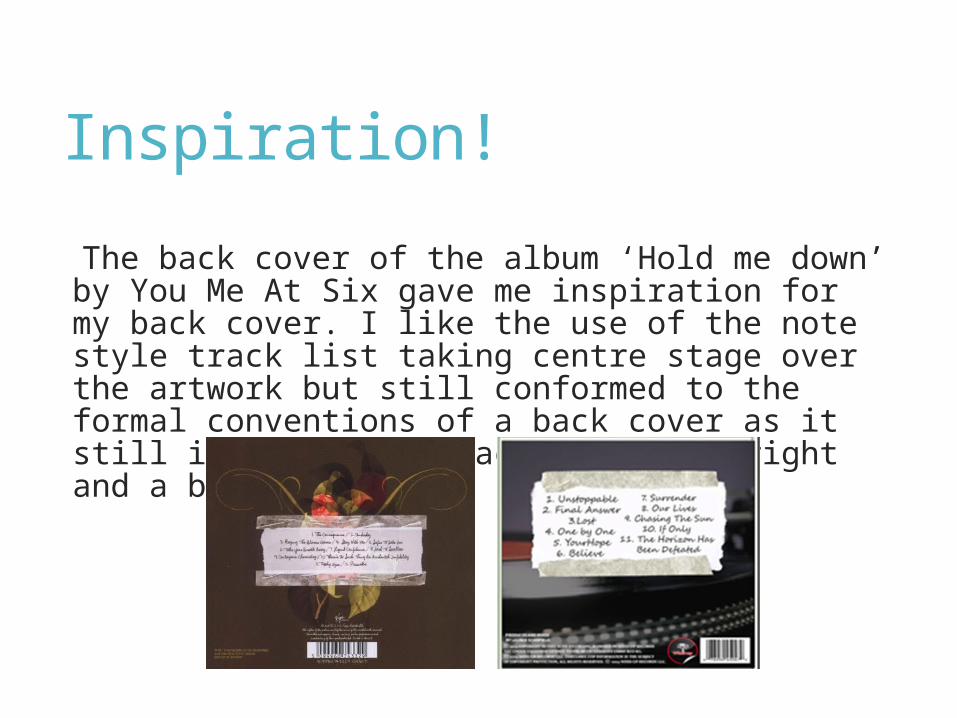
Inspiration!
The back cover of the album ‘Hold me down’ by You Me At Six gave me inspiration for my back cover. I like the use of the note style track list taking centre stage over the artwork but still conformed to the formal conventions of a back cover as it still included the track list, copyright and a barcode.

Conventions of a spine! A spine of an album conventionally has the name of the artist, the name of the album and possibly a production number and the record label.
Conventionally album artwork features the artist and images that relates to the songs on the album.

I have a simple design, just a plain white background and black writing. This reflects the nature of my product whit the life and death theme. I have followed conventions of a spine and put the name of the artist and the name of the album.I decided to put a production number on the spine as it is conventional and fits with the black and white them, where the record company logo is red and silver and would not go as well so instead, the logo is featured on the back cover and the production number is on the spine.
My album artwork is conventional as it features both the artist and images that relate to the meanings behind the songs, especially the song that I created a music video too.
The picture of the heart locket and the angel wing together symbol life and death, a theme that is sunning throughout my products therefore is conventional because it is an image that relates.
I also have an underlying old American rock theme that the artwork relates too as I have a 1959 Chevrolet featured in my video and on my front cover, the artwork relates as I have a country road similar to that in my video that the car would be driven down, this is conventional again because it relates to my theme of the album.
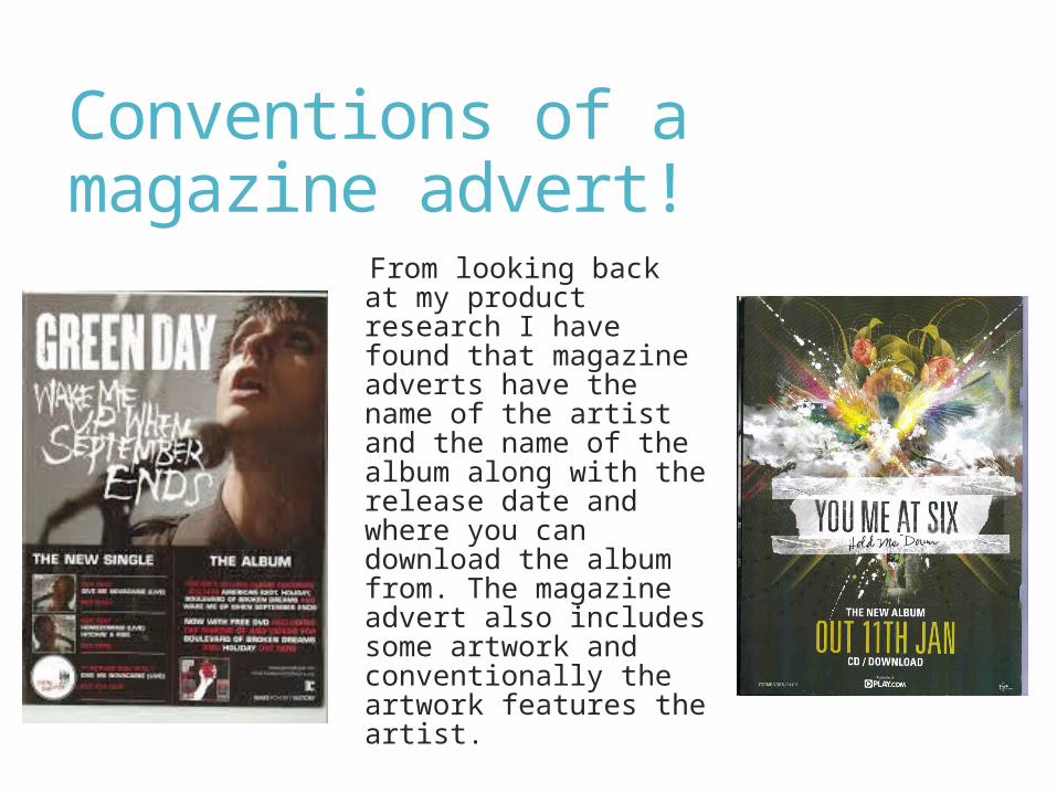
Conventions of a magazine advert!
From looking back at my product research I have found that magazine adverts have the name of the artist and the name of the album along with the release date and where you can download the album from. The magazine advert also includes some artwork and conventionally the artwork features the artist.

I decided to stick to conventions and add the name of my band/artist and the name of the album on my advert. I placed this at the top of my advert so it is easy for my audience to see. I included the lifeline again because I feel it fits with the theme of my work and separates the artist name and the album name very well.I have included the release date for my album on the advert, this is conventional of a magazine advert and tells my audience when they can buy the album. I have also included underneath the release date that the album is available in hard copy and as a download. This is becoming more conventional as more people are starting to download albums rather than buy the hard copy (especially young people). My target audiences is younger people so feel that putting a download option was necessary.
I placed the record company label on my magazine advert as I have found from research this is rather conventional as most magazine adverts have them.
I have gone against the traditional conventions of having the artist featured on the magazine. I have done this because I feel it give my album more of a mysterious feel, hopefully making people want to buy my album. I have used one of the images that features on my album cover therefore showing the continuity of the products.
I have decided not to adhere to conventions by not placing ratings from trusted publications on my advert because I feel this goes against conventions of genre as it is more of a pop album convention rather than an alternative rock genre convention.

Inspiration! I took inspiration again from a You Me At Six product, I looked at their magazine advert for the album ‘Hold me down’ and really like the look of it and because I took inspiration from their album, I thought that by taking inspiration from the advert my products would dhow continuity and work better as a promotional package. I decided to have an image from the front cover of my album as my image on the advert like the you me at six one as well as where I placed the release date and where my product is available from.

Conclusion! Digipak: Overall I have somewhat challenged conventions in my digipak but tried not to push the boundary too much as I feel there is very little room to experiment, especially with some parts of the digipak such as the spine because of how small it is. I did challenge conventions such as not featuring my artist much in the digipak but feel that was necessary to fit with the theme of my work. Also by challenging conventions too much may make my product look armature where I want my product to look as professional as possible.
Magazine advert: I feel that my product does follow the basic conventions of a magazine advert for the release of an album. My advert does go against some general conventions such as not featuring the artist but it does feature an image from the front cover therefore linking it to my digipak. Again I did not want to go against conventions too much as I want my product to look professional but unique so it would catch my audiences eye.