Essays on Human Capital Investment
162
Essays on Human Capital Investment Sarena Faith Goodman Submitted in partial fulfillment of the requirements for the degree of Doctor of Philosophy in the Graduate School of Arts and Sciences COLUMBIA UNIVERSITY 2013
Transcript of Essays on Human Capital Investment

Essays on Human Capital Investment
Sarena Faith Goodman
Submitted in partial fulfillment of the requirements for the degree of
Doctor of Philosophy in the Graduate School of Arts and Sciences
COLUMBIA UNIVERSITY
2013

© 2013
Sarena Faith Goodman
All rights reserved

ABSTRACT
Essays on Human Capital Investment
Sarena Faith Goodman
This dissertation contains a collection of essays on human capital formation and social service
provision in the United States. The chapters evaluate three policies targeted to populations for whom the
development and retention of skills is particularly critical – young adults, children, and the near-homeless.
The first and second chapters focus on uncovering methods that could enhance the performance of the
U.S. educational system: the first chapter examines a policy that better aligns educational expectations
and potential among secondary school students; the second chapter evaluates a policy that incentivizes
teachers to improve achievement among students in high-poverty primary and secondary schools. The
third chapter examines an intervention designed to assist high-need families on the brink of
homelessness. The chapters are also linked methodologically: in each, I exploit the exact timing of policy
events (i.e., testing mandates, the opportunity for teachers to earn bonuses, the availability of
homelessness prevention services) to identify their causal effects.
The first chapter examines whether requiring a high school student to take a college admissions
exam increases the likelihood that she attends a selective college. The analysis is based on quasi-
experimental variation in the adoption of state mandates that require high school juniors to take one of
two college entrance exams available to meet admissions requirements for U.S. selective colleges. I
show that the fraction of new test-takers owing to the mandates who go on to selective colleges far
exceeds the share that could be accommodated by rational test-taking behavior, given the relative cost of
sitting for the exam and benefits to attending a selective college. Instead, there must be a large subgroup
of students who would prefer a selective school but who also underestimate their admissibility, and thus
take college entrance exams at suboptimal rates. Altogether, the results demonstrate that providing
students with even very low-cost information appears to have a large impact on their educational choices,
and that policies aimed at reducing information shortages among secondary school students, particularly
those who are disadvantaged, are likely to be effective at increasing human capital investment.

The second chapter, which is joint work with Lesley Turner and was published in the Journal of
Labor Economics in April 2013, examines whether tying teacher salaries to particular educational outputs
leads to increases in primary and secondary student achievement. We analyze a program that
randomized over New York City high-need public schools the opportunity for teachers to earn bonuses
based on school-wide performance metrics. We demonstrate little effect of the program on student
achievement, teacher effort, and school-wide decisions, which could either imply that teacher incentive
pay is broadly ineffective or that, in this context, the incentive to free-ride obscured the potential returns to
individual effort in the outcomes we consider. The main contribution of this chapter to the debate on
teacher incentive pay is our investigation of whether the group-based nature of the program contributed to
its ineffectiveness. We show that in schools where incentives to free-ride were weakest (i.e. where there
were relatively few teachers with tested students), the program led to small increases in math
achievement. We conclude that teacher incentive pay administered according to school-wide
performance measures is likely not an efficient method to encourage increased academic achievement.
The third chapter, which is a collaborative study with Brendan O’Flaherty and Peter Messeri,
examines a New York City homeless prevention program designed to reduce the number of families
entering its homeless shelters. Under the program, families who think they are in danger of becoming
homeless are eligible to receive a wide variety of assistance, including financial help and counseling, to
keep them out of shelters. Exploiting quasi-experimental variation in the timing, location, and intensity of
the program, we generate estimates, according to two levels of geography, of its effects on spells of
homelessness and shelter entries and exits. Taken together, the estimates reveal that for every hundred
families enrolled in the program, there were between 10 and 20 fewer entries, with no discernible impact
on shelter spells. Additionally, we provide suggestive evidence that foreclosure initiations were associated
with shelter entries.

i
Table of Contents
List of Figures v
List of Tables vii
Acknowledgments x
Dedication xiii
1 Learning from the Test: Raising Selective College Enrollment by Providing
Information
1
1.1 Introduction 2
1.2 ACT Mandates 7
1.3 Test-taker Data 10
1.4 The Effect of the Mandates on the ACT Score Distribution 14
1.4.1 Estimating the Fraction of Compliers 15
1.4.2 Estimating the Fraction of High-Scoring Compliers 16
1.5 The Test-taking Decision 20
1.6 The Effects of the Mandates on College Enrollment 24
1.6.1 Enrollment Data Description 24
1.6.2 Estimating Enrollment Effects 26
1.6.3 Robustness Checks and Falsification Tests 29
1.6.4 Generalizability 33
1.7 Assessing the Test-taking Decision 34
1.8 Discussion 38
2 The Design of Teacher Incentive Pay and Educational Outcomes: Evidence 59

ii
from the New York City Bonus Program
2.1 Introduction 60
2.2 Data and Empirical Framework 62
2.3 Results 63
2.3.1 Group Bonuses and the Free-Rider Problem 63
2.3.2 Teacher Effort 65
2.4 Conclusions 66
3 Does Homelessness Prevention Work? Evidence from New York City’s
HomeBase Program
72
3.1 Introduction 73
3.2 Background 76
3.2.1 HomeBase History 76
3.2.2 Data 78
3.3 Summary Statistics 80
3.3.1 Trends in Shelter Entries 81
3.3.2 Trends in HB Cases 82
3.4 Shelter Entries: Coverage Analysis 82
3.4.1 Methods 82
3.4.1.1 CD Level 82
3.4.1.2 CT Level 85
3.4.2 Results 88
3.4.2.1 CD Level 88
3.4.2.2 CT Level 89

iii
3.5 Shelter Entries: Service Analysis 90
3.5.1 Methods 90
3.5.1.1 CD Level 90
3.5.1.2 CT Level 92
3.5.2 Results 92
3.5.2.1 CD Level 92
3.5.2.2 CT Level 94
3.6 Reconciliation of Coverage and Service Results 94
3.7 Issues and Possible Overstatements 96
3.7.1 “Musical chairs,” Contagion, and Other Effects on Non-Participants 96
3.7.2 Postponement and Other Inter-Temporal Effects 98
3.8 Exits and Spell Length 101
3.8.1 Theory 101
3.8.2 Methods 103
3.8.3 Results 104
3.9 Conclusion 104
3.9.1 HomeBase Worked 104
3.9.2 Was HomeBase Cost Effective? 105
3.9.3 Foreclosure 106
3.9.4 Directions for Future Research on Homelessness Prevention 107
Bibliography 124
Appendix Learning from the Test: Raising Selective College Enrollment by
Providing Information
130

iv
A.1.1 Comparing Test-taker Composition to Characteristics of the At-Risk
Population
131
A.1.2 Describing the Compliers 132
A.1.3 Bounding for LE Compliers 134
A.1.4 Simulating Luck 136

v
List of Figures
1 Learning from the Test: Raising Selective College Enrollment by Providing Information
1.1 Average ACT Participation Rates 41
1.2 ACT Score Distribution 42
1.3a Colorado ACT Score Distribution, 2004 43
1.3b Illinois ACT Score Distribution, 2004 44
1.4 2000 Enrollment Distribution by Selectivity 45
1.5a Overall College Attendance in the United States by State of Residence 46
1.5b Selective College Attendance in the United States by State of Residence 47
1.6 Implied Test-taking Thresholds for Various Estimates of the Return to
College Quality
48
3 Does Homelessness Prevention Work? Evidence from New York City’s HomeBase
Program
3.1 High and Low Shelter Use NYC Community Districts, 2003-2004 110
3.2 Low, Moderate, and High Use NYC Census Tracts, 2003-2004 111
3.3 Monthly Family Entries into the New York City Shelter System, 2003-2008 112
3.4 Estimates of Historical Effect of HomeBase on Shelter Entries Averted per
100 HB Cases
113
3.5 Survival Curves for Shelter Duration 114
Appendix Learning from the Test: Raising Selective College Enrollment by Providing
Information
A.1.1 Average ACT Participation Rates 138
vi
A.1.2 Simulated Pass Rates for Compliers 139

vii
List of Tables
1 Learning from the Test: Raising Selective College Enrollment by Providing Information
1.1 State ACT Mandate Timing 49
1.2 Summary Statistics 50
1.3 Estimated Mandate Effect on Test-taking 51
1.4 Summary Table of Complier Testing Statistics 52
1.5 Complier Characteristics and Scores by Characteristics 53
1.6 Differences in Key Characteristics between 2000 and 2002 54
1.7 Effect of Mandates on Log First-time Freshmen Enrollment, 1994-2008 55
1.8 Effect of Mandates on Log First-time Freshmen Enrollment at Selective
Colleges, Robustness and Specification Checks
56
1.9 Effects of Mandates on Log First-time Freshmen Enrollment in Detailed
Selectivity Categories, 1994-2008
57
1.10 Effects of Mandates on Log First-time Freshmen Enrollment in Various
Subcategories, 1994-2008
58
2 The Design of Teacher Incentive Pay and Educational Outcomes: Evidence from the
New York City Bonus Program
2.1 Free-riding and the Impact of Teacher Incentives on Student Math and
Reading Achievement
69
2.2 School Cohesion and the Impact of Teacher Incentives on Student Math
and Reading Achievement
70
2.3 The Impact of Teacher Incentives on Teacher Absences Due to Personal 71

viii
and Sick Leave
3 Does Homelessness Prevention Work? Evidence from New York City’s HomeBase
Program
3.1 Summary Statistics, January 2003 to November 2008 115
3.2 Annual Trends in Shelter Entries and HB Cases 116
3.3 Effects of HB Coverage on Monthly Shelter Entries, CD Level Results
(OLS Estimates)
117
3.4 Effects of HB Coverage on Monthly Shelter Entries, CT Level Results
(Point Estimates and 95% Confidence Intervals)
118
3.5 Effect of HB Services on Shelter Entries: Instrumental Variable Regressions 119
3.6 Estimates of the Historical Effect of HomeBase on Shelter Entries Averted
per 100 HB Cases
120
3.7 Effect of HB Estimated with Larger Units, Linear Specification 121
3.8 HB Coverage and Service Effects at CD level for 1-, 2-, 3-, and 6-month
Grouping of Observations
122
3.9 Effects of HB Coverage on Exit Rates, Cox Proportional Hazard Model 123
Appendix Learning from the Test: Raising Selective College Enrollment by Providing
Information
A.1.1 Female Share 140
A.1.2 Minority Share 141
A.1.3 Complier Characteristics 142
A.1.4 Scores by Characteristics 143
A.1.5 Gradations of Selectivity According to the Barron’s College Admissions 144

ix
Selector
A.1.6 Differences in Shares of Additional Types of Enrollment between 2000
and 2002
145

x
Acknowledgments
This dissertation would not have been possible without the support I have received from my
committee, fellow students, and the faculty and staff of the Economics Departments at Columbia
University and UC Berkeley. I am deeply grateful to Jesse Rothstein, Elizabeth Ananat, Brendan
O’Flaherty, and Miguel Urquiola for their advice, generosity, and encouragement. Jesse and Liz have
been the yin and yang of my early research career, and words in this space could not do justice to the
debt I feel to them for their endless dedication, patience, and guidance these last few years. The quality
of the first chapter is a testament to their kindness and tireless investment in my scholarship. Dan has
made the impossible possible for me almost every semester of my tenure at Columbia. Miguel’s regular
input since the beginning of graduate school has been instrumental in shaping my research agenda and
style. I am also thankful to Suresh Naidu for his participation on my committee.
I am lucky to have had the luxury of exceptional peers and friends within the Economics
Departments at both Columbia University and UC Berkeley. In particular, my life and research have
benefited greatly from input from Neil Mehrotra, John Mondragon, Charlie Gibbons, Owen Zidar, Anukriti
Sharma, Alice Henriques, Reed Walker, and Ivan Balbuzanov. Petra Persson has made me a stronger
researcher and individual from day one at Columbia. I feel as though I came to graduate school to meet
Todd Kumler. Ana Rocca has made Berkeley a place to come home to. The 2012-2013 academic year
simply would not have been possible without Maya Rossin-Slater by my side. Lesley Turner, who is a
coauthor on the second chapter of this dissertation, has been not only a peer role model for me, but also
always, always my friend first.
I thank several tremendous friends without whom this dissertation would not be possible.
Jacqueline Yen, Jeffrey Clemens, Dan Suzman, Tara Buss, Lauren Seigel, Elizabeth Wise, Elise Belusa,
Bennett Blau, Sarah Prager, Mary Croke, Hillary Allegretti, and Andrea Fellion have done their best to
keep me sane these past six years, and I owe each of them lifetimes of friendship for it. Daniel Gross,
Gabrielle Elul, and Bessa Goodman have been my Berkeley family, whom I love deeply and am thankful
for every day. I am also grateful for my real family, and specifically: Warren and Barbara Goodman, for
their unflinching belief and support; Bonnie Goodman, for her dedication to education and her support as

xi
well; Roni Goodman, for getting it when nobody else could; Fred Goodman, for the algebra lessons that
got me going; Thomas Boes, for his balanced advice and input; and Logan Maxwell Boes, who I only just
met and I love more every day.
I am also grateful for the continued guidance I have received from my mentors in economics. I
thank Eric Edmonds, Doug Staiger, and James Feyrer for a tremendous undergraduate education and
first exposure to the discipline, and, together with Jeffrey Liebman, Steven Braun, and Daniel Covitz, for
their large contributions to my decision to attend graduate school. I also thank the informal mentors I have
met along the way: my junior staff colleagues at the 2009-2010 Council of Economic Advisers; Andrew
Metrick, the oracle for CEA junior staff, whose benevolence and encouragement kept me on track during
many hard, dubious times; Mark Duggan, the best colleague I have ever had, on a variety of dimensions,
whose continued friendship I am extremely grateful for; and finally, Christina Romer and Cecilia Rouse,
who have both been excellent professional role models for me.
Last, this dissertation greatly benefited from seminar comments, feedback from individual
meetings and email exchanges, and data, financial, and research support. I am grateful for comments on
Chapter 1 from seminar participants at Columbia University, UC Berkeley, UT-Dallas, the National Center
for Analysis of Longitudinal Data in Education Research, the Federal Reserve Board of Governors, the
RAND Corporation, Tufts University, NERA Economic Consulting, and the Upjohn Institute; and
attendees of the 2012 All-California Labor Economics Conference. I am grateful to ACT, Inc. for data for
Chapter 1. Lesley and I are grateful for the feedback we received for Chapter 2 from Jonah Rockoff,
Derek Neal, Bentley MacLeod, Till von Wachter, and participants at the 2010 AEFP conference and the
2010 Harvard Kennedy School’s Program on Education Policy and Governance’s conference. The New
York City Department of Education generously provided data on schools participating in the city’s bonus
program experiment. For Chapter 3, Brendan O’Flaherty, Peter Messeri, and I are grateful to the New
York City Department of Homeless Services and the New York University Furman Center for data,
financial assistance, and answers to our many questions, as well as our institutional partners at the City
University of New York and the Columbia Center for Homelessness Prevention Studies. The chapter has
benefited from advice from Serena Ng, Kathy O’Regan, Bernard Salanié, Beth Shinn, and Till von
Wachter; and participants at conferences sponsored by the National Alliance to End Homelessness, the

xii
New York City Real Estate Economics Group, and the Columbia Population Research Center. Maiko
Yomogida and Abhishek Joshi provided excellent research assistance. Financial assistance from the New
York City Department of Homeless Services, the National Institute of Mental Health (5 P30MH071430-
03), and the National Institute of Child Health and Human Development (1R24D058486-01 A1) is
gratefully acknowledged.
All errors are, of course, my own, as are the opinions expressed.

xiii
Dedication
To my role model and sister, Mera Ashley.
For Challenge Center, everything before, and everything after.

1
Chapter 1
Learning from the Test: Raising Selective College
Enrollment by Providing Information

2
1.1 Introduction
College enrollment has risen substantially over the last 30 years in the United States. But this
increase has been uneven: The disparity in college attendance between the bottom- and top-income
quartiles has grown (Bailey and Dynarski 2011).1 Meanwhile, the importance of educational attainment for
subsequent earnings has grown as well. Earnings have been essentially steady among the college-
educated and have dropped substantially for everyone else (Deming and Dynarski 2010).
Not just the level of an individual’s education, but also the quality, has been shown to have
important consequences for future successes (Hoekstra 2009; Card and Krueger 1992). At the college
level, attending a higher-quality school significantly increases both an individual’s lifetime earnings
trajectory (Black and Smith, 2006) as well as the likelihood she graduates (Cohodes and Goodman 2012).2
Disadvantaged students, in particular, appear to gain the most from attending selective colleges
and universities (McPherson 2006; Dale and Krueger 2011; Dale and Krueger 2002; Saavedra 2008)—
often cast as the gateways to leadership and intergenerational mobility—but, as a group, they are vastly
underrepresented at these institutions. Just one tenth of enrollees at selective schools are from the bottom
income quartile (Bowen, Kurzweil, and Tobin 2005), a larger disparity than can be accounted for by
standardized test performance or admission rates (Hill and Winston 2005; Pallais and Turner 2006).3 In
addition, these findings rely on admissions test data in which disadvantaged students are also vastly
underrepresented; therefore, the shortage of these students at and applying to top schools is probably
1 Indeed, over the 20 years between 1980 and 2000, while average college entry rates rose nearly 20 percentage points, the gap in the college entry rate between the bottom- and top-income quartiles increased from 39 to 51 percentage points (Bailey and Dynarski 2011).
2 Hoxby (2009) reviews studies of the effects of college selectivity. Most studies show substantial effects. One exception is work by Dale and Krueger (2002, 2011), which finds effects near zero, albeit in a specialized sample. Even in that sample, however, positive effects of selectivity are found for disadvantaged students in particular.
3 Hill and Winston (2005) find that 16 percent of high-scoring test-takers are low-income. Pallais and Turner (2006) find that high-scoring, low-income test-takers are as much as 15-20 percent less likely to even apply to selective schools than their equally-high-scoring, higher-income counterparts.

3
even larger than conventional estimates suggest.4 The dearth of disadvantaged students at top schools
remains an open and important research question, especially in light of the growing income gap described
above.
These trends underscore the importance of education policies that raise postsecondary
educational attainment and quality among disadvantaged students. An obvious policy response is
improved financial aid. However, financial aid programs alone have not been able to close the educational
gap that persists between socioeconomic groups (Kane 1995). It is thus critically important to understand
other factors, amenable to intervention, that may contribute to disparities in postsecondary access and
enrollment.
Several such factors have already been identified in previous work. For instance, the complexity of
and lack of knowledge about available aid programs might stymie their potential usefulness. One
experiment simplified the financial aid application process and increased college enrollment among low-
and moderate-income high school seniors and recent graduates by 25-30 percent (Bettinger et al.
forthcoming). Another related experiment, seeking to simplify the overall college application process,
assisted disadvantaged students in selecting a portfolio of colleges and led to subsequent enrollment
increases (Avery and Kane 2004). Despite its established importance, recent work has found that students
are willing to sacrifice college quality for relatively small amounts of money, discounting potential future
earnings as much as 94 cents on the dollar (Cohodes and Goodman 2012). In developing countries,
experiments that simply inform students about the benefits of higher education have been effective in
raising human capital investment along several dimensions, including: attendance, performance, later
enrollment, and completion (Jensen 2010; Dinkelman and Martínez 2011); a recent experiment in Canada
indicated that low-income students in developed nations might similarly benefit from college information
4 Only 30 percent of students in the bottom income quartile elect to take these exams, compared to 70 percent of students in the top; conditional on taking the exam a first time, disadvantaged students retake it less often than other candidates, even though doing so is almost always beneficial (Bowen, Kurzweil, and Tobin 2005; Clotfelter and Vigdor 2003).

4
sessions (Oreopoulos and Dunn 2012). Altogether, it appears that many adolescents are not well-equipped
to make sound decisions about their human capital without policy encouragement.
This chapter focuses on a related avenue for intervention that has been previously unexplored: the
formation of students’ beliefs about their own suitability for selective colleges. Providing secondary
students with more information about their ability levels might help them develop expectations
commensurate with their true abilities and thus could raise educational attainment and quality among some
groups of students.
Much research, mostly by psychologists and sociologists, has examined the effect of a student’s
experiences and the expectations of those around her on the expectations and goals she sets for herself
(see Figure 1 in Jacob and Wilder 2010). Some authors find that students lack the necessary information to
form the “right” expectations (that is, in line with their true educational prospects) and to estimate their
individual-specific return to investing in higher education (Manski 2004; Orfield and Paul 1994; Schneider
and Stevenson 1999). Yet, Jacob and Wilder (2010) demonstrate that students’ expectations, inaccurate
as they may be, are strongly predictive of later enrollment decisions.
There is reason to believe that providing information to students at critical junctures, such as when
they are finalizing their postsecondary enrollment decisions, may help them better align their expectations
with their true abilities. Recent research has found that students indeed recalibrate their expectations with
new information about their academic ability (Jacob and Wilder 2010; Stinebrickner and Stinebrickner
2012; Zafar 2011; Stange 2012). In particular, Jacob and Wilder find that high school students’ future
educational plans fluctuate with the limited new information available in their GPAs.
To shed light on the role of students’ perceptions of their own abilities, I exploit recent reforms in
several states that required high school students to take college entrance exams necessary for admission
to selective colleges. In the last decade, five U.S. states have adopted mandatory ACT testing for their

5
public high school students.5 The ACT, short for the American College Test, is a nationally standardized
test, designed to measure preparedness for higher education, that is widely used in selective college
admissions in the United States. It was traditionally taken only by students applying to selective colleges,
which consider it in admissions, and this remains the situation in all states without mandatory ACT
policies.6
One effect of the mandatory ACT policies is to provide information to students about their
candidacy for selective schools. Comparisons of tested students, test results, and college enrollment
patterns by state before and after mandate adoption therefore offer a convenient quasi-experiment for
measuring the impact of providing information to secondary school students about their own ability.
Using data on ACT test-takers, I demonstrate that, in each of the two early-adopting states
(Colorado and Illinois), between and of high school students are induced to take the ACT test by the
mandates I consider. Large shares of the new test-takers – 40-45 percent of the total – earn scores that
would make them eligible for competitive-admission schools. Moreover, disproportionately many – of both
the new test-takers and the high scorers among them – are from disadvantaged backgrounds.
Next, I develop a model of the test-taking decision, and I use this model to show that with plausible
parameter values, any student who both prefers to attend a selective college and thinks she stands a non-
trivial chance of admission should take the test whether it is required or not. This makes the large share of
new test-takers who score highly a puzzle, unless nearly all are uninterested in attending selective schools.
Unfortunately, I do not have a direct measure of preferences. However, I can examine realized
outcomes. In the primary empirical analysis of the chapter, I use a difference-in-differences analysis to
examine the effect of the mandates on college enrollment outcomes. I show that mandates cause
5 One state, Maine, has mandated the SAT, an alternative college entrance exam.
6 Traditionally, selective college bound students in some states take the ACT, while in others the SAT is dominant. Most selective colleges require one test or the other, but nearly every school that requires a test score will accept one from either test. At non-selective colleges, which Kane (1998) finds account for the majority of enrollment, test scores are generally not required or are used only for placement purposes.
6
substantial increases in selective college enrollment, with no effect on overall enrollment (which is
dominated by unselective schools; see Kane 1998). Enrollment of students from mandate states in
selective colleges rises by 10-20 percent (depending on the precise selectivity measure) relative to control
states in the years following the mandate. My results imply that about 20 percent of the new high scorers
wind up enrolling in selective colleges. This is inconsistent with the hypothesis that lack of interest explains
the low test participation rates of students who could earn high scores, and indicates that many students
would like to attend competitive colleges but choose not to take the test out of an incorrect belief that they
cannot score highly enough to gain admission.
Therefore, this chapter answers two important, policy-relevant questions. The first is the simple
question of whether mandates affect college enrollment outcomes. The answer to this is clearly yes.
Second, what explains this effect? My results indicate that a significant fraction of secondary school
students dramatically underestimate their candidacy for selective colleges. This is the first clear evidence
of a causal link between secondary students’ perceptions of their own ability and their postsecondary
educational choices, or of a policy that can successfully exploit this link to improve decision-making.
Relative to many existing policies with similar aims, this policy is highly cost-effective.7
The rest of the chapter proceeds as follows. Section 1.2 provides background on the ACT and the
ACT mandates. Section 1.3 describes the ACT microdata that I use to examine the characteristics of
mandate compliers, and Section 1.4 presents results. Section 1.5 provides a model of information and test
participation decisions. Section 1.6 presents estimates of the enrollment effects of the mandates. Section
1.7 uses the empirical results to calibrate the participation model and demonstrates that the former can be
explained only if many students have biased predictions of their own admissibility for selective schools.
Section 1.8 synthesizes the results and discusses their implications for future policy.
7 For example, Dynarski (2003) calculates that it costs $1,000 in grant aid to increase the probability of attending college by 3.6 percentage points.

7
1.2 ACT Mandates
In this Section, I describe the ACT mandates that are the source of my identification strategy. I
demonstrate that these mandates are almost perfectly binding: test participation rates increase sharply
following the introduction of a mandate.
The ACT is a standardized national test for high school achievement and college admissions. It
was first administered in 1959 and contains four main sections – English, Math, Reading, and Science –
along with (since 2005) an optional Writing section. Students receive scores between 1 and 36 on each
section as well as a composite score formed by averaging scores from the four main sections. The ACT
competes with an alternative assessment, the SAT, in a fairly stable geographically-differentiated duopoly.8
The ACT has traditionally been more popular in the South and Midwest, and the SAT on the coasts.
However, every four-year college and university in the United States that requires such a test will now
accept either.9
The ACT is generally taken by students in the 11th and 12th grades, and is offered several times
throughout the year. The testing fee is about $50 and includes the fee for sending score reports to four
colleges.10 The scores supplement the student’s secondary school record in college admissions, helping to
benchmark locally-normed performance measures like the grade point average. According to a recent ACT
Annual Institutional Data Questionnaire, 81 percent of colleges require or use the ACT and/or the SAT in
admissions.
8 The ACT was designed as a test of scholastic achievement, and the SAT as a test of innate aptitude. However, both have evolved over time and this distinction is less clear than in the past. Still, the SAT continues to cover a smaller range of topics, with no Science section in the main SAT I exam.
9 Some students might favor one test over the other due to their different testing formats and/or treatment of incorrect responses.
10 The cost is only $35 if the Writing section is omitted. Additional score reports are around $10 per school for either test.

8
Even so, many students attend noncompetitive schools with open admissions policies. According
to recent statistics published by the Carnegie Foundation, nearly 40 percent of all students who attend
postsecondary school are enrolled in two-year associate’s-degree-granting programs. Moreover, according
to the same data, over 20 percent of students enrolled full-time at four-year institutions attend schools that
either did not report test score data or that report scores indicating they enroll a wide range of students with
respect to academic preparation and achievement. Altogether, 55 percent of students enrolled in either
two-year or full-time four year institutions attend noncompetitive schools and likely need not have taken the
ACT or the SAT for admission.
Since 2000, five states (Colorado, Illinois, Kentucky, Michigan, and Tennessee) have begun
requiring all public high school students to take the ACT. 11 There are two primary motivations for these
policies. The first relates to the 2001 amendment of the Federal Elementary and Secondary Education Act
(ESEA) of 1965, popularly referred to as No Child Left Behind (NCLB). With NCLB, there has been
considerable national pressure on states to adopt statewide accountability measures for their public
schools. The Act formally requires states to develop assessments in basic skills to be given to all students
in particular grades, if those states are to receive federal funding for schools. Specific provisions mandate
several rounds of assessment in math, reading, and science proficiency, one of which must occur in grade
10, 11, or 12. Since the ACT is a nationally-recognized assessment tool, includes all the requisite material
(unlike the SAT), and tests proficiency at the high school level, states can elect to outsource their NCLB
accountability testing to the ACT, and thereby avoid a large cost of developing their own metric.12
The second motivation for mandating the ACT relates to the increasingly-popular belief that all high
school graduates should be “college ready.” In an environment where this view dominates, a college
entrance exam serves as a natural requirement for high school graduation.
11 In addition, one state (Maine) mandates the SAT.
12 ACT, Inc. administers several other tests that can be used together with the ACT to track progress toward “college readiness” among its test-takers (and satisfy additional criteria of NCLB). Recently, the College Board has developed an analogous battery of assessments to be used in conjunction with the SAT.

9
Table 1.1 displays a full list of the ACT mandates and the testing programs of which they are a
part. Of the five, Colorado and Illinois were the earliest adopters: both states have been administering the
ACT to all public school students in the 11th grade since 2001, and thereby first required the exam for the
2002 graduating cohort.13 Kentucky, Michigan, and Tennessee each adopted mandates more than five
years later.
Figure 1.1 presents initial graphical evidence that ACT mandates have large impacts on test
participation. It shows average ACT participation rates by graduation year for mandate states, divided into
two groups by the timing of their adoption, and for the 20 other “ACT states”14 for even numbered years
1994-2010. State-level participation rates reflect the fraction of high school students (public and private)
projected to graduate in a given year who take the ACT test within the three academic years prior to
graduation, and are published by ACT, Inc.
Prior to the mandate, the three groups of states had similar levels and trends in ACT-taking. The
slow upward trend in participation continued through 2010 in the states that never adopted mandates, with
average test-taking among graduates rising gradually from 65 percent to just over 70 percent over the last
16 years. By contrast, in the early adopting states participation jumped enormously (from 68 to
approximately 100 percent) in 2002, immediately after the mandates were introduced. The later-adopting
states had a slow upward trend in participation through 2006, then saw their participation rates jump by
over 20 percentage points over the next four years as their mandates were introduced. Altogether, this
picture is strongly suggestive that the mandate programs had large effects on ACT participation, that
13 In practice, states can adapt a testing format and process separate from the national administration, but the content and use of the ACT test remains true to the national test. For instance, in Colorado, the mandatory test, more commonly known as the Colorado ACT (CO ACT), is administered only once in April and once in May to 11th graders. The state website notes that the CO ACT is equivalent to all other ACT assessments administered on national test dates throughout the country and can be submitted for college entry.
14 These are the states in which the ACT (rather than the SAT) is the dominant test. See Figures 1a and 1b in Clark, Rothstein, and Schanzenbach (2009) for the full list.

10
compliance with the mandates is near universal, and that in the absence of mandates, participation rates
are fairly stable and have been comparable in level and trend between mandate and non-mandate states.
Due to data availability, the majority of the empirical analysis in this chapter focuses on the two
early adopters. However, I briefly extend the analysis to estimate short-term enrollment effects within the
other ACT mandate states, and contextualize them using the longer-term findings from Colorado and
Illinois.
1.3 Test-taker Data
In this section, I describe the data on test-takers that I will use to identify mandate-induced test-taking
increases and outcomes. I present key summary statistics demonstrating that the test-takers drawn in by
the mandates were disproportionately minority and lower income relative to pre-mandate test-takers. I then
investigate shifts in the score distribution following the introduction of the mandate. Adjusting for cohort
size, I show that a substantial portion of the new mass in the post-mandate distributions is above a
threshold commonly used in college admissions, suggesting that many of the new students obtained ACT
scores high enough to qualify them for admission to competitive colleges.
My primary data come from microdata samples of ACT test-takers who graduated in 1994, 1996,
1998, 2000, and 2004, matched to the public high schools that they attended.15 The dataset includes a 50-
percent sample of non-white students and a 25-percent sample of white students who took the ACT exam
each year.
Each student-observation in the ACT dataset includes several scores measuring the student’s
performance on the exam. In my analysis, I focus on the ACT “composite” score, which is an integer value
ranging between 1 and 36 reflecting the average of the four main tested subjects. The composite score is
the metric most relied upon in the college admissions process. Observations also include an array of
15 I am grateful to ACT, Inc. for providing the extract of ACT microdata used in this analysis.

11
survey questions that the student answered before the exam that provide an overview of the test-taker’s
current enrollment status, socioeconomic status, other demographics, and high school. My analysis omits
any test-takers missing composite scores or indicating, when asked for their prospective college enrollment
date on the survey response form, that they are currently enrolled.
The ACT microdata contain high school identifiers that, for most test-takers, can be linked to
records from the Common Core of Data (CCD), an annual census of public schools. The CCD is useful in
quantifying the size and minority share of each school’s student body. I use one-year-earlier CCD data
describing the 11th grade class as the population at risk of test-taking. I drop any test-taker whose
observation cannot be matched to a school in the CCD sample, so that my final sample is comprised of
successful ACT-CCD matches.16, 17
The student-level analyses rely on neighboring ACT states to generate a composite counterfactual
for the experiences of test-takers from the two early-adopting states.18 In comparison to one formed from
all of the ACT states, a counterfactual test-taker constructed from surrounding states is likely to be more
demographically and environmentally similar to the marginal test-taker in a mandate state. This is
important because these characteristics cannot be fully accounted for in the data but could be linked to
particular experiences, such as the likelihood she attends public school (and thus is exposed to the
mandate) or her ambitiousness. Therefore, except where otherwise noted, the sample in the remainder of
this and the next section is restricted to public school test-takers from each of the two early-adopting states
and their ACT-state neighbors. Appendix Figure A.1.1 reproduces Figure 1.1 for the matched ACT-CCD
16 A fraction of students in the ACT data are missing high school codes so cannot be matched to the CCD. Missing codes are more common in pre-mandate than in post-mandate data, particularly for low-achieving students. This may lead me to understate the test score distribution for mandate compliers.
17 My matching method also drops school-years for which there are no students taking the ACT. For consistency, I include only school-years that match to tested students in counts and decompositions of the “at-risk” student population, such as constructed participation rates.
18 The neighboring states include all states that share a border with either of the treatment states, excluding Indiana which is an SAT state: Wisconsin, Kentucky, Missouri, and Iowa for Illinois; Kansas, Nebraska, Wyoming, Utah, and New Mexico for Colorado.

12
sample and demonstrates both that matched-sample ACT participation rates track closely those reported
for the full population by ACT and that average ACT participation rates in the neighboring states track
those in the mandate states as closely as a composite formed from the other ACT states.19
Table 1.2 presents average test-taker characteristics in the matched sample. Means are calculated
separately for the two treated states and their corresponding set of neighbors over the years before and
after treatment. Note that the sample sizes in each treatment state reflect a substantial jump in test-taking
consistent with the timing of the mandates. The number of test-takers more than doubled from the pre-
treatment average in Colorado, and increased about 80 percent in Illinois; in each case the neighboring
states saw growth of less than 10 percent.
Predictably, forcing all students to take the test lowers the average score: both treatment states
experienced about 1½-point drops in their mean ACT composite scores after their respective mandates
took effect. Similarly, the mean parental income is lower among the post-treatment test-takers than among
those who voluntarily test.20 Post-treatment, the test-taker population exhibits a more-equal gender and
minority balance than the group of students who opt into testing on their own.21 This is also unsurprising,
since more female and white students tend to pursue postsecondary education, especially at selective
19 The figure demonstrates that public school students tend to have a slightly lower participation rate than public and private school students together in the published data, but that trends are similar for the two populations.
20 The ACT survey asks students to estimate their parents’ pretax income according to up to 9 broad income categories, which vary across years. For instance, in 2004, the lowest parental income a student can select is “less than $18,000,” and the highest is “greater than $100,000,” but in 1994, the top and bottom thresholds are $60,000 and $6,000, respectively. To make a comparable measure over time, I recode each student’s selection as the midpoint of the provided ranges (or the ceiling and floor of the categories noted above, respectively), and calculate income quantiles for each year. In the end, each reporting student is associated with a particular income quantile that reflects her relative SES among all test-takers in all years.
21 The minority measure consolidates information from survey questions on race/ethnicity, taking on a value of 1 if a student selects a racial or ethnic background other than “white” (these categories include Hispanic, “multirace,” and “other”), and 0 if a test-taker selects white. This variable excludes non responses and those who selected “I prefer not to respond.”

13
schools. Finally, the post-treatment test-takers more often tend to be enrolled in high-minority high
schools.22
The differences between the pre-treatment averages in the treatment states and the averages in
neighbor states suggest that there are differences in test participation rates by state, differences in the
underlying distribution of graduates by state, or differences brought on by a combination of the two. In
particular, both Colorado and Illinois have higher minority shares and slightly higher relative income among
voluntary test-takers than do their neighbors. However, the striking stability in test-taker characteristics in
untreated states (other than slight increases in share minority and share from a high-minority high school)
over the period in which the mandates were enacted lend confidence that the abrupt changes observed in
the treatment states do in fact result from the treatment.
I next plot the score frequencies for the two treated states and their corresponding set of neighbors
over the data years before and after treatment (Figure 1.2). In order to better display the growth in the test-
taking rate over time, I do not scale frequencies to sum to one. To abstract from changes in cohort size
over time, I rescale the pre-treatment score cells by the ratio of the total CCD enrollment in the earlier
period to that in the later period.
Although U.S. college admissions decisions are multidimensional and typically not governed by
strict test-score cutoffs, ACT Inc. publishes benchmarks to help test-takers broadly gauge the
competitiveness of their scores. According to their rubric, 18 is the lower-bound composite score necessary
for application to a “liberal” admissions school, 20 for “traditional”, and 22 for “selective.”23 The plots include
a vertical line at a composite score of 18, reflecting the threshold for a liberal admissions school.
22 High-minority schools are defined as those in which minorities represent more than 25 percent of total enrollment.
23 According to definitions from the ACT, Inc. website, a “liberal” admissions school accepts freshmen in the lower half of high school graduating class (ACT: 18-21); a “traditional” admissions school accepts freshmen in the top 50 percent of high school graduating class (ACT: 20-23); and a “selective” admissions school tends to accept freshmen in top 25 percent of high school graduating class (ACT: 22-27). (See http://www.act.org/newsroom/releases/view.php?year=2010&p=734&lang=english.) For reference, according to a recent concordance between the two exams (The College Board 2009), an 18 composite ACT score corresponds

14
Some interesting patterns emerge between the years prior to the mandates and 2004. In both of
the treatment states, the change in characteristics presented in the last section appeared to shift the
testing distribution to the left. Moreover, the distributions, particularly in Colorado, broadened with the influx
of new test-takers. In the neighboring states, however, where average test-taker characteristics were
mostly unchanged, there were no such shifts.
New test-takers tended to earn lower scores, on average, than did pre-mandate test-takers, but
there is substantial overlap in the distributions. Thus, we see both a decline in mean scores following the
mandates and a considerable increase in the number of students scoring above 18. For example, the
number of students scoring between 18 and 20 (inclusive) grew by 60 percent in Colorado and 55 percent
in Illinois, even after adjusting for changes in the size of the graduating class; at scores above 23, the
growth rates were 40 percent and 25 percent, respectively.
1.4 The Effect of the Mandates on the ACT Score Distribution
There were (small) changes in score distributions in non-mandate states as well as in mandate states. In
this section, I describe how a difference-in-differences strategy can be used to identify the effect of the
mandates on the number of students scoring at each level, net of any trends common to mandate and non-
mandate states.
Conceptually, students can be separated into two groups: those who will take the ACT whether or
not they are required, and those who will take it only if subject to a mandate. Following the program
evaluation literature, I refer to these students as “always-takers” and “compliers”, respectively (Angrist,
Imbens, and Rubin 1996).24 My goal is to identify the complier score distribution.
roughly to an 870 combined critical reading and math SAT score (out of 1600); a 20 ACT to a 950 SAT, and a 22 ACT to a 1030 SAT.
24 In theory, there might be other students who do not take the exam when a mandate is in place (i.e., “never takers”), but Figure 1.1 shows that this group is negligible. All of the analysis below holds in the presence of never-takers, so long as there are no defiers who take the test without mandates but not with a mandate.

15
Because my data pertain to test-takers, compliers are not present in non-mandate state-year cells.
In mandate cells, by contrast, they are present but are not directly identifiable. Therefore, characterizing
the complier group requires explicit assumptions about the evolution of characteristics of the “at-risk”
population that I cannot observe (i.e. 11th grade students planning to graduate high school). I begin by
establishing some useful notation:
Number of test-takers by state and year:
Number of students at risk of taking the test (e.g., 11th graders in the CCD), by state and year:
Test-takers that earn a particular score, r, by state and year:
For simplicity, assume that there are just two states, 0 and 1, two time periods, 0 and
1, and two scores, 0 and 1. Define differencing operators, such that for any variable :
Finally, let superscript “AT” denote always-takers and “C” denote compliers.
1.4.1 Estimating the Fraction of Compliers
The first step is to identify the number of compliers. My key assumption is that absent the policy
the (voluntary) test-taking rate, ≡ , would have evolved in s=1 the same way it did in s=0. In words,
the likelihood that a randomly-selected student elects to take the exam would have increased by the same
amount over the sample period, regardless of state lines. The counterfactual can be written 0.
This permits me to identify the size of the complier group (as a share of total enrollment ) via a

16
difference-in-differences analysis of test participation rates. To see this, begin with writing out the
assumption:
≡ ( ) – ( ) = 0
Rearranging the above expression yields an estimate for :
Note that in the treated states I do not observe but rather: ≡
Substituting and rearranging so that known and estimable quantities appear on the right hand side gives:
.
From this, it is straightforward to recover the number of compliers and always-takers.
Thus, the mandates’ average effects on test-taking – i.e. the share of students induced to take the
exam by the mandates – can be estimated with an equation of the form:
(1)
where is observed test participation in a given state-year, and β1 is the parameter of interest,
representing the complier share .25 I estimate (1) separately for each of the two early-adopting states
and their neighbors, using the five years of matched microdata described earlier. Note that the specification
relies on the relevant neighboring states and the years prior to 2004 to serve as control state and period
composites.
Table 1.3 summarizes the results. About 45 percent of 11th graders in Colorado are “compliers”;
about 39 percent in Illinois. From these estimates, I decompose the number of test-takers into compliers
25 Note that an alternative specification of equation (1) is available: ln
ln , which implies a more flexible but still proportional relationship between the number of test-takers and the number of students. While I prefer the specification presented in the text for ease of interpretation, both approaches yield similar results.

17
and always takers (bottom panel of Table 1.3). These counts are necessary for the computations that
follow.
1.4.2 Estimating the Fraction of High-Scoring Compliers
It is somewhat more complex to identify the score distribution of compliers. My estimator relies on the fact
that the fraction of all test-takers scoring at any value can be written as a weighted average of compliers
and always-takers scoring at that value, where the weights reflect the shares of each group in the
population estimated in the last section.
I need an additional assumption that in the absence of a mandate, score distributions would have
evolved similarly in treatment and comparison states. Formally, I assume that: 0, where
≡ .26 In words, this means that, absent the mandate, the likelihood that a randomly-selected always-
taker earns a score of would increase (or decrease) by the same amount in both states 0 and 1 over
time.
With this additional assumption, I can fully recover the share and number of compliers earning
score . To see this, begin with writing out the assumption:
≡ ( ) – ( ) = 0
Rearranging the above expression yields:
So, similar to voluntary test participation, the share of always-takers scoring at can be computed directly
from the share of test-takers scoring at in all other treatment-periods.
Note that I do not observe when the mandate is in place, and instead observe:
26 Note that a counterfactual of 0 (i.e., the likelihood that a candidate test-taker potentially scoring at
actually takes the test evolves similarly across states), which is more analogous to the previous method, is unavailable since I never observe . Alternatively, I could rely on a counterfactual of 0 for overall test-taking, but it is less plausible.

18
≡ ≡ .
In words, the fraction of test-takers scoring at is the weighted average of the fraction of always-takers at
and compliers at , where the weights are the always-taker and complier shares of the population.
From the evaluation of equation (1), I have estimates for these weights. In addition, I have an
estimate for from above. Therefore, I can rearrange the above expression so that known and
estimable quantities appear on the right hand side and recover:
,
where the estimated number of compliers at is:
.
Following this procedure, I can identify the full score distribution for compliers.
An advantage of this approach is that it does not require knowing the underlying scoring potential
of the at-risk population in order to decompose the set of compliers according to their scores. A
disadvantage is that it poses stringent requirements on the relationship between the at-risk populations and
their corresponding test-taking rates.27 Without these, at least some of the differential changes in the score
distribution among test-takers might in fact have been driven by shifts in the student population. These
additional constraints underscore the importance of a comparison population that exhibits similar traits
(both demographically and educationally) to the exposed population.28 In Appendix A.1.1, I examine the
plausibility of this assumption by comparing the test-taker composition to observable characteristics of 11th
graders in the matched CCD schools.
27 For example, assume and 0 – i.e., the participation rate among potentially- -scoring students
within a state-year matches that of that state-year’s overall participation rate, and there are no differential changes between the treatment and control state in the potentially- -scoring fraction of students—so that the potentially- -scoring share of the population equals the -scoring share of always-takers. Then, any observed changes in the score distribution among test-takers can be attributed to the policy change (rather than changes in the underlying population).
28 For this reason, I restrict the complier analysis to only the treatment states and their neighboring ACT states.

19
I apply the above method to estimate the share of compliers within each ACT score cell. Figures
1.3a and 1.3b plot the 2004 score distributions among compliers and always-takers in each mandate state.
Evidently, compliers represent a measurable fraction of test-takers at nearly every score. While the
complier distribution is predictably more left skewed than the always-taker distribution—particularly so in
Illinois—a substantial number of compliers achieve scores at values above the conventional thresholds
used for college admissions.
To that point, Table 1.4 summarizes the information from the figures according to test-takers
scoring below 17, between18 and 20, between 21 and 24, and above 25. The estimates suggest that, while
a majority of compliers earned low scores (more than twice as often as their always-taker counterparts
from earlier years), many still scored within each of the selective scoring ranges (column 3). As a
consequence, a substantial portion of the high scorers in mandate states came from the induced group
(column 5). Altogether, I estimate that around 40-45 percent of compliers – amounting to about 20 percent
of all post-mandate test-takers – earned scores surpassing conventional thresholds for admission to a
competitive college.
Appendix A.1.2 shows how I can link the above methodology to test-taker characteristics to
estimate complier shares in subgroups of interest (such as, e.g., high-scoring minority students). I
demonstrate that in both treatment states, compliers tend to come from poorer families and high-minority
high schools, and are more often males and minorities, than those who opt into testing voluntarily.
Table 1.5 summarizes the other key results. Generally, a majority of students from disadvantaged
backgrounds are compliers with the mandates – that is, they would not have taken the exam in the
absence of the mandate.29 Turning to the scoring distribution, we see that a substantial portion of compliers
in every subgroup wind up with competitive scores. Compliers account for around 40 percent of high-
29 This is a true majority for all three categories that proxy for disadvantage in Colorado. In Illinois, however, just below half of the minority students and students from high-minority high schools would not take the test, absent the mandate. A majority of low-income students in both states are compliers.

20
scoring students from high-minority high schools as well as low-income and minority students overall, while
they comprise around 30 percent of high-scorers from other student groups. Thus, even conditioning on
scoring ability, students from disadvantaged backgrounds are more likely to be compliers—i.e. less likely to
take the ACT voluntarily—than are other students. Finally, in the Appendix, I also calculate the share of
high-scoring compliers (and always-takers) with particular characteristics. High-scoring compliers are
disproportionately likely to be from disadvantaged backgrounds, relative to students with similar scores
who take the test voluntarily.
Altogether, these test-taking and -scoring patterns are consistent with previous literature that finds
these same groups are vastly underrepresented at selective colleges, suggesting that as early as high
school, students from these groups do not aspire to attend selective colleges at the same rate as other
students.
The rest of this chapter asks why there are so many high-scoring students in the complier group,
when one might think that students with the potential to score so highly would have taken the test even
without a mandate. In particular, I investigate whether those who did not voluntarily take the test simply had
no interest in attending a selective college, or whether a substantial number of compliers were interested in
attending a selective school but underestimated their ability to qualify. I show that mandates led to large
increases in enrollment at selective colleges. I then argue that this is consistent only with substantial
underestimation among many students of their potential exam performance, leading them to opt out of the
exam when they would have opted in had they had unbiased estimates.
1.5 The Test-taking Decision
In this section, I model the test-taking decision a student faces in the non-mandate state. I assume that all
students are rational and fully-informed. Such a student will take the exam if the benefits of doing so
exceed the costs.
21
The primary benefit of taking the exam is potential admission to a selective college, if the resulting
score is high enough. The test-taking decision faced by a student in a non-mandate state can be fully
characterized by:
max 0, , (2)
where is the cost of taking the exam; and represent utility values accrued to the student from
attending a selective or unselective school, respectively 30; and is the (subjective) probability that the
student will “pass” – earn a high-enough score to qualify her for a selective school – if she takes the
exam.31 Note that this condition can be rewritten as:
0. (2∗)
The expression captures several important dimensions of the testing decision. A student who
prefers to attend the unselective school — for whom 0 — will not take the exam regardless of
the values of and . A student who prefers the selective school — for whom 0 — will take the
exam only if she judges her probability of passing to be sufficiently large, . Finally, note the
relevant is not the objective estimate of a student’s chance of earning a high score. The objective
estimate, which I denote ∗, governs the optimal test-taking decision but might not be a particularly useful
guide to the student’s actual decision. Rather, the student forms her own subjective expectation and
decides whether to take the exam on that basis. Thus, under , a high-ability student might choose not to
take the exam because she underestimates her own ability and judges her probability of passing to be
small. If students are rational in their self-assessments, ∗| , in which case there should be no
evidence that such underestimation is systematically occurring.
30 The descriptive model abstracts away from the difference between attending an unselective college and no college at all.
31 I assume that the probability of admission is zero for a student who does not take the exam; if this is incorrect, I could instead simply redefine to be the increment to this probability obtained by taking the exam.

22
This framework allows me to enumerate two exhaustive and mutually exclusive subcategories of
mandate compliers. There are those who abstain from the exam in the non-mandate state because they
simply prefer the unselective college to the selective college, and there are those who abstain from the
exam even though they prefer the selective college, because they judge .32 I refer to the former
as the “not interested” (NI) compliers and the latter as the “low expectations” (LE) compliers.
The LE group is of particular interest here because if these students have incorrectly low
expectations, then a mandate may lead substantial numbers of them to enroll in selective schools. It is thus
useful to attempt to bound the ratio . I sketch out an estimate here, and provide more details in
Appendix A.1.3.
I begin with the test-taking cost, . There are two components to this cost: the direct cost of taking
the test – around $50 – and the time cost of sitting for an exam that lasts about 4 hours. A wage rate of $25
would be quite high for a high school student. I thus assume is unlikely to be larger than $150.
It is more challenging to estimate . Given the magnitudes of the numbers involved in this
calculation – with returns to college attendance in the millions of dollars – it would be quite unlikely for the
choice between a selective and an unselective college to be a knife-edge decision for many students. I rely
on findings from the literature on the return to college quality to approximate the difference between the
return to attending a selective and a non-selective school. In the most relevant study for this analysis,
Black and Smith (2006) estimate that the average treatment-on-the-treated effect of attending a selective
32 In reality, a handful of students might indeed prefer the selective college, but plan to take only the SAT exam. In my setup, these students are part of the “NI” complier group, since they would not have taken the ACT without a mandate and, outside of measurement error between the two tests, their performance on the ACT will not affect their enrollment outcomes.

23
college on subsequent earnings is 4.2 percent.33 In my case, this implies that will average around
$80,000.
Combining these estimates, the ratio of is likely to be on the order of 0.0019 for a large share
of students for whom . In the appendix, I present a second, highly conservative calculation that
instead estimates at around 0.03, so that students opt not to take the test unless 0.03. Then the
average subjective passage rate among low-expectations compliers must be below 0.03 ( |
| 0.03 0.03), most likely substantially so.
As noted above, this framework does not incorporate the decision of whether to attend college at
all, which is a complex function of individual-specific returns to college attendance and the opportunity cost
of college each student faces. Note that the ability to attend college does not depend on test scores, as the
majority of American college students attend open-enrollment colleges that do not require test scores.
Further, it is unclear whether the return to college is an increasing, decreasing, or non-monotonic function
of test scores. While it is possible that students use the score as information about whether they can
succeed at a non-competitive college (Stange 2012)—in which case it could affect their choice to attend a
non-competitive college rather than no college—my empirical evidence will not support this possibility.
Thus, the information contained in a student’s ACT score is expected to have little influence on her ability
to enroll in college and has no clear effect on her interest in doing so. By contrast, conditional on attending
college, it is clear that returns are higher to attending a selective college, and acceptance at a selective
college is a function of test scores.
In the previous section, I explored the change in the test score distribution surrounding the
implementation of the mandate. The results indicate that about 40-45 percent of compliers attained high-
33 I follow Cohodes and Goodman (2012) in my reliance on the Black and Smith (2006) result due to their broad sample and rigorous estimation strategy. Dale and Krueger (2011), studying a narrower sample, find a much smaller effect.

24
enough scores to qualify them for admission to selective schools, or that ∗| 0.40. In the next section
(Section 1.6), I will investigate the effect of the mandates on selective college enrollment, which will identify
the share of compliers who both score highly and are interested in attending a selective college. In Section
1.7, I use these two results to place a lower bound on ∗| and shed light on whether these compliers’
low expectations are indeed rationally-formed.
1.6 The Effects of the Mandates on College Enrollment
1.6.1 Enrollment Data Description
The test-taker data discussed above are collected at the time of the test administration, and do not
describe where students ultimately matriculate. Thus, to study enrollment effects I turn to an alternative
data set, the Integrated Postsecondary Education Data System (IPEDS).34 IPEDS surveys are completed
annually by each of the more than 7,500 colleges, universities, and technical and vocational institutions
that participate in the federal student financial aid programs. I use data on first-time, first-year enrollment of
degree- or certificate-seeking students enrolled in degree or vocational programs, disaggregated by state
of residence, which are reported by each institution in even years.35 The number of reporting institutions
varies over time. To obtain the broadest snapshot of enrollment at any given time, I compile enrollment
statistics for the full sample of institutions reporting in any covered year.36
34 Data were most recently accessed June 11, 2012.
35 IPEDS also releases counts for the number of first-time first-year enrollees that have graduated high school or obtained an equivalent degree in the last 12 months, but these are less complete.
36 The number of reporting institutions grows from 3,166 in 1994 to 6,597 in 2010. My analysis will primarily focus on the 1,262 competitive institutions in my sample, of which 99 percent or more report every year, so the increase in coverage should not affect my main results. The 3,735 institutions in the 2010 data that do not report in 1994 represent around 15 percent of total 2010 enrollment and 3 percent of 2010 selective enrollment.

25
I merge the IPEDS data to classifications of schools into nine selectivity categories from the
Barron’s “College Admissions Selector.”37 A detailed description of the Barron’s selectivity categories can
be found in Appendix Table A.1.5. Designations range from noncompetitive, where nearly 100 percent of
an institution’s applicants are granted admission and ACT scores are often not required, to most
competitive, where less than one third of applicants are accepted. Matriculates at “competitive” institutions
tend to have ACT scores around 24, while those at “less competitive” schools (the category just above
“noncompetitive”) generally have scores below 21. I create six summary enrollment measures,
corresponding to increasing degrees of selectivity, in order from most to least inclusive: overall (any
institution, including those not ranked by Barron’s), selective (“less competitive” institutions and above),
more selective (“competitive” institutions and above), very selective (“very competitive” institutions and
above), highly selective (“highly competitive” institutions and above), and most selective (“most
competitive” institutions, only).38 As discussed above, there is little reason to expect mandates to affect
overall enrollment, since the marginal enrollee enrolls at a non-competitive school that generally does not
require the ACT. By contrast, if mandates provide information about ability to those who prefer selective to
unselective colleges but underestimate their candidacy for selective schooling, they may affect the
distribution of enrollment between non-competitive and competitive schools.
Figure 1.4 depicts the distribution of enrollment by institutional selectivity in 2000. Together, the
solid colors represent the portion of enrollment I designate “more selective”, and the solid colors plus the
hatched slice represent the portion I designate “selective.” More than half of enrolled students attend
37 Barron’s selectivity rankings are constructed from admissions statistics describing the year-earlier first-year class, including: median entrance exam scores, percentages of enrolled students scoring above certain thresholds on entrance exams and ranking above certain thresholds within their high school class, the use and level of specific thresholds in the admissions process, and the percentage of applicants accepted. About 80 percent of schools in my sample are not ranked by Barron’s. Most of these schools are for-profit and two-year institutions that generally offer open admissions to interested students. I classify all unranked schools as non-competitive. The Barron’s data were generously provided to me by Lesley Turner.
38 Year-to-year changes in the Barron’s designations are uncommon. I follow Pallais (2009) and rely on Barron’s data from a single base year (2001).

26
noncompetitive institutions, a much larger share of students than in any other one selectivity category.
Around 35 percent of enrollment qualifies as “more selective”, and 45 percent as “selective.” These shares
are broadly consistent with the Carnegie Foundation statistics described earlier.
I also explore analyses that cross-classify institutions by selectivity and other institutional
characteristics, such as program length (4-year vs. other), location (in-state vs. out-of-state), control (public
vs. private), and status as a land grant institution,39 constructed from the IPEDS.
1.6.2 Estimating Enrollment Effects
Figures 1.5a and 1.5b present suggestive graphical evidence linking the ACT mandates to college
enrollment. Figure 1.5a plots overall enrollment over time by 2002 mandate status for freshmen from all of
the ACT states. Students from Illinois and Colorado are plotted on the left axis, and those from the
remaining 23 states are on the right. Figure 1.5b presents the same construction for selective and more
selective enrollment. There is a break in each series between 2000 and 2002, corresponding to the
introduction of the mandates.
The graphs highlight several important phenomena. First, there are important time trends in all
three series: overall enrollment rose by about 30 percent between 1994 and 2000 (in part, reflecting
increased coverage of the IPEDS survey) among freshmen from the non-mandate states and by 15
percent among freshmen from the mandate states, while selective and more selective enrollment rose by
around 15 percent over this period from each group of states. Second, after 2002, the rate of increase of
each series slowed somewhat among freshmen from the non-mandate states. The mandate states
experienced a similar slowing in overall enrollment growth for much of that period, but if anything, the
growth of selective and more selective enrollment from these states accelerated after 2002. For instance,
39 Per IPEDS, a land-grant institution is one “designated by its state legislature or Congress to receive the benefits of the Morrill Acts of 1862 and 1890. The original mission of these institutions, as set forth in the first Morrill Act, was to teach agriculture, military tactics, and the mechanic arts as well as classical studies so that members of the working classes could obtain a liberal, practical education.” Many of these institutions – including the University of Illinois at Urbana-Champaign and Colorado State University – are now flagships of their state university systems.

27
by 2010, selective enrollment from the mandate states was almost 30 percent above its 2000 level, but
only 9 percent higher among freshmen from the other states.
Table 1.6 summarizes levels and changes in average enrollment figures according to mandate
status using data from 2000 and 2002. The bolded rows indicate the primary enrollment measures I
consider in my baseline regressions, denominated as a share of the at-risk population of 18 year olds.
(Note that the mandate states are larger than the average non-mandate state.) The share of 18 year olds
attending college increased around 5 percentage points within both groups between 2000 and 2002,
whereas attendance at selective and more selective colleges grew around 2 percentage points among
students from mandate states but was essentially flat for those from non-mandate states. Appendix Table
A.1.6 shows that the same general pattern—relatively larger growth among the students from mandate
states—holds for an alternative measure of institutional selectivity, schools that primarily offer four-year
degrees, as well as across a wide variety of subgroups of selective institutions, in particular those both
public and private and both in-state and out-of-state.
Table 1.6 also summarizes key characteristics derived from the Current Population Survey that
might affect college enrollment: namely, the minority and in-poverty shares, the fraction of adults with a
B.A., and the June-May unemployment rate. While mandate states differ somewhat from non-mandate
states in these variables, the change over time is similar across the two groups of states. This suggests
that differential time trends in these measures are unlikely to confound identification in the difference-in-
differences strategy I employ. Nonetheless, I will present some specifications that control for these
observables as a robustness check.
To refine the simple difference-in-differences estimate of the college-going effects of the mandates
from Table 1.6, I turn to a regression version of the estimator, using data from 1994 to 2008:
(3)
Here, Est is the log of enrollment in year t among students residing in s, aggregated across institutions (in
all states) in a particular selectivity category. The γ’s represent state and time effects that absorb any
28
permanent differences between states and any time-series variation that is common across states. The
variable is an indicator for a treatment state after the mandate is introduced; thus, β1 represents
the mandate effect: the differential change in the mandate states following implementation of the mandate.
Standard errors are clustered at the state level.40, 41
Xst represents a vector of controls that vary over time within states. For my primary analyses, I
consider three specifications of that vary in how I measure students at-risk of enrolling. In the first set of
analyses, I do not include an explicit measure of cohort size. In the second, I include the size of the
potential enrolling class (measured as the log of the state population of 16-year-olds in year t-2). And in the
third, just of selective and more selective enrollment, I instead use total postsecondary enrollment in the
state-of-residence/year cell as a summary statistic for factors influencing the demand for higher education.
Because (as I show below and as Figure 1.5a makes clear) there is little sign of a relationship between
mandates and overall enrollment, this control makes little difference to the results. I estimate each
specification with and without the demographic controls from Table 1.6.
Table 1.7 presents the regression results for the period between 1994 and 2008, where the
estimation sample includes all ACT states,42 and the treatment states are Colorado and Illinois. Each panel
reflects a different dependent variable measuring selective enrollment, with the definition of selectivity
increasing in stringency from the top to the bottom of the table. Within each panel, I present up to 6
40 Conley and Taber (2011) argue that clustered standard errors may be inconsistent in difference-in-differences regressions with a small number of treated clusters, and propose an alternative estimator for the confidence interval. Conley-Taber confidence intervals are slightly larger than those implied by the standard errors in Table 1.7, but the differences are small. For instance, in Panel B, Specification (5), the Conley-Taber confidence interval is (0.059, 0.219), while the clustered confidence interval is (0.104, 0.180). Conley-Taber confidence intervals exclude zero in each of the specifications marked as significant in Table 7.
41 Robust standard errors are generally smaller than clustered, except for some instances in Table 1.7, specifications (5) and (6) where they are slightly larger but not enough as to affect inferences. A small-sample correction for critical values using a t-distribution with 23 degrees of freedom (i.e. 1), as recommended by Hansen (2007), does not affect inferences.
42 The sample omits Michigan, due to its ACT mandate potentially affecting 2008 enrollees. Results are not very sensitive to its inclusion.

29
variations of my main equation: Specification (1) includes no additional controls beyond the state and time
effects, specification (2) adds only the demographic controls, specification (3) controls only for the size of
the high school cohort, specification (4) adds the demographic controls, and specifications (5) and (6)
replace the size of the high school cohort in (3) and (4) with total college enrollment.43
Results are quite stable across specifications. There is no sign that mandates affect overall
enrollment probabilities. However, the mandate does appear to influence enrollment at selective schools:
selective and more selective college enrollment each increase by between 10 and 20 percent when the
mandates are introduced. Altogether, the regression results coincide with the descriptive evidence: the
mandate is inducing students who would otherwise enroll in nonselective schools to alter their plans and
enroll in selective institutions.
1.6.3 Robustness Checks and Falsification Tests
This section explores several alternative specifications. To conserve space, I report results only for
selective enrollment, controlling for overall enrollment (as in Panel B, Specification (5) in Table 1.7).
Results using other specifications are similar (available upon request).
Table 1.8 presents the first set of results. Column (1) reviews the key results from Table 1.7. The
specification in column (2) extends the sample to include 2010. To do so, I remove Kentucky and
Tennessee from the sample, since their ACT mandates potentially affect 2010 enrollment. The treatment
coefficient strengthens a bit with the additional year of coverage.
In column (3), I reduce the sample to just the two mandate states and their nine neighbors (as
discussed in Sections 1.3 and 1.4). Given the demonstrated similarity in test-taking rates and demographic
characteristics across state borders, it is plausible that the marginal competitive college-goer within
43 I have also estimated the specifications presented in Table 1.8 weighting the regressions by population and total enrollment (where applicable). Results are mostly unchanged.

30
treatment states is better represented by her counterpart in a neighboring state than in the full sample of
ACT states. The results are quite similar to those in column (1).
The implicit assumption so far is that, all else equal, the underlying enrollment trends in treatment
and control states are the same. In column (4), I add state-specific time trends. The mandate effect
vanishes in this specification.44 However, Figures 1.5a and 1.5b suggest that the mandate effects appear
gradually after the mandates are introduced, a pattern that may be absorbed in a specification with a linear
trend and a single step-up mandate effect. So I also explore another specification that allows the treatment
effect to phase in:45
4 4
(3*)
The results are presented without state-specific trends in column (5) and with them in column (6). Column
(5) indicates that the treatment effect is 10 percent in the first years after mandate implementation and
grows to 20 percent thereafter. Turning to column (6), we see that this specification is much more robust to
the inclusion of state specific trends than was the version with a single treatment effect. The hypothesis
that both treatment coefficients are zero is rejected at the 1 percent level. There are a number of possible
explanations for the growing treatment effect in column (6), including changes in student aspirations over
time and/or better preparation for testing by both schools and students. I discuss these explanations more
fully toward the end of this section.
Column (7) presents a simple falsification test that extends the treatment period four years earlier
to 1998. I estimate:
44 In columns (4) and (6), I present robust standard errors, as they are more conservative here than the clustered standard errors of 0.016, 0.017, and 0.033, respectively.
45 Note that the complier analysis in Sections 1.3 and 1.4 includes test-taker data that extend only through 2004, corresponding to the period covered by the short-term effect in equation (3*).

31
2002 1998
(3**)
In effect, this specification simulates additional effects from a placebo testing mandate affecting the two
cohorts prior to the treatment group. The coefficient on the placebo term is not statistically different from
zero, while the average impact of the mandates on the exposed cohorts remains essentially unchanged.
Columns (8) and (9) present separate estimates of the mandate effect in Illinois and Colorado. The
increase in students attending selective schools is essentially the same across treatment states.46
In the last column, I use a similar specification to estimate the effects of more recent ACT
mandates in Kentucky, Michigan, and Tennessee. Column (10) presents the results of estimating equation
(3) over the full sample period for the late-adopting states, omitting Colorado and Illinois from the sample.47
An important limitation is that I have only one post-mandate year of data in Kentucky and Tennessee and
only two years in Michigan. Thus, based on column 5 we should expect a smaller treatment effect than was
seen for Illinois and Colorado with the same specification. This is indeed what we see.
Finally, Tables 1.9 and 1.10 present additional analyses for other measures of selectivity. The
regression framework mirrors equation (3) but varies the enrollment measure.48 For instance, Table 1.9
examines the effects of the mandate on enrollment in each of the six Barron’s selectivity categories,
treated as mutually exclusive rather than as cumulative. The enrollment effect is large and mostly
comparable in magnitude across each of the five selective tiers, but negative for non-competitive
enrollment.
46 When I estimate overall college enrollment effects, I find a decrease in Illinois and an increase in Colorado. The selective enrollment effects in the two states are similar with the alternative set of controls from Table 1.7.
47 There is no detectable overall enrollment effect among the later-adopting states (not shown).
48 As in Table 1.8, Tables 1.9 and 1.10 reflect the specification including a control for log overall enrollment, but results are mostly robust to its exclusion. I do not report robust standard errors, though they are nearly always smaller than clustered standard errors and none of the significant treatment coefficients would be insignificant using robust standard errors for inference.

32
Table 1.10 further probes variation across types of institutions. Mandates appear to increase
enrollment at all schools primarily offering four-year degrees, as well as enrollment within several
subcategories of selective institutions, including land grant schools, both public and private schools, and
both in-state and out-of-state schools. The size of the effect (in percentage terms) is larger at private than
at public schools, and at out-of-state than at in-state schools; however, taking into account baseline
enrollment in each category, attendance levels actually increased more at public and in-state institutions
with the mandate.
Rows 8 and 9 try to zero in on “flagship” schools, which are difficult to define precisely. I find large
effects for selective in-state land grant schools, but not particularly large effects for an alternative definition
that includes all in-state public schools. Applying the estimated increases to baseline enrollment, it appears
that state flagships absorb some, but not all, of the estimated in-state increase; a bit more than half of the
increase owes to increased enrollment at private schools in Colorado and Illinois. Since the effect for out-of
state enrollment (row 7) and in-state selective private enrollment (row 10) are each quite large, any
possible public sector responses—which might conceivably have been part of the same policy reforms that
led to the mandates (although I have found no evidence, anecdotal or otherwise, of any such reforms)—do
not appear to account for the observed boost in enrollment.
One concern is that the effects I find might derive not from the mandates themselves but from the
accountability policies of which the mandates were a part. In each of the mandate states but Tennessee,
the mandates were accompanied by new standards of progress and achievement imposed on schools and
districts. If those reforms had direct effects on student achievement or qualifications for selective college
admissions, the reduced-form analyses in Tables 1.6-1.10 would attribute those effects to the mandates.
There are several reasons, however, to believe that the results indeed derive from the mandates
themselves.
The first reason is the absence of an overall enrollment effect of the mandate policies. One would
expect that accountability policies that raise students’ preparedness would lead some to enroll in college

33
who would not otherwise have. There is no sign of this; effects appear to be concentrated among students
who would have attended college in any case.
Second, National Assessment of Educational Progress (NAEP) state testing results for math and
reading in both Colorado and Illinois mirror the national trends over the same period. These results are
based on 8th grade students, so do not reflect the same cohorts. Nevertheless, I take the stability of NAEP
scores as evidence that the school systems in mandate states were not broadly improving student
performance.
Third, one would expect accountability-driven school improvement to take several years to produce
increases in selective college enrollment. But I show above that important effects on selective college
enrollment appear immediately after the implementation of the mandates.
Finally, the policies in the later-adopting states and the different ways in which they were
implemented provide some insight into the causal role of the testing mandate alone. Beginning in Spring
2008, Tennessee mandated that its students take the ACT as part of a battery of required assessments,
but did not implement other changes in accountability policy at the same time. A specification mirroring the
baseline equation in this section estimates that enrollment of Tennessee students in selective schools rose
by 15 percent in 2010, similar to the estimates shown above for Illinois and Colorado. This strongly
suggests that it is testing mandates themselves—not accountability policies that accompanied them in the
two early-adopting states—that account for the enrollment effects.
1.6.4 Generalizability
The above estimates are based on two widely-separated states that implemented mandates. While
the total increase in selective enrollment represented about 15 percent of prior selective enrollment among
students from those states, the new enrollees amounted to only 1 percent of total national selective
enrollment and 5 percent of selective enrollment from the mandate states and their neighbors. One hurdle
to generalizing based on the results of the Illinois and Colorado mandates to encourage similar policies

34
nationwide is that national policies may create significant congestion in the selective college market,
leading either to crowd-out of always-takers by compliers or to reduced enrollment of compliers (Bound
and Turner 2007; Card and Lemieux 2000).49
Since the estimated effects from mandates in just two states represent such a small share of
national selective enrollment and are fairly evenly distributed across types of schools, this experiment
offers only limited insight into the extent of crowd-out we might anticipate from broader policies. Had the
main effect been larger or more concentrated within a particular type of school, there might be more direct
evidence for concern about crowd-out. Still, given the relatively large increases in selective out-of-state
enrollment and private in-state enrollment generated by the mandates, there is some indication mandate
compliers might compete for these types of admissions slots with always-takers if these policies were
scaled up.
This kind of crowd-out would be particularly likely if the selective college sector was unable to
expand quickly enough to accommodate new mandate-induced demand. However, over the sample period
national selective enrollment has grown by about 2 percent each year. This implies that the increase in
enrollment produced by a national mandate, which I estimate at around 15 percent, would be absorbed
with under eight years of normal growth. Thus, while crowd-out remains a possibility from a national
mandate, it seems likely that the supply of selective college seats is elastic enough to avoid large or long-
lasting crowd-out effects.
1.7 Assessing the Test-taking Decision
I have demonstrated that forcing students to take the ACT leads test-taking rates to rise by about 40-45
percentage points and produces substantial increases in selective college enrollment—between 10 and 20
percent, on average—with no detectable effect on overall college attendance. When I separately consider
49 The share of the population from untreated states enrolled in selective schools did not fall after the Illinois and Colorado mandates were introduced, suggesting that these smaller shocks at least did not produce meaningful crowd-out.

35
the early years of implementation, corresponding to the period covered by the test-taker data used in
Sections 1.3 and 1.4, the selective enrollment impact is still around 10 percent. This implies that the
mandates induced about 2,000 students in Colorado and 5,000 students in Illinois to enroll in selective
schools in each of the early post-mandate years of these mandates. This corresponds to about 10 percent
of the mandate compliers in 2004, estimated as 23,000 and 53,000, respectively, in Section 1.4. About half
of the compliers earned scores above 18, roughly corresponding to the threshold for admission to selective
schools. Thus, the enrollment effects indicate that about 20 percent of selective-college-eligible compliers
wound up enrolling in such schools.
In this section, I work through a simple calculation to show that the combination of results
above – in particular, the high share of mandate compliers who earn high scores and the large
effect of the mandates on selective college enrollment – are incompatible with a view in which
students make rational test-taking decisions based on unbiased forecasts of their probabilities of
earning high scores. In particular, I show that the true passing probability among compliers who
would attend a selective college if admitted (referred to previously as the LE compliers) is well
above 0.03. Because a passing probability well below that threshold would be sufficient to justify
the cost of taking the exam for an LE student, this implies an important divergence between ∗, the
actual rate at which such students pass the exam, and , the students’ subjective judgments of
their likelihood of passing.
Using the decomposition outlined in Section 1.5, I can write:
∗|C ∗|NI ∗|LE , (4)
where and are the shares of students in the NI (not interested) and LE (low expectations)
groups, respectively. Moreover, note that ∗|LE is simply the pass rate among LE students.
Thus, the second term of equation (4) can be rewritten as:
∗|LE Pr LE|C Pr pass|LE Pr pass ∩ LE|C .

36
The expression on the right hand side is the share of mandate compliers who would attend
a selective school if admitted and who earn high enough scores to enroll in a selective school. In
other words, it equals the share of compliers who ultimately enroll in a selective school. Under the
assumption that test mandates do not affect the preferences, scores, or behaviors of the always-
takers, I can interpret the effect of the mandate on selective college enrollment as an estimate of
this share.50 From Section 1.6, it is approximately 10 percent. Moreover, in Section 1.4, I
demonstrated that roughly 40 percent of compliers earn scores high enough to be admitted to a
selective college; that is, ∗|C ≅ 40%.
Substituting these into (4) and rearranging, we find that:
∗|NI ∗|C ∗|LE ≅ 40% 10% 30%
Next, I attempt to bound ∗|NI . It seems reasonable to assume that the NI compliers are no
more able than the group of always-takers. From Section 1.4, ∗|AT ≅ 80%. Assuming that
∗|NI 80%, we can conclude that 37.5%. This in turn implies 62.5%.
Returning to equation (4), this implies that ∗|LE ≅ 16%. In other words, the actual pass rate for
mandate compliers who want to attend selective schools is roughly 16%.
Using the rationale established by the model in Section 1.5, these calculations imply that
many high-scoring compliers thought that their chances of passing were lower than their actual
chances. Formally, |LE ≪ ∗|LE so that these students must have systematically
downwardly biased forecasts of their performance.
Figure 1.6 graphs the probability that a student will earn a competitive score against various
potential values of the return to selective college attendance. The solid curve represents the locus of points 50 This assumes that the 80 percent of high-scoring compliers who were not induced to enroll in selective schools are from the NI group. But there are other possibilities: some might have enrolled in the absence of the mandate (e.g., by electing the SAT test), while others might have been ineligible for admission for other reasons (such as bad grades). If any were from the latter group, I am understating Pr pass ∩ LE|C , and my bound on the break-even point for the test-taking decision is a lower bound.

37
{return to selective college, probability of admission} at which individual students will be indifferent between
taking the test or not. For a given anticipated selective college return, students who perceive their
probability of earning a high score as above this curve will find it rational to take the ACT even if it is not
mandated, while students who perceive their probability of earning a high score as below the line will not.
The dashed horizontal line represents my lower-bound estimate for the average passing rate among LE
compliers, 16 percent.51 This crosses the decision threshold at $963, indicating that the observed decisions
can be consistent with full information only if students perceive the return to attending a selective college
as under $1000.
The vertical lines on Figure 1.6 show estimates of the returns to attending a selective college from
the literature. These range from $5,000 (Black and Smith [2006] with an adjustment from Cohodes and
Goodman [2012]) to $507,000 (Dale and Krueger [2011] for their minority subsample; in the full sample,
Dale and Krueger estimate a return of zero).52 All of these are well above the value consistent with the
estimated passing rate. They thus imply much lower decision thresholds for students to take the test,
ranging from 3 percent down to 0.03 percent.
This of course does not count the psychic costs, if any, of attending a more selective school, nor
any difference in tuition or other financial costs. It is conceivable that such costs almost exactly offset the
wage benefits for some students, but it is extremely unlikely that very many students view the choice as a
knife-edge decision, so that removing $150 from the marginal cost of selective college enrollment is
decisive in making the benefit exceed the cost. A more plausible explanation for the results is that many
compliers held downward-biased estimates of their chances of earning high scores.
51 Heterogeneity in ∗ among LE compliers would imply an even higher break-even point. In Appendix A.1.4, I present an alternative calculation based on the full distribution of test scores and external estimates of the ACT’s reliability. This implies that students with ∗ as high as 40-45 percent are choosing not to take the test.
52 These conversions are approximate, since each estimate derives from a unique sample of students and colleges and a unique measure and definition of college quality. In particular, the return to selective college estimated by Dale and Krueger relies on a sample of colleges quite limited in scope. They examine colleges with Barron’s designations ranging only from "Competitive" to "Most Competitive," all of which are considered "selective" in my categorization.

38
1.8 Discussion
The analyses above demonstrate that ACT mandates lead to large increases in ACT participation, in the
number of high-scoring students, and in selective college enrollment. In particular, about 40-45 percent of
students induced to take the ACT exam under a mandate earned competitive scores and many of these
high-scoring students—about 20 percent—ultimately enrolled in competitive schools. The fraction of all
mandate compliers who achieved high scores and upwardly revised their enrollment plans—about 10
percent— is well beyond the fraction that can be accommodated by an unbiased model of the test-taking
decision. Under extremely conservative assumptions, such a fraction would not be higher than 3 percent.
Altogether, the evidence overwhelmingly suggests that students are systematically under-predicting their
suitability for selective schools.
Recent studies have demonstrated that college quality is an important determinant of later
success.53 Black and Smith (2006) and Cohodes and Goodman (2012), for example, find that students at
lower-quality schools earn less over their lifetimes and are less likely to graduate than their counterparts at
higher-quality schools. Since my results demonstrate that mandatory ACT testing leads many students to
enroll in more-competitive, higher-quality colleges, forcing students to take the ACT likely enables many
students to vastly improve their lifetime earnings trajectories. For instance, using the continuous quality
measure I describe in Appendix A.1.3, I can link my results to Black and Smith’s findings that an additional
standard deviation in college quality produces a 4.2 percent increase in lifetime earnings. The increase in
selective enrollment that I estimate translates into a 0.247 standard deviation increase in average college
53 Cohodes and Goodman (2012) suggest that students are willing to accept very low compensation in exchange for substantial reductions in college quality and therefore must apply extraordinarily high discount rates to potentially-severe lifetime earnings penalties. Even after accounting for this extremely-myopic behavior, students in my sample are still electing the exam much less than optimal.

39
quality. Thus, the roughly 4.5 percent of students who are induced to change their enrollment status by the
mandate should, on average, expect a boost of 23 percent in their lifetime earnings.54
In a separate but related line of research, Pallais and Turner (2006) recently established that
underprivileged groups are underrepresented at top schools. They attribute their finding to a combination of
information constraints, credit constraints, and pre-collegiate underachievement, but are unable to
distinguish among them. My analysis provides additional support for their first explanation – that lack of
information can explain at least some of the missing low-income students.
I demonstrate that students on average take the test less often than they should: mandate
compliers earn competitive scores at remarkably high rates and attend more-selective schools with
significant probability when they do earn competitive scores. Thus, many students are learning important
information from these tests, and these better-informed students, all else equal, are enrolling in better
schools. This pattern is not consistent with a model of rational ignorance – students who can collect
valuable information at low cost by taking the ACT frequently opt not to do so.
Framed differently, a substantial share of high-ability students prematurely and incorrectly rule out
selective colleges from their choice sets. Although my data do not permit me to estimate the characteristics
of these students, it seems likely that many of them come from low-income families. Students from low-
SES families are much less likely to take the test in the absence of a mandate than are their more
advantaged peers, and when the mandate is implemented the low-SES compliers are no less likely to earn
high scores than are compliers from high-SES families.
I conclude that increasing information flow between universities and students from these
underrepresented groups—so that the potential high scorers know they are indeed suitable candidates—
will likely erase some of the enrollment gap found at top schools. This is a potentially fruitful area for further
54 According to figures on average lifetime earnings of BA holders (Pew Research Center Social and Demographic Trends 2011), 23 percent of lifetime earnings amounts to about $760,000.

40
policy development – expanding mandates appears to be a desirable policy on its own, but there may be
additional policies that would complement mandates in targeting students’ information shortages.

41
50
60
70
80
90
100
110
1994 1996 1998 2000 2002 2004 2006 2008 2010
Early‐Adopters (CO [2002]/IL [2002])
Later‐Adopters (KY [2010]/MI [2008]/TN [2010])
20 Non‐mandate ACT States
Figure 1.1: Average ACT Participation RatesShare of Graduates Tested
Notes: Participation rates plotted for even years only. Each mandate state's first treated graduate class appears in brackets.

42
Notes: Graphs plot the number of test‐takers with score s (scaled by class size). "1994‐2000 Average" refers to the average calculated over even years only. Vertical line at 18 to reflect an admissions cutoff commonly used by selective colleges. This cutoff is approximately equal to a score of 870 on the SAT.
0
1000
2000
3000
4000
0 6 12 18 24 30 36
Colorado
ACT Score
0
3000
6000
9000
12000
0 6 12 18 24 30 36
Illinois
ACT Score
0
2000
4000
6000
8000
0 6 12 18 24 30 36
Colorado Neighboring States
ACT Score
0
3000
6000
9000
12000
0 6 12 18 24 30 36
Illinois Neighboring States
ACT Score
1994‐2000 Average 2004
Figure 1.2: ACT Score Distribution
43
0
500
1,000
1,500
2,000
2,500
3,000
3,500
4,000
≤9 10 11 12 13 14 15 16 17 18 19 20 21 22 23 24 25 26 27 28 29 30 31 32 33 34 35 36
Compliers
Always‐takers
Figure 1.3a: Colorado ACT Score Distribution, 2004
Number of test‐takers
Note: Always‐takers are students who take the ACT whether or not they are required; compliers take it only if subject to a mandate. Dashed line at 18 to reflect an admissions cutoff commonly used by selective colleges. This cutoff is approximately equal to a score of 870 on the SAT.

44
0
2,000
4,000
6,000
8,000
10,000
12,000
≤9 10 11 12 13 14 15 16 17 18 19 20 21 22 23 24 25 26 27 28 29 30 31 32 33 34 35 36
Compliers
Always‐takers
Note: Always‐takers are students who take the ACT whether or not they are required; compliers take it only if subject to a mandate. Dashed line at 18 to reflect an admissions cutoff commonly used by selective colleges. This cutoff is approximately equal to a score of 870 on the SAT.
Figure 1.3b: Illinois ACT Score Distribution, 2004
Number of test‐takers

45
Most Competitive (2.5%)
Highly Competitive (5.1%)
Very Competitive (11.2%)
Competitive (17.3%)
Less Competitive (7.5%)
Noncompetitive (56.4%)
Figure 1.4: 2000 Enrollment Distribution by Selectivity
Note: Sample is first‐time freshmen enrollees in all U.S. institutions in 2000. "Noncompetitive "enrollment includes students attending schools designated by Barron's as noncompetitive as well as all schools without Barron's designations.

46
600,000
700,000
800,000
900,000
1,000,000
120,000
140,000
160,000
180,000
200,000
1994 1996 1998 2000 2002 2004 2006 2008 2010
Overall (CO/IL) [left axis]
Overall (Other ACT States) [right axis]
Figure 1.5a: Overall College Attendance in the United States by State of Residence
Freshmen enrollees from early‐adopting states (CO/IL) Freshmen enrollees from other ACT states
Note: Data for even years only. Discontinuity in the series reflects timing of ACT mandates in early‐adopting states.

47
180,000
225,000
270,000
315,000
360,000
405,000
450,000
40,000
50,000
60,000
70,000
80,000
90,000
100,000
1994 1996 1998 2000 2002 2004 2006 2008 2010
Selective (CO/IL) [left axis]
More Selective (CO/IL) [left axis]
Selective (Other ACT States) [right axis]
More Selective (Other ACT States) [right axis]
Figure 1.5b: Selective College Attendance in the United States by State of Residence
Freshmen enrollees from early‐adopting states (CO/IL) Freshmen enrollees from other ACT states
Note: Data for even years only. Discontinuity in the series reflects timing of ACT mandates in early‐adopting states.

48
0%
5%
10%
15%
20%
25%
30%
0.5K 5.0K 50.0K 500.0K
Implied test‐taking threshold
Estimated E(P*|LE)
Black & Smith (2006) adjusted for Cohodes & Goodman (2012)
Black & Smith (2006)
Dale & Krueger (2011), minority sample
Return to attending a selective college (log scale)
Figure 1.6: Implied Test‐taking Thresholds for Various Estimates of the Return to College Quality
Probability of admission
Note: Students who perceive their probability of earning a high score to be above the solid line will find it rational to take the ACT even if it is not mandated, while those below will not. The horizontal line plots the probability of admission among the "low expectations" (LE) compliers that I derive in the text, while the vertical lines depict estimates of the returns to college quality from the literature. The Dale and Krueger (2011) estimate over their full sample implies a zero return (not shown). However, they examine colleges with Barron’s designations ranging only from "Competitive" to "Most Competitive," all of which are considered "selective" in my categorization.

49
State Program Name or Details
First Affected
Graduating Class /
Enrollment Year
Colorado Colorado ACT 2002
Illinois Prairie State Achievement Exam 2002
KentuckyKentucky Work and College Readiness
Examination2010
Michigan Michigan Merit Exam 2008
TennesseeTennessee Code Annotated 49‐6‐6001(b),
amended by Senate Bill No. 21752010
Table 1.1: State ACT Mandate Timing
Notes: All states—with the exception of Tennessee—began mandating the ACT as part of a statewide accountability
system overhaul. Program inception is denominated in even years to match enrollment data.

50
Period
State or
State Group
Number
of States
Number of
Test‐takers ACT Score
Income
Quintile Minority
Attended
High‐
Minority
HS Female
1994‐2000 Average Colorado 1 23,421 21.5 3.0 25% 30% 55%
2004 Colorado 1 51,300 20.1 2.7 34% 42% 50%
1994‐2000 Average CO neighbors 5 69,887 21.3 2.8 18% 21% 54%
2004 CO neighbors 5 71,604 21.3 2.8 21% 26% 54%
1994‐2000 Average Illinois 1 73,799 21.3 2.9 29% 36% 55%
2004 Illinois 1 135,468 19.8 2.6 36% 46% 51%
1994‐2000 Average IL neighbors 4 114,207 21.4 2.8 12% 12% 56%
2004 IL neighbors 4 123,684 21.5 2.8 14% 15% 56%
Note: "1994‐2000 Average" refers to the average calculated over even years only.
Table 1.2: Summary Statistics
Average Share of Test‐takers
51
Dependent variable
Treatment state Colorado Illinois
treatments*postt 0.455*** 0.393***
(0.03) (0.02)
postt ‐0.019 0.005
(0.03) (0.01)
treatments ‐0.036 0.025*
(0.02) (0.01)
adj R2 0.649 0.908
N 30 25
Compliers 22,803 52,718
Always Takers 28,497 82,750
Total ACT Test‐takers 51,300 135,468
Implied Number of Test‐takers in Each Group
Table 1.3: Estimated Mandate Effect on Test‐taking
Participation Rate (0 to 1)
Notes: Each column in the top panel reports coefficients from an
OLS regression, with robust standard errors in parentheses. The
participation rate is the share of potential public high school
graduates who take the ACT exam in each state‐time cell. The
estimation sample in each column is one of two early‐adopting
states ‐ treated beginning in 2002 ‐ and its neighboring states in
1994, 1996, 1998, 2000, and 2004, where the set of neighboring
states and the years prior to 2004 serve as control state and period
composites. See text for explanation of bottom panel.

52
(3) (4) (5)
Share of
Compliers
(2004)
Compliers
(2004)
Complier Share of
Test‐takers
(4)/(2)
(2004)
Score Range n % n % % n %
0‐17 4,880 21% 17,884 35% 53% 12,016 67%
18‐20 5,507 24% 10,992 21% 19% 4,417 40%
21‐24 6,973 30% 11,750 23% 13% 3,021 26%
25+ 6,060 26% 10,674 21% 15% 3,349 31%
All 23,421 100% 51,300 100% 100% 22,803 44%
0‐17 17,984 24% 51,656 38% 60% 31,394 61%
18‐20 16,256 22% 27,826 21% 19% 9,797 35%
21‐24 19,817 27% 29,130 22% 13% 6,975 24%
25+ 19,741 27% 26,856 20% 9% 4,554 17%
All 73,799 100% 135,468 100% 100% 52,718 39%
Colorado
Illinois
Pre
("1994‐2000 Average")
Post
(2004)
Table 1.4: Summary Table of Complier Testing Statistics
(1) (2)
Note: Compliers are students who take the ACT only if subject to a mandate. "1994‐2000 Average" refers to the average calculated over
even years only.
53
All 45% 32% 47%
Female 39% 27% 47%
Male 50% 37% 48%
From a High‐Minority HS 53% 37% 37%
Not From a High‐Minority HS 38% 29% 58%
Minority 54% 40% 37%
Non‐minority 40% 33% 64%
Bottom Income Quintile 57% 43% 37%
2nd ‐ 4th Quintiles 41% 30% 49%
Top Income Quintile 34% 29% 74%
All 39% 25% 40%
Female 35% 24% 43%
Male 43% 28% 39%
From a High‐Minority HS 47% 34% 35%
Not From a High‐Minority HS 32% 20% 47%
Minority 46% 37% 39%
Non‐minority 35% 28% 61%
Bottom Income Quintile 53% 46% 38%
2nd ‐ 4th Quintiles 34% 19% 36%
Top Income Quintile 29% 25% 75%
Note: Compliers are students who take the ACT only if subject to a mandate. A high‐scorer earns a
score greater than or equal to 18, reflecting an admissions cutoff commonly used by selective
colleges.
Share of
Compliers who
Earn High Scores
Complier Share
within Group
Table 1.5: Complier Characteristics and Scores by Characteristics
Colorado
Share of
High‐Scorers
who are Compliers
Illinois
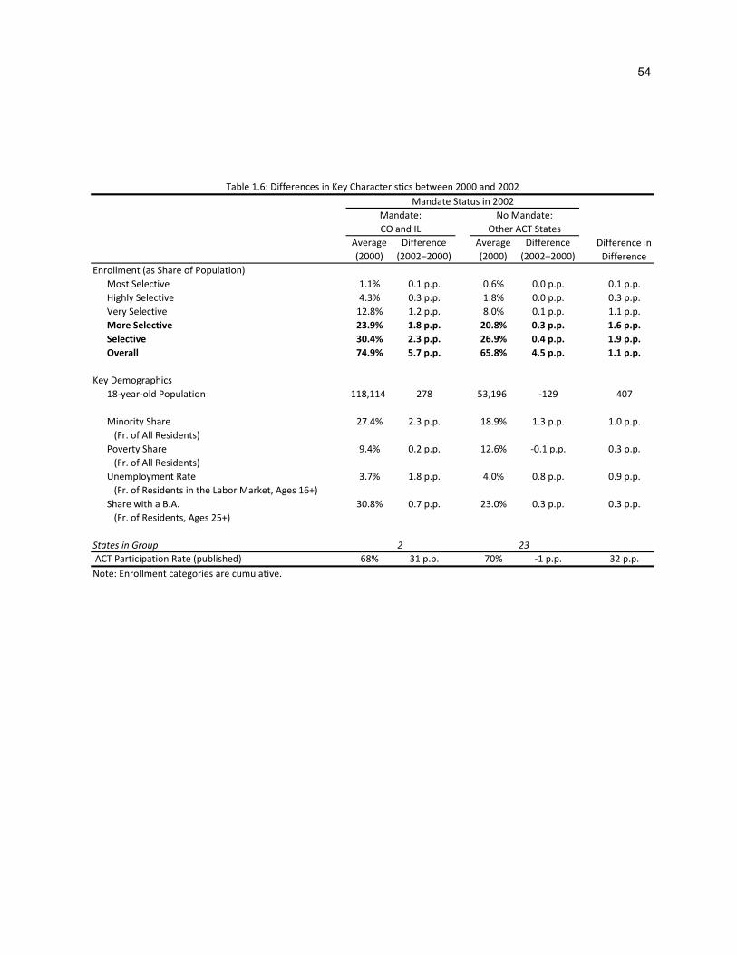
54
Average
(2000)
Difference
(2002‒2000)
Average
(2000)
Difference
(2002‒2000)
Enrollment (as Share of Population)
Most Selective 1.1% 0.1 p.p. 0.6% 0.0 p.p. 0.1 p.p.
Highly Selective 4.3% 0.3 p.p. 1.8% 0.0 p.p. 0.3 p.p.
Very Selective 12.8% 1.2 p.p. 8.0% 0.1 p.p. 1.1 p.p.
More Selective 23.9% 1.8 p.p. 20.8% 0.3 p.p. 1.6 p.p.
Selective 30.4% 2.3 p.p. 26.9% 0.4 p.p. 1.9 p.p.
Overall 74.9% 5.7 p.p. 65.8% 4.5 p.p. 1.1 p.p.
Key Demographics
18‐year‐old Population 118,114 278 53,196 ‐129 407
Minority Share 27.4% 2.3 p.p. 18.9% 1.3 p.p. 1.0 p.p.
(Fr. of All Residents)
Poverty Share 9.4% 0.2 p.p. 12.6% ‐0.1 p.p. 0.3 p.p.
(Fr. of All Residents)
Unemployment Rate 3.7% 1.8 p.p. 4.0% 0.8 p.p. 0.9 p.p.
(Fr. of Residents in the Labor Market, Ages 16+)
Share with a B.A. 30.8% 0.7 p.p. 23.0% 0.3 p.p. 0.3 p.p.
(Fr. of Residents, Ages 25+)
States in Group
ACT Participation Rate (published) 68% 31 p.p. 70% ‐1 p.p. 32 p.p.
Note: Enrollment categories are cumulative.
2 23
Table 1.6: Differences in Key Characteristics between 2000 and 2002
Difference in
Difference
Mandate Status in 2002
Mandate:
CO and IL
No Mandate:
Other ACT States

55
(1) (2) (3) (4) (5) (6)
mandatest 0.054 0.032 0.003 ‐0.006
s.e. (0.142) (0.138) (0.117) (0.115)
adjusted R2 0.988 0.988 0.990 0.990
mandatest 0.159*** 0.138** 0.111*** 0.102*** 0.142*** 0.128***
s.e. (0.057) (0.053) (0.034) (0.033) (0.018) (0.021)
adjusted R2 0.995 0.995 0.996 0.996 0.996 0.996
mandatest 0.163** 0.140* 0.110** 0.100** 0.145*** 0.130***
s.e. (0.000) (0.012) (0.045) (0.046) (0.025) (0.029)
adjusted R2 0.995 0.995 0.996 0.996 0.996 0.996
controls
ln(population) X X
ln(overall enrollment) X X
demographic controls X X X
Table 1.7: Effect of Mandates on Log First‐time Freshmen Enrollment, 1994‐2008
A. Overall
B. Selective
C. More Selective
Notes: Each column in each panel represents a separate OLS regression. The dependent variable in each regression is the log of
first‐time freshmen enrollment of students from state s in year t at a subset of schools, with the definition of selectivity increasing
in stringency from the top to the bottom of the table. All regressions include state and year effects. Demographic controls include
poverty and minority share, the June‐May unemployment rate, and the share of residents over 25 with a B.A.. The estimation
sample is all ACT states (excl. Michigan) in even years between 1994‐2008 (inclusive). Two states are treated beginning in 2002.
Standard errors, clustered on the state, are in parentheses. *, **, and *** reflect significance at the 10%, 5%, and 1% levels.

56
(1)
(2)
(3)
(4)
(5)
(6)
(7)
(8)
(9)
(10)
Specification
Table 1.7,
Panel B,
Spec. (5)
Extended
Sample
Period:
1994‐2010
Alt. Control
Sample:
Neighboring
States
State Time
Trends
Phased
‐in
Treatm
ent
State Tim
e
Trends w/
Phased
‐in
Treatmen
t
Placebo Policy
Four Years
Earlier
Colorado
only
Illinois
only
Late‐adopting
States
mandatest
0.142***
0.163***
0.134***
0.043
0.139***
0.156***
0.129***
s.e.
(0.018)
(0.019)
(0.020)
(0.044)
(0.018)
(0.025)
(0.016)
treatm
ent s*(<4 years of policy)
t0.095***
0.065**
0.070**
s.e.
(0.014)
(0.029)
(0.030)
treatm
ent s*(≥4 years of policy)
t0.190***
0.140***
s.e.
(0.029)
(0.034)
treatm
ent s*(post1998) t
0.007
s.e.
(0.018)
Joint Significan
ce Test
F‐statistic
30.962***
9.426***
p‐value
0.000
0.000
adjusted R
20.996
0.995
0.997
0.997
0.996
0.997
0.996
0.995
0.996
0.995
control states
22
20
922
22
22
22
21
21
20
N192
198
88
192
192
192
192
184
184
207
Table 1.8: Effect of Mandates on Log First‐time Freshmen Enrollm
ent at Selective Colleges, Robustness and Specification Checks
Notes: Each column rep
resents a sep
arate OLS regression. Sam
ple and specification for columns (1)‐(9) are as in
Table 1.7, Panel B, Specification (5), excep
t as noted. Sam
ple for (2)
excludes Ken
tucky and Tennessee; sam
ple for (10) excludes Colorado and Illinois and includes Michigan. In (10), one state is treated
beginning in 2008 and two states are treated in
2010. Standard errors, clustered on the state (except in columns (4) and (6), which use m
ore conservative robust standard errors), are in
paren
theses . *, **, and *** reflect significance
at the 10%, 5%, and 1% levels, respectively.

57
Enrollment Category Specification
Share of
Enrollment
(2000) mandatest
Most Competitive (1) 1.5% 0.139***
(0.024)
Highly Competitive (2) 4.4% 0.205***
(0.029)
Very Competitive (3) 11.3% 0.236***
(0.057)
Competitive (4) 14.8% 0.097***
(0.021)
Less Competitive (5) 8.5% 0.159**
(0.064)
Noncompetitive (6) 59.4% ‐0.122***
(0.032)
Notes: Each row represents a separate OLS regression. Sample and specification as in Table 1.7, Panel B, Specification (5).
Categories are exhaustive and mutually exclusive. Standard errors, clustered on the state, are in parentheses. *, **, and ***
reflect significance at the 10%, 5%, and 1% levels. Figures in the third column denote the share of freshmen enrollment in each
category in the treatment states in 2000 (before mandates were introduced).
Table 1.9: Effects of Mandates on Log First‐time Freshmen Enrollment in Detailed Selectivity Categories, 1994‐2008

58
Enrollment Category Specification
Share of Enrollment
(2000) mandatest
Four‐year (1) 47.6% 0.137***
(0.020)
Subcategories of Selective Enrollment
Selective‐Land Grant (2) 6.6% 0.169**
(0.077)
Selective‐Public (3) 27.8% 0.104***
(0.032)
Selective‐Private (4) 12.7% 0.230***
(0.040)
Selective‐Private Not‐for‐Profit (5) 11.8% 0.227***
(0.041)
Selective‐In‐State (6) 29.6% 0.116***
(0.031)
Selective‐Out‐of‐State (7) 10.9% 0.212***
(0.043)
More‐refined Subcategories
Selective‐Land Grant‐In‐State (8) 4.9% 0.167*
(0.093)
Selective‐Public‐In‐State (9) 23.1% 0.084**
(0.036)
Selective‐Private‐In‐State (10) 6.5% 0.311***
(0.095)
Selective‐Land Grant‐Out‐of‐State (11) 1.6% 0.240***
(0.059)
Selective‐Public‐Out‐of‐State (12) 4.8% 0.228***
(0.049)
Selective‐Private‐Out‐of‐State (13) 6.2% 0.210***
(0.067)
Notes: Each row represents a separate OLS regression. Sample and specification for (1)‐(7) and (11)‐(13) as in Table 1.7, Panel B,
Specification (5); Specifications (8) and (9) exclude Kansas and specification (10) excludes Wyoming, as there are none of the
relevant institutions in these states. Standard errors, clustered on the state, are in parentheses. *, **, and *** reflect
significance at the 10%, 5%, and 1% levels. Figures in the third column denote the average share of freshmen enrollment in each
category in the treatment states in 2000 (before mandates were introduced).
Table 1.10: Effects of Mandates on Log First‐time Freshmen Enrollment in Various Subcategories, 1994‐2008

59
Chapter 2
The Design of Teacher Incentive Pay and
Educational Outcomes: Evidence from the New York
City Bonus Program
with Lesley J. Turner
Accepted for publication by Journal of Labor Economics on 5/29/2012
http://www.journals.uchicago.edu/JOLE/
© 2013 by The University of Chicago. All rights reserved.

60
2.1 Introduction
Teacher compensation schemes are often criticized for their lack of performance pay. In other
sectors, incentive pay increases worker effort and output by aligning the interests of workers and
employers, providing information about the most valued aspects of an employee’s job, and motivating
workers to provide costly effort (Gibbons 1998; Lazear and Oyer 2010). In this chapter, we examine a
group-based teacher incentive scheme implemented by the New York City Department of Education
(DOE) and investigate whether specific features of the program contributed to its ineffectiveness.
In 2007, close to two hundred schools were randomly selected from a group of high- poverty
schools.55 These schools could earn school-wide bonuses by surpassing goals primarily based on
student achievement. Successful schools would earn lump sum payments equal to $3000 per union
teacher (three to seven percent of annual teacher pay). Several independent studies show that the
bonus program had little overall effect on either math or reading achievement (Springer and Winters
2009; Goodman and Turner 2010; Fryer 2011). We show that in schools where smaller groups of
teachers were responsible for instructing tested students, the program led to small but significant
increases in student achievement. Our finding is consistent with predictions that group-based incentives
are diluted by the potential for free-riding when payments depend on actions of a large number of
workers (Holmstrom 1982).
Several features of the educational sector complicate the design of teacher performance pay.
First, performance pay is most effective when employers can measure worker output or when
observable effort and productivity are closely aligned. Monitoring teachers is costly and measuring
individual teachers’ contributions to student achievement is difficult. Second, although education is a
complex good and teachers must allocate their effort across several activities, teacher incentive pay is
55 This experiment was designed and implemented by the New York City Department of Education and teachers’ union, random assignment was conducted by Roland Fryer, and RAND performed the official evaluation.

61
often linked to a single performance measure (e.g., student test scores), which may lead teachers to
direct effort away from other beneficial classroom activities (Holmstrom and Milgrom 1991).56 Despite
these issues, studies from outside the United States demonstrate that teacher incentive pay can
increase student achievement (e.g., Lavy 2002; Lavy 2009; Muralidharan and Sundararaman 2011).
Specific features of the NYC bonus program may have limited its effectiveness. First, the program
linked incentive pay to school-wide performance goals. In theory, group incentive pay is most effective in
the context of a joint production technology (Itoh 1991). For instance, if an individual teacher’s effort has
positive impacts on the effort exerted by her peers (e.g., Jackson and Bruegmann 2009), group incentives
may outperform individual incentives. Otherwise, relative to individual incentives, group incentives
decrease individual returns to effort and will lead to free-riding unless workers monitor each other’s effort.
We test for free-riding by allowing the bonus program’s impacts to vary by the number of teachers
with students who are tested (and therefore contribute to the probability that a school qualifies for the
bonus award). To test for the importance of joint production and monitoring, we examine whether program
impacts vary by the degree to which teachers report collaborating in lesson planning and instruction using
a survey administered prior to program implementation. We show that the bonus program raised math
achievement in schools with a small number of teachers with tested students, although these impacts are
small (0.08 student-level standard deviations) and only marginally significant in the program’s second
year. We present suggestive evidence of positive program impacts in schools with a high degree of
collaboration.
Second, teachers already faced negative incentives when the bonus program was implemented.
In fall 2007, the DOE instituted a district-wide accountability system that imposed sanctions on schools
that did not meet the same goals used in determining bonus receipt. Thus, estimated impacts of the
56 Teachers may also be induced to focus on narrow, exam-related basic skills, manipulate test scores, or focus on students whose performance contributes more towards goals (e.g., Jacob and Levitt 2003; Jacob 2005; Cullen and Reback 2006; Neal and Schanzenbach 2010).

62
bonus program represent the effect of teacher performance pay in schools already under accountability
pressure. However, this may be the most appropriate context to examine, since many states have
implemented accountability systems and all public school districts face pressure from No Child Left
Behind provisions. Finally, we find no differences in the impacts of the bonus program when we compare
schools under different degrees of accountability pressure, suggesting that our results are not solely
driven by the dilution of incentives due to the accountability system (Goodman and Turner 2010).
Third, teachers’ lack of understanding of the bonus program’s complex goals may have limited
its efficacy. Alternatively, since bonus awards were provided if a school’s performance reached a set
threshold, if thresholds were set too high or too low, a large number of teachers may have optimally
responded by not changing their behavior (Neal 2011). However, the metrics used to determine bonus
payments were the same goals used by the district-wide accountability system and Rockoff and Turner
(2010) show that negative incentives provided through this system increased student achievement.57
2.2 Data and Empirical Framework
Our analyses focus on schools classified as elementary, middle, and kindergarten through
grade 8 (K-8) schools eligible for selection into the bonus program. A total of 181 schools were chosen
to participate in the bonus program; 128 schools were placed in the control group.58 We use publicly
available DOE data and measure academic achievement using average math and reading test scores in
the 2006-07, 2007-08, and 2008-09 school years (hereafter 2007, 2008, and 2009).
57 On a related note, a committee within each school had some discretion over how bonuses would be distributed. However, the distribution scheme was set ex ante and most schools chose equal or close to equal distributions.
58 A small number of experimental sample schools were excluded prior to random assignment. Moreover, two of the 181 schools originally assigned to the treatment group were moved to the control group prior to notification of their assignment; we classify these as treatment group schools. Treatment schools were eligible to earn bonuses if 55 percent full-time United Federal of Teachers staff voted in favor of participation. Twenty-five schools voted not to participate or withdrew from the program after voting. Finally, four schools that were originally assigned to the control group were allowed to vote and participate in the bonus program; we consider these control schools. Ultimately, 158 schools were eligible to earn bonus payments.

63
We estimate the main effect of the bonus program using the following model:
where is the outcome of interest for school j in year t, is an indicator for selection into the bonus
program’s treatment group (regardless of whether the school ultimately participated), is a vector of
school characteristics, and is an idiosyncratic error term.59 School observations are weighted by the
number of tested students. With successful random assignment, is independent of omitted variables
and represents the causal impact of the bonus program.
2.3 Results
2.3.1 Group Bonuses and the Free-Rider Problem
Teachers should respond to the bonus program by increasing their effort until the expected
marginal benefit is equal to the expected marginal cost. However, the probability that a treated school
reaches its goal and receives a bonus primarily depends on students’ performance on math and reading
exams. Thus, the impact of an individual’s teacher’s effort on her expected bonus is decreasing as the
number of teachers with tested students increases.60 The diffusion of responsibility for test score gains
across many teachers may dilute the incentives of the bonus scheme. Moreover, monitoring may be more
difficult in schools with more teachers.
We test for evidence of free-riding by allowing treatment effects on math and reading scores to
vary by the number of math and reading teachers, respectively. We only focus on teachers whose students
59 Covariates include the outcome measured in 2007, school type indicators (i.e., elementary, middle, or K-8), the percentage of students that are English Language Learners, special education, Title I free lunch recipients, and minorities, and performance under the NYC accountability system (school accountability scores and peer indices).
60 Consider two extremes, a school with only one teacher with tested students and a school with an infinite number of these teachers. In the first case, the teacher will either respond to the program by increasing her effort to the expected level necessary to achieve the school’s goal or not respond (if the size of the bonus is less than the cost of exerting this level of effort). In the second case, changes in a given teacher’s effort do not affect the probability that the school receives the bonus and it will be optimal for teachers to not respond to the program.

64
take these exams, rather than the full set of teachers in a school, since only teachers with tested students
contribute to the probability that a school earns its bonus.61 The first set of regressions in Table 2.1 show
the main effect of the bonus program on math and reading achievement.62 We first add an interaction
between the number of math/reading teachers (relative to the mean number of such teachers in the
sample) and the treatment indicator (columns 2 and 5), and finally, interact treatment status with an
indicator for schools in the bottom quartile of the number of teachers with tested students (approximately
10 or fewer teachers in elementary and K-8 schools and 5 or fewer in middle schools). We only present
results from specifications that include covariates, however, results are similar when we exclude covariates
or instrument for actual treatment with initial assignment.
We find evidence of free-riding. For schools at the bottom of the distribution of the number of
teachers with tested students, we estimate a positive effect of the bonus program on math achievement in
the first year of the program and a positive, but insignificant effect in the second year, although we cannot
reject a test of equality of effects across years. In 2008, the bonus program resulted in a 3.2 point (0.08
student-level standard deviation) increase in math achievement.63
Group-based incentive pay may outperform individual incentives in the case of joint production. If
the degree to which teachers work together varies across schools, the bonus program may have been
effective in schools with a high level of cooperation between teachers. To proxy for the extent of joint
production in a school, we construct a measure of school cohesiveness using teachers' answers to a set of
61 On average, treatment and control group schools have 55 teachers in total, but only 16 teach tested students.
62 The small number of middle and K-8 schools that are missing information on the number of teachers with tested subjects are excluded.
63 Another implication of this finding is that, in schools with a large number of teachers with tested students, the bonus program had a negative impact on student achievement. One explanation is the bonus program crowded out teachers’ intrinsic motivation and only in schools where incentives were not diluted by free-riding did the potential monetary rewards lead to increased teacher effort.

65
five survey questions prior to the announcement of the bonus program.64 This measure may also
incorporate the degree to which teachers are able to monitor their colleagues. We sum responses across
survey questions and standardize the index so it has a mean of zero and standard deviation equal to one.
Schools with high levels of cohesion are distinct from those with a small number of teachers with tested
students.65
Table 2.2 tests for heterogeneity in the impact of the bonus program by school cohesion. We first
interact treatment with the linear index (columns 2 and 5) and then interact treatment with an indicator for
schools with above average cohesion (columns 3 and 6). The point estimates for schools with below
average cohesion are marginally significant and negative in both subjects and both years, while the
interaction of treatment and the indicator for above average cohesion is significant, positive, and of greater
magnitude. Results suggest that the bonus program may have had detrimental effects in schools with low
levels of cohesion, and small positive effects on achievement in cohesive schools.
2.3.2 Teacher Effort
A primary motivation for performance-based pay is to provide teachers with incentives to increase
effort devoted to raising student achievement. Although we do not directly observe teacher effort, we can
measure teacher attendance, which may be correlated with effort decisions and contributes to student
achievement (e.g., Miller, Murnane, and Willett 2008; Herrmann and Rockoff 2012). We measure teacher
absences using aggregate statistics from individual teacher data and estimate models where the
dependent variable is the average number of absences taken during the months when schools first learned
64 These surveys were administered in spring 2007. Questions include: (1) the extent to which teachers report feeling supported by fellow teachers, (2) whether curriculum and instruction is aligned within and across school grades, (3) whether the principal involves teachers in decision making, (4) whether school leaders encourage collaboration, and (5) whether teachers collaborate to improve instruction. We exclude schools with a survey response rate under 10%.
65 This index has a small, negative, and statistically insignificant correlation with the number of math and reading teachers in a school.
66
of their eligibility for the bonus program and when the last exams were taken.66 If teachers believe that their
attendance can affect the probability of bonus receipt by raising student achievement, the program’s
impacts on absenteeism should be largest over this period.67 We only examine absences that teachers
likely have some control over – those taken for illness and personal reasons.
Table 2.3 presents these results; each column within a panel contains the estimates from separate
regressions. The first column examines the effect of the bonus program on absences across all teachers
within a school and shows no measurable impact on overall attendance. Column 2 focuses on teachers
with tested students, while the third and fourth columns follow the same approach as Table 2.2 and interact
the treatment indicator with the number of teachers with tested students (column 3) or an indicator for
whether a school falls in the bottom quartile of the number of such teachers (column 4).
Program impacts on attendance are not consistent across years. In the program’s first year, for
schools with a small number of teachers with tested students, attendance increased.68 Conversely, in the
second year of the program, we find positive but insignificant impacts on absenteeism. Finally, we test
whether the bonus program had heterogeneous impacts according to initial teacher effort. For instance,
initially low effort (high absence) teachers may be the only group with the ability to respond through
increasing attendance. Conversely, if ex ante high effort teachers believed that achieving the bonus
program goals was a high probability event, they may have responded by reducing their effort. However,
we find no evidence teacher absenteeism varies along this dimension (available upon request). In the
United States, attendance may not be the dimension along which teachers respond to incentive pay.
2.3 Conclusions
66 We thank Jonah Rockoff for constructing these aggregate statistics for the purpose of this research.
67 In the first year of the program, schools learned of their eligibility in November while in the second year, eligibility was known in September. In both years, the last exams occurred in March. Results are robust to alternate definitions of the time period (e.g., November to March in the second year or September to March in the first year).
68 However, impacts are only significant in schools at the 10th percentile in the distribution of number of teachers (results available upon request).

67
In many sectors, performance-based pay enhances effort, output, and other desirable outcomes.
Evidence from Israel and India suggests that properly structured teacher incentive pay programs can
benefit students. However, despite substantial expenditures – over $40 million in the program’s first two
years – the NYC bonus program did not raise student achievement. This chapter discusses several
features of the NYC bonus program that may have contributed to its ineffectiveness. We provide
suggestive evidence that the group-based structure of the program may have been detrimental in the
majority of schools where the number of teachers responsible for tested students is large. Conversely, the
program improved math achievement in schools with fewer teachers responsible for tested students or a
more cohesive group of teachers. A lack of monitoring as well as the diffusion of responsibility for test
score gains among many teachers may have diluted the incentives of the opportunity to earn bonuses. Our
results are consistent with the long-standing literature in economics on the importance of taking into
consideration free-riding, joint production, and monitoring when designing incentive systems and suggest
that a one-size-fits-all approach may not be the most effective when implementing incentive pay schemes
within a school district.
Given that team-based incentives in other contexts resulted in student achievement gains, other
features of the NYC program may have also contributed to its ineffectiveness. Neal (2011) suggests that
results from economic theory offer valuable insights into optimal incentive design. For instance, an
intervention in India utilized a piece-rate payment scheme: teachers or schools received bonus payments
for incremental improvements in student achievement (Muralidharan and Sundararaman 2011). This
avoids threshold effects of schemes like the NYC bonus program, which dilute incentives for teachers with
a probability of bonus receipt approaches zero or one.
Even so, many challenges in designing effective teacher incentive schemes remain. Incentive pay
programs that come about as a compromise between school districts and teachers unions’ might contain
incentives that are so diluted they are destined to fail. Finally, the extensive margin may be most important
margin through which teacher pay can improve student achievement. Small-scale teacher incentive pay

68
experiments cannot provide information concerning the general equilibrium effects of overall increase in
teacher pay or movement towards performance-based compensation.
Currently, the U.S. government provides significant funding through the Race to the Top program.
Eligibility for Race to the Top funding depends on districts’ ability and willingness to link student
achievement to individual teachers and use this data in teacher evaluations, but grants districts a great
deal of discretion in designing performance pay systems. In 2010, 62 school districts and nonprofit groups
received over $400 million in funding from the federal Teacher Incentive Fund. Our results underscore the
importance of the structure of performance pay in education. Policy innovations in this area should be
carefully considered, taking into account personnel economics theory and research.

69
(1) (2) (3) (4) (5) (6)
A. Year 1: 2007‐2008Treatment ‐0.372 0.046 ‐0.667 ‐0.871 ‐0.536 ‐1.445
(0.490) (0.499) (0.519) (0.530) (0.568) (0.561)*
* Number of teachers (mean = 0) ‐0.233 ‐0.176(0.089)** (0.097)+
* First quartile of number of teachers 2.044 4.670
(1.575) (1.483)**
Treatment effect: schools in first quartile 1.377 3.225
(1.481) (1.395)*
Observations 300 300 300 301 301 301
B. Year 2: 2008‐2009
Treatment ‐0.579 ‐0.395 ‐0.909 ‐1.297 ‐0.979 ‐1.893(0.539) (0.572) (0.556) (0.668)+ (0.726) (0.689)**
* Number of teachers (mean = 0) ‐0.126 ‐0.171(0.099) (0.144)
* First quartile of number of teachers 2.122 4.826(2.067) (2.579)+
Treatment effect: schools in first quartile 1.213 2.933
(1.968) (2.461)
Observations 294 294 294 294 294 294
* p < 0.05
** p < 0.01
Table 2.1: Free‐riding and the Impact of Teacher Incentives on Student Math and Reading Achievement
+ p < 0.10
MathReading
Note: Each column within a panel denotes a separate regression; dependent variable: average math or reading test scores. Robust standard
errors in parentheses. The first row in each panel displays the estimated impact of treatment group assignment; in columns 2 and 5,
treatment group assignment is interacted with the (demeaned) number of teachers with tested students; in columns 3 and 6, treatment
group assignment is interacted with an indicator for being a school in the lowest quartile of teachers with tested students. The number of
math teachers for schools in the first quartile is less than or equal to: 10 (elementary and K‐8 schools), 5 (middle schools); the number of
reading teachers for schools in the first quartile is less than or equal to: 10 (elementary and K‐8 schools), 6 (middle schools). The regressions
are weighted by number of tested students in each school. Schools with no information on teachers with tested students are dropped. See
text for a description of additional controls included in regressions.

70
(1) (2) (3) (4) (5) (6)
A. Year 1: 2007‐2008Treatment ‐0.328 ‐0.091 ‐0.908 ‐0.628 ‐0.270 ‐1.264
(0.494) (0.515) (0.591) (0.530) (0.551) (0.674)+
* Cohesion index 0.283 0.766(0.547) (0.619)
* Above average cohesion index 1.840 1.962(0.975)+ (1.131)+
Treatment effect: schools with above average cohesion 0.932 0.698
(0.789) (0.891)
Observations 300 300 300 301 301 301
B. Year 2: 2008‐2009Treatment ‐0.544 ‐0.328 ‐1.139 ‐1.118 ‐0.669 ‐2.266
(0.540) (0.562) (0.666)+ (0.666)+ (0.679) (0.869)**
* Cohesion index 0.361 1.105(0.626) (0.839)
* Above average cohesion index 1.850 3.347(1.093)+ (1.446)*
Treatment effect: schools with above average cohesion 0.710 1.081
(0.868) (1.105)
Observations 296 296 296 297 297 297
MathReading
Note: Each column within a panel denotes a separate regression; dependent variable: average math or reading test scores. Robust standard errors in
parentheses. The first row in each panel displays the estimated impact of treatment group assignment; in columns 2 and 5, treatment group
assignment is interacted with the teacher cohesion index (mean = 0, sd = 1 across all NYC schools); in columns 3 and 6, treatment group assignment
is interacted with an indicator for having a cohesion index greater than zero. The regressions are weighted by number of tested students in each
school. Schools with teacher survey response rate below 10 percent are dropped. See text for a description of additional controls included in
regressions.
Table 2.2: School Cohesion and the Impact of Teacher Incentives on Student Math and Reading Achievement
+ p < 0.10* p < 0.05** p < 0.01

71
All Teachers(1) (2) (3) (4)
A. Year 1: 2007‐2008Treatment 0.001 ‐0.158 ‐0.217 ‐0.156
(0.091) (0.146) (0.148) (0.163)
* Number of teachers (mean = 0) 0.013(0.022)
* First quartile of number of teachers ‐0.236(0.390)
Treatment effect: schools in first quartile ‐0.391
(0.352)
Observations 301 301 301 301
B. Year 2: 2008‐2009Treatment 0.045 0.151 0.203 0.161
(0.119) (0.175) (0.192) (0.200)
* Number of teachers (mean = 0) 0.005(0.032)
* First quartile of number of teachers 0.158(0.621)
Treatment effect: schools in first quartile 0.319
(0.576)
Observations 294 294 294 294
Note: Each column within a panel denotes a separate regression; dependent variable: average absences/teacher
taken for personel or sick leave between November and March (Panel A) or September and March (Panel B). Robust
standard errors in parentheses. The first row in each panel displays the estimated impact of treatment group
assignment on absences for all teachers. The second row in each panel displays the estimated impact of treatment
group assignment on absences for teachers with tested students. In column 3, treatment group assignment is
interacted with the (demeaned) number of teachers with tested students; in column 4, treatment group assignment
is interacted with an indactor for being a school in the lowest quartile of teachers with tested students (see Table 1
notes). Schools with no information on teachers with tested students are dropped. See text for a description of
additional controls included in regressions.
Teachers of Tested Students
Table 2.3: The Impact of Teacher Incentives on Teacher Absences Due to Personal and Sick Leave

72
Chapter 3
Does Homelessness Prevention Work? Evidence
from New York City’s HomeBase Program
with Peter A. Messeri and Brendan A. O’Flaherty
73
3.1 Introduction
HomeBase (HB) is a community-based homelessness prevention program that the New York City
Department of Homeless Services (DHS) has operated since 2004. The program serves families
experiencing housing emergencies in an attempt to avert their entry into the City’s shelter system. The goal
is to reduce the number of homeless families. The phased introduction of this program in different
neighborhoods allows us to estimate the effect that this program had on family shelter entries and shelter
spells between 2004 and 2008.
To our knowledge, this is the first quasi-experimental evaluation of homelessness prevention at a
community level. Early evaluations of homelessness prevention programs asked whether their participants
became homeless within some time frame (see Apicello 2008, Apicello et al. 2012, Burt et al. 2005). These
evaluations did not convincingly establish counterfactuals to describe the shelter population absent these
programs. Specifically, no credible case can be made for how many participants would have become
homeless in the absence of these programs, or how long they would have stayed homeless if they had
become homeless. We also learn nothing about the effects on non-participants. Two small controlled
experiments on homelessness prevention have been attempted. The Western Massachusetts Tenancy
Preservation Program compared the housing outcomes for 366 cases they closed with those for 21
individuals who had been wait-listed. Abt Associates is conducting a randomized experiment on a later
version of HB in New York; they are currently following a control group of 200 and a treatment group of 200
(Buckley 2010). Results were not available at the time our study was completed.
However, even perfectly designed and executed controlled experiments with large samples of
individual participants cannot give us as full a picture of the effects of homelessness prevention as can
good community-level evaluations. Experiments estimate program effects for the treated under conditions
that may not reflect program operations under normal operations. Moreover, homelessness prevention
programs might affect non-participants. For instance, they could divert limited resources—subsidized or

74
cheap housing, legal assistance, private charity—from non-participants, and hence make non-participants
more likely to be homeless. (By definition, successful homelessness prevention efforts increase the
demand for housing in the short run, which may raise prices.) Homelessness may also be contagious. The
knowledge of one family entering a shelter may encourage others to do so by lessening stigma, by
showing them how to do it, or by giving them friends in the shelter. It is equally possible that the HB effect
may be contagious. Non-participating families may learn from an HB family how to resolve their housing
crises without resorting to shelter.
Furthermore, a thorough evaluation of a homelessness prevention program should estimate not
only how many non-participants enter or avoid homelessness because of the program, but also how long
they stayed homeless, or would have. Finally, the two individual-level studies we are aware of use
applicants for the program as the control group. This procedure estimates the effect of the program
correctly only if the program’s existence does not change the incidence of the problems that the program is
trying to alleviate. Our methods do not require this strong assumption.
Community-level studies like ours can estimate all these effects, but individual-level studies, even
experiments, cannot. We estimate the effect of HB on both participants and non-participants within
communities receiving HB services. Because we use communities as experimental controls, we are also
able to estimate whether HB shifts the prevalence of homelessness from eligible to ineligible communities.
The cost, however, is that we can estimate only the sum of effects at the community-level, not the effects
on participants or non-participants separately.
Because we have enough detailed data on the regular operations of the New York City family
shelter system, we are able to construct multiple plausible counterfactuals, and therefore we are able to
come much closer to a complete analysis of the effects of a prevention program than previous work.
However, because we consider a range of plausible counterfactual scenarios, we present a range of point
estimates as our best approximation of “the” HomeBase effect.
75
We estimated the effect of HB on shelter entries along two different dimensions. One dimension is
geography: we use New York City community districts (CDs) and census tracts (CTs) as alternative
geographic designations of neighborhoods. Census tracts are more plentiful and exhibit greater variation in
intensity of HB services, but community districts have cleaner definitions of when HB was operating and
because they are larger than census tracts, allow us to net out at least some of the potential role that HB
might play in increasing or decreasing entries by non-participants. The other dimension is how we quantify
HB operations. In some equations, the key explanatory variable is a measure of whether HB had begun
operation in a particular geography—HB coverage— and in other equations the key explanatory variable
is the number of families that HB serves—HB service. The coverage equations are simpler and more
direct, but the great variation in the actual level of services that different offices provide means that they
obscure a great deal of the heterogeneity in how many entries HB might divert in a month. The service
equations resolve this heterogeneity issue but have to be estimated by instrumental variables techniques,
and raise questions about the timing of HomeBase effects.
To preview study findings, HB was associated with a statistically significant reduction in shelter
entries in the neighborhoods in which it was operating. Between the start of limited operations in November
2004 and November 2008, we estimated that HomeBase reduced shelter entries by 10 to 20 for every 100
cases opened. There was great heterogeneity in the effect of HB on shelter entries. Alternative statistical
models resulted in a large range of point estimates related to both choice of geographic unit of analysis, CT
or CD, and counterfactual scenario. HB appears to avert entries, at least on net, not divert or delay them.
We also present evidence that suggests that this reduction does not come at the expense of additional
entries in nearby neighborhoods.
We also look at the rate of shelter exits for families who entered the system when HB was
operating. A priori, an effective prevention program might have conflicting effects on spell length. On one
hand, it might disproportionately divert the families with the least serious problems and hence those who
would have had the shortest spells; this would raise the average length of shelter spells. On the other

76
hand, if HB delayed shelter entry for some families and these families ended their homelessness when
their luck turned better, independent of what occurred in the shelter, then HB would shorten shelter spells.
We find essentially no effect; HB appears to reduce the length of shelter spells but the effect is small and
statistically insignificant.
Besides estimating the effects of HB, we also examine the impact of foreclosures on entries to
homeless shelters. These are the first results we are aware of that attempt to link foreclosures to
homelessness. Specifically, we consider lis pendens (LP) filings, the first step in the lengthy foreclosure
process in New York that may typically take 12 to 18 months from LP filing to auction. A hundred
lispendens filings were associated with 3-5 additional shelter entries over the next 18 months.
The plan of the chapter is the following. We begin with a history of HomeBase and a description of
the data. The third section provides summary statistics and information about trends in shelter entries and
HomeBase cases. The fourth section estimates the coverage effect, using both community-district and
census-tract data, the fifth section estimates the service effect, and the sixth section reconciles the two
sets of estimates. Section 3.7 addresses the questions of robustness and spillovers—both to non-
participants in the same month and to the same participant in later months. Section 3.8 analyzes exits and
spell length. Section 3.9 concludes.
3.2 Background
3.2.1 HomeBase History
For planning and land use purposes, New York City is divided into 59 community districts (CDs),
each with about 140,000 people (the largest CD, Flushing, would have been the 75th largest city in the
United States in 2010). The Department of Homeless Services (DHS) began HomeBase in November
2004 by selecting non-profit agencies in six CDs to operate the program. These CDs were not chosen
randomly, although they were dispersed over four of New York City’s five boroughs: DHS chose CDs that
were heavily represented among the last addresses of shelter entrants. (This is a weakness in our study;

77
an ideal community-level study would randomize selection of communities in which the treatment was
available.) We will refer to these CDs as the “big six,” because the majority of HB participants during the
period we studied came from these six CDs. During the 22-month pre-program period (January 2003
through October 2004), the average number of shelter entries from the big six CDs was about 2.3 times as
large as the citywide average. These six included the CD with the most shelter entries in the pre-program
period, and even the big six CD with the smallest number of family shelter entries was ranked 14thamong
all 59 CDs. Only residents of the big six CDs were eligible to receive HB services between the start of
operations in November 2004 and June 2007.
DHS expanded HB citywide in two phases. In July 2007, 31 more CDs were included in HB, and
the remaining 22 CDs started in January 2008. The average CD that started in July 2007 had 21% fewer
shelter entries in the pre-program period than the citywide average, and the average CD that started in
January 2008 had 7% fewer. We will refer to these two sets of CDs as the “2007 cohort” and the “2008
cohort” respectively. After January 2008, HB operated everywhere in the city. In spring 2007, the initial
contracts in the big six CDs were nearing completion, and because HB was going citywide, operators knew
that the contracts for these particular CDs would be smaller. The intensity of service in the big six CDs
declined in spring 2007 and remained low for the rest of the period (see Table 3.2). The addition of each
successive cohort expanded the set of families eligible to receive HB services.
By “families,” we mean any group of individuals who live together, and pregnant women. We
include both families with children and families with no children (“adult families”). This is consistent with the
definitions that DHS uses. HB also served single adults unaccompanied by children. Because we matched
HB cases to family shelter entries, single adult cases were not part of our analysis.
HB helps families overcome immediate problems and obstacles that could result in loss of housing.
Families experiencing difficulties voluntarily apply at an HB office located in their neighborhood, or are
referred from shelter intake centers (but only when an HB office was operating in the family’s CD of origin).
HB centers disseminate information through outreach activities in neighborhoods that are known to be the

78
origin of large numbers of family shelter entries. HB case managers have wide discretion in matching
services to the specific problems of eligible families. Services include family and landlord mediation, legal
assistance, short-term financial assistance, mental health and substance abuse services, child care, and
job search assistance. Our data do not allow us to distinguish among services or service-delivery
strategies. The neighborhood base of operations—the fact that each participating family has an address, if
only tenuously—is the key to our analysis.
HB offices are instructed to provide services only to eligible families. Eligibility includes an income
criterion (200 percent of the federal poverty level during our study period) and, through December 2007, a
residence criterion.69 Although HB offices were supposed to serve only families living in their designated
CDs, they did not always abide by this rule. About 6 percent of HB participants received services before
HB was operating in the CDs in which they appeared to live. Presumably they travelled to an HB office
outside the CD in which they lived (DHS officials sometimes instructed HB staff to accept these ineligible
families). Our models include a parameter to isolate the HB effect for families residing in ineligible CDs
from the effect on officially eligible clients.
3.2.2 Data
Our primary dependent variables are family entries and exits for the New York City family
homeless shelter system, disaggregated by time and geography. We study only eligible families who spent
one or more days in the shelter system. Eligibility for the family shelter system essentially means a
demonstration that a family has no reasonable alternative place to live. Determining eligibility often takes
over a week, and families who are found ineligible often re-apply. We do not have information on families
who entered the shelter system and were subsequently found ineligible or who left before an eligibility
69 Since 2008, 13 HB centers provide services to families living within their respective catchment areas.

79
determination was made. HomeBase may have affected their number as well as the number of eligible
entrants.
DHS supplied us with a list of all eligible families who entered the shelter system between January
2003 and December 2008. Because information for December 2008 appeared to be incomplete, we
excluded it from our analysis of entries and of HB operations. Information for each family included family
composition, their entry date, their exit date (if it was before December 31, 2008), their type of exit, and
their last address. Names were redacted. The Center for Urban Research at CUNY attached a community
district and a census tract to each address, and then redacted the address before sending us the data.
The operation of HB provides us with several independent variables—some of them measures of
coverage, some measures of service. The simplest measure of coverage comes from a listing of when HB
began operation in each CD, and the exact location of each HB office. We also have a file of all HB
participants from inception to December 2008. Like the shelter entrant file, this file has names and
addresses redacted, but it includes the community district and census tract of the family’s current address
(not the office where they sought services). We also know eligibility status and date of enrollment. From
this file, we compute the number of family HB cases opened each month by the CDs and CTs they live in.
(However, we are not able to tell whether the families that HB served later enter shelters; subsequent work
by Abt Associates will examine this issue.)
For methodological and substantive reasons, we stratified CDs and CTs by number of entries
during the 22-month pre-program period. In particular, we would like to know if HB worked differently in
neighborhoods with many shelter entrants than it does in neighborhoods with few shelter entries. We
assumed that the ordering of neighborhoods by characteristics that determine risk of homelessness—the
supply of affordable rental apartments, socioeconomic status of residents, family and employment
stability—were relatively stable during the six-year period of this study. Therefore, we measured a CD’s or
CT’s use of family shelter as the count of families entering the shelter system by CD or CT of residence at
time of entry for the 22 months preceding the start of HB program in November 2004. We assumed this

80
stratification applied for the HB program period. A comparison of shelter entries before and after the start of
the HB programs substantiates this assumption. Thus, the Pearson correlation between the count of
families entering the shelter system by census tract for the 22 months just prior to the start of HB services
and first four years of HB operations was 0.93. Even eliminating the many “low use census tracts”, those
with only 0, 1, or 2 families entering shelters during the pre-program period, the correlation only slightly
declined to 0.90 for 894 census tracts with between 3 and 67 family entries during the pre-program period.
We divided the CDs into a high-shelter-use stratum that included 21 CDs that experienced above
average number of entries during the pre-program period, and a low-use stratum that contained the
remaining 38 CDs. Figure 3.1 presents the geographical layout of the high- and low-use CDS, highlighting
the big six (all of which are in the high-use CD stratum). The much more numerous CTs were divided into
three shelter use strata. CTs with 0, 1, or 2 shelter entries during the pre-program period were grouped into
a low use stratum, those with 3 to 18 shelter entries formed a moderate-use stratum, and those with 19 to
67 shelter entries formed a high-use stratum. Most census tracts, 995, fell into the low shelter use group.
There are 702 moderate-use and 192 high-use census tracts. Figure 3.2 shows the distribution of NYC
CTs by shelter use. This map illustrates that the moderate and high use census tracts are heavily
concentrated in high use CDs, but the correlation is not perfect.
Finally, the Furman Center at New York University provided us with a file of all lispendens (LP)
filings in New York City by date and address for the period 2001-2008. An LP filing is the first step in a
foreclosure, although many LPs do not result in foreclosures70. After the LP is filed, the foreclosure and
resale process often takes a long time—a year or more.
3.3 Summary Statistics
70 Of lispendens filings in New York City in 2007, only 14 percent had ended with bank ownership or third party auction by 2009; 54 percent had had no subsequent legal transactions. See Furman Center 2010.

81
Table 3.1 presents summary statistics. During the study period, 45,088 families entered the NYC
shelter system and HB centers opened 10,987 cases. There were 115,320 LP filings during this period.
Shelter entries averaged 10.7 families per month from each CD. On average 3.6 HB cases were opened
per month in a CD during months in which HB was operating. The number of LP filings averaged 17.5 per
CD-month. There were 1,889 NYC census tracts with at least one family shelter entry or HB case during
the study period.
3.3.1 Trends in Shelter Entries
HomeBase began operations during an extraordinarily dynamic period in the use of the City’s
family shelter system. During the study period, 2003-2008, an average of 635 families entered the shelter
system each month, but the mean obscures pronounced seasonal and year-to-year fluctuations (see
Figure 3.3). In any calendar year, entries tend to peak in the late summer months and ebb during the
winter and early spring. The amplitude of seasonal variation is large, on the order of a 200 to 300 change
in family monthly entries. The start of HomeBase in November 2004 occurred midway through a period of
relatively low shelter use that extended through 2005: entries fluctuated between 400 and 600 each month.
After 2005 family entries began to climb. The numbers of monthly family entries increased to between 600
and 800 during 2006, 2007, and the first half 2008. By the second half of 2008, monthly family entries
jumped to over 1,000 as the burst of the housing bubble and the full force of the Great Recession began to
take hold.
Of particular note for evaluating HomeBase was the sharp downward disjuncture in family entries
that followed the start of the program in November 2004. Family entries attained a study period nadir for
the seven months following the start of HomeBase operations in the big six CDs. The sharp fall-off in
entries was in part due to seasonal declines, but a regression model that adjusts for both seasonal
variation and annual change in family entries estimated this disjuncture to be a highly significant 75 (95%
C.I.=27, 122) drop in monthly family shelter entries averaged over 50 months of partial and later full

82
coverage HomeBase operations. It is not possible to draw strong causal inferences about the effects of
HomeBase from a citywide aggregated time series, because of the possibility that changes in economic
and housing market factors that coincided with the start of HomeBase operations were also influencing the
observed secular changes in shelter entries. Figure 3.3 also illustrates the very “noisy” background in
shelter entries that presents significant challenges in modeling the counterfactual condition that would have
obtained in the absence of the HB program. For a more robust estimate of treatment effects, we turn to
more detailed analyses at the CD and CT levels.
3.3.2 Trends in HB Cases
Annual counts of shelter entry and HB cases presented in Table 3.2 confirm the intended
restriction of HB services to the relatively small number of very high use CDs during the early years of the
HB program. During the two pre-program years 3,088 or 23% of all family shelter entries resided in the
“Big Six” CDs. During the first two full years of HB operations, 2005 and 2006, the number of families
entering the shelter system from the six CDs served by HB was substantially less than the number of HB
cases opened in these communities. For every 10 shelter entries, approximately 16 HB cases were
opened. The successive expansion of the HB program to all of New York starting in July 2007 sharply
diluted HB services. The combined effect of dispersal of a constant level of HB services over a greatly
expanded geographic area during a period of rising shelter entry resulted in a reversal of the early period
with roughly three shelter entries for each HB case, for both the entire city and the Big Six CDs.
3.4 Shelter Entries: Coverage Analysis
3.4.1 Methods
3.4.1.1 CD level

83
In this section we treat HB operation as a series of binary variables, and see how changes in
shelter entries in CDs subject to the “treatment” of HB operation differ from changes in untreated CDs.
Specifically, the simplest equation is:
(1)
Here c indexes CDs and t indexes months, Sct denotes the number of shelter entrants from CD c in month
t, is a CD fixed effect, and is a month fixed effect. The key independent variable is , a dummy
variable equal to one if and only if HomeBase is officially operating in CD c in month t. The coefficient β is
an estimate of the HB effect, the average number of shelter entries averted in a CD-month of HB operation.
A negative β indicates that the treatment works: HomeBase reduces shelter entries.
Simple equation (1) can be improved in several ways. First, foreclosures are month- and CD-
specific events that may affect shelter entries, since most households affected by foreclosure in New York
City were probably renters (Furman Center 2010) or may reflect CD-specific housing market trends. Let Fct
denote the number of LP filings in CD c in month t. We add several lags of this variable to equation (1):
contemporaneous, 3-month lag, 9-month lag, 12-month lag, 15-month lag, and 18-month lag. We use
these lags because the time between the filing of an LP and the resolution of the foreclosure, including the
displacement of residents, is often long.
Second, the official definition of when HB was operating in a CD does not properly account for
treatment, since some families received HB services before HB was operating in their CD, as we noted in
the discussion of the small number of apparently ineligible families receiving services. To address this
problem, we add a second dummy variable Pct, equal to one if and only if some resident of CD c has
received HB services during or before month t. During normal operations of HB, both Hct and Pct equal one,
and so we will be interested in the sum of their coefficients.
Third, treatment effectiveness may change as time goes on. One possibility is that HB offices
become more proficient as they acquire more experience. In that case, later months of experience would
be associated with greater reductions in shelter entries. On the other hand, HB may delay shelter entries

84
rather than avert them entirely. Then the first months of operation would show the greatest reduction in
total entries; after that, delayed entries would offset new reductions. Participants who come to HomeBase
in later months when the program is better known may also differ systematically from participants who
made their way to HomeBase when it was little known. Another possibility is that as time passes,
enthusiasm wanes and treatment intensity declines. To explore these possibilities, we include a dummy
variable Rct, equal to one if and only if in month t HB has been officially operating in CD c for more than two
months.
To summarize, our fullest model of entries as a function of HB coverage is:
∑ (2)
Equation (2) is linear. While the functional form of the estimating equation does not matter for the
argument that the coefficients on HB operation give average reductions in shelter entries associated with
HB, it does matter for the interpretation of the fixed effects and hence the construction of the counterfactual
(what would have happened if HB were not operating in the CD-months in which it was operating?). In
particular, the form of equations (1) and (2) forces the month fixed effect to be the same in absolute
magnitude in every CD: a city-wide shock like a change in shelter eligibility rules or a recession increases
or decreases shelter entries in every CD by the same amount.
We address this problem in two different ways, neither of which is totally satisfactory. One
approach is to estimate equation (2) in logarithmic form:
ln 1 ∑ (2’)
The implicit counterfactual in equation (2’) is that city-wide shocks operate in multiplicative fashion:
they cause identical percentage changes in shelter entries in every CD. The possible drawback of
equation (2’) is that it forces entries averted to be a constant fraction of entries not averted. By contrast,
linear equation (2) is less restrictive about the relationship between entries averted and entries not averted.
Equation (2) provides a better model of HB operations if those operations are small relative to flows into
the shelter system: if HB offices run out of resources to treat cases, for instance, not cases to treat, or good

85
cases to treat. If, for instance, an HB office is incapable of averting more than a small fixed number of
cases in a month, no matter how many families are entering the shelter system, then the coefficient on HB
operations in (2’) will be biased down.
An alternative way to construct the counterfactual is to stratify the sample and estimate equation
(2) separately for CDs that usually have many entries and CDs that usually have few. This allows us to
estimate different sets of month effects for the CDs that are usually large and for the CDs that are usually
small. We used the two strata based on pre-program shelter entries. Stratifying the sample and estimating
two equations has an additional advantage in interpretation. Although we do not attempt to perform a cost-
benefit analysis, anyone who wanted to use our results for this purpose could be guided by the stratified
results in deciding whether to expand or contract the program in high- or low-use CDs.
Stratifying the sample and thereby multiplying the number of month fixed effects, however, has a
downside. The month fixed effects are supposed to reflect city-wide shocks, but if they are not constrained
to be equal or proportional across the two strata, they may not reflect the same shocks at all. Adding sets
of month fixed effects almost automatically reduces the size and significance of coefficients that measure
within CD and month variation, like those on HB operations and foreclosures. In the limit, if there were 59
strata so that each CD had its own set of month fixed effects, the effects of HB and foreclosures would be
unidentified. Thus when we stratify, we will have to examine the resulting month fixed effects and see how
well the month effects from one equation are correlated with those from the other—essentially, whether
they are picking up the same city-wide shocks.
Including 18-month lags of foreclosures forces us to ignore 18 months of data, starting in 2003. We
have estimated these equations over the full period without foreclosure lags. Results are not materially
different. We have also estimated these equations dropping the CD-months in which unofficial entries
appear. Again, the results are not materially different.
3.4.1.2 CT level
86
Except for adjustments related to the change in unit of analysis, the CT level equations that
estimate the average treatment effect of the HB program are identical to CD level coverage equations (1),
(2) and (2’). Corresponding to the change in unit of analysis, the dependent variable is now monthly
counts of family shelter entries for each census tract and CT fixed effects substitute for CD fixed effects. All
models also include monthly fixed effects. The HB coverage variables are identical to those applied to the
CD level analysis. That is to say, all CT’s are assigned their CD’s values for official and unofficial start of
HB services. As in the CD-level analysis, the CT-level coverage equations are estimated in both linear
additive and multiplicative forms. Because of the large number of CT-months with no shelter entries and
limited range of shelter entries at the CT level, we substituted a Poisson regression model for the loglinear
CD model. We also estimated CT-models stratified by three shelter use levels. The stratified Poisson
model contains only one set of city-wide monthly fixed effects that are allocated proportionate to the CTs
level of shelter use, whereas the stratified linear models estimated separate monthly effects for each
stratum.
While there may be good reasons to prefer a linear additive model when examining HB operations
at the CD-level, there are equally good reasons for preferring a loglinear link between the independent and
response variables when fitting CT data. In contrast to conditions at the CD level where HB offices might
run out of resources before they run out of good cases to treat (see Section 3.4.1.1), the opposite is likely
to obtain at the CT level. The many low shelter use CTs are likely to run out of treatable cases before HB
resources run out. Thus we expect HB centers will tend to allocate resources within their catchments
proportional to need at the CT level, as indexed by the number of families entering the shelter. Our a priori
reasoning is consistent with the empirical distribution of HomeBase cases. Low use census tracts
averaged 0.040 new HB cases opened each month during period of official program eligibility. The mean
number of new HB cases per months jumps to 0.34 and 0.96 for moderate and high use CT’s, respectively.
DHS reinforced the natural tendency of HB to target high-risk families from areas where shelter use is
greatest by contracting services to nonprofit organizations located in or close to neighborhoods with the

87
highest volume of family shelter entries. Under conditions where HB centers devote more resources to high
use CTs, a constant HB effect for individual families would be expected to translate into a proportional
effect when data are aggregated as counts at the CT level, which is how Poisson model coefficients are
interpreted. The Poisson model has the additional virtue that in constructing a counterfactual condition, a
single set of month fixed effect allocates city-wide shocks to the shelter system proportional to a CT’s
shelter use. Of course even if HB offices allocate resources roughly proportionate to CT-level need for
services, this doesn’t necessarily translate into equal effectiveness at the individual family level. We test
this assumption when HB effects are estimated separately by CT’s level of shelter space use.
The effect of foreclosures on shelter entries over an 18 month period was also estimated at the CT
level. In a minor departure from the CD level analysis, all monthly lags from 1 to 18 months are estimated
in the CT equations. Because of their much smaller size, monthly LP housing unit filings are relatively rare
occurrences at the CT level. There were no LP filings in three-quarters of monthly CT observations and 1
to 5 LP filings accounted for another 23 percent of CT-months. At the other extreme, 52 monthly
observations with the largest numbers of LP filings ranged between 59 and 690 filings. Despite the very
small number of outlying CT-months (.04 percent of all observations), preliminary analysis indicated that
these extremely high LP counts had a substantial depressing effect on estimates of family entries. To
remove the distorting effect of very high LP counts, the LP count was truncated at 50 and an indicator
variable for these outlying observations (1=observations with 50+ filings, 0 otherwise) was added for each
lagged variable. Effects of foreclosure are estimated for the linear model, but not the Poisson model, since
each additional foreclosure is assumed to have a fixed additive effect on shelter entries regardless of
spatial aggregation or the volume of families entering the shelter system.
We also grouped CTs by the time that HB officially began operating—November 2004, July 2007,
or January 2008. Results of this analysis are available in the working paper version of this chapter (Messeri
et al. 2011).

88
3.4.2 Results
HB appeared to decrease entries to the shelter system. This holds at both the CD and CT levels.
3.4.2.1 CD level
Table 3.3 shows OLS regression estimates for all variants of the CD coverage model. HB
operation appeared to reduce shelter entries by about 4.6 per CD-month. Since the average CD-month
during our study period had about 10.7 shelter entries, this reduction is economically as well as statistically
significant. The sign of the coefficient on experience indicates that HB offices became less effective
(although not significantly so) after they had been open for two months; this suggests that delay probably
played a role, though a small one, or that the client mix changed as the program was becoming better
known in the community.
Foreclosure initiations appear to increase homelessness. The coefficients indicate that for every
100 LP filings, about five additional families enter shelters. The effect was strongest at 12 months after the
initial filing. Since most LP filings do not result in foreclosures, the results are economically as well as
statistically significant.
Results for the logarithmic equation (2’) were not so strong. Coefficients have the same signs as
they do for the linear model, but estimates are less precise. The estimated magnitude of the effect of HB is
also somewhat smaller, but is still significantly different from zero when all the coefficients are added. HB
produced a reduction of around 1.58 entries in the average fully operating CD-month, rather than over four
with the linear specification.
The estimated effect of foreclosures was also smaller and less significant. This suggests that the
LP effect was tied directly to displaced tenants, and not a general indication of housing market difficulties.
The linear model appears to fit the data better than the logarithmic model, but the fixed effects of
the linear model run into the problems we discussed in the methods section. Consider CD 503, the south
shore of Staten Island, a relatively affluent CD. During the pre-program period, less than half a family

89
entered the shelter system from this CD in an average month. Yet the counterfactual with the linear model
was that absent HB, around 9 families would have entered in August 2008.
Because of this problem, we present the results of the stratified equations in Table 3.3. HB effects
were quite small and insignificant for the stratum with low shelter use CDs, and while they were significant
for the stratum with high use CDs, the effect was smaller than the unstratified effect. Specifically, on
average the stratified coefficients imply that a fully operating CD averts 1.72 shelter entries a month, while
the unstratified coefficients imply more than 4. (The 95 percent confidence intervals do not overlap.) The
effect of foreclosures in the stratified equations was also smaller: 100 LP filings led to around three shelter
entries, as compared to five with the unstratified equation. This effect was still highly significant, however.
3.4.2.2 CT level
Table 3.4 presents estimates of the effect of HB coverage on shelter family entries for the CT-level
models. The pooled Poisson and linear models produced divergent estimates of HB effects, while the
stratified model estimates lie between the two extremes. The estimated average HB program effect,
presented as the incidence ratio, for the pooled Poisson model, after combining the three HB parameters,
was .949 (95% C.I.=.897,1.001) or 5.5 families averted for each 100 shelter entries.---about half a family in
average operating CD-month. The linear formulation of the coverage model estimated a much stronger HB
program effect, possibly too large an effect: 0.13 (95% C.I.=0.106,0.153) family shelter entries averted for
each month of official HB operations in a CT. Extrapolated to the CD level, this would imply about 4.2
entries averted in an average operating CD-month. When the linear coverage model is stratified by shelter
use level, the HB effect is substantially reduced and is now much more in line with the estimated effect of
the Poisson model. The stratified linear model indicates that the HB effect strengthened with increasing CT
use for shelter services. Qualitatively similar results obtain for stratified Poisson models.71
71 We also estimated stratified Poisson models. Similar to the stratified linear model these models indicate that the HB effect strengthened with increasing shelter use. The point estimate and 95% confidence intervals for the incidence ratio

90
3.5 Shelter Entries: Service Analysis
3.5.1 Methods
3.5.1.1 CD level
An alternative approach is to assume that what affects shelter entries is not the simple presence of
an HB office, but the number of families that the HB office serves. Both direct and indirect effects of HB
depend on how many families are served. This relationship argues for making the independent variable the
level of HB service in a month, not a description of the coverage of the area.
Let HBct denote the number of families living in CD c whom HB served in month t. Thus we would
like to estimate a linear equation like:
∑ (3a)
or a quadratic equation like
′ ′ ′ ′ ∑ ′ ′ (3b)
However, HB service in a particular CD-month is likely to be endogenous—for instance, a CD-
specific event that causes many families to visit HB is likely to cause many other families to enter shelters
at the same time. So OLS will not produce unbiased estimates for equation (3).
Fortunately, administrative decisions provide us with several instruments for HB service, and so we
estimate equation (3) by instrumental variables. The first instrument is obvious: Hct, the variable indicating
whether HomeBase was officially operating. CD-months when HomeBase was officially operating should
for low, moderate and high use strata were respectively 1.25 (1.14,1.38), .927 (.871,.986) and .904 (.848,.964) The positive effect for the low use stratum we believe is not real, but an artifact of a fixed effect Poisson model, which drops a cluster, in this case a CT, when the outcome is constant, in this case it drops CTs with zero shelter entries, but retains CTs with only one or two shelter entries during the study period. Dropping the zero entry CTs removed CTs in which HB cases may have potentially averted shelter entries while retaining a matched group of low use CTs in which HB failures could have occurred. Thus a disproportionate loss of successful HB cases may have positively biased treatment effects in the low use CTs, whereas the linear model suggests the HB has no effect when serving low use census tracts.

91
see more HB cases than CD-months when it was not. The next instrument is the distance from the CD
centroid in question to the HB office that was nearest that month. The distance is set to zero for CDs in
which an operating HomeBase office is located.
We also use a series of instrumental variables to reflect administrative differences between groups
of CDs and differences over time. For each of the three cohorts defined by starting date (the big six, the
2007 cohort, the 2008 cohort) we have a dummy variable that turns on only for the CDs in this cohort, and
only after the start of official HomeBase operations for that cohort. In addition, for each cohort and each
fiscal year after HomeBase operation begins for that cohort, we have a dummy variable that turns on for
CDs in that cohort in that fiscal year. We use fiscal year dummies because most DHS contracts are on a
fiscal year basis and many important policy changes coincide with new contracts, including changes in
funding levels that influence the overall number of HB cases the HB centers are able to open each year.72
Thus, for instance, for a CD-month when HomeBase is not operating, all instruments will be zero,
except the distance to the nearest operating HomeBase office.73 For a CD-month in fiscal year 2009for a
CD in the 2007 cohort, the positive dummy variables will be Hct, the 2007 cohort dummy, and the FY-2009-
interacted-with-2007-cohort dummy.
These instruments are highly correlated with HB service; the R2 on the first-stage CD-level
regression for HBct is .797. The distance variable and Hct are significant and their estimated effects have
the right sign.
The other question about the instruments is whether they satisfy the necessary exclusion
restriction. To be valid instruments, they must affect shelter entries only through the services that HB
provided. Unconditionally the location of HB offices and the period of formal HB operations in a CD are
correlated with number of shelter entries. Thus the big six CDs that were first to receive HB services were
72 Of course, we omit dummies as appropriate.
73 In contrast to the coverage model in which observations prior to the start of HB operations in November 2004 provide useful information, observations for the service model are restricted to the period of HB operations.

92
chosen because of their high rate of shelter entry. The expansion of HB services and the opening of new
HB centers to serve the remaining CD occurred during the final 18 months of the study period when the
rate of shelter entry was higher. However the inclusion of the month- and CD- fixed effects should remove
the correlation with shelter entries mediated by the level of HB services. There remains the possibility that
DHS may have re-allocated resources in response to transitory events in a particular month and CD, but
we have no evidence for such a fine-tuned response. DHS created HB coverage through contracts with
nonprofit organizations, and nonprofits had to gear up and acquire staff and space to implement the
contracts. These are complex and time-consuming processes. HB was implemented in only three waves,
moreover, so there was little scope for adjusting start-up dates. Hence it is likely that the effect of CD-and-
month-specific events on HB coverage was at most small. To the extent it was present, however, it biases
down our estimates of the effect of HB service on shelter entries.
Because of the size of our sample and because all of the big six CDs are in the large stratum, we
were unable to produce meaningful stratified results.
3.5.1.2 CT level
The CT service model is estimated using the linear form and instrumental variables applied to the
CD-level data. However, we do not estimate a quadratic form of the service model, as the observed
number of HB cases opened in any month at the CT level is seldom more than 3 cases. In this study, we
did not attempt to investigate the potential conditioning effect of this and other CD level attributes on CT
level effects.
3.5.2 Results
3.5.2.1 CD level
Table 3.5 shows the results of the IV regressions, both the linear and quadratic versions. Both
equations imply that HB averted shelter entries, but the size of the effect is considerably larger, on

93
average, in the quadratic equation than in the linear. In the linear specification, it appears that shelter
entries fell by about 10.3 for every 100 families that HB serves. This value is consistent with the CT
coverage results with the Poisson specification. The significant coefficient on the quadratic term indicates
that the linear equation might be mis-specified. The quadratic results imply that the marginal effectiveness
of an HB office declined considerably as the number of families it serves increased. Taken literally, the
quadratic results imply that after about 30 cases, more cases were counter-productive (but very few CD-
months had more than 30 cases). Among CD-months with HB officially operating, the average number of
cases from within the CD was 9.7 and the average number of squared cases was 296.99. This implies an
average reduction in shelter entries of 2.6.
Why was HB more effective with small caseloads than with large? We do not know. Answering this
question is clearly important for future decisions about the size of HB.
One possibility is simple congestion. With staff fixed, participants in CD-months with higher
caseloads received less attention and outcomes may have deteriorated as a result.
Selection is another possible reason for the differential effectiveness. The size of the coefficients
on Pct suggests that selection is an important part of the story. These coefficients indicate that unofficial
operation of HB in a CD reduced shelter entries by about two a month. Receiving services before the start
of official operation (“pure unofficial operation”) means that residents of that CD had had to travel to
another CD to apply for HB services, and then had been served—DHS may have permitted and even
instructed HB centers to open cases for families living in ineligible CDs. During an average CD-month of
pure unofficial operation, 0.58 families were served (many CD-months of pure unofficial operation had zero
families because unofficial operation started when the first family in the CD received services). The
astounding effectiveness of unofficial operation was probably an important part of the diminishing marginal
effectiveness result.
Why is pure unofficial operation so effective? Families who travel outside their neighborhoods, may
be special, especially those who can convince HB workers to bend the rules. Either the families

94
themselves or the HB workers may recognize that they are in imminent danger of homelessness and that
specific assistance can resolve that danger. The same may be true for HB offices that are small and not
well-known. Convenient, well-publicized HB offices may draw many families that HB cannot help avoid
homelessness.
In both regressions, the sum of foreclosure coefficients is positive and significant—slightly larger, in
fact, than it was in the linear OLS regressions. The service results also imply a larger impact of
foreclosures on shelter entries than the coverage results imply. In the long run, a hundred LP filings result
in 8.2 more shelter entries. In the first-stage regression, moreover, foreclosures also increased HB cases.
This suggests that our decision to use IV was not misguided: if foreclosures increased both shelter entries
and HB cases, other CD-and-month-specific shocks probably did the same. (In fact, if equation (3a) is fit by
OLS, the coefficient on HB cases is a positive and significant: HB appears to have increased shelter
entries.) This estimate is higher than the estimate from the coverage equation, and most other estimates of
foreclosure effects in this chapter do not support such a large impact.
3.5.2.2 CT level
Table 3.5 also presents IV estimates for the CT service equation. The service model indicates a
reduction of 12 shelter entries for every 100 HB cases opened. This is in line with the estimate obtained
from the Poisson coverage model.
3.6 Reconciliation of Coverage and Service Results
Table 3.6 and Figure 3.4 consolidate all of the service and coverage results and transform the
original coefficients into a consistent treatment effect metric: entries averted per 100 HB cases. We use
historical accounting in this table; that is, the weighted average across the actual number of months in
each condition (unofficial operation, official operation, and experienced operation) that occurred in during
the study period. The results consistently show that HB reduced shelter entries, but are not consistent on

95
the size of the reduction.
Generally, CD models imply larger effects than CT models. For coverage models with only one set
of monthly fixed effects, however, the CD and CT results have the same pattern. For an unstratified linear
model both data sets imply a very large reduction in entries, about 68 entries per hundred HB cases for the
CD model and about 65 for the CT model. For the unstratified logarithmic or Poisson model, both data sets
imply smaller reductions: about 25 entries per hundred cases for CD estimates and 12 per hundred for CT
estimates. The difference between the CD and CT logarithmic estimates, however, is not statistically
significant. For both data sets, the stratified linear model produces very similar results that are much closer
to the unstratified logarithmic or Poisson models: 19 per hundred cases for CD estimates and 21 entries
per hundred cases for CT estimates.
Since we have reason to believe that the unstratified linear results are too high, we are left with a
range of 10 to 20 shelter entries averted per hundred HB cases.
With the service models, the CD and the CT linear models produce about the same estimate: 10 to
12 averted shelter entries per hundred HB cases. The CD quadratic estimated over twice this level, or 26
cases averted.
We should not be surprised that the CT linear and CD linear service estimates are about the same.
Our instruments are at the CD level, not the CT level; they use no CT-specific information. Thus we are
looking at the instrumental variation in the number of CT HomeBase cases that is driven by CD-level
phenomena. By construction, month-to-month variation in HB cases is constrained to be the same in each
CT of a CD. Month-to-month variation in shelter entries in a CD is the sum of month-to-month variation in
shelter entries in the component CTs, and so if month fixed effects are working about the same way on the
CD and CT levels, the estimated effect of HB cases on shelter entries should be the same in the CT linear
and CD linear equations. The CT linear and CD linear estimates will also differ because the number of CTs
forming a CD differs.

96
Thus the approximate equivalence of the CT linear and CD linear estimates gives us confidence in
the service equations. The CD quadratic equation nests the CD linear equation, and lets us reject the
hypothesis of no nonlinear effects. The nonlinear effects we find on the CD level have no obvious
counterpart on the CT level. (Congestion, for instance, arises from an imbalance between the resources of
a CD level office and the total number of families seeking service, not matter how they are divided among
CTs.)
3.7 Issues and Possible Overstatements
The effect of HomeBase on shelter entries might be overstated or understated for two reasons:
because we may not have properly accounted for the effect of HomeBase on non-participants and because
HomeBase may merely perturb the time pattern of shelter entries. In this section we discuss these two
issues. Our estimates in the previous two sections, especially the coverage equations, appear to be net of
both effects, but a great deal still needs to be learned.
3.7.1 “Musical chairs,” Contagion, and Other Effects on Non-Participants
We do not know whether the shelter entries that HB averted would have been HB participants or
other families; all that we can estimate is the net number of entries averted. But that is the relevant number
for evaluating HB, not the number of entries averted among participating families.
HB may either increase or decrease entries among non-participating families. Increases would
arise from “musical chairs;” decreases from contagion. A priori, there is no way of predicting whether
musical chairs or contagion is more powerful.
Do spillovers to non-participants bias our estimate of the net effect of HB? We need to consider
each of the four classes of estimate.
For CT coverage estimates, there is no bias. All CTs within a CD are either operating in a given
month or not. Spillovers between CTs will cancel each other out in the aggregate. For CT service

97
estimates, there would be bias if we used OLS or different instruments, but our instruments for CT service
are all on the CD level. Instrumented CT service levels move in tandem within a CD, and so no bias arises.
For CD coverage estimates, a bias could arise if HB activity in an operating CD affected shelter
entries in a neighboring non-operating CD. If musical chairs were the stronger effect, our estimates of
entries averted would be too high; if contagion were the stronger effect, they would be too low.
To check for these geographic spillovers, we formed pairs of adjacent CDs, and looked at entries
from each pair for each month. (Since there are an odd number of CDs and Staten Island with three CDs is
relatively isolated, we consolidated all of Staten Island as “CD-pair.”)74 If HomeBase service in a CD affects
non-participants in adjacent CDs adversely through musical chairs, then the estimated HomeBase effect
estimated from CD-pairs will be smaller than the effect estimated from single CDs; if contagion is stronger,
the CD-pair estimate will be bigger than the single CD estimate. Table 3.7 shows the result. The HB
coverage effect is larger when estimated on double-CDs, but the difference is not significant. Thus, we find
no evidence of sizable spillovers between adjacent CDs.
There still could be larger, more diffuse spillovers—HomeBase activity in Queens may affect non-
participants in Staten Island. We have no way of checking for such spillovers. Since we have found no
evidence of spillovers between adjacent CDs, we do not think net spillovers between non-adjacent CDs are
likely to be large.
74 Specifically, outside of Staten Island, we first constructed an adjacency table describing which pairs of CDs
were adjacent. We consider the East River (but not the Harlem River or Newtown Creek) to be impenetrable (and so CDs on opposite sides of the East River are not adjacent, but CDs on opposite sides of the Harlem River are). (The Harlem River is treated differently from the East River because it is bridged more often.) Similarly we considered Central, Van Cortland, and Flushing Meadow Parks to be impenetrable, but not the Bronx Zoo or Forest Park.
We then arranged the boroughs in the order Manhattan, Bronx, Brooklyn, Queens; within boroughs CDs are numbered. We then did iterations of the following process:
a. Check to see whether any unassigned CD has only one potential unassigned partner; if so, assign the CD and that partner.
b. When no unassigned CD has only one potential partner, assign the unassigned CD that comes first in order to the unassigned adjacent CD that comes first in order.
c. Start over at a. Clearly this algorithm is not unique.

98
For CD service estimates, bias could arise from spillovers between CDs that were operating at a
high level and CDs operating at a low level, as well as spillovers between operating and non-operating
CDs. The former effect is a form of attenuation bias that biases our estimated coefficients down no matter
whether contagion or musical chairs were operating. Because our preferred CD service equation is
nonlinear, we were unable to form CD-pairs to check for this bias, but the CD coverage exercise suggests
that it may not be large.
Thus the estimates in the previous sections appear to approximate the net HomeBase effect. The
HomeBase effect on participants only may be different, and could be found with a randomized controlled
experiment. Such an experiment, however, could not find the effect on everyone, which is the relevant
measure. By combining the results from a randomized experiment with the results from this chapter, one
might be able to learn whether HomeBase affected non-participants.
3.7.2 Postponement and Other Inter-Temporal Effects
HomeBase has effects beyond the month in which service starts, and these effects may alter the
interpretation of our results, particularly the service equations. It is helpful to begin with a precise
understanding of inter-temporal linkages.
Let V(t) denote the probability that a family receiving HomeBase services remains out of the
shelters for t months after these services begin, t = 1, 2,…. Define V(0) = 1. Let v(t)= V(t-1))-V(t) denote the
probability that a family enters shelter in month t, conditional on receiving HomeBase services. Let U(t) be
the probability that this same family would remain out of shelter for t months if it did not receive HomeBase
services—the counterfactual. Set U(0)=1 and let u(t) = U(t-1)-U(t) denote the corresponding probability of
entering shelter for the first time in month t. Let q(t) = u(t)-v(t), t =1, 2, ….
In the long run, the expected number of shelter entries that one HomeBase case averts is the limit
of U(T)-V(T) as T goes to infinity. Define

99
∞ lim→
lim→
This is what we would like to know. The naïve estimate of HomeBase effects is q(1), shelter entries averted
in the month service begins.
A priori, there is no reason to think that E(∞) is either bigger or smaller than q(1). Some families
whom HomeBase serves may enter shelters in later months; they might have entered in later months
without service. Some HomeBase families without HomeBase might have entered shelters in later months;
because of HomeBase they never enter. The expression
∞ 1 lim→
can be either positive or negative.
Let HB(t) denote the number of HomeBase cases begun in month t of calendar time. If HomeBase
starts operating in month 0, then the net reduction in entries through month T due to HomeBase is
∗
The most direct approach is to try to estimate the sequence (q(t)). Since the CT service equation is
plausibly linear, we estimate shelter entries from a CT as a function of current HomeBase cases and lags
of HomeBase cases, with lags extending up to six months. Table 3.5 shows the result. The sum of the
contemporaneous effect and six lags results is substantially larger: -.30 compared with the
contemporaneous estimate of -.12. We are not sure what to make of the large increase in the lag effects
for the instrumented number of cases. However it surely argues against a postponement hypothesis.
We undertook a second analysis that is parallel to the one applied at the CD level to the
geographical question. We re-estimated both the coverage and services model by now grouping
observations into longer time periods, 2, 3 and 6 months. The estimates in Table 3.8 show only modest
declines in the HB effect when the duration of the observation period is lengthened up to six months,

100
Thus we cannot reject the hypothesis that the sum of q(t) for t running from 2 to 6 is zero. This
suggests that ignoring lags does not lead us seriously astray in the service equations. If the sum of u(t)-v(t)
for t running from 7 to infinity is zero, too, then q(1) =E(∞). This result is not “no postponement”; it is “no
net postponement”, or “equal postponement regardless of HomeBase services.” With a quadratic term and
less data, lags are not practical with CDs.
The interpretation of the coverage equations is simpler. The coverage effects without the
“experienced” variable are unbiased estimates of the average value of E*(T) during the study period. With
the experienced variable included, the estimates with R=0 give the average value of E*(1) and E*(2), and
those with R=1 give the average value of E*(T), 2. Thus the coverage coefficients are estimates of the
HomeBase effects that are uncontaminated by postponement problems; but they cannot be confidently
extrapolated to the future without a more serious structural model like those in the service equations.
However, the approximate equivalence of the estimated HomeBase effect in the coverage and services
equations is also weak evidence for “no net postponement.”
A final weak piece of evidence for “small net postponement” comes from the study of residuals
from the coverage equation for CDs. If short-term net postponement occurs, then months with unusually
large numbers of shelter entries averted should be followed by months with unusually low numbers of
entries averted, as some of the families served in the first month enter in the second. So the serial
correlation between residuals should be more negative (less positive) when HomeBase is operating than
when it is not operating.
To test for such an effect, we use our fullest model of entries as a function of HB coverage,
equation (2). We divide the original sample into two subsamples. In one subsample of CD-months, HB
services are “on”, and in the other they are “off.” We compute three sets of residuals from equation (2)
estimated over our samples (the original, the “on” subsample, and the “off” subsample), and then estimate
a linear regression of each residual set on its one-period lag. Note that a t-test using the estimated
coefficient on the lagged residual in any of these three equations is a test for residual autocorrelation at lag

101
one (assuming all regressors are strictly exogenous). However, in our case, we are primarily interested in
whether the estimable serial correlation is statistically significantly different between our two subsamples.
To answer this, we conduct a Chow Test. The Chow statistic is computed using the sum of
squared residuals from each lagged equation, the number of observations in each subsample (N1 and N2),
and the total number of parameters (k); in our case, the test statistic equals 5.66. The test statistic follows
the F distribution with k and N1 + N2 − 2k degrees of freedom, in general, and 3 and 3121 in our case. The
null hypothesis for this test is that the regression fit is equal across our three proposed samples, or in other
words that the serial correlation is the same for the full sample and both subsamples.
When HB is officially operating, serial correlation between residuals is 0.894 (95% C.I.=0.865,
0.923), and when HB is not officially operating, the serial correlation is 0.825 (95% C.I.=.800, .850). The
critical value is 1.091 at the 5% significance level (with a p-value of 0.0007), so we reject the null
hypothesis, concluding that there is strong evidence that the expected values in the two groups differ. The
residuals are more-positively correlated when HB operates, not more negatively correlated. This is not
consistent with the postponement story. But the effect, even if significant, is small.
Thus our coverage results are unbiased estimates of the average effect of HomeBase operation,
and several pieces of evidence suggest that net postponement is either small or nonexistent.
3.8 Exits and Spell Length
3.8.1 Theory
To find the full effect of HB on New York City’s family shelter population, we must look at exits as
well as entries. HB could affect exits in three different ways. Two of these ways would make spells longer,
and one would make spells shorter.
Selection might make spells longer. If HB were more successful in averting homelessness for
families with less serious problems than for families with more serious problems, and if homeless spells are
longer for families with more serious problems, then HB will be more successful in averting spells that

102
would have been short than in averting spells that would have been long. The average spell that starts
when HB is operating would therefore be longer than the average spell that starts when HB is not
operating.
Spillovers might also make spells longer. For instance, if HB participants stay in apartments they
would otherwise vacate, fewer apartments will be available for shelter residents to move into. When HB is
operating, then, spells may end less often.
Postponement could make spells shorter. Suppose some families leave shelters when an
exogenous favorable event occurs—winning the lottery, finding a good job, getting married—and the
hazard of the good event does not depend on whether the family is in a shelter or not, and rises over time.
Then if HB delays shelter entry, it reduces the expected interval between shelter entry and the favorable
event. The average shelter spell for families who entered after HB started would be shorter.
Notice that each of these three effects tells us to look at a somewhat different set of exit hazards.
Postponement tells us to look at all days in spells that began after HB had been operating a few months.
Selection tells us to look at those days, as well as all days in all the other spells that began when HB was
operating, too. The spillover story, by contrast, tells us to look at days when HB was operating, not the
spells in which they are embedded.
To keep the analysis simple, we will concentrate on selection and postponement, and not test
directly for spillovers. To the extent that spillovers are geographically diffuse, moreover, our dataset may
not let us test for them at all (we have no way of knowing whether a family that originally came from
Brooklyn would not have left the shelter system and moved to the Bronx if HB had not been operating).
During the period we study, the majority (about two-thirds) of eligible families left the shelter
system by receiving a subsidized apartment through DHS. This is called “placement.” Families’
circumstances and decisions have some bearing on when placement occurs, but DHS resources, rules,
and queues are very important. We would not expect selection to have a large effect on the timing of
placement, and postponement should have none, since time-in-shelter is what matters for DHS queues.

103
3.8.2 Methods
We use Cox proportional hazard methods. Because we want to consider placement and non-
placement exits separately, we use a competing risk specification. The goal is to find whether families who
entered the system when HB was operating had a smaller or larger hazard of non-placement exit than
other families.
Specifically, let , , , denote the hazard that in calendar month m, family f, which came from
community district c, will leave the shelter system after d days, and the exit will be type j (placement or
non-placement). Our basic equation is
, , , exp (4)
Here is the baseline hazard for type j exits; the Cox method does not estimate this directly.
The vector Xfc is a vector of characteristics of family f and community district c. In particular,
Here Af is the (demeaned) number of adults in family f, Kf is the (demeaned) number of children in family f,
is a dummy equal to one if and only if Hct=1 for the month in which family f entered the shelter system,
is a dummy equal to one if and only if Pct=1 for the month in which family f entered the shelter system,
and is a dummy equal to one if and only if Rct=1 for the month in which family f entered the shelter
system.
Continuing with (4), and are dummies for the CD and the current month respectively, and L is
a dummy variable equal to one if and only if the exit is a placement. Thus the independent variables are
fully interacted with placement type.
The coefficients we are most interested in are: , , and . These coefficients indicate how the
non-placement hazard changes for families who entered the shelter system when and where HB was
operating. We are also interested in , , and . These sums indicate how the
placement hazard changes for families who entered the shelter system when and where HB was operating.

104
3.8.3 Results
Figure 3.5 shows the baseline survival probabilities for placement and non-placement exits for
families who entered when HB was officially operating and those who entered when it was not. (This is for
a family with the mean number of adults and children.) HB appears to make little difference, especially for
placements.
Table 3.9 provides the results from estimating equation (4). It confirms the general picture that HB
makes no significant difference to exits. HB families seem to leave slightly faster, but the difference is tiny
and not statistically significant. Family size has large and significant effects: larger families stay longer,
though the effect is stronger for non-placements than for placements. In fact families with more children are
placed sooner than families with fewer children; the effect is small but significant.
Selection and postponement may both be operating, but if they are, they are cancelling each other
out. There is reason to suspect, however, that neither is operating. If operating in the hypothesized
direction, postponement would increase the non-placement hazard rate for CDs that have been operating
several months, relative to CDs that have been operating less time. So postponement implies that the
effect of experience on non-placement exits should be positive and large. Selection has no implication for a
change in effect after several months. So if both postponement and selection are strong and offsetting, the
coefficient on experience for non-placements should be positive and significant. But it is not: the point
estimate is .004(95% C.I.=-.083, .091). Moreover, we have independent evidence in Section 3.7.2 that net
postponement is unlikely to be large.
Notice that neither selection nor postponement would affect the length of shelter spells in a
Markovian world where current condition was a sufficient statistic for all predictions. See O’Flaherty (2012)
for a discussion of this proposition. This result is weak support for a Markovian model of shelter transitions.
3.9 Conclusion
3.9.1 HomeBase Worked

105
Our best estimates are that HomeBase reduced shelter entries by between one and two for every
ten families it served. It did not change homeless spell lengths. Our evidence suggests that, on net, non-
participants did not enter shelters more often as a result of HB, and that either “small net postponement” or
“no net postponement” occurred. While we have been able to estimate net effects, especially historical net
effects, we have not been able to estimate gross effects—particularly gross postponement. Experiments
would be very helpful in estimating many of these gross effects.
Our findings lead us to believe that HomeBase effects are heterogeneous. We are reasonably
confident that HB worked better in neighborhoods that historically generated many shelter entries than in
neighborhoods that historically generated few. This is intuitive—you can’t avert shelter entries that would
not have occurred anyway. Even in neighborhoods where potential shelter entries were plentiful, however,
HB had decreasing returns to scale: it was less effective when it had to contend with many cases. Whether
this deterioration is due to congestion or to selection is an open and important question.
We would like to know why HB effects were heterogeneous, but we cannot tell. Outcome variation
might stem from variation in what service providers do, variation in the characteristics and motivations that
HB participants bring to the offices, or variation in neighborhood and historical environments. Because HB
operations have evolved and economic and housing conditions have dramatically changed since the start
of HB operations, we are also cautious about extrapolating effect sizes estimated from the study period to
today’s HB program.
3.9.2 Was HomeBase Cost Effective?
Despite uncertainties about the true effect size, these findings suggest that HB compares favorably
with other strategies to prevent homelessness and probably saved the city money. A reduction of even ten
entries per hundred cases, the lower bound of our range of reasonable estimates of the HB effect, is large
in the homelessness literature. Since homeless families on average stay in shelter for close to a year,
these results imply a reduction in point-in-time (PIT) homelessness of at least almost ten (and maybe as

106
much as twenty) per hundred HB cases. In contrast, subsidized housing probably reduces PIT
homelessness by about 3-7 per hundred households served. (See Ellen and O’Flaherty 2010 for a review
of the literature and calculation.) Of course, these results may not apply beyond New York, which has a
constitutional right-to-shelter, and a large family shelter system, in which families stay for long periods.
A rough comparison suggests that HB probably saved the city money. The budget cost of HB in
this period was clearly below the estimated $30-60 million in shelter costs that HB saved (this uses
$30,000 per shelter stay, which is the standard figure).
A more thorough cost-benefit analysis, of course, would consider the benefits to the participants
themselves of both the direct assistance that HB provided (even if it did not avert homelessness) and the
benefits both to participants and the rest of society to averting homelessness. HomeBase may have
promoted residential stability, for instance, quite apart from any effect on homelessness, and a large body
of evidence (Haveman et al. 1991, Astone and McLanahan 1994, Aaronson 2000, Mohanty and Raut
2009) suggests that residential instability hurts children’s cognitive development).
By analogy, people do not generally evaluate fire prevention on whether it saves municipalities
money; they evaluate it on the value of lives saved and property preserved. We do not see why an
evaluation of homelessness prevention should be limited to impacts on the city budget. (Shelters and
police services are not evaluated on that basis.) The real unanswered question that is needed for a serious
cost-benefit analysis of prevention is what the cost of a homeless spell is—to the homeless family, to third
parties, and to the city government. Without such a number, cost-benefit analysis of homeless prevention
is a feckless exercise.
3.9.3 Foreclosure
We believe our study is also the first to model the effect of the foreclosure process on
homelessness. In New York’s largely rental market, foreclosures have a strong association with shelter
entries. The association between the foreclosure process and shelter entries is always statistically
107
significant, but the point estimates typically range between 3 and 5 shelter entries over and 18 month
period per 100 filings. Given the large number of LP filings during this period--115,000--these estimates
suggest that 3,400 to 5,700 shelter entries during this period may be associated with the foreclosure
process. Our data do not allow us to draw a strong causal inference. We cannot state with a high degree
of confidence whether this association is a direct consequence of the foreclosure process or whether it is
merely an indicator for broader economic factors that are tied to variation in housing stability between
neighborhoods and over time. A better understanding of this connection is an important topic for future
research.
3.9.4 Directions for Future Research on Homelessness Prevention
This study was designed to answer the question of whether HB worked during the early years of its
operation. Left for future research are the equally important questions of the how and why it worked.
The first research question should be how and where prevention programs find potential clients,
and what information those clients have? HB began with a community-based approach. Using data from
DHS showing the spatial distribution of last known addresses of shelter applicants, staff at HB centers
developed and implemented targeted outreach strategies to publicize services in high-shelter-use
neighborhoods, and established relationships with a referral network of local service providers and
government agencies that come into contact with families with housing emergencies. Although this study is
based on HB cases found through community outreach, DHS has supplemented the community-based
approach to case finding with a “diversion approach:” HB staff recruit clients in New York’s central shelter
intake center as families are applying for shelter services.
A second question is what families benefit most from HB? During its early years, DHS left
considerable discretion to HB center staff in selecting eligible clients. During the first four years of
operation, 9000 families were turned away for HB offices—40% of all applicants. Only a quarter of these
families were rejected based on bright-line rules: high income (5%) or residence in an ineligible CD (20%).

108
The leading reasons for denying eligibility involved staff judgment: the applicant’s housing problems were
better served by other programs (37%); the applicant had an insufficient housing crisis (19%); and non-
compliance with the application process (19%). As our findings show, HB case manager discretion
apparently extended to waiving the residency requirement. We suspect that a careful study of the
application procedure may also turn up evidence that there was some flexibility even when it came to the
income criterion.
DHS is now introducing a structured screening instrument to better target HB services based upon
results of Shinn and Greer’s 2011 study of risk factors for shelter entry among family applicants for HB.
The theory is that by constraining case manager discretion in selecting eligible cases, a structured
screening instrument will yield a higher concentration of families at high risk of shelter entry, and as a
consequence will result in increased allocation of HB services targeted at families most likely to enter
shelter. It is an empirical question as to whether substitution of structure for professional judgment results
in more effective HB operations. Is there valuable soft information in the intake process that is
unobservable to outside econometricians? How much of this soft information do potential participants
have? How much do intake workers have? What are the incentives to reveal this information and to use it
in decision-making?
Then there is the question about the sources of effect heterogeneity. An important source of
variation is the mix and delivery of the basket of HB prevention services. A distinctive feature of the HB
program is the discretion HB case managers have in selecting from a menu of prevention services that are
matched to the characteristics of housing emergency confronting each client. We had no information on
the mix of services received by clients or the nature of housing emergencies and only minimal
characteristics of family characteristics. These are all pieces of information that would be required for a
refined analysis designed to explain variation of an HB effect between HB centers and between
neighborhoods served by each center. Is the soft information from intake used to make decisions about

109
what services to provide? How do the service decisions affect the incentives to reveal information? What
are the incentives of service providers?
A prominent theme running through evolving HB policies and procedures is an effort to limit or
imposing structure on the broad discretion given to case managers and center in deciding to whom and
how to delivery HB services. These changes raise interesting questions about the optimal balance
between structure and flexibility—between hard information and soft-- in prevention programs.
To answer the above questions, will require a combination of observation studies that peer into the
black box and describe how HB and other community prevention programs go about outreach and case
finding, determining client eligibility, and matching services to client needs. More detailed description of
how community prevention programs work may then provide the basis for more refined experiments and
quasi experiments to better understand why they work.
Besides studying variation in program structure and operations, future research should investigate
how prevention programs operate in different neighborhoods, different historical contexts, and different
milieus of local housing and homeless policies. How easy it is to resolve housing emergencies may depend
on neighborhood characteristics, average income, ethnicity, and the quality and price of the housing.
Finally local housing and homeless policy may matter in determining prevention program
effectiveness. Homelessness can be prevented only among people who would otherwise be homeless,
and local housing policies and the structure of homeless programs together exert considerable influence
on who potentially homeless people are. In the limit, homelessness prevention would not “work” at all in a
city with no shelters (and Draconian street policies). More expensive and attractive shelters may make
homelessness prevention a more attractive strategy from the point of view of a municipal budget, but a less
attractive strategy from the point of view of family well-being.
Community-based prevention programs may prove to be an important policy tool in reducing family
homelessness. This study is a first step in a larger program of research on how they work in New York City
and how they might be adopted elsewhere.

110
Figure 3.1: High and Low Shelter Use NYC Community Districts, 2003-2004

111
Figure 3.2: Low, Moderate, and High Use NYC Census Tracts, 2003-2004

112
Figure 3.3: Monthly Family Entries into the New York City Shelter System, 2003-2008
400
600
800
100
01
200
2003m1 2004m1 2005m1 2006m1 2007m1 2008m1Year and Month
Monthly Family Entries Smoothed Trend In Monthly Entries
Vertical Lines mark the phased start of offical HB operations

113
Figure 3.4: Estimates of Historical Effect of HomeBase on Shelter Entries Averted per 100 HB Cases
Note: Markers indicate point estimates and vertical line are 95% confidence intervals. (See Table 3.6 for values of upper and lower bounds.)
Cov.=Coverage Model
Stat.=Stratified Model

114
Figure 3.5: Survival Curves for Shelter Duration
Note: Figure plots the comparison between shelter spells that ended and don’t end in a housing placement(placement==1), and residents in CDs that were (hit=1) and were not eligible (hit=0) for HomeBases services at time of shelter entry.

115
Table 3.1: Summary Statistics, January 2003 to November 2008
CD-Level(N=59) CT-Level (N=1,889)
Total Monthly Observations 4,189(100%) 134,119(100%)
CD/CT-Months of Formal HB Operations 1,063(25.4%) 35,117(26.2%)
CD/CT-Months of Informal HB Operations 1,166(27.8%) 37,316(27.8%)
CD/CT-Months of Experienced HB Operations 946(22.6%) 31,339(23.4%)
Total Shelter Entries 45,088
Average Shelter Entries/Monthly Observation 10.7 0.336
Total HB Cases Opened 10,978
Average HB Cases Opened/Monthly Observationa 3.8 0.118
Total Units in Foreclosure proceedings 115,320
Average Foreclosures started/Monthly Observation 27.53(45.37) 0.86(4.88)
Average Distance to Closest HB Center (in Miles) 3.05(1.91) a Averaged over period of HB operations starting in November 2004

116
Table 3.2: Annual Trends in Shelter Entries and HB Cases 2003 2004 2005 2006 2007 2008a
All CDs Shelter Entries 6,459 6,726 5,951 8,116 8,190 9,646
HB Cases Opened b 194c 2,440 3,042 2,111 3,191
(Shelter Entries)-to-(HB Cases) Ratiod 1.32 .60 .65 2.09e 3.02
Units Starting Foreclosure Process 16,163 13,298 12,798 17,763 27,421 27,877
Restricted to “Big Six” CDs
Shelter Entries 1,499 1,589 1,382 1,896 1,969 2,325
HB Cases Opened 180 2,312 2,897 1,404 822
(Shelter Entries)-to-(HB Cases) Ratio 1.32 .60 .65 1.40f 2.83
Units Starting Foreclosure Process 4,998 2,934 3,208 4,436 6,717 5,924 a Study Period ends November, 2008 b HB not Operating c Limited HB operations begin in “Big Six” CDs in November 2004 d Restricted to CDs during official HB operations e
For the first six months of 2007 shelter-HB ratio=.86; after expansion of HB program starting in July 2007 Shelter-to-HB ratio=3.73 f For first half of 2007 shelter-HB ratio=.86; second half of 2007 shelter-HB-ratio=2.80

117
Table 3.3: Effects of HB Coverage on Monthly Shelter Entries, CD Level Results (OLS Estimates: Point Estimates and 95% Confidence Intervals)
All CD Linear Model
Low-Use CD Linear Model
High-Use CD Linear Model
Loglinear Model
HB Coverage Variables
Official Operations -2.5** -0.198 -2.10† -0.06
(-3.67, -1.32) (-1.05, 0.65) (-4.40, 0.19) (-0.16, 0.04)
Unofficial Operations -2.17** -0.319† -0.93 -0.055*
(-2.77, -1.57) (-0.70, 0.06) (-2.54, 0.68) ( -0.11, -0.00)
Experienced Operations 0.07 -0.193 0.62 -0.012
(-1.09, 1.24) (-1.04, .65) (-1.65, 2.88) (-0.11, 0.09)
Sum of HB Coverage Coefficients -4.59** -0.71† -2.42* -0.126**
(-5.61, -3.58) (-1.54 , 0.12) (-4.52, -0.31) (-.21, -.04)
Sum of foreclosure coefficients .053** 0.038** .027** .001*
(0.040, 0.066) (0.024, 0.052) (0.007, 0.047) (0.000 , 0.003)
Within R2 0.34 0.21 0.59 0.22
N 3127 2014 1113 3127
All regressions include month and CD fixed effects.
†p<.1
*p<.05
**p<.01

118
Table 3.4: Effects of HB Coverage on Monthly Shelter Entries, CT Level Results (Point Estimates and 95% Confidence Intervals)
All CT Linear Model
Low Use CT Linear Model
Moderate Use CT Linear Model
High Use CT Linear Model
Poisson Modela
HB Coverage Variables
Official Operations
-0.056**
(-0.071,-0.007)
-0.018*
(-0.035,-0.002)
-0.019
(-0.068,0.029)
-0.009
(-0.176,0.158)
0.948
(0.881,1.018)
Unofficial Operations -0.071**
(-0.085,-0.056)
0.007†
(-0.001,0.015)
-0.034*
(-0.062,-0.006)
-.120†
(-0.244,0.004)
0.973
(0.929,1.019)
Experienced Operations
-0.003
(-0.030,0.25)
0.002
(-0.015,0.019)
0.002
(-0.046,0.050
0.015
(-0.150,0.018)
1.03
(0.958,1.106)
Sum of HB Coverage Coefficients
-0.130**
(-0.153.-.106)
-0.010
(-0.025,0.006)
-0.051*
(-.093,-.010)
-0.114
(-0.270,0.043)
0.949†
(0.897,1.095)
Sum of Foreclosure Coefficients
0.038**
(0.030,0.046)
0.013**
(0.005,0.021)
0.026**
(0.014,0.038)
-0.004
(-0.040,0.032)
Within R2 .026 0.007 0.035 0.095
N 100,117 52,735 37,206 10,176 131,279
All regressions include month and CT fixed effects. a Coefficients for Poisson model are incidence rate ratios †p<.1 *p<.05 **p<.01

119
Table 3.5: Effect of HB Services on Shelter Entries: Instrumental Variable Regressions (Point Estimates and 95% Confidence Intervals)
CD Level Models
CT Level Service Model
CT Level, 6-month lag Model
HB families served -0.103* -0.576* -0.12** -0.30**
(-0.14, -0.06) (-0.80, -0.35) (-0.15. -0.09) (-0.49, -0.039)
(HB families served)2 --- 0.00991*
--- (0.005, 0.014)
Sum of Foreclosure Coefficients
0651**
(0.050, 0.080)
.0820***
(0.064, 0.010)
0.045**
(0.037,0.053)
0.060**
(0.050,0.071)
R2 0.86 0.85 0.005 0.046
N 2725 2725 100,117 88,783
Instruments include distance to nearest HB center, official operations, Initial Big Six contract period, fiscal year Other covariates include month and CT/CD fixed effects and foreclosure variables †p<.1 *p<.05 **p<.01

120
Table 3.6: Estimates of the Historical Effect of HomeBase on Shelter Entries Averted per 100 HB Cases
Point
Lower
Upper
Point
Lower
Upper
Coverage Linear
60.5
47.8
73.2
65.4
54.6
75.2
Stratified 19.2 4.5 34.2 20.8 7.2 34.4 Log/Poisson 25.1 3.5 46.8 11.8 -1.7 25.4
Service Linear 10.3 6.0 14.0 12.0 9.0 15.0 Quadratic 26.1 16.9 35.2 - - -
Note: Point estimates are calculated by estimating the number of entries averted for each equation during unofficial and official HB operations adjusted for the experience factor. The total is divided by the total number of HB cases opened and multiplying the ratio by 100. 95% confidence intervals are calculated using the Stata lincom procedure.

121
Table 3.7: Effect of HB Estimated with Larger Units, Linear Specification (Point Estimates and 95% Confidence Intervals)
Single month
Capacity (OLS)
Single CD -4.62*
(-5.57, -3.67)
Double CD -5.6*
(-6.77, -4.42)
All regressions have month and CD fixed effects and foreclosures. The capacity effect is the sum of the coefficients on unofficial and official operation. *Significant at 1 percent level.

122
Table 3.8: HB Coverage and Service Effects at CD level for 1-, 2-, 3-, and 6-month Grouping of Observations
(Point Estimates and 95% Confidence Intervals)
One month Two month Three month Six month
Capacity Equation Poisson 0.952 0.952 0.954 0.949
(0.899, 1.008) (0.898, 1.010) (0.899, 1.012) (0.891, 1.012)
Services equation -0.21 -0.18 -0.19 -0.18
(-0.24, -0.17) (-0.21, -0.14) (-0.23, -0.15) (-0.21, -0.14)
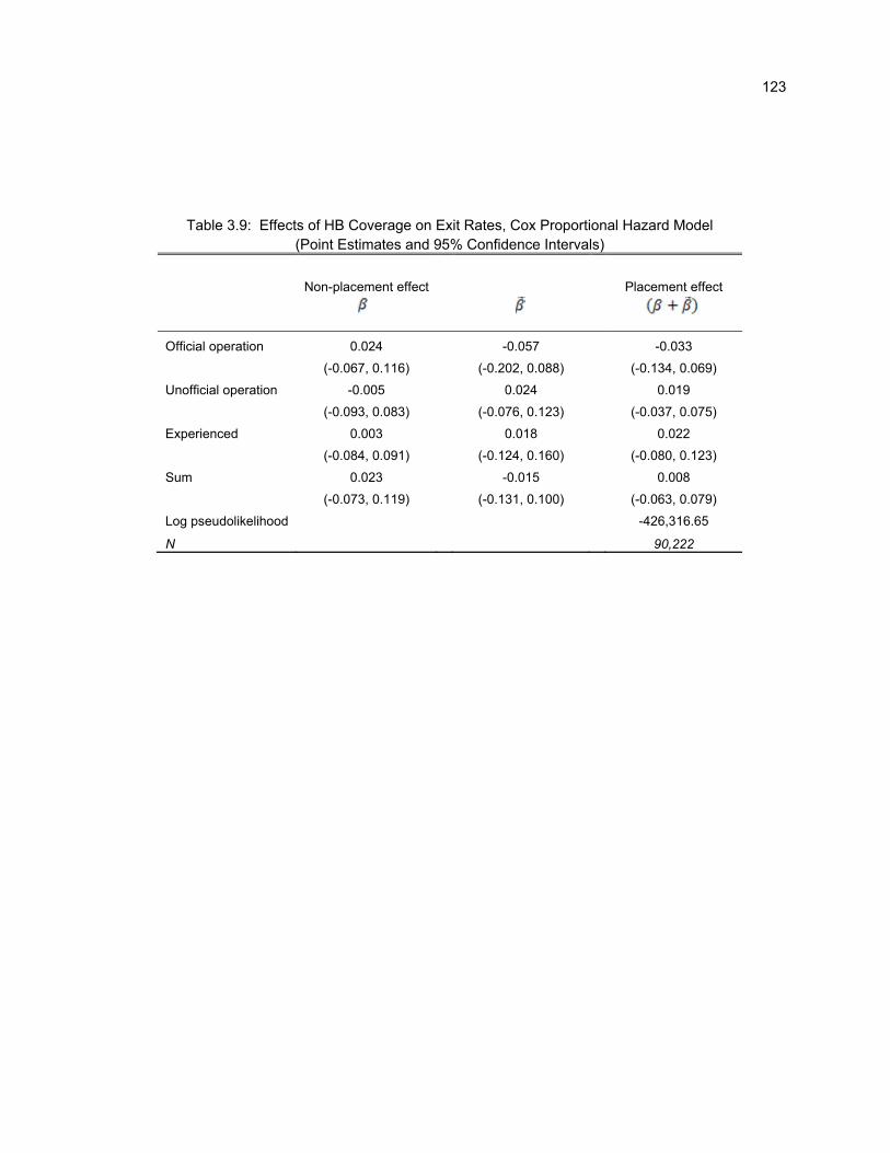
123
Table 3.9: Effects of HB Coverage on Exit Rates, Cox Proportional Hazard Model (Point Estimates and 95% Confidence Intervals)
Non-placement effect Placement effect
Official operation 0.024 -0.057 -0.033
(-0.067, 0.116) (-0.202, 0.088) (-0.134, 0.069)
Unofficial operation -0.005 0.024 0.019
(-0.093, 0.083) (-0.076, 0.123) (-0.037, 0.075)
Experienced 0.003 0.018 0.022
(-0.084, 0.091) (-0.124, 0.160) (-0.080, 0.123)
Sum 0.023 -0.015 0.008
(-0.073, 0.119) (-0.131, 0.100) (-0.063, 0.079)
Log pseudolikelihood -426,316.65
N 90,222
124
Bibliography
1. Aaronson, D. (2000). A Note on the Benefits of Homeownership. Journal of Urban Economics 47(3): 356-69.
2. Angrist J., G. Imbens, and D. Rubin (1996). Identification of Causal Effects Using Instrumental Variables. Journal of the American Statistical Association 91(434), 444-455.
3. Apicello, J. (2008). Applying the Population and High-Risk Framework to Preventing Homelessness: A Review of the Literature and Practice. Working Paper, Columbia Center on Homelessness Prevention Studies.
4. Apicello, J., W. McAllister, and B. O’Flaherty (2012). Homelessness: Prevention. Article 00352 In: Susan J. Smith, Marja Elsinga, Lorna Fox O'Mahony, OngSeowEng, Susan Wachter, editors. International Encyclopedia of Housing and Home. Oxford: Elsevier.
5. Astone, N.M., and S.D. McLanahan (1994). Family Structure, Residential Mobility, and School Dropout: A Research Note. Demography 31(4): 575-84.
6. Avery, C. and T. Kane. (2004). Student Perceptions of College Opportunities: The Boston COACH Program. In C. Hoxby, ed. College Choices: The Economics of Where to Go, When to Go, and How to Pay for It. University of Chicago Press.
7. Bailey M. and S. Dynarski (2011, December). Gains and Gaps: Changing Inequality in U.S. College Entry and Completion. Working Paper 17633, National Bureau of Economic Research.
8. Barron’s College Division (2000). Barron’s Profiles of American Colleges: 24th Edition, 2001. Barron’s Educational Series, Inc.
9. Bettinger, E., B. Long, P. Oreopoulos, and L. Sanbonmatsu (forthcoming). The Role of Simplification and Information in College Decisions: Results from the H&R Block FAFSA Experiment. Journal of Labor Economics.
10. Black, D. and J. Smith (2006). Estimating the Returns to College Quality with Multiple Proxies for Quality. Journal of Labor Economics 24(3), 701–728.
11. Bound, J. and S. Turner (2007). Cohort Crowding: How Resources Affect Collegiate Attainment. Journal of Public Economics 91(5-6), 877-899.
12. Bowen, W., M. Kurzweil, and E. Tobin (2005). Equity and Excellence in American Higher Education. Reviewed by R. Rothstein. University of Virginia Press.
13. Buckley, C. (2010). To Test Program, Some are Denied Aid. New York Times, December 8, accessed at http://www.nytimes.com/2010/12/09/nyregion/09placebo.html?pagewanted=all.

125
14. Burt, M., C. Pearson, and A. E. Montgomery (2005). Strategies for Preventing Homelessness. Washington, DC: U.S. Department of Housing and Urban Development.
15. Card, D. and A. Krueger (1992). Does School Quality Matter? Returns to Education and the Characteristics of Public Schools in the United States. The Journal of Political Economy 100(1), 1-40.
16. Card, D. and T. Lemieux (2000). Dropout and Enrollment Trends in the Post-War Period: What Went Wrong in the 1970s? In J. Gruber, ed. An Economic Analysis of Risky Behavior Among Youth. University of Chicago Press, 439-482.
17. Clark, M., Rothstein, J., and D. Schanzenbach (2009). Selection Bias in College Admissions Test Scores. Economics of Education Review 28(3), 295-307.
18. Clotfelter C. and J. Vigdor (2003). Retaking the SAT. Journal of Human Resources 38(1).
19. Cohodes S. and J. Goodman (2012, August). First Degree Earns: The Impact of College Quality on College Completion Rates. Working Paper RWP12-033. Harvard Kennedy School Faculty Research Working Paper Series.
20. Conley T. and C. Taber (2011). Inference with "Difference in Differences" with a Small Number of Policy Changes. The Review of Economics and Statistics 93(1), 113-125.
21. Cragg, M., and B. O’Flaherty (1999). Do Homeless Shelter Conditions Determine Shelter Population? The Case of the Dinkins Deluge. Journal of Urban Economics 46: 377-415.
22. Cullen, J. B. and R. Reback (2006). Tinkering toward Accolades: School Gaming under a Performance Accountability System. In Advances in Applied Microeconomics Volume 14: Improving School Accountability, ed. Timothy J. Gronberg and Dennis W. Jansen. Oxford, UK: JAI Press.
23. Dale, S. and A. Krueger (2002). Estimating the Payoff to Attending a More Selective College: An Application of Selection on Observables and Unobservables. Quarterly Journal of Economics 117(4), 1491–1527.
24. Dale, S. and A. Krueger (2011, June). Estimating the Return to College Selectivity over the Career Using Administrative Earnings Data. Working Paper 17159, National Bureau of Economic Research.
25. Deming, D. and S. Dynarski (2010). Into College, Out of Poverty? Policies to Increase the Postsecondary Attainment of the Poor. In Phil Levine and David Zimmerman, eds. Targeting Investments in Children: Fighting Poverty When Resources are Limited. University of Chicago Press, 283-302.
26. Dinkelman, T. and C. Martínez (2011, May). Investing in Schooling in Chile: The Role of Information about Financial Aid for Higher Education. Discussion Paper No. DP8375. Centre for Economic Policy Research.
126
27. Dynarski, S. (2003). Does Aid Matter? Measuring the Effect of Student Aid on College Attendance and Completion. American Economic Review 93(1), 279-288.
28. Ellen, I. G. and B. O’Flaherty (2010). Introduction, in Ellen and O’Flaherty, eds., How to House the Homeless. New York: Russell Sage.
29. Fryer, R. G. (2011). Teacher Incentives and Student Achievement: Evidence from New York City Public Schools. Working Paper 16850, National Bureau of Economic Research.
30. Furman Center for Real Estate and Urban Policy (2010). Foreclosed Properties in New York City: A Look at the Last 15 Years. Accessed on January 21. 2011 at http://furmancenter.org/files/publications/Furman_Center_Fact_Sheet_on_REO_Properties.pdf.
31. Gibbons, R. (1998). Incentives in Organizations. Journal of Economic Perspectives 12(4): 115–32.
32. Goodman, S. and L. Turner (2010). Teacher Incentive Pay and Educational Outcomes: Evidence from the NYC Bonus Program. Working Paper 10-07, Program on Education Policy and Governance Working Paper Series, Cambridge, MA.
33. Goodman, S. and L. Turner (Forthcoming). The Design of Teacher Incentive Pay and Educational Outcomes: Evidence from the New York City Bonus Program. Journal of Labor Economics.
34. Hansen, C. (2007). Asymptotic Properties of a Robust Variance Matrix Estimator for Panel Data When T is Large. Journal of Econometrics 141, 597–620.
35. Haveman, R., B. Wolfe, and J. Spaulding (1991). Childhood Events and Circumstances Influencing High School Completion. Demography 28(1): 133-57.
36. Herrmann, M. A. and J. E. Rockoff (2012). Worker Absence and Productivity: Evidence from Teaching. Journal of Labor Economics 30(4): 749-782.
37. Hill, C. and G. Winston (2005). Access to the Most Selective Private Colleges by High Ability, Low–Income Students: Are They Out There? Discussion Paper No. 69. Williams Project on the Economics of Higher Education.
38. Hoekstra, M. (2009). The Effect of Attending the Flagship State University on Earnings: A Discontinuity-Based Approach. The Review of Economics and Statistics 91(4), 717-724.
39. Holmstrom, B. (1982). Moral Hazard in Teams. Bell Journal of Economics 13(2): 324–40.
40. Holmstrom, B. and P. Milgrom (1991). Multitask Principal-Agent Analyses: Incentive Contracts, Asset Ownership, and Job Design. Journal of Law, Economics, and Organization 7 (January): 24–52.
41. Hoxby, C. (2009). The Changing Selectivity of American Colleges. Journal of Economic Perspectives 23(4), 95-118.

127
42. Itoh, H. (1991). Incentives to Help in Multi-Agent Situations. Econometrica 59(3): 611-36.
43. Jackson, C. K. and E. Bruegmann (2009). Teaching Students and Teaching Each Other: The Importance of Peer Learning for Teachers. American Economic Journal: Applied Economics 1(4): 1–27.
44. Jacob, B. A. (2005). Accountability, Incentives and Behavior: Evidence from School Reform in Chicago. Journal of Public Economics 89: 761–96.
45. Jacob, B. A. and S. D. Levitt (2003). Rotten Apples: An Investigation of the Prevalence and Predictors of Teacher Cheating. Quarterly Journal of Economics 118(3): 843–77.
46. Jacob, B. and T. Wilder (2010, January). Educational Expectations and Attainment. Working Paper 15683, National Bureau of Economic Research.
47. Jensen, Robert (2010). The (Perceived) Returns to Education and the Demand for Schooling. The Quarterly Journal of Economics 125 (2): 515-548.
48. Kane, T. (1995, July). Rising Public College Tuition and College Entry: How Well Do Public Subsidies Promote Access to College? Working Paper 5164, National Bureau of Economic Research.
49. Kane, T. (1998). Misconceptions in the Debate over Affirmative Action in College Admissions. In G. Orfield and E. Miller, eds. Chilling Admissions: The Affirmative Action Crisis and the Search for Alternatives. Harvard Education Publishing Group, 17–31.
50. Lavy, V. (2002). Evaluating the Effect of Teachers’ Group Performance Incentives on Pupil Achievement. The Journal of Political Economy 110(6): 1286–1317.
51. Lavy, V. (2009). Performance Pay and Teachers' Effort, Productivity and Grading Ethics. American Economic Review 99(5): 1979–2011.
52. Lazear, E. P. and P. Oyer (Forthcoming). Personnel Economics. In Handbook of organizational economics, ed. Robert Gibbons and D. John Roberts. Princeton, NJ: Princeton University Press.
53. Manski, C. (2004). Measuring Expectations. Econometrica 72, 1329–1376.
54. McPherson, M (2006). Low–Income Access through Different Lenses. Address to WISCAPE. University of Wisconsin, Madison. February 1, 2006.
55. Miller, R. T. R. J. Murnane, and J. B. Willett (2008). Do Worker Absences Affect Productivity? The Case of Teachers. International Labour Review 147(1): 71–89.
56. Mohanty, L. L., and Lakshmi K. R. (2009). Home Ownership and School Outcomes of Children: Evidence from the PSID Child Development Supplement. American Journal of Economics and Sociology 68(2): 465-89.
57. Muralidharan, K. and V. Sundararaman (2011). Teacher Performance Pay: Experimental Evidence
128
from India. Journal of Political Economy 119(1): 39-77.
58. Neal, D. (2011). The Design of Performance Pay in Education. In Handbook of economics of education, volume 4, ed. Eric Hanushek, Steve Machin, and Ludger Woessmann. Amsterdam: Elsevier.
59. Neal, D. and D. W. Schanzenbach (2010). Left Behind by Design: Proficiency Counts and Test-Based Accountability. Review of Economics and Statistics 92(2): 263-83.
60. O’Flaherty, B. (2012). Individual Homelessness: Entries, Exits, and Policy. Journal of Housing Economics 21(2): 77-100.
61. O’Flaherty, B. and T. Wu (2006). Fewer Subsidized Exits and a Recession: How New York City’s Family Homeless Shelter Population Became Immense. Journal of Housing Economics 15 (2): 99-125.
62. Oreopoulos, P. and R. Dunn. (2012, November). Information and College Access: Evidence from a Randomized Field Experiment. Working Paper 18551, National Bureau of Economic Research.
63. Orfield, G. and F. Paul. (1994). High Hopes, Long Odds: A Major Report on Hoosier Teens and the American Dream. Indiana Youth Institute.
64. Pallais A. and S. Turner (2006). Opportunities for Low Income Students at Top Colleges and Universities: Policy Initiatives and the Distribution of Students. National Tax Journal 59(2), 357-386.
65. Pallais, A. (2009, February). Small Differences That Matter: Mistakes in Applying to College. MIT Working Paper.
66. Pew Research Center Social and Demographic Trends (2011, May 16). Is College Worth It? Retrieved from http://www.pewsocialtrends.org/category/reports/2011/page/2/
67. Rockoff, J. and L. J. Turner (2010). Short-run Impacts of Accountability on School Quality. American Economic Journal: Economic Policy 2(4): 119–47.
68. Saavedra, Juan (2008). The Returns to College Quality: A Regression Discontinuity Approach. Unpublished Manuscript. Harvard University.
69. Schneider, B. and D. Stevenson (1999). The Ambitious Generation: American Teenagers Motivated but Directionless. Yale University Press.
70. Springer, M. G. and M. A. Winters (2009). The NYC Teacher Pay-for-Performance Program: Early Evidence from a Randomized Trial. Manhattan Institute Civic Report No. 56.
71. Stange, K. (2012). An Empirical Investigation of the Option Value of College Enrollment. American Economic Journal: Applied Economics 4(1), 49-84.

129
72. Stinebrickner T. and R. Stinebrickner (2012). Learning about Academic Ability and the College Dropout Decision. Journal of Labor Economics 30(4), 707-748.
73. The College Board (2009, October). ACT and SAT® Concordance Tables. RN-40.
74. Zafar, B. (2011). How Do College Students Form Expectations? Journal of Labor Economics 29(2), 301-348.

130
Appendix
Learning from the Test: Raising Selective College
Enrollment by Providing Information

131
Appendix A.1.1: Comparing Test-taker Composition to Characteristics of the At-Risk Population
Appendix Tables A.1.1 and A.1.2 compare the gender and racial composition of test-takers, both
before and after mandates, to those of the high school student population. I draw data for the latter from
the CCD, focusing on 11th grade students in public schools that enroll at least one test-taker in the
corresponding year – either 2000 or 2004.75
Not surprisingly, the composition of high school students changes little over time within states. The
composition of test-takers is stable as well in non-mandate states and in mandate states before the
mandates are introduced. However, in 2004 the female share of test-takers falls, and the minority share
rises, in Illinois and Colorado.
Note that even after the mandates, there are small differences in the minority share of test-takers
and high school students in the mandate states. This may reflect differences in the way that race is
reported and counted in the two data sets. Gender shares are quite comparable across the two groups.
75 Colorado did not report demographic data to the CCD in 1998-99. I use data on 12th graders in 1999-2000 instead.

132
Appendix A.1.2: Describing the Compliers
In this Appendix, I generalize the methods developed in Section 1.4 to characterize the
demographic composition of mandate compliers. Assume is an indicator variable taking on a value of 1 if
a test-taker indicates that she has a particular characteristic (i.e., low income, male, minority), and 0 if not.
Though the ACT-CCD matched dataset enables me to approximate a limited number of
characteristics describing the at-risk population, I cannot observe the full range of student demographics or
data years available in the ACT survey. Thus, to best approximate the characteristics of the complier
population, I assume, analogous to the main text, that test-taker composition would evolve similarly across
states over time in the absence of mandates: 0, where ≡ . This assumption is supported
by the estimates in Appendix Tables A.1.1 and A.1.2. With this assumption and a derivation parallel to that
in Section 1.4, I can express in terms of observable quantities.
Appendix Table A.1.3 estimates complier characteristics using school reports of their minority
enrollment and student reports of their gender, minority status, and parental income bracket. The middle
columns reveal that in both treatment states, compliers are from poorer families, and are more often males
and minorities, than those who opt into testing voluntarily. The final column presents these same statistics
from a different perspective: a majority of low-income and minority students would not have taken the exam
if they had not been forced.
The first columns of Appendix Table A.1.4 present the share of high-scorers who are compliers
and always-takers in each demographic. Across groups, a substantial portion of the compliers from every
subpopulation wind up with competitive scores, and generally about 30-40 percent of students with scores
above 18 would not have taken the test in the absence of a mandate. Compliers account for around 40
percent of competitive scoring within groups typically associated with disadvantage (low income and
minority students and students from high-minority high schools), and around 30 percent of competitive

133
scoring within other student groups. Thus, students who can earn high scores are less likely to take the
ACT if they are from minority groups.
The last columns of Appendix Table A.1.4 present the share of always-takers and compliers who
are high scorers in each demographic. These statistics are useful in calculating the share of high-scoring
compliers (or always-takers) with particular characteristics. Using Bayes’ Rule,
| |
. Substituting in values from
Appendix Tables A.1.3 and A.1.4, I estimate that 30 percent of high-scoring compliers in Colorado, and 40
percent in Illinois, are minority students. These figures can be compared with the 20 percent of high-
scoring always-takers in each mandate state that are minorities. A similar series of calculations
demonstrates that between 30 and 40 percent of high-scoring compliers are from the bottom income
quintiles, compared to just 15 percent of high-scoring always-takers.

134
Appendix A.1.3: Bounding for LE Compliers
This exercise generates a rough estimate for the upper bound of for the LE compliers. Recall
from the text that these students would like to enroll in selective schools but perceive that their probabilities
of achieving a high score are below some threshold, . Define ̅ ≡ .
First, I bound the numerator, – the cost to the student of taking the test. $25/hour would be an
implausibly large time cost, incorporating the disutility of sitting for the test. (Note that this is well above
minimum wage, and teenage unemployment rates are high.) The test is about three hours in length, so
allowing an additional hour for transportation and administration time, the full amount a student would need
in exchange for taking the exam is $100. To this must be added the direct cost of signing up for the test,
$35 in 2012 (for the version of the exam without the writing portion). Therefore, under extremely
conservative assumptions, the total cost of taking the exam is $150. Thus, any student who perceives the
net present value of taking the exam to be $150 or more will take the test even without a mandate.
Next, I consider the denominator, the additional value accrued from attending a selective school. I
model the calculation after Cohodes and Goodman (2012). Black and Smith (2006) find that a one
standard deviation increase in quality causes earnings to rise by 4.2 percent. To use this, I need to convert
the difference in quality a student in my sample experiences from electing the selective school over the
unselective school into standard deviation units. Following Cohodes and Goodman (2012), I first construct
a continuous measure of “college quality” as the first component of a principal components analysis of
available college characteristics; specifically, I use each college’s student-faculty ratio, detailed Carnegie
classification, dichotomous Barron’s competitiveness measure, and open enrollment status.76 The gain in
college quality associated with moving from an unselective to selective college—estimated by scaling the
average mandate-induced change in college quality by the fraction of students induced to take the test—is
76 I weight the principal component analysis by first-time, first-year enrollment figures to give colleges with more students more significance, and then standardize the resulting quality measure to have mean zero and standard deviation of one.

135
0.60 standard deviation. Average lifetime earnings for college graduates are approximately $3.3 million
(Pew Research Center Social and Demographic Trends 2011).77 So, according to the Black and Smith
result, a student stands to gain 0.042 $3,300,000 $139,000 in lifetime earnings for every standard
deviation increase in quality, or around $80,000 by switching from unselective to selective enrollment
among the colleges in my sample.
Therefore, for any rational student not to take the exam, $
$ ,, or 0.0019. Hence, a
student interested in attending college must believe she has a less-than-0.19 percent probability of passing
in order to opt out of the exam, or | 0.0019.
The above calculation assumes that all students value attending a selective college (relative to an
unselective college) at $80,000. This might be too high, either due to heterogeneity in the returns to
selectivity or to understatement of the discount rate that some students apply to long-run earnings
changes. For instance, Cohodes and Goodman (2012) find that students value differences in college
quality with an extremely large discount rate. By their estimates, students are willing to sacrifice about
$110,000 of lifetime income for about $7,000 in free tuition. Adjusting my estimates for these low values of
selective schooling, reduces the value of a high score to about $5,000 $0.06 $80,000 , and thus
increases the estimate of ̅ to 0.03, so that | 0.03.
77 By using earnings of graduates, I am assuming that the student in question will graduate. Note, however, that graduation rates are higher in selective than in unselective colleges, and while the simple difference may overstate the causal effect, it appears to be positive (Cohodes and Goodman 2012). Thus, my calculation probably understates the benefit of matriculating at a selective college.

136
Appendix A.1.4: Simulating Luck
In the main text, I assigned an upper bound on ∗| that could be consistent with the
estimated share of compliers who were observed to earn “passing” scores and with the effect of the
mandate on college-going. An even tighter bound that would be consistent with rational decision-making
can be obtained by assuming that potential test-takers know their own ability and are uncertain only about
how lucky they will be on the test day. In this Appendix, I ask whether this “luck” effect is large enough to
account for the effect I find of the mandates on enrollment, given the full distribution of test scores I
observe (rather than only the passing rate).
Under an assumption that students make rational test-taking decisions based on accurate
estimates of ∗, I demonstrate that, in order to match the 10 percent share of all compliers that go on to
competitive schools, it would have to be the case that students opt out of the exam whenever their pass
rates are below 40 to 45 percent. This far exceeds the threshold implied by any plausible estimate of the
ratio of the costs of test-taking to the benefits of attending a selective school.
To estimate this, I assume that students are fully informed about their own ability, as measured by
the ACT. We can write the ACT test score, as the sum of ability, ∗, and a luck component, , which
reflects idiosyncratic influences on the test (e.g., the student has a cold on test day). Assume that ∗ and
are normally distributed and independent, with:
∗~N( ∗, ∗)
~N(0, )
Suppose there is a known threshold, ̅, that a student’s must meet or surpass in order to enroll in
the selective college. The condition for a “passing” test score is thus: ≥ ̅. Student 's probability of
passing, given her ability, can be written:
∗ ∗ ∗ Pr ∗ ̅| ∗ Pr ̅ ∗| ∗ 1 ̅ ∗| ∗ ,
where is the cumulative distribution function of .

137
I assume that students take the test voluntarily if ∗ , so compliers consist of those students for
whom ∗ . Then the complier pass rate is:
∗| ∗ 1 ̅ ∗ ∗
∗
I assume that the ACT’s test-retest reliability is 0.9 and compute as: √1 0.9.78 I
estimate ∗ and ∗ from the empirical score distributions in each state in 2004. For each, I generate
1,000,000 draws of ∗, which together with my estimate of and an assumed value of ̅, yields 1,000,000
observations of ∗. Incrementing values of by hundredths for values between 0 and 1, I calculate the
mean passing rate among test-takers who have ∗ . Appendix Figure A.1.2 shows the implied mean
passing rate among compliers, assuming ̅ 18, as a function of , for Illinois and Colorado.
The graph also plots dashed horizontal lines at the estimated competitive attendance rate among
compliers within each state. This can be taken as a lower bound to the actual pass rate – if there are any
high-scoring compliers who are not interested in attending selective colleges, the true pass rate exceeds
this rate.
The horizontal lines fall quite high in the distribution. They indicate that one would expect to see
the observed effects on selective college enrollment if students take the test only when their anticipated
probabilities of passage exceed 40 percent (in Colorado) or 45 percent (in Illinois). The calculations in
Section 1.5 would support this kind of a decision rule only if the benefit of enrolling in a selective college
rather than a nonselective one were smaller than $330.
78 The test-retest reliability is derived from two years of published estimates for the ACT composite score—reliability was 0.97 for test dates in 1995 and 0.96 in 2005-6. (See: http://www.act.org/aap/pdf/ACT_Technical_Manual.pdf). Reliability estimates are similar for the SAT.

138
50
60
70
80
90
100
110
1994 1996 1998 2000 2002 2004
Early‐Adopters (CO [2002]/IL [2002])
ACT states (excl. Early‐Adopters)
Neighboring ACT states
Appendix Figure A.1.1: Average ACT Participation RatesShare of (Potential) Graduates Tested
Note: Solid lines reflect published participation rates; open circles reflect participation rates constructed from matched ACT‐CCD data. "ACT states" include later‐adopting states: Kentucky (2010), Michigan (2008), and Tennessee (2010). "Neighboring ACT states" include

139
0
10
20
30
40
50
60
70
0 0.1 0.2 0.3 0.4 0.5 0.6 0.7 0.8 0.9 1
Simulated share of CO compliers that pass
Simulated share of IL compliers that pass
Estimated share of CO compliers that attend competitive colleges
Estimated share of IL compliers that attend competitive colleges
Appendix Figure A.1.2: Simulated Pass Rates for Compliers

140
1994 1996 1998 2000 2004 2000 2004
Iowa 54 55 56 55 54 49 49
Kansas 54 54 53 55 54 49 49
Kentucky 56 56 57 57 57 50 50
Missouri 55 56 57 58 56 49 49
Nebraska 53 53 54 54 54 49 49
New Mexico 55 56 55 57 57 49 49
Utah 53 53 54 54 53 49 50
Wisconsin 55 56 57 57 56 49 49
Wyoming 55 55 58 56 54 49 49
Colorado* 54 55 56 55 50 50 49
Illinois 54 55 55 55 51 50 50
Note: Colorado CCD data for 2000 uses 1999‐2000 12th graders rather than 1998‐1999 11th graders.
CCD DataACT Data
Appendix Table A.1.1: Female Share
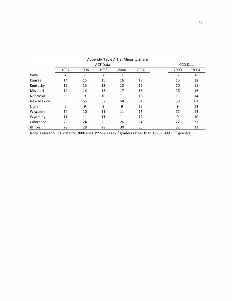
141
1994 1996 1998 2000 2004 2000 2004
Iowa 7 7 7 7 9 6 8
Kansas 14 15 15 16 18 15 18
Kentucky 12 13 13 12 15 10 11
Missouri 14 14 15 17 18 16 16
Nebraska 9 9 10 11 13 11 14
New Mexico 53 55 57 58 61 58 61
Utah 8 9 9 9 13 9 13
Wisconsin 10 10 11 11 13 12 14
Wyoming 11 11 11 11 12 9 10
Colorado* 23 24 25 26 34 22 27
Illinois 29 28 29 30 36 31 33
Note: Colorado CCD data for 2000 uses 1999‐2000 12th graders rather than 1998‐1999 11
th graders.
CCD DataACT Data
Appendix Table A.1.2: Minority Share

142
Characteristic
Pre‐reform
Test‐takers
Complier
Share of
2004 Test‐
Takers
Always‐
Takers All
Always‐
Takers Compliers Compliers
Female 55% 50% 55% 45% 39%
Male 45% 50% 45% 55% 50%
From a High‐Minority HS 30% 42% 35% 50% 53%
Not From a High‐Minority HS 70% 58% 65% 50% 38%
Minority 25% 34% 28% 41% 54%
Non‐minority 75% 66% 72% 59% 40%
Bottom Income Quintile 22% 26% 20% 33% 57%
2nd ‐ 4th Quintiles 60% 61% 65% 57% 41%
Top Income Quintile 18% 13% 15% 10% 34%
Characteristic
Pre‐reform
Test‐takers
Complier
Share of
2004 Test‐
Takers
Always‐
Takers All
Always‐
Takers Compliers Compliers
Female 55% 51% 55% 46% 35%
Male 45% 49% 45% 54% 43%
From a High‐Minority HS 36% 46% 39% 56% 47%
Not From a High‐Minority HS 64% 54% 61% 44% 32%
Minority 29% 36% 32% 42% 46%
Non‐minority 71% 64% 68% 58% 35%
Bottom Income Quintile 24% 29% 22% 39% 53%
2nd ‐ 4th Quintiles 58% 58% 62% 51% 34%
Top Income Quintile 18% 13% 16% 10% 29%
Appendix Table A.1.3: Complier Characteristics
2004 Test‐takers
Colorado
Illinois
2004 Test‐takers

143
Characteristic
Share of
High‐Scorers
who are
Always‐takers
Share of
High‐Scorers
who are
Compliers
Share of
Always‐takers who
Earn
High Scores
Share of
Compliers
who Earn
High Scores
All 68% 32% 79% 47%
Female 73% 27% 80% 47%
Male 63% 37% 80% 48%
From a High‐Minority HS 63% 37% 70% 37%
Not From a High‐Minority HS 71% 29% 86% 58%
Minority 60% 40% 64% 37%
Non‐minority 67% 33% 86% 64%
Bottom Income Quintile 57% 43% 64% 37%
2nd ‐ 4th Quintiles 70% 30% 81% 49%
Top Income Quintile 71% 29% 92% 74%
All 75% 25% 76% 40%
Female 76% 24% 74% 43%
Male 72% 28% 77% 39%
From a High‐Minority HS 66% 34% 62% 35%
Not From a High‐Minority HS 80% 20% 85% 47%
Minority 63% 37% 55% 39%
Non‐minority 72% 28% 85% 61%
Bottom Income Quintile 54% 46% 50% 38%
2nd ‐ 4th Quintiles 81% 19% 81% 36%
Top Income Quintile 75% 25% 92% 75%
Note: A high‐scorer earns a score greater than or equal to 18.
Appendix Table A.1.4: Scores by Characteristics
Colorado
Illinois

144
Category Criteria Share Admitted Example Schools
Most Competitive HS rank: top 10‐20% <1/3 Amherst College, MA
GPA: A to B+ Brown University, RI
Median SAT: 1310‐1600 Middlebury, VT
Median ACT: 29+ Tufts University, MA
Highly Competitive HS rank: top 20‐35% 1/3 ‐ 1/2 UIUC, IL*
GPA: B+ to B George Washington University, DC
Median SAT: 1240‐1308 SUNY Binghamton, NY
Median ACT: 27‐28 Vanderbilt University, TN
Very Competitive HS rank: top 35‐50% 1/2 ‐ 3/4 Colorado State University, CO*
GPA: B‐ and up American University, DC
Median SAT: 1146‐1238 Fordham University, NY
Median ACT: 24‐26 George Mason University, VA
Competitive HS rank: top 50‐65% 75% ‐ 85% University of Colorado at Boulder, CO*
GPA: C and up Quinnipiac University, CT
Median SAT: 1000‐1144 SUNY Buffalo, NY
Median ACT: 21‐23 UC Davis, CA
Less Competitive HS rank: top 65% 85% or more San Francisco State University, CA
GPA: below C SUNY Farmingdale, NY
Median SAT: below 1000 UT Arlington, TX
Median ACT: below 21 UWisconsin/Milwaukee, WI
Noncompetitive HS graduate 98% or more CUNY York, NY
UT El Paso, TX
UT San Antonio, TX
Wilmington College, DE
Appendix Table A.1.5: Gradations of Selectivity According to the Barron's College Admissions Selector
Note: * indicates a state flagship university in one of the early‐adopting mandate states.
Source: Barron's Profiles of American Colleges 2001.

145
Average
(2000)
Difference
(2002‒2000)
Average
(2000)
Difference
(2002‒2000)
Subcategories of Enrollment (as Share of Population)
Four‐Year 35.7% 2.7 p.p. 36.8% 1.2 p.p. 1.5 p.p.
Selective and
Land Grant 4.9% 0.4 p.p. 7.2% 0.2 p.p. 0.2 p.p.
Public 21.0% 1.5 p.p. 20.1% 0.5 p.p. 1.0 p.p.
Private 9.3% 0.7 p.p. 6.8% ‐0.1 p.p. 0.9 p.p.
Private Not‐for‐Profit 8.7% 0.7 p.p. 6.6% ‐0.1 p.p. 0.8 p.p.
In‐State 22.3% 1.4 p.p. 20.4% 0.5 p.p. 0.9 p.p.
Out‐of‐State 8.1% 0.9 p.p. 6.6% ‐0.1 p.p. 1.0 p.p.
In‐State and
Selective‐Land Grant 3.7% 0.3 p.p. 6.3% 0.2 p.p. 0.1 p.p.
Selective‐Public 17.5% 1.1 p.p. 17.6% 0.4 p.p. 0.7 p.p.
Selective‐Private 4.7% 0.3 p.p. 3.7% 0.0 p.p. 0.2 p.p.
Out‐of‐State and
Selective‐Land Grant 1.2% 0.1 p.p. 1.2% 0.0 p.p. 0.1 p.p.
Selective‐Public 3.5% 0.4 p.p. 3.3% 0.1 p.p. 0.3 p.p.
Selective‐Private 4.6% 0.4 p.p. 3.2% ‐0.2 p.p. 0.6 p.p.
18‐year‐old Population 118,114 278 53,196 ‐129 407
States in Group
ACT Participation Rate (published) 68% 31 p.p. 70% ‐1 p.p. 32 p.p.
2 23
Difference in
Difference
Appendix Table A.1.6: Differences in Shares of Additional Types of Enrollment between 2000 and 2002
Mandate Status in 2002
Mandate:
CO and IL
No Mandate:
Other ACT States